Checkout flow refers to the sequence of steps a customer moves through to complete a purchase on an e-commerce website — from the moment they click “Proceed to Checkout” to the order confirmation screen. Each step in the flow (cart review, contact information, shipping selection, payment entry, and order confirmation) represents a potential drop-off point where shoppers may abandon the purchase before completing it.
The checkout flow is one of the highest-leverage areas of any e-commerce site. By the time a shopper reaches checkout, they’ve already decided to buy — the job of the checkout is simply to get out of the way and let them do it. Yet the average checkout abandonment rate hovers around 70%, meaning most shoppers who begin checkout never finish it. A checkout flow optimized for clarity, speed, and trust can meaningfully increase completed orders without any additional marketing spend.
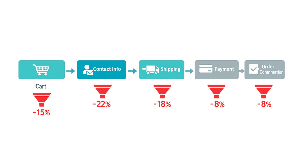
[Image: Diagram showing the standard WooCommerce checkout steps — Cart → Contact Info → Shipping → Payment → Order Confirmation — with drop-off indicators at each step]
Key Components of a Checkout Flow
A typical WooCommerce checkout flow includes these stages:
- Cart page — Shows items selected, quantities, prices, subtotal, and an order summary. The first place shipping costs or discount fields appear.
- Contact/account information — Collects email address and optionally prompts for account creation or guest checkout.
- Shipping information — Collects the delivery address and allows selection of a shipping method and speed.
- Payment — Collects payment details through a secure payment gateway (credit card, PayPal, buy now/pay later, etc.).
- Order review — Some checkout flows include a summary step before final submission.
- Order confirmation — The “thank you” page confirming the order was placed successfully.
Single-page checkout flows collapse these steps into one scrollable page. Multi-step checkouts break them into separate screens. Either can work well — what matters is minimizing friction at each point, not the specific layout.
Purpose & Benefits
1. Directly Impact Revenue Without Increasing Traffic
Checkout flow optimization converts more of the traffic you already have. If your store receives 1,000 checkout initiations per month and completes 30% of them, that’s 300 completed orders. Improving that to 40% — a 10-point gain — means 400 completed orders: 33% more revenue with no increase in advertising spend or traffic acquisition. This is why checkout optimization consistently delivers strong ROI relative to other e-commerce investments.
2. Reduce Cart Abandonment at the Most Critical Stage
Cart abandonment peaks at the checkout stage, not the cart or product pages. Unexpected costs, required account creation, confusing forms, and limited payment options all cause shoppers to exit at the final step. A streamlined checkout flow that eliminates these friction points keeps shoppers moving forward. Well-optimized stores see checkout completion rates between 45–55%; stores with checkout friction often fall below 30%.
3. Build Trust at the Moment It Matters Most
Shoppers enter payment information at checkout — the highest-trust moment in any online transaction. A checkout flow that displays SSL indicators, recognizable payment logos, clear return policy summaries, and a secure-looking design reinforces that this purchase is safe. Our web design services treat checkout as a trust-building design challenge, not just a form to fill out.
Examples
1. Guest Checkout Enabling
A WooCommerce store previously required account creation before purchase. After enabling guest checkout — where customers complete a purchase with just their email and shipping/payment details, without creating a password — the checkout completion rate improved noticeably. Removing the account creation step eliminates one of the most commonly cited barriers: shoppers who don’t want another account to manage.
2. Transparent Shipping Cost Display
A retailer moved shipping cost estimates from the checkout step to the cart page, using WooCommerce’s shipping calculator widget. Visitors can now see estimated shipping before committing to checkout. The result: fewer surprise-cost drop-offs at the payment step, because shoppers already know the total before they begin the checkout process. This directly addresses the leading cause of checkout abandonment — unexpected fees.
3. Payment Method Expansion
A store selling mid-to-high-priced products added buy-now-pay-later options (Afterpay, Klarna, Shop Pay Installments) to their WooCommerce checkout. Customers who hesitated at the payment step due to the full upfront cost now have a lower-commitment path to complete the purchase. This is especially effective for items in the $100–$500 range, where spreading payments removes price as the primary objection.
Common Mistakes to Avoid
- Too many required form fields — Every field a shopper has to complete is an opportunity to abandon. Audit your checkout fields and remove anything that isn’t strictly necessary to complete the order. Company name, phone number, and “how did you hear about us” fields are common culprits.
- Forcing account creation — Requiring shoppers to create and verify an account before checkout significantly increases abandonment. Guest checkout should always be available. You can prompt account creation on the confirmation page after the purchase is complete.
- Unclear error messages — When a field fails validation (wrong card number format, incomplete address), generic error messages like “Error: please correct the information” don’t tell the shopper what to fix. Write clear, field-specific error messages that guide the shopper to the solution.
- Poor mobile checkout experience — Mobile checkout abandonment runs around 80% on average. If your checkout form requires zooming, the keyboard covers fields, or buttons are hard to tap on small screens, you’re losing the majority of mobile shoppers at the final step.
Best Practices
1. Show the Complete Cost Early
The number one cause of checkout abandonment is unexpected costs — shipping fees, taxes, and handling charges that appear for the first time at the payment step. Display shipping cost estimates on the product page or cart page. If shipping is free above a threshold, show how close the shopper is. Transparency about total cost before checkout begins dramatically reduces surprise-driven abandonment.
2. Reduce Steps and Fields to the Minimum
Every step removed and every field eliminated reduces the opportunities for a shopper to abandon. If billing and shipping are the same address, default to that. If you don’t need a phone number, remove the field. Enable browser autofill to speed up form completion. Consider whether a multi-step checkout could be condensed into a single page without sacrificing clarity. Each friction point you remove has a measurable positive effect on conversion rate.
3. Optimize for Mobile First
With mobile checkout abandonment averaging around 80%, mobile checkout experience deserves priority attention. Test your checkout on multiple screen sizes and real devices — not just a browser resize. Ensure tap targets are large enough, the keyboard doesn’t obscure fields, payment methods include mobile-native options (Apple Pay, Google Pay), and the layout renders correctly without horizontal scrolling.
Frequently Asked Questions
What’s the average checkout completion rate?
Checkout completion rates for most eCommerce stores fall between 20% and 40%. Well-optimized stores achieve 45–55% or higher. If your completion rate is below 25%, there’s likely a significant friction point — most commonly unexpected shipping costs, forced account creation, or a confusing payment step.
Should I use a one-page or multi-step checkout?
Both can perform well when optimized correctly. One-page checkouts can feel faster and less intimidating. Multi-step checkouts can be clearer for complex orders (multiple shipping addresses, customization options). The most important factor isn’t the structure — it’s reducing friction and showing costs transparently at each step. Test both approaches if you have the traffic volume to run a meaningful A/B test.
How do I see where shoppers are dropping off in my checkout?
Google Analytics with Enhanced Ecommerce tracking or GA4’s funnel exploration feature shows the step-by-step conversion data for your checkout flow. WooCommerce-specific analytics tools like Metorik provide more granular checkout data. Look for the step with the highest drop-off rate — that’s where to focus optimization efforts first.
Does checkout design really affect sales?
Yes, measurably so. Research from Baymard Institute found that a checkout redesign focused on removing friction could improve conversion by up to 35%. For a store doing $100,000/month, that’s potentially $35,000 in additional revenue — from a design and UX change, not from increased advertising.
What payment methods should I offer?
At minimum: major credit cards, debit cards, and PayPal. Beyond that, consider Apple Pay and Google Pay (for faster mobile checkout), buy-now-pay-later options (for higher-priced items), and ACH/bank transfer (for B2B transactions). The right mix depends on your audience and average order value. Every payment method you don’t offer is a reason for some customers to abandon.
Related Glossary Terms
How CyberOptik Can Help
Building and optimizing WooCommerce stores is one of our specialties. From checkout flow design and payment gateway configuration to cart recovery strategies, we help businesses create online shopping experiences that convert visitors into buyers. If your store is leaving revenue on the table at the checkout step, we can help diagnose and fix it. Contact us to start your eCommerce project or see our eCommerce services.