Whitespace — also called negative space — is the empty area between and around the elements of a design: the gaps between lines of text, the padding around a button, the margin separating a headline from a paragraph, the open space surrounding an image. Contrary to the name, whitespace doesn’t have to be white — it can be any color or texture, as long as it’s free of content.
Whitespace is one of the most underestimated elements in web design. The instinct on many sites is to fill every available pixel — more content, more images, more calls-to-action. But in practice, the opposite tends to produce better results. Strategic use of whitespace helps visitors process information faster, feel less overwhelmed, and more clearly understand what action to take. It’s not empty space — it’s working space.
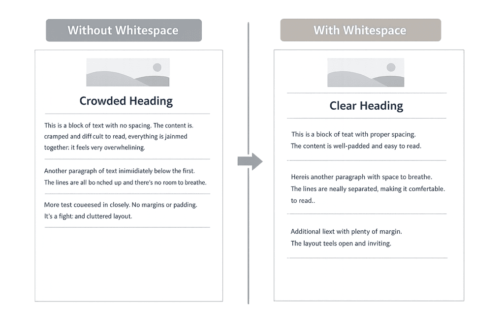
[Image: Side-by-side comparison of a dense, cluttered web page versus the same content with generous whitespace, showing improved readability and visual clarity]
Why Whitespace Matters in Web Design
Whitespace operates at multiple levels on a web page, each serving a different purpose:
- Micro whitespace — The space between small elements: line spacing in body text, letter spacing, padding inside buttons, gaps between list items. Micro whitespace directly affects readability and the ease of scanning.
- Macro whitespace — The larger open areas separating major sections, columns, or content blocks. Macro whitespace gives a page its overall breathing room and visual structure.
- Active whitespace — Space that’s deliberately placed to guide the eye or draw attention to a specific element. A headline surrounded by open space naturally draws more attention than one crowded by other content.
- Passive whitespace — Space that results from the natural layout of content, like the margin around a paragraph, rather than a deliberate design decision.
Research from Nielsen Norman Group consistently demonstrates that whitespace improves user comprehension and reduces cognitive load — the mental effort required to process a page. When content is allowed to breathe, visitors read faster and retain more.
Purpose & Benefits
1. Improved Readability and Comprehension
Adequate spacing between lines of text (line-height), between paragraphs, and between content blocks makes reading significantly easier. Dense text with minimal spacing slows readers down and increases the chance they’ll abandon the page before engaging with your message. For business websites, where you need visitors to understand and act, this directly impacts results. Good web design treats whitespace as a readability tool, not wasted real estate.
2. Visual Hierarchy and Guided Attention
Whitespace helps establish which elements are most important. A button with generous padding and open space around it stands out more than one crammed into a crowded section. Larger gaps between sections signal a new topic; tighter spacing between related elements signals they belong together. This is sometimes called the Gestalt principle of proximity — and it’s a core reason whitespace-aware design is more intuitive for users.
3. Perceived Quality and Brand Trust
Sites with generous whitespace consistently read as more professional and premium than cluttered ones. Think of luxury retail brands versus discount sites — the open, airy layouts signal quality and care. For any business trying to build trust with visitors quickly, the visual spaciousness of a well-designed site communicates that the brand pays attention to detail. This connects directly to how usability affects conversions.
Examples
1. Landing Page with a Clear CTA
A software company’s homepage hero section uses a large headline, a two-sentence subheadline, and a single call-to-action button — surrounded by generous whitespace on all sides. Nothing competes with the CTA for attention. The result is a cleaner, more confident design that outperforms a version packed with multiple headlines, features lists, and competing buttons. Less visual noise means the visitor’s eye goes exactly where the design intends.
2. Blog Post Readability
A blog post with 1.6–1.8 line spacing, comfortable padding on either side of the text column, and clear spacing between each paragraph is noticeably easier to read than one with tight line spacing and edge-to-edge text. The reader moves through the content more naturally, stays longer, and is more likely to scroll to the end — all metrics that indicate successful content engagement.
3. Product Page Spacing
A WooCommerce product page with generous padding between the product image, the price, the description, and the Add to Cart button guides shoppers through a clear decision path. Each piece of information has room to register before the next arrives. Contrast this with a product page where everything is stacked tightly with minimal spacing — the shopper has to work harder to find the information they need, and conversion rates reflect that friction.
Common Mistakes to Avoid
- Treating whitespace as waste — The belief that empty space should be filled is one of the most common mistakes in web design. Every extra element added competes for attention and dilutes the impact of what matters most. Resist the urge to fill space for its own sake.
- Inconsistent spacing — Using arbitrary or inconsistent spacing creates visual disorder. Spacing decisions should follow a consistent system — padding values, gap sizes, and section margins that relate to each other (e.g., multiples of 8px) rather than ad-hoc decisions throughout the page.
- Neglecting mobile whitespace — Text that’s readable on desktop with standard line spacing may become cramped on a small screen. Whitespace needs to be reviewed specifically at mobile breakpoints, where padding and margins often need adjustment to maintain readability.
- Removing whitespace to “add more content” — Compressing spacing to fit more information on screen is usually counterproductive. Visitors don’t read more just because more is present — they often read less when the density becomes overwhelming. Better to present fewer things clearly than many things poorly.
Best Practices
1. Use a Consistent Spacing System
Rather than applying arbitrary padding and margin values, design around a spacing scale — typically multiples of 4 or 8 pixels. This creates visual rhythm and consistency across the page. When all spacing decisions follow a system, the result feels intentional and cohesive rather than assembled piecemeal. This principle applies whether you’re working with custom CSS or a page builder inside WordPress.
2. Let Key Elements Have Room to Breathe
Your most important elements — primary headlines, main CTAs, hero sections — deserve the most whitespace. Surround them with more space than feels strictly necessary. The extra room isn’t waste; it’s emphasis. A headline with significant whitespace above and below it commands more attention than one packed between other elements. This applies to call-to-action buttons in particular.
3. Review Spacing at All Screen Sizes
Whitespace decisions made for desktop often break down on mobile. Before finalizing any design, audit the spacing on phones and tablets. Common issues include sections with inadequate top/bottom padding on small screens, text that runs edge-to-edge without breathing room, and buttons that feel too small or too cramped. A responsive design approach treats whitespace as a responsive element, not a fixed one.
Frequently Asked Questions
Does more whitespace mean less content?
Not necessarily. Whitespace is about how content is presented, not how much is there. A page with the same content but improved spacing, line height, and section margins will often feel like it has less content — but actually contains the same information, presented more clearly. Visitors absorb it more easily as a result.
Will adding whitespace push important content below the fold?
It might move things down slightly, but the tradeoff is almost always worth it. Studies consistently show that users scroll — the concern about “the fold” is often overstated for modern websites. A page that’s slightly longer but easier to read and navigate outperforms a cramped page that keeps everything “above the fold” at the cost of clarity.
Is whitespace the same thing as padding and margin in CSS?
Those are the technical implementation tools. In CSS, padding controls space inside an element and margin controls space outside it. Whitespace as a design concept describes the visual result — the breathing room that makes a design work. So yes, designers achieve whitespace primarily through padding, margin, and gap properties in their stylesheets.
How does whitespace affect SEO?
Whitespace doesn’t directly affect search engine rankings, but it affects the user experience metrics that search engines increasingly consider — like time on page, scroll depth, and bounce rate. A page that’s easy to read and navigate will generally perform better on these indicators than a cramped, difficult-to-navigate one. Good design supports good SEO indirectly.
Related Glossary Terms
- User Experience (UX)
- User Interface (UI)
- Wireframe
- Usability
- Responsive Design
- Accessibility
- Call to Action (CTA)
How CyberOptik Can Help
Great design is about more than aesthetics — it’s about creating experiences that work. Whitespace is one of the most powerful tools we apply to every site we design, because it directly affects how clearly visitors understand your message and how easily they find what they’re looking for. If your current site feels cluttered, hard to read, or isn’t converting the way it should, the solution is often found in the design fundamentals. See our web design services or contact us to start a project.

