Heatmap is a data visualization tool that overlays color-coded interaction data on top of a webpage to show how visitors engage with it. Warmer colors — reds and oranges — indicate areas of high activity, while cooler colors — blues and greens — indicate areas that are rarely noticed or interacted with. The visual output makes behavioral patterns immediately readable, even for people who have never looked at analytics data before.
For businesses trying to improve their websites, heatmaps answer a question that standard analytics can’t: not just how many people visited a page, but what they actually did while they were there. A heatmap can reveal that visitors are clicking an image that isn’t a link, missing a call-to-action button entirely, or dropping off before reaching the most important content on the page. That kind of insight drives real improvements.
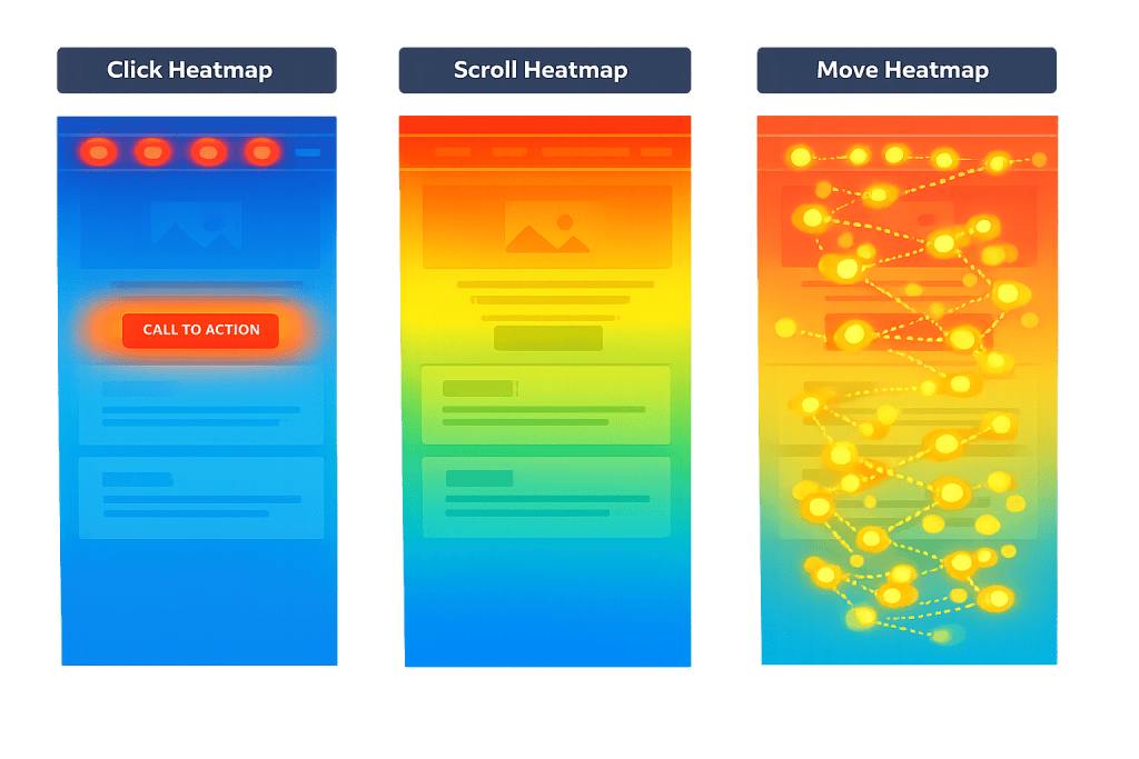
[Image: Side-by-side comparison of click, scroll, and move heatmaps on the same landing page]
Types of Heatmaps
Not all heatmaps capture the same data. Each type answers a different question:
- Click heatmaps — Show where visitors click or tap. These reveal which buttons and links get attention, and which visual elements users try to click that aren’t actually interactive. Dead clicks and rage clicks are visible here.
- Scroll heatmaps — Show how far down a page visitors scroll before leaving. These are essential for understanding whether visitors ever reach key sections like pricing tables, testimonials, or form submissions placed lower on the page.
- Move (hover) heatmaps — Track cursor movement on desktop. Cursor position correlates loosely with where people are reading or focusing, though this is a signal to investigate further rather than a definitive measure of attention.
- Zone-based heatmaps — Aggregate interaction data by defined sections of a page (hero, navigation, footer, etc.), making it easier to compare performance across areas without interpreting scattered pixel-level data.
Popular heatmap tools include Hotjar, Microsoft Clarity (free), Mouseflow, and Lucky Orange. Most integrate directly with WordPress without requiring code changes.
Purpose & Benefits
1. Identify UX Friction Before It Costs You
Heatmaps reveal where visitors are confused, stuck, or clicking the wrong things. A click heatmap showing repeated clicks on a non-clickable product image tells you visitors expect a link that isn’t there. Fixing that one issue — adding a link or making the intent clearer — can directly improve your conversion rate. This is the foundation of good CRO (Conversion Rate Optimization).
2. Prioritize What Visitors Actually Care About
Scroll depth data answers the brutal question: does anyone actually read this? If your scroll heatmap shows 80% of visitors drop off before reaching a section you’ve prioritized, you can either move that content higher or reconsider whether it belongs on the page at all. This makes design and content decisions more grounded in evidence than opinion.
3. Inform and Validate A/B Tests
Heatmaps and A/B testing work well together. A heatmap tells you where a problem exists on a page; an A/B test helps you determine whether a proposed fix actually works. Running a heatmap after a test confirms whether visitor behavior changed the way you expected. Our team uses both together when working on digital marketing and UX improvements for clients.
Examples
1. Homepage Hero Click Analysis
A service company notices their homepage has a high bounce rate but can’t identify why from analytics alone. A click heatmap reveals that visitors are clicking the background image in the hero section — a pattern suggesting they expect it to be interactive or link somewhere. Adding a link to the company’s main service page at that click cluster reduces bounce rate measurably.
2. Scroll Depth on a Landing Page
A business running paid ads sends traffic to a landing page with a contact form at the bottom. A scroll heatmap shows that only 40% of visitors scroll far enough to see the form. Moving the form above the fold — or adding a secondary CTA button at the top — immediately increases form submissions without changing the ad spend.
3. Click Heatmap on a Product Page
An eCommerce store uses a click heatmap on a product page and finds visitors are clicking the product description images more than the “Add to Cart” button. This suggests the images are more compelling than the CTA. Enlarging the button, changing its color, or repositioning it closer to the images becomes a clear test hypothesis with data backing it.
Common Mistakes to Avoid
- Reading heatmaps in isolation — A click heatmap shows behavior, not intent. Pair heatmap data with session recordings and analytics to understand why visitors behave the way they do, not just that they do.
- Drawing conclusions from small samples — A heatmap based on 50 sessions can look definitive but may not reflect real patterns. Wait until you have at least 500–1,000 sessions on a page before acting on the data.
- Ignoring mobile and desktop separately — Visitor behavior on mobile and desktop often differs significantly. A scroll heatmap that looks fine on desktop may show catastrophic drop-off on mobile. Always segment by device type.
- Treating hover data as attention data — Cursor movement on desktop only loosely correlates with where people are reading. Use it as a hypothesis generator, not a conclusion.
Best Practices
1. Start with Your Highest-Traffic Pages
Heatmaps require a meaningful volume of visits to produce reliable patterns. Prioritize your homepage, main service pages, and any landing pages tied to active campaigns. These pages also tend to have the most direct connection to conversions, so improvements here have the biggest business impact.
2. Combine Heatmaps with Your Analytics Data
Heatmaps tell you where behavior happens; analytics tools like Google Analytics 4 tell you what happens next. If your analytics show a high exit rate on a specific page, use a heatmap to investigate what visitors are doing — or not doing — on that page. Together, these tools create a complete picture.
3. Act on Patterns, Not Outliers
Look for consistent patterns across many sessions before making changes. A single visitor clicking an unusual spot isn’t meaningful. But if 30% of visitors are clicking the same non-clickable element, that’s a pattern worth addressing. Use your findings to build specific hypotheses, then test them with A/B testing before committing to a permanent change.
Frequently Asked Questions
What is a heatmap used for in web design?
A heatmap shows how visitors interact with a webpage — where they click, how far they scroll, and where their cursor moves. This data helps identify usability problems, misplaced elements, and missed conversion opportunities. It replaces guesswork with observable evidence about what visitors are actually doing.
Is a heatmap the same as a session recording?
No. A heatmap aggregates behavior across many visitors into a single visual — you see patterns. A session recording shows one visitor’s entire journey through your site in real time, including mouse movement, scrolling, and clicks. Both tools are useful and complement each other; most heatmap platforms offer both features.
How many visitors do I need before a heatmap is reliable?
Most practitioners recommend at least 500–1,000 sessions before drawing strong conclusions from a heatmap. For low-traffic pages, you may need to run the heatmap for several weeks to collect enough data. Running on insufficient data can produce misleading patterns.
Do heatmaps affect website performance or privacy compliance?
Heatmap scripts add a small amount of JavaScript to your pages. This can have a minor impact on load speed if not implemented correctly — lighter tools like Microsoft Clarity (free) are less intrusive than some enterprise options. For privacy, most heatmap tools offer session masking for form fields and are configurable to meet GDPR and CCPA requirements. Confirm your implementation with your privacy policy before going live.
What’s the difference between a click heatmap and a scroll heatmap?
A click heatmap shows where visitors tap or click on the page. A scroll heatmap shows how far down the page visitors scroll before leaving. Use click heatmaps to evaluate CTAs, navigation, and interactive elements. Use scroll heatmaps to evaluate content placement and whether key sections are being seen at all.
Related Glossary Terms
- CRO (Conversion Rate Optimization)
- A/B Testing
- Conversion Rate
- Bounce Rate
- Core Web Vitals
- Landing Page
- Google Analytics 4 (GA4)
- Exit Rate
How CyberOptik Can Help
Heatmaps are one of the tools we use when auditing websites for conversion and UX performance. If your site has traffic but isn’t generating the leads or sales it should, behavioral data often reveals exactly why. Whether you need help setting up heatmap tracking, interpreting the data, or redesigning pages based on findings, our team handles both the analysis and the execution. Explore our marketing services or get in touch to discuss a website audit.