A modal (also called a popup, overlay, or dialog) is a window that appears on top of the main page content, temporarily interrupting the user’s current activity to present information, request input, or prompt a decision. Unlike navigating to a new page, a modal keeps the user in context — the page behind it remains visible (usually dimmed), and the user can typically close the modal to return to what they were doing.
The terms “modal” and “popup” are often used interchangeably, though there’s a technical distinction: a true modal is blocking — users must interact with it or dismiss it before continuing. A popup can be non-blocking, appearing alongside content without requiring immediate attention. In practice, most marketers and site owners use the terms interchangeably, and both serve similar functions: capturing attention to deliver a message, collect information, or prompt an action.
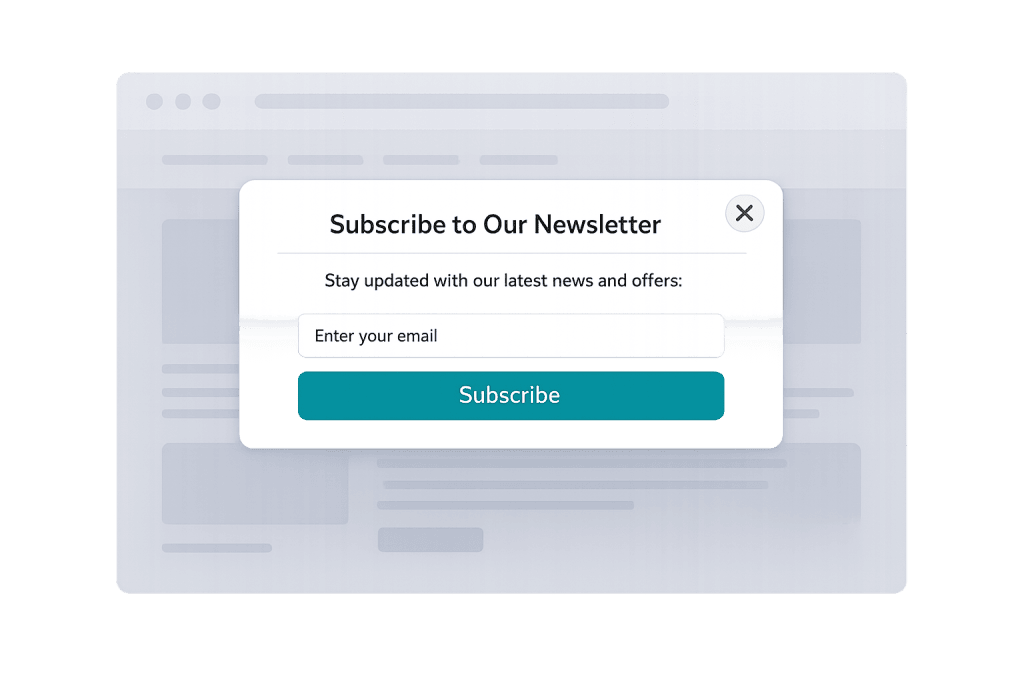
[Image: Screenshot of a modal dialog over a dimmed page, showing a newsletter signup form with a clear close button]
Types of Modals and Popups
Not all modals serve the same purpose. Common types include:
- Newsletter/lead capture popups — Ask visitors to subscribe with their email, often triggered after a time delay or scroll depth
- Exit-intent popups — Appear when the browser detects the cursor moving toward the browser’s close button, offering a last-chance incentive
- Confirmation dialogs — Require users to confirm irreversible actions (“Are you sure you want to delete this?”)
- Cookie consent notices — Inform visitors about data collection and request permission
- Lightbox modals — Display enlarged images or embedded videos without navigating away
- Login/authentication modals — Prompt users to sign in or create an account without leaving the current page
- Promotional modals — Announce sales, special offers, or time-sensitive deals
Purpose & Benefits
1. Capture Leads and Drive Conversions
Lead capture modals remain one of the most effective tools for growing an email list. A well-timed popup with a clear value proposition — “Get our free guide” or “10% off your first order” — can convert 2–10% of visitors who might otherwise leave without taking any action. When connected to a marketing automation platform, the captured leads enter a nurture sequence automatically.
2. Deliver Important Messages Without Interrupting Navigation
Modals allow you to surface urgent information — shipping delays, policy updates, limited-time promotions — without replacing the page the visitor came to see. A dimmed overlay signals that something requires attention, while the underlying page remains visible, reinforcing context. This is more effective than banner messages that blend into the page or get ignored.
3. Protect Users from Unintended Actions
Confirmation modals reduce costly mistakes. Before a user deletes content, cancels a subscription, or submits a form that can’t be undone, a modal asking “Are you sure?” gives them a chance to reconsider. In user experience (UX) design, this pattern is called a “destructive action confirmation” and it’s standard practice for any irreversible action.
Examples
1. Newsletter Signup Popup with Exit Intent
A marketing agency’s blog triggers a popup when a visitor moves their cursor toward the browser close button. The popup offers a free checklist download in exchange for an email address. Because it fires only at the moment of exit, it doesn’t interrupt visitors who are actively reading content — it captures attention only from those who are about to leave.
2. E-Commerce Welcome Discount
A WooCommerce store shows a full-screen modal to first-time visitors after 10 seconds on the site, offering 15% off their first order if they subscribe. The modal has a clear “No thanks” option. This type of popup consistently drives email list growth for e-commerce businesses — and the discount coupon tied to the signup improves initial conversion rate.
3. Confirmation Dialog Before Deleting Content
A WordPress site administrator clicks “Delete Page” and a modal appears: “This will permanently remove the page and all its data. Are you sure?” with “Cancel” and “Confirm Delete” buttons. Without this modal, accidental deletions could cause content loss. The friction created by the extra click is intentional — it prevents mistakes without making the delete function inaccessible.
Common Mistakes to Avoid
- Triggering popups too early — A modal that fires 2 seconds after a page loads disrupts visitors before they’ve had a chance to engage with content. Most best practices recommend a minimum of 8–15 seconds, or triggering on scroll depth rather than time.
- Making modals hard to close — A small or hidden close button frustrates users and is a dark pattern. Always provide a clearly visible X button, allow closing by clicking outside the modal, and support the Escape key for keyboard users.
- Showing the same popup repeatedly — Visitors who have already seen and dismissed a popup shouldn’t see it again every visit. Set cookies to suppress the popup for returning visitors for at least 30 days.
- Ignoring mobile design — A modal designed for desktop often breaks on mobile. Text becomes too small, close buttons fall off-screen, and the form becomes unusable. Mobile modals should be tested specifically and may need a full-screen treatment on small screens.
Best Practices
1. Time Your Modals Intentionally
The most effective modals are triggered by behavior, not just time. A popup that appears after a visitor has scrolled 50% of a page is targeting someone engaged with your content. Exit-intent popups target visitors actively leaving. Scroll-depth and exit triggers consistently outperform timed triggers because they match the modal’s message to the visitor’s demonstrated interest level.
2. Offer Clear Value and an Easy Out
Every popup should answer “what’s in it for me?” immediately. A weak headline like “Subscribe to our newsletter” performs significantly worse than “Get 5 practical tips for [specific outcome] — free.” Always include a prominent, low-friction dismiss option. Visitors who feel trapped by a modal will leave the site rather than engage — the opposite of the intended outcome. A call to action should be compelling, not coercive.
3. Ensure Accessibility and Mobile Compatibility
When a modal opens, keyboard focus should move into it so keyboard-only users can interact with it without navigating through the background page. All interactive elements inside the modal should be reachable via tab key. Provide aria labels for screen reader users. Test at mobile viewport sizes to confirm the modal fits the screen, the close button is tappable, and the form fields function correctly on touch screens.
Frequently Asked Questions
Do popups hurt SEO?
Google has penalized certain types of intrusive interstitials (popups) on mobile — specifically those that cover main content immediately on page load. However, properly timed popups (triggered by scroll, exit intent, or user interaction), cookie consent notices, and legal-required notices are not penalized. The key is that the main content should be accessible before the popup appears.
What’s the difference between a modal and an interstitial?
An interstitial typically covers the entire page and appears before or between content — more disruptive than a standard modal. Google specifically warns against mobile interstitials that block content immediately on page load. A modal appears over a page the user has already loaded, and the underlying content remains visible.
How do I add a popup to my WordPress site?
WordPress offers many popup plugins — OptinMonster, Popup Maker, and Elementor’s popup builder are popular options. They provide visual editors, behavioral triggers (time delay, scroll depth, exit intent), and integrations with email marketing platforms. Most don’t require any coding.
Can I use modals for contact forms?
Yes. A “Get a Quote” button that opens a contact form in a modal keeps users on the current page rather than navigating them to a separate contact page. This approach reduces the perceived commitment of making contact and can increase form submission rates. Ensure the modal’s form is mobile-friendly and includes proper accessibility markup.
Related Glossary Terms
- Call to Action (CTA)
- Conversion Rate
- User Experience (UX)
- Email List / Mailing List
- Lead Magnet
- Microinteraction
How CyberOptik Can Help
Great design is about more than aesthetics — it’s about creating experiences that work. Our team designs modals and popups that convert without annoying visitors: properly timed, mobile-friendly, and accessible. Whether you’re looking to grow your email list, reduce cart abandonment, or surface important messages, we build it right. See our web design services or contact us to start a project.