Microinteraction is a small, single-purpose animation or response built into a user interface to communicate feedback, guide behavior, or simply make an interaction feel alive. Button hover states, loading spinners, toggle switches that slide on click, a heart icon that pulses when you like a post — these are all microinteractions. They’re the details that separate a site that feels polished from one that feels flat.
The term was popularized by designer Dan Saffer, who defined microinteractions as trigger-feedback pairs: something initiates them (a user action or a system state change), and something responds (a targeted visual or motion cue). For businesses, microinteractions matter because they directly affect how visitors perceive your site’s quality and trustworthiness — often within the first few seconds.
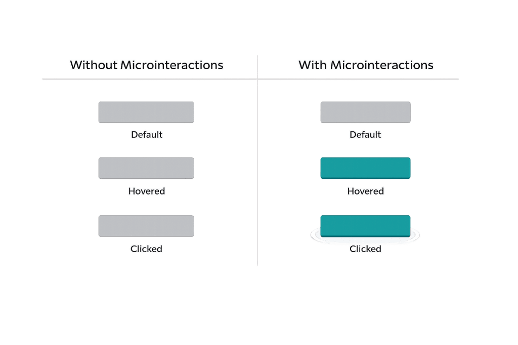
[Image: Side-by-side comparison of a plain button vs. a button with hover/click microinteraction states]
How Microinteractions Work
Every microinteraction follows a basic structure:
- Trigger — What initiates the response. This can be a user action (hovering, clicking, scrolling, typing) or a system event (a form error, a page completing load, a notification arriving).
- Rules — What happens when the trigger fires. Is the button color changing? Is an icon animating? Is a message appearing?
- Feedback — The visible or audible response the user experiences. This is the part users actually see.
- Loop/Mode — Whether the interaction repeats (like a spinning loader) or happens once (like a success checkmark after form submission).
Common microinteraction types include:
– Hover states — Color or shadow changes on buttons and links
– Loading indicators — Spinners, progress bars, skeleton screens
– Form feedback — Inline validation (field turns green/red as you type)
– Toggle animations — On/off switches that slide rather than jump
– Success/error states — Checkmarks, shake animations, confirmation messages
Purpose & Benefits
1. Communicate System Status Without Words
Microinteractions tell users what’s happening at every step — a spinner says “wait, this is processing”; a green checkmark says “done.” Without these signals, users are left guessing whether their click registered, their form submitted, or their action succeeded. Clear feedback reduces confusion and support requests. This is a core principle of effective user experience (UX).
2. Increase Engagement and Perceived Quality
When interactive elements respond naturally to user input, the site feels more responsive and professional. Subtle animations on call-to-action buttons encourage clicks by making them feel interactive rather than static. Studies consistently show that sites with thoughtful motion design hold attention longer — visitors subconsciously associate responsiveness with reliability.
3. Guide Users Through Interactions
Microinteractions can direct attention and indicate affordance — which elements are clickable, which fields are required, where to go next. A form field that highlights on focus, or a navigation item that animates on hover, teaches users how to interact with your site without any instruction text. This is especially valuable on mobile, where screen real estate is limited.
Examples
1. Form Field Validation
A contact form that shows a green checkmark next to each field as it’s completed correctly — and a red indicator with a brief message when something is wrong. The user gets immediate, inline feedback without having to submit the form and scroll back to find errors. This reduces friction and abandonment on lead generation forms.
2. Button Hover and Click States
A “Get a Quote” button that subtly shifts color on hover and shows a brief ripple effect on click. The visual change confirms the button is interactive before clicking, and the click animation confirms the action registered. Without these states, flat buttons can feel broken — users sometimes click multiple times because they can’t tell if anything happened.
3. Loading Progress Indicator
An e-commerce or resource-heavy page that displays a slim progress bar at the top of the screen while the page loads, then fades it away smoothly when complete. This communicates system status without interrupting the experience. Compare this to a blank white screen — users will often navigate away from blank screens within a few seconds, assuming the page is broken.
Common Mistakes to Avoid
- Animation for animation’s sake — Every microinteraction should serve a purpose. Decorative animations with no functional feedback distract more than they help. Ask what problem each microinteraction solves before adding it.
- Animations that are too slow — A hover response that takes 500ms feels sluggish. Most microinteractions should complete in 100–300ms. Longer animations create the impression of lag rather than polish.
- Ignoring accessibility — Users with vestibular disorders or motion sensitivity can be negatively affected by certain animations. Always respect the
prefers-reduced-motionmedia query to disable non-essential animations when the OS setting is enabled. - Inconsistent behavior — If some buttons have hover states and others don’t, it creates confusion about which elements are interactive. Microinteraction patterns should be systematic across the entire site.
Best Practices
1. Keep It Functional First
Every microinteraction on your site should answer a question the user is implicitly asking: Did my click register? Is this field valid? Is something loading? Design microinteractions around these functional needs before worrying about aesthetics. The best ones are barely noticed — they just make everything feel right.
2. Maintain Consistency with Your Design System
Microinteractions should feel like a natural extension of your overall design. If your brand uses soft, rounded aesthetics, your animations should feel smooth and gentle — not sharp and mechanical. Consistent behavior across interactive elements builds user trust and makes the experience feel coherent. This connects to principles from your overall JavaScript and CSS implementation.
3. Test on Real Devices
Animations that look smooth on a high-end desktop can feel choppy or slow on a mid-range phone. Always test microinteractions on actual mobile devices and lower-powered hardware. Pay particular attention to form interactions and hover states — touch screens don’t have hover states, so designs that rely exclusively on hover feedback need alternative touch-based feedback patterns.
Frequently Asked Questions
Are microinteractions the same as animations?
Not exactly. Animations can be purely decorative — a hero video playing in the background, for instance. Microinteractions are always functional: they communicate something specific in response to a specific trigger. All microinteractions involve animation or motion, but not all animations are microinteractions.
Do microinteractions affect SEO?
Not directly — search engines don’t rank pages based on whether buttons have hover effects. However, microinteractions contribute to better user experience, which can reduce bounce rates and increase time-on-page. These behavioral signals do influence how Google perceives your site’s quality.
Can I add microinteractions to a WordPress site without a developer?
Many page builders and WordPress themes include basic microinteraction options — hover effects, scroll animations, button states — without requiring custom code. For more refined behavior, JavaScript or CSS animations are typically needed, which usually involves some developer involvement.
How do I know if my microinteractions are helping or hurting UX?
The clearest signals are behavioral metrics: form completion rates, click-through rates on CTAs, and time on page. If your contact form has inline validation microinteractions and you see fewer failed submission attempts, that’s the interaction working. Tools like heatmaps can also reveal whether users are engaging with interactive elements as expected.
What’s the difference between a microinteraction and a modal?
A modal or popup is a full interface element that interrupts the current flow and requires user attention. A microinteraction is a small, contained response that enhances the existing flow without interrupting it. They serve different purposes: modals present content or require decisions; microinteractions confirm actions and guide behavior.
Related Glossary Terms
How CyberOptik Can Help
Great design is about more than aesthetics — it’s about creating experiences that feel right at every touchpoint. Our team applies microinteraction principles to every site we design, ensuring your visitors get clear feedback, feel guided through key actions, and come away with a sense that your site is polished and trustworthy. See our web design services or contact us to start a project.