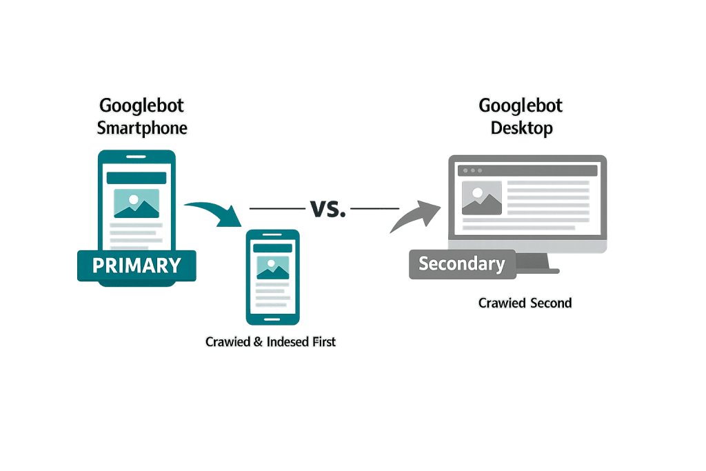
Mobile-first indexing is Google’s practice of using the mobile version of a website as the primary version it crawls, indexes, and uses to determine search rankings. Rather than treating the desktop version of your site as the authoritative one, Google evaluates your site the way a smartphone user would see it — and ranks your pages accordingly.
Google completed its full rollout of mobile-first indexing in July 2024. Every website Google indexes is now evaluated through its mobile version. There is no longer a desktop-first crawling mode for any site. This shift reflects reality: the majority of web searches happen on mobile devices, and Google’s indexing methodology has aligned to match user behavior.
[Image: Diagram showing Googlebot Smartphone crawling mobile page vs. Googlebot Desktop being secondary]
How Mobile-First Indexing Works
When Googlebot visits your site, it uses the smartphone crawler — not the desktop crawler — to fetch and render your pages. The content Googlebot sees on mobile is what gets indexed and used for ranking.
Key things Googlebot evaluates during mobile-first crawling:
- Content parity — Is the same content available on mobile as on desktop? Pages that hide or collapse significant content on mobile may be indexed incompletely.
- Mobile usability — Are text sizes readable? Are tap targets large enough? Is horizontal scrolling required?
- Page speed — How fast does the page load on a mobile connection? Google evaluates Core Web Vitals (LCP, INP, CLS) on mobile.
- Structured data — Is schema markup present on the mobile version?
- Images and media — Are images appropriately sized for mobile? Do videos play on mobile?
If your site uses responsive design — a single set of HTML that adapts to different screen sizes — your mobile and desktop versions are the same content, just reflowed. This is the ideal setup. If your site has a separate mobile domain (like m.domain.com) or uses dynamic serving, the mobile version must include equivalent content and structured data.
Purpose & Benefits
1. Alignment with How People Actually Search
Over 60% of Google searches now happen on mobile devices. A ranking system based on desktop versions of sites would be misaligned with actual usage patterns. Mobile-first indexing ensures that the experience Google evaluates and ranks reflects how most of your potential visitors will actually encounter your site.
2. Incentive to Build Better Mobile Experiences
Mobile-first indexing creates a direct business incentive for building fast, responsive-design sites that work well on small screens. Sites that treated mobile as an afterthought — with content hidden, slow load times, or difficult navigation — face real ranking consequences. Investing in mobile quality is now inseparable from investing in SEO.
3. Integration with Core Web Vitals
Core Web Vitals — Google’s set of user experience metrics — are measured on mobile. Largest Contentful Paint (LCP), Interaction to Next Paint (INP), and Cumulative Layout Shift (CLS) scores from mobile sessions feed into Google’s ranking signals. Optimizing for mobile-first indexing means optimizing for Core Web Vitals — and both support better organic rankings.
Examples
1. Responsive Design Site
A law firm’s website uses a single responsive WordPress theme. The same HTML content renders on desktop and mobile — just reflowed. Googlebot crawls the mobile version and sees all practice area descriptions, attorney bios, and structured data. Rankings are unaffected by mobile-first indexing because the content is identical across devices.
2. Desktop-Heavy Site Experiencing Ranking Drops
A manufacturer’s website was built for desktop years ago. Their product specification pages use large data tables and require horizontal scrolling on mobile. Navigation menus are difficult to use with a finger. Googlebot now evaluates this site primarily on mobile — and the poor mobile usability signals contribute to lower rankings for competitive product terms.
3. Hidden Content on Mobile
A retail site shows full product descriptions on desktop but collapses them behind a “Read More” button on mobile to save screen space. Google may treat collapsed content as less significant for indexing purposes. Moving that content into a visible state on mobile — or using proper accordion markup that signals the content is available — protects its indexing.
Common Mistakes to Avoid
- Blocking resources on mobile — If your robots.txt or server configuration blocks CSS or JavaScript from being loaded on mobile (but not desktop), Googlebot can’t render your pages correctly and will index them as broken or incomplete.
- Content parity gaps — Having detailed content on desktop but a stripped-down version on mobile. Every piece of content you want indexed and ranked must be accessible on the mobile version.
- Slow mobile page speed — Poor Core Web Vitals scores on mobile directly affect rankings. Large images, render-blocking JavaScript, and inefficient code are common causes.
- Missing structured data on mobile — If your desktop version includes schema markup but your mobile version doesn’t (common on older separate-mobile-URL setups), Google may not associate that structured data with your pages.
Best Practices
1. Use Responsive Design
A single responsive website is the most straightforward way to ensure content parity and avoid mobile-first indexing issues. Responsive design means your HTML content is the same across all devices — only the CSS layout changes based on screen size. WordPress themes built with responsive design are the standard and are strongly preferred.
2. Test with Google’s Mobile-Friendly Tool
Google Search Console includes a Mobile Usability report that flags specific issues Googlebot has encountered on your mobile pages — things like text too small to read, clickable elements too close together, and viewport configuration problems. Review this report regularly and address flagged issues. You can also use Google’s Rich Results Test and URL Inspection tool to see how Googlebot actually renders a specific page.
3. Prioritize Core Web Vitals on Mobile
Check your Core Web Vitals scores for mobile specifically using PageSpeed Insights and Google Search Console. Mobile scores are typically lower than desktop scores due to smaller CPU/memory and slower connections. Focus on image optimization, lazy loading, minification, and server response time to bring mobile performance scores up.
Frequently Asked Questions
Does mobile-first indexing mean my desktop site doesn’t matter?
Your desktop site still matters for the experience of desktop visitors, but Google no longer uses it as the primary basis for indexing. What it sees on mobile is what determines your rankings. If your mobile and desktop experiences are the same (responsive design), there’s no tension.
My site traffic is mostly desktop users. Does mobile-first indexing still affect me?
Yes. Google indexes and ranks your site based on how it appears on mobile, regardless of your visitor device mix. Even if 90% of your visitors use desktop, Google’s evaluation of your site is based on the mobile version. Poor mobile experience will hurt your rankings and ultimately reduce the desktop traffic you receive.
How do I know if my site is mobile-first indexed?
You can check Google Search Console under Settings — there’s a section indicating whether your site has been switched to mobile-first indexing. For most sites this happened during the 2024 full rollout, but if you migrated or launched a new site recently, it’s worth confirming.
Is mobile-first indexing the same as mobile-friendly?
Related, but different. Mobile-friendly refers to whether your site is usable on a mobile device. Mobile-first indexing refers to which version of your site Google uses to determine rankings. A site can be mobile-friendly but still have content parity issues that hurt it under mobile-first indexing — and vice versa.
Does having an app instead of a mobile website satisfy mobile-first indexing?
No. Google indexes websites, not apps. If your business relies on a mobile app rather than a mobile-optimized website, your web presence (including rankings) will be based on whatever your mobile website looks like — which may be a basic page if the app is your primary channel.
Related Glossary Terms
How CyberOptik Can Help
Managing mobile-first indexing effectively is a core part of any serious SEO strategy — and it starts with having a fast, fully responsive website. Whether you need a comprehensive SEO audit, a site rebuild optimized for mobile performance, or ongoing technical SEO support, our team handles this daily. Contact us for a free website review or learn more about our SEO services.