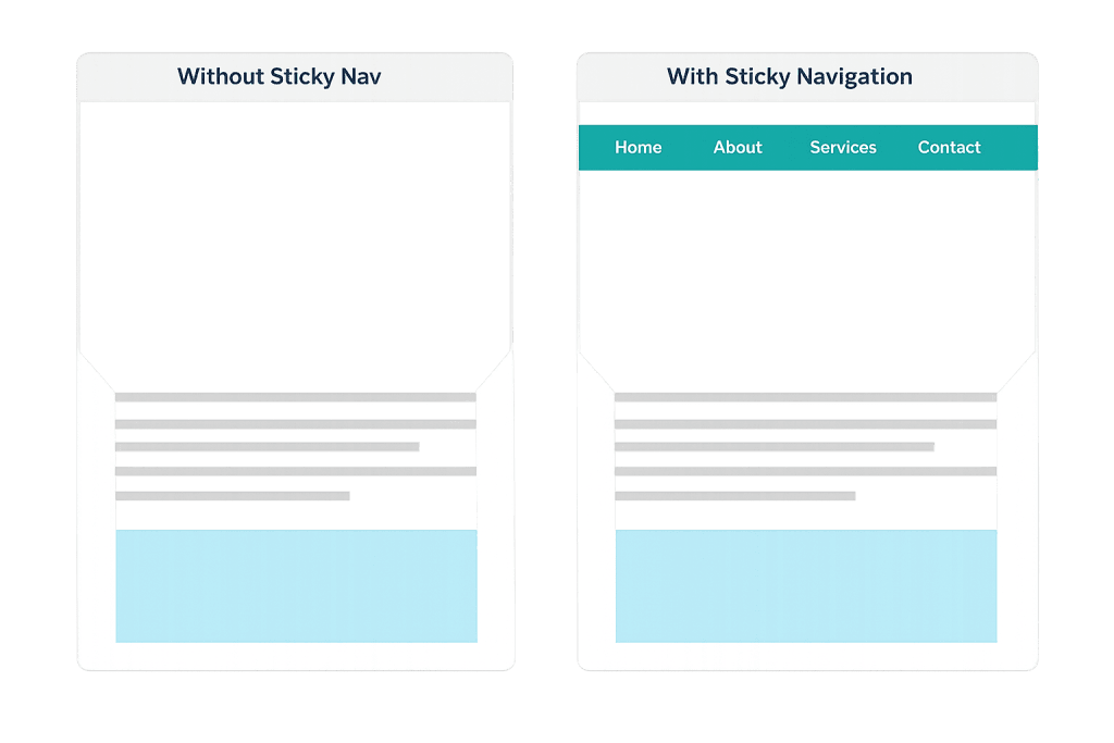
Sticky navigation is a web design technique where the site’s navigation bar remains fixed at the top of the browser window as the user scrolls down the page. Unlike a standard navigation that disappears as content scrolls past, sticky navigation stays visible at all times — giving visitors constant access to the site’s menu no matter how far they’ve scrolled.
The practical value is straightforward: visitors don’t have to scroll back to the top to navigate elsewhere. On long-form pages — service pages, blog posts, landing pages with detailed information — sticky navigation reduces friction and keeps the path to other sections always within reach. It’s a small design decision that has a measurable effect on how people move through a site.
[Image: Split comparison showing a page scrolled halfway down — one version with navigation scrolled out of view, one with sticky navigation still visible at the top]
How Sticky Navigation Works
From a technical standpoint, sticky navigation is implemented using the CSS property position: sticky (or position: fixed for a simpler variation). The distinction matters:
- Sticky positioning — The element behaves normally until the user scrolls it to a defined point (like the top of the viewport), at which point it “sticks” and stays in view. This is the preferred modern approach because it integrates more naturally with the page layout.
- Fixed positioning — The element is always fixed relative to the browser window, regardless of scroll position. It never scrolls with the page at all.
Most modern web design tools — including WordPress page builders and block-based themes — include sticky header options that can be enabled without writing custom CSS. The behavior is handled natively by the browser, making it lightweight and performant compared to JavaScript-based scroll solutions.
Well-designed sticky navigation often includes a compact variation: the full-height header is visible at the top of the page, and as the user scrolls down, it transitions to a slimmer version that takes up less vertical space but keeps the menu accessible.
Purpose & Benefits
1. Improved Navigation Access on Long Pages
On pages with significant scroll depth — detailed service pages, long blog posts, or product landing pages — sticky navigation ensures visitors can jump to another section or page without scrolling all the way back to the top. Reduced friction in navigation directly supports lower bounce rates and longer session times.
2. Consistent Brand Presence Throughout the Page
Sticky navigation keeps your logo, primary menu, and often a CTA button (like “Contact Us” or “Get a Quote”) visible as the visitor reads. This reinforces brand recognition and keeps conversion pathways accessible at every point in the reading experience. Our web design services apply principles like this to every site we build.
3. Better Mobile User Experience
On mobile devices, where pages are often long and scrolling is the primary navigation gesture, sticky navigation is especially valuable. A persistent menu bar means mobile visitors don’t have to hunt for navigation — it’s always visible. This supports better overall usability and is a recognized best practice in responsive design.
Examples
1. Service-Based Business Website
A law firm’s service page is several screens long, covering multiple practice areas with detailed descriptions. With sticky navigation, a visitor reading halfway down the page can immediately click to “Contact” or jump to “About” without scrolling back. The persistent header keeps the primary CTA button visible throughout the reading experience.
2. Long-Form Blog Post
A digital marketing blog publishes detailed guides that run 2,000+ words. Sticky navigation lets readers jump to the homepage, category archives, or related posts at any point without interrupting their reading experience. Many publishing sites also combine sticky navigation with an in-page sticky table of contents for added convenience on long articles.
3. E-Commerce Product Page
An online store’s product pages include detailed specifications, reviews, and related products below the fold. Sticky navigation keeps the shop categories and cart icon accessible as customers scroll through product details — making it easier to continue browsing without having to scroll up to find the navigation again.
Common Mistakes to Avoid
- Making the sticky header too tall — A sticky nav that takes up a large portion of the screen on mobile is more hindrance than help. The sticky version should be compact — ideally no more than 60–70px in height on mobile — so it doesn’t eat into the reading area.
- Using JavaScript when CSS suffices — JavaScript-based sticky navigation was necessary before CSS
position: stickywas widely supported. Today, CSS handles it natively and more efficiently. Heavy scroll-based JavaScript implementations can negatively affect PageSpeed scores. - Poor contrast with page content — A sticky header that becomes transparent or loses contrast as the user scrolls can make navigation links hard to read. Ensure the sticky state has a solid background and sufficient color contrast, especially against varied page backgrounds below.
- Ignoring mobile behavior — A sticky header design that works well on desktop can become intrusive on small screens. Always test sticky navigation on multiple screen sizes and consider a different behavior (like hiding on downscroll, showing on upscroll) for mobile.
Best Practices
1. Keep the Sticky Version Compact
Design the sticky state to be noticeably smaller than the initial header — remove secondary elements, shrink the logo, and reduce padding. Users on large monitors may tolerate a taller sticky bar, but on laptops and mobile devices, every pixel of vertical space matters. A slim, focused sticky nav respects the user’s reading area.
2. Include a Persistent CTA
The sticky navigation is prime real estate for a high-priority call-to-action button. Whether it’s “Schedule a Call,” “Get a Quote,” or “Start Your Free Trial,” keeping a conversion action in persistent view throughout the page is one of the highest-value placements on the site. Pair this with good color contrast so the button stands out.
3. Test Scroll Performance on Mobile
Sticky headers can interfere with mobile scroll momentum if not implemented correctly. Use CSS position: sticky rather than JavaScript listeners where possible, and test on real devices — not just browser emulation. Tools like Google’s PageSpeed Insights and Core Web Vitals reports will surface layout stability issues (like Cumulative Layout Shift) caused by sticky elements.
Frequently Asked Questions
Does sticky navigation affect page speed?
Implemented with CSS, the performance impact is negligible — sticky positioning is handled natively by the browser. JavaScript-based implementations that recalculate on every scroll event can impact performance, particularly on lower-end devices. Modern themes and builders use CSS-based sticky navigation that doesn’t meaningfully affect load times.
Should every website use sticky navigation?
Not necessarily. For simple sites with just a few pages and short scroll depth, sticky navigation adds little value and may feel visually heavy. It’s most beneficial on content-heavy sites, long landing pages, and any site where visitors regularly scroll well below the fold. The decision should be based on how users actually interact with your content.
Can sticky navigation hurt my SEO?
Sticky navigation itself doesn’t directly impact search rankings. However, a sticky header that’s too large and causes Cumulative Layout Shift (CLS) issues can negatively affect Core Web Vitals scores, which are a confirmed ranking factor. Ensure the sticky implementation is clean and doesn’t shift page content unexpectedly.
Is “sticky” the same as “fixed” navigation?
They’re similar but technically different. Fixed navigation is always locked to the viewport — it doesn’t scroll with the page at all. Sticky navigation follows the page until it reaches a defined threshold (like the top of the window), at which point it “sticks.” In practice, both achieve the same goal for most website use cases.
Related Glossary Terms
How CyberOptik Can Help
Great navigation design is one of those details that visitors don’t consciously notice — until it’s frustrating. We apply design principles like sticky navigation to every site we build, ensuring menus are accessible, CTAs are persistent, and the experience holds up on every device. Whether you need a full redesign or want to improve navigation on an existing site, we can help. See our web design services or contact us to start a conversation.