Dark mode is a display setting that replaces a website or application’s default light background with a dark color scheme — typically dark gray or near-black backgrounds with light-colored text and interface elements. What began as a niche preference among developers and late-night readers has become a mainstream user expectation, with roughly 82% of smartphone users now using dark mode according to survey data.
For website owners, dark mode is no longer optional UX decoration. Operating systems from Apple, Google, and Microsoft all expose a system-level dark mode preference that browsers can detect and relay to websites. When a site doesn’t support dark mode and a user has it enabled at the system level, the result can be a jarring visual experience — or, in some cases, automatic browser-level inversion that looks nothing like the original design. Building dark mode support into a site’s design system gives you control over how it looks and performs.
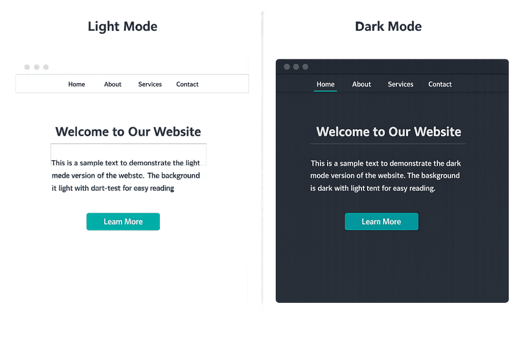
[Image: Side-by-side comparison of the same website in light mode and dark mode, showing color inversion and adjusted typography]
How Dark Mode Works on Websites
Websites implement dark mode primarily through the CSS media query prefers-color-scheme. This query detects whether the user’s operating system is set to dark mode and applies the corresponding CSS rules automatically. The two main implementation approaches are:
- Automatic (system-following) — The site detects the OS preference and switches themes without any user action. This is the most seamless approach and what most users expect.
- Manual toggle — The site includes a light/dark mode switch that users can click independently of their system preference. This gives users direct control and is especially useful for sites where many visitors may be on mixed preferences.
- CSS custom properties (variables) — Most modern dark mode implementations define color tokens as CSS variables, then swap the variable values inside the
prefers-color-schememedia query. This approach is clean, maintainable, and avoids duplicating entire stylesheets.
Beyond colors, dark mode design requires adjustments to images, shadows, border visibility, and contrast ratios — all of which behave differently on dark backgrounds than on light ones.
Purpose & Benefits
1. Improved User Comfort and Reduced Eye Strain
Many users genuinely find dark mode easier on the eyes, particularly in low-light environments. A 2023 survey of 10,000 users found that 68.4% preferred dark mode for reduced eye strain. For sites with long-form content — blogs, documentation, articles — dark mode can meaningfully improve the reading experience and time-on-page. This connects directly to user experience (UX) and how comfortable visitors feel on your site.
2. Battery Life on OLED and AMOLED Screens
On modern OLED and AMOLED displays — which include most flagship smartphones — dark pixels consume significantly less power than lit pixels. Dark mode can reduce battery consumption by up to 60% on these screens at typical brightness levels. This matters for mobile users, and mobile traffic accounts for the majority of web visits for most business sites. Supporting dark mode is a concrete way to optimize the mobile experience.
3. Brand Perception and Design Sophistication
64.6% of users in one survey said they want websites to switch to dark mode automatically. Sites that support dark mode signal awareness of current design standards and user expectations. For businesses where visual presentation matters — agencies, creative services, tech companies — dark mode support is increasingly part of what a professional, modern site looks like. It’s also an accessibility consideration for users with certain visual sensitivities or conditions that make bright interfaces uncomfortable.
Examples
1. System-Following Dark Mode on a Business Site
A professional services website detects that a visitor’s macOS or iOS device has dark mode enabled at the system level. The site automatically serves a dark version of its design — dark backgrounds, appropriately adjusted text contrast, logo variants that work on dark surfaces, and images with subtle dark-edge adjustments. The visitor never has to change a setting; the site simply matches their environment.
2. Manual Toggle on a Content-Heavy Site
A business blog adds a sun/moon icon toggle in the site header. Visitors can switch between light and dark modes regardless of their system preference. The selected mode is stored in localStorage so it persists across page visits. This approach is common on sites with long-form content where users may want to override their system preference for reading.
3. Dark Mode in an E-Commerce Product Gallery
An online store implements dark mode support that affects the site chrome — navigation, backgrounds, text — while keeping product photography on neutral cards that display correctly in both modes. This prevents product photos from appearing washed out or incorrect when dark mode is active. Attention to these details separates a considered dark mode implementation from a hasty one.
Common Mistakes to Avoid
- Ignoring image and media contrast — On dark backgrounds, white-border images disappear, semi-transparent PNGs with white backgrounds look broken, and high-key photography can appear washed out. Dark mode design requires reviewing every image context, not just swapping background colors.
- Failing to maintain sufficient contrast ratios — Switching to dark mode doesn’t automatically guarantee accessibility-compliant contrast. Light gray text on a dark gray background may look subtle and refined but fail WCAG contrast ratio requirements. Test both modes against the same accessibility standards.
- Using automatic browser inversion as a substitute — Some developers rely on a simple CSS
filter: invert(1)hack rather than a designed dark mode. This inverts photographs, distorts color palette choices, and generally produces unpredictable results. Designed dark mode is worth the investment. - Not testing on actual devices — Dark mode rendering varies between browsers, operating systems, and screen types. Something that looks correct in a desktop browser may render differently on iOS Safari or Android Chrome. Test across devices before treating dark mode as complete.
Best Practices
1. Use CSS Custom Properties for Color Management
Define all colors as CSS variables and swap the values inside your prefers-color-scheme media query. This approach keeps your CSS clean and makes updates straightforward — change a variable value once and it updates everywhere. It also integrates naturally with a broader design system built on tokens.
2. Design Both Modes, Not Just One
The most successful dark mode implementations are designed from the start for both states, not retrofitted after the fact. Consider shadows (often reversed or softened on dark backgrounds), border visibility, icon treatment, and the color palette choices that work across both modes. A thoughtful design system documents these choices and makes them consistent.
3. Respect User Preferences with a Manual Override
Even if you implement system-following dark mode, give users the ability to override it with a toggle. Some users prefer light mode on sites even when their system is set to dark, and vice versa. Storing that preference in localStorage ensures the choice persists. This level of control directly supports user experience (UX) and accessibility goals.
Frequently Asked Questions
Do I need to support dark mode on my website?
You don’t need to, but it’s increasingly expected. With over 80% of smartphone users enabling dark mode, a site that looks broken or jarring in dark mode is delivering a substandard experience to a significant share of your audience. For professional service sites, it’s worth implementing.
Does dark mode affect SEO?
Not directly. Search engines don’t rank pages based on whether they support dark mode. However, if dark mode reduces bounce rate and increases time-on-page by improving the reading experience for users who prefer it, those engagement signals can have an indirect positive effect.
How is dark mode different from night mode?
They’re often used interchangeably, but technically dark mode is a UI color scheme (dark backgrounds, light text), while night mode typically refers to screen-level filters that reduce blue light — often applying an orange or warm tint. A site can support dark mode while a user also has night mode or a blue light filter active at the OS level.
Can dark mode be bad for some users?
For a subset of users — particularly those with astigmatism — light text on a dark background can cause halation (a blooming or spreading effect around text) that makes reading harder. This is why offering both modes and a manual toggle matters. No single default works for everyone, which is why this also falls under accessibility considerations.
Will my existing WordPress theme support dark mode?
Many modern WordPress themes include built-in dark mode support. Older or custom themes may require CSS additions. The prefers-color-scheme media query is the standard approach, and implementation complexity ranges from straightforward for simple themes to more involved for heavily customized designs.
Related Glossary Terms
How CyberOptik Can Help
Great design is about more than aesthetics — it’s about creating experiences that work for every visitor. Our team considers dark mode support as part of how we approach modern web design, ensuring your site meets current user expectations and accessibility standards in both light and dark environments. See our web design services or contact us to start a project.