A design system is a documented collection of reusable components, visual standards, and guidelines that define how a product or website should look and behave. It acts as a single source of truth for design decisions — covering everything from typography and color palette choices to button styles, spacing rules, grid layouts, and UI component patterns like cards, modals, and navigation elements.
For businesses, a design system is the difference between a website that looks cohesive across every page and one that drifts visually as it grows. Without a system, every new page, landing page, or campaign asset becomes a design decision from scratch — and over time, inconsistencies accumulate. With a system, your team (and any agency working on your behalf) works from an established foundation, producing consistent outputs faster and with less back-and-forth. Research from Figma’s data science team found that designers with access to a design system completed tasks 34% faster than those without.
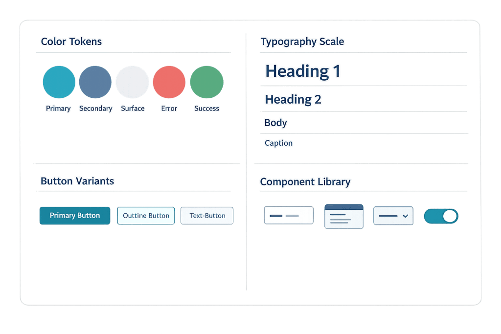
[Image: Example of a design system showing color tokens, typography scale, button variants, and component library]
What a Design System Contains
Design systems vary in depth, but most include some combination of:
- Design tokens — Named variables for foundational values like brand colors (
--color-primary: #2D5BE3), font sizes, spacing units, and border radii. Tokens ensure that a single update propagates consistently across the entire system. - Color palette — Primary, secondary, and neutral colors defined with specific hex values, along with guidance on where each color is used. Often includes dark mode variants.
- Typography — Font families, weights, sizes, line heights, and usage rules for headings, body text, captions, and UI labels.
- Component library — Documented, reusable UI components: buttons, form inputs, navigation patterns, cards, modals, alerts. Each component includes design specs and usage guidelines.
- Spacing and layout grid — Defined spacing increments and grid configurations that keep layouts consistent across pages.
- Iconography — A set of icons with usage guidelines and sizing rules.
- Accessibility standards — Contrast ratio requirements, focus state styles, and interaction patterns that meet WCAG guidelines.
Purpose & Benefits
1. Consistency Across Every Touchpoint
A design system ensures that your website, landing pages, marketing materials, and any future additions all feel like they belong to the same brand. Without a system, design decisions made independently across different pages or campaigns produce gradual visual drift. With one, color palette, typography, and component usage are defined — not improvised. This consistency builds the visual trust that contributes to a professional brand perception.
2. Faster Design and Development
When design decisions are already made and documented, designers spend time applying them rather than making them. Vanguard reports 50% faster design updates with a proper design system in place. For businesses commissioning ongoing web work — new landing pages, campaign assets, feature additions — a design system means each new piece takes less time to produce because the framework already exists.
3. Easier Maintenance and Scalability
A design system with well-defined tokens means that changing your primary button color, for instance, requires updating one variable — not finding every button on every page. As a website grows from 10 pages to 100, a design system prevents the maintenance burden that comes from one-off design decisions scattered across the codebase. It also makes onboarding new designers or developers faster, since the rules are documented rather than tribal knowledge. This connects directly to building sites with responsive design that scale gracefully.
Examples
1. A Professional Services Firm’s Website System
A consulting firm’s website has a documented design system specifying: two primary brand colors plus a defined neutral palette, a typographic scale with specific font sizes for H1 through H6 and body text, button variants (primary, secondary, ghost), a card component for team member profiles and case studies, and spacing rules based on an 8px grid. Any new page built for the site follows these specifications without creative guessing — the designer applies the system.
2. A Growing E-Commerce Brand
An online retailer starts with a 50-product store and grows to 500 products across multiple categories. Early in the project, the agency builds a design system that defines product card layouts, badge styles, rating display patterns, and call-to-action button variants. As the catalog grows and new categories are added, all new pages and templates apply the same system — the store looks and functions consistently whether a customer is browsing apparel or home goods.
3. A Multi-Location Service Business
A franchise business with locations in multiple markets needs locally relevant landing pages while maintaining a consistent national brand. A design system defines the brand-level components and visual standards, while allowing specific variables (location name, phone number, local imagery) to be swapped in. Marketing teams in each location can produce new assets without reinventing the design — or accidentally breaking brand guidelines.
Common Mistakes to Avoid
- Building a design system without documenting it — A set of Figma components or CSS variables that only one person understands is not a system — it’s personal tooling. A design system requires documentation: usage guidelines, context for decisions, and clear rules about when to use each component.
- Over-engineering before the website exists — A startup building a 10-page brochure site doesn’t need a comprehensive design system from day one. Start with clearly defined design tokens (colors, typography) and a basic component set, then expand the system as the site grows. Premature over-engineering wastes effort.
- Treating the system as finished — Design systems evolve as brands, products, and technologies change. Treating a design system as a static artifact rather than a living document causes it to fall out of sync with the actual site, defeating its purpose.
- Ignoring accessibility in the system — Building contrast ratios, focus states, and keyboard navigation patterns into the design system from the start is far more efficient than retrofitting them later. These requirements affect every component in the system.
Best Practices
1. Start with Design Tokens
Before building components, define your design tokens — the foundational values for color, typography, and spacing. Tokens connect your design files to your code, enabling changes to propagate across both simultaneously. A primary color change should require updating one token, not hunting through every CSS file and design frame.
2. Build Components for Real Use Cases
Design system components should reflect the actual patterns your site uses, not a theoretical complete set. Focus on the components you actually need: navigation, cards, buttons, form elements, and the specific layout patterns your wireframe establishes. A lean, well-documented system of 20 components beats a sprawling, poorly documented library of 100.
3. Keep the System Synchronized with the Live Site
A design system that drifts from the actual website is worse than not having one — it creates confusion about which version is authoritative. Establish a process for keeping design files, documentation, and code in sync. When a component changes on the live site, update the system documentation at the same time.
Frequently Asked Questions
Does my small business website need a formal design system?
Not necessarily a formal system, but you benefit from defining the basics: your color palette, typography scale, button styles, and component patterns. Even a simple documented style guide prevents the visual inconsistency that accumulates without one. Formal, comprehensive design systems become more valuable as sites grow in size and complexity.
What’s the difference between a design system and a style guide?
A style guide is typically a document defining visual standards — colors, fonts, logo usage rules. A design system is broader: it includes the style guide, but also reusable coded components, interaction patterns, and usage guidelines. A design system is more operational; a style guide is more reference material.
Who maintains a design system?
In larger organizations, a dedicated design systems team. For smaller businesses, typically the lead designer or the web agency responsible for the site. The key is that someone owns the system, keeps it updated, and enforces its use in new work.
How does a design system relate to responsive design?
Closely. A well-built design system defines how components adapt across breakpoints — how a navigation becomes a hamburger menu on mobile, how a four-column card grid becomes a single-column stack. Responsive design is part of the system, not a separate concern layered on top.
Can WordPress sites use design systems?
Yes. WordPress themes built with a design system foundation use CSS custom properties (variables) for tokens, and component templates correspond to reusable blocks in the block editor. For more advanced implementations, agencies build WordPress themes that are systematically tied to a documented design system in Figma or similar tools.
Related Glossary Terms
How CyberOptik Can Help
Great design is about more than aesthetics — it’s about creating experiences that work and scale. We approach every site we build with a design system mindset: defining visual foundations, building reusable components, and documenting the patterns that keep your site consistent as it grows. See our web design services or contact us to start a project.