A focal point is the element within a design that draws the viewer’s eye first — the visual anchor that wins attention before anything else on the page. In web design, every page has one (whether it’s intentional or not). Effective focal points are designed deliberately: the right element gets visual emphasis, and secondary elements are arranged to support it without competing.
The concept applies at multiple scales. A page’s hero section might contain the page’s dominant focal point — a bold headline or a striking image. Within that section, a call to action button becomes the focal point of the CTA area. Good design creates a hierarchy of focal points that guides visitors through the page in a logical order — from the most important message to the supporting information to the action you want them to take.
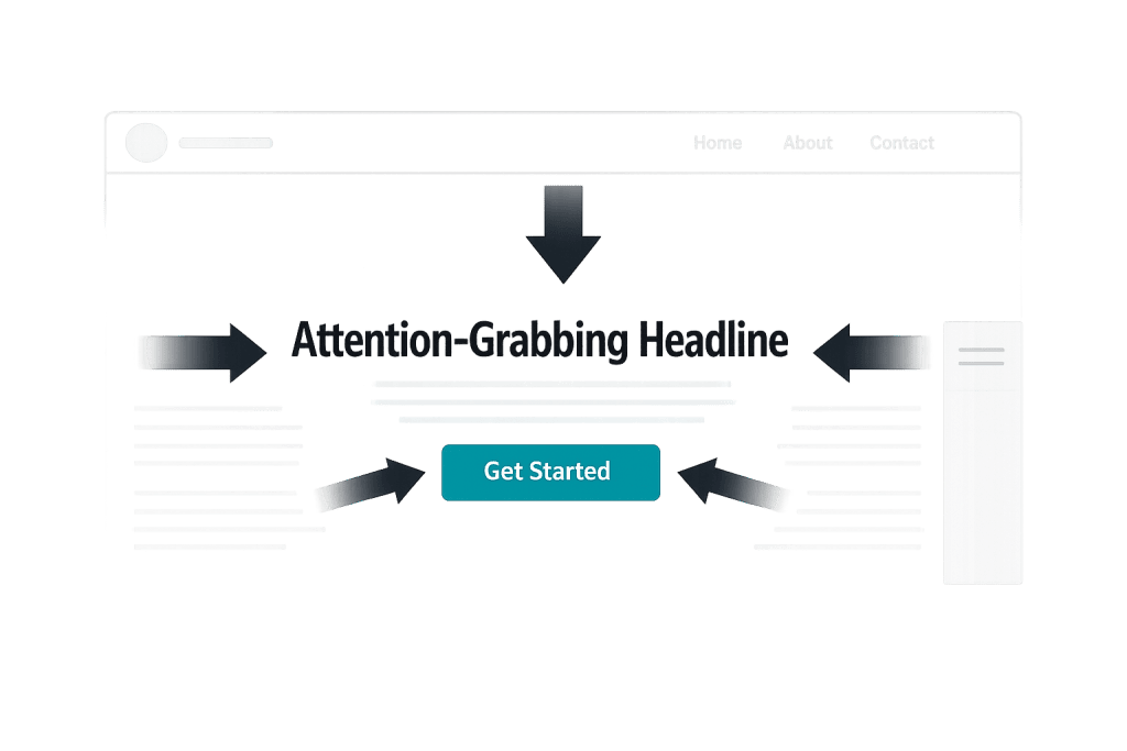
[Image: Example showing a web page with a clear dominant focal point (bold headline + CTA button) surrounded by lower-emphasis supporting content]
How Focal Points Are Created
Designers use several techniques to establish a focal point:
- Size and scale — Larger elements naturally draw more attention. A headline set at 60px dominates a page where body text is 16px.
- Color and contrast — An element that contrasts sharply with its surroundings stands out. A brightly colored button on a neutral background becomes the focal point of its section.
- Whitespace — An element surrounded by open space receives more visual weight. Isolating a key message gives it room to land.
- Imagery — A strong photograph or illustration naturally captures attention, especially faces or scenes with clear subjects.
- Position — Elements placed at the optical center of the screen (slightly above true center) or in the top-left of a layout naturally receive the first glance.
- Typography — Variations in font size, weight, and style direct the eye. A heavy, large typeface pulls focus; lighter text recedes.
The most common mistake is having too many elements competing for dominance — when everything is emphasized, nothing is. A page with three hero images, four large headlines, and six brightly colored buttons has no focal point; it has chaos.
Purpose & Benefits
1. Faster Communication of Your Core Message
Visitors spend only a few seconds deciding whether to stay on a page. A clear focal point — typically your headline and primary value proposition — communicates what the page is about and who it’s for before the visitor has consciously decided to read anything. This is the difference between a visitor orienting themselves immediately versus spending mental energy trying to figure out where to look. Our web design services prioritize this hierarchy on every page we build.
2. Higher Conversion Rates Through Guided Attention
A call to action that stands out visually gets more clicks than one that blends in. When the CTA is the natural focal point of its section — through color contrast, size, or surrounding whitespace — visitors arrive at it without friction. Designing this visual path intentionally is one of the most direct ways design affects business outcomes. This is why landing pages, service pages, and product pages with clear visual hierarchy consistently outperform cluttered ones.
3. Reduced Cognitive Load for Visitors
When a page has a clear hierarchy of focal points, visitors don’t have to work to figure out what to look at next. The design does that work for them. This reduces cognitive load — the mental effort required to process the page — and makes the experience feel easier and more intuitive. Sites that reduce friction in this way tend to see lower bounce rates and longer session times, both of which signal quality to search engines.
Examples
1. A Professional Services Homepage
A law firm’s homepage places a single, bold headline — “Protecting your business since 1998” — in large, high-contrast type against a dark background image. Below it, a clearly outlined button reads “Schedule a consultation.” Everything else on the page — the navigation, the trust badges, the scroll indicator — is visually subordinate. Visitors know exactly where to look and what to do. The focal point is doing exactly what it should: orienting visitors and pointing them toward the primary action.
2. A Product Page Above the Fold
An e-commerce page for a premium coffee subscription uses a close-up photograph of the product as its dominant focal point. The image fills most of the above-the-fold area, naturally drawing the eye. The product name and price sit immediately adjacent, and a contrasting “Subscribe” button sits just below. The rest of the page — reviews, ingredients, FAQs — exists below the focal hierarchy, accessible for visitors who want to go deeper before deciding.
3. A Service Page With a CTA in the Hero
A digital agency’s web design page leads with a two-line headline in large type: “Websites built for growth.” Below it, a subheading gives two lines of context. Then, two buttons in contrasting colors: “See our work” (primary) and “Get a quote” (secondary). The visual weight given to “See our work” — via color, size, and position — makes it the focal point of the CTA pair, guiding visitors to portfolio content that builds trust before they’re asked to commit.
Common Mistakes to Avoid
- Creating competing focal points — Two equally prominent elements on the same page fight for attention and dilute both. Establish a clear hierarchy: one dominant focal point, secondary supporting elements, and the rest receding into background.
- Using the wrong element as the focal point — A large decorative image can unintentionally become the dominant focal point when the actual priority is the headline or CTA. Make sure what you’re emphasizing visually matches what matters most to the visitor.
- Inconsistent hierarchy across breakpoints — A focal point that works on desktop may lose its impact on mobile. A large hero image that establishes dominance on a widescreen layout may crop to nothing useful on a phone. Always validate the focal hierarchy across device sizes.
- Overusing emphasis — Bolding every other sentence, using multiple bright accent colors, or making every section feel urgent trains visitors to ignore emphasis. Reserve your strongest visual tools for your actual priorities.
Best Practices
1. Establish One Clear Dominant Focal Point Per Page
Before designing a layout, decide what the single most important thing is that a visitor should notice. On a homepage, it’s usually the headline and primary value proposition. On a landing page, it’s often the form or CTA. On a blog post, it’s the headline and opening paragraph. Design that element with the most visual weight and ensure nothing else on the page competes with it directly.
2. Use Contrast as Your Primary Tool
Contrast is the most reliable way to create a focal point — contrast in size, color, weight, or surrounding whitespace. A bright button in a neutral section always draws the eye. A large, heavy headline above smaller body text naturally reads first. When in doubt, add contrast to what matters most and reduce it on what matters less. This principle applies equally to hero sections, CTAs, and content layouts throughout the page.
3. Test the Hierarchy Before Launch
Once a design is built, step back and look at it squint-eyed — deliberately blurring your vision. What’s the first thing you see? The second? The third? This rough visual test quickly reveals whether your intended focal hierarchy matches what the design actually communicates. If the wrong element jumps out, it needs more or less visual weight relative to the others. Tools like heatmaps can also validate where real users focus their attention after launch.
Frequently Asked Questions
Can a page have more than one focal point?
Yes, but they shouldn’t have equal emphasis. A page can have a dominant focal point (the most visually prominent element), several secondary focal points (supporting elements that guide the eye through the page), and a large amount of subordinate content. The key is maintaining a clear hierarchy — visitors should intuitively feel which elements matter most without having to consciously decide.
How does a focal point relate to calls to action?
Your call to action should usually be the focal point of its section — or the second element the eye lands on after the headline establishes context. A CTA that blends in with surrounding content gets fewer clicks. Giving the CTA button distinct color, adequate size, and surrounding whitespace ensures it stands out as the logical next step.
Does the focal point affect SEO?
Not directly. Search engines don’t “see” visual hierarchy the way humans do. However, focal point design affects user behavior — time on page, bounce rate, conversion rate — and those signals influence SEO indirectly. A page that immediately communicates its purpose and guides visitors clearly tends to perform better on both user experience metrics and business goals.
What’s the difference between a focal point and visual hierarchy?
A focal point is a specific element that captures attention first. Visual hierarchy is the broader system of arranging all elements in order of importance. Every design has a visual hierarchy; the focal point is the top level of that hierarchy — the dominant element. Good visual hierarchy uses focal points intentionally at multiple levels to guide users through the page in the intended order.
Related Glossary Terms
How CyberOptik Can Help
Every site we design is built around a deliberate visual hierarchy — starting with the focal point of each page and working outward. Good design isn’t just about how a site looks; it’s about how it guides visitors toward the outcomes your business needs. See our web design services or contact us to start a project.

