Data visualization turns complex numbers into engaging stories. When presented as charts and graphs, numbers become more compelling and easier to understand. The right WordPress plugin can transform abstract data into visual content that resonates with your audience.
We’ve tested dozens of data visualization tools for our clients’ WordPress sites. Our experience shows that the right visualization plugin can significantly increase page engagement and help convey complex information clearly. In this guide, we’ll share the best WordPress data visualization plugins to help you showcase your data effectively.
Why Data Visualization Matters for Your WordPress Website
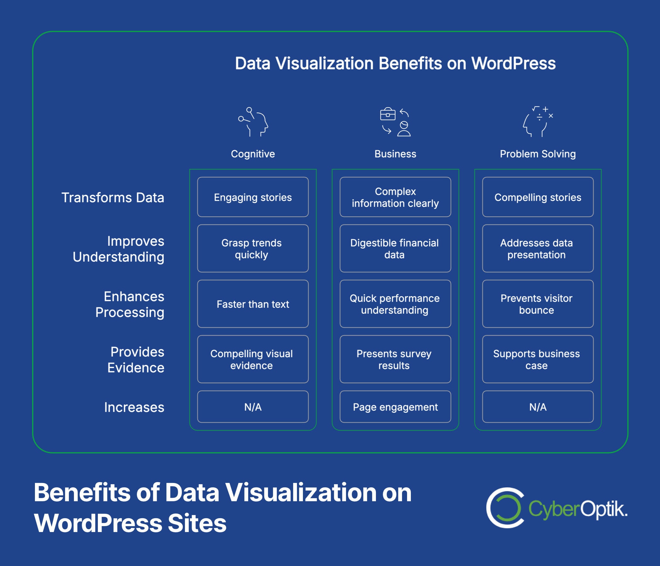
Data visualization transforms complex information into clear, digestible formats. It allows visitors to grasp important trends and statistics at a glance. This visual approach proves especially valuable for business websites that need to present financial data, survey results, or performance metrics.
Visual data presentation helps your audience understand complex information faster. Our brains process visual information much faster than text. This makes charts and graphs perfect for conveying complex concepts quickly. Clear data visualization can make the difference between engaged visitors and bounced traffic.
Many business owners struggle to present their data effectively. Raw numbers in spreadsheets rarely engage website visitors. Good visualization turns those numbers into stories that support your business case. This transforms dry statistics into compelling visual evidence of your success.
Top WordPress Data Visualization Plugins
Let’s examine the leading WordPress plugins that can transform your data into engaging visual content. We’ve assessed these tools based on ease of use, visualization options, and value for money.
Before diving into specific plugins, let’s compare their key features and pricing in the table below. This comparison will help you quickly identify which tools might best suit your specific needs.
| Plugin | Free Option | Premium From | Key Strength | Best For |
|---|---|---|---|---|
| WPForms | No | $49.50/year | Form integration | Survey visualization |
| Formidable | Limited | $39.50/year | Form-to-chart conversion | Interactive data display |
| Visualizer | Yes | $99/year | Chart variety | Multiple data sources |
| wpDataTables | No | $55/year | Large dataset handling | Financial data |
| Graphina | Limited | $19 premium | Elementor integration | Visual website builders |
| iCharts | Yes | $19/year | CSV/Excel import | Simple data import |
Now let’s explore each of these plugins in greater detail to help you find the right solution for your specific needs.
WPForms: Best for Survey Results
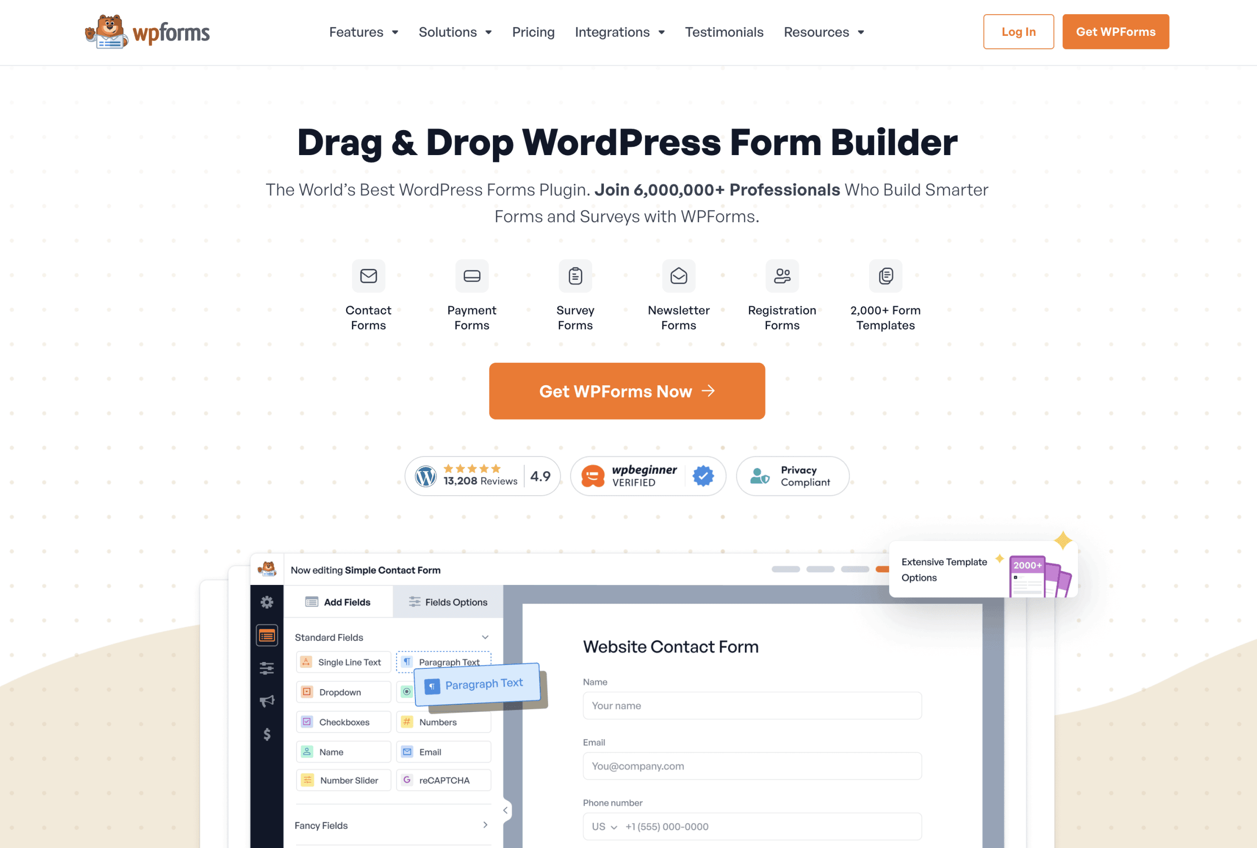
WPForms excels at visualizing survey and poll data directly. It transforms form submissions into colorful, interactive charts that engage your audience. The plugin makes data collection and visualization a seamless process.
This solution works particularly well for businesses regularly collecting customer feedback. The survey visualization feature turns responses into actionable insights through clear graphs. These visual elements help you spot trends and make data-driven decisions.
WPForms pricing starts at $49.50 per year, which includes the survey and polls addon. The investment provides significant value when you need to showcase user feedback or survey results in a professional format. The visual reports feature makes WPForms ideal for businesses that frequently gather customer input.
Formidable Forms: Advanced Data Visualization
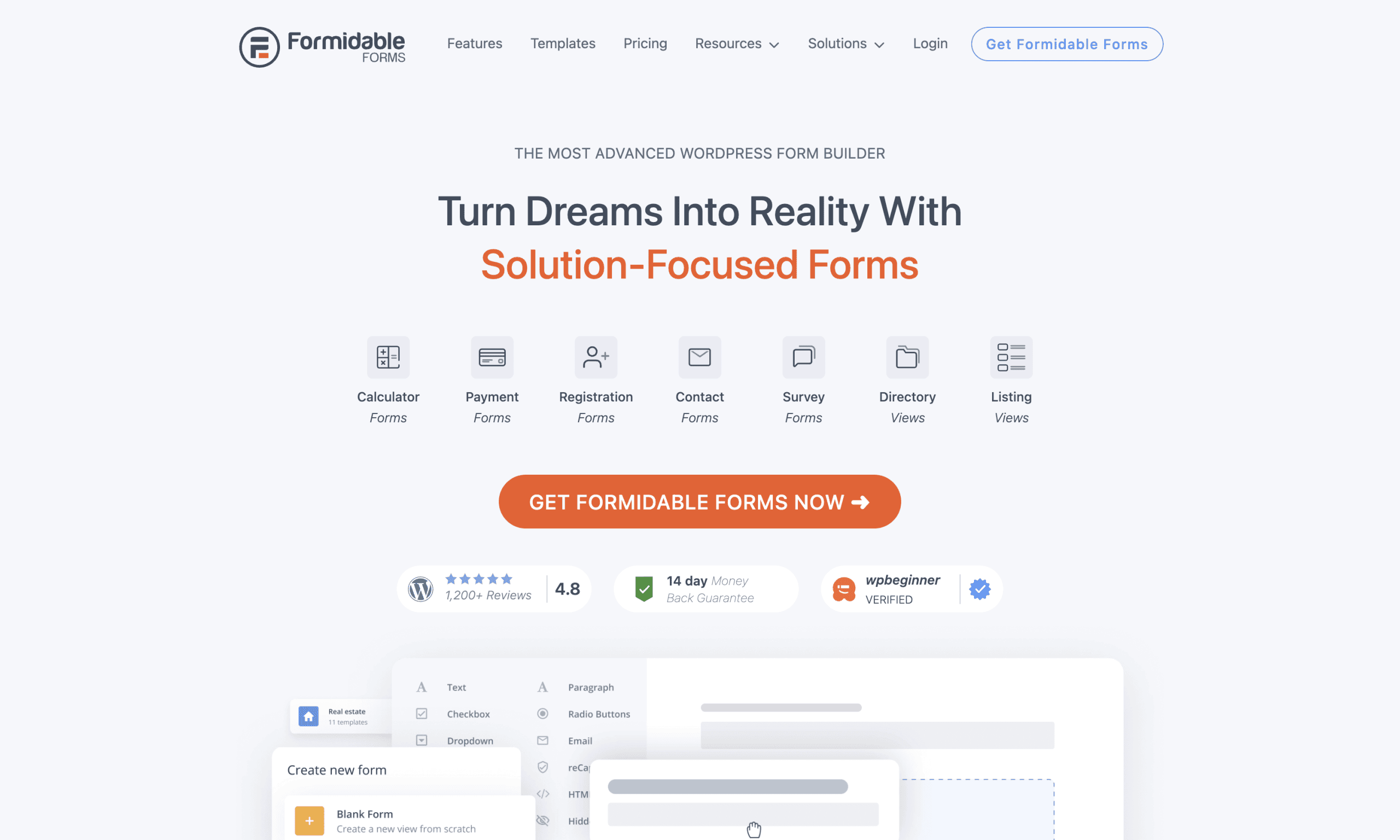
Formidable Forms offers powerful data transformation capabilities. It converts form submissions into charts and graphs with advanced customization options. The plugin stands out for its flexibility in data presentation.
The visual reports feature can create dynamic charts that update as new form data arrives. This real-time aspect makes Formidable particularly valuable for ongoing data collection efforts. You can embed these charts anywhere on your site to showcase the latest information.
Pricing starts at a competitive $39.50 per year for the base premium version. The visual styles add-on allows extensive customization of your charts and graphs. This makes Formidable Forms perfect for businesses needing to present continuously updating data from form submissions.
Visualizer: Comprehensive Chart Options
Visualizer offers impressive versatility for different data types. The free version includes over 15 chart types including line, bar, and pie options. This variety ensures you can find the right visual format for any dataset.
The premium version adds live data synchronization capabilities. This feature allows charts to automatically update when your source data changes. The live sync adds significant value for businesses needing current data visualization.
Let’s explore the chart types available in Visualizer compared to other plugins:
| Chart Type | Visualizer Free | Visualizer Pro | Available in Others |
|---|---|---|---|
| Line Chart | Yes | Yes | Most plugins |
| Bar Chart | Yes | Yes | Most plugins |
| Pie Chart | Yes | Yes | Most plugins |
| Area Chart | Yes | Yes | Some plugins |
| Geo Chart | Yes | Yes | Few plugins |
| Scatter Chart | Yes | Yes | Some plugins |
| Gauge Chart | No | Yes | Few plugins |
| Candlestick Chart | No | Yes | Very few plugins |
Visualizer’s free version provides solid functionality for basic visualization needs. The premium tier ($99/year) adds features like private charts and real-time data connections. This makes Visualizer appropriate for both small businesses and larger organizations with complex data needs.
wpDataTables: Handling Large Datasets
WpDataTables specializes in managing substantial amounts of data effectively. It handles large datasets and creates user-editable tables that would overwhelm many other plugins. The plugin creates responsive, sortable tables that visitors can interact with.
One standout feature is the ability to create editable tables for front-end users. This functionality proves valuable for collaborative environments or membership sites. Users can filter, search, and sort data without needing admin access.
The plugin costs $55 per year, offering good value for its data management capabilities. For finance, research, or any data-heavy applications, wpDataTables delivers exceptional performance. The investment makes sense for businesses working with complex spreadsheets or large data collections.
Graphina: Elementor Integration
Graphina offers seamless integration with the popular Elementor page builder. This plugin adds powerful charting widgets directly to your Elementor editing toolkit. The integration makes creating charts a visual drag-and-drop process.
The plugin includes both free and premium options with different capabilities. The premium version ($19) unlocks advanced animation effects and additional chart types. These features help create more engaging and interactive data presentations.
Graphina works perfectly for users who already design with Elementor. The direct integration eliminates the need to switch between different interfaces. This makes it an excellent choice for designers who want to add data visualization within their existing workflow.
iCharts: Simplified Data Import
iCharts focuses on making data import straightforward and accessible. The plugin simplifies bringing CSV and Excel data into WordPress for visualization. This approach saves time when working with external data sources.
The free version offers basic functionality with limited customization options. Premium features start at just $19 per year, making it one of the more affordable options. The low price point makes iCharts attractive for small businesses with simple visualization needs.
This plugin works best for users who regularly update charts from spreadsheet data. The streamlined import process reduces the technical barriers to keeping visualizations current. For teams already working with Excel or CSV files, iCharts offers a natural transition to web visualization.
WordPress Analytics Plugins with Visualization Features
Some WordPress plugins combine analytics tracking with visualization capabilities. These dual-purpose tools help you both collect and display important website metrics.
Let’s compare the key features of analytics plugins with visualization capabilities:
| Feature | WP Statistics | MonsterInsights | Standard Analytics |
|---|---|---|---|
| Data Storage | Self-hosted | Google servers | Google servers |
| Dashboard Integration | Full | Full | Limited/None |
| Privacy Focus | High | Medium | Low |
| Visual Reports | Yes | Yes | External only |
| Real-time Data | Yes | Limited | Limited |
These specialized tools offer insights directly within your WordPress dashboard. Let’s look at the top options:
WP Statistics: Privacy-Focused Analytics
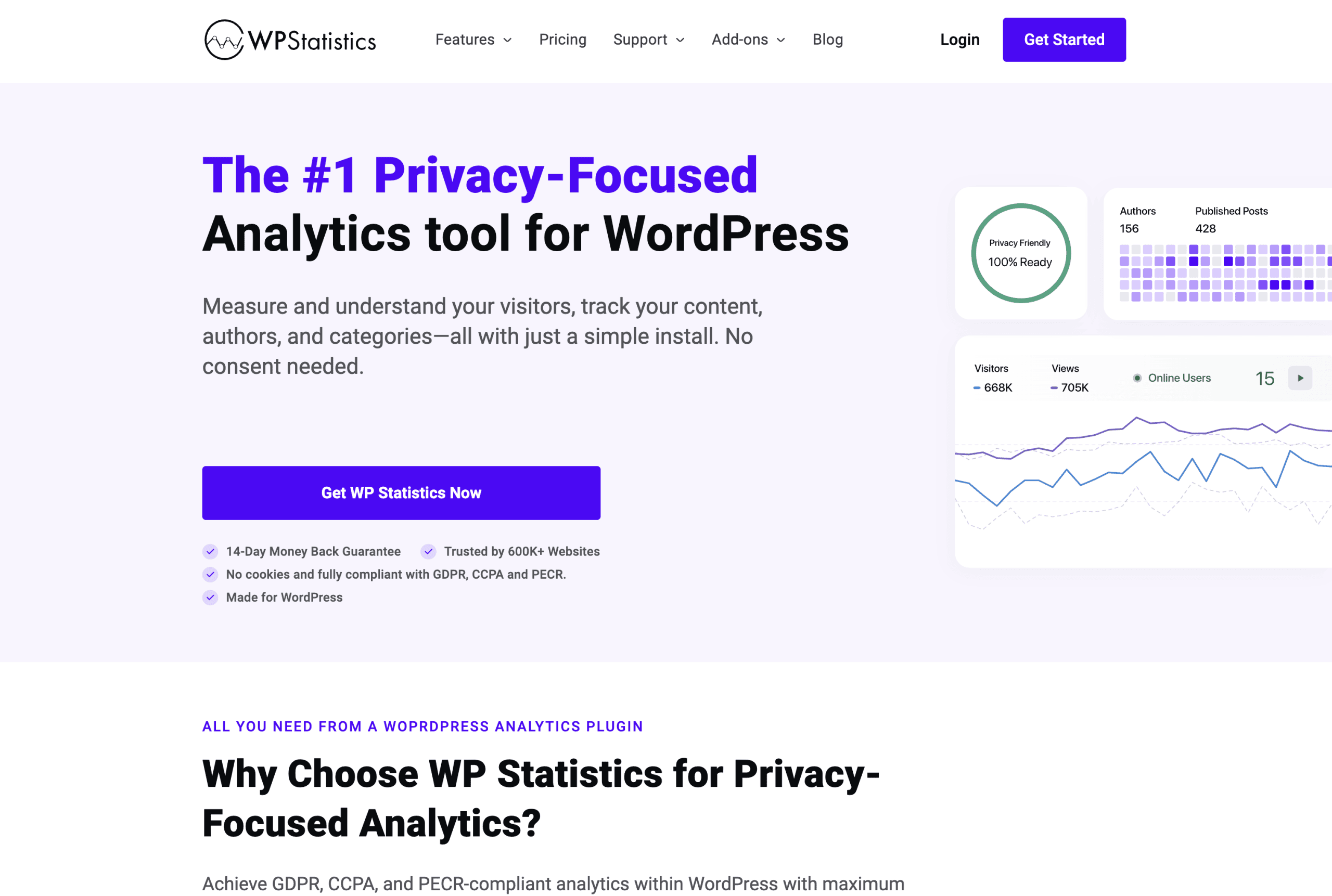
WP Statistics offers a privacy-centered approach to web analytics. It stores all visitor data on your own server rather than third-party services. This self-hosted approach helps address privacy concerns and data ownership issues.
The plugin provides clear visualizations of visitor behavior directly in your dashboard. You can track pageviews, referrers, user locations, and more through intuitive charts. These visual reports make it easy to understand traffic patterns at a glance.
WP Statistics works particularly well for businesses with privacy concerns. The self-contained nature avoids sharing visitor data with external services like Google. For European websites concerned with GDPR compliance, this privacy-focused approach offers significant advantages.
MonsterInsights: Google Analytics Integration
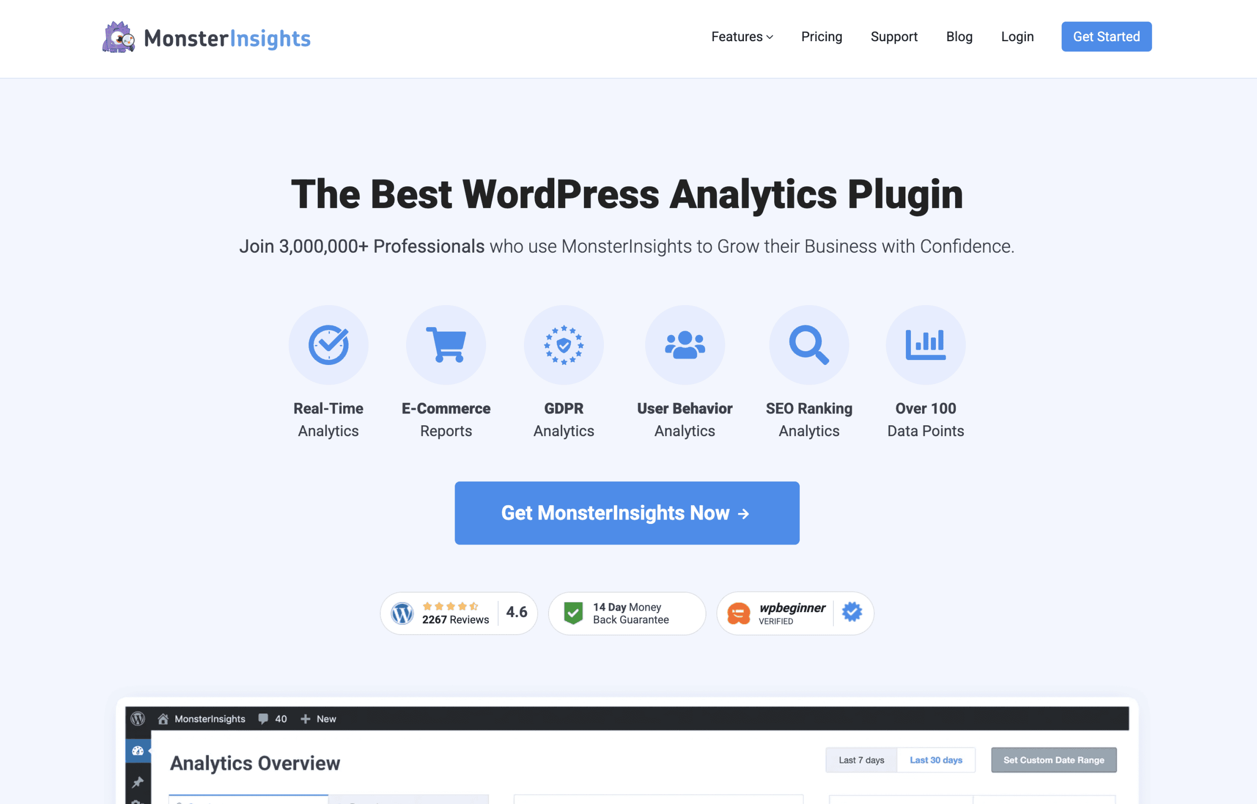
MonsterInsights brings Google Analytics visualizations directly into your WordPress dashboard. It connects your site with Google’s powerful analytics platform while simplifying the data presentation. The integration saves you from constantly switching between WordPress and Google Analytics.
The plugin creates visual reports for key metrics right within your admin area. These reports highlight the most important data points through clear charts and graphs. The visual approach helps you quickly understand performance without wading through complex reports.
This solution works best for users who want Google Analytics’ power with WordPress convenience. The direct dashboard integration makes analytics data more accessible to team members. For marketing-focused websites, the comprehensive tracking and visualization capabilities provide valuable insights.
Alternative Visualization Options
Beyond dedicated WordPress plugins, other approaches exist for adding data visualization to your site. These alternatives offer different advantages depending on your technical skills and specific requirements.
Google Charts: For Developers
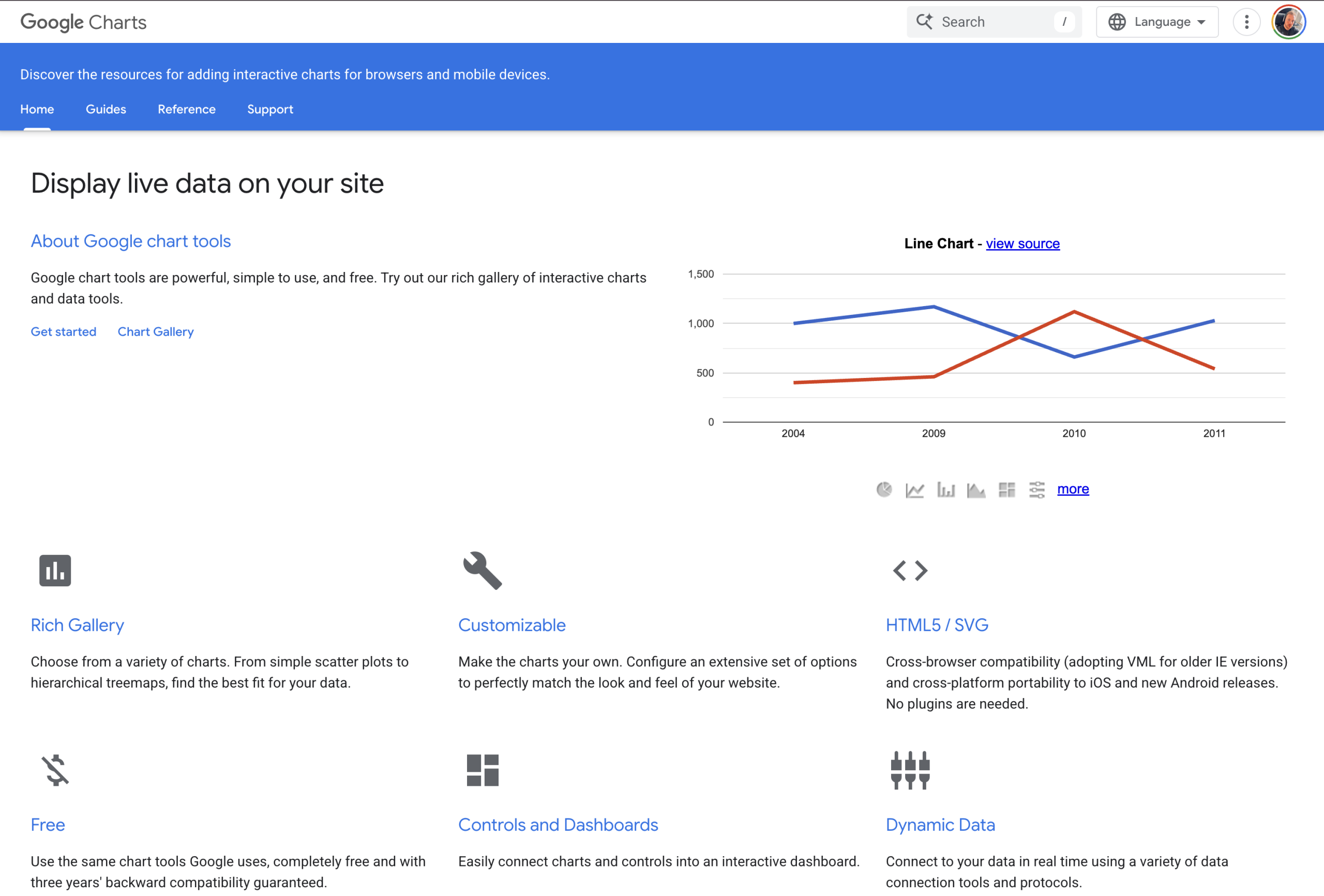
Google Charts provides a powerful free visualization library. It requires manual coding for embedding live-updating charts in WordPress. The library offers extensive customization options for developers comfortable with JavaScript.
The main advantage is complete control over visualization appearance and behavior. You can create highly customized, interactive charts that match your exact specifications. The direct code implementation also avoids the performance overhead of some plugins.
Google Charts works best when you have development resources available. The solution requires technical knowledge to implement and update visualizations. For businesses with development teams, this approach offers maximum flexibility and customization.
POWR Graph: Drag-and-Drop Solution
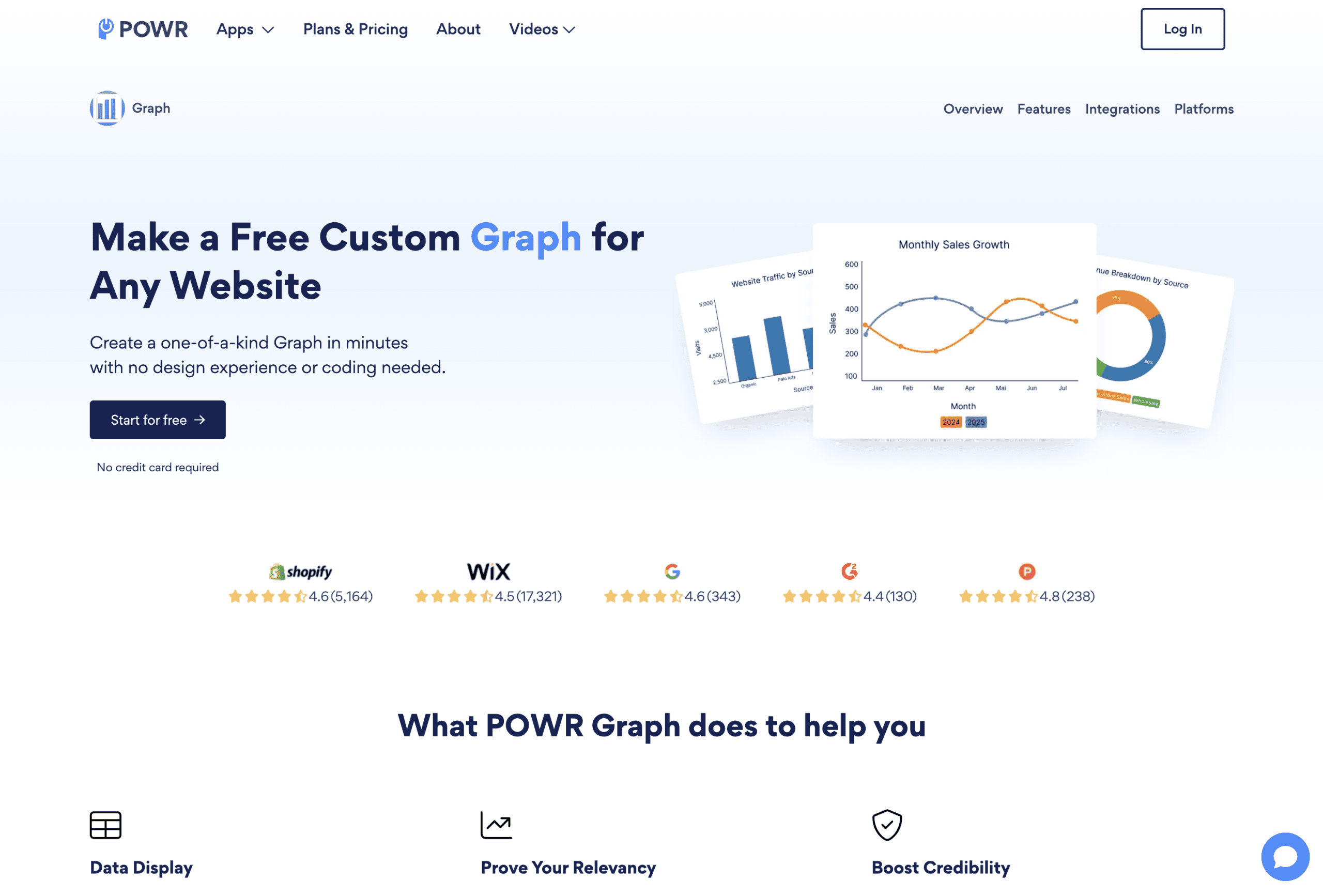
POWR Graph offers a user-friendly drag-and-drop editor for creating visualizations. The cloud-based tool provides mobile-responsive infographics without requiring technical skills. You can embed the results into any WordPress page using a simple shortcode.
The visual editor makes creating and updating charts straightforward for anyone. This accessibility eliminates the learning curve often associated with data visualization tools. Non-technical team members can create and manage visualizations without developer assistance.
This solution works well for users prioritizing ease of use over advanced features. The simple interface makes it accessible to team members without technical backgrounds. For small businesses needing basic charts without complexity, POWR Graph offers a streamlined solution.
How to Choose the Right Data Visualization Plugin
Selecting the ideal plugin depends on several key factors. Consider these important aspects to find the solution that best matches your specific needs.
The type and complexity of your data should guide your choice. Simple datasets with few variables work with most visualization tools. Complex data with multiple variables may require specialized plugins like wpDataTables. Match the plugin’s capabilities to your specific information structure.
Your technical expertise level affects which solution will work best. Developer-oriented options like Google Charts offer more flexibility but require coding skills. User-friendly plugins like POWR Graph sacrifice some customization for easier implementation. Be realistic about your team’s technical capabilities when choosing a tool.
Integration requirements with existing systems matter significantly. Consider whether you need connections to form builders, CRMs, or other data sources. Some plugins offer native integrations that simplify these connections. Ensuring compatibility with your current tools prevents implementation headaches later.
Budget constraints naturally influence your available options. Free plugins offer basic visualization with limited support and features. Premium options provide more capabilities but require ongoing investment. Balance cost considerations against your specific visualization needs and importance.
Here are the key factors to consider when selecting a data visualization plugin:
- Data complexity – Match plugin capabilities to your information structure
- Technical expertise – Choose tools appropriate for your team’s skills
- Integration needs – Ensure compatibility with existing systems
- Budget constraints – Balance cost against required features
- Update frequency – Consider how often your data will change
Taking time to evaluate these factors will help you select the most appropriate solution. The right choice depends on your specific business requirements and resources.
Implementing Data Visualization: Best Practices
Effective implementation goes beyond just installing a plugin. Follow these best practices to create compelling, useful visualizations.
Keep your visualizations simple and focused on key insights. Overloaded charts with too many data points confuse rather than clarify. Each visualization should communicate one clear message or trend. This focused approach ensures visitors grasp the main point quickly.
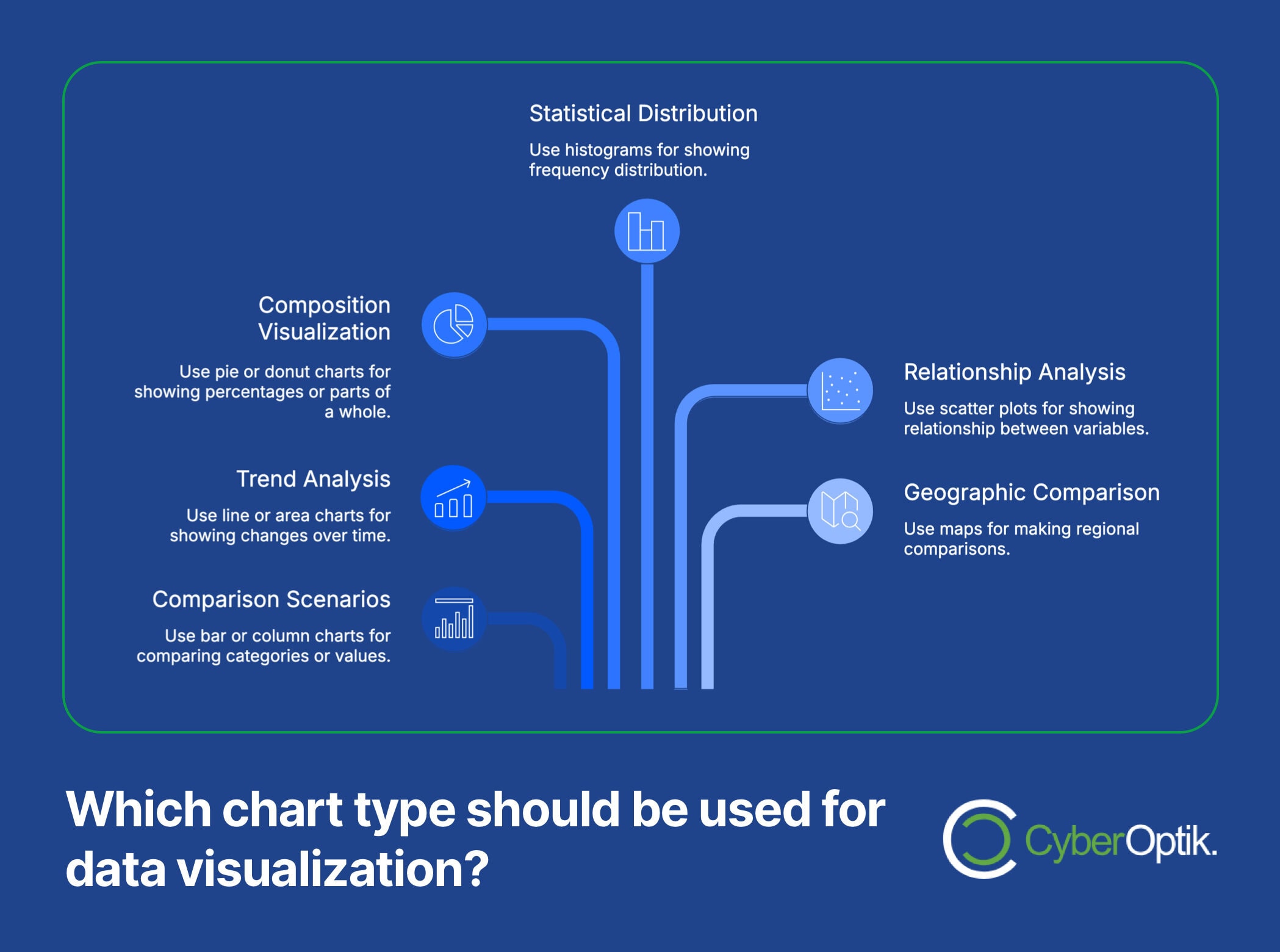
Choose the right chart type for your specific data relationship. Bar charts work well for comparisons, while line charts excel at showing trends over time. Pie charts effectively display parts of a whole, but become confusing with too many segments. Matching chart types to data relationships improves comprehension dramatically.
Here’s a quick guide to selecting the appropriate chart type for different data scenarios:
| Data Relationship | Recommended Chart | When to Use | When to Avoid |
|---|---|---|---|
| Comparing values | Bar or Column | Comparing categories | Too many categories |
| Showing trends | Line or Area | Changes over time | Few data points |
| Parts of a whole | Pie or Donut | Showing percentages | More than 5-7 segments |
| Distributions | Histogram | Frequency distribution | Categorical data |
| Correlations | Scatter Plot | Relationship between variables | More than two variables |
| Geographic data | Map | Regional comparisons | Non-geographical data |
Ensure mobile responsiveness for all data visualizations. Many users will view your charts on smartphones or tablets. Test how visualizations appear and function on various screen sizes. Some plugins handle this automatically, while others require configuration for proper mobile display.
Consider the performance impact of data-heavy visualizations. Complex charts with large datasets can slow page loading times. Optimize by limiting data points and using lazy loading when possible. Performance matters both for user experience and search engine rankings.
Finally, maintain visual consistency with your overall brand design. Colors, fonts, and styles should complement your website’s existing aesthetic. This consistency reinforces your brand identity while making visualizations feel integrated. Many plugins allow customization of these visual elements to match your site design.

Conclusion: Transforming Your Data into Insights
Effective data visualization transforms complex information into meaningful insights. The right WordPress plugin makes this process straightforward for businesses of any size. Whether you’re displaying survey results, financial data, or performance metrics, visual presentation enhances understanding.
We’ve covered the leading WordPress data visualization options available today. From form-integrated solutions like WPForms and Formidable to versatile charting tools like Visualizer, options exist for every need. Specialized tools like wpDataTables handle complex datasets, while integrations like Graphina work seamlessly with page builders.
When selecting a visualization plugin, consider your specific data needs, technical capabilities, and budget. Start with a clear purpose for each visualization and choose the simplest effective format. Remember that clarity and insight should always take priority over flashy effects or complexity.
Ready to transform your website’s data presentation? Our team can help you select and implement the perfect custom WordPress website design solution with data visualization tools that match your needs. Want to understand how can a WordPress website save you money while adding powerful visualization features? Contact us today.
While adding plugins enhances functionality, it’s important to understand how WordPress plugins can compromise your website security if not properly maintained. Check out our WordPress plugins 101 guide for more information on safely extending your site’s capabilities.


