Just looking for our Best Pediatrician Website examples list?
Key Takeaways:
For pediatricians and practice managers looking to enhance their digital presence, a strategic website is the cornerstone of patient acquisition and retention. Here are the essential takeaways for designing a website that meets the needs of modern parents and ranks effectively in search results.
- Build a Foundation of Trust Through Design: Your website is often the first interaction a family has with your practice. Prioritize a professional, welcoming design with authentic photos of your staff and office, not generic stock images. A clean, calming color palette and an intuitive layout create a sense of competence and care before a patient ever steps through your door.
- Prioritize a “Mobile-First” Experience: The vast majority of parents will access your website from a smartphone, often while multitasking. Your website must be flawlessly responsive and easy to navigate with one hand. Key information like your phone number, address, and a “Book Appointment” button should be immediately visible without pinching or zooming.
- Integrate Features That Offer True Convenience: A modern site is a tool that saves time for both parents and your staff. The most critical features include:
- Online Appointment Booking: Allow parents to schedule visits 24/7.
- Secure Patient Portal: Provide easy access to immunization records, test results, and secure messaging.
- Downloadable & Online Patient Forms: Reduce waiting room time and streamline the onboarding process for new families.
- Develop a Hyper-Local Content Strategy: Position your practice as a community health authority. Create blog and video content that addresses local concerns (“Navigating Allergy Season in [Your City]”) and answers the specific questions your front-desk staff hear every day. Featuring your own pediatricians in this content builds a powerful connection with potential patients.
- Ensure Your Website is HIPAA Compliant: Protecting patient data is non-negotiable. Your website must be built on a secure, HIPAA-compliant platform, especially any features that handle protected health information (PHI) like patient forms or portals. Clearly stating your commitment to privacy is a major trust signal for parents.
- Make Your “After-Hours” and Emergency Instructions Crystal Clear: One of the biggest sources of anxiety for parents is not knowing what to do when your office is closed. A prominent, easy-to-find section detailing your emergency protocols, on-call information, and directions to the nearest pediatric ER is an invaluable resource that demonstrates you care about patient well-being around the clock.
Beyond a Digital Brochure: How Strategic Pediatric Website Design Attracts New Patients
Imagine a new family in town, phone in hand, searching for a pediatrician. Their child has a persistent cough, and their immediate goal is to find a trusted healthcare provider, fast. They land on two different websites for local practices. The first is clunky, hard to read on their mobile device, and they can’t find the new patient forms. The second, however, is welcoming. With two taps, they learn about the doctors, see a virtual tour of the office, and can book an appointment online. Which pediatric practice do you think they’ll choose?
This scenario plays out thousands of times a day. This means that your website is no longer a simple online business card; it is your most powerful tool for patient engagement and reputation management. For a modern pediatric office, investing in strategic pediatric website design is not an expense—it’s a direct investment in the growth and success of your practice. A well-designed site that delivers a superior user experience does more than just look good. It builds immediate trust with parents, streamlines administrative tasks for your staff, and is the engine for a powerful local SEO strategy that ensures you are visible when and where it matters most—at the top of the search engine results. This guide will move beyond the basics of web design to give you an actionable blueprint to transform your medical website into a patient-attraction machine.
Website Planning & Purpose: Building Your Digital Front Door
Before a single design element is chosen or a line of code is written, the most critical phase of any medical website design project is planning. This phase is not just about outlining a sitemap; it’s about defining the very purpose of your digital presence and creating a strategic blueprint that aligns with your practice’s growth and patient care goals. The purpose of your website is twofold: to serve as a magnet for potential patients searching for a trusted healthcare provider online, and to function as an efficient, 24/7 resource for your existing patient families.
The planning phase in this industry requires a deep understanding of your specific audience—modern parents who value convenience, authority, and a sense of personal connection. The process begins by asking foundational questions:
- Who is our primary audience? (e.g., expectant mothers, families new to the area, parents of toddlers, parents of teens). Each has slightly different needs.
- What is the primary action we want users to take? (e.g., book an appointment, call the office, download patient forms, access the patient portal).
- How will we measure success? (e.g., an increase in online appointment requests, a reduction in administrative calls, higher rankings for specific keywords).
With these goals defined, the next step is to map out the website’s architecture. This involves creating a logical sitemap that makes information discovery effortless. A busy parent needs to find their location, hours, and emergency contact information instantly. They should be able to navigate seamlessly to doctor bios, insurance information, and vaccination schedules. Every click should lead them logically to the next step, avoiding frustration and building confidence in your practice.
This planning stage is also where crucial technical and legal considerations, like HIPAA compliance, are addressed. You must determine which parts of your site will handle Protected Health Information (PHI)—such as appointment requests or online forms—and plan for the necessary security measures from the very beginning.
Ultimately, a well-designed website is built on a solid plan that considers both the user’s needs and the practice’s objectives. Understanding these foundational elements is key before moving into visual design. For a deeper dive into the universal rules that govern effective site structure and usability, you can explore the core principles of web design: a guide for beginners. This strategic foresight ensures your final practice website is not just an attractive digital brochure, but a high-performing asset that serves your patients and grows your practice.
Design Principles: Crafting a Welcoming and Usable Digital Experience
The design of your website is a direct reflection of your practice’s professionalism, empathy, and commitment to patient care. For parents, the visual and functional quality of your site builds immediate trust or creates instant doubt. An effective design is one that is intuitive, reassuring, and completely focused on the needs of a busy and often stressed parent. The following principles are foundational to achieving this.
- Clean, Calming, and Professional Visual Design
The look and feel of your website should be welcoming, not clinical or chaotic. This is achieved through the careful selection of visual elements.
- Color Palette: Avoid overly bright, jarring primary colors that can feel unprofessional. Instead, opt for a calming and modern color scheme. Soft blues, gentle greens, warm grays, and other muted tones can create a sense of tranquility and competence. Pops of brighter, friendly colors can be used strategically as accents for calls-to-action or key navigational elements.
- Authentic Imagery: Stock photos of smiling, generic children are impersonal. The most impactful design choice you can make is to invest in high-quality, professional photography of your actual staff, doctors, and office spaces. Seeing the real, friendly faces of the pediatricians and the clean, child-friendly environment of your practice builds an immediate, powerful connection and alleviates anxiety for both new parents and children.
- Legible Typography: Readability is paramount. Choose clean, modern fonts that are easy to read across all devices. Ensure there is sufficient font size and line spacing so that a parent scanning your site on their phone can absorb information effortlessly.
- Intuitive Navigation and User Experience (UX)
Parents are often short on time and patience. Your website’s structure should be so simple that it requires no thought to navigate.
- Logical Information Hierarchy: Critical information must be accessible within a single click from the homepage. This includes your phone number, address, office hours, a link to the patient portal, and a highly visible “Book Appointment” button. Your main navigation menu should be simple and use clear, common-sense labels like “Our Team,” “Services,” “For Patients,” and “Contact Us.”
- A Frustration-Free Journey: Every element, from contact forms to online bill pay, should be streamlined and easy to complete. Minimize the number of clicks required to perform any task. If a parent has to hunt for information, they are more likely to leave your site and call a competitor.
- Mobile-First Responsiveness
It is not enough for your website to simply “work” on a mobile device; it must be designed for a mobile experience first. The vast majority of your website traffic will come from parents on smartphones. A responsive design ensures your site automatically adapts to any screen size, providing an optimal experience for every user. All text should be readable without zooming, buttons should be large enough to be tapped easily with a thumb, and images should resize correctly. A poor mobile experience is one of the fastest ways to lose a new potential patient.
- Accessibility for All Families
A core principle of healthcare is to provide care for everyone, and your website should be no different. Designing for accessibility (often following Web Content Accessibility Guidelines, or WCAG) ensures that parents with disabilities can access and use your site effectively. This includes practices like ensuring high color contrast between text and backgrounds, providing alternative text (alt text) for all images so screen readers can describe them, and making sure the entire site can be navigated using only a keyboard. An accessible website is a clear sign that your practice is inclusive and dedicated to serving your entire community.
Content & Navigation: Structuring Your Site for Clarity and Trust
The success of a website hinges on how effectively parents can find the information they need at the moment they need it. A logical navigation structure and well-organized, empathetic content work together to create a seamless user experience, building confidence in your practice from the very first click. The goal is to anticipate a parent’s questions and provide clear, reassuring answers through an intuitive digital layout.
Logical Navigation: Creating a Clear Path for Parents
Your website’s navigation is the roadmap that guides users to their destination. For a parent who may be stressed or in a hurry, this roadmap must be simple, predictable, and free of roadblocks.
- Primary Navigation Menu: This is the main menu, typically located at the top of your site. It should be uncluttered and use clear, universally understood language. Avoid internal jargon or overly creative labels. The essential items every website should feature are:
- Home: A clear link back to your main landing page.
- Our Team / About Us: Where parents can get to know your pediatricians and staff.
- Services: A comprehensive overview of the care you provide, from routine check-ups to specialized treatments.
- For Patients / Patient Resources: A critical hub for new and existing families containing forms, policies, insurance information, and educational materials.
- Contact Us: A dedicated page with your address, phone numbers, map, and hours.
- Blog / Health Hub: Your section for articles, news, and SEO-driven content.
- Utility Navigation: Above the primary navigation, there should be a “utility” bar that contains links to the most critical, action-oriented items. These are the tools parents need quick access to. This area should prominently display:
- Patient Portal Login: The single most important link for existing patients.
- Pay Bill: A direct link to your online payment system for ultimate convenience.
- Phone Number: Your main office number should be clickable on mobile devices (“click-to-call”).
- Footer Navigation: The website footer is another opportunity to provide helpful links. It should repeat the main navigation and include other useful items like your privacy policy, accessibility statement, and social media links.
Essential Content: Answering Questions Before They’re Asked
The content on each page should be written with empathy, anticipating the user’s mindset. It should be scannable, easy to understand, and authoritative.
- Homepage: This is your digital front door. It must immediately communicate who you are, what you do, and what a user should do next. It should feature authentic imagery, clear calls-to-action (“Book an Appointment,” “Access Patient Portal”), your address and phone number, and brief introductions to your services and doctors.
- Our Team Page: This is arguably the most important page for building trust. Go beyond a simple list of names and credentials. Each pediatrician and key staff member should have a high-quality photo and a brief bio that shares their care philosophy, educational background, and a personal touch that helps them seem approachable.
- Services Page: Clearly outline the full scope of your pediatrics practice. Use an organized format (like bullet points or accordion menus) to detail services such as well-child visits, sick visits, immunizations, sports physicals, behavioral health consultations, lactation support, and any other specializations.
- “For Patients” Resource Hub: This is where you make life easier for parents. This section is a content goldmine and should be meticulously organized. Key sub-pages include:
- New Patient Forms: Offer downloadable PDFs and, ideally, secure online forms that can be submitted prior to the first visit.
- Insurance & Billing: A clear list of accepted insurance plans and a straightforward explanation of your billing policies.
- Office Policies: Information on appointments, cancellations, and prescription refills.
- After-Hours & Emergency Instructions: A vital page that clearly explains what to do when the office is closed.
- Health Resources: A library of trusted information, such as dosage charts for common medications, the CDC’s recommended immunization schedule, and links to reputable sources like the American Academy of Pediatrics.
By structuring your content and navigation with this level of intention, you remove friction from the UX. You demonstrate that you understand and respect a parent’s time, solidifying your reputation as a professional, organized, and caring healthcare provider.
Visual Elements: Building Trust and Communicating Care Through Imagery
The visual elements of your website are the primary communicators of your brand’s personality and a powerful tool for building immediate trust with parents. In an industry where compassion and competence are paramount, your site’s visual language must convey a sense of warmth, professionalism, and unwavering reliability. Every color, photo, and font choice works together to shape the UX and answer a parent’s most fundamental question: “Is this a place where my child will receive the best possible care?”
Authentic Photography: Your Most Powerful Trust Signal
If there is one visual element to invest in, it is high-quality, professional photography of your own practice. Generic stock photos of smiling children are instantly recognizable and create a sterile, impersonal impression. Parents want to see the real people and the real environment where they will be bringing their family.
- Show Your Team: Feature warm, approachable headshots of every pediatrician and key staff member. Group photos that show your team’s positive dynamic can be incredibly effective. Seeing the friendly faces they will interact with helps demystify the practice and builds a human connection.
- Showcase Your Space: Provide a virtual glimpse into your office. High-resolution images of your clean, welcoming waiting room (showcasing separate well and sick areas if you have them), child-friendly exam rooms, and overall facility help reduce anxiety for both parents and young patients. This visual transparency signals that you have nothing to hide and are proud of your practice.
Color Palette: Evoking Calm and Professionalism
Color psychology plays a significant role in how your brand is perceived. While it’s a website for children’s health, the target audience for the design is adults. The goal is to strike a balance between “child-friendly” and “medically professional.”
- Avoid Cliché Palettes: Steer clear of overly simplistic, bright primary colors that can make your website design feel dated or unsophisticated.
- Embrace a Soothing Foundation: Build your palette around a base of soft, calming colors. Light blues, gentle greens, warm grays, and other muted earth tones create a sense of tranquility and competence. These colors are reassuring to an anxious parent.
- Use Accent Colors Strategically: Use a brighter, more vibrant color as a strategic accent to draw attention to key actions. This “pop of color” should be used consistently for all buttons, links, and calls-to-action (like “Book an Appointment” or “Access Patient Portal”), guiding the user’s eye and making the site easier to navigate.
Typography: Ensuring Clarity and Readability
The fonts you choose are a cornerstone of accessibility and UX. A parent trying to read about fever symptoms at 2 AM on their phone needs clarity, not creative flair.
- Prioritize Legibility: Select clean, modern, and sans-serif fonts that are easy to read on screens of all sizes. Ensure the font weight and size are substantial enough for effortless reading, with ample spacing between lines of text to avoid a cluttered feel.
- Establish a Clear Hierarchy: Use different font sizes and weights consistently to create a clear visual hierarchy. Headers should be clearly distinguishable from sub-headers and body text, allowing users to scan pages quickly to find the information they need. This structured approach makes your content more digestible and reinforces a sense of order and professionalism.
Ongoing WordPress Maintenance: Protecting Your Practice and Patients
Launching your website is a significant milestone, but the work doesn’t stop there. A website is a dynamic asset that requires consistent, proactive maintenance to function effectively, remain secure, and protect the integrity of your practice. For a pediatric office using WordPress, this ongoing upkeep is not merely a technical chore—it is an essential component of your risk management, reputation management, and patient service strategy. Neglecting maintenance can lead to slow performance, broken features, and critical security vulnerabilities that put patient data at risk.
A comprehensive WordPress maintenance plan focuses on three core areas:
- Security and HIPAA Compliance
In the healthcare industry, website security is paramount. Your practice handles Protected Health Information (PHI), making your site a target for malicious actors. A security breach can have devastating consequences for your patients and your practice’s reputation.
- Continuous Security Monitoring: Implementing a professional-grade firewall and security monitoring service is non-negotiable. These systems actively scan for malware, block brute-force attempts to log in, and monitor for suspicious activity 24/7.
- Adherence to HIPAA Guidelines: Any part of your website that collects or transmits PHI—such as patient intake forms, appointment requests, or patient portal connections—must be managed within a HIPAA-compliant framework. This involves ensuring data is encrypted both in transit (with an SSL certificate) and at rest (in the database), and that access to the website’s backend is strictly controlled and logged. Regular security audits are necessary to confirm ongoing compliance.
- Software Updates and Proactive Backups
The WordPress ecosystem is constantly evolving. The core software, along with the themes and plugins that provide your site’s functionality, receive regular updates to introduce new features and, most importantly, to patch security vulnerabilities.
- Timely Updates: Failing to update plugins, themes, and the WordPress core is one of the most common reasons websites get compromised. A maintenance plan ensures these updates are tested in a safe staging environment before being applied to your live site to prevent any conflicts or broken features.
- Robust Backup Strategy: Regular, automated backups are your website’s ultimate safety net. In the event of a critical error, server failure, or security breach, a recent backup allows for a swift and complete restoration of your site. For a pediatric practice, this strategy must include daily backups of both the website files and the database, with all backups encrypted and stored securely on an off-site, HIPAA-compliant server.
- Performance and Speed Optimization
A slow, clunky website provides a poor experience and can frustrate parents trying to access important information. Search engines like Google also favor fast-loading sites, meaning site speed directly impacts your visibility to potential patients.
- Database Optimization: Over time, your WordPress database accumulates unnecessary data like post revisions, spam comments, and expired temporary files. Regularly cleaning and optimizing the database keeps it running efficiently and helps your pages load faster.
- Performance Monitoring: Consistent performance scans using tools like Google PageSpeed Insights help identify issues that could be slowing your site down, such as large image files or inefficient code. A maintenance plan includes addressing these issues through tasks like image compression and leveraging browser caching to ensure your website remains fast and responsive for every visitor.
20 Pediatric Site Design Examples
A well-designed website is a pediatric practice’s most valuable marketing asset, serving as the digital front door for both new and existing patients. The industry websites blend a welcoming, child-friendly aesthetic with a seamless user experience for parents. They are easy to navigate, build trust, and provide clear pathways to essential information.
Below are 20 exceptional examples from across the U.S. that effectively combine form and function, including five designed by our pros:
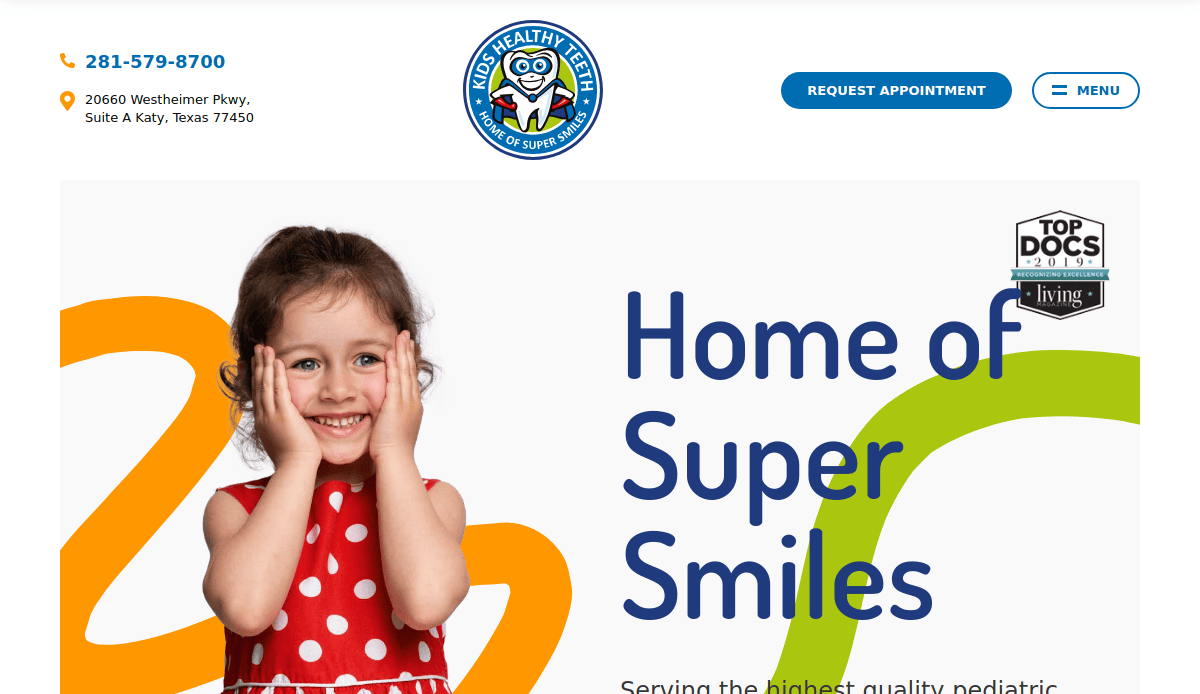
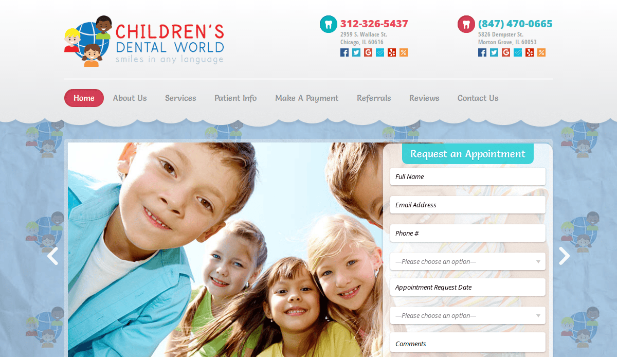
1. Kids’ Healthy Teeth
Location City: Katy, TX
3 Key Takeaways:
- Vibrant & Playful Branding: The use of bright colors and custom cartoon characters creates a fun and non-intimidating atmosphere for a pediatric dental practice.
- Prominent “Request an Appointment” CTA: A high-contrast call-to-action is consistently visible in the header, making it easy for users to take the next step.
- Engaging Office Tour: The website features a photo gallery that serves as a virtual tour, helping to ease anxiety for new patients and their parents by familiarizing them with the office.
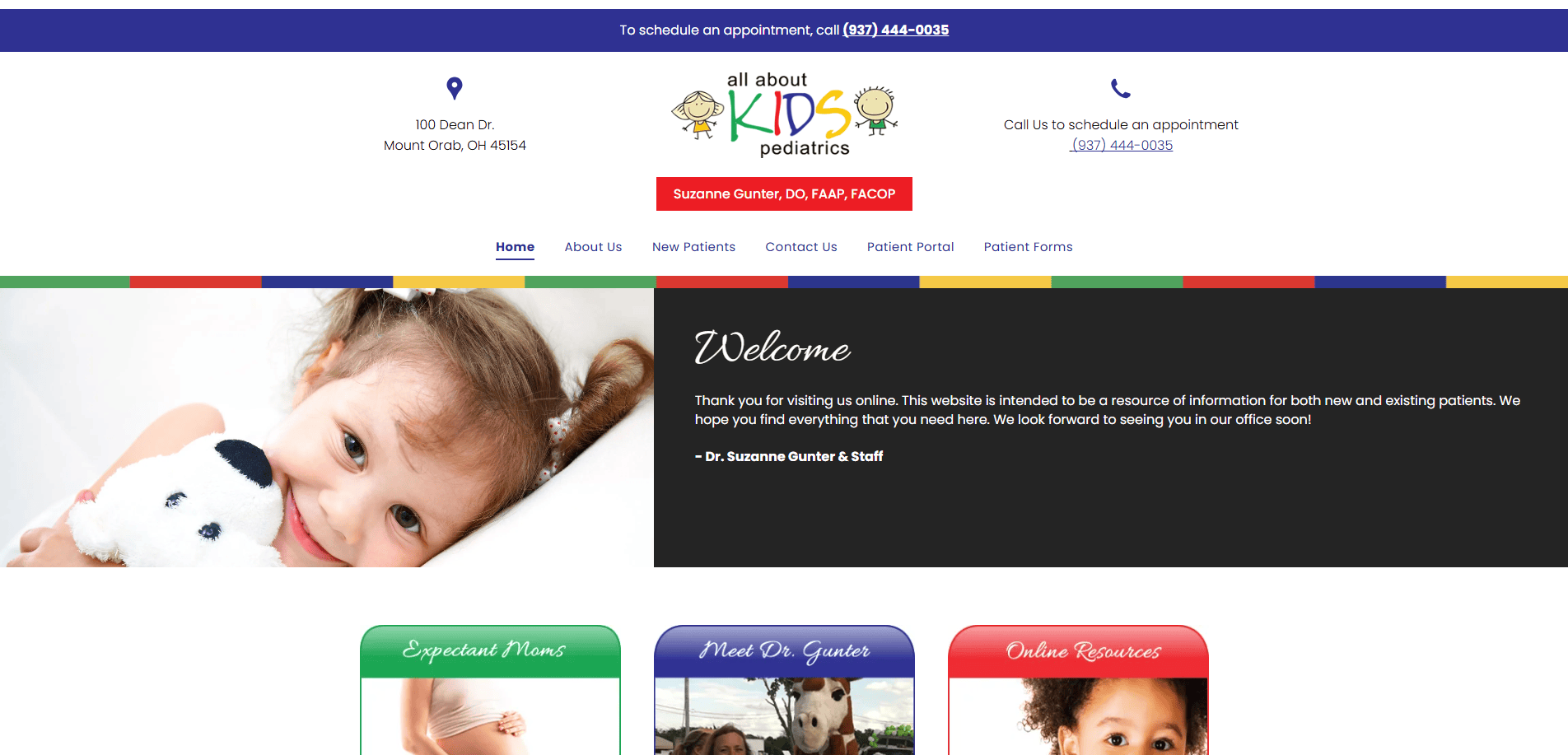
2. All About Kids Pediatrics
Location City: Plano, TX
3 Key Takeaways:
- Soothing & Professional Color Palette: The website uses a soft blue and green color scheme that feels calming, professional, and trustworthy.
- Clear Service Organization: Services are broken down into logical categories (Newborns, Toddlers, etc.), making it easy for parents to find relevant information for their child’s age group.
- Efficient Patient Forms Section: The “Patient Forms” page is well-organized with clear instructions, streamlining the new patient onboarding process and saving time for parents.

3. DuPage Paediatricians
Location City: Darien, IL
3 Key Takeaways:
- Strong Trust Signals: The homepage immediately features a “Voted Best of the Best” award badge, instantly building credibility with new visitors.
- Well-Structured Navigation: A clean top menu with dropdowns allows users to quickly find information on locations, providers, and policies without feeling overwhelmed.
- Integrated Patient Portal Access: The “Patient Portal” button is highly visible in the main navigation, providing convenient access for existing patients to manage their child’s care.
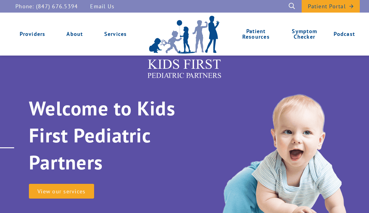
4. Kids First Pediatric Partners
Location City: Skokie, IL
3 Key Takeaways:
- Authentic, High-Quality Photography: The site uses genuine photos of the staff and office, creating a sense of authenticity and connection that stock photos cannot replicate.
- Urgent Care vs. Emergency Guidance: A dedicated section clearly explains the difference between urgent and emergency care, helping parents make informed decisions.
- Action-Oriented Utility Navigation: The topmost header provides clear, clickable links for “Pay My Bill,” “Patient Portal,” and the phone number, addressing key user actions immediately.
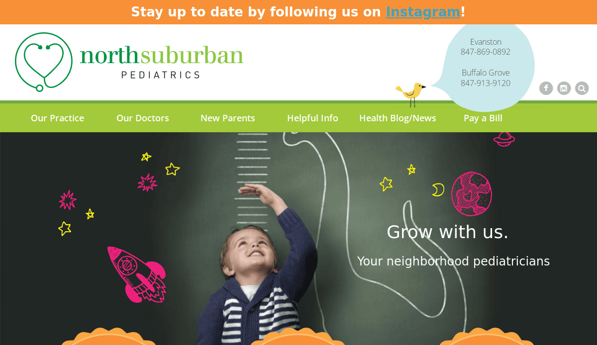
5. North Suburban Pediatrics
Location City: Evanston, IL
3 Key Takeaways:
- Clean & Modern Layout: The website utilizes ample white space and a grid-based design, making the content easy to read and digest.
- Robust “Parent Resources” Hub: The site features a comprehensive section with valuable content on topics like ADHD, asthma, and adolescent health, positioning the practice as an authority.
- Multi-Location Information Architecture: The design elegantly handles information for their two locations, with clear contact details and provider lists for each.
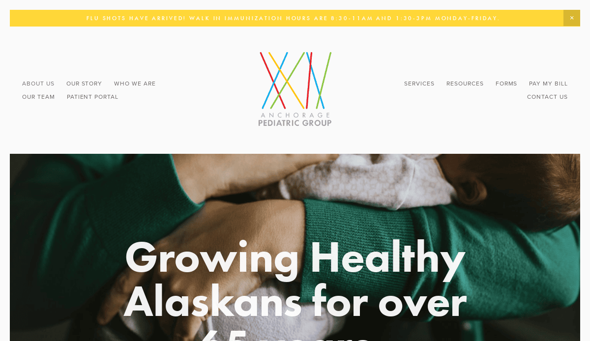
6. Anchorage Pediatric Group
Location City: Anchorage, AK
3 Key Takeaways:
- Stunning Local Visuals: The use of beautiful, high-quality photography of Alaskan landscapes and local families creates a unique and memorable brand identity.
- Simple, Icon-Based Navigation: Key services on the homepage are represented by clean, simple icons, which makes scanning for information quick and intuitive.
- Helpful “Health Questions” Triage: The site has a section that helps parents determine the urgency of their child’s symptoms, providing valuable guidance.
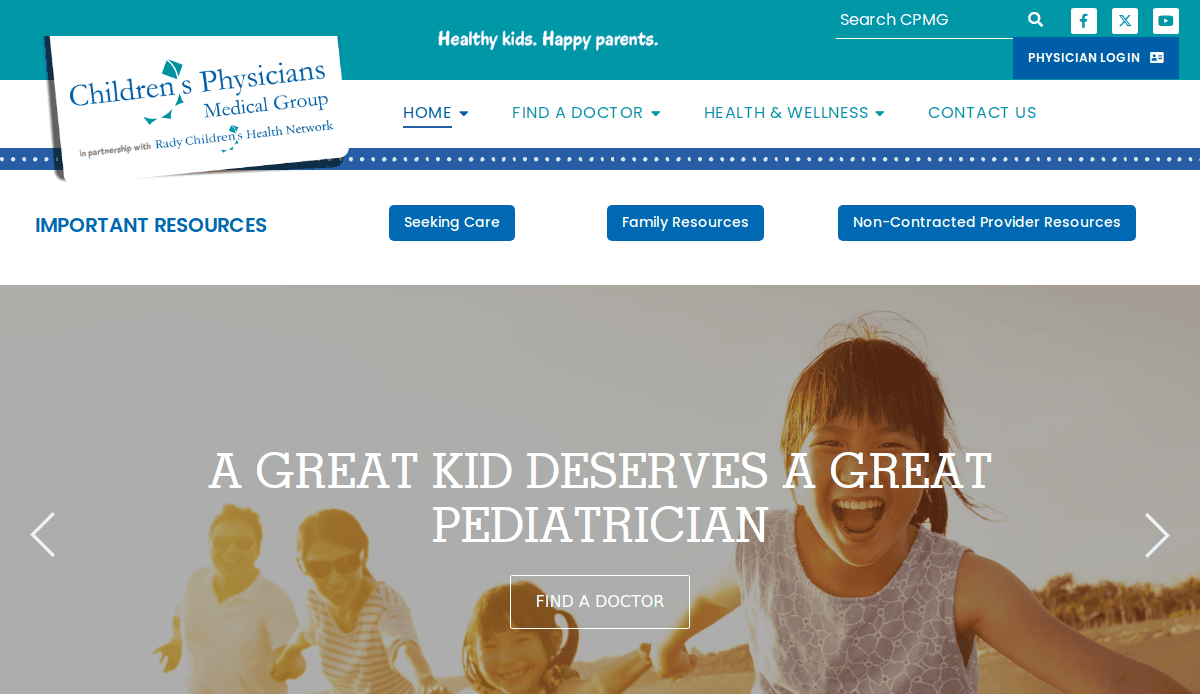
7. Children’s Physicians Medical Group
Location City: San Diego, CA
3 Key Takeaways:
- Excellent Search Functionality: The “Find a Doctor” tool is robust, allowing users to filter by location, gender, and language, which is crucial for a large medical group.
- Bilingual Content (English/Spanish): The website offers a language toggle, making it accessible to a broader community and demonstrating inclusivity.
- Comprehensive Health Library: The site integrates a vast library of pediatric health topics, providing a trusted educational resource for parents.
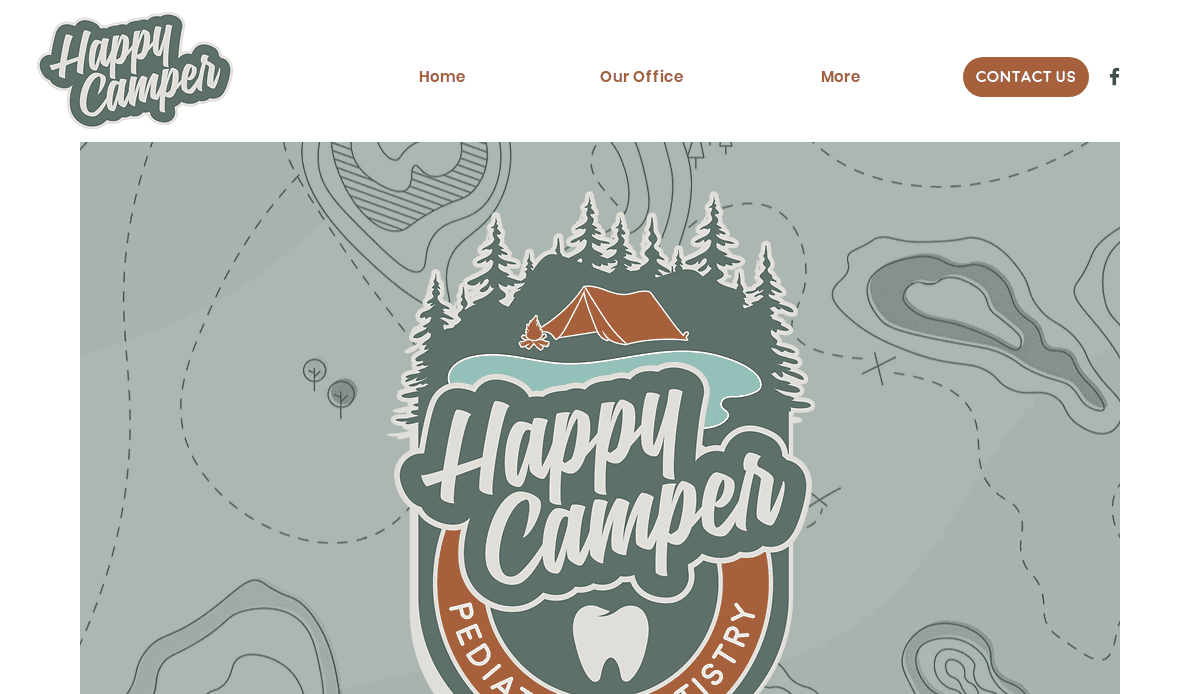
8. Happy Camper Pediatric Dentistry
Location City: Longmont, CO
3 Key Takeaways:
- Unique & Cohesive Branding: The “happy camper” theme is executed perfectly with custom illustrations and website copy, making the brand fun and memorable.
- Engaging Microinteractions: Small animations and hover effects on buttons and images make the site feel dynamic and engaging to use.
- Parent-Focused Testimonials: Testimonials are prominently displayed and focus on the positive experiences of other parents, which is a powerful form of social proof.
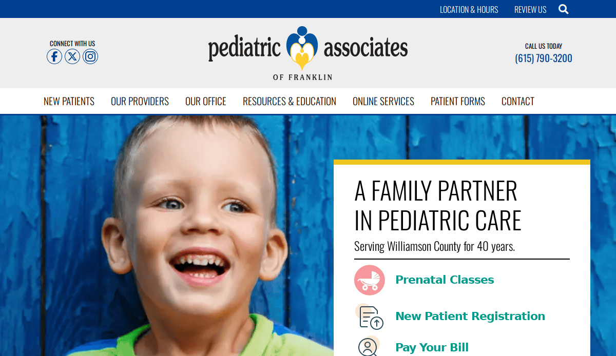
9. The Pediatric Associates of Franklin
Location City: Franklin, TN
3 Key Takeaways:
- Warm & Inviting Tone: The website copy is written in a friendly, reassuring voice that speaks directly to the concerns of parents.
- Clear COVID-19 Information: A highly visible banner provides up-to-date information on office policies related to COVID-19, addressing a key user concern.
- “Meet Our Providers” Videos: Including short video introductions for the doctors helps build a personal connection and trust before the first visit.
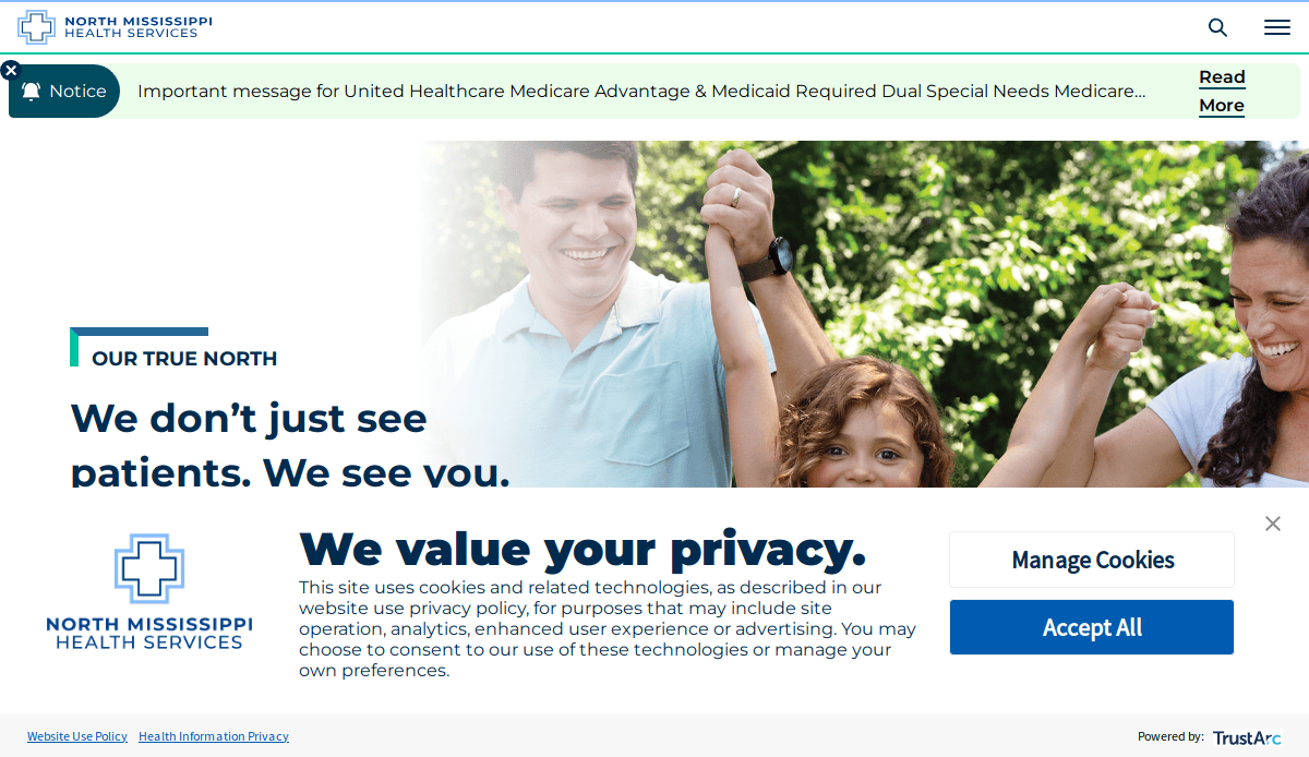
10. North Mississippi Pediatrics
Location City: Tupelo, MS
3 Key Takeaways:
- Strong Sense of Place: The design incorporates elements and language that give it a friendly, local, small-town feel, building a connection with the community.
- Simplified Appointment Process: The appointment request form is simple and requires minimal information, reducing friction for busy parents.
- Mobile-First Design: The website is clearly designed for mobile users, with large, tappable buttons and a simple, single-column layout that is easy to scroll.
11. Pediatric Associates of Savannah
Location City: Savannah, GA
3 Key Takeaways:
- Elegant & Classic Design: The use of a classic serif font and a refined color palette gives the practice a distinguished and trustworthy brand image.
- Integrated Blog for SEO: The website features a well-maintained blog with helpful articles, which helps attract organic traffic and positions them as experts.
- Logical Patient Information Hub: The “Patient Info” dropdown is extremely well-organized, guiding users to forms, billing info, and policies effortlessly.
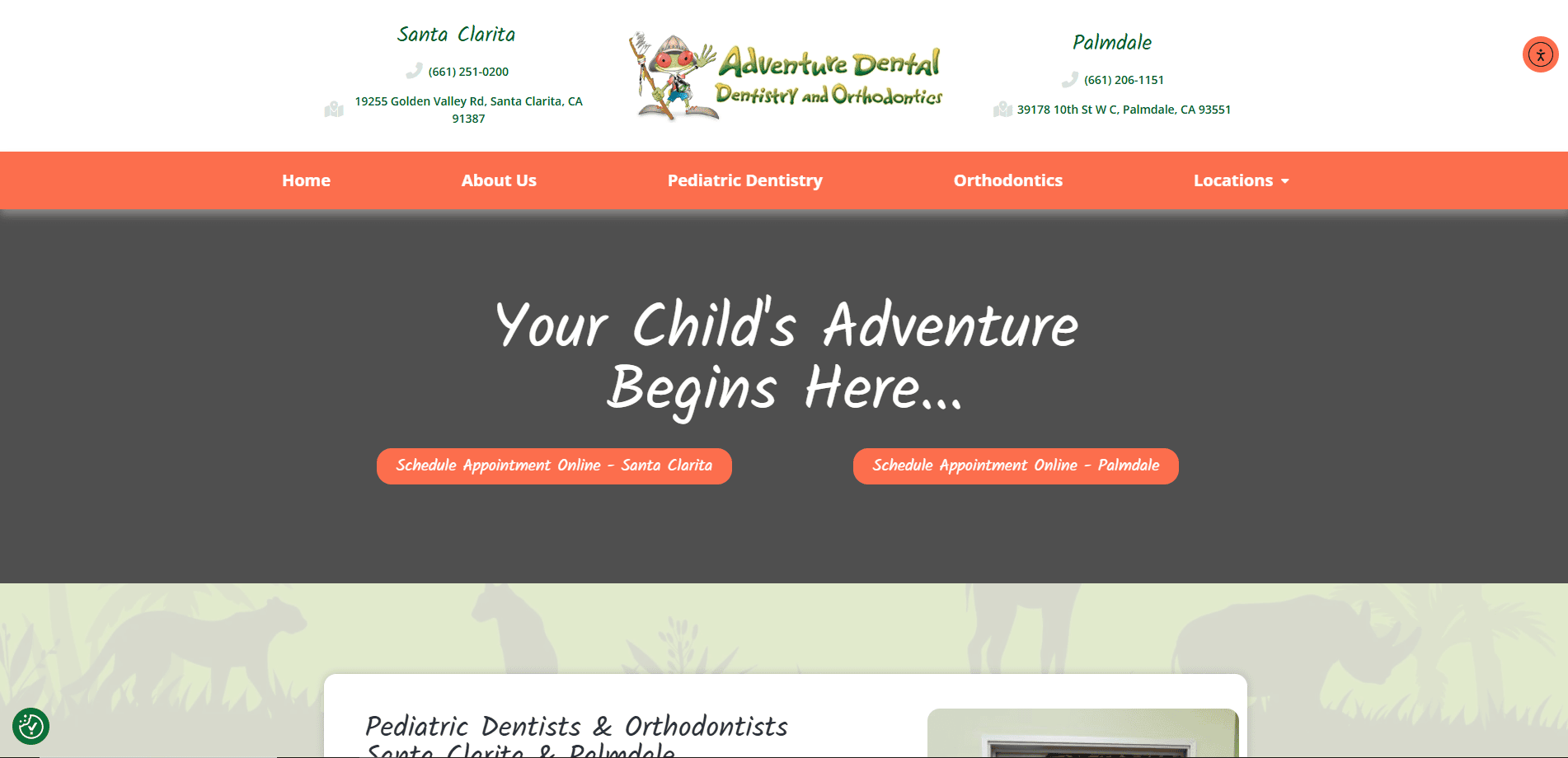
12. Adventure Pediatric Dentistry
Location City: Sacramento, CA
3 Key Takeaways:
- Bold & Adventurous Theme: The “adventure” theme is creative and well-executed with fun visuals and copy, making dentistry seem exciting rather than scary.
- Strong Visual Hierarchy: The use of size, color, and placement guides the user’s eye directly to the most important elements on each page.
- Interactive New Patient Experience: The new patient section is designed as a step-by-step guide, walking parents through the process and what to expect.
13. PIP (Pediatricians of an Independent Practice)
Location City: Downers Grove, IL
3 Key Takeaways:
- Minimalist & Clean Aesthetic: The design is incredibly clean and uses white space effectively, resulting in a modern and professional feel.
- Focus on the “Independent Practice” Advantage: The website copy clearly articulates the benefits of choosing a smaller, independent practice, which is a strong, unique selling proposition.
- Provider-Centric Homepage: The homepage immediately introduces the doctors with friendly photos, emphasizing the personal nature of their care.
14. Austin’s First Steps
Location City: Austin, TX
3 Key Takeaways:
- Modern & Artistic Branding: The website uses unique illustrations and a sophisticated color palette that feels modern and aligns with the Austin city vibe.
- Clear Call-to-Action Buttons: High-contrast CTAs like “Become a New Patient” are strategically placed and easy to spot.
- Value-Driven Service Descriptions: The descriptions of services focus on the benefits and outcomes for the child and parent, not just the features.
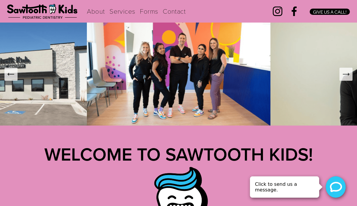
15. Sawtooth Pediatric Dentistry
Location City: Boise, ID
3 Key Takeaways:
- Nature-Inspired Visuals: The branding is inspired by the local Sawtooth Mountains, creating a unique identity that resonates with the local community.
- Excellent Use of Textures: The design incorporates subtle background textures that add depth and visual interest without being distracting.
- Patient Comfort Focus: The website content repeatedly emphasizes a commitment to patient comfort and a gentle approach, directly addressing a key parental concern.
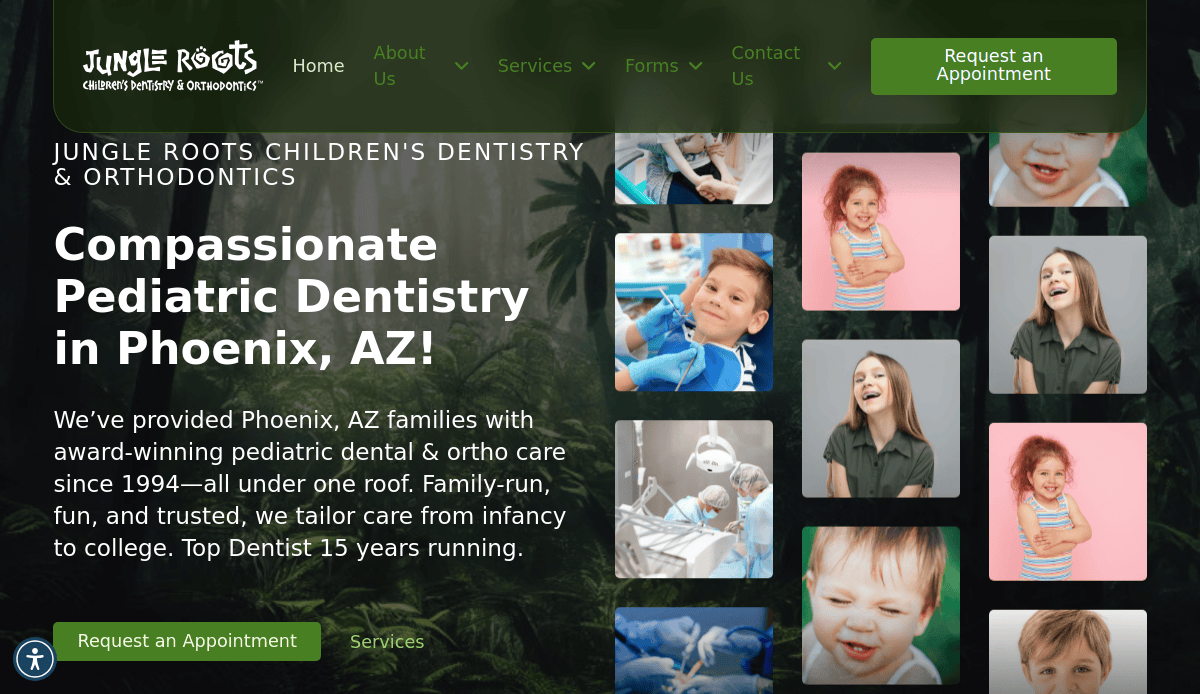
16. Jungle Roots Children’s Dentistry & Orthodontics
Location City: Gilbert, AZ
3 Key Takeaways:
- Immersive Jungle Theme: The theme is executed flawlessly across the entire site, from the visuals and language to the office photos, creating a fun, immersive experience.
- Dual Service Offering: The website does an excellent job of marketing both dentistry and orthodontics, with clear navigation paths for each service.
- Video Testimonials: Using video testimonials adds a powerful layer of authenticity and social proof.
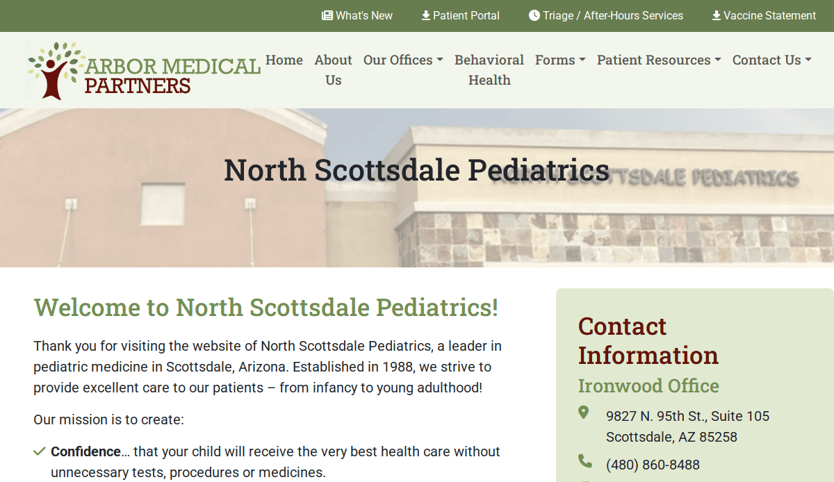
17. North Scottsdale Children’s Clinic
Location City: Scottsdale, AZ
3 Key Takeaways:
- Professional & High-End Feel: The design is clean, spacious, and has a premium feel that matches the target demographic of the Scottsdale area.\
- Efficient Online Scheduling: The site features a prominent and easy-to-use online scheduling tool directly on the homepage.
- Meet & Greet CTA: Offering a “complimentary meet & greet” is an excellent, low-pressure call-to-action for expectant or new parents.
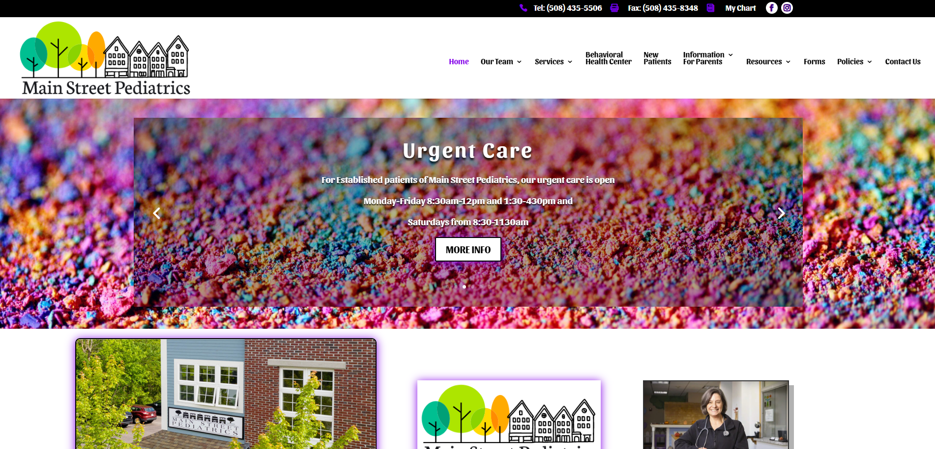
18. Main Street Pediatrics
Location City: Towson, MD
3 Key Takeaways:
- Community-Focused Messaging: The “Main Street” name and accompanying copy create a feeling of a friendly, local, community-based practice.
- Well-Organized “Patient Advice” Section: This section is neatly categorized, allowing parents to quickly find information on common illnesses, medications, and more.
- Simple & Accessible Design: The website avoids complex features and layouts, ensuring it is extremely easy to use for people of all technical skill levels.
19. Coast-to-Coast Children’s Dental World
Location City: Huntington, NY
3 Key Takeaways:
- Bright & Cheerful Atmosphere: The website uses a bright color palette and fun photos to create an overwhelmingly positive and cheerful first impression.
- “First Visit” Guide: A dedicated page for the “First Visit” clearly outlines what to expect, helping to prepare both parents and children.
- Strong Social Media Integration: The site features a live Instagram feed, which helps keep the content fresh and shows the practice’s personality.
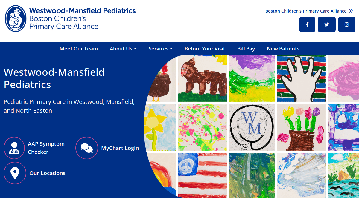
20. Westwood-Mansfield Pediatric Associates
Location City: Westwood, MA
3 Key Takeaways:
- Trustworthy & Established Tone: The design and content convey a sense of experience, stability, and long-standing community trust.
- Comprehensive Policy Information: The website provides detailed information on financial, appointment, and referral policies, which helps manage patient expectations.
- Clear Separation of Locations: For a practice with multiple offices, the website provides distinct sections and contact information for each, preventing confusion.
Turn Your Digital Presence into Your Greatest Asset
Your pediatric practice’s website is the core of your digital marketing strategy and a direct reflection of your commitment to quality of care. A custom, well-designed website built on SEO best practices ensures that when parents are in the critical process of choosing a pediatrician, your independent pediatric practice stands out. By investing in strategic site design, you create a platform that supports your current patients and works tirelessly to attract more. It’s the most effective way to showcase your services, provide crucial patient education, and build a foundation of trust with prospective patients before they ever step into your pediatric clinic.
Staying ahead in the competitive field of pediatric healthcare means keeping your digital front door modern and effective. As technology evolves, so do the expectations of the families you serve. Ensuring your website looks and functions at a high level requires an awareness of what’s next.
If you’re ready to build the best website for your pediatric practice and elevate your online presence, then let’s work together to create a website that truly serves your practice. Contact us today to speak with an expert web designer about your website needs and begin building a custom site that delivers results.
Common Questions & Concerns About Pediatric Web Design
How much does it cost to build a website?
The cost to build a website varies widely based on the scope of the project. A simple site will cost less than a large, custom website with extensive features like patient portal integration and online booking. Key factors that influence price include the complexity of the site design, the amount of content and website copy that needs to be created, and the level of search engine optimization required.
What are the most important features for a pediatric practice website?
The best sites in the industry balance a welcoming design with powerful functionality. The most critical features include:
- A prominent display of your contact information and location.
- Easy-to-find doctor bios and information about your pediatric care philosophy.
- A secure patient portal login.
- Online appointment request forms.
- A resource center with new patient forms, insurance information, and patient education materials.
- A mobile-first, responsive website design that works flawlessly on all devices.
How can I make sure my website shows up on Google?
Making sure your website appears in search results requires a dedicated strategy for search engine optimization (SEO). This process involves several layers. It starts with a technically sound, well-designed website. It also includes creating high-quality website content that answers questions related to child health, and optimizing your site for local searches so families in your area can find you. For a comprehensive approach, many practices use ongoing digital marketing services.
What kind of content should I include on my practice’s site?
Your website content should be created to build trust and provide value to parents. Beyond the basic pages (Home, About, Services, Contact), the most effective content includes detailed doctor bios, clear descriptions of your pediatric services, answers to common health questions, and a blog with articles relevant to your community. High-quality website copy is essential for both patient education and marketing for pediatricians.
Why is having a “responsive design” so important for pediatric doctors?
An adaptive design is critical because the vast majority of parents will access your site from a smartphone. Without this nuance, a site is difficult to read and navigate on a small screen, creating a frustrating experience. A strong site design automatically adjusts to fit any device—from desktops to tablets to phones—providing a seamless and positive experience for every user. For more information on foundational principles, you can review our guide on the core principles of web design.


