Just looking for our Best Interior Designer Website examples list?
As an interior designer, you are an expert in transformation. You understand that the right combination of texture, color, and light doesn’t just create a beautiful room—it creates a feeling. It shapes experiences, improves functionality, and brings a client’s vision to life. But what happens when that client’s first impression of your work isn’t a physical space, but a digital one? In this market, your website is your new showroom, your business card, and your most powerful client-facing tool, all in one.
For years, the standard advice has been simple: have a beautiful online portfolio. And while a stunning display of your work is non-negotiable, it’s also just the beginning. A pretty website that doesn’t attract your ideal client, streamline your process, or build your brand is like a perfectly designed room that no one ever gets to live in. It’s a missed opportunity.
This guide moves beyond the basics. We’re not just going to show you how to create a beautiful website; we’re going to give you the blueprint to build a high-performing digital engine for your business. We will show you how to transform your website from a static portfolio into a dynamic client magnet—a hub that saves you time, enhances your professional image, and directly impacts your bottom line. It’s time to build a website that works as hard and as intelligently as you do.
Website Planning & Purpose: The Blueprint for Your Digital Studio
Every successful interior design project begins with a blueprint. You would never order custom furniture or tear down a wall without a detailed plan that aligns with your client’s vision and functional needs. The same rigorous, strategic approach is essential when building your website. The planning phase is where you translate your brand identity and business objectives into a digital strategy, ensuring that the final product is beautiful and a powerful, purpose-driven asset. For an interior designer, this means defining precisely what you need your digital studio to do for your business.
Defining Your Website’s Core Purpose: Beyond the Portfolio
The first question to answer isn’t “What will my website look like?” but rather, “What is its primary job?” While showcasing your portfolio is a key function, it is not the sole purpose. Your goal is to move from a passive online brochure to an active business tool. Consider what role you need your website to play:
- Is it a lead generation machine? Its main purpose is to attract and capture the contact information of prospective clients who fit your ideal project profile.
- Is it a brand authority platform? The goal is to establish your expertise and unique design philosophy through insightful blog content, case studies, and press features, making you the go-to designer in your niche.
- Is it an operational hub? The primary aim is to streamline your client workflow, using integrated portals for onboarding, communication, and project management to save time and elevate the client experience.
Your core purpose will dictate every subsequent decision, from the features you need to the content you create. For most designers, the answer will be a combination of these, but identifying the top priority brings clarity to the entire project.
Identifying Your Ideal Client Avatar: Designing for “The One”
You don’t design for everyone; you design for a specific type of client. The same principle must be applied to your website. A site trying to appeal to both budget-conscious DIYers and high-end luxury clients will resonate with neither. Get granular in defining your ideal client avatar. Go beyond basic demographics and map out their psychographics:
- What are their biggest pain points?Are they overwhelmed by a renovation, short on time, or struggling to define their style? Your website’s messaging must speak directly to these problems.
- What does their dream home look and feel like?Understand their aesthetic aspirations. A client seeking minimalist, Scandinavian design will be drawn to a different website experience than one who loves bold, eclectic styles.
- Where do they look for inspiration?Do they spend their time on Pinterest, read Architectural Digest, or follow specific influencers? This informs your visual language and potential marketing channels.
When you design your website for this one specific person, your content, imagery, and calls-to-action will connect on a much deeper level, naturally attracting the clients you are most passionate about serving.
Setting SMART Goals for Your Website
With your purpose defined and your audience in focus, the final step in the planning phase is to set clear, measurable goals. This transforms your vision into an actionable plan and allows you to track what’s working. Use the SMART goal framework:
- Specific:Instead of “get more clients,” aim to “Increase qualified leads from high-end residential projects by 20%.”
- Measurable:How will you track this? “I will measure success through contact form submissions that specifically mention ‘full-service residential design’.”
- Achievable:Is your goal realistic based on your current marketing efforts and budget?
- Relevant:Does this goal directly support the overall purpose of your business?
- Time-bound:Set a deadline. “I will achieve this goal within six months of the new website launch.”
Examples of SMART goals for an interior designer’s website could include: “Reduce client email inquiries about project status by 50% within three months by directing them to a new client portal,” or “Secure five paid virtual consultations through the website’s new booking feature in the first quarter.” This level of clarity ensures your website is built with intention and held accountable for delivering tangible business results.
Design Principles: Translating Your Design Ethos into a Digital Experience
As an interior designer, you are already a master of design principles. You intuitively understand balance, rhythm, harmony, and scale. Creating an effective website requires applying this same expertise to a digital canvas. The goal is to build a user experience that looks professional and feels like a natural extension of your brand. It should communicate your unique design philosophy from the very first click, assuring potential clients that they are in the hands of a true expert.
Visual Hierarchy: Guiding the Eye with Intention
Just as you create a focal point in a room to draw the eye, a website must use visual hierarchy to guide the visitor’s attention. This principle involves arranging elements to signal their order of importance. Without a clear hierarchy, a webpage can feel chaotic and overwhelming, causing visitors to leave before they discover your best work.
- Size and Scale:The most important elements should be the largest. Your headline or a stunning hero image of your best project should dominate the top of the page. Lesser elements, like secondary text or contact details in the footer, should be smaller.
- Color and Contrast:Use your brand’s color palette strategically. A bright, contrasting color should be reserved for critical calls-to-action (CTAs), like “Book a Consultation” or “View My Portfolio,” making them impossible to miss.
- White Space:In web design, white space (or negative space) is the ultimate luxury. It is the visual breathing room around your images, text, and other elements. Ample white space creates a sense of calm, sophistication, and focus, preventing visual clutter and allowing your portfolio images to truly shine.
The Uncompromising Power of High-Quality Visuals
For an interior designer, photography is not just a component of the website; it isthe website. Your images are your product, your proof, and your most powerful selling tool. Grainy, poorly lit, or low-resolution photos can instantly devalue your work and undermine your credibility, no matter how exquisite the design is in reality.
- Invest in Professional Photography:This is a non-negotiable business expense. A professional architectural or interior photographer knows how to capture the lighting, detail, and scale of a space in a way that an iPhone cannot replicate.
- Optimize for Speed:High-resolution images are large files that can slow your website down dramatically, leading to frustrated visitors. All images must be compressed and optimized for the web beforebeing uploaded. This ensures your site loads quickly without sacrificing visual quality.
- Tell a Cohesive Story:Your portfolio should not be a random assortment of pictures. Curate a gallery for each project that walks the visitor through the space, showcasing wide-angle shots for context, medium shots for furniture arrangements, and detailed close-ups of textures, materials, and custom finishes.
Brand Consistency: Creating a Seamless Digital Identity
Your website is a critical touchpoint in your brand ecosystem. Its look and feel must be in perfect harmony with your other brand materials, from your business cards and social media profiles to your client proposals. Consistency builds brand recognition and reinforces your professionalism.
- Typography:Choose one or two font families that reflect your brand’s personality—perhaps a classic serif for elegance or a clean sans-serif for modernity—and use them consistently for headings and body text.
- Color Palette:Implement your brand’s color palette with precision. Your primary colors should feature prominently, while secondary accent colors are used for emphasis and CTAs.
- Logo Usage:Your logo should be placed in a consistent location on every page, typically the top-left corner of the header, and should link back to your homepage.
Intuitive User Experience (UX): The Beauty of Effortless Navigation
A stunning website is useless if visitors can’t find what they’re looking for. A great user experience (UX) is like the functional layout of a home—it feels so natural and intuitive that you don’t even notice it. The goal is to remove all friction between a visitor’s question and their answer.
- Simple, Clear Navigation:Your main menu should be uncluttered and use straightforward labels. Stick to standard terms like “About,” “Services,” “Portfolio,” and “Contact.” Avoid trendy or vague labels that could confuse visitors.
- Logical Flow:A user should be able to land on your homepage, view your portfolio, understand your services, and find your contact information in just a few clicks. The path should be logical and effortless.
- Mobile-First Design:Today, the majority of your website visitors will likely be on a mobile device. Your website must be designed to be fully responsive, meaning it automatically adjusts to look and function perfectly on all screen sizes, from a large desktop monitor to a smartphone.
Content & Navigation: Structuring Your Digital Studio for Clarity and Impact
Once you have established your design principles, the next step is to structure your website’s content and navigation. Think of this as creating the floor plan for your digital studio. A logical structure ensures that potential clients can move through your site effortlessly, finding exactly what they need at every turn. The goal is to create a clear, intuitive path from initial discovery to a confident inquiry, showcasing your professionalism and thoughtful approach along the way.
The Core Pages: Your Website’s Foundation
While every design business is unique, a set of core pages forms the essential foundation of a successful website. Each page serves a distinct, strategic purpose in telling your brand story and guiding visitors toward becoming clients.
- Homepage:This is your digital front door and reception area. It must immediately answer three questions: Who are you? What do you do? And who do you do it for? It should feature a compelling headline, a stunning hero image of your best work, brief introductions to your services and philosophy, and clear calls-to-action that direct visitors to the most important sections of your site, like your portfolio or services page.
- About Page:This is where you build a personal connection. Go beyond a dry resume. Tell the story of why you became a designer, articulate your unique design philosophy, and share the values that drive your process. Including a professional headshot or even a short video introduction can make your brand significantly more relatable and build trust.
- Services Page:This page pre-qualifies your leads. Clearly outline the services you offer (e.g., Full-Service Design, E-Design, Consultation). Crucially, describe your design process in stages. A visual timeline that walks a client from initial consultation to final installation demystifies your work, manages expectations, and demonstrates the immense value you provide.
- Portfolio/Projects Page:As the heart of your website, this section deserves its own detailed approach (see below). It is the ultimate proof of your capabilities.
- Blog/Journal:This is your platform for establishing authority. Regularly updated content about your projects, design tips, or industry trends positions you as an expert and is incredibly valuable for SEO, helping ideal clients find you through search engines.
- Contact Page:Make it as easy as possible for a qualified lead to get in touch. Include a simple contact form, your business email address, and phone number. Consider embedding a scheduling tool for booking initial consultations directly, which can streamline your intake process.
Crafting Your Portfolio for Maximum Impact
Your portfolio should be more than a gallery of pretty pictures; it should be a collection of compelling success stories. Each project you feature is an opportunity to demonstrate not just your aesthetic talent but also your problem-solving skills.
- The Case Study Approach:Structure each project as a mini-case study. Start with a brief project title and location. Describe “The Challenge” or the client’s initial problem. Explain “The Solution” or your design approach. Finally, display “The Result” with a stunning gallery of professional “after” photos. Including a client testimonial on each project page adds a powerful layer of social proof.
- Filtered Navigation:If you have a large body of work, enable visitors to filter your projects. Common filters include Room Type (Kitchen, Living Room, Master Bedroom), Style (Modern, Traditional, Eclectic), or Project Scope (New Build, Renovation). This allows potential customers to quickly find examples most relevant to their own needs.
Designing Intuitive Navigation: The Art of the Effortless Journey
Your website’s navigation is the framework that holds everything together. If visitors are confused or can’t find what they are looking for, they will leave. The best navigation feels invisible—it’s so intuitive that the user doesn’t even have to think about it.
- Keep Your Main Menu Simple:Resist the urge to clutter your main navigation bar. Limit it to 5-7 essential items. A typical menu for an interior designer should be: Home | About | Services | Portfolio | Blog | Contact.
- Use Clear and Common Labels:Now is not the time for creative jargon. Use straightforward terms that everyone understands. Label your portfolio “Portfolio” or “Projects,” not “Creations” or “Visionary Spaces.”
- Prominent Call-to-Action (CTA):Your most important action, such as “Book a Consultation” or “Get in Touch,” should be visually distinct from the other menu items. Often styled as a button with a contrasting color, it should be consistently visible in the header.
- The Footer as a “Fat Footer”:The footer at the bottom of your website is a secondary navigation tool. Use it to include links to less critical but still important pages, such as an FAQ, press mentions, your social media profiles, and detailed service location pages. This keeps your main navigation clean while still providing easy access to more information.
Visual Elements: Crafting Your Signature Brand Experience
For an interior designer, the visual experience is everything. Your clients hire you for your sophisticated eye and your ability to create a cohesive, beautiful environment. Your website must do the same. The visual elements—your photography, color palette, typography, and logo—are the building blocks of your digital brand identity. When used effectively, they work in harmony to support a seamless user experience, communicate your unique value proposition, and leave a lasting, professional impression on your ideal clients.
Photography and Videography: Your Most Valuable Asset
In the interior design industry, your portfolio photography is the cornerstone of your marketing. It is the most direct and powerful way to highlight the quality and style of your work. Sub-par visuals will undermine even the most spectacular designs.
- Invest in Professionalism:As emphasized before, professional architectural photography is a non-negotiable business expense. A skilled photographer can capture the light, scale, and detail of a space in a way that is impossible to replicate with a smartphone. This is the single most important visual element on your site.
- Curate a Dynamic Shot List:A rich visual story includes more than just wide shots of a room. Work with your photographer to capture a variety of images for each project: establishing wide shots, intimate vignettes of styled corners, close-ups on unique materials and textures, and detail shots of custom craftsmanship. This variety allows you to create visually engaging project pages and provides versatile content for social media and marketing.
- Embrace Videography:Video is a powerful tool for creating a personal connection and offering a more immersive experience. Consider adding a short, professionally produced “brand anthem” video on your homepage or about page to introduce yourself and your design philosophy. Project reveal videos, showing the transformation and capturing the client’s reaction, can be incredibly compelling and shareable content.
Color Palette: Evoking Emotion and Ensuring Consistency
Your understanding of color is one of your greatest strengths as a designer. On your website, your color palette serves as a powerful, non-verbal communication tool that reinforces your brand’s personality and guides the user’s eye.
- Translate Your Brand Style:Your website’s color scheme should be a direct reflection of your design aesthetic. A designer known for light, airy, coastal interiors might use a palette of soft whites, sandy beiges, and pale blues. A designer with a bold, modern style might opt for a monochrome palette with a single, vibrant accent color.
- The Power of a Neutral Foundation:Often, the most effective approach is to use a neutral background (like white, off-white, or a soft grey). This creates a gallery-like feel that allows the rich colors within your portfolio photos to take center stage without competing with the website’s design.
- Strategic Use of Accent Colors:Your boldest brand color should be reserved for actionable elements. Using a single, consistent accent color for all buttons, links, and calls-to-action (“View Project,” “Book a Consultation”) trains the user’s eye, making it immediately clear where they should click to move forward.
Typography: The Voice of Your Written Content
If your images are the visual story, your typography is the narrative voice. The fonts you choose have a distinct personality and play a major role in how your brand is perceived.
- Choose Fonts That Reflect Your Brand:Typography can instantly convey a feeling. Classic serif fonts (with small decorative strokes, like Times New Roman or Garamond) often feel more traditional, elegant, and established. Clean sans-serif fonts (without strokes, like Helvetica or Arial) tend to feel more modern, minimalist, and approachable. Select a font family that aligns with the brand you want to project.
- Limit Your Choices for Clarity:To maintain a professional and uncluttered look, limit yourself to a maximum of two font families. Use one distinct font for your headings and another, highly readable font for your body text. This creates a clear visual hierarchy and ensures your written content is easy and pleasant to read.
Logo and Brand Marks: The Signature of Your Digital Presence
Your logo is the most concise representation of your brand. It must be used consistently and professionally across your website to build recognition and anchor your visual identity.
- High-Resolution and Versatile:Ensure you have high-resolution versions of your logo suitable for all digital applications. This includes a full version for your website header and footer, as well as a simplified icon or “favicon” (the small icon that appears in a browser tab).
- Consistent Placement:Your logo should typically appear in the top-left corner of your website’s header on every page. This is standard web practice and provides a reliable “home” button for your visitors.
- Subtle Use of Brand Elements:Beyond the logo, consider using secondary brand marks, custom icons, or subtle patterns as section dividers or background textures. When used sparingly, these elements can add a layer of custom sophistication that elevates your site above generic templates.
Ongoing WordPress Maintenance: Protecting Your Digital Asset
Launching your new website is a significant milestone, but it is not the end of the project. Like a beautifully designed home, a website requires ongoing care to keep it secure, functional, and performing at its best. WordPress is a powerful and flexible platform, but its dynamic nature means it needs regular attention. For a busy interior designer, professional ongoing maintenance is not a technical chore; it is an essential business strategy to protect your investment, your reputation, and your ability to attract new clients.
Protecting Your Digital Asset: Security and Updates
The internet is constantly evolving, and so are the methods used by malicious actors. WordPress, along with its themes and plugins, receives regular updates that often include critical security patches to fix vulnerabilities.
- Core, Theme, and Plugin Updates:Running an outdated version of any part of your website is the single biggest security risk. Regular updates are your first line of defense, closing security loopholes as soon as they are identified by developers.
- Security Monitoring:Professional maintenance involves proactive security scanning to detect and block malware or suspicious activity. A hacked website can severely damage your brand’s reputation and lead to being blacklisted by Google, making your site invisible to potential clients.
Ensuring Peak Performance: Speed and User Experience
For an interior designer, a portfolio-heavy website must be fast and responsive. Potential customers browsing your stunning project photos will not wait for slow-loading images.
- Performance Optimization:Ongoing maintenance includes tasks like database optimization and image compression that keep your site running efficiently. This ensures that your pages load quickly, providing a smooth and professional user experience that keeps visitors engaged.
- Functionality Checks:Routine checks ensure that all features, especially your contact forms and consultation booking systems, are working correctly. A broken form is a lost lead, and consistent functionality reflects the same attention to detail you bring to your design projects.
Peace of Mind: Backups and Support
Despite all precautions, issues can still arise from a server error, a software conflict, or human error. A reliable backup strategy is the ultimate insurance policy for your digital presence.
- Regular, Off-Site Backups:Your entire website—files, database, images, and all content—should be backed up on a regular schedule and stored securely in a separate, off-site location. This means that in a worst-case scenario, a complete and recent version of your site can be restored quickly, minimizing any downtime or data loss.
- Dedicated Support:Having a professional maintenance plan provides access to expert support when you need it. Instead of spending hours trying to troubleshoot a technical problem, you have a dedicated partner to resolve issues efficiently, allowing you to focus on what you do best: designing incredible spaces for your clients.
Best Interior Designer Website Examples
As promised, here are 20 of the best interior design websites that effectively amplify brand identity, generate leads, and provide a stellar user experience.
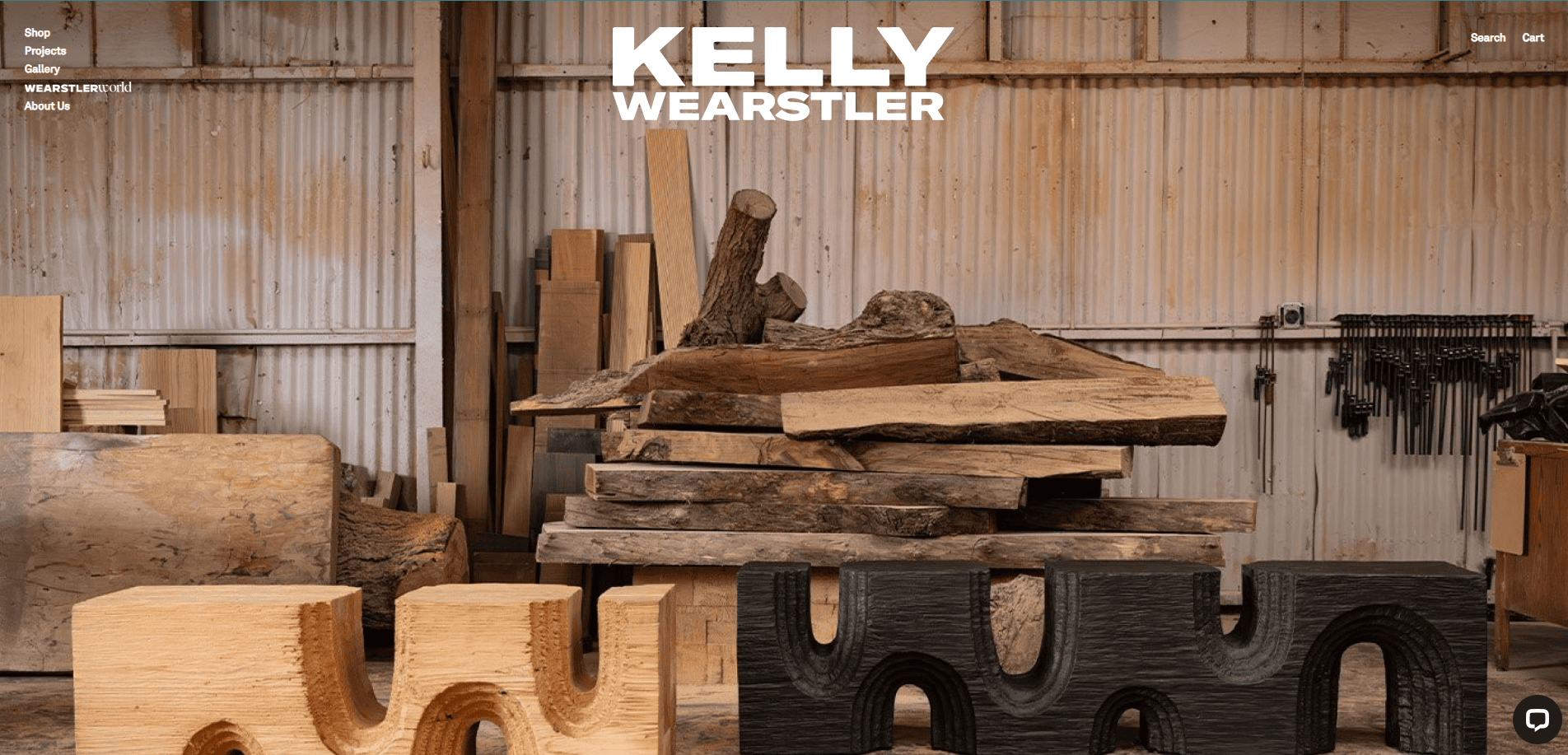
1. Kelly Wearstler
Location City:Los Angeles, CA
3 Key Takeaways:
- Immersive Visuals:The site uses full-screen, high-fashion photography that treats interior design as high art, immediately establishing a luxury brand.
- Integrated Commerce:Seamlessly blends a world-class portfolio with an e-commerce shop, allowing users to browse projects and purchase pieces in a unified experience.
- Minimalist Navigation:The clean, minimal navigation focuses the user’s attention entirely on the powerful visuals of her work.
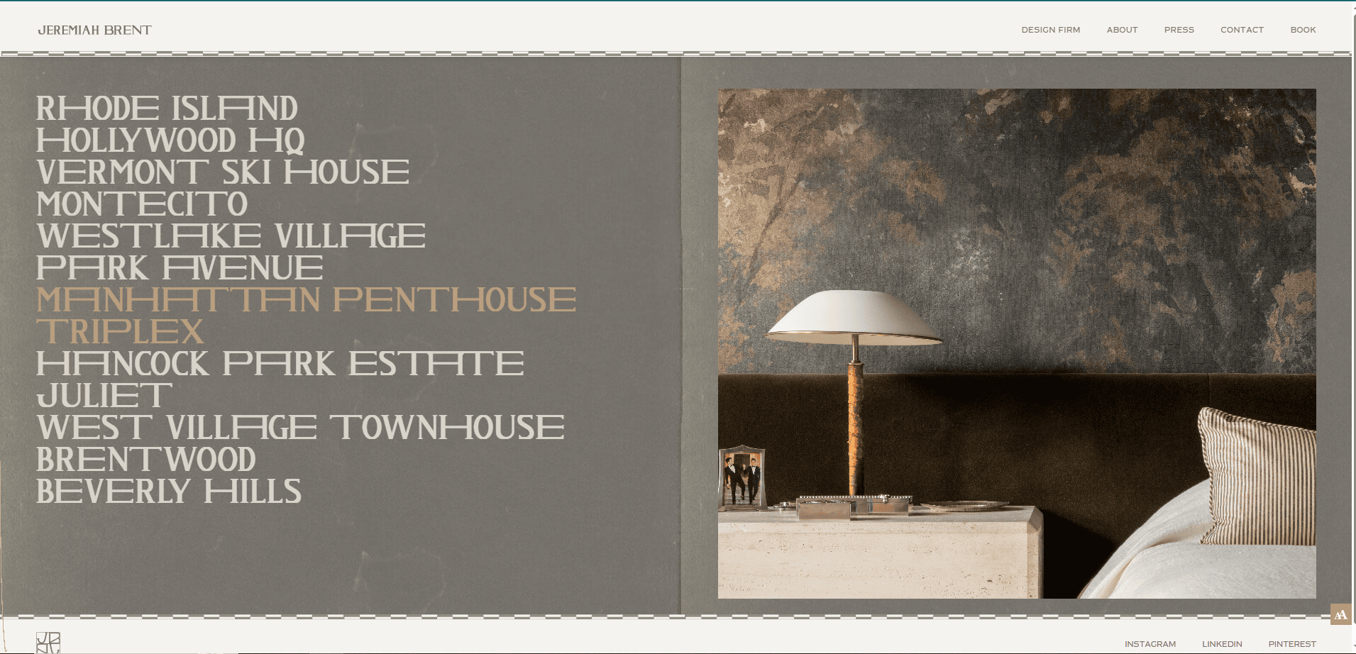
2. Jeremiah Brent
Location City:New York, NY
3 Key Takeaways:
- Strong Personal Brand:The website effectively centers Jeremiah Brent as the face of the brand, creating a personal connection and building trust.
- Editorial Content:Features a journal (“The Edit”) that provides value beyond an exhibit, positioning the firm as a tastemaker and lifestyle authority.
- Subtle Animations:Elegant and subtle animations on scroll and hover add a layer of sophistication and polish to the user experience.
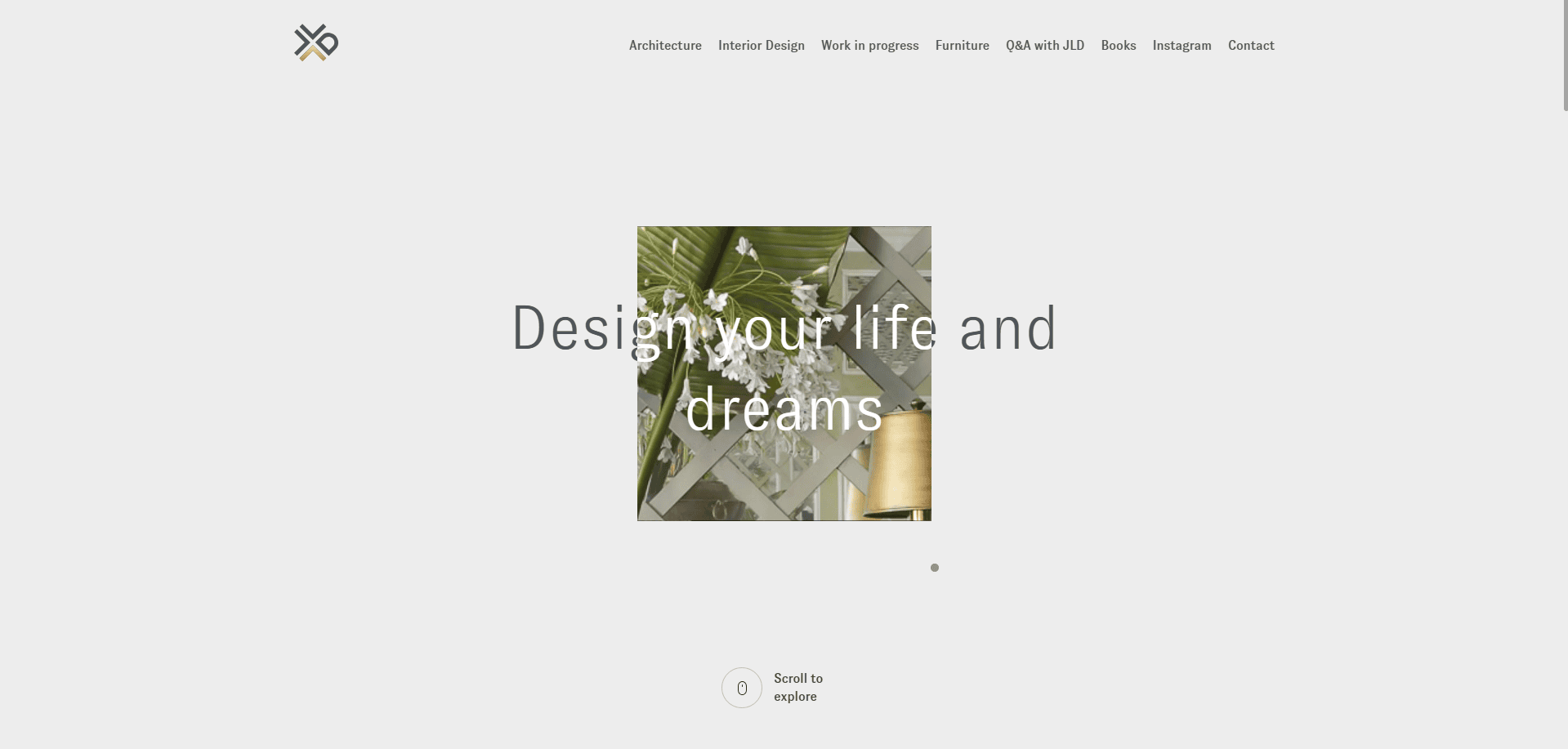
3. Jean-Louis Deniot
Location City:New York, NY
3 Key Takeaways:
- Architectural Grid Layout:The display uses a clean, structured grid that feels architectural and organized, reflecting the precision of his work.
- Atmospheric Photography:The visuals are less about bright, clinical shots and more about mood and atmosphere, conveying a sense of timeless elegance.
- Focus on Global Reach:The website clearly displays projects across the globe, establishing the firm as an international leader in luxury design.
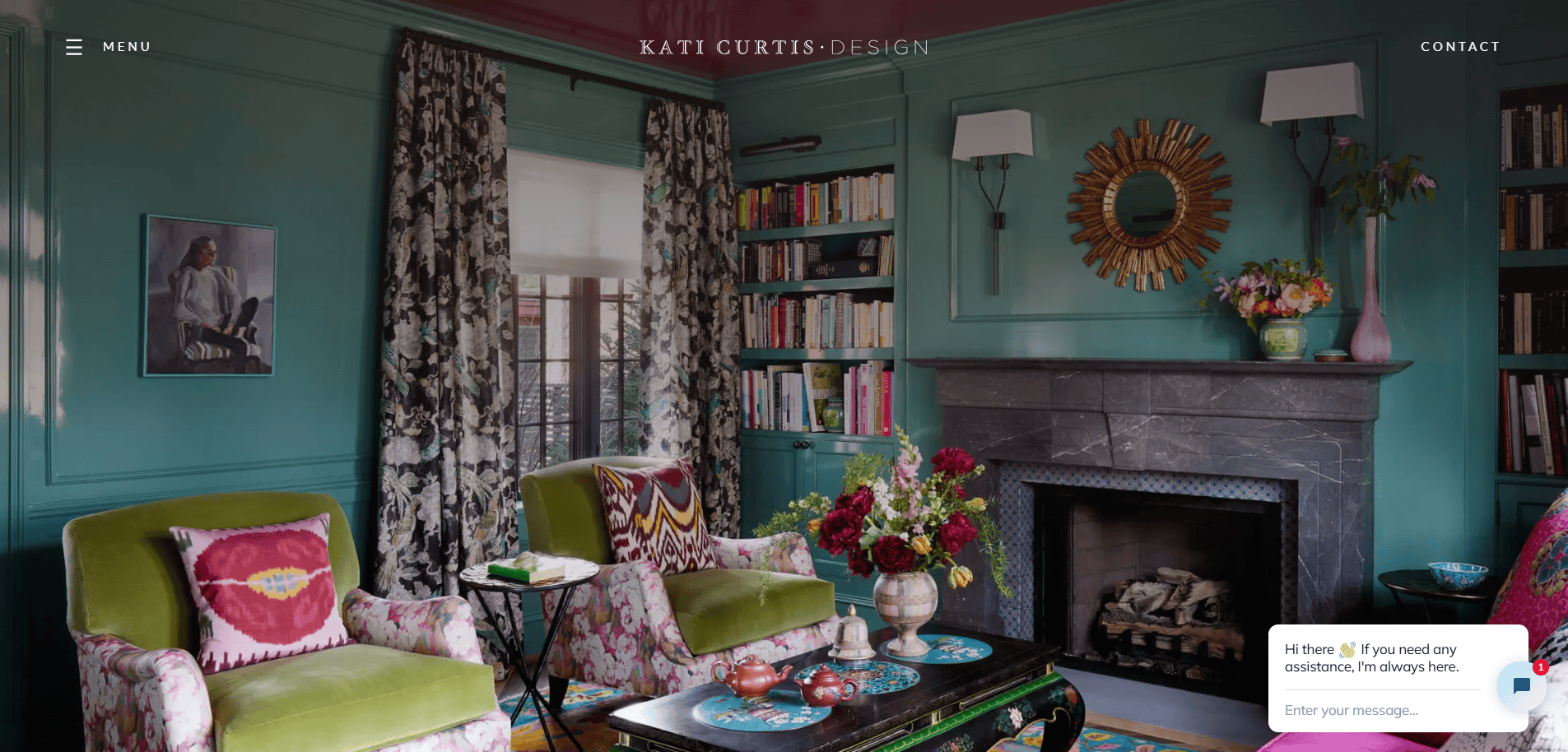
4. Kati Curtis Design
Location City:New York, NY
3 Key Takeaways:
- Excellent SEO Integration:The site ranks well for key terms due to a well-structured blog and project descriptions filled with relevant keywords.
- Clear “Process” Page:A dedicated page explaining their design process demystifies their services and sets clear expectations for potential clientele.
- Prominent Testimonials:Client testimonials are strategically placed to build immediate social proof and credibility.
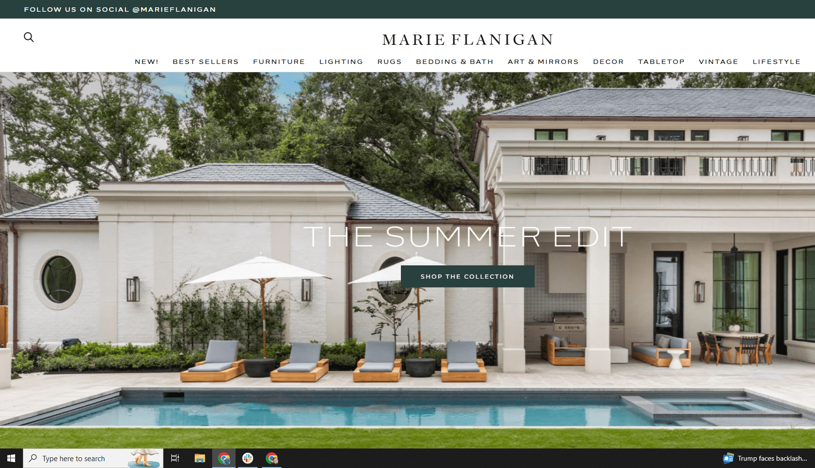
5. Marie Flanigan Interiors
Location City:Houston, TX
3 Key Takeaways:
- Warm and Inviting Tone:The use of soft colors, personal stories, and welcoming copy makes the brand feel approachable despite its high-end aesthetic.
- “The Journal” as a Content Hub:The blog is robust, with project reveals and design tips that drive traffic and establish authority.
- Intuitive Portfolio Filtering:Users can easily filter projects by room, which is a highly effective user experience feature for those looking for specific inspiration.
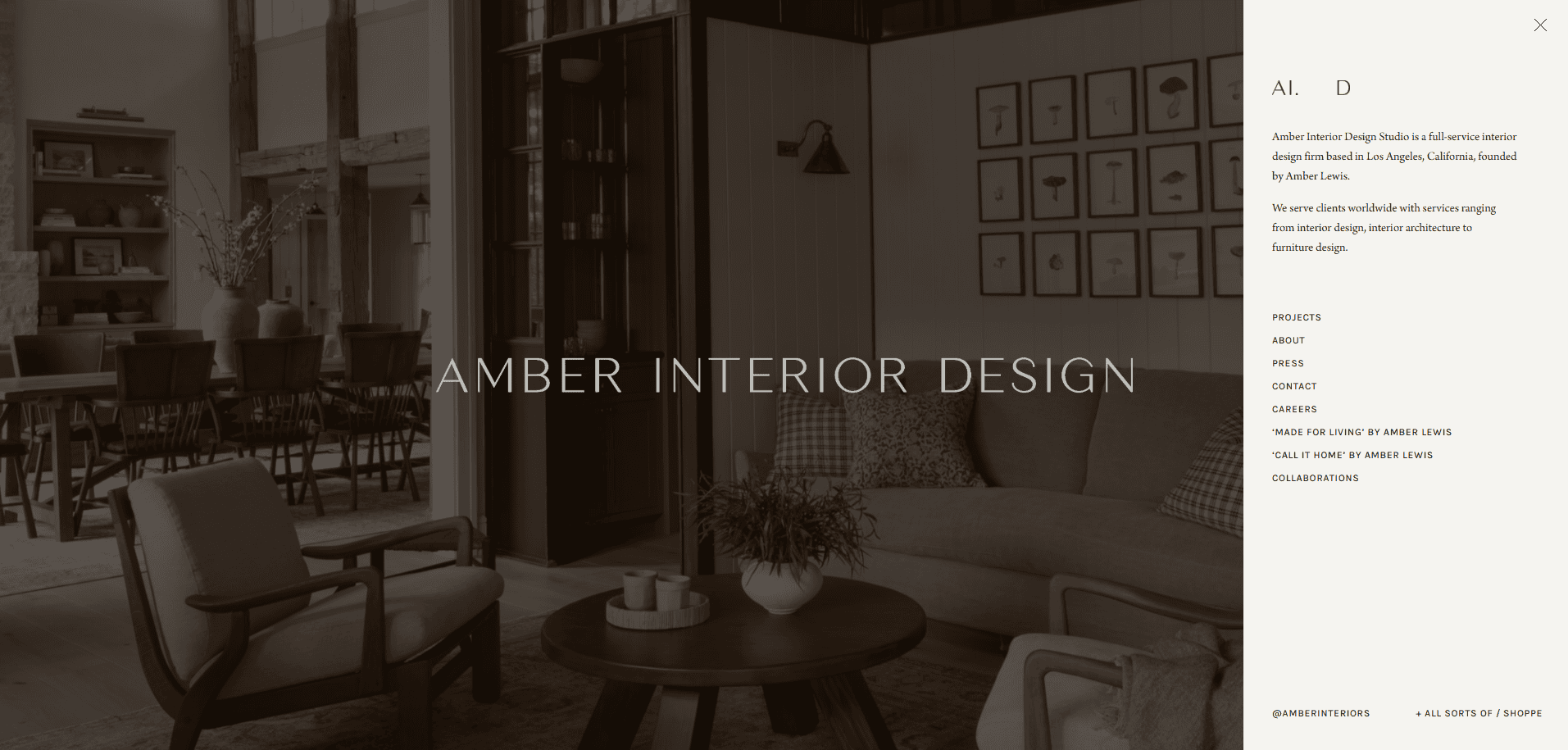
6. Amber Interiors
Location City:Calabasas, CA
3 Key Takeaways:
- Masterful Content & Commerce Blend:The site is a masterclass in integrating a design gallery, a popular blog, and a large-scale e-commerce shop into one cohesive brand experience.
- Signature Casual Luxury Aesthetic:The website’s design—from fonts to photo styling—perfectly captures the firm’s well-known “California cool” aesthetic.
- Strong Community Building:The prominent blog and newsletter sign-ups foster a strong sense of community and a loyal following.

7. Ryan Saghian
Location City:Los Angeles, CA
3 Key Takeaways:
- Bold, Confident Branding:The use of dramatic, high-contrast black and white design with bold typography makes a powerful and memorable statement.
- Video Integration:The site effectively uses video backgrounds and project videos to create a dynamic and immersive experience.
- Clear Luxury Positioning:Every element, from the language to the imagery, is geared toward a high-end, luxury client, leaving no ambiguity about the brand’s market position.
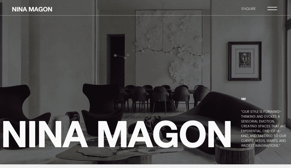
8. Nina Magon
Location City:Houston, TX
3 Key Takeaways:
- Interactive Homepage:The homepage features an engaging, interactive “hotspot” element on a hero image, inviting users to explore different facets of the firm’s work.
- Strong Press & Awards Section:A dedicated and visually impressive “Press” section immediately establishes credibility and industry recognition.
- Multi-faceted Business Showcase:Clearly delineates between interior design, architecture, and their product collection, showing the breadth of the firm’s expertise.
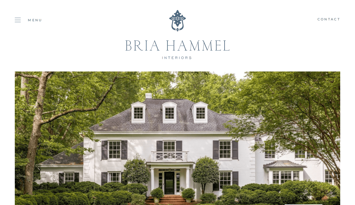
9. Bria Hammel Interiors
Location City:Mendota Heights, MN
3 Key Takeaways:
- Light & Airy Design:The website design itself is clean, bright, and airy, perfectly mirroring the aesthetic of the firm’s interior design work.
- Effective Lead Magnet:Offers a “Design Style” quiz as a lead magnet, which is an engaging way to capture emails and segment their audience.
- Shop Integration:The “Brooke & Lou” shop is well-integrated, providing an additional revenue stream and strengthening the brand’s lifestyle appeal.
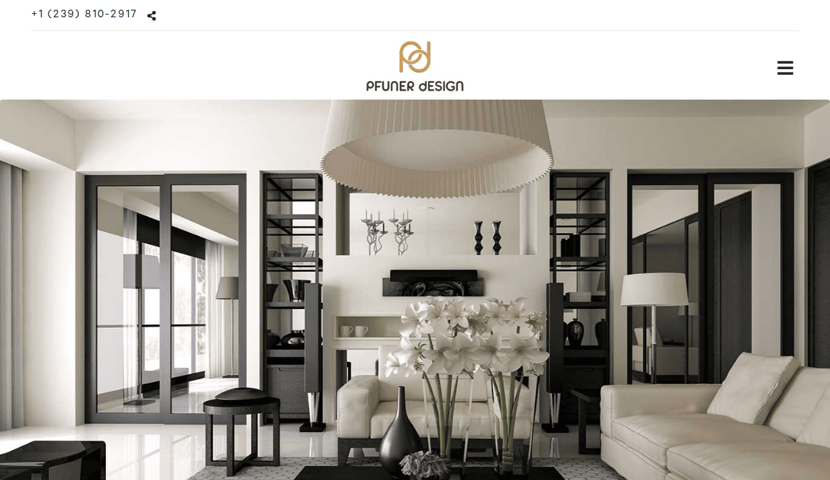
10. Pfuner Design
Location City:Miami, FL
3 Key Takeaways:
- Organized Content-Rich Homepage:The homepage successfully presents a large amount of information (services, gallery, about) in a clean, organized, and scannable format.
- Strong Use of White Space:Excellent use of white space prevents the content-rich pages from feeling cluttered and maintains a high-end feel.
- Clear Value Proposition:The copy clearly communicates the firm’s philosophy and its commitment to creating soulful, client-focused spaces.
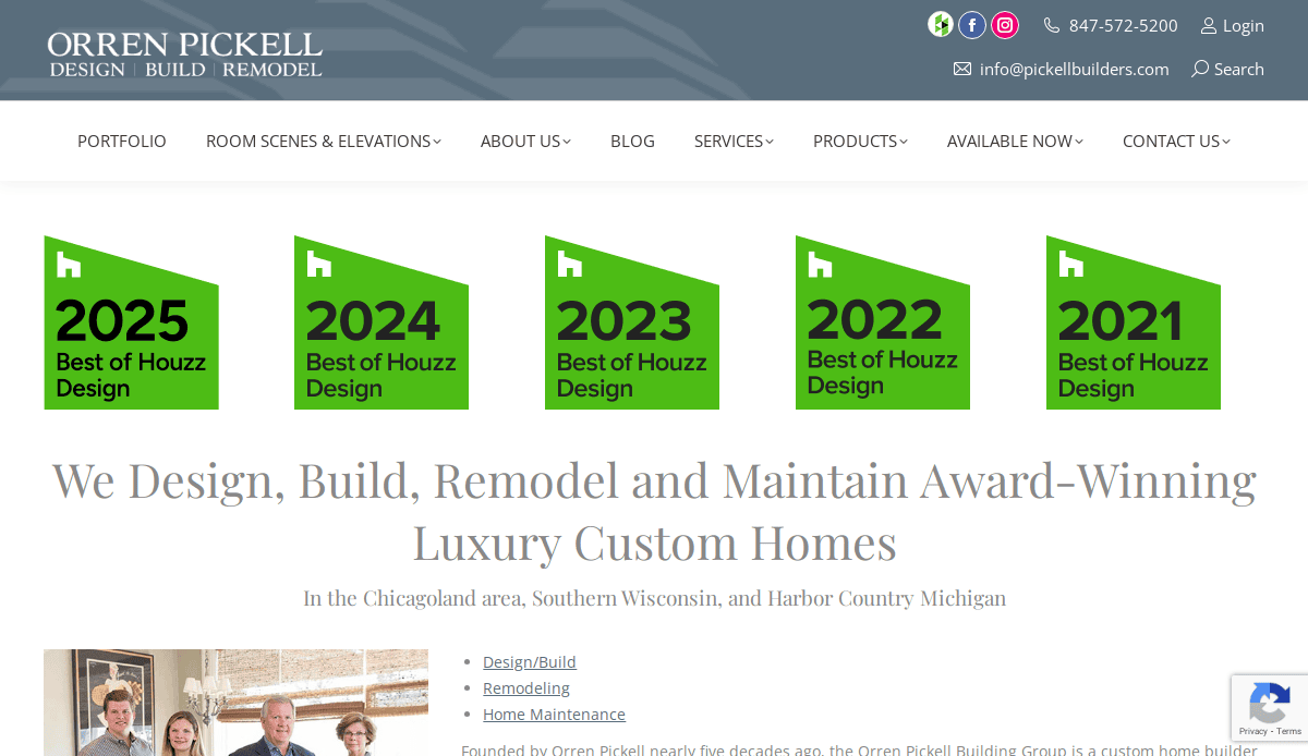
11. Orren Pickell Building Group
Location City:Northfield, IL
3 Key Takeaways:
- Hero Video Homepage:An immersive hero video immediately highlights the quality and luxury of their custom homes, creating a powerful first impression.
- Clear Navigation Funnel:The navigation is structured to guide users logically from viewing lookbooks to understanding their process and making contact.
- Strong “Why Us” Section:A dedicated “Why Pickell” section effectively communicates their value proposition, awards, and testimonials to build trust.
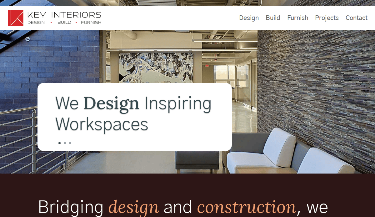
12. Key Interiors
Location City:Chicago, IL
3 Key Takeaways:
- Corporate & Professional Aesthetic:The clean lines, professional photography, and blue color palette perfectly match their focus on commercial and corporate interiors.
- Case Study-Driven Portfolio:The gallery is presented as detailed case studies, showcasing problem-solving skills and results for their B2B clientele.
- Clear Calls-to-Action:Strong, contrasting “Start a Project” CTAs are placed strategically throughout the site to drive lead generation.

13. Michael Menn
Location City:Northbrook, IL
3 Key Takeaways:
- Trust-Building Elements:The site prominently features awards, affiliations (NARI, AIA), and testimonials to build immediate credibility in the remodeling and design space.
- Service-Specific Pages:Dedicated landing pages for different services (Architectural, Remodeling, New Construction) allow for targeted messaging and improved SEO.
- Educational Blog:The blog provides real value and answers common client questions, positioning the firm as a helpful expert.

14. Nicholas Design Collaborative
Location City:Northfield, IL
3 Key Takeaways:
- Focus on Collaboration:The branding and copy (“Collaborative”) emphasize their team-based approach, which is a key differentiator for clients looking for a partner.
- High-Impact Image Galleries:The web pages use large, beautiful images with minimal text, letting the quality of the architectural and design work speak for itself.
- Clean and Timeless Design:The website’s design is classic and uncluttered, reflecting a sophisticated and enduring approach to architecture and design.
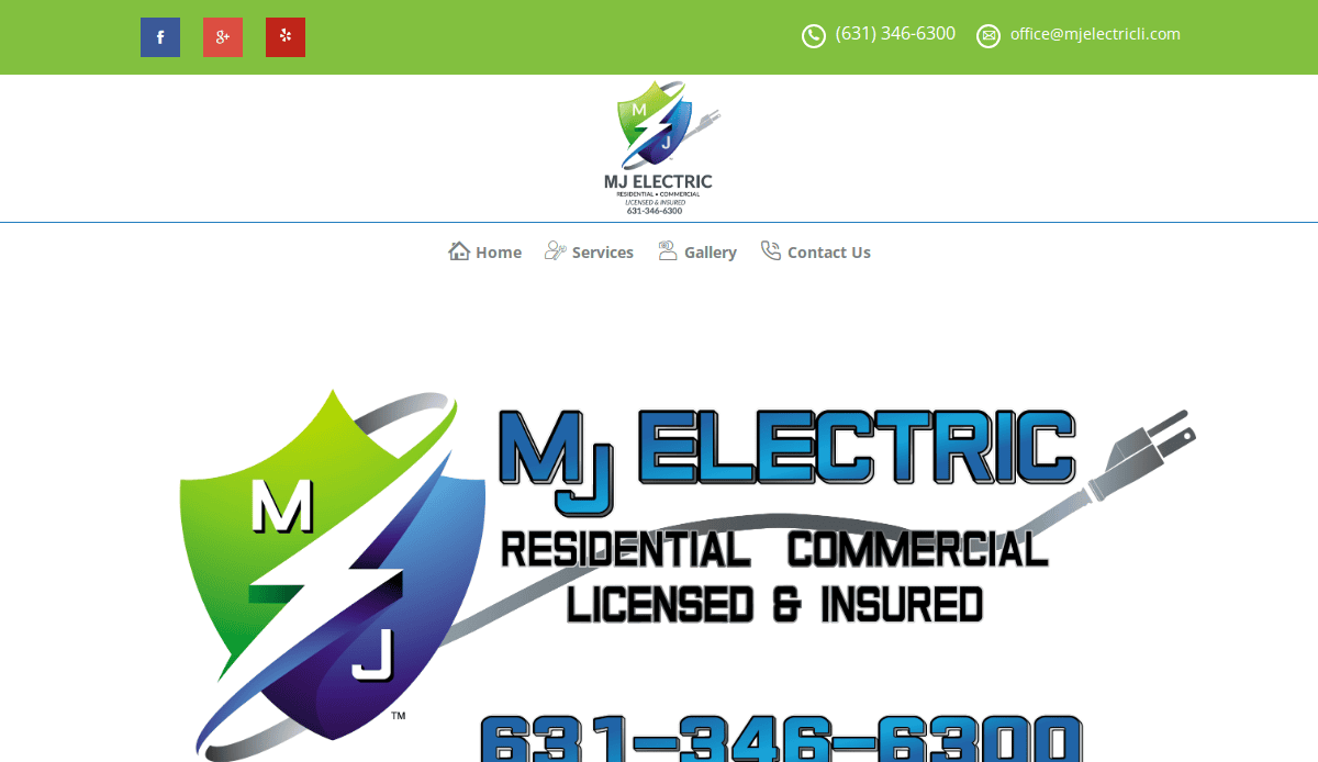
15. M. J. Electrical & Construction
Location City:Bensenville, IL
3 Key Takeaways:
- Clear Service Differentiation:The website does an excellent job of clearly separating its residential and commercial services, guiding different user types effectively.
- Action-Oriented Language:The copy is direct and action-oriented, focused on solutions and capabilities, which appeals to clients looking for a reliable contractor.
- Streamlined User Experience:The site is easy to navigate with a simple structure, ensuring potential customers can quickly find service information and contact details.
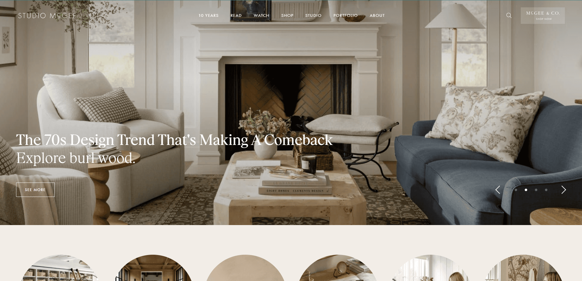
16. Studio McGee
Location City:Draper, UT
3 Key Takeaways:
- Impeccable Brand Cohesion:The website seamlessly integrates their design services, a massive e-commerce brand (McGee & Co.), and their media presence (Netflix show) into one cohesive, recognizable brand.
- Educational Content:Their blog and “How-To” guides provide immense value, teaching design principles to their audience, which builds trust and authority.
- “Before & After” Sliders:The use of interactive before-and-after sliders in their gallery is a highly effective and satisfying way to amplify the transformative power of their work.
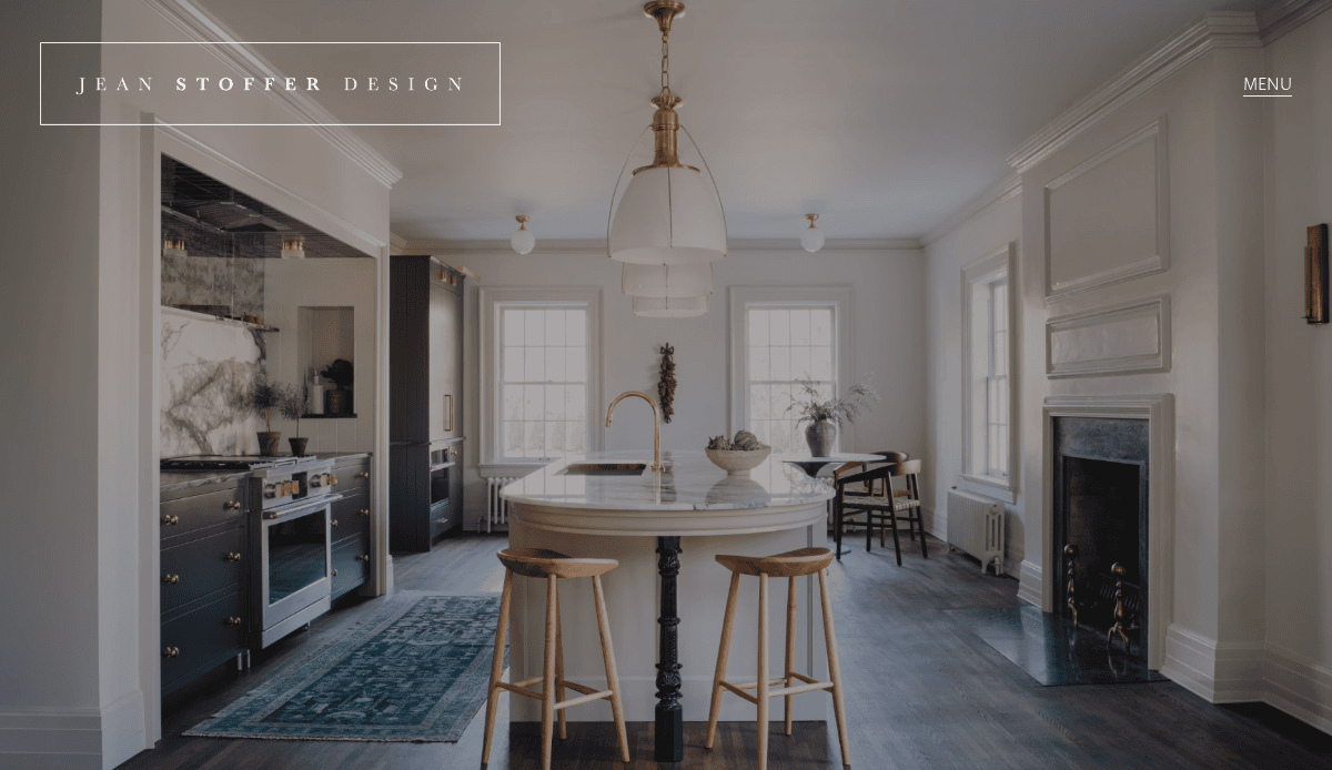
17. Jean Stoffer Design
Location City:Grand Rapids, MI
3 Key Takeaways:
- Focus on Timeless Elegance:The website design uses a clean, classic layout with a soft color palette that perfectly reflects Jean’s signature timeless and sophisticated design style.
- Integrated Product Lines:The site effectively promotes Stoffer Home’s complementary businesses, including their own cabinetry line and a curated home goods shop.
- High-Quality, Detailed Imagery:The portfolio is filled with crisp, well-lit images that allow users to zoom in and appreciate the fine details and craftsmanship in every project.
18. Drake/Anderson
Location City:New York, NY
3 Key Takeaways:
- Luxury Editorial Feel:The website presents projects like a high-end magazine spread, using large, dramatic photos and sophisticated typography to create a feeling of exclusivity.
- Emphasis on Press:A visually prominent and extensive “Press” section immediately establishes the firm as a celebrated, leading authority in the luxury design space.
- Simplified Navigation:By keeping the navigation menu extremely minimal, the user’s focus is directed entirely toward the stunning body of work.

19. HOK
Location City:New York, NY (and other global offices)
3 Key Takeaways:
- Global Firm Authority:The site effectively communicates the firm’s massive scale and multidisciplinary expertise (architecture, engineering, interior design) for a global corporate audience.
- Thought Leadership Content:A dedicated “Ideas” section features in-depth research and reports, positioning HOK as forward-thinking leaders shaping the future of design.
- Market-Specific Portfolios:Users can easily filter projects by industry (e.g., Aviation, Healthcare, Hospitality), making it highly relevant for their diverse B2B client base.
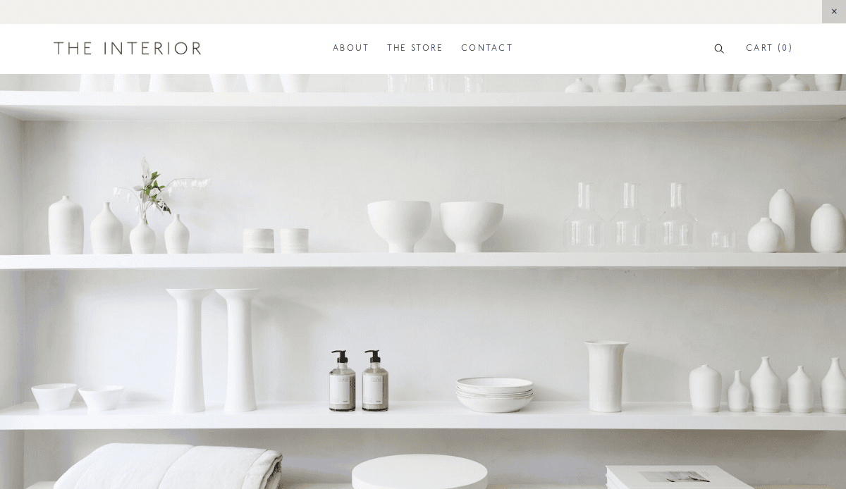
20. The Interior
Location City:New York, NY
3 Key Takeaways:
- Bold, Modern Branding:The use of a vibrant accent color, modern sans-serif fonts, and a clean grid creates a fresh, energetic, and contemporary brand identity.
- Clear and Concise Copy:The website avoids jargon and uses direct, easy-to-understand language to describe its process and services, making it very user-friendly.
- Strong Call to Action:A persistent “Start Your Project” button in the navigation bar ensures that a potential lead is never more than one click away from making contact.
Ready to Build Your Ultimate Designer Website?
You now have the blueprint from this ultimate guide to transform your online presence. For any interior design business, creating a professional website is the single most important step to growth. It’s more than just a digital design gallery; a truly effective interior design website works for you, helping to increase traffic and perfectly convey your design style to high-value clients. Don’t let your designer website be a passive gallery. Instead, build a powerful tool that reflects the quality of your work and elevates your entire brand.
If you’re ready to create an interior designer website that looks stunning and delivers results, our team is here to help. Request Your Free Consultation Today
Webmaster for Interior Design Sites FAQs
What are the absolute must-have pages for an interior designer website?
For every interior designer, a successful business website has a core structure designed to build trust and guide visitors. Your website needs to go beyond a simple landing page. The essential pages include: a Home Page that serves as a stunning first impression and directory; an About or Team Page to introduce the people and philosophy behind your interior design firm; a Services page that clearly outlines what you offer and for whom; and a Contact page that makes inquiries effortless.
Above all, the most critical section is your Portfolio Page. This is where you highlight your best interior design work. Each of these pages plays a vital role in the user journey from the moment someone enters your website. For a deeper dive into structuring these pages effectively, our Website Organization Guideprovides a detailed framework.
How can I make my interior design portfolio more effective at attracting high-end clients?
To attract a high-end interior clientele, your interior design portfolio must do more than just show pictures—it must tell a story. While high-quality images are non-negotiable for creating a visually stunning website, the context you provide is what elevates your work. Instead of a simple gallery, structure each project with story-like images and content. Describe the client’s initial challenge, your unique design process, and the final transformation.
Incorporate various design elements in your descriptions to highlight your expertise in creating, for example, a luxury design or a specific rustic design. This case-study approach gives depth to your work and demonstrates value beyond aesthetics. You can see more examples of interior design best practices in our 3 Web Design Tips for Interior Designers.
Should I use a DIY website builder or hire a professional for my interior design studio’s website?
While a DIY website builder can seem like a cost-effective way to create a website, an established interior design studio or a designer focused on growth should consider the limitations. To effectively promote your interior design business and build a brand, a generic template may not suffice. A professional agency ensures you can make sure your website is unique, scalable, and technically optimized to increase traffic.
For professionals whose brand image is paramount, much like those in our remodelling company website designportfolio, a professional website is a critical business asset. It allows for custom features like client portals, advanced SEO strategies, and a flawless user experience that reflects the high standards of your work as an interior designer.


