Data tells stories your audience needs to hear. Charts and graphs transform complex numbers into clear visual insights that capture attention and improve understanding. Finding the right WordPress chart plugin makes all the difference in how effectively you communicate your data.
We’ve tested dozens of visualization tools to identify the most powerful, user-friendly options for WordPress websites. Our analysis focuses on plugins that balance robust features with ease of use.
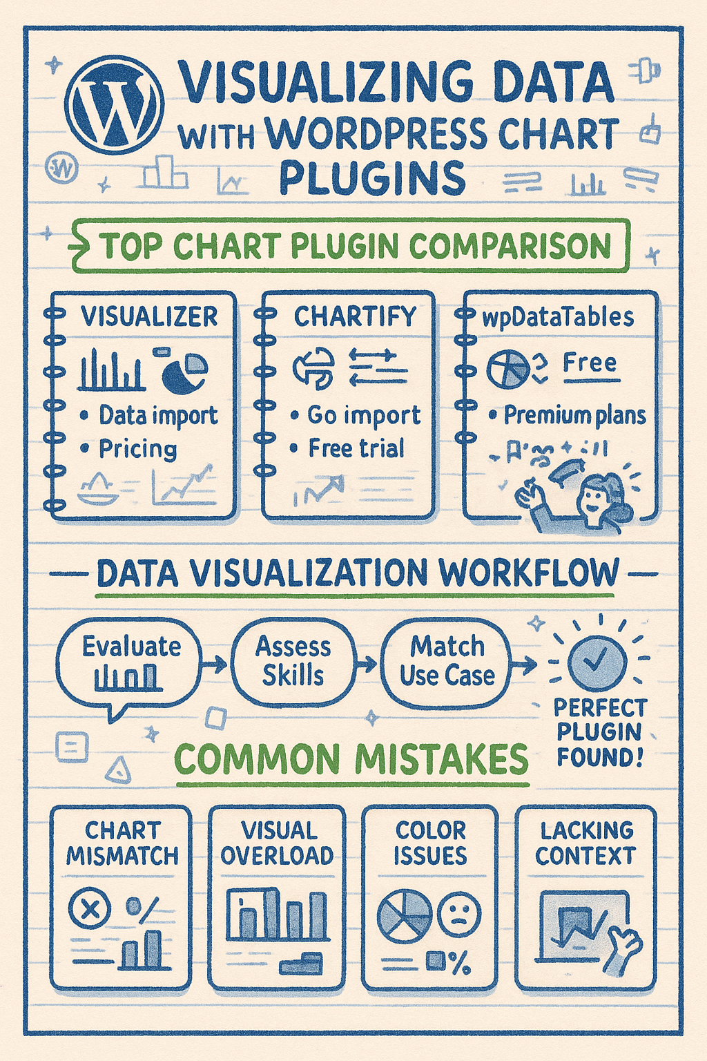
This guide examines the top three WordPress chart plugins that stand out in 2025. We’ll compare their features, explore their strengths, and help you choose the right one for your specific needs.
The Importance of Data Visualization for WordPress Websites
Data visualization transforms complex information into accessible insights. When website visitors encounter raw data, they often struggle to draw meaningful conclusions. Charts and graphs make patterns and trends immediately apparent.
We’ve found that websites using effective data visualizations keep visitors engaged longer. People process visual information 60,000 times faster than text. This speed of comprehension makes charts powerful for conveying complex messages quickly.
WordPress sites benefit particularly from good visualization tools. Whether you’re running a business site, an educational platform, or a data-heavy blog, charts help your audience grasp key points faster. They also add visual interest to text-heavy pages.
The right chart plugin does more than display numbers. It tells stories, supports arguments, and helps visitors understand complex relationships at a glance. This visual clarity can significantly impact how well your content achieves its goals.
Key Features to Look for in WordPress Chart Plugins
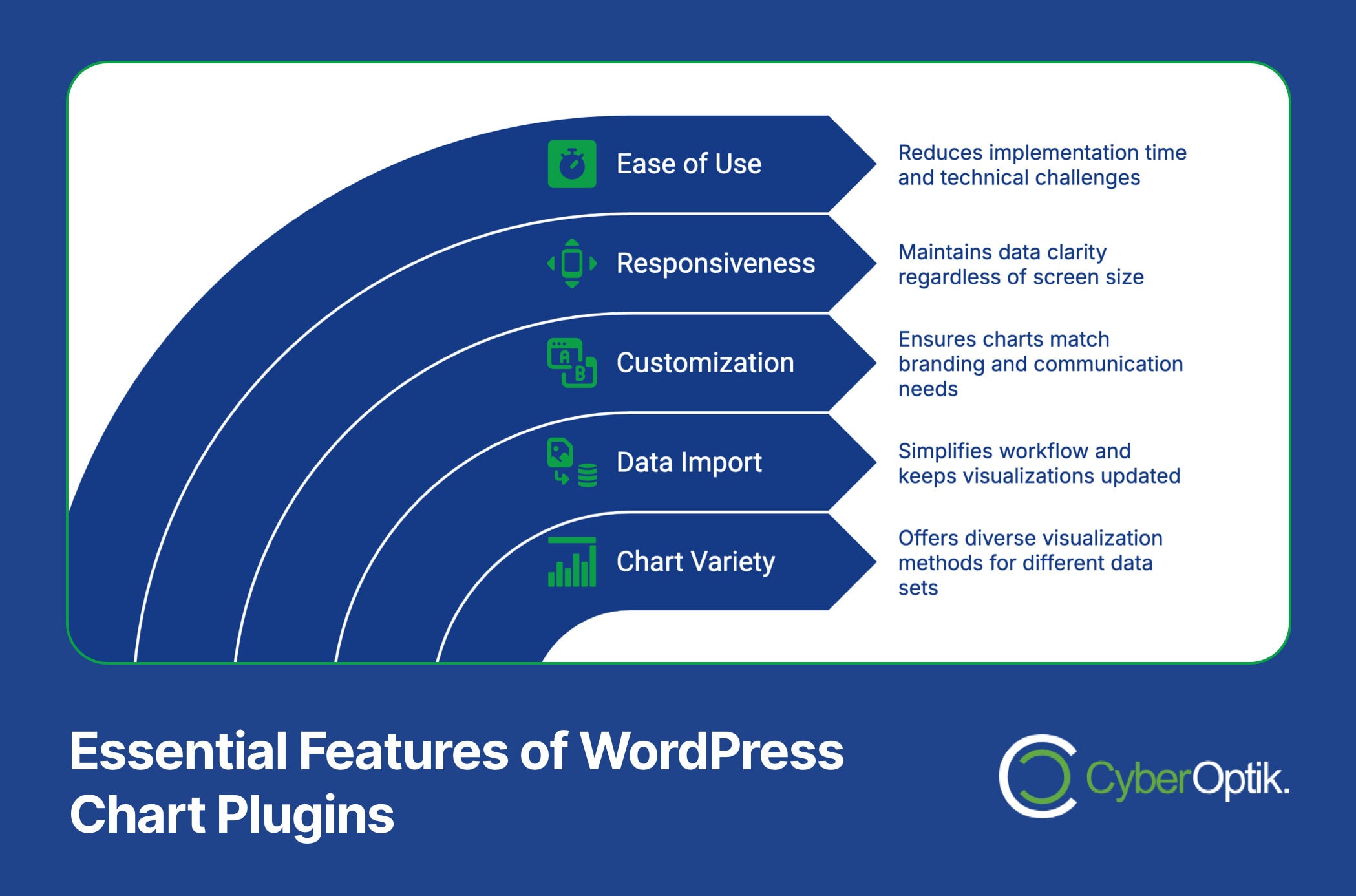
Not all chart plugins offer the same capabilities. Understanding the essential features helps you select a tool that meets your specific needs. We recommend focusing on five key areas when evaluating chart plugins.
| Feature Category | What to Look For | Why It Matters |
|---|---|---|
| Chart Variety | Range of chart types (line, bar, pie, area, etc.) | Different data sets require different visualization methods |
| Data Import | Support for CSV, Excel, Google Sheets | Simplifies workflow and keeps visualizations updated |
| Customization | Color control, label options, sizing flexibility | Ensures charts match your branding and communication needs |
| Responsiveness | Proper display across all devices | Maintains data clarity regardless of screen size |
| Ease of Use | Intuitive interface, minimal learning curve | Reduces implementation time and technical challenges |
The table above highlights what we consider most important when selecting chart plugins. The right combination of these features ensures your data visualizations enhance rather than complicate your WordPress site.
Beyond these core elements, consider how each plugin integrates with your WordPress installation and existing workflow. The ideal plugin works seamlessly with your theme and other essential tools.
Advanced features like animation, interactivity, and real-time data connections can elevate your visualizations further. However, these capabilities often come with premium pricing or additional technical requirements.
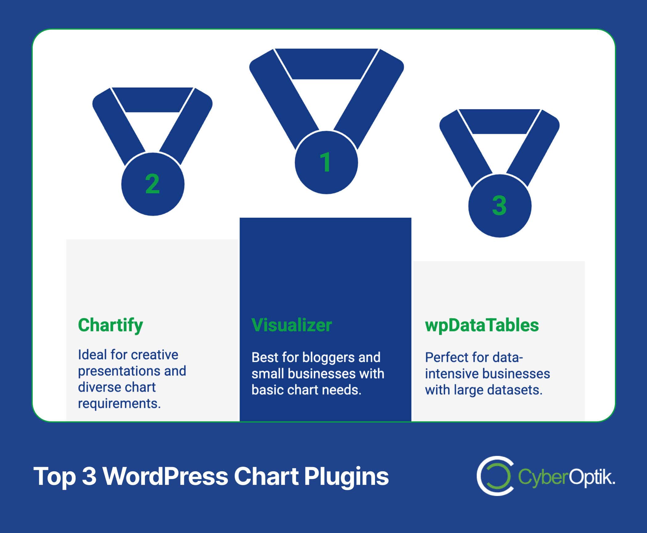
Top 3 WordPress Chart Plugins Compared
After extensive testing, we’ve identified three standout chart plugins for WordPress. Each offers a unique combination of features, ease of use, and pricing models. This comparison helps you understand their relative strengths and limitations.
The table below provides a high-level comparison of the three leading WordPress chart plugins. We’ve evaluated them across key dimensions that matter most to website owners and developers.
| Plugin | Free Version | Premium Starting Price | Chart Types | Data Import | Best For |
|---|---|---|---|---|---|
| Visualizer | Yes | $69/year | 9+ types | CSV, Google Sheets (Pro) | Bloggers, small businesses |
| Chartify | Limited demo | $39 one-time | 22+ types | CSV, JSON, Google Sheets | Creative presentations, diverse chart needs |
| wpDataTables | Lite version | $59/year | 8+ advanced types | Excel, CSV, Google Sheets, MySQL | Data-intensive businesses, large datasets |
This comparison gives you a quick reference for the key differences between these top plugins. Now, let’s examine each one in greater detail to understand their unique strengths and use cases.
1. Visualizer: Tables and Charts Manager
Visualizer stands out for its balance of simplicity and capability. The plugin includes line, bar, pie, and table charts with full HTML5/SVG compatibility in its free version. (Source: WordPress.org)
We appreciate Visualizer’s straightforward approach to chart creation. It uses a familiar WordPress interface that flattens the learning curve for new users. The editor provides a side-by-side preview that shows changes in real-time.
Integration happens through a simple shortcode system. Once you create a chart, the plugin generates a shortcode you can place in any post, page, or widget area. This flexibility makes it easy to position visualizations exactly where needed.
The table below highlights the differences between Visualizer’s free and premium offerings.
| Feature | Free Version | Pro Version |
|---|---|---|
| Basic Charts (Line, Bar, Pie) | Yes | Yes |
| Advanced Charts (Area, Geo) | No | Yes |
| Data Import Sources | CSV only | CSV, Excel, Google Sheets |
| Frontend Editing | No | Yes |
| Private Charts | No | Yes |
| Auto-Sync with External Data | No | Yes |
The pro version enhances Visualizer significantly by adding area charts, geo charts, and advanced data import capabilities from Excel, CSV, and Google Sheets. (Source: ThemeIsle Docs)
Visualizer works best for bloggers, small businesses, and websites with straightforward data visualization needs. Its free version offers enough for basic charting, while the pro version adds powerful features for those with more complex requirements.
Pros:
- User-friendly interface that follows WordPress design patterns
- Solid free version with essential chart types
- Responsive charts that work well on mobile devices
- Regular updates and good documentation
Cons:
- Limited advanced customization options
- Some useful features reserved for pro version
- Fewer chart types than some competitors
2. Chartify – WordPress Chart Plugin
Chartify impresses with its extensive chart library. The plugin supports 22 different chart types, including standard options and specialized visualizations. This variety makes it suitable for virtually any data presentation need. (Source: ThemeIsle Docs)
We find Chartify particularly strong for creative data presentations. The plugin offers unique chart types not commonly found in other solutions, such as polar area charts, radar charts, and bubble charts. These options allow for more engaging and distinctive visualizations.
Dynamic data connections set Chartify apart from many competitors. The plugin can create charts linked directly to Google Sheets, allowing for automatic updates when your source data changes. This feature saves time and ensures your visualizations always reflect the latest information.
The table below showcases some of the unique chart types available in Chartify.
| Chart Category | Available Types | Best Use Case |
|---|---|---|
| Basic Charts | Line, Bar, Pie, Doughnut, Area | General data visualization needs |
| Comparison Charts | Radar, Polar Area, Horizontal Bar | Comparing multiple variables across categories |
| Distribution Charts | Scatter, Bubble, Box Plot | Showing data distribution and correlations |
| Specialized Charts | Gauge, Funnel, Timeline, Heat Map | Specific data visualization requirements |
This extensive chart library makes Chartify extremely versatile. You can choose exactly the right visualization method for your specific data and communication goals.
Chartify uses a block-based editor that integrates well with Gutenberg. This modern interface makes chart creation intuitive for users already familiar with the WordPress block editor. The live preview feature helps you fine-tune your visualizations before publishing.
Pros:
- Extensive library of 22+ chart types
- Dynamic data connections with Google Sheets
- Modern block-based editing experience
- One-time payment rather than subscription
Cons:
- Limited free version (essentially a demo)
- Steeper learning curve for some advanced features
- Documentation not as extensive as some competitors
3. wpDataTables
wpDataTables excels at handling large datasets and creating interactive tables with robust sorting and filtering capabilities. This makes it ideal for business intelligence applications and data-intensive websites. (Source: ThemeIsle)
We value wpDataTables for its powerful data management features. The plugin can handle thousands of rows efficiently, making it suitable for complex data presentations that would overwhelm simpler tools. This capability is particularly important for business dashboards and analytics displays.
wpDataTables is recommended by WP Engine for business intelligence use cases because of its robust data handling and visualization capabilities. (Source: WP Engine)
The table below outlines the types of business scenarios where wpDataTables particularly shines.
| Business Scenario | wpDataTables Solution | Key Advantage |
|---|---|---|
| Financial Reporting | Interactive tables with calculation features | Handles large datasets with complex calculations |
| Sales Dashboards | Combined tables and charts with filters | Real-time filtering and interactive exploration |
| Product Catalogs | Searchable, sortable tables with images | User-friendly product exploration and comparison |
| Research Presentations | Advanced charts with statistical features | Sophisticated visualization options for complex data |
This table highlights how wpDataTables addresses specific business needs with tailored solutions. The plugin’s versatility makes it valuable across various professional contexts.
The WordPress maintenance needs for sites with complex data tools are often higher than average. wpDataTables works with MySQL databases directly, which adds power but may require more technical knowledge to maximize its potential.
Unlike the other plugins, wpDataTables offers conditional formatting. This feature allows you to highlight cells or values based on specific criteria, making important data points instantly visible to viewers.
Pros:
- Superior handling of large datasets
- Advanced filtering and sorting capabilities
- Direct MySQL database connections
- Conditional formatting options
Cons:
- Higher price point than alternatives
- Steeper technical learning curve
- More features than needed for simple visualization tasks
How to Choose the Right Chart Plugin for Your Website
Selecting the ideal chart plugin depends on your specific needs and technical context. We recommend evaluating several key factors to make an informed decision for your WordPress site.
Consider your data complexity first. Simple data sets with few variables work well with basic plugins like Visualizer. Complex, large-scale data with multiple variables benefits from the advanced capabilities of wpDataTables.
Your technical comfort level matters significantly. Visualizer offers the gentlest learning curve for beginners. Chartify requires moderate technical confidence. wpDataTables demands more technical knowledge, especially for advanced features.
Budget constraints will naturally influence your choice. Free options like Visualizer’s basic version work well for simple needs. Premium solutions offer more capabilities but require financial investment. Consider both immediate costs and long-term value.
What benefits does WordPress provide as a content management system for your data visualization goals? The flexibility of WordPress means you can start with a simpler solution and upgrade later as your needs evolve.
The table below provides a decision framework based on different website types and data visualization needs.
| Website Type | Typical Needs | Recommended Plugin |
|---|---|---|
| Personal Blog | Basic charts, occasional use | Visualizer (Free) |
| Small Business | Branded charts, regular updates | Visualizer (Pro) or Chartify |
| E-commerce | Product comparisons, sales data | Chartify or wpDataTables |
| Educational Site | Varied chart types, interactive elements | Chartify |
| Corporate/Enterprise | Complex data, interactive dashboards | wpDataTables |
This framework helps match your specific situation with the most appropriate chart plugin. Your unique requirements might vary, but these guidelines provide a solid starting point for decision-making.
Implementing Charts on Your WordPress Website: Best Practices
Creating effective data visualizations goes beyond simply installing a plugin. We’ve gathered several best practices to help you implement charts that enhance your WordPress site’s communication power.
Start with clean, well-organized data. Even the best chart plugin can’t fix problems with your underlying information. Ensure your data is accurate, properly formatted, and free from errors before visualization.
Choose the right chart type for your data. Line charts work best for trends over time. Bar charts excel at comparing values across categories. Pie charts should only show proportional parts of a whole. Match your chart type to your specific data story.
How can WordPress plugins enhance your site’s functionality beyond basic visualization? Consider how your chart plugin integrates with other tools like SEO plugins, caching solutions, and analytics trackers.
Keep your designs simple and focused. Include only essential information in each chart. Remove decorative elements that don’t add meaning. Label clearly but minimally. Remember that clarity trumps complexity in effective data visualization.
Consider these additional implementation tips:
- Use consistent colors and styles across all charts on your site
- Provide context through clear titles and brief descriptions
- Test your visualizations on multiple devices and screen sizes
- Consider accessibility for viewers with visual impairments
- Update your data regularly to maintain accuracy and relevance
These best practices help ensure your charts effectively communicate insights rather than simply displaying data. The goal is always to enhance understanding through visual means.
Common Data Visualization Mistakes to Avoid
Even with powerful chart plugins, visualization missteps can undermine your communication goals. We regularly see several common mistakes that diminish the effectiveness of data presentations on WordPress sites.
Mismatching chart types with data relationships leads to confusion. For example, using a pie chart to show changes over time distorts the data story. Always select visualization methods appropriate to your specific data relationships.
Overloading charts with too much information creates visual clutter. Each chart should present one clear insight or relationship. When a visualization becomes too complex, consider breaking it into multiple focused charts instead.
Poor color choices can interfere with comprehension. Ensure sufficient contrast between elements. Use color consistently across charts. Consider color-blind viewers by avoiding problematic color combinations like red/green distinctions.
Many sites fail to optimize charts for mobile viewing. All three plugins we’ve reviewed offer responsive features, but you should still test how your visualizations appear on smaller screens and make adjustments as needed.
Missing or misleading titles and labels leave viewers without proper context. Always include clear titles, axis labels, and legends where appropriate. Each chart should be self-explanatory even when separated from surrounding text.

Conclusion
Effective data visualization transforms complex information into accessible insights for your WordPress website visitors. The right chart plugin makes this process straightforward while delivering professional results.
We’ve examined three excellent options for WordPress chart plugins, each with unique strengths. Visualizer offers simplicity and accessibility for basic needs. Chartify provides creative versatility through its extensive chart library. wpDataTables delivers powerful solutions for complex data challenges.
Your choice should align with your specific requirements, technical comfort level, and budget constraints. The comparison tables and analysis in this guide provide a framework for making that decision confidently.
Remember that successful data visualization combines the right tools with thoughtful implementation. Follow best practices, avoid common mistakes, and focus on clearly communicating the story your data tells.
Need help implementing these chart plugins or optimizing your WordPress website? Our team specializes in WordPress development and can help you create powerful data visualizations that engage your audience and enhance your content. Contact us today to discuss your specific needs.


