Just looking for our Best Architecture Website examples list?
Key Takeaways:
Creating an effective website for a professional architect requires a strategic blend of design aesthetics, user experience, and search engine optimization. Here are the essential takeaways to guide your website development process:
- Prioritize User-Centric Design: Ensure your website is intuitive and easy to use. A well-structured layout with clear menus and accessible content enhances user experience and encourages visitors to explore your portfolio and services.
- Optimize for Mobile Devices: With a significant portion of web traffic coming from mobile users, your website must be responsive. A mobile-friendly design ensures that your site looks and functions well on all devices, improving user engagement and SEO rankings.
- Implement SEO Best Practices: Incorporate relevant keywords, meta tags, and descriptive alt text for images to improve your website’s visibility on search engines. Structured data and a clean URL structure also contribute to better indexing and ranking.
Why Website Design Matters for Architecture Firms
Your website is often the first impression a potential client has of your work. Today, a well-crafted, high-performing site is essential for standing out and converting interest into inquiries.
For any architecture firm, the ability to create a website that reflects both creative vision and technical excellence is non-negotiable. Strong website design showcases your best work, directly impacts user experience, navigation clarity, and ultimately, conversion rate. A seamless homepage layout, paired with thoughtful typography and responsive elements, can mean the difference between a curious browser and a booked consultation.
Moreover, a website optimized for search engine visibility helps position your firm in front of the right audience at the right time. Implementing SEO best practices ensures that your projects aren’t just seen but sought after. Whether you’re an independent architect or a growing team, investing in your digital presence is key to sustained growth.
This guide walks you through everything from foundational design principles to advanced strategies that help you attract and retain website visitors. If you’re ready to elevate your online presence, this is where your journey begins.
Website Planning & Purpose
Before you dive into layout design or color palettes, a clear planning phase is crucial. This stage defines how your website will look and, more importantly, what it needs to achieve. Whether your goal is to attract commercial real estate developers, showcase award-winning residential designs, or establish authority in sustainable building, this purpose must drive every decision moving forward.
Start by identifying your primary user personas—potential clients, partners, or even media contacts. Consider their needs: Are they looking for visual inspiration, project credentials, or easy ways to contact your firm? Aligning your architecture website with these goals ensures the final product meets user expectations while supporting your business objectives.
Establishing a clear sitemap is the next step. This is the blueprint of your website’s navigation. What pages are essential? Common inclusions for architecture websites include a dynamic homepage, portfolio with project categories, firm overview, service descriptions, testimonials, blog for thought leadership, and a compelling contact page. Each page should serve a defined purpose and tie back to your overall business strategy.
The planning phase is also the best time to set measurable goals. Define what success looks like—increased consultation requests, improved search engine visibility, or higher engagement on your project portfolio. With those metrics in mind, you can more effectively design a user experience that drives results. Planning with precision helps ensure your architecture firm’s website is more than beautiful; it’s strategic.
Design Principles for Effective Sites
Great websites work hard to support your firm’s business goals. The design phase builds upon the planning groundwork by applying strategic visual and functional choices that elevate the brand and serve the user.
- Visual Hierarchy
Your most important content—project features, contact calls to action, or awards—should command attention. Use strategic placement, size, and contrast to guide visitors through your site and highlight key areas. - Whitespace and Minimalism
Clean, uncluttered layouts allow your work to take center stage. Whitespace enhances aesthetics and supports readability, and allows users to focus on one element at a time. - Grid-Based Layouts
A well-structured grid reinforces alignment and consistency, helping present content in an orderly and digestible format. This is especially important for showcasing images in portfolios. - Consistent Typography
Choose a modern, legible typeface that reflects your brand identity. Limit your font styles and weights to create a cohesive visual experience that maintains professionalism and clarity. - Mobile-First and Responsive Design
More users access websites via mobile devices than ever before. Responsive design ensures your site adapts fluidly to every screen size, preserving usability and design integrity across platforms. - Speed and Performance
Optimized images, streamlined code, and reliable hosting are critical. Fast-loading pages reduce bounce rates and increase visitor engagement—two key factors in SEO and conversion. - Strategic Use of Color
Your color palette should reflect your brand while enhancing readability and emotional engagement. Subtle, professional tones often work best for architecture firms, with accent colors used sparingly for emphasis. - Cohesive Imagery
Use high-resolution, professionally photographed imagery to tell the story of your projects. Visuals should be consistent in style and lighting, with descriptive captions to improve SEO.
These principles should be applied with your audience in mind—every visual decision should reinforce your brand’s identity while making it easier for a visitor to become a client. For a step-by-step breakdown of how these design elements come together in a real project, explore our web design process guide.
Content & Navigation
A well-designed website only succeeds when paired with structured, intuitive content. Where visual storytelling is paramount, content must be both captivating and purposeful. Navigation, on the other hand, needs to make this content easily accessible without overwhelming the user.
Strategic Content Organization
Begin by defining the hierarchy of your content. Your homepage should offer a clear snapshot of who you are and what you do—featuring bold imagery, a concise mission statement, and a link to your best work. From there, guide users into your portfolio, service descriptions, and about pages with strategically placed callouts.
Each page should focus on a single objective. For example, your project portfolio should highlight key achievements with high-resolution images, client challenges, and solution-driven narratives. Service pages should explain what you do, who you do it for, and how clients benefit, using concise text and supporting visuals.
Navigation That Leads With Clarity
Effective navigation empowers users to explore your site with ease. A horizontal top navigation bar is standard, with dropdowns that group services and projects logically. Avoid overwhelming users with too many options; 5 to 7 primary menu items are ideal.
Use sticky navigation or a floating menu to maintain access to key links as users scroll. Additionally, include breadcrumbs, a search bar, and a well-structured footer with secondary links to increase usability.
Internal linking is vital—not just for SEO, but to guide users toward deeper engagement. When referencing case studies or thought leadership, create clear pathways between pages. For more best practices on organizing your site’s structure, see our guide to web design principles.
When your content is purposeful and your navigation is intuitive, you’ll enhance the UX and increase time on site, improve conversion rates, and build lasting digital trust.
Visual Elements That Strengthen Architecture Websites
In an industry where presentation is everything, the visual elements of your website must do more than just look polished—they must tell a compelling story about your brand and inspire action.
Architectural Photography as a Differentiator
High-quality, professionally captured images of your work form the foundation of visual storytelling. Every project photo should showcase scale, texture, lighting, and context. Avoid stock images whenever possible; real-world visuals of your work build authenticity and credibility.
Custom Graphics and Icons
Use bespoke icons and subtle illustrations to enhance navigation and reinforce brand consistency. These elements help guide users through complex content without distraction and contribute to a cohesive design system.
Motion and Micro-Interactions
Subtle animations—like image fades, hover effects, or slide transitions—can add elegance and interactivity without overwhelming the content. These touches contribute to a refined UX and encourage exploration of more pages.
Hero Sections That Establish Tone
Your homepage hero image or video should instantly communicate your design philosophy. This is your chance to make a bold statement with a captivating image and value-driven headline, establishing visual tone and setting user expectations from the first moment.
Balanced Use of Video
Short project walkthroughs or behind-the-scenes studio clips can deepen visitor engagement. When done correctly, video adds a layer of dimension to your work, but it must be optimized for performance and accessibility to avoid slowing down the site.
Visual Consistency Across Pages
Maintain harmony in colors, image styling, and visual spacing. Repeating design patterns builds trust, reduces cognitive load, and improves navigation flow. Visual continuity reinforces your firm’s identity and fosters a seamless experience across devices.
When thoughtfully executed, visual elements elevate the aesthetic value of your website, reinforce your brand promise, and turn curious visitors into committed clients.
Ongoing WordPress Maintenance
Once your website is live, maintaining its performance, security, and content integrity becomes a critical responsibility. Architecture firms rely heavily on the stability and functionality of their sites to attract new business and validate their professional image. Without proper maintenance, even the best-designed WordPress website can experience slow load times, security vulnerabilities, or outdated content that drives users away.
Routine updates are essential. Core WordPress software, plugins, and themes receive regular improvements that address security issues and enhance functionality. These updates should be applied promptly to prevent exposure to known threats and ensure compatibility across your site. Skipping updates can result in broken elements or compromised data.
Backups are equally important. A reliable backup system ensures your website can be restored quickly in the event of a server failure, hacking attempt, or accidental data loss. Backups should be scheduled frequently and stored in a secure, off-site location.
Regular security scans and monitoring services help detect malicious activity before it impacts your visitors or your search engine rankings. Implementing a Web Application Firewall (WAF) and limiting login attempts adds an extra layer of protection.
Performance optimization should also be ongoing. Image compression, database cleanup, and caching enhancements keep your website running fast, improving user experience and supporting SEO. Broken link audits and 404 error tracking further reduce friction for your visitors.
Finally, maintaining fresh content is not just a branding benefit—it’s a signal to search engines that your site is active. Adding new projects, posting articles, or updating firm news communicates relevancy and helps build authority in your niche.
Ongoing maintenance is not a luxury—it’s a necessary part of keeping your website working as intended. Partnering with a trusted web maintenance provider can free up your time while ensuring your digital presence remains secure, efficient, and impactful.
Best Architecture Website Design Examples
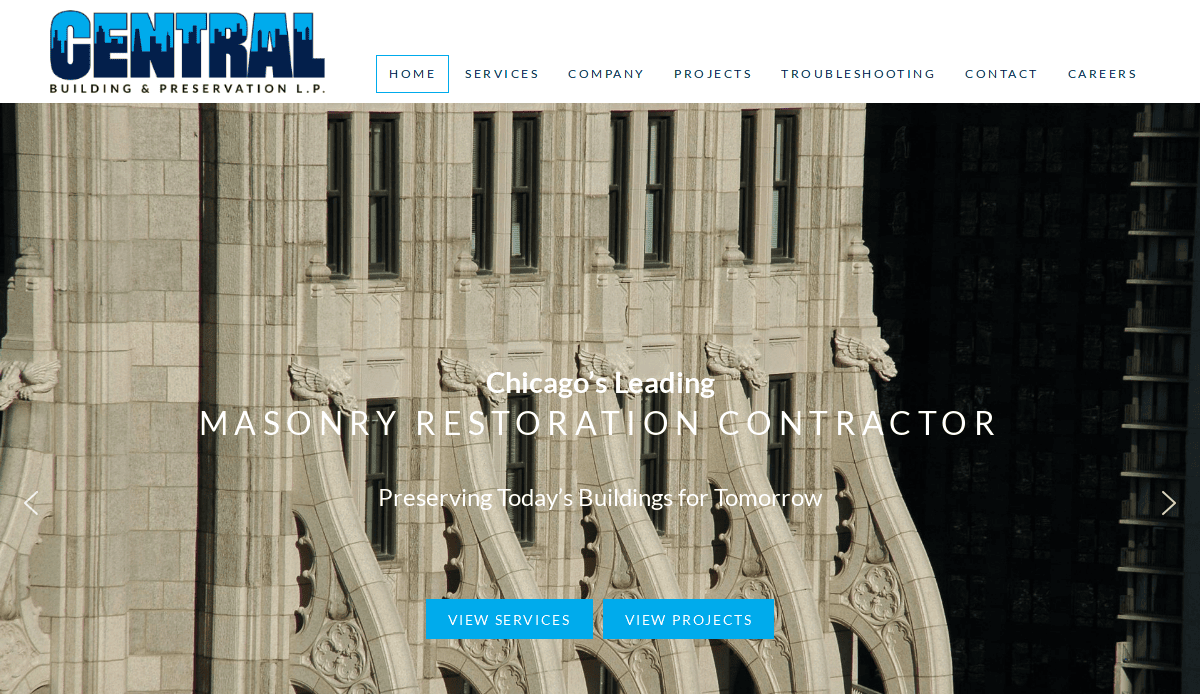
1. Central Building
Location: Chicago, IL
Key Takeaways:
- Visually dynamic homepage featuring rotating project images
- Global navigation supports easy access to disciplines
- Compelling brand storytelling with modern typography
2. Perkins&Will
Location: Chicago, IL
Key Takeaways:
- Case study approach to project presentation
- Consistent color palette enhances navigation
- Strong commitment to sustainable design
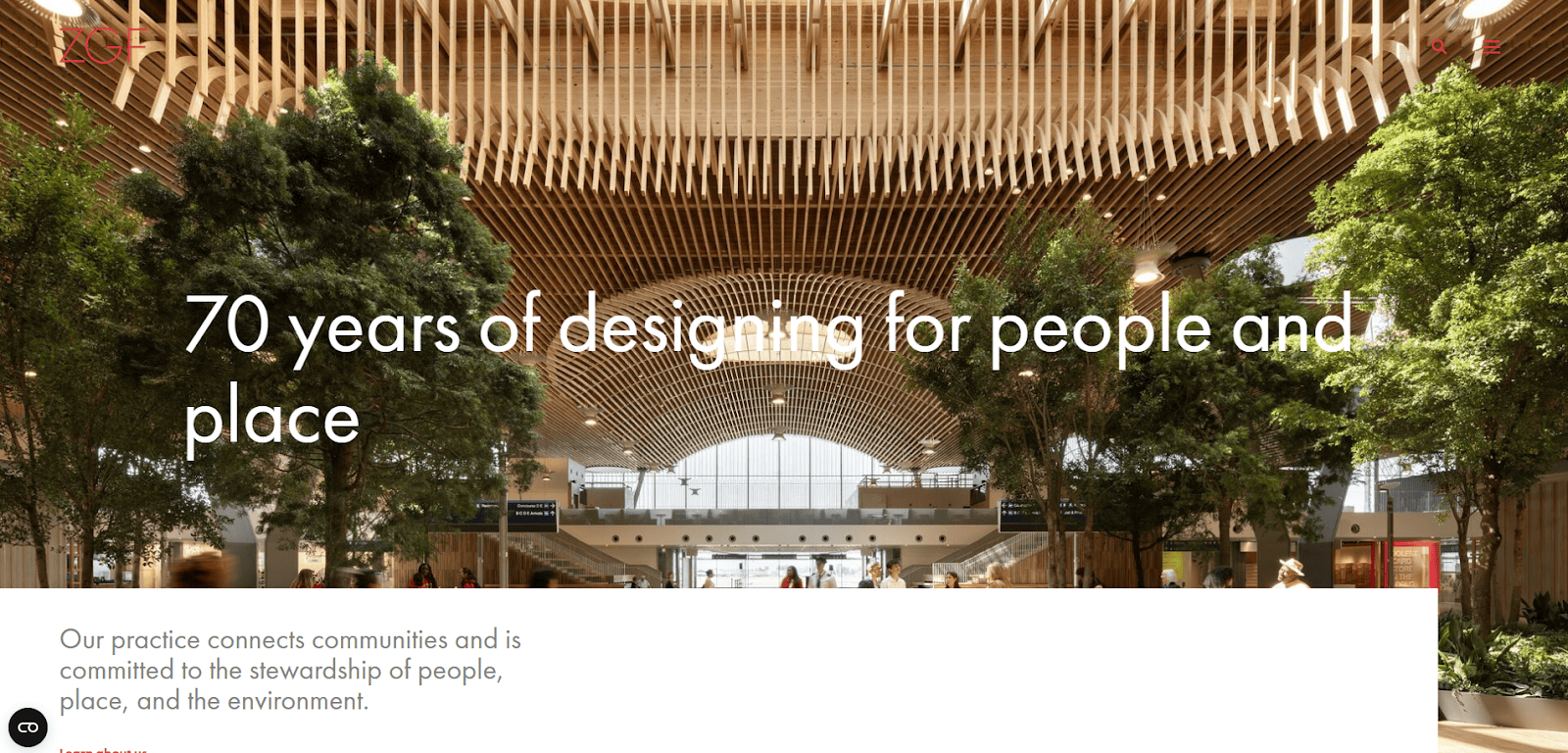
3. ZGF Architects
Location: Portland, OR
Key Takeaways:
- Large project imagery balanced with minimalist design
- Unique system design explained in plain language
- Effective ‘About Us’ narrative
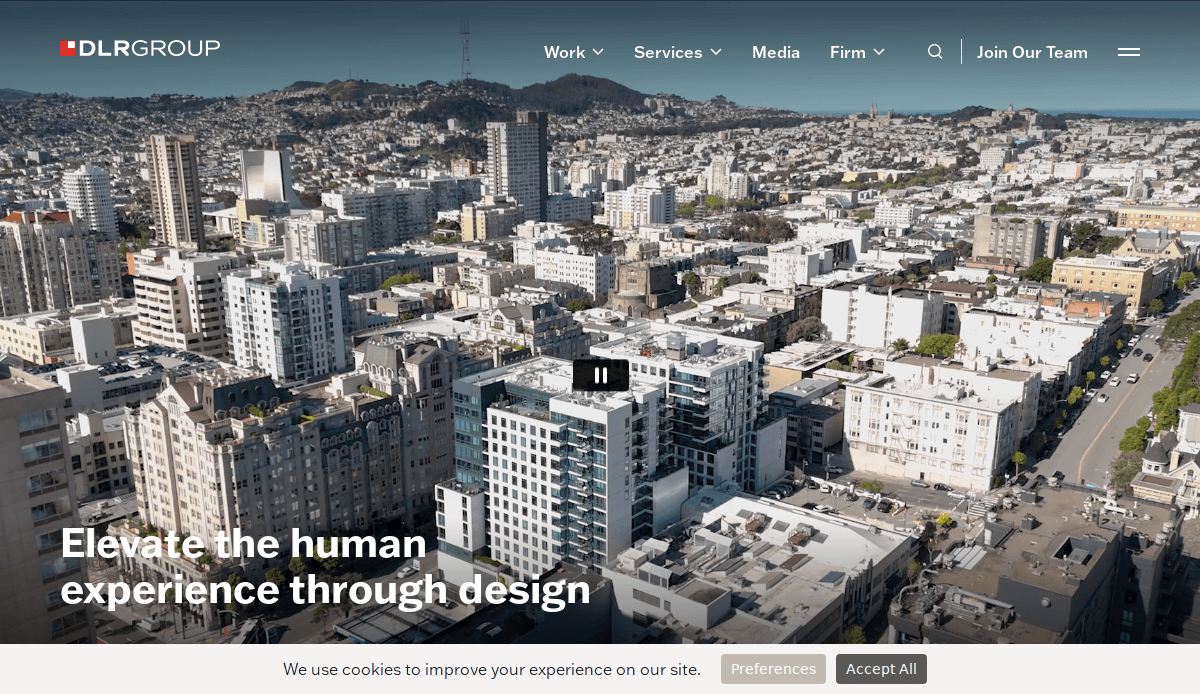
4. DLR Group
Location: Minneapolis, MN
Key Takeaways:
- Filterable project gallery supports user exploration
- Clean site architecture for content organization
- Emphasis on community and innovation
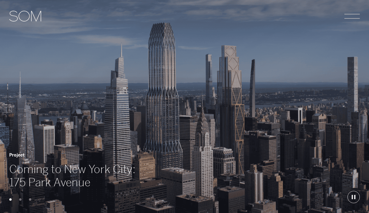
5. SOM (Skidmore, Owings & Merrill)
Location: New York, NY
Key Takeaways:
- Editorial-style presentation of design insights
- Clearly structured pages on your website for each sector
- High-quality animations and photography
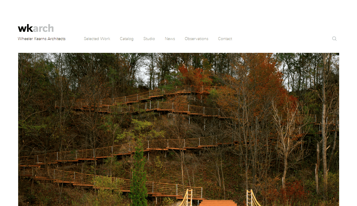
6. Wheeler Kearns Architects
Location: Chicago, IL
Key Takeaways:
- Minimalist design style showcasing project images
- Organized structure of your website for browsing projects
- Use of short headlines to connect with your audience
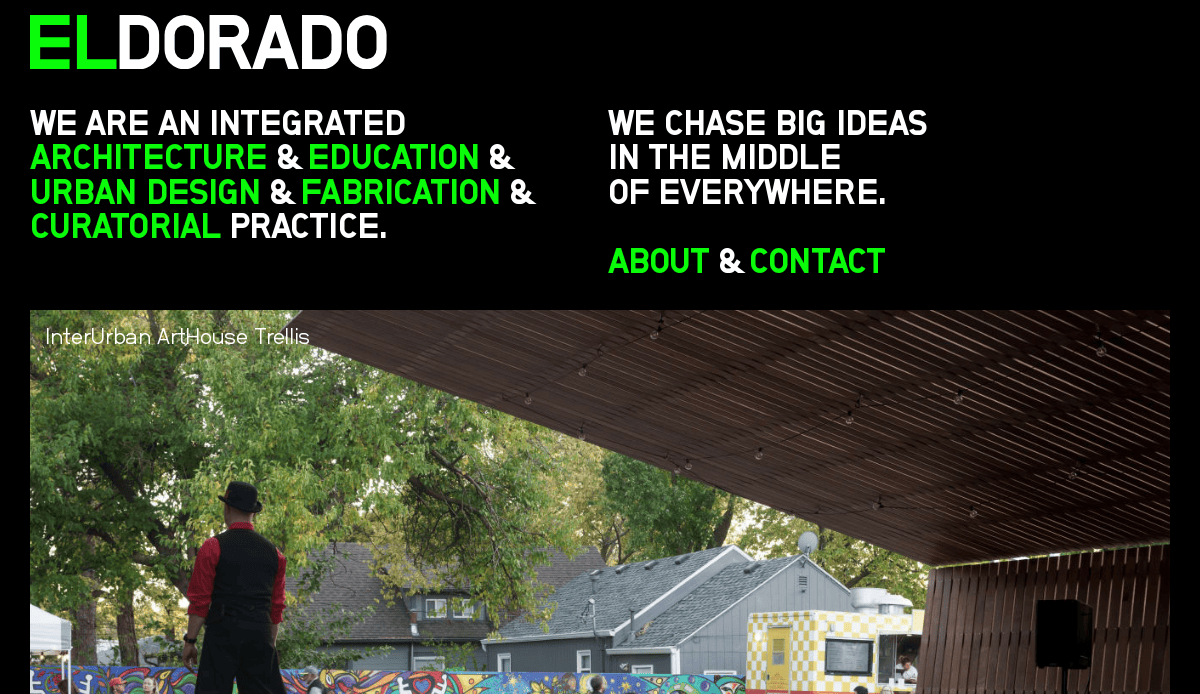
7. El Dorado Inc.
Location: Kansas City, MO
Key Takeaways:
- Emphasizes community-centered architectural services
- Dynamic scroll interactions with valuable information
- Clear descriptions of each project
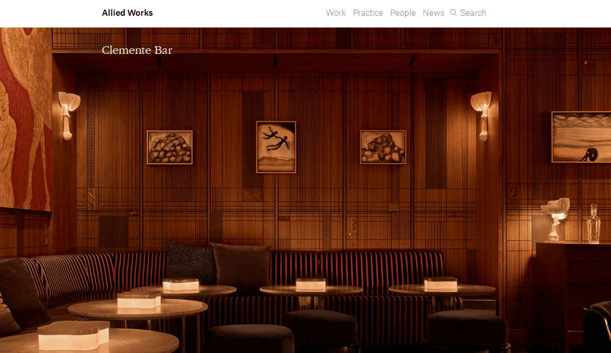
8. Allied Works
Location: Portland, OR
Key Takeaways:
- Bold photography focused on spatial storytelling
- Unique project filtering for easy navigation
- Template-free, artistic approach
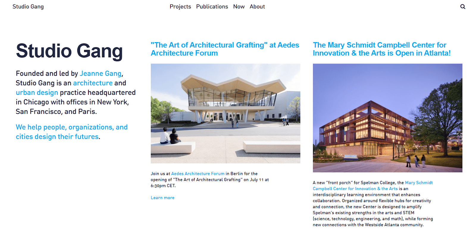
9. Studio Gang
Location: Chicago, IL
Key Takeaways:
- Integrates research-driven design insights throughout
- Strong visual storytelling of sustainable design
- Sophisticated color usage and clean layout
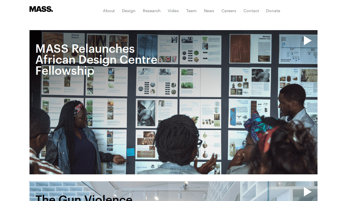
10. MASS Design Group
Location: Boston, MA
Key Takeaways:
- Mission-forward homepage and ‘About Us’ page
- Immersive project content that’s easy for visitors to explore
- Highlights sustainable design as a core principle
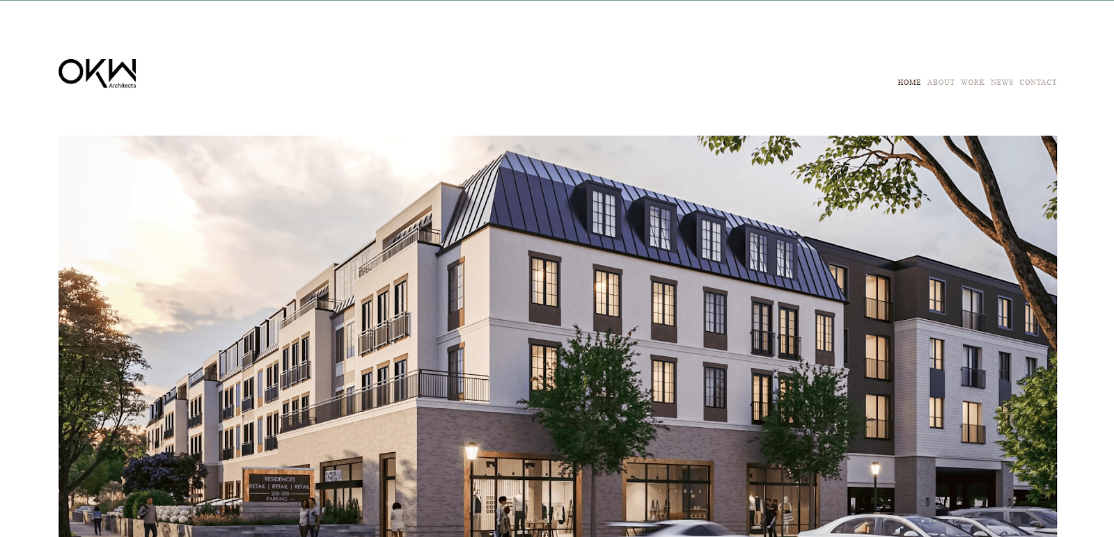
11. OKW Architects
Location: Chicago, IL
Key Takeaways:
- Cohesive color palette and site architecture
- Well-structured project portfolio and navigation
- Clear CTA and descriptive text enhance lead generation
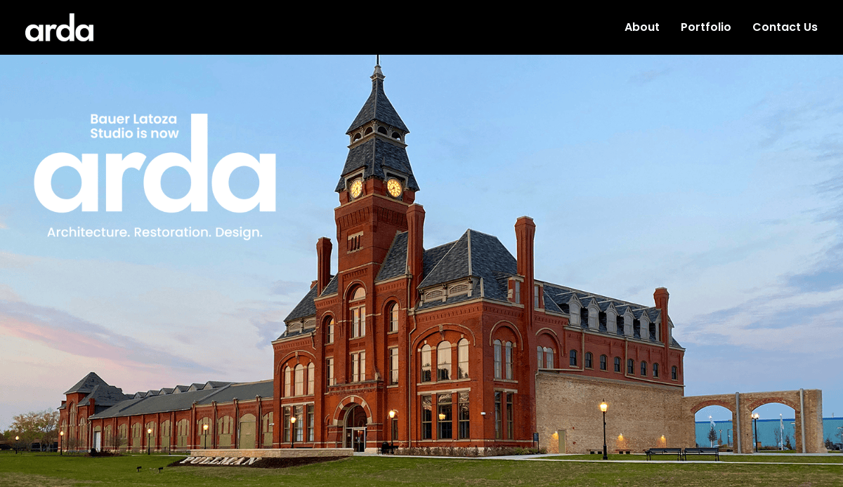
12. Arda Design
Location: Chicago, IL
Key Takeaways:
- Clean, easy-to-read layout with architectural patterns
- Highlighting cultural and historic restoration projects
- Effective use of concise copy and contact form
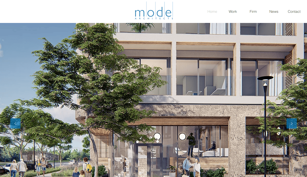
13. MoDE Architects
Location: Naperville, IL
Key Takeaways:
- Emphasizes modern minimalist design
- Project images displayed in full-width format
- Structured services page tailored to ideal clients
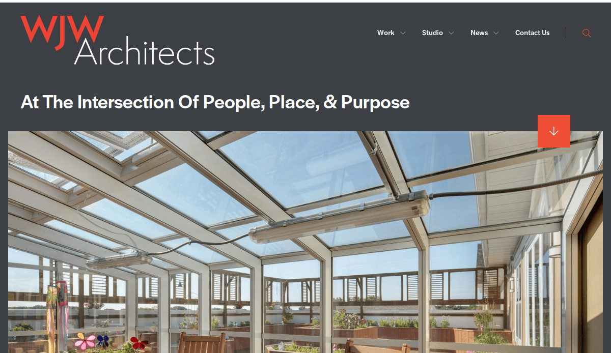
14. WJW Architects
Location: Chicago, IL
Key Takeaways:
- Smart content layout across all pages on your website
- Warm imagery reinforces inclusive community design
- Clear messaging throughout the rest of your website
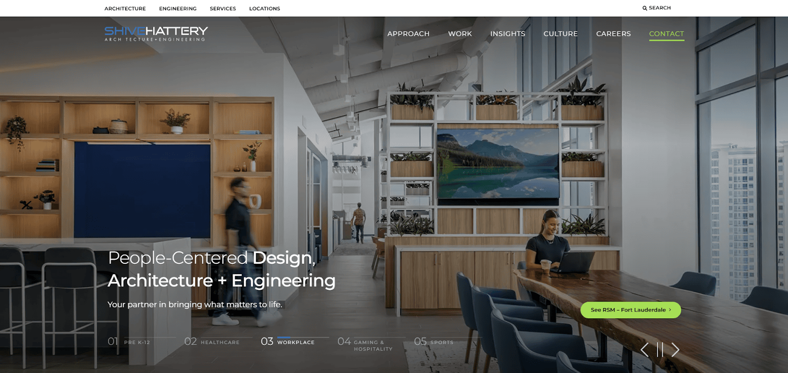
15. Shive-Hattery
Location: Cedar Rapids, IA
Key Takeaways:
- Homepage that highlights new features and latest work
- Thoughtful use of whitespace and professional font choices
- Case study approach that makes it easy for visitors to engage
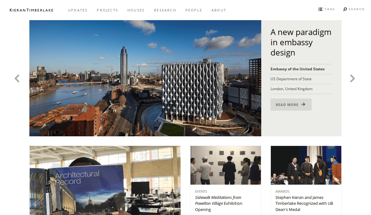
16. KieranTimberlake
Location: Philadelphia, PA
Key Takeaways:
- Emphasis on sustainable design research
- Interactive portfolio layout using modular grid
- Strong commitment to transparency in each piece of content
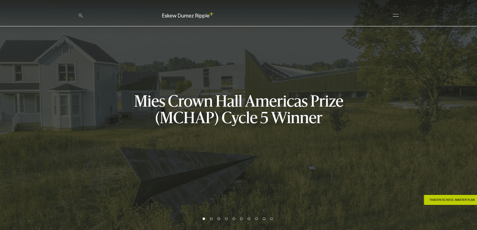
17. EskewDumezRipple
Location: New Orleans, LA
Key Takeaways:
- Rich visual content with full-screen project imagery
- Clearly defined structure of your website supporting intuitive navigation
- Deep commitment to sustainable design and community-driven architecture
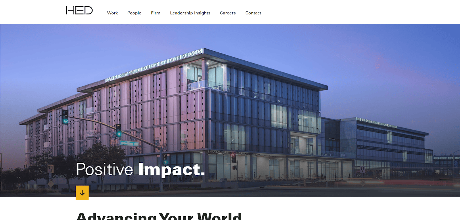
18. HED (Harley Ellis Devereaux)
Location: Southfield, MI
Key Takeaways:
- Broad range of sectors showcased through intuitive navigation
- Case studies support system design insights
- Strong use of team bios and project visuals
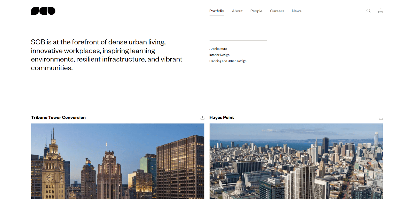
19. SCB (Solomon Cordwell Buenz)
Location: Chicago, IL
Key Takeaways:
- Responsive layout tailored to mobile and desktop
- Use of subtle animations and typographic hierarchy
- Clear structure that makes it easy to find the information
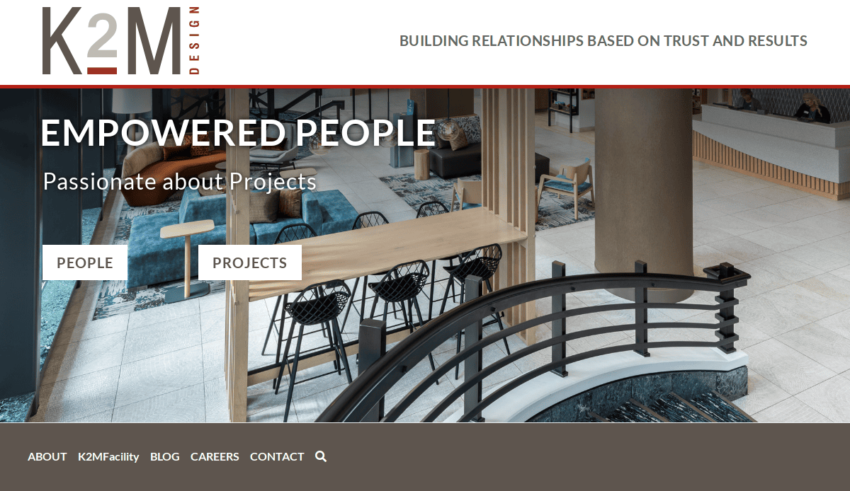
20. K2M Design
Location: Cleveland, OH
Key Takeaways:
- Consistent branding with unique design insights
- Engaging project case studies with detailed images
- Simple site navigation and fast performance
Take the Next Step in Building a High-Impact Architecture Website
Your website is often the first opportunity to communicate your firm’s design insights, highlight your best work, and show off your services in a clear and easy format. By implementing a strong website structure, showcasing key content, and ensuring your site architecture supports easy user pathways, you position your firm as a top contender in search results.
If your current website isn’t delivering the results you need—or if you’re launching a new website and want to get it right from the start—our top-tier digital marketing agency can help you take the next step with confidence.
Request a free consultation and get expert support tailored to the architecture industry.
Common Questions for Web Designing Architectural Websites
What are the key components of a good architectural firm’s website?
A good website includes a compelling homepage, well-structured navigation, high-quality project images, and clear descriptions of each project. It should showcase your architectural patterns and communicate your firm’s values with easy-to-read content that’s true to your brand. If you need more guidance, reach out to us to discuss our architecture web design services.
How should I structure the pages on my website?
The structure of your website should align with user intent and make it easy for visitors to find information quickly. Common pages include Portfolio, About Us page, Services, Blog, and a clear Contact Form. Group content logically and use intuitive gateways to support usability and search engine optimization.
Why is minimalist design effective for architecture firms?
Minimalist design emphasizes clean layouts, whitespace, and simplicity, allowing project images and key content to stand out. It helps convey professionalism, supports fast loading times, and makes your site easy for visitors to browse across devices.
How can I connect with my audience through design?
Use visual storytelling and valuable information to connect emotionally and functionally. Include descriptions of each project, behind-the-scenes content, or sustainable design insights that reflect your philosophy. A strong visual narrative enhances trust and aligns your site with your ideal clients.
What role does sustainable design play in website messaging?
Sustainable design, both in your projects and how you present them online, resonates with eco-conscious clients. Highlighting these efforts—through case studies or dedicated pages—reinforces your commitment to innovation and aligns with current design trends.
What design challenges do architecture firms typically face online?
Challenges often include slow load speeds, outdated software architecture, disorganized content, and a lack of mobile optimization. Addressing these issues involves attention to system design, continuous updates, and consistent branding across the rest of your website.
Can I use templates, or should I build a custom site?
Templates can be cost-effective, but often lack flexibility for more complex website design needs. Custom sites provide greater control over design elements, functionality, and scalability, allowing you to truly show off your work and support new features as you grow.
How often should I update the content on my architecture website?
Update your site regularly with project news, blog posts, and images of your best work. Frequent updates help you stay relevant in search results and provide visitors with fresh, valuable information.
What is the best way to capture leads on my site?
Use a strategically placed contact form on key pages of your website, such as the homepage, services pages, and portfolio. Keep the form clear, ask only for essential information, and make it easy for visitors to reach out.
Where should I place project images for maximum impact?
Use large, high-quality images throughout your portfolio and homepage. Ensure they load quickly and are supported by brief, keyword-rich descriptions. Highlight the most visually compelling examples first, then let users explore the rest of your website for additional work.


