Just looking for our Best Solar Website examples list?
Key Takeaways:
- Prioritize User Experience with Responsive Design: Ensure your green energy website is mobile-friendly and loads quickly to accommodate users on various devices, enhancing engagement and reducing bounce rates.
- Highlight Clear Calls-to-Action (CTAs): Incorporate prominent CTAs like “Get a Free Quote” or “Schedule a Consultation” to guide visitors toward conversion and improve lead generation.
- Showcase Trust-Building Elements: Include customer testimonials, certifications, and case studies to establish credibility and foster trust with potential clients.
- Implement SEO Best Practices: Optimize your website with relevant keywords, meta descriptions, and structured data to improve visibility in search engine results, including AI-generated summaries.
- Utilize Visual Content Effectively: Employ high-quality images and informative videos to illustrate your solar solutions, making complex information more digestible and engaging for visitors.
How Great Website Design Powers Solar Business Growth
Your company website serves as more than just a digital brochure—it is a vital tool for establishing credibility, educating potential clients, and driving business growth. As consumers increasingly turn to online platforms to research and select solar energy providers, the design and performance of your website can significantly influence their decision-making process.
A well-designed website showcases your company’s commitment to renewable energy but also enhances user experience, builds trust, and facilitates conversions. Key elements such as intuitive navigation, responsive design, and compelling calls-to-action are essential in guiding visitors through their journey from awareness to action. Moreover, optimizing website performance—ensuring fast load times and seamless functionality—can reduce bounce rates and improve search engine rankings, ultimately leading to increased visibility and customer engagement.
As the industry experts behind this comprehensive guide, we will delve into the critical components of effective website design, explore current trends shaping the solar industry, and highlight exemplary websites that set the standard for excellence. Whether you’re looking to revamp your existing site or build a new one from the ground up, this resource will provide actionable insights to help your solar company shine online.
Website Planning & Purpose 101
Before the first pixel is pushed or a line of code is written, every high-performing company website begins with a well-thought-out plan. The planning phase is foundational—aligning your website’s purpose with the business goals, understanding the needs of your audience, and defining how your site will drive conversions.
In the solar industry, planning a website involves identifying core objectives like lead generation, education, and brand differentiation. Most solar companies serve a wide range of customers—from environmentally conscious homeowners to large-scale commercial clients. Each segment has unique pain points and expectations. A successful planning phase segments these audiences and crafts user journeys tailored to each type of visitor.
Start by defining your primary and secondary calls-to-action. Do you want users to request a quote, schedule a consultation, or download a solar savings guide? Clear, measurable goals allow every design choice—from layout to content—to serve a purpose. This strategy ensures your website does more than just look good—it functions as a powerful marketing tool.
Planning also includes competitor analysis and SEO groundwork. Reviewing other industry sites reveals common strengths and weaknesses, while keyword research uncovers terms your potential customers are actively searching for. For example, integrating search phrases like “solar installation cost calculator” or “best solar energy systems for homes” can position your website to capture high-intent traffic.
From content structure to backend CMS selection, this phase lays the groundwork for a site that is beautiful, strategic, fast, and findable.
Web Design Principles for Successful Site Development
Designing a successful website requires more than aesthetics—it demands a strategic approach grounded in usability, clarity, and brand alignment. Solar companies must appeal to both homeowners and commercial clients, making it critical to apply design principles that support trust, conversion, and education.
- Visual Hierarchy:
Establish a clear visual hierarchy that guides visitors naturally from headline to call-to-action. - Responsive & Mobile-First Design:
Design with mobile in mind to ensure accessibility and fast performance across all devices. - Branding & Color Scheme:
Use colors and visuals that convey sustainability, reliability, and innovation consistently. - Accessibility & Readability:
Ensure all users can access your content by implementing high-contrast text and intuitive layouts. - Performance-Driven Design:
Every visual element should serve a function, from lead capture to content engagement. - Trust Signals & Social Proof:
Client testimonials, reviews, and certifications build confidence and credibility. - Simplicity & Clarity:
Maintain clean layouts and minimize distractions to focus visitors on key actions.
Web Content & Navigation Structure
In the solar industry, a company’s website must act as both a marketing asset and an educational resource. The content and navigation should be intentionally structured to guide diverse visitor types—homeowners, commercial property managers, and municipalities—toward relevant information and conversion points.
- Clear and Logical Navigation Menu
Use intuitive categories like Home, About, Services, Projects, Blog, and Contact. - Service Pages for Each Audience Segment
Create distinct pages for residential and commercial clients, each tailored to their needs. - Conversion-Oriented Page Layouts
Incorporate clear CTAs and concise layouts to direct visitors toward specific actions. - Informational Hubs and Blog Content
Maintain an active blog that ranks for long-tail keywords and educates your audience. - Visual Content Integration
Use videos, diagrams, and photography to make technical content accessible. - Footer and Utility Navigation
Provide key contact and navigational links in the footer for easy access.
Visual Elements That Elevate Site Design
Visual elements do more than enhance the look of a solar website—they influence trust, comprehension, and engagement.
- Hero Images and Banners with Purpose
Use professional imagery to establish trust and communicate your brand message. - Custom Photography Over Stock Images
Showcase real projects and teams to build authenticity and differentiate your brand. - Infographics for Complex Concepts
Simplify solar technologies and incentives using digestible visuals. - Video Content That Tells a Story
Incorporate client testimonials and explainer videos to drive deeper engagement. - Iconography for Quick Scanning
Use consistent, branded icons to make information more skimmable. - Color and Typography as Brand Signals
Choose a palette and fonts that reflect innovation and reliability. - Layouts That Guide the Eye
Design with a clear flow that leads visitors from interest to action.
Ongoing WordPress Maintenance for Long-Term Success
Building a great WordPress website is only the beginning. For companies in solar energy, ongoing maintenance is essential to ensure your website remains secure, fast, and optimized for growth.
- Security Updates and Monitoring
Keep plugins, themes, and WordPress core updated to prevent vulnerabilities. - Speed Optimization
Regularly optimize load times using caching, compression, and lightweight assets. - Plugin and Theme Compatibility
Test updates on a staging environment to avoid live site issues. - Backup and Restore Procedures
Maintain automated daily backups with both local and off-site storage. - SEO Health Checks
Monitor for broken links, update meta tags, and refresh content to retain rankings. - Content Updates and Blog Management
Keep your blog active and relevant to target evolving customer questions. - Analytics and Reporting
Track user behavior to inform ongoing improvements and campaign performance.
Best Solar Website Examples
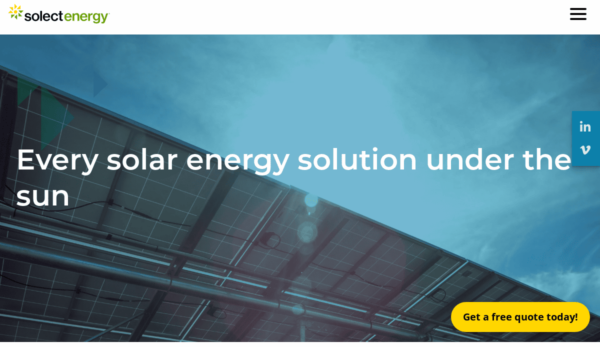
1. Solect Energy
Location: Hopkinton, MA
Key Takeaways:
- Clean, modern design with a focus on sustainability
- High-quality imagery showcasing solar installations
- Informative content highlighting services and industry insights
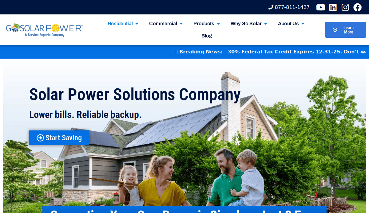
2. Go Solar Power
Location: Miami, FL
Key Takeaways:
- Vibrant color scheme reflecting energy and innovation
- User-friendly navigation with clear service breakdowns
- Engaging visuals and interactive elements for user engagement
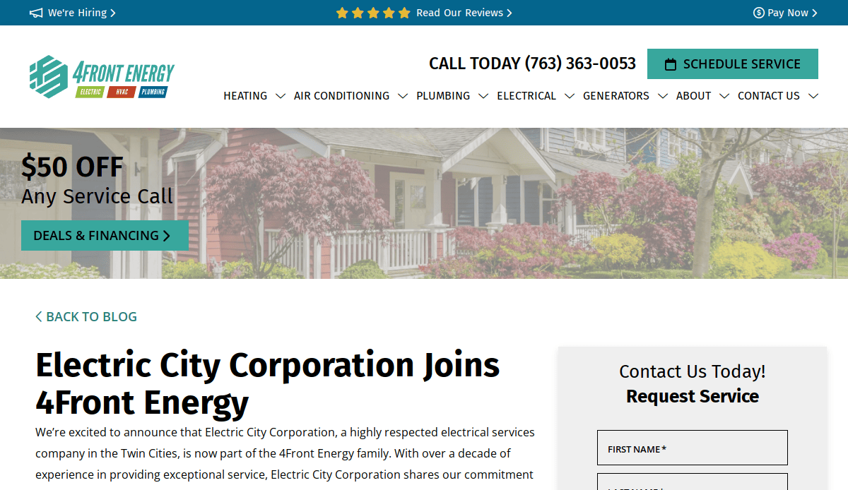
3. Electric City Energy
Location: Minneapolis, MN
Key Takeaways:
- Modern layout with illustrative design elements
- Clear calls-to-action guiding user interaction
- Informative content tailored to customer needs

4. Zeno
Location: Seattle, WA
Key Takeaways:
- Sleek, visually appealing design with bold color usage
- Simple navigation enhances user experience
- Responsive design optimized for all devices
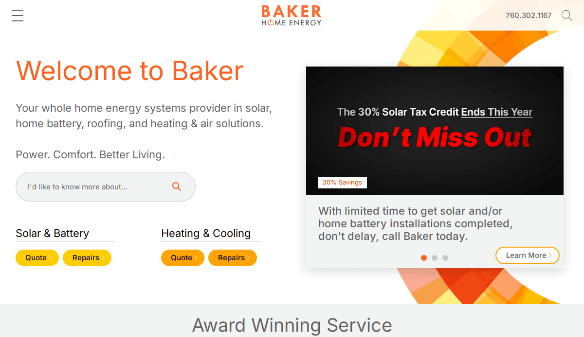
5. Baker Electric Home Energy
Location: Escondido, CA
Key Takeaways:
- Professional design with high-quality graphics
- Intuitive navigation for easy information access
- Emphasis on customer testimonials and satisfaction
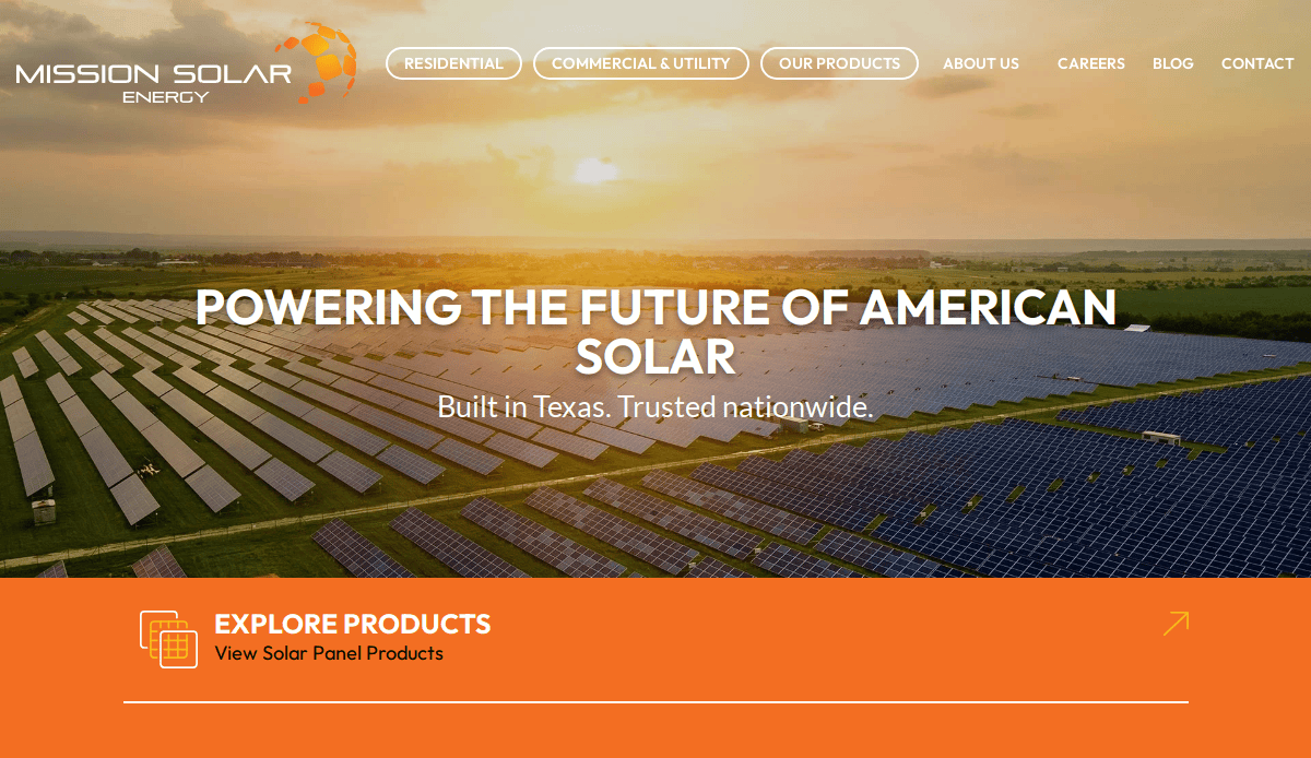
6. Mission Solar Energy
Location: San Antonio, TX
Key Takeaways:
- Sleek, modern design with bold typography
- Comprehensive product information and resources
- Easy navigation enhances user experience
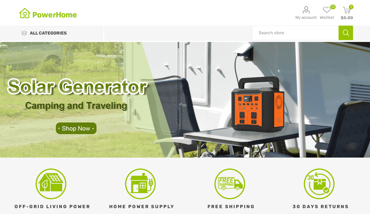
7. PowerHome Solar
Location: Mooresville, NC
Key Takeaways:
- Professional design with vibrant imagery
- Organized layout facilitates information access
- Clear calls-to-action encouraging user engagement
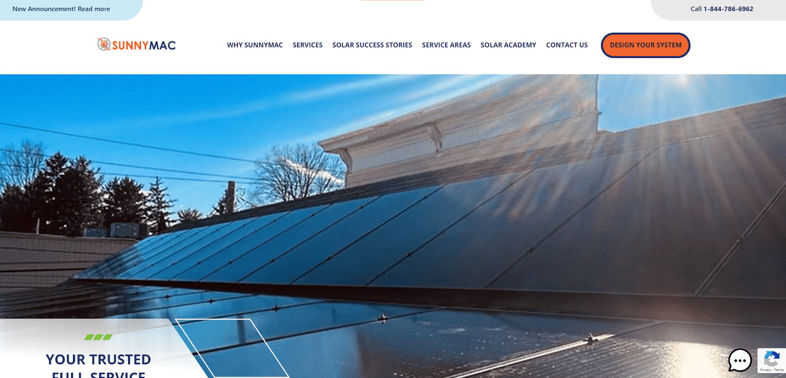
8. SunnyMac Solar
Location: Glassboro, NJ
Key Takeaways:
- Eye-catching design reflecting solar energy
- Client reviews building trust and credibility
- User-friendly contact options for customer inquiries
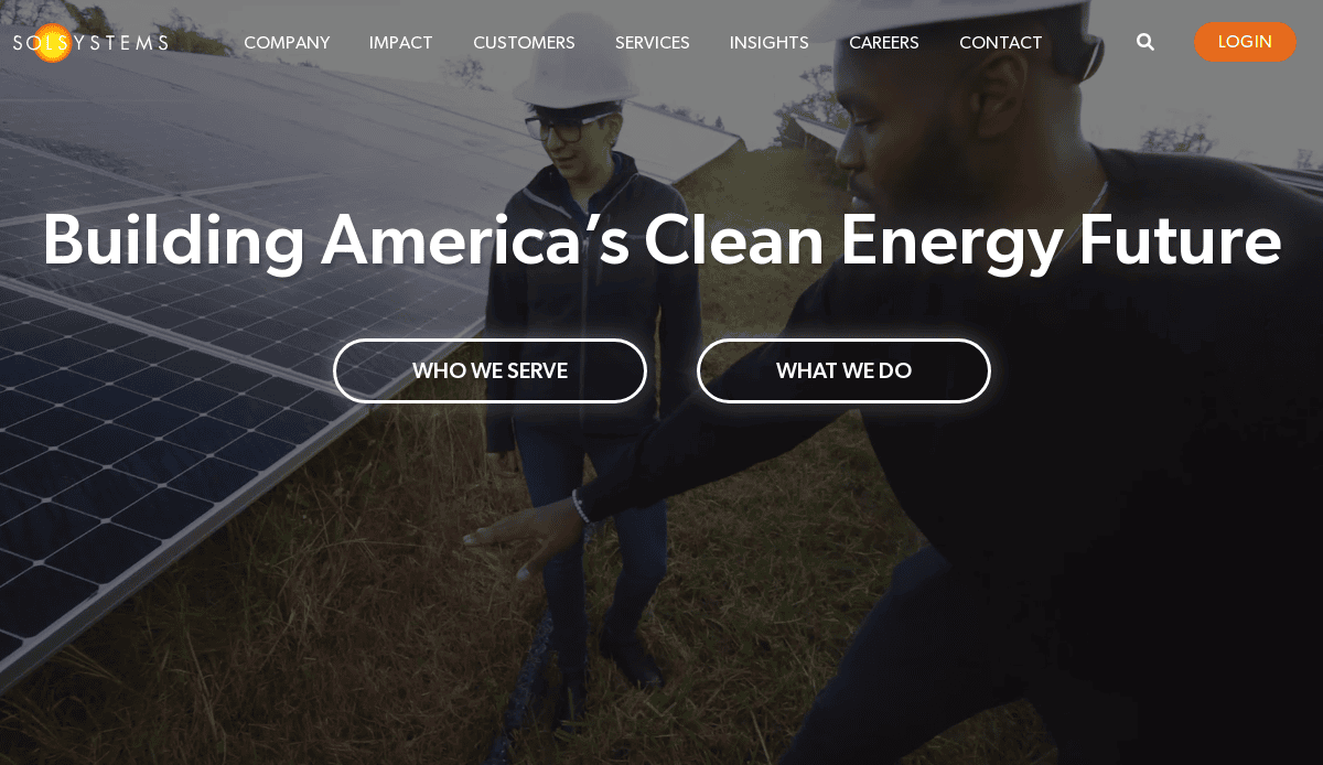
9. Sol Systems
Location: Washington, D.C.
Key Takeaways:
- Clean, modern appearance with vivid graphics
- Fixed menu enhancing navigation
- High-quality imagery showcasing solar projects
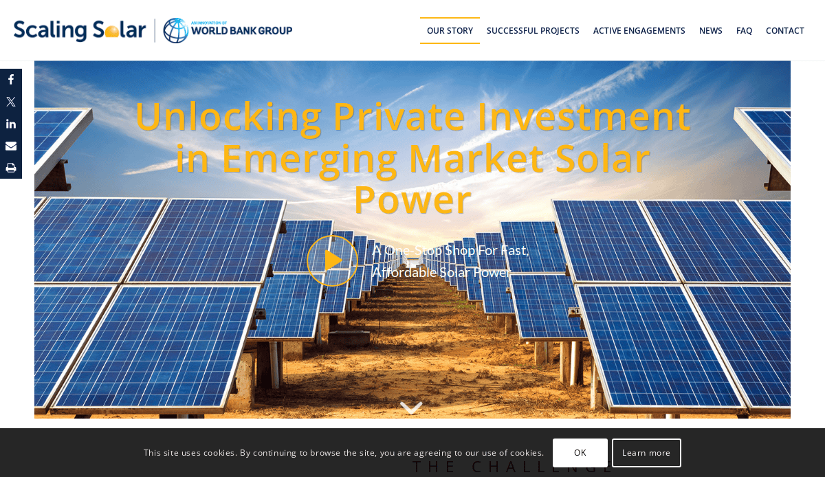
10. Scaling Solar (World Bank Group)
Location: Washington, D.C.
Key Takeaways:
- Modern, clean design reflecting innovation
- Bright imagery conveying solar power potential
- Interactive features fostering community engagement
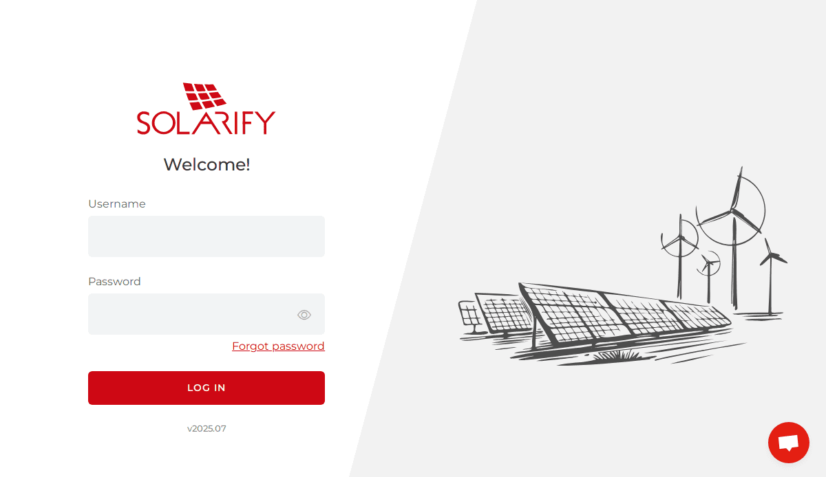
11. Solarify
Location: Portland, OR
Key Takeaways:
- Clean, modern style guiding users through content
- Informative content with high-quality visuals
- Interactive features enhancing user engagement
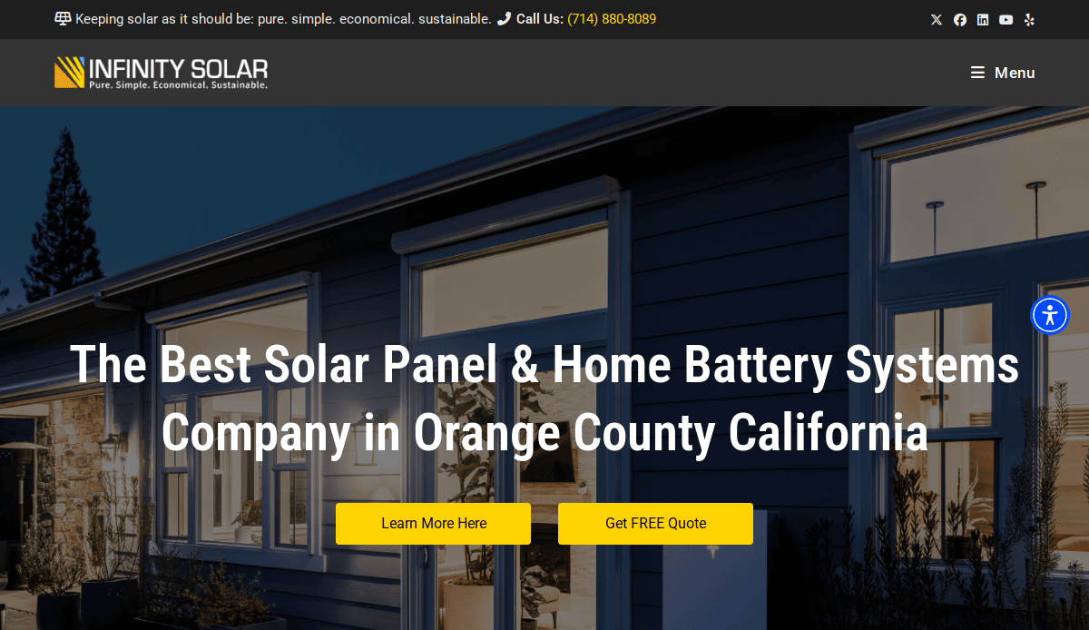
12. Infinity Solar USA
Location: Riverside, CA
Key Takeaways:
- Modern design with user-friendly navigation
- High-quality visuals enhance appeal
- Clear messaging emphasizing transparency and ethics

13. Next Solar
Location: Denver, CO
Key Takeaways:
- Visually appealing design with vibrant color palette
- High-resolution imagery complementing content
- Prominent calls-to-action encouraging user interaction
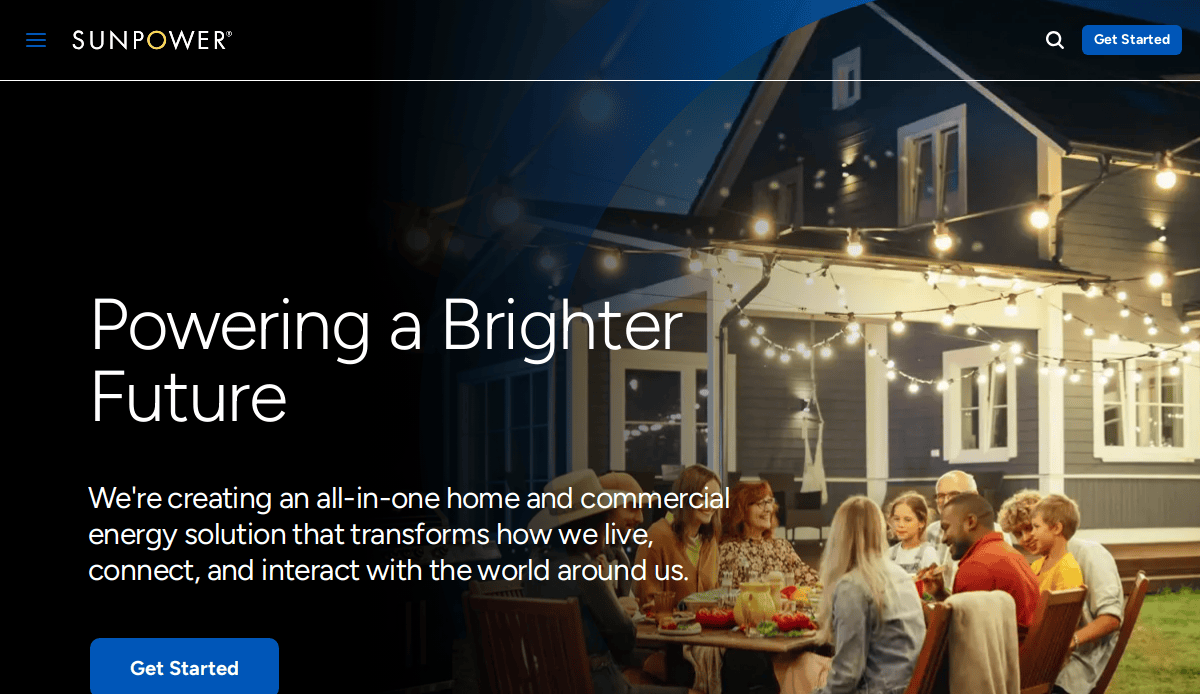
14. SunPower
Location: San Jose, CA
Key Takeaways:
- Professional design with clean color schemes
- High-quality visuals showcasing solar solutions
- Informative content with clear navigation
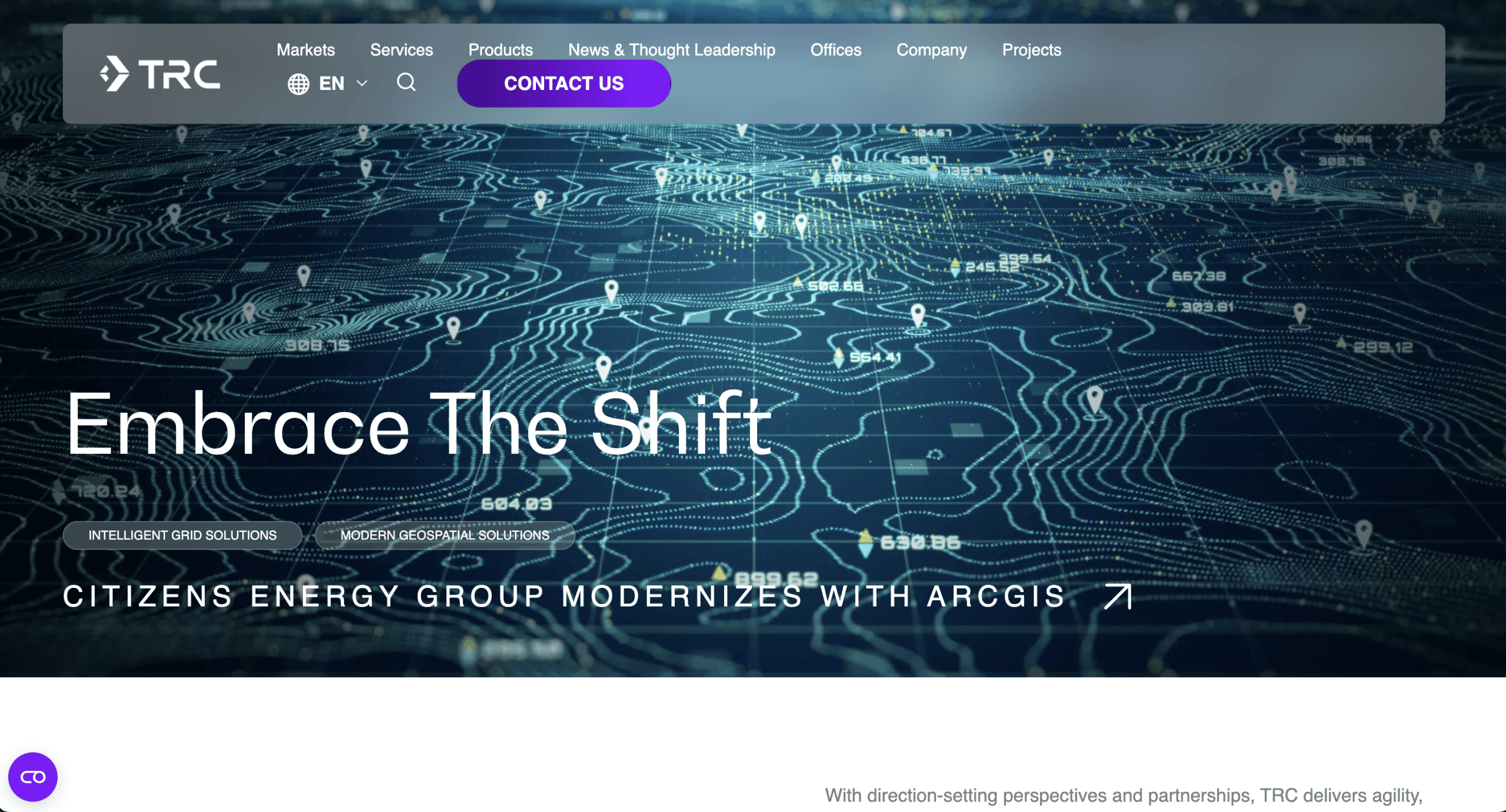
15. TRC Companies
Location: Houston, TX
Key Takeaways:
- Full-service photovoltaic system design and engineering
- Projects include major installations like the Google campus
- Emphasis on commercial and utility solar PV systems
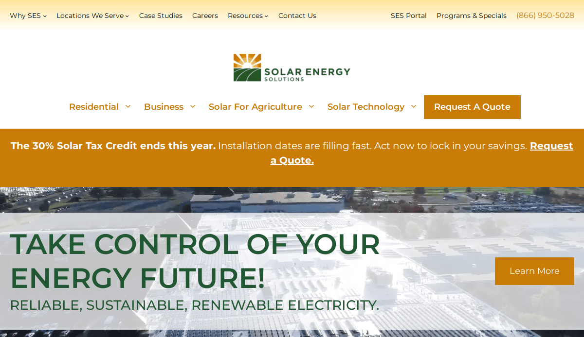
16. Solar Energy Solutions
Location: Chicago, IL
Key Takeaways:
- Custom web design tailored for solar companies
- Emphasis on SEO and lead generation
- Responsive design ensuring mobile compatibility
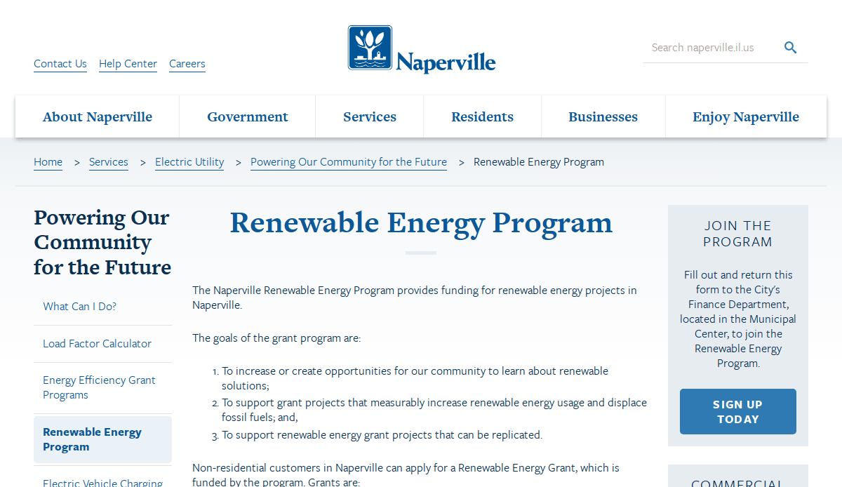
17. Renewable Energy Co.
Location: Naperville, IL
Key Takeaways:
- Clean, modern layout with intuitive navigation
- Integration of informative content and visuals
- Focus on user experience and engagement
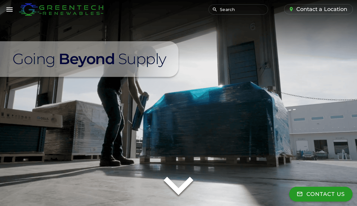
18. GreenTech Solar
Location: Evanston, IL
Key Takeaways:
- Vibrant design reflecting eco-friendly initiatives
- Clear calls-to-action guiding user interaction
- Responsive design optimized for various devices

19. Solar Innovators
Location: Aurora, IL
Key Takeaways:
- Professional design with high-quality imagery
- Emphasis on the company’s innovative solar solutions
- User-friendly layout, enhancing navigation
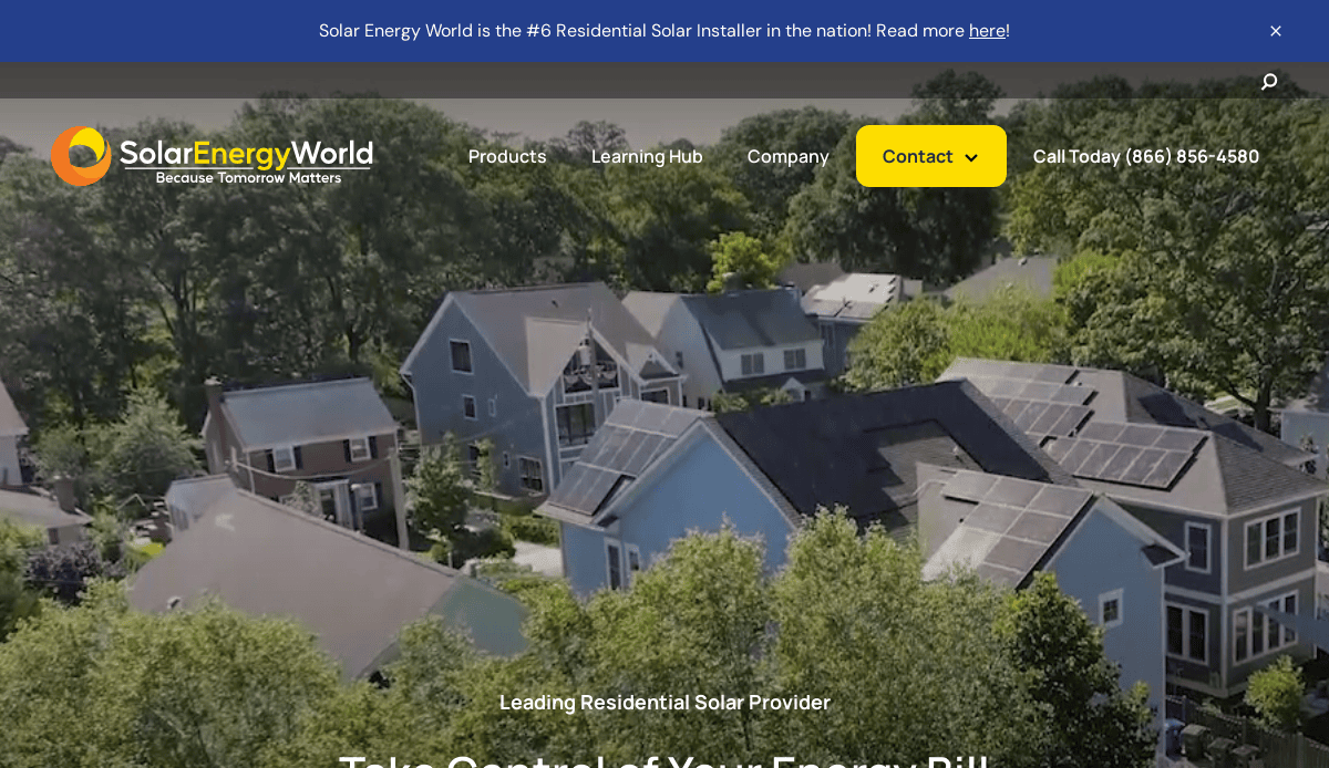
20. Solar Energy World
Location: Elkridge, MD
Key Takeaways:
- Clean and modern design with intuitive navigation
- Informative content highlighting services and industry insights
- Responsive design ensures a consistent browsing experience across all devices
These websites exemplify best practices in solar industry web design, offering inspiration for creating engaging, user-friendly, and effective online presences.
Take the Next Step Toward Powerful Solar Web Design
A high-impact website is more than just a digital presence—it’s a business growth engine. Whether you’re launching a new solar panel business or refreshing an outdated site, a strategic approach to web design can elevate your brand, attract qualified leads, and convert visitors into loyal customers. From selecting the right template to working with an experienced designer, every detail counts when it comes to building trust and authority in the solar industry.
If your current site isn’t performing or you’re unsure where to start, let our experts help. Our team specializes in crafting high-performing websites for solar companies—tailored to your needs, scalable to your goals, and optimized for visibility and conversion. Whether you’re promoting a single solar panel product line or offering full installation services, we’ll help you turn your vision into a results-driven online experience.
Contact us today to schedule a free consultation and start designing a solar website that works as hard as you do.
Solar Web Design Frequently Asked Questions
What should a solar energy company include on its homepage?
A solar energy company’s homepage should clearly communicate its value proposition with a compelling header, clean navigation, and calls-to-action that guide users to key services. Featuring elements like an illustration of a solar system, a brief brochure download, or links to an installation gallery can help build trust and inform visitors.
How does landing page design impact conversions for solar companies?
Effective landing page design is critical for capturing leads. Focused content, fast load times, and a clear call-to-action allow you to drive engagement and guide users to schedule consultations or request quotes. Pages built with a strong front-end and optimized back-end development help reduce bounce rates and increase conversions.
Can I customize my solar website for residential and commercial customers?
Yes, a customizable website structure allows companies in the industry to serve both markets effectively. With a robust content management system, you can segment content by audience, showcase relevant solar design solutions, and maintain consistent branding across pages.
What role does energy efficiency content play in SEO?
High-quality content focused on energy efficiency helps establish authority and capture search intent. Discussing topics like PV systems, solar battery options, and battery storage solutions can help you rank higher in search results and meet user needs with informative, targeted answers.
How important is branding in solar web design?
Branding is foundational. Your logo, color scheme, and imagery create a visual identity that users will remember. Reinforcing this branding across your home page, headers, and service pages helps build recognition and trust with your audience.
What type of design software is best for energy-based website projects?
Professional design software like Adobe XD or Figma enables designers to craft clean, scalable layouts tailored to sun energy companies. These tools make it easier to build downloadable templates, manage responsiveness, and collaborate with developers on front-end and back-end tasks.
How can I test my site’s performance and usability?
You can use tools like Google PageSpeed Insights or GTmetrix to test your site for performance. These platforms evaluate load times, mobile responsiveness, and core web vitals, offering insights on what to improve to enhance the user experience.
Should I integrate a portal for customers on my solar site?
Yes, a customer portal can be a valuable tool for account management, service requests, or monitoring solar system performance. It increases convenience and enhances your company’s professionalism.
What elements are key to a successful website redesign?
A web redesign should begin with identifying outdated elements, improving UX, and updating visuals. Focus on improving the grid layout, integrating strong calls-to-action, updating content, and enhancing visuals with real-world solar illustration examples and installation stories.
What internal pages should a complete website include?
A comprehensive solar site should feature a home page, about page, service details, blog, and contact form. Additionally, include a gallery of installations, an FAQ section, and dedicated pages for solar software, installers, and service area coverage. All content should align with your company’s clean energy mission and reduce your digital footprint by being optimized for fast loading.
For more on optimizing your site for performance and visibility, check out our SEO and digital marketing services. Ready for a redesign? Explore our custom web design solutions.

