Just looking for our Best Siding Website Website examples list?
Key Takeaways:
- Strategic Web Design Drives Qualified Leads: A modern, mobile-responsive website tailored to the siding industry builds trust and converts more visitors into paying customers. From clean visuals to persuasive calls-to-action, design directly impacts lead generation.
- Local SEO Is Essential for Visibility: Optimizing your website for local search, including “siding contractor near me” keywords, city pages, and service area maps, ensures your business ranks where homeowners are searching.
- Before & After Galleries and Reviews Build Instant Credibility: High-impact visual elements and customer testimonials demonstrate past success, differentiate your brand, and increase trust, making it easier for prospects to choose your business.
Why Great Website Design Matters for Siding Contractors
If you’re a siding contractor looking to grow your business, your website is your most valuable lead generation tool. Homeowners searching for siding companies online will form an opinion about your professionalism and quality in just seconds. A poorly designed site can send them straight to your competitors, while a well-crafted one builds trust, conveys expertise, and converts visitors into paying customers.
Great site design goes beyond good looks. It blends mobile-friendly layouts, clear navigation, and strategic calls-to-action to create a seamless user experience. Add in proper SEO, a strong online presence, and local search engine optimization, and your siding business becomes highly visible in search results when and where it matters most.
In this guide, we’ll show you how to optimize every part of your website for performance, credibility, and growth. Whether you’re redesigning or starting from scratch, you’ll find actionable tips that help your company stand out and succeed.
Website Planning & Purpose
Before choosing a template or writing a single line of copy, every successful website begins with clear, strategic planning. This step is often rushed or skipped entirely, but it’s what separates high-performing websites from those that underdeliver.
Start by defining your website’s primary purpose. This is typically lead generation. Are you trying to get more quote requests? Showcase completed projects? Educating homeowners about your siding services? Identifying your goals helps prioritize content, design elements, and functionality.
Next, clarify your target audience. A residential siding contractor in suburban Illinois will have different messaging needs than a commercial installer working with property managers. Understanding who you’re speaking to ensures the site’s tone, imagery, and structure all connect with the right audience.
Additionally, determine what actions you want visitors to take. Whether it’s calling your office, submitting a quote form, or browsing your portfolio, each page should be built with purpose to guide users toward those outcomes. As this guide to conversion tips for contractors explains, strategically placed CTAs and intuitive navigation dramatically improve results.
Finally, use your website planning process to audit your current content and identify what needs to be improved, removed, or added. This might include adding FAQs, better organizing services, or enhancing visuals with new photography. Effective planning ensures the finished product is beautiful and built to grow your business.
Design Principles for a High-Performing Website
Effective design starts with a strong understanding of the user experience. For siding contractors, this means creating a site that communicates credibility, supports clear navigation, and delivers information in a way that feels both professional and approachable.
First, prioritize mobile-first design. Most homeowners will discover your business from their phone, and if your site isn’t mobile-friendly, you’ll lose their attention immediately. Mobile responsiveness isn’t optional—it’s essential to keep users engaged and improve your performance in search engine rankings.
Second, use a clean, uncluttered layout. Home service buyers want answers fast, and visual overload leads to confusion. Employ a consistent grid structure, generous white space, and clearly defined content sections that highlight services, locations, and calls-to-action.
Third, follow brand consistency. Your color palette, typography, logo placement, and imagery should reflect your brand’s professionalism and build recognition. In a competitive local market, homeowners remember a polished presentation.
Fourth, integrate trust-building design elements like testimonial sliders, certification badges, warranty guarantees, and before-and-after photo galleries. These reinforce the quality of your work without needing long explanations.
Fifth, emphasize user-friendly navigation. Your menu should be logical and minimal. Important content such as services, portfolio, financing, and contact information should be no more than one click away from any page.
Lastly, ensure your site structure and calls-to-action are built for conversions. From sticky headers with “Get a Quote” buttons to intuitive forms and localized contact info, every design decision should support your business goals. For more visual ideas and advanced layout strategies, check out this list of 15 proven construction web design strategies.
By applying these principles, your website can become more than a digital placeholder—it becomes a reliable sales engine that builds trust and brings in consistent business.
Content & Navigation That Converts
Once the visual structure is solid, your content and navigation strategy must align with how your customers search, read, and decide. The right content communicates professionalism, answers key questions, and makes it easy for visitors to move through the site naturally.
Begin with a homepage that acts as your digital handshake. Highlight your most popular services, include a compelling value proposition, and guide visitors toward a clear next step, like requesting an estimate. From there, build out individual service pages that go beyond listing what you do. Each page should explain the process, address common objections, and include FAQs and testimonials specific to that service.
Include a well-structured navigation menu with top-level categories like “Services,” “Gallery,” “About,” and “Contact.” Avoid overloading your main menu with too many items. Use drop-down menus strategically to organize subcategories. For example, under “Services,” you can list “Vinyl Siding,” “Fiber Cement,” and “Soffit & Fascia.”
Make navigation effortless with clear buttons and prominent calls-to-action. Add visual pathways that lead visitors from information to action—a CTA under each section, a sticky estimate bar, or a floating contact button. Keep contact info readily accessible in your header and footer.
Equally important is building content that reflects how real customers think and search. Include location-specific pages for your service areas, educational blog posts that address common homeowner concerns, and a project gallery organized by siding type or neighborhood. This improves SEO and builds trust.
Finally, ensure your site is accessible, easy to skim, and optimized for mobile users. Break long content into sections with headers, use bullet points where helpful, and place key information above the fold. For more guidance on structuring effective contractor content, review this guide to contractor website design best practices.
With the right navigation and content structure, your website becomes a tool that supports every stage of the customer journey—from discovery and evaluation to decision and contact.
Visual Elements That Build Brand and Trust
Strong visual elements play a pivotal role in connecting with homeowners and reinforcing your brand as a professional siding contractor. Design alone isn’t enough—your imagery, layout choices, and on-page visuals must communicate reliability, quality, and attention to detail.
Start with professional photography that showcases your work. Invest in high-resolution images of completed projects, team members in action, and before-and-after shots. These images tell your story without words and give visitors tangible proof of what they can expect.
Next, use icons and illustrations to support key service highlights. Instead of relying solely on text, break up sections with custom visuals for vinyl siding, soffit, and fascia, or fiber cement installation. These small touches add visual interest and help users quickly scan the page.
Incorporate video content where possible. A short homepage reel or customer testimonial video can create a personal connection and elevate your credibility. When visitors see and hear satisfied customers, trust increases exponentially.
Don’t underestimate the power of layout hierarchy. Use heading styles, contrast, and spacing to guide the eye naturally from one section to the next. Pair visual cues with action steps, like placing a “Get an Estimate” button below a transformation gallery or testimonial quote.
Also include social proof graphics such as review badges, client ratings, or local affiliations. Visual representations of credibility cues are easy to digest and build instant confidence.
Finally, keep your brand visuals consistent throughout the site. Stick to a cohesive color palette, typeface style, and photography style. This consistency sends the message that your business is organized, trustworthy, and detail-oriented.
Every visual on your website should serve a purpose—whether it’s to educate, reassure, or drive action. When executed well, these elements will enhance user experience and establish your company as a brand worth trusting.
Ongoing WordPress Maintenance for Siding Contractor Websites
Launching your website is only the beginning. For siding contractors, ongoing WordPress maintenance is essential to ensure your site stays fast, secure, and effective at capturing leads. Regular updates and performance checks protect your investment and keep your online presence working for your business 24/7.
Start by keeping your WordPress core, themes, and plugins up to date. Outdated software can create security vulnerabilities and cause compatibility issues. These updates often include performance improvements and bug fixes that help your site run smoothly.
Backups are another key aspect of maintenance. Automate daily or weekly backups to ensure that if something goes wrong—like a site crash or malware infection—you can restore everything without losing data or revenue opportunities.
Security should be proactive, not reactive. Use a web application firewall, enable SSL encryption, and install trusted security plugins to monitor threats. Set up alerts for suspicious activity and review your site’s access logs regularly.
Don’t overlook site speed and uptime. Monitor page load times and address slowdowns by optimizing images, minimizing scripts, and using a content delivery network (CDN). Downtime hurts SEO rankings and frustrates users, so choose a reliable hosting provider with strong uptime guarantees.
Maintenance also includes checking for broken links, testing contact forms, and reviewing analytics to ensure your content is performing as expected. Regularly reviewing your analytics helps identify areas for improvement and ensures your site continues to convert visitors into leads.
Investing in ongoing maintenance gives your siding business a competitive edge. It shows clients you’re serious about professionalism, and it helps your site maintain strong performance in search rankings. A well-maintained website establishes trust with users and helps generate consistent, measurable results.
20 Siding Website Examples
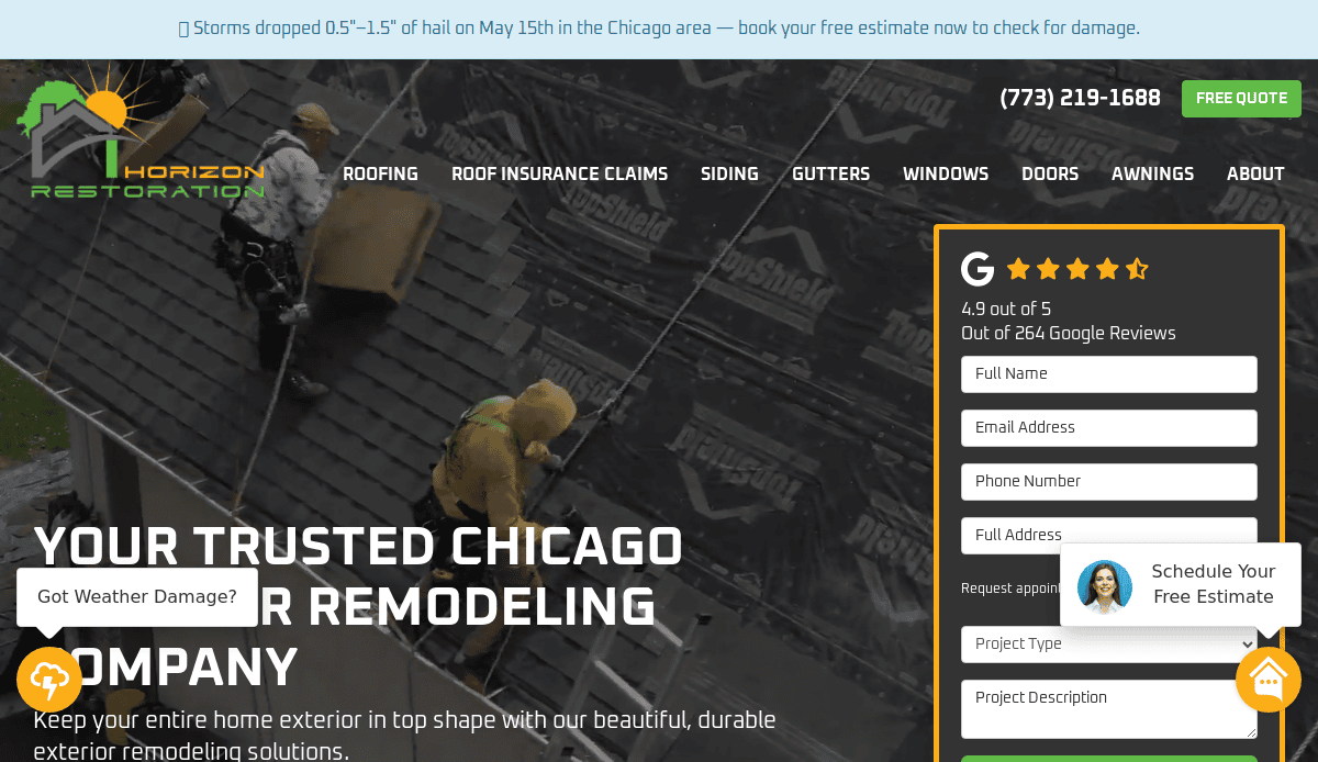
1. Horizon Restoration
Location: Chicago, IL
Key Takeaways:
- Strong focus on local SEO and roofing and siding service area pages
- Clean, mobile-responsive layout with a strong call-to-action
- Trust-building homepage elements including customer reviews and certifications
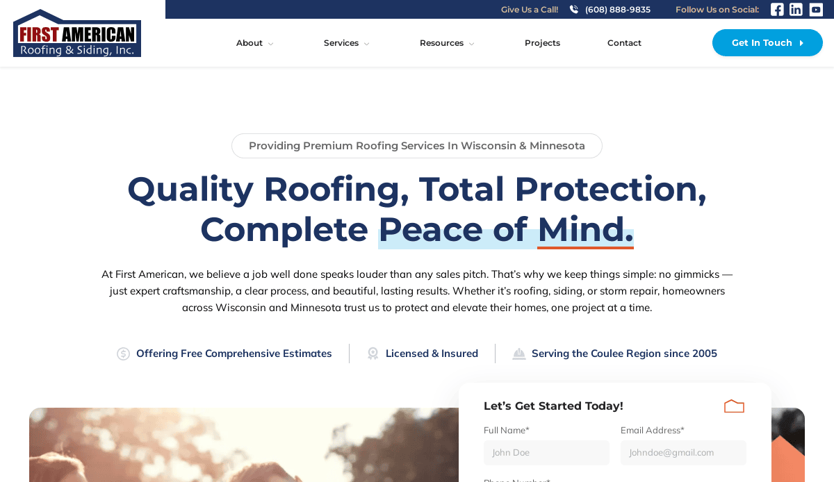
2. First American Roofing & Siding
Location: Onalaska, WI
Key Takeaways:
- Easy navigation with well-organized service menus
- Professional photography highlights siding materials and project quality
- Case studies showcase project success and client satisfaction
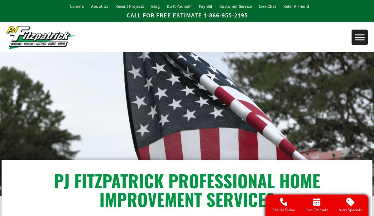
3. PJ Fitzpatrick
Location: New Castle, DE
Key Takeaways:
- Homepage CTA encourages quote requests right away
- Clear customer value statements support brand authority
- Website also includes detailed product education for siding materials
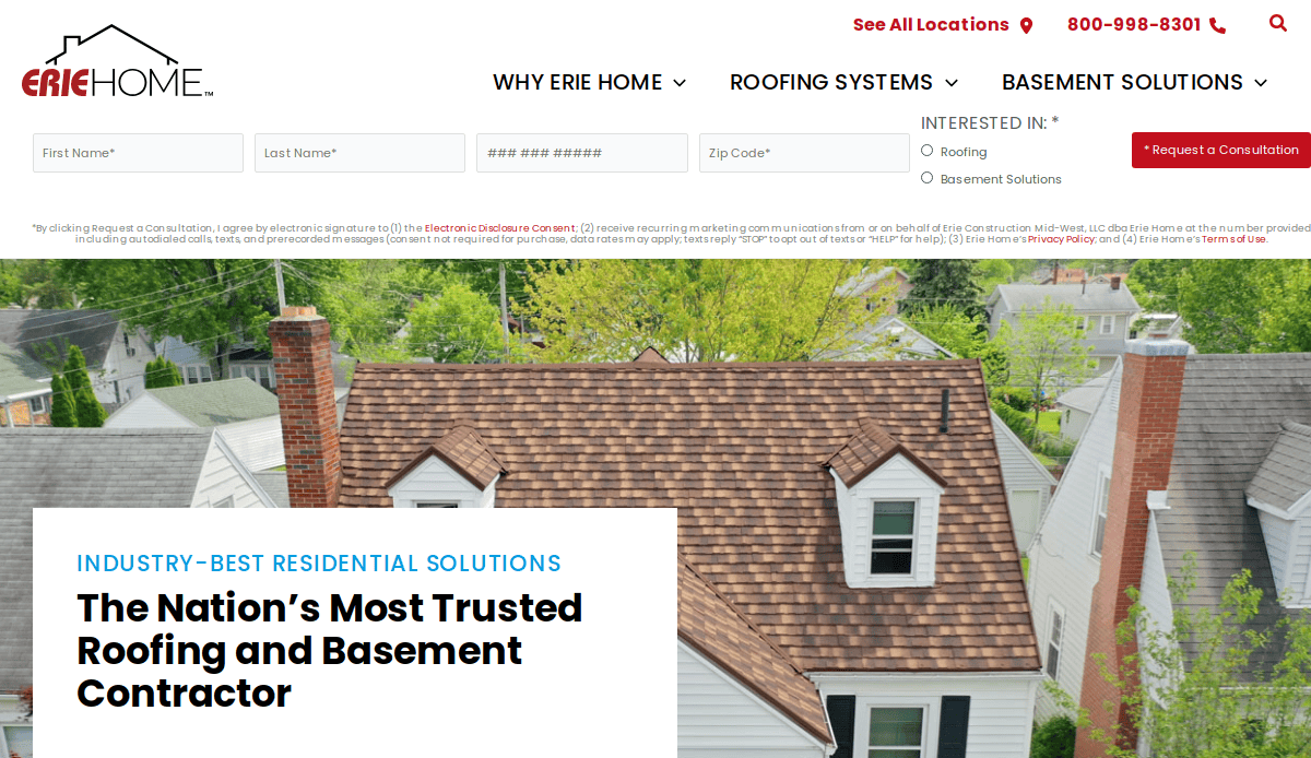
4. Erie Home
Location: Toledo, OH
Key Takeaways:
- Visually compelling full-screen design focused on home improvement
- Seamless mobile experience across devices
- Strategic use of customer reviews and trust badges
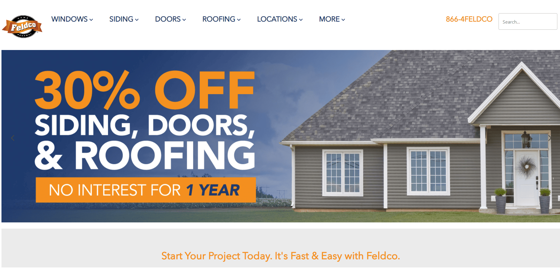
5. Feldco
Location: Des Plaines, IL
Key Takeaways:
- High-traffic SEO pages targeting siding and windows
- Bright CTAs and color-coded navigation for user-friendly design
- Consistent branding that enhances online visibility
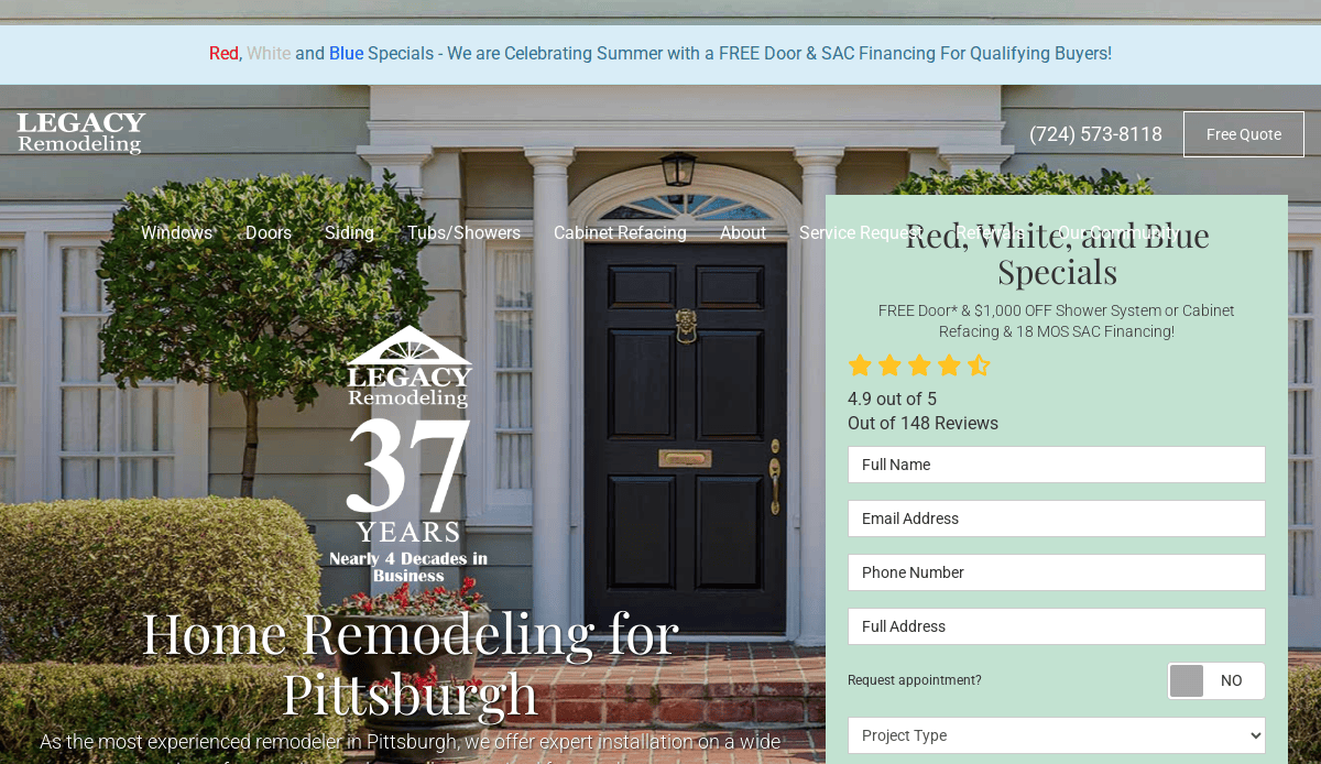
6. Legacy Remodeling
Location: Pittsburgh, PA
Key Takeaways:
- Strong brand credibility built with professional design and development
- Features local SEO landing pages and photo galleries
- Clean navigation and call-to-action for roofing and siding services
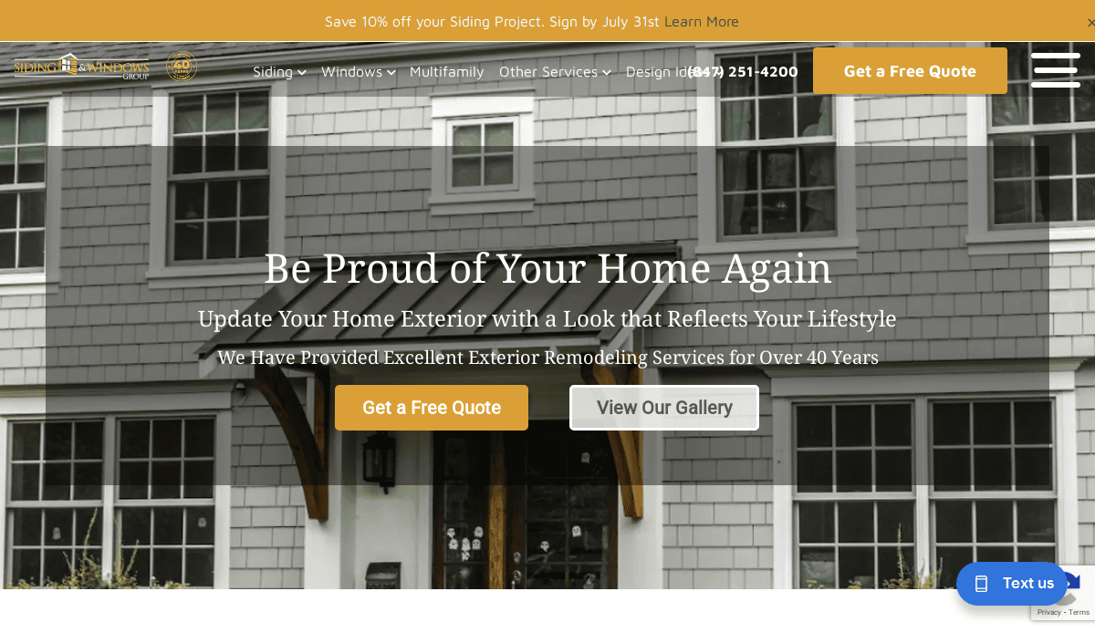
7. Siding & Windows Group
Location: Arlington Heights, IL
Key Takeaways:
- Detailed service area coverage improves local search rankings
- Content-rich layout that balances design with functionality
- Highlights premium products like James Hardie siding
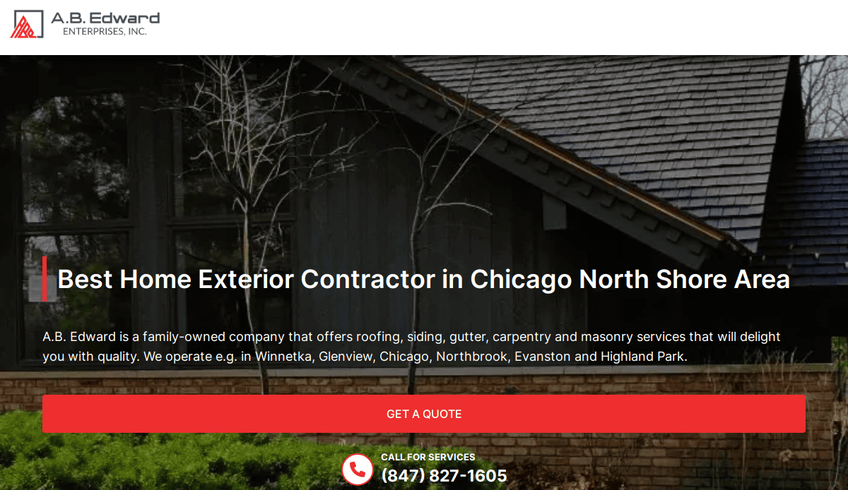
8. A.B. Edward Enterprises
Location: Wheeling, IL
Key Takeaways:
- Mobile-optimized with clear calls to action
- SEO for siding contractors backed by well-structured content
- High-quality visuals throughout your website that reflect project expertise
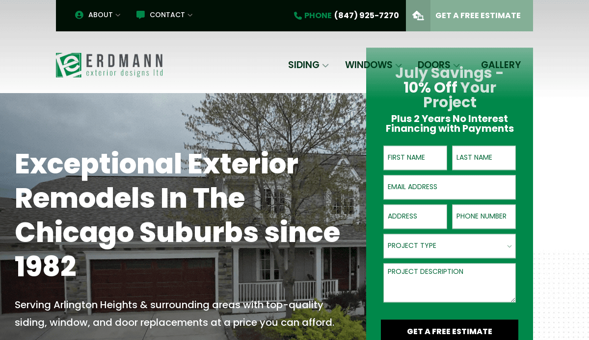
9. Erdmann Exteriors
Location: Arlington Heights, IL
Key Takeaways:
- Emphasis on design for siding contractors and premium remodeling
- Gallery section that helps potential clients make informed decisions
- User-friendly navigation with consistent branding and CTAs
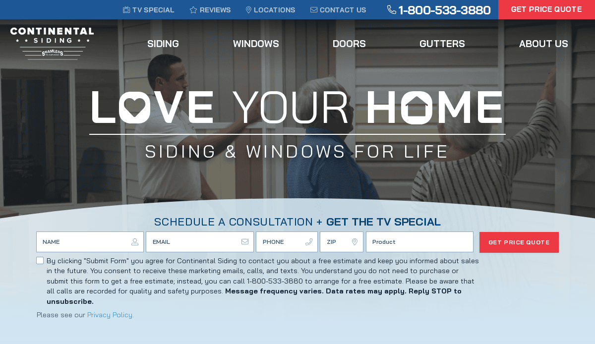
10. Continental Siding
Location: Kansas City, MO
Key Takeaways:
- Fast-loading, performance-optimized pages
- Website features a virtual quote tool
- Focus on user experience and SEO with clearly defined service areas
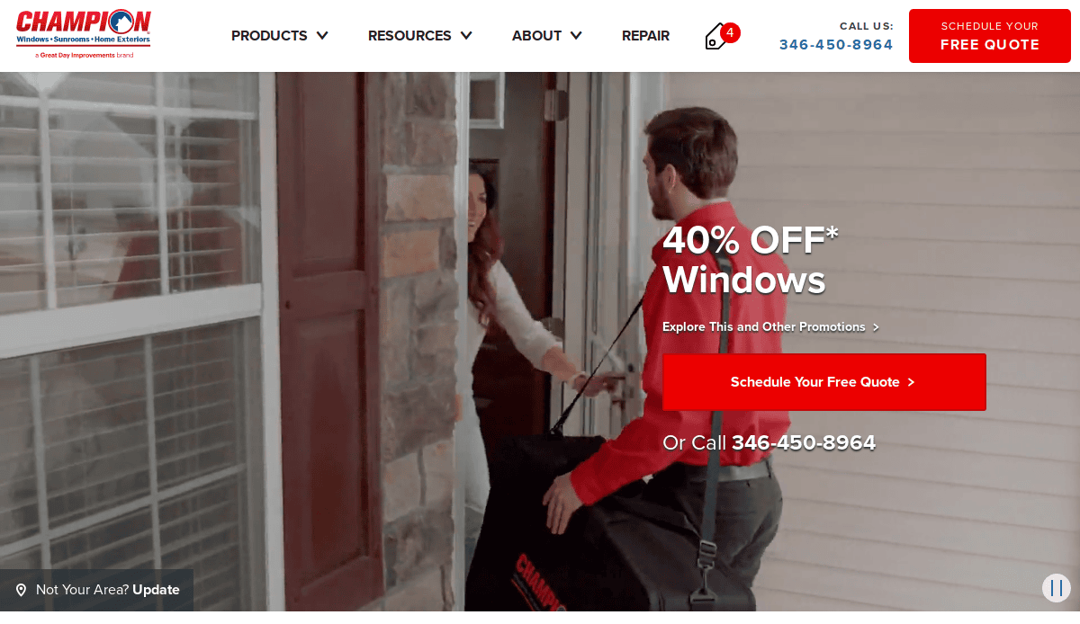
11. Champion Windows
Location: Cincinnati, OH
Key Takeaways:
- Large-scale website with clear product breakdowns
- Focused CTAs that generate leads across multiple channels
- Strong use of trust signals like Better Business Bureau accreditation
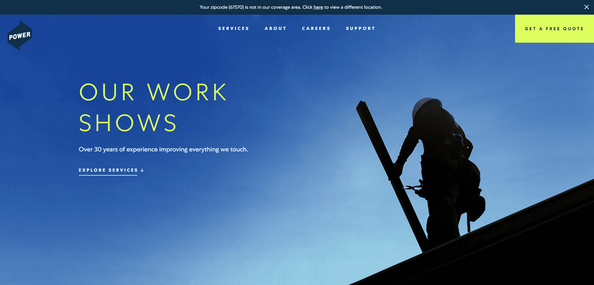
12. Power Home Remodeling
Location: Chester, PA
Key Takeaways:
- Clean, modern layout focused on home improvement and exterior siding
- Prominent testimonials and client results
- Engaging About page that reinforces company values
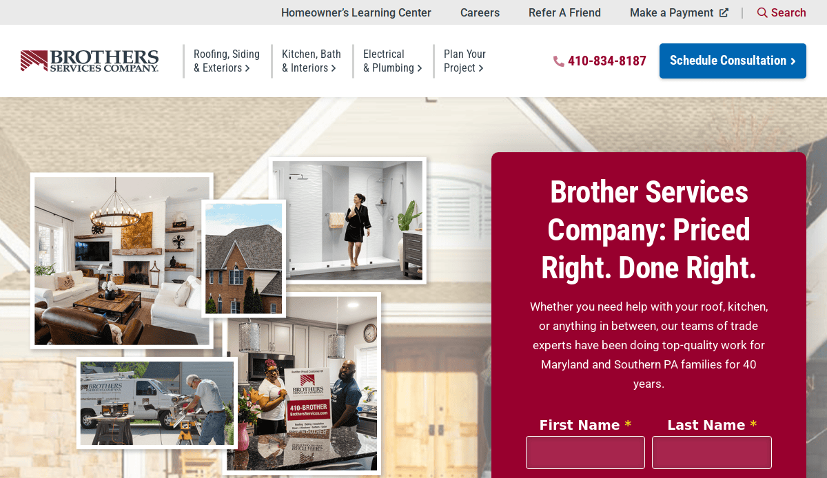
13. Brothers Services
Location: Hampstead, MD
Key Takeaways:
- Easy-to-use site structure and navigation for roofing and siding
- Professional imagery of exterior remodeling projects
- Emphasis on education through blog and FAQ sections
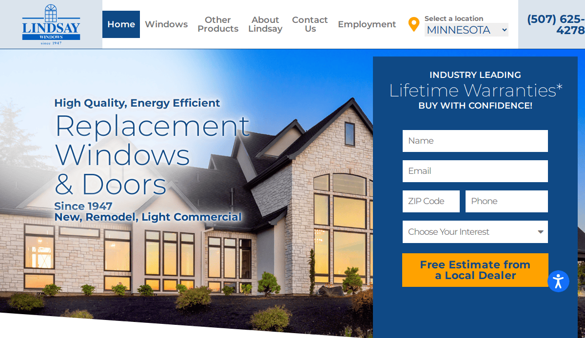
14. Lindsay Windows & Siding
Location: North Mankato, MN
Key Takeaways:
- Simple navigation and minimalist design
- Clear product descriptions and installation processes
- Effective use of before-and-after galleries
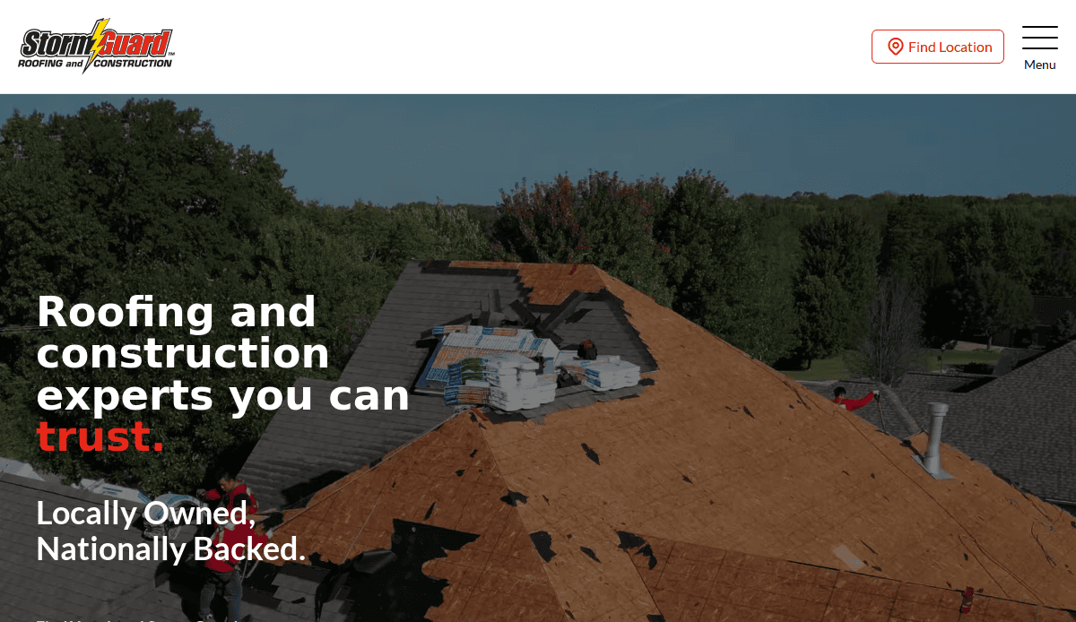
15. Storm Guard
Location: Fort Worth, TX
Key Takeaways:
- Emphasizes emergency response for siding repair
- Optimized mobile interface and fast load speed
- Integrated online visibility with local office listings
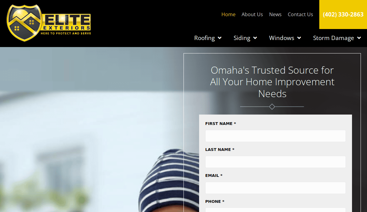
16. Elite Exteriors
Location: Omaha, NE
Key Takeaways:
- Color-coded navigation for fast exploration of siding services
- Engaging homepage design for potential clients
- Robust photo gallery showcasing good siding options
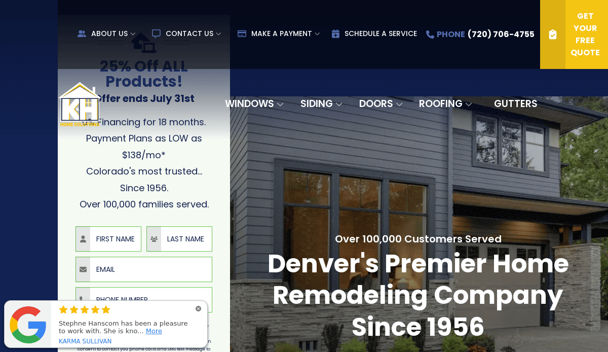
17. K&H Home Solutions
Location: Englewood, CO
Key Takeaways:
- Keyword-rich headers for SEO services and product pages
- Modern layout with sticky CTA buttons
- Displays certifications and long-standing experience as an industry expert
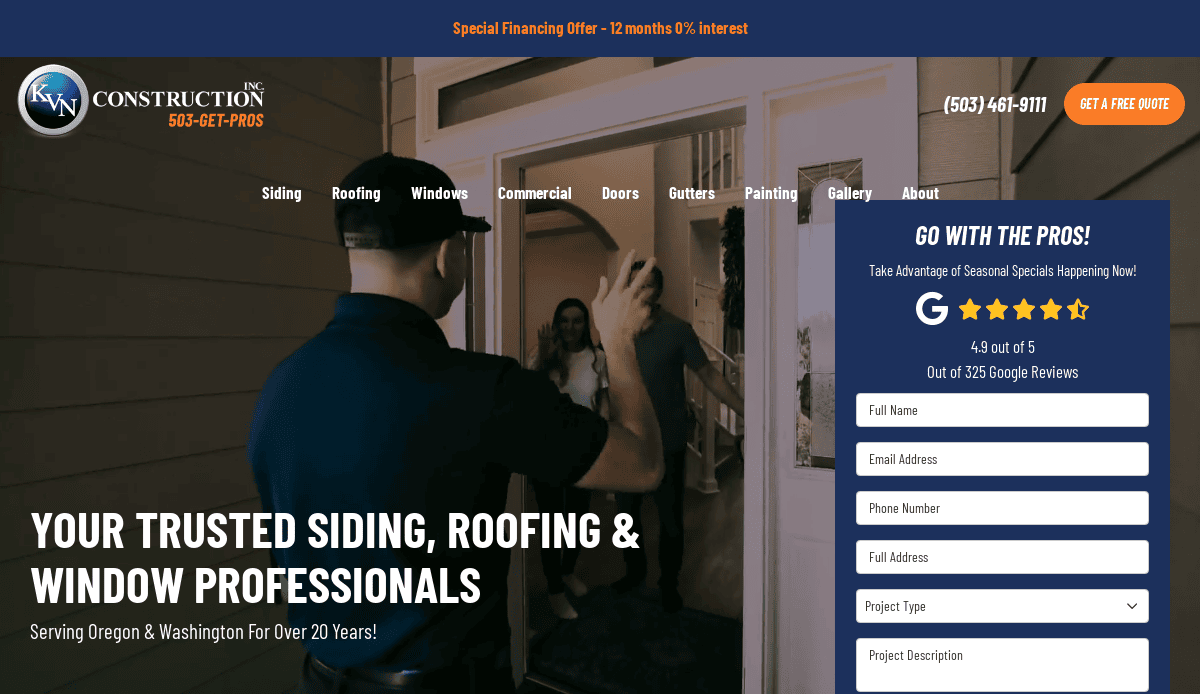
18. KVN Construction
Location: Portland, OR
Key Takeaways:
- Seamless scrolling and clean grid layout
- Strong call-outs for siding installers and exterior siding needs
- Embedded project galleries that highlight completed work
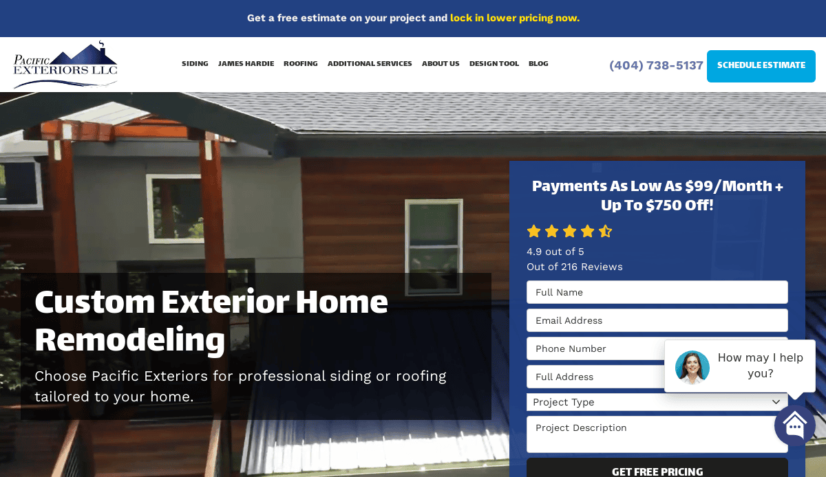
19. Pacific Exteriors
Location: Seattle, WA
Key Takeaways:
- High-converting homepage with CTA buttons above the fold
- Navigation built for mobile devices and desktop ease
- Product pages educate customers on choosing the right siding
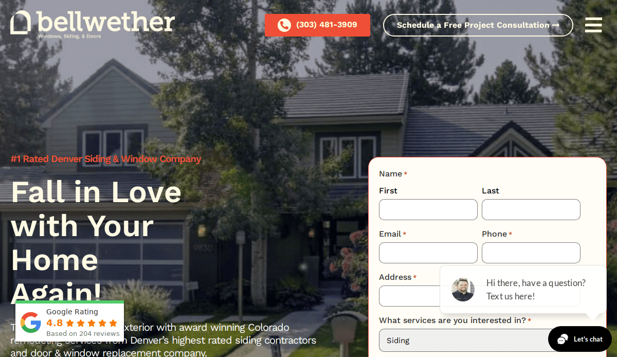
20. Bellwether
Location: Denver, CO
Key Takeaways:
- Distinct color palette for brand consistency
- Informational blog and SEO content strategy
- Site promotes user-friendly design and easy navigation
Ready to Elevate Your Siding Website?
A professional website is more than a digital asset—it’s your most valuable salesperson. Whether you install James Hardie products, handle full exterior remodeling, or offer residential siding installation, your site needs to engage potential customers and convert website visitors into leads. It should reflect the quality of your work, showcase your siding projects, and support your broader digital marketing for siding contractors.
If your current website is outdated or underperforming, it’s time to take the next step. As a full-service digital marketing agency, we specialize in website design services tailored for your industry, combining responsive design with SEO strategies to help you grow your siding business.
Request a quote today and find out how we can help you drive traffic, enhance your online presence, and turn your marketing efforts into measurable results.
Frequently Asked Questions About Siding Contractor Websites
What features should an industry-specific website include?
A good industry website should include clear service descriptions, before-and-after project photos, customer reviews, and strong calls-to-action. Integrate user-friendly design, mobile responsiveness, and localized SEO to attract customers searching for siding services and help them make informed decisions.
How does SEO help increase leads?
SEO ensures your website ranks well in search engines like Google, especially for local searches. By targeting the right keywords and optimizing your site structure, you increase your online visibility and attract more potential clients to your siding business’s services.
Should my company use a WordPress website?
Yes, a WordPress website is ideal for siding installers because it’s flexible, easy to manage, and SEO-friendly. It supports essential features like mobile responsiveness, fast loading times, and plug-ins that enhance design and development without sacrificing user experience and SEO.
What makes a website responsive for mobile devices?
A responsive website automatically adjusts to the screen size of mobile devices, tablets, or desktops. This is essential for roofing and siding companies since many homeowners browse from their phones. A responsive design keeps the layout clean, improves user experience, and boosts website traffic.
How often should a company update its website?
Your company’s website should be updated at least once a quarter. Keep content fresh by posting blog articles, uploading new siding project galleries, and refreshing testimonials. Regular updates also improve your SEO and show potential customers that your business is active and trustworthy.
Why is it important to highlight customer reviews on my site?
Customer reviews are critical to building trust with new visitors. Featuring online reviews throughout your website provides social proof and increases conversions. Positive experiences help visitors feel confident in contacting your business for siding repair or installation.
Can my website support digital marketing strategies?
Absolutely. A well-built website should act as the foundation for all your digital marketing strategies. It supports SEO services, social media traffic, and email marketing. When strategized properly, it can turn website visitors into leads around the clock.
What are the best ways to show off siding materials?
Use high-quality images, product detail pages, and comparison tables. Highlight siding materials like James Hardie products and show how they match different home improvement styles. This helps potential clients easily find the right siding for their needs.
How do I make it easy for potential customers to contact us?
Your website should have visible contact buttons, a streamlined quote request form, and a phone number in the header. Simplify the process for website visitors to reach you from any page and ensure your website is adaptive to make it easy on any device.
How do case studies help grow your siding business?
Case studies provide detailed examples of your completed siding projects. They show your process, showcase results, and include customer feedback. Case studies reinforce your expertise and help customers make informed decisions by showing proof of success.

