Just looking for our Best School Website examples list?
Build a Better First Impression: Why School Website Design Matters More Than Ever
We live in a digital-first environment, and the truth is that your website isn’t just a resource—it’s your institution’s front door. For many prospective families, staff, and community partners, the website is their first impression of your educational institution. And just like a well-maintained campus, a well-organized digital presence speaks volumes.
But a great website design for schools does far more than look good. It drives measurable outcomes. From increased inquiries to better parent communication and stronger enrollment pipelines, a modern, responsive design serves as the hub of your school’s outreach and operations.
Yet too many schools are still working with outdated layouts, broken navigation, and designs that don’t adapt to mobile phones or different-sized screens. These issues frustrate website visitors, create barriers for inclusivity, and cause schools to lose credibility. That’s why investing in smart, strategic web design is no longer optional.
Whether you’re updating an old site or building from scratch, this guide will walk you through what makes the best school website—from homepage structure and navigation to mobile performance and brand identity. Along the way, we’ll explore real-world examples, design best practices, and how the right layout, font, calendar integrations, images, and videos can help you establish trust and deliver important information efficiently.
If your goal is to create a seamless user experience (UX) that reflects your entire school’s mission and values, it all starts here. Let’s design a site that works for every visitor, on any screen, at any time.
Website Planning & Purpose: The Strategic Start of Every Great Site
Before any pixels are placed or code is written, a successful website begins with a focused planning phase. This stage defines the foundation for everything that follows, aligning your educational institution’s goals with the needs of your audiences—families, students, faculty, alumni, and the wider community.
The planning process starts by answering the essential “why” behind the website redesign or build. Is your current site difficult to update? Are families struggling to find important information? Are you aiming to improve mobile performance or ADA accessibility? Establishing a clear purpose ensures your website is more than just a digital brochure—it becomes a tool that supports your school’s mission and day-to-day operations.
This stage should include stakeholder discovery sessions, which often involve school administrators, communication teams, IT staff, and sometimes even parent advisory groups. Their input is essential in identifying what’s missing, what’s working, and what must change. Schools often overlook this collaborative aspect, but it’s crucial for producing well-organized content that reflects the voice and values of the school.
Equally important is identifying your primary audiences and mapping their key goals. Prospective parents want to evaluate the curriculum, read testimonials, and browse clear admissions info. Current families need fast access to forms, events, and school announcements. Students may look for class schedules or technology resources. Designing with these varied needs in mind shapes your site’s navigation, homepage layout, and feature prioritization.
Strategic planning also includes creating a content audit of your existing site. What pages get the most traffic? Which ones cause drop-offs? Are important resources buried or out of date? Understanding how users interact with the current platform informs decisions about structure, design flow, and opportunities for improvement.
Finally, the planning phase addresses compliance and technology. Will your new site meet WCAG accessibility standards? Is your content management system easy to use for staff updates? Is the design responsive across all screen sizes? These considerations aren’t just technical—they directly affect UX, site longevity, and overall visibility.
In short, the purpose of this phase is clarity. The clearer your roadmap, the stronger your results. When done right, website planning ensures every element—content, design, and functionality—works toward the same goal: serving your school community with a platform that’s intuitive, inclusive, and impactful.
Design Principles That Define the Best Websites
Designing an effective website isn’t just about aesthetics—it’s about creating a digital experience that’s clear, inclusive, and genuinely useful to your school community. For educational institutions, the goal is to make a website that informs, supports, and builds trust with diverse users, from prospective families to current students and faculty. To do that, certain design principles must guide every decision.
Clarity and simplicity are foundational. A school website must prioritize ease of use, especially since many visitors are navigating under time constraints or searching for specific information. This begins with thoughtful navigation. Menus should be intuitive and predictable, grouping content in a way that mirrors how parents, staff, and students think. A well-structured homepage should feature prominent links to high-priority areas—like agendas, enrollment, news, or contact pages—without overwhelming the user with too many choices.
Visual hierarchy is another essential principle. Effective school websites use font size, contrast, spacing, and section breaks to help guide users’ eyes and emphasize the most important content. Whether highlighting upcoming events or emergency notifications, the site should visually lead visitors where they need to go, especially on mobile devices.
Brand consistency plays a vital role in reinforcing trust. Every aspect of the site—from color palette to imagery—should reflect the school’s values and culture. High-quality images and videos that showcase real students, teachers, and classrooms can powerfully humanize the institution and inspire confidence. Generic stock photos, on the other hand, can feel cold and impersonal.
Responsive design is no longer optional. With more than half of all website traffic coming from mobiles, your site must adapt seamlessly to and size screen. That means ensuring everything from menus to videos functions properly on phones, tablets, and desktops alike. A responsive layout helps eliminate user frustration and ensures equal access to information for all audiences.
Accessibility is also a non-negotiable design standard. A truly inclusive website follows WCAG 2.1 guidelines—offering high color contrast, readable text, keyboard navigation, and alternative text for all images. Designing for inclusivity helps users with disabilities; it also supports optimization and demonstrates your school’s commitment to equity.
Lastly, performance matters. Pages should load quickly and behave predictably, even under high traffic. Clean, modern layouts should be free of distractions and clutter, creating an experience that’s easy to navigate and remember. For visual inspiration and additional guidance, review this collection of the 20 best education websites and explore how top schools are implementing these design principles effectively.
Together, these principles don’t just create a beautiful website—they build an online space that’s functional, accessible, and designed with every visitor in mind.
Content & Navigation: Structuring Websites for Clarity and Impact
A website should serve as a central hub of communication, not a maze. Structuring content and navigation effectively is one of the most important ways to support your audience, reduce confusion, and improve the overall UX. For educational institutions, that means organizing information so that it’s easy to find and clearly aligned with the needs of multiple user groups.
The first step is to define content categories based on real-world usage. Rather than assuming what users need, schools should conduct stakeholder interviews and review analytics from the current site. Parents typically look for enrollment steps, lunch menus, event schedules, or school news. Students might seek class schedules, library resources, or homework portals. Staff and faculty often need internal tools, HR documents, and policy updates. Structuring the site with these roles in mind ensures that navigation feels intuitive from the moment a user arrives.
Navigation menus should be simple, predictable, and consistent. Avoid overwhelming users with long dropdowns or deeply nested pages. Instead, aim for a top-level menu with five to seven core categories, each leading to well-organized subpages. A popular best practice is to include quick links or audience-based pathways directly on the homepage, guiding users to parent, student, or staff-specific sections without requiring them to dig.
Content should be written in plain, accessible language. Avoid jargon and use scannable formatting, including short paragraphs, bullet points, and clear headings. For example, instead of a long paragraph about academic programs, break it down by grade level or subject area with links to relevant pages. If a parent is looking for how to enroll, the page title should say “How to Enroll” rather than “Admissions Process Overview.”
Dynamic content such as school calendars, announcements, and recent news should be placed in prominent homepage areas and kept up to date. These sections improve engagement, and they also serve returning visitors who depend on timely information. Events and agenda updates should be filterable and easy to browse, especially on mobile.
Search functionality is critical for larger school websites. Include a robust site-wide search that indexes all content and helps visitors locate forms, directories, or policy documents quickly. For smaller schools, streamlined navigation with clearly labeled links may reduce the need for search, but it should still be available.
Internal consistency is key to helping users understand where they are and where to go next. This includes consistent URL structures, page layouts, and navigation across every device. Responsive design ensures that menus, text, and navigation elements adapt to any size screen without breaking or hiding content.
Ultimately, the content and navigation should reflect a deep understanding of your school community’s needs. By reducing friction and removing guesswork, you create a website that feels welcoming, informative, and aligned with your institution’s mission. When content is purposeful and navigation is intuitive, your site becomes not just easier to use—it becomes an asset that supports the school in its entirety.
Visual Elements: Enhancing Websites with Purposeful Design
Visual design is more than decoration—it’s communication. For school websites, the visual elements play a central role in reinforcing brand identity, guiding the UX, and building trust with every visitor. Whether someone is visiting the homepage for the first time or checking the schedule from their phone, the quality and clarity of visual design leave a lasting impression.
Start with consistency. Your website should reflect the school’s colors, logo, and overall visual identity in a clean, professional way. Fonts should be legible and align with your brand style. Limit the number of font types used across the site to ensure a cohesive look, and always prioritize readability over style. Body text should be easy to scan on all screen sizes, while headings should clearly separate content sections.
High-quality images and videos are critical. Prospective families want to see real students and authentic learning environments, not generic stock photos. Feature classroom activities, student life, and community events to show the energy and culture of the school. Background videos or banners can add motion and storytelling, but only when done in moderation and with performance in mind. Visual media should always support the message, not distract from it.
Photo galleries, virtual tours, and embedded videos provide engaging ways to showcase your facilities and programs. These tools help bring the school experience to life, especially for families who are considering enrollment but can’t visit in person. Be sure to include alt text for all images and transcripts for videos to support inclusivity and ensure that all users can engage with your content.
Layout and spacing also impact usability. Leave ample white space to avoid visual clutter, and use grids to align elements for a clean, balanced feel. Calls-to-action should be visually distinct, using contrasting colors to stand out while remaining aligned with the brand. Buttons like “Schedule a Tour” or “Contact Admissions” should be consistently styled and easy to spot across devices.
Icons and infographics can improve comprehension, especially for mobile users. Use them to summarize complex information like enrollment steps, department overviews, or academic programs. Simple visuals help guide the eye and reduce cognitive load, allowing users to quickly absorb key details without wading through text-heavy pages.
Mobile responsiveness is essential for visual performance. All design elements—from images and videos to buttons and layouts—must scale fluidly across smart devices. A great visual experience on a desktop means little if the same content is broken or unreadable on a phone.
Above all, visual design should support the user’s goals. If they’re looking to learn more about your curriculum, register for an event, or explore your school’s community, the design should make that path intuitive and engaging. For design inspiration tailored to higher education and broader institutional aesthetics, explore our curated guide to the best college and university websites.
When executed well, visual elements do more than make a website look polished—they build credibility, express personality, and help users connect emotionally with the school. It’s that connection that turns visitors into inquiries and casual browsers into committed families.
Ongoing WordPress Maintenance for School Websites
A website doesn’t stop evolving once it launches. To remain reliable, secure, and functional, it needs continuous attention, especially when built on WordPress. Ongoing maintenance is essential for protecting sensitive data, improving site speed, ensuring compatibility, and keeping everything running smoothly for the entire school community.
WordPress is a dynamic platform, and that flexibility comes with responsibility. Regular updates are critical. This includes core WordPress software, theme files, and plugins. Ignoring updates can create vulnerabilities that hackers exploit, while updating without testing can lead to broken features. For schools, where the website often hosts family portals, calendars, contact forms, and internal documents, stability is non-negotiable.
Security should be a top priority. A proper maintenance plan includes active security monitoring, firewall protection, malware scanning, and login protection. In the education sector, a breach doesn’t just damage reputation—it could expose private student or staff information. With a proactive maintenance routine, issues are flagged early and addressed before they escalate.
Backups are equally vital. Automated daily or weekly backups ensure that if something goes wrong, your site can be restored quickly. Whether it’s a user error, a plugin conflict, or a server issue, a recent backup minimizes downtime and protects against data loss.
Website speed and performance also depend on regular maintenance. Over time, database clutter, outdated files, and unused plugins can slow down load times, especially on mobile devices. A well-maintained WordPress site is optimized through database cleanups, image compression, caching adjustments, and monitoring tools that ensure every visitor experiences smooth navigation.
Content updates are often overlooked, but are incredibly important for school websites. Events change, staff rosters evolve, and policies are updated. Routine content reviews ensure information stays accurate and timely. Schools that delay these updates risk confusing families or providing outdated forms and links.
Maintaining accessibility standards requires ongoing attention, too. As new content, images, and PDFs are added, they need to meet WCAG compliance. A maintenance plan includes regular inclusivity checks and remediation to keep the site usable for everyone.
Finally, ongoing maintenance provides peace of mind for staff and administrators. Instead of reacting to issues, schools benefit from a predictable support structure that includes updates, monitoring, testing, and expert guidance. With a trusted partner handling the technical upkeep, your team can focus on what matters most—serving your students and school community.
Best School Website Design Examples

1. Francis Parker School
Location: San Diego, CA
Key Takeaways:
• Sophisticated design with clean typography and strong imagery.
• Clear communication of school mission and educational philosophy.
• Responsive design ensures functionality across all screen sizes.
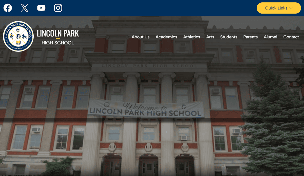
2. Lincoln Park Elementary
Location: Chicago, IL
Key Takeaways:
• Beautiful design uses real photos of students to build trust.
• Simple navigation menu groups resources by audience (parents, students, staff).
• Integrated feedback from parents form used to capture community suggestions.

3. The Lexington School
Location: Lexington, KY
Key Takeaways:
• Engaging homepage with bold visuals and interactive elements.
• Streamlined navigation built around parent and student needs.
• Emphasis on values and academics with beautifully written content.
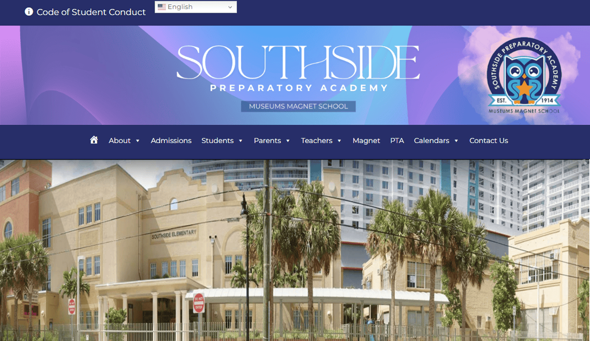
4. Southside Prep Elementary
Location: Chicago, IL
Key Takeaways:
• Homepage highlights school events and student achievements.
• Visual storytelling via embedded video tour.
• Scannable sections with clear icons for parents, prospective students, and staff.
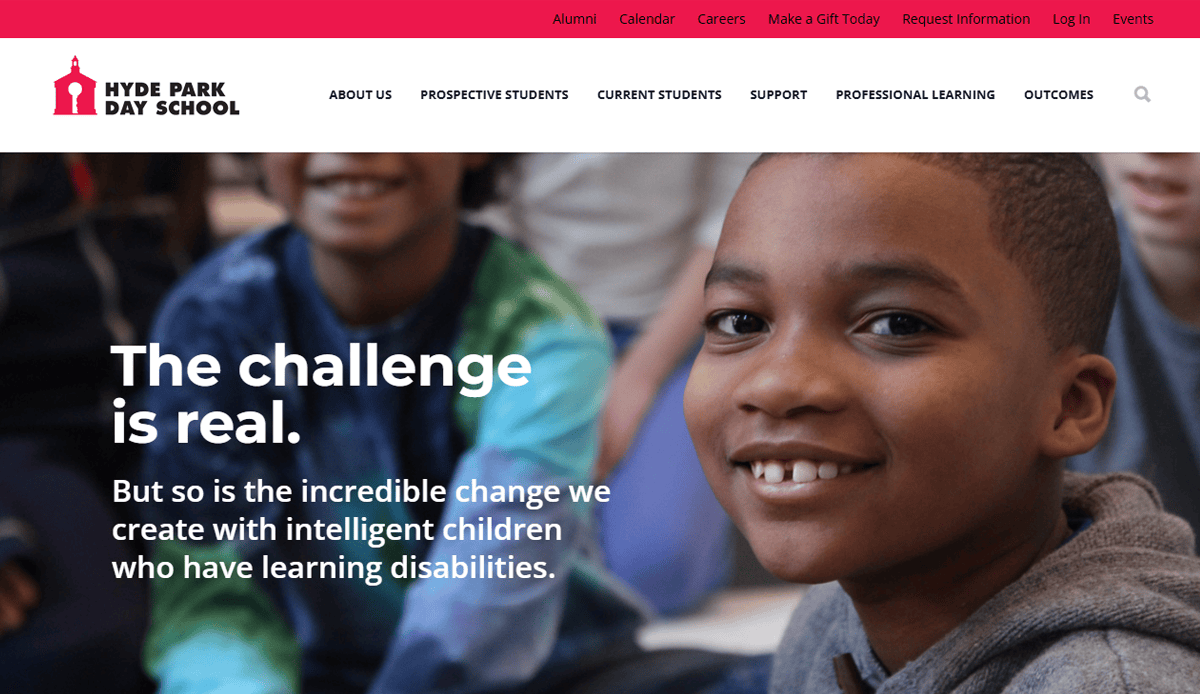
5. Hyde Park Independent School
Location: Chicago, IL
Key Takeaways:
• Dynamic news ticker featuring school events and announcements.
• Accessible design with alt-text and high-contrast visuals.
• Resources for parents—forms, lunch menus, volunteer signup—are easily located.
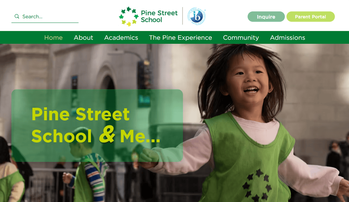
6. Pine Street School
Location: New York, NY
Key Takeaways:
• Effective dual-language navigation (English/Spanish).
• Clean design with vibrant images of classroom activity.
• Clear admissions pathway for prospective students.

7. Open Window School
Location: Bellevue, WA
Key Takeaways:
• Independent school with consistent brand colors and typography.
• Well-designed school website includes technology lab highlights.
• Easy-to-access parent portal and event listings.

8. Allen‑Stevenson School
Location: New York, NY
Key Takeaways:
• Traditional branding balanced with modern navigation.
• Homepage promotes arts and athletics via high-quality visuals.
• Clear menu structure helps parents and students quickly find key info.

9. Tracy Learning Center – Primary Charter
Location: Tracy, CA
Key Takeaways:
• Charter school emphasizes community engagement and student success.
• Menu separates grade-level information for easy access.
• Strong visuals support brand identity and mission
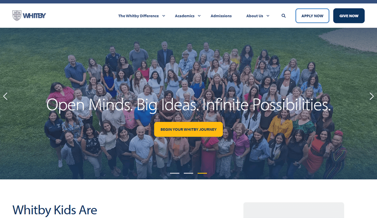
10. Whitby School
Location: Greenwich, CT
Key Takeaways:
• Montessori and IB curriculum highlighted via visual storytelling.
• Spacious layout uses white space and strong typographic hierarchy.
• Clear navigation paths for families and community visitors.

11. Cotati Rohnert Park Unified Elementary
Location: Cotati, CA
Key Takeaways:
• District-level navigation with embedded school-specific pages.
• Accessible event calendar with filters and color coding.
• Parent-focused quick links on the homepage.
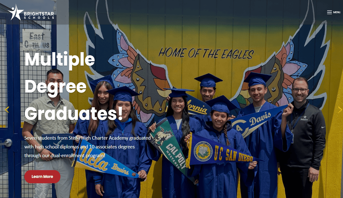
12. Bright Star Primary (Multisite)
Location: Various CA campuses
Key Takeaways:
• Consistent branding across network of schools.
• Well-organized menus by age group and location.
• Bilingual sections improve accessibility for families.
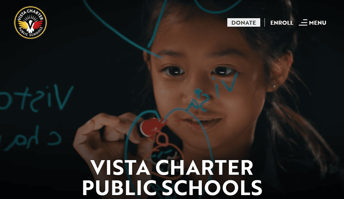
13. Vista Charter Elementary
Location: Los Angeles, CA
Key Takeaways:
• Homepage features testimonial videos and clean layout.
• Mobile-responsive design especially effective on small screens.
• Enrollment CTA clearly visible and accessible.

14. Finland International School, Maldives
Location: Male, Maldives (template inspiration)
Key Takeaways:
• Branded color palette and infographics highlight school stats.
• Secure members-only portal for admitted families.
• Layout is simple, clean, and mobile-friendly.
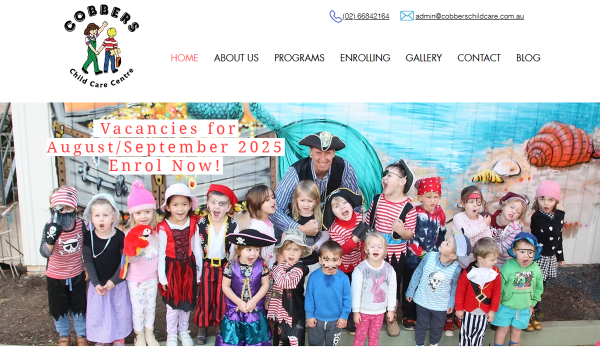
15. Cobbers Childcare Centre
Location: Australia (inspirational model)
Key Takeaways:
• Engaging hero image of students sets welcoming tone.
• Blog “learning stories” keep parents informed.
• Parent testimonial carousel increases trust.

16. The Town School
Location: New York, NY
Key Takeaways:
• Ample white space and strong headline hierarchy.
• Clear CTA buttons for admissions and contact forms.
• Photo gallery showing community and classroom life.

17. King’s Schools
Location: Seattle, WA
Key Takeaways:
• Background video reflects campus life and culture.
• Consistent typography and color palette reinforce brand.
• Sticky menu supports easy site-wide navigation.
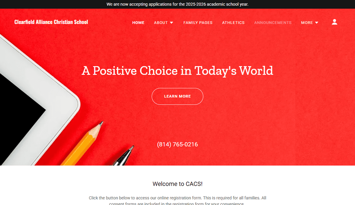
18. Clearfield Alliance Christian School
Location: Clearfield, NJ
Key Takeaways:
• Bold color scheme with strong CTA above the fold.
• Minimal text and impactful visuals on homepage.
• Menu structured around key audiences: families, academics, community.

19. Olive School (Star Academies)
Location: Birmingham, UK (multisite network model)
Key Takeaways:
• Friendly, energetic color palette and imagery.
• Top-fold CTA and clear menu structure guide parents quickly.
• Consistent design aesthetic across network schools.
Ready to Transform Your School’s Website?
A well-designed school website is more than a digital brochure—it’s the central hub of communication, trust, and engagement for your entire community. Whether you’re building a site for a charter school, a primary school, or a full district website, every design element should reflect your mission, support school activities, and serve both students and parents. Modern school sites are mobile-first, visually engaging, and built to support everything from enrollment to real-time updates about school events.
If you’re ready to make your school website work harder for you—with a clean design, optimized website content, and an online experience that’s welcoming and easy to navigate—we’re here to help. From selecting the right layout to integrating photos of students and ensuring accessibility across devices, our custom design process is tailored to fit your school’s unique needs.
Let’s make your school’s website a resource for your school, not a roadblock. Get your custom website strategy now.
Frequently Asked Questions About School Website Design
What makes a school website successful in 2026?
The most successful school websites are fast, mobile-first, visually clean, and serve the entire school community with clear pathways and updated content. They meet accessibility standards, reflect brand identity, and prioritize UX. A well-structured site also provides valuable resources for prospective students, parents, and staff.
How often should a school website be updated?
Maintaining your school website is crucial. Content like event details, announcements, and event listings should be updated weekly or even daily. Larger updates such as photo galleries, design adjustments, or feedback from parents should be reviewed quarterly to ensure that the website remains relevant and aligned with the needs of the school community.
What should be included on a new school website?
Every new website should have clear sections for admissions, academics, faculty, school events, and contact information. Website content should reflect what prospective students and families are looking for, including testimonials, photos of students, and quick links to forms or parent portals. These elements help schools communicate effectively and cement trust online.
Why is mobile-first design important for school web projects?
With most users accessing sites from mobile devices, mobile-first design ensures that the website is visually optimized, loads quickly, and functions smoothly on every screen. A mobile-first approach helps schools create a better user experience and improve accessibility, which directly impacts engagement and retention.
Can a school get a free website?
While some platforms advertise a free website, they often come with limitations, such as ads, limited support, and a lack of customization. Schools looking to build a beautiful website that reflects their mission and meets compliance standards will benefit from working with experienced designers who understand the education space.
What is the difference between a district website and a school-specific site?
A district website manages information for a network of schools, providing centralized resources like district-wide calendars, policies, and board updates. An individual school website is one that focuses on localized communication, specific school events, staff directories, and classroom resources. Both require a clear content strategy and a visually consistent brand to maintain coherence across the system.
How do I choose the right website designer for my school?
Look for a website expert with proven experience building school websites, an understanding of accessibility standards, and a portfolio of relevant website examples. The best web designers will guide you through making the design process simple and collaborative while offering post-launch support.
What are some common mistakes to avoid when launching a school website?
Common pitfalls include overcomplicated gateways, outdated design, lack of mobile responsiveness, and missing accessibility features. Another key mistake is not gathering enough feedback from parents, teachers, and students during the design phase. Avoiding these issues helps schools establish trust and deliver a beautiful design that functions well across user types.
Do independent schools have different website needs?
Yes, an independent school often operates with distinct branding, admissions strategies, and academic models. The website is one of the most important tools for communicating these differences to prospective students and families. A custom website ensures your message is clear and visually aligned with your mission.
Where can I find a comprehensive guide for school website planning?
Our school’s guide to website design offers a comprehensive look at how to structure, design, and maintain a school web project. It includes best practices, visual inspiration, and actionable insights to help you plan a beautiful website that meets every need of your school community.


