The importance of a well-designed website for educational institutions cannot be overstated. A website is the virtual front door to any educational entity, whether a school, college, or e-learning platform. It’s not just about aesthetics; a well-crafted education website design can significantly impact student enrollment, parent engagement, and overall academic performance.
The digital landscape has evolved, and so have the expectations of students, parents, and educators. They seek intuitive, informative, and accessible platforms offering information and a seamless user experience. A well-designed website can deter potential students and give a favorable impression of the institution it represents. In contrast, a website that excels in design and functionality can be a powerful marketing tool and a hub for educational resources.
Moreover, a practical education website design can serve multiple purposes—it can act as a centralized location for resources, a portal for online learning, and a showcase for an institution’s achievements and offerings. It’s not just about creating a visually appealing layout; it’s about building a comprehensive digital ecosystem that aligns with educational goals and objectives.
Examples of the Best Education Website Designs
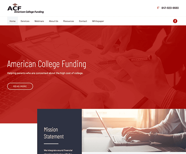
- American College Funding (ACF): The website greets visitors with a clean, professional layout that immediately establishes trust. One of the standout features of American College Funding’s website is its exceptional user experience. The navigation is intuitive, with clearly labeled tabs and a straightforward menu that effortlessly guides users to essential information. The website excels in providing a wealth of information without overwhelming its audience. From blog posts to downloadable resources, it offers a variety of content forms that cater to different learning styles.

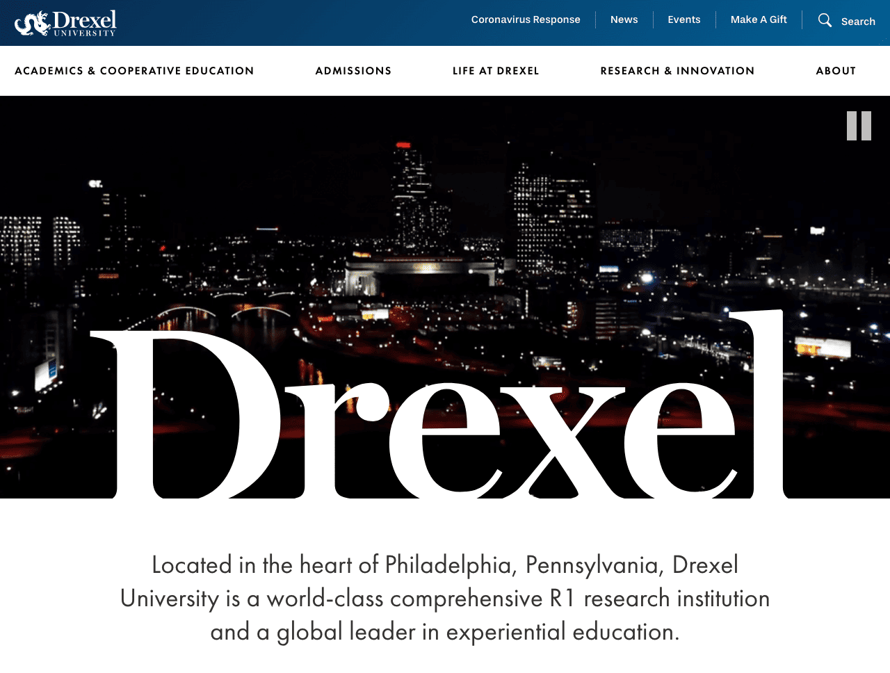
- Drexel University: Upon landing on the homepage, one is immediately struck by the modern, sleek design that its website employs. Using a bold color palette featuring blues and gold aligns with the school’s branding and adds a sense of prestige and quality. The layout is clean and uncluttered, allowing for easy readability and focus on what matters most: the content. Strategically placed call-to-action (CTA) buttons are a highlight of the site. Whether it’s encouraging prospective students to apply, inviting visitors to attend an open house, or prompting alums to donate, the CTAs are designed to be eye-catching without intrusive, effectively guiding user behavior.
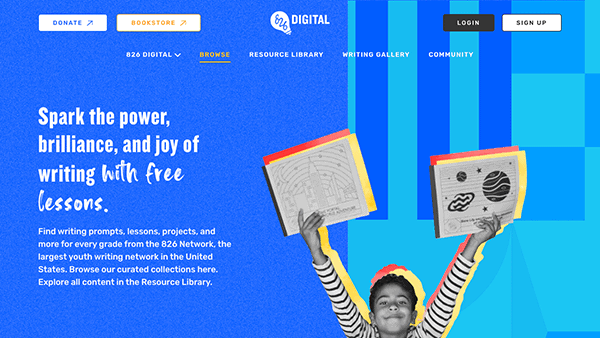
- 826Digital: 826Digital.com is an educational platform designed to ignite a love for writing among students from grades K-12. Upon entering the homepage, you’re immediately drawn in by the vibrant and engaging layout. The color scheme, a mix of lively tones, reflects the brand’s youthful and creative spirit. The navigation is intuitive, allowing visitors to explore various sections effortlessly. Using captivating visuals and interactive elements adds depth to the user experience. The content is organized, offering valuable information about their educational resources. The website’s design effectively captures the essence of its mission and expertise while ensuring an enjoyable user journey.
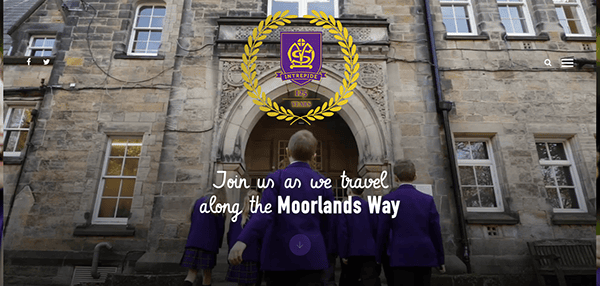
- Moorlands School: Upon arriving at the homepage, you’re immediately captivated by its refined and welcoming design. The color scheme, featuring comforting and inviting hues, mirrors the school’s supportive and educational ethos. User navigation is seamless, efficiently directing visitors across different site areas. Skillfully selected, top-tier visuals highlight the school’s lively events and amenities. Well-placed call-to-action prompts encourage deeper exploration and interaction with the institution. The site is further enriched by timely news updates, events, and student accomplishments, ensuring the content remains dynamic and current.
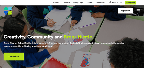
- Bronx Arts: Their website is a remarkable embodiment of artistic expression and digital design. Captivating visuals, vibrant color palette, creative layout, and interactive elements immediately draw attention to viewers, reflecting the vibrancy and diversity of the Bronx’s artistic community. Navigating the site is a delight, with a user-friendly menu guiding you through various content, artistic genres, and events. Thus, its website portrays an exquisite canvas of creativity, effectively connecting the local arts scene with a global online audience.
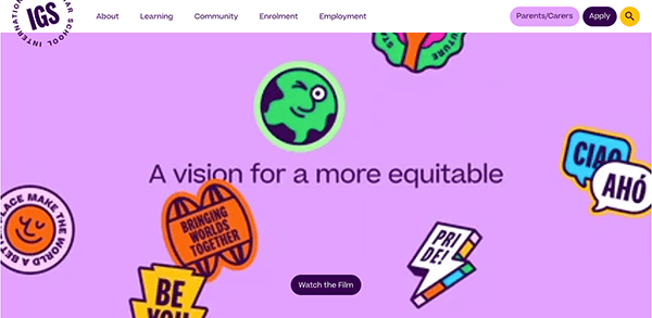
- International Grammar School: The website shines as an exemplary representation of educational excellence and effective digital design. Upon entering the homepage, immediate immersion in a world of knowledge and learning welcomes viewers stunningly. High-quality imagery and engaging videos illuminate the vibrant campus life and academic rigor. Incorporating informative content, such as detailed program descriptions and the latest news, offers prospective students and parents a comprehensive view of the institution’s offerings. Notably, the “Tour IGS” and “Apply Now” CTAs are strategically placed, facilitating seamless interaction.
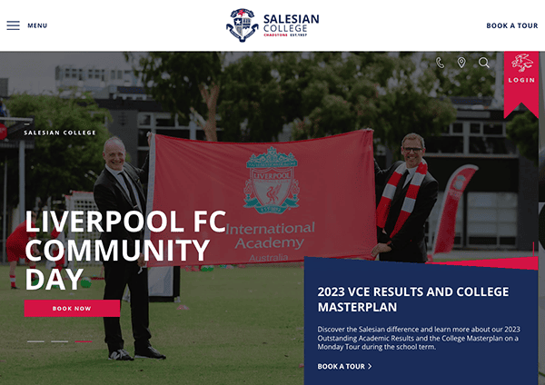
- Salesian College Chadstone: The website design exudes professionalism as it uses a clean and minimalistic layout, ample white spaces, and a warm color palette, reflecting the institution’s nurturing learning environment. The website’s organization is impeccable, with intuitive navigation menus guiding you effortlessly through various sections, from academics to co-curricular activities. Integrating high-quality images and videos immerses visitors in the vibrant campus life and showcases the institution’s commitment to holistic development. The comprehensive content provides in-depth insights into academic programs, values, and community engagement initiatives, fostering a strong sense of connection.
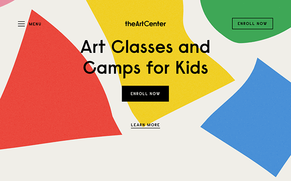
- The Art Center: The website is a captivating masterpiece embodying the essence of creativity and artistic expression. Its visually stunning layout blends with modern interactive design and creates a sense of artistic flair. Vibrant colors and bold typography immediately capture attention and set the tone for the creative journey that awaits. Its user-friendly interface makes navigation easy: combined with strategically placed call-to-action buttons, it guides users to explore various sections seamlessly. The After Art class section showcases the diverse range of artistic works from its students, allowing art enthusiasts to engage with the depth and talent of the artists.
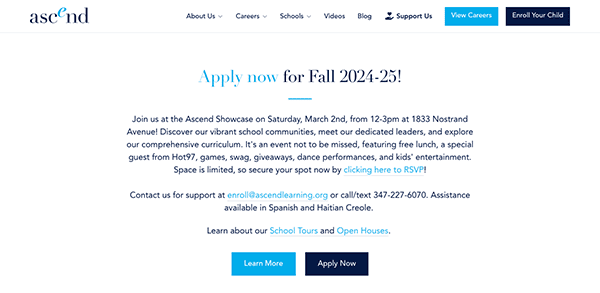
- Ascend: The website of Ascend Learning is a triumph of design and functionality, reflecting the organization’s commitment to educational excellence. Its vibrant and welcoming design color palette with inviting hues set the tone for an inclusive and dynamic learning environment. The well-structured layout offered easy navigation, with sections thoughtfully categorized to cater to diverse visitors – from prospective students and parents to educators and the community. Engaging imagery and captivating videos allow viewers to delve into the school’s ethos, achievements, and unique learning approach. The website successfully creates a website that mirrors their educational journey: inspiring, innovative, and inclusive.
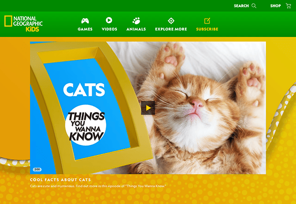
- National Geographic Kids: Their website stands out as a discovery and learning treasure trove. The homepage greets viewers with a vibrant, inviting design that instantly captures the imagination. The color palette, a burst of vivid hues, resonates with the vibrancy of nature and the world around us. The well-organized layout makes navigating and exploring various sections easy for kids. The website shines as it blends education with entertainment. It inspires kids to embark on a journey of discovery, encouraging them to be curious, informed, and engaged learners. It’s not just a website – it’s a digital playground where learning comes alive, making it an invaluable resource for young minds and curious explorers.
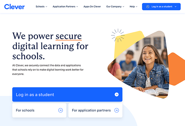
- Clever: The website’s sleek, contemporary design instantly grabs attention. Its color scheme, a balanced fusion of soothing blues and whites, cultivates a setting ideal for learning. The site skillfully marries visual allure with rich informational content. Crisp, compelling narratives adeptly communicate the platform’s unique offerings and advantages. A focus on accessibility is evident through logically organized headings and clickable elements, facilitating quick navigation to pertinent details. The website embodies the company’s ethos, as its design and utility blend to deliver an exceptional user experience.
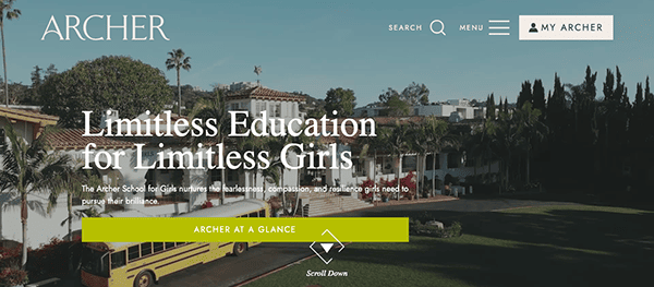
- Archer School for Girls: The website employs a clean and modern design, using a harmonious color scheme that aligns with the school’s branding. The judicious use of visuals and well-organized content welcomes visitors, initiates an exploration of new experiences, and captures the essence of the school’s vibrant community. Whether seeking information about academics, community, or admissions, Archer.org ensures that every click leads to a well-structured wealth of information. The design seamlessly accommodates visitors with varying needs, ensuring all users can engage with the content without barriers.
- Multiversity: It stands as a beacon of innovation and educational excellence in online learning, and its website design truly reflects this commitment. The website’s design exudes a sense of professionalism and forward-thinking. The intelligent use of visuals and thoughtfully curated content guides users on a journey of exploration and learning. The website’s interactive elements elevate engagement and interactivity. The platform’s design echoes Multiversity’s mission of fostering a learning, exploration, and growth culture, promising a bright and enriching educational journey for all who enter its virtual halls.
- Westbourne Grammar: Their website welcomes viewers of the eye-catching rotating banner on the homepage and highlights key aspects of the school’s offerings. Its captivating design seamlessly guides visitors to a wealth of information while reflecting the institution’s commitment to fostering holistic development. The color palette, a tasteful combination of warm tones, exudes a welcoming and vibrant atmosphere, mirroring the school’s inclusive ethos. Vivid imagery showcasing diverse activities and engaged students provides a window into the rich educational ecosystem Westbourne offers. Its website exemplifies a harmonious blend of academic excellence and cutting-edge web design by harmonizing design and content.
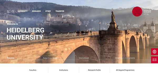
- Universität Heidelberg: The website blends elegance and practicality to deliver a great digital experience to its broad audience. The homepage’s clean look and orderly structure make it simple for visitors to find crucial aspects, including academics, research, and admissions. A sophisticated color palette and consistent typeface honor the educational institution’s illustrious history while preserving a contemporary aesthetic. High-quality images and featured news sections highlight the institution’s robust academic and cultural life. The site’s responsiveness allows seamless access across all devices, catering to desktop and mobile visitors.
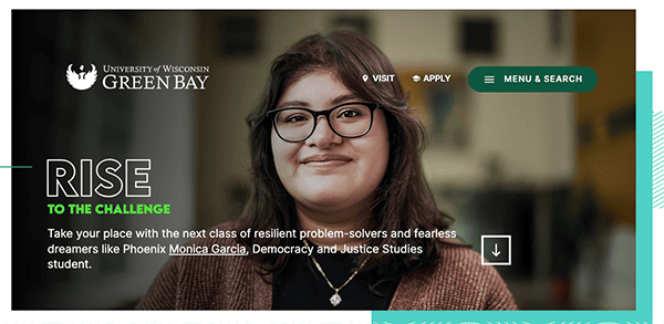
- Green Bay: Their website stands as a digital gateway to educational excellence. Upon entering the site, stunning impressions last by a well-organized interface that effortlessly navigates users through many offerings. The color palette is inviting, and the layout provides a sense of coherence, making information easy to locate. The integration of captivating imagery evokes a strong sense of campus life. Clear calls to action lead visitors to relevant sections, whether it’s exploring academic programs, campus events, or admissions details. The site is rich with resources, from virtual tours to interactive maps, ensuring a comprehensive experience for current and prospective students.
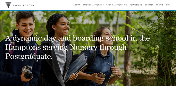
- Ross School: The website’s color palette emanates a feeling of calmness, perfectly reflecting the school’s values. Its layout is user-friendly, effortlessly leading visitors through various options, from academic courses to community involvement. Captivating images showcasing campus life and student events establish a genuine rapport with the school’s lively ambiance. Including videos and students’ testimonials introduces a human touch, enabling potential students and parents to gain direct insights. The navigation is smooth, seamlessly guiding users to essential sections. Additionally, the website highlights its dedication to sustainability, reflecting the school’s principles and values.
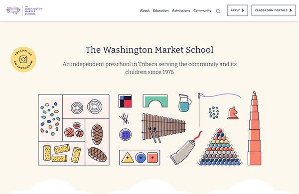
- Washington Market School: The homepage immediately conveys the school’s mission and educational philosophy, making it easy for parents to understand what the institution stands for with a user-friendly interface. The website employs a vibrant color scheme, playful toy illustrations, and interactive elements to establish the desired ambiance. The site’s structure is well-organized, guiding users effortlessly through essential sections. Including testimonials from parents adds a layer of trust and community engagement, giving prospective parents valuable insights into the school environment. The site effectively communicates the school’s educational philosophy, curriculum, and programs, aiming to spark curiosity and inspire a lifelong love of learning in children.
- University of Chicago: The University of Chicago’s website exudes academic excellence and a sense of intellectual exploration from the moment you arrive. Its sleek and modern design reflects the institution’s forward-thinking approach to education. The homepage artfully combines dynamic visuals that highlight campus activities and research initiatives, while intuitive headings and a meticulously organized menu direct users to essential areas. The inclusion of striking, high-quality images enriches the user experience, offering a glimpse into the institution’s ethos and accomplishments. The website’s responsive layout ensures seamless navigation across devices. The “News” and “Events” sections inform visitors about recent developments and happenings.
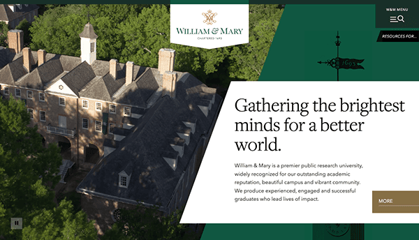
- William & Mary: The website’s design elegantly combines the university’s rich history with its forward-looking approach. The website features a well-organized menu with clearly labeled sections such as “About,” “Academics,” “Admission & Aid,” and “Campus Life,” making it easy for users to find relevant information. The homepage offers a balanced blend of vibrant imagery and text, showcasing campus life, academic fields, and research endeavors. This feature provides a comprehensive view of what the university has to offer. The “News & Events” section keeps visitors up-to-date with the latest happenings, and integrating social media links fosters a sense of community. Whether you’re a prospective student, current scholar, or alumni, the William & Mary website warmly invites you to embark on a journey of education, discovery, and lasting connections.


As we’ve explored some of the most exemplary education website designs, it’s clear that a well-designed website is more than just a “nice-to-have” feature; it’s necessary. It can be the deciding factor that tips the scale in favor of one institution over another when students and parents decide. A website that is easy to navigate, visually appealing, and rich in content can set the tone for a student’s educational journey.
However, achieving such design sophistication requires expertise and a deep understanding of the educational sector’s unique needs. From compliance with accessibility standards to integrating various educational technologies, numerous factors must be considered. It’s not just about looking good; it’s about creating a functional, user-friendly platform that meets the needs of students, educators, and administrators alike.
If you want to elevate your educational institution’s online presence, CyberOptik is here to help. Our specialized knowledge in education website design allows us to create a tailored solution that looks great, enhances user engagement, and fulfills your institution’s specific requirements. Get in touch with CyberOptik for a free consult about your education website today.