Just looking for our Best Physical Therapy Website examples list?
Why Website Design Matters for Physical Therapy Clinics
Your website is more than just a digital business card—it’s the front door to your business. For physical therapy practices, a thoughtfully designed site builds credibility, enhances user experience, and plays a critical role in patient acquisition. It’s often the first interaction potential clients have with your brand, and first impressions count.
From streamlined appointment booking tools to informative service pages and engaging visuals, every element of your site can influence a visitor’s decision to contact you or move on. High-performing websites inform and convert. With increasing competition and client expectations, your practice can’t afford a site that’s outdated, slow, or hard to navigate. This guide will show you how to create a modern, optimized, and conversion-focused website that supports your growth goals.
Website Planning & Purpose
Before diving into the design phase, physical therapy locales must approach site development with clear planning and defined goals. A successful site begins with an understanding of who the target audience is, what their pain points are, and how the website can serve their needs. For PT sites, this often includes patients seeking recovery solutions, those comparing providers, and referring physicians looking for trustworthy partners.
Start by establishing the primary objectives of your site. Do you want to increase appointment bookings? Educate patients? Improve your search engine rankings? Each goal will guide design choices, content strategy, and functionality. For example, a clinic focused on lead generation may prioritize a seamless appointment booking system, while a practice aiming to showcase expertise may emphasize blog content, patient education, and case studies.
It’s also essential to perform a competitive analysis. Evaluate competitor websites to identify gaps and opportunities—what do their sites do well, and where do they fall short? From there, you can tailor your approach to stand out with superior user experience, clearer messaging, and more effective conversion points.
Lastly, align the website’s purpose with your overall marketing strategy. Your site is not an isolated asset—it should reflect your brand identity, support your advertising campaigns, and function as the hub of your digital presence. By planning with purpose, you ensure your site becomes a strategic asset that actively supports patient engagement and business growth.
Design Principles for an Effective Website
Designing an effective industry site requires more than aesthetics—it’s about creating a user experience that builds trust, delivers value, and drives conversions. The following core design principles are critical to achieving these outcomes:
- Clarity and Simplicity
Your website must communicate its purpose immediately. Use clean layouts, straightforward navigation, and minimal clutter to ensure that visitors can easily find what they’re looking for. People visiting a medical site often seek quick answers—make it easy for them.
- Visual Hierarchy and Readability
Organize content in a way that naturally guides the reader’s eye. Headings, subheadings, and calls-to-action should stand out visually. Use large, legible fonts and contrast text with background colors to enhance readability across all devices.
- Consistent Branding
Maintain a unified look and feel across your site. This includes your logo, color palette, typography, and tone of voice. Consistent branding reinforces trust and helps differentiate your practice in a competitive market.
- Mobile-First Responsiveness
With a growing number of people accessing healthcare information on mobile devices, your site must be fully responsive. Ensure that menus, images, and interactive features adapt seamlessly to different screen sizes.
- Accessibility and Inclusivity
Design with all users in mind. Follow ADA compliance guidelines to ensure that your site is accessible to users with disabilities. Use alt text for images, keyboard-friendly navigation, and sufficient color contrast to support an inclusive experience.
- Engaging Visuals and Multimedia
Leverage high-quality images, videos, and infographics to convey professionalism and support educational content. Consider showcasing your staff, treatment rooms, or a walkthrough video of the patient experience.
- Fast Load Times and Performance Optimization
A slow site can frustrate users and lead to high bounce rates. Optimize image sizes, leverage browser caching, and minimize unnecessary code to ensure your site loads quickly.
- Clear Calls-to-Action (CTAs)
Every page should prompt visitors to take action—whether it’s booking an appointment, filling out a contact form, or signing up for a newsletter. Position CTAs prominently and make the desired action clear and compelling.
Applying these principles thoughtfully will ensure your site is visually appealing, functional, accessible, and effective at converting visitors into loyal customers.
Content and Navigation Strategy
A well-organized content structure and an intuitive navigation system are fundamental to the success of a professional site. Visitors need to find relevant information quickly and without confusion, whether they are booking an appointment, researching treatment options, or learning more about your business.
- Organize Content Around Patient Needs
Structure your site around common questions and goals. Group content into logical sections such as “Conditions We Treat,” “Our Services,” “Meet the Team,” “Patient Resources,” and “Insurance & Payments.” This allows visitors to self-navigate based on their intent.
- Create a Clear and Predictable Navigation Menu
Your top navigation should include clearly labeled menu items that reflect the key content areas of your site. Use dropdowns for subpages, but keep the structure shallow—no more than two levels deep to reduce friction. Include persistent navigation on every page to support easy movement through the site.
- Prioritize High-Intent Pages in the Layout
Pages that drive conversions—such as “Book an Appointment,” “Contact Us,” and “New Patient Intake Forms”—should be easily accessible from the homepage and main navigation. Place CTA buttons for these pages prominently throughout the site.
- Use Internal Linking to Guide the Journey
Strategically link related content to guide users through their decision-making journey. For example, a page on post-surgical rehab can link to your staff bios, success stories, or educational blog posts. This increases time on site and improves SEO.
- Maintain Consistent Page Templates
Use uniform page layouts for consistency. Visitors should not need to reorient themselves every time they navigate to a new section. This consistency reinforces brand professionalism and improves user experience.
- Enable On-Site Search and Filters
A robust on-site search bar helps users find specific treatments, blog content, or forms. For places with extensive service offerings, consider filters or interactive tools that help visitors select the most relevant care options.
By carefully planning your content hierarchy and navigation structure, you streamline the user journey, signal professionalism and trust, key factors for converting online visitors into lifelong clients.
Visual Elements That Enhance User Experience and Branding
Visual elements are not merely decorative—they serve a functional role in communicating your professionalism, creating emotional connections, and improving usability. Thoughtful use of visuals can set the tone for your brand and influence how visitors interact with your content.
- Hero Images and Banner Videos: The top of your homepage is prime real estate for strong visual storytelling. Use high-resolution images or short videos that reflect real people in real settings—patients in therapy, interactions with your staff, or your business environment. These visuals humanize your practice and immediately convey your value proposition.
- Color Scheme and Typography: Your color palette should evoke trust, cleanliness, and professionalism. Common choices include calming blues, greens, and neutrals. Typography should be clean and consistent, prioritizing readability across devices. Avoid cluttered designs or overly ornate fonts.
- Staff and Facility Photography: Include professional photos of your team and your treatment spaces. This fosters trust and familiarity, especially for new customers. Featuring your actual staff rather than stock images adds authenticity to your brand.
- Icons and Infographics: Custom icons and infographics can simplify complex information. Use them to visually represent treatment processes, service categories, or instructions. They’re especially useful on mobile, where dense text can overwhelm users.
- Consistent Visual Branding: Every image, icon, and graphic should align with your brand guidelines. This consistency reinforces brand identity and makes your site feel cohesive. Use your logo thoughtfully throughout the site without overuse.
- Interactive Visuals and Animations: Incorporate interactive design features sparingly to enhance user engagement. Hover animations, subtle transitions, and scroll-triggered effects can guide attention without distracting from the content.
- Alt Text and Accessibility: All images should include descriptive alt text for screen readers. This supports web accessibility and ensures your visuals contribute to an inclusive experience for all users.
Strategically designed visuals strengthen your brand and keep users engaged, improve clarity, and help communicate your values quickly and effectively.
Ongoing WordPress Maintenance
Launching a WordPress website is only the beginning. To keep your site secure, fast, and performing at its best, ongoing maintenance is essential. For physical therapy sites, where people rely on up-to-date information and seamless online interactions, neglecting maintenance can lead to usability issues and security risks.
- Security Updates and Patching
WordPress, along with its themes and plugins, requires regular updates to address security vulnerabilities. Failing to update can expose your site to malware or hacking attempts. A secure site protects both patient data and your business’s credibility.
- Plugin and Theme Management
Outdated or incompatible plugins can break functionality. Routine checks ensure your tools—like booking forms, contact integrations, and SEO plugins—are working correctly and are compatible with the latest WordPress version.
- Backup Scheduling
Regular backups protect your site from data loss caused by crashes, hosting failures, or cyberattacks. A reliable backup solution allows your business to restore functionality quickly without losing content or disrupting operations.
- Performance Monitoring and Speed Optimization
Over time, site speed can decline due to bloated databases or unoptimized assets. Monitoring load times and cleaning up backend clutter ensures the site continues to deliver a fast, smooth experience for visitors.
- Broken Link and Error Checking
User experience suffers when visitors encounter 404 pages or broken internal links. Scheduled audits help maintain seamless navigation and prevent drop-offs.
- Analytics and Reporting
Ongoing performance tracking reveals insights about site traffic, user behavior, and conversion trends. Reviewing this data helps optimize marketing efforts and prioritize new content or feature updates.
- Content Review and Refresh
Service pages, staff bios, pricing information, and blog posts should be reviewed periodically to ensure accuracy. Updating content improves relevance, supports SEO, and trust.
Maintaining your WordPress website ensures it remains a functional, secure, and reliable asset to your clinic. Investing in a structured maintenance plan protects your online presence and supports continued growth.
Best Physical Therapist Website Examples
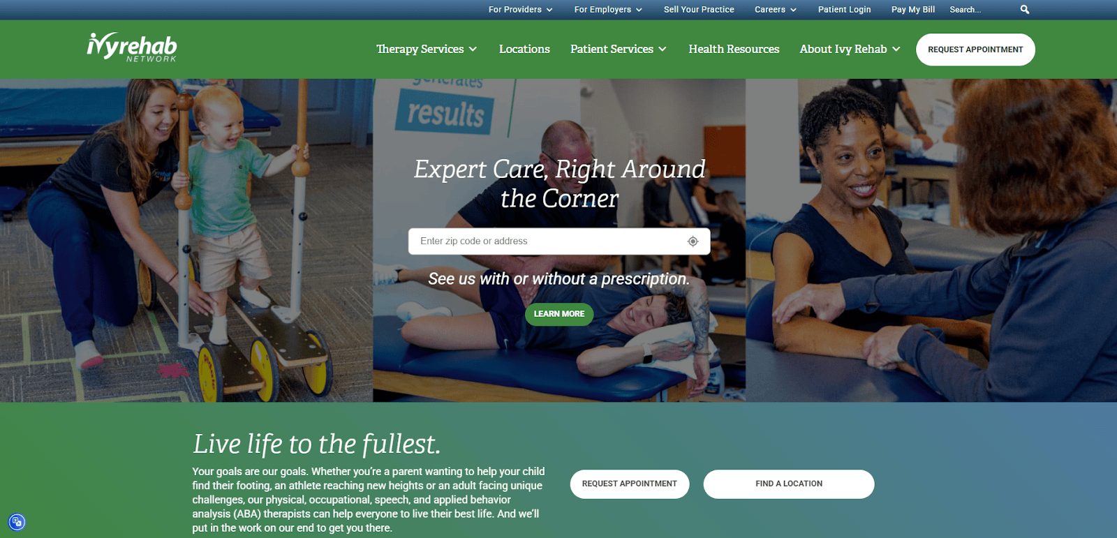
1. Ivy Rehab Network
Location: White Plains, NY
Key Takeaways:
- Streamlined navigation with intuitive layout.
- High-quality visuals and animations that load quickly.
- Clear calls-to-action facilitate easy appointment scheduling.
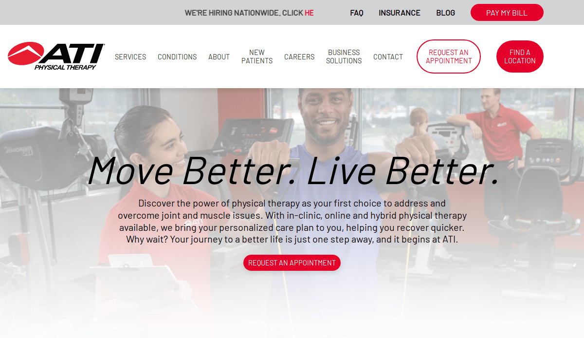
2. ATI Physical Therapy
Location: Bolingbrook, IL
Key Takeaways:
- Engaging intro video on the homepage.
- Consistent branding with a red, black, and white color scheme.
- Accessible information on insurance and FAQs.
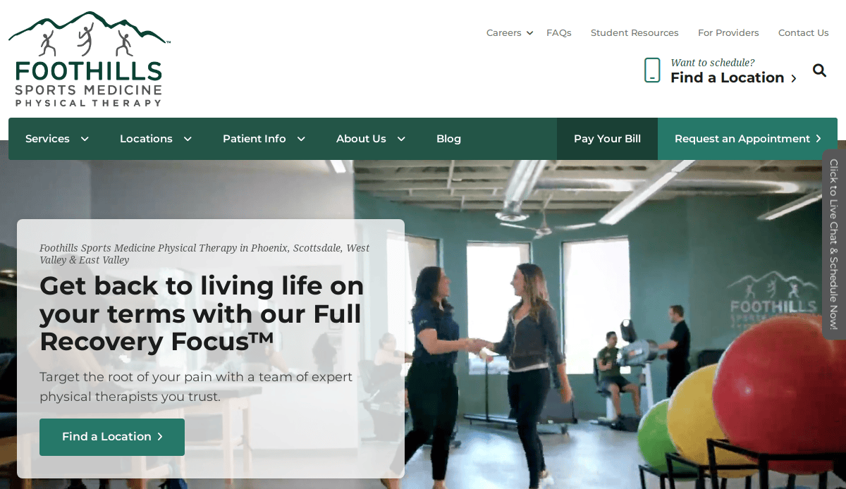
3. Foothills Sports Medicine Physical Therapy
Location: Phoenix, AZ
Key Takeaways:
- Soothing green and white color palette.
- Easy navigation with well-organized menus.
- Incorporation of patient testimonials and educational resources.
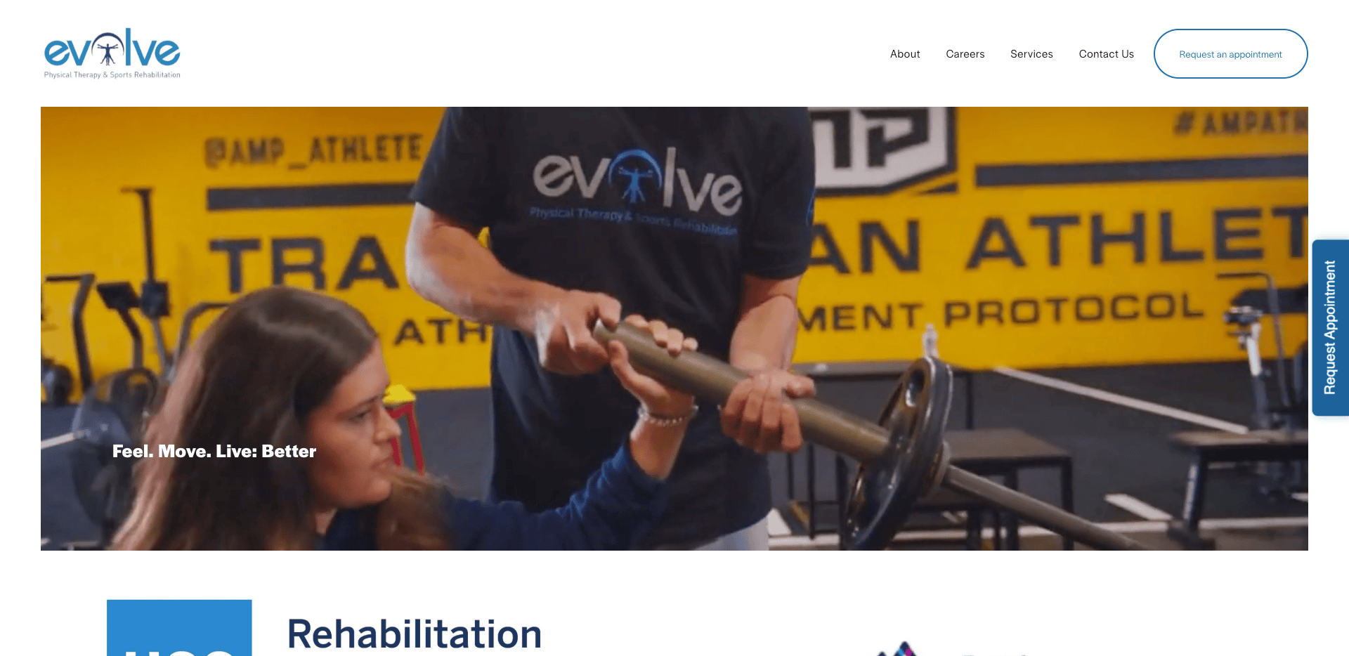
4. Evolve Physical Therapy
Location: New York, NY
Key Takeaways:
- Dynamic homepage slider showcasing various sports.
- Prominent appointment booking buttons.
- Comprehensive information on services offered.
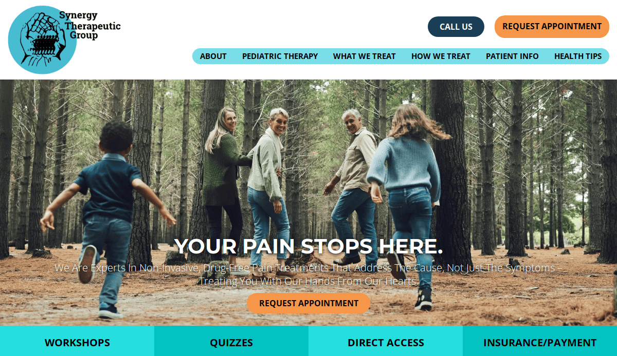
5. Synergy Therapeutic Group
Location: Carbondale, IL
Key Takeaways:
- Warm, community-focused design with inviting visuals
- Easy navigation and strong service pages targeting various conditions
- Clear calls-to-action and quick appointment access

6. PRN Home Health & Therapy
Location: San Diego, CA
Key Takeaways:
- Creative use of slanted color blocks.
- High-quality visuals breaking up content.
- Well-labeled navigation bar enhances usability.
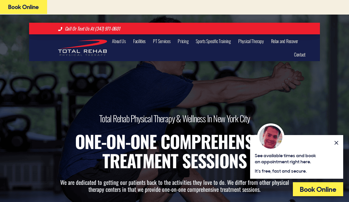
7. Total Rehab Physical Therapy
Location: Dallas, TX
Key Takeaways:
- Unique orange, white, and grey color palette.
- Full-screen slider on the homepage.
- Easy-to-use navigation bar.
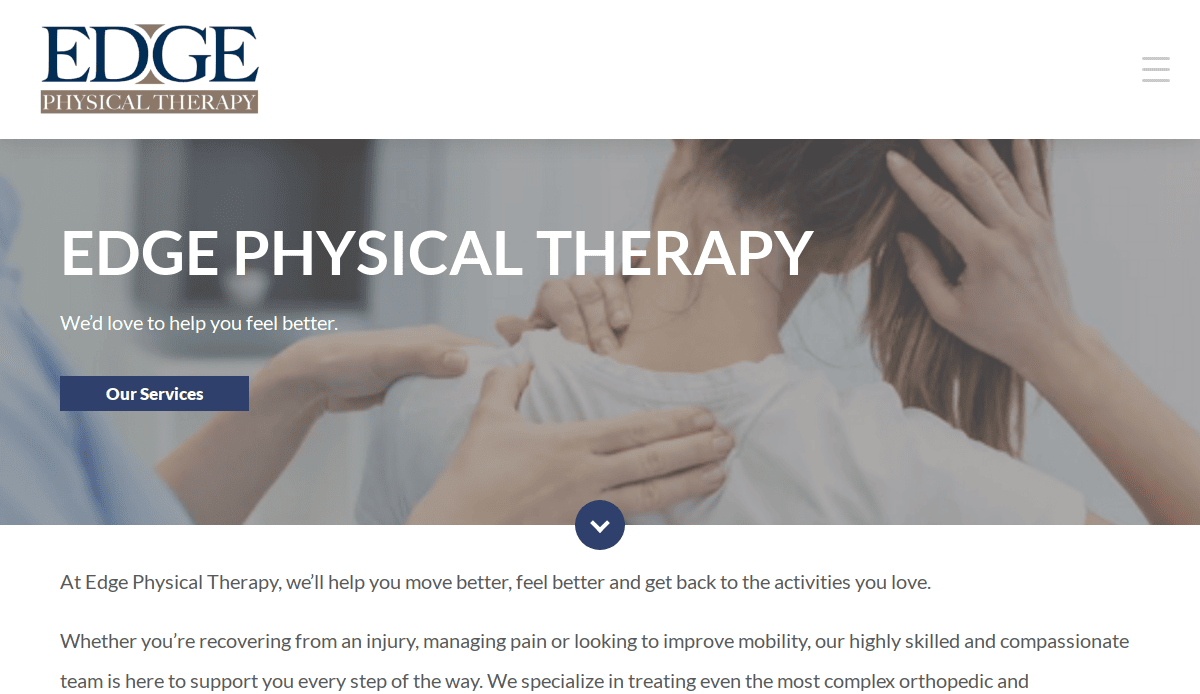
8. Edge Physical Therapy
Location: Seattle, WA
Key Takeaways:
- Modern and elegant design.
- Hero video on the homepage.
- Clear navigation menu for easy browsing.
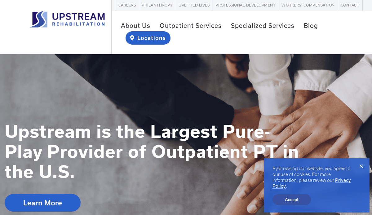
9. Upstream Rehabilitation
Location: Birmingham, AL
Key Takeaways:
- Simple and intuitive design.
- Clear navigation menu.
- Attractive slider on the homepage.
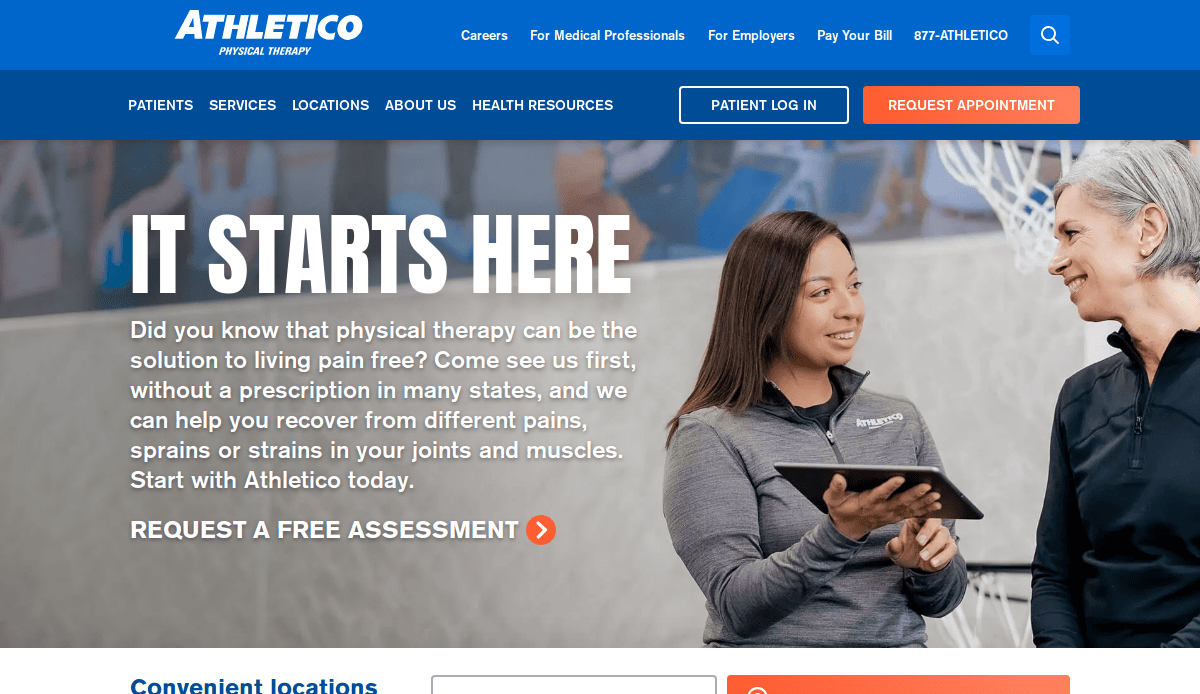
10. Athletico Physical Therapy
Location: Oak Brook, IL
Key Takeaways:
- Modern, professional design.
- Attractive image slider on the homepage.
- Simple and intuitive navigation bar.
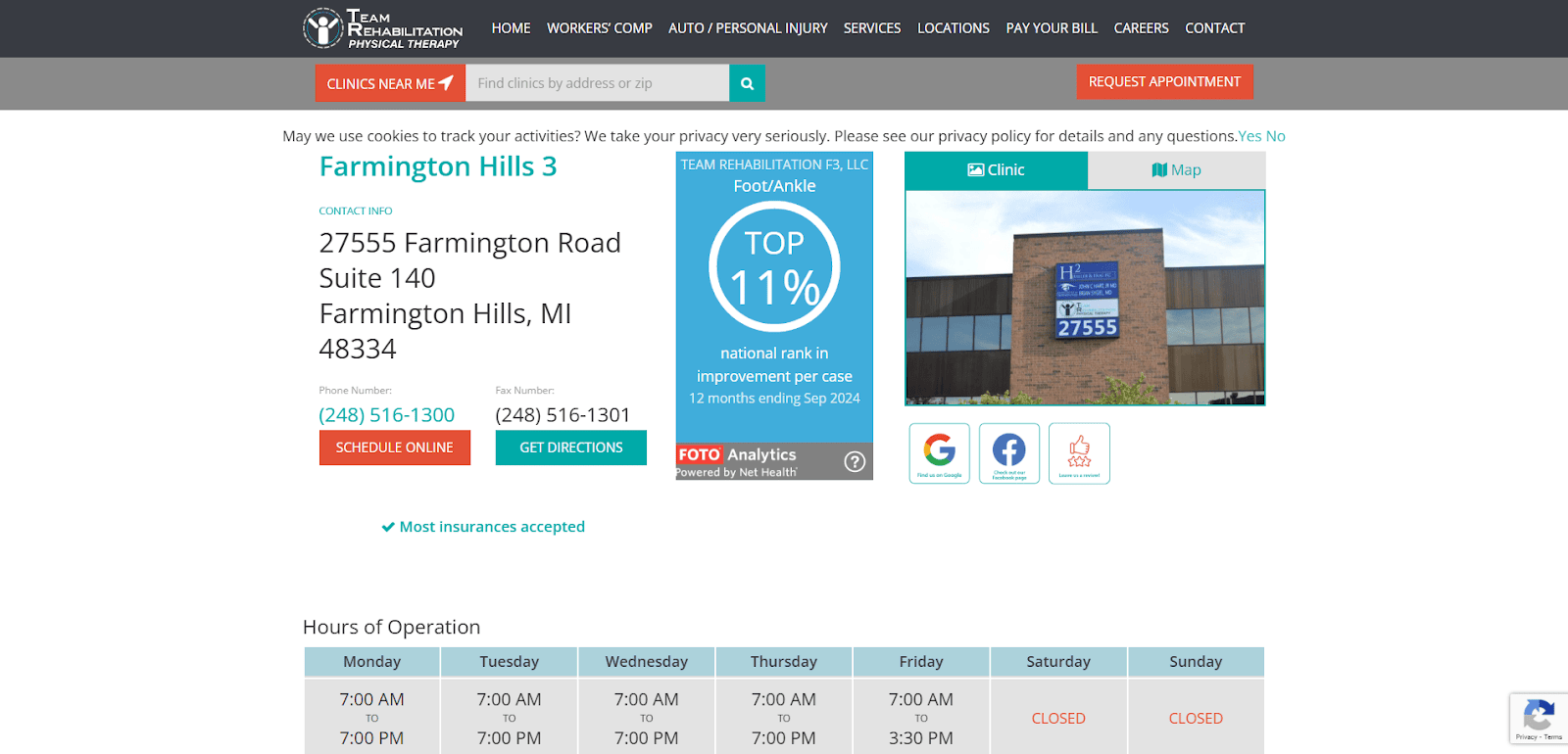
11. Team Rehabilitation
Location: Farmington Hills, MI
Key Takeaways:
- Organized layout with bold CTAs
- Strategic use of service menus
- Strong content hierarchy for SEO
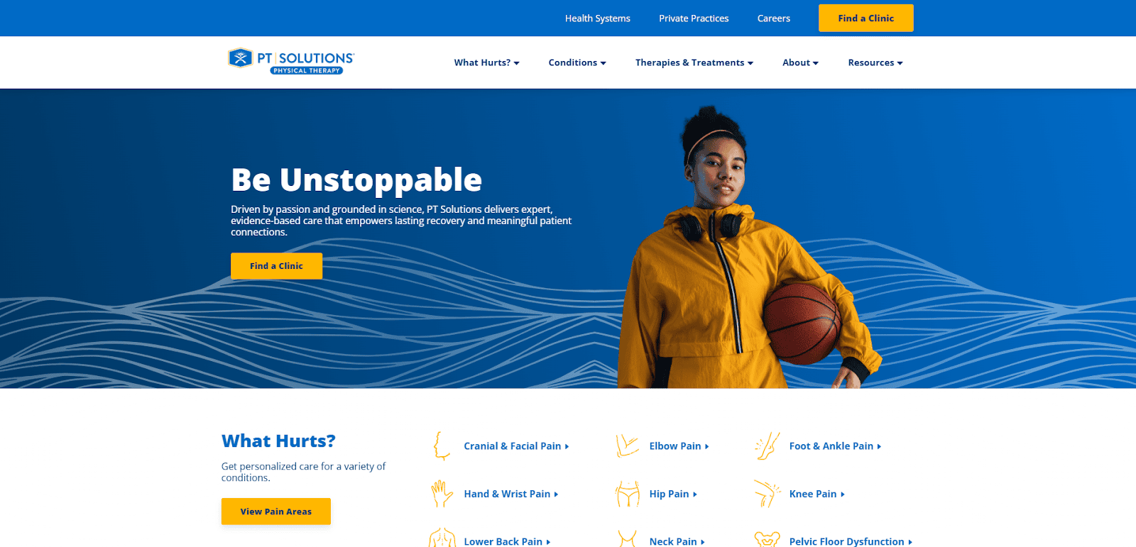
12. PT Solutions
Location: Atlanta, GA
Key Takeaways:
- Mobile-optimized with fast load speed
- Engaging imagery showcasing therapy settings
- Clear messaging targeting various audiences
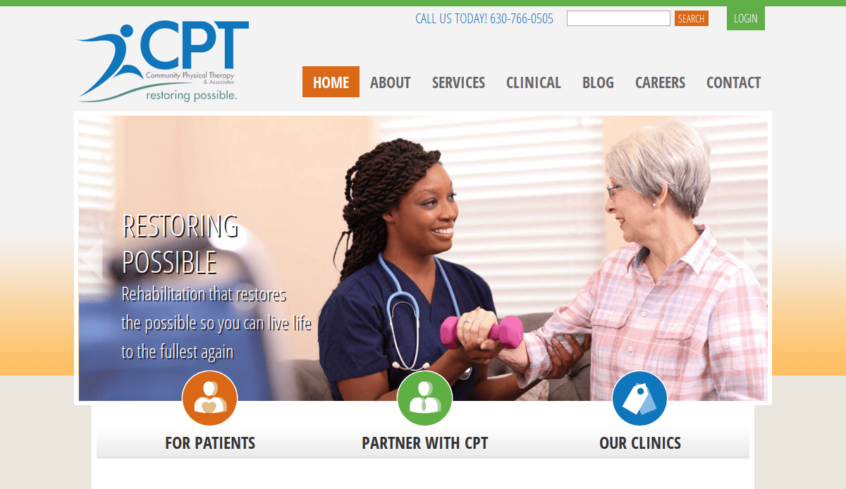
13. Community Physical Therapy
Location: Addison, IL
Key Takeaways:
- Structured homepage with CTA emphasis
- Easy access to patient forms and resources
- Strong local SEO structure
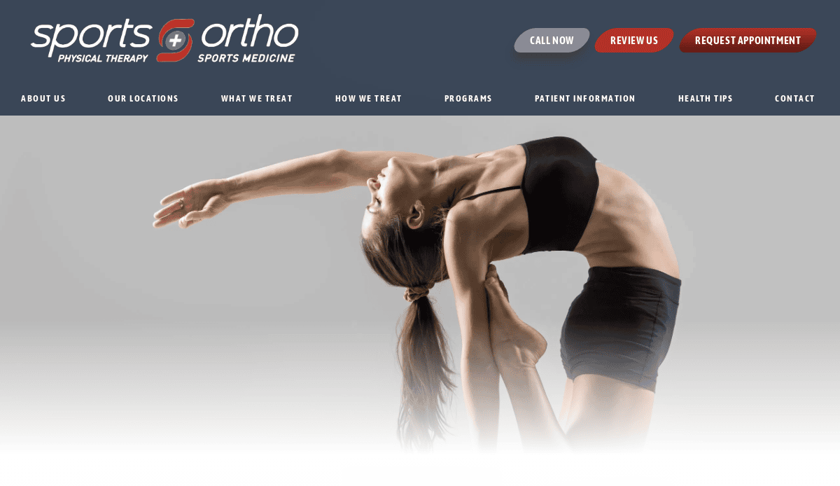
14. Sports & Ortho Physical Therapy
Location: Chicago, IL
Key Takeaways:
- Localized content targeting neighborhoods
- High-contrast buttons for accessibility
- Prominent appointment request forms
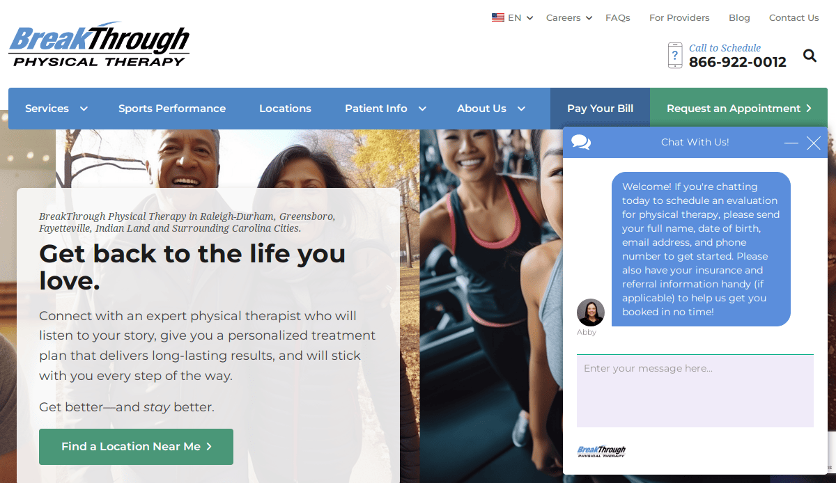
15. BreakThrough Physical Therapy
Location: Greenville, NC
Key Takeaways:
- Personalized messaging throughout the site
- Great use of color for emotion and brand
- Logical navigation menu with service-focused flow
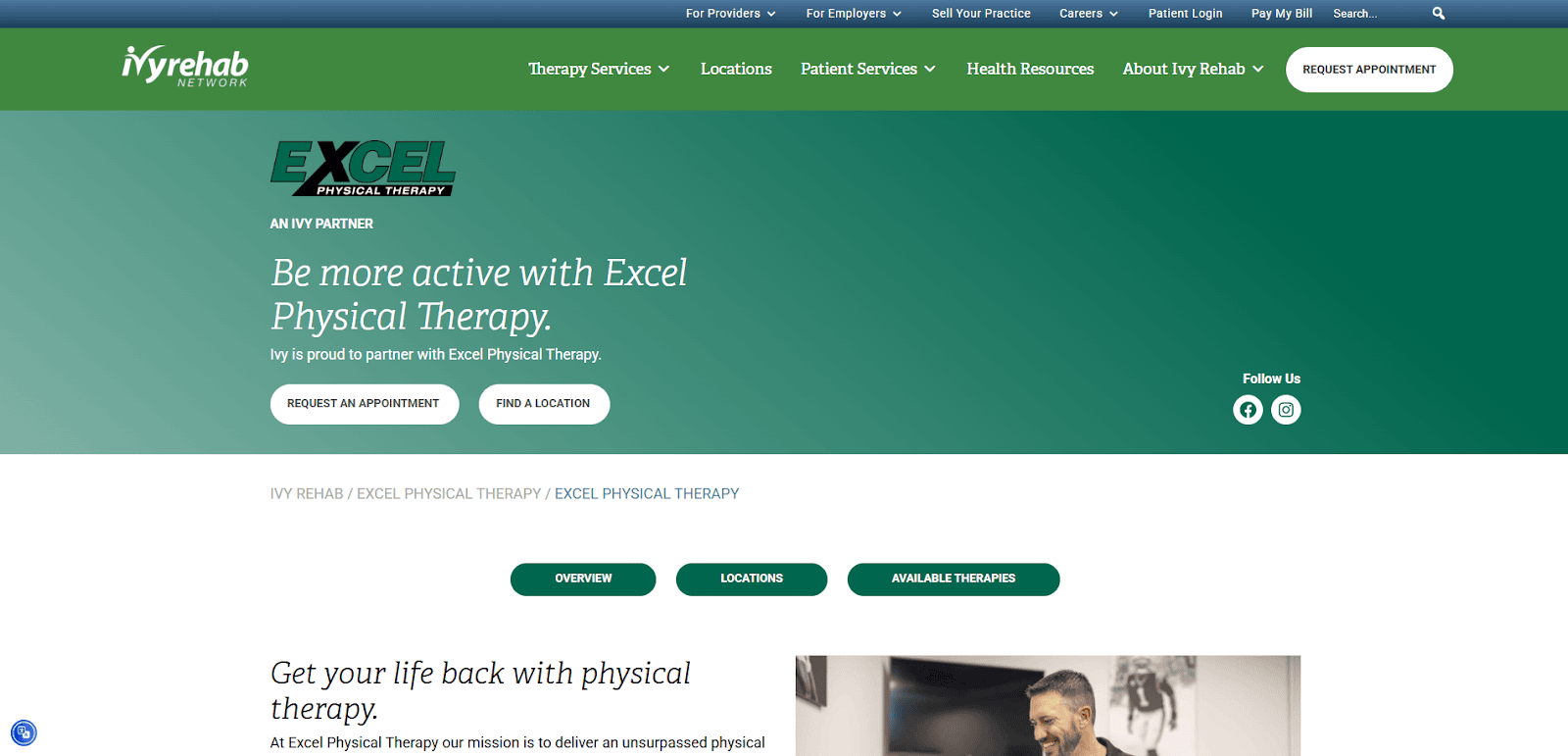
16. Excel Physical Therapy
Location: Mechanicsburg, PA
Key Takeaways:
- Structured design with clear service lines
- Accessibility compliance integrated in design
- Prominent contact features and directions
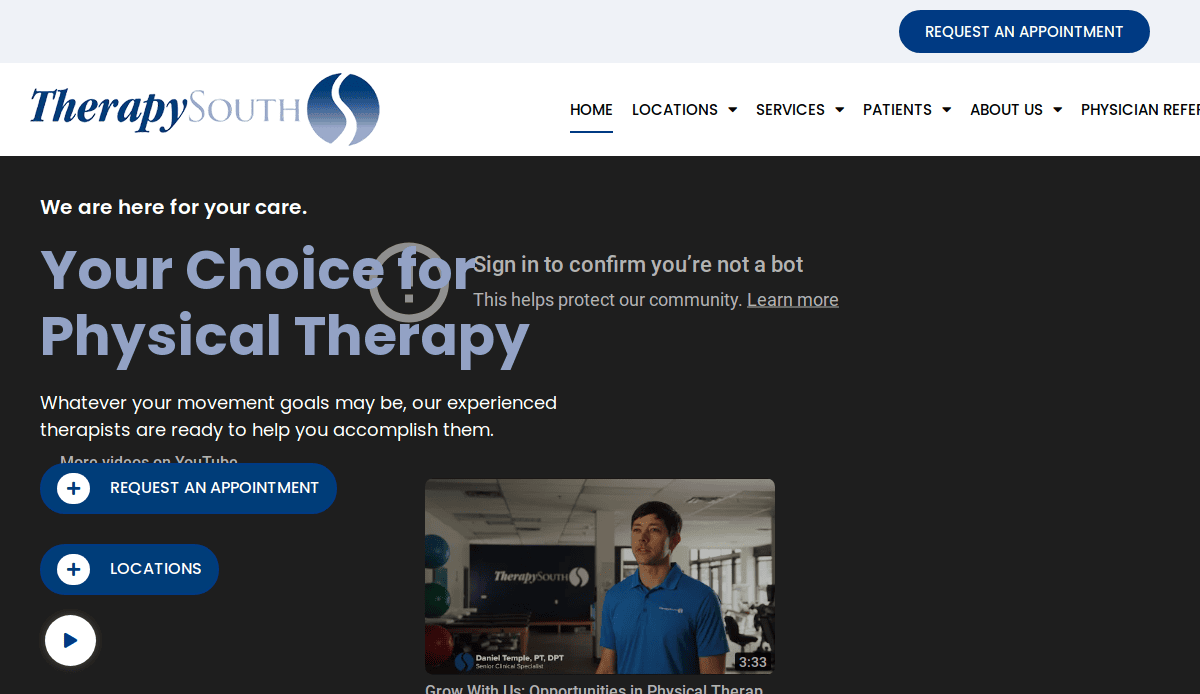
17. TherapySouth
Location: Birmingham, AL
Key Takeaways:
- Warm and inviting color palette
- Focus on community and values
- Informative blog and resources

18. Professional Therapy Solutions
Location: Boston, MA
Key Takeaways:
- Visually cohesive branding across pages
- Detailed service descriptions
- Straightforward appointment setup
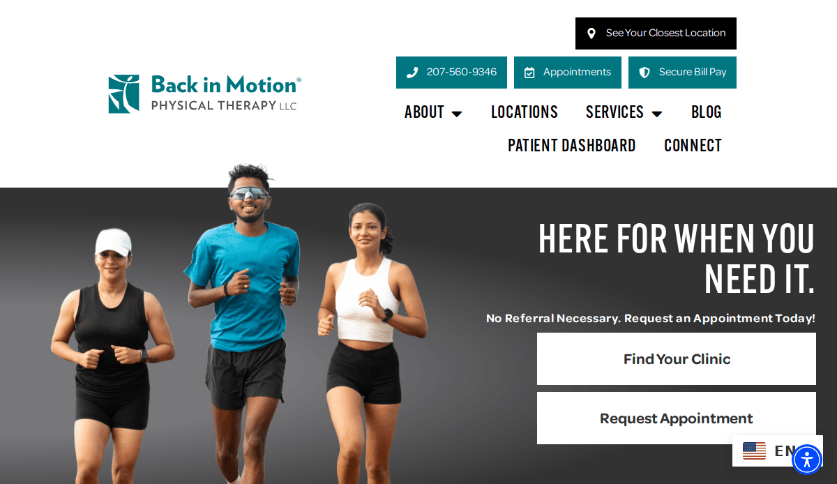
19. Back in Motion Physical Therapy
Location: Portland, ME
Key Takeaways:
- Innovative homepage design
- Integrated scheduling and intake
- Bold CTAs and engaging content
These examples showcase how effective web design can enhance user experience, facilitate patient engagement, and support the growth of physical therapy practices.
Build a Better Website for Your Practice
The best websites go beyond aesthetics—they prioritize user experience, seo best practices, and conversion performance. Whether you’re launching a new website or redesigning an outdated platform, it’s essential to ensure your website reflects professionalism and is easy to use across all devices.
Physical therapists who want to attract new clients and support patients, plus grow their practice, should think strategically about website building. Avoid relying solely on a diy builder or free website tools if you’re aiming for long-term growth. Platforms like Webflow, Squarespace, and WebPT offer varying capabilities, but working with a professional developer can help you customize your website around your specific needs.
From integrating appointment scheduling tools to applying the latest technology, every element of your new site should be designed to convert visitors into patients. Budget-friendly design doesn’t mean compromising on functionality—it means using the right tips and strategies to build your website the right way.
If you’re ready to upgrade to a user-friendly website that meets industry best practices, we can help you customize and optimize your online presence.Request a free consultation to start your website project.
Healthcare Industry Designing FAQs
What makes the best physical therapy websites stand out?
The best websites combine professional design, user-friendly navigation, and conversion-driven features like appointment scheduling and patient testimonials. They reflect your brand, highlight your expertise, and are optimized using SEO best practices to attract more patients and grow your practice.
Do I need to hire a professional for web design, or can I build it myself?
While DIY platforms can be tempting, healthcare professionals benefit most from hiring a professional who understands how to develop a secure, mobile-responsive, and fast-loading website. This ensures your site meets industry standards and supports long-term growth.
How should PT websites be structured to help new clients?
PT websites should feature easy-to-use navigation with clearly labeled sections like Services, Meet the Team, Conditions Treated, and Contact. This helps patients find the information they need quickly and encourages them to book appointments directly from the site.
Is it important for a physical therapist’s website to be mobile-friendly?
Yes, mobile responsiveness is critical. A mobile-friendly website allows potential patients to easily browse services, read reviews, and schedule appointments from their devices, improving accessibility and engagement.
How do I ensure my new website appeals to both patients and referring healthcare professionals?
Provide clear value to both audiences. For patients, highlight services, success stories, and easy appointment scheduling. For healthcare professionals, include a section about referral partnerships and credentials to build trust and expand your network.
Can a free website be good enough for my physical therapy clinic?
Free websites often lack the flexibility, security, and functionality needed for clinics. A professional website allows for better customization, stronger SEO performance, and integrations like online booking systems that drive results.
What platforms are best for physical therapy web design?
Platforms like WebPT, Webflow, and Squarespace are popular for healthcare websites. The best choice depends on your goals and whether you plan to manage content yourself or prefer to partner with a custom web developer.
How can my website help with patients and grow your practice?
An optimized website improves visibility, attracts the right audience, and converts visitors into patients. Features like contact forms, testimonials, educational content, and blog posts increase engagement and trust.
What role does SEO play in attracting new patients?
Optimization is essential for ranking in local and organic search results. Using relevant keywords, optimizing page titles, and publishing helpful content increases your visibility to people searching for physical therapy services nearby.
How often should I update my website?
Regular updates help keep your content accurate and relevant. Refresh service pages, add blog posts, and monitor site performance to ensure it remains a valuable tool for bringing in new patients and supporting current ones.