Just looking for our Best Personal Trainer Website examples list?
Why Your Personal Trainer Website Is More Than Just a Digital Brochure
Imagine a potential client is searching for a trainer in your area. They visit your personal training website and within seconds, they decide whether you’re the right fit or not. That first impression is everything. Whether you’re using a template from Squarespace or building with WordPress, the design, functionality, and content of your site will either convert browsers into buyers or lose them to the competition.
Today, websites do more than look good. They build trust, rank on search engines, and create a seamless UX that guides visitors to take action—book a consultation, sign up for online training sessions, or explore service pages. A high-quality homepage with client testimonials, clear brand messaging, and an easy-to-navigate layout showcases your professionalism and helps communicate your unique training philosophy.
In this guide, we’ll walk you through how to elevate your personal training website from a simple presence to a powerhouse marketing tool. Whether you’re a seasoned fitness pro or just launching your online personal training business, you’ll see how design, copywriting, and SEO work together to attract more leads, convert visitors, and boost your bottom line.
Website Planning & Purpose
Before designing anything, it’s essential to define its strategic purpose and align the site’s features with business goals. This phase lays the foundation for success. Rushing into design without understanding the “why” behind your website can lead to wasted effort and missed opportunities.
A website should be a digital sales tool, brand extension, and lead generation machine. As such, the planning phase should start by identifying key objectives: do you want to attract new local clients, promote online training services, or both? Are you looking to build a mailing list, automate bookings, or showcase positive reviews and transformation stories? These goals determine the structure, content, and technical needs of your site.
Your target audience should also be clearly defined. Are your ideal clients busy professionals, postnatal mothers, aspiring athletes, or older adults seeking mobility support? Your site’s messaging, images, and tone need to reflect their needs and motivations. During planning, outline the buyer journey—from first impression to booking a session—and ensure your homepage and service pages support each step with intuitive navigation and persuasive content.
Consider platform selection early in the process. WordPress offers flexibility and scalability for growth, while website builders like Squarespace may appeal to trainers needing a faster launch but fewer customization options. Your choice will affect how easily you can optimize for SEO, add integrations, or scale over time.
A successful website begins with thoughtful planning that aligns design choices with real business outcomes. When purpose leads the process, design decisions become strategic rather than aesthetic, and the result is a site that attracts the right visitors, builds trust, and converts leads into loyal clients.
Design Principles for Engaging Websites
Effective design goes far beyond aesthetics. It’s about guiding visitors to take action, establishing your authority as a fitness expert, and creating a seamless digital experience. Whether you’re building your first website or redesigning an existing one, these design principles should guide every decision.
- Simplicity and Clarity
Every element on your website should serve a purpose. Cluttered layouts, unnecessary animations, or unclear CTAs can confuse visitors. Prioritize clean layouts, easy-to-read wording, and straightforward navigation. - Consistent Branding
Use a cohesive color palette, uniform typography, and consistent design elements. Personal training is a trust-based service, and consistent branding reinforces professionalism. - Mobile-First Design
Most of your site traffic will come from smartphones. Design mobile-first to ensure fast loading, easy navigation, and great appearance on all screen sizes. - Visual Hierarchy and Flow
Structure content so users naturally move from headline to CTA. Use whitespace to highlight testimonials, pricing, and service features. - High-Quality Visuals
Real images of you, your clients, and your space create trust. Ditch generic stock photography for personalized visuals that reflect your personality and services. - Accessibility and Readability
Use no more than two fonts, ensure high contrast, and follow ADA/WCAG guidelines to serve all users effectively. - Fast Load Times
Compress images, minimize plugin use, and use quality hosting to ensure speed. - Purpose-Driven CTAs
Guide visitors with clear next steps, whether that’s “Book a Free Session” or “View Training Packages.”
Content & Navigation Strategy
Effective content structure and intuitive navigation are critical to a website’s success. Visitors should be able to quickly find the information they need and be encouraged to take meaningful action. Each page must serve a purpose, guide users along a clear journey, and reinforce your authority and brand.
- Prioritize Must-Have Pages
Your site should include these core pages:
- Homepage: Serves as your digital storefront. Clearly articulate who you are, what you offer, and how clients can get started.
- About Page: Tell your story, qualifications, certifications, and what sets you apart. Use real photos to humanize your brand.
- Services Page: Detail your offerings—1-on-1 training, group classes, online coaching, nutrition consulting. Include pricing if appropriate.
- Testimonials Page: Showcase client success stories, reviews, and before-and-after photos.
- Contact Page: Include a contact form, location (if relevant), phone number, and booking integration.
- Blog or FAQ Page: Educate your audience and boost SEO with valuable tips and answers to common questions.
- Use Clear, Descriptive Labels in Navigation
Your main menu should use plain language. Instead of “Solutions,” use “Training Services.” This ensures clarity and helps with SEO. Limit your top-level navigation to 5–7 links to reduce decision fatigue. - Guide Visitors with Internal Linking
Every page should lead somewhere else. Link your homepage to your services, your blog to your contact page, and client reviews to your booking form. This flow reduces bounce rates and encourages deeper engagement. - Create a Hierarchical Structure
Organize your content with H1, H2, and H3 tags to establish a clear reading flow for users and search engines. Break longer pages into digestible sections, and use bullet points to make scanning easy. - Keep Navigation Accessible on Mobile
Use sticky headers or mobile-friendly menus to ensure visitors can easily access navigation from any screen size. Touch targets should be large enough for thumbs, and links spaced to prevent accidental clicks. - Align Content with User Intent
Make sure each page solves a problem or answers a question. A visitor landing on your “Online Training” page should immediately see benefits, session types, pricing, and a CTA to book or contact you.
By combining streamlined navigation with purposeful content, you create a UX that supports your business goals while guiding potential clients toward conversion.
Visual Elements That Strengthen Impact
Visual design elements are more than just decoration—they are essential tools that shape user experience, communicate your brand identity, and build credibility. In the competitive industry, your visual presentation must instantly convey professionalism, energy, and trust.
- Professional Photography
The use of high-quality, authentic photography is non-negotiable. Feature real photos of your training space, equipment, and—most importantly—yourself and your clients (with permission). These images should reflect your training style and client demographics. Avoid stock imagery whenever possible; personalized photos help you connect emotionally with potential clients. - Branded Color Palette
Choose 2–3 core colors that represent your brand and use them consistently across the site. Your color scheme should support your messaging—energizing hues like red or orange suggest intensity, while blues and greens often convey calm and wellness. Maintain contrast for accessibility and readability. - Typography That Aligns with Personality
Select fonts that match your tone—whether bold and dynamic or modern and minimal. Use font pairings strategically: a standout headline font can be paired with a clean, readable body text font. Limit yourself to two font families to maintain consistency. - Iconography and Infographics
Icons and infographics can break up text and simplify complex ideas, such as illustrating your training process or comparing packages. Use clean, consistent icons that match your visual style and don’t overwhelm the page. - Video Integration
Videos are one of the most powerful tools for building trust. A short welcome video or a review from a satisfied client can dramatically improve time-on-site and conversion rates. Make sure videos are optimized for fast loading and display well on both desktop and mobile devices. - Social Proof in Visual Form
Incorporate visual testimonials, star ratings, and before-and-after image galleries. These act as proof of results, drawing attention to your successes in a quick and engaging format. Include the client’s name (if permitted) and a short quote for extra credibility. - Layout and White Space
Avoid the temptation to fill every inch of your page. Use white space strategically to emphasize important elements, improve readability, and guide the viewer’s eye through your content. Balanced layouts make your site feel more open and easier to navigate.
When used intentionally, visual elements make your website attractive and effective. They reinforce your credibility, reflect your professionalism, and create a memorable experience that sets your training business apart from the competition.
Ongoing WordPress Maintenance
Keeping a website running smoothly doesn’t stop after launch. WordPress sites require regular upkeep to remain secure, functional, and aligned with your business goals. Neglecting maintenance can lead to slow load times, broken features, security vulnerabilities, and missed client inquiries.
- Software and Plugin Updates
WordPress core software, themes, and plugins are regularly updated to fix bugs, improve performance, and patch security issues. Updates should be checked weekly to prevent compatibility problems or site crashes. Before applying updates, always back up the site. - Site Backups
Backing up your site ensures you can quickly recover if something goes wrong. Set up automated daily or weekly backups, depending on how frequently you update your site. Store these backups securely off-site, not just on your hosting server. - Security Monitoring
Personal trainer websites often include forms, login areas, and client data. Protect your site with a security plugin that monitors login attempts, scans for malware, and blocks suspicious IP addresses. Use strong passwords and enable two-factor authentication where possible. - Performance Optimization
Over time, even well-built sites can slow down. Optimize databases, compress images, and remove unused plugins or themes to maintain speed. Monitor performance using tools like Google PageSpeed Insights and make adjustments to stay fast. - Form and Function Testing
Test your contact forms, booking tools, and newsletter signups monthly to ensure they’re functioning properly. Broken forms can lead to lost leads and frustrated clients. Regularly check that all CTA buttons and page links work as intended. - Content Updates and SEO Checks
Update your service pages, blog posts, or class schedules to reflect what’s happening in your business. Refresh meta tags and perform periodic SEO audits to ensure your site continues ranking well for relevant keywords. - Uptime and Analytics Monitoring
Use monitoring tools to ensure your site stays online 24/7. Also track performance through analytics platforms to understand where your visitors come from, what pages perform best, and where improvements are needed.
Ongoing maintenance isn’t just technical housekeeping—it’s essential for delivering a professional experience, maintaining trust with your audience, and ensuring your site continues to support your personal training business as it grows.
Best Personal Trainer Website Examples
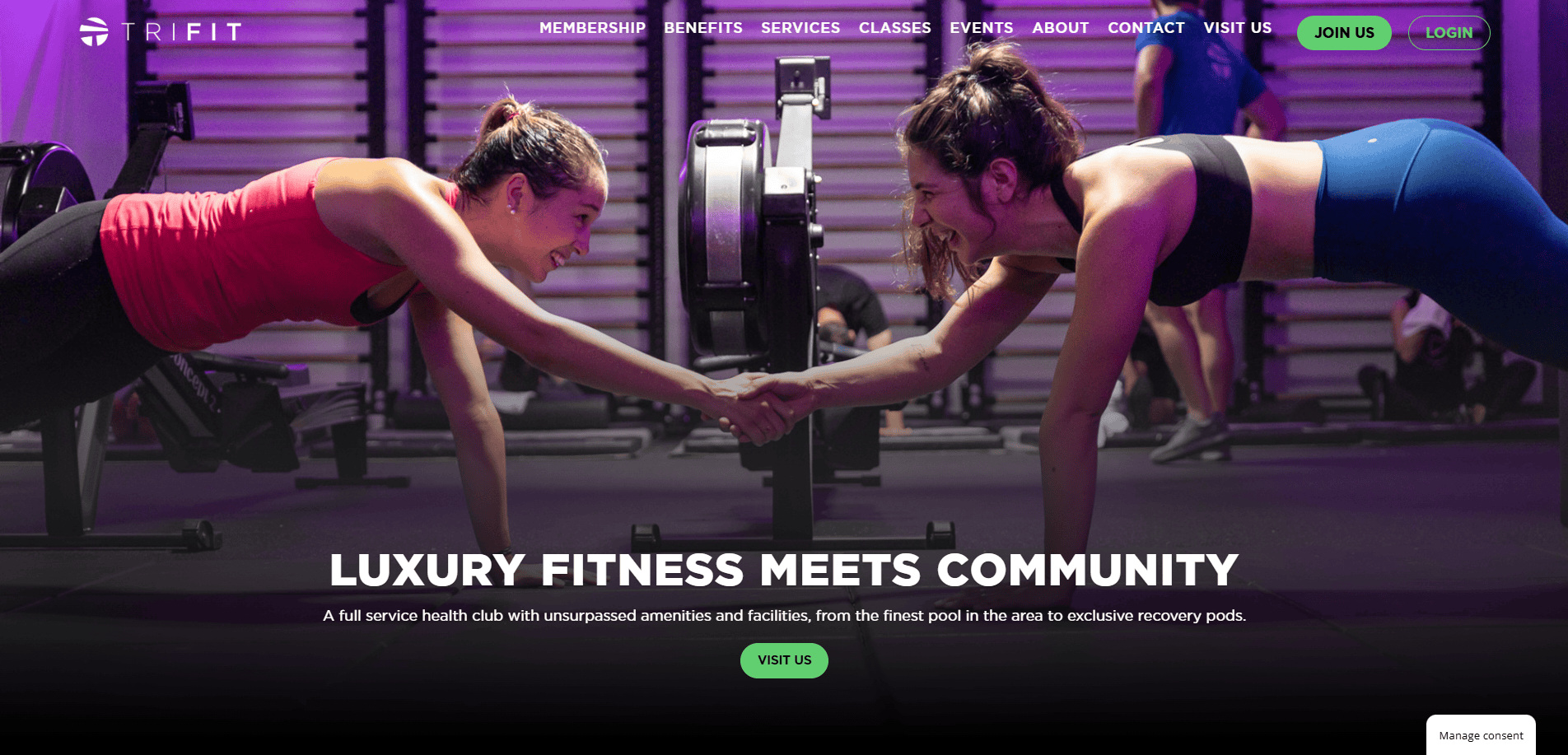
1. TriFit
Location: Los Angeles, CA
Key Takeaways:
- Integrated booking with trainer bios for credibility
- Smart use of whitespace and scannable sections
- Location-focused CTA placements to increase conversions
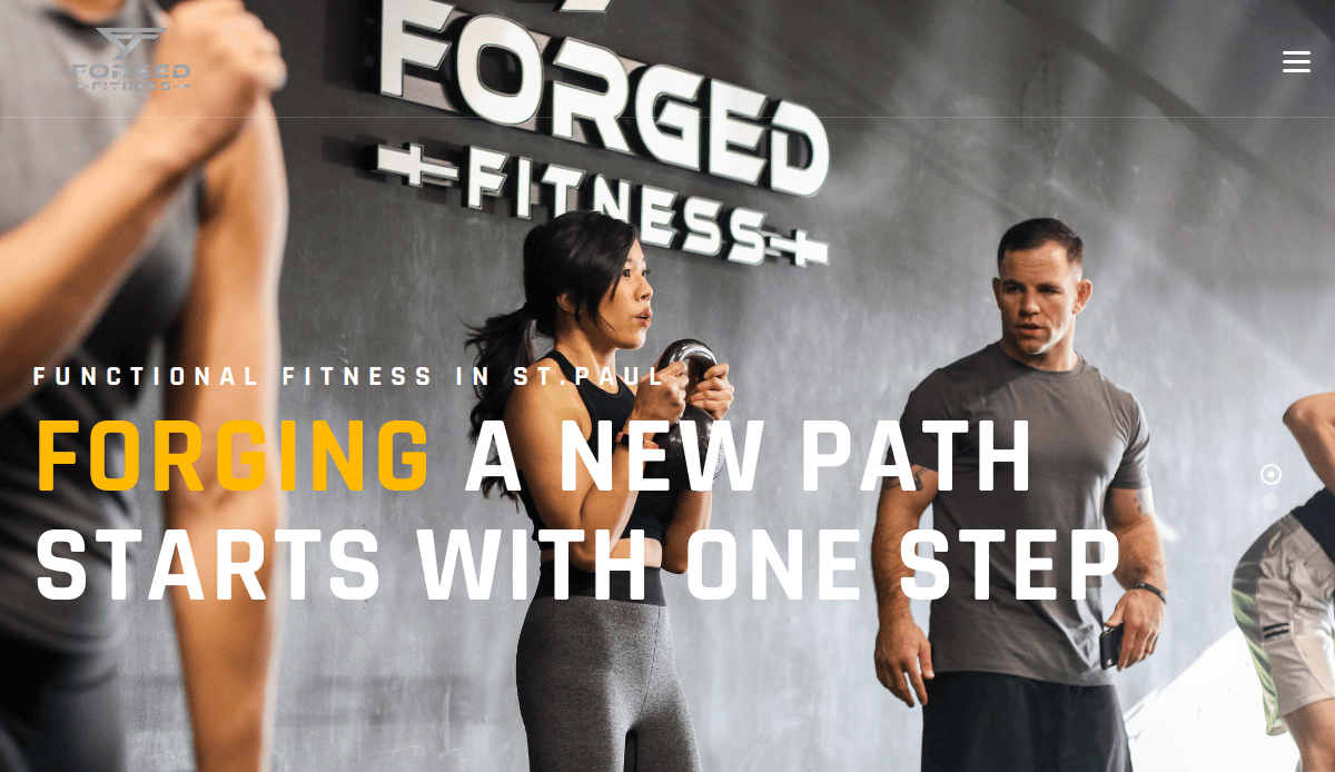
2. Forge Fitness
Location: Minneapolis, MN
Key Takeaways:
- Hero video introduces trainer and space
- Clear service breakdown by goal type
- Mobile-first responsive design
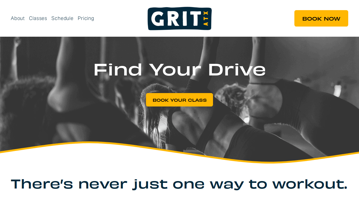
3. Grit Training
Location: Austin, TX
Key Takeaways:
- High-contrast design with bold fonts
- Direct booking integration with Calendly
- Trust-building success stories
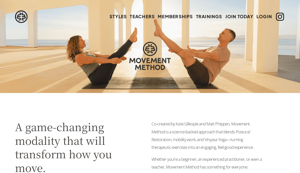
4. Movement Method
Location: Seattle, WA
Key Takeaways:
- Beautiful custom photography
- Emphasis on functional training benefits
- Simple navigation with sticky header
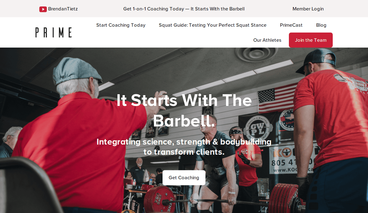
5. Prime Strength Systems
Location: Houston, TX
Key Takeaways:
- Strong brand color palette
- Integrated testimonials carousel
- Multiple training programs listed clearly
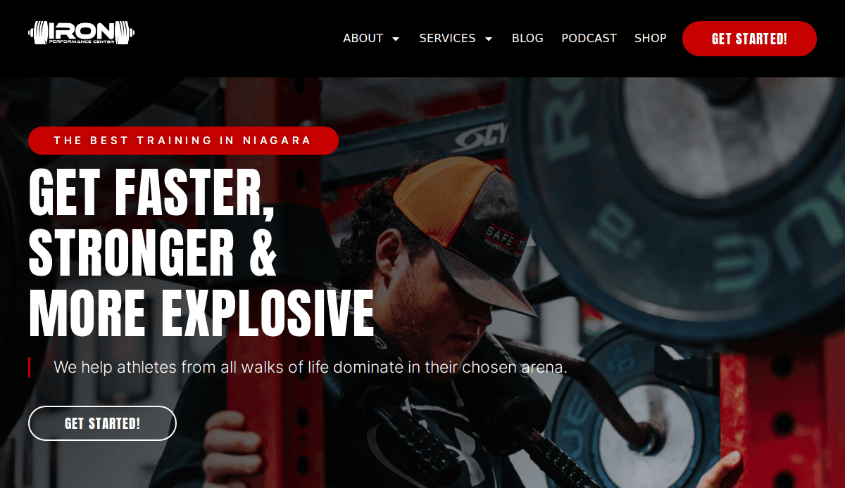
6. Iron Performance Center
Location: Buffalo, NY
Key Takeaways:
- Location-focused SEO elements
- High-performing blog with lead magnets
- Contact CTA always visible
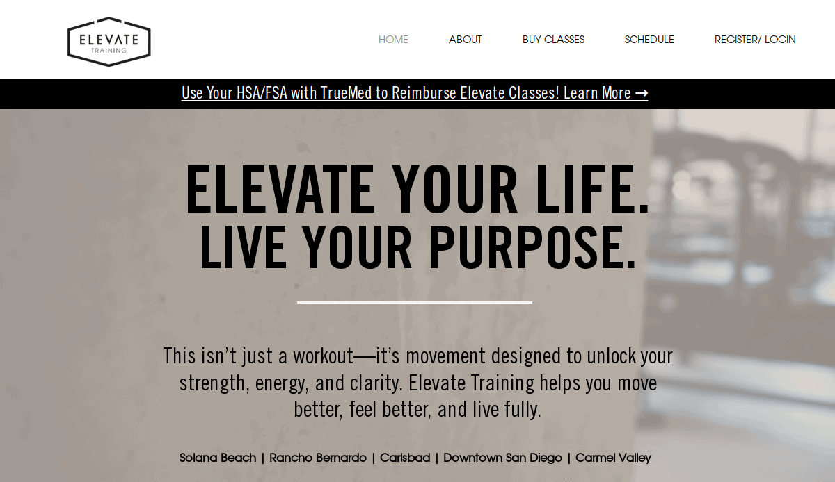
7. Elevate Fit Studio
Location: San Diego, CA
Key Takeaways:
- Simple design with pastel accents
- Strong female-focused branding
- Effective landing pages for each service
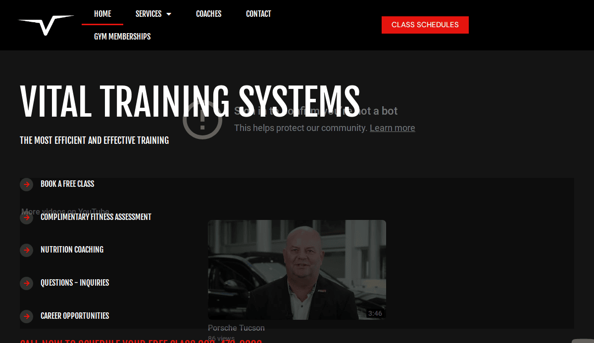
8. Vital Edge Training
Location: Denver, CO
Key Takeaways:
- Clear program segmentation (youth, adult, senior)
- Modern animations without slowing performance
- Transparent pricing section
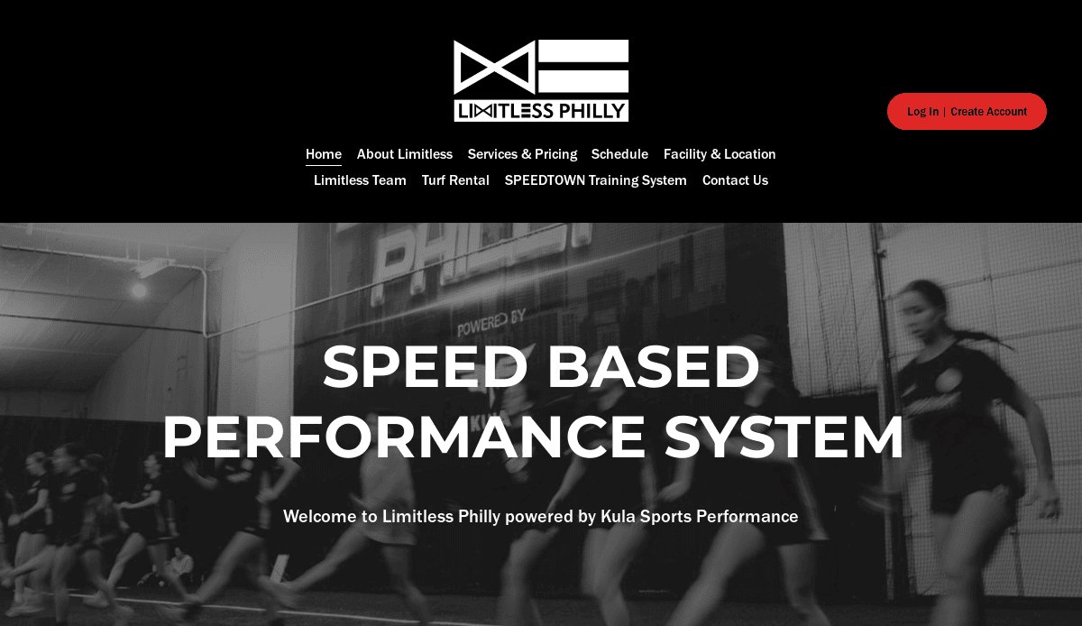
9. Limitless Training Systems
Location: Philadelphia, PA
Key Takeaways:
- Fitness blog optimized for search
- Lead gen form above the fold
- Strong brand story woven throughout
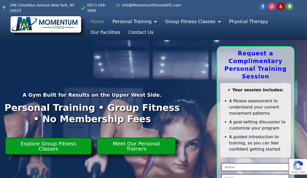
10. Momentum Training Group
Location: St. Louis, MO
Key Takeaways:
- Emphasis on group training with clear tiered pricing
- Embedded Instagram gallery for real-time social proof
- Focused lead funnel with minimal distractions
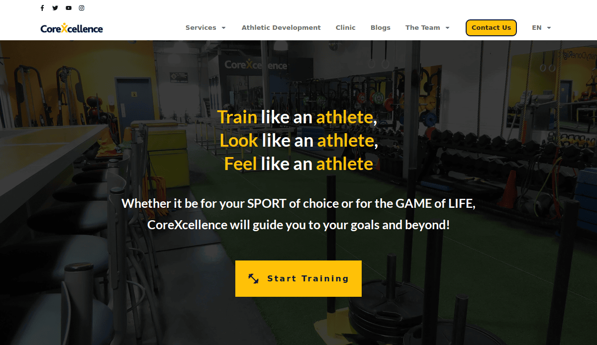
11. CoreXcellence
Location: Brooklyn, NY
Key Takeaways:
- Unique brand voice that stands out in a competitive market
- Sleek, dark-mode inspired design with video header
- Strong educational blog for SEO traffic
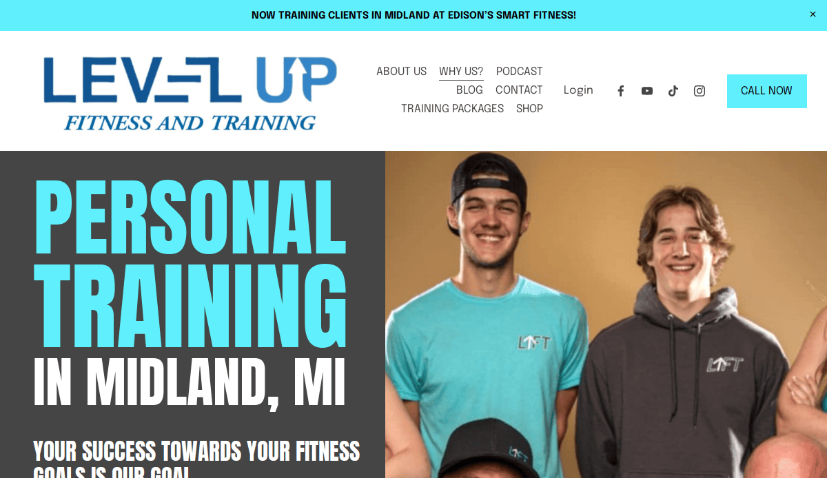
12. Level Up Personal Training
Location: Miami, FL
Key Takeaways:
- Gamified elements and progress trackers
- Responsive design with bold visuals
- Emphasis on mindset and lifestyle
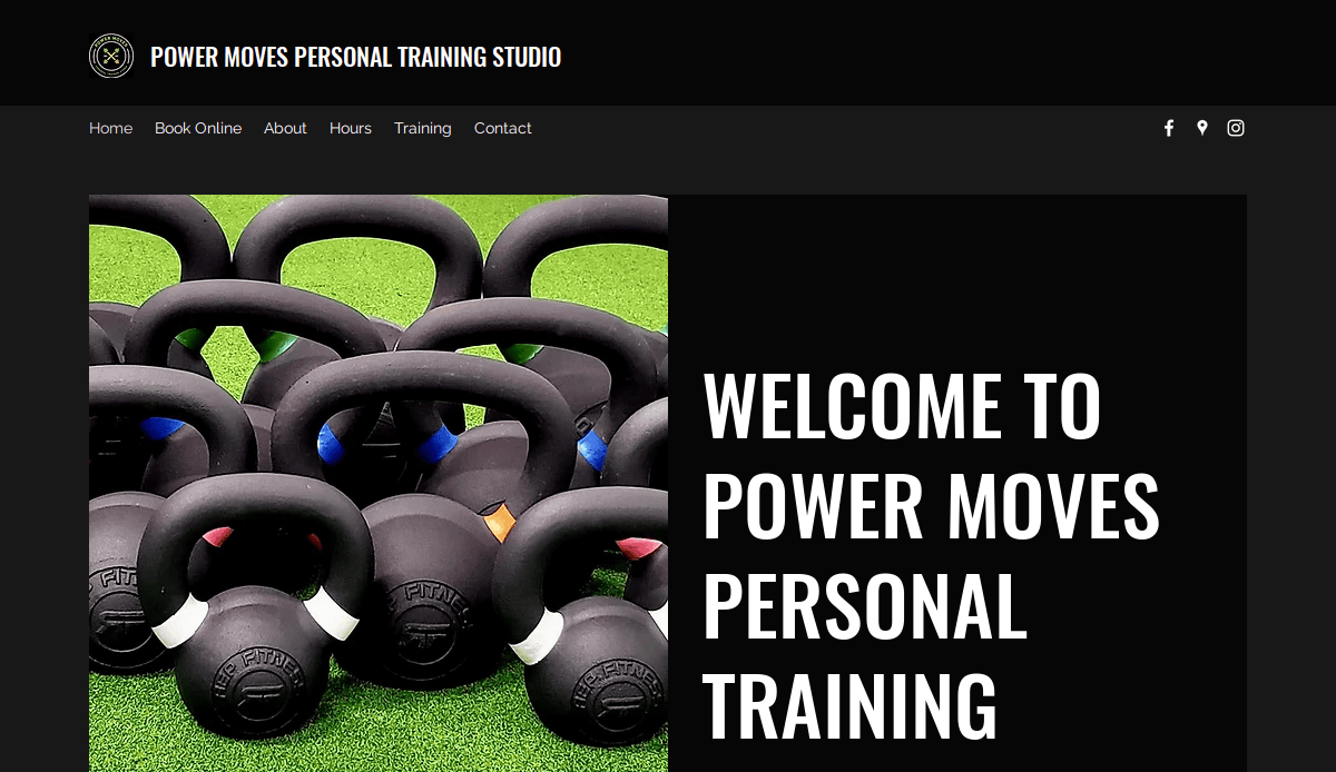
13. Power Moves PTS
Location: Brooklyn, NY
Key Takeaways:
- Diverse client imagery
- Emphasis on inclusive fitness
- Social proof integrated into blog
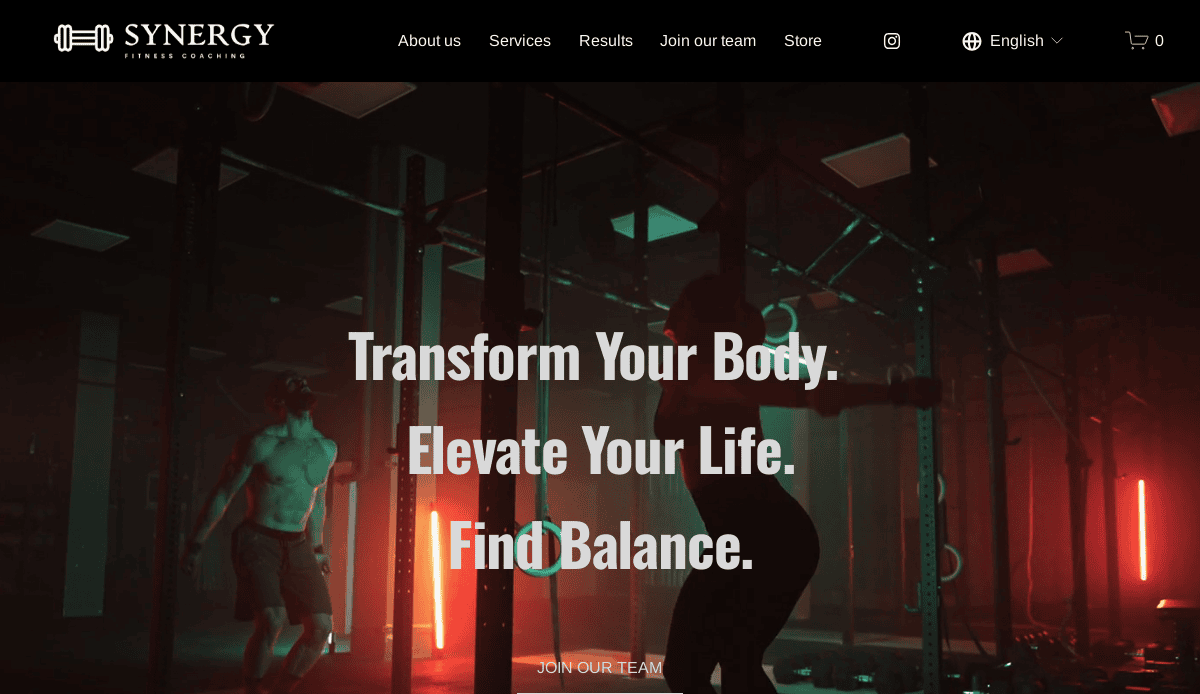
14. Synergy Strength Coaching
Location: Charlotte, NC
Key Takeaways:
- High-end photography and sleek layout
- Individual and group training pages
- Local SEO optimization throughout site
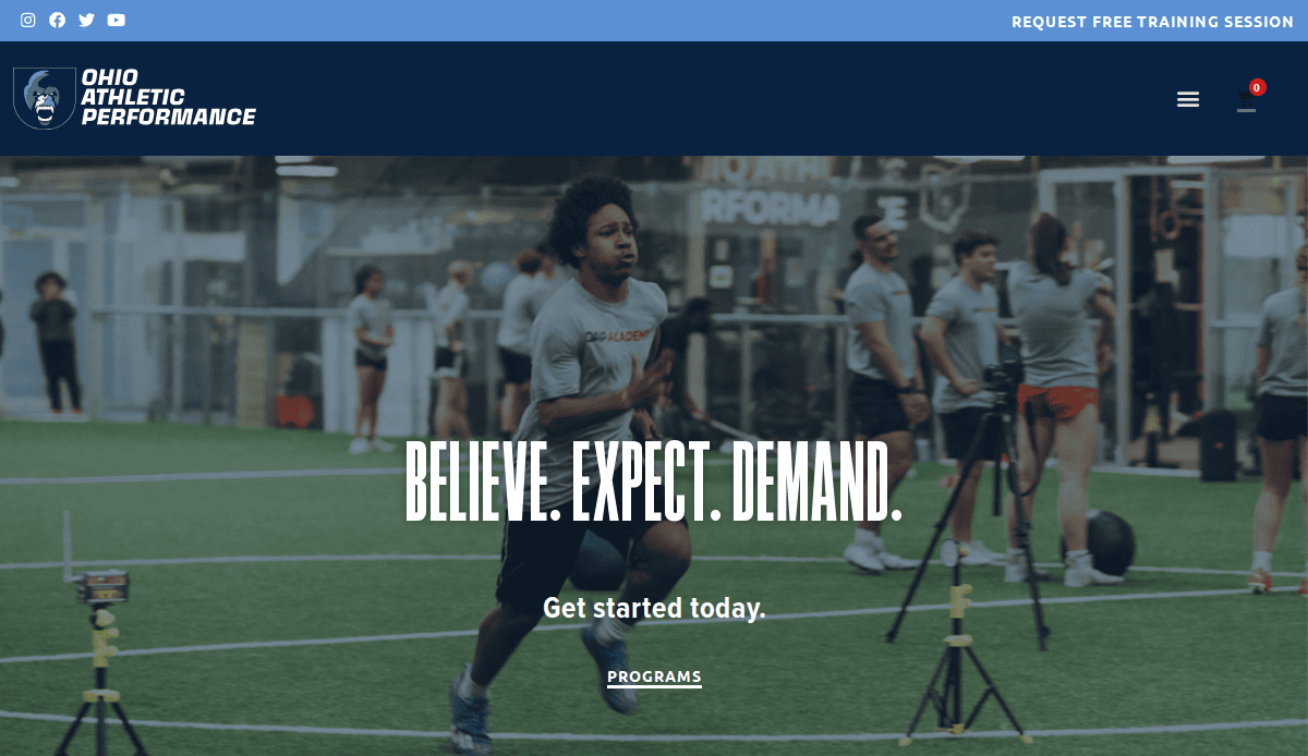
15. AthletIQ Performance
Location: Columbus, OH
Key Takeaways:
- Structured services by athlete level (youth, collegiate, adult)
- Engaging callouts that speak directly to fitness goals
- Strong visual contrast to guide attention to CTAs
16. Reignite Personal Training
Location: Boston, MA
Key Takeaways:
- Fire-themed branding and icon set
- Clear value propositions on the homepage
- Focus on strength and mobility
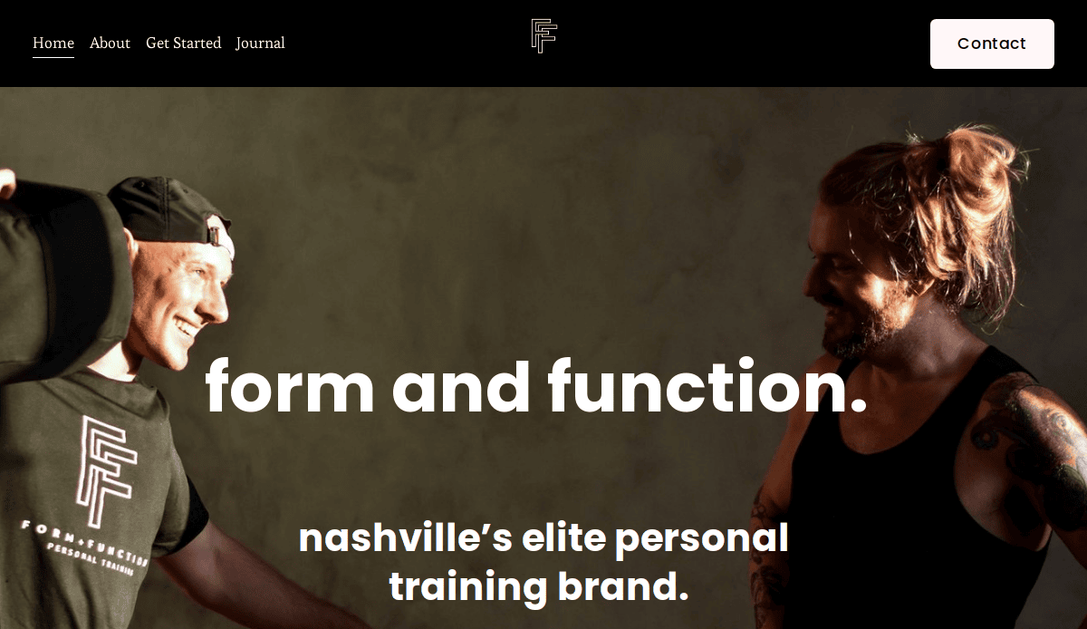
17. Form & Function Fitness
Location: Nashville, TN
Key Takeaways:
- Structured homepage with easy navigation
- Each service gets its own landing page
- Trust-building trainer bios
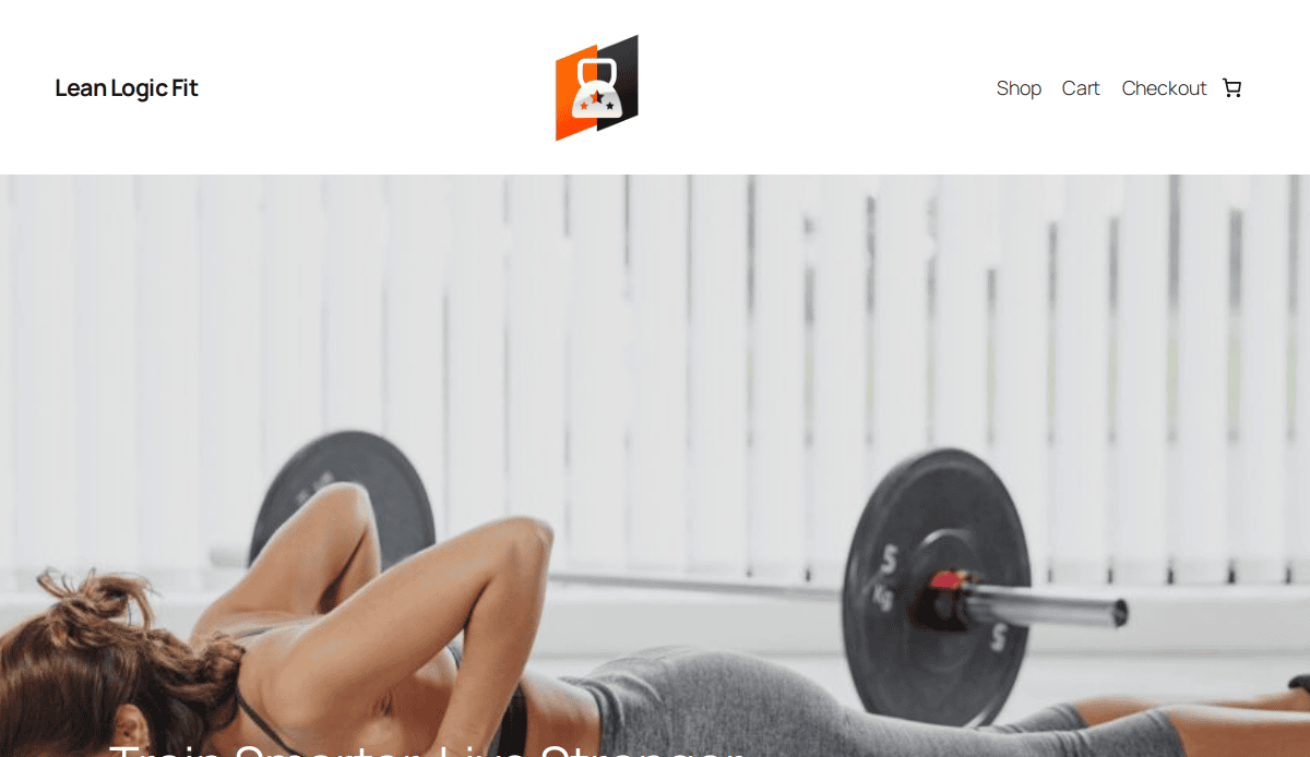
18. Lean Logic Training
Location: Raleigh, NC
Key Takeaways:
- Use of minimalist, grid-based layout
- Video intro of lead trainer
- Blog answers client FAQs directly
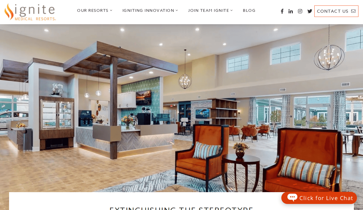
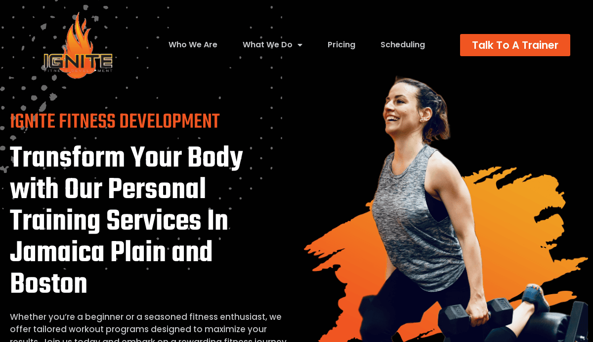
19. IGNITE PT & Wellness
Location: Kansas City, MO
Key Takeaways:
- Bold visual storytelling with high-resolution images
- Differentiated personal vs. group training services
- CTAs throughout service pages
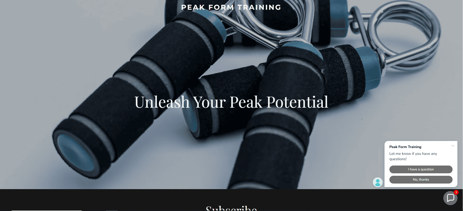
20. Peak Form Training
Location: Indianapolis, IN
Key Takeaways:
- Modern, dynamic homepage scroll animations
- Focus on athlete development
- Social proof placed before CTA
Build Your Personal Trainer Website with Confidence
You’ve explored the essential strategies to build a competitive website that performs, from responsive design and simple layouts to effective SEO and compelling testimonials. Whether you’re launching a new website or improving an existing fitness trainer website, each element should reflect your fitness brand and help your website convert visitors into loyal clients.
For certified industry professionals, your site is more than a digital storefront—it’s a critical tool to grow your business, offer training programs, promote group training, and sell fitness products. A professional website with clear website templates, user-focused navigation, and optimized website layouts supports your growth online.
Ready to make a personal training website that showcases your strength training services and fitness journey? Our top-tier web design and development agency offers a free trial to professionals looking for expert website builders. Contact us today, and we’ll help your website stand out and drive results.
Web Design Frequently Asked Questions for Training Professionals
What should a training professional’s website include?
Your website should include a clear homepage, detailed services, testimonials, a contact form, and SEO-friendly blog content. Your site must be mobile-responsive and designed with a simple layout that guides website visitors toward booking a session. Learn more about what your fitness website should include.
How do I start building my professional website?
Start by selecting a platform such as WordPress. From there, focus on planning your structure, choosing from optimized website templates, and adding branded visuals and content that support your fitness business goals.
Can I use industry-specific website templates for my new site?
Yes, high-quality templates are a great way to streamline the design process while ensuring your PT website looks professional. Templates offer a simple design structure and can often be customized to reflect your brand and training programs.
What makes a fitness website effective for converting leads?
An effective fitness website should be fast-loading, mobile-friendly, and strategically organized with clear CTAs. Strong copy, trust-building testimonials, and seamless navigation help guide website visitors through the buying journey.
Are there industry site design examples I can reference?
Yes, viewing competitor websites as examples is a great way to see how others structure their fitness brand online. Look for layouts that emphasize clean design, strong imagery, and direct paths to book training sessions. You can also check out our portfolio of personal trainer website design examples.
Why is responsive design important in building your personal training website?
Responsive design ensures your site looks and works well across all devices, which is essential as most users visit your website from smartphones. It improves user experience and supports SEO.
How long does it take to complete a new website for fitness professionals?
Timelines vary depending on scope, but with a clear plan and the right website-building tools, many websites can go live in 4–6 weeks.
Can a simple design still be effective for my training business?
Absolutely. Simple, clean website layouts often perform better than cluttered ones. They keep users focused, improve readability, and help highlight key actions like booking or contacting.
How can my website help grow my fitness business?
Your website works as a 24/7 marketing tool. When built strategically, it attracts leads, showcases client success, and reinforces your authority in the fitness industry.
What’s the ultimate guide to launching my fitness trainer website?
This blog is your ultimate guide. From website planning to visual strategy, we’ve covered every essential element of building a personal training website that drives traffic and conversions. Revisit each section above for in-depth tips or contact us at CyberOptik for personalized support.


