Just looking for our Best Personal Portfolio Website examples list?
Crafting a Portfolio Website That Builds Your Brand and Wins Business
Your website is more than just a digital scrapbook of your past work—it’s the engine of your online presence and your most powerful sales tool. Whether you’re a designer, developer, consultant, or creative entrepreneur, your portfolio site plays a pivotal role in how potential clients and employers perceive your value. In a digital-first world, a well-executed online portfolio can open doors to career-defining opportunities, while a mediocre one can just as quickly close them.
What sets a great portfolio apart? It’s not just aesthetic; it’s strategic web design that highlights your best work, guides visitors seamlessly through your content, and compels them to take action. From the homepage to the connect page, every element must work together to highlight your business, demonstrate credibility, and make it easy for someone to say, “Let’s work together.”
In this comprehensive guide, you’ll learn how to build a high-performing professional website that goes beyond templates. We’ll show you how to combine smart content strategy, visual storytelling, and real-world case studies to turn your site into a magnet for potential employers and clients. You’ll also discover how to integrate LinkedIn, testimonials, and direct call-to-action prompts like “get in touch” or clear contact information—tools that help turn interest into action.
If you’re serious about creating a portfolio that doesn’t just impress but converts, you’re in the right place. Let’s dive into the strategies that will transform your portfolio from a static CV into a dynamic exhibit that moves your career forward.
Website Planning & Purpose: Laying the Foundation for a High-Impact Website
Before diving into design tools or exploring website templates, the first and most important step in building a website is thoughtful planning. This phase sets the tone for everything that follows, and skipping it is one of the most common mistakes people make when they start designing a portfolio website.
Whether you’re an experienced creative or just starting out, you need to build your website with clear objectives. Are you trying to attract freelance clients? Land a full-time role? Or showcase personal projects and creative experiments? Defining your purpose early ensures the final product aligns with your goals and sets you apart from the crowd.
Start by evaluating the type of work you want to present and how you’ll tell the story behind the work. A good portfolio is a great way to display recent work and demonstrate your thought process and problem-solving skills. Use detailed case studies and personal touch narratives to explain not just what you did, but why and how. Visitors want to understand what makes your design portfolio unique, not just see visuals, but also the thinking behind them.
Next, think about the structure and functionality of your site. A main page that immediately communicates who you are and what you do, an “About” section that shows your personality, a project section with carefully selected examples of your work, and a contact section with social media links, GitHub, and an easy-to-use contact form are essential. Make it easy for people to find the information they need, and design your portfolio to guide them through your content intuitively.
For those still working to build their professional portfolio of work but looking to create something scalable and easy to maintain, a website builder like WordPress, Webflow, or Squarespace might be the best fit. These platforms offer portfolio website themes you can customize to match your style and goals. Choose one that fits the type of work you do—whether it’s artistic, technical, or minimalist—and enhance your visibility by integrating social media profiles or linking to your source code when appropriate.
As you create your website, look at high-performing examples for inspiration. Study how they represent and present the work, the components they include, and how easy it is to navigate from project details to contact information. Learn how to create an experience that reflects your unique skills and interests while staying on trend with modern design practices.
Remember, designing a website isn’t just about aesthetics—it’s about functionality, storytelling, and intentional design. Take your time in the planning phase. Think deeply about your audience, the breadth of your work experience, and how each piece of your website will support your professional narrative. This upfront investment ensures that when you hit “publish,” your website showcases your work with strategy, clarity, and professionalism.
Design Principles That Make Your Site Work for You
A personal website exhibits your professional work, personality, and problem-solving ability. That’s why design principles are at the core of building a website that actually works. When you’re working on your portfolio, the goal isn’t just to “look good”—it’s to make it easy for potential clients or employers to understand who you are, what you do, and why you’re the right person for the job.
Prioritize Clarity and Simplicity
One of the most common mistakes in portfolio design is trying to do too much. A minimalist layout, when done right, is often the most effective way to present your work. Simple navigation, clear headlines, and ample whitespace make your site feel approachable and professional. If users have to hunt for information, they’re more likely to bounce. Make your website make sense at a glance—this is especially critical for time-strapped decision-makers.
Structure With Purpose
Your site should follow a strategic structure that flows naturally: introduce who you are, show the breadth of your skills through curated work, and then provide clear ways to get in touch. Essential components to include are a strong homepage, a featured work or “projects” section, an about page that supports your image, and a footer or bottom of the page contact area. This structure helps tell your story while guiding users through your content.
Use Visual Hierarchy and Typography
Effective use of typography and layout helps users consume your content quickly and comfortably. Use font weights, sizes, and colors to create a visual hierarchy that directs attention to what matters most. When designing a website, keep headings bold and clear, subtext readable, and ensure your style matches your business’s personality—professional, creative, or somewhere in between.
Choose Projects Strategically
Not all projects deserve equal attention. Choose examples and themes that best demonstrate your problem-solving skills, design thinking, or creative process. Focus on the work you exhibit and how you present it. Whether it’s a detailed case study or a sleek image gallery, be intentional. Present their work with enough context so it’s not just “what you made,” but also “why it matters.”
Make It Functional and Fast
Functionality is non-negotiable. From responsive design to fast load times, your portfolio should perform flawlessly across devices. Use clean CSS, compress your images, and test every interactive element. Avoid unnecessary animations or effects that could hinder performance—modern design trends favor fast, responsive experiences over flashy distractions.
Support With Consistent Branding
The look and feel of your site should reflect your personal or professional image. Consistent colors, fonts, and tone of voice across all pages reinforce your identity. Whether you’re aiming to work online full-time or use your site as a side project portfolio, consistency is a key trust signal. If you’re using a template to create a portfolio website, choose one that aligns with the style and type of work you do.
Don’t Forget the Small Details
Add finishing touches that show professionalism: easy-to-use navigation, a responsive design, a way to contact you that works, and portfolio examples that load quickly. These may seem minor, but they’re the details that often make or break a visitor’s experience. A strong website portfolio doesn’t just tell—it shows through every pixel and click.
By applying these design principles, your website becomes more than a gallery—it becomes a strategic, polished platform that’s easy to maintain and tailored to your career goals. Whether you’re updating your portfolio or starting from scratch, these tips for creating an effective design will help you stand out in a crowded digital space.
Content & Navigation: Structuring a Website That Converts
A well-designed website highlights your work, guides visitors through your story, qualifications, and how to hire you. The structure and navigation must support a clear, intuitive user experience, removing friction at every step. If someone lands on your site and can’t immediately understand who you are, what you do, and how to contact you, they’ll leave. To convert visitors into clients or job leads, your content and navigation must work seamlessly together.
Start With a Clear Homepage
This is your first impression, so it must clearly communicate your value proposition. Start with a concise headline that defines who you are and what kind of work you do. Add a short subheading that explains your unique edge—whether it’s a specific design niche, technical expertise, or cross-disciplinary skills. Include one or two strong visuals from your portfolio to give immediate context, followed by a clear call to action (CTA), such as “View My Work” or “Get in Touch.”
Build Dedicated Pages for Your Work
Instead of cramming everything into a single page, use individual project pages to showcase your work. Each page should include:
- Project overview (what you did, for whom, and why)
- Problem and solution breakdown
- Visuals that tell the story
- Your role and contributions
- Measurable outcomes (if available)
Link these project pages from a main “Portfolio” or “Work” navigation tab. This allows visitors to quickly find relevant examples and explore your capabilities in depth.
Create an ‘About’ Page That Builds Trust
Your “About” page isn’t just about listing your background—it’s your chance to build rapport and show your personality. Include:
- A brief bio written in a clear, confident tone
- A high-quality headshot
- A summary of your experience, tools you use, and industries you’ve worked with
- Links to your social media profiles or GitHub (if relevant)
- Optional: Add a downloadable resume or CV for hiring managers
Make Contact Effortless
Every professional website should include a dedicated “Contact” page, and ideally, a footer section with your contact info on every page. This page should include:
- A simple, mobile-friendly contact form
- Email address (optional, but often appreciated)
- Social media links (LinkedIn is a must)
- Location (if relevant for local work)
Label the contact link clearly in your navigation and consider repeating a “Contact Us” CTA at the bottom of each major page.
Use a Simple, Intuitive Navigation Menu
Your top-level menu should include 4–5 items at most:
- Home
- Work / Portfolio
- About
- Contact
- (Optional) Blog or Case Studies
Avoid clever or vague names—use clear labels that help people find what they’re looking for. If your site includes a lot of content, consider adding dropdowns or filters (e.g., “Web Design,” “Branding,” “UX/UI”) to help users navigate directly to the most relevant content.
Incorporate SEO-Optimized, Skimmable Content
Each page should follow SEO best practices—use keyword-rich headings (H1, H2, H3), short paragraphs, bullet points, and clear subheadings. Make your content easy to skim while still being informative. Every sentence should serve a purpose—cut the fluff and keep your content conversion-focused.
By aligning your site’s content and navigation with the expectations of today’s users, especially those hiring creatives or technical professionals, you’ll ensure your site is visited and gets results. Clarity, structure, and thoughtful UX are what turn clicks into conversations.
Visual Elements: Elevating the User Experience and Showcasing Your Work
Visual elements do more than make your site “look good.” They serve as powerful tools for reinforcing your image, guiding user behavior, and highlighting the depth of your creative and technical skills. When used intentionally, every visual component—from imagery and layout to typography and animation—can enhance your site’s impact and help potential clients or employers form a lasting impression.
Visual Hierarchy: Directing Attention Strategically
One of the foundational principles of effective site design is visual hierarchy—the use of size, color, contrast, and positioning to guide the viewer’s eye through the page. Establish a clear reading path with large, bold headlines, subheadings that support them, and body text that’s easy to scan. Position your most important elements—like project previews or CTAs—near the top of the page or above the fold, where users naturally look first.
Image Selection and Presentation
The images you choose are a direct reflection of the work you do and the quality you deliver. Whether you’re featuring design mockups, product photography, or screenshots of apps and websites, make sure all visuals are high-resolution and on-brand. Use consistent image sizes and aspect ratios to avoid a disjointed layout. For projects, include contextual visuals that show the product in use, not just flat screenshots. Visual storytelling is far more powerful than a static grid of thumbnails.
Color and Brand Consistency
Your color palette should be aligned with your branding and used consistently throughout the site. Use one or two primary colors for brand identity and a neutral background to ensure your work takes center stage. Consistency builds familiarity, which builds trust. Avoid excessive gradients, clashing hues, or overly trendy color schemes that could distract from your content or become dated quickly.
Typography and Readability
Typography is often overlooked, but critically important. Choose web-safe fonts that reflect your style—serif for a traditional tone, sans-serif for modern minimalism—and maintain consistency in font pairings across your portfolio. Use line height and spacing to improve readability, especially on mobile devices. Font choices should support your image and ensure that the content is easy to digest at a glance.
Layout and White Space
Clean layouts and strategic use of white space help keep your site visually appealing and prevent content from feeling overwhelming. A grid-based structure allows for symmetry and balance, which can elevate the overall professionalism of your site. White space also increases comprehension and lets your work breathe, ensuring the attention stays on what matters most.
Interactive Elements and Motion
Thoughtful animations and micro-interactions can enhance the user experience, but restraint is key. Subtle hover effects, smooth transitions, or animated loading states can add polish without being distracting. Use motion to emphasize action or feedback, such as highlighting a CTA when a user scrolls to the bottom of the page or animating project images on hover to reveal details.
Icons, Graphics, and Visual Aids
Supplemental graphics—like custom icons or infographics—can help communicate ideas more efficiently and keep visitors engaged. However, they should be stylistically aligned with your overall image. Overuse or inconsistency in style can create visual clutter, undermining your credibility and distracting from your core message.
Remember, every visual decision should support a better user experience, amplify your image, and frame your work in the best possible light. Visuals are not just for flair—they are critical tools for storytelling, usability, and persuasion. When done right, they transform a simple online portfolio into a polished, memorable experience.
Ongoing WordPress Maintenance: Keeping Your Site Secure, Fast, and Effective
Building a professional industry website is just the beginning—ongoing maintenance is what ensures your site continues to perform, stays secure, and reflects your most current work. Without consistent upkeep, even the most beautifully designed site can become slow, vulnerable, or outdated, undermining your image and costing you potential clients or opportunities.
Keep WordPress Core, Plugins, and Themes Updated
Regular updates are non-negotiable. WordPress frequently releases core updates to patch security vulnerabilities and improve performance. The same applies to plugins and themes, especially those used for visual builders, forms, or SEO tools. Failing to apply these updates risks compatibility issues and opens your site to potential security threats. Use a staging environment to test major updates before applying them live to prevent any unintended disruptions.
Perform Regular Backups
A comprehensive backup strategy ensures that if something goes wrong—whether it’s a failed update, plugin conflict, or security breach—you can quickly restore your site. Set automated daily or weekly backups and store them in multiple locations (such as a secure cloud storage service). This safeguard protects the time and effort you’ve invested in building your site and presenting your work.
Monitor Performance and Speed
A slow website creates a poor user experience and negatively impacts SEO. Regular performance audits help identify and fix speed bottlenecks. Compress images, remove unused plugins, and use a caching plugin to reduce load times. Your WordPress hosting provider should offer performance monitoring tools, but it’s also useful to run periodic tests using platforms like GTmetrix or PageSpeed Insights.
Strengthen Website Security
WordPress powers over 40% of the internet, making it a frequent target for attacks. Basic security practices should include strong password management, limiting login attempts, and enabling two-factor authentication. Install a reputable security plugin that actively scans for threats and blocks suspicious activity. Also, ensure your SSL certificate is active and properly configured—this is essential for both user trust and search rankings.
Manage Content and Plugins
A clean backend contributes to a clean front end. Delete unused plugins and themes to reduce bloat and security risk. Keep your media library organized to make future content updates easier. Review your site’s content periodically to ensure your services, testimonials, case studies, and portfolio entries reflect your most recent work. Even small changes can increase engagement and conversions.
Test Forms, Links, and Functionality
Information forms, buttons, and navigation menus must always function properly. Broken elements frustrate users and create a poor impression of your reliability. Test your forms monthly, check for broken links, and ensure all external links still direct users to the right destinations. This attention to detail signals professionalism and helps maintain a smooth user journey.
Protect Against Spam and Bot Traffic
Spam comments and info form submissions can clutter your site and strain server resources. Use tools like Akismet or Google reCAPTCHA to filter spam and maintain a clean, user-friendly interface. Bot traffic can also skew analytics data, making it harder to assess performance accurately. Monitoring tools and firewall settings help keep these issues in check.
Ongoing site maintenance isn’t optional for professionals relying on their websites to generate leads, highlight skills, and support their online business identity. It’s a strategic investment in your long-term credibility and online performance. A well-maintained site gives you peace of mind, keeps your work visible and accessible, and ensures that your digital presence continues to grow alongside your career.
Best Personal Portfolio Website Examples
Below are 20 exceptional design examples, including four designed by our pros, that stand out for their strategic use of design, content, and usability. These sites span different industries and creative disciplines, but all share one thing in common—they’re built to impress and convert.
1. Elm West Banquets
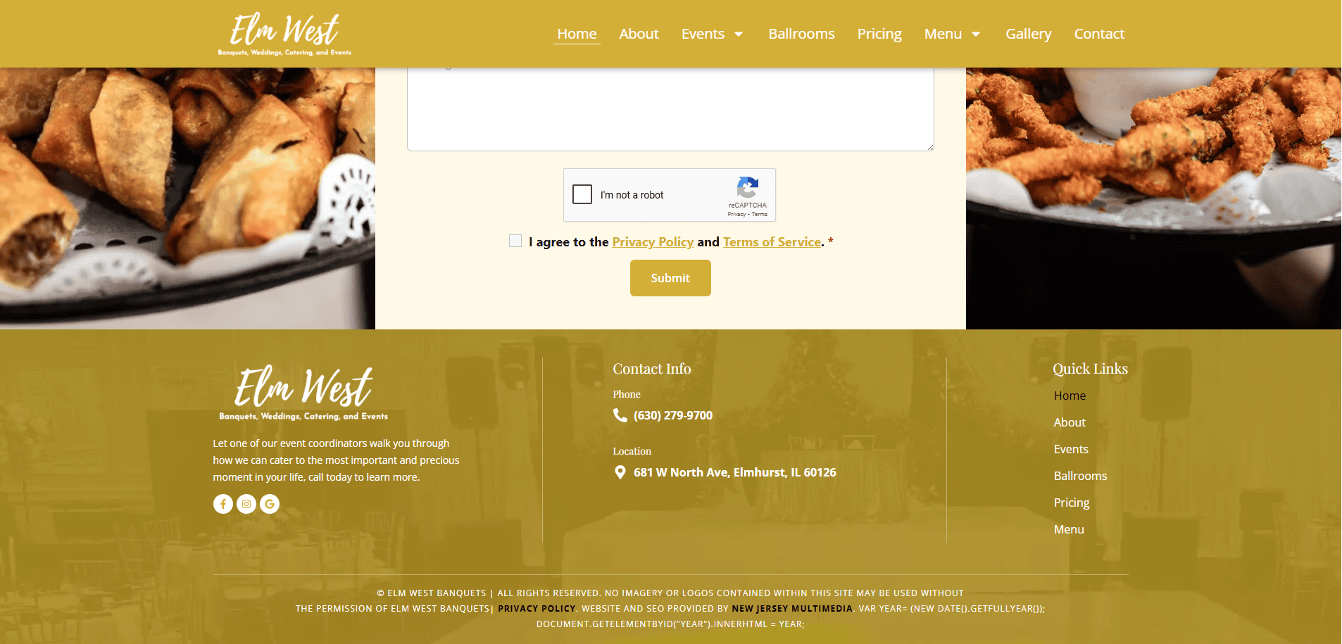
Location: Elmhurst, IL
Key Takeaways:
- Elegant minimalist layout aligns with upscale images
- Strong storytelling behind each event
- Clear CTA with streamlined contact form

2. The Chicago Cabinet Co.
Location: Chicago, IL
Key Takeaways:
- High-quality imagery showcasing craftsmanship
- Intuitive navigation and portfolio filtering
- Testimonials reinforce credibility

3. Veris CPA
Location: Oak Brook, IL
Key Takeaways:
- Modern layout for a traditionally conservative industry
- Case studies support trust and expertise
- Clear site architecture and quick-load speeds
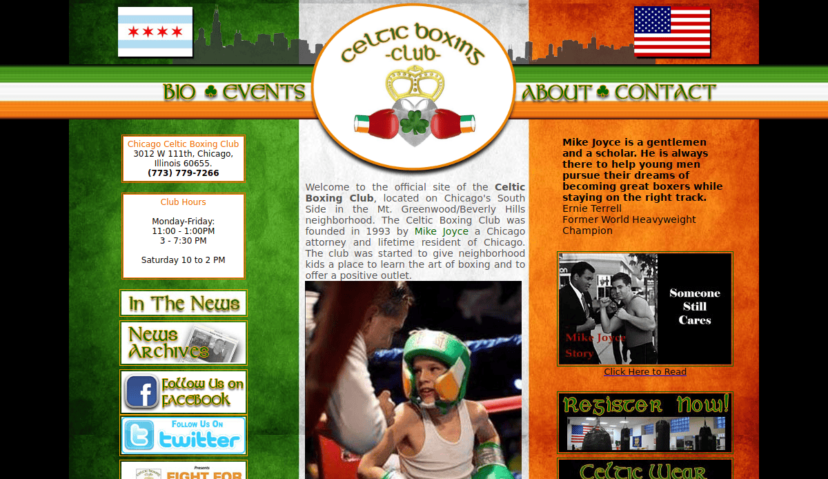
4. Celtic Boxing Club
Location: Chicago, IL
Key Takeaways:
- Strong branding with bold fonts and imagery
- Easy-to-use class schedule integration
- Mobile-first design for on-the-go users

5. NorthStar Wealth Group
Location: Naperville, IL
Key Takeaways:
- Clean, professional aesthetic fits the financial industry
- Trust symbols and certifications clearly displayed
- Service pages are structured for SEO and clarity

6. Tukaiz
Location: Franklin Park, IL
Key Takeaways:
- Bold use of video and motion design
- Easy-to-navigate portfolio with deep storytelling
- Integrated service highlights on project pages
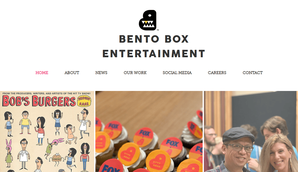
7. Bento Box Interactive
Location: Los Angeles, CA
Key Takeaways:
- Stunning animated visuals reflect the creative industry
- Portfolio displays the breadth of work clearly
- Balanced combination of fun and functionality

8. Emma Taylor Miller
Location: Brooklyn, NY
Key Takeaways:
- Business identity shines through curated portfolio
- Minimalist design with detailed project insights
- Unique scroll-based storytelling
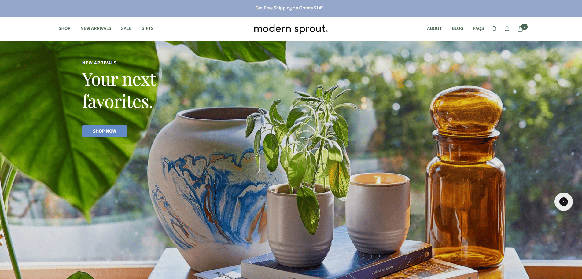
9. Modern Sprout
Location: Chicago, IL
Key Takeaways:
- Strong visuals paired with sustainability messaging
- Seamless e-commerce integration
- Project-based portfolio complements shop features

10. Carrie Schmitt
Location: Portland, OR
Key Takeaways:
- Bold color palette and character-driven illustrations
- Easily browsable portfolio by category
- Strong call to action for commissions

11. Studio Mega
Location: Chicago, IL
Key Takeaways:
- Full-screen visuals that showcase high-impact imagery
- Interactive transitions keep users engaged
- Simple yet elegant navigation
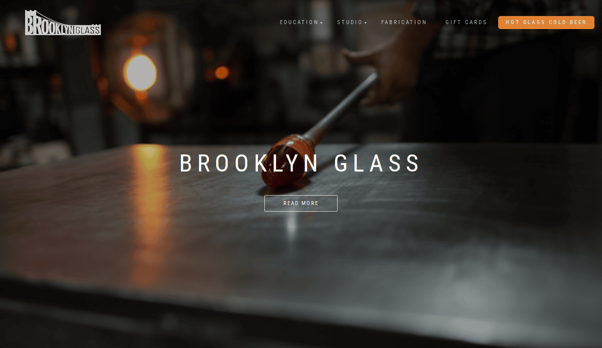
12. Brooklyn Glass
Location: Brooklyn, NY
Key Takeaways:
- Unique mix of visuals and industrial design elements
- Behind-the-scenes project views enhance transparency
- Great use of whitespace to direct attention

13. TrendyMinds
Location: Indianapolis, IN
Key Takeaways:
- Bold branding and clear messaging
- Detailed case studies show process and impact
- Clear hierarchy with excellent mobile UX
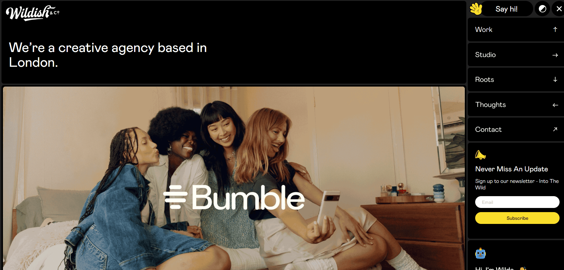
14. Wildish & Co.
Location: London
Key Takeaways:
- Unique illustrative style tailored to their niche
- Great storytelling from page to page
- Consistent visual identity across all touchpoints
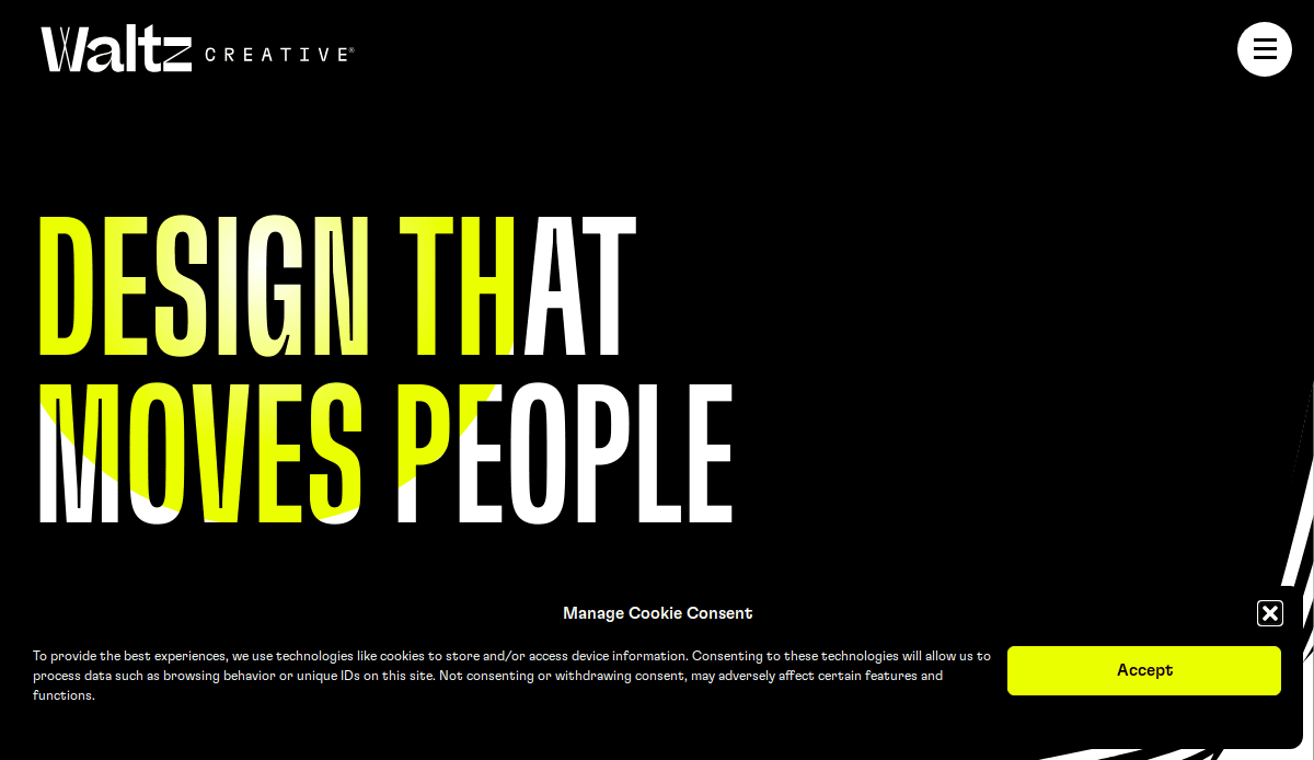
15. Waltz Creative
Location: San Francisco, CA
Key Takeaways:
- Women-led design studio with an inclusive tone
- Projects categorized by client type and goal
- Vibrant color use and engaging microcopy
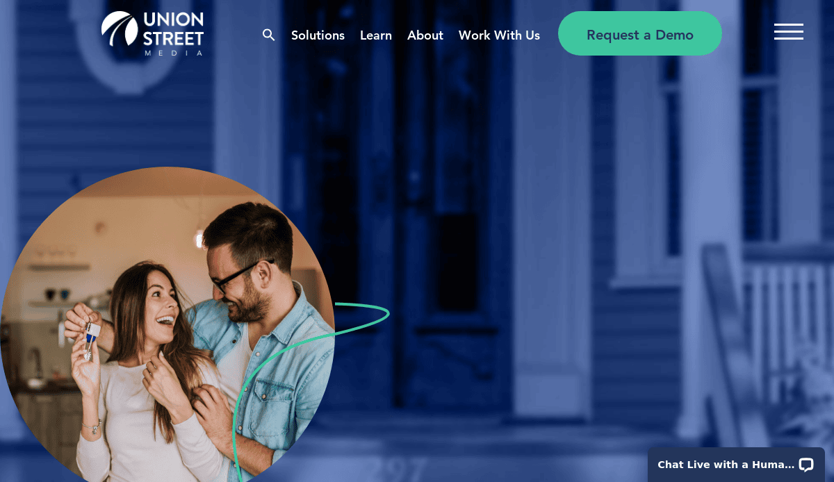
16. Union Street Media
Location: Burlington, VT
Key Takeaways:
- Industry-specific design for real estate professionals
- Highly detailed portfolio filters by outcome and service
- Strong internal linking and CTA usage
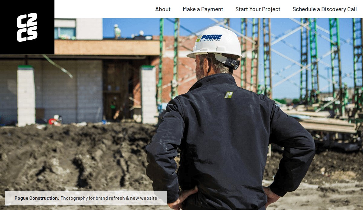
17. C2 Creative Studio
Location: Chicago, IL
Key Takeaways:
- Visual-first homepage draws immediate attention
- Work pages blend visuals with measurable results
- Streamlined navigation enhances user flow

18. Echo Design Group
Location: Elmhurst, IL
Key Takeaways:
- Bold header visuals establish brand authority
- Easy-to-scan service and work sections
- Portfolio segments tied directly to conversion funnels
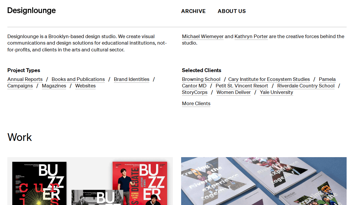
19. Designlounge
Location: New York, NY
Key Takeaways:
- High-end typography elevates visual storytelling
- Projects shown with deep background narrative
- Subtle animations enhance interactivity
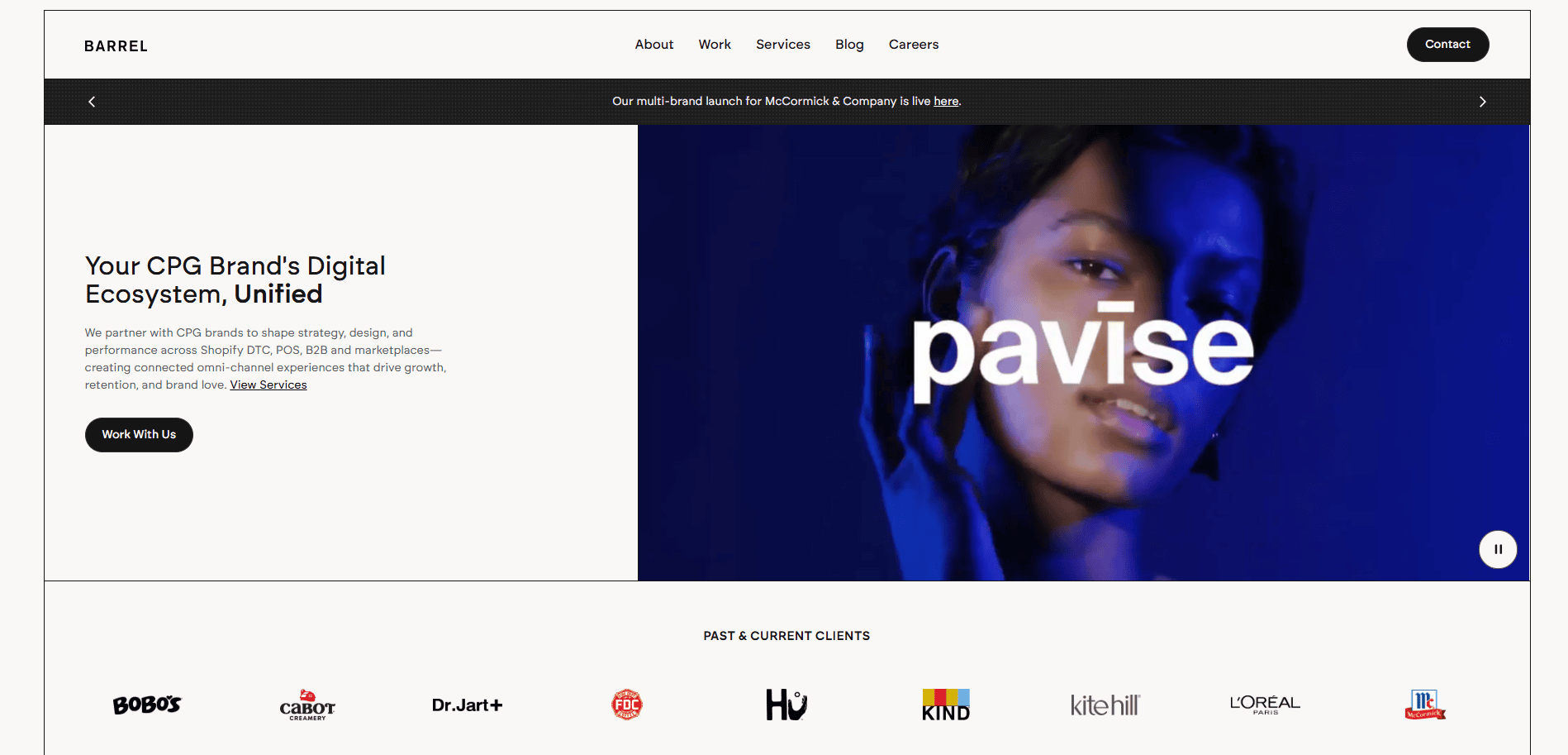
20. Barrel
Location: New York, NY
Key Takeaways:
- Strong grid structure for project overviews
- UX and brand strategy elements on display
- Clean, professional, agency-level polish
These website examples represent the best in creative, technical, and strategic design. If you’re building a portfolio website and looking to stand out in a saturated market, studying these examples—and working with a partner like us—can help you elevate your digital presence.
Ready to Build a Portfolio Website That Works as Hard as You Do?
A high-performing website in this industry doesn’t just amplify your work—it drives results. Whether you’re aiming to impress potential employers or attract freelance clients, your site should function as a living, evolving representation of your professional identity. Every element—from layout and visuals to SEO and site maintenance—contributes to how effectively your site builds trust, communicates value, and converts visitors.
If you’re ready to create a portfolio website that’s fast, polished, and built to grow with your career, we’re here to help. Our top-tier agency has been designing and maintaining performance-focused WordPress sites since 2002. We combine clean design with strategic digital marketing to ensure your online presence delivers real value.
Get in touch with us to discuss your custom web strategy today and turn your body of work into your most valuable business asset.
Frequently Asked Questions About Building an Effective Portfolio Website
What should I include in a professional website?
A completely professional website should include a homepage, an “About” section, an exhibit or work gallery, and a contact page. The homepage sets the tone, while the work you exhibit should include clear visuals, project context, your role, and outcomes. Adding testimonials, case studies, and a call to action strengthens your credibility and encourages visitors to connect with you.
How many projects should I showcase?
Quality always beats quantity. Aim to include 4–6 strong projects that represent your skills and align with the type of work you want to attract. Niche-down website examples that convert typically focus on depth, not volume—telling a story behind each project helps differentiate you from others. The way you display each piece is more important than how many you feature.
What’s the best platform for building a professional website?
WordPress is a popular and powerful choice for building a professional site thanks to its flexibility, SEO benefits, and wide range of plugins. It’s especially ideal if you plan to scale or customize your site extensively. If you’re just starting out or need something fast, a platform like Squarespace or Webflow might be helpful. The key is choosing the right tool based on your goals, comfort with technology, and the features you’ll need long term.
How do I make my website stand out?
Focus on both design and storytelling. Use consistent branding, high-quality images, and clean navigation to guide users. More importantly, explain the context behind each project—what was the problem, your approach, and the outcome? Great websites don’t just display deliverables—they provide insight into the creative or strategic process.
Should I use a template or a custom design?
Templates are a great starting point, especially for those not ready for full custom development. The key is customizing it enough to reflect your personality and goals. Whether you use a one or go custom, what matters is the content and how you present it. Make sure the structure aligns with best practices for conversion and clarity.
How do I make my site easy to maintain?
Choose a content management system (CMS) like WordPress and stick to a consistent design system. Keep plugins updated, use reusable page sections, and plan to revisit your site quarterly. Ongoing WordPress maintenance is essential for keeping your projects secure, fast, and professional.
When is the right time to publish my portfolio?
Start publishing your body of work as soon as you have a few strong pieces to exhibit. Don’t wait until everything feels “perfect.” A website is a living document—you can always update it as you grow. Publishing your portfolio early helps you start gaining visibility and feedback from real users or employers.
What’s the most effective way to showcase personal projects?
Treat personal projects like client work. Provide background, explain the problem you solved, and describe your process. These projects are often some of the most creative and personal, making them a great way to amplify passion, initiative, and design thinking.
Should I include writing or blog content on my site?
If you want to enhance your authority or show thought leadership, a blog or insights section is a valuable addition. It’s especially useful if you’re in a field like UX, development, or marketing. It also supports SEO by allowing you to target additional keywords related to your skills and services. Explore how SEO supports web visibility.
How do I know if my website is performing well?
Track metrics like time on site, bounce rate, and contact form submissions using tools like Google Analytics. Regularly test usability and gather feedback from peers or mentors. Most importantly, measure whether your site is helping you connect with new clients or employers. If not, revisit how you’re presenting your work and whether your navigation, structure, or messaging needs improvement.
Need help reviewing or improving your portfolio? Talk to our web design experts for a strategic evaluation and custom improvement plan.


