Just looking for our Best Kitchen Remodeling Website examples list?
Design with Your Ideal Customer in Mind
The most effective websites are crafted to speak directly to homeowners looking for transformation. Understanding your customer’s intent and pain points allows you to position your services with maximum relevance and impact.
Visual Appeal Converts Visitors into Clients
A visually striking layout that showcases your past projects, integrates before-and-after photos, and uses a cohesive color palette helps build trust instantly. This visual storytelling approach differentiates your business from competitors.
SEO Strategy is a Non-Negotiable
Without on-page SEO fundamentals—such as keyword-targeted headlines, meta tags, and schema markup—even the most beautiful website won’t generate leads. Prioritize technical and content SEO to dominate local searches for your services.
Why Your Kitchen Remodeling Website Design Matters
If your website isn’t turning visitors into leads, it’s costing you business. An outdated, cluttered, or uninspired site can silently erode credibility and lose potential clients to competitors with more polished digital storefronts.
Today’s homeowners do their homework. They search, compare, and vet kitchen remodelers online before ever reaching out. That first impression happens fast, and your website design plays a pivotal role in whether they stay or bounce. A modern, high-performing site doesn’t just look good; it strategically guides users toward action, builds trust through visuals, and ensures you’re visible in local searches.
In this guide, we break down the essentials of professional site design—from foundational elements to high-converting features—so you can attract more qualified leads, stand out from the crowd, and grow your business online.
Website Planning & Purpose: Setting the Foundation for Success
Every successful site starts with strategic planning. Before any visual formatting or coding begins, it’s critical to define your site’s goals, identify your target audience, and align your messaging with your company’s value proposition. This foundational step ensures your digital presence is built to generate leads, showcase your capabilities, and support your broader marketing efforts.
Your site must do more than look professional. It needs to:
- Communicate trust and craftsmanship through strong visuals and testimonials
- Clearly outline your services, process, and areas served
- Include intuitive navigation to help users find information effortlessly
- Capture leads through compelling calls-to-action and contact forms
Equally important is defining key performance indicators (KPIs) during the planning phase. Whether your goal is to increase consultations, drive calls, or grow your email list, these benchmarks will shape the user experience and content strategy.
Failing to plan leads to websites that look decent but lack strategy, ultimately costing you conversions. By laying the groundwork with purpose and intention, your site becomes a growth engine, not just a digital brochure.
Design Principles That Drive Engagement and Trust
Design is more than aesthetics—it’s a strategic tool that influences user behavior and drives engagement. Following core design principles ensures your website looks professional and functions as a powerful sales asset.
Clarity and Simplicity
Avoid cluttered layouts and overwhelming text blocks. Use whitespace effectively to create breathing room and guide the visitor’s eye. Prioritize a clear hierarchy in typography, using H1-H3 headers to break up content logically.
Consistency and Branding
Every element—from fonts and button styles to photography and color palette—should reinforce your brand identity. A consistent layout builds familiarity and strengthens brand recognition.
Visual Storytelling
Highlight before-and-after galleries, 3D renderings, and project showcases to illustrate your craftsmanship. Images should be high-resolution and professionally lit, helping prospective clients envision their dream kitchen.
Mobile Optimization
With most homeowners browsing on mobile devices, responsive design is non-negotiable. Ensure every element of your site is mobile-friendly, fast-loading, and easy to navigate with touch gestures.
Visual Flow and Calls-to-Action
Create your pages with a visual path that leads users toward conversion points. CTAs like “Schedule a Consultation” or “Get a Free Estimate” should stand out visually and be placed strategically throughout the site.
Accessibility and Performance
Websites should load quickly, use readable fonts, and be accessible to all users. Implement alt text for images, maintain contrast ratios, and ensure your site meets basic ADA compliance standards.
By integrating these design principles, you’ll create a visually impressive site that also performs in converting traffic into inquiries and booked consultations.
Content & Navigation: Guiding the User Journey
Strong website content and intuitive navigation are critical for guiding potential clients through your site and into your sales funnel. In this industry, your content must speak directly to homeowners’ needs while making it easy for users to find what they’re looking for.
Homepage
Your homepage should immediately establish credibility with a clear value proposition, a striking hero image of a completed project, and concise calls to action. Include a summary of your services, featured testimonials, and a showcase of your best work.
About Page
Tell your brand story, emphasize your years of experience, and introduce your team. Humanizing your brand builds trust and gives prospects a reason to choose you over a generic contractor.
Services Pages
Each core service—such as kitchen design, cabinet installation, or full renovations—should have its own page. Break down the benefits, process, and timeline for each service with supportive imagery and CTA buttons.
Portfolio Page
Use this section to highlight past projects with high-quality images, project overviews, and client testimonials. Filter options (e.g., modern kitchens, rustic designs) enhance user experience.
Blog or Resource Center
Provide expert advice on relevant trends, budgeting tips, and planning guides. This builds authority and improves SEO performance.
Contact Page
Keep it simple and accessible. Include a clean form, phone number, email, and embedded map if you have a showroom. Add a scheduling tool if you offer free consultations.
Navigation Best Practices
Use a sticky header for easy access to menu items. Keep your navigation bar concise, with no more than 6 – 7 top-level items. Use breadcrumb navigation on deeper pages to improve usability.
Structured content and thoughtful navigation ensure users find value at every click, encouraging them to stay longer and take action.
Visual Elements That Enhance the User’s Experience
In a visual-first industry like this one, compelling imagery and thoughtfully integrated visual elements are essential. These elevate the overall aesthetic, help communicate craftsmanship, build credibility, and guide users through a seamless experience.
High-Quality Project Photography
Photos of completed projects serve as proof of your expertise. Use before-and-after sliders, close-ups of finishes, and wide-angle shots of full kitchens to show your range. Authenticity matters—use real client work, not stock photos.
3D Kitchen Planners and Interactive Tools
Embedding a virtual kitchen planner or a 3D layout viewer gives users the ability to visualize their renovation. These tools increase engagement and position your brand as a tech-savvy, customer-focused provider.
Illustrations and Icons
Custom illustrations can help break up text and convey process steps, service categories, or unique selling points. Icons are especially useful in service lists, contact forms, and value proposition sections to improve scannability.
Video Content
Short videos—whether walk-throughs of recent projects, behind-the-scenes clips, or testimonials—add a personal, dynamic touch. They keep visitors engaged longer and humanize your brand.
Color Palette and Typography
Choose a color scheme that reflects your brand personality—warm neutrals for a welcoming feel or bold contrasts for a modern aesthetic. Typography should be easy to read and used consistently to reinforce hierarchy.
Trust-Building Visuals
Logos of certifications, review stars, and media mentions all lend instant credibility. Display these elements near calls to action to reduce buyer hesitation.
By thoughtfully integrating visual content, you elevate both form and function, creating a compelling site that looks great and supports conversion goals, and reinforces brand trust.
Ongoing WordPress Maintenance: Protecting Your Digital Investment
A professional site built on WordPress requires consistent upkeep to perform at its best. Maintenance is not optional—it ensures your site remains secure, fast, and fully functional as technology evolves.
Security Updates
WP core, themes, and plugins receive regular updates to fix bugs and patch vulnerabilities. Without timely updates, your site can become an easy target for hackers or malware attacks.
Performance Optimization
Regularly clearing the cache, optimizing databases, and compressing images keeps your site running quickly. A slow site hurts user experience and damages your search rankings.
Backups and Recovery
Scheduled backups safeguard your site against data loss. In case of a crash, update error, or breach, you can restore the site quickly without downtime or lost revenue.
Plugin and Theme Management
As the WP ecosystem evolves, some plugins or themes may become unsupported or incompatible. Routine audits help you replace outdated tools with reliable alternatives.
Technical SEO Checks
Maintenance is the time to monitor broken links, fix crawl errors, and ensure your SEO settings are correctly configured. These small tweaks protect and improve your search performance.
User Experience Testing
Routine testing across browsers and devices ensures everything looks and functions as expected. Broken forms, misaligned layouts, or faulty scripts can drive visitors away.
For companies like yours, the site is a living tool. Ongoing web maintenance supports its longevity and ensures it continues delivering results for years to come.
Best Kitchen Design Website Examples
1. APolishedFinish.com – Athens, GA
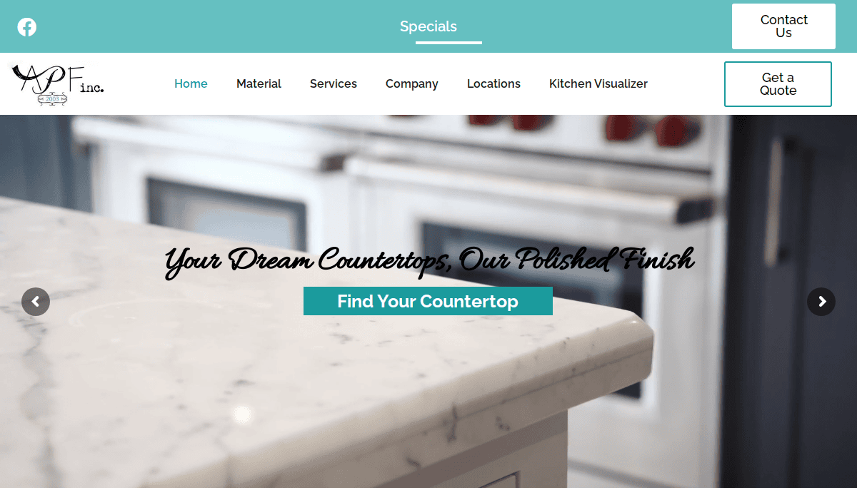
- Clean, upscale layout with an earthy color palette
- Simple navigation makes service discovery easy
- Powerful use of high-resolution photography
2. KitchenKrafters.com – Fredericksburg, VA
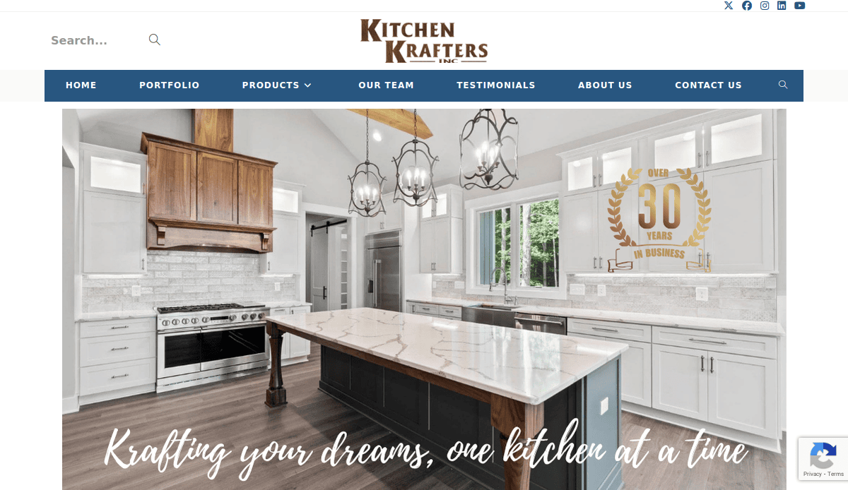
- Elegant layout that showcases luxury kitchens
- Clear CTAs lead users to book consultations
- Strong testimonial and portfolio section
3. RemodelWerks.com – Shrewsbury, MA
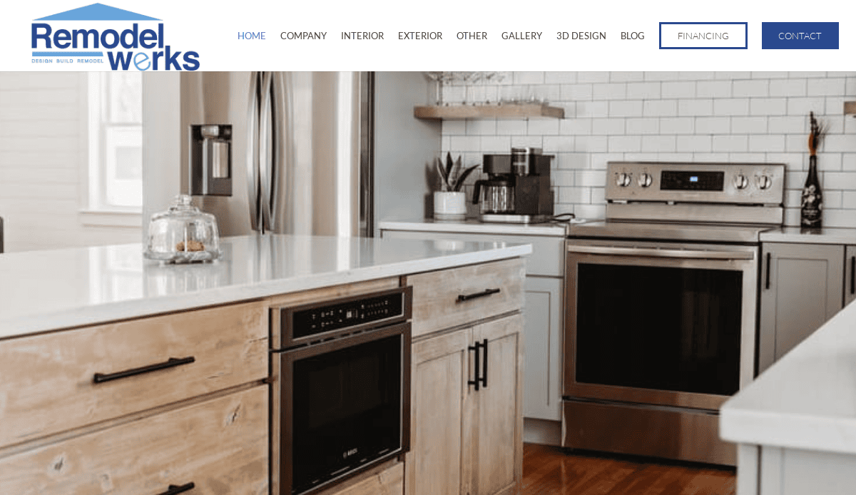
- Highlights award-winning successes with rich visuals
- Excellent UX and responsive layout
- Comprehensive “Our Process” content educates clients
4. KitchenDesignPartners.com – Northbrook, IL
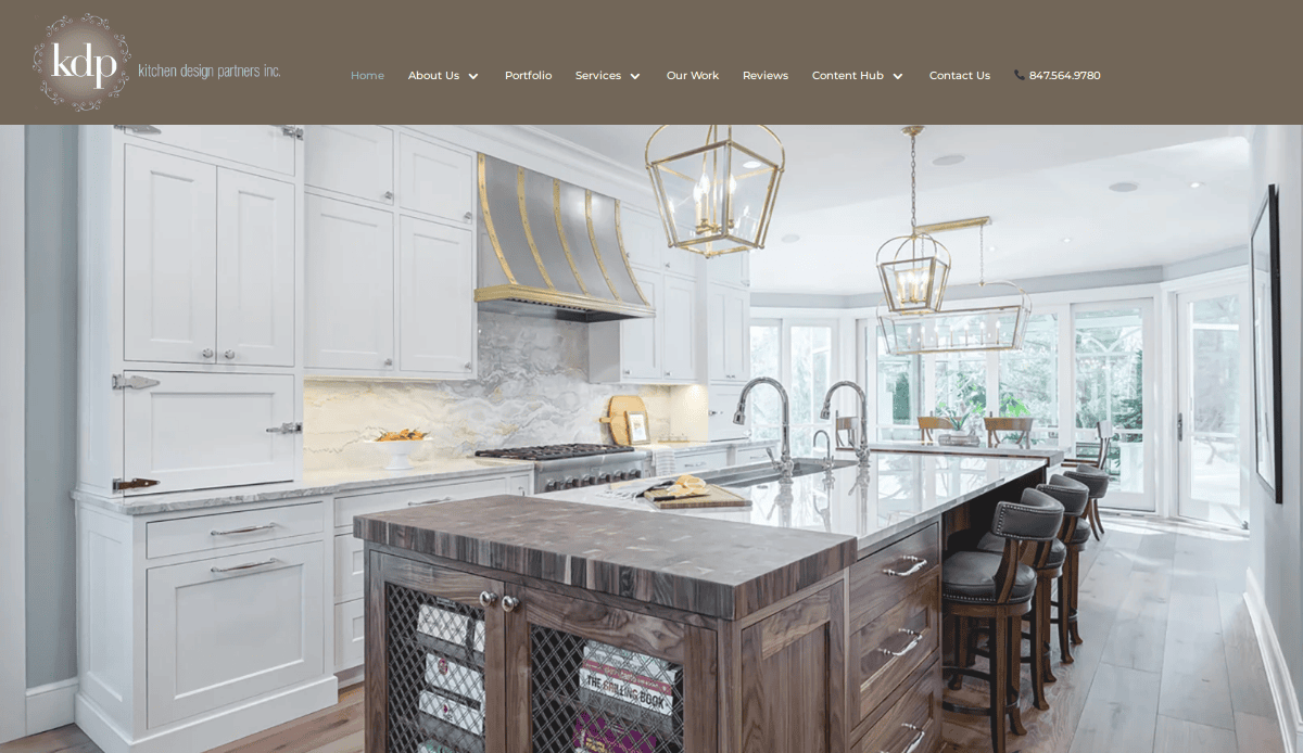
- Sleek and modern aesthetic
- Portfolio-driven storytelling builds trust
- Includes design tools for user interaction
5. SebringDesignBuild.com – Naperville, IL
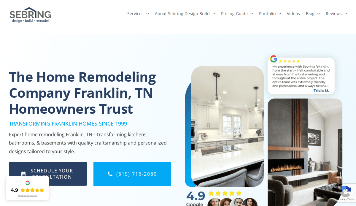
- Clean, professional WordPress layout
- Informative blog builds SEO authority
- Strong before-and-after photo sections
6. DruryDesigns.com– Glen Ellyn, IL
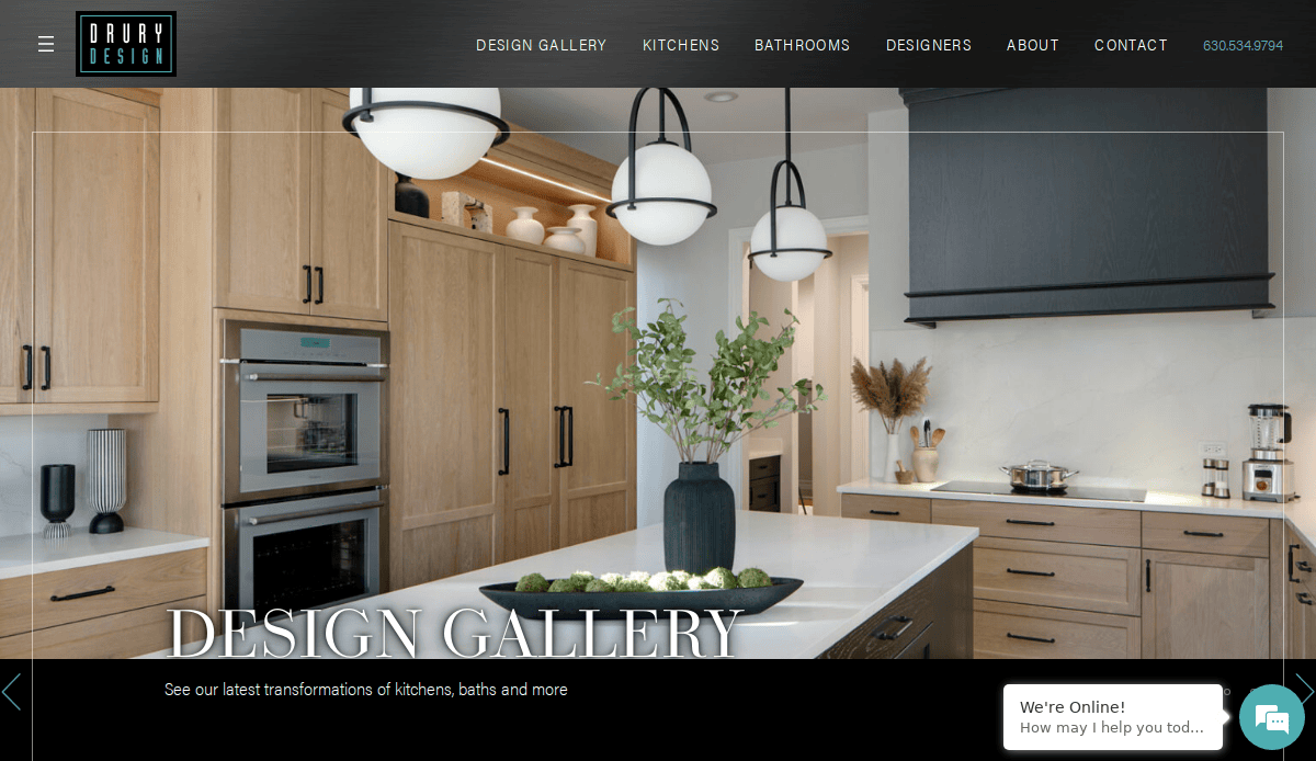
- Excellent use of white space and typography
- Beautiful gallery of award-winning kitchens
- Engaging brand story and strong CTA buttons
7. Normandy Remodeling – Hinsdale, IL
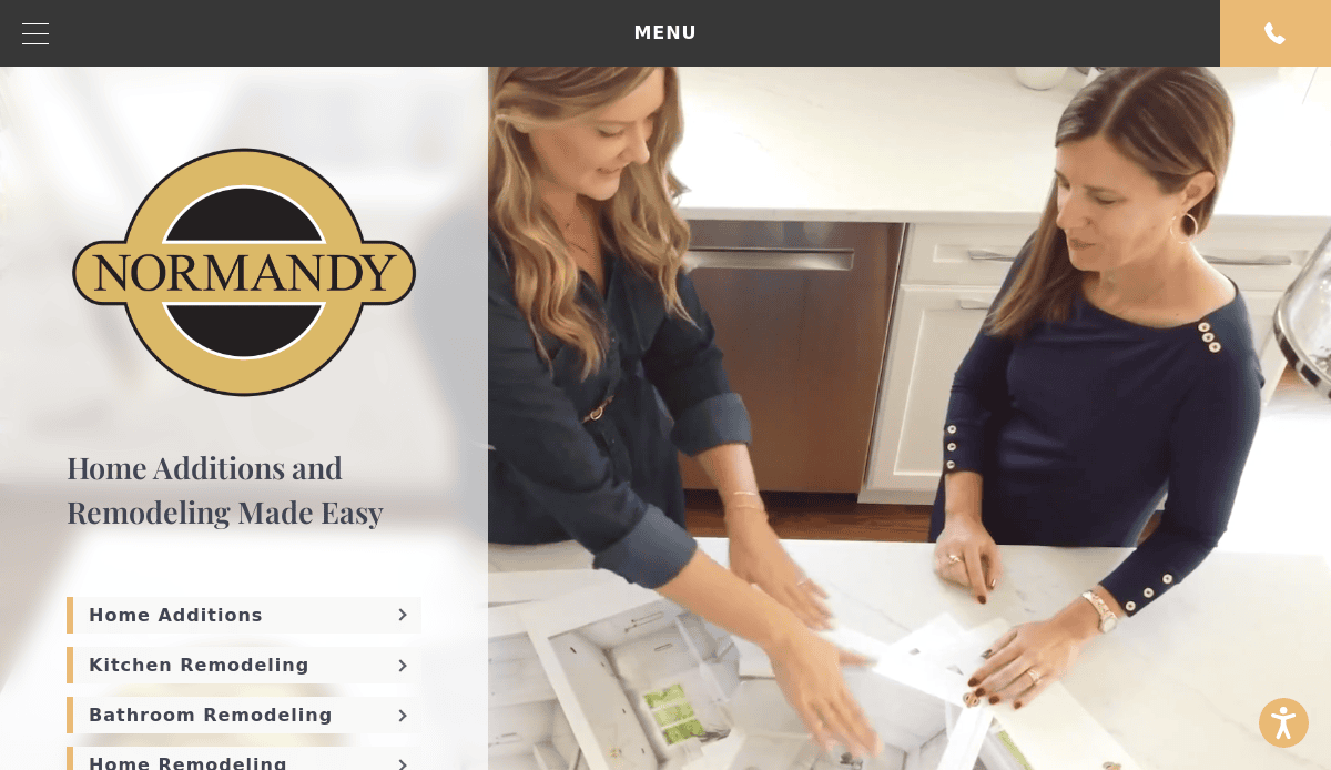
- Sophisticated, high-end template with refined branding
- Comprehensive portfolio section with filters
- Robust UX for conversions and lead gen
8. Kitchen Village – Arlington Heights, IL
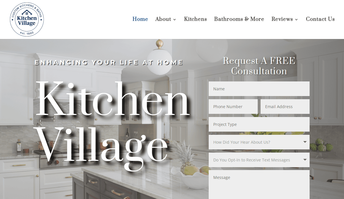
- Intuitive navigation and engaging homepage layout
- Emphasis on personal service and quality
- Visual case studies guide the user journey
9. DreamMaker Bath & Kitchen – Springfield, IL
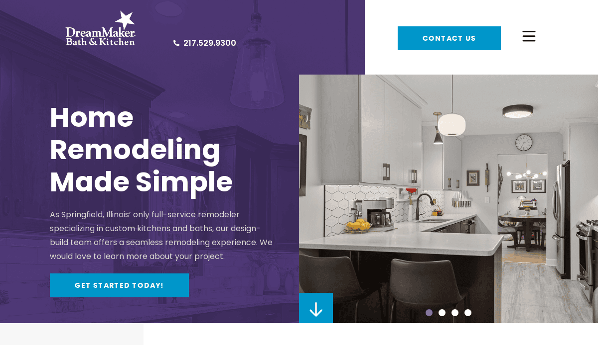
- Bright, friendly visual style
- Consistent branding and easy access to services
- Strong lead generation with online forms
10. A.J. Michaels– Baltimore, MD

- Clean layout that prioritizes usability
- Integration of service details and blog content
- Location-specific landing pages for SEO
11. Dreamstyle Remodeling– Albuquerque, NM
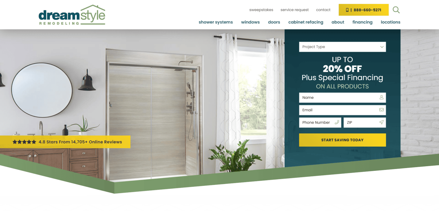
- Bold visuals that highlight finished tasks
- Clear CTAs across the homepage and service pages
- Excellent social proof integration
12. Kitchen Design Central– Orlando, FL
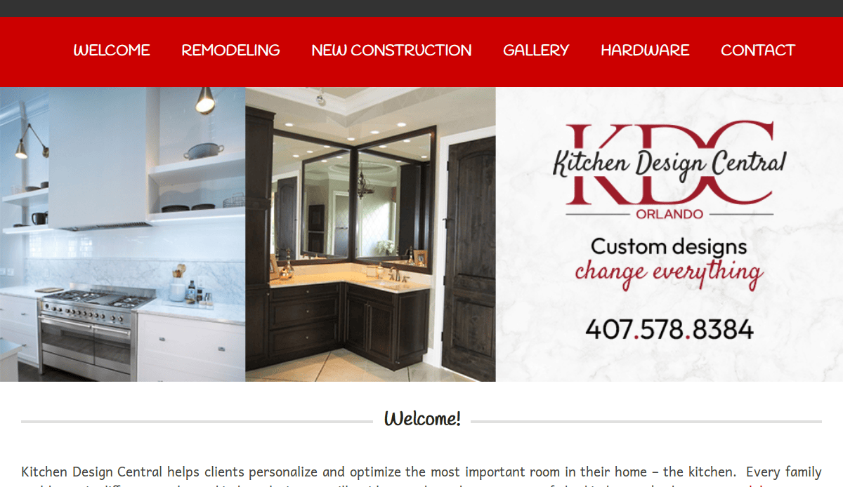
- Clean structure with informative content
- Well-organized gallery and testimonials
- Local focus increases trust and searchability
13. Kitchen Solvers – La Crosse, WI
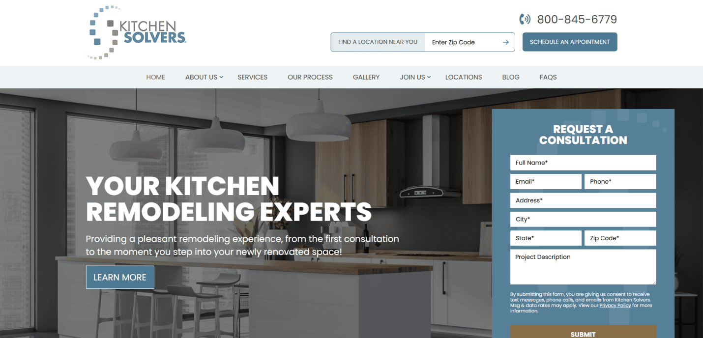
- Well-branded multi-location structure
- Franchise feel with localized pages
- Modern layout with trust badges and FAQs
14. Kitchen Tune-Up – Aberdeen, SD
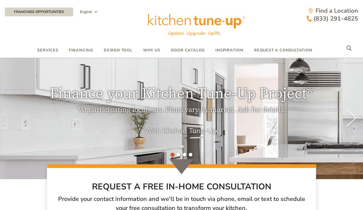
- Accessible user experience across devices
- Extensive resource section for customers
- Franchise scalability without losing clarity
15. Home Remodeling Pros of Central PA – York, PA
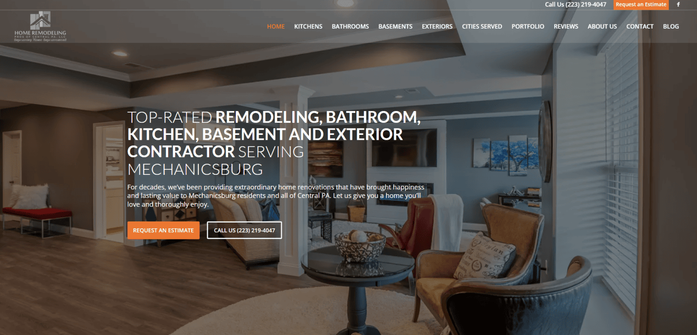
- Local authority and expertise emphasized
- Trust-driven with reviews and service clarity
- Balanced visuals and CTA integration
16. Renovation Studio – Atlanta, GA
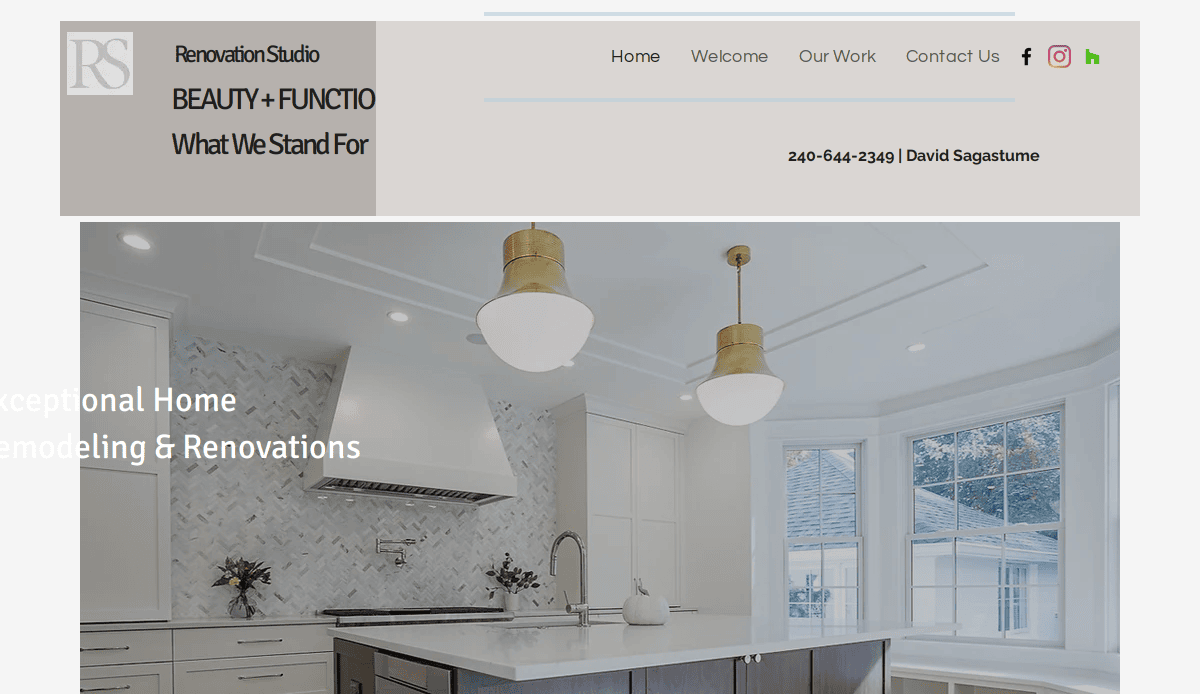
- Crisp layout with modern UX features
- Portfolio showcase and blog for SEO reach
- Strong color and branding consistency
17. ReVision Design/Remodeling – Charlotte, NC
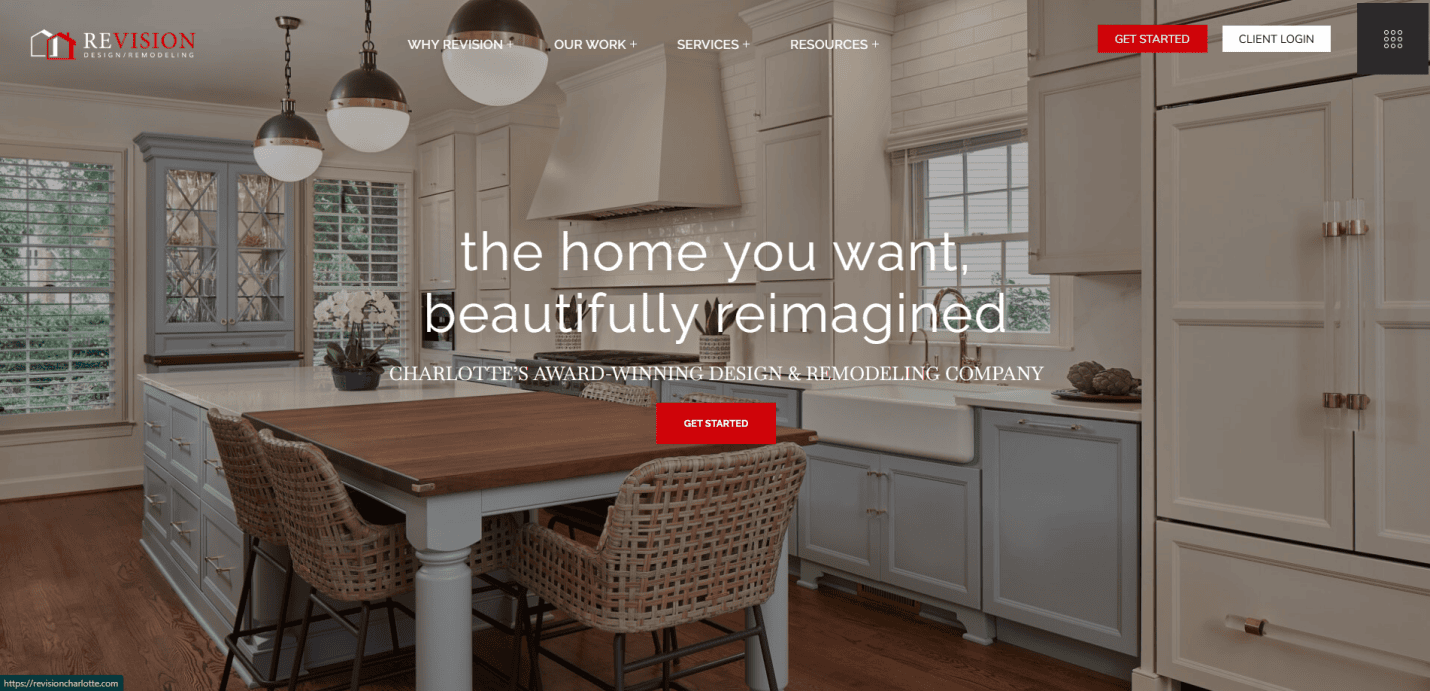
- Stunning project visuals and filters
- Educational blog content to support leads
- Personal storytelling and brand authenticity
18. Kitchen Magic – Nazareth, PA
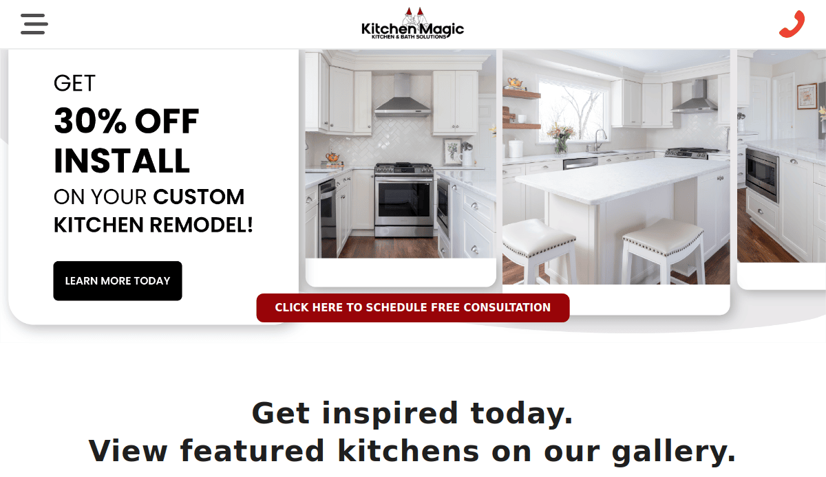
- Family-owned angle highlighted with storytelling
- Focused content around kitchen remodels only
- Conversion-focused homepage layout
19. Builders Cabinet – Chicago, IL
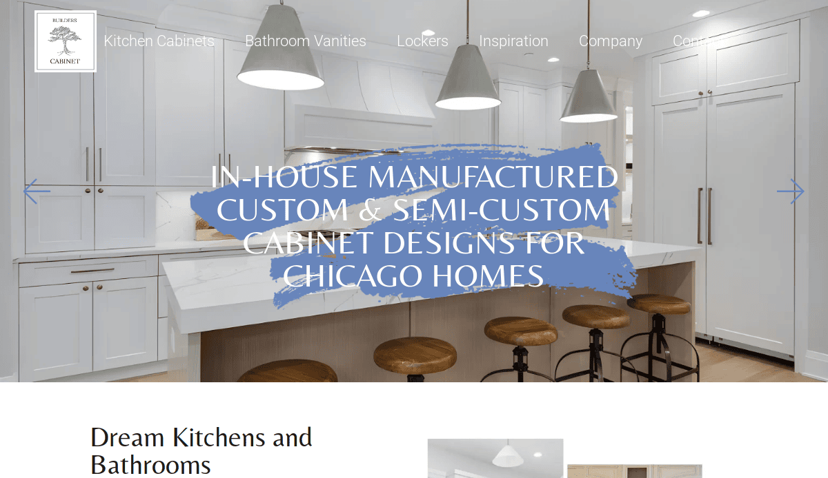
- Clean layout with builder-focused content
- Interactive product selection and filtering
- Strong architectural branding and visuals
Get Started: Build a Kitchen Remodeling Website That Performs
Your website is more than a digital business card—it’s your most valuable lead generation method. From selecting the right template to showcasing a stunning floor plan, every element matters. Whether you’re inspired by the top industry websites, use platforms like Webflow, one thing remains clear: strategy-backed web design drives results.
A site that uses modern formatting tools, presents real architecture and construction examples, and highlights your best customize options will always stand out. When you show your pro craftsmanship and offer a curated selection of work, you position your business among the best websites in the industry.
If you’re ready to get serious about your home renovation marketing, we’re here to help you launch a high-performing site designed to convert. Schedule your free website review and get inspired today.
Kitchen Remodeling Website Design FAQS
What should a kitchen remodeling website include?
A professional kitchen remodeling website should feature a service overview, portfolio, client testimonials, clear contact options, and utilities like a free kitchen planner or project estimator. Visual storytelling and CTA-driven layouts are essential.
Why is WordPress a good platform for remodeling websites?
It offers flexibility, scalability, and access to powerful plugins and software for performance and SEO. It supports custom themes and integration with customized visual elements for better branding and engagement.
How often should I update my kitchen remodeling website?
Website content should be reviewed quarterly, with technical SEO and plugin updates performed monthly. Consider updating your layout every 2 – 3 years to stay modern and competitive with top remodeling websites.
How can visuals improve engagement on my site?
High-resolution photography, video tours, and interactive utilities help clients visualize their luxury home upgrades. They also support trust and position your business as a luxe kitchen expert.
Can I see examples of other top-performing sites?
Yes—check out our blog on the best kitchen design websites for inspiration and competitive benchmarking.
What’s the difference between DIY templates and custom web design?
DIY templates are faster but lack customization and scalability. A custom design from professionals ensures your site aligns with your brand, conversion goals, and architecture or construction process.
How can I attract more traffic to my website?
Focus on SEO, content marketing, and user experience. Showcase local expertise, such as work with home remodeling pros of central or remodeling pros of central PA, and build authority through blog posts and testimonials.
What tools can enhance my site’s performance?
Use heatmaps, analytics platforms, SEO plugins, and scheduling software to optimize conversions and streamline appointment booking for prospects.
Is it important to show before-and-after projects?
Absolutely. These visuals are a powerful trust-builder and a core part of any successful customize strategy. They provide proof of results and encourage visitors to engage with your brand.
How can I start a project with your agency?
Book an appointment for a free consultation. We’ll assess your needs and build a solution tailored to your remodeling business goals.

