Just looking for our Best Higher Education Website examples list?
Key Takeaways:
Designing an effective higher education website requires a strategic blend of user-centric design, technological innovation, and accessibility compliance. This guide outlines the essential elements to create a digital presence that resonates with prospective students, faculty, and stakeholders.
1. Prioritize User-Centered Design
Modern websites must focus on delivering intuitive and engaging user experiences. Implementing clear navigation, responsive layouts, and streamlined content helps users find information efficiently. Emphasizing user-centered design enhances satisfaction and supports institutional goals.
2. Embrace Mobile Responsiveness
With a significant portion of users accessing websites via mobile devices, ensuring mobile responsiveness is critical. Responsive design adapts content to various screen sizes, providing a seamless experience across devices and improving search engine rankings.
3. Ensure Accessibility Compliance
Adhering to accessibility standards like WCAG ensures that websites are usable by individuals with disabilities. Features such as keyboard navigation, alt text for images, and appropriate color contrasts meet legal requirements and demonstrate a commitment to inclusivity.
4. Integrate Personalization and AI
Incorporating AI-driven personalization enhances user engagement by delivering tailored content and recommendations. Features like chatbots and personalized dashboards can provide real-time assistance and relevant information, improving the overall user experience.
5. Highlight Virtual Campus Experiences
Offering virtual tours and interactive campus experiences allows prospective students to explore facilities remotely. These features can increase engagement and provide valuable insights into campus life, aiding in the decision-making process.
6. Focus on Clear and Compelling Content
Effective copywriting that communicates the institution’s values, programs, and opportunities is essential. Content should be concise, informative, and aligned with the institution’s brand voice to resonate with diverse audiences.
7. Optimize for Search Engines
Implementing SEO best practices ensures that the website ranks well in search engine results, increasing visibility to prospective students. This includes optimizing meta tags, using relevant keywords, and ensuring fast load times.
8. Incorporate Interactive Elements
Interactive features such as dynamic content, multimedia elements, and user feedback mechanisms can enhance engagement. These elements make the website more engaging and can provide valuable insights into user preferences.
9. Maintain Up-to-Date Content
Regularly updating website content ensures that information remains current and relevant. This includes academic programs, event calendars, news updates, and policy changes, which are crucial for maintaining credibility and user trust.
10. Implement Robust Analytics
Utilizing analytics tools helps track user behavior, identify areas for improvement, and measure the effectiveness of website features. Data-driven insights enable continuous optimization of the website to better serve its audience.
By focusing on these key areas, higher education institutions can develop websites that meet the needs of their diverse audiences and stand out.
Why Website Design Is the New Front Door to Your Campus
Today, a website is more than just a place to post course catalogs and event calendars—it’s the first impression you make on prospective students, faculty, parents, and even potential donors. For colleges and universities, a well-executed website design is now central to enrollment strategy, brand perception, and student engagement.
When executed with best practice in mind, your higher ed website becomes a 24/7 recruiting tool, a hub for student services, and a showcase for your institution’s values and achievements. It drives decisions as much as in-person campus visits ever did. In fact, many prospective students form their opinion of a school long before speaking to an admissions counselor, based entirely on their digital experience.
That’s why optimizing every touchpoint—from navigation to responsive design and web accessibility—isn’t just a technical requirement; it’s a strategic imperative. This guide unpacks the most effective strategies and emerging trends for college and university website design, revealing what it takes to build an education website that informs, inspires, and converts.
Whether you’re in the middle of a site overhaul or just beginning to rethink your digital marketing priorities, this guide will help you align your web design with your institution’s goals—and the expectations of your evolving target audience.
Website Planning & Purpose: Laying the Groundwork for a High-Impact Site
Before any line of code is written or pixel placed, the success of a website hinges on one critical phase: planning. For colleges and universities, website planning isn’t just about layout or color schemes—it’s about aligning digital presence with institutional strategy. From student recruitment to alumni engagement, every decision must be driven by purpose.
At the core of planning is defining who the website is for. Higher ed institutions serve multiple audiences simultaneously—prospective students, current students, faculty, parents, alumni, and donors. A successful site starts by mapping these user groups and tailoring journeys to meet each one’s needs. For instance, prospective students need quick access to admissions and virtual tours, while current students prioritize academic calendars, course portals, and support services.
Equally important is setting clear objectives. Is the goal to increase applications? Boost enrollment in a specific program? Improve donor engagement? Each objective informs the site structure, content strategy, and call-to-action placements. When these goals are defined early, the result is a university website that looks impressive and drives measurable results.
Content planning plays a vital role. Academic programs, student life, campus news, and alumni success stories all need to be organized for clarity and searchability. A content inventory—auditing what exists and identifying what’s missing—sets the foundation for a robust site map and intuitive navigation.
Accessibility must be a core focus from the beginning. Adhering to these standards ensures inclusivity and compliance with legal requirements, while enhancing the overall user experience. The same is true for mobile responsiveness and SEO; they can’t be bolted on later—they must be embedded in the planning process.
Lastly, it’s crucial to future-proof the website. That means anticipating evolving user behaviors, technology shifts, and digital expectations. Higher ed teams should stay informed about innovations in design, such as AI personalization and modular content blocks. For a detailed look at what’s on the horizon, explore upcoming web design trends for 2025 to see how forward-thinking colleges are preparing for the next wave of digital engagement.
Strategic planning ensures that your website isn’t just functional—it becomes an active, adaptable asset that meets institutional goals and user expectations from day one.
Design Principles: Building Blocks of an Effective Website
Designing for higher education is about creating a seamless, strategic experience that serves a diverse audience while reflecting the institution’s values and academic strengths. Whether targeting high school seniors exploring majors or alumni looking to give back, effective design principles ensure your site is both functional and inspiring.
Clarity is paramount. Visitors to a college website often come with a mission: finding admissions requirements, researching academic programs, or locating campus resources. Clear visual hierarchy—through headings, white space, and intuitive grouping—guides users to what they need quickly, reducing frustration and boosting engagement.
Consistency reinforces trust and brand recognition. Fonts, colors, imagery, and messaging must align across every page to reinforce the institution’s identity. A scattered or disjointed design can erode credibility. A cohesive visual language helps users instantly recognize the site as belonging to a professional and reputable college or university.
Accessibility is non-negotiable. Designing for compliance with WCAG guidelines ensures students with disabilities can access content and interact with features like forms, calendars, and navigation. Considerations like keyboard-friendly menus, alt text, and sufficient color contrast are essential, not just for compliance, but for demonstrating institutional inclusivity.
Responsive design ensures usability across all devices. With many users—especially prospective students—navigating on smartphones or tablets, a site must adapt fluidly to various screen sizes. Layouts should reflow gracefully, and key functions like forms and menus must be fully mobile-compatible to avoid user drop-off.
Simplicity enhances performance. While creativity is encouraged, cluttered pages loaded with excessive visuals or animations can confuse users and slow down load times. Prioritize simplicity and focus on functional design elements that support the content, not overshadow it.
Authentic imagery boosts emotional connection. Real photos of students, campus life, faculty, and events add personality and credibility. Stock photos should be used sparingly; prospective students want to see real experiences they can relate to.
Finally, storytelling is a powerful design layer. Design should support the narrative of the institution—who it serves, what it stands for, and what makes it unique. From homepage hero sections to program pages, visual elements should help tell that story in a compelling, modern format.
For a closer look at how these principles come to life, review our curated list of the 20 best education websites for inspiration and practical examples of design done right. Each showcases how great design can deliver results without compromising the mission of higher education.
Content & Navigation: Structuring Websites for Clarity and Engagement
Effective content and navigation are at the heart of any high-performing website. For colleges and universities, these elements must do more than inform—they must guide, inspire, and convert a wide range of users with very different needs.
The foundation begins with content hierarchy. Every page should serve a specific purpose, with headlines and subheadings that allow users to scan and absorb key points quickly. Admissions pages should highlight application deadlines, requirements, and financial aid options right at the top. Academic program pages should lead with degree outcomes and curriculum details, followed by faculty bios and career paths. This top-down approach prioritizes what matters most to your target audience.
Tone and language must remain consistent throughout the site. Content should be informative but not overly academic, particularly on pages aimed at prospective students or parents. Use plain language that communicates benefits, not just features. For instance, instead of listing course codes, describe the skills and experiences students will gain. Aligning this tone across the site strengthens your institutional brand and supports enrollment efforts.
Navigation must be intuitive and predictable. Users should never feel lost or unsure of where to click next. Mega-menus are common on higher ed websites for a reason—they allow large amounts of content to be grouped under logical categories like Academics, Admissions, Student Life, Research, and About. But simplicity still rules. Aim for no more than 5–7 top-level menu items to prevent cognitive overload.
Sub-navigation should help users dig deeper without forcing them to rely on the back button. Breadcrumb trails, sticky navigation bars, and smart search functions make it easier for users to find their way, especially on large university websites with hundreds of pages.
Calls-to-action (CTAs) should be strategically placed and visually distinct. Whether it’s “Apply Now,” “Schedule a Campus Visit,” or “Request Information,” CTAs should be available within one click from any page. They should also reflect the user journey: informative pages should lead to action-oriented next steps.
Internal linking also plays a critical role in connecting users to the right content. On a student life page, linking to housing, dining, or counseling services can keep users engaged longer and help them discover important resources they might have missed. For institutional SEO and improved user flow, these links are as valuable as main navigation items.
Content management is another essential factor. Your website should be built on a system that empowers non-technical staff to keep content fresh and accurate. This is especially important for fast-changing sections like events, deadlines, faculty listings, and news.
To see how these best practices are applied across real-world projects, visit our page on education website design services, where we share examples of structured, purpose-driven content and streamlined navigation built for results.
With the right structure, your content and navigation work together to create a digital experience that is informative, accessible, and genuinely engaging, ensuring that users find what they need and take the next step with confidence.
Visual Elements: Elevating User Experience and Brand Identity
In site design, visuals are functional tools that shape perception, build trust, and drive engagement. From the first scroll to the final click, every image, icon, and animation should work to enhance the user experience and communicate the institution’s brand values.
Authenticity is the starting point. Prospective students want a genuine glimpse into campus life, not a generic stock photo. High-quality images of real students, classrooms, and events make the website feel welcoming and credible. These visuals humanize the institution, showing diversity, vibrancy, and community. When paired with compelling storytelling, they can powerfully convey the student experience.
Video content adds depth and dimension. Whether it’s a virtual tour of campus, a faculty spotlight, or a student testimonial, video can break down complex ideas and make emotional connections in seconds. It’s one of the most engaging formats available and increasingly expected by digital-first audiences.
Visual consistency strengthens brand identity. A unified visual language—colors, typography, iconography, and image style—should echo the college or university’s official branding. Consistent use of colors and fonts across academic departments and microsites reinforces institutional credibility and creates a seamless user experience.
White space is a visual element, too. Strategic spacing improves readability, reduces overwhelm, and directs attention to key messages and calls-to-action. Combined with a clean layout and a clear visual hierarchy, it helps users focus on what matters most.
Infographics and data visuals are essential for presenting complex information. Tuition breakdowns, program structures, and application timelines can be communicated more effectively through visual formats than walls of text. These elements help users process content faster and retain key points longer.
Interactive visuals—such as hover effects, animated statistics, or scroll-triggered content—create a dynamic, modern feel. When used sparingly and purposefully, these elements increase user engagement without distracting from the message.
Inclusivity must guide every visual decision. Images should include descriptive alt text, and color palettes must provide sufficient contrast to support readability for users with visual impairments. Videos should include captions, and animations must be used in ways that do not trigger motion sensitivities.
Visual design is where strategy meets emotion. It’s not just about making a site look good—it’s about aligning imagery, layout, and interactivity with user needs and institutional goals. When done well, visual elements turn a website into a compelling, conversion-driving extension of your campus.
Ongoing WordPress Maintenance: Keeping Websites Secure, Fast, and Up-to-Date
For colleges and universities, launching a new WordPress website is just the beginning. To remain effective, your site requires continuous upkeep, just like the campus it represents. Ongoing WordPress maintenance ensures your website stays secure, high-performing, and aligned with evolving institutional priorities.
Security is a top priority. Professional websites in this field often manage sensitive user data—from application forms to alumni donations—which makes them attractive targets for cyberattacks. Regular updates to WordPress core, plugins, and themes are essential to patch vulnerabilities and prevent breaches. A single outdated plugin can be a major risk, especially on complex university websites with dozens of integrated features.
Performance also depends on routine maintenance. Over time, unoptimized databases, bloated media libraries, and unused plugins can slow down load times. A sluggish website can damage user experience, hurt SEO rankings, and increase bounce rates. Scheduled performance audits, cache optimization, and content cleanup help keep the site running at top speed.
Backups must be automated and consistent. A dependable backup system allows IT or marketing teams to quickly restore the site in case of errors, updates gone wrong, or server issues. For higher ed institutions with multiple content editors and frequent updates, reliable backups are non-negotiable.
Compatibility testing is part of ongoing maintenance. Each update introduces potential conflicts, especially when third-party plugins are used for functionality like forms, accessibility tools, or CRM integrations. Testing ensures that all features continue to work seamlessly across browsers and devices.
Content updates are also part of maintenance. Academic calendars, staff directories, program descriptions, and policy documents need to be reviewed regularly to maintain accuracy and relevance. WordPress makes these changes easy, but it’s the consistency of the updates that drives long-term value.
Accessibility compliance must be monitored over time. Even if your site launched as WCAG-compliant, new content or design changes can introduce barriers. Regular audits ensure that your website remains usable for all visitors and meets institutional and legal obligations.
Analytics and user behavior tracking should inform maintenance efforts. Reviewing how users interact with your content can reveal areas of friction or opportunity. For example, if a key admissions page sees high traffic but low engagement, it might need faster load times, better CTAs, or simplified navigation.
Maintenance isn’t a one-time project—it’s a continuous investment in performance, user experience, and institutional reputation. For websites built on WordPress, consistent upkeep ensures your site remains a trusted and effective tool for recruitment, retention, and community engagement.
20 Higher Ed Website Design Examples
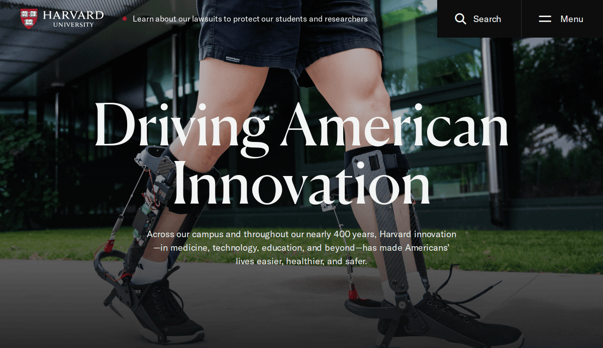
1. Harvard University
Location: Cambridge, MA
Key Takeaways:
- Timeless and clean layout reflecting the institution’s esteemed legacy.
- Seamless blend of imagery with clear navigation guiding visitors to key information.
- Mobile-friendly design ensures accessibility across devices.
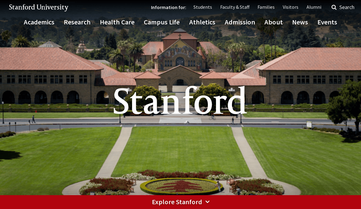
2. Stanford University
Location: Stanford, CA
Key Takeaways:
- Dynamic homepage engaging visitors with research breakthroughs and student stories.
- Strong brand colors and well-structured navigation for effortless information retrieval.
- Interactive elements like virtual tours enhance user engagement.
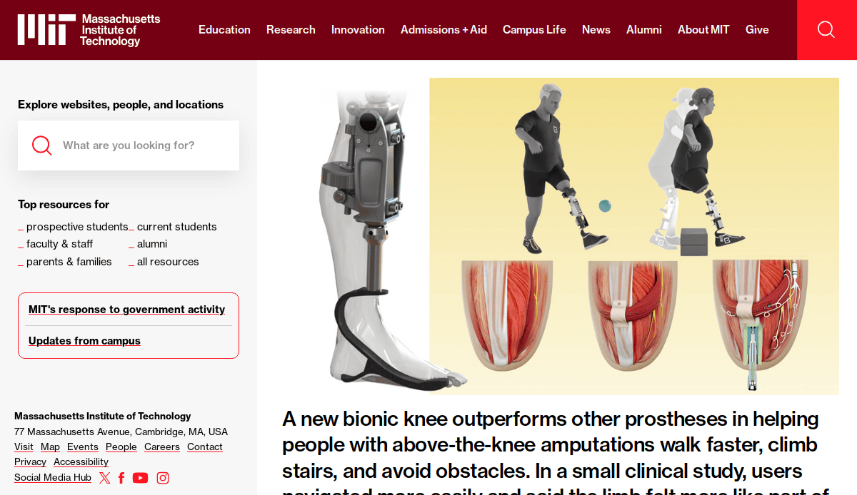
3. Massachusetts Institute of Technology (MIT)
Location: Cambridge, MA
Key Takeaways:
- Balanced blend of eye-catching imagery and straightforward content blocks.
- Interactive maps and cutting-edge features highlighting ongoing projects.
- Consistent color scheme reinforcing brand identity throughout the site.
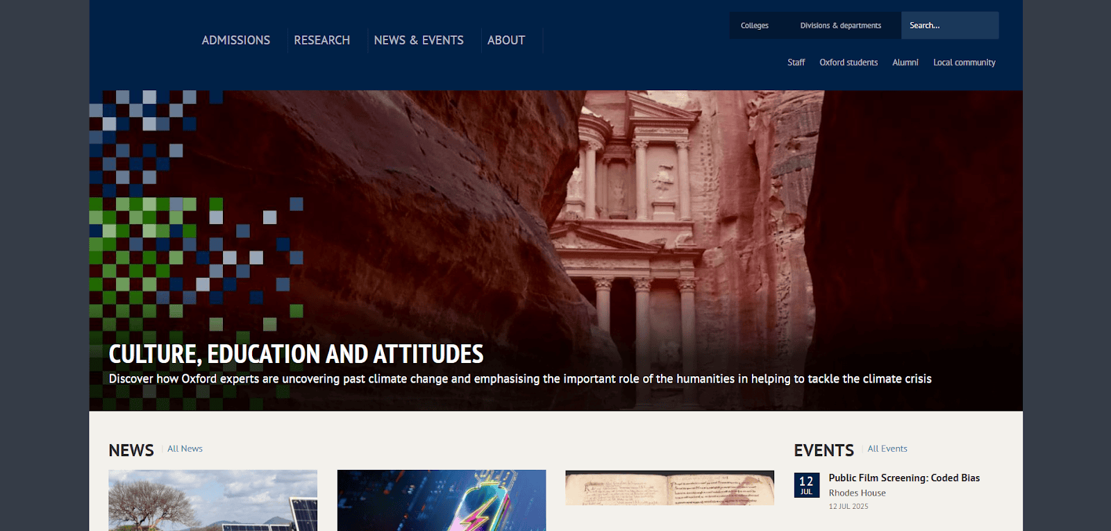
4. University of Oxford
Location: Oxford, UK
Key Takeaways:
- High-quality photographs highlighting the campus’s architectural beauty.
- Intuitive navigation leading users to information on admissions and departments.
- Thoughtful content organization with quick links to research findings and events.
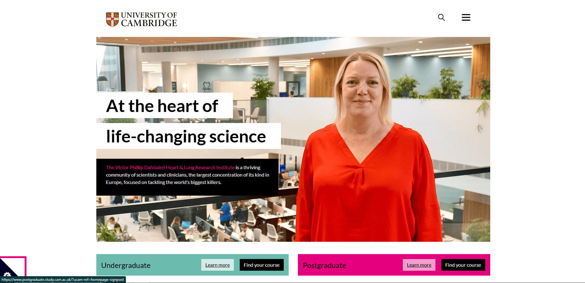
5. University of Cambridge
Location: Cambridge, UK
Key Takeaways:
- Elegant, image-centric design immersing visitors in the university’s heritage.
- Unified color palette and consistent typography giving the site a cohesive look.
- Straightforward menus directing users to relevant sections quickly.
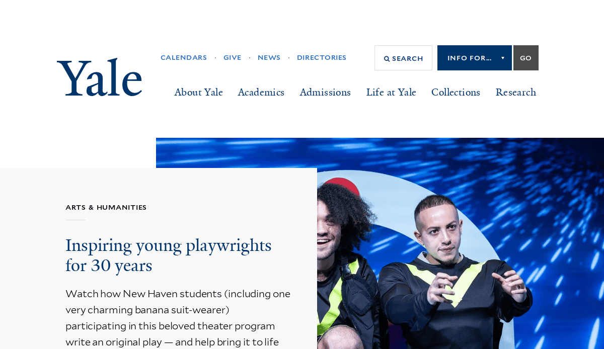
6. Yale University
Location: New Haven, CT
Key Takeaways:
- Warm, inviting color scheme with high-resolution campus imagery.
- Thoughtful navigation enabling exploration of academic programs and research initiatives.
- Modern layout ensures headlines and calls to action are immediately noticeable.
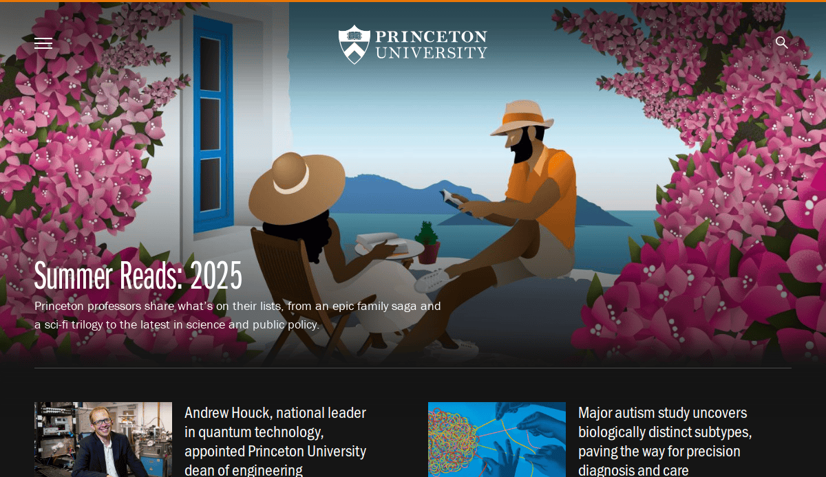
7. Princeton University
Location: Princeton, NJ
Key Takeaways:
- Subtle incorporation of Princeton’s signature orange reinforcing brand identity.
- Clear and stylish design exemplifying the best university websites.
- User-friendly interface guiding visitors to key content areas.
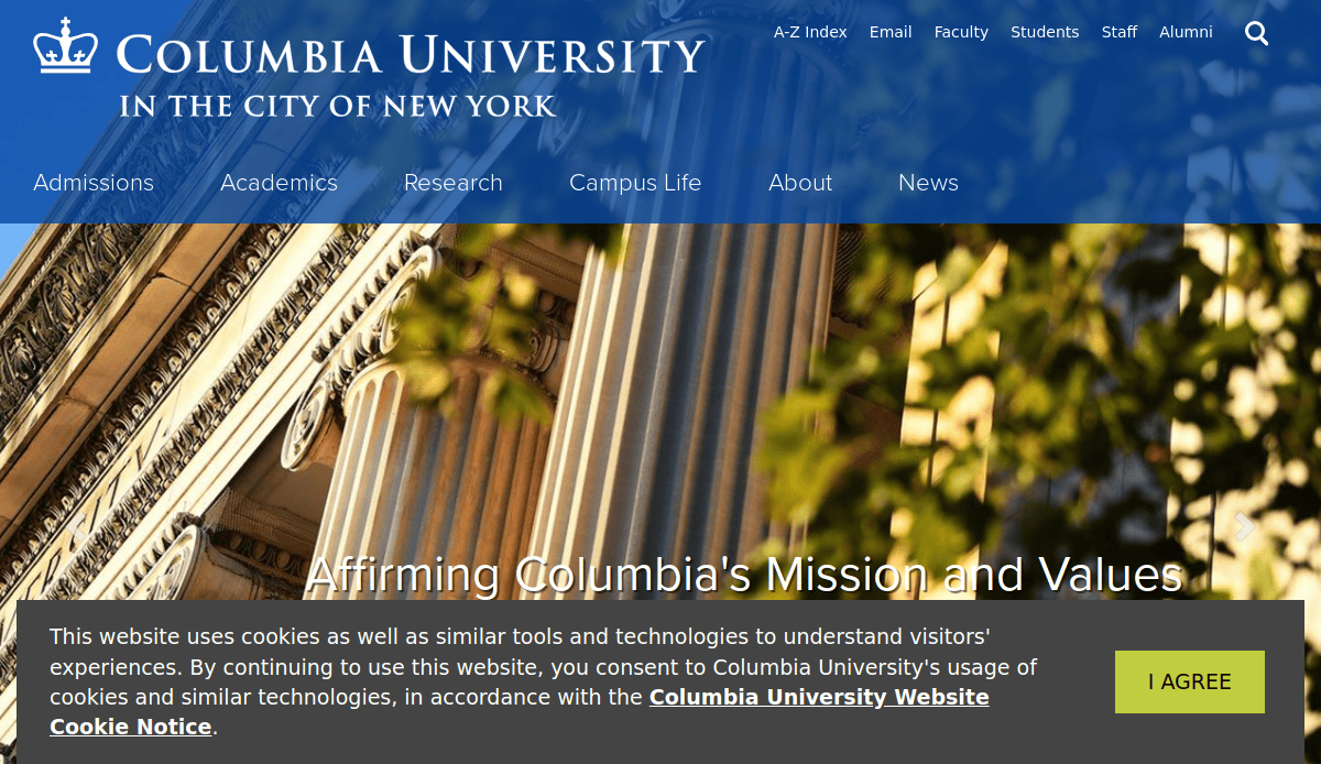
8. Columbia University
Location: New York, NY
Key Takeaways:
- Layout merging tradition with contemporary design elements.
- Large, vibrant banners highlighting significant campus events and initiatives.
- Intuitive navigation facilitates easy access to various programs and departments.
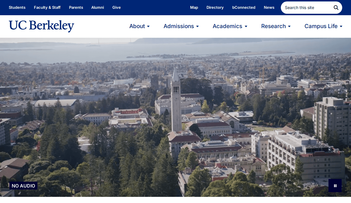
9. University of California, Berkeley
Location: Berkeley, CA
Key Takeaways:
- Visually appealing interface with a balanced mix of imagery and text.
- Clear sections for admissions, academics, research, and campus life.
- Video highlights of student experiences adding a personal touch.
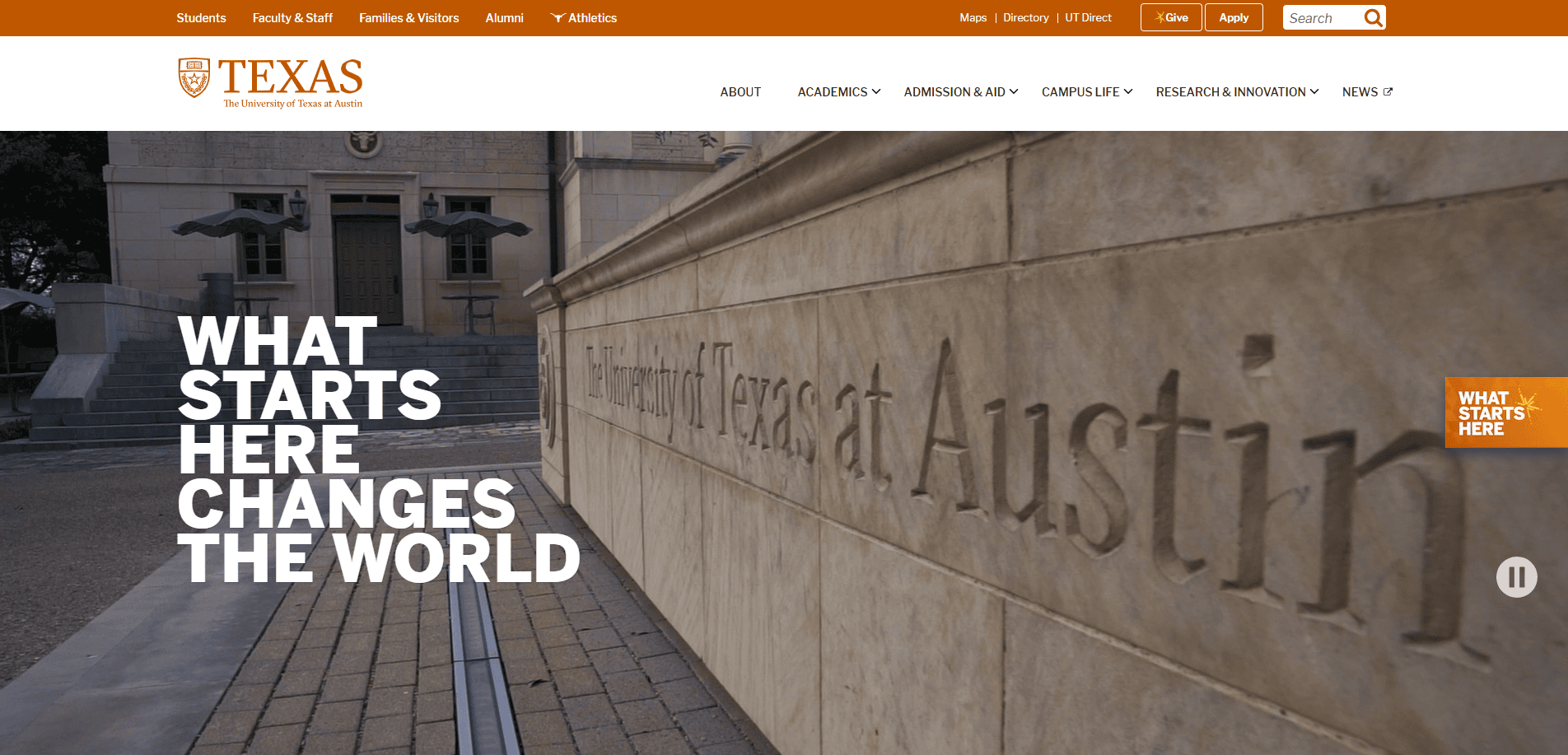
10. University of Texas at Austin
Location: Austin, TX
Key Takeaways:
- Bold homepage hero presenting clear messaging.
- Creative image effects and layered design providing unique depth.
- Easy navigation through individual schools and university departments.
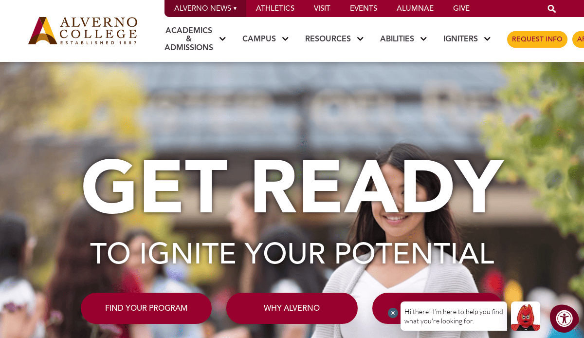
11. Alverno College
Location: Milwaukee, WI
Key Takeaways:
- Lively array of colorful buttons guiding visitors to various goals.
- Emphasis on storytelling with student testimonials and alumni success stories.
- Immersive video on the homepage enhancing user engagement.
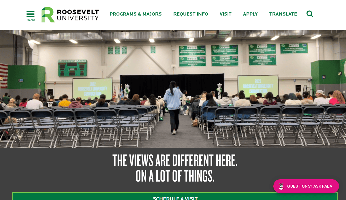
12. Roosevelt University
Location: Chicago, IL
Key Takeaways:
- Highly engaging, interactive experience for various university community members.
- Dynamic visuals and interactive elements enhancing user experience.
- Streamlined navigation facilitating easy access to information.
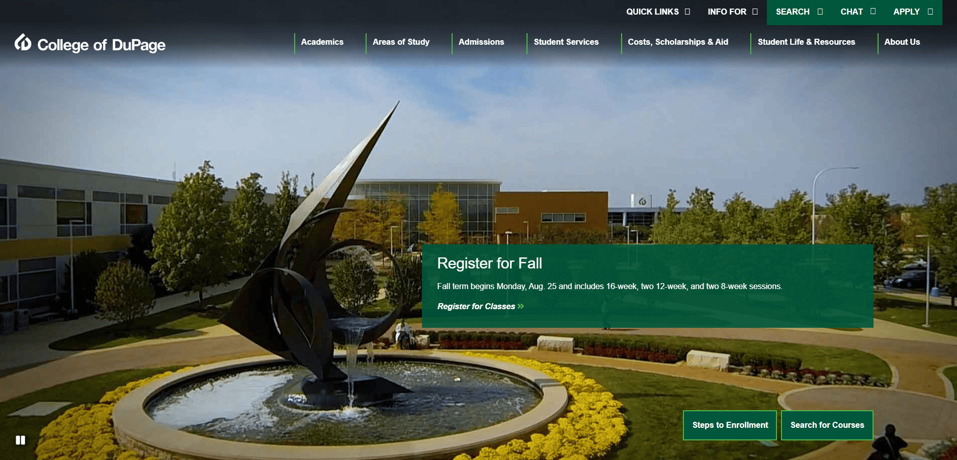
13. College of DuPage
Location: Glen Ellyn, IL
Key Takeaways:
- Homepage dominated by shades of green setting the website apart.
- Clear calls to action directing users to main purposes like application steps.
- Visually appealing design with large visuals enhancing user engagement.
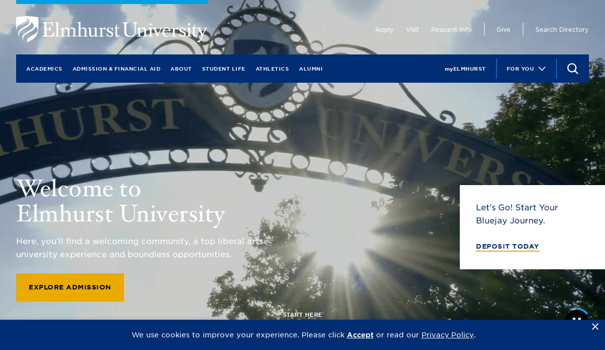
14. Elmhurst University
Location: Elmhurst, IL
Key Takeaways:
- Modern design with intuitive navigation guiding users to key information.
- Responsive design ensures accessibility across various devices.
- Consistent branding and color scheme reinforcing university identity.
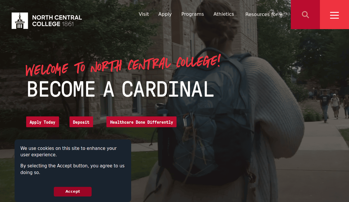
15. North Central College
Location: Naperville, IL
Key Takeaways:
- Clean and organized layout presenting information clearly.
- User-friendly interface with straightforward navigation.
- Engaging visuals and content highlighting campus life and programs.
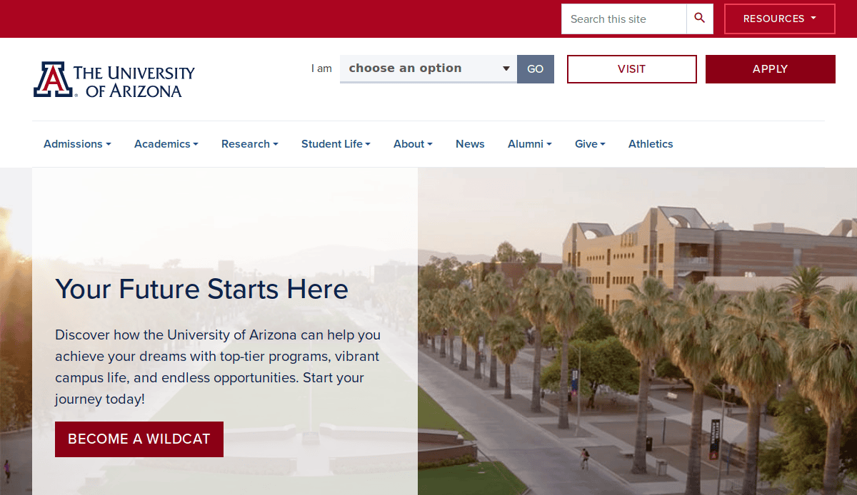
16. University of Arizona
Location: Tucson, AZ
Key Takeaways:
- Optimized user experience with tailored resources for new students.
- “I am” drop-down search option offering customized experiences for various visitors.
- Mobile-friendly design ensures accessibility across devices.
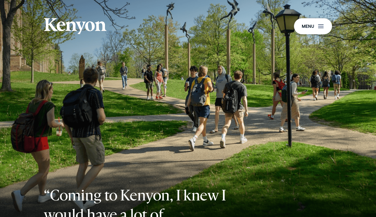
17. Kenyon College
Location: Gambier, OH
Key Takeaways:
- Diversity & Inclusion page exemplifying commitment to a diverse learning environment.
- Variety of resources for underrepresented students enhancing support.
- Clear navigation and content organization facilitating information access.
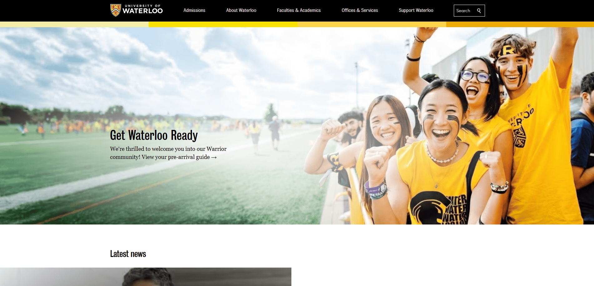
18. University of Waterloo
Location: Waterloo, ON, Canada
Key Takeaways:
- Equity, Diversity, Inclusion, & Anti-Racism strategy page detailing strategic goals.
- Amplify podcast magnifying diverse student voices.
- Quick links to resources for students in need enhancing accessibility.
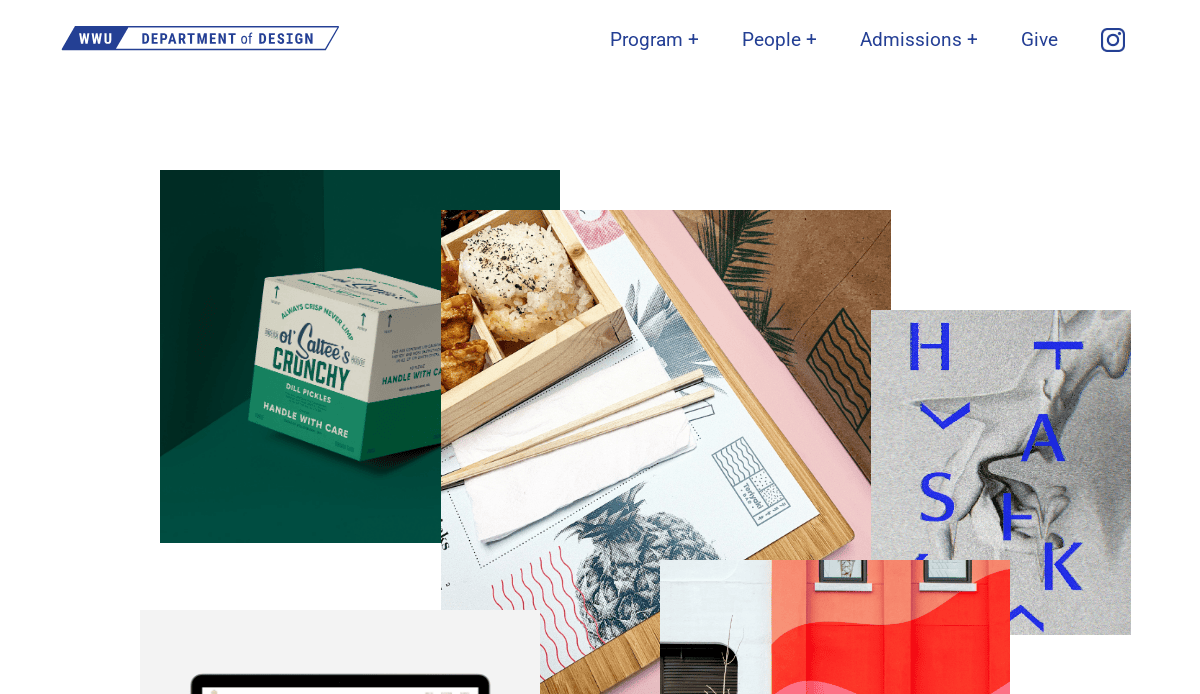
19. Western Washington University’s Department of Design
Location: Bellingham, WA
Key Takeaways:
- Interactive homepage allowing visitors to rearrange elements on the page.
- Unique way to showcase the school’s personality and design focus.
- Engaging and memorable user experience through interactive design.
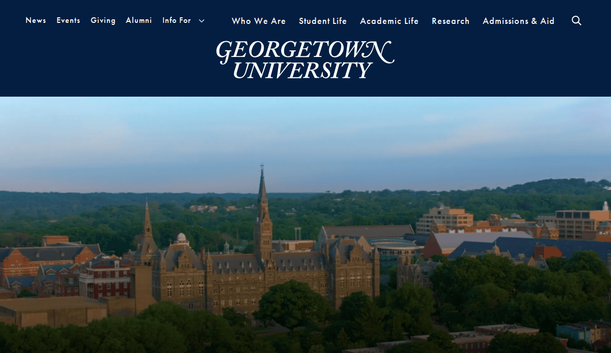
20. Georgetown University
Location: Washington, D.C.
Key Takeaways:
- Focus on mental health and wellness with dedicated resources.
- Quick links for different visitors aiding in navigation.
- Mobile-friendly design ensures a positive user experience across devices.
These 20 sites exemplify excellence in designing all of the elements we’ve referenced in this guide thus far, serving as benchmarks for institutions aiming to enhance their digital presence.
Ready to Create a Website That Moves Your Mission Forward?
Your website is one of the most powerful tools your institution has to influence prospective students, engage current learners, and reflect your college or university’s mission. But building a successful higher education web design strategy doesn’t happen by chance—it’s the result of careful planning, proven design tips, and a commitment to delivering the best experience possible across every page.
Whether you’re rebuilding from scratch or refining an existing presence, the right partner can make the difference between a site that simply exists and one that drives real results. From UX design to content management systems and analytics, our expert designers deliver websites for higher education that are modern, fast, accessible, and built to support enrollment and retention goals.
Let’s turn your vision into a strategy that connects your university community and attracts students to learn with confidence. Schedule a free consultation with our experts today, and let’s start building a site that represents the best your institution has to offer.
Common Questions About Web Design for Educational Institutions
What should a college or university website include?
A successful college or university website includes clear navigation, accessible web pages, compelling web content, and strategic calls to action that guide website visitors to key areas. The homepage should highlight important information for both prospective and current students, such as academic programs, admissions, news and events, and student services. A clean design that features easy-to-read layouts, consistent branding, and optimized mobile responsiveness ensures a seamless website experience across all devices.
How does the design process impact the effectiveness of higher ed sites?
The design process is foundational to creating a website that effectively supports your institution’s goals. It helps define the website strategy, target audience needs, and the visual look and feel that makes your university stand out. A well-structured process also ensures alignment between technical web development requirements and content priorities, helping institutions deliver the best higher education design practices without overlooking functionality or inclusivity guidelines.
Why is it important to keep your website menu short?
Keeping your website menu short improves usability and ensures that students and their families can find what they need quickly. Cluttered menus can overwhelm users and make navigation frustrating, especially on mobile. Instead, use concise labels and prioritize the top of the page for your most visited or conversion-focused pages, such as “Apply Now” or “Request Info.”
How can Google Analytics improve your college or university website?
Google Analytics is a vital tool for understanding how website visitors interact with your content. It helps track which web pages get the most traffic, where users drop off, and what content drives conversions. These insights enable ongoing optimization of your website strategy, allowing you to improve your college’s digital presence over time.
What makes a school website stand out to new students?
New students are drawn to websites that offer a modern design, relevant web content, and a user experience tailored to their needs. This includes simplified navigation, clear pathways to admissions, housing, financial aid, and engaging visuals. Websites for colleges that prioritize storytelling, inclusivity, and direct calls to action tend to better attract prospective students.
How does web content support university marketing goals?
Content is central to effective university marketing. It helps articulate the value proposition of your programs, highlights student success stories, and showcases what makes your university different. Strategic use of keywords, storytelling, and optimized web pages increases visibility in web search and strengthens brand perception throughout your website.
Are there examples of industry best practices for higher ed design?
Yes, many schools showcase the best higher ed design, such as the University of Houston, Arizona’s website, and the University of Reading’s digital presence. These institutions follow industry best practices like consistent branding, clean layouts, engaging media, and compliance. For inspiration, check out our list of the 10 best education websites to see what today’s top-performing higher ed sites look like.
What’s the best way to help your university stay competitive online?
Using your website as a digital recruitment tool is one of the best ways to help your university remain competitive. A successful web strategy combines modern UX design, performance optimization, and strategic storytelling. Regular updates, compelling news and events content, and consistent branding ensure your university’s website continues to meet evolving user expectations.
How does accessibility impact websites for higher education?
It’s critical for compliance and user experience. Higher education design must meet WCAG standards to ensure students and their families—regardless of ability—can navigate the site, access content, and complete tasks. It also aligns with broader institutional values of inclusivity and equal access.
Should we work with a design agency for a college website redesign?
Partnering with a design agency can be highly beneficial for colleges or universities undergoing a full redesign. Agencies bring deep knowledge of higher ed design, experience with content management systems, and the ability to create effective layouts, calls to action, and back-end infrastructure that scales. They also help ensure your redesign meets ADA and other important guidelines and reflects the identity that makes your university unique.


