A compelling online presence for heavy equipment companies showcases the range of products and establishes the brand’s reliability and expertise in a fiercely competitive market. The best heavy equipment websites are robust platforms highlighting key product features, specifications, and benefits, effectively engaging potential customers and driving business leads.
With the industry’s focus on functionality and durability, top-heavy equipment websites must reflect these qualities through web design. This means incorporating elements like high-quality images, detailed product catalogs, and easy-to-access technical information. These websites must offer intuitive navigation to accommodate the diverse needs of their users, from contractors looking for specific construction equipment to procurement managers comparing machinery specifications. It’s also essential for the website to be responsive and mobile-friendly, given that decision-makers frequently access information while on the move.
Examples of the Best Heavy Equipment Website Designs
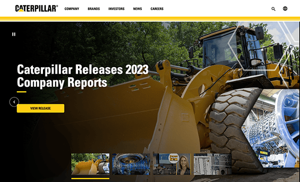
- Caterpillar: The design aspects of this website are not only visually appealing but also functional. The utilization of high-resolution photo sliders and videos effectively highlights their offerings’ tough durability and cutting-edge technology. The color scheme, which is mainly yellow and black, complements the brand’s identity and assures readability and accessibility throughout the website. The website’s straightforward appearance and well-organized menu structure make navigating easy. The inclusion of dropdown menus and search capabilities improves the user experience by enabling easy exploration of the site’s enormous material. Aside from promoting its products and services, the website emphasizes its dedication to sustainability and corporate social responsibility. There are separate sections on environmental stewardship, community participation, diversity, and inclusion.

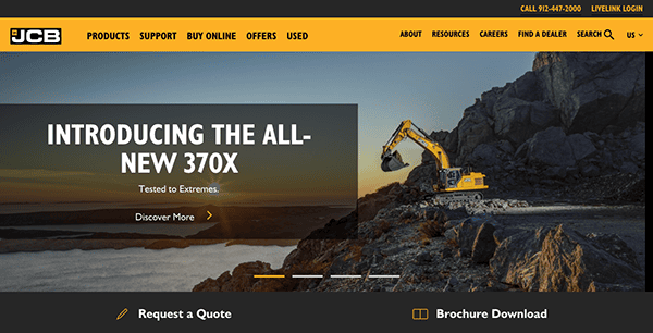
- JCB: The website’s homepage has a sleek and modern look. The combination of high-quality graphics and dynamic visuals effectively shows the brand’s product and service offerings, giving an impression of quality and reliability. The website’s intuitive appearance and precisely arranged menu structure make navigation effortless. Dropdown menus and prominent call-to-action buttons improve usability and help users easily navigate the site’s areas. One of the website’s main focuses is client fulfillment, as evidenced by its customer support resources and interactive elements. It ensures that aid is always available for people in need, with features such as live chat, a search button, and dealer location.

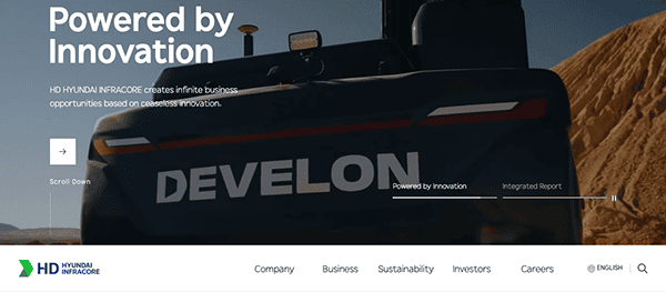
- Doosan Infracore: As soon as you arrive on the homepage of its website, viewers are met with a visually striking design that commands attention. With top-notch images and dynamic videos, they effectively demonstrate their machinery’s powerful performance and advanced technology, leaving a strong impression of dependability and effectiveness. The layout is smartly arranged, ensuring easy navigation for users of all skill levels. Whether you’re an experienced construction professional or a first-time visitor, accessing essential information is simple, owing to clear menu layouts and strategically positioned call-to-action buttons. Its website focuses on offering extensive product information to help clients make decisions. Each product page contains precise specifications, features, and applications, complemented by vivid imagery and engaging content.

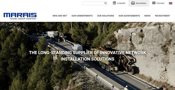
- Marais: The website’s basic design conveys sophistication and elegance. The use of white space allows the vibrant product photos to take center stage, immediately catching the attention and conveying a sense of luxury. The color choice of subtle blues and whites emphasizes the brand’s identity. Its website offers an easy navigation method. The menu is strategically placed for simple access, and the dropdown categories create a clear hierarchy of product choices. It also uses appealing graphic components throughout its website to increase interaction and make an impact on visitors. It includes genuine client testimonials, highlighting real-life experiences and fostering visitors’ confidence. These different testimonials elicit emotions, foster connections, and provide helpful feedback for ongoing progress.

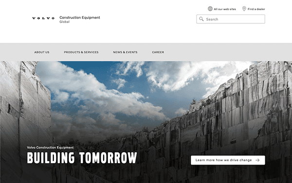
- Volvo: The website’s clean and modern design is fascinating and reflects the company’s commitment to cutting-edge technology and heavy equipment innovation. Clean lines, white spaces, bold writing, and high-quality pictures combine to produce a visually attractive, engaging, professional atmosphere in a minimalistic style. Navigating is simple because of its logical layout and user-friendly interface. The website’s orderly structure makes it easy to discover information, whether you’re perusing its product portfolio, obtaining resources, or seeking support. This straightforward navigation significantly improves usability, allowing users to quickly get the information they need.

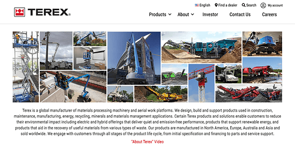
- Terex Corporation: The website’s design emphasizes simplicity and practicality. The clean structure and clear navigation make it easy for consumers to get exactly what they’re searching for, whether it’s information about the company’s varied product lines or insights into its values and mission. The purposeful use of high-quality photographs and videos throughout the site displays the company’s outstanding range of machinery and its influence across numerous industries. The soft color scheme exudes professionalism while appealing, instilling trust and dependability. Its website uses a similar branding strategy, including a color palette, font, and graphics to support its brand image. At the heart of its website is a plethora of helpful information. Every content, from thorough product descriptions to educational blog pieces, is carefully picked to add value to users’ experiences. Whether you need technical specifications or industry insights, it delivers precisely and clearly.

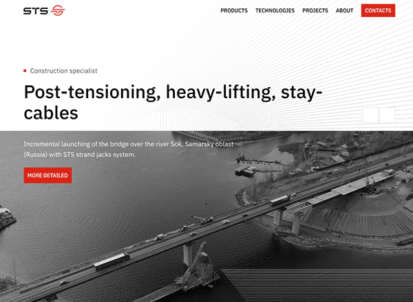
- STS-Hydro: Its website also exemplifies simplicity and functionality, giving a smooth user experience from start to finish. Visitors may explore the company’s services and solutions because of its clean structure and user-friendly navigation menu. Striking visuals, including high-quality pictures and slick graphics, captivate viewers and highlight the company’s experience and craftsmanship. The website’s content is extensive and valuable, with detailed descriptions, instructive blog posts, and entertaining multimedia components. It prioritizes accessibility, ensuring all users can easily browse the site, regardless of device or ability. Furthermore, the website promotes community participation through interactive elements and social media integration, fostering cooperation and knowledge exchange within the sector.

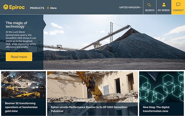
- Epiroc: Its website has a dynamic and engaging layout that draws users in and keeps them interested in the browsing experience. Throughout the website, clear and conspicuous call-to-action buttons direct viewers to the appropriate actions, such as researching products, contacting customer service, or getting a quote. It also features a robust search tool that allows users to rapidly find the items, services, or information they want. As a multinational firm with a broad consumer base, its website provides multilingual support to accommodate customers from various locations and language backgrounds. This inclusive strategy allows visitors to access the website in their favorite language, promoting inclusion and accessibility to foreign audiences.
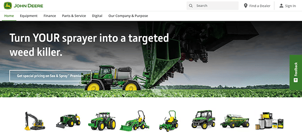
- Deere & Co: Their website is designed to be clean and easy to navigate. The menu layout is rationally organized, and the site has a search button, allowing users to navigate the company’s diverse products and services easily. Whether you’re looking for tractors, combines, or precision agricultural solutions, the website makes locating information easy and pleasant. Each page features stunning images of verdant fields, contemporary farm equipment, and happy customers, providing insight into the company’s long history and devotion to innovation. The mix of high-quality photos and modern graphics provides an immersive experience that appeals to visitors while demonstrating the company’s commitment to excellence and outstanding craftsmanship. It also promotes accessibility and responsiveness, ensuring that users may access the website anytime, anywhere, and from any device.
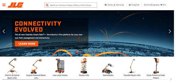
- JLF: Its website has a perfect visual hierarchy that uses font, color, and spacing to guide viewers fluidly. The elegant color palette elicits emotion and adds to the site’s aesthetic appeal. Interactive components like product galleries and animations spark users’ interest and promote investigation. The user experience is seamless from landing on the site until you complete the intended action. The well-organized menu structure and accessible search features guarantee that users can effortlessly locate the information or product they need. One of the website’s standout features is the use of interesting multimedia material. From engaging movies that show their products in action to interactive features that allow users to experiment with different solutions, every piece of multimedia helps improve the user experience and dynamically bring their services to life.

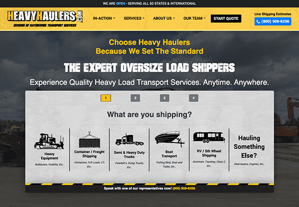
- Heavy Haulers: The website has an appealing visual design that embodies the essence of the heavy equipment transportation industry. The use of high-quality photographs and films exhibiting their fleet of transportation and equipment stimulates your interest, eliciting curiosity and wanting to learn more. The design is straightforward and user-friendly through various areas and services. Prominent CTAs encourage visitors to take action, increasing engagement and facilitating conversions with simplicity. The site also displays client feedback and associations, strengthening its credibility and reliability. Testimonials from delighted customers demonstrate the company’s dedication to excellence and customer satisfaction. Furthermore, ties with prominent business groups demonstrate its commitment to following industry standards and best practices, giving prospective clients confidence.

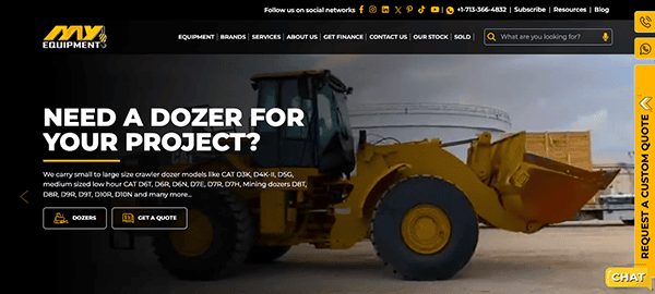
- MY- Equipment: Its website has a visually appealing design initially captivates visitors. The combination of high-quality pictures, a streamlined layout, and modern typography results in an immersive experience that highlights the beauty and functionality of their products. Every piece, from the homepage to particular product pages, has been thoughtfully designed to leave a memorable impression. The website’s intelligent navigation system makes it easy to find your way around. Whether browsing equipment categories, searching for specific products, or looking at featured products, finding what you need is simple. The menu layout is clean and concise, directing users around the site and providing a seamless browsing experience from beginning to end. With tools like live chat support, request quote forms, and available contact information, users can communicate with experienced professionals in real time, allowing for quick and tailored service. This commitment to rapid engagement improves the user experience while instilling confidence and reliability.

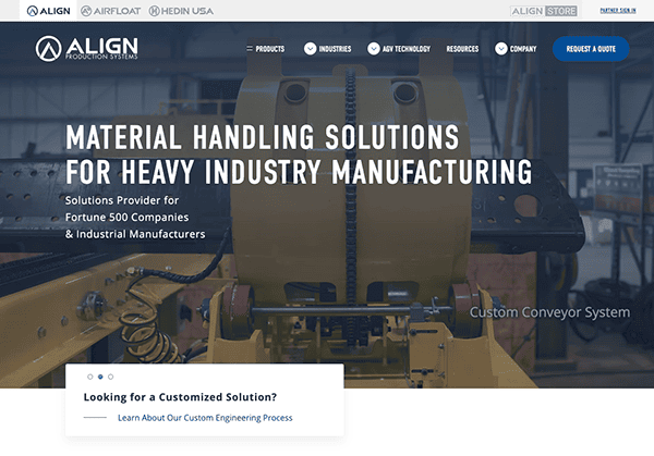
- Align Production Systems: Its website welcomes visitors with a slick, professional design that conveys confidence and expertise. Clean lines, high-quality imagery, and modern typography create a visual aesthetic reflecting the accuracy and innovation inherent in its goods and services. Every aspect, from the homepage to particular product pages, has been carefully chosen to communicate a sense of trustworthiness and excellence. The menu layout is straightforward and concise, directing users smoothly across the site and allowing quick access to requested content. One of the most notable aspects of its website is its extensive product displays. Each product has full explanations, specifications, and high-resolution photographs to help you understand its features and uses. The strategic placement of engaging call-to-action (CTA) buttons encourages users to take decisive action, such as researching items, seeking estimates, or delving into resources. Recognizing the global reach of its audience, the website provides multilingual support, catering to a wide range of linguistic preferences.

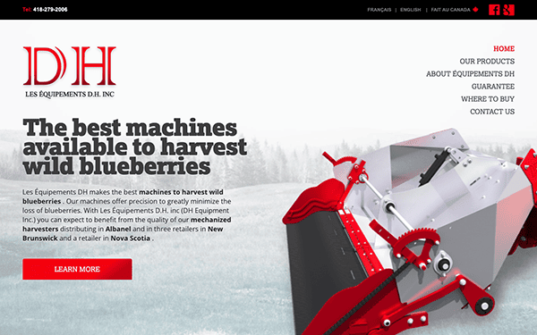
- D.H.: Entering the digital universe of their website is like beginning a voyage through a treasure trove of equipment solutions carefully built into a smooth online experience. Its website welcomes visitors with a visually appealing interface that conveys professionalism and knowledge. The harmonic combination of eye-catching photography, modern style, and clean language delivers an immersive experience that highlights the variety and quality of the equipment offered. The website encourages participation and involvement with various elements, including contact forms, quote request choices, and easily accessible contact information. These interactive aspects allow customers to communicate with trained professionals in real-time, providing rapid assistance and individualized instruction.

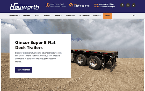
- Hayworth Equipment: One of the first things that make the website excel is its clean and intuitive interface. The well-organized sections and search functionality made navigating their comprehensive equipment catalog accessible. The fixed menu at the top of the page allows quick access to all aspects of the website, resulting in a smooth surfing experience. Whether you’re an experienced professional or new to the field, getting what you need is quick and easy. It has an excellent collection of industrial machines and products designed to meet various requirements. They appear to have everything from heavy-duty construction equipment to precision tools for specialized uses. Its website recognizes the necessity of directing users to essential activities, and its carefully placed CTAs accomplish just that. It also includes prominently displayed contact information. Whether you phone them, send an email, or visit their physical presence, the options are displayed, ensuring that help is always available.

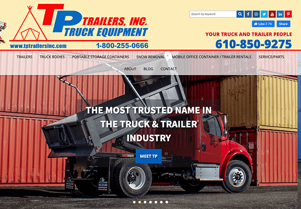
- T.P. Trailers & Truck Equipment: Their website welcomes visitors with a visually appealing homepage that immediately conveys their commitment to quality and service. The simple layout and high-resolution photos entice and provide a comprehensive overview of the varied selection of trailers and equipment on offer. It features a vibrant and entertaining design. The website’s layout, which includes interactive sliders highlighting prominent products and dynamic features that respond to user interactions, is intended to captivate consumers and promote research. The website’s strategically placed calls-to-action (CTAs), easily accessible contact information, and live chat function encourage visitors to participate actively. Whether getting a quote, making a service appointment, or researching financing alternatives, these pieces are strategically placed to direct visitors to action.

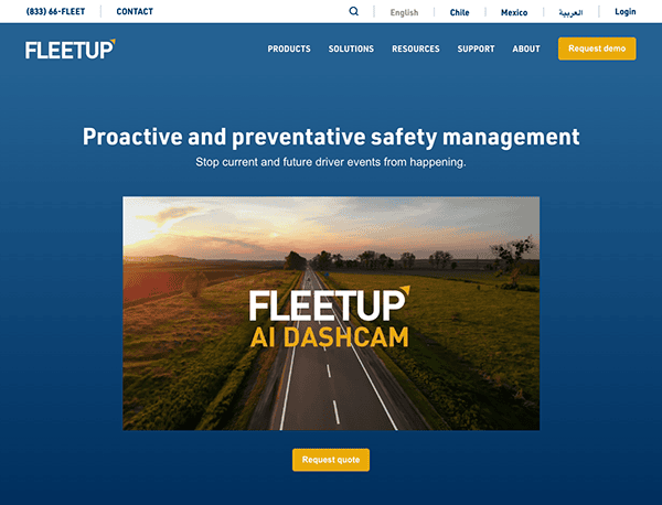
- Fleet Up: Their website has a sleek, modern interface. The use of enough white space conveys a sense of openness and elegance, allowing crucial pieces to shine without overpowering the visitor. The color palette is carefully selected to suit the brand’s identity while improving visual appeal and readability. Vibrant accent colors are intentionally utilized to draw attention to crucial features like buttons and calls-to-action, generating a visual hierarchy and leading people around the website. Visually appealing photos are utilized throughout the website to elicit emotions, support brand messaging, and highlight product attributes. High-quality imagery, whether of sleek vehicles, equipment, or dynamic dashboard displays, helps create a memorable and immersive experience for visitors.

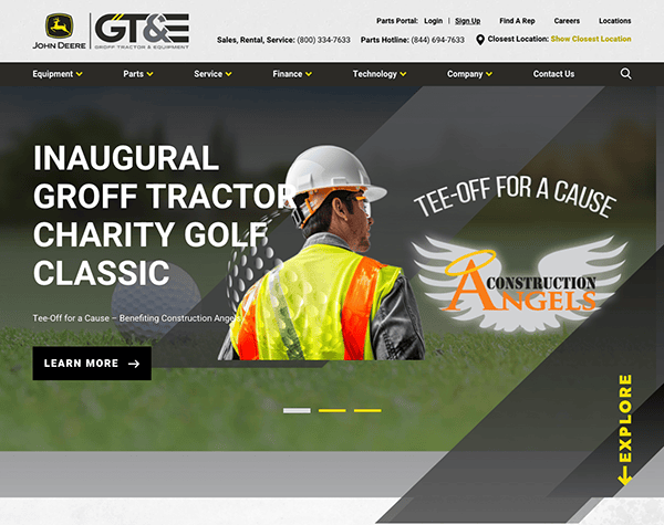
- Groff Tractor & Equipment: The website’s design promotes simplicity and clarity, with a clean, uncluttered appearance that allows users to focus on the information. The intentional use of whitespace highlights critical features such as featured heavy equipment, interactive maps, and promotions, ensuring that important information is seen. The navigation is simple and intuitive, with a well-organized menu layout that directs users to their chosen destinations. Users may easily explore the site for specific equipment models, service information, and support resources. The design combines strategic components to improve conversion rates and motivate visitors to take action. This includes prominent calls-to-action (CTAs), clear contact information, and user-friendly forms, making it easy for visitors to take the following steps in their customer journey.

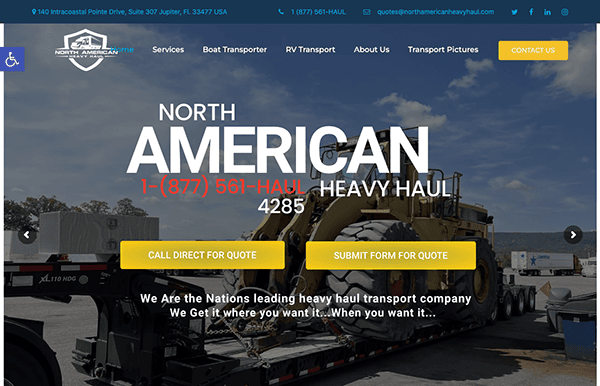
- North American Heavy Haul: The website’s design is very appealing. The use of high-quality photos demonstrating their heavy haul equipment and services effectively communicates the company’s experience and professionalism. The color choice is visually attractive and suits the company’s industrial aspect. The menu is well-organized, so you can easily discover what you’re searching for, whether it’s information on their services, fleet, or how to contact them. Clear calls to action ensure that visitors can swiftly proceed to the next stage in their journey, whether obtaining a quote or learning more about the organization. The addition of live chat support and a disability-friendly design demonstrates their unwavering dedication to providing excellent customer service and ensuring accessibility for all users. These thoughtful additions improve the user experience, reinforcing their image as a reliable partner for heavy hauling needs.

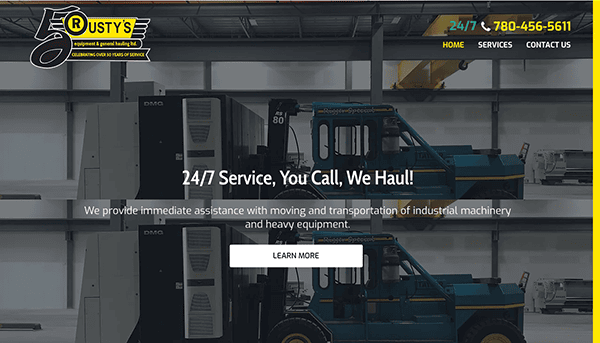
- Rusty’s: The website’s design communicates professionalism while retaining an inviting atmosphere. The sleek layout and high-quality photographs of their equipment and services immediately draw your attention and convey the company’s dedication to excellence. The color palette is modern and appealing, providing visitors with a fluid browsing experience. The navigation is thoughtfully organized, and each page is rationally designed, allowing users to navigate different website sections and rapidly find important information. One of the most notable aspects of the website is the abundance of product information available to visitors. Whether you’re a prospective customer looking for information on their equipment or an industry enthusiast wanting to learn more, Rusty’s Equipment has you covered.

The heavy equipment industry demands a digital showcase that impresses with aesthetics and delivers substantial content and functionality. The best heavy equipment websites understand this balance and implement designs that efficiently guide potential customers through various products and services. These sites effectively use technical diagrams, video tutorials, and interactive elements to help visitors fully comprehend the capabilities and applications of their machinery.
Such websites are pivotal in building a brand image that resonates with core industry values like robustness, innovation, and reliability. They incorporate customer testimonials, case studies, and detailed success stories to demonstrate their equipment’s impact and efficiency in real-world applications. Furthermore, top heavy equipment websites are optimized for search engines, ensuring they capture the attention of prospective buyers at the critical moment of online research. This strategic SEO approach draws more traffic, generates leads, and facilitates conversions.
If you’re looking to develop or revamp your heavy equipment website, CyberOptik offers tailored web design solutions that stand out from your competition. Contact CyberOptik today for a free consultation to see how we can help your business achieve a competitive edge with one of the best heavy equipment websites in the industry.