Just looking for our Best Gutter Website examples list?
Why Site Design Is More Than Just Looks
When it comes to site designing, first impressions aren’t just visual—they’re financial. Your website is often the first and only chance to impress a potential customer. A cluttered layout or clunky navigation can cost you leads before you even know they existed. In contrast, a streamlined, adaptive design can position your business as trustworthy, local, and ready to help.
Modern websites aren’t just about throwing images and text on a page. They’re built on a solid design system with a responsive grid that adapts gracefully to different screen sizes. Whether your visitor is browsing on a 6-inch smartphone or a 27-inch monitor, a well-planned layout grid—with smart spacing, intentional column width, and width—ensures every user experiences your brand consistently and clearly.
Professional web designers know that behind every high-performing site lies a thoughtful design process that includes the right number of columns, adequate white space, and logical amounts of room between sections. The right layout doesn’t just look clean—it strategically guides the visitor’s eye to key information, calls-to-action, and trust signals.
From column grids to mobile-first breakpoints, each design decision impacts your site’s ability to generate leads. If your current website isn’t built with these principles in mind, you could be losing business daily. This guide will walk you through the must-have features, examples, and strategies to transform your company site into a high-converting digital asset.
Website Planning & Purpose: Laying the Groundwork for Results
Before diving into design systems or content, every successful website begins with a detailed planning phase. This industry’s customers—homeowners, property managers, and contractors—aren’t looking for flash. They want clear answers, easy ways to get in touch, and evidence that your business is capable, trustworthy, and local.
The planning process starts with defining your core goals. Do you want more quote requests? Better rankings in your service area? A clearer way to showcase your services and past work? Each of these objectives informs how the site should be structured, what features to prioritize, and how users should flow through the experience.
Structure is everything. That includes defining the sitemap early: a homepage that captures the brand promise, service pages that explain offerings (gutter cleaning, guard installation, repair), a gallery that builds trust through visuals, and clear contact pathways across every screen size.
This phase also includes auditing competitors, collecting client reviews to showcase, and identifying local keywords to guide on-page SEO. Wireframes, content outlines, and conversion maps ensure that the design aligns with real customer behavior.
One common pitfall? Rushing into design without a foundation. Taking the time to plan your site’s architecture and strategy will save you time, prevent costly redesigns, and create a high-performance site from day one. For additional insights on this stage of the process, read our home services website design guide.
Design Principles That Power High-Performing Websites
While a website must function well, it also needs to convey clarity, confidence, and professionalism at a glance. Achieving this comes down to applying a handful of key design principles that elevate the user experience and encourage engagement.
- Visual Hierarchy That Guides the Eye
Every visitor should know where to look and what action to take within seconds. Effective use of headings, subheadings, and callout boxes establishes a clear visual path. This makes it easy for users to identify your services, understand your value, and take the next step. - Consistent Branding Across Pages
Brand colors, fonts, logo usage, and iconography must be unified throughout the website. Consistency builds trust and helps users immediately recognize your business. For gutter service providers, this visual integrity reflects operational professionalism. - Simplicity and White Space
Overcrowding a page leads to confusion. Embrace white space to let content breathe and improve scannability. Simplicity in layout and copy allows your primary messages—like what you do and why you’re the right choice—to stand out. - Responsive Design Across All Devices
A website must perform seamlessly across different screen sizes, from desktop to tablet to smartphone. An adaptive design ensures buttons are tappable, forms are usable, and layouts remain intuitive no matter the device. - Accessible and Legible Typography
Font choices matter. Use clean, legible typefaces with proper contrast and size. Headings should stand out but not overwhelm. Paragraphs should be easy to skim while still providing essential detail for those who want to read deeper. - Clear and Repeatable Calls-to-Action
Strong CTAs should appear consistently throughout the site—in the header, after service descriptions, and in the footer. Phrases like “Get a Free Estimate” or “Book Your Inspection” should be action-oriented and visible without scrolling far. - Imagery That Builds Trust
Use real photos of your team, equipment, and completed projects. Authentic visuals outperform stock images in helping visitors feel they’re dealing with a reputable local provider. Visual proof of quality work is one of the strongest conversion tools for home service websites.
When applied together, these design principles create a seamless, user-centered experience that builds trust, keeps visitors engaged, and encourages conversions. For those businesses competing in a local market, design is not just decoration—it’s differentiation.
Visual Elements That Strengthen Website Performance
Visual elements are more than just decoration—they shape the user experience and establish immediate trust. The right visuals guide attention, reinforce credibility, and convey professionalism without saying a word.
- Hero Imagery That Sets the Tone
Your homepage should open with a high-quality image that reflects your core service. This could be an action shot of your team working on a residential gutter system, or a clean, well-installed gutter on a home exterior. Hero images build emotional connection and allow site visitors to immediately see what you do. - Custom Photography That Builds Trust
Stock photos feel generic. Real photos of your trucks, employees, and local job sites are powerful trust signals. Visitors want to know they’re hiring a reliable, local company, not a faceless franchise. Use visuals to show the human side of your business. - Visual Callouts for Services and Benefits
Use icons and service thumbnails to break up text and quickly communicate offerings. Whether it’s “Gutter Cleaning,” “Leaf Guards,” or “Same-Day Repairs,” pairing each with a graphic reinforces clarity and keeps users engaged. - Consistent Color Palette and Design System
Align your colors with your brand and use them consistently. Design systems that pair a neutral background with accent colors for buttons and calls-to-action help keep the look professional and conversion-friendly. Consistency strengthens brand recognition and aids in usability. - Before-and-After Visuals for Social Proof
One of the most compelling tools in a home service company’s arsenal is the before-and-after photo gallery. Showcasing transformations tells a visual story of your skill and results, removing doubt from the decision-making process. - Clean Layout with Visual Spacing
Avoid crammed layouts. Use open spaces and margins to guide the user’s eye and maintain focus. A clean layout supports readability, boosts user retention, and makes your site feel premium. - Videos That Explain or Demonstrate
Short videos of your team in action, testimonials from satisfied customers, or time-lapse footage of an installation can significantly enhance engagement. Embedded video builds personality and gives prospects a reason to stay longer.
Incorporating these visual strategies enhances how your website looks and directly impacts how users interact with it. Smart, consistent use of visuals helps businesses stand out in a crowded field while reinforcing the local, trustworthy, and results-driven identity that wins leads. For additional inspiration on creating visually effective websites in the trades, see our home services website design guide.
Ongoing WordPress Maintenance for Gutter Service Websites
Launching a professional website is only the beginning. Maintaining its performance, security, and effectiveness requires consistent attention. WordPress websites, especially those built to generate local leads, benefit greatly from structured maintenance routines.
- Core Updates and Plugin Management
WordPress regularly releases updates that address security vulnerabilities and improve functionality. Ignoring these updates can expose your site to threats. Plugins—especially those handling forms, caching, or SEO—must also be kept current to ensure compatibility and performance. - Backup and Recovery Plans
Every website should have a scheduled backup plan. Whether daily or weekly, off-site backups protect your investment and provide peace of mind. Should an issue arise, being able to restore your site quickly limits downtime and potential lost leads. - Security Monitoring and Malware Scanning
Gutter businesses are not immune to cyber threats. Security plugins can detect suspicious activity, block malicious traffic, and alert you to any issues before they escalate. Implementing SSL certificates, firewalls, and login protection is no longer optional. - Speed Optimization Reviews
Website speed directly affects conversion rates and SEO rankings. Maintenance includes image compression, script minimization, and cache tuning to keep your site running fast across all devices. - SEO Health Checks
As search algorithms evolve, so should your website. Conduct regular audits to identify broken links, outdated content, or missed optimization opportunities. Fresh content, correct metadata, and accurate schema markup are essential for staying competitive. - Content Refresh and Seasonal Updates
Home service companies thrive on seasonal relevance. Update your homepage banners, service highlights, and blog content to reflect the time of year—spring gutter cleaning, fall maintenance, or winter protection tips. - Contact Forms and Conversion Testing
Ensure that all forms are working correctly, messages are reaching inboxes, and CTA buttons are functioning. Test phone links, contact forms, and any custom quote tools monthly.
WordPress maintenance isn’t a luxury—it’s a necessity for any gutter business looking to maintain a strong online presence. With regular care, your site remains secure, fast, and optimized for converting local visitors into real customers.
20 Best Gutter Website Design Examples
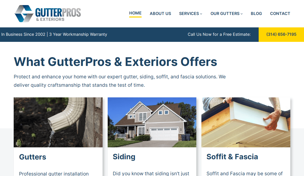
1. GutterPros
Location: St. Louis, MO
Key Takeaways:
- Clean and intuitive layout for easy navigation
- Strong visual branding with bold colors and custom icons
- Prominent CTA buttons and service breakdown
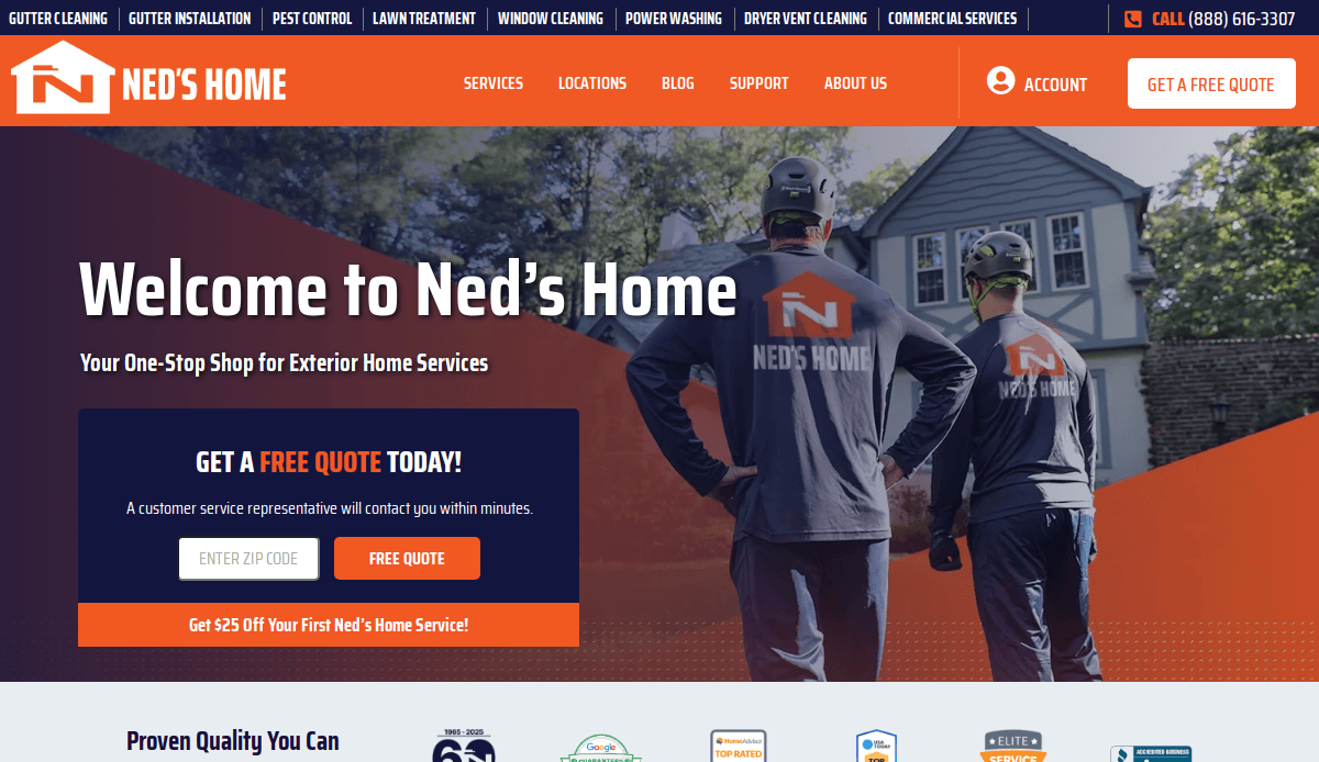
2. Ned Stevens Gutter Cleaning
Location: Fairfield, NJ
Key Takeaways:
- Highly optimized service area pages for SEO
- Trust signals with BBB ratings and insurance info
- Easy appointment scheduling with visual icons
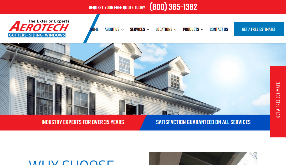
3. Aerotech Gutter Service
Location: St. Charles, MO
Key Takeaways:
- Effective use of a modular grid for services
- Clean navigation and fast page load times
- Video introduction for building trust
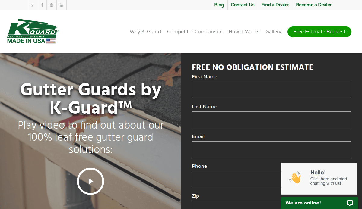
4. K-Guard Gutters
Location: Kansas City, KS
Key Takeaways:
- High-contrast design with excellent CTA visibility
- Extensive FAQs and resources for customer education
- Showcases product features with interactive visuals
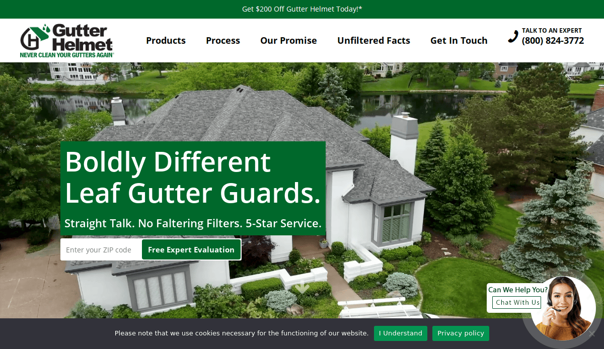
5. Gutter Helmet
Location: Minneapolis, MN
Key Takeaways:
- Focus on product innovation through hero video
- Testimonials and review integration
- Effective SEO structure and internal linking
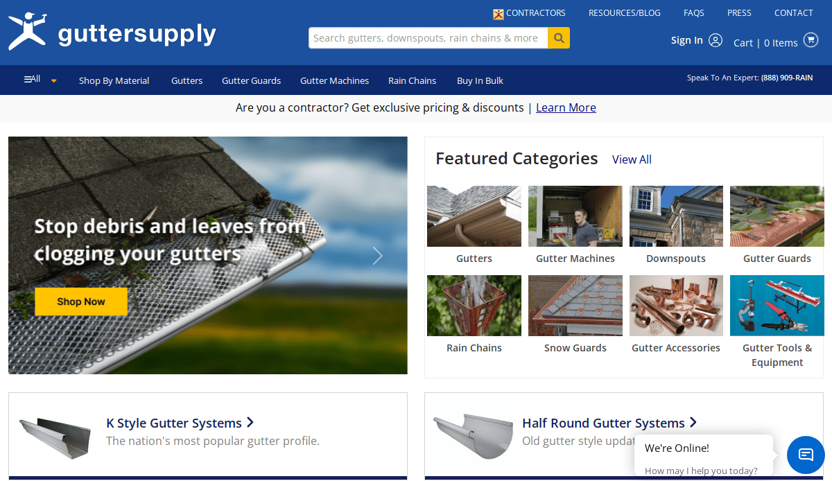
6. Gutter Supply
Location: Lake Bluff, IL
Key Takeaways:
- B2B-focused structure with product filters
- Smart use of grid layout for product categories
- Strong SEO copy on each product page
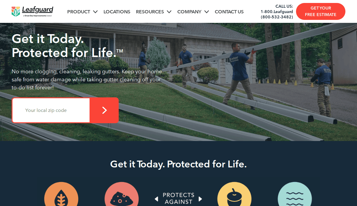
7. LeafGuard
Location: Chicago, IL
Key Takeaways:
- Simple visual branding with uncluttered layout
- Dedicated product demo section with visual explanations
- Clear CTA placement throughout the site
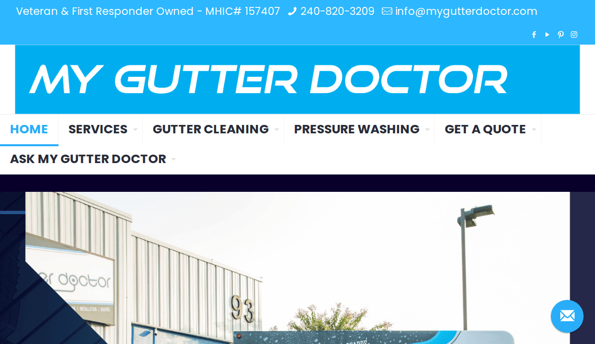
8. My Gutter Doctor
Location: Baltimore, MD
Key Takeaways:
- Friendly branding with personable visuals
- Easy-to-navigate service menu
- Bold, repeatable calls-to-action
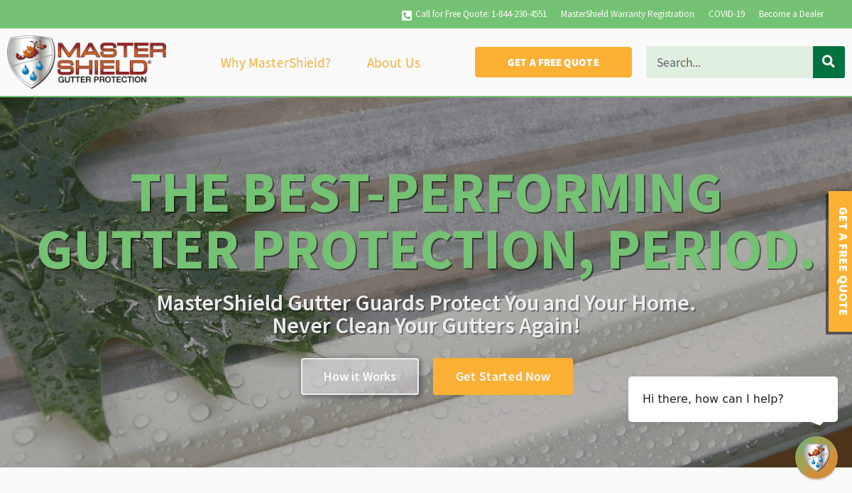
9. MasterShield Gutter Protection
Location: Ridgewood, NJ
Key Takeaways:
- Educational product breakdowns with a grid layout
- Comparison charts that guide buyer decisions
- Contact forms are on nearly every section
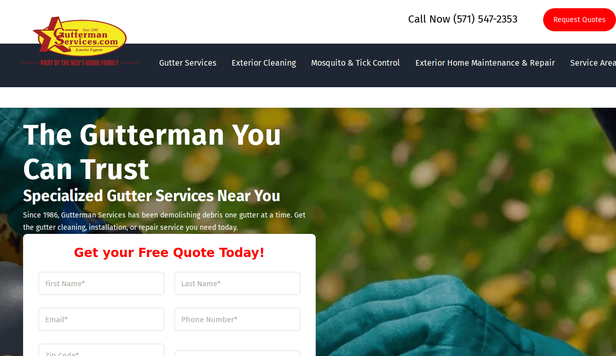
10. Gutterman Services
Location: Sterling, VA
Key Takeaways:
- Luxury aesthetic for high-end clients
- Mobile-first responsive layout grid
- Easy service request form at the top of the page
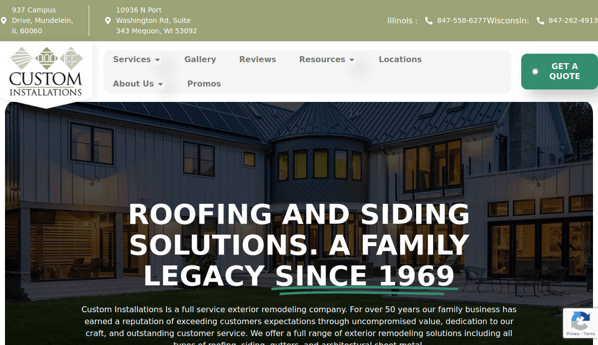
11. Custom Installations – Designed by CyberOptik
Location: Lake Forest, IL
Key Takeaways:
- Balanced grid layout and strong project gallery
- Clear branding and fast performance
- Optimized local SEO across multiple service pages
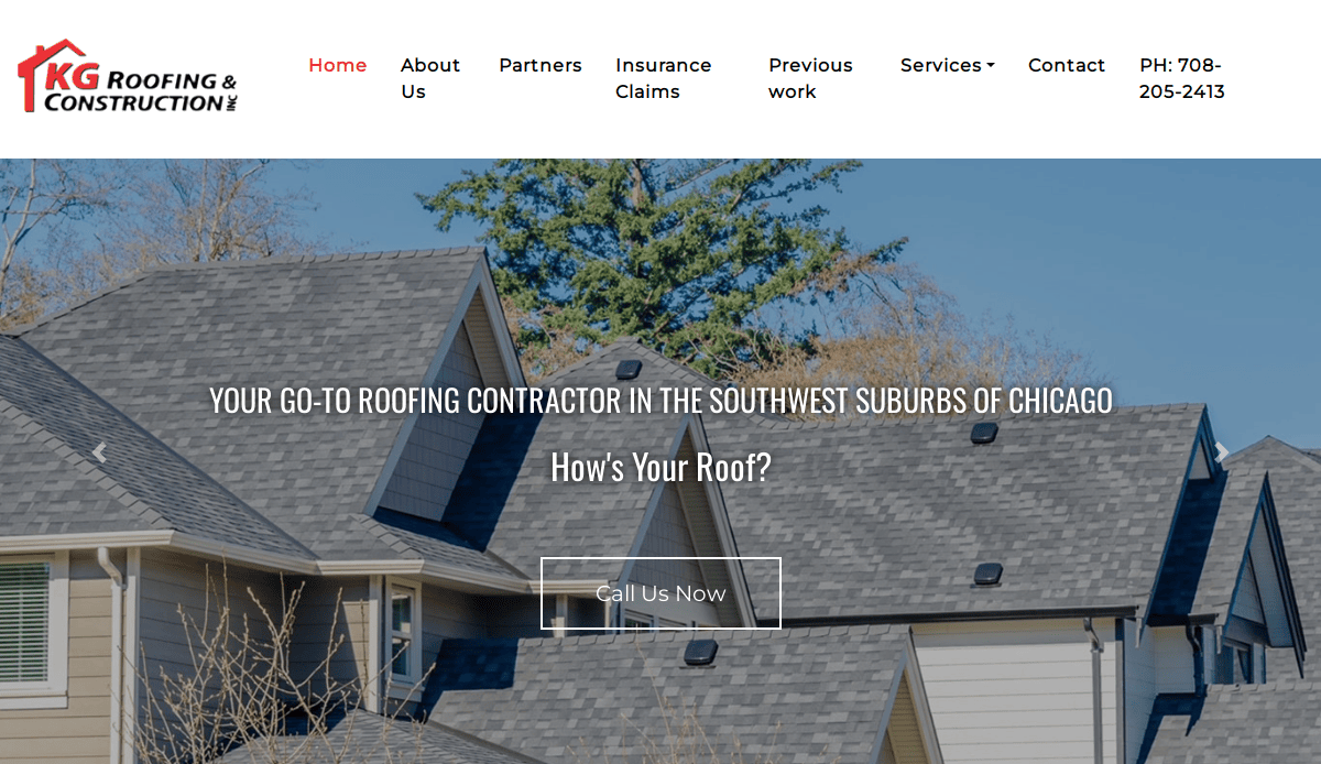
12. KG Roofing & Construction – Designed by CyberOptik
Location: Chicago, IL
Key Takeaways:
- Hierarchical grid with visual testimonials
- Strong use of white space and modern icons
- Clear navigation and calls-to-action
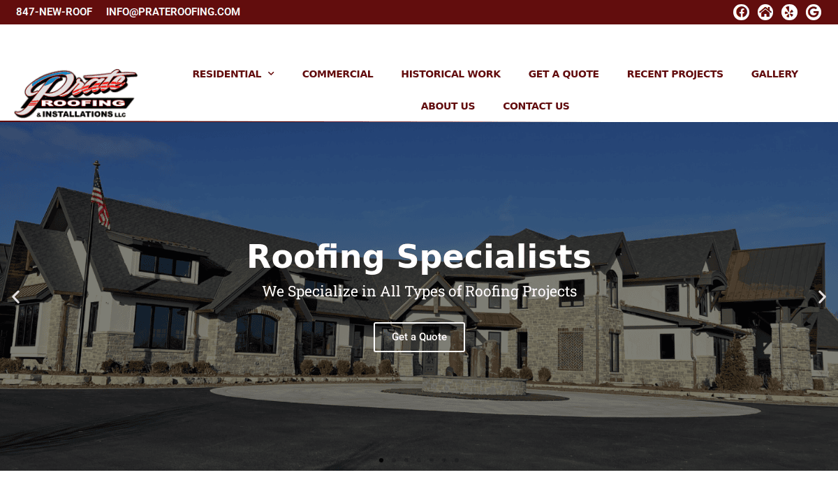
13. Prate Roofing & Installations – Designed by CyberOptik
Location: Wauconda, IL
Key Takeaways:
- Website grid highlights project case studies
- Simple navigation with location-driven SEO
- Effective conversion-focused footer
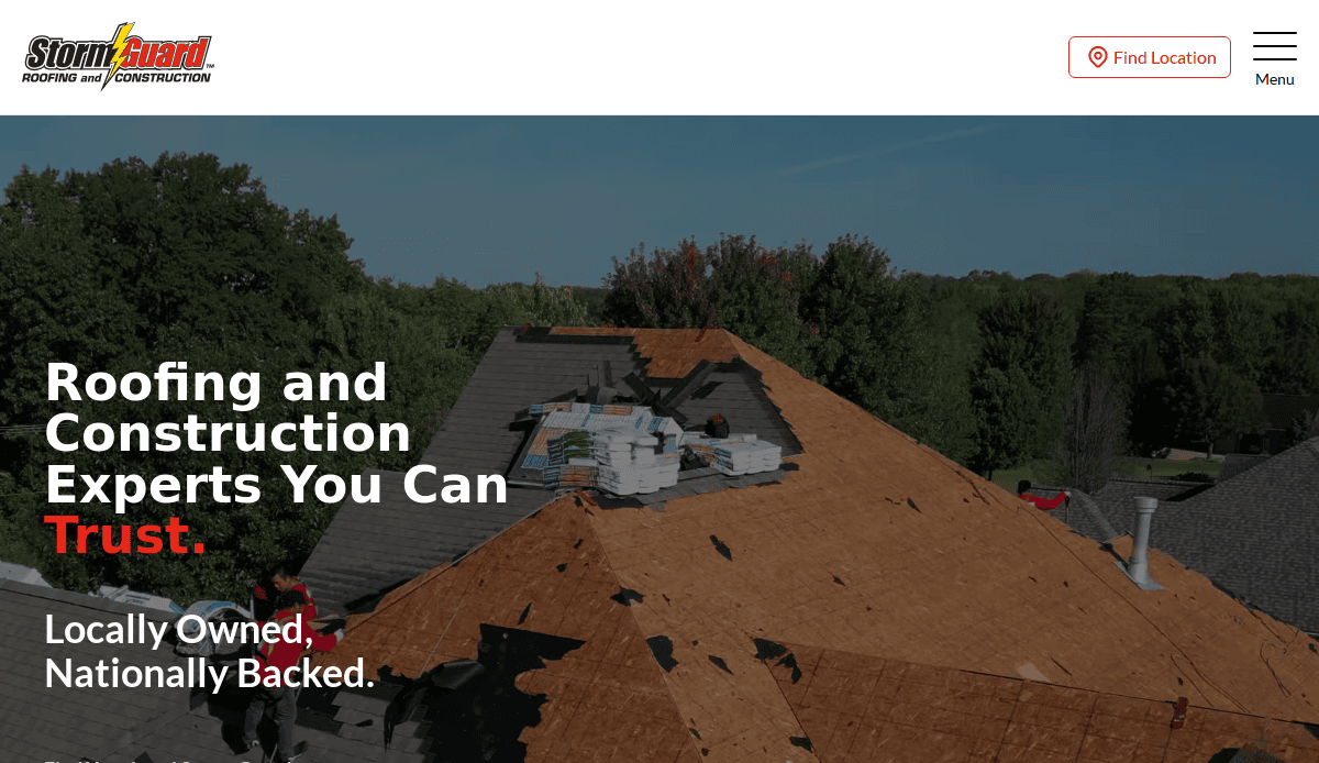
14. Storm Guard of Madison – Designed by CyberOptik
Location: Madison, WI
Key Takeaways:
- Modular grid design with service area focus
- Local project showcase in the layout regions
- Well-defined user flow for quotes
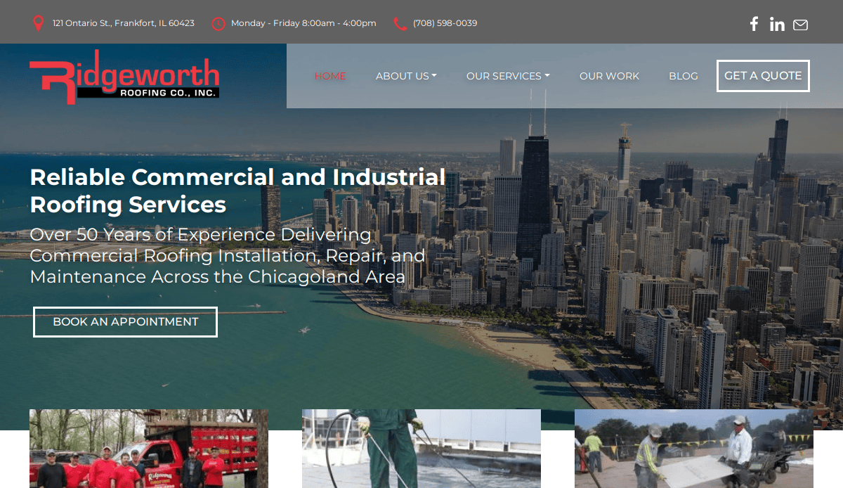
15. Ridgeworth Roofing – Designed by CyberOptik
Location: Frankfort, IL
Key Takeaways:
- Comprehensive guide style service structure
- Strong grid structure with detailed navigation
- Full-width visuals with consistent branding
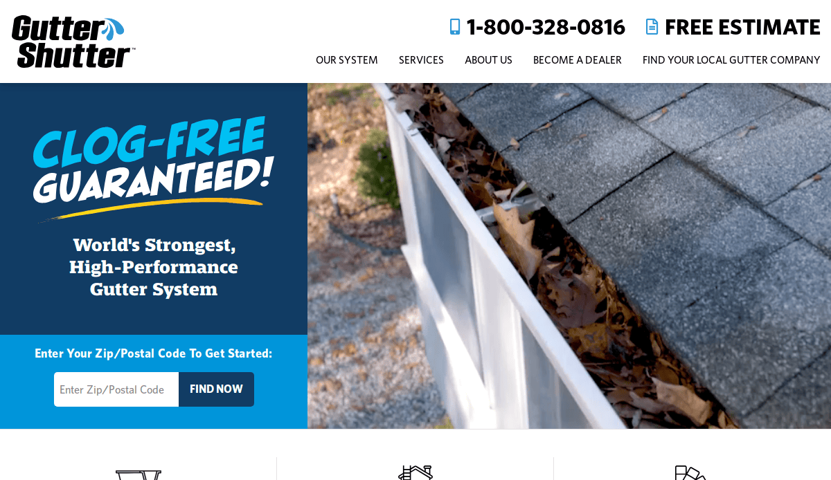
16. Gutter Shutter
Location: Cincinnati, OH
Key Takeaways:
- Full-width grid sections with bold product highlights
- Multiple CTA opportunities throughout the scroll
- Organized layout design for easy comparisons
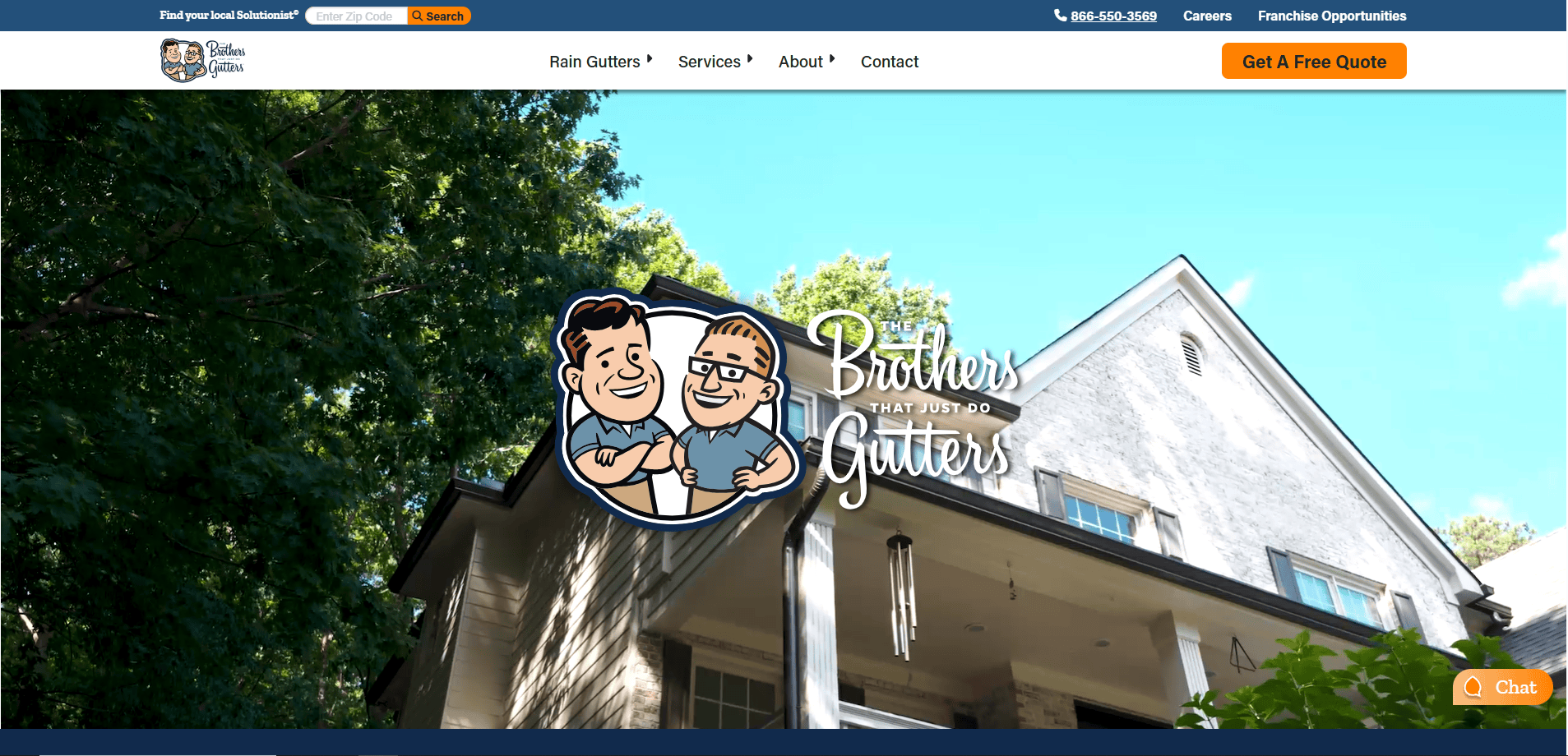
17. The Brothers that Just Do Gutters
Location: Poughkeepsie, NY
Key Takeaways:
- Fun branding and consistent voice across pages
- Strong focus on customer education
- Regional service breakdowns for SEO
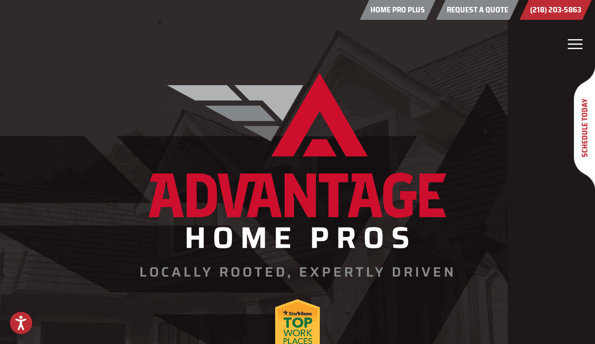
18. Advantage Seamless Gutters
Location: Baxter, MN
Key Takeaways:
- Clean layout and subtle animations
- Testimonials slider and review integrations
- Local project photos reinforce credibility
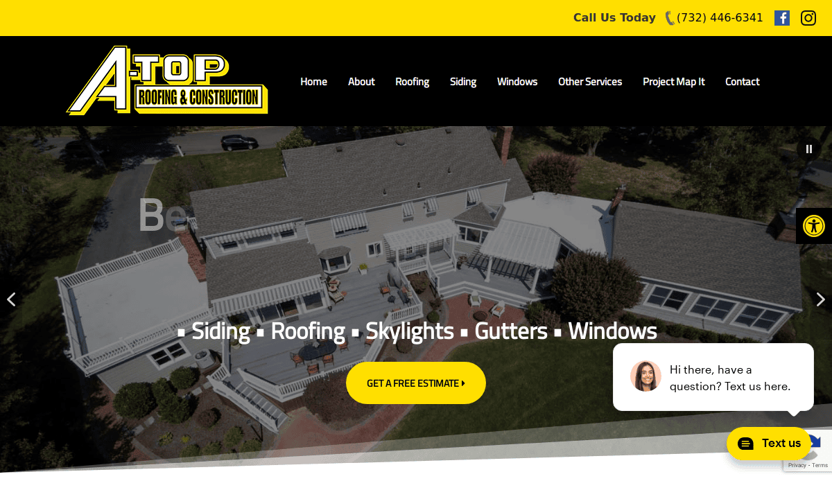
19. A-Top Roofing & Construction
Location: Manalapan, NJ
Key Takeaways:
- Simple homepage design with a clear services list
- Effective use of design elements for quick scannability
- Strong contact callouts in the header and footer
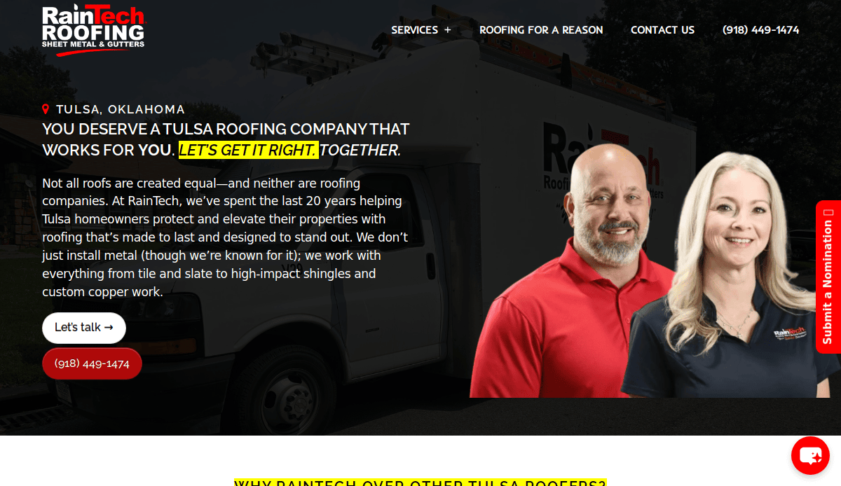
20. RainTech Roofing, Sheet Metal & Gutters
Location: Tulsa, OK
Key Takeaways:
- Responsive grid system and easy-to-use menu
- Great balance of text, images, and whitespace
- Clearly defined calls-to-action for fast quotes
Ready to Build a Gutter Website That Converts?
Your website is your most powerful marketing tool—and when designed using a responsive grid system, intentional layout grid choices, and spacing that respects every element on the page, it becomes a 24/7 lead generator. From fixed grids for desktop to fluid grids for mobile design, the right design improves readability and guides website visitors to take action.
Remember, web design isn’t just for aesthetics—it supports navigation, consistency, and hierarchy across every web page. If you’re ready to elevate your gutter business with a website design built for performance, clarity, and growth, we can help.
Gutter Website Design and Grid Layout Best Practice FAQs
What is a grid layout in web design and why is it important?
A grid layout organizes content into columns and rows, making it easier to maintain consistency across all web pages or layouts. For gutter websites, this helps structure service information clearly and makes the website more user-friendly. A well-implemented grid in web design improves visual hierarchy and enhances UX design.
Which type of grid works best for mobile-friendly gutter websites?
Responsive layout grids and fluid grids are best suited for mobile design. These types of grid layouts adjust automatically to the size of the screen, ensuring every website design remains accessible and functional across all devices.
How does using a modular grid benefit website layout and design?
Modular grids break the page layout into consistent modules or blocks, which is ideal for showcasing services, reviews, or project galleries. This grid structure enhances layout regions and supports a clean, professional appearance.
What are wider gutters, and how do they affect layout design?
Wider gutters—the space between columns—help improve readability by reducing visual clutter. They are an essential design element for web creators aiming to maintain a balanced grid and create a breathable layout.
Is a 960 grid system still relevant for modern websites?
While modern responsive site design often goes beyond the traditional 960 grid, the principles behind it still apply. Fixed grid systems based on 12 columns or similar logic provide structure and alignment that benefit both UX and visual design.
Should I use a baseline grid in my website layout?
Yes, baseline grids align text and visual components to a consistent vertical rhythm, supporting readability and aesthetic cohesion. They’re especially useful when working with typographic elements in print design and digital design projects.
Can I use Figma to create a grid-based layout for my website?
Absolutely. Figma allows web designers to create a grid, define column widths, and apply a standard grid or custom layout design efficiently. It’s a popular tool within the design community for wireframes and prototypes.
What are some best practices of using grids in website design?
Follow a step-by-step guide that includes defining layout goals, selecting the right type of grid, setting proper gutter width, and applying consistent spacing. Grids also improve your design workflow by making revisions easier and ensuring layout consistency across the site.
How does a grid-based layout improve SEO and user engagement?
A well-planned grid design ensures that key website content is placed where users expect it, which reduces bounce rates and increases engagement. It also helps web crawlers understand the hierarchy of content, boosting SEO performance.
What’s the difference between a hierarchical grid and a balanced grid?
A hierarchical grid allows certain layout regions to dominate visually, guiding attention to CTAs or featured content. A balanced grid, meanwhile, distributes visual weight evenly across the design. Both can be effective, depending on the goals of your website layout.