Just looking for our Best Fintech Website examples list?
Why Fintech Website Design Is Crucial for Long-Term Success
When it comes to financial technology, a website is more than a digital brochure—it’s the foundation of trust, the driver of conversions, and often the first impression that defines your brand. As fintech companies innovate and disrupt traditional financial services, the user experience (UX) of their digital platforms must keep pace. A well-designed site doesn’t just look good; it fuels business growth by enhancing user trust, increasing retention, and streamlining complicated financial interactions.
From intuitive navigation to data-rich control panels, every component of your site design must be crafted with purpose. Today’s users expect a seamless, responsive experience, whether they’re accessing your site from a desktop or a mobile device. They demand clear, user-friendly interfaces that make even the most complicated financial concepts easy to understand.
Today, site design principles have evolved beyond static pages and bland templates. Modern UX design prioritizes functionality, accessibility, and speed, delivering not just a UI but a responsive design that adapts to users’ needs and behaviors. And when your industry website becomes an active tool in helping users manage their finances, it moves from being a marketing asset to a business driver.
In this guide, we’ll explore how to create high-performing fintech websites using strategic UX, compelling UI, and conversion-focused frameworks. Whether you’re building a new site or refining an existing one, these insights will help you align your digital presence with user expectations and business results.
Website Planning & Purpose: Laying the Foundation for High-Performing Sites
Effective site design begins long before a single pixel is placed or a line of code is written. The planning phase is where strategic clarity and long-term success are shaped. For companies operating in a highly regulated and competitive landscape like fintech, this stage is critical because the stakes are higher. You’re not just building a site; you’re creating a user interface that communicates trust, simplifies financial information, and drives meaningful engagement.
Define the Site’s Primary Goals
Every site must begin with a clear definition of its purpose. Is your website focused on lead generation, onboarding new users, educating your audience, or driving app downloads? Many companies aim to do all of the above. But prioritizing these objectives ensures the website structure, content, and UX design all align with your most important business goals.
For example, a B2B SaaS fintech platform may prioritize demo sign-ups, while a consumer-focused digital bank may need to guide users quickly into account creation through responsive and frictionless user journeys. Clear goals help define everything—from calls-to-action to the placement of service pages and navigation menus.
Identify Your Audience Segments
This website often serves multiple user types: consumers, business clients, investors, and regulators. Each audience has distinct needs, expectations, and behavior patterns. Planning UX and UI elements based on specific user personas ensures a more personalized and effective experience. For instance, business users may value feature comparisons and hubs, while first-time consumers may need onboarding guides and intuitive navigation to feel at ease.
User research, behavioral data, and customer interviews should inform this segmentation. Without it, even the most visually impressive site can fall flat in conversion performance.
Map the Buyer Journey
From discovery to decision, users take multiple steps before converting. Effective web design considers this journey at every stage. During the planning phase, create a sitemap that mirrors this flow, introducing value early, educating through content, and reinforcing trust through case studies or testimonials. Every touchpoint, from landing page to pricing page, should serve a role in nurturing conversions.
This planning should also address how users will interact across devices. Adaptable design ensures that mobile device users—now the majority—receive the same thoughtful, friction-free experience as desktop users.
Plan for Content that Builds Authority
In this space, authority equals trust. The content architecture of your website should include resources like blogs, whitepapers, and security disclosures that help establish credibility. Strategically placing these assets—especially near CTAs or onboarding flows—can reinforce confidence and guide action. Your content strategy should also align with SEO best practices to ensure visibility in search.
Set Technical and Compliance Requirements
Finally, the planning stage must consider the regulatory and technical complexities unique to financial services. ADA compliance, data encryption standards, GDPR policies, and site security protocols should all be built into the roadmap from day one. Overlooking these details can lead to costly redesigns—or worse, reputational damage.
In short, the planning phase is where vision becomes an executable strategy. For companies in this industry, it’s where differentiation is born—through thoughtful structure, intelligent user flows, and a relentless focus on both usability and compliance. Skip it, and you risk building a beautiful site that doesn’t perform. Nail it, and your website becomes one of your most valuable assets.
Design Principles: Building Blocks of an Effective Website
Designing a high-performing website requires more than visual appeal. It demands a deliberate approach rooted in clarity, consistency, and user trust. Every element—from the structure of the layout to the smallest microinteraction—must support the site’s goals while accommodating the needs of fintech users, who often interact with complex financial tools under strict time constraints.
Clarity Over Complexity
In the financial services space, users expect to interact with data-intensive content and multifunctional tools. The key is to present these elements with simplicity. Clear typography, generous whitespace, and straightforward messaging help reduce cognitive load. Visual hierarchy should guide the eye naturally—from headline to call-to-action—ensuring users don’t feel overwhelmed
Consistency Across All Touchpoints
Consistency in design fosters familiarity, which builds trust, an essential factor for companies dealing with sensitive financial data. Uniform button styles, heading structures, color palettes, and iconography across the site improve usability and reinforce brand recognition. When users know what to expect visually, they move around more confidently and make decisions faster..
Trust-Driven Design Elements
Trust is non-negotiable. Visual cues like SSL certification badges, security icons, transparent pricing tables, and customer testimonials are critical. But trust is also built through design itself. Professional, polished UI design signals credibility. Sloppy layouts, broken links, or outdated design patterns instantly erode confidence.
Visual Hierarchy That Guides Decision-Making
Strong visual hierarchy directs users to take desired actions, such as signing up, starting a trial, or requesting a demo. Headings should differentiate clearly in size and weight, and key actions should be above the fold or within reach on mobile. Use contrast to highlight CTAs and ensure the most important information is always the most visible.
Mobile-First and Responsive Design
More than half of fintech users access services from a mobile device. That means your design must be fully compatible with smart devices, ensuring seamless functionality across screen sizes and devices. Navigation should collapse into clean, touch-friendly menus, and buttons must be large enough to tap easily.
Purposeful Interactivity
Microinteractions—like button hover states, loading indicators, and animated confirmations—enhance usability and provide immediate feedback. These subtle UI touches reassure users that their actions are registered, making the platform feel more intuitive.
Accessibility and Inclusivity
These platforms must be usable by everyone, regardless of ability. Following accessibility standards such as WCAG 2.1 ensures compliance while expanding your user base. Design should account for keyboard-only users, screen readers, and those with visual or cognitive impairments.
To dive deeper into the foundational design rules that every site should follow, explore our article on the Core Principles of Web Design.
Content & Navigation: Structuring Fintech Websites for Clarity and Conversion
Content and navigation aren’t just design considerations—they’re strategic assets. Financial companies deal with complex financial data, diverse customer journeys, and users with a low tolerance for confusion. Structuring content and navigation with clarity, intention, and user behavior in mind is essential for delivering a high-performance user experience and driving engagement.
Content Strategy: Simplify the Complex
Start with a clear content hierarchy. Each page should focus on a specific topic or action. Break up dense information using bullet points, subheadings, and collapsible sections. Use visual elements—charts, infographics, icons—to explain processes or product features.
Key content types for a fintech website include:
- Homepage: A concise value proposition, high-level product overview, and primary CTAs.
- Product/Service Pages: Detailed features and benefits, use cases, trust signals.
- Pricing Page: Transparent plans with comparison tables and FAQs.
- About Page: Company story, leadership bios, and mission.
- Blog/Insights: Educational content to support SEO and user onboarding.
- Support Center: Guides, knowledge base articles, and contact options.
Always write in plain language, even when addressing technically savvy users. Prioritize transparency and clarity over marketing buzzwords.
Navigation: Make Every Click Count
Poor navigation can derail even the most beautifully designed site. Users should be able to find what they need in as few clicks as possible.
Best practices include:
- Sticky navigation bars
- Clear, action-oriented menu labels
- Segmented user paths (e.g., “For Individuals” vs. “For Businesses”)
- Mega menus or dropdowns for complex architecture
- On-site search and breadcrumb trails
Navigation should also support accessibility with keyboard and screen reader compatibility.
Mobile Navigation: Designed for Action
Implement hamburger menus with expandable submenus, large tap targets, and minimized scroll friction. Prioritize high-intent actions like “Log In” or “Apply Now” at the top of mobile menus.
Visual Elements: Enhancing UX and Brand Through Design
Visual elements play a pivotal role in how users perceive, interact with, and trust a brand. From icons and imagery to layout and animations, every visual component should serve a functional purpose: guiding users, clarifying information, and reinforcing brand credibility. In the financial sector, where trust, security, and clarity are paramount, strategic visual design isn’t optional—it’s essential.
Establishing Visual Hierarchy and Focus
Effective visual hierarchy ensures users immediately understand what matters most. Key information—such as calls-to-action, pricing details, and value propositions—should be visually prioritized using size, contrast, and positioning. For example, a homepage banner with a clear headline and a prominent “Get Started” button can immediately direct a user’s attention.
Color usage is critical here. While large brands often lean on blues and greens to signal trust and stability, contrast must be used carefully to distinguish primary actions from secondary ones. Avoid overly bright or saturated hues that create visual noise or hinder readability.
Whitespace also contributes to hierarchy by separating sections and allowing the eye to rest. Crowded interfaces overwhelm users and increase bounce rates, especially when dealing with complex financial content. Thoughtful spacing creates breathing room and enhances comprehension.
Using Imagery to Build Trust and Connection
Images are not just decorative—they shape perception. Professional websites should use high-quality, relevant visuals that align with the brand’s tone. This may include:
- Custom Illustrations: Simplify abstract concepts, such as investment strategies or crypto wallets.
- Professional Photography: Humanize your brand with real images of your team, office, or customers.
- Data Visualizations: Graphs and charts that explain financial outcomes or platform performance.
- Screenshots: Show your platform in action, especially in product pages or onboarding flows.
Avoid generic stock photography, which feels impersonal and can damage credibility. Instead, opt for visuals that reflect your target users’ environments and goals. This reinforces the idea that your platform is designed for real people with real financial challenges.
Microinteractions and Motion Design
Microinteractions—small, purposeful animations triggered by user actions—can significantly improve usability. For instance, a loading animation that confirms data is being processed, or a hover effect that highlights interactive elements, provides valuable feedback, and enhances user confidence.
Motion design should be subtle and consistent. In fintech, excessive animation can feel gimmicky or untrustworthy. Instead, use motion to clarify user actions and reinforce responsiveness. Examples include:
- Smooth transitions between dashboard tabs.
- Slide-in success messages after form submissions.
- Animated progress indicators during account setup.
These micro-cues add polish and help users feel in control, especially during tasks that involve sensitive financial data.
Consistent Branding Through Design Systems
Your website should reflect a unified brand identity—one that is easily recognizable and trustworthy. Establishing a design system that includes fonts, color palettes, icon sets, and UI components ensures consistency across pages and platforms. This strengthens brand recognition and reduces cognitive load for users.
Fonts should be clean, web-safe, and readable at various sizes. Icons should be simple and intuitive, especially when representing features like “Secure Login,” “Transfer Funds,” or “Crypto Wallet.” Every design choice should reinforce your unique voice and values.
If your website feels inconsistent or cluttered, start with foundational improvements. This Website Organization Guide provides actionable steps for structuring your site more effectively, both visually and functionally.
Supporting Accessibility and Performance
Visual elements must also meet accessibility standards. That means using sufficient contrast ratios, providing alt text for images, and avoiding flashing elements that could cause seizures or disorientation.
Finally, every image or animation must be optimized for fast loading. A slow site erodes trust and leads to higher abandonment. Use next-gen image formats like WebP, lazy loading techniques, and compress visual assets without sacrificing quality.
In short, visual design must be intentional and strategic. It’s not just about looking modern—it’s about communicating stability, guiding decisions, and reinforcing your brand promise at every interaction. When executed well, these elements form the invisible framework of a site that users trust, enjoy, and return to.
Ongoing WordPress Maintenance: Keeping Your Fintech Website Secure and High-Performing
A WordPress website is more than a digital presence—it’s a critical asset tied directly to user trust, regulatory compliance, and lead generation. But launching a beautifully designed site is only the beginning. Without consistent maintenance, even the most robust platform can become outdated, vulnerable, and sluggish over time.
As such, ongoing maintenance is not optional in the fintech space. It’s essential for ensuring security, uptime, speed, and compatibility with evolving technologies and regulations.
Security Updates and Vulnerability Management
Financial websites often handle sensitive user information, multiple financial transactions, and third-party integrations. These platforms are frequent targets for cyberattacks and data breaches. WordPress, while highly secure when properly configured, requires continuous updates to its core software, plugins, and themes to address newly discovered vulnerabilities.
Failing to apply these updates promptly leaves your site open to threats like cross-site scripting (XSS), SQL injection, and brute-force login attacks. Maintenance routines must include:
- Weekly checks for plugin, theme, and core updates
- Prompt patching of known vulnerabilities
- Use of security plugins with a firewall, malware scanning, and brute-force protection
- Strong password policies and two-factor authentication for all admin users
Performance Monitoring and Optimization
Speed is a significant factor in both user experience and SEO rankings. A fintech site that lags by even one second can lose potential clients, especially those on mobile devices. Ongoing maintenance helps maintain top performance through:
- Image and asset compression
- Database optimization to reduce bloat
- Caching configurations and CDN integration
- Regular performance audits using tools like GTmetrix or Google PageSpeed Insights
As your website scales—adding more content, users, or integrations—performance tuning ensures it remains fast and responsive across all devices.
Plugin and Theme Integrity
This sector often relies on advanced functionality—such as user interfaces, calculators, CRM integrations, and compliance tools—powered by WordPress plugins. Each plugin adds complexity, and outdated or unsupported plugins can introduce bugs or security risks.
Maintenance includes:
- Vetting and testing new plugins before deployment
- Removing unused or deprecated plugins
- Verifying plugin compatibility after every WordPress update
- Monitoring license renewals for premium plugins
Themes also need upkeep. Custom or third-party themes may require updates to stay compatible with the latest WordPress version and security protocols.
Backups and Disaster Recovery
Even with strong security measures, issues can arise—malware infections, accidental deletions, or server crashes. Scheduled backups ensure you have a safety net. Maintenance best practices include:
- Daily off-site backups of your database and files
- Redundant storage systems to avoid single points of failure
- Scheduled restore tests to confirm backup integrity
- Rollback plans for plugin or theme updates
For regulated fintech platforms, this backup strategy also supports data recovery requirements under compliance frameworks.
Uptime Monitoring and Alerts
Your website is expected to be available 24/7. Downtime can damage brand credibility and disrupt service. Maintenance programs include automated uptime monitoring tools that alert you instantly if the site goes offline, allowing rapid response and resolution.
Even minor lapses in availability can have cascading effects on user trust and SEO rankings. Continuous monitoring ensures issues are addressed before they impact users or stakeholders.
Compliance and Accessibility Checks
Companies must meet a range of compliance standards—ADA, GDPR, PCI DSS, and more. Maintenance ensures your WordPress website continues to meet these evolving requirements. This includes:
- Quarterly accessibility scans and remediation
- Periodic privacy policy updates
- Plugin reviews for GDPR data processing compliance
- Security header configuration and audits
Failing to stay compliant doesn’t just risk fines—it damages the credibility essential to success in the financial sector. A well-designed WordPress site sets the stage, but ongoing maintenance is what keeps it secure, fast, and compliant. Where precision and reliability are non-negotiable, a proactive maintenance plan safeguards your investment and supports long-term growth. Neglecting it can result in performance decline, security breaches, and missed opportunities—risks no financial technology firm can afford.
Best Fintech Website Examples
A well-designed site in this sector is essential for building trust, enhancing user experience, and driving conversions. Here are 20 standout fintech websites, including a few crafted by our experts, showcasing effective design principles and innovative features.
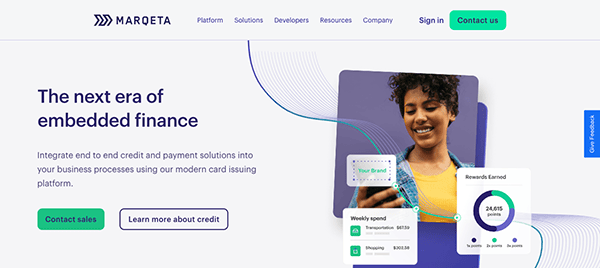
1. Marqeta
Location: Oakland, CA
Key Takeaways:
- Sleek, modern design that exudes professionalism and reliability.
- Minimalist aesthetic with easy-to-read fonts and a simple color scheme.
- Showcases awards and accolades to instill user confidence.
2. Stripe
Location: San Francisco, CA
Key Takeaways:
- Clean, developer-friendly design with bold typography.
- Dark-themed UI with subtle animations enhancing user engagement.
- Well-organized content and intuitive navigation.
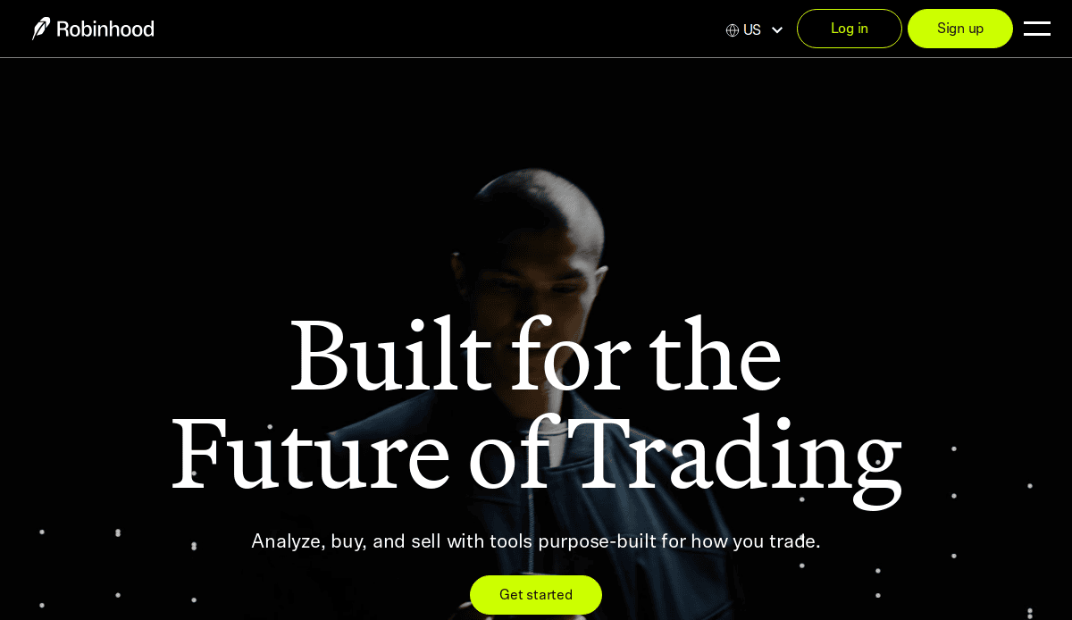
3. Robinhood
Location: Menlo Park, CA
Key Takeaways:
- Futuristic, high-contrast design aligning with the brand.
- Simple onboarding process encouraging user conversions.
- Interactive elements enhance user engagement.
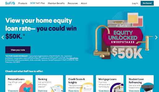
4. SoFi
Location: San Francisco, CA
Key Takeaways:
- Polished design with a balance of creative images and text.
- Dynamic hero section showcasing featured banking programs.
- Uses soothing colors to instill trust.
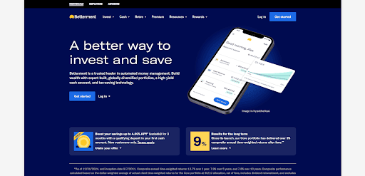
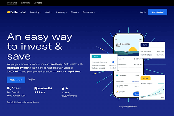
5. Betterment
Location: New York City, NY
Key Takeaways:
- Minimalistic, user-friendly interface simplifies investing.
- Soft colors and clear CTAs enhance user experience.
- Trust-building elements like performance graphs and testimonials.
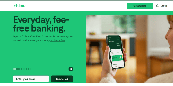
6. Chime
Location: San Francisco, CA
Key Takeaways:
- Tasteful cartoon illustrations create a friendly vibe.
- Tightly polished sections for easy navigation.
- Quirky, creative, and professional design.
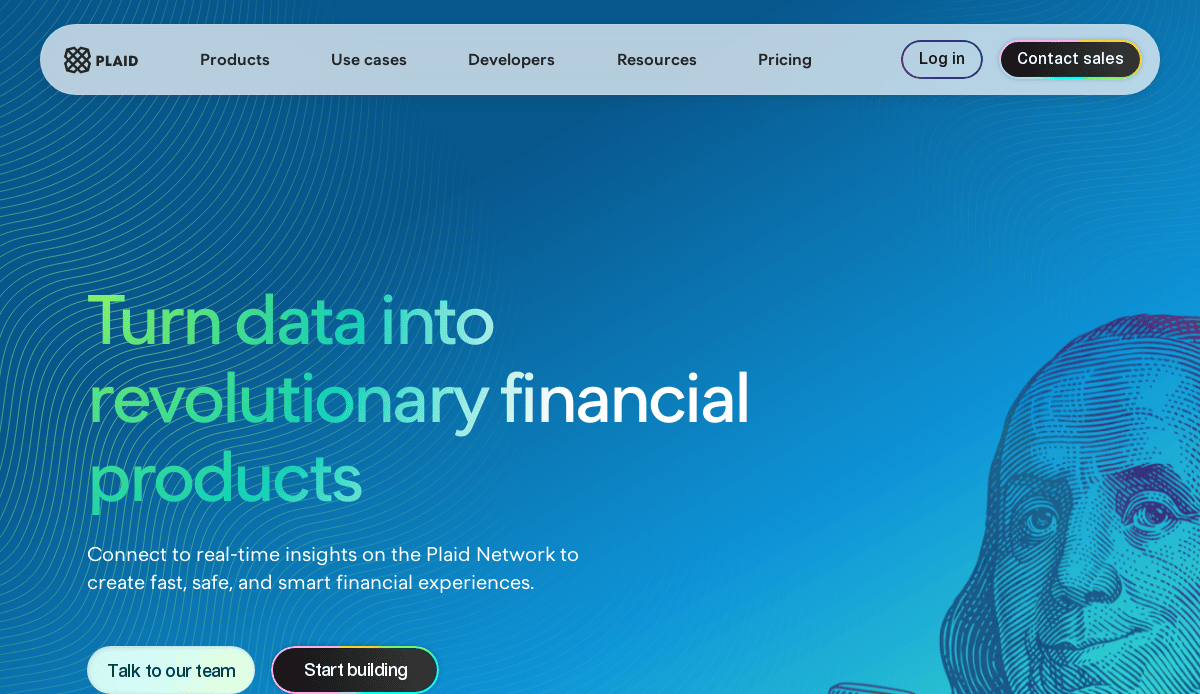
7. Plaid
Location: San Francisco, CA
Key Takeaways:
- Excellent use of white space, creating a dynamic feel.
- Clean, easy-to-navigate design.
- Comprehensive and easy-to-read content.
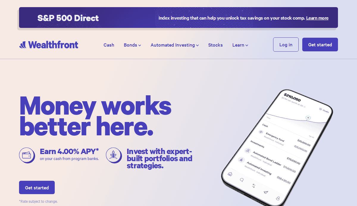
8. Wealthfront
Location: Palo Alto, CA
Key Takeaways:
- Gorgeous, subtle, and inviting color palette.
- Well-polished design with a balance of text and images.
- Visitor-friendly interface enhances engagement.
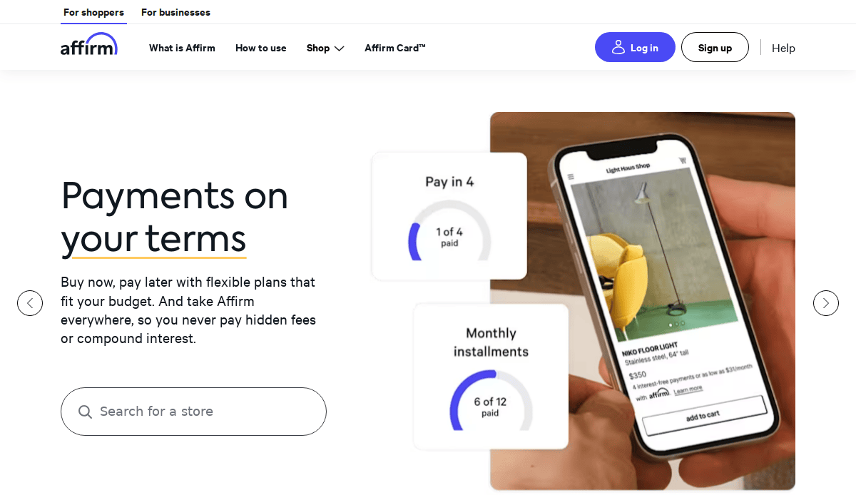
9. Affirm
Location: San Francisco, CA
Key Takeaways:
- Creative, high-quality images coupled with informational icons.
- Abundant white space makes colors stand out.
- Clean, serviceable design.
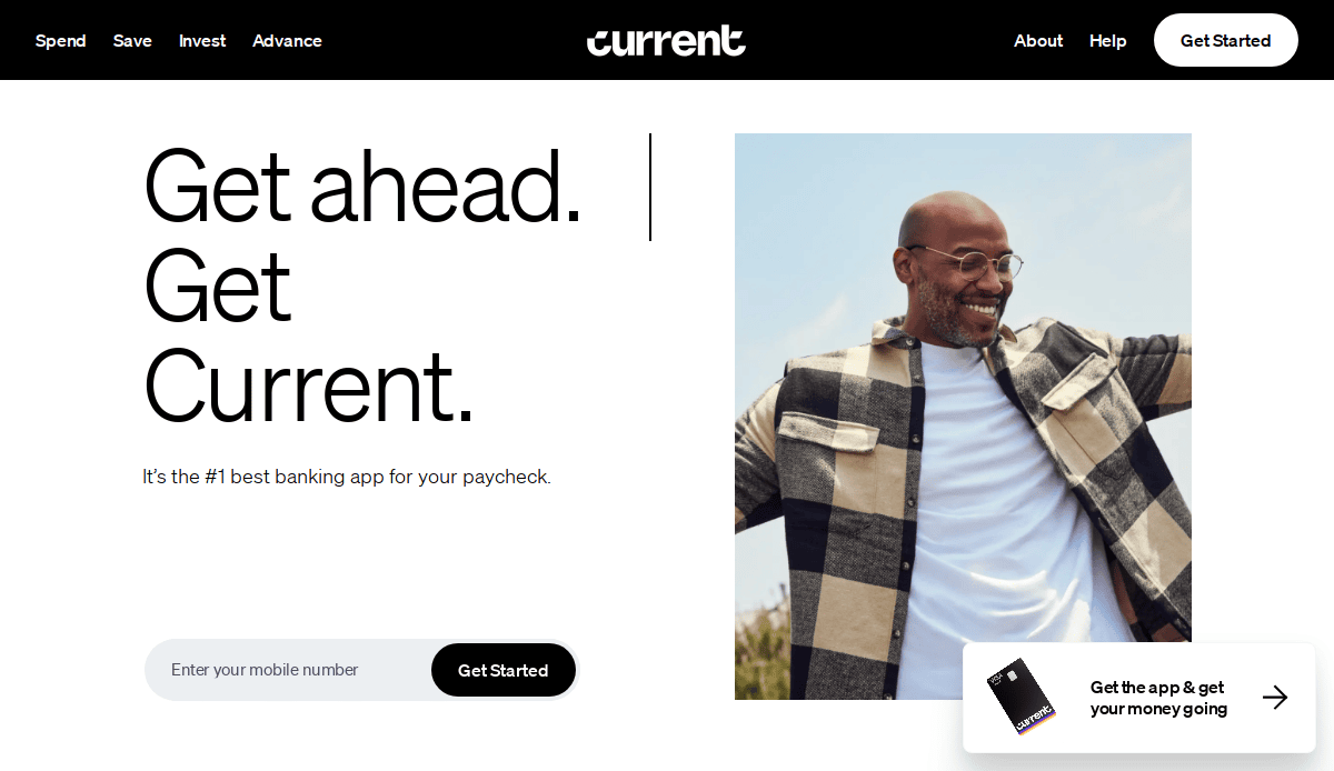
10. Current
Location: New York City, NY
Key Takeaways:
- Modern design with a focus on mobile banking services.
- User-centric features like early access to paychecks and fee-free overdraft.
- Clean layout with intuitive user pathways.
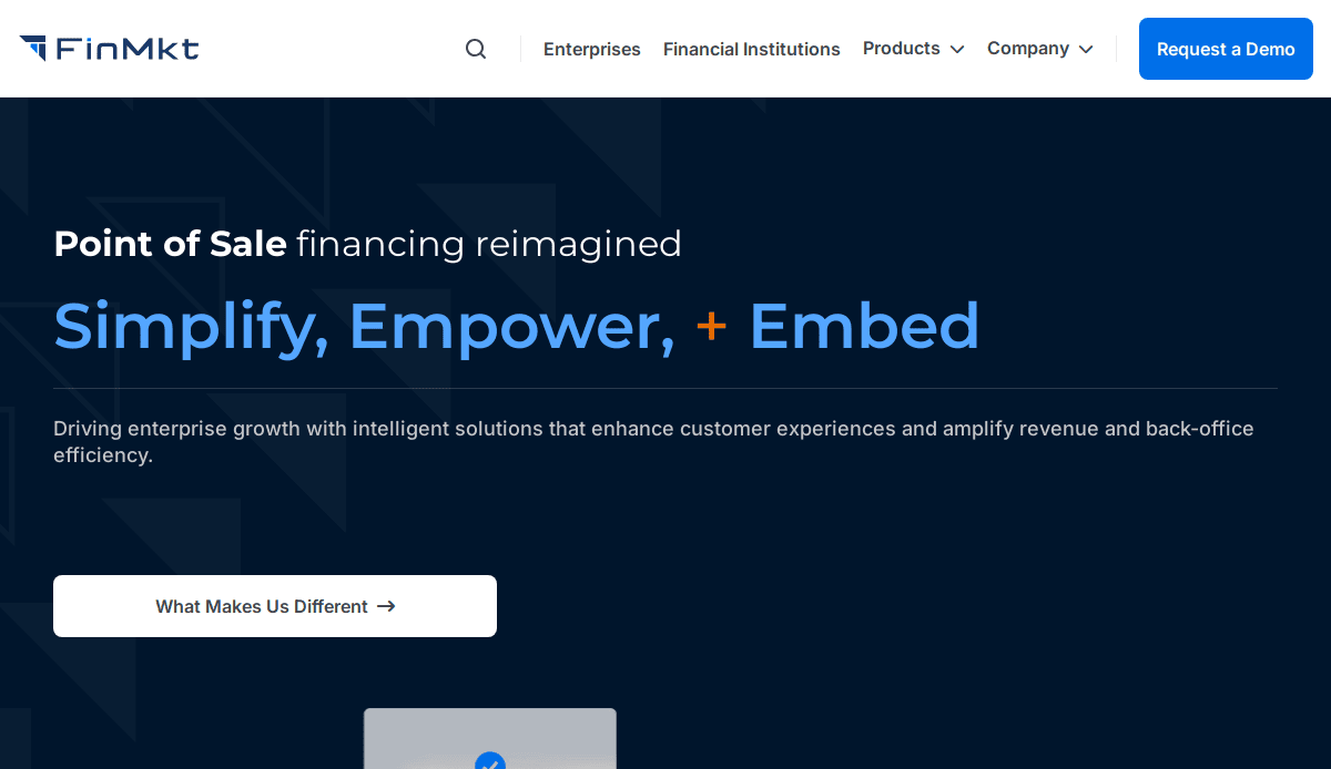
11. FinMkt
Location: New York City, NY
Key Takeaways:
- Premier SaaS, multi-lender, omnichannel, customizable point-of-sale financing platform.
- Sleek design with straightforward user pathways.
- Professional appearance enhances credibility.
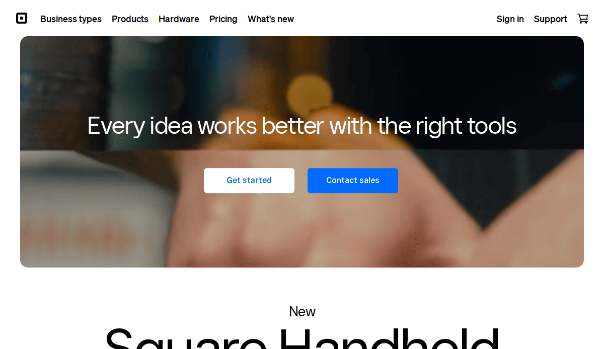
12. Square
Location: San Francisco, CA
Key Takeaways:
- Dynamic 3D effects in a clean, breathable design.
- Exceptional use of visuals and typography.
- User-friendly interface promoting engagement.
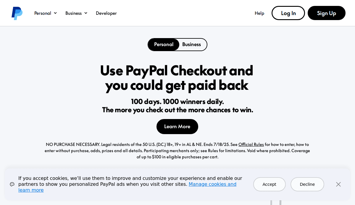
13. PayPal
Location: San Jose, CA
Key Takeaways:
- Dynamic, creative images with large, simple, easy-to-read fonts.
- Clean design promotes trust and usability.
- Comprehensive content catering to various user needs.
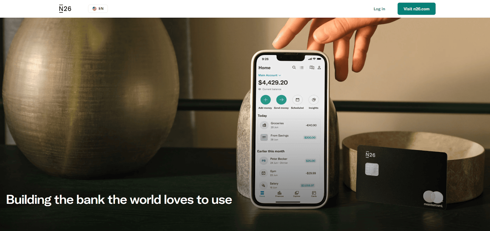
14. N26
Location: New York City, NY
Key Takeaways:
- Simple, direct, and to-the-point design.
- Minimalistic approach enhancing user focus.
- Clean layout with intuitive navigation
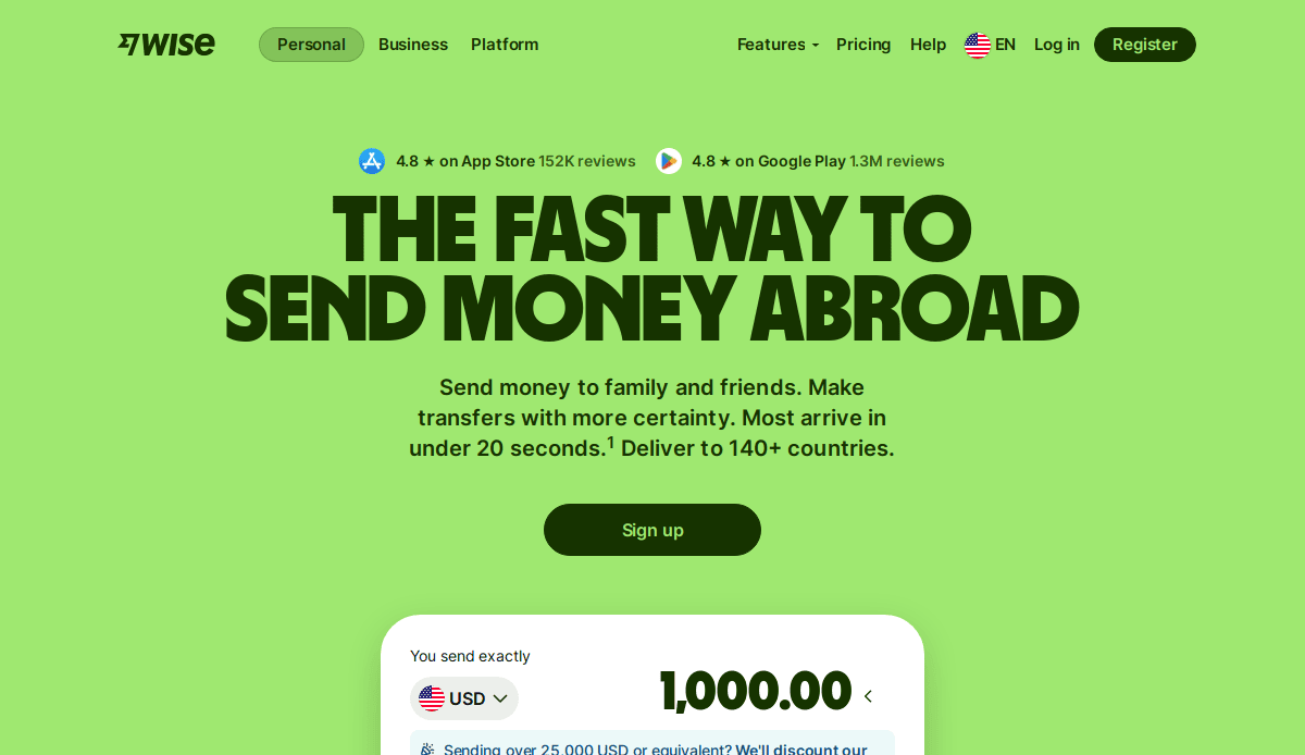
15. Wise
Location: New York City, NY
Key Takeaways:
- Unique font choices and creative images.
- Strong branding brings the design to life.
- Excellent example of fintech design inspiration.

16. CyberOptik Client: Butter Payments
Location: Chicago, IL
Key Takeaways:
- Sleek and modern design reflecting innovative payment solutions.
- Visually appealing layout balancing aesthetics with straightforward CTAs.
- A professional color palette creates a trustworthy vibe.
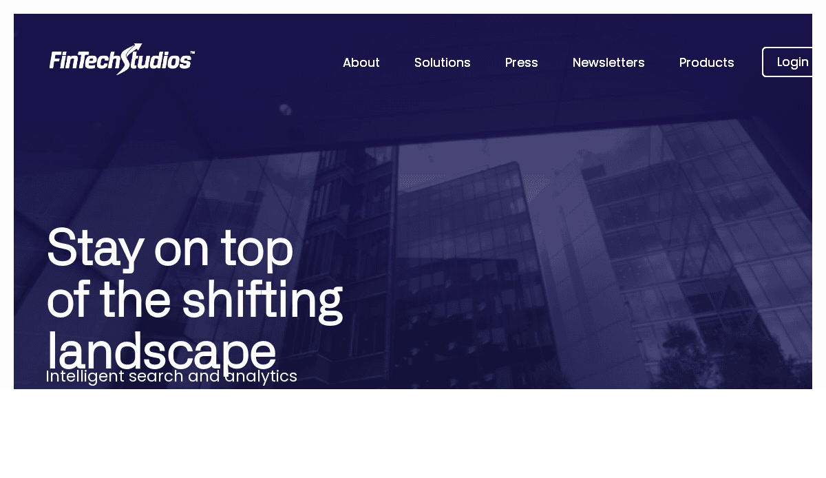
17. CyberOptik Client: FinTech Studios
Location: New York City, NY
Key Takeaways:
- Clean, modern design with a focus on financial data analytics.
- User-friendly interface promoting engagement.
- Professional appearance enhances credibility.
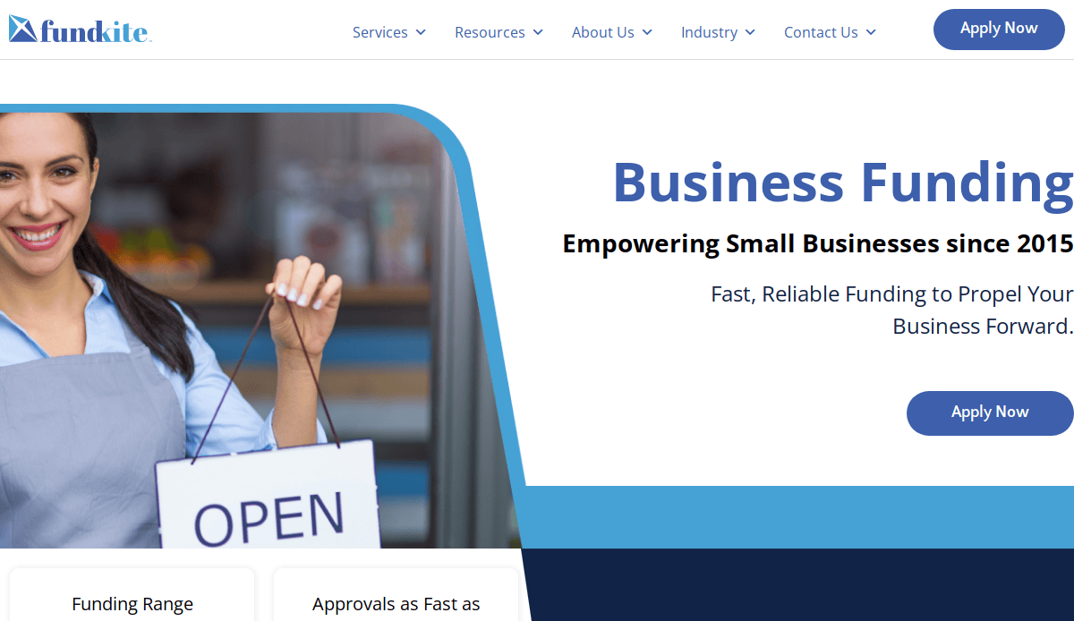
18. CyberOptik Client: FundKite
Location: New York City, NY
Key Takeaways:
- Sleek design with straightforward action steps.
- Professional appearance enhances credibility.
- User-centric features promoting engagement.
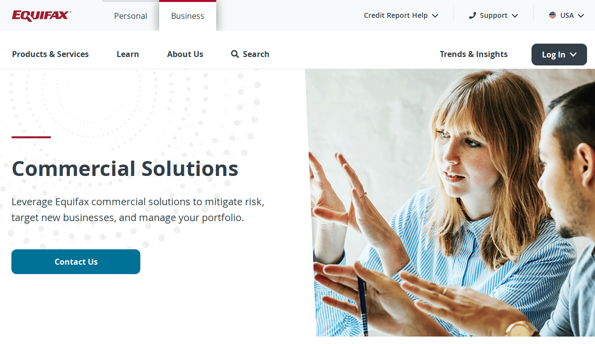
19. CyberOptik Client: Equifax (PayNet)
Location: Chicago, IL
Key Takeaways:
- Modern design reflects innovative payment solutions.
- Visually appealing layout balancing aesthetics with straightforward user pathways.
- A professional color palette creates a trustworthy vibe.
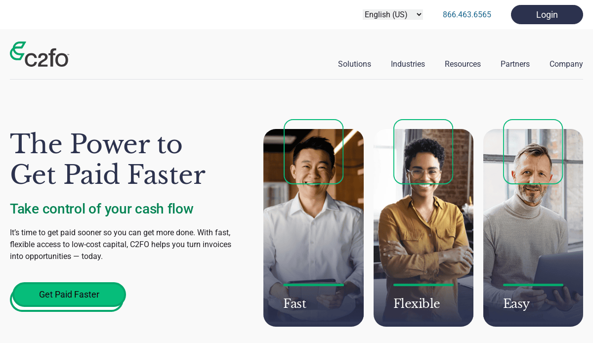
20. CyberOptik Client: C2FO
Location: Kansas City, MO
Key Takeaways:
- Clean, modern design with a focus on working capital solutions.
- User-friendly interface promoting engagement.
- Professional appearance enhances credibility.
These examples showcase how effective design can transform a website into a powerful tool for user engagement and business growth. For more insights and a step-by-step guide to creating a high-performing site, explore our Step-by-Step Guide to the Web Design Process.
Ready to Build a Successful Fintech Website That Converts?
Designing a new fintech website is more than an aesthetic project—it’s a strategic tool to build trust, drive engagement, and accelerate growth. Whether you’re launching a financial app, refining a mobile banking app, or scaling your platform, your website’s design must reflect best practices, support your unique products, and meet the highest accessibility guidelines.
The top priority for web design in this industry is creating user-centric digital experiences that grow with your product. From fintech UX and UI to performance optimization and customer support integration, the best industry websites are built around user needs and strategic goals. You don’t just need an app design or landing page—you need a complete digital ecosystem where your fintech app and website work seamlessly together.
Our expert webmasters help fintech businesses create a web experience that’s fast, secure, and conversion-focused. Our step-by-step process ensures your site is accessible, supports product design evolution, and delivers the best possible experience across all devices. We align with design trends, apply Web Content Accessibility Guidelines, and use proven web design principles to ensure your site is functional and inspires confidence.
Looking for design services that deliver measurable results? Explore how strategic web design can transform your online presence—and attract more qualified website visitors. If you’re ready to elevate your fintech website, then let’s design your website the right way—built to convert, built to last.
Frequently Asked Questions About Site Design in Fintech
What are the best practices for fintech website design?
Best practices for design focus on usability, security, speed, and trust-building. Your design should be responsive, mobile-optimized, and built to meet Web Content Accessibility Guidelines. It should clearly present your value proposition, provide an intuitive fintech UI, and ensure secure experiences for all users. Prioritizing website speed and clear navigation also supports customer satisfaction and helps fintech companies convert more users.
How do I build a fintech website that stands out?
To build a fintech website that stands out, start by defining your audience and key objectives. Choose a scalable platform like WordPress, integrate features that address user needs, and ensure the design focuses on creating seamless user journeys. Include secure payment integrations, responsive interfaces, and onboarding flows that reflect your product’s complexity. For a step-by-step guide, review our web design process.
What are the top industry websites doing differently?
Top industry websites apply consistent branding, prioritize performance, and create engaging fintech UI experiences. These websites follow design principles that balance function with aesthetics and optimize UX across every device. They also leverage microinteractions, live chat, educational content, and user feedback loops to support both product adoption and long-term customer satisfaction.
Why is design crucial in fintech?
Design is crucial because it communicates trust, simplifies complex digital financial processes, and directly impacts user retention and conversion. An app might have great functionality, but it also needs a front-end experience that inspires confidence and drives engagement. In a highly competitive market, design can transform casual visitors into loyal users.
How do you ensure a secure website?
A secure site requires SSL encryption, secure login protocols (such as multi-factor authentication), compliance with data protection standards, and regular maintenance. You should also update plugins and CMS platforms, implement backups, and monitor uptime and vulnerabilities. Ensuring security is a compliance necessity and drives brand trust.
What makes for great site designs?
The best industry designs include fast load times, clean user interfaces, consistent brand identity, and strong visual hierarchy. They demonstrate how design requires strategic thinking, user-centric layouts, and scalable infrastructure. Design across all device types and platforms is also essential to support mobile-first behaviors.
Can website design affect fintech app performance?
Yes. While website and app development are often separate, design decisions like branding, navigation structure, and visual consistency affect how users perceive and interact with your fintech app. A poorly designed marketing site can undermine even the most polished app, while a cohesive experience reinforces your brand’s value and functionality.
What should be included when creating a fintech website?
Secure forms, interactive dashboards, support channels, pricing comparisons, testimonial sections, and clear product descriptions. Also, integrate analytics tools, SEO best practices, and performance monitoring to improve engagement. These elements help fintech companies connect with their audience and showcase value quickly.
What are the current trends in fintech site design?
Current trends in fintech include minimalistic UI, personalization, real-time data dashboards, microinteractions, and a focus on speed and accessibility. Other design solutions gaining traction include dark mode, app-like web experiences, and modular content blocks. Following these trends can help your site feel modern and user-friendly while maintaining high functionality.
How can CyberOptik help fintech companies design effectively?
Our top-tier web design and development company helps fintech companies by delivering high-performance websites that emphasize usability, accessibility, and conversion. Our design focuses on creating trust through proven UX/UI strategies and aligns with both industry best practices and emerging fintech trends. We support you from planning to launch, ensuring your website grows with your product and reflects your brand’s leadership in the digital financial space. Reach out today to ensure you’re building the right website for long-term success.


