Just looking for our Best Environmental Website examples list?
- A compelling environmental website design should align visual identity with the mission.From sustainable color palettes to nature-inspired layouts, the design must reflect your brand’s environmental values while enhancing trust and emotional connection.
- User experience and accessibility are mission-critical for eco-websites.Clear navigation, responsive design, and inclusive features ensure visitors can easily engage with your message across all devices and backgrounds.
- SEO and conversion-focused design elements amplify your impact.Strategically placed calls-to-action, optimized copy, and technical SEO fundamentals help turn site visitors into supporters, clients, or advocates while increasing online visibility in a competitive digital landscape.
Designing Sites That Inspire Action
When your cause is as important as protecting the environment, your website needs to do more than just look good—it needs to inspire action. Why? A well-crafted website isn’t a luxury; it’s a strategic asset. It influences how visitors perceive your mission, decide to get involved, and ultimately take action—whether that’s donating, subscribing, or spreading awareness.
But what does it really take to design a high-performing environmental website? It’s more than visuals; it’s about aligning your site with your sustainability mission, optimizing UX, and turning web traffic into measurable results. In this guide, we’ll unpack the key components of website design that elevate brand credibility, improve search rankings, and increase conversions. Whether you’re an advocacy group, nonprofit, or eco-conscious brand, this guide will show you how to create a site that resonates with purpose and delivers performance.
Laying the Groundwork: Planning with Purpose for Maximum Impact
Every effective website begins with a strong foundation: a clear plan and purpose. The planning phase sets the tone for everything that follows—from content strategy to user pathways to final design elements.
For environmental companies and nonprofits, this starts by identifying your primary goal: Are you aiming to educate the public, generate donations, promote policy change, or sell eco-friendly products? Clarifying your core mission ensures your website serves as a strategic tool, not just a digital brochure.
Next, define your audience. Whether you’re targeting activists, donors, educators, or the general public, knowing who you’re speaking to helps shape messaging, visual style, and functionality. For example, advocacy-focused organizations may prioritize storytelling and calls-to-action, while sustainability startups may focus on product features and eco-credentials.
Once the purpose and audience are clearly defined, map out your user journey. What should happen the moment someone lands on your homepage? Which paths should guide them toward deeper engagement or conversion? Use this planning stage to anticipate user needs and remove friction at every step.
Planning also includes setting clear metrics for success. Do you want more newsletter signups, reduced bounce rates, or increased donations? Aligning goals with analytics ensures your design choices lead to meaningful results.
In short, the website planning phase for environmental organizations is about translating mission into action. With clear goals, defined audiences, and an intentional UX, your site can become a high-performing platform for change.
Designing for a Cause: Principles That Drive Eco-Focused Engagement
Effective website design is rooted in visual storytelling, emotional resonance, and seamless functionality. The right design principles transform a static web presence into a living, breathing representation of your environmental mission.
1. Clarity and Simplicity
An eco-conscious message should never be buried under cluttered layouts or complex structuring. Keep your interface clean, intuitive, and minimal, removing any unnecessary design elements that distract from your core message. Prioritize white space and ensure every visual serves a purpose.
2. Consistent Branding
Environmental organizations must build trust quickly. That starts with brand consistency. Use defined colors inspired by nature (greens, blues, earth tones), and pair them with typography that conveys professionalism and calm. From logo placement to button styles, keep your design identity uniform across every page.
3. Visual Hierarchy
Guide visitors through your content with a strong visual hierarchy. Use headings, font sizes, and color contrast to emphasize key points and lead users toward action steps. Effective hierarchy increases readability and drives deeper engagement.
4. Responsiveness and Accessibility
Environmental websites often speak to diverse audiences. Ensure your design works across all screen sizes, devices, and accessibility needs. Use large clickable elements, alt text for images, accessible color contrasts, and screen reader compatibility to create an inclusive experience.
5. Nature-Inspired Imagery
Photos and illustrations of the natural world can powerfully connect your audience to your mission. Use authentic, high-resolution images of forests, oceans, wildlife, and clean energy to evoke emotion and urgency. Just be sure every image complements your copy and loads quickly.
6. Emotional Storytelling
Design is more than aesthetics—it’s how you make people feel. Leverage emotional storytelling with thoughtful layouts, meaningful images, and visual cues that build empathy and inspire action. Use call-to-action buttons that are emotionally resonant, not just functional.
By grounding your website in these core principles, you ensure that it not only looks beautiful but also moves your audience to care, engage, and take meaningful steps toward a more sustainable future.
Structure with Strategy: Creating Content and Navigation That Converts
Content and a visitor’s journey form the backbone of a well-structured website. Without clear messaging and an intuitive user flow, even the most beautiful design will fail to meet its purpose. This section outlines how to structure content and pathways for maximum impact.
Clear and Purposeful Content
Every word on your site should serve your mission. Use concise, audience-focused language that emphasizes your impact and invites action. Incorporate storytelling to humanize environmental data and causes. Highlight successes, urgent issues, and ongoing initiatives in a way that’s easy to digest.
Start with high-impact pages: your main page, about page, key service or project pages, and a contact page with clear engagement invitations. If your organization hosts events or publishes reports, dedicate sections for news, blog content, and downloadable resources.
Incorporate testimonials, case studies, or statistics to reinforce credibility. Break up long content with subheadings, bullet points, and visuals to maintain reader engagement and optimize for SEO.
Strategic Navigation
The interface layout should guide users seamlessly through your site. A well-organized directory helps visitors find what they need without frustration, boosting both usability and conversions.
Use simple, descriptive labels for site items—avoid jargon or overly technical terms. Limit top-level pathways to 5–7 categories, and use drop-downs for deeper pages where needed. Include search functionality for larger sites with robust content.
Place key conversion pages (like “Donate,” “Take Action,” or “Get Involved”) in prominent directory positions or as buttons in your site header. Mobile navigation should be equally streamlined, with responsive menus and touch-friendly interactions.
Internal Linking and Calls to Action
Help visitors explore your site with internal links placed naturally within content. Link related blog posts, resources, or service pages to keep users engaged and improve SEO.
Every page should include a clear call to action—whether that’s signing up for a newsletter, downloading a guide, or supporting a cause. Use consistent, persuasive language to nudge users toward meaningful next steps.
By combining compelling content with strategic structuring, your website becomes an engine for awareness, engagement, and impact—one that’s easy to explore and built to convert.
Visual Storytelling: Using Design to Communicate Your Environmental Mission
Visual elements are far more than decoration—they’re essential tools for conveying your environmental brand identity and enhancing user experience. From color choices and typography to photography, each visual cue should reinforce your mission and make your website a compelling, cohesive experience.
Sustainable Color Palettes
The colors used on your website should reflect your environmental values. Greens and blues often symbolize nature and sustainability, while earth tones can convey groundedness and authenticity. Use contrasting colors wisely to guide user focus toward CTAs and key messaging, ensuring visual interest without overwhelming the eye.
Typography That Tells a Story
Typography plays a subtle but powerful role in brand perception. Choose typefaces that reflect your brand’s personality—clean and modern for innovation, serif fonts for tradition and trust. Maintain consistent font hierarchy to enhance readability and support accessibility.
Purposeful Photography
Use high-quality, emotionally engaging photography to spotlight real people, landscapes, and the natural world. Showcase your team in action, highlight fieldwork, or illustrate the results of your environmental efforts. Authentic imagery builds trust, while visual storytelling reinforces the real-world impact of your mission.
Illustration and Iconography
Custom media and icons can simplify complex concepts, such as eco-conscious frameworks or renewable energy processes. They add visual texture while reinforcing your branding. Make sure these elements are consistent in style and color to avoid visual confusion.
Motion and Microinteractions
Thoughtfully applied motion, like hover effects or animated transitions, can guide user attention and enhance engagement. Microinteractions—such as button animations or scroll-triggered effects—help users intuitively navigate your site while adding a polished, modern feel.
Cohesive Layouts and Spacing
Good visual design depends on balanced spacing and layout. Use consistent margins, grid systems, and alignment to create visual harmony across your pages. This promotes clarity, makes content easier to scan, and prevents cognitive overload.
When visual elements are intentional and aligned with your brand story, they don’t just look good—they make your message stick. For environmental organizations, this connection between form and function is vital for educating audiences, building emotional resonance, and inspiring action.
Best Environmental Website Examples
1. Environment California — Los Angeles, CA
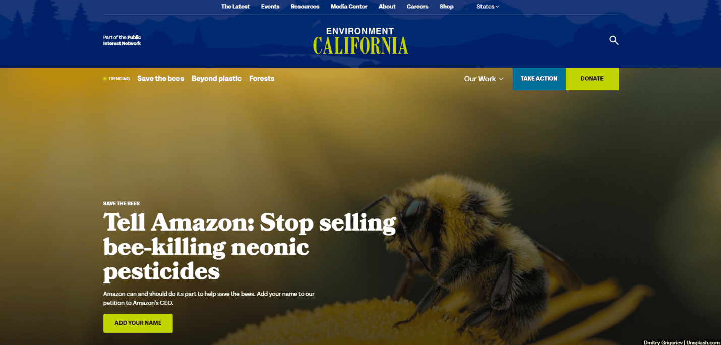
- Key Takeaways:
- Beautiful imagery highlighting California’s natural beauty and ecosystems.
- Accessible design reflecting inclusivity and user-friendliness.
- Informative content provides thorough insights into environmental projects and successes.
2. The Nature Conservancy — Arlington, VA

- Key Takeaways:
- Immersive full-width images of nature.
- Mobile-responsive design for seamless UX.
- Clear action steps encouraging donations and involvement.
3. Environmental Protection Agency (EPA) — Washington, D.C.
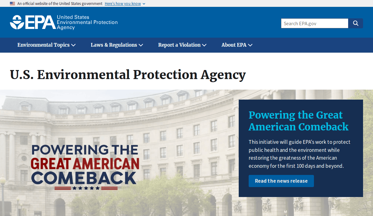
- Key Takeaways:
- Comprehensive resources on environmental laws and research.
- Tools for calculating personal environmental impact.
- Educational materials for teachers and students.
4. Treehugger — New York, NY
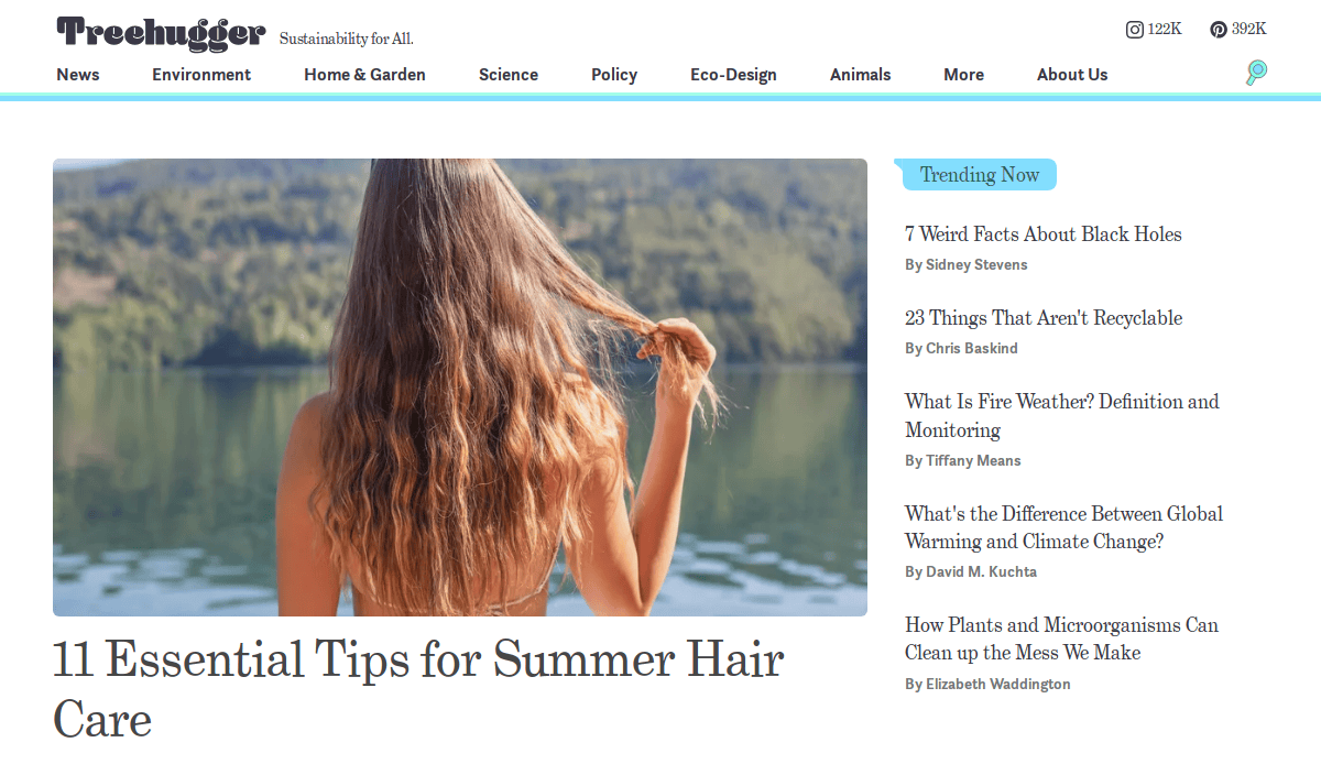
- Key Takeaways:
- Extensive coverage on environmental responsibility and green living.
- User-friendly design with categorized content.
- Regular updates with the latest environmental news.
5. Mongabay — Menlo Park, CA

- Key Takeaways:
- In-depth reporting on environmental science and conservation.
- Multilingual content catering to a global audience.
- Engaging visuals and comprehensive articles.
6. Inside Climate News — Brooklyn, NY

- Key Takeaways:
- Award-winning journalism on climate change and energy.
- Investigative reports with scientific backing.
- Accessible layout for easy reading.
7. Rainforest Alliance — New York, NY
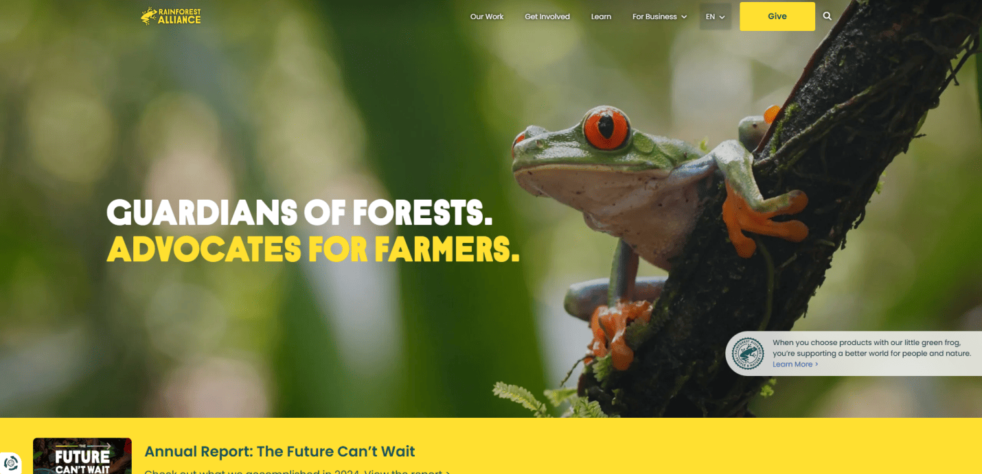
- Key Takeaways:
- Focus on sustainable agriculture and forestry.
- Certification programs promoting eco-friendly practices.
- Educational resources and impact stories.
8. Oceana — Washington, D.C.
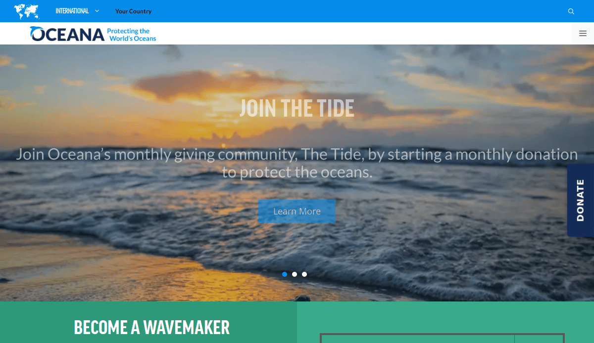
- Key Takeaways:
- Dedicated to ocean conservation and marine life protection.
- Campaigns targeting overfishing and pollution.
- Interactive maps and data visualizations.
9. EcoWatch — Cleveland, OH
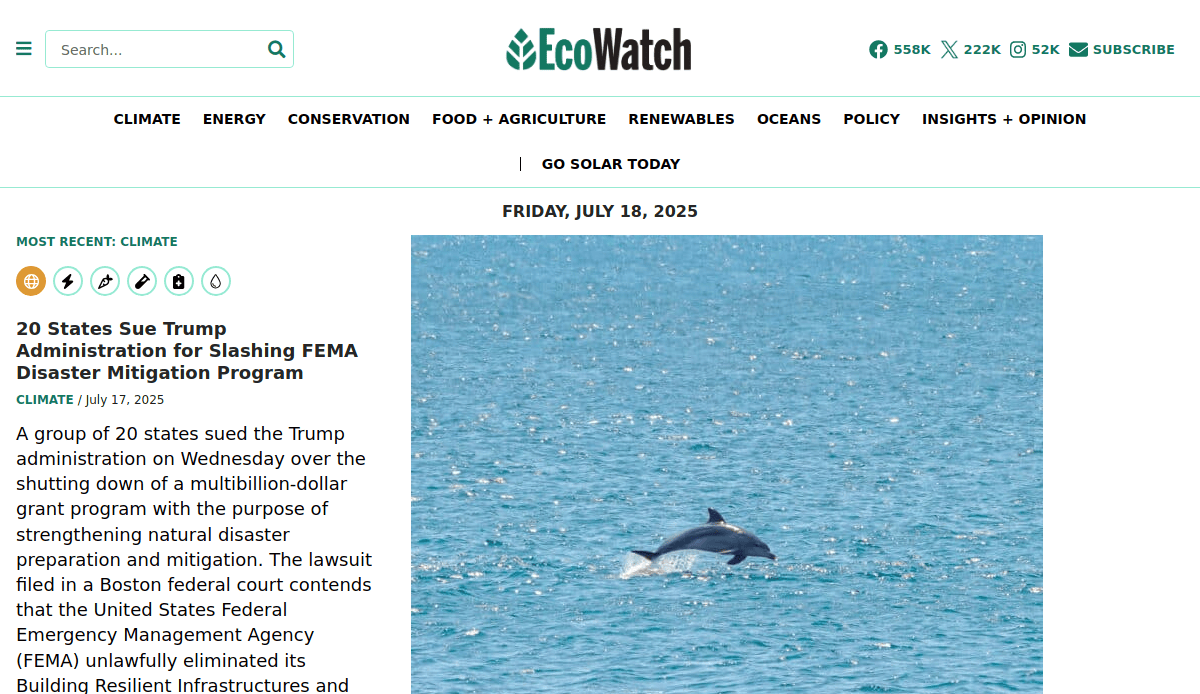
- Key Takeaways:
- News platform covering environmental issues and solutions.
- Expert opinions and analysis on eco-related topics.
- Community engagement through comments and shares.
10. Searious Business — Chicago, IL
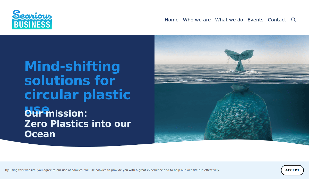
- Key Takeaways:
- Bright, oceanic color palette conveying freshness and environmental focus.
- High-quality visuals and videos displaying projects and activities.
- Interactive infographics demonstrating the impact of plastic pollution.
11. Environmental Defense Fund— Chicago, IL
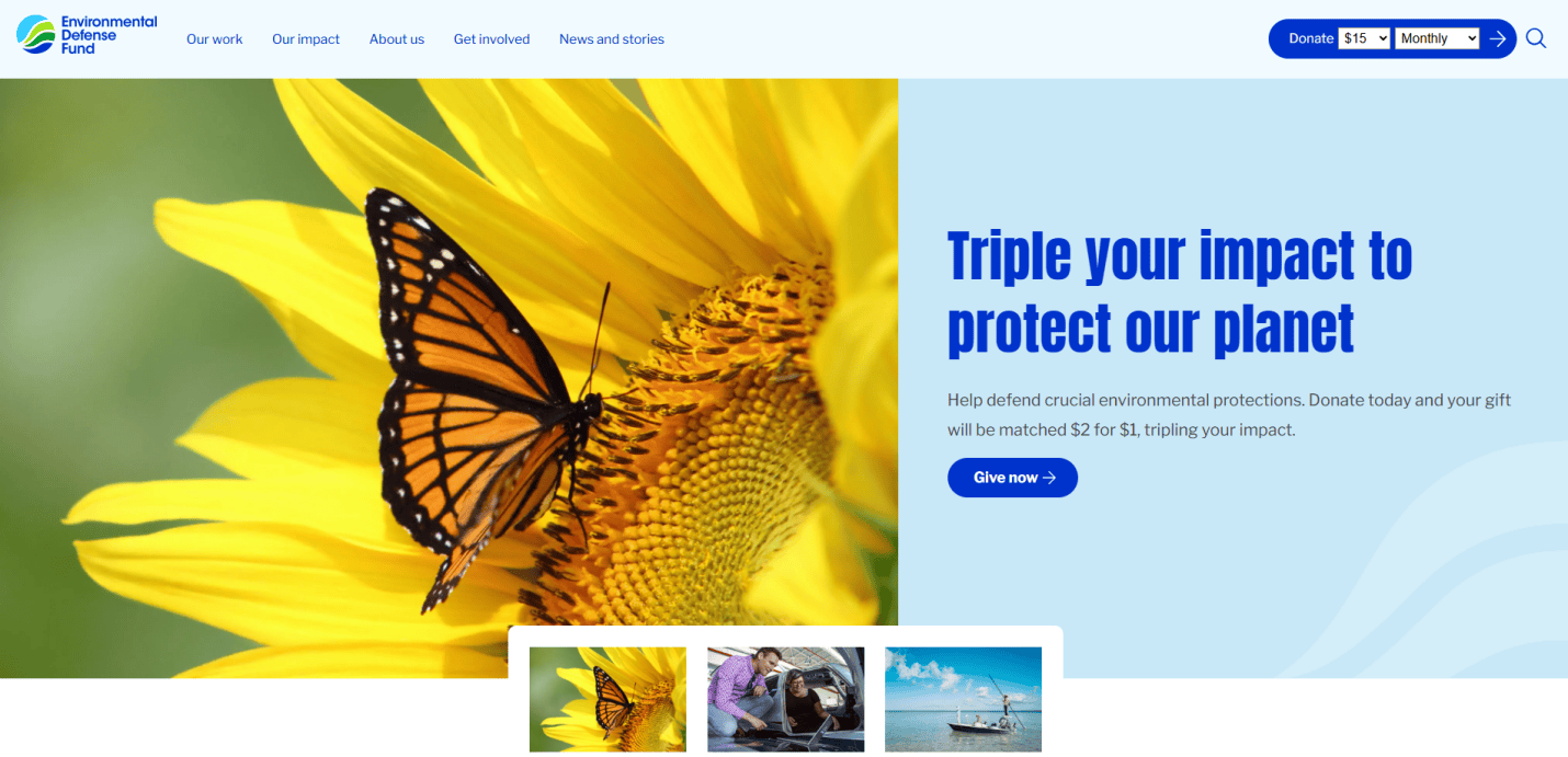
- Key Takeaways:
- Vibrant interface combining passion and purpose for environmental advocacy.
- Well-organized menu for easy wayfinding of environmental issues.
- Interactive features like petitions and donation drives empower visitors to act.
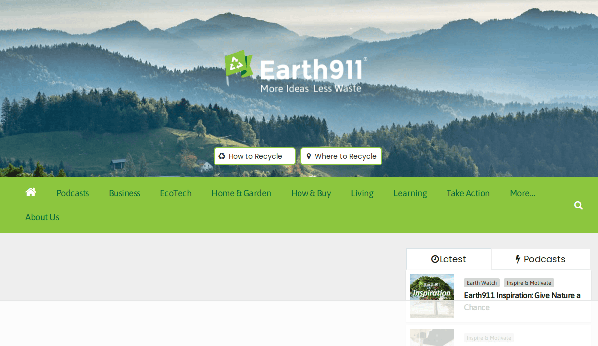
12. Earth911 — Scottsdale, AZ
- Key Takeaways:
- Comprehensive recycling guides and resources.
- Searchable database for local recycling centers.
- Tips for reducing waste and living sustainably.
13. Yale Environment 360 — New Haven, CT
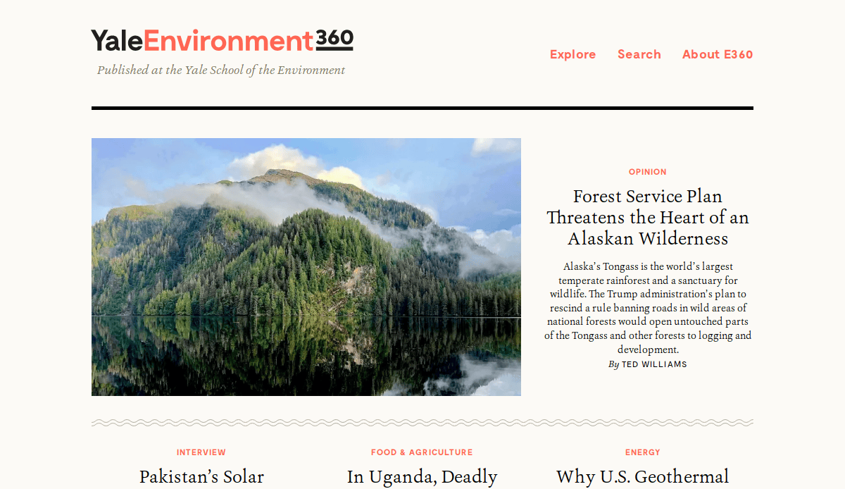
- Key Takeaways:
- Academic insights into global environmental issues.
- Contributions from leading environmental writers and scientists.
- In-depth analysis and opinion pieces.
14. NRDC (Natural Resources Defense Council) — New York, NY
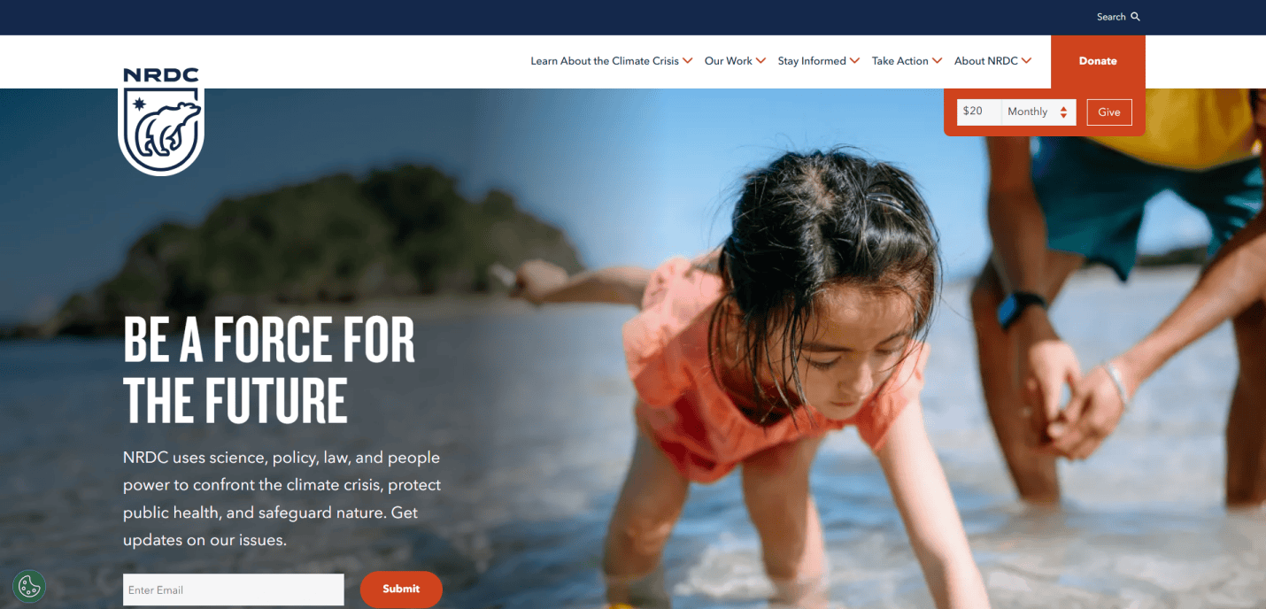
- Key Takeaways:
- Advocacy for environmental policies and legislation.
- Scientific research supporting environmental protection.
- User-friendly action center for public involvement.
15. World Wildlife Fund (WWF) — Washington, D.C.
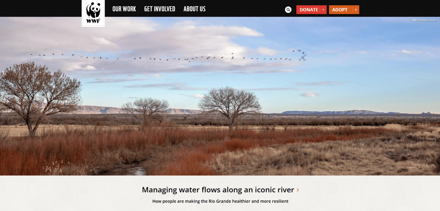
- Key Takeaways:
- Global conservation efforts for wildlife and habitats.
- Educational materials and species information.
- Donation and adoption programs to support initiatives.
16. Greenpeace USA — Washington, D.C.
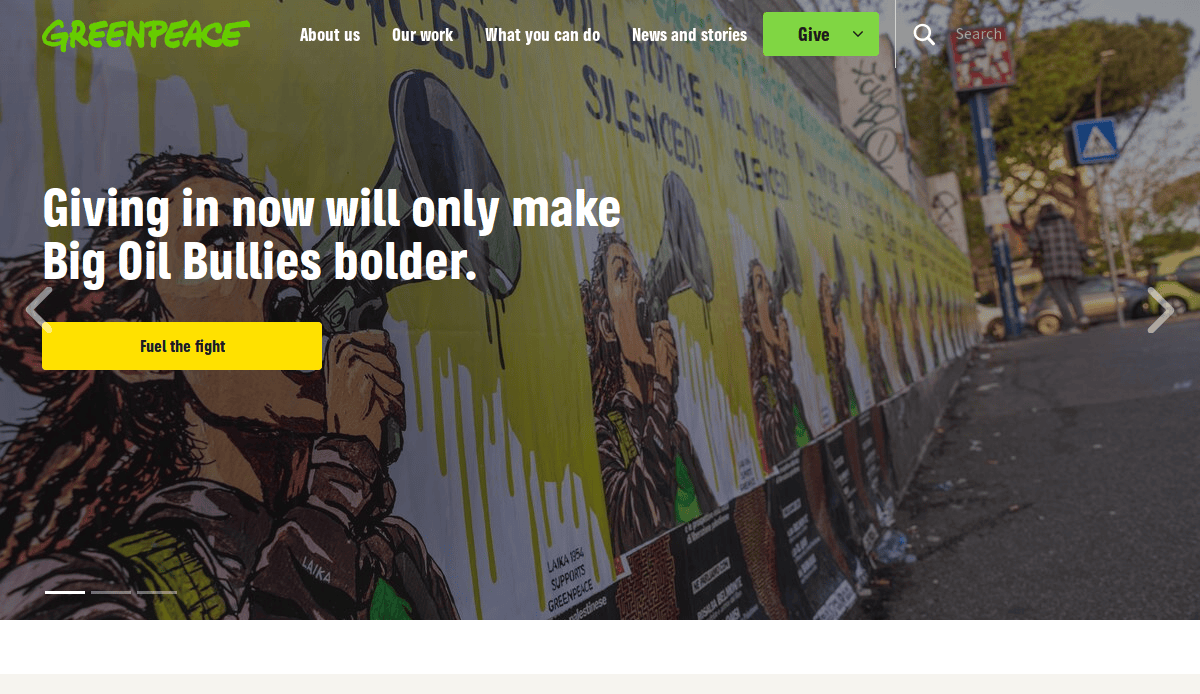
- Key Takeaways:
- Campaigns addressing climate change and environmental justice.
- Opportunities for activism and volunteering.
- Multimedia content highlighting global environmental issues.
17. David Suzuki Foundation
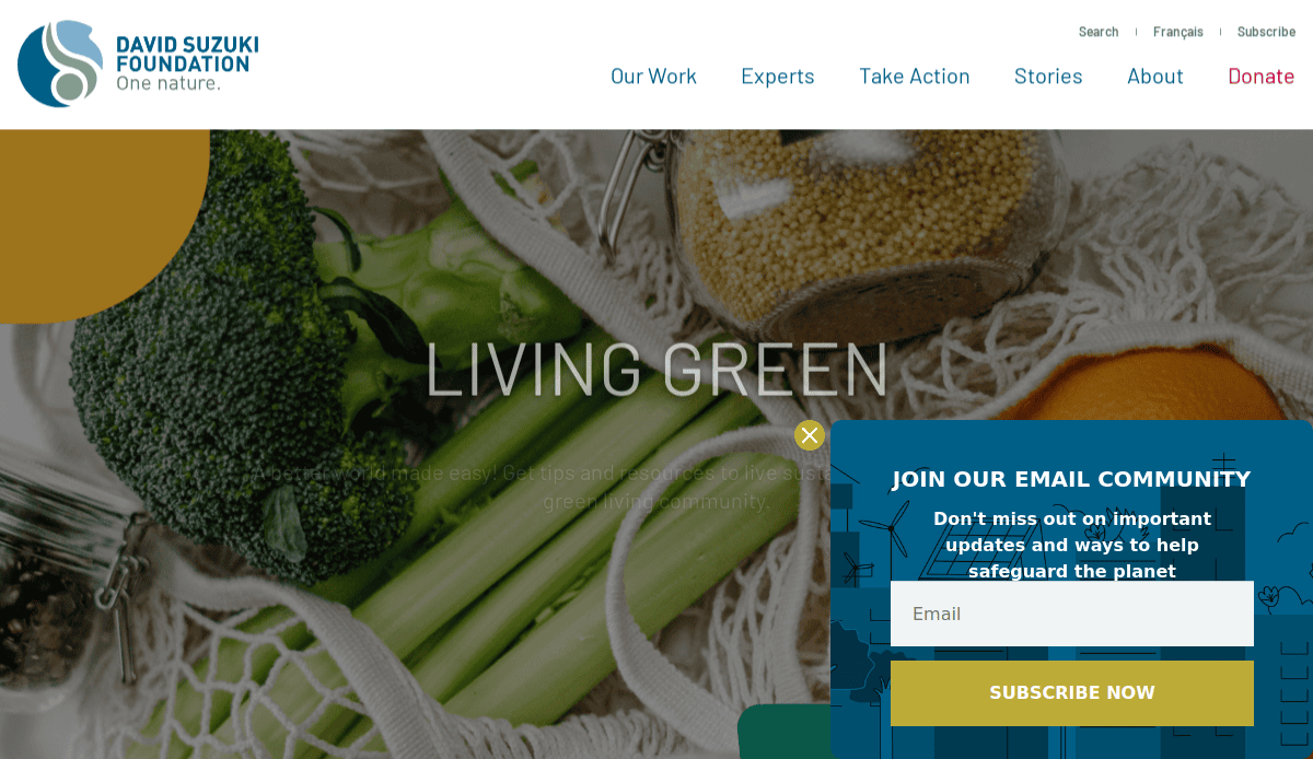
- Location:Chicago, IL
- Key Takeaways:
- Balanced design combining simplicity with complex environmental topics.
- Clear calls to action encourage user engagement and donations.
- Educational resources and impact stories promoting environmental awareness.
18. Friends of the Earth — Washington, D.C.
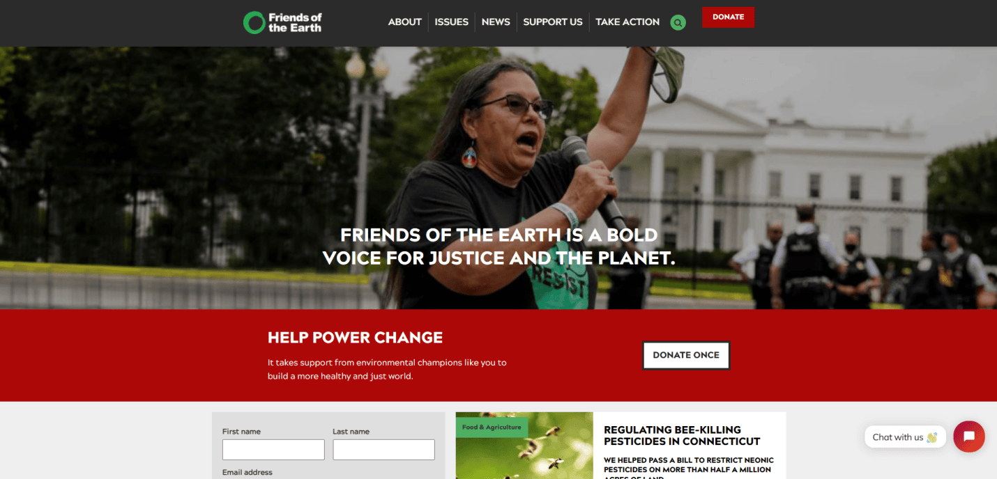
- Key Takeaways:
- Focus on environmental justice and green strategy.
- Campaigns against harmful environmental practices.
- Resources for activism and education.
19. Earthjustice — San Francisco, CA
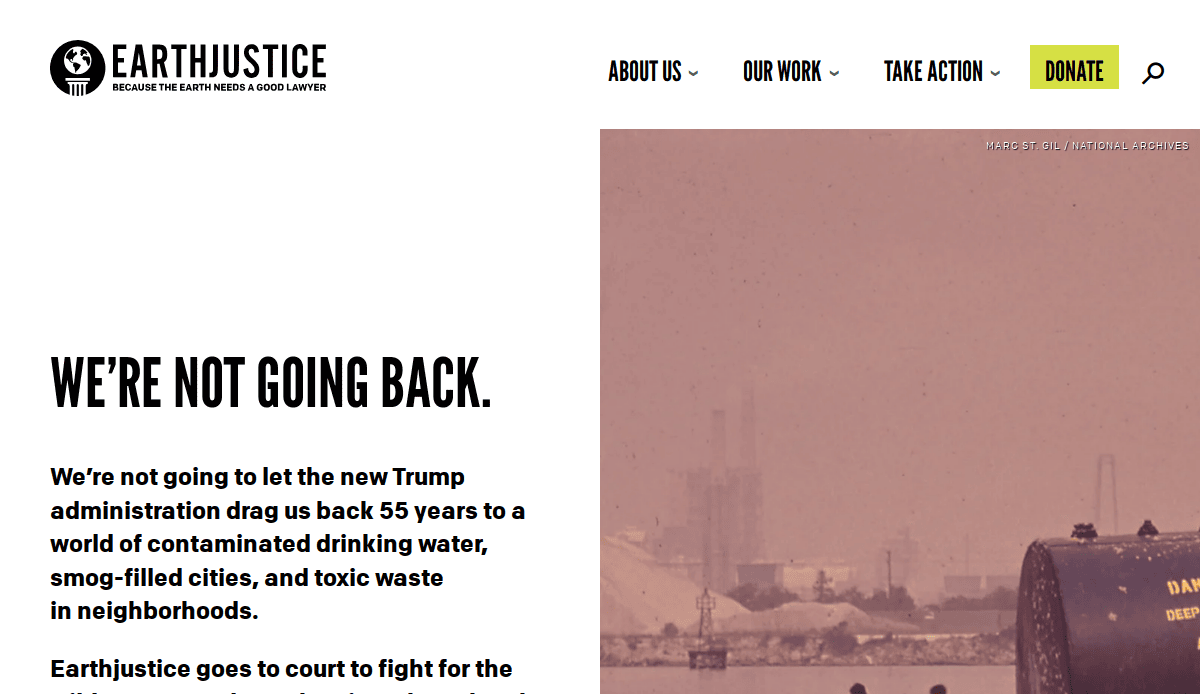
- Key Takeaways:
- Legal representation for environmental causes.
- Success stories of environmental litigation.
- Informative content on environmental laws and rights.
Build a Website That Makes a Difference
You’ve seen the design examples. You’ve explored the strategies. Now it’s time to act. If your website isn’t converting, inspiring, or clearly reflecting your mission, you’re leaving impact—and opportunities—on the table.
Whether you’re a nonprofit fighting for environmental justice, a startup in sustainable energy, or a community group protecting the natural environment, your website should be a powerful extension of your cause. That means leveraging sustainable web design practices, using eco-conscious color choices, and structuring your landing page and web services with a clean and modern layout that’s easy to navigate.
Let our team of professionals help you build one of the best environmental websites online—visually appealing, user-centric, and conversion-ready. Explore our environmentally focused web design services and let’s make something eye-catching and effective together.
Get a free website consultation and start your journey toward a well-designed, sustainable future.
Frequently Asked Questions (FAQs)
What should be included on the home page of an environmental website?
An intro page should be visually appealing, clearly state your mission, showcase key projects or causes, and include action-oriented steps that invite people to join the movement.
How can I reduce my website’s carbon footprint?
Use eco-conscious hosting, optimize images, minimize resource-heavy scripts, and adopt clean and modern web design practices.
Are there effective WordPress templates for the environmental industry?
Yes! There are several WordPress templates designed for eco-conscious brands that emphasize eco-conscious design matters, responsive layouts, and easy-to-use structure.
What’s a great source of design inspiration for an environmental webpage?
Look at mission-driven websites. These sites typically pair storytelling with strategic design to drive action.
How does good design influence future generations?
A well-designed website educates and motivates future generations, reinforcing values of environmental stewardship.
How do I choose a design template that fits my environmental mission?
Pick templates that prioritize readability, nature-inspired visuals, and strategic layout elements. Look for features that spotlight your services, impact metrics, and community engagement.
How can I use storytelling on my website to engage users?
Tell real stories of people and places you’ve impacted. Use case studies, images, and data from partners to reinforce credibility and inspire.
What design services should I prioritize for my green-focused site?
Invest in responsive design, fast load speeds, accessible UX, and clear conversion paths. These services align with green goals while delivering tangible results.
What’s an example of a webpage that effectively connects with audiences?
Websites by organizations like our client, the David Suzuki Foundation, use emotional resonance and impactful content to draw users into the cause.