Just looking for our Best Daycare Website examples list?
Why Great Daycare Website Design Is the Key to Establishing Trust and Boosting Enrollment
When parents begin searching for a childcare center, their first impression often comes from a website. A well-crafted daycare website is your digital handshake, your trust builder, and your silent sales tool. The difference between a parent clicking “enroll” or moving on to the next option often hinges on how your homepage feels, how easily it guides users, and whether it answers their most pressing questions about child development, safety, and care.
Modern parents are tech-savvy and short on time. They’ll quickly leave a cluttered, confusing site. But a user-friendly, visually appealing design can keep them engaged, help them find important information fast, and give them the confidence to enroll their child. Whether you’re using WordPress, Wix, or a custom template, the goal is the same: create a website that performs on every device—from desktops to cell phones and tablets—and clearly communicates your values, offerings, and personality.
This guide walks you through the key principles of daycare website design—from branding and layout to content strategy and optimization. We’ll show you how to establish trust, enhance your online presence, and ultimately increase enrollment.
Website Planning and Purpose: Building a Digital Foundation for Your Childcare Center
Before you select colors, write headlines, or choose photos, the most successful websites start with strategic planning. This foundational phase ensures that every decision you make—from structure to visuals—supports your center’s goals and aligns with what parents are looking for when they visit your site.
The first step is defining your site’s core purpose. Is it to increase enrollment? Build credibility? Educate parents on your programs? For most child care providers, the answer is a mix of all three. Understanding this from the beginning helps guide key decisions around messaging, gateways, and functionality. A homepage built to welcome and reassure should look very different from a site primarily used to schedule tours or collect tuition payments.
Next comes audience research. Consider who will be using your site: typically, busy parents accessing your site from a cell phone during off-hours. This means your website design must be responsive, fast-loading, and easy to use. The information architecture—the way pages are grouped and labeled—needs to reflect a parent’s priorities: program descriptions, teacher credentials, safety policies, and registration steps.
Planning also includes deciding what features matter most. Should you include a photo gallery of classrooms and playgrounds? Will you need a parent portal or form for waitlist inquiries? These choices directly impact your site’s structure and technical build. Without proper planning, you risk creating a visually pleasing website that fails to deliver results.
A strong planning phase also accounts for brand alignment and content strategy. Your visual identity—colors, typography, logo—should reinforce the warmth, professionalism, and trustworthiness of your center. Your written content must feel reassuring, informative, and consistent across pages.
Finally, as emphasized in our guide on the core principles of web design, planning is where usability and clarity begin. A thoughtful sitemap and wireframes reduce guesswork later in development and ensure your site looks great and functions intuitively.
Whether you’re creating a website from scratch or redesigning an outdated one, the planning phase sets the tone for everything that follows—and directly affects your ability to establish trust and convert visitors into registered families.
Design Principles That Make Websites Effective and Trustworthy
Design isn’t just how your company website looks—it’s how it works. Design directly impacts how easily parents can find information, whether they trust your center, and how likely they are to take action. Great design guides users toward registering their child without friction or confusion. It’s the bridge between curiosity and commitment.
One of the most important principles is simplicity. Parents visiting your site are often multitasking—scrolling during naptime or late at night on a mobile phone. A clean, uncluttered layout with intuitive design ensures they can quickly locate program details, safety protocols, and registration information without feeling overwhelmed. Every element should serve a clear purpose. If it doesn’t help cement trust or drive action, it shouldn’t be on the page.
Visual hierarchy is another essential factor. Your homepage should guide the eye, starting with a welcoming message or hero image, followed by key actions like “Schedule a Tour” or “See Our Programs.” Use consistent typography and thoughtful spacing to establish order. Bright, accessible buttons, short sections, and clearly labeled headings all make your site easier to scan.
Color also plays a critical role. Effective website design uses soft, nurturing tones to create a sense of warmth and safety. A muted palette with pops of color can subtly guide the user’s focus to calls-to-action or highlight important areas like testimonials or licensing badges. Avoid high-contrast or overly playful palettes that could distract from your message.
Accessibility should never be an afterthought. Ensure that text contrasts well against backgrounds, images include descriptive alt tags, and all features work across screen readers and mobile devices. A truly inclusive website meets compliance standards and reflects a center’s values of care and community.
Consistency builds trust. From your logo and brand colors to the tone of your messaging and page layouts, repetition helps visitors feel confident they’re in the right place. Mismatched visuals or disjointed page structures can confuse or deter parents who are comparing several providers.
Modern web design also calls for adaptability. As highlighted in our recent insights on upcoming web design trends for 2025, features like sticky navigation, mobile-first layouts, and modular content blocks make it easier to maintain a dynamic site that evolves with your business needs.
Ultimately, your design must reflect the care and professionalism parents expect. When done right, it becomes more than decoration—it becomes a strategic tool that enhances your digital presence, builds confidence, and drives sales.
Content & Navigation: Structuring a Site That Works for Parents
In this industry, these two nuances can make or break a parent’s experience. Families visiting a website for daycare services are usually focused, time-strapped, and looking for answers. Your job is to make that process as easy and reassuring as possible. That starts with a content structure that’s clear, helpful, and directly aligned with what parents want to know.
Start with the must-have pages. Every childcare center website should include an inviting homepage, a clear “About Us” page, program breakdowns by age group, a tour or enrollment page, testimonials, and a contact page. Add an FAQ section that tackles concerns like licensing, nutrition, staff credentials, and health protocols. This content doesn’t just inform—it helps build trust with prospective families.
Keep your messaging simple and human. Avoid overly formal or technical language. Use a warm, reassuring tone that reflects the care parents expect from your center. Incorporate language that highlights your values and showcases how your center supports child development in real, tangible ways.
For layout, break up long blocks of text into scannable sections with bold subheadings and short paragraphs. Use bullet points to highlight key features like daily routines, meal plans, or staff qualifications. Embedding short video clips or positive reviews can also personalize the experience and drive connection.
Navigation should be intuitive and minimal. Limit your main menu to five to seven key items, and organize dropdowns logically—grouping age-based programs, parent resources, or school calendars, for instance. Always include a prominent call-to-action in the header or sticky menu, such as “Schedule a Tour” or “Enroll Now.”
Mobile usability is critical. Many parents will explore your site on a phone or tablet. A responsive design ensures that content loads quickly, menus are touch-friendly, and nothing gets lost in translation from desktop to mobile. The easier it is to find and act on key information, the more likely parents are to engage.
A good rule of thumb: each page should have one clear purpose and lead the visitor to the next step. Whether that’s reading more, completing a form, or calling your center, your user pathways and content should gently but clearly guide them through their decision-making process.
And if you ever need inspiration to fuel your approach to content or layout, explore the insights shared in our roundup of inspiring web design quotes that highlight how intentional, thoughtful design leads to better digital experiences.
By pairing thoughtful content with seamless navigation, your website becomes more than a digital brochure—it becomes a trusted guide for families exploring your daycare center.
Visual Elements That Build Trust and Elevate the Daycare Experience
Visual design does more than make a site look attractive—it plays a central role in establishing credibility, building emotional connection, and supporting the overall user experience. Parents want to feel confident that your center is warm, professional, and attentive to detail. Your website’s visuals should reflect those same qualities from the very first click.
Start with photography. Authentic, high-quality images of your classrooms, playgrounds, teachers, and children in action create an immediate emotional response. Stock photos may be tempting, but they lack the warmth and trust that real imagery provides. Parents want to see your space, your team, and the joy on children’s faces. Include diverse representation and real-life moments that communicate care, safety, and learning.
Color choices also influence how your brand is perceived. Use a palette that reflects your center’s values—soft pastels or nature-inspired tones convey warmth and comfort, while brighter accents can help draw attention to important features like calls-to-action or program highlights. Avoid overly bold or jarring combinations that may distract or cause visual fatigue.
Typography should be clear and consistent. Use friendly, readable fonts with enough spacing and size to ensure easy reading on both desktop and mobile. Avoid using more than two or three typefaces across the site, and reserve decorative fonts for headings only. This keeps the user’s focus on your message, not on deciphering your text.
Icons and graphics can simplify complex ideas and add visual rhythm to your content. For example, you might use icons to represent age groups, meal types, or daily schedules. When used sparingly and with intention, they make your content easier to scan and digest, especially on mobile phones.
White space is just as important as the elements you include. It gives your content room to breathe and helps users focus on what matters. A clutter-free layout signals professionalism and control, which translates into trust for parents evaluating your center.
Video is another powerful asset. A short welcome message from your director, a tour of the classrooms, or a day-in-the-life montage can provide clarity and comfort to new families. It also allows you to speak directly to the viewer in a way that feels personal and engaging.
Finally, make sure your visual elements are consistent with your offline branding—signage, flyers, uniforms—so that every touchpoint reinforces the same message. A well-aligned visual identity assures families that you are organized, thoughtful, and committed to quality care.
Visuals aren’t just decoration—they are proof. Proof of your environment, your professionalism, and your values. When used strategically, they strengthen your message, improve usability, and create a memorable first impression that encourages parents to take the next step.
Ongoing WordPress Maintenance for Websites
A website built on WordPress is a powerful asset—but like any tool, it needs regular maintenance to keep performing at its best. For child care centers, ongoing updates aren’t just about keeping up appearances—they’re about protecting trust, ensuring functionality, and supporting population goals.
One of the most critical aspects of WordPress maintenance is keeping the platform, themes, and plugins updated. Outdated components can lead to security vulnerabilities, broken features, and performance issues. When your site is slow, unresponsive, or doesn’t load properly on all devices, it reflects poorly on your center. Regular updates ensure your website runs smoothly across all browsers and devices, providing a reliable user experience for busy parents.
Security is another top concern. Parents share sensitive information when they complete these forms, request tours, or sign up for waitlists. That data must be protected. Ongoing maintenance includes setting up and monitoring firewalls, implementing SSL certificates, running malware scans, and creating regular site backups. These steps help guard against breaches and data loss, giving you and your visitors peace of mind.
Speed and performance monitoring also play a role in retaining site visitors. A few extra seconds of load time can cause potential families to click away. Maintenance tasks like image optimization, database cleanup, and caching configuration directly impact how fast your site loads and how smoothly it operates.
Content should be reviewed and updated routinely as well. Information about programs, staff, licensing, and policies should remain current and accurate. A blog or news section—if included—needs fresh updates to show your center is active and engaged. Outdated information can raise red flags and lower confidence.
Accessibility standards and compliance requirements can also evolve over time. Regular audits ensure your site continues to meet modern guidelines so that all families, regardless of ability, can access and use your site effectively.
Another advantage of ongoing maintenance is the opportunity to improve based on performance data. Reviewing analytics helps you understand how parents are using the site—what pages they visit, how long they stay, and where they drop off. That data can inform future design changes, content adjustments, and user experience upgrades.
Maintaining a website isn’t a one-time task. For daycares, it’s an ongoing commitment to providing a digital experience that mirrors the professionalism, reliability, and care you offer in person. A well-maintained website cements trust, supports registration, and keeps your childcare center competitive.
Best Daycare Website Design Examples
Here are 20 standout daycare websites. Each example highlights what makes the site effective for parents and enrollment:
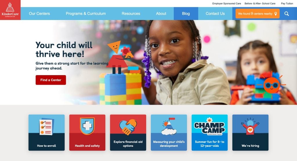
1. KinderCare
Location: Multiple US cities
- Bright, playful design with smiling children to create an emotional connection.
- Streamlined navigation for programs, locations, and safety info.
- Clear branding and consistent layout across pages.
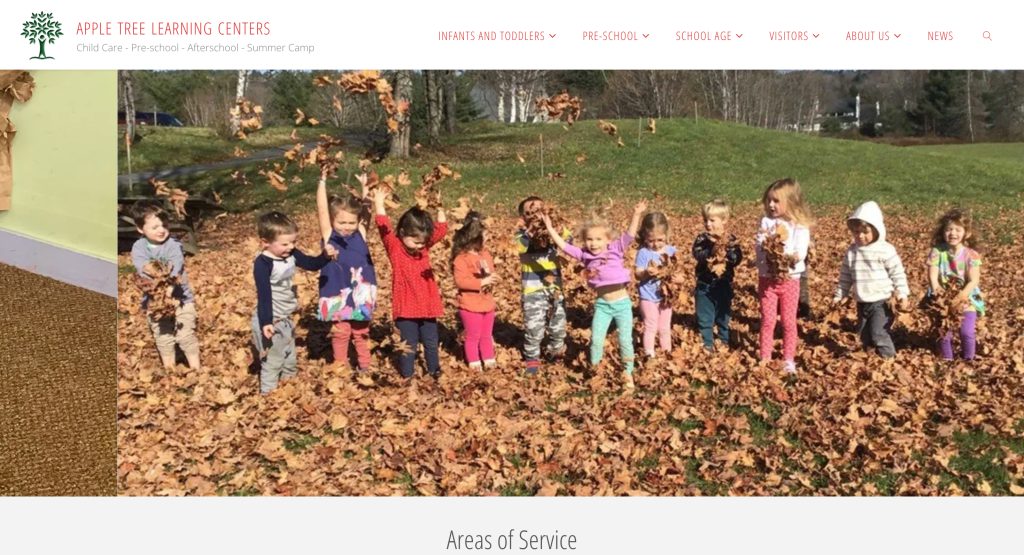
2. Apple Tree Learning Centers
Location: Multiple US cities
- Warm color palette and cheerful imagery throughout.
- Age-specific sections with clear learning objectives.
- Homepage layout engages visitors immediately.
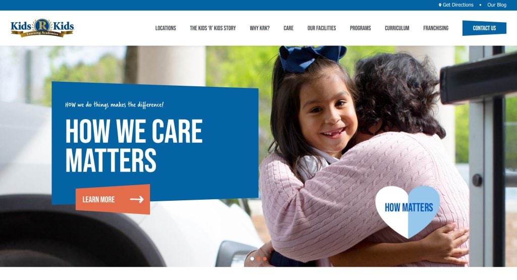
3. Kids ‘R’ Kids
Location: Multiple US cities
- Bold, energetic branding reflects active learning.
- Virtual tours and teacher bios for transparency.
- Logical navigation into infant care, preschool, and after-school.
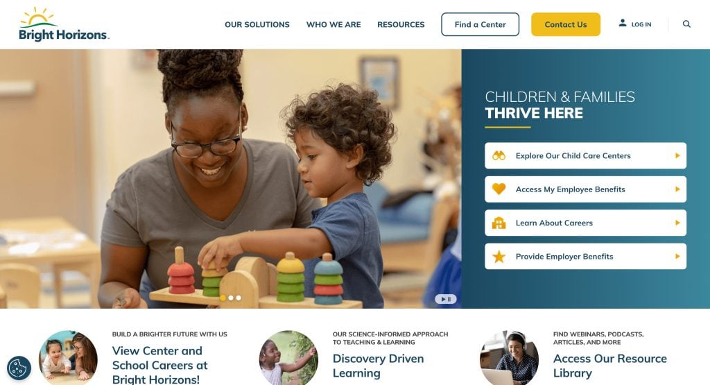
4. Bright Horizons
Location: Multiple US cities
- Professional aesthetics balanced with family-friendly imagery.
- Intuitive navigation and clear calls to action.
- Emphasis on educational philosophy and accreditation.
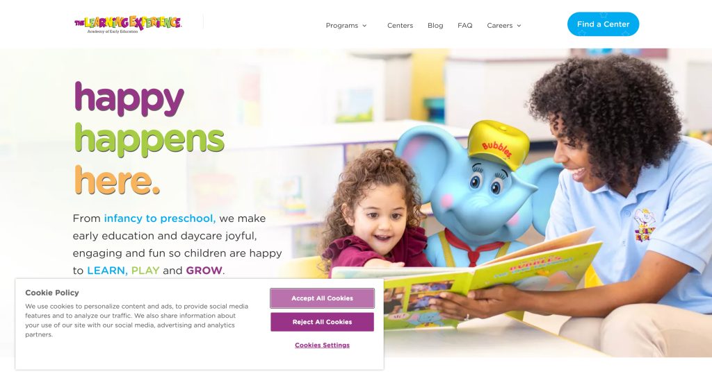
5. The Learning Experience
Location: Multiple US cities
- Educational focus with clear structure and organized layout.
- Strong trust-building via testimonials and credentials.
- Vibrant visuals enhance appeal.
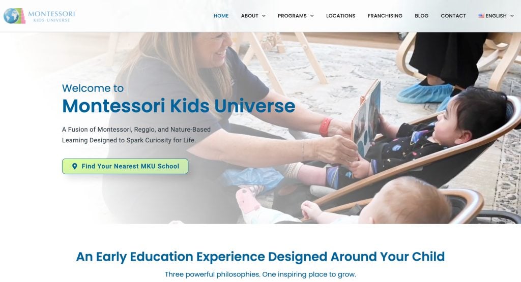
6. Montessori Kids Universe
Location: Multiple US cities
- Montessori philosophy emphasized through content and imagery.
- Structured, easy-to-navigate layouts.
- Trust elements like credentials and staff info.
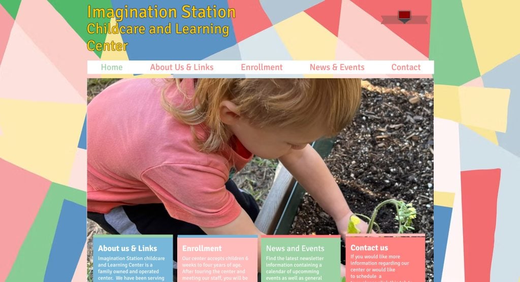
7. Imagination Station Childcare
Location: US
- Playful, creative design aligns with early childhood education.
- Informative program descriptions.
- Seamless navigation across desktop and mobile.
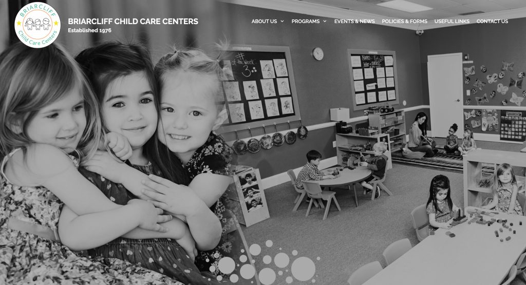
8. Briarcliff Daycare
Location: US
- Reliable, trustworthy design.
- Warm, nurturing messaging.
- User-friendly interface for parents.
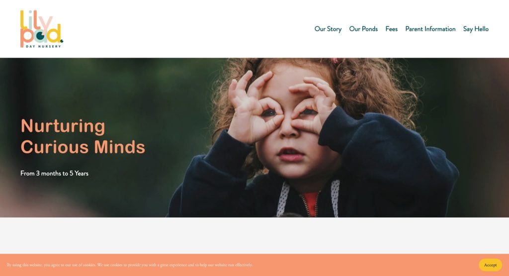
9. Lilypad Nursery
Location: US
- Gentle visuals to evoke care.
- Simplified navigation.
- Reassuring content supporting trust.
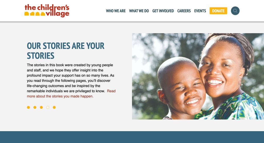
10. Children’s Village
Location: US
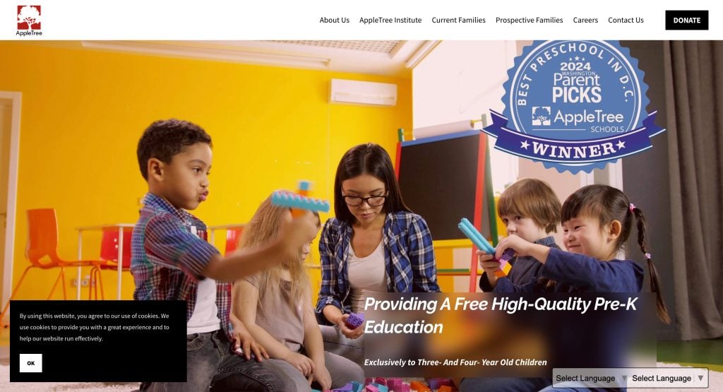
11. Appletree Institute
Location: US
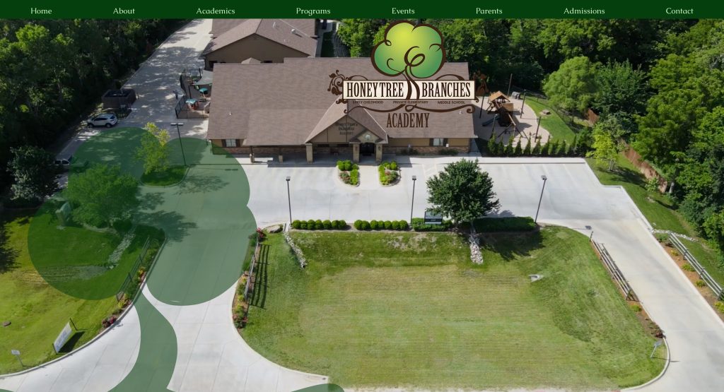
12. Honey Tree and Branches Academy
Location: US
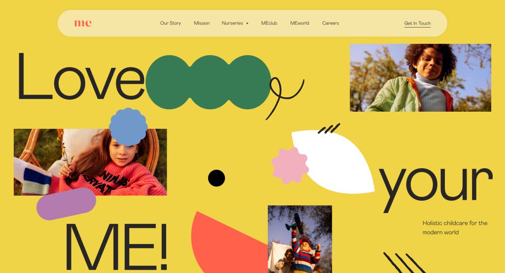
13. Me Place
Location: US
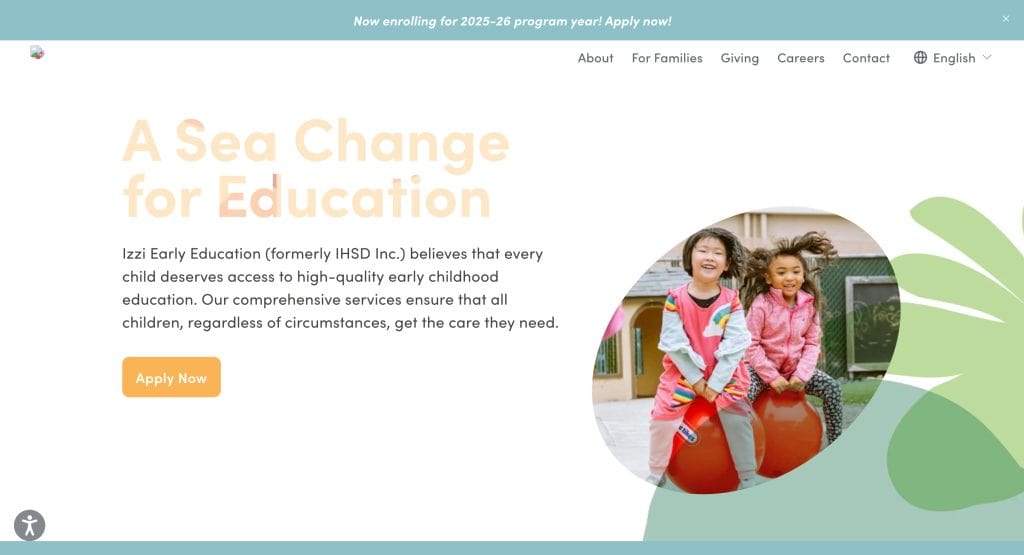
14. Izzie Early Education
Location: US
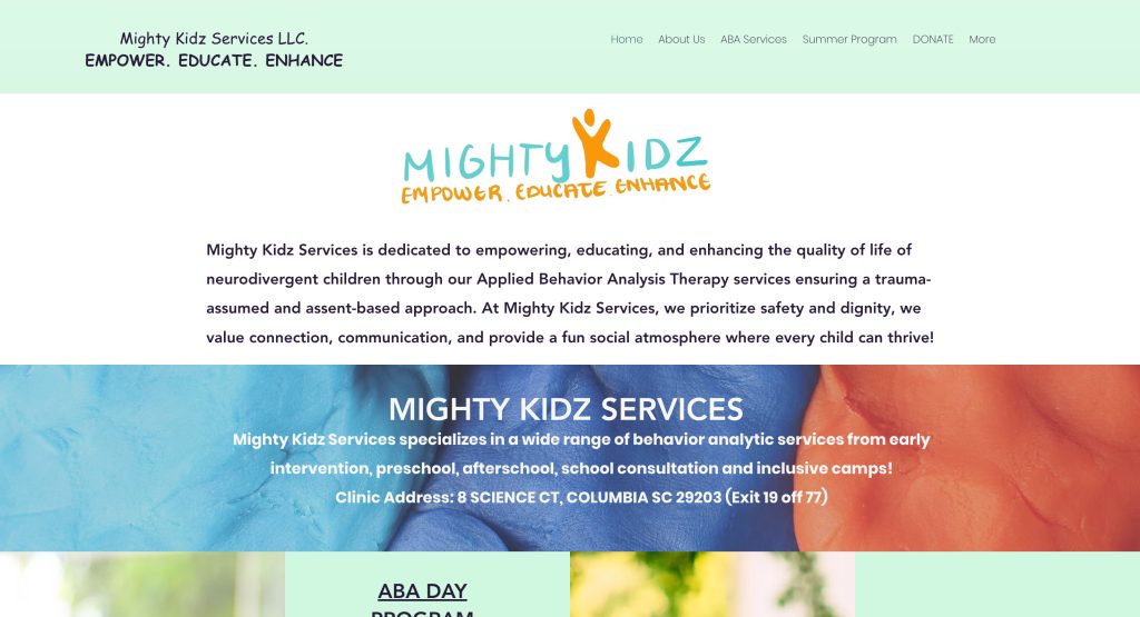
15. Mighty Kidz
Location: U.S.
- Energetic visuals reflect active learning
- Intuitive navigation guides parents easily
- Clear CTAs encourage engagement
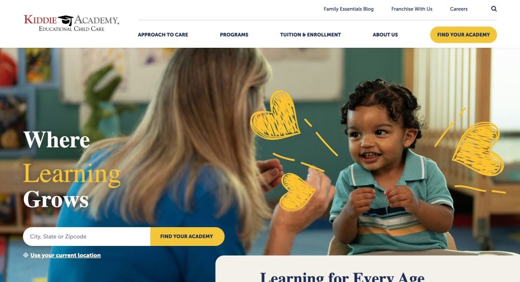
16. Kiddie Academy
Location: U.S.
- Structured layout improves content clarity
- Educational messaging highlights learning mission
- Trust signals such as testimonials and credentials
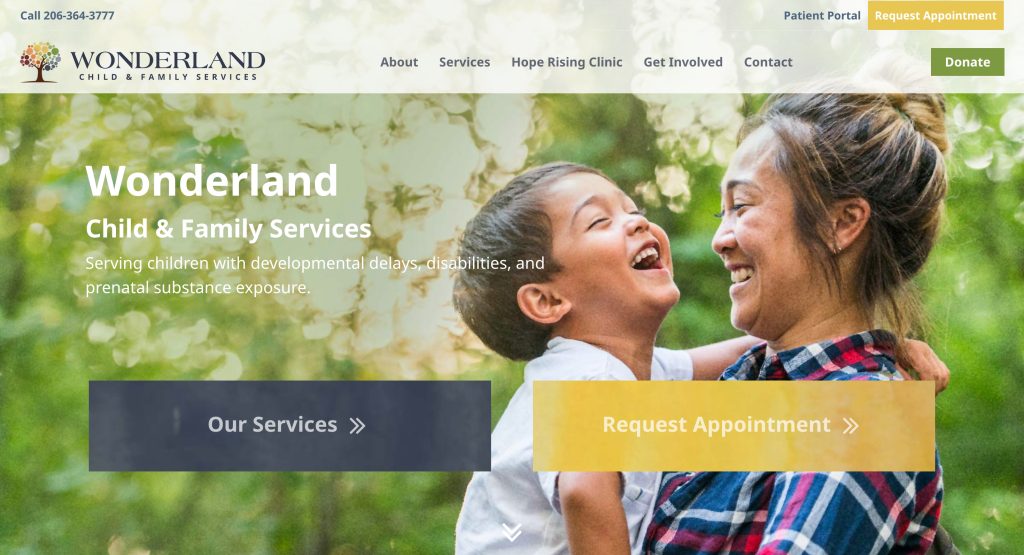
17. WonderLand Kids
Location: U.S.
- Streamlined white-space design
- Bold headlines to direct attention
- Inviting homepage imagery
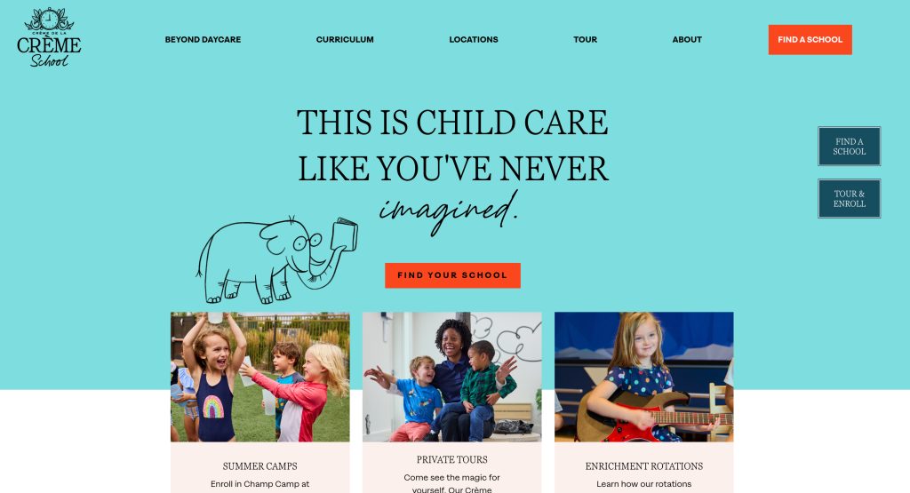
18. Crème de la Crème
Location: Multiple U.S. cities
- Luxury branding reflects premium early childhood education experience
- Virtual tours and detailed curriculum descriptions enhance transparency
- Strategic CTAs like “Schedule a Tour” guide parents toward enrollment
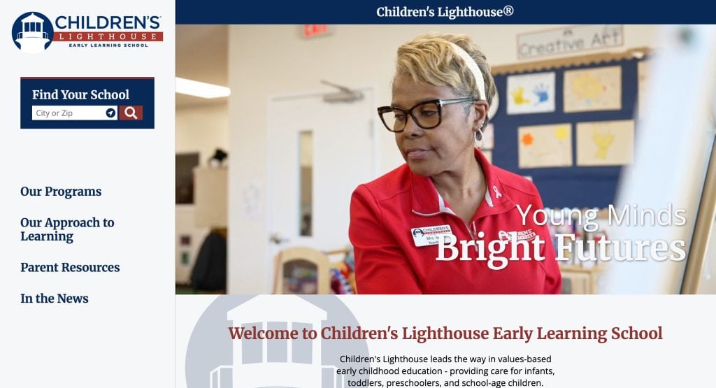
19. Children’s Lighthouse
Location: Multiple US cities
- Modern branding with engaging imagery.
- Easy access to curriculum and program pages.
- Mobile-friendly and accessible design.
These 20 examples showcase best-in-class design, trust-building features, and enrollment-focused functionality.
Ready to Build a Website That Reflects Your Commitment to Quality Care?
Designing a website for a daycare isn’t just a marketing task—it’s one of the most important ways to communicate your values, showcase your programs, and make it easy for parents to connect with you. A standout daycare website reflects everything families want in a great child care provider: professionalism, warmth, safety, and clarity. Your website must balance best practices in design with the specific needs of your local community, ensuring it’s visually appealing and user-friendly, mobile-ready, and filled with pertinent information.
Whether you’re launching a new child care business or refreshing your existing site, we’re here to help you create a website that effectively represents your center. From clean design and content strategy to a strong presence online, our team builds every site with a deep understanding of what daycare providers need to grow.
Let’s talk about building the perfect website for your daycare center. Request a consultation with our design and development experts today.
Common Questions About Daycare Website Design, Answered
What pages should a daycare website include?
Every site should have a clear homepage, an “About Us” section, program details, a contact page, and a dedicated page for registration information. Your website also benefits from testimonials, staff bios, and a photo gallery to establish trust and credibility. Including FAQs and blog content around early childhood education topics helps parents make informed decisions while strengthening your SEO.
How can I make sure my child care website stands out?
To ensure your child care website stands out, use a clean, visitor-friendly design with bright colors and real photos of your center. Prioritize functionality—like mobile responsiveness and fast load times—and ensure your site communicates professionalism and warmth. Showcase what makes your center a high-quality daycare option and what sets it apart as the perfect daycare choice for local families.
What makes a daycare website effective?
An effective website communicates trust, answers parents’ key questions quickly, and makes it easy to take the next step—whether that’s scheduling a tour or submitting an application. A fantastic website will include clear navigation, engaging website content, strong calls to action, and client reviews that reinforce the value of your care.
Should I use website builders or hire a web designer?
While website builders can work for some, hiring a professional web designer ensures your site is customized, scalable, and optimized for performance. A professional will guide you on what each page of your website needs, align the look with your branding, and make sure your child care website functions perfectly across all devices.
What are the best website themes for daycare providers?
The best website themes for daycare providers include features tailored for early childhood education, such as calendar integrations, classroom overviews, and bright visuals. Choose themes that support user-friendly design and include features like tour scheduling and newsletter sign-ups to support both marketing and parent communication.
How does design impact a parent’s decision when choosing a daycare?
Parents often begin their search for daycare online, and your website’s design is the 1st impression. A well-designed site helps position your center as the right daycare choice by showcasing your values, qualifications, and environment in a professional and trustworthy way. A visitor-friendly design ensures website visitors can find what they need without frustration.
What should I include in the content of my website?
Your website content should clearly explain your daycare options, daily routines, staff credentials, safety policies, and educational philosophy. The website provides a space to highlight your commitment to quality, making sure your care’s website is both informative and persuasive for parents looking for the best.
How can I convert more website visitors into enrolled families?
Ensure your website includes strong, visible calls to action on every page—like “Schedule a Tour” or “Request More Info.” Add trust-building content such as feedback from existing students or parents, licensing information, and a clear explanation of your registration process. A website that’s easy to navigate and answers common questions can dramatically improve conversion rates.
Does the visual design really matter for a company website?
Yes, visual design plays a key role. From the colors and layout to the photos and graphics, how your website looks directly affects how parents perceive your center. A site that uses bright colors, modern fonts, and a clean structure can leave a positive impression and make parents feel more confident about scheduling a visit.
Why is having a professional website important for my daycare business?
Having a professional website signals your commitment to quality and shows that your business is modern, transparent, and responsive. In a competitive market, families are looking for the best daycare and often base their decision on online impressions. A professionally designed site helps establish trust and encourages parents to visit your website and take the next step.


