Just looking for our Best Conference Website examples list?
Why Great Design Matters: The Impact of a High-Performing Conference Website on Business Results
When it comes to hosting a successful conference, your website is often the first point of interaction for potential attendees. It serves as a virtual introduction to your brand and as a tool to drive engagement, boost registrations, and create lasting impressions. A well-designed website is crucial to transforming casual visitors into confirmed guests and ensuring your event’s success.
Today, creating a user-friendly, responsive design is no longer just a nice-to-have—it’s essential. The best conference website designs don’t just look visually appealing; they offer seamless action steps, fast load times, and an intuitive event schedule that encourages interaction. These features make it easier for people to register, explore event details, and engage with the content, from speaker bios to sponsor showcases.
Whether you’re building a website for a virtual event or an annual conference, leveraging website templates or website builders can help event organizers save time while ensuring a visually appealing and responsive design that works across devices. A great conference website creates the first impression of your event, so making sure it’s designed with the right website features can have a measurable impact on your overall business results.
From generating buzz and increasing registration to guiding visitors smoothly through event details, the design of your event website plays a pivotal role in attracting and retaining interest. Let’s explore why your website is more than just a template—it’s a powerful tool that can lead to a successful event with a lasting impact on your brand.
Website Planning & Purpose
In the early stages of site design, the planning phase is crucial for establishing a solid foundation that aligns with both the event’s goals and the guests’ needs. This phase is where everything begins, and its success depends on clearly defining the website’s purpose, target audience, and key features.
It serves multiple purposes: it is a digital marketing tool, an information hub, and a registration platform. Therefore, the first step in planning is to outline the specific objectives the website needs to achieve. These could range from increasing ticket sales and engagement to promoting event sponsors and providing up-to-date event information. Setting clear goals ensures that the design, layout, and functionality of the site support these objectives from the very beginning.
The next step is identifying the target audience. Understanding the demographic, professional backgrounds, and technical expertise of potential attendees is essential. For instance, a conference targeting tech professionals may require a more sophisticated design, while an event aimed at a general audience might need simpler guidance and more accessible features. Knowing the audience allows for a more tailored approach in terms of design, content, and functionality.
Once the goals and audience are defined, it’s important to choose the right features that will provide a seamless user experience. These features may include a dynamic event schedule, easy-to-navigate registration forms, integrated social media feeds, and speaker bios. Additionally, special considerations like responsive design are essential, ensuring the website is optimized for various devices, especially smartphones, where many users may access the site.
During this phase, it’s also essential to plan for content creation. The website should feature rich content that appeals to potential participants and aligns with the conference’s theme. This could include speaker profiles, session descriptions, and event news. A content strategy that emphasizes SEO-friendly language is vital for improving search engine rankings and attracting more traffic.
Furthermore, integrating branding elements that reflect the essence of the event and its organizers is a key part of the planning phase. The website must be visually appealing, making use of consistent colors, fonts, and logos that create a cohesive identity. This branding should extend to the homepage, registration pages, and other sections of the site.
Finally, it’s important to recognize that a website is not static. It must have the capability to evolve and update as event details change, such as session timings, speaker additions, or sponsor announcements. This dynamic aspect requires careful planning of the website’s architecture and content management system (CMS).
By the time this planning phase is complete, event organizers should have a clear blueprint for the design and functionality of the website. This planning process sets the stage for a well-designed website that meets the expectations of participants, supports event goals, and creates a memorable visitor experience. For a more detailed look into the core principles of web design, you can explore this guide for beginners.
Design Principles
The design of a site is critical to its success. It must be visually appealing and functional, intuitive, and efficient in guiding people through the necessary actions, such as registering for the event, reviewing the event schedule, and exploring important event details. A well-designed website enhances UX, fosters engagement, and drives conversions. Below are key design principles that should be followed when building a successful website.
The first principle to consider is clarity. A website should have clear, easy-to-understand content and navigation. Event information must be readily available, with simple paths to find specific details such as session schedules, registration forms, and speaker information. The gateways should be straightforward, with well-organized menus and a clean layout that allows users to quickly locate the information they need. This approach reduces the likelihood of potential partygoers leaving the site out of frustration.
Visual hierarchy is another crucial design principle. By establishing a clear hierarchy, designers guide the user’s eye toward the most important elements of the site. Key sections, such as the registration call-to-action, sponsor banners, and event highlights, should stand out visually through the use of size, color, and placement. This helps visitors focus on what matters most and makes the website more intuitive to navigate. Consistency in font choices, color schemes, and imagery is vital to avoid overwhelming the user while maintaining a cohesive visual identity for the event.
A great site design must be responsive. As an increasing number of users access websites through mobile devices, having a mobile-friendly design is no longer optional. The website should be fully optimized for smartphones and tablets, ensuring that all elements of the site adjust to different screen sizes without compromising functionality or design. A mobile-first approach ensures that potential guests can easily register, browse event details, and view session schedules on any device.
User engagement is a critical aspect of site design. Attendees should be encouraged to interact with the site beyond just reading content. Adding features like real-time event updates, integrated social media feeds, and interactive elements (such as live polling or speaker Q&As) can increase engagement and foster a sense of community. The website should also provide easy ways to share content, whether it’s session highlights, event news, or speaker updates, to encourage word-of-mouth marketing.
Incorporating strong calls to action (CTAs) is also essential. Whether it’s registering for the conference, signing up for updates, or downloading event resources, clear and prominent CTAs should guide the user through their journey on the site. These should be strategically placed on each page, ensuring visitors know exactly what to do next. Using action-oriented language that evokes urgency can further encourage user interaction.
Accessibility is another key consideration. The website should be designed to accommodate all potential guests, including those with disabilities. This includes providing alt text for images, ensuring keyboard navigability, and offering color schemes that are friendly to colorblind users. Ensuring that the website complies with accessibility standards broadens its reach and reflects a commitment to inclusivity.
Lastly, performance plays a significant role in the design of a site. A slow-loading site can lead to high bounce rates and frustrated users. Optimizing images, scripts, and other resources is critical to ensure that the website loads quickly on all devices. This is particularly important for people accessing the site during the event itself, when they may need to quickly find information or register on the go.
By implementing these design principles, event organizers can create a website that is visually appealing and highly functional, user-friendly, and effective in achieving their event goals. For a deeper dive into the entire web design process, explore our step-by-step guide to the web design process.
Content & Navigation
When designing a website, organizing content and navigation is paramount for ensuring that visitors can easily find what they’re looking for. A well-structured website enables smooth movement and provides clear pathways to important event details. The goal is to streamline access to key information while maintaining a visually engaging design that aligns with the event’s brand.
The first step in structuring content for a website is to identify the most important sections and prioritize them. Key pages should include the homepage, event schedule, registration page, speaker bios, sponsors, and event details. These pages serve as the backbone of the site, providing essential information that folks need to plan their participation. The homepage should act as a gateway, offering visitors a snapshot of the event, with prominent links to the most critical areas like the registration form, event agenda, and contact details. A well-organized homepage should also include featured sections such as speakers, special guests, or key sponsors to create a strong first impression.
Navigation is the pathway that connects the various sections of the website. The user menu should be straightforward and easy to use, with clear labels and categories that make sense to the user. It should be located at the top of every page, ensuring that users can always access it, regardless of where they are on the site. Common categories in the menu dropdown should include “About,” “Schedule,” “Speakers,” “Sponsors,” “Registration,” and “FAQs.” For larger conferences, it’s helpful to break down the schedule into days or tracks (such as sessions, workshops, or networking events) to make it easier for people to find relevant information. Additionally, incorporating a search function on the website can be incredibly helpful for those looking for specific content, such as session topics or speaker information.
When structuring the content within each page, keep in mind that simplicity and clarity are key. Text should be broken into scannable sections with short paragraphs and bulleted lists to improve readability. Ensure that important details such as event times, locations, and session descriptions are easy to find. For example, the event schedule should be clearly laid out, with times, speakers, and descriptions for each session. Interactive elements, such as a filter or search option, can be added to help guests quickly find the sessions most relevant to them. Speaker bios should also be concise and include only essential information, with options for expanding the content if users want more details.
A crucial aspect of effective navigation is ensuring that every page is logically connected. Each page should link to others in a way that makes sense. For example, a speaker bio should link to their session or workshop page, while the event schedule page should provide quick access to registration and session details. Calls to action (CTAs) should be placed strategically throughout the website, guiding users toward taking the next step, whether that’s signing up for the event, downloading event materials, or contacting the event organizers for more information. These CTAs should be clear and actionable, with a sense of urgency when appropriate.
Finally, ensure the website is easy to navigate on all devices, including mobile phones and tablets. The layout should adjust accordingly, with content remaining accessible and easy to use on smaller screens. Mobile optimization is critical, especially since a large number of people will likely access the site from their mobile devices.
By following these guidelines for structuring content and navigation, you ensure that your website is intuitive, user-friendly, and effective at guiding visitors through the information they need. Proper organization of content enhances and boosts engagement, plus ensures higher conversion rates. For a deeper look into the best practices for website organization, take a look at our website organization guide.
Visual Elements
Visual elements play a vital role in the design of any website, as they directly impact both the UX and the website’s overall brand. A well-thought-out visual design does much more than make a website aesthetically pleasing—it enhances usability, guides user behavior, and reinforces the event’s identity. Event websites, which often carry significant expectations from participants, rely on visual elements to communicate the event’s theme, build trust, and create a seamless, engaging experience for users.
The first step in integrating effective visual elements is to ensure consistency with the event’s branding. This includes using the logo, color scheme, and typography that align with the conference’s brand identity. These elements should be carefully selected to reflect the tone and nature of the event. For example, a corporate business conference might use a sleek, professional color palette with clean fonts, while a creative industry event might incorporate more vibrant colors and dynamic typefaces. A consistent visual identity across all pages strengthens the brand and builds trust with users, as it signals professionalism and attention to detail.
Images and graphics also play a significant role in conveying the essence of the event. High-quality images of speakers, past conferences, and event venues help users visualize what they can expect, creating excitement and anticipation. These visuals should be carefully selected to represent the diversity and scope of the event, showcasing different aspects such as keynote speakers, breakout sessions, networking opportunities, and the event’s atmosphere. Additionally, event details such as the schedule, location, and speakers should be accompanied by relevant, engaging visuals that complement the text, making the content more digestible and memorable. However, it’s important that these images are optimized for web performance to avoid slow page load times, which could hinder the user experience.
Typography is another crucial visual element in website design. The choice of fonts affects both readability and the overall aesthetic of the website. The typography should be clear, legible, and easy to read on both desktop and mobile devices. Hierarchy in typography—using different font sizes for headings, subheadings, and body text—helps guide the user through the site, making important sections stand out and enhancing the overall experience. Consistency in font usage across the website ensures that content remains cohesive and professional, supporting the event’s brand and providing a clean and organized look.
Incorporating icons and buttons can also improve the functionality and visitor experience. Icons help break up text and make the website more visually interesting, while also providing clear visual cues for the user. For example, icons can be used to represent different types of events (e.g., a speaker icon for talks, a networking icon for social sessions, etc.), helping users quickly identify relevant sections of the site. Similarly, buttons should be designed to stand out and guide users toward key actions, such as registration, contact, or downloads. These elements should be easy to identify and strategically placed throughout the website to encourage users to take the next step.
Lastly, the layout and structure of the website play a key role in guiding users through the site. A well-organized layout, with visually distinct sections, will help people navigate seamlessly. For instance, having a clean, grid-based design for the event schedule or speaker bios can make the information easy to scan, while call-to-action buttons should be clearly positioned to prompt users toward registration or other key actions. A well-thought-out layout also ensures that the site is visually balanced, avoiding clutter and focusing user attention on the most important elements.
When visual elements are used thoughtfully and strategically, they help create a cohesive, professional, and engaging platform that reflects the quality of the conference itself. By combining effective branding, high-quality images, clear typography, and intuitive layouts, event organizers can design a website that looks great and supports user satisfaction and drives conversions.
Ongoing WordPress Maintenance
Maintaining a WordPress website for a conference or event is an ongoing process that goes beyond the initial design and launch. Regular maintenance ensures that the site remains secure, functional, and up-to-date, providing a smooth experience for attendees and event organizers alike. Without proper maintenance, websites can become vulnerable to security risks, suffer from performance issues, or fail to adapt to new technologies. This is particularly important for websites, which often experience fluctuating traffic before, during, and after the event.
One of the most critical aspects of ongoing WordPress maintenance is security. WordPress websites are frequent targets for cyberattacks, and ensuring that the site remains secure requires regular updates to WordPress core files, themes, and plugins. These updates often include security patches that protect the site from vulnerabilities. Additionally, implementing strong security practices, such as regularly changing passwords, using firewalls, and ensuring proper backup procedures, is essential. Automated backups should be scheduled regularly to ensure that, in case of a website failure, the most recent version of the site can be quickly restored, minimizing downtime and preventing data loss.
Performance optimization is another vital aspect of ongoing maintenance. These types of websites often handle large amounts of traffic during peak times, such as event registration or live session streams. Website speed directly impacts UX and search engine rankings. Slow-loading pages can frustrate visitors, causing them to leave the site. Regular performance checks should include optimizing images, caching, and minimizing unnecessary scripts and code. Database optimization should also be part of routine maintenance to ensure that the website runs efficiently, even during high-traffic periods. Additionally, monitoring server performance and upgrading hosting plans as necessary can further improve speed and reliability.
It is also important to ensure that the user journey remains optimal throughout the life of the website. This means continually testing and updating the website’s menu, ensuring that all event details—such as schedules, speaker information, and sponsors—are accurate and easily accessible. As event schedules change, speakers are added, or sponsors sign on, the website must be updated promptly to reflect the latest information. If the conference includes interactive features, such as live streams, real-time updates, or registration forms, it’s essential to regularly test these features to ensure they continue to function smoothly.
Keeping the website’s content fresh and relevant is essential for engaging visitors and improving SEO. Regular updates to blog posts, news articles, and other content can keep the website dynamic and encourage people to visit the site multiple times. This could include posting updates about speakers, new event features, or behind-the-scenes preparations. Adding and maintaining SEO strategies, such as optimizing meta tags, headers, and keywords for each page, helps maintain or improve the website’s search engine ranking. This is particularly important for conference websites, where search engine visibility directly influences attendee registrations and event participation.
Another aspect of maintenance involves checking the compatibility of the website with new versions of WordPress, themes, and plugins. WordPress plugins are often updated to introduce new features or enhance security. However, these updates can sometimes cause compatibility issues with other plugins or the WordPress theme. It is crucial to test all plugins after an update to ensure that they work together seamlessly. Regularly cleaning up unused plugins and themes can also improve the website’s performance and reduce security risks.
Finally, monitoring analytics and user feedback is essential for continuously improving the website. Regularly reviewing data on user behavior, registration conversions, and page views allows event organizers to identify areas that may need improvement. Based on this data, adjustments can be made to the website’s design, content, or features to ensure higher conversion rates. For example, if analytics show that users are struggling to find the application form, it can be repositioned or made more prominent on the homepage.
Ongoing WordPress maintenance is a critical part of keeping a website secure, user-friendly, and efficient throughout the lifecycle of the event. Regular updates, security checks, performance optimizations, and content refreshes all contribute to a smooth-running website that provides a positive experience for participants and event organizers. Neglecting maintenance can result in security vulnerabilities, poor performance, and a frustrating visitor experience that could harm the event’s reputation and success.
Best Conference Website Design Examples
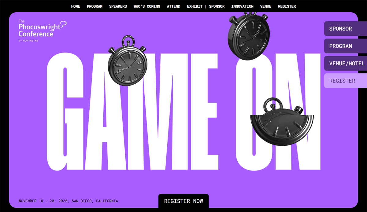
1. Phocuswright Conference
Location: Fort Lauderdale, FL
Key Takeaways:
- Sleek and Modern Design: Utilizes a clean, visually appealing layout with strong branding.
- Customizable Event Schedule: Attendees can filter by track and speaker for personalized schedules.
- Responsive Design: Fully optimized for mobile devices, making it easy to navigate the conference website on any device.
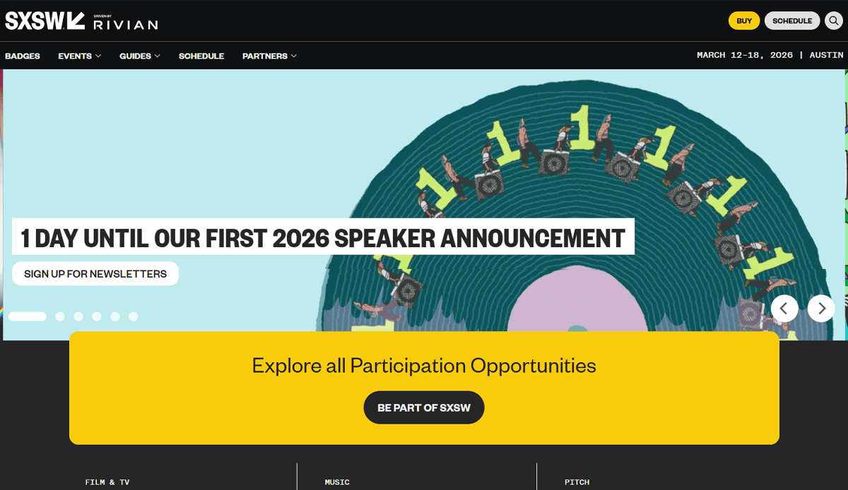
2. SXSW Conference
Location: Austin, TX
Key Takeaways:
- Immersive User Experience: High-quality video backgrounds engage users and set the event’s tone.
- Detailed Speaker and Session Info: Comprehensive bios and session descriptions make it easy to engage with content.
- Interactive Map: Event map for easy navigation through different conference venues and sessions.
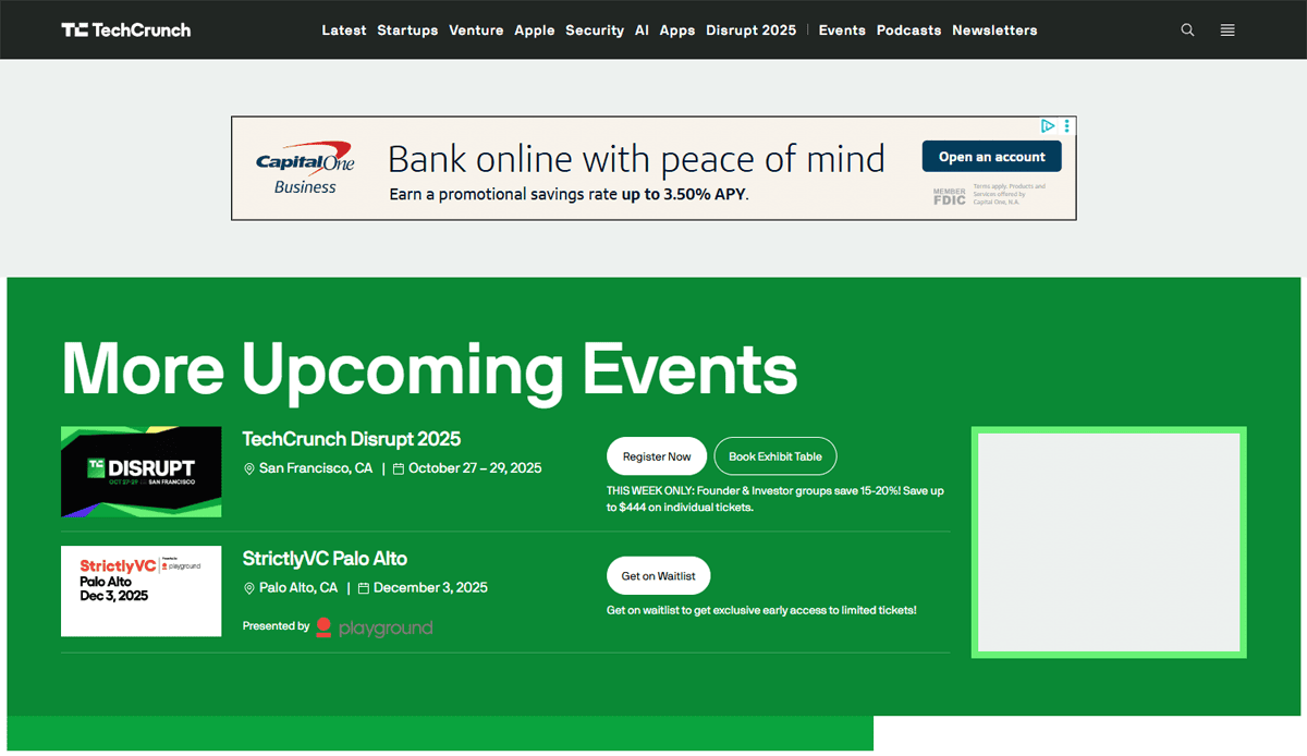
3. TechCrunch Disrupt
Location: San Francisco, CA
Key Takeaways:
- Interactive Speaker Session Listings: Allows users to click on session titles to view details instantly.
- Clean and Simple Design: Focuses on functionality with minimal distractions.
- Social Media Integration: Displays live feeds from Twitter and other platforms, ensuring constant event engagement.
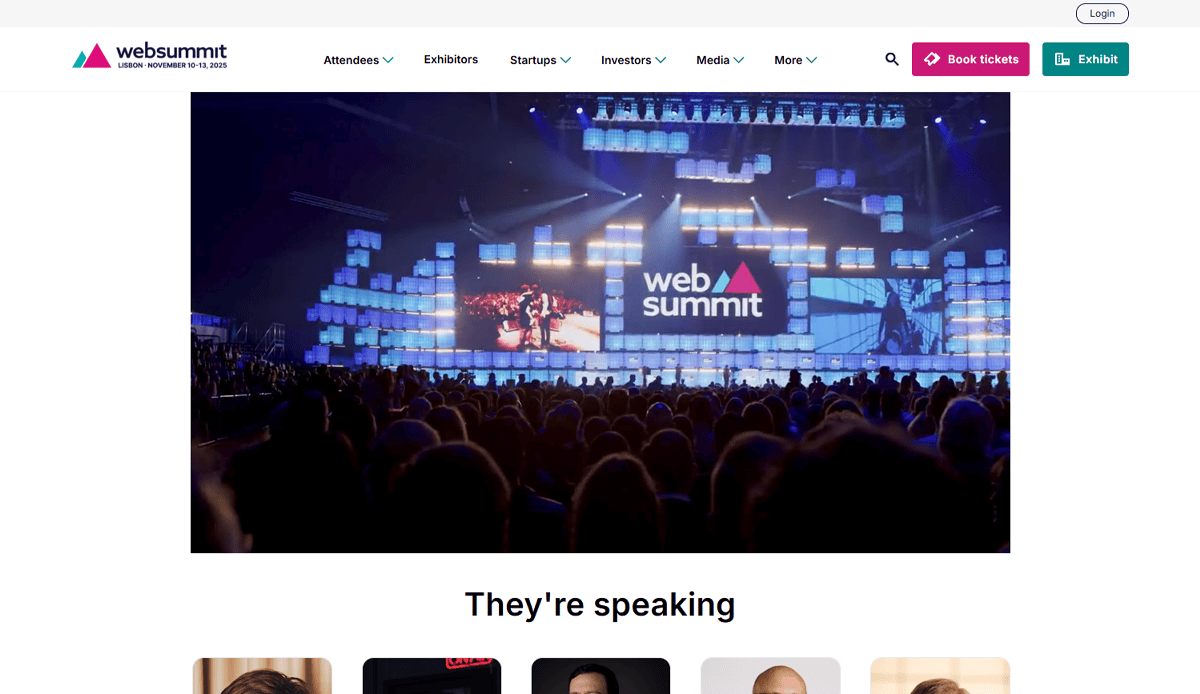
4. Web Summit
Location: Lisbon, Portugal (US page)
Key Takeaways:
- Engaging Visuals: High-quality images and a large video section feature keynote speakers and event highlights.
- Track Filter for Sessions: A user-friendly filter allows attendees to explore sessions by topics, speakers, and industries.
- Conference Registration Integration: Smooth process for purchasing tickets and completing registrations.
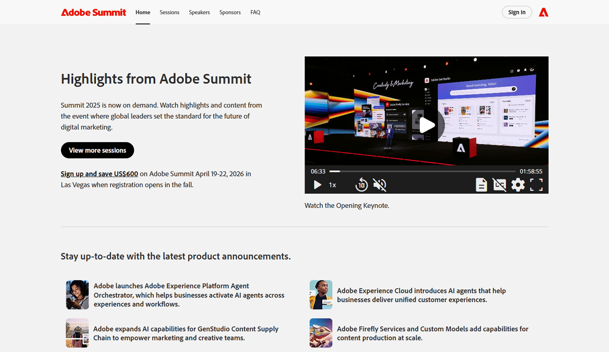
5. Adobe Summit
Location: Las Vegas, NV
Key Takeaways:
- Interactive Event Schedule: Allows users to filter sessions by topic and speaker for a personalized experience.
- Visually Stunning Design: Bold imagery and engaging video elements make the site dynamic and appealing.
- Clear and Concise Navigation: Key event information, including registration and agenda, is easily accessible from the homepage.
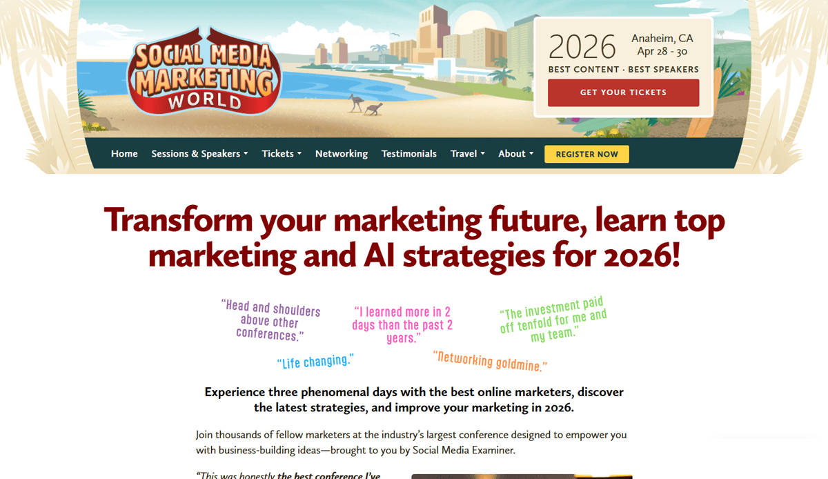
6. The Social Media Marketing World Conference
Location: San Diego, CA
Key Takeaways:
- Focused on User Engagement: Features an easy-to-navigate event schedule and options to track favorite sessions.
- Social Media Integration: Highlights live social media posts from attendees and speakers.
- Prominent CTAs: Clearly visible register nowbuttons encourage immediate action from visitors.
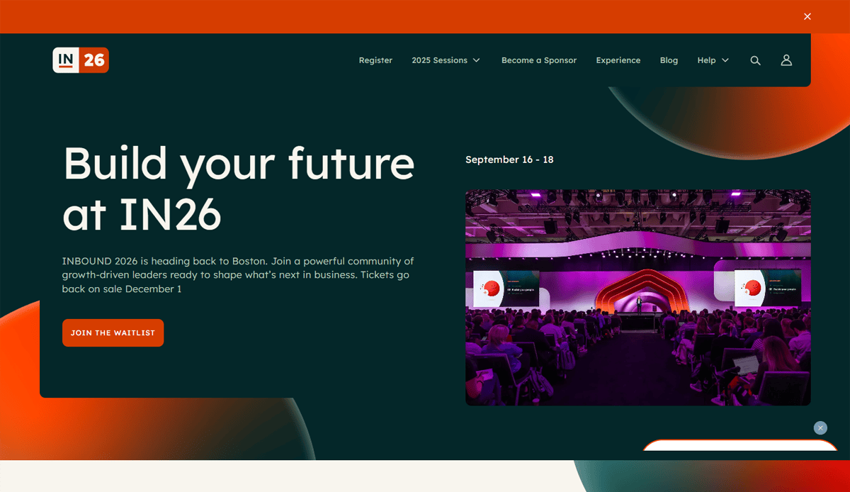
7. Inbound by HubSpot
Location: Boston, MA
Key Takeaways:
- Personalized Experience: Attendees can select sessions and speakers they’re most interested in.
- User-Centered Navigation: The navigation is simple, allowing users to quickly access event schedules and content.
- Visually Rich Design: The site features high-quality images and graphics that enhance the user experience.
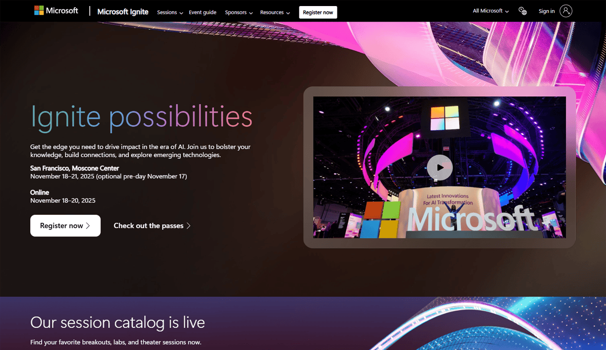
8. Microsoft Ignite
Location: Orlando, FL
Key Takeaways:
- Detailed Session Descriptions: Provides in-depth information about each session and speaker.
- Mobile-Friendly: Fully responsive design ensures the site is optimized for all devices.
- Comprehensive Conference Information: Includes everything from logistics to session tracks and networking opportunities.
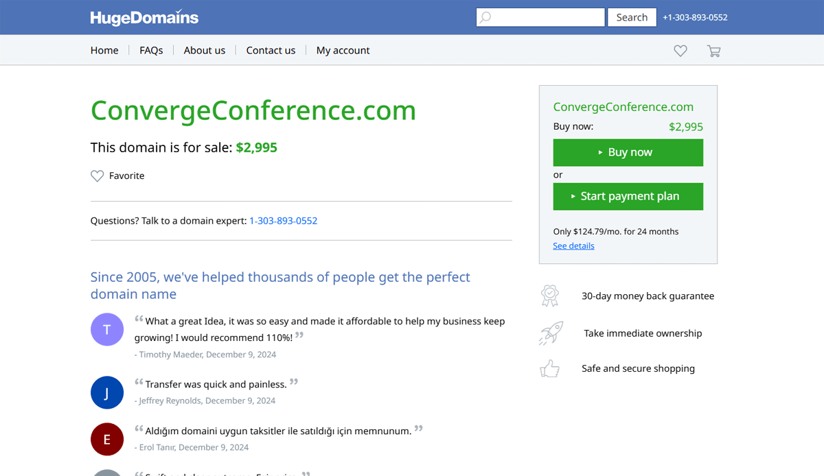
9. Converge Conference
Location: Austin, TX
Key Takeaways:
- Personalized Event Experience: A unique event schedule tailored to user interests.
- Sleek and Simple Design: Clean lines and whitespace create a modern, focused look.
- Focused Call to Action: Immediate registration and contact options.
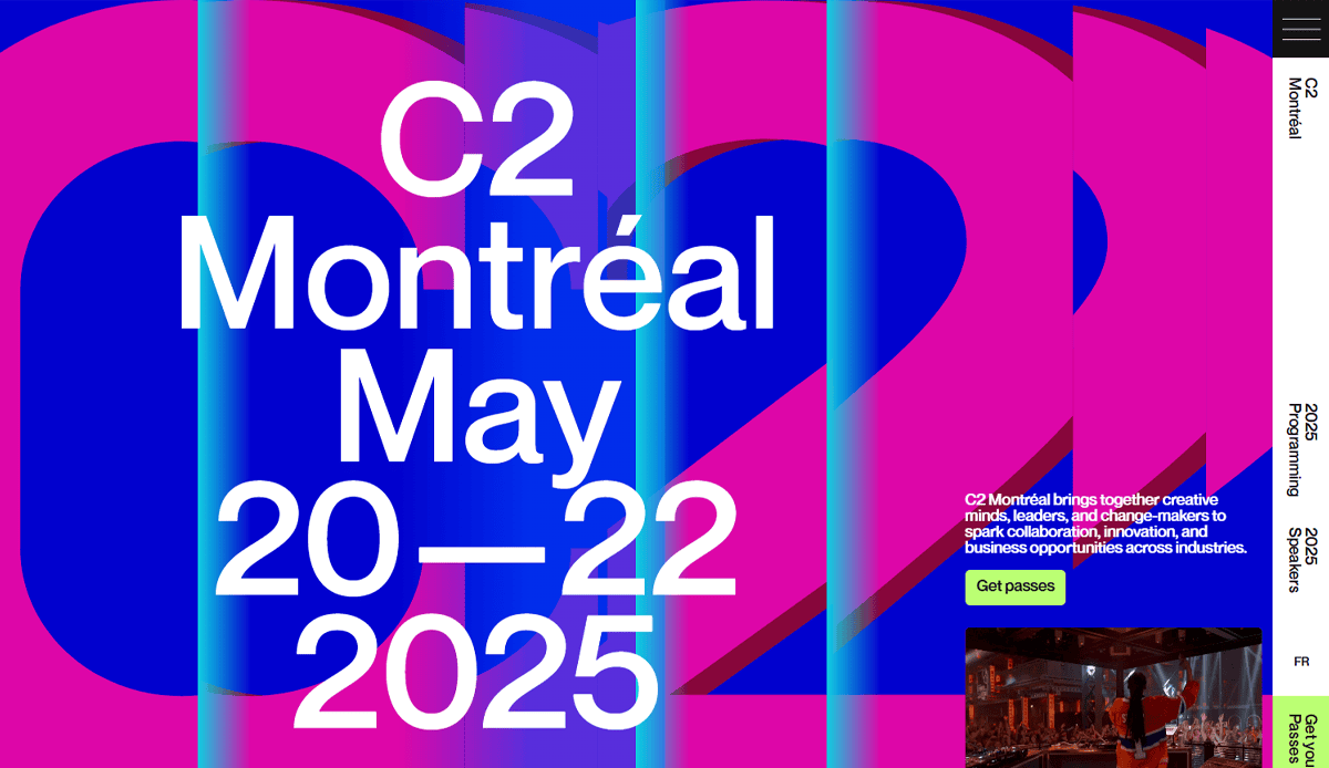
10. C2 Montreal
Location: Montreal, Canada
Key Takeaways:
- Interactive Event Planning: Users can filter events by themes and speakers.
- Immersive Video Backgrounds: High-quality visual media sets an engaging atmosphere.
- Clear Sponsorship Displays: Sponsors are highlighted prominently throughout the site.
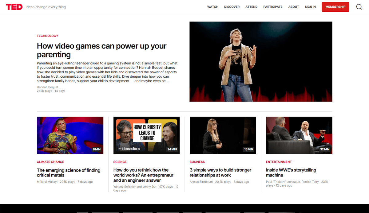
11. TEDx Conference
Location: New York, NY
Key Takeaways:
- Simple, Bold Design: Strong typography and minimalist layout focus attention on content.
- Live Streaming: Interactive livestreaming of key sessions increases accessibility.
- Social Media Integration: Direct links to social media platforms enhance visibility and engagement.
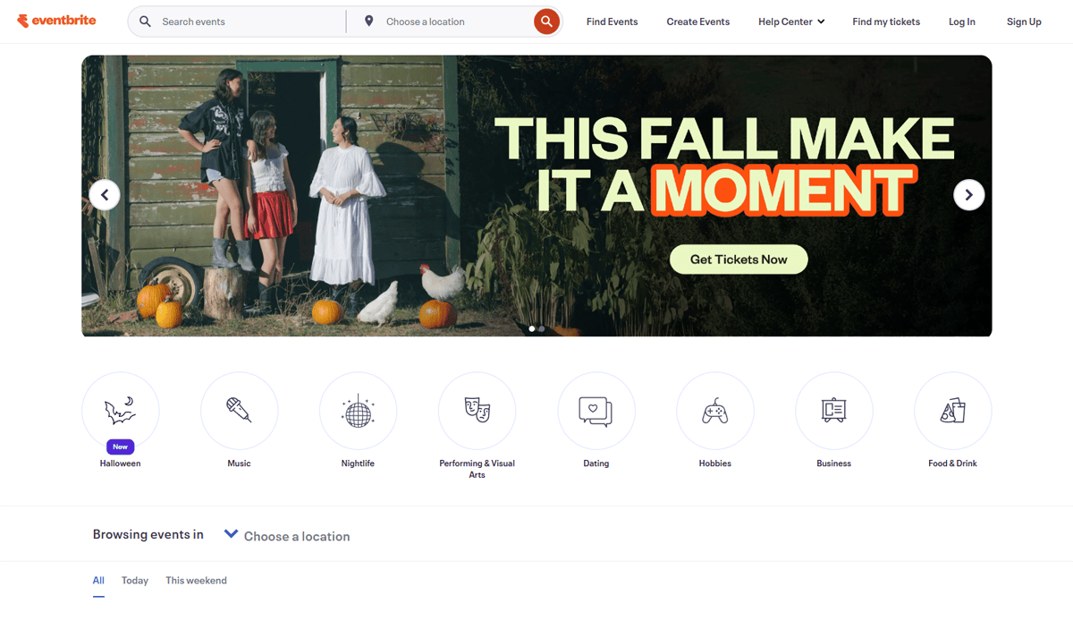
12. Eventbrite Conference
Location: San Francisco, CA
Key Takeaways:
- Streamlined Registration: Easy-to-use ticketing and event management system.
- Customizable Event Pages: Allows organizers to personalize their event page easily.
- Responsive Design: Fully optimized for mobile viewing and interactions.

13. Design Thinkers Conference
Location: Toronto, Canada
Key Takeaways:
- Visually Appealing Layout: Clean design with strong contrast for easy readability.
- Simplified Session Filtering: Attendees can easily filter through various events.
- Networking Opportunities: Promotes collaboration and networking through the website’s interactive platform.
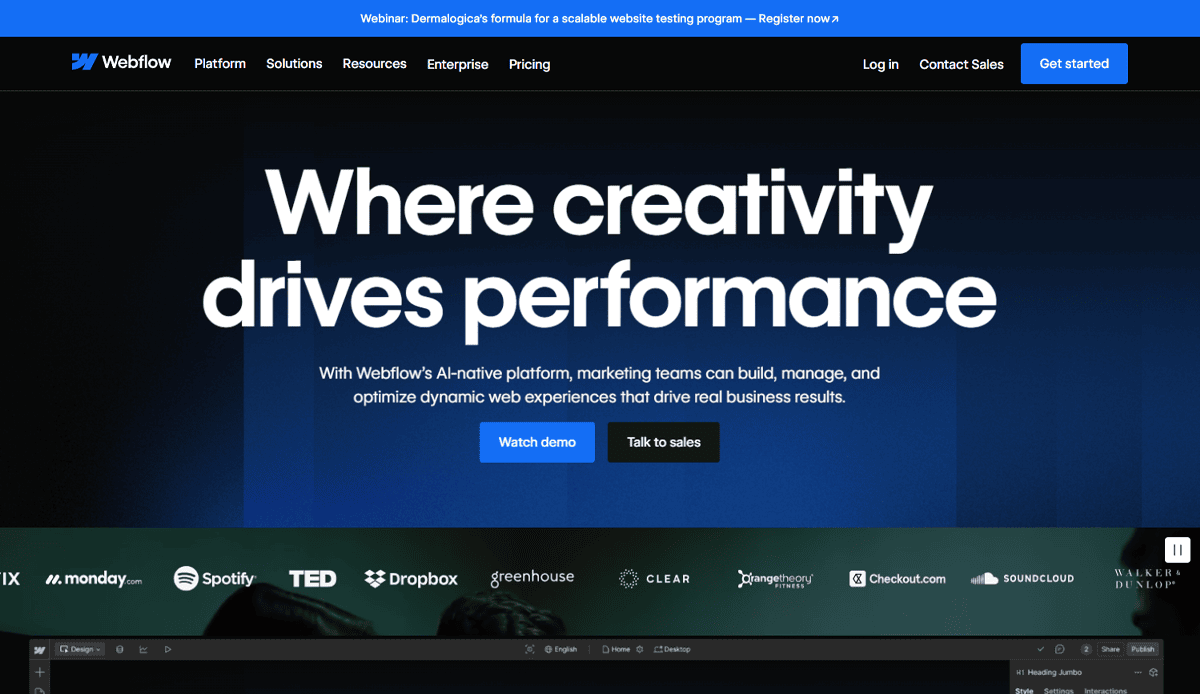
14. Webflow Conference
Location: San Francisco, CA
Key Takeaways:
- Integrated Community Forum: Encourages conversations and networking before and after the event.
- Customizable Conference Schedule: Users can customize and export their schedule for convenience.
- Clear Call to Action: Registration and sponsor callouts are immediately visible.
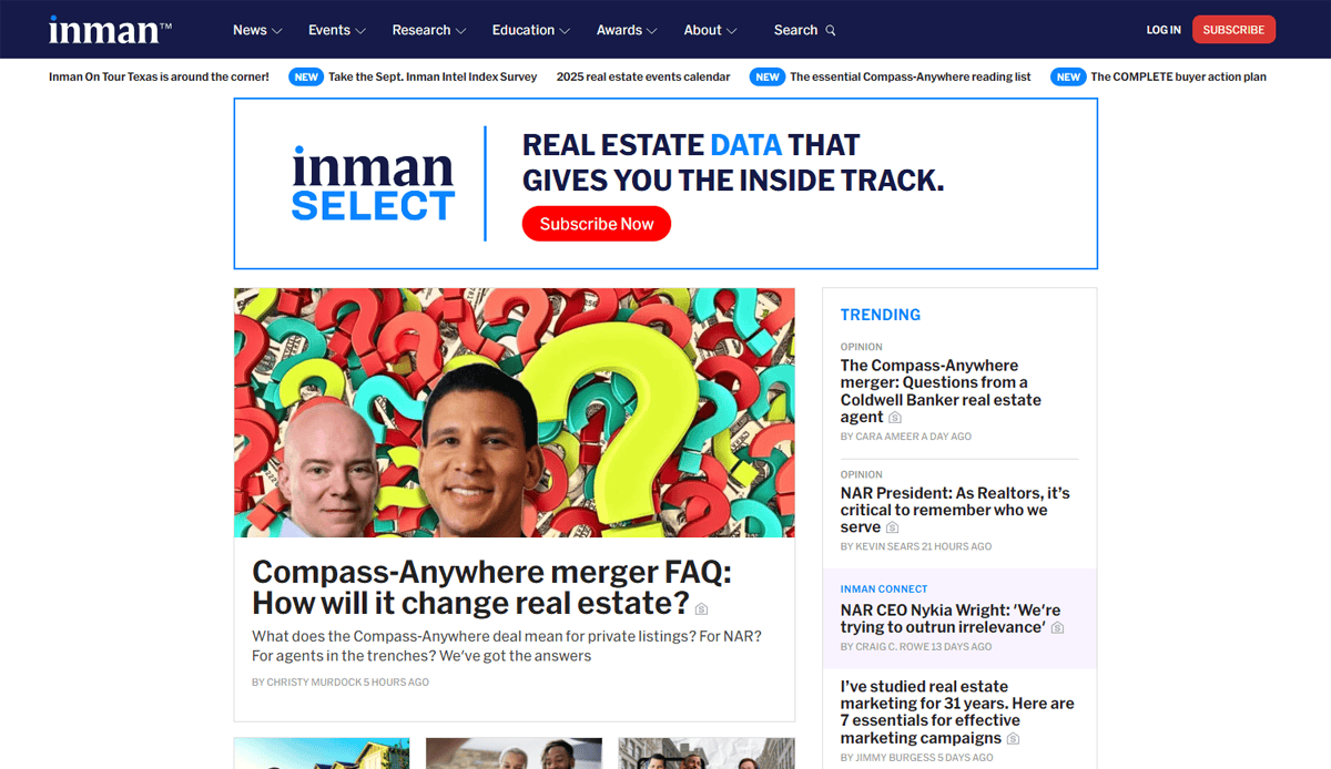
15. Inman Connect
Location: New York, NY
Key Takeaways:
- User-Centric Interface: Easy-to-navigate event schedule with color-coded sessions.
- Real-Time Updates: Provides real-time notifications for changes or additions to the schedule.
- Registration Made Simple: One-click sign-up option integrated with all event content.
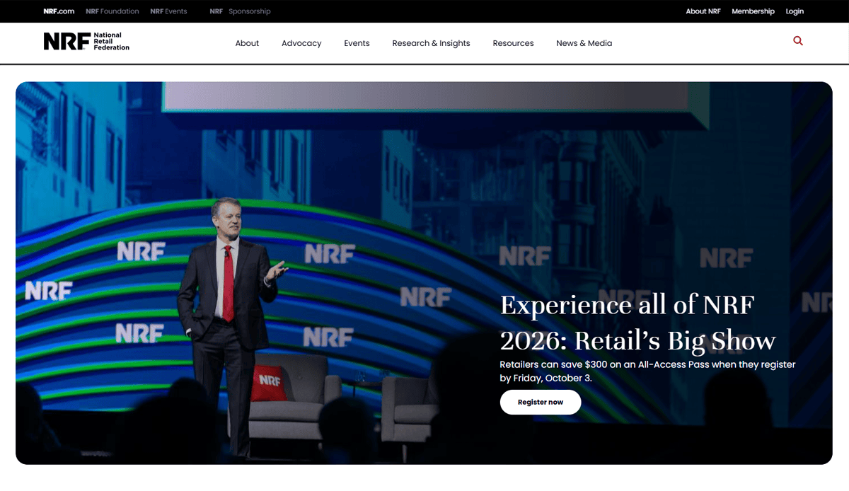
16. National Retail Federation Conference
Location: New York, NY
Key Takeaways:
- Clear Conference Goals: The website directly communicates event themes and objectives.
- Easy Access to Speaker Details: Speaker bios and session links are well-integrated.
- Sponsor Highlights: Event sponsors are given clear visibility throughout the website.
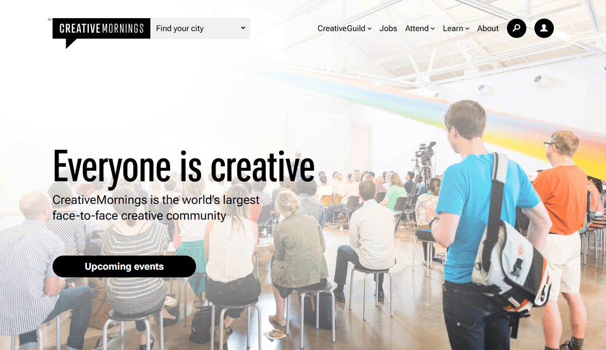
17. Creative Mornings Conference
Location: New York, NY
Key Takeaways:
- Simple Design: The use of vibrant images creates an exciting and inviting atmosphere.
- Strong Brand Identity: The website reflects the conference’s creative nature through dynamic design elements.
- Social Media Integration: Active integration of social media platforms directly on the site.
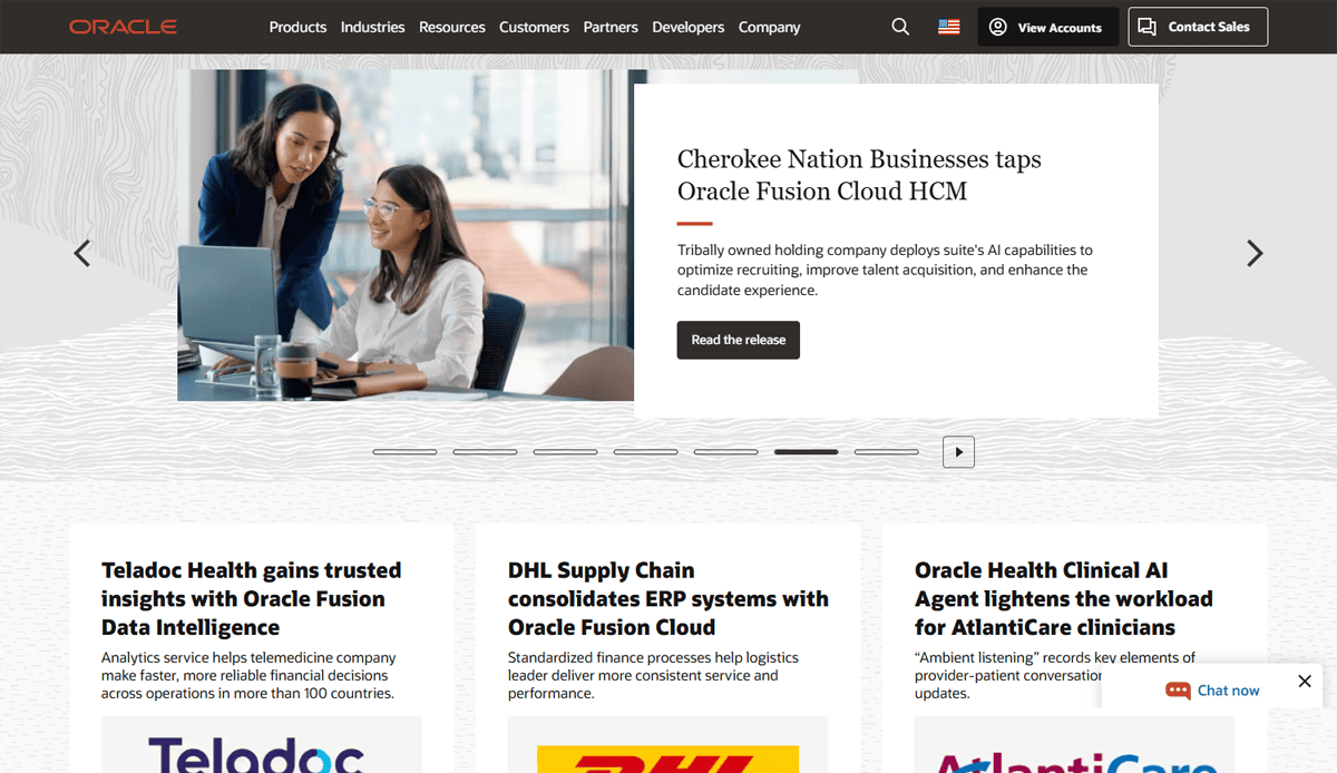
18. Oracle OpenWorld
Location: San Francisco, CA
Key Takeaways:
- Immersive Visuals: High-impact graphics that align with the innovative nature of the event.
- Interactive Sessions: Users can filter the event schedule by topic or speaker.
- Simple Registration: Direct and easy access to registration with minimal steps.
Take Action and Build Your Exceptional Conference Website
Now that you’ve explored the essential elements of website design, it’s time to take action and bring your vision to life. Whether you’re planning a corporate event, a design conference, or a creative design showcase, the right website is crucial for promoting your event and ensuring its success. A modern design that incorporates key features like a conference schedule, social media integration, and a visually appealing design will set your event apart from the rest.
Building a conference website from scratch or selecting the right website builder can be a daunting task, but following the guide to building an effective conference site will make it easier to connect with attendees and achieve your event objectives. Remember, the overall design of your site should align with the tone and purpose of your event. By ensuring that your website is mobile-friendly, easy to navigate, and has essential features like registration forms and session details, you can create an exceptional conference website that enhances the success of your event.
If you’re ready to take the next step in building a conference website that delivers results, our agency’s professionals are here to help. We specialize in website development and creating responsive sites that provide design with a focus on user experience. Get in touch with us to discover best practices and start planning your event planning success today.
Contact us for your custom conference website design.
Common Web Design Questions Answered for Conference Organizers
What are the essential design elements for a conference website?
The design elements of a website are crucial for ensuring both functionality and aesthetic appeal. Key elements include a clean design with easy-to-navigate menus, a responsive layout that adapts to mobile devices, and interactive features like a conference schedule and social media integration. A sleek and modern design can create an immersive experience that draws attendees in. To ensure your website aligns with the objectives of your event, consider your audience and the type of experience you want to offer. Minimalist design often works well for a professional feel, while a more vibrant approach might suit creative conferences.
For more tips on designing an effective website, check out our guide on the core principles of web design.
How do I create a website from scratch?
When planning a conference, creating a website from scratch requires a structured approach. Begin by selecting a website builder that fits your technical skills and budget. The website should have a clean design, with essential features like registration forms, event details, and interactive features such as session filters. It’s important to include key features like speaker bios, sponsor highlights, and social media feeds to create an engaging experience. Whether you choose a digital design template or start from the ground up, your website needs to be responsive and mobile-friendly to reach all potential attendees.
If you’re looking for inspiration, check out our post on how to choose a website builder.
What features should I include in my conference website?
A great website design should include social media links, a clear conference schedule, speaker profiles, and detailed event information. It’s also important to integrate easy-to-find registration options and live updates on event sessions. Other helpful features include a search function to help users navigate the site and CTA buttons that encourage conversions, such as signing up for newsletters or registering for sessions. As your website’s features include more functionality, ensure they are streamlined so visitors can easily engage with the site.
How do I choose a website builder for my conference site?
Choosing the right website builder is an essential step in creating your website. It should make it easy to manage the site, be scalable for future updates, and offer customizable templates to align with your event’s branding. Some website builders come with digital design templates tailored to website design, offering built-in features such as event registration, schedules, and session descriptions. For a sleek and modern design, you might prefer a builder that supports minimalist design, ensuring a professional and clean look.
If you need tips to help with choosing the right builder, check out our article on choosing a website builder for your next project.
How can I ensure your event website is effective?
To ensure your event website meets your goals, focus on the functionality and clarity of your website’s design. The website should align with the objectives of your event, offering easy access to event details, registration forms, and the conference schedule. By creating a responsive design, you can ensure that your website provides a seamless experience for all visitors, regardless of their device. Regularly updating content, checking for broken links, and testing features like session registration and speaker lists will keep the site functioning smoothly.
For guidance on maintaining and optimizing your site, take a look at our step-by-step guide to the web design process.
How do I create an immersive experience?
To create an immersive experience for visitors, your website should focus on engaging content and dynamic design. Use sleek and modern design elements, such as interactive session schedules, videos from past events, and live updates. Design elements like scrolling banners, background images, and transitions can add a professional touch. Consider adding social media feeds that showcase real-time attendee reactions and event highlights. A visually appealing design can captivate visitors, but it’s the integration of engaging content and functionality that turns casual browsers into attendees.
If you’re looking for inspiration on how to create an interactive event website, check out our article on how to design a responsive website.
What are some tips to help improve my conference website design?
Here are some tips to help you refine your website design:
- Focus on simplicity—simple design helps guide users without overwhelming them.
- Prioritize mobile-friendliness, as many users will access the site from mobile devices.
- Incorporate a conference schedule that is easy to navigate and visually clear.
- Include a search bar to help attendees quickly find relevant sessions and speakers.
- Use minimalist design techniques to keep the website looking clean and professional.
For more detailed tips, refer to our guide to building a website that converts.
How can I increase website traffic for my conference?
To increase website traffic, consider integrating SEO strategies into your design. Optimize your site with keywords relevant to your event, such as “best event” or “conference website design.” Regularly update your site with fresh content, such as speaker announcements or new sponsors, to keep both users and search engines engaged. Additionally, include options for social media sharing so attendees can help promote the event by spreading the word to their networks. Ensuring your website is a great resource for information will also encourage return visits.