In an industry as dynamic and fast-paced as transportation, having a robust online presence is not just an option—it’s a necessity. The transportation sector is the backbone of global commerce, connecting people, goods, and services across vast distances. As such, a well-designed transportation website serves as the digital hub for your business, offering a seamless interface for customers to access services, track shipments, and get real-time updates.0
The digital age has transformed customer expectations, and the transportation industry is no exception. Clients are looking for quick, easy, and reliable solutions. A well-designed website can tarnish your brand’s reputation and result in lost business opportunities. On the other hand, a well-crafted transportation website design can elevate your brand, streamline operations, and secure a distinct advantage in an increasingly competitive landscape.
Investing in a high-quality website is akin to investing in a fleet of state-of-the-art vehicles. It’s an essential tool that drives your business forward, enhances customer experience, and ultimately impacts your bottom line. A meticulously crafted website can make all the difference in the transportation industry, where time is often equated with money.
Examples of the Best Transportation Website Designs
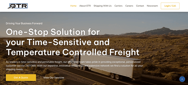
- OTR: The design is modern and engaging, using a mix of high-quality images and well-placed text to convey its message. The color palette is consistent and complements the overall branding. Slides on the homepage dynamically showcase their core services, adding a layer of interactivity that keeps the user engaged. The website is rich in content, providing comprehensive information about their services, from temperature-controlled freight to specialized shipments. One of the first things you’ll notice about its website is its clean, intuitive layout. The navigation is straightforward, with clearly labeled sections for “About OTR,” “Shipping With Us,” “Carriers,” and more. This makes it easy for visitors to find what they’re looking for: service details or contact information. The site also offers a “Get A Quote” button prominently displayed, streamlining the user journey from inquiry to conversion.

- Top Shelf Expediting: The site’s aesthetic is contemporary yet sophisticated, featuring a color palette that seamlessly integrates with the brand ethos. Focused on offering fast shipping services across multiple sectors, the website aims to tackle issues in the supply chain. Upon entry, users are greeted by a streamlined and well-arranged interface, simplifying site navigation. The menu is logically organized and segmented into categories. Exceptional imagery and neatly arranged text enhance the visual allure of the website, captivating the audience. A prominently positioned “Request A Quote Today” section is designed to engage users proactively.
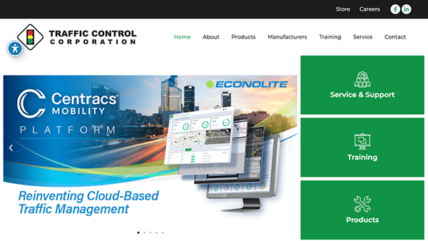
- Traffic Control Corporation: The visual design is modern and straightforward, employing a balanced color scheme that aligns well with the brand’s identity. The colors are consistent throughout the site, creating a cohesive visual experience that speaks to the brand’s reliability and professionalism. Dynamic sliders showcasing essential products and manufacturers infuse an interactive element into the homepage. The website is rich in content, offering detailed information on various traffic solutions and technologies. One of the site’s most noteworthy features is its accessibility tool, designed to personalize the user experience according to individual needs. This inclusion is more than just a usability enhancer; it’s a pivotal step toward making the platform accessible to a diverse audience, including those with disabilities.
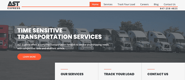
- AST Express: The website specializes in providing services for urgent transportation needs, achieving this with a remarkable blend of professionalism and a design that prioritizes the user. As you enter the site, you’re met with a well-organized interface that simplifies navigation. The strategic use of white space enhances readability, giving each content section room to stand out. Interactive design features, such as hover effects and fluid scrolling, add finesse to the user’s interaction with the site. The color palette is uniform and thoughtfully selected to instill a sense of trust and expertise. Accent colors are subtly applied to call-to-action buttons and links, directing the user’s focus toward essential actions.
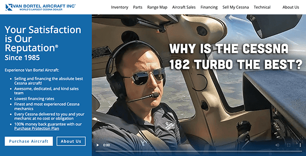
- Van Bortel Aircraft, Inc.: The website’s sleek and modern aesthetic features a harmonious blend of bright whites and vivid blues that resonate with the brand ethos. Dynamic sliders on the homepage spotlight essential products, enriching user interaction and engagement. As a leading hub for Cessna aircraft transactions and financing solutions, the platform impresses immediately with its uncluttered, systematic design. Additionally, it offers convenient access to financial resources and technical assistance, streamlining the customer’s path from initial interest to final acquisition.
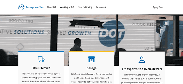
- Dot Transportation, Inc.: The website employs a professional color scheme that aligns well with the industry it represents. The use of blues and whites creates a sense of trust and reliability. The site is rich in content, providing everything from job benefits to employee testimonials. The website is straightforward to navigate, with quick links to essential sections. The site’s compelling visuals and dynamic animations effectively highlight Drive for DTI’s commitment to efficiency and innovation, making it a go-to platform for those exploring driving careers. Quick-access links to crucial sections like “Apply Now” and “Contact Us” streamline the user experience, enabling visitors to locate desired information quickly.
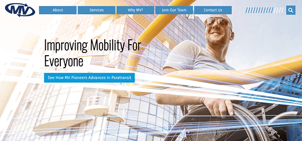
- MV Transit: The website stands as a comprehensive resource for transportation services, effectively blending a clean, professional design with a wealth of content. Its color palette, dominated by shades of blue and gray, not only resonates with the sector it represents but also instills a feeling of reliability. Navigation is intuitive, thanks to a systematically arranged menu and easily accessible links to key areas. Well-placed, persuasive call-to-action elements contribute to an optimized user journey across the site. The platform shines in its detailed presentation of various services, from specialized paratransit options to standard routes, and gains added trustworthiness through the inclusion of customer testimonials.
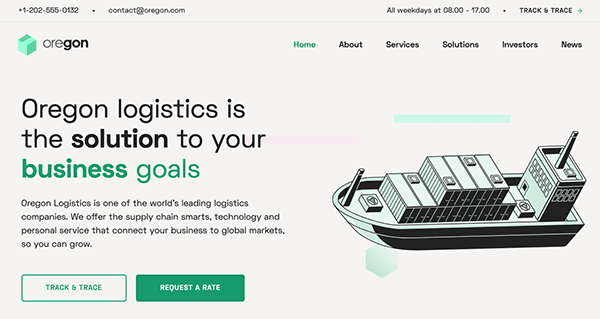
- Oregon: The website’s clean and professional design uses a straightforward layout that makes navigation easy. The color scheme is subtle yet effective, creating a sense of reliability and expertise. Using icons and graphics adds a visual element that complements the text, making the site more engaging. User interaction is facilitated by systematically arranged sections and well-marked action buttons. The platform stands out for its detailed presentation of services, ranging from air transport solutions to automotive logistics. Including customer testimonials lends authenticity, while investor-focused information highlights the company’s openness and dedication to stakeholder engagement. Key functionalities like “Track & Trace” and “Request a Rate” are easily accessible, serving as valuable resources for prospective clients.
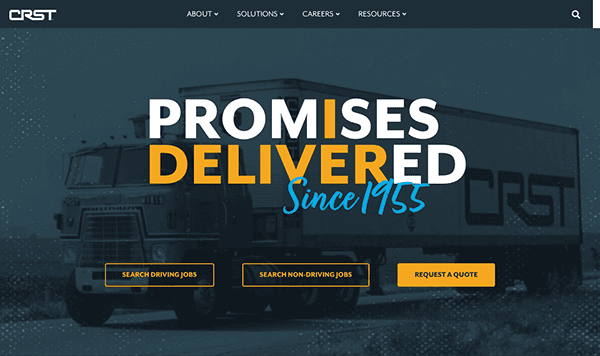
- CRST: The website displays a clean, professional design with an intuitive layout, making navigation effortless. The website is meticulously designed to cater to a diverse audience, including potential drivers, corporate partners, and logistics clients. It excels in providing a wealth of information about its various services, from dedicated to expedited solutions. The inclusion of awards and accolades lends additional trustworthiness to the platform. Visual elements like multimedia features and hover animations skillfully highlight the company’s offerings and know-how. The user’s interaction is elevated by systematically arranged content sections and well-labeled action buttons, thoughtfully positioned for convenient access.
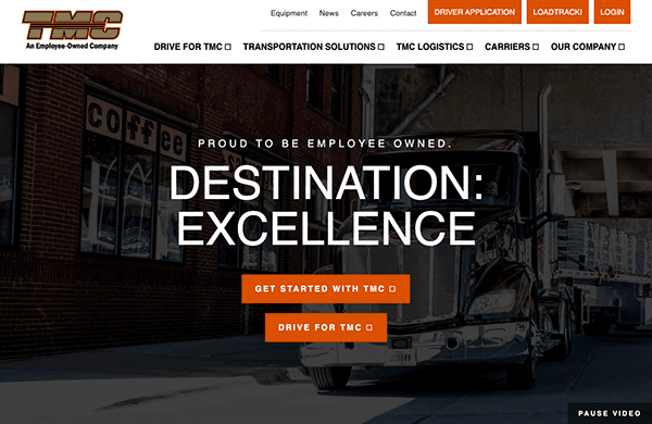
- TMC: The website features a sleek and professional design, combining functionality with visual appeal. Its intuitive layout simplifies navigation, allowing users to find what they need quickly. The color scheme, consisting of blacks, whites, and oranges, adds a touch of vibrancy while maintaining a professional tone, aligning well with the transportation sector. It offers in-depth information about its services and driver opportunities, catering to newcomers and seasoned trucking industry professionals. The website incorporates high-quality images, videos, and graphics that break up the text and add a layer of visual engagement.
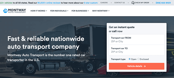
- Montway: As you land on the website, you’re immediately met with a modern and visually pleasing design, beautifully aligning with the company’s dedication to high-quality auto transport services. The dominant color scheme of rich blues and clean whites instills a feeling of trustworthiness and dependability, setting a welcoming tone for those needing vehicle shipping options. The site’s navigation is intuitive, facilitated by a logically organized menu and well-curated content. Users can effortlessly locate crucial details about the company’s diverse transportation offerings, team expertise, and valuable resources, all meticulously arranged to enhance the user experience. The “Get an instant quote” feature, strategically positioned on the homepage, adds a convenient element that invites user interaction.
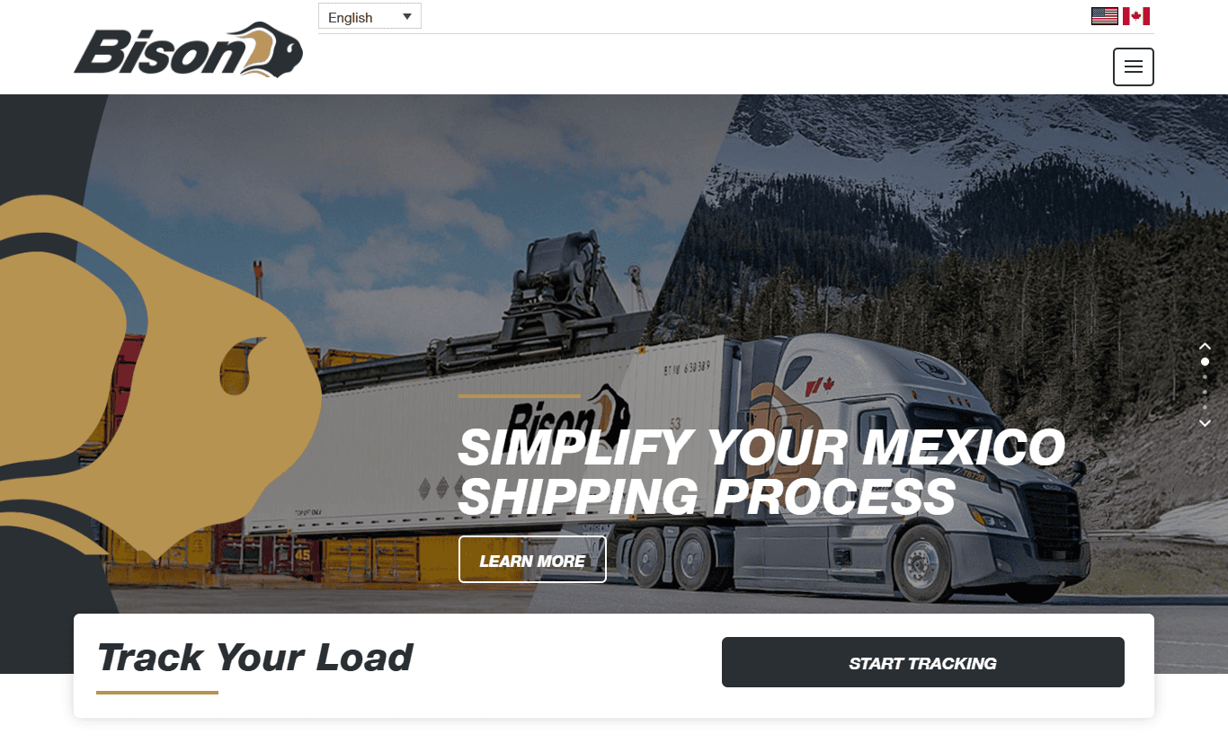
- Bison Transport: Its website delivers a clean, professional design that reflects the company’s strong presence in the North American transportation industry. The homepage features bold statistics and visuals that quickly build trust, such as fleet size and safety records. Navigation is user-friendly, with clearly defined sections for shippers, carriers, and career opportunities. The site includes a helpful “Track Your Load” feature and easy access to quote requests, enhancing functionality for clients. Its bilingual and mobile-responsive design ensures accessibility across regions and devices.
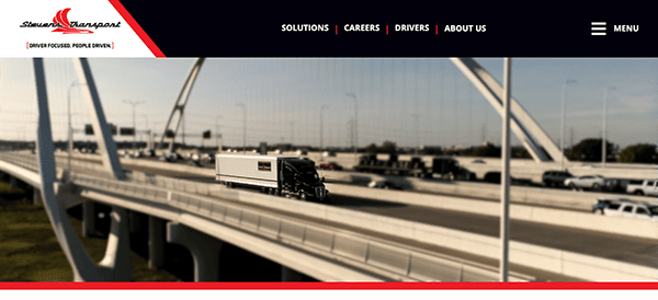
- Stevens Transport: Its website is an all-encompassing resource for temperature-controlled transportation services, effectively combining a clean, professional design with a wealth of informative content. Its layout is intuitively structured, facilitating effortless navigation for users exploring diverse transportation options, career paths, and opportunities for drivers. The fixed navigation menu, or sticky menu, elevates the user experience by offering uninterrupted access to crucial navigation choices, eliminating the need for users to scroll back to the top. Prominent sections such as “Transportation Solutions” and “Awards and Recognition” are thoughtfully positioned to impart key insights and bolster the company’s credibility.
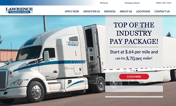
- Lawrence Transportation: Their website skillfully blends a clean, professional design with abundant valuable information. The site’s layout is intuitively organized, facilitating easy navigation for users interested in various transport solutions and career opportunities. Noteworthy design elements include the sticky menu and generous use of white space, which enhance user navigation without creating a cluttered experience. The site is rich in content, featuring detailed insights into its services, compensation packages, and perks, all reinforced by customer testimonials. This lends additional credibility to the site, enabling prospective drivers and clients to assess the company’s quality and reliability.
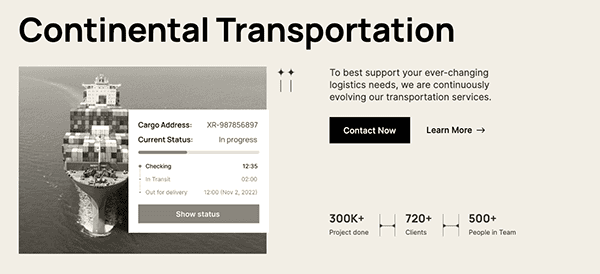
- Continental Transportation: The website employs a clean and uncluttered design that resonates well with its focus on the logistics industry. Its layout is intuitively organized, facilitating easy navigation for users exploring diverse shipping options. Key highlights of the site include neatly arranged sections such as “Our Special Services” and “World-Wide Shipping,” complemented by compelling statistics that add an extra layer of trustworthiness to the company. The site is designed for optimal responsiveness, providing a smooth user experience on multiple devices. It features a wealth of content, delivering in-depth information on various services, from packaging & storage to freight forwarding.
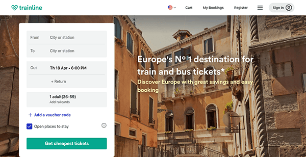
- Trainline: The website boasts a clean and straightforward design, essential for a platform that handles ticket bookings and travel planning. The search functionality is a standout element in its design is the search functionality; the search bar is strategically positioned at the top of the homepage, enabling users to enter their travel information effortlessly. The site utilizes a well-designed visual hierarchy that directs the user’s attention to key components, such as the search bar, special promotions, and customer testimonials. Additionally, the site includes a persuasive call-to-action (CTA) button labeled “Get cheapest tickets,” which is thoughtfully placed to navigate the user through the booking process, thereby enhancing conversion rates.
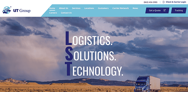
- LST Group LLC: The website’s sleek and minimalist design emanates professionalism. Its primary color scheme of white and blue conveys a sense of trustworthiness. The generous use of whitespace elevates both readability and aesthetics. A striking image and succinct tagline instantly captivate visitors in the hero section. High-quality images throughout the site enhance its visual appeal and effectively communicate the company’s expertise and approach. The strategically placed call-to-action (CTA) buttons entice users to delve deeper into the site.
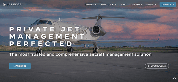
- Jet Edge: The website’s design oozes luxury, aligning perfectly with the high-end private jet industry. Using a dark color scheme with gold accents exudes opulence, immediately setting the tone for an exclusive experience. The navigation is intuitive and provides effortless access to essential sections. The website leverages striking, high-resolution images that beautifully showcase the private jet fleet and their lavish interiors. Video integration in the hero section creates an immersive experience, vividly bringing the private jet journey to life. Additionally, interactive elements like hover effects and subtle animations on buttons and links provide a delightful sense of engagement and interactivity. Furthermore, the website’s responsive design ensures that it maintains its allure and functionality on various mobile devices, catering to users on the go.
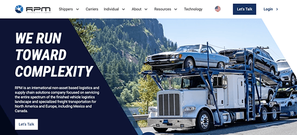
- RPM Moves: The website boasts a clean, modern design that immediately imparts a sense of professionalism and dedication. Its uncluttered layout guarantees that visitors can swiftly locate the information they seek. The color palette, characterized by serene blues and neutral shades, harmonizes with the moving industry’s image of reliability and trustworthiness. The navigation menu is straightforward and concise, facilitating access to vital sections. Incorporating client testimonials and certifications imparts an additional layer of trust and authenticity. Integrating web analytics tools empowers the company with valuable insights into user behavior, paving the way for data-driven website design and content enhancements.
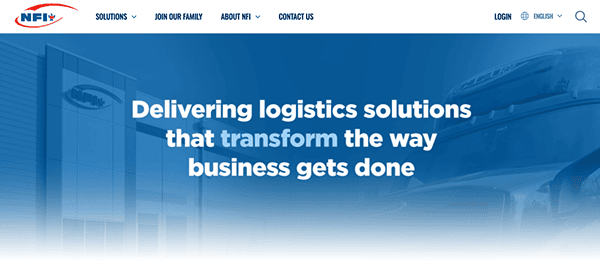
- NFI: The website radiates professionalism, establishing a firm and authoritative presence in the logistics and supply chain industry. Its sleek, contemporary design featuring a harmonious color palette crafts an initial impression that is captivating and dependable. Navigating the site is a breeze, credit to its user-friendly and instinctual setup. Utilizing high-resolution images, video content, and visuals effectively showcases the breadth of their services and the scope of their operations. The site is rich in content, providing comprehensive insights into the company’s heritage, mission, values, and various services since 1932. Interactive elements like button hover effects and animated links introduce an engaging layer, enhancing the overall user experience with interactivity and enjoyment.
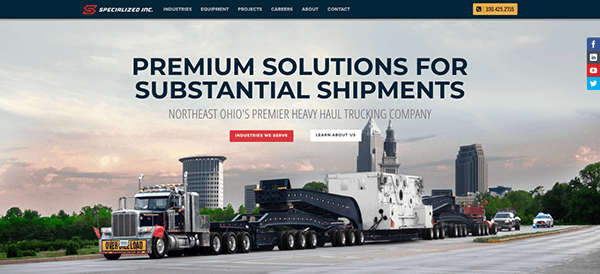
- Specialized Inc: The site exudes a clean, modern design that instantly establishes a sense of expertise and skillfulness. The selection of fonts contributes to the site’s visual appeal, with easily readable fonts for both titles and content text, reinforcing its professional appearance. Uniformity in brand representation is achieved through the strategic use of color schemes, logos, and visual components, all of which are complemented by user-friendly navigation. The project section offers tangible case studies of the organization’s capabilities, serving as compelling evidence of both their proficiency and the effectiveness of their offerings. The “Contact” segment furnishes a variety of communication channels, encompassing a contact form, phone number, and physical location.
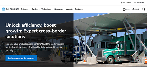
- C.H. Robinson: The website quickly grabs attention with its sleek, contemporary design that masterfully blends visual allure with practical features. Its uncluttered layout, carefully selected fonts for easy reading, and cohesive brand presentation through colors and visuals all contribute to a polished user experience. The site’s straightforward navigation directs users to extensive information, from air freight services to intricate supply chain solutions. Enhanced by the presence of authentic case studies and customer testimonials, the site gains added credibility while showcasing the company’s domain expertise. A well-rounded “Contact” section, offering multiple avenues for communication, simplifies user interaction with the enterprise.

Having examined some of the industry’s standout transportation website designs, it’s evident that a well-crafted online platform can be a game-changing asset for your business. These websites are not just visually appealing; they are engineered to offer functional features that simplify customer interactions. From easy-to-navigate menus to real-time shipment tracking, the most effective transportation websites are tailored to meet the specific challenges of this dynamic industry.
Creating such a high-caliber website requires a specialized skill set. It demands an in-depth understanding of the transportation and digital industries. This is where targeted expertise becomes invaluable. Whether you’re considering a website overhaul or starting from scratch, it’s imperative to collaborate with professionals who have a deep-rooted understanding of transportation website design.
Is it time to take your transportation business to the next level? Contact CyberOptik for a complimentary consultation about your transportation website needs. Our seasoned team is dedicated to providing customized solutions that go beyond meeting your expectations. Choose CyberOptik and invest in a website that genuinely accelerates your business.