Just looking for our Best Insurance Website examples list?
Why Insurance Website Design Is a Business Game-Changer
When someone lands on your website, you have seconds to capture their attention—or lose them to a competitor. That means that your site isn’t just a digital brochure; it’s a revenue-generating tool that can drive leads, build trust, and convert visitors into lifelong clients.
In the insurance industry, credibility and clarity are everything. A great website design ensures your message is understood, your business is trusted, and your services are easy to explore. From seamless navigation and clean visuals to on-brand messaging and mobile responsiveness, the design choices you make directly impact your bottom line.
This guide breaks down what makes an insurance website truly effective—from foundational design principles and SEO strategies to conversion techniques and inspiring examples. Whether you’re launching a new site or planning a redesign, this comprehensive resource will show you how to elevate your online presence and deliver real business results.
Website Planning & Purpose: Setting a Clear Direction From the Start
Before diving into visuals or content, the most successful websites begin with strategic planning. This phase sets the foundation for a site that looks good and performs effectively for your agency.
Every insurance business serves a unique clientele—from auto and life insurance brokers to niche commercial agencies. Understanding your target audience’s specific needs, behaviors, and decision-making processes is the first step in creating a tailored user journey.
During the planning stage, your team should define:
- Core Goals: Are you aiming to generate leads, educate visitors, or drive quote requests?
- Target Audiences: Consider their demographics, insurance needs, and what motivates them to choose a provider.
- Top Priorities: Do you need mobile responsiveness, client portals, or integrations with CRMs or quote tools?
- Success Metrics: Determine how you will measure success—conversion rate, form fills, session duration, or traffic sources.
Once these questions are answered, structure and content planning become much more intuitive. Clear calls-to-action, intuitive navigation, and personalized content will stem naturally from a purpose-driven blueprint. This alignment between business objectives and UX is what turns a brochure website into a lead-generation machine.
Design Principles: Building Blocks of an Effective Insurance Website
Designing a website requires more than aesthetics—it demands strategic thinking. Your design must serve both your visitors and your bottom line. Applying proven design principles ensures your site earns trust, simplifies navigation, and supports conversion goals.
Clarity and Readability
Use clear, legible fonts, adequate contrast between text and background, and sufficient white space to guide the user’s eye. Visitors should never struggle to read or locate key information like insurance offerings, testimonials, or CTAs.
Consistency Across Pages
Consistency in color schemes, typography, and layout builds company recognition and professionalism. Uniformity across service pages, the homepage, and contact forms reassures users they’re in the right place.
Mobile-First Design
With a significant portion of users browsing from smartphones, your site must adapt seamlessly to all screen sizes. Mobile-optimized menus, touch-friendly forms, and fast load times are essential for retaining traffic.
Visual Hierarchy
Arrange content to lead the visitor’s attention toward important actions, like “Get a Quote” or “Speak to an Agent.” Use size, color, and spacing to highlight key areas and guide the user journey.
Speed and Performance
A slow website can lose potential clients in seconds. Optimize images, streamline code, and leverage reliable hosting to deliver a fast, responsive experience.
Accessibility
Design for inclusivity by following ADA compliance guidelines. This includes using alt text, keyboard navigation, and accessible color contrasts to accommodate all users.
Together, these principles form a strong foundation for a website that isn’t just beautiful—it’s functional, reliable, and built to convert.
Content & Navigation: Structuring Your Site for Clarity and Engagement
Once your goals are clear and your design strategy is in place, the next priority is how you organize content and structure navigation. In the insurance industry, where clarity, trust, and simplicity are essential, smart content architecture is critical to conversion.
Prioritize User Intent
Your homepage should immediately answer the visitor’s core questions: What insurance services do you offer? Who do you serve? Why should they trust you? Place primary offerings like auto, life, or business insurance front and center with concise summaries and links to detailed service pages.
Clear, Predictable Navigation
A top navigation menu should include five to seven primary links: Home, About, Services, Resources, Testimonials, and Contact. Group dropdowns logically by audience type or insurance category. Make sure important CTAs like “Get a Quote” or “Call Now” are always visible—ideally as sticky buttons.
Create Content Hubs
Rather than scattering articles or service explanations across unrelated pages, organize them into content clusters. Group related blog posts, FAQs, and product descriptions to support SEO and help visitors navigate your offerings more easily.
Use Scannable Layouts
Break up content into short paragraphs, bullet points, and bold subheadings. Include icons and visuals to support important points. This formatting encourages engagement, especially for users skimming on mobile devices.
Localize When Relevant
If your agency serves specific regions, create dedicated pages for each city or state with localized keywords and contact info. This improves both UX and search engine visibility for local search queries.
Effective content and navigation help build trust, reduce bounce rates, and guide users naturally toward conversion. Your content should educate, reassure, and prompt action—every step of the way.
Visual Elements: Strengthening Brand Identity and Enhancing User Experience
Visual elements aren’t just decorative—they’re strategic tools that support branding, guide user behavior, and build trust with potential clients. In the competitive insurance industry, compelling visuals can make the difference between a site that converts and one that gets ignored.
Strong Brand Imagery
Use high-quality photography that reflects your audience and services. This includes relatable lifestyle images of families, professionals, and local landmarks that create an emotional connection. Avoid overused stock images that feel generic or impersonal.
Consistent Brand Aesthetics
Your visuals should align with your brand colors, logo, and overall tone. This consistency reinforces recognition and conveys professionalism. Use accent colors to draw attention to calls-to-action without overwhelming the layout.
Icons and Infographics
Icons help simplify complex insurance topics. Use custom iconography to represent services like auto, home, life, or business insurance. Infographics can be used to explain processes like claims or policy comparisons in a visual, easy-to-digest way.
Video Integration
Short videos—such as welcome messages from agents, explainer animations, or customer testimonials—add personality and build trust. Embedding video near service or quote pages can increase time-on-site and engagement.
Whitespace and Layout Balance
Don’t clutter your pages. Whitespace helps content breathe and improves readability. Strategic use of spacing makes key visuals and messages more impactful and easier to navigate.
Trust Badges and Certification Logos
Display affiliations with national associations, BBB accreditation, or security certifications prominently. These visuals enhance credibility and help visitors feel confident about sharing their information or purchasing policies.
When implemented with intent, visual elements amplify your brand’s message and make your site more intuitive and inviting. They transform your insurance website from a static page into a powerful conversion tool.
Ongoing WordPress Maintenance: Keeping Your Website Secure and High-Performing
A website built on WordPress requires consistent upkeep to stay secure, fast, and effective. Once the site is launched, ongoing maintenance ensures that it continues to deliver results and avoids costly disruptions.
Security Updates and Plugin Management
Outdated plugins and themes are common entry points for cyber threats. Routine updates to WP core files, themes, and plugins reduce vulnerabilities. A strong security plugin and regular malware scans help protect sensitive client data.
Performance Monitoring and Speed Optimization
Website speed impacts both UX and search rankings. Ongoing performance audits help maintain fast loading times. Compressing images, minimizing scripts, and leveraging caching tools contribute to smooth performance.
Backup Solutions and Recovery Plans
Reliable, automated backups prevent data loss during unexpected outages or technical issues. Storing backups off-site and testing recovery processes ensures business continuity even in worst-case scenarios.
Form Functionality and Lead Flow Testing
Insurance sites rely on lead generation through quote forms and contact pages. Monthly tests confirm that all forms submit correctly, email notifications function as expected, and CRM integrations remain intact.
Content and Compliance Reviews
Regulatory guidelines in the insurance sector can shift. Reviewing site content periodically ensures compliance, accuracy, and alignment with changing services. Keeping team bios, policy pages, and FAQs currently builds trust with returning visitors.
Analytics Tracking and Goal Adjustments
Maintenance includes evaluating analytics to track conversions, bounce rates, and traffic sources. Reviewing this data informs adjustments in content strategy, CTA placement, or page design to meet business goals better.
Regular WordPress maintenance isn’t optional— it’s a core part of ensuring your insurance website continues to serve its role as a high-converting, trustworthy digital platform.
How about some live industry examples?
Insurance Agency Website Design Examples to Inspire
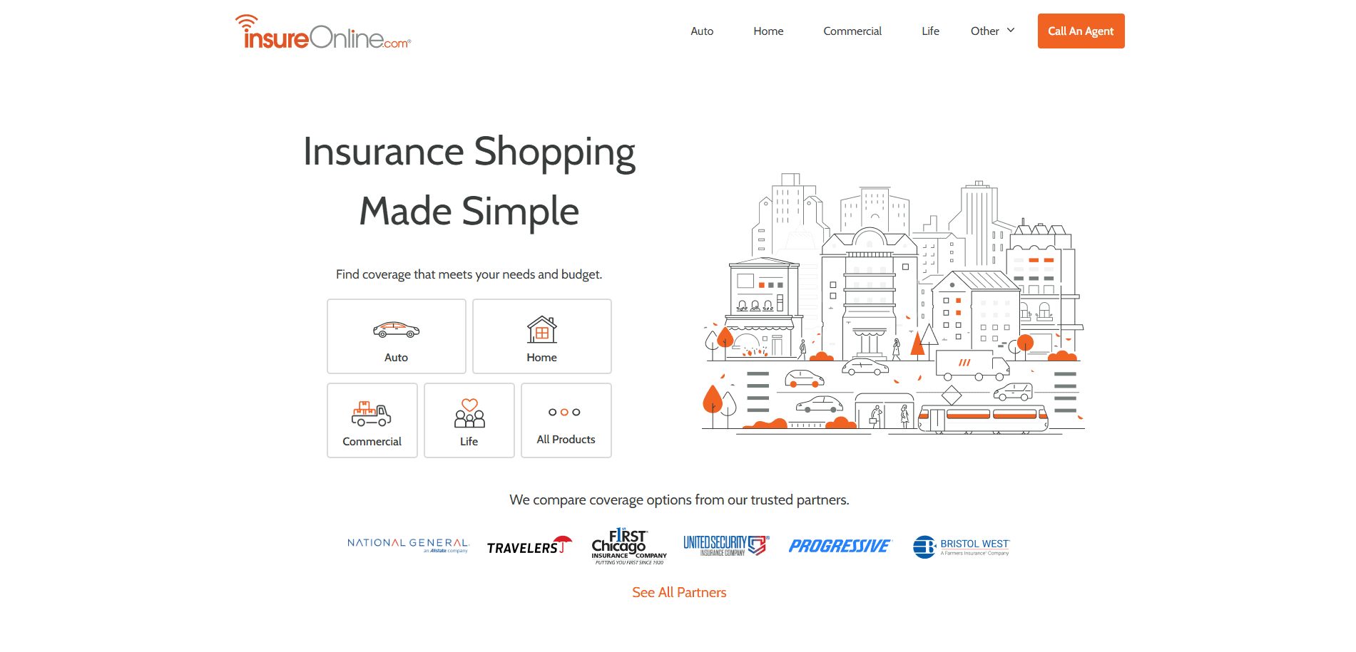
1. RogersGray Insurance – Kingston, MA
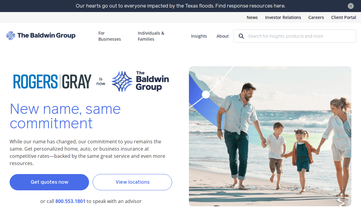
Key Takeaways:
- Clean navigation and bold CTAs
- Strong visuals and consistent layout
- Educational blog section for SEO
2. The Hartford – Hartford, CT
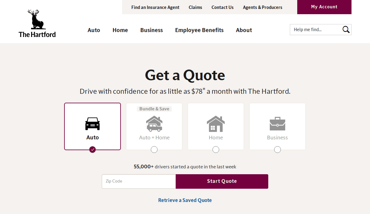
Key Takeaways:
- Clear segmentation by audience type
- Accessible navigation and policy info
- Strong commitment to customer satisfaction
3. Next Insurance – Palo Alto, CA
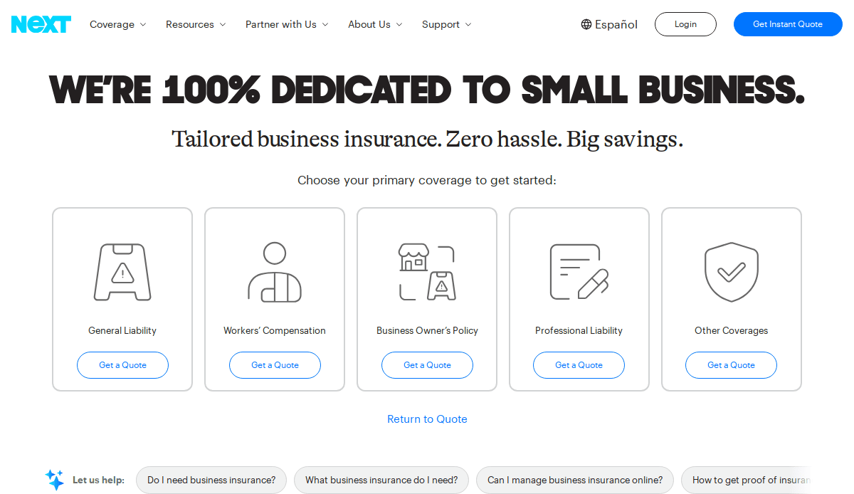
Key Takeaways:
- Crisp design with self-service tools
- Great use of animations and microinteractions
- Well-organized insurance products
4. Lemonade – New York, NY
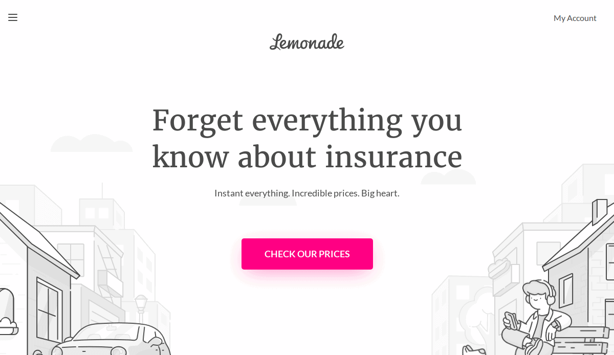
Key Takeaways:
- Bold visuals and interactive quote flow
- Distinctive branding and storytelling
- Customer testimonials and trust elements
5. Thimble – New York, NY
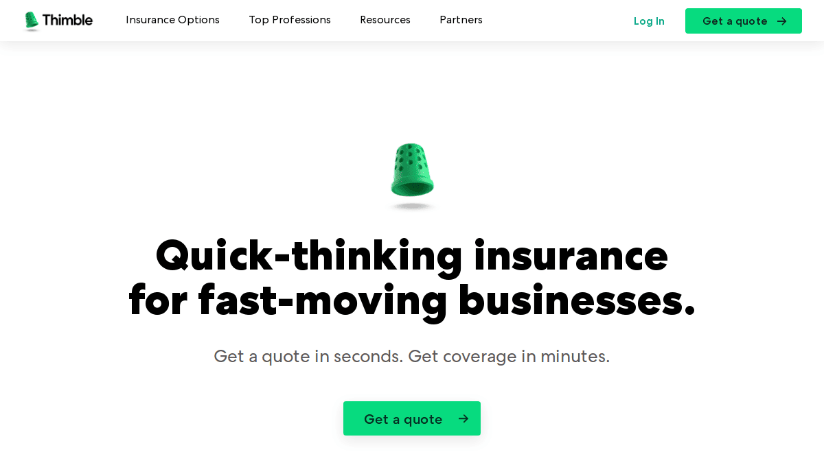
Key Takeaways:
- Friendly microcopy and illustrations
- Strong mobile optimization
- Clear path to getting a quote
6. CoverHound – San Francisco, CA
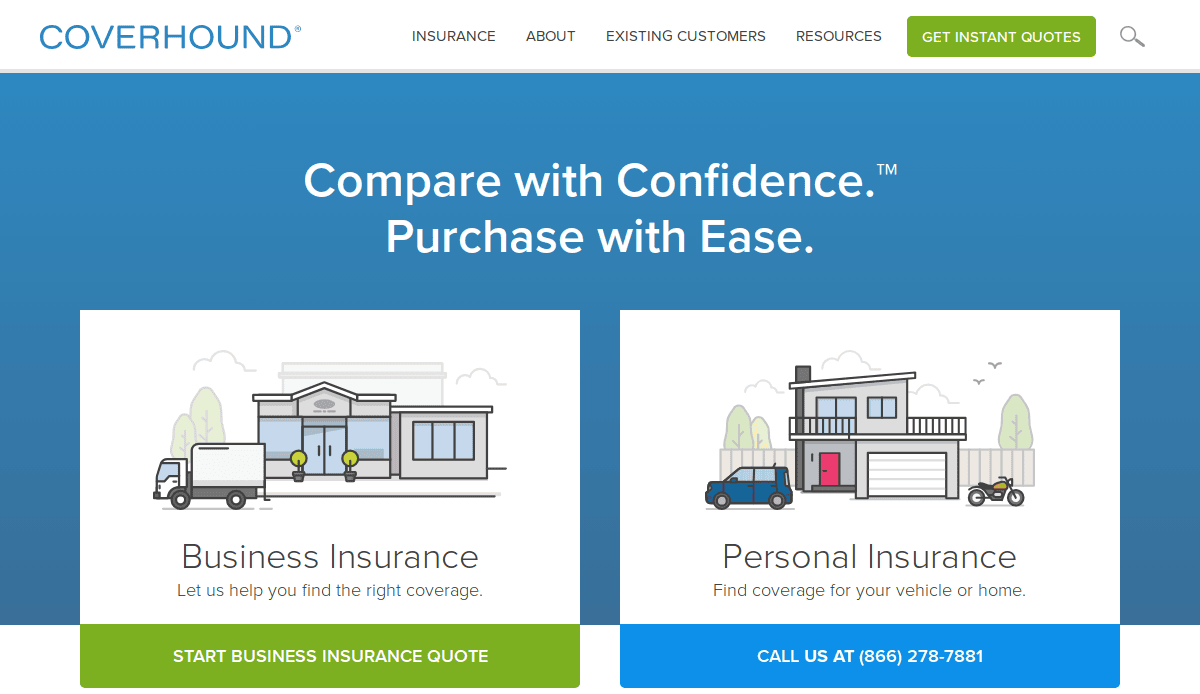
Key Takeaways:
- Strong CTAs at every step
- Product pages clearly differentiated
- SEO-friendly blog articles
7. Pie Insurance – Washington, DC
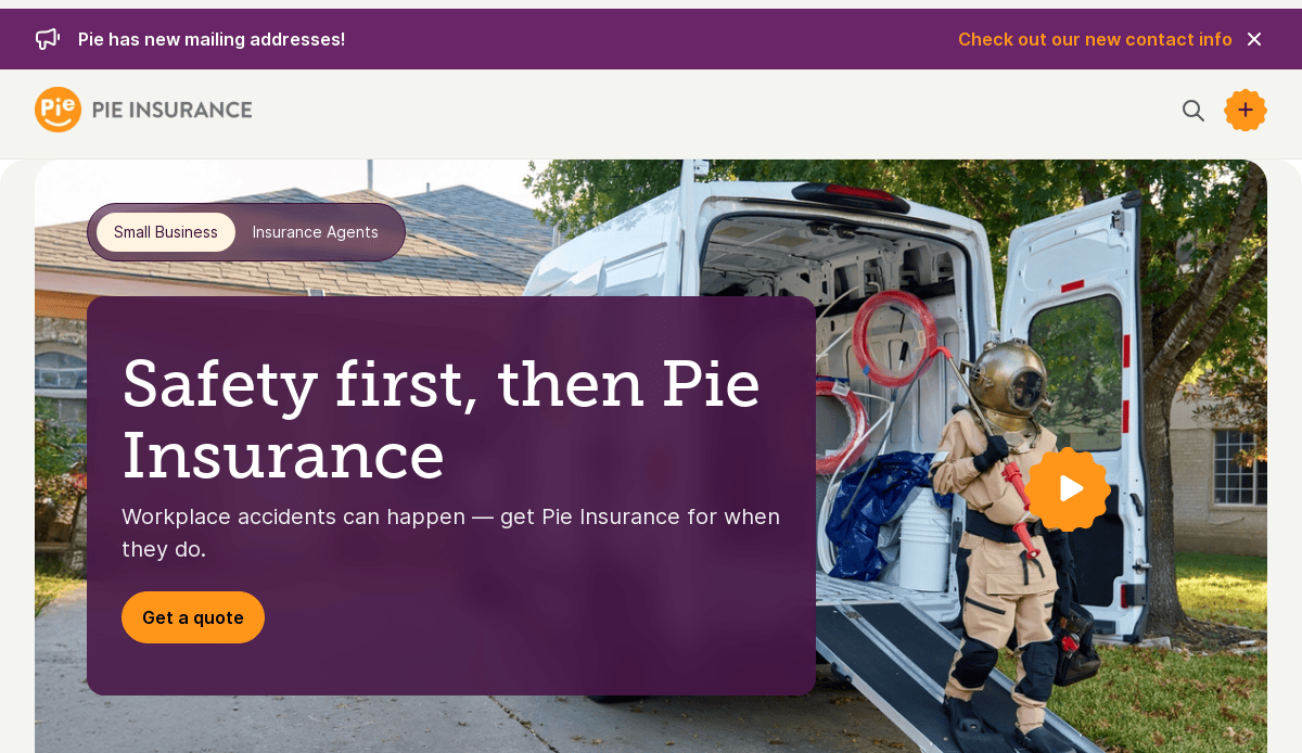
Key Takeaways:
- Data-driven visuals and messaging
- Seamless quote request funnel
- Clean layout and clear copy
8. Policygenius – New York, NY
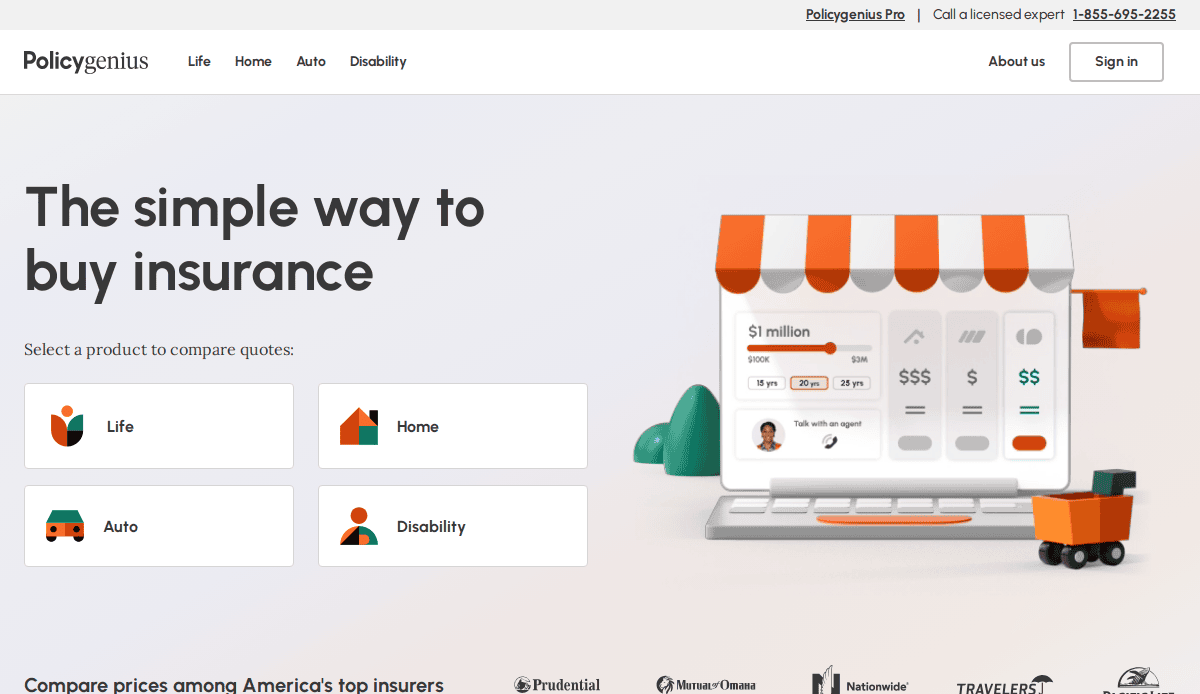
Key Takeaways:
- Excellent comparison tools
- FAQ-driven navigation to help website visitors
- Engaging layout built for trust
9. Branch Insurance – Columbus, OH
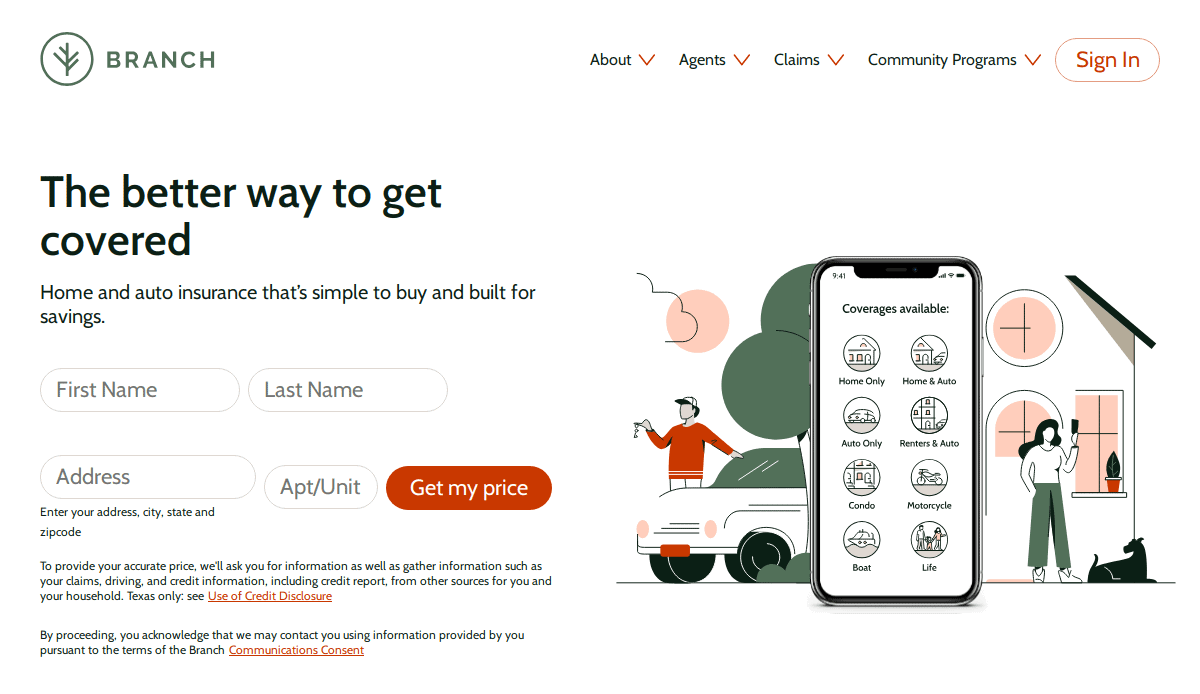
Key Takeaways:
- Transparent pricing and bundled options
- Personalized homepage based on location
- Friendly tone of voice throughout
10. Otto Insurance – Austin, TX
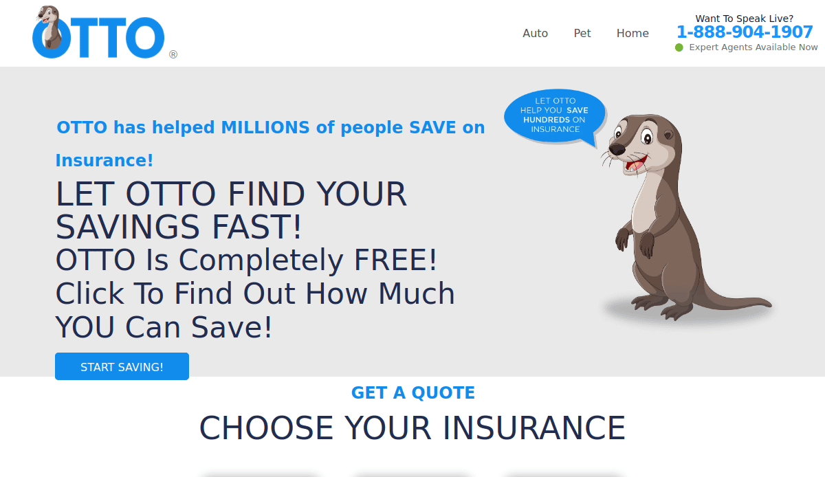
Key Takeaways:
- Engaging one-page scroll design
- Strong lead capture strategy
- User-focused layout
11. Insureon – Chicago, IL
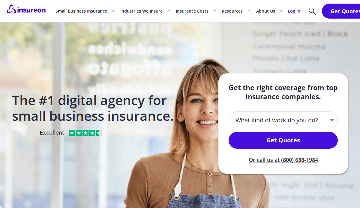
Key Takeaways:
- Expert-driven content across pages
- Simplified process for getting a quote
- Clean and informative homepage
12. Matic – Columbus, OH
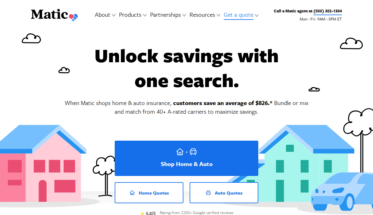
Key Takeaways:
- Mortgage integration made simple
- Straightforward value messaging
- Smooth quote request form
13. Brightway Insurance – Jacksonville, FL
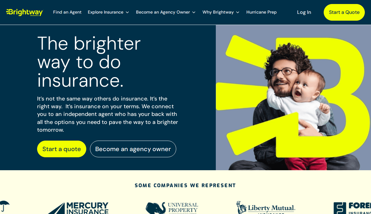
Key Takeaways:
- Well-branded location pages
- Comprehensive list of offerings
- Clear CTAs on every section
14. Embroker – San Francisco, CA
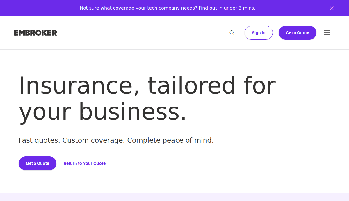
Key Takeaways:
- Visual storytelling for complex topics
- Streamlined business insurance flow
- Clean imagery and user interface
15. Central Insurance – Van Wert, OH
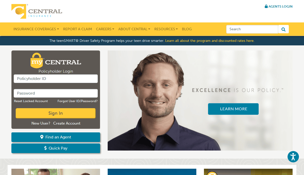
Key Takeaways:
- Classic visuals with a modern twist
- Easy-to-use customer service portal
- Clear policy breakdown for different segments
16. First Baldwin Insurance – Foley, AL 
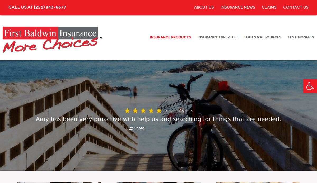
Key Takeaways:
- Informative homepage and navigation
- Community-focused branding
- High-contrast CTAs
17. Hallberg Insurance Network – Bedford Park, IL
Key Takeaways:
- Clean and professional UI
- Multiple quote request entry points
- Simplified product education
18. Hosfeld Insurance – Indianapolis, IN
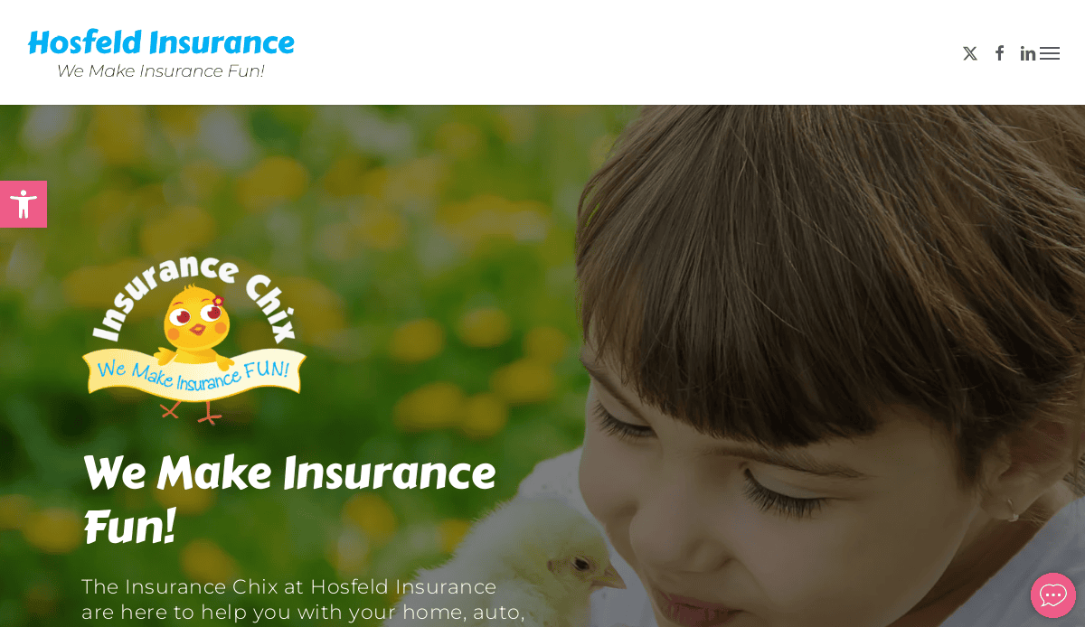
Key Takeaways:
- Friendly, inviting design
- Easy quote submission
- Comprehensive FAQ and resource sections
Take the Next Step Toward a Better Insurance Website
Every industry website should work just as hard as the agents and brokers behind it. Whether you’re looking to update your website, improve site visitors’ experience, or offer better access to your range of products, the right design can make all the difference.
From showcasing insurance products through well-organized product pages to integrating customer testimonials, modern websites for insurance agencies are built to deliver everything your agency needs. With a user-friendly layout, strategic call-to-action placements, and search engine optimization baked into the design process, your company website becomes a powerful tool to sell insurance and attract potential customers.
A custom website ensures effortless access to content, seamless customization options, and an experience built with the user in mind. It’s about giving your agency the best first impression and making it easy to manage updates across various insurance offerings—from auto insurance to niche services.
If you’re ready to create one of the best examples of active designs and ensure your websites are optimized to convert, get your agency started with our team of professionals today.
Common Design Questions for Insurance Industry Professionals
What makes a great industry website for agents and brokers?
A great insurance website includes clean navigation, responsive design, lead-generating features like “Get a Quote” buttons, and a clear presentation of services. It also showcases your commitment to customer satisfaction through reviews and testimonials, while following web design best practices.
Why is optimization important for sites in insurance?
Search engine optimization helps your site rank higher on search results, driving more targeted website visitors. For insurance agents, this means more local exposure and an increase in potential leads.
How can I make my website user-friendly and easy to manage?
Using a content management system like WordPress ensures your site is easy to update. Combine this with intuitive layouts, well-organized product pages, and streamlined navigation to make the experience smooth for both admins and site visitors.
What features should be included to boost customer satisfaction?
Live chat, fast loading times, responsive design, and clear CTAs are essential. Including educational blog articles and FAQs also helps build trust and keep website visitors engaged.
How often should I update my site?
Websites should be reviewed and updated at least quarterly to keep content fresh, reflect current insurance products, and maintain top performance. Updating your site also helps meet evolving design standards and optimization expectations.
Can an insurance website support Ecommerce or online policy sales?
Yes, Ecommerce functionality can be integrated for agencies offering direct-to-consumer insurance products. With the right tools, users can compare policies, read terms, and even initiate purchases, enhancing convenience for website visitors.
Should insurance agents use blog articles to attract traffic?
Absolutely. Regularly publishing blog articles improves your site’s SEO, educates your audience, and highlights your expertise. It also supports internal linking strategies that help engines crawl your content more efficiently.
What role do web designers play in the design process?
Professional web masters translate your agency’s goals into a compelling digital experience. They ensure that your branding, compliance needs, and lead generation tools are fully aligned with user expectations.
How do I ensure my site aligns with industry best practices?
Follow guidelines for accessibility, mobile optimization, fast loading, and intuitive user journeys. A site audit or working with specialists can help maintain alignment with these evolving standards.
What’s the best way to drive quote requests from site visitors?
Place “Get a Quote” buttons strategically throughout your website, especially on service pages and the homepage. Pair them with concise, benefit-driven copy and a simple form to reduce friction and encourage conversions.


