Just looking for our Best MSP Website examples list?
Key Takeaways:
- Prioritize User Experience (UX)
- Design intuitive navigation and ensure fast load times to enhance user engagement and reduce bounce rates.
- Implement Responsive Design
- Ensure your website is mobile-friendly to provide a seamless experience across all devices, which is crucial for both user satisfaction and SEO rankings.
- Optimize for Search Engines (SEO)
- Incorporate relevant keywords, meta descriptions, and structured data to improve visibility and attract targeted traffic to your managed service website.
- Highlight Clear Calls-to-Action (CTAs)
- Use compelling and strategically placed CTAs to guide visitors toward desired actions, such as contacting your team or requesting a quote.
- Showcase Client Testimonials and Case Studies
- Provide social proof by featuring testimonials and detailed case studies that demonstrate your expertise and successful client outcomes.
- Maintain Consistent Branding
- Use a cohesive color scheme, typography, and imagery that reflect your brand identity, building trust and recognition among visitors.
- Ensure Website Accessibility
- Design your website to be accessible to all users, including those with disabilities, by following best practices and compliance standards.
- Regularly Update Content
- Keep your website content fresh and relevant by regularly adding blog posts, updating service offerings, and sharing industry insights.
- Integrate Analytics Tools
- Utilize analytics to monitor user behavior, track conversions, and make data-driven decisions to continually improve your website’s performance.
- Secure Your Website
- Implement robust security measures, such as SSL certificates and regular updates, to protect your website and build trust with visitors.
Why Your Website Design is a Business Growth Engine
In the competitive world of managed services, your website is more than just a digital presence—it’s your most powerful marketing tool. A well-designed website doesn’t simply look good; it performs. It captures attention, communicates trust, and turns visitors into leads. Whether you’re aiming to attract new clients, showcase your services, or establish your authority in the industry, the design of your website directly influences your business outcomes.
Many managed service providers (MSPs) struggle with outdated or ineffective websites that fail to reflect their expertise or convert traffic. In a space where every impression counts, a subpar website can cost you opportunities. This guide will walk you through everything you need to know to create a high-performing website, from foundational design principles to advanced conversion strategies. If you want a website that does more than just exist—one that drives results—you’re in the right place.
Website Planning & Purpose
Before writing a single line of code or choosing a color palette, the success of a website begins with detailed planning. This phase lays the groundwork for a site that looks professional and performs at a high level. For managed service providers, where competition is fierce and the services offered can be complex, strategic planning ensures the final product aligns with business goals, speaks directly to the target audience, and differentiates your brand in the marketplace.
Start by defining clear objectives for your website. Are you focused on lead generation, educating potential clients, supporting existing customers, or establishing thought leadership? These goals will dictate the structure, design, and content strategy of your site. Next, understand your audience—business owners and decision-makers looking for reliable IT support. Know their pain points: unreliable tech, data security concerns, or lack of in-house expertise. Your website should anticipate and address these challenges with clarity.
A competitive analysis during the planning phase can also uncover gaps and opportunities. What are other MSPs doing well? Where are they falling short? Use these insights to shape your own approach, ensuring your site stands out with unique messaging, a clear value proposition, and superior usability. Consider future growth too. Your website should be scalable, flexible, and built on a content management system that allows for easy updates and expansion.
Effective planning in this phase sets the stage for everything that follows. With a clear purpose and solid strategy, your MSP website becomes more than just an online brochure—it becomes a core asset for attracting, engaging, and converting your ideal clients.
Design Principles
Strong design is the linchpin of any successful website. It sets the tone for how your business is perceived, plays a direct role in user engagement and lead generation. To achieve a professional, conversion-focused site, you must follow several key design principles tailored specifically for managed service providers.
First and foremost, simplicity and clarity are essential. Avoid cluttered layouts and instead use clean, structured designs that guide the user through your content. Each page should serve a clear purpose, and the design should support that purpose with minimal distraction. White space, logical content hierarchy, and concise copy all contribute to a clean, user-friendly interface.
Consistency is another foundational principle. Your branding—logo, color scheme, fonts, and imagery—must remain uniform throughout the site to build trust and recognition. This consistency extends beyond visuals to include tone of voice and messaging, reinforcing a cohesive brand identity that resonates with your target audience.
Navigation should be intuitive. Visitors should be able to find what they need quickly, without confusion or excessive clicks. Use a top navigation menu with clear labels, and consider including breadcrumb trails and a search function for larger sites. The goal is to reduce friction and keep users engaged.
Visual hierarchy is critical in directing attention to key elements like calls-to-action (CTAs), value propositions, and testimonials. Use contrast, size, and positioning to draw attention to what matters most. Every design element should serve the dual purpose of reinforcing your vision and guiding users toward a conversion.
Finally, ensure your site is responsive and mobile-optimized. More than half of website traffic now comes from mobile devices, and Google prioritizes mobile-friendly sites in search rankings. Your design must look and function seamlessly on screens of all sizes.
When these design principles are applied effectively, your MSP website looks professional and becomes a trusted, high-performing digital asset that supports your business goals and enhances user satisfaction.
Content & Navigation
The structure of your content and navigation can make or break the effectiveness of your website. For potential clients, clarity and ease of use are non-negotiable. A visitor should be able to land on your homepage and, within seconds, understand who you are, what you offer, and how to get in touch. Achieving this level of clarity requires a deliberate content and navigation strategy built around the needs of your users.
Start with the primary pages: Home, About, Services, Industries Served, Testimonials, Blog, and Contact. Each of these core pages should be easily accessible through your main navigation bar. The Home page should offer a concise, compelling overview of your value proposition, with links directing users deeper into your site. Your Services and Industries pages should be broken down by offering or vertical, each with dedicated subpages that highlight key benefits and capabilities.
Your navigation should be simple and logical, with no more than 5–7 main menu items. Dropdowns can help organize subcategories without overwhelming users. Always keep the end-user experience in mind: a clear path to critical information shortens the journey from curiosity to purchase. Make sure calls-to-action like “Schedule a Consultation” or “Get a Quote” are visible and consistent throughout the site.
When it comes to content, prioritize brevity and clarity. Use headings, bullet points, and short paragraphs to break up information. Incorporate relevant keywords naturally into your copy, particularly in H1 and H2 tags, for SEO effectiveness. Support your text with visuals—icons, images, infographics—that reinforce your vision without cluttering the design.
Finally, include conversion elements strategically across all pages: testimonial sliders, contact forms, downloadable resources, and exit-intent popups can all help move visitors closer to taking action. By building a site where navigation is intuitive and content is purpose-driven, you create an experience that keeps users engaged and nudges them toward becoming clients.
Visual Elements
Visual elements play a crucial role in enhancing the UX and reinforcing brand identity. In an industry built on trust, reliability, and technical expertise, your visuals must communicate professionalism and clarity without overwhelming the user.
Start with imagery. Use high-quality, relevant images that reflect the services you provide and the audience you serve. Photos of your team, real office environments, and behind-the-scenes shots of your operations build authenticity and trust. Avoid generic stock photos whenever possible, as they often lack impact and personalization.
Icons and illustrations can also be effective tools for explaining complex services and guiding the user through content. For MSPs, which often deal with abstract offerings like cybersecurity, data backup, or cloud solutions, clear and well-designed icons make the intangible more tangible. Use consistent styles and colors to align with your overall branding.
Color scheme plays a major role in setting the tone of your site. Stick to a defined palette that supports your brand identity—typically 2-3 primary colors with complementary accent tones. Use color to create contrast and highlight important elements like CTAs and headlines. Avoid overly bright or clashing hues that distract from your message.
Typography should be clean, readable, and consistent across the site. Limit yourself to two or three typefaces and maintain a clear hierarchy to guide users through content. Headings should stand out, and body text should be comfortable to read on both desktop and mobile screens.
Whitespace is often underutilized but incredibly powerful. By giving elements room to breathe, you reduce cognitive overload and help users focus on what matters most. Use spacing to separate sections, organize content, and create a clean, sophisticated layout.
Lastly, leverage video where appropriate. Short, engaging videos can introduce your team, explain key services, or highlight client success stories. Video helps humanize your brand and can significantly boost engagement when embedded thoughtfully.
When visual elements are used strategically, they create a polished, professional experience that makes visitors feel confident in your expertise. They transform a static site into a dynamic tool for storytelling, engagement, and sales.
Ongoing WordPress Maintenance
Once your website is live, ongoing maintenance is critical to ensure it continues to perform at peak levels. For WordPress sites, regular upkeep goes beyond content updates—it involves security monitoring, software updates, performance optimization, and more. Neglecting maintenance can result in downtime, vulnerabilities, and a poor UX, all of which can harm your brand and bottom line.
Security is a top priority. WordPress is a popular platform, which makes it a common target for cyber threats. Regular updates to the WordPress core, themes, and plugins help close security loopholes. Implementing a security plugin, enabling two-factor authentication, and using strong passwords can further safeguard your site. Daily backups are essential so your data can be restored quickly in the event of a breach or failure.
Performance optimization is another key aspect. Over time, websites can become bloated with unused plugins, oversized images, or outdated code. Regular audits can identify and resolve these issues, ensuring your site loads quickly and runs efficiently. Speed and uptime are critical for UX and search engine rankings.
Content updates also play a role in maintenance. Keeping your blog fresh with new posts, updating service descriptions, and refining landing pages helps keep your site relevant to both users and search engines. This also gives you opportunities to improve your SEO and increase visibility.
Lastly, monitoring and analytics are crucial. Use tools like Google Analytics and Google Search Console to track traffic, user behavior, and performance. These insights can guide ongoing improvements and ensure your site is delivering on its goals.
For MSPs, offering ongoing maintenance services can also be a value-added service for clients. Showcasing your own proactive care and technical reliability on your website demonstrates the standards clients can expect from your managed services.
A well-maintained website reflects a well-run business. Investing in routine WordPress maintenance ensures your site remains secure, fast, and effective, continuing to serve as a vital component of your digital strategy.
Best MSP Website Examples
1. Dedicated IT
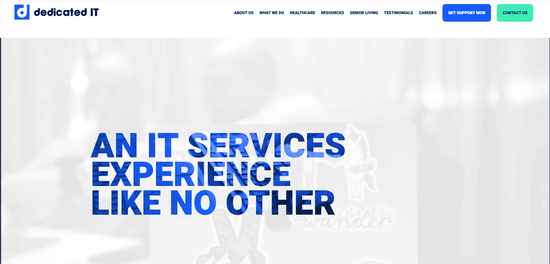
- Location: Palm Beach Gardens, FL
- Key Takeaways:
- Bold branding with energetic and emotional impact.
- High contrast visuals that convey confidence and capability.
- Design that creates an emotional connection with visitors.
2. CyberStreams
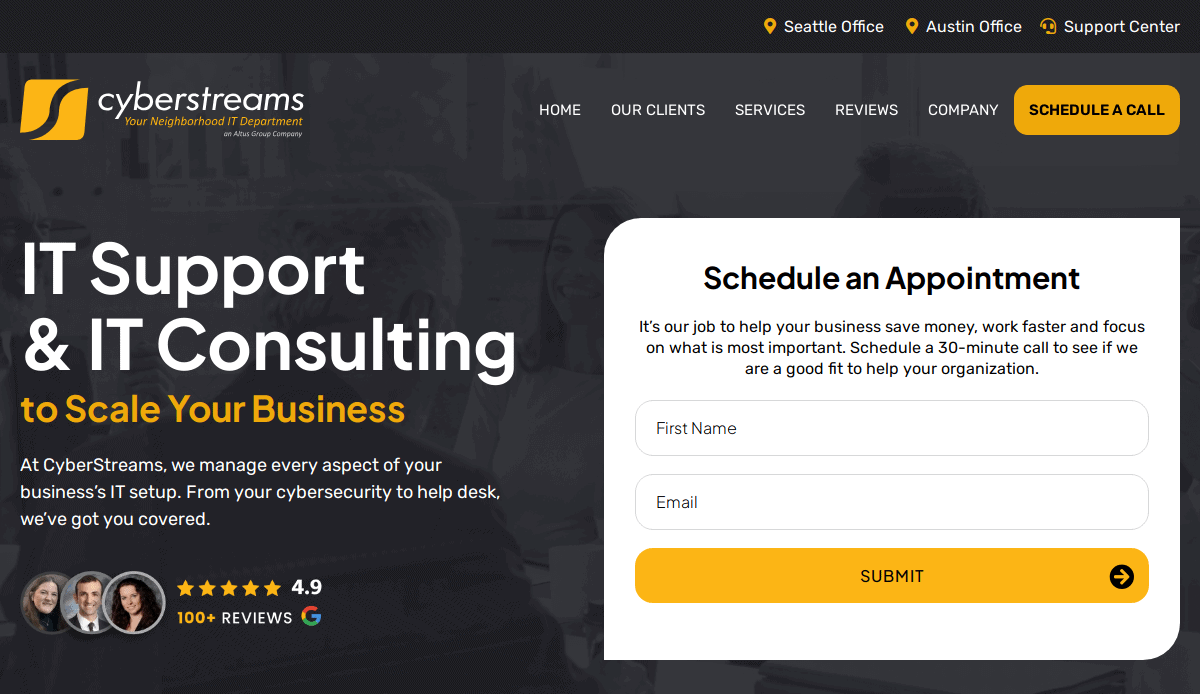
- Location: Seattle, WA
- Key Takeaways:
- Engaging content that showcases the company’s unique approach and values.
- User-friendly navigation enhances visitor experience.
- Professional visuals that build trust and credibility.
3. Ntiva
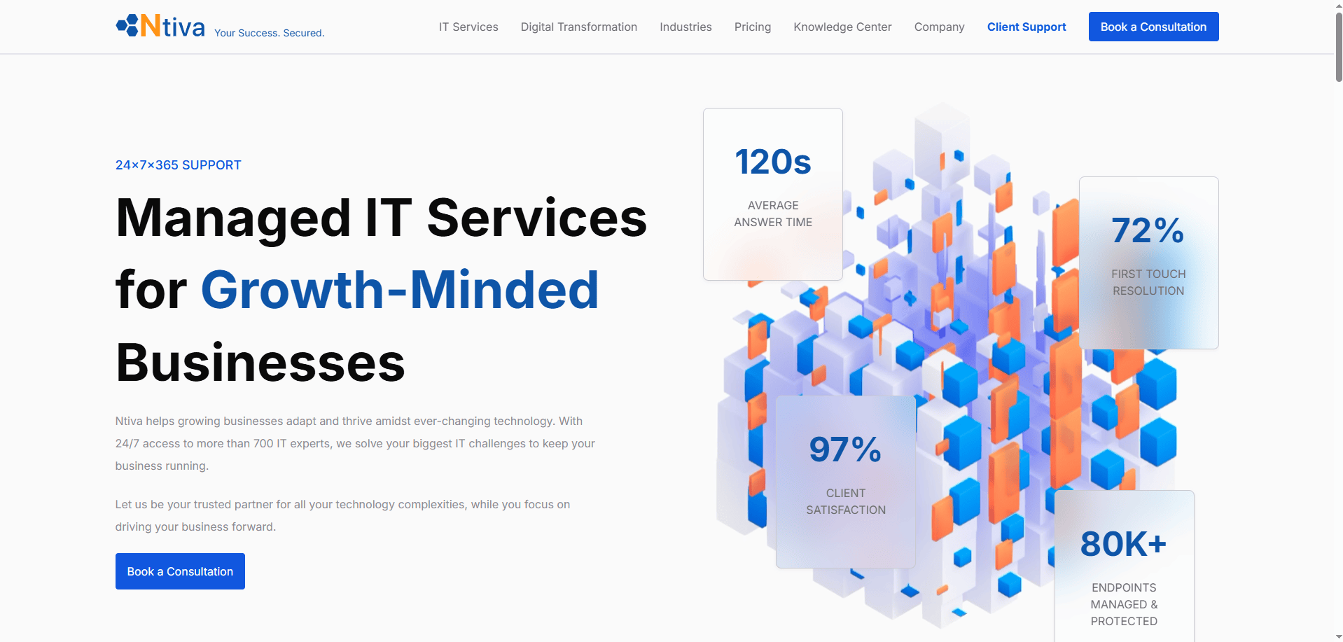
- Location: Chicago, IL
- Key Takeaways:
- Comprehensive managed IT services with a focus on client success.
- Clear presentation of services and solutions offered.
- Strong emphasis on customer testimonials and case studies.
4. TPx Communications
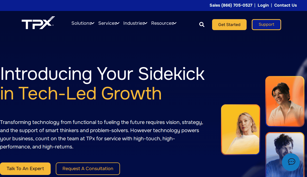
- Location: Austin, TX
- Key Takeaways:
- Comprehensive IT services including network security and unified communications.
- User-centric design facilitates easy access to information.
- Strong emphasis on customer service and responsiveness.
5. EMPIST
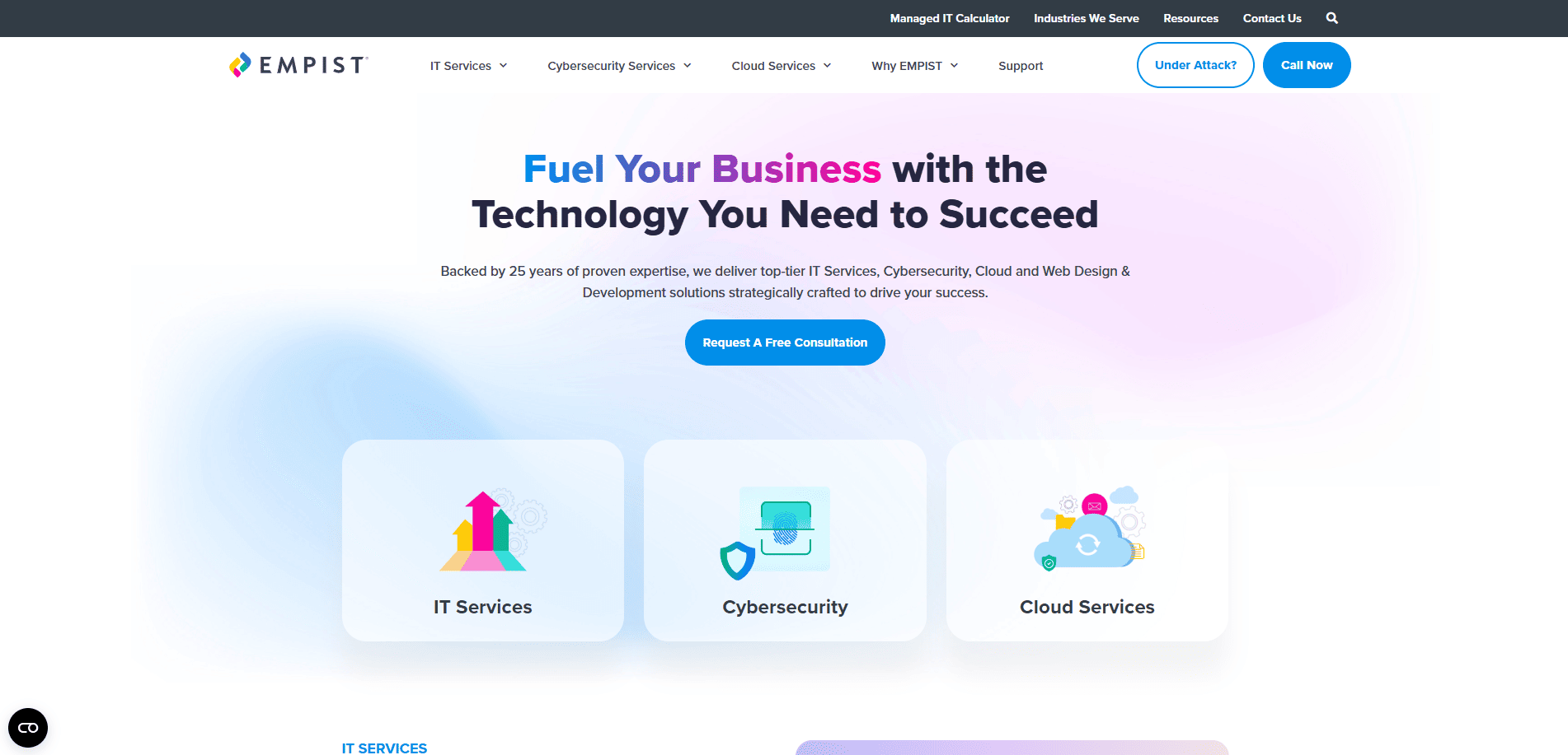
- Location: Chicago, IL
- Key Takeaways:
- Modern design with a focus on digital transformation services.
- Clear articulation of services and industry expertise.
- Engaging visuals that reflect technological proficiency.
6. BetterWorld Technology
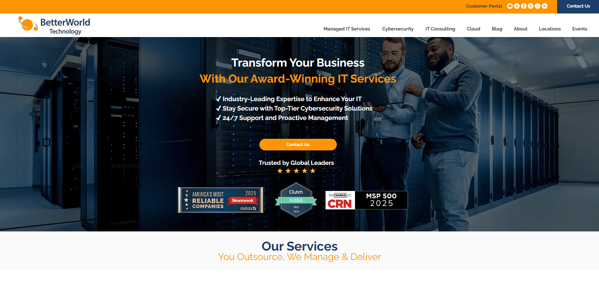
- Location:Naperville, IL
- Key Takeaways:
- Professional design highlighting comprehensive IT solutions.
- Emphasis on customer satisfaction and service excellence.
- Informative content that addresses client needs.
7. Bytagig

- Location: Clackamas, OR
- Key Takeaways:
- Clean and straightforward design focusing on IT support services.
- Clear messaging that communicates value propositions.
- Easy navigation enhances user experience.
8. Andromeda Technology Solutions
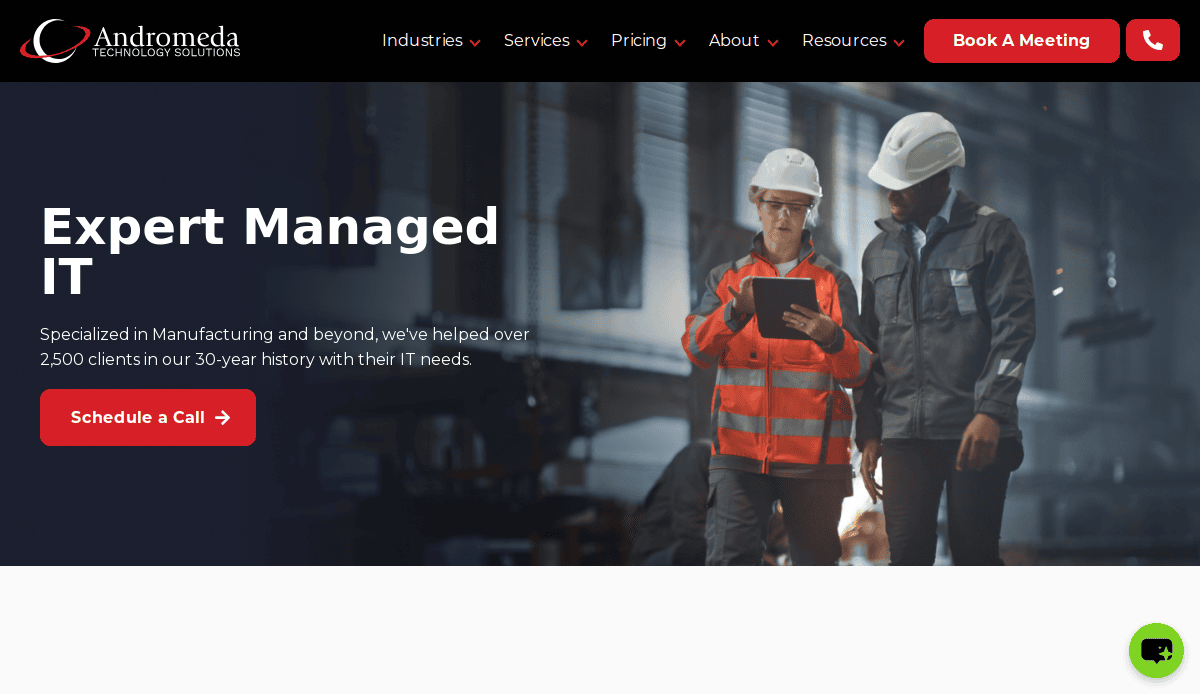
- Location: Lockport, IL
- Key Takeaways:
- Modern website design with a focus on client-centric services.
- Detailed service descriptions aiding in informed decision-making.
- Strong call-to-action elements encourage engagement.
9. Uprite Services

- Location: Houston, TX
- Key Takeaways:
- Professional design showcasing a range of IT services.
- Client testimonials that build trust and credibility.
- Clear navigation facilitates easy access to information.
10. MIS Solutions, Inc.
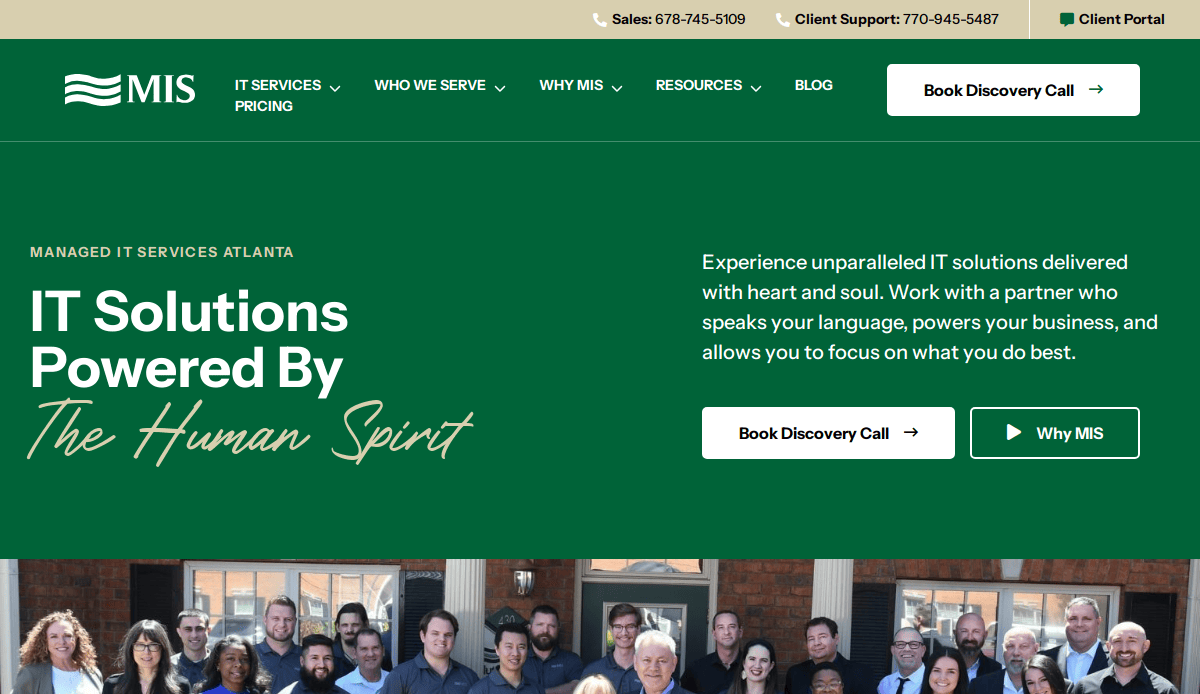
- Location: Suwanee, GA
- Key Takeaways:
- User-friendly design with a focus on managed IT services.
- Informative content that addresses client pain points.
- Strong emphasis on customer support and satisfaction.
11. TechMD
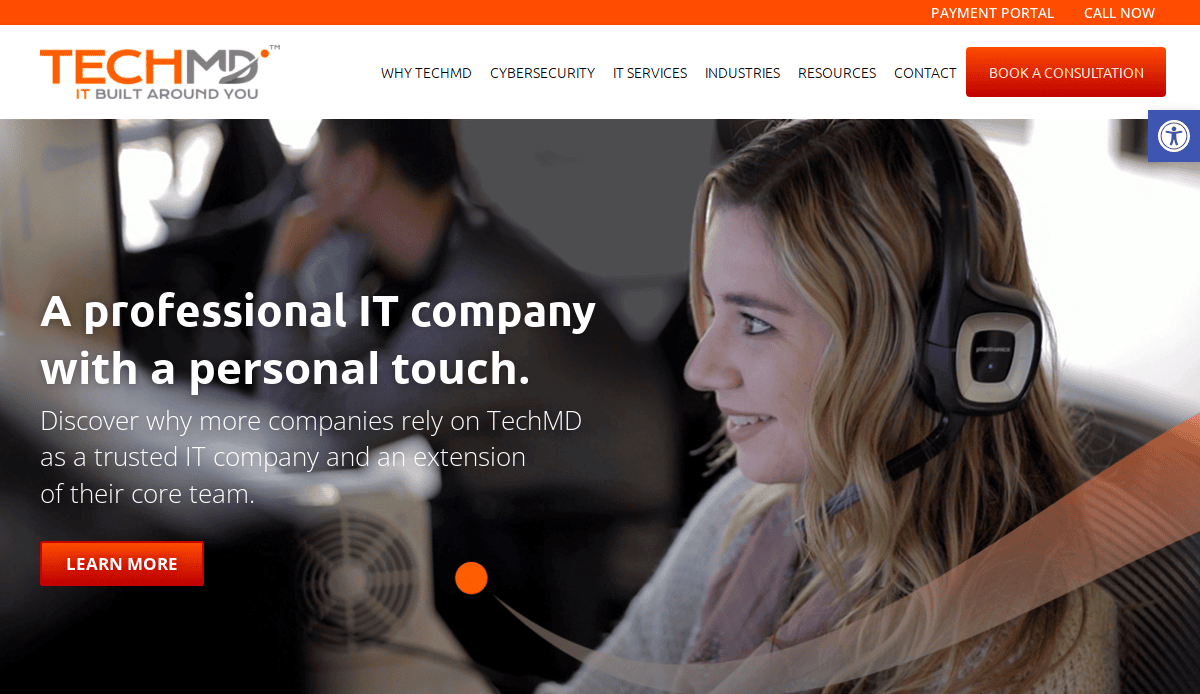
- Location: Santa Ana, CA
- Key Takeaways:
- Modern design with a focus on IT support and cybersecurity.
- Engaging visuals that reflect technological expertise.
- Clear articulation of services and solutions.
12. Total Networks
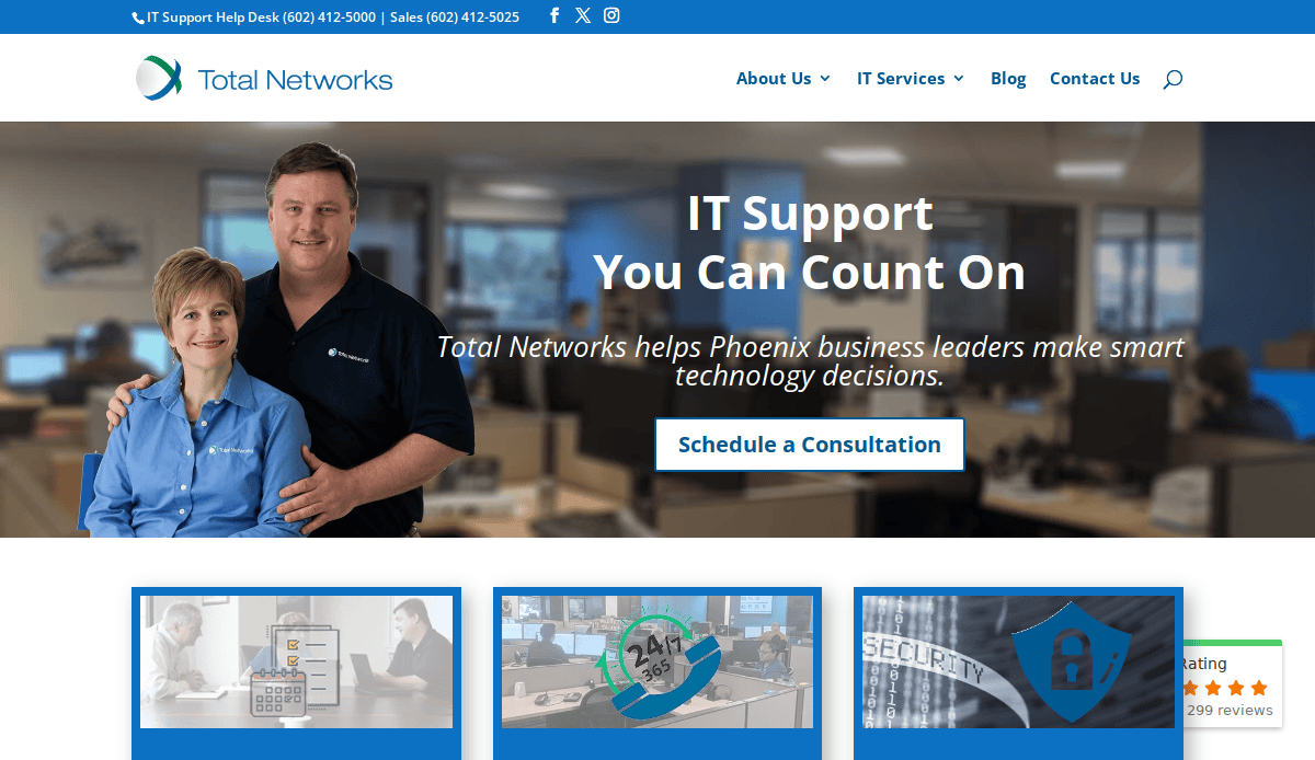
- Location:Phoenix, AZ
- Key Takeaways:
- Professional design emphasizing managed IT services.
- Client-focused content that addresses specific needs.
- Easy navigation enhances UX.
13. Klik Solutions
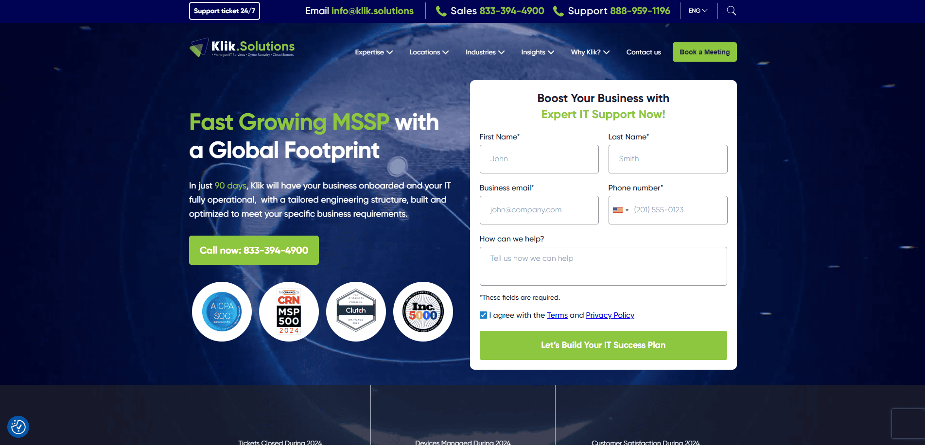
- Location: Baltimore, MD
- Key Takeaways:
- Clean design with a focus on IT support and cloud services.
- Clear messaging that communicates service offerings.
- Engaging visuals that build trust and credibility.
14. TechProComp
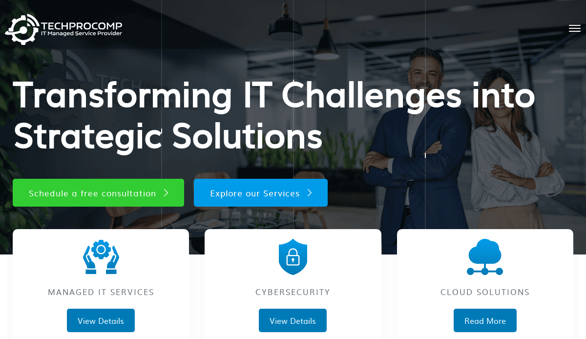
- Location: Austin, TX
- Key Takeaways:
- Clean and chic design focusing on IT solutions.
- Informative content that addresses client challenges.
- Strong call-to-action elements encourage engagement.
15. designDATA
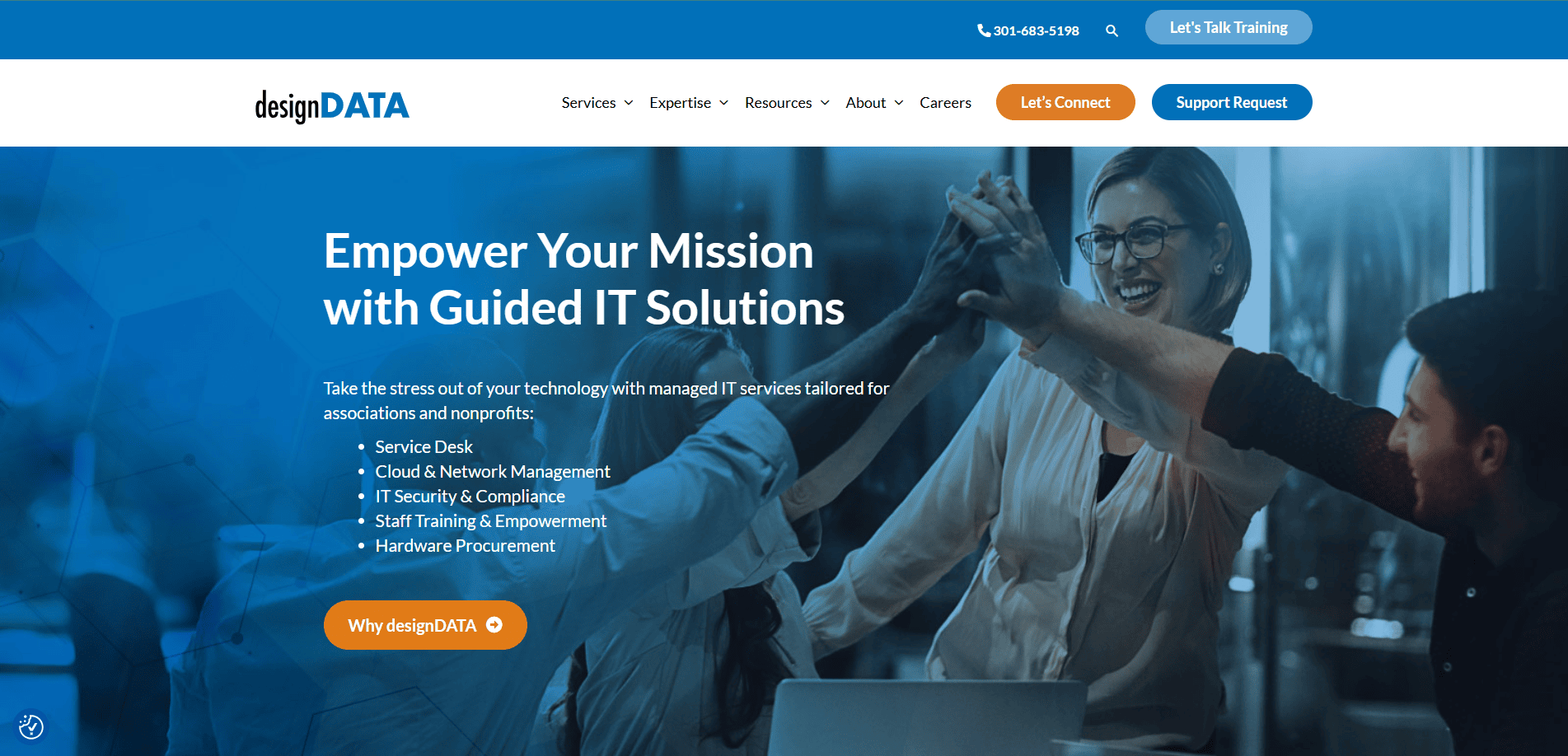
- Location: Gaithersburg, MD
- Key Takeaways:
- Professional design highlighting managed IT services.
- Client testimonials that build trust and credibility.
- Clear navigation facilitates easy access to information.
16. Summit (formerly Deft)
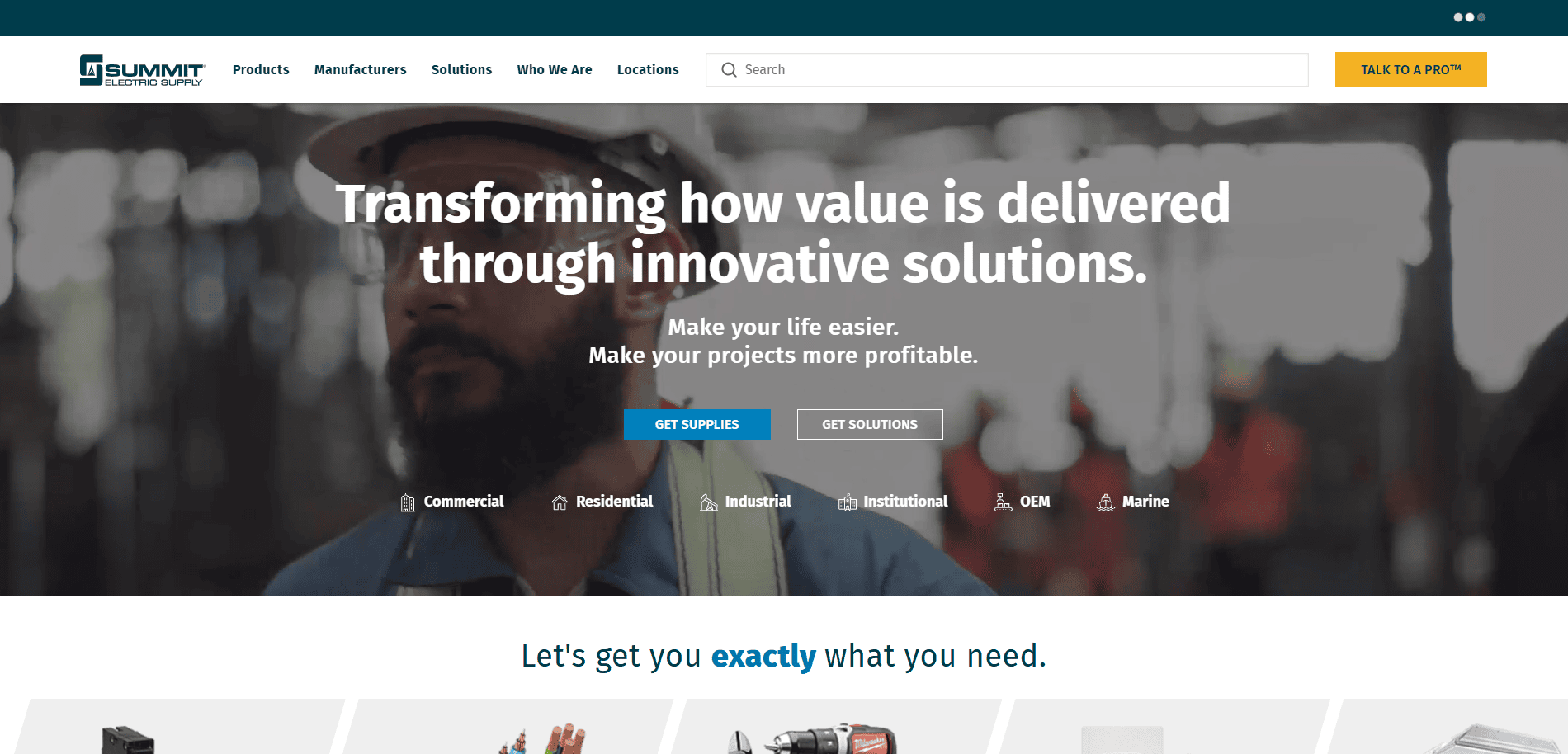
- Location: Alpharetta, GA
- Key Takeaways:
- Chic design with a focus on IT strategy consulting.
- Engaging visuals that reflect technological expertise.
- Clear articulation of services and solutions.
17. Genatec
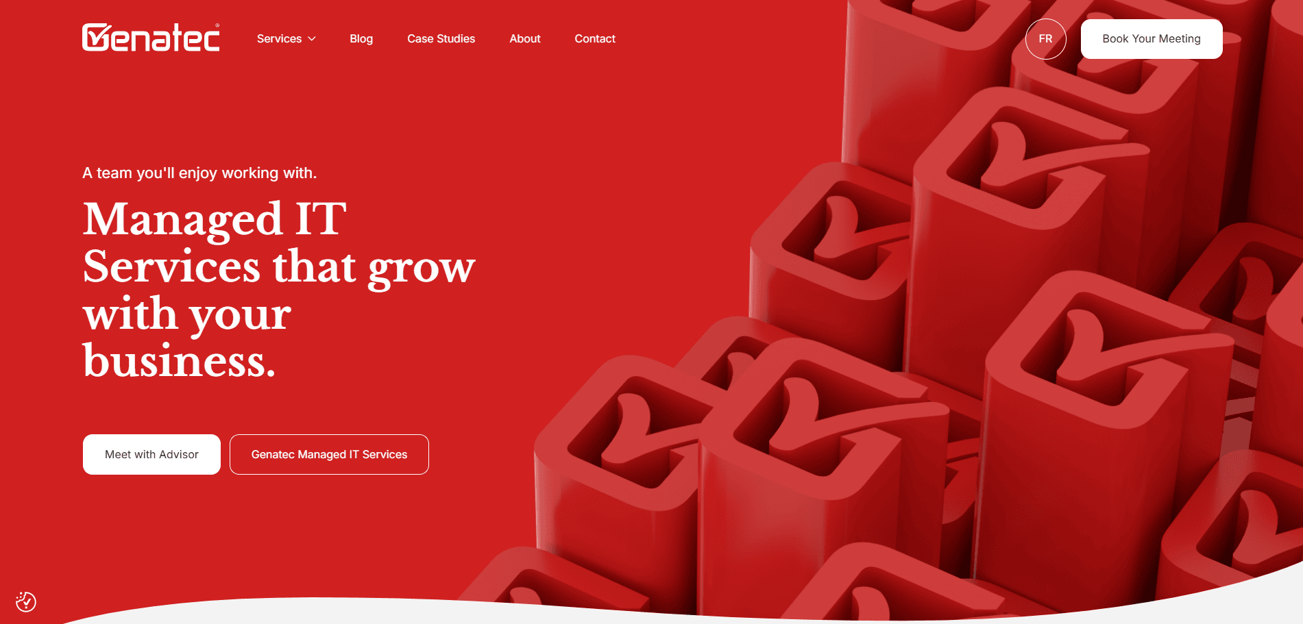
- Location: Montréal, Canada
- Key Takeaways:
- Professional design emphasizing managed IT services.
- Client-focused content that addresses specific needs.
- Easy navigation enhances UX.
18. Lighthouse IT Solutions

- Location: Perrysburg, OH
- Key Takeaways:
- Engaging, animated visuals that add interactivity without clutter.
- Client-focused messaging with strong positioning for SMBs.
- Clear navigation and service segmentation for easy browsing.
Ready to Launch the Best MSP Website?
If you’re serious about building a website that speaks directly to your prospects and showcases your MSP services with confidence, the time to act is now. A professional, SEO-optimized site is a foundational piece of your MSP marketing strategy, and it’s what separates top-performing providers from the rest. From demonstrating your certification standards to standing out as the best MSP in your region, your website should drive results, not just exist.
Don’t settle for average when your site can be the best MSP website in the industry. Get started with our expert MSP web design services and turn your website into a growth engine today.
Designing MSP Sites FAQs
What makes a great website stand out?
A great industry website combines modern design, fast load times, a clear value proposition, and tailored messaging. It should include strategic CTAs, professional design components, and support for SEO and sales.
Should I use a template or opt for custom website design services?
While templates can be useful for rapid deployment, custom website design services ensure a site tailored to your brand, optimized for your services, and structured for long-term growth.
How often should I update my current website?
Your MSP’s website should be updated quarterly at a minimum. This can include new blog posts, service pages, testimonials, or a full website refresh if your design or performance is outdated.
What’s the difference between a basic site and a conversion-focused MSP website?
A basic site provides information; a conversion-focused website is designed to turn visitors into leads with an optimized layout, compelling CTAs, and trust-building content like certifications and case studies.
What pages should every MSP website have?
Every website should include: Home, About, Services (broken down by your range of IT services), Case Studies, Contact, and Blog. Each page on your website should guide prospective clients toward taking action.
How can I generate leads from website visitors?
Lead gen strategies include clear calls to action, gated content, contact forms, chatbots, and retargeting ads. Your website should be part of a broader MSP marketing and sales funnel.
What role does my header play in user experience?
The header is often the first impression. It should clearly display your branding, navigation, and a CTA. The best MSP websites use sticky headers to ensure easy navigation on all devices.
What are the common mistakes MSP owners make during a website redesign?
Skipping a mobile-first approach, reusing outdated content, or ignoring SEO and user behavior data are all mistakes that reduce the effectiveness of your new website.
Why is website support important for managed IT services providers?
Website support ensures uptime, security, and ongoing performance, mirroring the reliability you offer through your managed IT support and support and cybersecurity services.
How can I improve the overall design of my MSP business site?
Focus on a clean layout, modern website aesthetics, fast load times, mobile responsiveness, and messaging tailored to your brand. Engage a trusted website partner to bring your vision to life.

