Just looking for our Best Life Coaches Website examples list?
As a life coach, your greatest gift is the ability to connect, to see the potential in people, and to guide them toward meaningful transformation. You can command a room, inspire action in a one-on-one coaching session, and create breakthroughs. But does your website do the same? For most coaches, the answer is a frustrating no. The passion and impact so evident in person get lost in a generic, passive online presence that fails to capture the essence of your coaching services.
Too many coaches settle for a basic template or a hastily built site that does little more than state their name and services. They end up with a digital business card when what they truly need is a client-generation machine. Every potential client who lands on a confusing or uninspiring life coach site is a lost opportunity—a life you could have changed, who instead clicks away in seconds. An effective coaching website is not just about pretty colors and fonts; it’s the engine at the heart of your entire coaching business.
This is where strategic website design comes in. A high-performing site does the heavy lifting for you: it builds trust, establishes your authority, and makes it easy for the right website visitor to say “yes” to your coaching program.
This guide goes beyond the basics. We will walk you through, step by step, how to create a website that represents the power of your work and becomes your most effective tool for attracting a steady stream of ideal coaching clients.
Phase 1: The Strategic Blueprint – Planning Your Life Coach Website for Success
Before a single design element is chosen or a line of code is written, the most critical phase of your website project begins: planning. In the web design industry, we call this the “discovery” or “strategy” phase, but for a life coach, it’s more accurate to call it the blueprint for your digital business. Skipping this foundational step is the single most common reason why a coaching website fails to get clients. It’s like building a house without a blueprint; you might end up with a structure, but it won’t be functional, efficient, or meet your needs.
The planning phase is where you make the strategic decisions that will guide every subsequent choice, from the layout and content to the technology you use. It ensures that your website is not just a pretty online brochure, but a purpose-built tool designed to achieve a specific business objective. For a coach, a website has to do more than just exist; it has to connect, build trust, and inspire action.
Defining Your Website’s Primary Job
First, you must decide on your website’s single most important job. While a site will perform multiple functions, it needs one primary goal to be truly effective. For most life coaches, this choice boils down to two options:
- Lead Generation: The primary goal is to capture a potential client’s email address. This is typically done by offering a valuable free resource—a lead magnet—such as a PDF guide, a workbook, a webinar, or a video course. This strategy is built on the understanding that most visitors aren’t ready to hire a coach on their first visit. By capturing their email, you earn the opportunity to build a relationship and demonstrate your value over time through email marketing.
- Direct Inquiry/Sales: The primary goal is to persuade a visitor to take the next step in the sales process, which is usually booking a free discovery call or consultation. This approach is more direct and targets visitors who are further along in their buying journey and actively looking for a coach now. The entire website is optimized to build credibility quickly and funnel visitors toward the “Book a Call” button.
Deciding between these two goals is crucial because it dictates the entire call-to-action (CTA) strategy for your website. If your goal is lead generation, your main CTA will be “Download My Free Guide.” If your goal is direct inquiry, it will be “Book Your Free Consultation.”
Identifying and Understanding Your Ideal Coaching Client
You cannot design an effective website if you don’t know exactly who you are designing it for. The biggest mistake is trying to appeal to everyone. When you speak to everyone, you connect with no one. In this phase, you must go deep into the mind of your ideal client—the person you are most passionate about helping and who will receive the most value from your specific coaching services.
Create a detailed client avatar. Go beyond basic demographics and answer these questions:
- What is their primary pressing problem? What keeps them up at night?
- What are their biggest fears and frustrations related to this problem?
- What are their deepest aspirations? What does their ideal outcome look like after working with you?
- What false beliefs do they have about their situation or about coaching itself?
- What language do they use? How would they describe their problem to a friend?
The answers to these questions will dictate your website’s messaging, tone of voice, imagery, and content. You will use their exact language in your headlines. You will choose images that reflect their aspirations. You will create blog posts and resources that solve their specific problems. When your ideal client lands on your site, they should feel instantly understood, as if the entire website was created just for them.
Phase 2: The Digital Handshake – Key Design Principles
Once you have a strategic blueprint, it’s time to translate that plan into a visual experience. The design of your website is far more than just decoration; it’s a powerful form of non-verbal communication. For a life coach, your website’s design is the digital equivalent of a first impression. It’s your handshake, your office environment, and your body language all rolled into one. Before a potential client reads a single word, they will form an opinion based on what they see. The design must instantly communicate professionalism, empathy, and above all, trust.
Effective design guides your visitors through the journey you mapped out in the planning phase, making them feel comfortable and confident at every step. It’s not about chasing fleeting design trends, but about applying timeless principles to create a connection and encourage action.
Clarity and Simplicity Above All
The single most important design principle for a coaching website is clarity. When a potential client is feeling overwhelmed or uncertain, the last thing they need is a confusing or cluttered website. Your goal is to create a sense of calm and order, making it effortless for visitors to find the information they need.
- Embrace White Space: White space (or negative space) is the empty area around text, images, and other elements. It is not wasted space; it is an active and powerful design tool. Ample white space reduces cognitive load, improves readability, and helps users focus on your most important content.
- Intuitive Navigation: Your website’s menu should be simple and predictable. Use clear, common labels like “Home,” “About,” “Coaching Services,” and “Contact.” A visitor should never have to hunt for essential information. Stick to a primary navigation menu at the top of the page and keep it consistent across your entire site.
- Legible Typography: Choose fonts that are clean, professional, and easy to read. Avoid overly decorative or script fonts for body text. Use a large enough font size so that visitors don’t have to strain their eyes. Create a clear typographic hierarchy with different sizes and weights for headings, subheadings, and body paragraphs to structure your content logically.
Authentic Visuals That Build Connection
Life coaching is a deeply personal service. Therefore, the visuals on your website must build a human connection. This is the area where generic approaches fail most spectacularly.
- Invest in Professional Photography: The most critical visual asset on your website is you. Stock photos of strangers posing in business meetings or serene yoga poses create an immediate sense of artificiality. Invest in a professional photoshoot to get high-quality, authentic headshots and lifestyle photos. Your visitors want to see the real person they might be sharing their vulnerabilities with. A warm, genuine smile is a powerful conversion tool.
- Create a Purposeful Color Palette: Colors evoke emotion. Your brand’s color palette should be chosen intentionally to reflect the feeling you want to create for your clients. Are you aiming for a sense of calm, peace, and clarity (perhaps using blues, greens, and soft neutrals)? Or is your coaching style more energetic, bold, and action-oriented (potentially using warmer, more vibrant colors)? A consistent color scheme makes your brand look more professional and memorable.
Visual Hierarchy That Guides the Eye
Visual hierarchy is the art of arranging elements to show their order of importance. A strong visual hierarchy guides your visitors’ attention, ensuring they see the most important information first and follow the path you have designed for them.
- Make Your Calls-to-Action (CTAs) Pop: Your primary call-to-action buttons (e.g., “Book a Free Call,” “Download the Guide”) should be the most visually prominent elements on the page. Use a contrasting, action-oriented color that stands out from the rest of your color palette, and use clear, compelling text.
- Size Equals Importance: Your most important message—your main headline—should be the largest text on the page. Subheadings should be smaller, and body text smaller still. This creates a clear flow of information and allows users to scan the page effectively to grasp the key points.
Designing for Trust and Credibility
Because the coaching industry is unregulated, potential clients are often skeptical. Your website design must actively work to overcome this skepticism by building trust and establishing your credibility from the moment the page loads.
- Display Social Proof Prominently: Human beings look to others for cues on how to behave. Sprinkle testimonials, success stories, and client reviews throughout your site, especially on your homepage and services page. If possible, include a photo of the client next to their testimonial to increase its authenticity.
- Showcase “As Seen In” Logos: If you have been featured on podcasts, in online articles, or on other reputable platforms, display their logos in an “As Seen In” or “Featured In” section. These logos act as third-party endorsements and instantly boost your authority.
- A Professional Logo: Your logo is a visual anchor for your brand. A professional, well-designed logo signals that you take your business seriously.
Mobile-First and Responsive Design
Today, a significant portion of your audience will find you on their smartphone. If your website is difficult to use on a mobile device, you will lose clients. A responsive design is no longer an option; it is an absolute necessity. This means your website’s layout, images, and text automatically adjust to fit the screen of any device, from a wide desktop monitor to a small smartphone screen. Every element must be as clear, accessible, and easy to use on mobile as it is on a desktop computer.
Phase 3: The Conversation – Structuring Your Website’s Content and Navigation
If your website’s design is the first impression and the handshake, its content and navigation are the conversation that follows. This is where you articulate your value, build a deep connection with your visitor, and guide them confidently toward a solution. The content is your message—what you say—and the navigation is the map that ensures they can follow along without getting lost. For a life coach, this digital conversation must be clear, empathetic, and compelling.
Crafting Content That Connects and Converts
The words on your website, known as copy, have one primary job: to make your ideal client feel seen, understood, and inspired to take the next step. Your content must resonate on an emotional level while also clearly communicating the logic behind your coaching services.
- Speak Your Client’s Language: Revisit the detailed client avatar you created in the planning phase. Your website copy should use the exact words and phrases your ideal clients use to describe their problems, fears, and desires. Avoid industry jargon. Write in a conversational, approachable tone—as if you were speaking directly to them in a coaching session. Use “you” and “your” frequently to make the entire experience feel personal.
- Lead with a Compelling Value Proposition: Your value proposition is a clear, concise statement that explains the tangible results you deliver. It must be front and center on your homepage. A powerful formula is: “I help [Specific Ideal Client] to [Achieve a Tangible Outcome] so they can [Experience the Ultimate Transformation].” For example: “I help new female entrepreneurs overcome self-doubt so they can build a profitable business with confidence.” This single sentence immediately tells the right people they are in the right place.
- Sell Transformations, Not Sessions: A common mistake is to list the features of a coaching package (e.g., “Six 60-minute sessions”). Clients don’t buy features; they buy outcomes. Your copy needs to translate features into benefits, and then into transformations.
- Feature: What it is (e.g., “Weekly goal-setting worksheets”).
- Benefit: What it does (e.g., “Provides clarity and structure”).
- Transformation: What it feels like (e.g., “Go from feeling scattered and overwhelmed to having a clear, actionable roadmap to your dream career”). Your services page should be rich with the language of transformation.
- Weave in Proof and Credibility: Don’t isolate your testimonials to a single “Praise” page. Integrate them directly into your homepage and services page, right next to the claims you make. When you describe the outcome of your coaching program, follow it up immediately with a quote from a real client who achieved that exact outcome. This provides instant validation and builds immense trust.
Designing an Effortless Navigation Menu
Your navigation is the primary tool visitors use to explore your website. If it is confusing, they will become frustrated and leave. The goal is to make moving through your site feel intuitive and effortless.
- The “Must-Have” Pages: For a life coach website, a clear and simple navigation menu is essential. These are the core pages every visitor expects to find:
- Home: Your digital front door. It orients the visitor and directs them to the most important areas of your site.
- About: Where you build a personal connection and share your story.
- Services / Work With Me:Clearly outlines your coaching packages, the problems they solve, and the transformations you offer.
- Blog / Articles: Where you demonstrate your expertise, provide value, and attract organic traffic.
- Contact: Makes it simple for potential clients to get in touch.
- Use Clear and Simple Labels: This is not the place for creative or clever names. Use straightforward labels that anyone can understand instantly. “Work With Me” is much clearer than “The Journey” or “Begin.” Clarity always wins over creativity in navigation.
- Follow the Three-Click Rule: This is a long-standing usability guideline that states a user should be able to find any information on your website with no more than three clicks from the homepage. This principle forces you to create a logical and shallow site structure, preventing important pages from getting buried in confusing submenus.
- Utilize Your Website’s Footer: The footer, located at the very bottom of every page, serves as a secondary navigation and a home for important but less-trafficked links. This is the perfect place for your Privacy Policy, Terms & Conditions, social media icons, and a repeat of your contact information or a link to your contact page. This keeps your main navigation clean while ensuring all necessary information is easily accessible.
Phase 4: The Visual Language – Using Imagery and Branding to Build Trust
The visual elements of your website are what transform a black-and-white blueprint into a full-color, emotionally resonant experience. This is the layer of communication that a visitor feels before they even process the words. For a business as personal as life coaching, your visual language is fundamental to establishing your brand, creating an immediate connection, and building the trust necessary for someone to invest in your services. These elements are not afterthoughts; they are strategic tools that support your message and enhance the user’s experience.
Your Logo: The Anchor of Your Brand Identity
Your logo is the most concise representation of your coaching business. It’s a visual anchor that appears on your website, social media profiles, and business cards, creating a consistent and recognizable brand identity. A professional logo signals that you are a serious, established professional.
- Reflects Your Brand: Your logo’s design—its shape, font, and style—should align with your coaching personality. A business coach might opt for a strong, modern, and clean logo, while a wellness coach might choose something more organic and flowing.
- Simplicity and Versatility: The best logos are simple, memorable, and work well at various sizes, from a tiny favicon in a browser tab to a larger header on your website.
The Strategic Use of Color Psychology
Color is a powerful tool for evoking emotion and conveying meaning. A consistent and intentionally chosen color palette will reinforce your brand’s voice and create a cohesive user experience. Visitors should associate your specific colors with your brand.
- Elicit the Right Feeling: Think about the transformation you provide. If you help clients find calm and clarity, your palette might include blues (trust, stability), greens (growth, harmony), and soft neutrals. If your coaching is about energy and bold action, you might incorporate orange (enthusiasm, creativity) or yellow (optimism, intellect).
- Consistency is Key: Choose a primary palette of two to three main colors and use them consistently across your entire website. This creates a professional, polished look and strengthens brand recognition.
Typography That Speaks Your Voice
Just like colors, fonts have distinct personalities. The typography you choose is a subtle but constant expression of your brand’s voice.
- Align with Your Tone: Are you modern and minimalist? A clean, sans-serif font like Helvetica or Lato might be appropriate. Are you more traditional and authoritative? A classic serif font like Garamond or Lora could be a better fit.
- Prioritize Readability: Above all, your fonts must be easy to read. Ensure your body text is a suitable size (16px is a common minimum for web) and that there is sufficient contrast between your text color and the background color. Use a limited number of fonts—typically two (one for headlines, one for body text)—to maintain a clean and uncluttered feel.
Authentic Photography: The Ultimate Trust Signal
This is arguably the most important visual element for a life coach. Because your business is you, potential clients need to see who you are to begin forming a connection.
- Reject Impersonal Stock Photos: Using generic stock photos of smiling strangers is a credibility killer. It signals a lack of authenticity and prevents a real connection. Visitors know it’s not you, and it creates a subconscious barrier.
- Invest in Professional Headshots: This is a non-negotiable investment. High-quality, professional photos of you are the most powerful trust-building asset on your website. They allow potential clients to look you in the eye, see your genuine expression, and begin to feel comfortable with you. A good photoshoot should provide a variety of shots: a professional headshot for your bio, a warmer “in-action” shot of you working (even if staged), and lifestyle images that convey your personality.
Icons and Graphics: Simplifying Concepts
Custom icons and simple graphics serve as visual signposts that make your content easier to scan and digest. They can break up long blocks of text and illustrate complex ideas in a simple, elegant way. For example, you can use three simple icons to visually represent your three-step coaching process, making it more memorable and easier to understand at a glance than a paragraph of text alone. This attention to detail enhances the user experience and shows a high level of professionalism.
Phase 5: Protecting Your Investment – Ongoing WordPress Maintenance
Launching your WordPress website is the beginning, not the end, of your online journey. Your website is a valuable business asset, and just like any asset, it requires regular care to function correctly and remain secure. Neglecting ongoing maintenance is like owning a car and never changing the oil; eventually, it will break down, leading to costly emergency repairs and lost opportunities. For a life coach, a broken or compromised website means lost client trust, missed inquiries, and a damaged professional reputation.
A structured WordPress maintenance plan is not a technical chore but a fundamental business practice. It ensures your website remains a secure, high-performing tool that consistently supports your coaching business.
Regular Backups: Your Website’s Insurance Policy
The single most important maintenance task is performing regular backups. A backup is a complete copy of all your website’s files and its database. If your site ever experiences a major issue, such as a hacking attempt, a software conflict, or a server error, a recent backup allows you to restore it to a fully functional state quickly, minimizing downtime and data loss.
- Frequency: For a typical coaching website that is updated with new blog posts, the best practice is to have automated daily backups.
- Storage: Backups should always be stored in a secure, off-site location (like a cloud service such as Google Drive or Dropbox), not just on your website’s server. This ensures that if the server itself is compromised, your backups remain safe and accessible.
Software Updates: The First Line of Defense
WordPress is a dynamic platform with three core components that require regular updates: the WordPress core software, plugins (which add functionality), and themes (which control the design).
- Security Patches: Developers frequently release updates to patch security vulnerabilities. Failing to apply these updates is the number one reason WordPress sites get hacked. Cybercriminals actively seek out websites running outdated software with known security holes.
- Bug Fixes and Compatibility: Updates also fix bugs, improve performance, and ensure compatibility between all the moving parts of your website. Running updates promptly prevents features like contact forms or scheduling tools from breaking unexpectedly.
Security Monitoring: Protecting Your Digital Door
In addition to keeping software updated, active security monitoring is essential for protecting your website from threats. This is not a one-time setup but an ongoing process.
- Malware Scanning: Regular, automated scans of your website’s files are necessary to detect any malicious code that may have been injected.
- Web Application Firewall (WAF): A firewall acts as a protective barrier between your website and incoming traffic, automatically blocking known malicious requests and brute-force login attempts before they can ever reach your site.
Performance Checks and Optimization
A website that is fast and functions flawlessly provides a better user experience and supports your search engine rankings. Maintenance includes tasks aimed at keeping your site running smoothly.
- Database Optimization: Over time, your WordPress database can accumulate unnecessary data (like post revisions and spam comments) that can slow it down. Regularly cleaning and optimizing the database keeps your site lean and fast.
- Uptime Monitoring: This service automatically checks your website every few minutes to ensure it is online. If your site ever goes down, you will be notified immediately so the issue can be addressed.
- Broken Link Checks: Regularly scanning your site for broken links and fixing them is important for both user experience and SEO.
The Value of a Professional Maintenance Plan
Handling these essential maintenance tasks requires time and technical expertise. For a busy life coach, managing this process can be a distraction from the core work of serving clients. A professional maintenance plan provides peace of mind, ensuring that all technical tasks are handled correctly and proactively. It frees you to focus on growing your coaching business, confident that your most important digital asset is secure, optimized, and professionally managed.
Key Takeaways: Your Blueprint for a High-Impact Website Design
Here is a summary of the core principles for designing a life coach website that serves as a powerful client-generation engine:
- Prioritize Strategy Before Design: The most effective websites are built on a clear strategy. Before choosing colors or fonts, you must first map the client journey from a new visitor to a signed client. Define your coaching niche, identify your ideal client’s single biggest problem, and decide if your website’s main goal is to capture leads or book calls.
- Reimagine Your Pages for Connection and Conversion: Move beyond thinking of your website as a simple brochure. Each page has a specific job focused on building trust and inspiring action.
- Homepage: Must pass the “5-second test” by clearly stating who you help, what you solve, and what to do next.
- About Page: Should tell a relatable story about your journey, not just list your credentials. It’s for the client to see themselves in your story.
- Services Page: Frame your coaching packages around the tangible outcomes and transformations you provide, not just the number of sessions.
- Build a Content Engine for Authority: Your blog is a strategic tool for attracting your ideal clients, not a personal diary. Focus on creating in-depth “pillar content” that answers the most pressing questions your target audience is searching for on Google. This establishes your expertise and drives organic traffic.
- Integrate Essential Technology for Growth: A professional website operates as a marketing hub, not a static page. Integrating an email marketing service or a simple CRM is critical for capturing leads through forms and nurturing potential clients automatically, so no opportunity is missed.
- Include Non-Negotiable Legal Pages: To protect your coaching practice and build trust, your website must include three key legal pages: a Privacy Policy (required for contact forms and lead magnets), a Disclaimer (to clarify the scope of your coaching relationship), and Terms and Conditions (to outline the rules of your services).
- Design for Your Future Business: A smart website design anticipates your long-term goals. Choose a flexible platform like WordPress that can grow with you, allowing you to add features like online courses, group programs, or membership areas as you scale your coaching business beyond one-on-one sessions.
20 High-Converting Coaching Website Design Examples
Here are 20 of the best life coaching websites, with five designed by our top-tier web design and development agency, to provide inspiration and showcase effective web design in practice.
1. Jonathan Parker
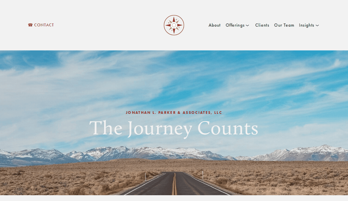
- Location City In The US: Chicago, IL
- 3 Key Takeaways about what makes it effective:
- Bold, Trust-Building Video: The homepage features a prominent, high-quality video of Jonathan speaking, immediately establishing his authority and building a personal connection.
- Clear, High-Contrast CTAs: Action-oriented buttons like “Book a call” are in a bright, contrasting color, making them impossible to miss and guiding the user’s next step.
- Strong Social Proof: Testimonials and “As Seen In” logos from major publications like Forbes and The Wall Street Journal are placed strategically to build immediate credibility.
2. The Finding You Again Foundation
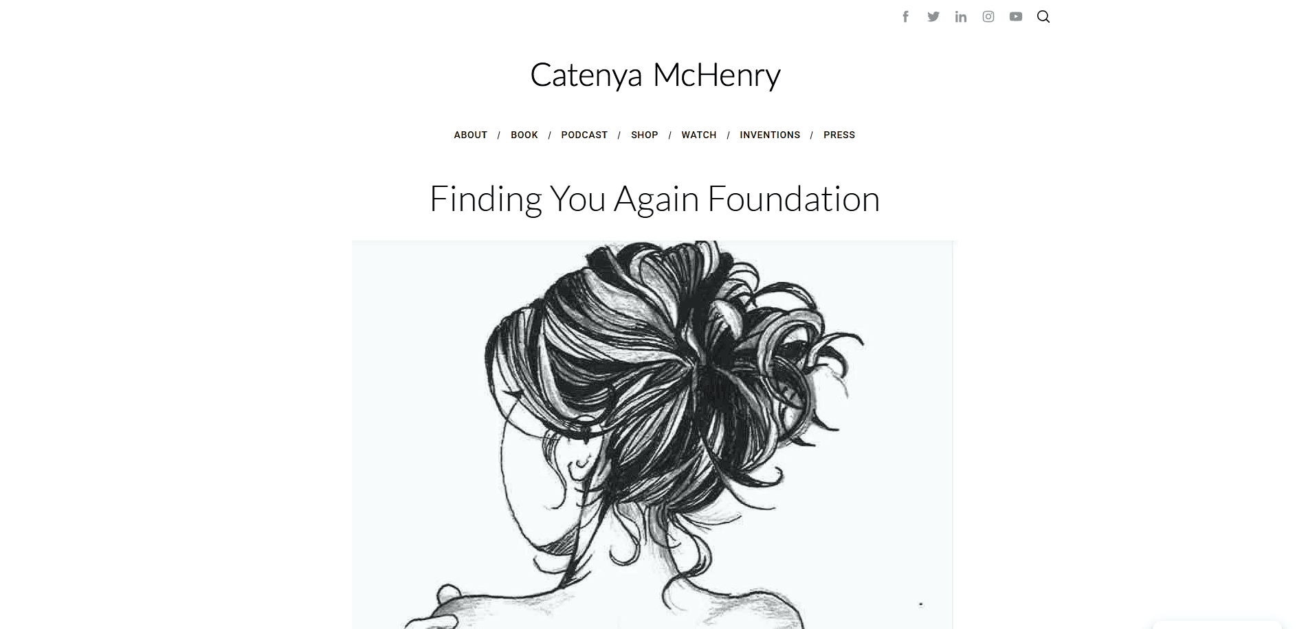
- Location City In The US: Woodbury, MN
- 3 Key Takeaways about what makes it effective:
- Empathetic and Clear Mission: The website immediately communicates its purpose with a clear, emotionally resonant headline, making visitors feel understood.
- Soft and Inviting Color Palette: The use of soft pinks, golds, and clean whites creates a warm, safe, and professional atmosphere that aligns perfectly with the brand’s mission.
- Simple, Action-Oriented Navigation: The menu is uncluttered with clear labels like “Get Help,” “Give Help,” and “Events,” making it easy for different types of users to find what they need.
3. Stratejoy (Molly Mahar)
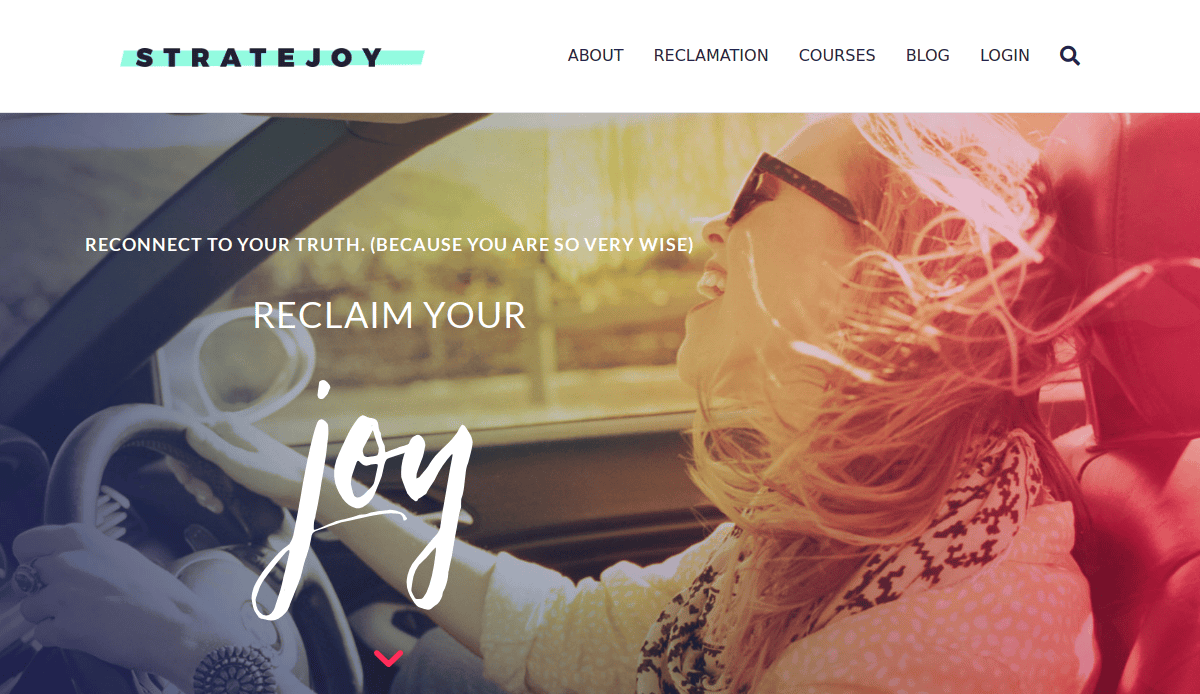
- Location City In The US: Portland, OR
- 3 Key Takeaways about what makes it effective:
- Vibrant Community Focus: The website immediately feels like joining a movement rather than just hiring a coach. The use of group photos and community-focused language is excellent for attracting clients who seek connection.
- Engaging Quizzes as Lead Magnets: Stratejoy uses quizzes effectively to help visitors understand themselves better while also capturing leads in a fun, interactive way that provides instant value.
- Relatable and Authentic Copy: The writing style is down-to-earth and feels like a conversation with a good friend, which builds rapport and makes the brand feel trustworthy and approachable.
4. Lalah Delia
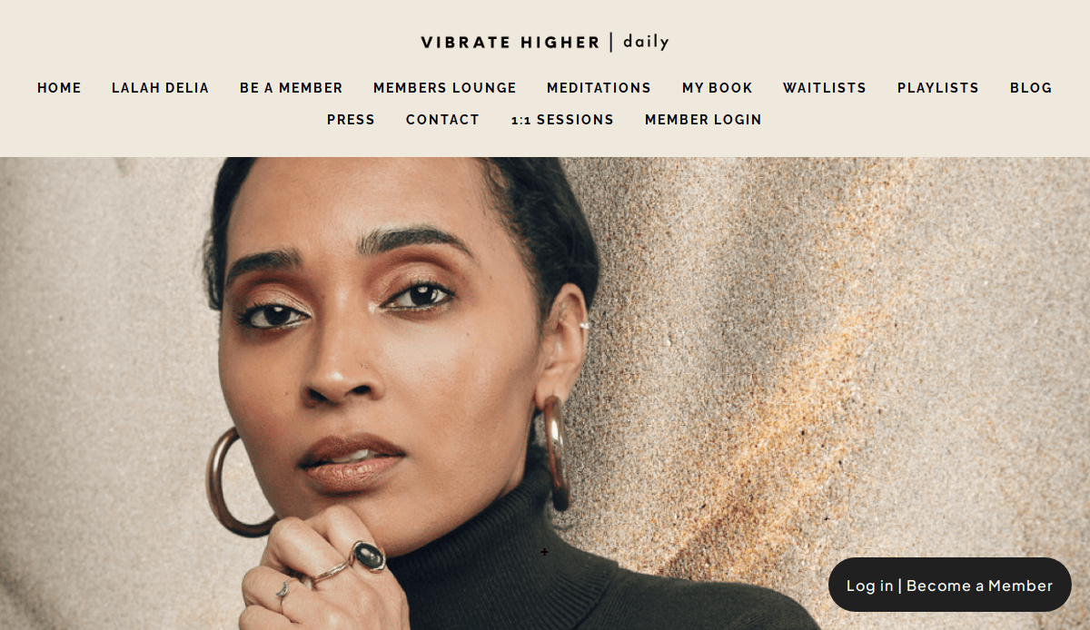
- Location City In The US: Los Angeles, CA
- 3 Key Takeaways about what makes it effective:
- Calm and Soulful Branding: The website uses earthy tones, serene imagery, and elegant, minimalist design to create an immediate sense of peace and mindfulness, perfectly aligning with her “vibrational living” message.
- Focus on a Core Philosophy: The entire site is built around her clear and powerful philosophy, with her book and core teachings placed front and center, which establishes strong authority and a unique identity.
- Seamless Integration of Content: Her popular social media content and articles are woven directly into the site, creating a rich, immersive experience that encourages visitors to explore her work deeply.
5. The Place for Children with Autism
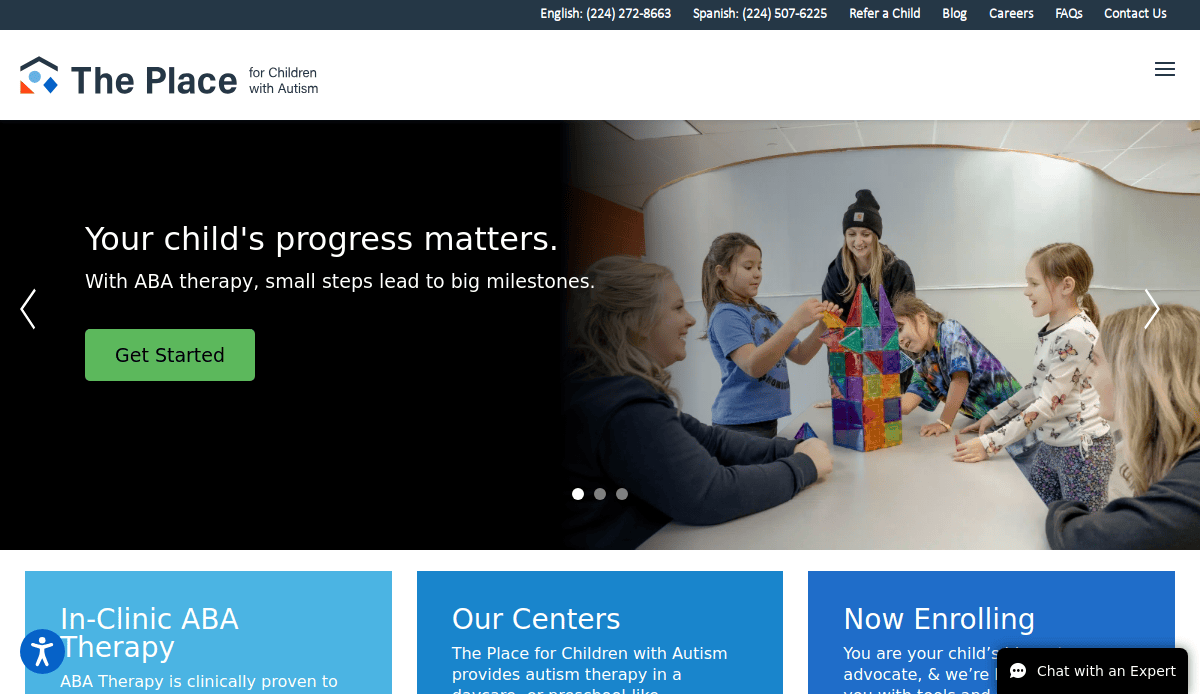
- Location City In The US: Chicago, IL
- 3 Key Takeaways about what makes it effective:
- Hopeful and Positive Imagery: The site uses bright, joyful photos of children and therapists, creating a positive and reassuring feeling for parents.
- Extremely Clear User Journey: Large, colorful buttons for “Get Started” and “View Locations” provide an unmissable path for parents seeking help.
- Trust-Building Accreditations: The prominent display of the BHCOE Accreditation mark serves as powerful social proof and a key differentiator.
6. Marie Forleo
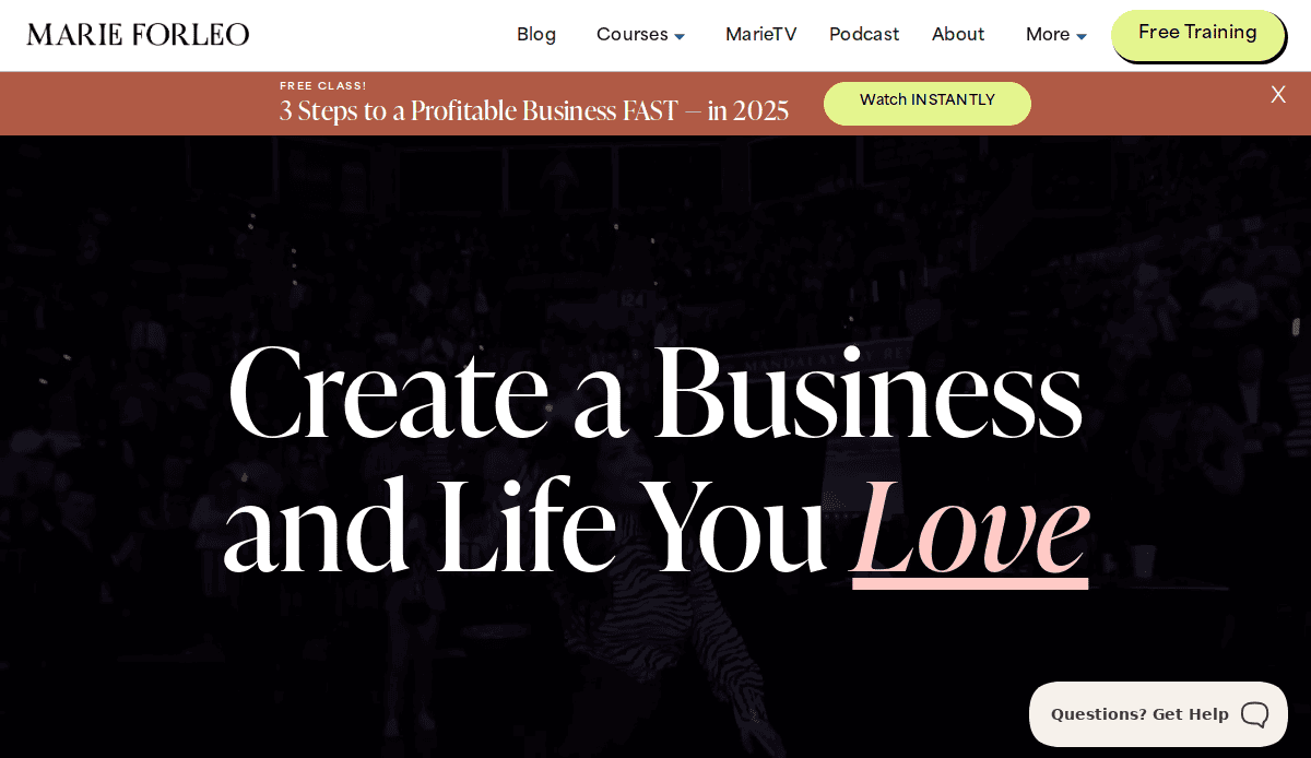
- Location City In The US: New York, NY
- 3 Key Takeaways about what makes it effective:
- Strong Personal Brand: The entire site is a masterclass in branding, with a consistent, energetic, and optimistic voice, color scheme, and photography.
- High-Value Content Offers: Marie Forleo effectively uses free content like video training and audio sessions as powerful lead magnets to build her email list.
- Abundant Social Proof: The site is filled with testimonials, success stories, and endorsements from well-known figures, creating an overwhelming sense of authority and trust.
7. Tony Robbins
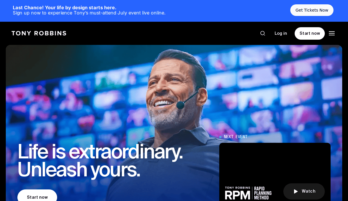
- Location City In The US: West Palm Beach, FL
- 3 Key Takeaways about what makes it effective:
- Action-Oriented Language: The copy is filled with powerful verbs and inspirational language that motivates the user to take action.
- Event-Driven Design: The website is clearly structured to drive attendance to his events, with dates, locations, and benefits prominently featured.
- Multimedia Engagement: The site effectively uses a mix of video, articles, and interactive quizzes to engage visitors and showcase the value it provides.
8. Brené Brown
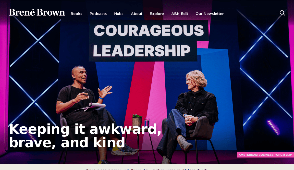
- Location City In The US: Houston, TX
- 3 Key Takeaways about what makes it effective:
- Clean, Academic Layout: The design is simple, uncluttered, and focuses on the content, reflecting her background as a researcher and author.
- Centralized Content Hubs: The site is brilliantly organized around her books and talks, with dedicated hubs that provide a wealth of related resources.
- Soft, Approachable Aesthetic: The hand-drawn elements and muted color palette create a feeling of warmth and accessibility, making her work feel less intimidating.
9. Natalie Bacon
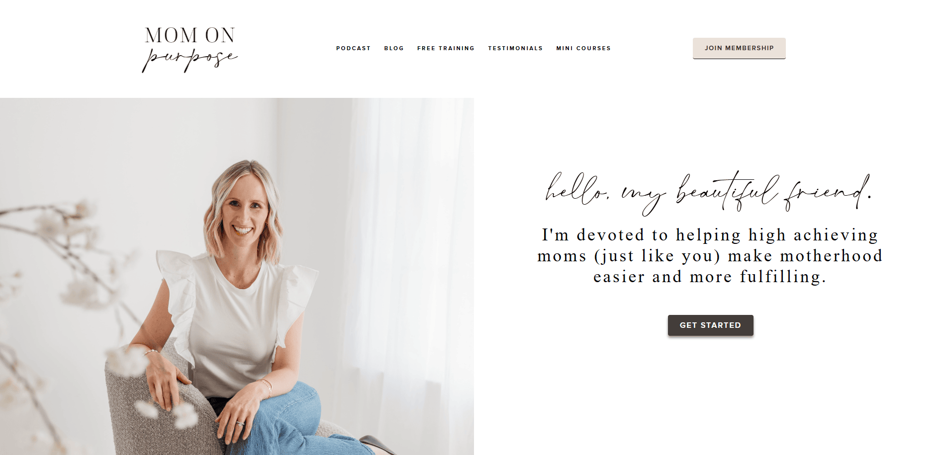
- Location City In The US: Dallas, TX
- 3 Key Takeaways about what makes it effective:
- Clear and Specific Niche: The website does an excellent job of calling out its target audience—moms who want to pursue their dreams—with headlines like “Hey, Mama.” This focus makes the messaging highly effective.
- Clean, Modern, and Professional Design: The site combines a professional, minimalist aesthetic with soft, approachable colors, which conveys both authority and empathy.
- Strong Content Marketing: The prominent features of her podcast and blog establishes her as a thought leader and consistently provides value, building a loyal audience and attracting organic traffic.
10. Preston Smiles
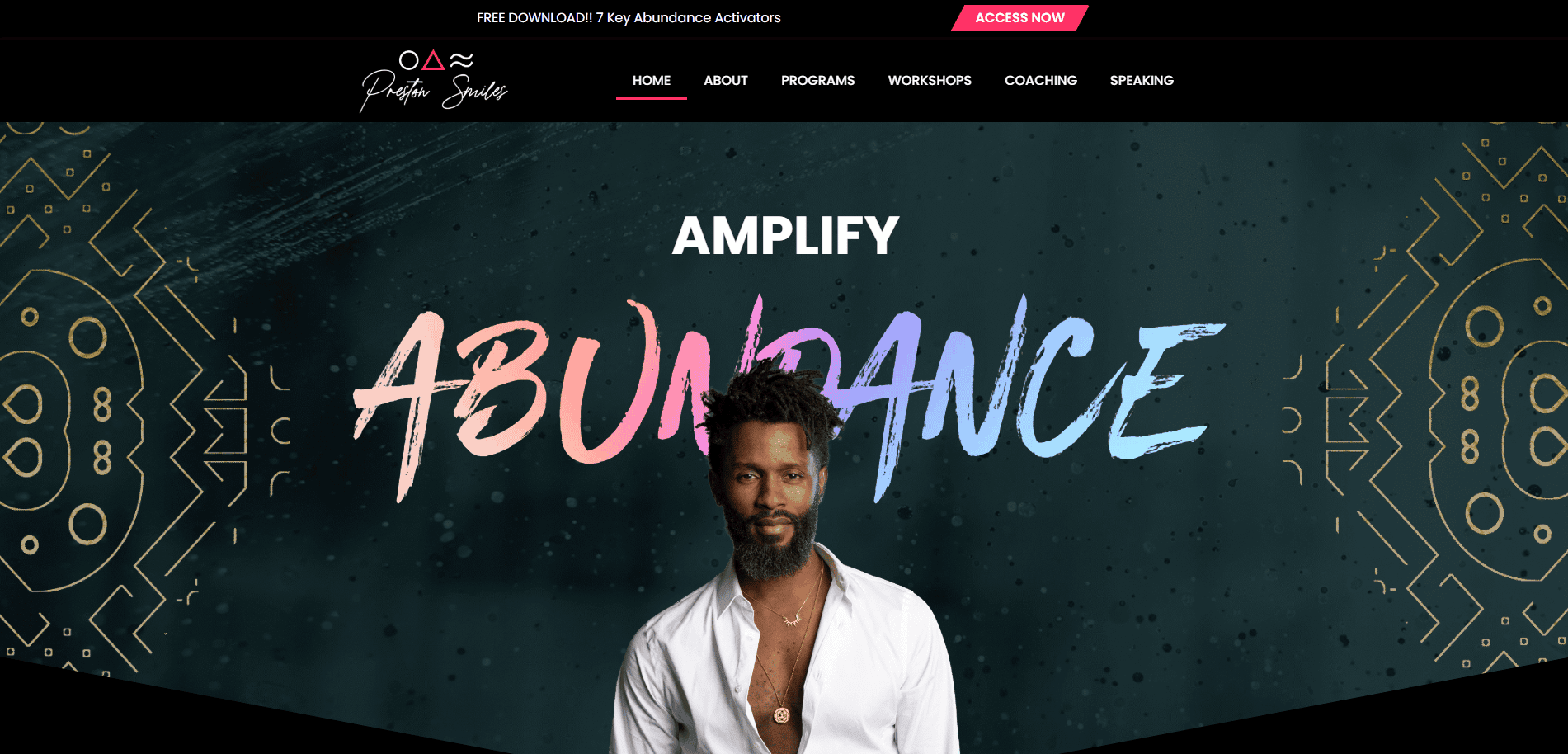
- Location City In The US: Los Angeles, CA
- 3 Key Takeaways about what makes it effective:
- Energetic and Unconventional Branding: The bold fonts, vibrant colors, and dynamic photos perfectly capture his high-energy personality and unique coaching style.
- Strong Community Focus: The site heavily promotes community challenges and group events, fostering a sense of belonging.
- Clear Product Funnel: Visitors are clearly guided from free content to books, events, and higher-ticket coaching programs.
11. Gabby Bernstein
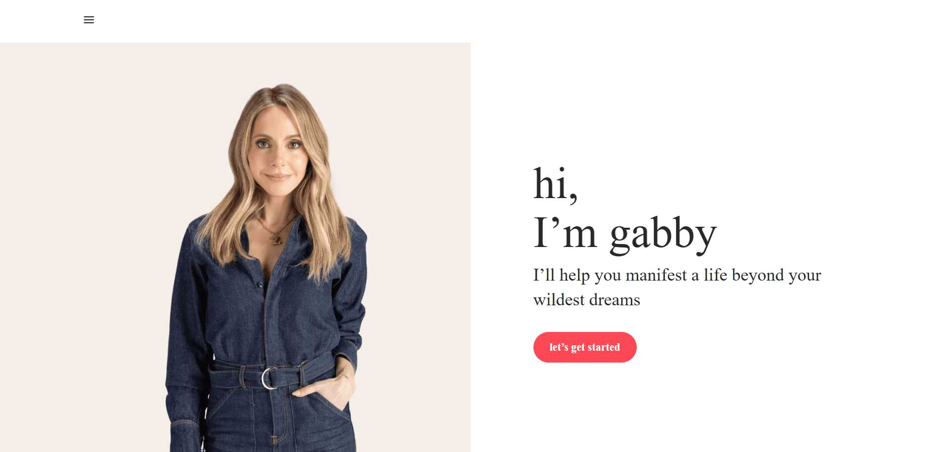
- Location City In The US: New York, NY
- 3 Key Takeaways about what makes it effective:
- Excellent Use of Lead Magnets: The site prominently offers a free meditation and workshop in exchange for an email, effectively building her audience.
- Consistent Visual Branding: The photography, color scheme, and typography are consistent and professional, creating a polished and trustworthy brand.
- Clear Calls to Action: Every page has a clear purpose and a strong CTA, whether it’s to join a challenge, buy a book, or sign up for a mailing list.
12. Iyanla Vanzant
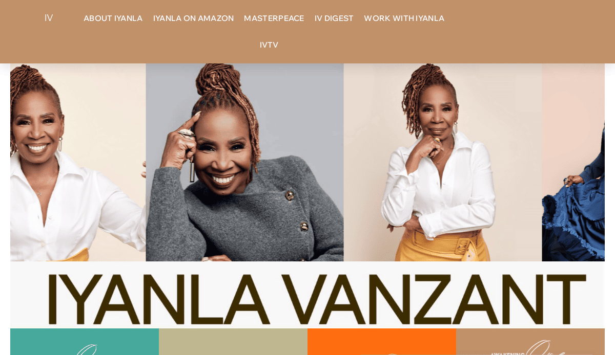
- Location City In The US: Atlanta, GA
- 3 Key Takeaways about what makes it effective:
- Authoritative and Wise Tone: The design uses rich colors and elegant fonts to create a sense of wisdom and authority.
- Focus on Media Presence: Her TV appearances and books are heavily featured, leveraging her media success to build credibility.
- Spiritually-Infused Language: The copy is infused with spiritual concepts and language that resonates deeply with her target audience.
13. Christine Hassler
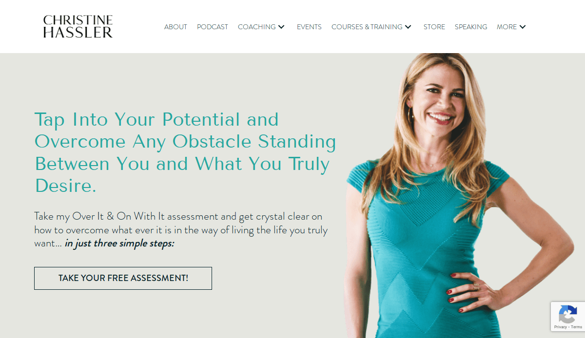
- Location City In The US: San Diego, CA
- 3 Key Takeaways about what makes it effective:
- Relatable Personal Story: Her “About” page effectively uses her own life challenges (“expectation hangovers”) to build a strong, relatable connection with her audience.
- Multiple Entry Points: She offers a variety of ways to engage, from her podcast and books to coaching and retreats, catering to different commitment levels.
- Clean and Professional Layout: The website is well-organized and easy to navigate, allowing users to easily find her resources.
14. Michael Hyatt
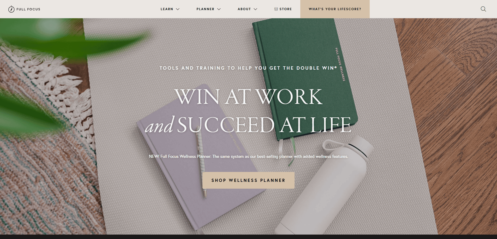
- Location City In The US: Franklin, TN
- 3 Key Takeaways about what makes it effective:
- Clear Value Proposition: The headline “Win at Work and Succeed at Life” is a powerful and concise summary of the transformation he offers.
- Product-Focused Design: The site is clearly designed to sell his books and planners, with professional product photography and compelling benefits.
- Strong Use of Data and Proof: He uses statistics, testimonials, and case studies to prove the effectiveness of his productivity systems.
15. Amy Smith (The Joy Junkie)
- Location City In The US: Raleigh, NC
- 3 Key Takeaways about what makes it effective:
- Bold, Minimalist Design: The site uses a very clean layout with bold typography and a simple color scheme, creating a modern and confident feel.
- Direct, No-Nonsense Copy: The language is straightforward and to the point, which will appeal to clients looking for a direct coaching style.
- Focus on a Specific Problem: The website is tightly focused on helping people-pleasers and perfectionists, which makes her messaging highly effective for that niche.
16. Melissa Ambrosini
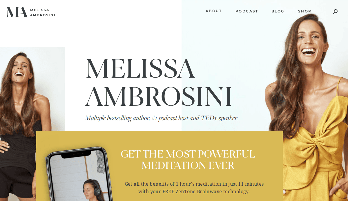
- Location City In The US: Noosa, QLD (Note: Australian-based, included for exceptional design)
- 3 Key Takeaways about what makes it effective:
- Beautiful and Consistent Visuals: The entire site features stunning, high-quality photography with a consistent, warm filter that creates a beautiful and aspirational brand feel.
- Engaging “Start Here” Page: She has a dedicated page to guide new visitors, helping them navigate her wealth of content without feeling overwhelmed.
- Strong Podcast Integration: Her podcast is a central element of the site, with episodes, show notes, and subscription links prominently displayed to build a loyal audience.
17. Nisha Moodley
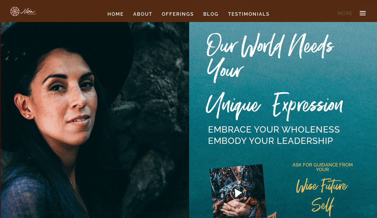
- Location City In The US: Mill Valley, CA
- 3 Key Takeaways about what makes it effective:
- Artistic and Soulful Aesthetic: The design uses earthy tones, artistic photography, and elegant fonts to create a deep, soulful, and introspective mood.
- Poetic and Evocative Copy: The writing style is lyrical and thoughtful, designed to attract clients who are seeking deep, transformational work.
- Focus on Sisterhood and Community: The site emphasizes group programs and circles, building a strong sense of community around her work.
18. Handel Group
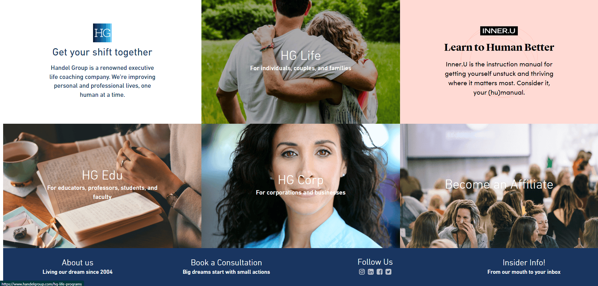
- Location City In The US: New York, NY
- 3 Key Takeaways about what makes it effective:
- Clear Corporate and Personal Tracks: The website does an excellent job of separating its offerings for corporate clients and individual clients right from the homepage.
- Proprietary Method Branding: They have successfully branded “The Handel Method,” which makes their coaching feel unique, proven, and tangible.
- Direct and Actionable Language: The copy uses strong commands and questions to engage the user and push them toward self-reflection and action.
19. Jody Moore
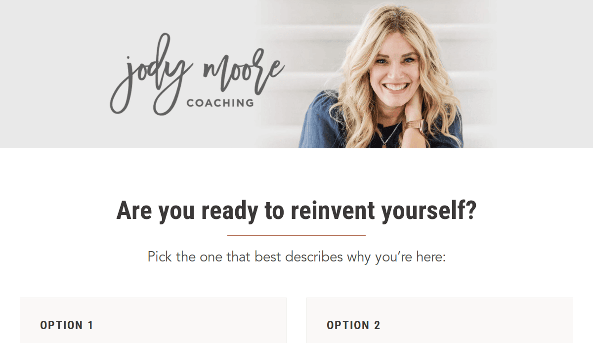
- Location City In The US: San Diego, CA
- 3 Key Takeaways about what makes it effective:
- Hyper-Specific Niche: She targets a very specific audience (members of The Church of Jesus Christ of Latter-day Saints), which makes her messaging incredibly resonant and effective.
- Relatable and Authentic Voice: Her writing style is down-to-earth, humorous, and highly relatable, making her feel more like a trusted friend than a distant guru.
- Strong Membership Funnel: The entire website is expertly designed to guide visitors toward her primary offering: her “Be Bold” coaching membership program.
20. Susan Hyatt
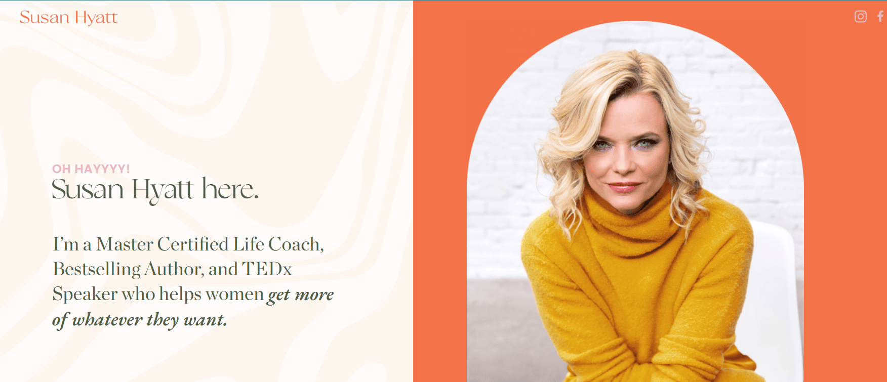
- Location City In The US: Nashville, TN
- 3 Key Takeaways about what makes it effective:
- Bold and Energetic Branding: The use of bright colors, energetic photos, and bold typography creates a fun, “larger-than-life” brand personality.
- Clear Focus on Women’s Empowerment: The messaging is unapologetically focused on empowering women to be more confident and visible.
- Prominent Media and Book Promotion: Her books and media appearances are seamlessly integrated into the site to build authority and drive sales.
Your Blueprint for a Beautiful Coaching Website
You have the passion for coaching and the vision for your life coach business; this step-by-step guide has provided the blueprint. Following these phases is the key to moving beyond a simple website template and building a coaching business on a solid digital foundation. The difference between a struggling site and a high-converting coaching website lies in this strategic approach—combining authentic content with professional web design for coaches. While it’s possible to do it yourself, the path of website development requires time, technical skill, and a deep understanding of what makes a site truly effective.
Your energy is best spent on your clients. Let our energy be spent on building your digital home. If you’re ready to partner with a professional website designer who understands the nuances of creating a powerful online presence for coaches, we’re here to help. Contact us today for a free consultation and let’s build your high-converting website together.
Frequently Asked Questions About Life Coach Sites
What are the must-have pages for a professional coaching website?
Every professional coaching website needs a core set of pages designed to guide visitors from curiosity to client. To create a user-friendly website, you must include:
- Home: Your digital front door that makes a strong first impression and clearly communicates who you help.
- About: A page to tell your story, share your values, and build a personal connection.
- Services / Work With Me: This page should detail your offerings, such as one-on-one coaching, group coaching programs, or specific packages for career coaching or executive coaching.
- Blog/Articles: This is where you demonstrate your expertise and provide value, which is essential for a website that showcases your unique approach.
- Contact: A simple page that makes it easy for potential clients to take the next step. These pages are the foundation of a well-designed website, and you can gain more insight by understanding the Core Principles of Web Design.
What’s the best website platform for a life coach: WordPress, Squarespace, or Wix?
Choosing the best website platform depends on your technical comfort and long-term goals for your life coach business.
- Website builders like Wix and Squarespace are known for their user-friendly, drag-and-drop interfaces, which can be great for creating a website quickly.
- WordPress offers unparalleled flexibility and scalability. If you plan to build a successful online brand with extensive blogging, membership areas, or advanced coaching tools, WordPress is the superior choice. It has a steeper learning curve, but it gives you complete control to build a life and business without limitations. To understand what’s involved, it helps to review the typical Step-by-Step Guide to the Web Design Process. For most serious coaches, we believe WordPress is the best investment for the future.
How can I make my website content actually attract online coaching clients?
Your website content is your primary sales tool. To make it effective, you must shift your focus from yourself to the client. Clearly articulate the problems you solve and the transformations you provide. Use the exact language your ideal clients use to describe their struggles and aspirations. Most importantly, you need to build trust by weaving in social proof that your coaching works. This includes testimonials, case studies, and success stories that validate your coaching experience and skills.
Beyond design, what technical coaching tools or software should my website integrate with?
To create a truly successful site that functions as a business hub, you should integrate a few key coaching tools. The most important is an online scheduling tool (like Acuity or Calendly) that allows clients to book sessions directly from your site. Additionally, integrating life coaching software for email marketing (like Mailchimp or ConvertKit) is essential for nurturing leads you capture through contact forms or free resource downloads. This turns your website from a simple brochure into an active business-building machine.
Why do life coaches need a website if they get clients from referrals?
While referrals are powerful, they are also unpredictable. A common reason life coaches need a website is to build a stable, scalable, and professional foundation for their business. Your website acts as your 24/7 digital presence, providing instant credibility to the referrals you do get. It gives potential clients a place to validate your expertise, understand your methods, and decide if you’re the right fit before they even speak to you. Ultimately, having a professional coaching site is essential to build a strong, independent brand and create a predictable flow of clients beyond word-of-mouth. To see website examples of how we help coaches achieve this, you can view our work with other coaching industry professionals.


