Just looking for our Best Handyman Website examples list?
Why Great Handyman Website Design is Crucial for Growing Your Business
The truth is that today, your website is often the first impression new clients have of your handyman business. That means that a professional website is no longer just a luxury—it’s an essential tool for success. Imagine a situation where a potential client searches online for local handyman services, only to find your website is outdated, difficult to navigate, or lacks important information. That potential client quickly moves on to a competitor with a more polished and functional website.
Your company website serves as more than just an online business card; it’s the cornerstone of your online presence. A high-performing, well-designed website can dramatically increase your visibility, making it easier for prospective clients to find you through SEO. When done right, your website showcases your offerings and establishes trust with visitors, ultimately driving more leads and converting those leads into paying customers.
Whether you’re using a website builder or hiring a web designer, building a website that reflects your expertise and professionalism is critical. In this guide, we’ll walk you through why great design matters and how to create a website that can help grow your business, enhance your online presence, and attract more website visitors. Let’s discuss the elements of a high-performing website that will help you stand out in the competitive handyman service industry.
Website Planning & Purpose
The planning phase is one of the most critical steps in designing a website for your handyman business. This phase sets the foundation for everything that follows and ensures your website aligns with both your business goals and the expectations of your clients.
Before diving into design, it’s essential to define the primary purpose of your website. Are you aiming to increase local leads, promote your handyman services, or provide a platform for customers to request a free estimate? Clarifying your goals helps guide every decision, from the content structure to design elements.
A well-planned website for your handyman business should be more than just visually appealing; it needs to serve as an effective marketing tool that communicates the value of your services to your target audience. One of the first things to consider is your audience: homeowners looking for reliable and efficient handyman services in your area. What are their key pain points, and how can your website address them? Understanding this allows you to present your services in a way that resonates with them.
You should also focus on the core functionality of the site. It needs to be easy to navigate, mobile-responsive, and fast-loading to ensure a seamless user experience. Ensure your contact information is readily available, provide clear calls to action, and showcase testimonials to build trust with prospective clients. These are crucial elements for turning website visitors into paying customers.
It’s also important to keep in mind that your website will evolve over time. Incorporating a content management system (CMS) like WordPress gives you the flexibility to update and expand your site as your business grows. Be sure to plan for regular updates and content additions, such as blog posts, to keep your website fresh and relevant. For more in-depth tips on creating effective websites for service businesses, you can also check out our Home Builder Website Design Guide.
Proper planning and a clear purpose during the design phase will help you create a functional and compelling online presence that serves as an asset to your handyman business. With the right strategy, your website can become a powerful tool for customer acquisition, lead generation, and business growth.
Design Principles
Designing a website for your business goes beyond aesthetics; it is about creating a functional, intuitive, and visually appealing online experience for your visitors. A well-designed website can significantly impact how new clients perceive your business and can be the deciding factor in whether they choose to reach out to you. Below are key design principles to keep in mind when developing your handyman website.
- Simplicity and Clarity
A clean, simple design helps communicate your message clearly and reduces friction for visitors. Too many elements on a page can overwhelm users, making it difficult for them to navigate your site. Use a simple layout that emphasizes the most important information—like the services you offer, contact details, and calls to action—without distracting from the primary goal of converting visitors into clients. A straightforward, clutter-free website ensures that visitors can quickly find what they’re looking for and easily reach out to you. - Mobile-First Design
With more than half of all website traffic coming from mobile devices, it is essential to design a website with mobile users in mind. A mobile-responsive website adapts its layout and content to fit the size of the user’s device, ensuring an optimal experience regardless of whether a user is on a smartphone, tablet, or desktop. This principle improves user engagement and reduces bounce rates, especially when prospective clients are looking for quick answers while on the go. Designing with a mobile-first approach also positively impacts SEO rankings, as search engines favor mobile-friendly sites. - Fast Loading Speed
A slow-loading website can result in high bounce rates and poor UX. Visitors expect fast, responsive sites that load within a few seconds. Ensure that images are optimized, code is streamlined, and unnecessary plugins or scripts are removed. A fast website improves user satisfaction, helps improve your SEO ranking, and makes it easier for clients to find your business online. - Strong Visual Hierarchy
Effective design should guide visitors through your content in a logical, intuitive way. Use a clear visual hierarchy to lead users from one section to the next. This can be achieved by utilizing headings, subheadings, bullet points, contrasting colors, and spacing. Organize your content so that the most important elements, like service offerings and contact information, stand out. A strong visual hierarchy ensures that visitors know where to look and what action to take next, increasing the likelihood of conversions. - Clear Calls to Action (CTAs)
A great design includes well-placed, clear calls to action that encourage visitors to take the next step. Whether it’s requesting a free estimate, scheduling an appointment, or calling for more information, CTAs should be easily visible and strategically placed throughout the site. Use action-oriented text like “Get a Free Estimate” or “Contact Us Today” to prompt visitors to engage. The clearer and more compelling your CTAs, the more likely your website will convert visitors into leads. - Trust-Building Elements
Building trust is crucial in this industry, where clients often seek dependable professionals for their home repairs and projects. Incorporating trust-building elements, such as customer testimonials, certifications, and case studies, can significantly improve your credibility. Display positive reviews prominently on your homepage or service pages and ensure that your contact information is easy to find. Transparency is key to making your visitors feel comfortable reaching out to your business. - User-Friendly Navigation
Navigation is one of the most important aspects of site design. A well-structured, easy-to-use navigation menu helps visitors find the information they need quickly, making their experience more pleasant. Group related pages together, and ensure that key pages like your services, about us, and contact page are easily accessible. Avoid overwhelming visitors with too many options, and consider using sticky navigation that stays visible as users scroll down the page. - Consistent Branding
Your website should reflect the identity of your business. Consistent branding, including your logo, color scheme, typography, and messaging, will help visitors immediately recognize your business and connect with your services. Use colors and design elements that align with your brand values and appeal to your target audience. A cohesive brand image reinforces professionalism and reliability, traits that are essential in the handyman industry.
When designing your website, it’s important to balance aesthetics with functionality. A beautiful site is of little use if it doesn’t serve the purpose of converting visitors into clients. By following these design principles, you can create a website that looks great and works effectively to grow your business. For more in-depth information on designing websites for service professionals, check out our Contractor Website Design Guide.
Content & Navigation
When designing a website for your business, structuring content and navigation effectively is critical to providing a seamless user experience and ensuring visitors can easily find the information they need. A well-organized website enhances usability and supports your business goals by increasing engagement, building trust, and ultimately converting visitors into clients.
Structuring Content for Your Handyman Website
The content on your website should be clear, concise, and easy to read. Break down your services into digestible sections and ensure that visitors can quickly find the information they need without feeling overwhelmed. Here are some best practices for structuring content on a handyman website:
- Homepage: The homepage is the first impression prospective clients will have of your business. It should succinctly convey who you are, what you do, and why you are the best choice for their handyman needs. Include a compelling headline, a brief overview of your services, and a clear call to action (CTA), such as “Request a Free Estimate” or “Schedule an Appointment.” Keep the content above the fold (the part of the page visible without scrolling) concise, highlighting your value proposition.
- Service Pages: Create individual pages for each handyman service you offer, such as plumbing, electrical work, drywall repair, etc. Each service page should describe the specific service in detail, including its benefits, how you approach the job, and why your clients can trust you. Provide a CTA on every service page that prompts users to take the next step—whether that’s getting in touch with you or scheduling a service.
- About Us Page: The “About Us” page is where you can tell your story and give your business a personality. Share your experience, qualifications, and the core values that drive your business. This is a great opportunity to establish trust with visitors by showcasing your expertise and commitment to quality service.
- Testimonials and Case Studies: Social proof is a powerful tool. Including customer testimonials or case studies throughout your website helps build credibility and trust with visitors. Real feedback from satisfied clients provides reassurance to new visitors that your services are reliable and of high quality.
- Blog or Resource Section: A blog or resource center is an excellent way to educate your clients while improving your SEO. Write articles about common home repair problems, maintenance tips, or DIY advice that your clients can use. By regularly updating your content, you can also position yourself as an expert in your field and help your website rank higher in search results. Additionally, the blog helps you target long-tail keywords and capture more organic traffic.
Structuring Navigation for Your Handyman Website
Navigation is a critical element of your website’s usability. If users can’t find what they’re looking for quickly, they will leave your site and turn to a competitor. The goal of your navigation is to make it easy for visitors to move from one page to another without confusion. Here’s how to effectively structure your website’s navigation:
- Main Navigation Bar: The main navigation should include the most important sections of your website, such as Home, Services, About Us, Testimonials, and Contact. Ensure that the menu is simple and uncluttered. Avoid overloading the navigation with too many options, as this can overwhelm visitors. Stick to the essentials and consider dropdown menus if you have multiple service categories.
- Sticky Navigation: Consider using sticky navigation, which keeps the menu at the top of the page as visitors scroll down. This ensures that your navigation options are always available, making it easier for users to find key pages without having to scroll back to the top of the page.
- Service-Based Navigation: If you offer a variety of services, categorize them under relevant headings in your navigation. For example, you might have categories like “Plumbing,” “Electrical,” “Carpentry,” etc., with sub-pages that detail each service. This allows users to quickly find the specific service they need without having to dig through irrelevant information.
- Search Functionality: A search bar should be easy to find on your website, preferably in the top-right corner. This is particularly useful for visitors who are looking for specific information or services. Ensure that your search bar is optimized to return relevant results and improve user experience.
- Contact Information: Make your contact information easy to find by including a “Contact” link in the main navigation and also prominently on the footer of every page. Users should be able to reach out to you with minimal effort, whether through a contact form, phone number, or email.
- Clear Calls to Action: Every page on your website should have a clear, action-oriented button or link. This could be a “Get a Free Estimate,” “Schedule an Appointment,” or “Contact Us Today.” Make sure the CTAs are visible and easy to click, particularly on mobile devices.
By structuring content and navigation with the user in mind, you improve the UX and ensure your website fulfills its business purpose: attracting and converting leads. For additional insights on designing effective websites for service-based businesses, check out our Home Services Website Design Guide.
Visual Elements
Visual elements play a crucial role in creating a compelling UX and supporting your handyman business’s brand identity. A well-designed website should be functional and visually appealing, ensuring that visitors stay engaged and feel confident in your services. In this industry, where trust and professionalism are paramount, the visual aspects of your website can significantly influence a potential client’s decision to contact you for their needs.
Consistency in Branding
Your website should reflect your brand’s identity through consistent use of colors, fonts, logos, and imagery. This visual consistency builds brand recognition and trust. For example, if your business uses a particular color palette for its logo or marketing materials, incorporating those colors into your site design helps reinforce the connection between your online presence and your real-world business. It also makes your brand more memorable to visitors, ensuring that every interaction with your website feels like a continuation of the positive impression you’ve made with your offline marketing materials.
High-Quality Images
In the handyman industry, where service quality is key, showcasing your work through high-quality images can make a significant impact. Use clear, professional photos of completed projects, tools, and your team in action. Before-and-after photos are particularly effective in demonstrating the transformative power of your services, allowing visitors to visualize the impact you can make. Avoid stock images that feel generic or disconnected from the real work you do; instead, opt for original photos that showcase the unique nature of your services. This visual representation cements trust and shows new clients that you take pride in your work.
Visual Hierarchy for Easy Navigation
The visual design of your website should guide visitors naturally from one section to the next. A clear visual hierarchy uses size, color, and spacing to prioritize important content and calls to action. For example, the most crucial information, such as your services and contact details, should be prominently featured on your homepage and other key pages. Use larger text or bold headings for important sections, and reserve smaller text for secondary information. This approach helps visitors quickly find the information they are looking for without feeling overwhelmed, improving overall user experience and ensuring that they can navigate your website with ease.
Typography
Typography plays a vital role in both readability and the tone of your website. For a company website, it is important to use clean, easy-to-read fonts that create a sense of professionalism and clarity. Avoid overly decorative fonts that may be hard to read on various devices. Stick to a limited number of font styles—usually one for headings and another for body text—to maintain a polished and cohesive design. The choice of font should align with your brand’s personality: a strong, reliable handyman business may benefit from a solid, sans-serif font that feels modern and sturdy.
Color Scheme
Color is one of the most powerful visual elements because it can influence emotions and perceptions. Using colors that convey trust, reliability, and professionalism is important. Blue is often associated with trust and professionalism, while green can evoke feelings of safety and dependability. Earth tones like brown and gray can represent stability and craftsmanship. When selecting colors, it’s essential to maintain contrast for readability—text should be easy to read against the background. Ensure your color scheme is consistent throughout the website and complements your logo and other marketing materials.
Icons and Graphics
Incorporating simple icons and graphics can improve the UX by providing visual cues and breaking up text-heavy sections. For example, using icons to represent services (like a wrench for plumbing or a light bulb for electrical work) can help users quickly understand what services you offer without having to read lengthy descriptions. Icons and other graphical elements also enhance the visual appeal of your website, making it more engaging and interactive. Just be sure to keep icons simple and avoid overloading your website with too many, as this can distract from your core message.
Call-to-Action Buttons
Call-to-action (CTA) buttons are one of the most critical visual elements on your website, as they guide visitors to take the next step, whether it’s getting a free estimate, scheduling an appointment, or contacting you for more information. These buttons should stand out visually without being overwhelming. Use contrasting colors for your CTA buttons to make them noticeable and easy to find. The text on the button should be action-oriented, such as “Get a Free Estimate” or “Contact Us Today,” encouraging users to engage with your business.
Responsive Design and Adaptability
Since many potential clients will access your website from mobile devices, it’s essential that all visual elements adapt seamlessly to different screen sizes. A responsive design ensures that images, buttons, and text resize and reposition appropriately, providing an optimal viewing experience on smartphones, tablets, and desktops. This adaptability is key to retaining visitors and ensuring they can navigate your website efficiently, regardless of the device they are using.
Emotional Impact Through Visuals
The visuals on your website should work to evoke trust, reliability, and professionalism—qualities that potential clients look for when hiring a service provider. The choice of images, colors, and fonts can help to reinforce these emotions. A clean and well-designed website helps to establish a strong first impression and reassures visitors that they are dealing with a credible, experienced business. Positive visual impressions can lead to longer time spent on your website, higher engagement, and, ultimately, more leads.
In summary, visual elements are not just about making your website look good—they are integral to creating a user-friendly experience and building trust with your audience. Thoughtfully chosen images, a consistent color scheme, clear typography, and well-placed CTAs all contribute to a site that reflects the quality and professionalism of your services. By carefully considering these visual aspects, you can design a website that attracts visitors and helps turn them into loyal clients.
Ongoing WordPress Maintenance
Maintaining a WordPress website for your business is essential to ensure it continues to run smoothly, stays secure, and remains up to date with the latest features. Ongoing maintenance keeps your site functioning efficiently, improves UX, SEO performance, and protects your business from security vulnerabilities. In a digital world where technology is constantly evolving, it’s crucial to stay on top of updates and routine checks to ensure your website remains effective in meeting your business goals.
One of the most important aspects of WordPress maintenance is keeping your plugins, themes, and the WordPress core updated. Updates are released regularly by developers to fix bugs, patch security holes, and add new features. Failing to apply these updates can leave your site exposed to security threats and compatibility issues. It’s especially important to ensure that your contact forms, booking systems, and other client-facing elements are functioning properly, as these are vital to converting visitors into leads.
Another critical maintenance task is regular backups. Backing up your WordPress website ensures that if anything goes wrong—whether it’s due to a technical glitch, a hacker, or a server failure—you can quickly restore your site to its previous state. Automated backups are the best way to ensure this happens without manual intervention. In the event of an issue, you can restore your website with minimal downtime, reducing the impact on your business and preventing data loss.
Security is a top priority for any WordPress site. Hackers often target WordPress websites, and even a small vulnerability can lead to serious damage. Regularly scanning for malware and ensuring that your website’s security measures, such as firewalls and security plugins, are up to date will help protect your website from potential attacks. It’s also important to use strong passwords, enable two-factor authentication for users with administrative access, and keep track of your website’s security logs to spot any unusual activity early.
Performance optimization is another ongoing maintenance task that should not be overlooked. As you add new content, plugins, and features to your site, the website’s performance may slow down, which could negatively impact user experience and search engine rankings. Regularly testing and optimizing your website’s speed, image sizes, and code ensures your site continues to load quickly, keeping visitors engaged and helping you maintain a competitive edge. This is especially important for mobile users, as slow-loading websites on smartphones can lead to high bounce rates and missed opportunities.
In addition to the technical aspects, content updates are also part of ongoing maintenance. A stagnant website can harm your business’s online presence, as both visitors and search engines expect fresh, relevant content. Regularly updating your service offerings, adding new testimonials, and blogging about recent projects or industry trends helps improve SEO and keeps your site engaging for potential clients. Consistent content updates also provide opportunities to target new keywords, boosting your visibility in search results.
Monitoring your website’s performance through analytics is another essential part of ongoing maintenance. By regularly reviewing key metrics such as website traffic, bounce rates, conversion rates, and user behavior, you can identify areas for improvement and adjust your strategy accordingly. This data allows you to make informed decisions about your website’s content, layout, and functionality, helping you fine-tune the user experience and ensure that your website continues to meet your business objectives.
Having a solid ongoing maintenance plan for your WordPress website will ensure that it remains secure, functional, and optimized for performance. Regular updates, backups, security checks, performance optimizations, content revisions, and performance monitoring are all necessary to ensure that your handyman business continues to thrive online. With proactive maintenance, you can focus on running your business while your website works seamlessly to attract new clients and support your growth.
19 Best Handyman Business Website Examples
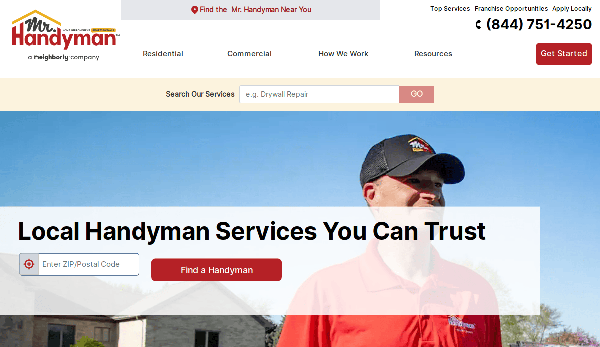
1. Mr. Handyman
Location: Ann Arbor, MI
Key Takeaways:
- Clean, professional design with a welcoming aesthetic.
- Easy navigation with clear service categories.
- Prominent call-to-action buttons for scheduling services.
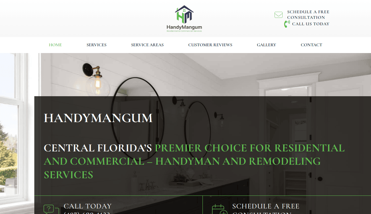
2. HandyMangum
Location: Orlando, FL
Key Takeaways:
- Eye-catching hero image showcasing quality work.
- Clear service listings with detailed descriptions.
- Testimonials that build trust with clients.
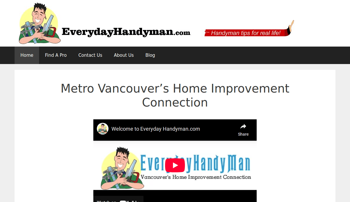
3. Everyday Handyman
Location: Boston, MA
Key Takeaways:
- Simple layout with easy-to-find contact information.
- Service areas clearly defined for customer convenience.
- User-friendly interface with quick load times.
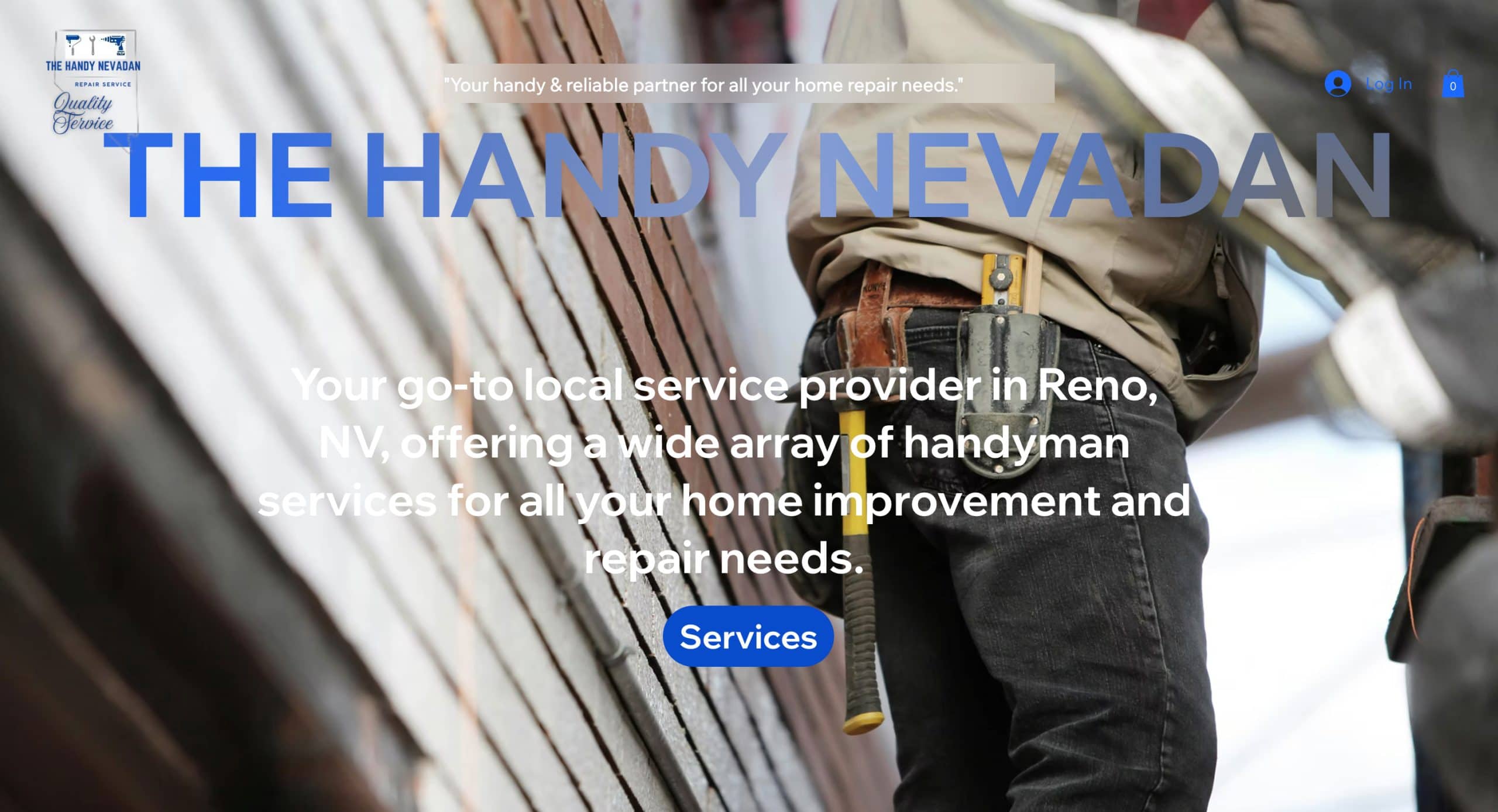
4. The Handyman Nevadan
Location: Reno, NV
Key Takeaways:
- Strong branding with a memorable logo.
- Comprehensive list of services offered.
- Engaging blog content that boosts SEO.
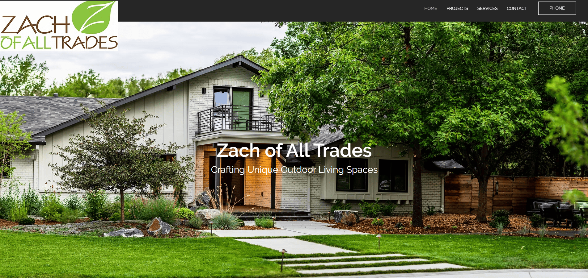
5. Zach of All Trades
Location: Denver, CO
Key Takeaways:
- Personalized approach with owner’s story featured.
- High-quality images of completed projects.
- Clear calls-to-action encouraging client engagement.
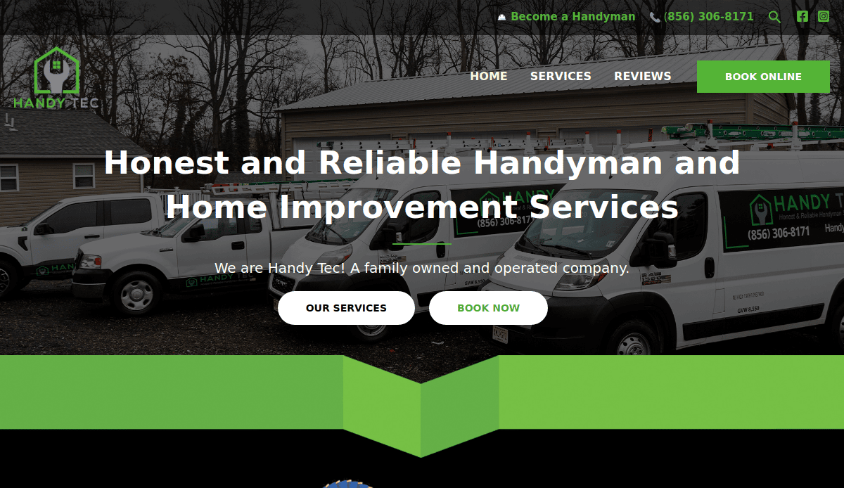
6. Handy Tec
Location: Austin, TX
Key Takeaways:
- Modern design with interactive elements.
- Online booking system for customer convenience.
- Detailed service descriptions with pricing information.
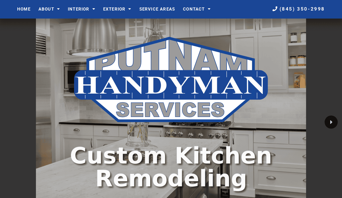
7. Putnam Handyman Services
Location: Putnam, CT
Key Takeaways:
- Clean, minimalist design focusing on services.
- Easy navigation with a responsive layout.
- Customer testimonials highlighting satisfaction.
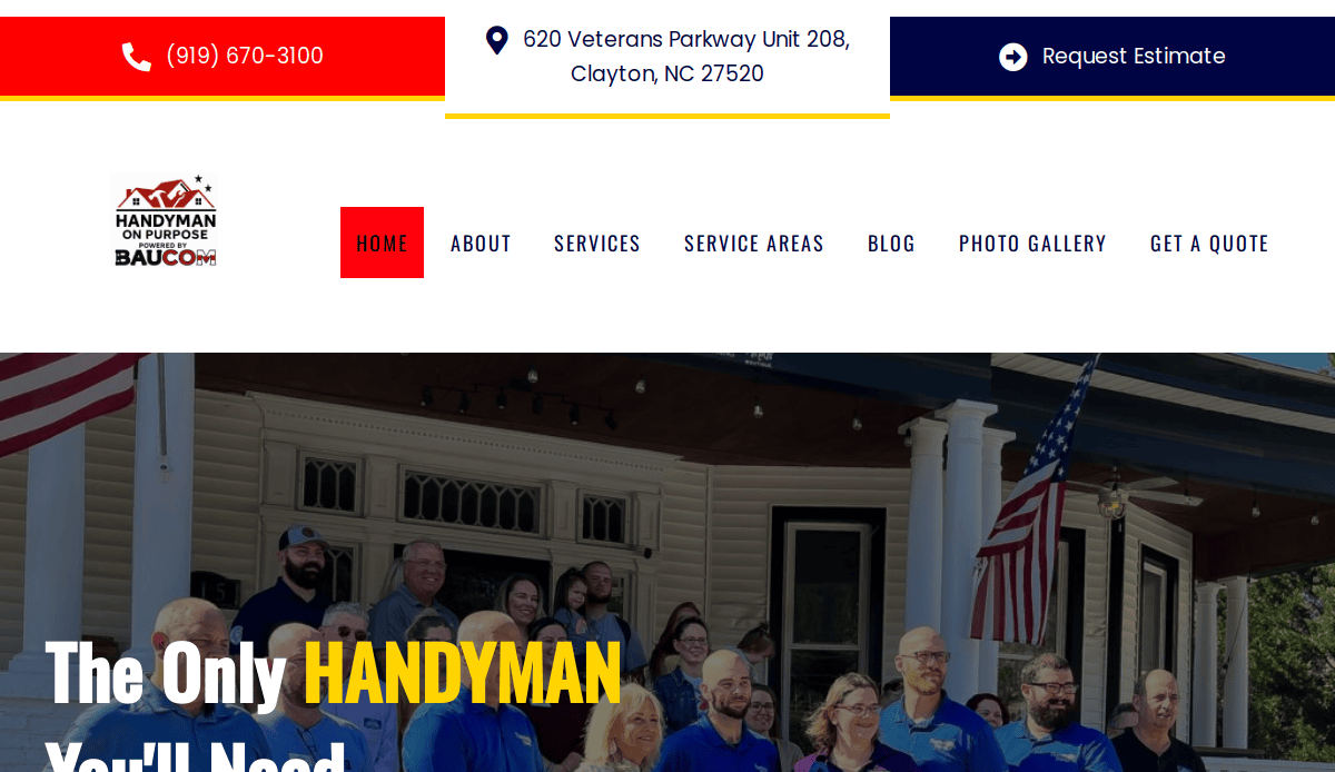
8. Handyman on Purpose
Location: Seattle, WA
Key Takeaways:
- Purpose-driven branding that resonates with clients.
- Comprehensive FAQ section addressing common concerns.
- Strong visual elements showcasing completed work.
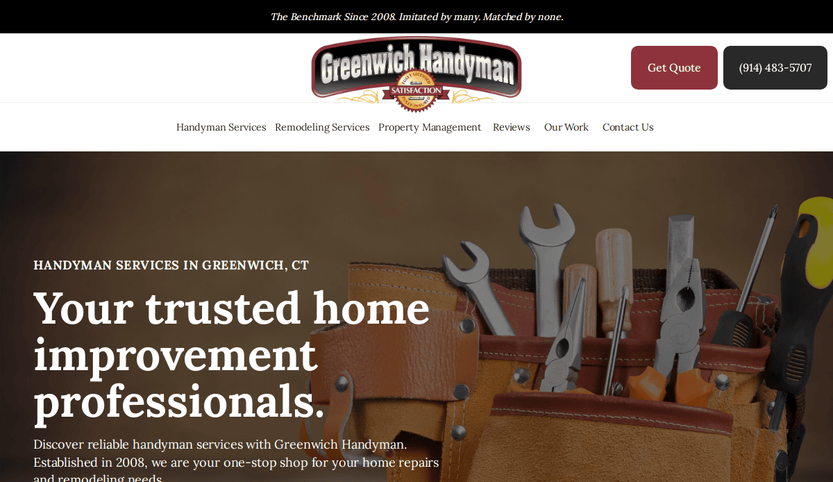
9. Greenwich Handyman
Location: Greenwich, CT
Key Takeaways:
- Elegant design reflecting high-end services.
- Detailed service descriptions with accompanying images.
- Easy-to-use contact form for client inquiries.
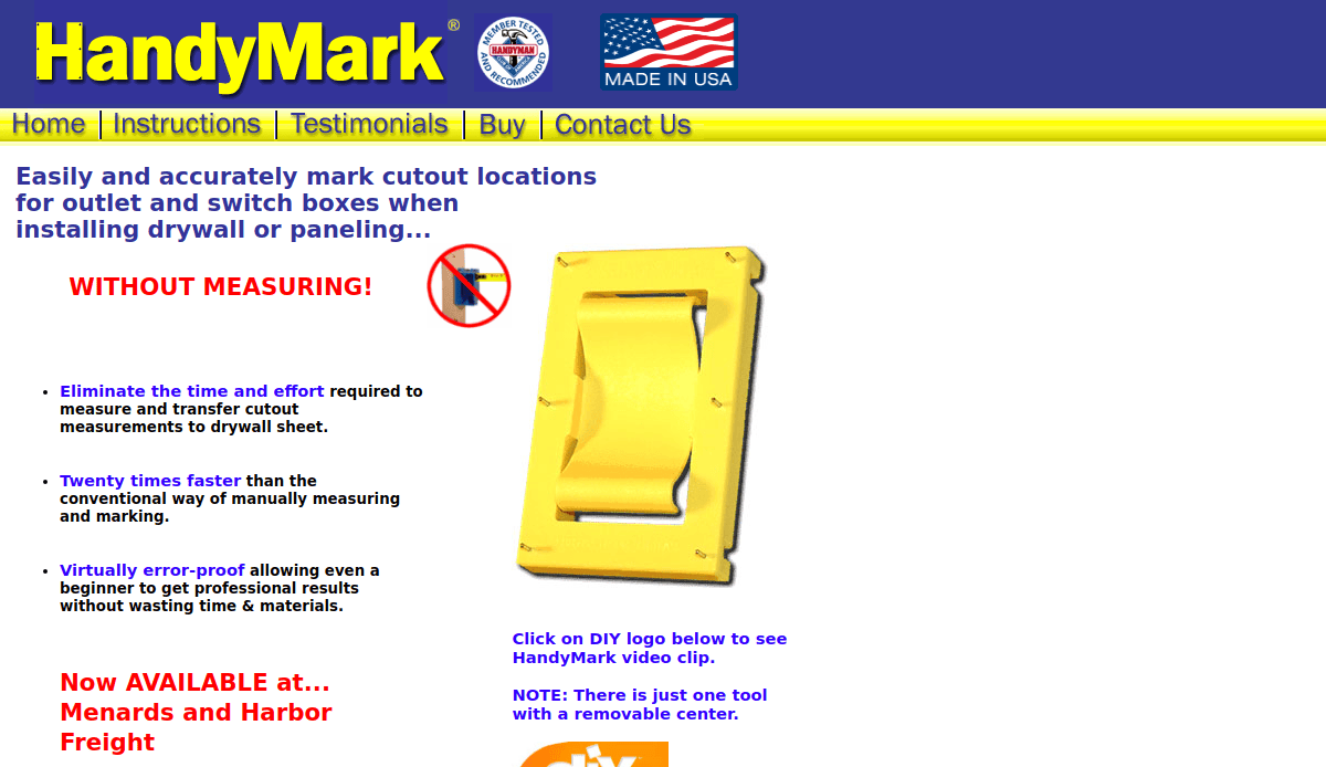
10. HandyMark
Location: Chicago, IL
Key Takeaways:
- Bold design with strong visual hierarchy.
- Clear calls-to-action encouraging bookings.
- Testimonials that build trust with visitors.
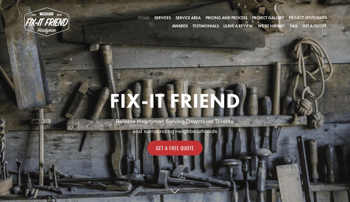
11. Fix-It Friend
Location: Portland, OR
Key Takeaways:
- Friendly branding that appeals to a broad audience.
- Service listings with transparent pricing.
- Blog content that provides value to visitors.
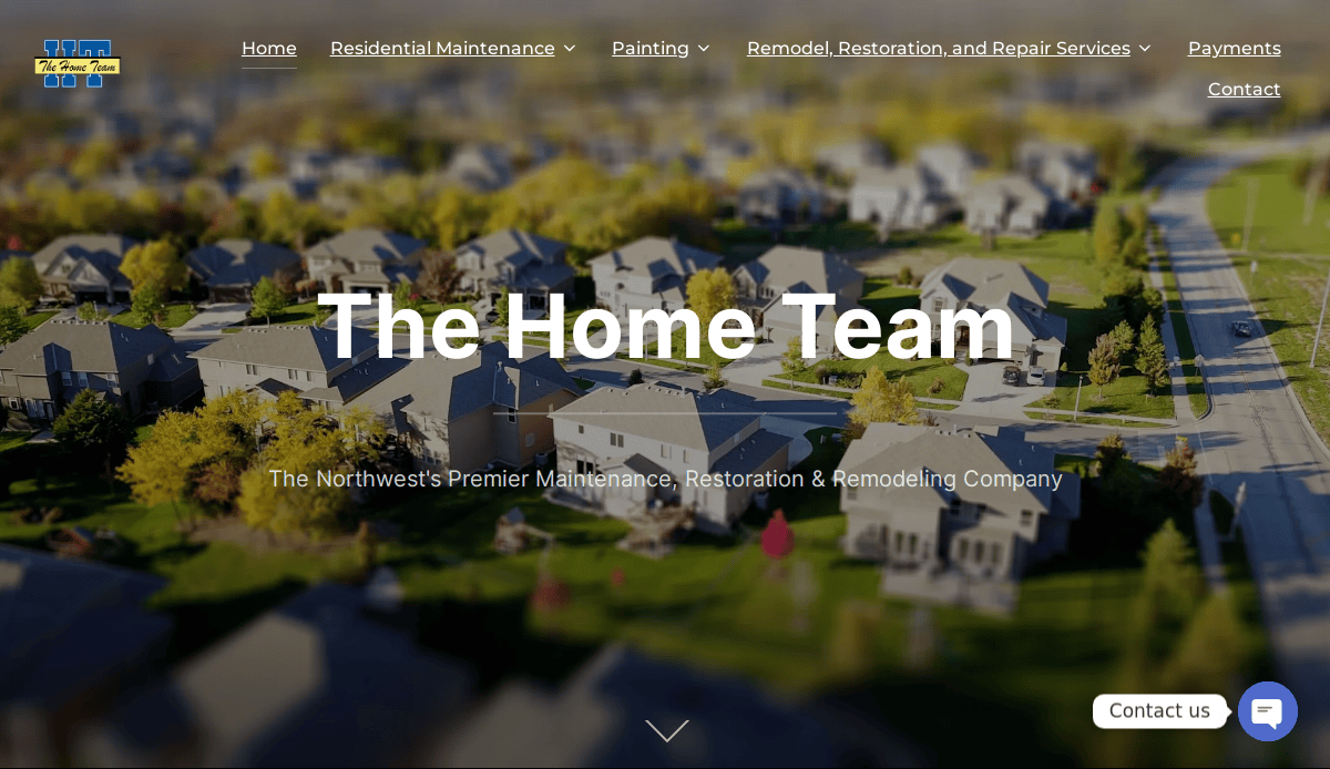
12. The Home Team NW
Location: Tacoma, WA
Key Takeaways:
- Professional design with a cohesive color scheme.
- Detailed service areas map for client clarity.
- Easy scheduling system integrated into the site.
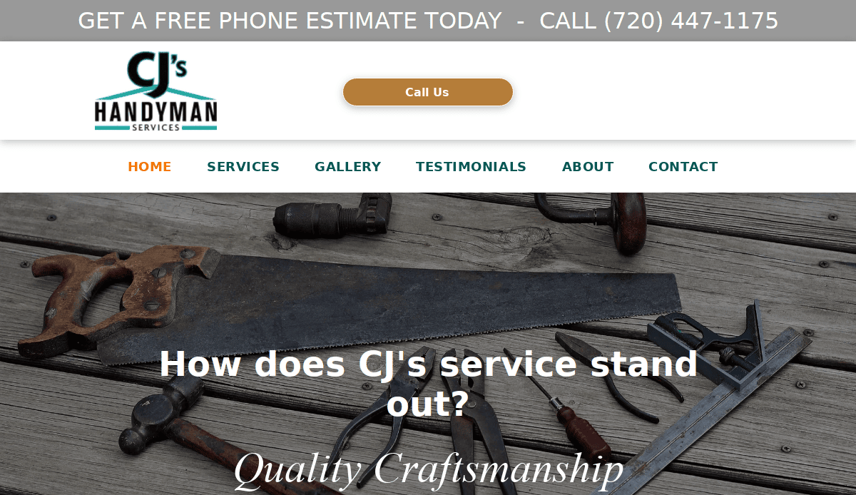
13. CJ’s Handyman Services
Location: Atlanta, GA
Key Takeaways:
- Organized layout with clear service categories.
- High-quality images showcasing completed projects.
- Customer reviews that enhance credibility.
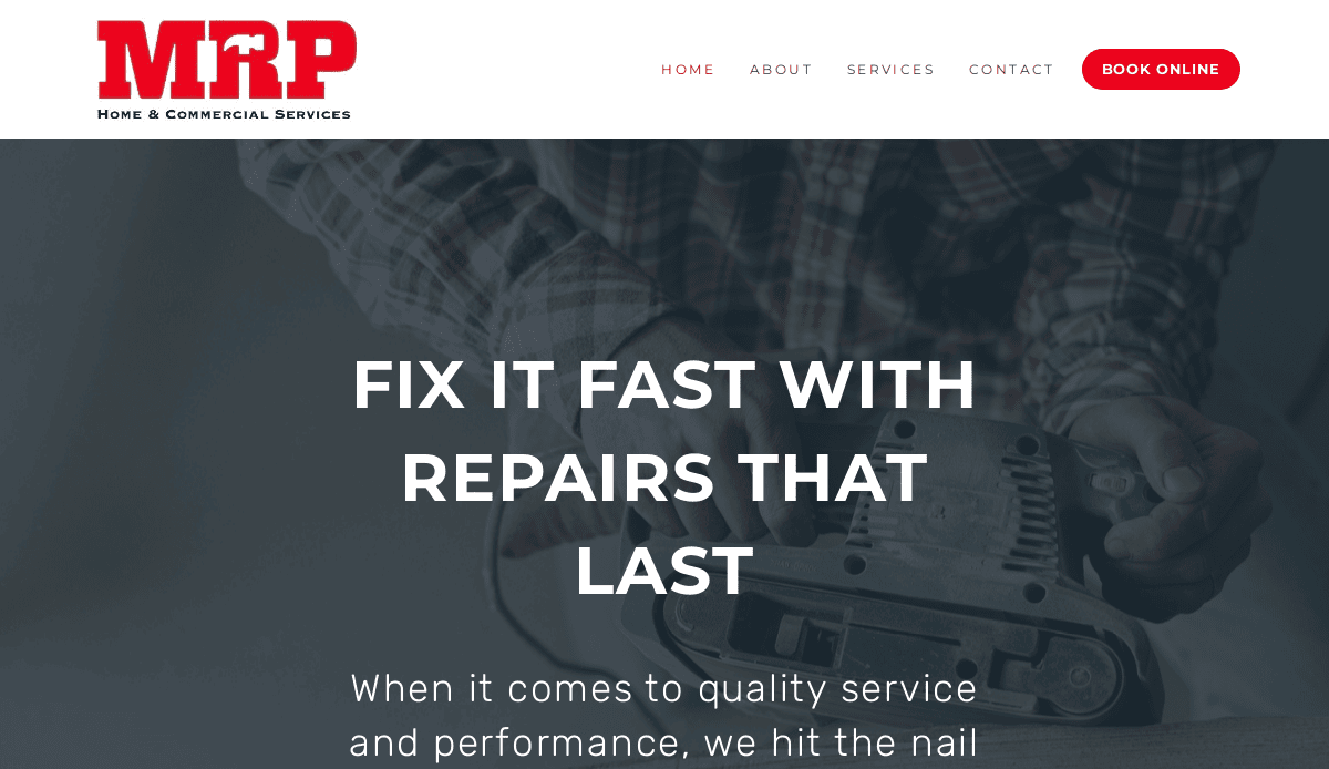
14. MRP Services
Location: Los Angeles, CA
Key Takeaways:
- Sleek design with modern aesthetics.
- Comprehensive list of services with detailed descriptions.
- Easy-to-navigate interface for user convenience.
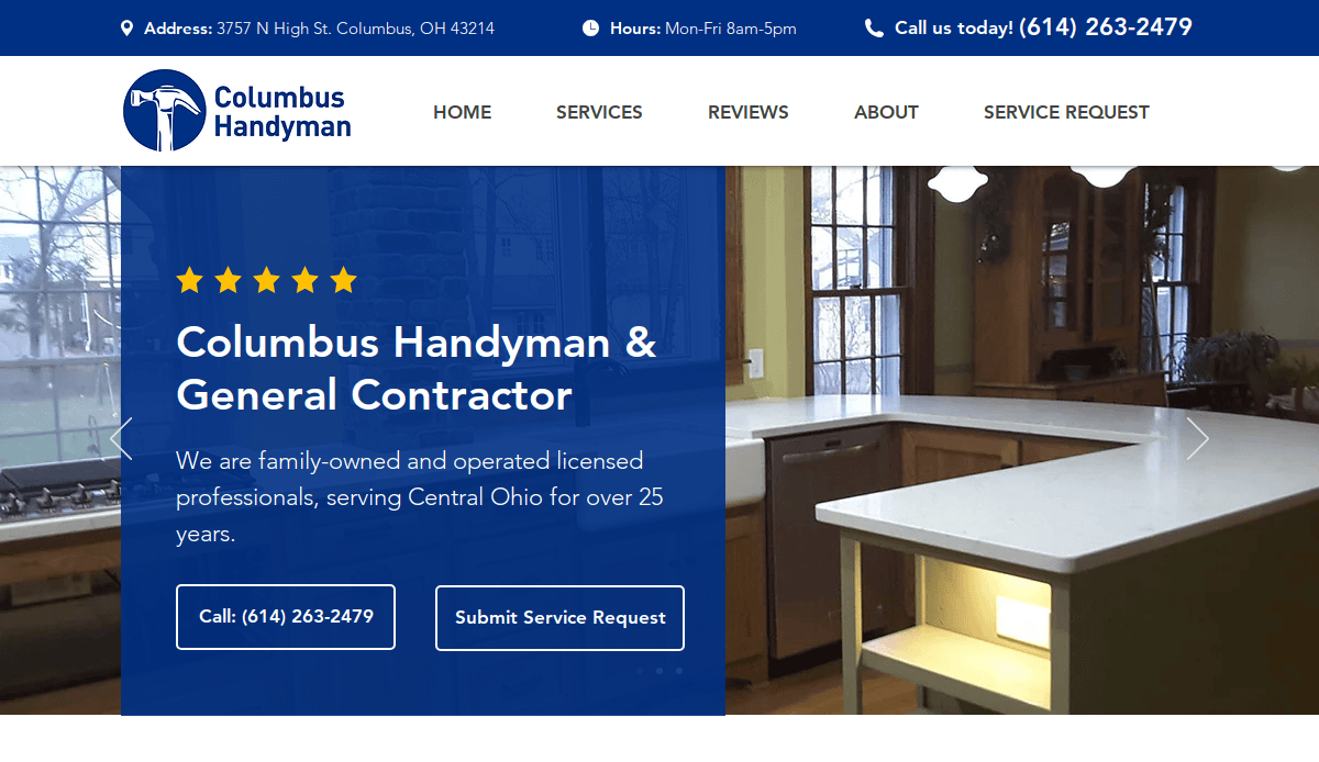
15. Columbus Handyman
Location: Columbus, OH
Key Takeaways:
- Clean design with a focus on user experience.
- Detailed service listings with accompanying images.
- Prominent contact information for easy client communication.
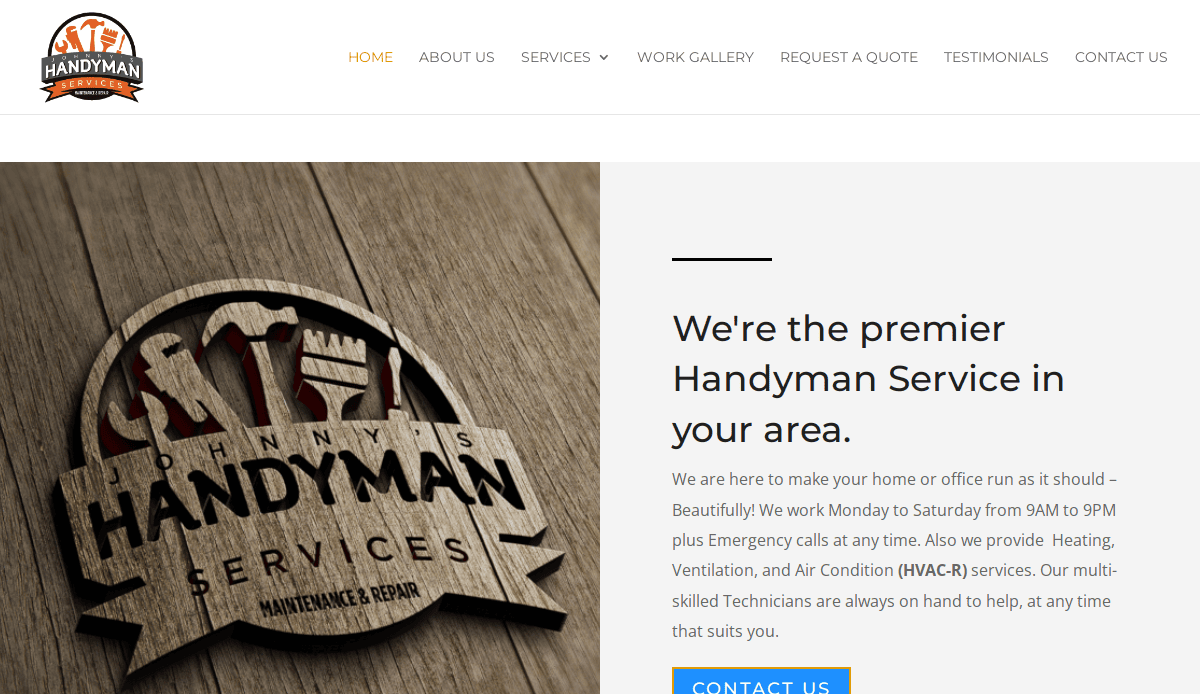
16. JH Services
Location: Phoenix, AZ
Key Takeaways:
- Professional layout with intuitive navigation.
- High-quality images of past projects.
- Clear calls-to-action encouraging client engagement.
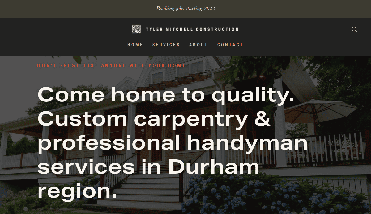
17. Tyler Mitchell Construction
Location: Nashville, TN
Key Takeaways:
- Modern design with a focus on services offered.
- Easy-to-use contact form for client inquiries.
- Testimonials that build trust with prospective clients.
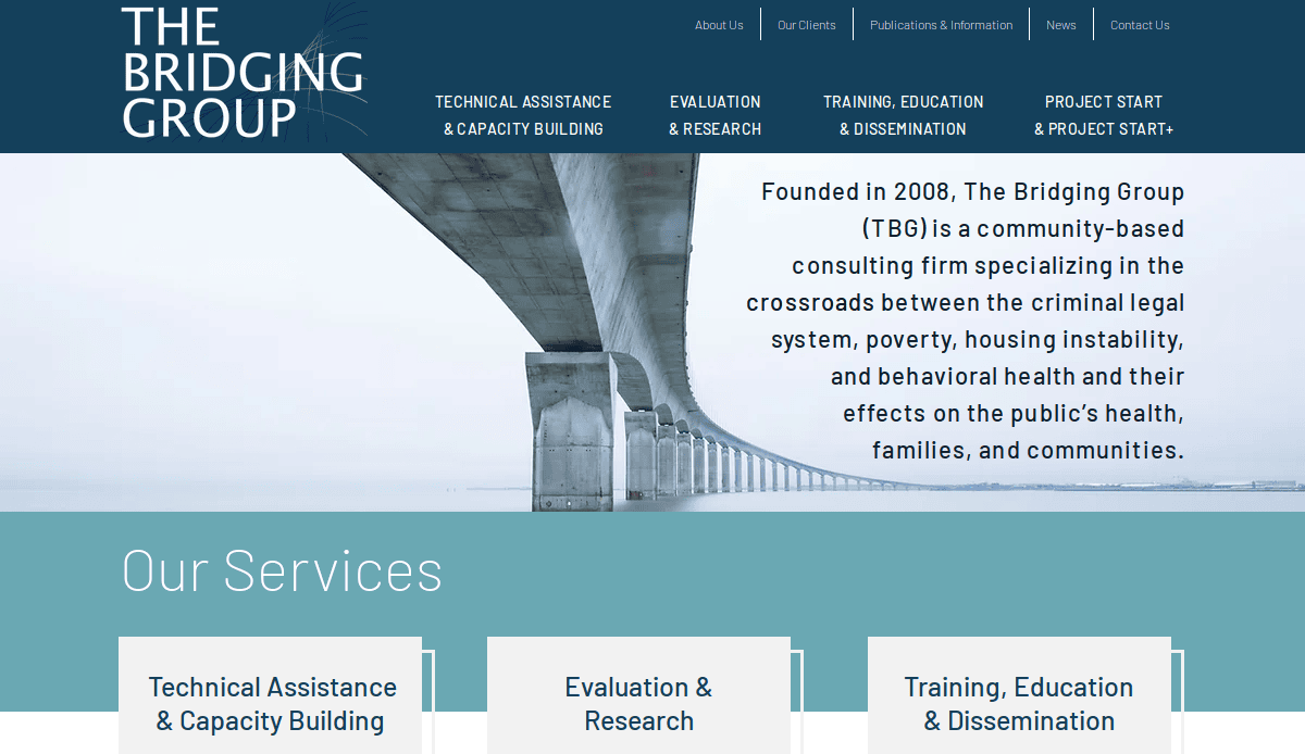
18. The Bridging Group
Location: San Diego, CA
Key Takeaways:
- Sleek design with a professional aesthetic.
- Detailed service descriptions with accompanying images.
- Easy navigation with a responsive layout.
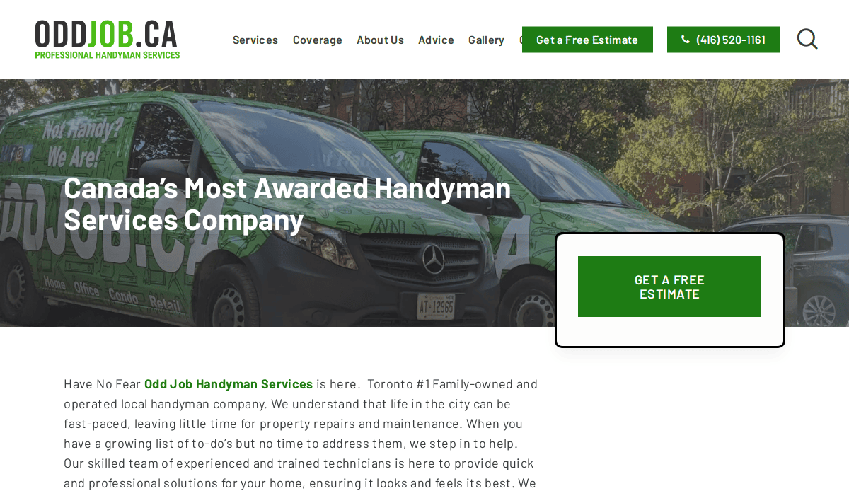
19. OddJob
Location: New York, NY
Key Takeaways:
- Vibrant design with dynamic visuals.
- Clear service categories for easy navigation.
- Testimonials that enhance credibility.
These examples showcase the importance of a well-designed, user-friendly website in attracting and retaining clients in the handyman industry. Incorporating elements such as clear service listings, high-quality images, and easy navigation can significantly enhance your online presence and drive business growth.
Take Action and Build Your Handyman Website Today
Now that you have a solid understanding of the essential elements for creating a handyman website, it’s time to take the next step. A well-designed, professional website is a critical tool for attracting new clients and showcasing your unique services. Whether you’re looking to make your handyman website stand out or integrate essential features like an invoicing system or online booking, every detail matters in establishing a strong online presence.
By following the step-by-step guide we’ve shared, you can create a website that highlights your handyman skills and serves as an effective marketing tool. Don’t let an outdated or poorly designed website hold your business back. It’s time to build a website that is user-friendly, visually appealing, and optimized for SEO to help people find your handyman company when they search for services in their area.
If you’re ready to create a professional website for your handyman business or need expert assistance with web design for a handyman, our expert team is here to help. Get your website designed by professionals today, and start turning website visitors into loyal clients. Let’s work together to bring your handyman company to the next level online.
Web Design for Handyman Company FAQs
What is the importance of creating a professional website for my business?
A professional web design is crucial because it acts as your digital storefront. It’s one of the first things visitors will see when searching for handyman services online. A visually appealing website that showcases your handyman work builds trust and sets you apart from competitors. If your website isn’t user-friendly, visitors may quickly leave, meaning missed opportunities for inquiries and potential business. A good website should include clear calls to action, service offerings, and easy navigation to make it easier for clients to find the information they need.
How do I make a website that generates leads?
To make a website that generates leads, focus on the visitor experience and clear conversion paths. Your website should include a simple, easy-to-navigate design that showcases your services and includes contact forms, quote requests, or a phone number prominently displayed. Integrating an online invoicing system or booking system can make the process seamless for clients. This, combined with SEO strategies, will help drive traffic to your website. For a more detailed guide to building a website that brings in leads, check out our guide to building a handyman website.
What features should I include on my website?
A good site should include several essential features to convert visitors into clients. These include a professional representation of your business, clear descriptions of your services, client testimonials, and a portfolio of your past work. Additionally, features like easy-to-find contact details, an online invoicing system, or a booking feature can help streamline client interaction. Make sure the look of your website reflects the type of website you want to create—a modern and visually appealing website that establishes trust and credibility.
How do I choose the right website builder for my business?
When setting up your website, choosing the right website builder is crucial. Consider platforms that offer customizable templates and SEO features, such as WordPress, which is often the best option for small businesses. A website builder designed to be user-friendly is ideal for tradesmen without web design experience. If you’re unsure where to start, our agency offers website design services to create a strong online presence tailored specifically to your business needs.
What should my website include to attract more traffic?
Your website should include key elements to attract more traffic, such as SEO-optimized content and a mobile-responsive design. Incorporating keywords like “handyman work” and “handyman services” into your content helps people searching to find you more easily. Additionally, using local SEO strategies to target people in your service area can bring in more leads. Don’t forget to include engaging content like blog posts, handyman website examples, or tips that keep visitors coming back and help increase the chances of them contacting you.
How can I make my website memorable?
To make your website memorable, it’s important to focus on both the design and functionality. A visually appealing website with unique branding, clear navigation, and well-organized information on your website can make a lasting impression. Highlighting your services, offering helpful tips, and using engaging calls to action that lead to inquiries and potential business opportunities will ensure that your website stands out. Consider incorporating custom elements, such as unique photos of your team and projects, or a client testimonial section that reinforces the value you offer.
How does professional web design impact my marketing?
Professional web design plays a significant role in your marketing efforts. A well-structured, attractive website can improve your online visibility and help you rank higher on search engines, which increases the chances of prospective clients finding you when they search for handyman services. A well-designed website also enhances your brand identity, making you appear more credible and trustworthy to visitors. Whether you’re looking to create a strong online presence or make sure your website showcases your expertise, professional web design should be a priority for your handyman marketing strategy.
Should I review some examples of good site design first?
Examples can offer great inspiration when planning your own site. A good website showcases your services and your brand’s personality and commitment to quality. Look for websites that use strong visuals, have easy-to-navigate menus, and feature clear calls to action. Many successful handyman websites integrate online scheduling or invoicing systems, allowing clients to easily book services or get quotes directly. Reviewing other sites in your field can help you identify features you might want to implement on your own site.
How do I ensure my website is user-friendly?
To make sure your website is user-friendly, focus on clear navigation, fast loading speeds, and mobile responsiveness. Your website should be designed so that even users with limited technical knowledge can easily find information about your services and contact you. Avoid clutter and make sure your pages are well-organized with relevant, concise information. By ensuring your website is easy to use and aesthetically pleasing, you will improve the likelihood that visitors will stay longer and engage with your business. For more tips on building a user-friendly website, check out our home services website design guide.
How can I integrate an invoicing system into my website?
Integrating an invoicing system into your website can streamline your business operations and improve customer experience. Many modern website platforms, like WordPress, allow you to add invoicing plugins or integrate third-party invoicing services. This feature allows clients to receive invoices directly through your website, which is especially useful for handyman companies that offer ongoing services. Ensuring your invoicing system is simple and transparent will also increase client trust and satisfaction.


