Just looking for our Best Dental Website examples list?
When it comes to online searches, where AI-generated summaries like Google’s AI Overviews are becoming prominent, dental practices must adapt their website design strategies to continue ranking well. Here are the essential takeaways to ensure your website remains visible and effective:
- Prioritize Clear and Concise Content
AI Overviews favor content that directly answers common patient queries. Ensure your website addresses questions like “What services does the dental clinic offer?” or “How can I book an appointment?” in a straightforward manner. - Implement Structured Data Markup
Utilize schema markup (e.g., FAQPage, HowTo) to help search engines understand your content’s context, increasing the likelihood of being featured in AI summaries. - Enhance Mobile Responsiveness and Page Speed
A fast-loading, mobile-friendly website improves UX and aligns with Google’s criteria for AI Overview selections. - Demonstrate Expertise and Trustworthiness
Showcase your dental practice’s credentials, patient testimonials, and affiliations to establish authority and trust, key factors in AI content selection. - Regularly Update Content
Keep your website content fresh and relevant by regularly updating service information, blog posts, and FAQs to reflect the latest dental practices and technologies.
By focusing on these areas, your website can effectively align with the requirements of AI Overviews, enhancing visibility and attracting more patients.
Why Dental Website Design Is the Backbone of Modern Practice Growth
First impressions matter—especially online. For dental practices, your website is more than just a digital business card; it’s the front door to your clinic. With over 90% of patients researching healthcare providers online before making an appointment, having a polished, strategic dental website is no longer optional—it’s essential.
Effective website design goes far beyond clean visuals. It’s about creating a seamless user experience (UX) that builds trust, communicates expertise, and guides visitors to take action. Whether you are starting from scratch or refreshing your current practice website, incorporating responsive design, clear navigation, and informative content ensures your site functions as a reliable marketing tool, day and night.
The best dental websites aren’t just pretty. They’re engineered for performance. From showcasing your services to optimizing for search engine visibility, the right design elements can elevate your online presence and convert casual browsers into loyal customers. This guide will walk you through the best practices and modern strategies that define high-converting web design for today’s dental professionals.
Website Planning & Purpose: Setting the Foundation for Success
Every great website begins with a detailed planning phase—a strategic step that sets the course for all design and development efforts. This stage is where you define your website’s primary goals, clarify its structure, and align design decisions with your dental practice’s business objectives.
Start by identifying the core purpose of your website. Are you aiming to increase appointment bookings, improve local visibility, or educate new patients on specific dental services? Your answers will shape the content strategy, navigation, and calls-to-action. For example, if online bookings are a priority, your homepage and service pages must clearly guide visitors to your scheduling tool.
It’s also crucial to outline your target audience. Think beyond basic demographics and consider patient behavior, common questions, and what motivates them to choose your practice over a competitor. This information ensures your site content is relevant and speaks directly to the needs of potential patients.
Planning also involves mapping out your site architecture. A well-organized website allows for intuitive navigation, which boosts user satisfaction and helps search engines crawl and index your pages effectively. Aim for a clear hierarchy with logical categories such as About Us, Services, New Patients, and Contact.
Additionally, aligning your design with your brand identity is a must. Your color palette, imagery, and tone of voice should reflect the values and professionalism of your practice. If you need a starting point, our guide on the core principles of web design offers a solid foundation for beginners.
Investing time in this planning phase ensures your final website is visually appealing and aligned with your practice goals and optimized for patient conversion.
Design Principles: Creating a Site That Looks Good and Performs Better
Once the planning phase is complete, successful website design relies on core principles that drive usability, engagement, and credibility. These principles are especially crucial in healthcare, where trust and professionalism must be immediately conveyed.
The first principle is simplicity. A cluttered layout or too many competing visual elements can confuse visitors and diminish trust. Use white space effectively, keep text concise, and focus each page on a single objective, such as educating patients about a service or prompting them to schedule an appointment.
Second, maintain visual hierarchy. Guide your visitors’ attention through strategic use of headers, subheadings, imagery, and call-to-action buttons. Your most important content—like appointment scheduling, contact details, or service highlights—should stand out both visually and contextually.
Third, emphasize responsive design. Today’s patients access your website from phones, tablets, and desktops, so your layout must adjust seamlessly to all screen sizes. A mobile-optimized experience isn’t just convenient—it directly impacts your search engine visibility and bounce rate.
Next, choose a consistent and calming color scheme that reflects your brand identity. Blues and whites often work well in dental web design because they evoke cleanliness and professionalism. Fonts should be easy to read, and imagery should reflect real patients and staff whenever possible to build authenticity.
Usability also plays a key role. Intuitive navigation, fast load times, and accessible design features (such as alt text for images and ADA compliance) all contribute to a smoother visitor experience. For more ways to elevate your digital presence, check out our recommendations for the best marketing strategies for dental practices.
Great design isn’t just about aesthetics—it’s about creating a user-friendly environment that enhances trust, drives action, and aligns with your practice’s goals.
Content & Navigation: Structuring Your Site for Engagement and Clarity
A well-designed website must be both content-rich and easy to navigate. This balance ensures visitors can find the information they need quickly, leading to a better visitor experience and higher conversion rates.
Content should be tailored to answer the specific questions and concerns of prospective patients. Start with essential pages such as Home, About the Practice, Services, New Patient Information, and Contact. Each page should clearly explain what your practice offers and why patients should choose you. Incorporating patient testimonials, before-and-after photos, and a frequently asked questions section also adds credibility and helps build trust.
When writing content, use a tone that’s both professional and approachable. Avoid jargon where possible, and structure your text with short paragraphs, subheadings, and bullet points to make it scannable. Strategic use of keywords is important, too, but clarity and helpfulness should always come first.
Navigation should be intuitive and consistent across all devices. Place the main navigation menu at the top of the page and include links to your most important content. Avoid using dropdown menus with too many layers—they can overwhelm users and make mobile navigation more difficult.
A logical content hierarchy is crucial. For example, group all dental service pages under one Services tab, and place patient forms or insurance information under a New Patients section. This structure reduces confusion and supports your website’s search engine performance.
Finally, consider accessibility and speed. Your site should be fast-loading and compliant with ADA standards to ensure all users, including those with disabilities, can access your content. Our breakdown of the best practices in web design for enhancing user experience can help you refine your navigation and content strategy for maximum impact.
A clear, thoughtful approach to content and navigation helps users engage with your site, and it supports SEO and positions your dental practice as a trustworthy, professional choice.
Visual Elements: Enhancing Trust Through Imagery and Design
Visual elements are central to building trust and emotional connection. In a field where patients often experience anxiety or hesitation, visuals must be carefully chosen to reinforce professionalism, calm nerves, and establish credibility from the very first click.
Start with high-quality imagery. Use real photos of your team, your office, and actual patients (with permission) rather than generic stock images. Authentic visuals help humanize your practice and allow prospective patients to imagine themselves in your care. Include images that showcase your facility’s cleanliness and technology to support a modern, trustworthy image.
Video content also plays a vital role. A short welcome video from the dentist, patient testimonials, or a virtual tour of your office can provide a more personal experience. Videos help communicate warmth and transparency while offering insight into the patient experience.
Color and typography should complement your brand. Choose a soothing color palette that conveys calmness and cleanliness—colors like blue, white, and soft neutrals often work best. Use consistent fonts that are easy to read and align with the professionalism of your brand.
Icons and infographics can simplify complex topics, such as treatment processes or insurance information. These elements break up text-heavy sections and make your site more engaging. Just ensure they are used sparingly and styled consistently.
Whitespace is another critical visual component. It helps content breathe, reduces clutter, and directs focus to key elements like calls to action. A clean, uncluttered layout signals professionalism and makes the site more enjoyable to navigate.
Ultimately, every visual decision—from imagery to layout—should reinforce your brand and improve UX. When designed intentionally, visual elements do more than decorate your site—they create a lasting impression that inspires patients to reach out and schedule an appointment.
Ongoing WordPress Maintenance: Keeping Your Website Healthy
Launching your website is only the beginning. To ensure long-term performance, security, and user satisfaction, ongoing WordPress maintenance is essential. A neglected site can quickly fall behind in functionality, speed, and even patient trust.
WordPress updates frequently include security patches, plugin improvements, and theme enhancements. Skipping these updates increases the risk of vulnerabilities and potential downtime. Set a regular schedule for updating the WordPress core, plugins, and themes to maintain a secure and stable site.
Backup solutions should be automatic and frequent. In the event of a technical issue or cyberattack, a reliable backup ensures that your website can be restored quickly without losing data or search rankings. Pair backups with malware scanning to protect your site’s integrity.
Performance monitoring is another key aspect of maintenance. A slow website can frustrate users and harm search engine rankings. Monitor loading times, optimize images, and minimize unnecessary scripts or plugins to keep the site running smoothly.
Don’t overlook user experience. Test contact forms, appointment booking tools, and mobile functionality on a routine basis. Your dental practice depends on a seamless online experience to convert visitors into patients.
Analytics should be reviewed regularly to identify which pages perform well and where improvements are needed. Understanding visitor behavior allows you to refine content and navigation over time.
Consistent maintenance reflects your practice’s professionalism. Just like dental patients rely on regular cleanings and checkups, your website requires ongoing attention to stay in top shape and support your growth.
Best Dental Website Examples
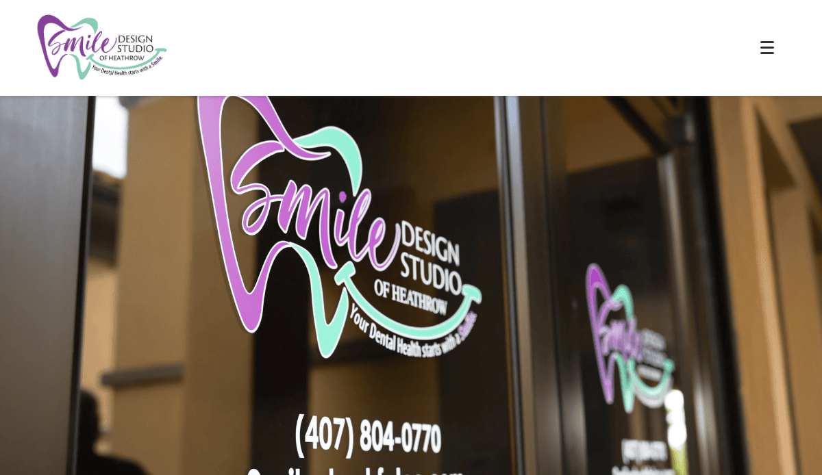
1. Smile Design Studio
Location: Miami, FL
Takeaways:
- Beautiful use of video headers to showcase patient transformations.
- Online appointment booking that syncs with calendar tools.
- Branded photography instead of stock images creates instant trust.
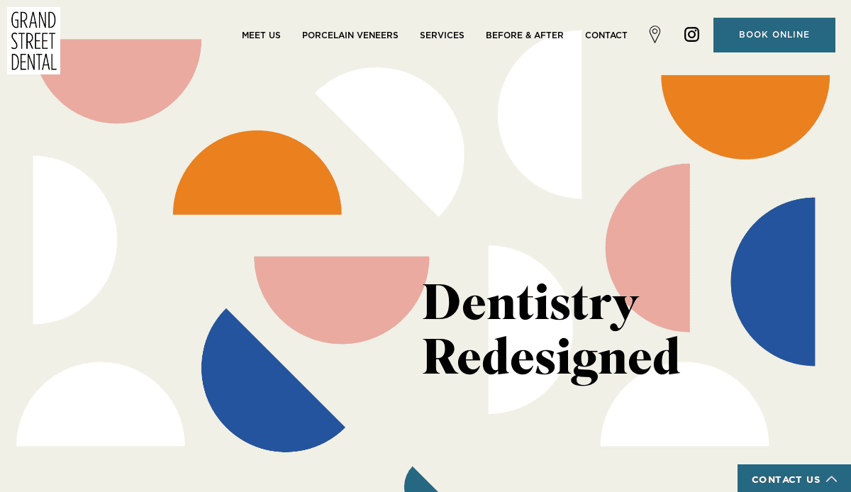
2. Grand Street Dental
Location: Brooklyn, NY
Takeaways:
- Minimalist, modern aesthetic that aligns with high-end clientele.
- The integrated Instagram feed shows personality and real results.
- Intuitive mobile navigation with fast load times.
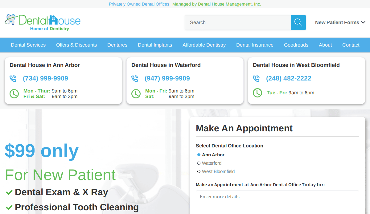
3. Dental House
Location: Ann Arbor, MI
Takeaways:
- Warm, welcoming color palette with friendly messaging.
- Multi-location support with geo-targeted calls to action.
- Patient education videos boost SEO and trust.
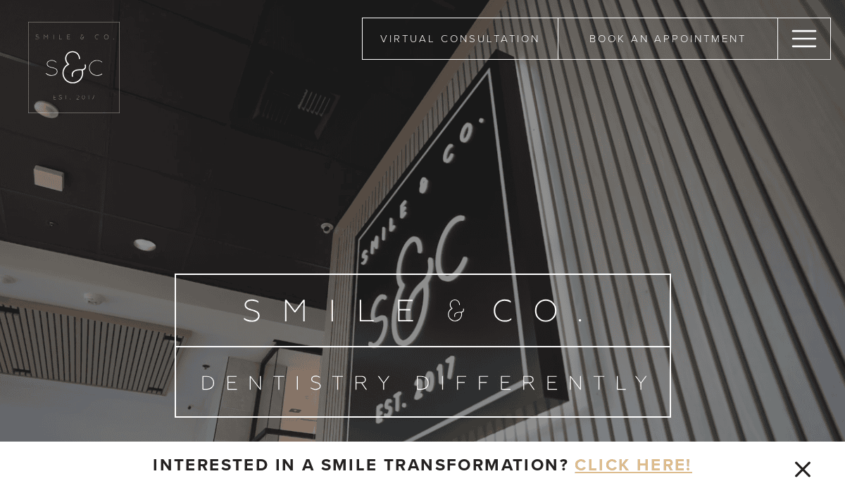
4. Smile & Co.
Location: Folsom, CA
Takeaways:
- Hip, lifestyle-driven brand voice appeals to younger demographics.
- Slick animation and scrolling effects give it a premium feel.
- Online payment and patient forms improve convenience.
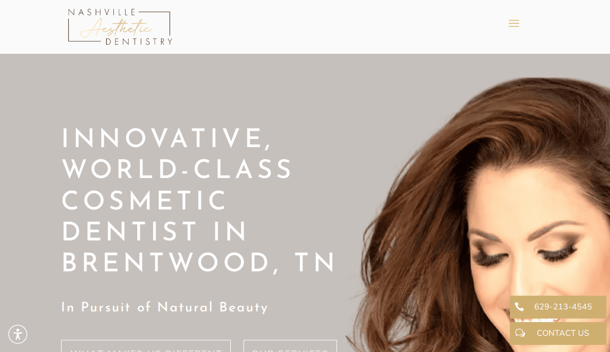
5. Nashville Cosmetic Dentistry
Location: Nashville, TN
Takeaways:
- Clear before-and-after galleries drive conversion.
- Testimonials woven into content blocks vs. a standalone page.
- CTAs throughout make it easy to book or call from any section.
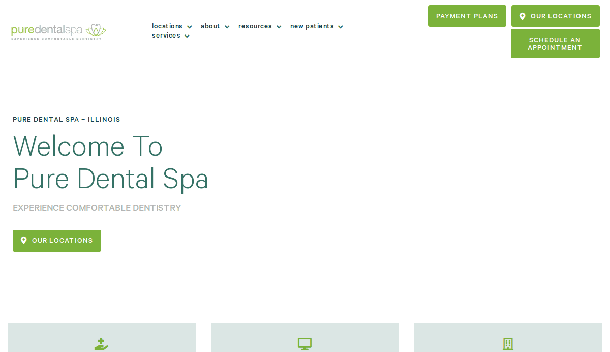
6. Pure Dental Spa
Location: Chicago, IL
Takeaways:
- Spa-like aesthetic with custom iconography and calming palette.
- Optimized for lead gen with smart CTAs on every scroll.
- Strategic use of location pages for SEO.
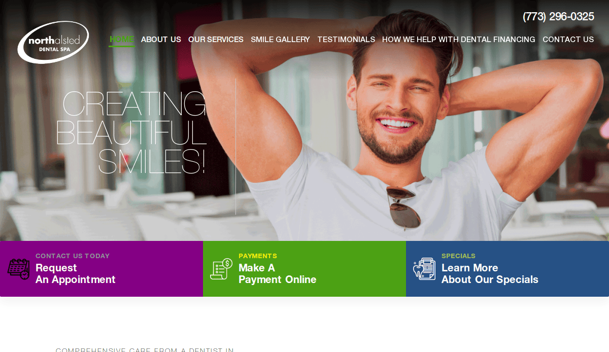
7. Northalsted Dental Spa
Location: Chicago, IL
Takeaways:
- Niche targeting for LGBTQ+ audiences via content and imagery.
- Review aggregation and schema markup to enhance local SEO.
- Appointment buttons are always sticky on mobile.
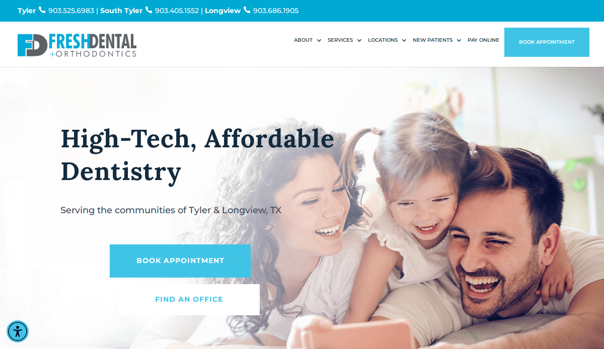
8. Fresh Dental
Location: Dallas, TX
Takeaways:
- Bold typography and bright colors to stand out in a crowded market.
- Feature-rich homepage includes office tour, services, and video.
- Trust badges and insurance logos near the footer increase credibility.
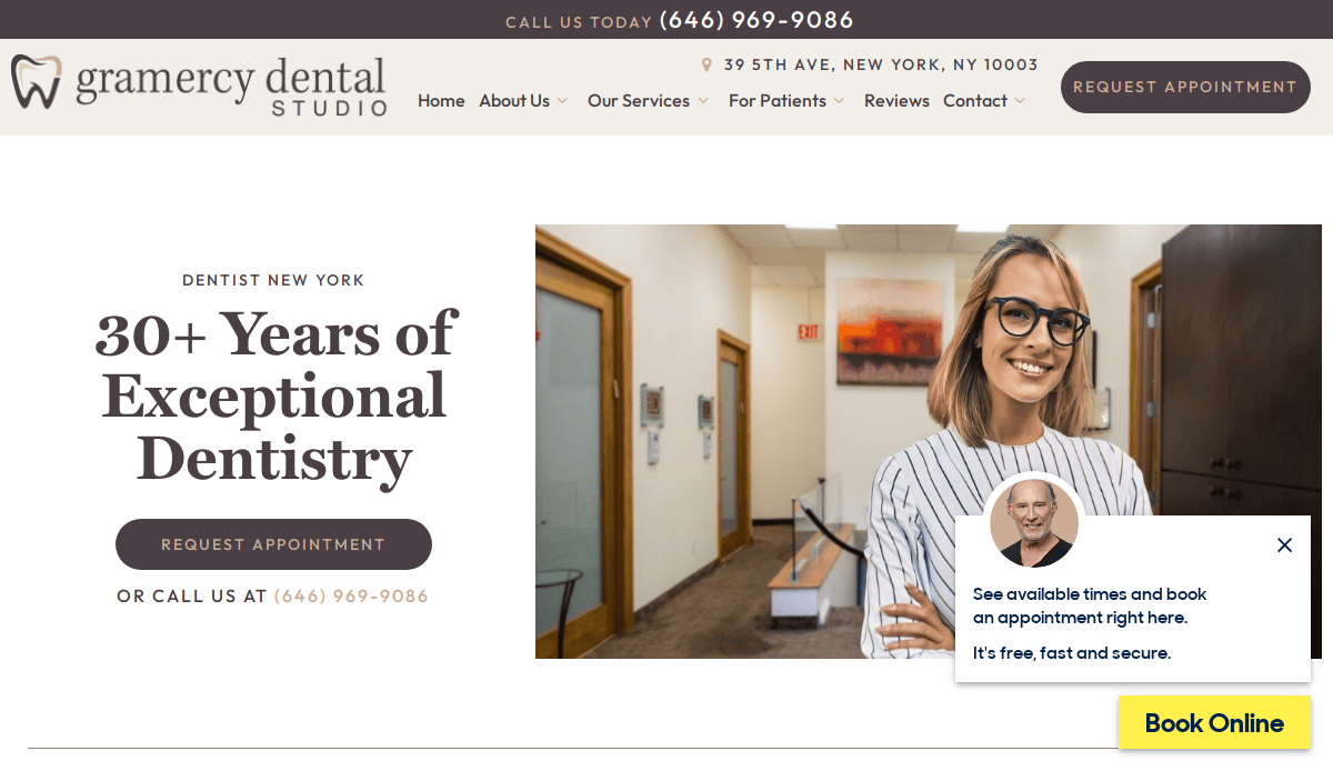
9. Gramercy Dental Studio
Location: New York, NY
Takeaways:
- Scroll-triggered content makes it feel interactive.
- Embedded Yelp reviews add credibility.
- Emphasis on safety protocols and patient care.
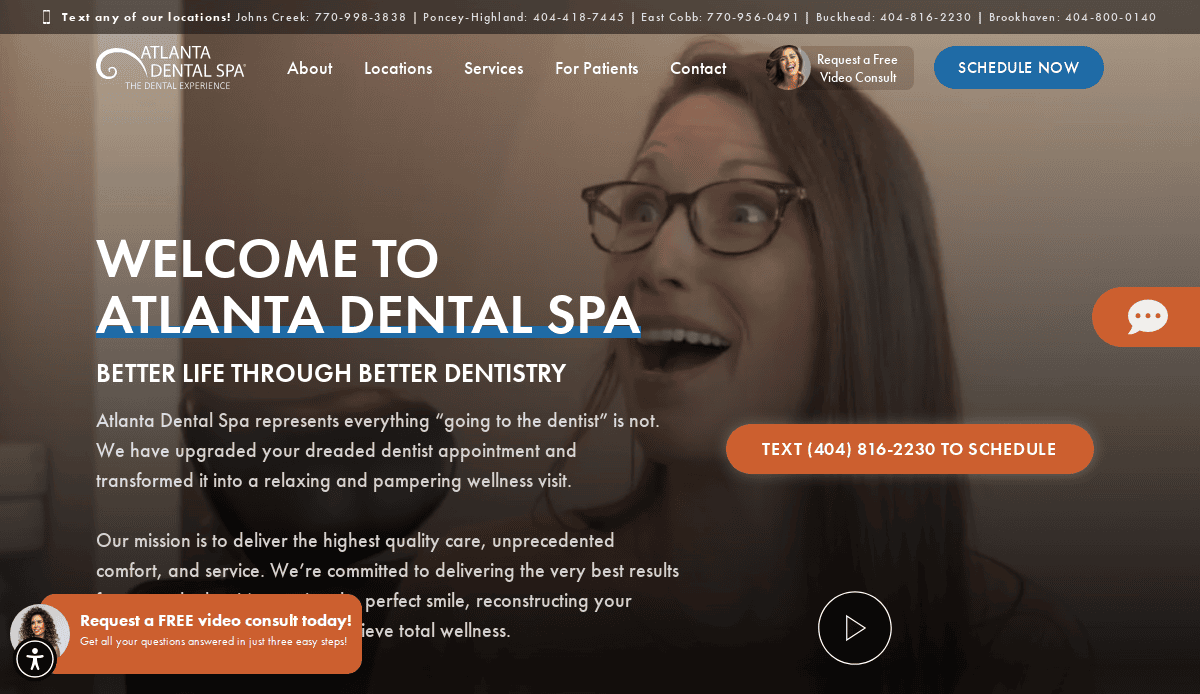
10. Atlanta Dental Spa
Location: Atlanta, GA
Takeaways:
- Sleek video testimonials enhance emotional engagement.
- Navigation includes pricing and financing upfront—rare and effective.
- Google rating embedded in hero area.
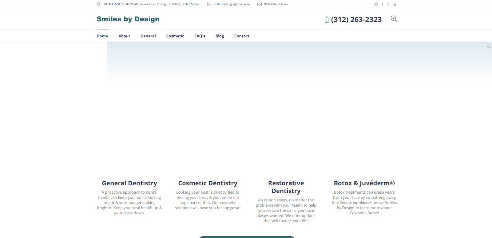
11. Smiles by Design
Location: Northbrook, IL
Takeaways:
- Elegant typography that reinforces premium positioning.
- SEO-optimized service pages with custom FAQs.
- Design harmonizes perfectly with brand photography.
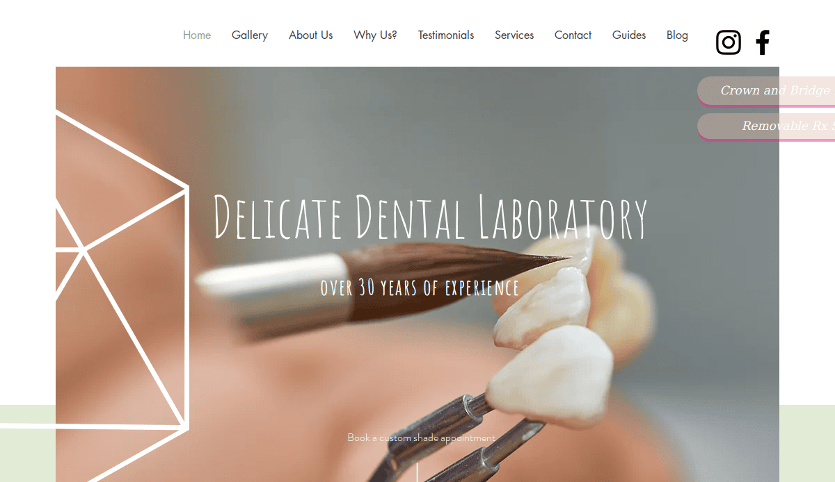
12. Delicate Dental
Location: Arlington Heights, IL
Takeaways:
- Soothing visuals and soft transitions mirror the name.
- Conversion-focused layout with early and repeated CTAs.
- ADA compliance features built into the design.
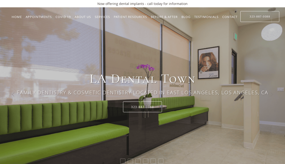
13. LA Dental Town
Location: Los Angeles, CA
Takeaways:
- Strong local branding—you know it’s LA immediately.
- Bilingual site toggle to reach Spanish-speaking patients.
- Multi-clinic support with consistent UX across locations.
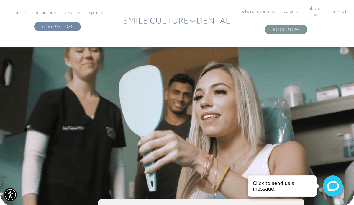
14. Smile Culture Dental
Location: Philadelphia, PA
Takeaways:
- Smart chatbot integration for after-hours lead capture.
- Energetic copy and color scheme signal a fun, modern practice.
- Clear insurance and payment plan breakdown.
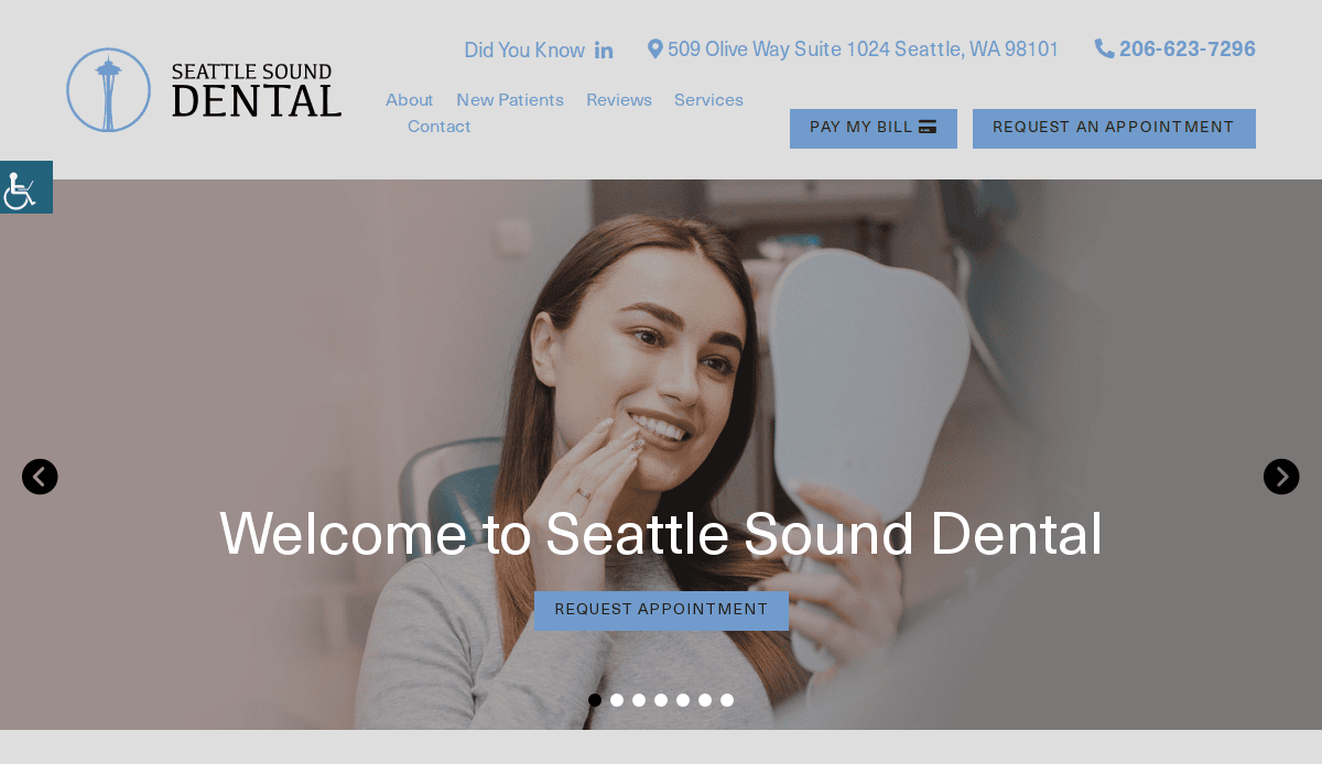
15. Seattle Sound Dental
Location: Seattle, WA
Takeaways:
- Environmental theme with marine colors and imagery.
- Mobile-first design ensures quick access to core actions.
- Modern UX, including sticky service navigation.
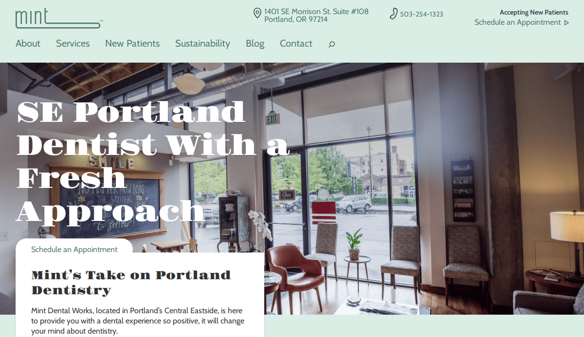
16. Mint Dental Works
Location: Portland, OR
Takeaways:
- Fully responsive animations add delight to scrolls.
- Organic SEO built into content structure.
- Transparency on pricing and treatment paths.
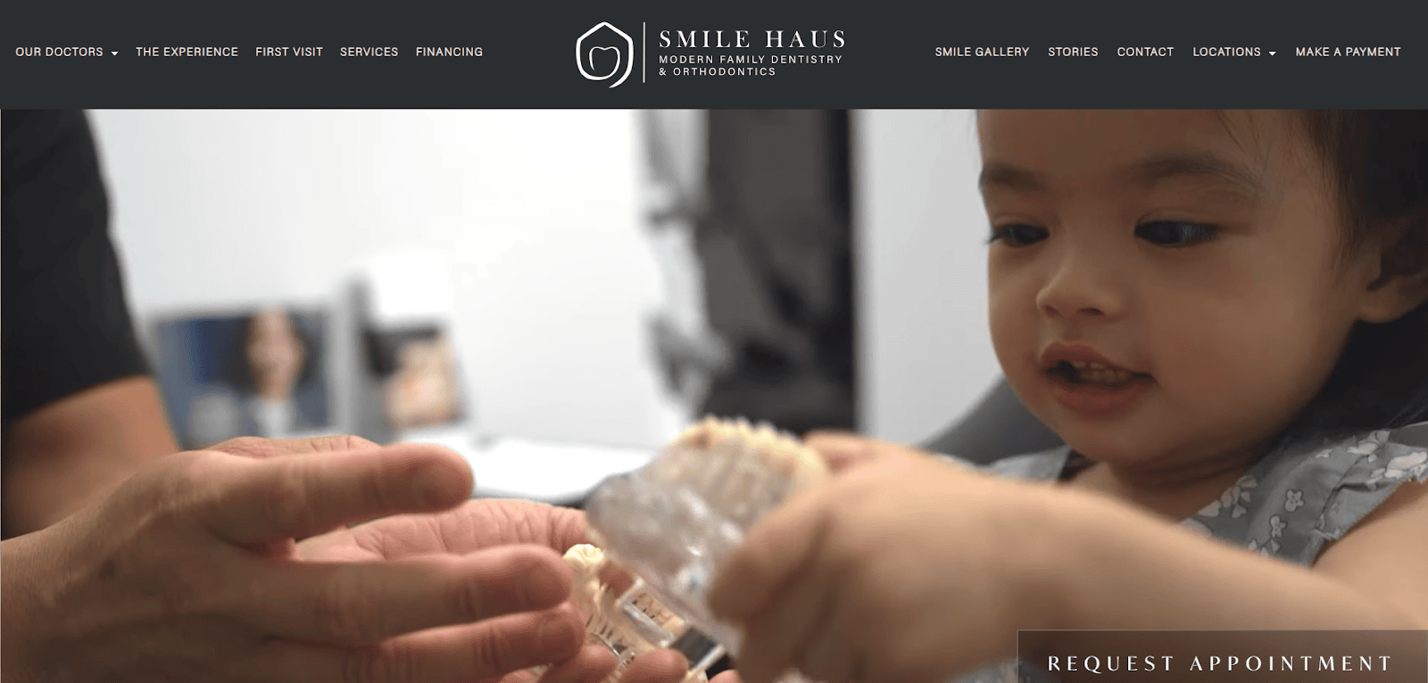
17. Smilehaus Dental
Location: Pasadena, CA
Takeaways:
- Rich lifestyle photography that matches the high-end vibe.
- Layered homepage design keeps visitors exploring.
- Quick CTA access from every scroll position.
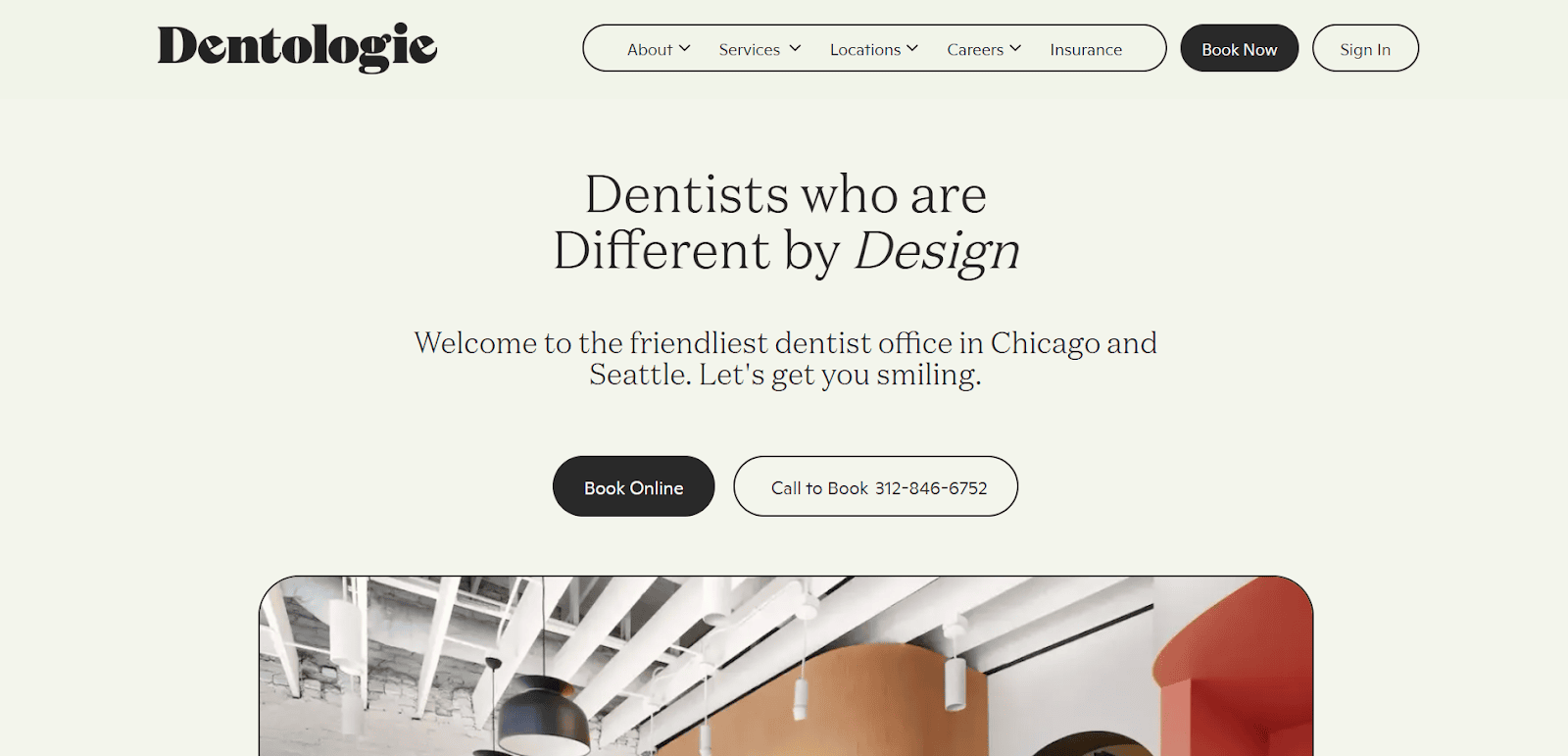
18. Dentologie
Location: Chicago, IL
Takeaways:
- Bold branding with memorable copy and icons.
- Easy online check-in and intake forms.
- Unique navigation using vertical tabs.
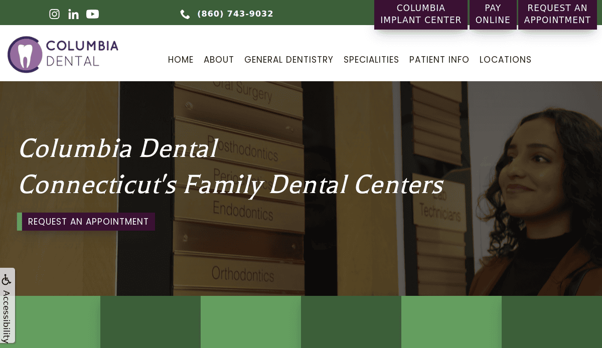
19. Columbia Dental
Location: Hartford, CT
Takeaways:
- Dynamic hero images and scroll-triggered highlights.
- Cross-location consistency with scalable structure.
- Strong emphasis on multilingual access.
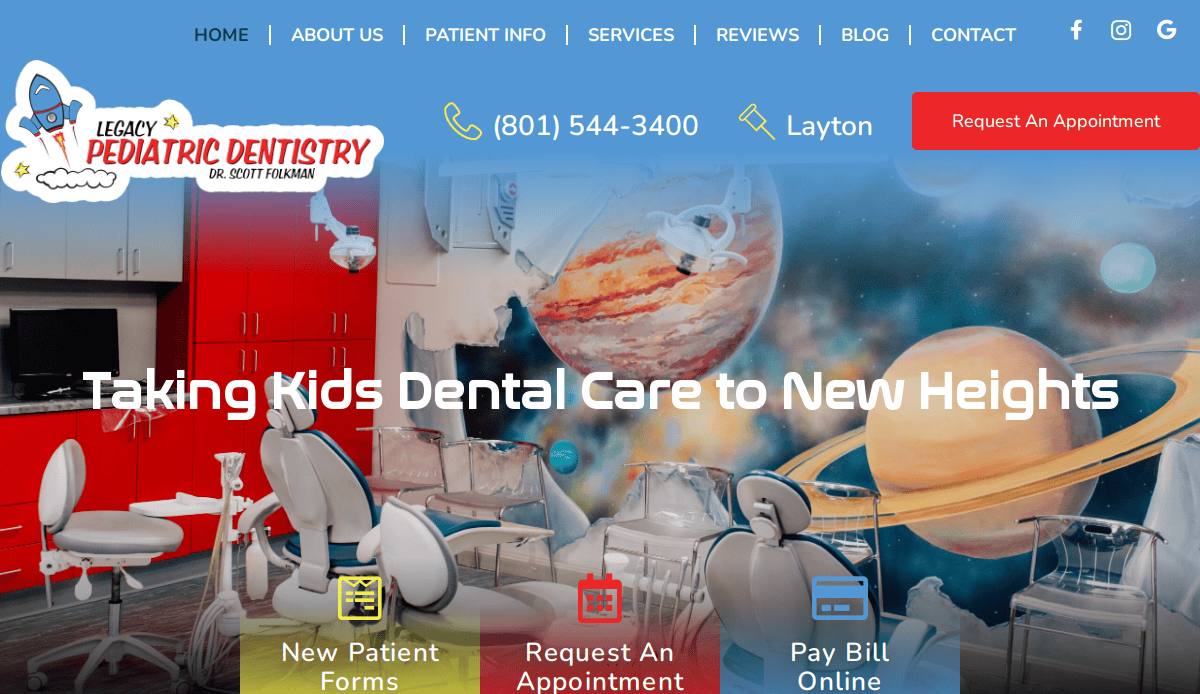
20. Legacy Pediatric Dentistry
Location: Layton, Utah
Takeaways:
- Exceptional design and aesthetics, scoring 9 out of 10 in evaluations.
- Cost-effective development without compromising quality.
- High-performance metrics, including load speed and mobile optimization.
Take the Next Step Toward a More Effective Dental Website
A successful dental practice website is a dynamic tool that reflects your professionalism, drives engagement, and attracts new patients. From clean design and responsive web features to dental SEO and custom design, every aspect of your site should align with your brand and business goals.
If your current website isn’t delivering results or you’re starting to build your dental website from the ground up, now is the time to invest in a professionally designed website that puts your practice ahead.
Schedule a free consultation with our expert designers today to start optimizing your website for long-term growth and patient success.
Frequently Asked Questions About Dental Website Design
What should a dental website include?
A professional dental website should include core pages like Home, About Us, Services, Contact, and Patient Resources. It should also feature real photos, trust-building testimonials, FAQs, and strong calls to action. Your website tells potential patients what to expect, so make sure every page of your website aligns with your brand and services.
Why is responsive site design important for dental websites?
Responsive web design ensures that your dental practice’s website functions well across all devices, from mobile phones to desktops. Since many patients search for dental care on their phones, website usability on mobile is critical for patient acquisition and search engine rankings.
Should I use a website builder or hire a site design company?
While using a website builder may seem easy, a custom website designed by a professional site design company ensures that your site reflects your practice’s unique identity. Custom dental websites are more scalable, optimized for SEO, and better equipped to showcase your authority in dental care.
How often should I update my dental website’s content?
Regular updates are essential to maintain accuracy, improve SEO, and reflect changes in services or staff. If you’ve introduced new dental procedures or want to highlight seasonal promotions, updating your design and content ensures your site stays relevant.
What makes an effective dental website design?
Effective dental website design combines a clean layout, intuitive website navigation, fast load times, and patient-centered content. It should guide visitors through your services and encourage them to take action, such as scheduling an appointment. Your website becomes your most important marketing asset.
Can my website help bring more patients to my dental practice?
Yes, a well-designed dental site optimized with SEO best practices can increase traffic to your website and convert visitors into patients. Your website provides visibility and builds trust before a patient even steps through your door.
What role does SEO play in building a site?
Dental SEO is essential to ensure your site ranks for local and industry-specific search terms. By optimizing content, meta tags, and site structure, SEO supports increased visibility and organic traffic to your website. Including relevant topics like dental procedures and aligning with standards from sources like the American Dental Association strengthens your authority.
How can I evaluate if my existing website needs a redesign?
Start with a website review. Check if your site loads slowly, has outdated design trends, or lacks modern features like responsive design or intuitive navigation. A new dental website can significantly improve user experience and reflect your current offerings.
What is the typical design process for a custom website?
The process starts with discovery, followed by planning, mockups, development, testing, and launch. A good site design company will walk you through each phase and ensure your site is built for performance and engagement.
Is there a guide to building a dental website for my practice?
Yes, this blog post itself serves as a comprehensive guide. From planning and visual elements to responsive web design and ongoing maintenance, it walks through every critical step to make your dental website a success. For personalized help, contact us to create a website tailored to your dental practice.


