Just looking for our Best Finance Website examples list?
Why Finance Website Design Can Make or Break Your Business
A financial company’s website is more than just a virtual brochure—it’s a direct extension of your brand, trustworthiness, and expertise. With financial services often dealing in sensitive data and high-stakes decision-making, users won’t settle for anything less than a clean, secure, and intuitive online experience.
An outdated or confusing website design can erode client trust, diminish credibility, and drive potential leads to better-presented competitors. On the other hand, a well-designed website can powerfully influence how your brand is perceived, boost SEO rankings, and dramatically increase conversions. This guide explores the core elements of effective website design, emerging trends, and the strategies leading firms use to stay ahead online.
Website Planning & Purpose
Before a single line of code is written, successful websites begin with a deep strategic planning phase. The goal is to ensure the final site aligns with business objectives, regulatory standards, and the specific needs of a discerning target audience.
For financial companies, this planning phase includes identifying the website’s primary goals, such as lead generation, online banking functionality, education, or customer support. Stakeholders must define the user journey, ensuring each page guides visitors toward conversion goals while building trust along the way.
This phase also evaluates technical requirements such as SSL encryption, ADA compliance, secure client login portals, and integrations with third-party platforms like CRM tools and financial calculators. During planning, finance firms must also consider how content will be structured, what SEO strategy to employ, and how the brand voice will be reflected across messaging and visuals.
A well-planned website communicates professionalism; it becomes a powerful business tool that supports growth, compliance, and customer satisfaction from day one.
Design Principles
The foundation of an effective website is rooted in key design principles that foster trust, usability, and engagement. These principles ensure users can navigate the site with ease, understand the services offered, and take action confidently.
Clarity and Simplicity: Finance can be complex, so your website design must be simple. Clean layouts, intuitive interaction, and limited distractions help visitors find information quickly. A clear content hierarchy, supported by white space and strong typography, enhances readability.
Consistency and Branding: Visual consistency across all pages—using identity-aligned colors, typography, and iconography—builds credibility and brand recognition. A professional and uniform aesthetic assures users they’re dealing with a reputable institution.
Trust Signals: Prominent placement of security badges, certifications, client testimonials, and privacy policies reassures visitors. Including SSL, secure login forms, and contact transparency enhances perceived safety and legitimacy.
Accessibility and Responsiveness: Company websites must perform flawlessly on all devices and comply with ADA accessibility guidelines. Mobile-first design, scalable interfaces, and inclusive features like screen reader compatibility are essential.
Call to Action (CTA) Design: CTAs should be strategically placed, visually distinct, and action-oriented. Whether the goal is to schedule a consultation, open an account, or download a resource, CTAs should be obvious and compelling.
When executed properly, these design principles don’t just improve the visual appeal—they directly impact user satisfaction, trust, and conversion rates, making them indispensable in custom website design.
Content & Navigation
Content and navigation are the dual pillars that structure the user experience on any website. Without clear content and intuitive pathways, even the most beautifully designed site can fail to convert.
Content Hierarchy: Begin by organizing content in a logical, user-friendly manner. Start with high-level overviews of services, then drill down into specific offerings. Each page should answer common questions and direct users to the next step in their journey. Financial content should be accurate, concise, and reassuring, demonstrating expertise without overwhelming the visitor.
Navigation Simplicity: Keep the pathway structures clean and consistent. Main menus should include no more than 5–7 core links, such as Home, Services, About, Resources, and Contact. Use dropdowns for subcategories to avoid clutter. Sticky headers, breadcrumbs, and search functionality improve accessibility and usability.
Content Types: Effective websites include a mix of content formats—core service pages, educational blog posts, FAQs, case studies, testimonials, and lead generation assets like whitepapers or downloadable guides. This variety supports search engine optimization, builds authority, and nurtures potential clients.
Compliance and Clarity: Financial content must meet legal and industry compliance standards. Disclaimers, terms of use, and privacy policies should be easy to access. All content should reflect the company’s tone—professional, confident, and approachable.
Internal Linking Strategy: Strategic internal linking keeps users engaged and distributes optimization authority. Use keyword-rich anchor text to connect blog posts with service pages or to guide users toward key conversion points like consultations or account sign-ups.
Well-structured content and intuitive direction enhance the UX; they also build trust, support optimization, and move visitors efficiently toward conversion.
Visual Elements
Visual elements play a crucial role in enhancing user experience and reinforcing company identity in web design. They are not just decorative—they provide essential cues that guide user behavior and influence trust.
Brand Imagery and Colors: Company websites should use a consistent color palette that aligns with the company’s tone, often leveraging cool, trustworthy colors like blue, gray, or green. Custom photography, professional headshots, and media illustrations create authenticity and humanize the experience.
Iconography and Graphics: Well-designed icons help simplify complex financial topics. Visual cues can lead users through processes like onboarding, investment education, or application submission. Infographics are particularly effective in breaking down data-heavy content.
Data Visualization: Finance content is often numerical. Charts, graphs, and tables help users absorb and interpret data quickly. These elements should be interactive when possible, allowing users to explore trends and comparisons.
Whitespace and Layout: Strategic use of whitespace improves readability and reduces visual fatigue. Clean design looks modern and helps users focus on key messages and calls to action.
Motion and Animation: Subtle animations—like hover effects or scrolling transitions—can make the website feel dynamic without being distracting. Used sparingly, these enhancements guide attention and create a more engaging browsing experience.
Video Content: For services like investment advising or loan programs, short explainer videos or client testimonials can build credibility and trust. Videos should be optimized for fast loading and mobile viewing.
By leveraging smart visual design, websites capture attention, communicate professionalism, reduce friction, and support the user journey from arrival to conversion.
Ongoing WordPress Maintenance
Maintaining a website built on WordPress is essential for long-term performance, security, and user trust. Unlike static websites, WordPress sites require consistent updates and oversight to ensure smooth functionality and protection against emerging threats.
Security Updates and Backups: Core WordPress files, plugins, and themes must be updated regularly to patch vulnerabilities. Scheduled backups—both on-site and cloud-based—help safeguard data in case of unexpected failures or cyberattacks.
Performance Monitoring: Regular performance audits identify issues like slow load times, broken links, or outdated scripts. Ensuring that the site remains fast and responsive improves the overall UX and supports search engine rankings.
Plugin and Theme Management: Sites in banking often rely on critical plugins for compliance, forms, and analytics. Routine checks prevent compatibility issues and ensure that plugins remain secure and functional.
Content Revisions and SEO Tuning: Ongoing maintenance includes updating financial content to reflect regulatory changes or new service offerings. It also involves optimization refinement based on analytics, adjusting keywords, meta descriptions, and page structure as needed.
User Experience and Accessibility Testing: Continuous testing guarantees that the website remains accessible, especially after major updates. This ensures compliance with ADA standards and maintains an inclusive experience for all users.
Uptime Monitoring and Support: Proactive monitoring tools alert site administrators to outages or downtime. Dedicated support ensures quick resolution of issues before they impact end users.
A well-maintained WordPress website enhances operational reliability and reinforces a company’s reputation for professionalism and digital excellence.
Best Financial Website Design Examples
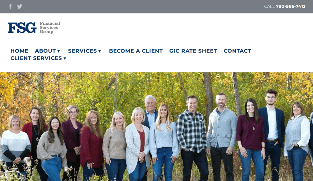
1. Financial Services Group
Location: Chicago, IL
Key Takeaways:
- Clean, calming design that builds trust
- Seamless navigation with clear CTAs
- High-quality imagery enhances user engagement

2. MK Capital
Location: Chicago, IL
Key Takeaways:
- Minimalist design with a sleek aesthetic
- Elegant color scheme conveying professionalism
- Strategic use of red for CTAs adds vitality
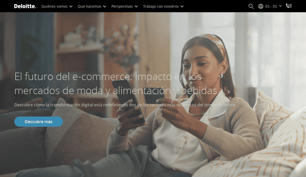
3. Deloitte
Location: New York, NY
Key Takeaways:
- Intuitive UX with clear sections
- Sophisticated color palette and typography
- Prominent navigation guides users effectively
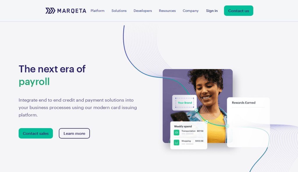
4. Marqeta
Location: Oakland, CA
Key Takeaways:
- Innovative and simple design in payment technology
- Dynamic credit card animation enhancing UX
- Striking graphics with clear messaging
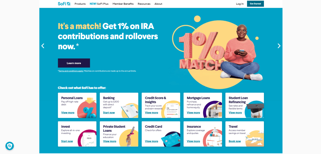
5. SoFi
Location: San Francisco, CA
Key Takeaways:
- Simple look with easy navigation
- Organized template for exploring financial products
- Brilliant colors and high-quality photography
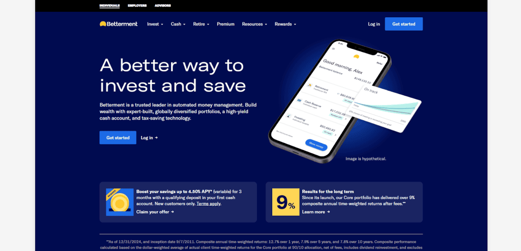
6. Betterment
Location: New York, NY
Key Takeaways:
- Sophisticated and minimalist design
- Responsive design across devices
- Clear messaging instills confidence
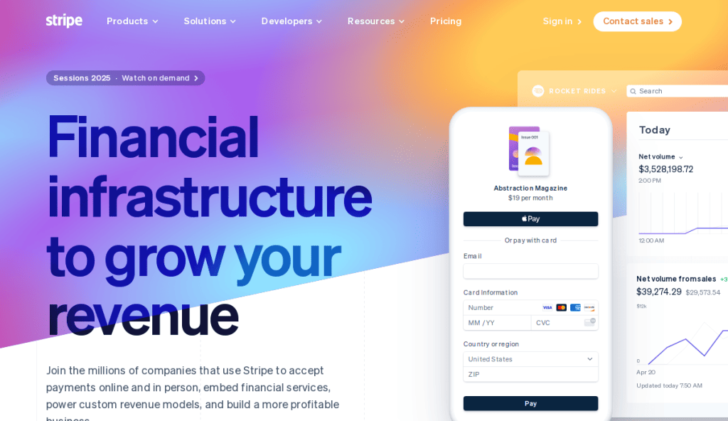
7. Stripe
Location: San Francisco, CA
Key Takeaways:
- Clean and modern design with subtle animations
- Harmonious color palette enhances aesthetics
- User-friendly interface simplifies navigation
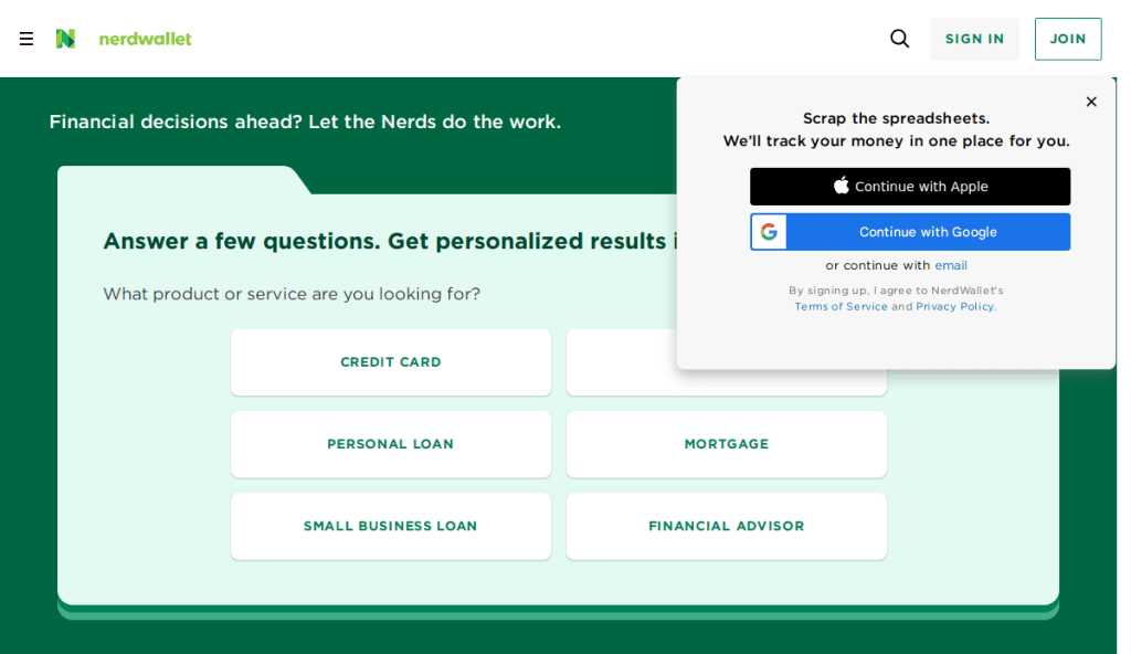
8. NerdWallet
Location: San Francisco, CA
Key Takeaways:
- Comprehensive financial guides and tools
- User-centric design for easy information access
- Strong branding with consistent visual elements
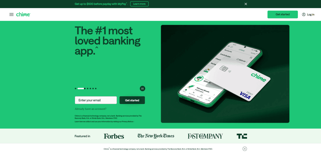
9. Chime
Location: San Francisco, CA
Key Takeaways:
- Mobile-first design catering to digital banking users
- Fee-free services are highlighted prominently
- Simple navigation with clear value propositions
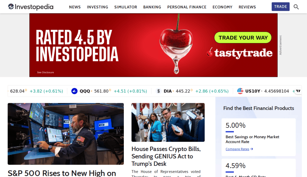
10. Investopedia
Location: New York, NY
Key Takeaways:
- Extensive educational content on financial topics
- Structured format for easy topic exploration
- Professional design reinforcing authority
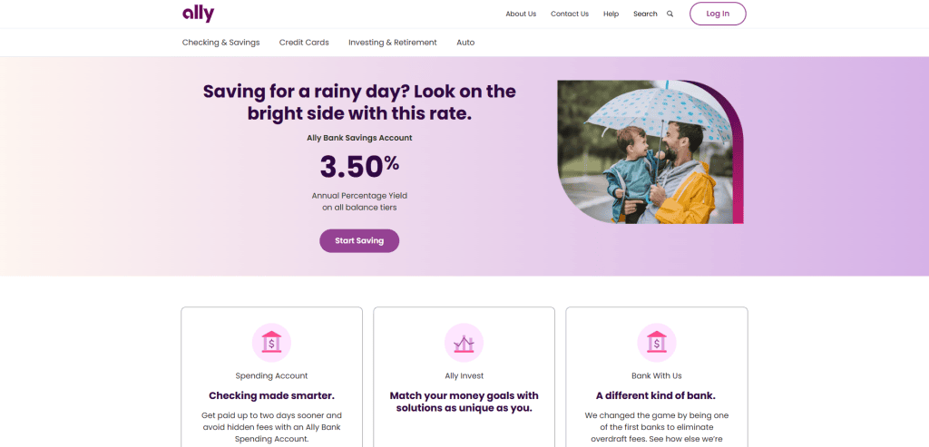
11. Ally Bank
Location: Sandy, UT
Key Takeaways:
- User-friendly interface with modern design
- Transparent information on banking products
- Responsive design ensuring accessibility
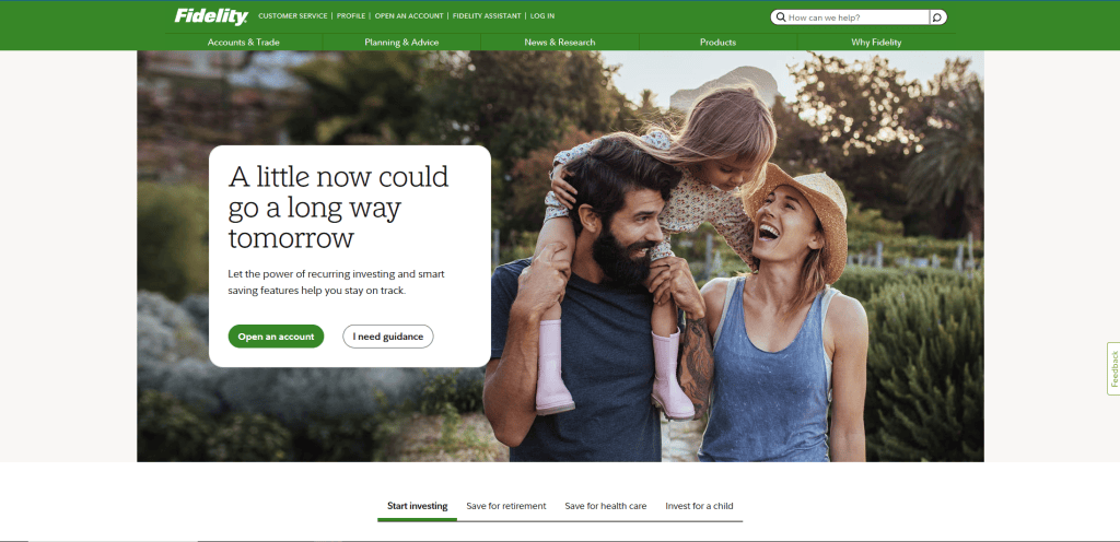
12. Fidelity Investments
Location: Boston, MA
Key Takeaways:
- Comprehensive investment tools and resources
- Clean design with intuitive navigation
- Strong emphasis on user education
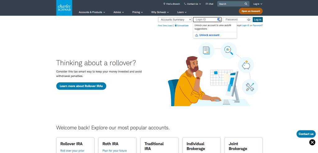
13. Charles Schwab
Location: Westlake, TX
Key Takeaways:
- Minimalist design focusing on investment services
- Straightforward navigation aids the user journey
- Emphasis on educational content
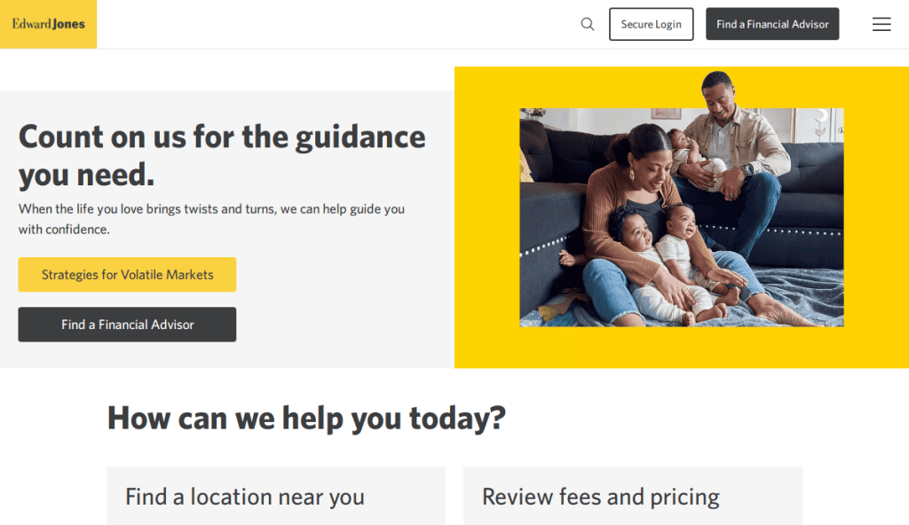
15. Edward Jones
Location: St. Louis, MO
Key Takeaways:
- Personalized financial advisory services highlighted
- Clean design with easy-to-find information
- Strong use of imagery to build trust
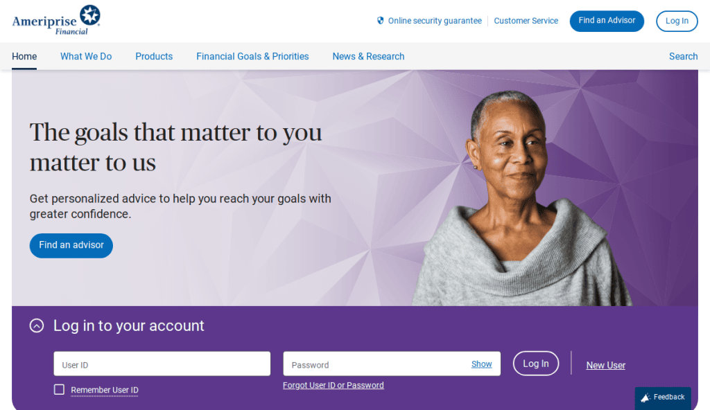
16. Ameriprise Financial
Location: Minneapolis, MN
Key Takeaways:
- Green color palette promoting calmness
- Visual tools guiding through services
- Client login area for personalized account management
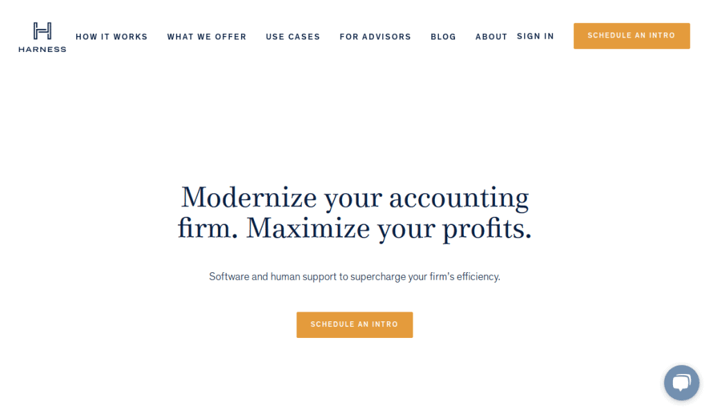
17. Harness Wealth
Location: New York, NY
Key Takeaways:
- Cool color scheme creates a soothing atmosphere
- Clear navigation highlighting tailored solutions
- Bright colors are used strategically for CTAs

18. Clarity Wealth Development
Location: Corvallis, OR
Key Takeaways:
- Calming blue-green palette with user-friendly template
- Emphasis on personalized, fee-only advisory solutions
- Strong branding reinforces company identity

19. Brighton Jones
Location: Seattle, WA
Key Takeaways:
- User-centric and professional approach
- Visually organized layout highlighting services
- Consistent branding with value-driven content
These websites exemplify best practices in financial services website design, offering inspiration for creating a site that is both aesthetically pleasing and functionally robust.
Take Action: Build a Financial Website That Works for You
Your website is more than just a digital storefront—it’s the foundation of your client experience. Whether you’re a financial advisor, accountant, or offer a broad range of financial services, your services website needs to instill confidence and convert visitors into loyal clients. Using the right website template is a great start, but true results come from a custom-built design tailored to your company, goals, and compliance needs.
If you’re ready to elevate your online presence with a site that performs as well as it looks, contact us for a free consultation.
FAQs for Designing the Best Finance Websites
What makes a financial services website design effective?
An effective financial services website design combines great design with functional elements like clear direction, strong CTAs, and secure user interfaces. It must be responsive across devices, load quickly, and comply with all security and compliance regulations.
How can an accounting website stand out in a competitive market?
An accounting website should highlight unique value propositions with personalized content, use a clean and modern layout, and include trust elements like testimonials and case studies. Visual branding, such as a distinctive logo and engaging homepage design, creates a memorable impression.
What are the best practices for finance business UI and UX?
Best practices include prioritizing ease of use, fast page load times, intuitive pathways, and mobile responsiveness. Websites that are easy to navigate with a logical layout help educate visitors and reduce bounce rates.
Why is website security important for a financial site?
Given the sensitivity of financial data, website security is critical. Secure hosting, SSL certificates, secure forms, and consistent updates ensure user trust and compliance with industry standards.
Should a bank’s website use a template or custom design?
While templates from platforms like ThemeForest offer a quick start, a custom website is tailored to specific goals, compliance needs, and branding. Custom solutions also integrate seamlessly with a content management system for scalability.
How should a financial startup approach web design?
Startups should focus on building credibility through professional design, showcasing their differentiator, and providing a wealth of information without overwhelming users. A modern design with interactive previews can help drive engagement.


