Just looking for our Best Education Website examples list?
Why Education Website Design Matters More Than Ever
Your website is actually the front door to your educational institution. Whether you’re a university, nonprofit, tutoring center, or e-learning platform, the quality of your website design directly impacts your credibility, engagement, and enrollment numbers. A high-performing site doesn’t just look good—it builds trust, enhances the learning experience, and drives real-world results.
Yet many education organizations settle for outdated, cluttered sites that frustrate users and undercut their missions. From poor mobile usability to disjointed branding, these design pitfalls are more than aesthetic issues—they’re barriers to growth. The right website design can transform your digital presence by guiding visitors to take action, from applying to programs to donating or signing up for courses.
This guide reveals the must-know strategies for creating websites that captivate, convert, and compete. Whether you’re revamping your current education site or starting from scratch, you’ll find actionable tips, SEO best practices, and real-world examples that help you elevate your online presence. Let’s explore what it takes to design a website that speaks to students, supports your mission, and grows your impact.
Laying the Foundation: Design Principles for High-Impact Education Websites
An effective site must do more than convey information—it should engage, guide, and inspire action. To achieve this, foundational design principles must be applied strategically. These principles ensure your site is visually compelling, user-friendly, and aligned with your brand and goals.
1. Clarity and Simplicity
The best sites prioritize clarity. Clean layouts, ample white space, and intuitive navigation structures help visitors—whether they’re prospective students, parents, or donors—find the information they need quickly. Avoid overcrowded pages and excessive design elements that distract from your message.
2. Consistent Branding
A consistent visual identity across your website reinforces credibility and professionalism. Use a cohesive color palette, typography, and iconography that reflect your institution’s mission and values. Your logo, tone, and brand message should be uniformly applied throughout the site, from the homepage to program pages.
3. Responsive and Mobile-Friendly Design
With the majority of users accessing websites on mobile devices, responsive design is non-negotiable. Your site must adapt seamlessly to all screen sizes and provide a smooth user experience across desktops, tablets, and smartphones. This also contributes to better search engine rankings and longer session durations.
4. Visual Hierarchy and Typography
Effective website design guides the visitor’s eye through content using a clear visual hierarchy. Use bold headlines, engaging subheaders, and concise body text to organize content. Choose legible, modern fonts that are easy to read on all devices and align with your brand.
5. Strategic Use of Imagery and Multimedia
High-quality images, videos, and illustrations personalize the experience and help build emotional connections. Showcase your campus, student life, classrooms, and faculty to create trust and interest. Multimedia elements should be optimized for speed and never interfere with usability.
6. Accessibility and Usability
Accessibility ensures that your website is usable by all visitors, including those with disabilities. Use alt text for images, ensure sufficient color contrast, and design with keyboard navigation in mind. Usability testing should be a routine part of your process to identify friction points and improve functionality.
7. Strong Calls to Action (CTAs)
Every page should have a purpose and a clear call to action. Whether it’s applying to a program, scheduling a campus tour, downloading a brochure, or making a donation, your CTAs must be visually prominent and action-oriented. Use language that’s direct, encouraging, and specific.
Site Structuring for Success: Content & Navigation
A well-structured website empowers users to find what they need effortlessly. For educational organizations, content must be logically organized, easy to browse, and written with clarity. At the same time, navigation must be intuitive, guiding visitors seamlessly through their journey.
1. Content Architecture: Organized, Not Overwhelming
Academic websites often house a large amount of information, from admissions processes and academic programs to faculty bios and campus events. The key is to group content into digestible, intuitive categories. For example:
- Main Navigation: Programs, Admissions, About, Student Life, News, Contact
- Subnavigation: Under “Programs,” include Undergraduate, Graduate, Online Learning, and Continuing Education
- Utility Navigation: Apply Now, Donate, Alumni, My Account (for portals)
Use headings and subheadings to create a logical content hierarchy and break long pages into scannable sections. Stick to plain language and avoid jargon that could confuse first-time visitors.
2. Navigation Menus: Simple and Predictable
A clean, top-level menu should anchor every page. Dropdown menus or mega menus work well for education websites with multiple offerings, but they must be easy to scan and click. Avoid cluttering the header—limit top-level links to 5–7 main categories.
Additionally, include breadcrumb trails to help users keep track of where they are on the site. Sticky headers and a clearly visible search bar improve usability, especially for content-heavy sites.
3. Internal Linking: Guide and Engage
Strategic internal linking improves SEO and helps users discover related content. For instance, a blog post on preparing for college should link to program pages or admissions deadlines. Use descriptive anchor text like “Explore our Business Programs” instead of generic terms like “Click here.”
4. Homepage Content: Clear, Compelling, and Targeted
The homepage is your first impression. Feature high-impact visuals, concise messaging, and clear calls to action. Prioritize your top user paths—such as prospective students researching programs or donors exploring your impact—and guide them to the next step.
5. Mobile Navigation: Optimized for Touch
For mobile users, implement collapsible hamburger menus and ensure all navigation elements are touch-friendly. Avoid tiny buttons or nested menus that are difficult to use on small screens. Prioritize content that matters most to on-the-go users, like contact information, campus tours, and FAQs.
The Power of Visuals: Enhancing User Experience and Brand Identity
Visual elements are not just decorative—they play a pivotal role in shaping user perception, guiding behavior, and reinforcing brand identity. For educational websites, compelling visuals help humanize your institution, communicate professionalism, and inspire trust.
1. Photography: Make It Personal and Authentic
Use high-quality, authentic photography that reflects the real people, spaces, and culture of your organization. Prospective students and families want to envision themselves in your environment, so feature imagery of students, classrooms, campus facilities, and events. Avoid overused stock photos—they dilute trust and make your site feel generic.
Photos should be optimized for web performance to avoid slow load times and must include alt text for accessibility. Ensure diversity and inclusion are visually represented to reflect the welcoming nature of your institution.
2. Video: Tell Your Story with Impact
Short, engaging videos can significantly boost time-on-site and emotional connection. Use them to introduce your programs, share student testimonials, or take visitors on a virtual campus tour. Place videos strategically—on homepages, about pages, or program-specific landing pages—and always include captions for accessibility and mobile viewing.
3. Icons and Illustrations: Simplify and Support
Icons help break up content and communicate concepts quickly. Use custom-designed or brand-aligned icon sets to represent key features like course types, deadlines, or support services. Illustrations can also add a creative touch, especially for youth-focused programs or e-learning platforms, making the experience feel more engaging and inclusive.
4. Color Palette: Communicate Emotion and Clarity
Your color scheme should align with your institution’s identity and resonate with your audience. Successful websites often benefit from calming, trustworthy colors like blue and green, paired with vibrant accents to highlight calls to action. Use color contrast wisely to maintain accessibility standards and ensure legibility.
5. Consistent Design Language: Create a Unified Experience
All visual elements—from images and icons to colors and spacing—should follow a consistent design system. This consistency builds brand recognition and makes the site feel cohesive. It also supports usability by helping users understand how to interact with your site more intuitively.
6. White Space and Layout: Let Content Breathe
Don’t underestimate the power of space. White space improves readability, reduces visual clutter, and emphasizes key messages. Balanced layouts help prioritize content, guide the user’s eye, and create a smooth flow throughout the site.
Sustaining Success: Ongoing WordPress Site Maintenance
A beautifully designed website built on WordPress is only the beginning. To ensure security, performance, and user experience over time, ongoing maintenance is essential. Without regular upkeep, even the most advanced sites can suffer from downtime, outdated content, and vulnerability to cyber threats.
1. Regular Updates: Security and Compatibility
WordPress core, theme, and plugin updates are released frequently to address security issues and compatibility with evolving technologies. Failing to keep these updated leaves your site exposed to hacks and performance problems. Education websites, which often store sensitive student data and handle online applications, must prioritize timely updates.
Establish a routine—weekly or biweekly—for checking and applying updates. Always perform a backup before updating to prevent data loss in case of conflicts.
2. Website Backups: Disaster Recovery Readiness
Consistent backups ensure that in the event of a website crash, cyberattack, or content error, your site can be restored quickly. A solid maintenance plan includes both daily automated backups and periodic manual ones stored off-site.
Backup schedules should align with how often your content changes. For dynamic websites in education with frequent updates to events, news, or admissions details, daily backups are recommended.
3. Performance Monitoring: Speed and Uptime
Load speed directly affects user satisfaction and SEO rankings. Many websites often feature multimedia content and engaging tools, which can slow performance if not optimized. Use tools like Google PageSpeed Insights or GTmetrix to monitor speed and identify areas for improvement regularly.
Uptime monitoring tools can alert your team immediately if the site goes offline, minimizing disruption to prospective students or faculty users.
4. Security Measures: Protecting User Data
Academic sites are high-value targets for cyberattacks. Protect your site with SSL certificates, strong login protocols, and security plugins like Wordfence or Sucuri. Limit login attempts, use two-factor authentication, and regularly scan for malware or vulnerabilities.
For institutions handling student information or payment data, compliance with standards such as FERPA or PCI DSS may also be required.
5. Content Review and SEO Health Checks
Outdated or broken content damages credibility. Monthly content audits ensure that links work, information is current, and calls to action remain relevant. At the same time, perform SEO health checks to ensure metadata, alt text, and page structure align with current best practices and search engine algorithms.
6. Plugin and Theme Management: Stay Lean and Secure
Avoid plugin overload, which can slow down your site and increase maintenance risks. Audit plugins quarterly—remove unused ones, and ensure all active plugins are reputable and regularly maintained by developers.
The same goes for themes. Use a child theme for customization, and always keep the parent theme updated to maintain functionality and design integrity.
Ongoing WordPress maintenance isn’t optional—it’s critical. A well-maintained site builds trust, protects your users, and ensures that your digital presence remains as strong and dependable as your institution itself.
20 of the Best Education Website Design Examples to Inspire You
1. American College Funding (ACF)

- Location: Chicago, IL
- Key Takeaways:
- Clean, professional format that establishes trust.
- Intuitive navigation with clearly labeled tabs.
- Provides comprehensive information without overwhelming users.
2. Alverno College
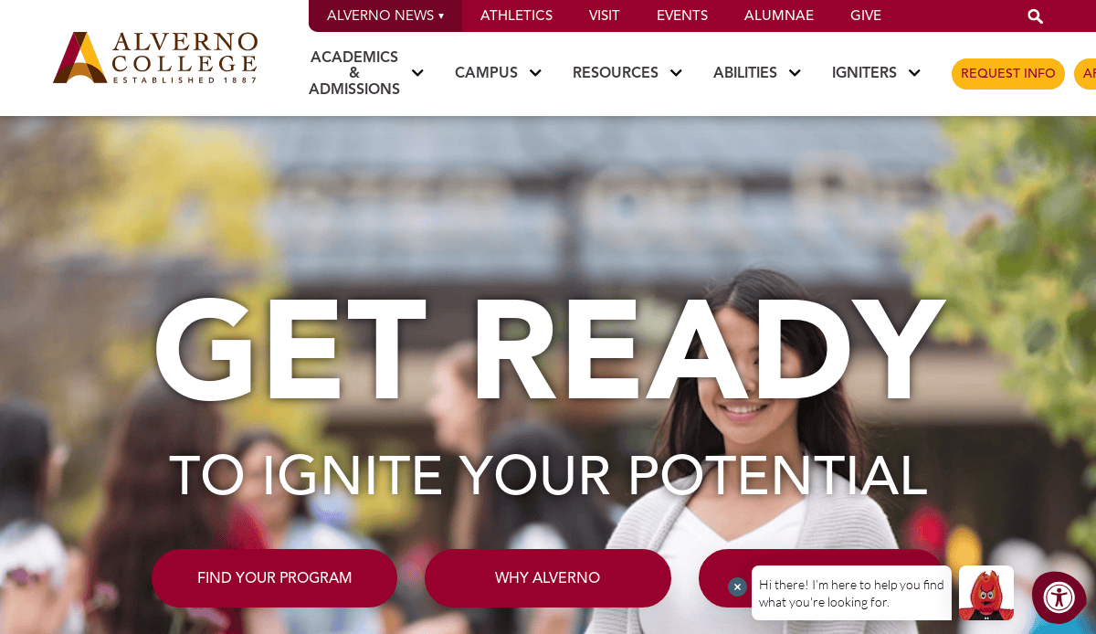
- Location: Milwaukee, WI
- Key Takeaways:
- Vibrant color palette with refined typography.
- Prominent “Apply Now” button for an efficient application process.
- Outstanding photographs that reflect the university’s dedication to high standards.
3. Flagler College
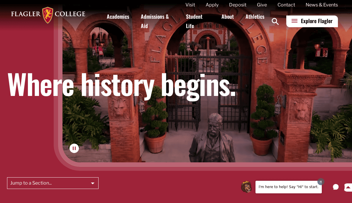
- Location: St. Augustine, FL
- Key Takeaways:
- Clean and modern design with harmonious graphics and text.
- High-quality images provide a snapshot of campus life.
- Immersive video on the homepage enhances user engagement.
4. Bates College
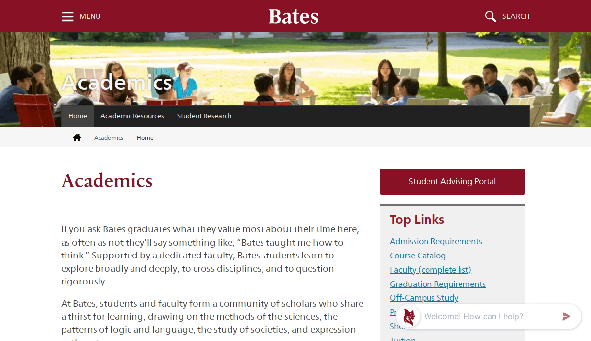
- Location: Lewiston, ME
- Key Takeaways:
- Simplistic design focusing on essential content.
- Robust emphasis on institution branding through color scheme.
- Clear calls-to-action guiding user interaction.
5. Roosevelt University
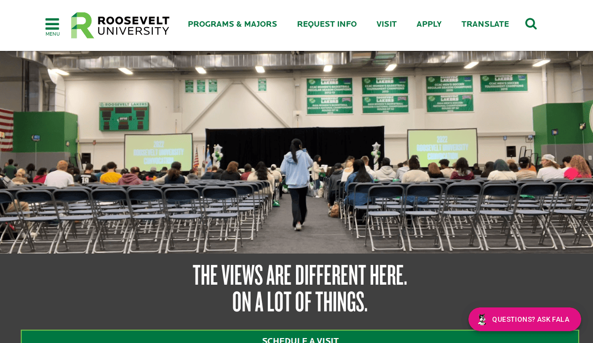
- Location: Chicago, IL
- Key Takeaways:
- Captivating images depicting campus life and academic atmosphere.
- Inviting call-to-action buttons for user engagement.
- Incorporation of multimedia components enhances the browsing experience.
6. University of Chicago

- Location: Chicago, IL
- Key Takeaways:
- Dynamic visual experience with a brief hero video.
- User-friendly design with logical menu arrangement.
- Prominent search engine for easy information retrieval.
7. Harvard University
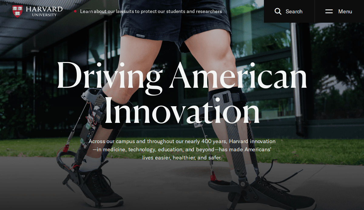
- Location: Cambridge, MA
- Key Takeaways:
- Timeless and clean template reflecting esteemed legacy.
- Seamless blend of historic imagery and modern typography.
- User-centric navigation enhances accessibility.
8. Saint Joseph’s College of Maine
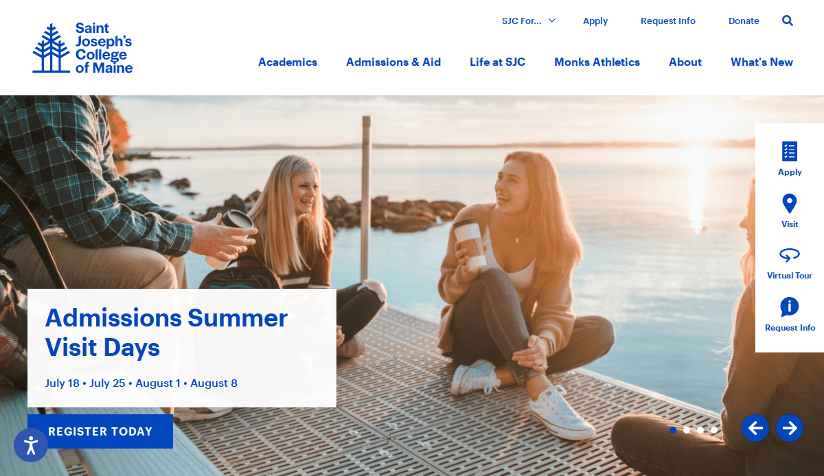
- Location: Standish, ME
- Key Takeaways:
- Inviting web design aligning with a liberal arts focus.
- Homepage highlighting educational programs and student life.
- Neatly organized menu for intuitive navigation.
9. The Washington Market School
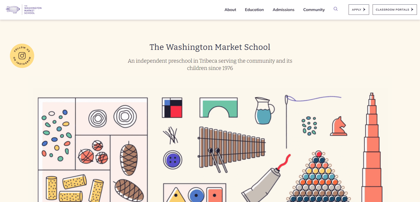
- Location: New York, NY
- Key Takeaways:
- Creative website communicating school values and community involvement.
- Soft colors and child-friendly images create a welcoming atmosphere.
- Responsive design with intuitive navigation.
10. Great Walstead School
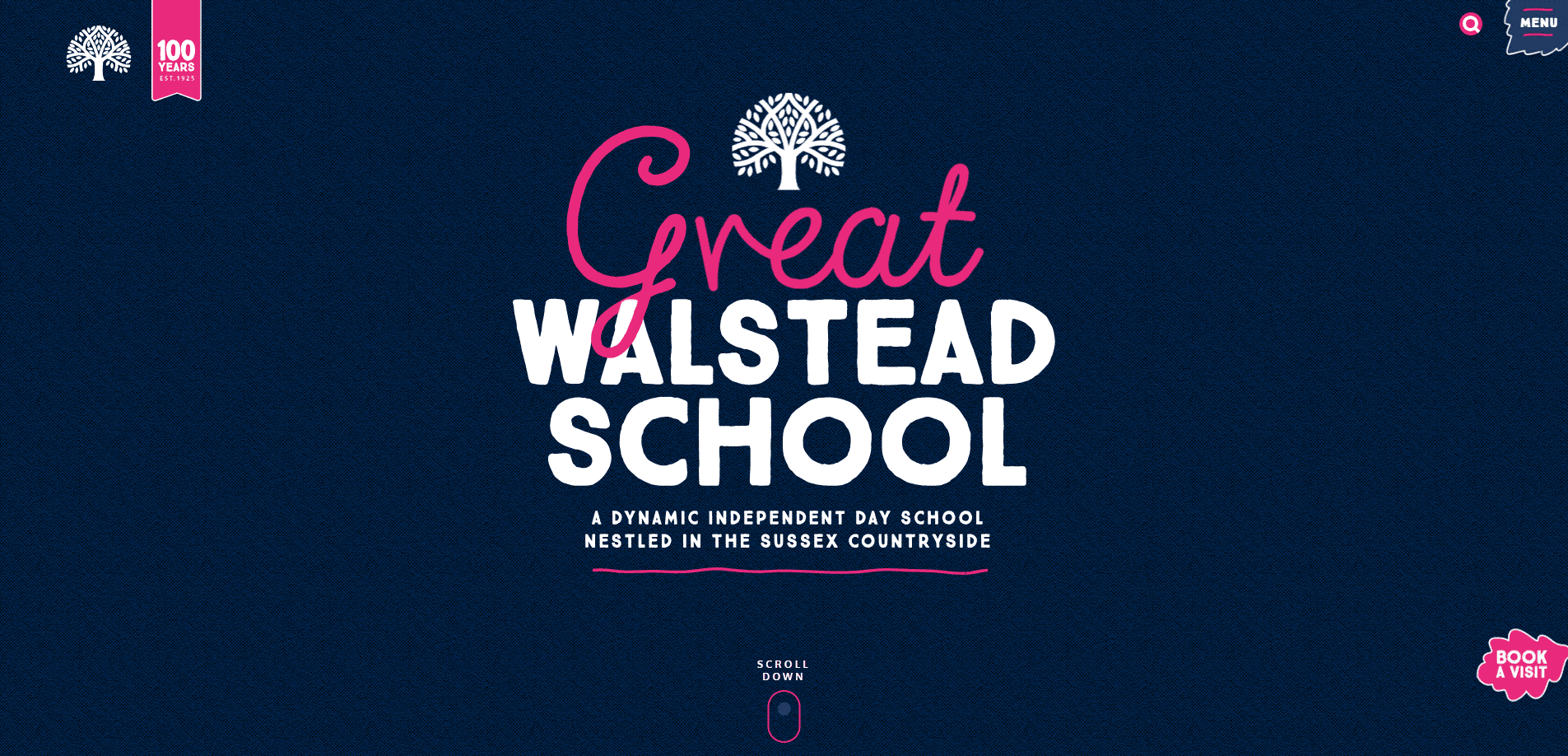
- Location: Lindfield, West Sussex, UK
- Key Takeaways:
- Colorful, modern, visually rich experience.
- Dynamic design with images and custom graphics reflecting activities.
- Highly engaging yet easily navigated, mobile-friendly design.
11. Università IUAV di Venezia
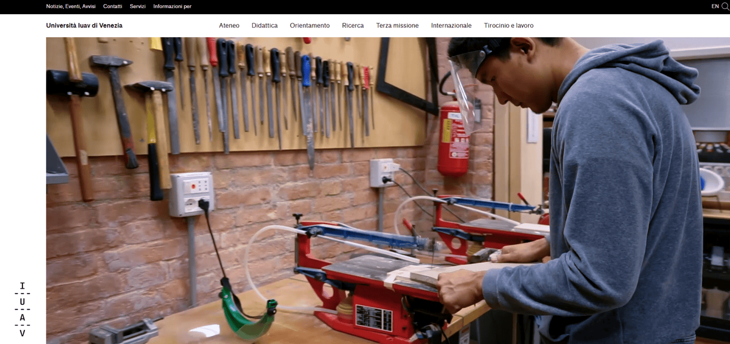
- Location: Venice, Italy
- Key Takeaways:
- Clean, non-obtrusive design highlighting creative and academic focus.
- High-quality visuals and broad navigation.
- Emphasis on reputation for architecture and design education.
12. Deerfield Academy

- Location: Deerfield, MA
- Key Takeaways:
- Polished and visually appealing design emphasizing storytelling.
- Homepage featuring high-quality photos and videos.
- Intuitively organized navigation bar.
13. Columbia Business School
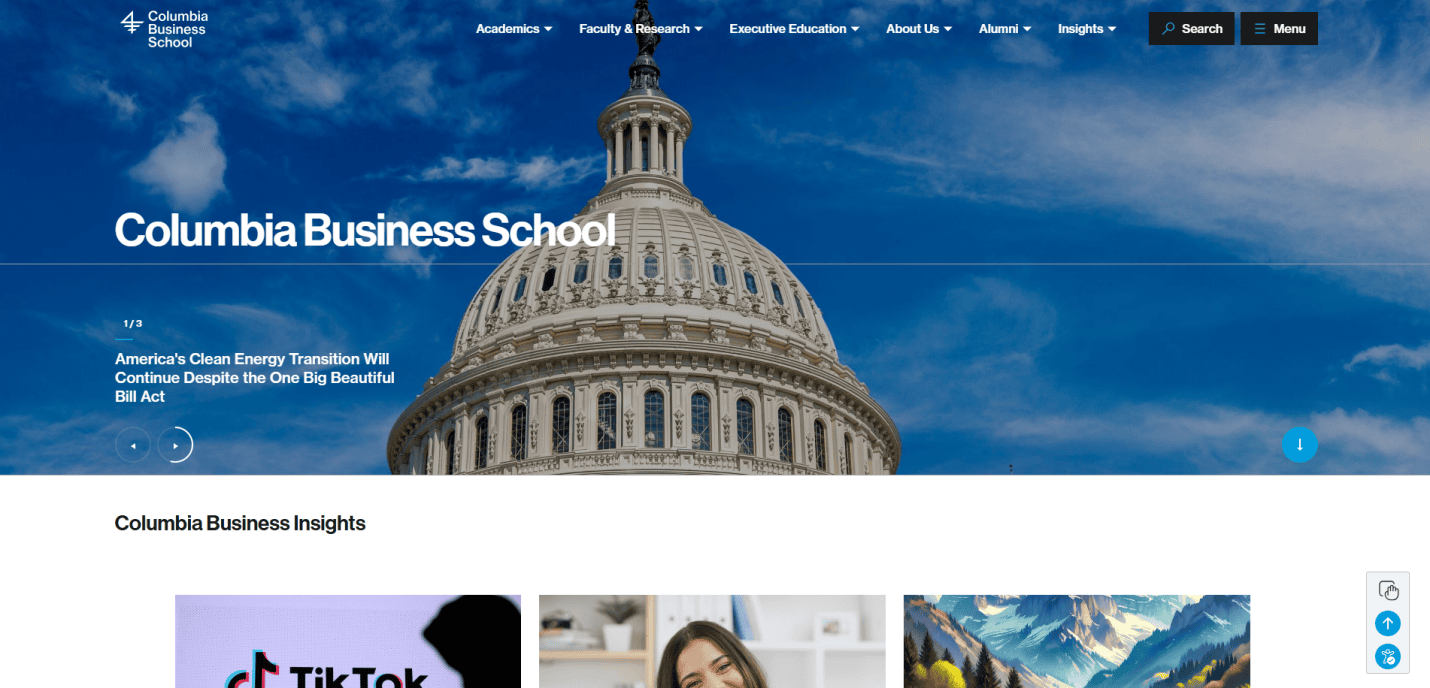
- Location: New York, NY
- Key Takeaways:
- Professionalism with clean, contemporary design.
- High-resolution images and impactful headlines.
- User-friendly design allowing easy access to information.
14. Woodbridge School
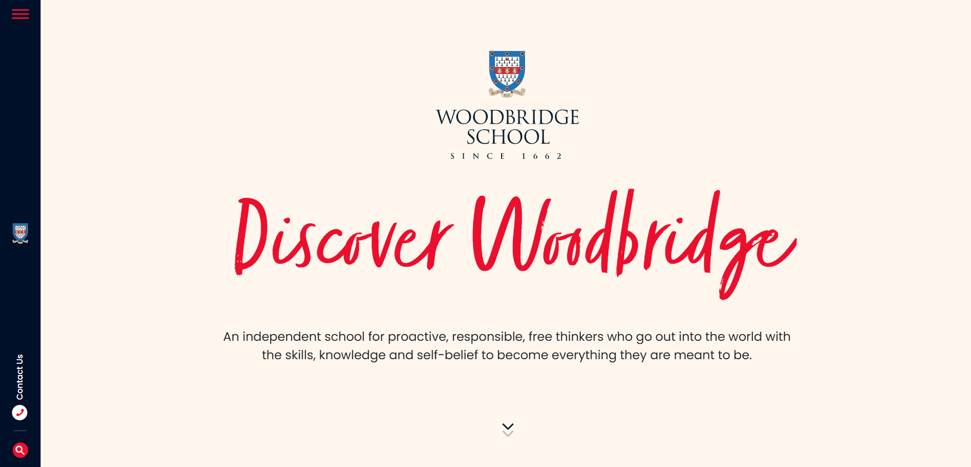
- Location: Suffolk, UK
- Key Takeaways:
- Professional design with convenient sidebar navigation.
- High-quality visuals draw attention to academic programs.
- Well-organized pages allow quick information access.
15. UMS-Wright Preparatory School
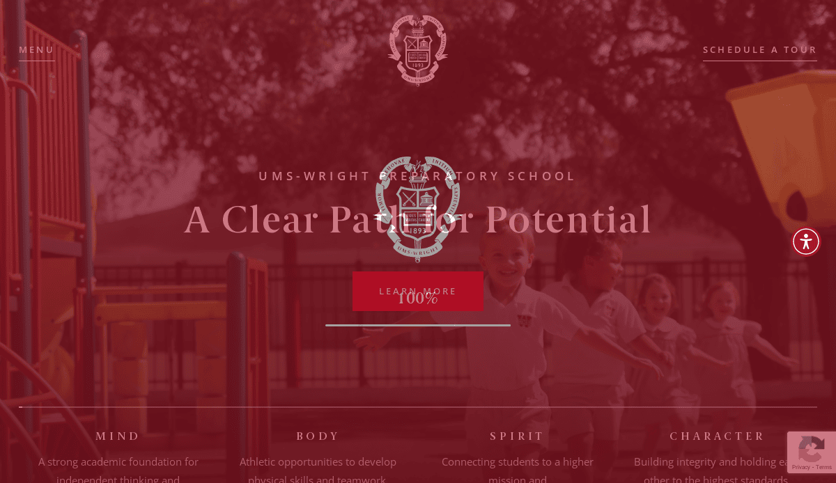
- Location: Mobile, AL
- Key Takeaways:
- Highlights rich traditions and community spirit.
- Visually appealing images and relevant content.
- Minimalist web design focusing on core information.
16. Khan Academy
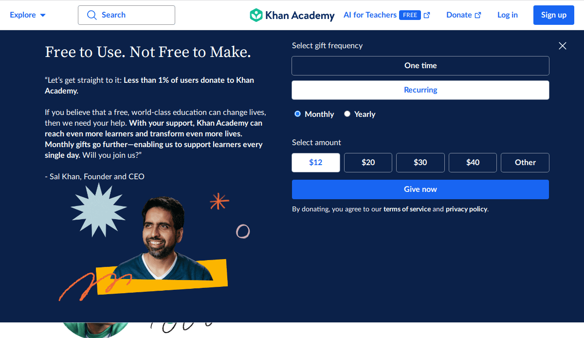
- Location: Mountain View, CA
- Key Takeaways:
- Extensive library of video lessons and exercises.
- Free and accessible to learners of all ages.
- User-friendly interface supporting various subjects.
17. Coursera
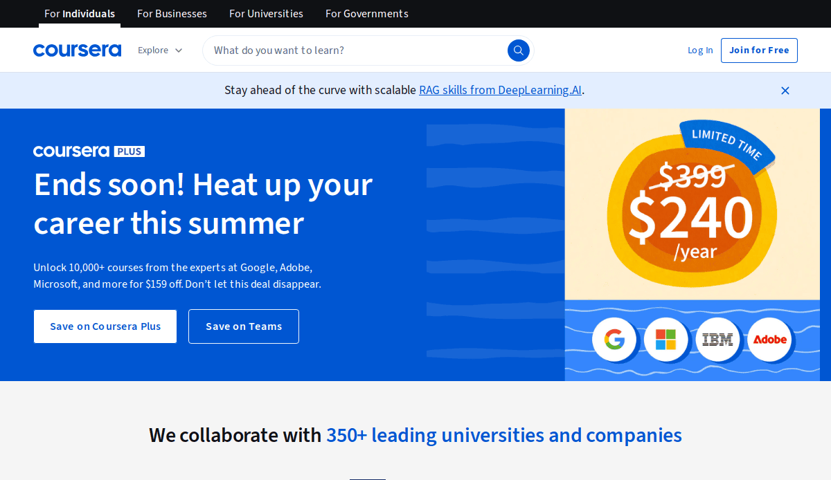
- Location: Mountain View, CA
- Key Takeaways:
- Partners with top universities offering diverse courses.
- Provides certificates and degrees recognized by employers.
- Flexible learning structure is appealing to professionals.
18. edX
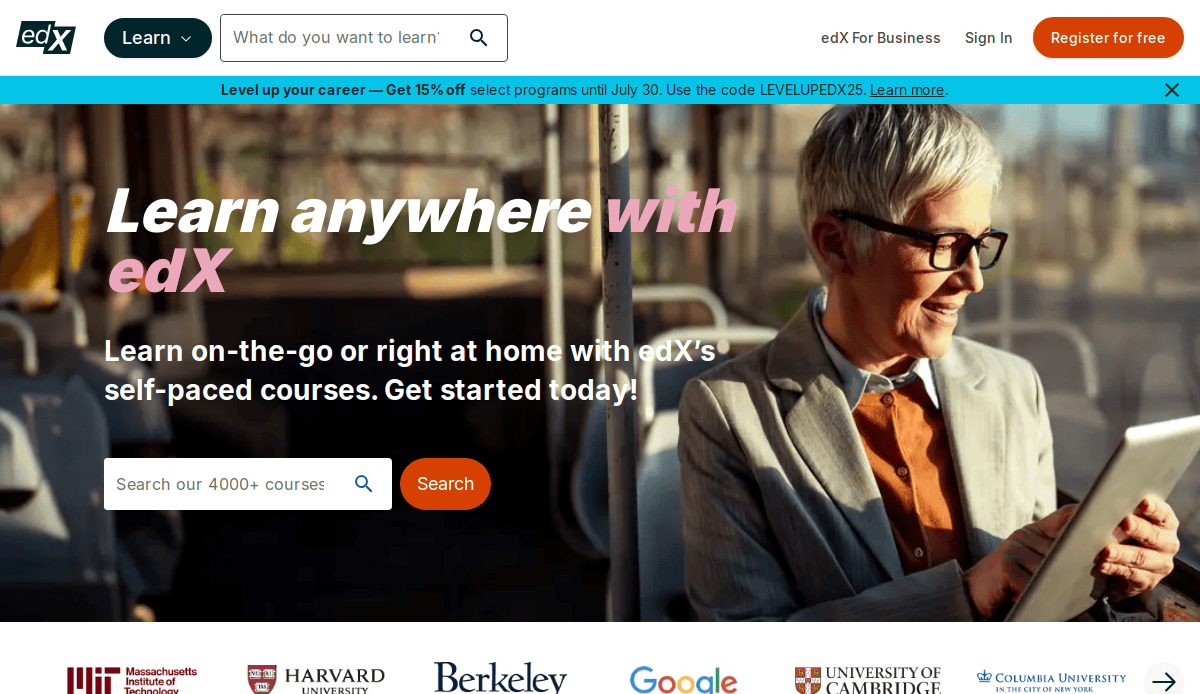
- Location: Cambridge, MA
- Key Takeaways:
- Offers high-quality courses from top universities.
- Free access to a wide range of subjects.
- Emphasis on accessibility and quality education.
19. MIT OpenCourseWare
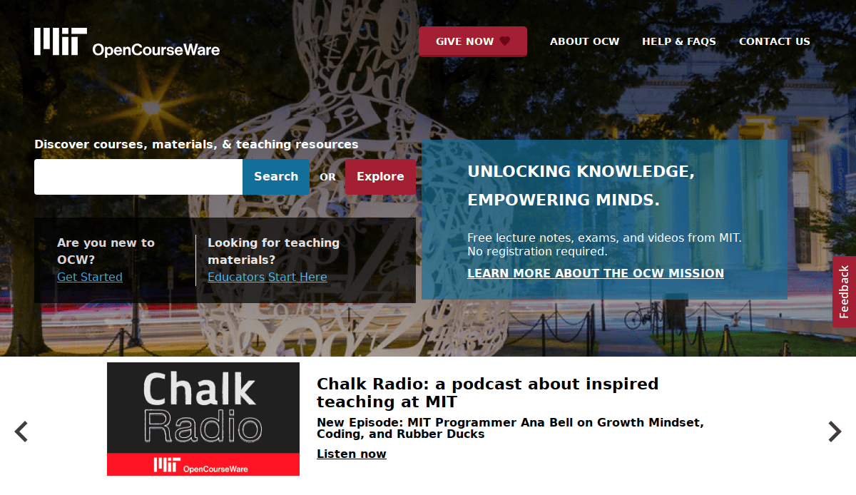
- Location: Cambridge, MA
- Key Takeaways:
- Provides free access to MIT course materials.
- Supports self-paced learning across various disciplines.
- Encourages global knowledge sharing.
20. National Geographic Kids
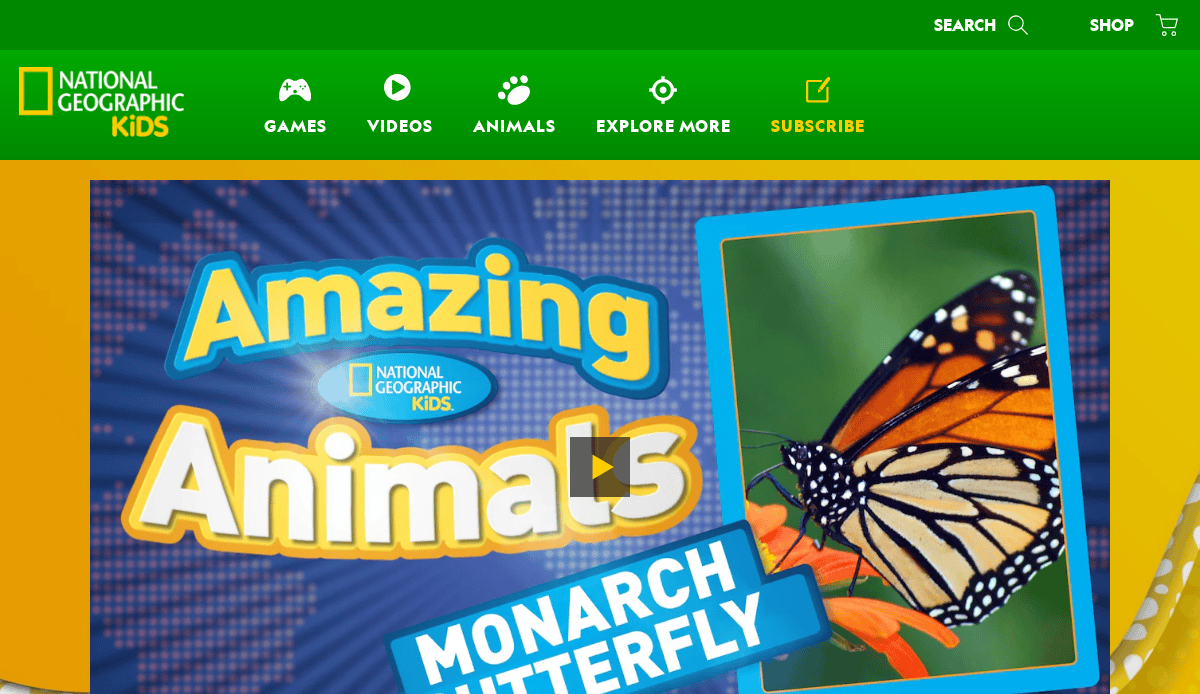
- Location: Washington, D.C.
- Key Takeaways:
- Interactive content engages young learners.
- Educational games and videos enhance learning.
- Colorful design is appealing to children.
These websites exemplify best practices in educational web design, offering user-friendly interfaces, engaging content, and adaptive layouts that cater to diverse audiences.
Take the Next Step Toward Exceptional Education Web Design
A powerful website is more than just a digital brochure—it’s a dynamic platform that supports your mission, showcases your programs, and drives real outcomes. Whether you’re using a custom build or adapting a flexible template, your site’s web design should prioritize clarity, usability, and engagement. From highlighting your latest online course offerings to optimizing mobile navigation, every design choice should serve a strategic purpose.
As a top-tier digital marketing agency, we specialize in education website design that delivers results. Our team understands how to blend design excellence with technical precision, ensuring your site not only looks great but also performs exceptionally. Ready to build a site that truly reflects the strength of your institution?
Contact us today to get started with a customized web design strategy tailored to your educational goals.
Common Questions About Website Design in the Education Industry
What are the best website templates for educational institutions?
The best education website templates are adaptive, accessible, and tailored to showcase academic programs, events, and admissions. Look for templates that support seamless navigation, are easy to customize, and offer features like calendars, testimonials, and integration with your learning platform. For inspiration, visit our portfolio of education web design.
How can education websites improve UX for all visitors?
A strong UX (user experience) starts with a design that meets the needs of different users, from prospective students to parents and alumni. Clear navigation, responsive layouts, and readable typography make your web pages easier to navigate and information easier to find. Prioritize accessibility features and fast load times to ensure a seamless experience for all.
What key features should be included in a modern college website?
A college website should include intuitive navigation, clear CTAs, and dynamic content like news, events, and program details. Essential website features also include a management system for content updates, social proof elements, and optimized website templates for mobile devices to attract prospective students and make informed decisions.
How do you design a website that attracts prospective learners?
To attract prospective learners, focus on a visually appealing design that emphasizes benefits, success stories, and program outcomes. Use compelling headlines, authentic imagery, and strategic UX elements to guide website visitors toward the right actions, like exploring programs or requesting info.
What makes for effective web design ideas in 2026?
Leading website design ideas for academic organizations emphasize minimalism, mobile-first layouts, and interactive tools. Video tours, virtual chats, and live event calendars all help create engaging experiences that encourage visitors to explore further. Consistency in branding and a clean, modern design remain foundational.
Should I build from scratch or use templates?
If you’re just creating a website, high-quality education website templates can accelerate development and reduce costs. Templates are ideal for standard website projects, but a custom design by an experienced design team offers more flexibility for schools with unique needs or advanced functionality requirements.
What pages are essential for school websites?
Core web pages for school websites include Home, About, Programs, Admissions, Faculty, Events, and Contact. Additional value pages like student life, testimonials, and FAQs support current students and help attract prospective ones. Always include a search bar and clear menus to make your website easier to navigate.
How can I make my academic website more interactive?
To make your website more interactive, add features like course finders, campus maps, live chat, and social media feeds. This not only helps visitors engage but also boosts time on site and conversions. Make sure all tools are mobile-friendly and integrated into your site’s management system.
How often should school websites be updated?
School websites should be up-to-date at all times, with routine updates to programs, news, and deadlines. Frequent reviews help ensure relevant information is always available, which enhances trust and user experience. Schedule monthly content audits and work with a dedicated design team for maintenance support.
How does website design support community engagement?
A good education web design supports community engagement by highlighting events, achievements, and ways to get involved. News sections, alumni portals, and donation pages give stakeholders reasons to return and stay engaged. A well-designed site allows visitors to easily navigate your story and build lasting relationships.


