Just looking for our Best Travel Agency & Tourism Website examples list?
Why Design Makes or Breaks Your Travel Website
When someone plans their dream vacation, their first stop is often a travel-related website. But not just any site—a modern, responsive platform that blends beautiful visuals with a smooth user experience. If your travel agency website is slow, outdated, or confusing, your potential customer will move on quickly, most likely to a competitor who invested in smart design.
Whether you run a boutique tour company or manage a large tourism board, your website isn’t just a digital brochure—it’s your most important sales tool. A successful agency website doesn’t just showcase destinations; it inspires action, builds trust in your brand, and guides visitors effortlessly from curiosity to reservation.
Design matters because it communicates your brand values and delivers a user experience that meets modern expectations. With the right design strategy, your site becomes more than just pretty—it becomes a growth engine for your business.
Website Planning & Purpose
Before diving into the design itself, a successful website begins with clear strategic planning. For businesses in the travel industry, this planning phase defines the site’s purpose, target audience, and business goals—all of which influence the design and content structure.
The primary goal for most websites is to convert interest into purchases. Whether you are a local tour operator, a global travel agency, or a tourism board, your site must serve as both a marketing tool and a booking engine. That means planning how visitors will interact with your content, from browsing itineraries to reading customer reviews to finalizing a tour reservation.
Effective planning starts with understanding your audience’s needs. Are they seeking adventure tours, luxury getaways, or cultural explorations? This clarity informs the tone, imagery, and features required, like multilingual support, live chat, or real-time booking availability.
A well-planned website aligns the site structure with the buyer journey. Homepage, destination pages, travel blog, booking tools, and FAQs must all fit into a seamless, intuitive user experience. The planning process is also the time to integrate essential brand elements—from visual identity to messaging—that will carry through the design.
Ultimately, strong planning turns a basic website into a purposeful digital tool that showcases your brand, connects with users, and drives reservations in a way that aligns with business outcomes.
Design Principles for a High-Impact Travel Website
Designing a website requires more than aesthetics—it demands a deep understanding of user behavior, brand storytelling, and functionality. The following principles guide the creation of effective websites that look beautiful and drive measurable results.
- Visual Hierarchy and Layout: A clear structure helps users navigate effortlessly. Use a hierarchy that draws attention to key elements like hero images, call-to-action buttons, featured tours, and customer reviews. Grid-based layouts and white space help maintain clarity and visual balance.
- Consistent Branding: From the color palette and fonts to the tone of voice and iconography, every element should reinforce your identity. Consistency builds trust and recognition across every touchpoint—from the homepage to enrollment confirmation pages.
- Responsive Design: With most users accessing travel sites from mobile devices, responsive design is non-negotiable. A mobile-first approach ensures your content looks great and functions seamlessly across all screen sizes, boosting engagement and reducing bounce rates.
- High-Quality Imagery: Use large, high-resolution images that inspire wanderlust. Showcase destinations, accommodations, and experiences that resonate with your target audience. Imagery should be beautiful, purposeful, and drive users toward enrollment.
- User-Centered Navigation: Design intuitive menus and logical paths for users to explore your offerings. Navigation should be accessible, clearly labeled, and optimized for search. Incorporate breadcrumbs, sticky headers, and mega-menus where appropriate.
- Fast Load Times: Tourists don’t wait. Optimize your site’s performance with compressed images, streamlined code, and minimal plugin usage. Speed is critical for both UX and search engine rankings.
- Clear CTAs and Booking Paths: Design buttons and links that guide users through the journey, from learning about your services to making a reservation. Use action-driven language like “Book Your Safari,” “Explore Packages,” or “Start Planning.”
- Accessibility: Your website should be usable for all visitors, including those with disabilities. Ensure proper contrast ratios, alt text for images, and keyboard navigability to meet accessibility standards.
Together, these principles form the blueprint for designing a website that looks professional and functions as a powerful tool for engaging visitors and driving business results.
Content & Navigation: Structuring Travel Websites for Engagement
Content and navigation are the backbone of any successful site. They determine how easily a user can find information, understand your offerings, and take action. The structure must support inspiration, exploration, and conversion.
- Organize Content by Intent: Travel websites attract users at various stages of the planning process. Organize your site into clear sections—destination overviews, tour packages, travel blogs, FAQs, and contact information—to support both research and reservations. Group related services under common categories to reduce friction.
- Use Clear, Descriptive Labels: Menus should be short and meaningful. Avoid vague labels like “Services” in favor of action-oriented titles like “Plan Your Trip,” “Explore Destinations,” or “Request Tour Details.” These improve usability and help search engines understand page content.
- Showcase Key Pages in Navigation: Promote your most critical pages, such as booking options, reviews, and itineraries, within the primary navigation. This helps guide users to revenue-driving sections quickly. Use dropdown menus or mega menus if needed for complex offerings.
- Design for Mobile Navigation: With a growing number of travelers planning trips on their phones, mobile navigation must be intuitive. Use expandable menus, tap-friendly buttons, and persistent headers to ensure easy access to content across devices.
- Support with Internal Linking: Travel blog posts, destination guides, and FAQs should include internal links to relevant tours, booking tools, or contact forms. This strategy keeps users on your site longer and encourages deeper engagement.
- Keep Navigation Consistent Across Pages: Visitors expect consistency. Ensure your main menu, footer, and any secondary navigation remain stable across the entire website. Inconsistent navigation creates confusion and can lead to user drop-off.
- Incorporate Search and Filtering Tools: Especially for larger travel sites, offering search bars and filtering options (by destination, activity type, price, etc.) enhances usability and helps users quickly find relevant content.
When content and navigation are structured with purpose, your website becomes a streamlined, user-focused platform that supports both the browsing experience and your business goals.
Visual Elements: Supporting the User Experience Through Design
Visual elements play a critical role in shaping how visitors experience your website and perceive your business. Where emotion and inspiration drive purchasing behavior, visuals must do more than fill space—they must communicate, motivate, and convert.
- Hero Images and Full-Width Banners: These large visuals at the top of the homepage or key pages immediately immerse users in a destination. Hero images should be crisp, emotionally resonant, and tied to clear calls-to-action. The goal is to evoke a sense of place and inspire exploration at first glance.
- Destination Photography and Videos: Showcasing real experiences through dynamic photo galleries or background videos adds authenticity. Highlighting landscapes, activities, and cultural moments helps potential travelers visualize themselves in the scene. This emotional connection increases engagement and encourages deeper exploration.
- Icons and Infographics: Supporting visuals like icons can improve scannability and guide users through complex information, such as itineraries, pricing, or package features. Infographics are ideal for summarizing statistics (e.g., customer satisfaction or enrollment trends) in a digestible format.
- Visual Consistency and Branding: From color palettes and font pairings to image style and placement, visual consistency strengthens digital identity. Aligning visuals with your brand guidelines enhances trust and recognition while creating a professional, polished impression.
- White Space and Composition: Proper use of white space creates breathing room for content and visual elements, helping users focus on what matters most. Strategic spacing also improves readability and reinforces a clean, modern aesthetic.
- Testimonials with Photos: Incorporating real customer images next to testimonials reinforces credibility. These visuals provide social proof and make the endorsement feel more genuine and relatable.
- Visual Support for CTAs: Buttons, hover effects, and directional cues like arrows or subtle animations help guide users toward desired actions. Visual cues should be designed to stand out while remaining cohesive with the overall aesthetic.
When thoughtfully implemented, visual elements enhance UX, strengthen your travel brand, and create an emotional connection that transforms website visits into real-world reservations.
Ongoing WordPress Maintenance for Travel Websites
Building a website is only the beginning. Ongoing WordPress maintenance ensures that your site continues to operate efficiently, securely, and in alignment with your business goals. For travel-focused businesses, where real-time enrollment and user trust are critical, regular upkeep is essential.
- Security Updates and Backups: WordPress core, themes, and plugins need consistent updates to patch vulnerabilities. Regular backups safeguard against data loss from hacks or system failures, providing peace of mind and faster recovery if needed.
- Plugin and Theme Management: As plugins evolve, compatibility issues can arise. Monitoring and updating these components prevents conflicts that could break functionality or slow down site performance. It’s especially important for booking engines or translation tools.
- Performance Optimization: Over time, databases accumulate clutter, and media files stack up. Scheduled performance checks help maintain quick load times—a must for mobile users planning trips on the go. This also includes image optimization and cache management.
- SEO and Content Audits: Periodically reviewing content ensures accuracy and relevance. Audit meta tags, internal links, and keyword usage to maintain visibility in search engine rankings. Refreshing travel blog posts or adding new travel tips signals to search engines that your site is active and authoritative.
- Broken Link Checks and UX Improvements: As pages are added or removed, links can break. Routine scanning prevents negative UX. Monitoring analytics can also highlight areas where users drop off, informing targeted UX updates.
- Legal Compliance and Accessibility: Tourism websites often serve global audiences. Keeping privacy policies, cookie notifications, and accessibility features up to date reduces liability and improves trust with international users.
Reliable WordPress maintenance supports a stable digital foundation for your travel brand. It allows you to focus on promoting destinations and serving customers while your website stays secure, optimized, and aligned with your business objectives.
20 Travel & Tourism Website Examples to Inspire
Here are 20 top industry websites that stand out for design, usability, and user experience, five of which were created by our pros!
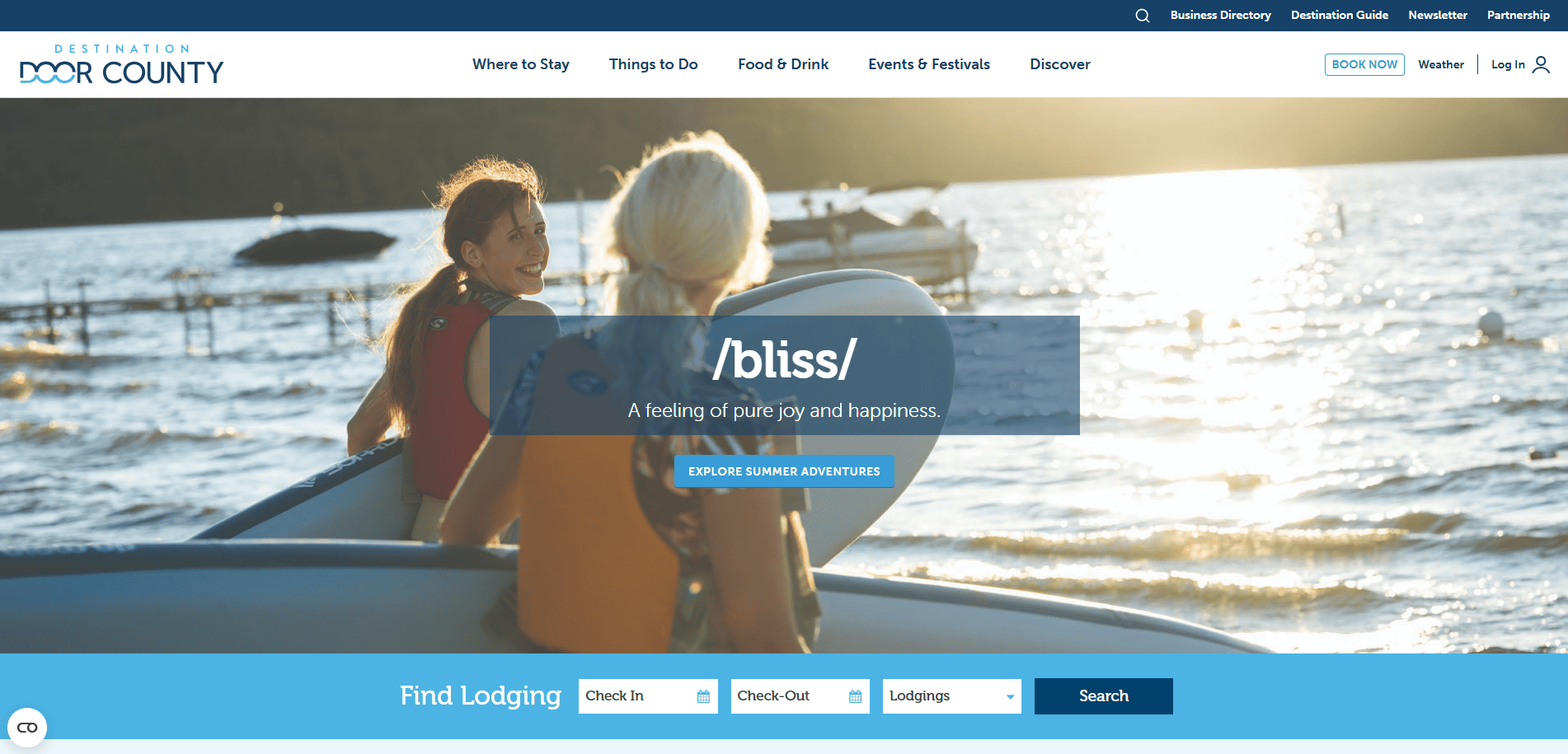
1. Door County Visitor Bureau – Door County, WI
- Key Takeaways: Clean layout, scenic visuals, organized trip planning tools
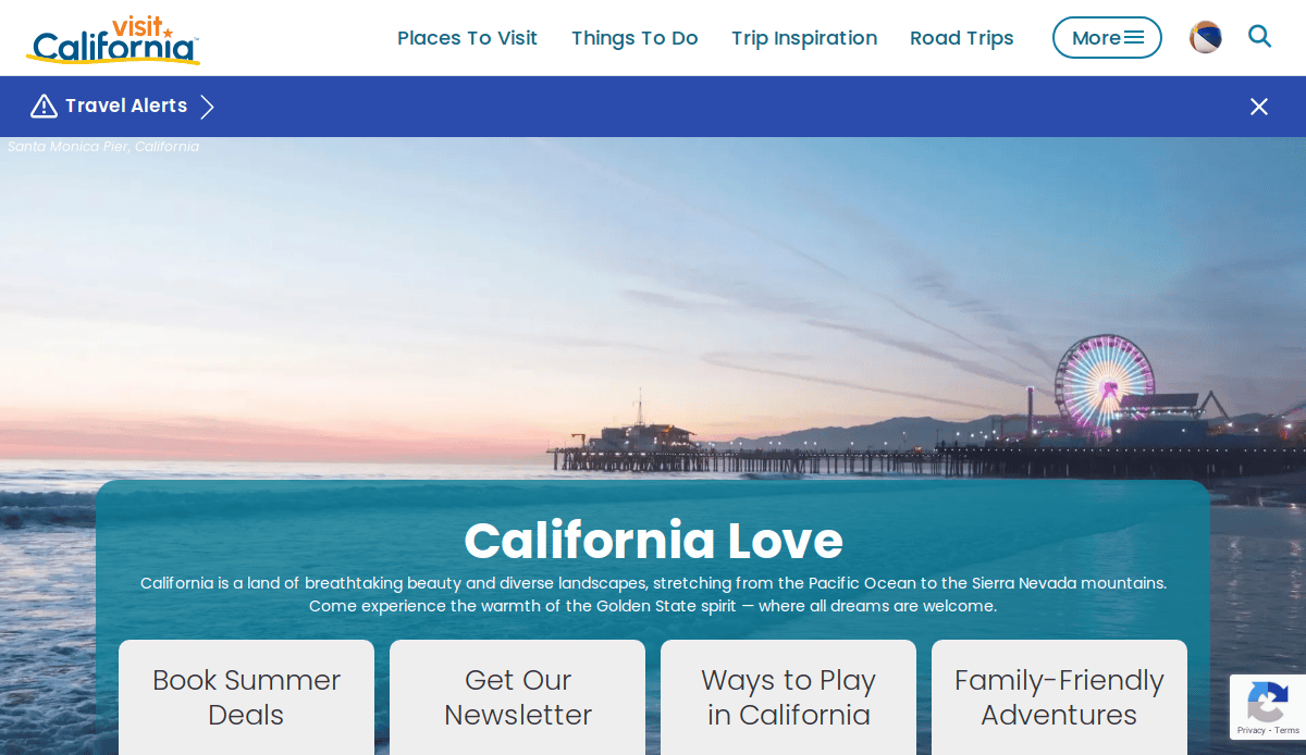
2. Visit California – Sacramento, CA
- Key Takeaways: Strong branding, multimedia storytelling, engaging travel content
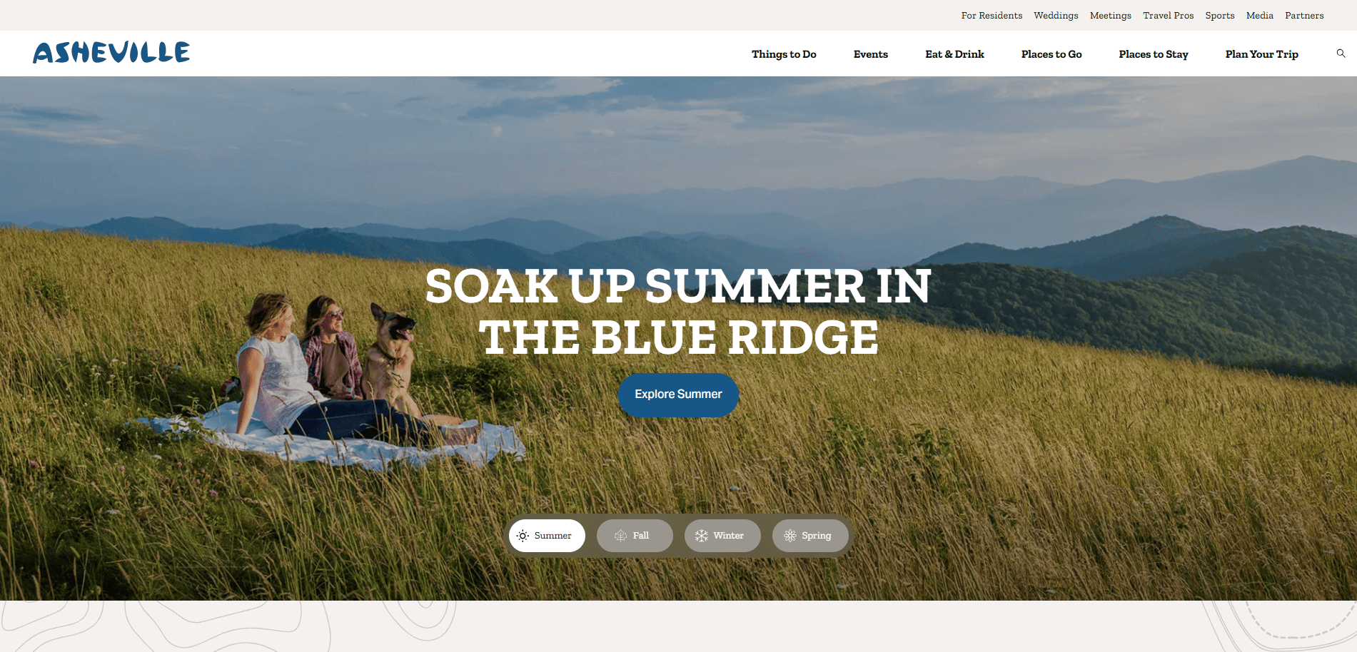
3. Explore Asheville – Asheville, NC
- Key Takeaways: Vibrant imagery, custom itineraries, mobile optimization
4. Pure Michigan – Lansing, MI
- Key Takeaways: Full-screen visuals, integrated social proof, easy trip planning

5. Visit St. Pete/Clearwater – Clearwater, FL
- Key Takeaways: Clear categories, booking options, powerful visuals
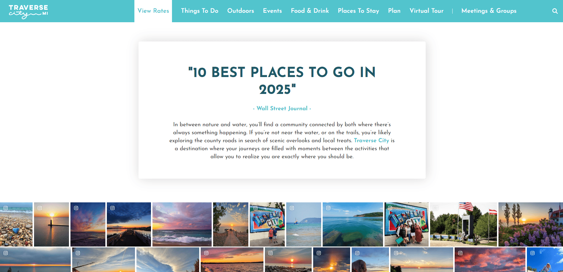
6. Traverse City Tourism – Traverse City, MI
- Key Takeaways: Adaptive design, compelling CTAs, intuitive navigation

7. Visit Seattle – Seattle, WA
- Key Takeaways: Urban branding, fresh content, strong SEO
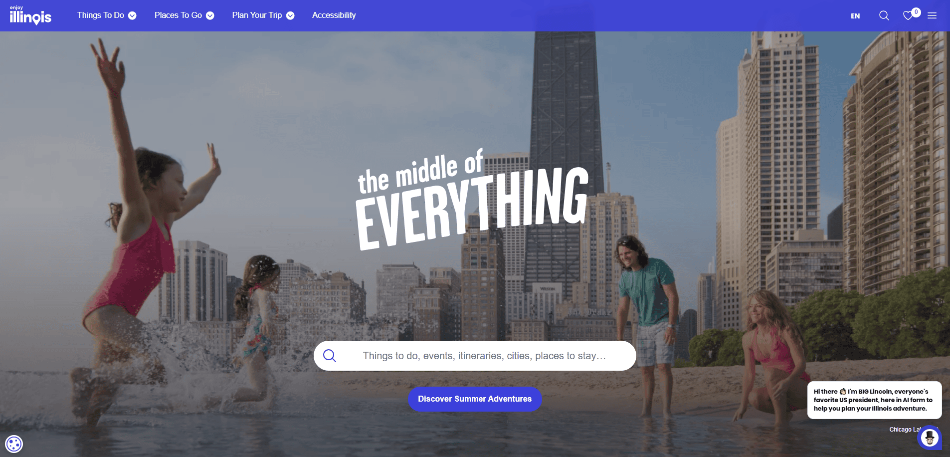
8. Enjoy Illinois – Chicago, IL
- Key Takeaways: Statewide destination integration, interactive guides, and visual appeal
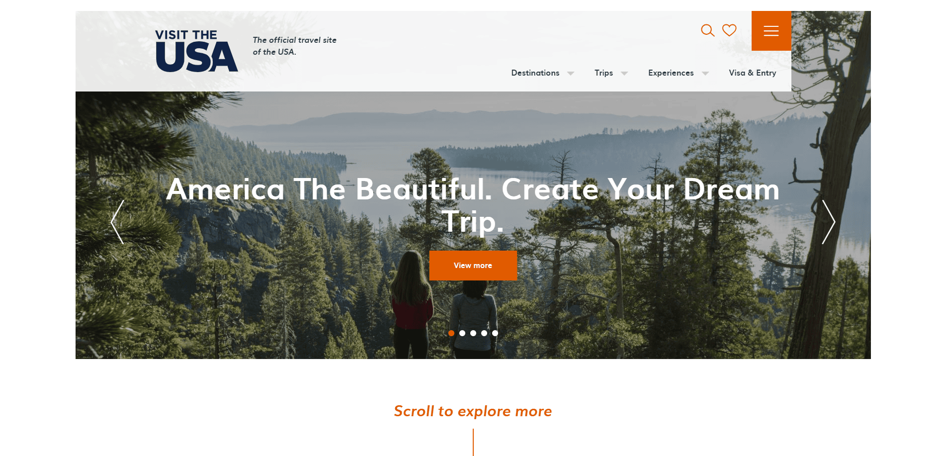
9. Visit The USA – Washington, D.C.
- Key Takeaways: Nationwide reach, multilingual support, travel search functionality
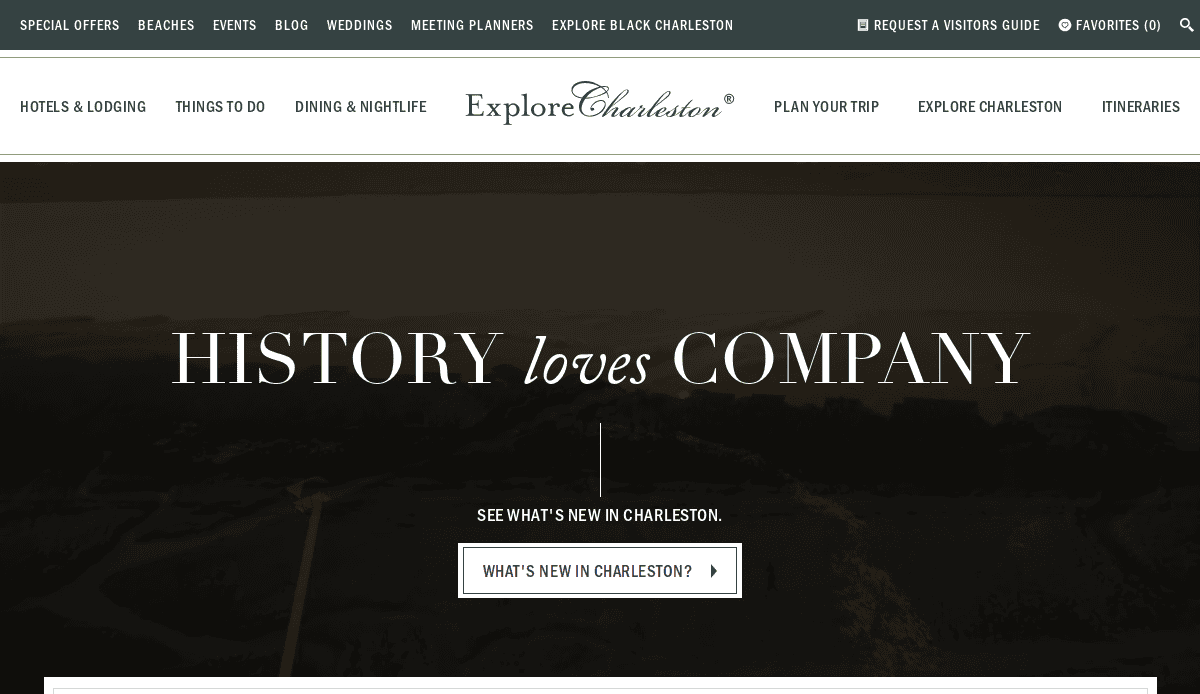
10. Charleston CVB – Charleston, SC
- Key Takeaways: Charming visuals, seamless booking, engaging storytelling
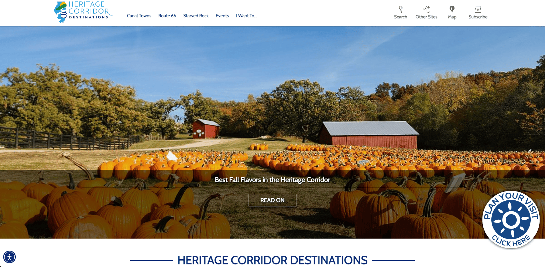
11. Heritage Corridor CVB – Joliet, IL
- Key Takeaways: Route 66 focus, regional appeal, user-centered content layout
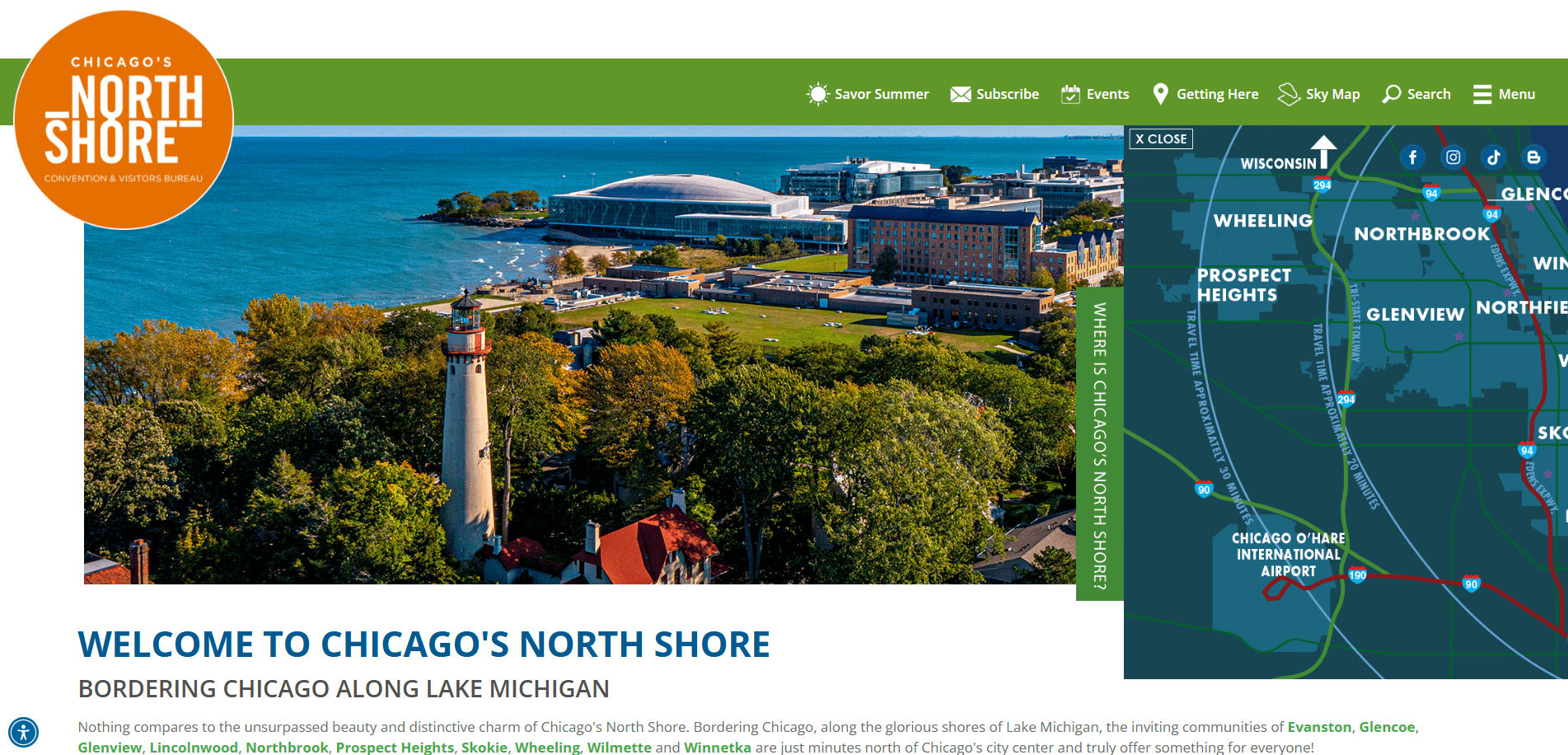
12. Chicago’s North Shore CVB – Northfield, IL
- Key Takeaways: Regional navigation, vibrant site layout, informative content
13. Village of Downers Grove – Downers Grove, IL
- Key Takeaways: Community events integration, adaptive UI, local business promotion
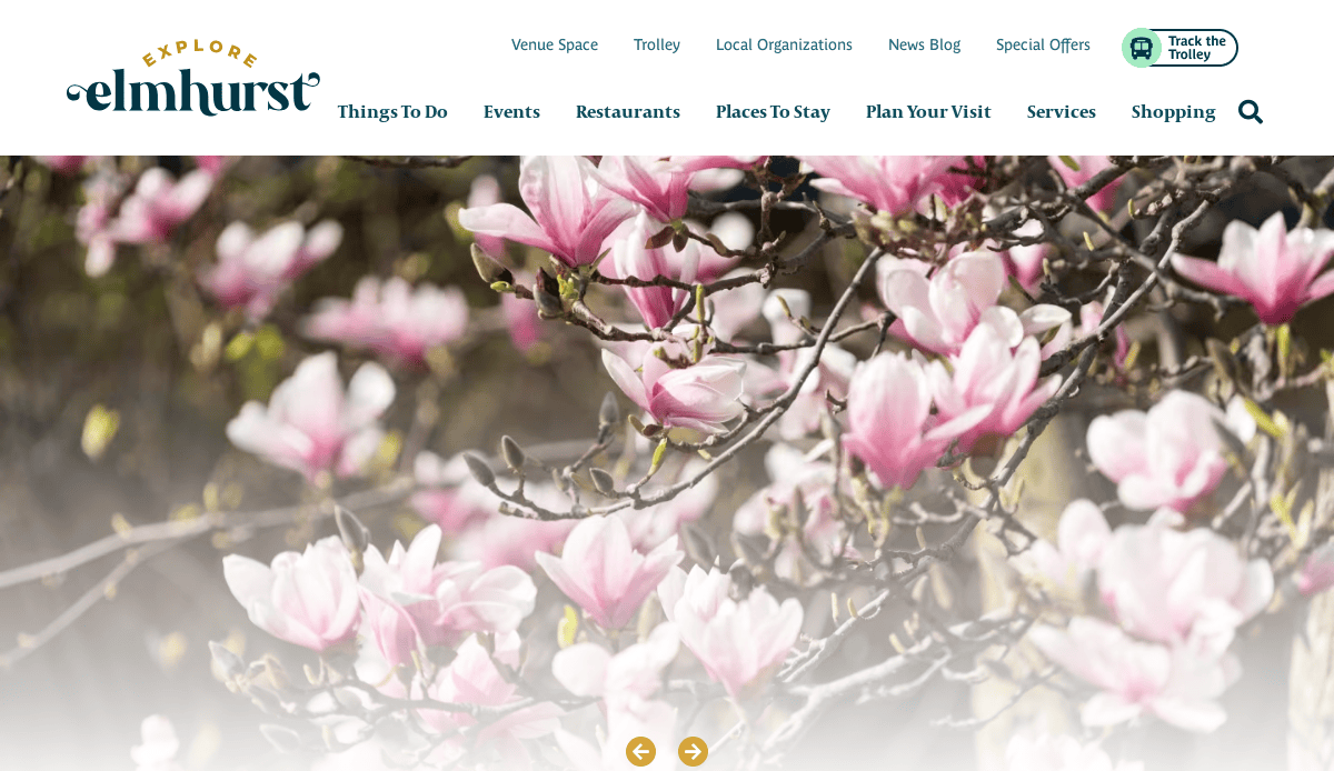
14. Explore Elmhurst – Elmhurst, IL
- Key Takeaways: Local promotion, strong CTAs, full-screen visuals

15. Addison Events – Addison, IL
- Key Takeaways: Event-first design, adaptable mobile version, easy-to-update CMS
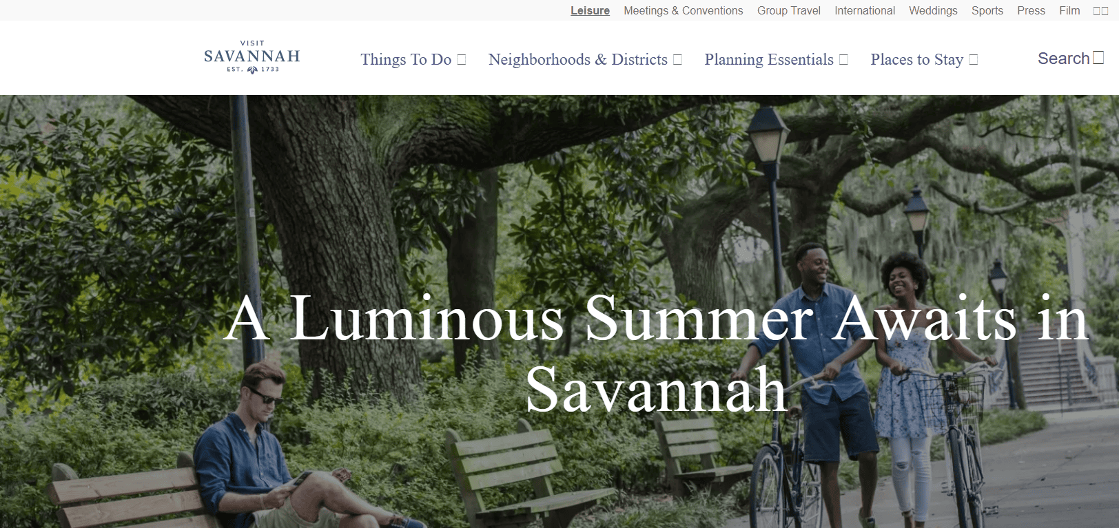
16. Visit Savannah – Savannah, GA
- Key Takeaways: Southern charm branding, detailed trip planning, rich content
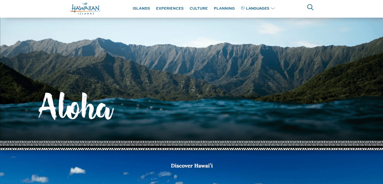
17. Go Hawaii – Honolulu, HI
- Key Takeaways: Visual storytelling, travel tips, seamless site layout
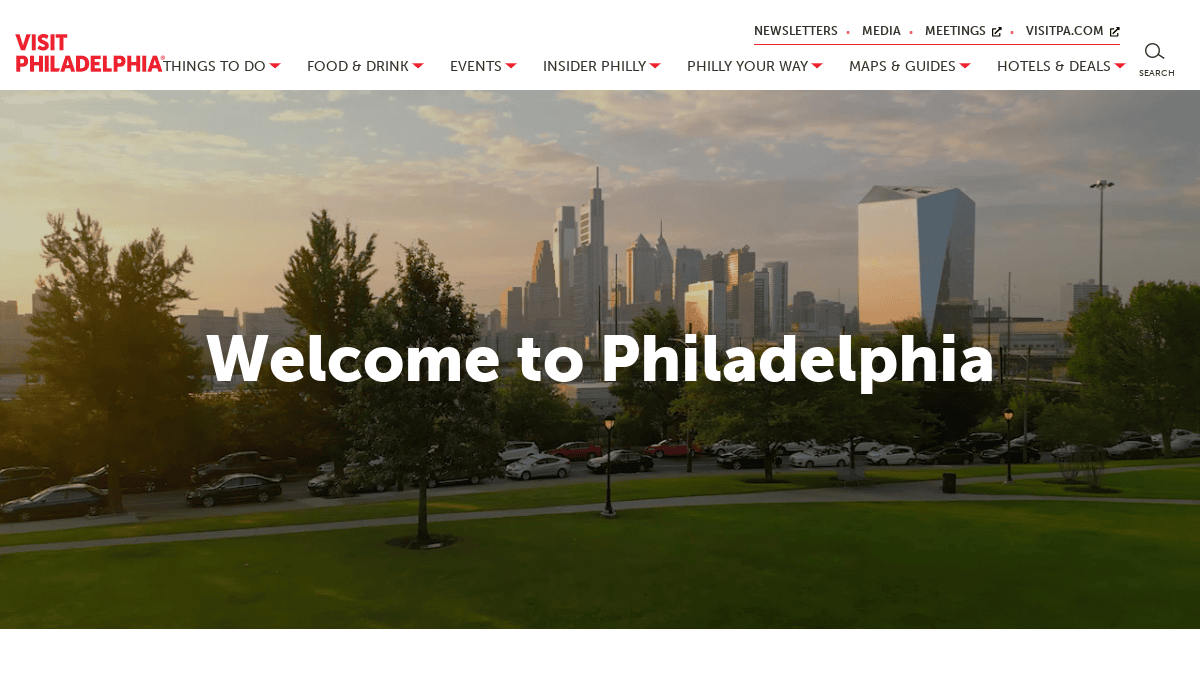
18. Visit Philadelphia – Philadelphia, PA
- Key Takeaways: High-quality images, destination events, and mobile-ready booking
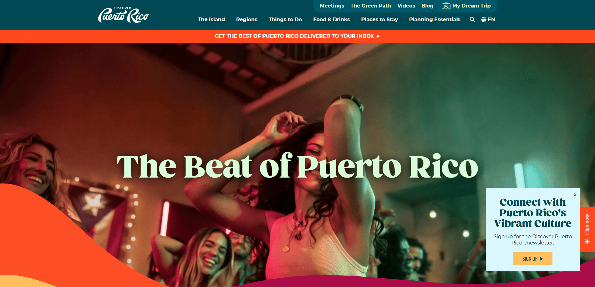
19. Discover Puerto Rico – San Juan, PR
- Key Takeaways: Bright branding, immersive media, multilingual UX
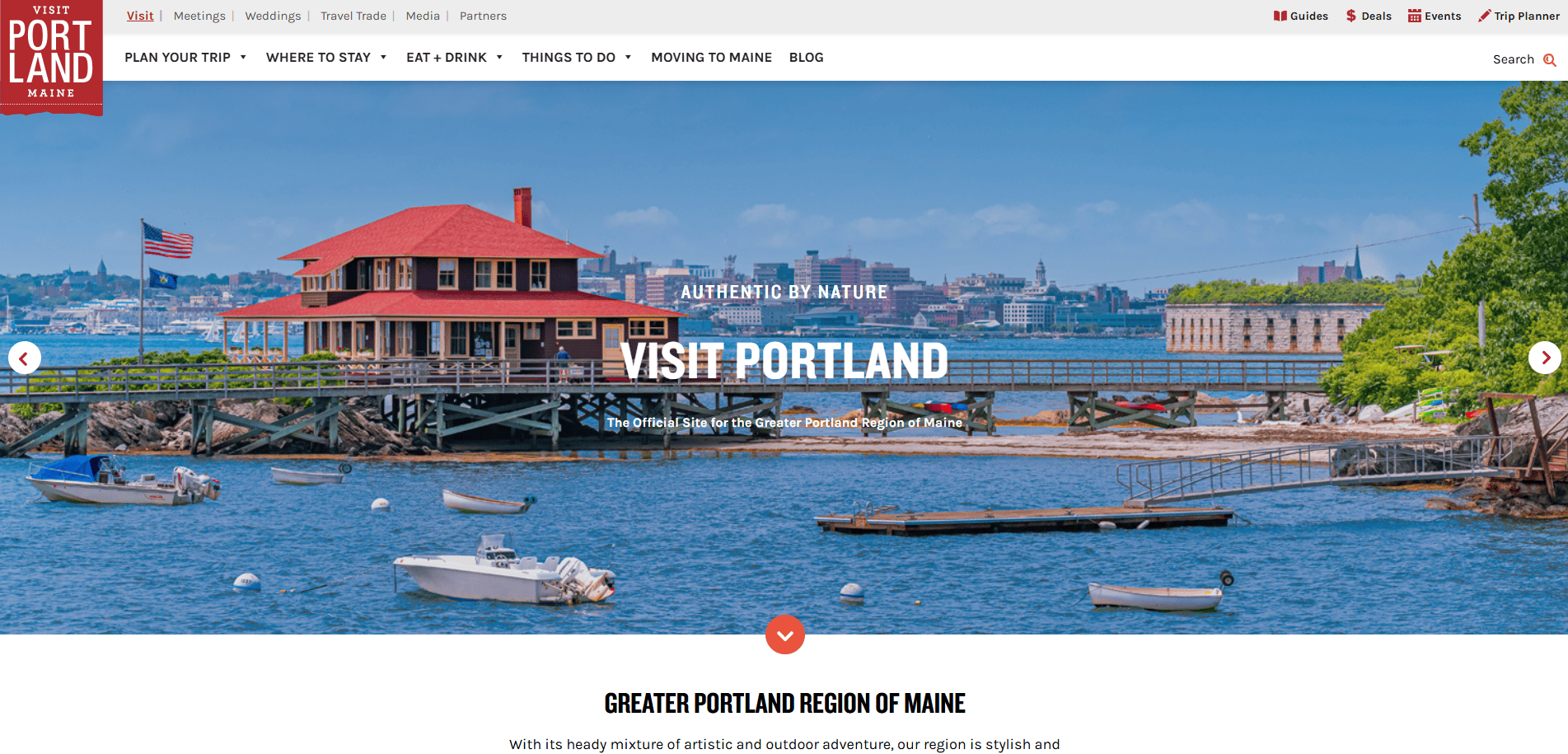
20. Visit Portland Maine – Portland, ME
- Key Takeaways: Coastal visuals, clean UI, regional storytelling
Start Building Your Travel Website with Confidence
If you’re ready to elevate your online presence and drive more bookings, it starts with a website that reflects the quality and excitement of the experiences you offer. Whether you’re launching a new travel agency website or redesigning your travel platform, the right strategy, design, and maintenance plan make all the difference.
Our team specializes in creating high-performing WordPress websites tailored for the travel and tourism industry. From initial planning through long-term support, our team ensures your site is built to attract, engage, and convert.
Contact us for a free consultation and take the next step toward a travel website that works as hard as you do.
FAQs About Travel and Tourism Site Design
What features should a travel website include to enhance Overall UX?
A successful website must include essential features such as fast-loading pages, a responsive mobile version, trip planning tools, high-quality images, clear categories, and an intuitive website. These design elements improve usability and help visitors complete bookings with confidence.
Are tourism website templates a good option for my new website?
Tourism website templates can offer a quick launch option, but they often lack the flexibility and branding power needed for long-term success. For a more professional and scalable solution, consider working with a design agency with a WordPress Website Design team to create a custom experience.
How important is branding and logo design in the travel industry?
Logo design and company visuals establish credibility and recognition. A cohesive digital identity reinforces trust and makes your site visually memorable, especially when paired with a modern site layout and consistent design elements.
What’s the best approach to choosing the right website for a travel company?
Choosing the right website involves evaluating the type of content you’ll offer, the user journeys you want to support, and the backend functionality needed to handle things like reservations, payments, and customer inquiries. Your decision should prioritize user-friendly design and scalability.
Do hotel websites need different features than general travel websites?
Hotel websites often require specialized booking engines, photo galleries with full-screen image views, customer review sections, and location-based features like maps. However, the core principles—mobile optimization, visual appeal, and search engine visibility—remain the same.
Can I use a website builder for my travel agency website?
While website builder platforms can work for very small or early-stage travel companies, most growing agencies benefit from custom WordPress development. This allows for better performance, SEO optimization, and support for advanced features like interactive maps or multilingual content.
What type of content performs best on a travel website?
Informative content that addresses specific experiences, destination guides, and tips performs well. Including fresh content regularly through a blog enhances your site’s relevance and improves SEO.
How can I integrate digital marketing into my tourism website?
Digital marketing should be embedded from the start. This includes optimizing each page for search engine visibility, running paid ads tied to landing pages, and creating shareable content like blogs or videos. Consider leveraging our digital marketing services for strategic support.
What should I include in my site to support users planning outdoor adventure travel?
For creative travel and outdoor adventure offerings, include engaging travel visuals, reservation options, equipment guides, and itineraries. Use dynamic features that enhance UX, such as interactive maps or scroll-triggered animations.
How does a strong visual design help sell tours online?
A well-designed site with high-quality images, visual storytelling, and compelling calls-to-action improves conversion rates. Visual appeal builds emotional connection, while functional layouts make it easier for users to take action, especially when designed to support creating travel bookings directly on the site.


