Just looking for our Best Private Equity Website examples list?
When it comes to high-stakes capital and strategic acquisitions, multi-billion-dollar decisions can hinge on perception, credibility, and trust. Your private equity firm meticulously crafts its investment strategy and curates its portfolio, but is that same level of precision applied to your most public-facing asset? Before a handshake ever occurs, potential investors are conducting their due diligence online. This means that your firm’s website is no longer a static brochure; it is the virtual front door, and its design speaks volumes.
A generic or outdated online presence can inadvertently signal a firm that is behind the curve. For a PE firm, this is a critical misstep. The goal of superior website design is to instantly convey the caliber of your operation, build immediate trust, and create a seamless user experience that guides visitors effectively. It’s about more than just a modern look; it’s about crafting a powerful brand identity and ensuring that the platform’s navigation and functionality reflect the sophistication of your work with your portfolio companies. This is where strategic design transcends aesthetics and becomes a direct driver of business results, influencing perceptions and opening doors to new opportunities.
The Blueprint for Success: Website Planning & Purpose
For a private equity firm, the planning phase of website design is not about chasing trends; it is an exercise in strategic precision. Unlike a retail brand or a software company, a PE firm’s website serves a unique and multi-faceted purpose. It must operate as a secure, highly professional digital hub for multiple, distinct, and incredibly high-value audiences. A failure in planning means a failure to connect with the very people who determine the firm’s success. This initial stage, therefore, is the most critical part of the entire process, laying the foundation for an online presence that is both a fortress of credibility and a beacon for opportunity.
The core of the planning phase involves answering a series of foundational questions, with each answer shaping the project’s direction:
- Defining Key Audiences and Objectives: Before a single wireframe is sketched, the primary audiences must be clearly identified and prioritized. Are you hoping to attract new investors (LPs)? Are you trying to source deals by appealing to founders and business owners? Is the site a recruitment tool for top-tier talent? A successful private equity website must cater to all these groups, providing clear pathways for each. The objective for an LP might be to access a secure investor portal, while the objective for a CEO is to quickly understand your investment thesis and the expertise of your team.
- Architecting an Intuitive User Experience: The UX is paramount. The site’s architecture and navigation must be flawlessly logical. A potential investor should be able to move seamlessly from your firm’s history to your investment criteria to your current portfolio without a moment of confusion. A founder exploring your site should easily find case studies relevant to their industry and the biographies of the partners they might be working with. Every click should build confidence, not create friction.
- Translating the Brand Identity: Your digital brand identity must be an extension of your boardroom presence: authoritative, sophisticated, and professional. The planning phase involves defining how to translate these abstract values into tangible design elements. This includes establishing a color combination that conveys stability and trust, selecting typography that is classic and readable, and determining an imagery style that reflects the firm’s character, whether that’s through professional team portraits or abstract, conceptual graphics.
- Outlining a Content and Messaging Strategy: A PE website is built on substance, not fluff. The planning process must map out all necessary content. This includes meticulously crafted copy for your firm’s history, a detailed explanation of your investment strategy and criteria, compelling and data-driven case studies of portfolio companies, and comprehensive biographies of your leadership team. The messaging must be consistent, confident, and laser-focused on demonstrating expertise and a track record of success. This content is not just filler; it is the evidence that substantiates your firm’s reputation.
Executing Excellence: Key Design Principles for a Private Equity Website
Once the strategic blueprint is in place, the focus shifts from planning to execution. The design principles for a private equity website are not guided by fleeting digital trends but by a timeless commitment to clarity, authority, and trust. In this high-stakes environment, design is a vehicle for strategic communication. Every visual element, from the choice of font to the use of white space, must serve a purpose: reinforcing the firm’s stature, clarifying its message, and enhancing the user experience for its discerning audience.
Here are the essential design principles that transform a standard website into a powerful digital asset for a PE firm:
- Understated Sophistication: The aesthetic should be the digital equivalent of a finely tailored suit—impressive but not ostentatious. A modern design in this context means clean lines, ample white space, and refined and purposeful color choices. The goal is to project an image of stability, confidence, and quiet competence. Flashy animations and overly vibrant colors can undermine credibility and distract from the core message.
- Unwavering Clarity and Readability: Busy executives and investors value their time above all else. The website’s typography must be exceptionally legible, and its layouts must be structured and uncluttered. Information should be presented in a hierarchical manner that is easy to scan and digest. A confusing or visually chaotic design is more than just a nuisance; it implies disorganized thinking and can erode a visitor’s confidence in the firm itself.
- Building Trust Through Visuals: Generic stock photography has no place on a professional private equity website. Building trust visually requires an investment in high-quality, professional headshots of the team and, where appropriate, compelling imagery of your portfolio companies. Displaying the logos of your portfolio acts as a powerful form of social proof. Every image should be authentic and chosen to reinforce the firm’s professionalism and success.
- Seamless Responsive Design: A significant portion of your audience will access your site from tablets or mobile devices. A flawless and fully responsive design is therefore non-negotiable. The experience of navigating your firm’s investment strategy or team biographies must be as smooth on a smartphone as it is on a 30-inch desktop monitor. A site that fails to render properly on a mobile device appears unprofessional and out of touch with the realities of modern business.
- Data-Driven Storytelling: Private equity is a world of numbers, but raw data can be overwhelming. A key design principle is to use effective data visualization to tell a story. Instead of dense paragraphs, use clean charts, graphs, and infographics to showcase fund performance, industry diversification, or the growth trajectory of a case-study company. This makes complex information highly digestible and demonstrates a mastery of the details.
- Purposeful Calls-to-Action (CTAs): While a PE site isn’t a typical marketing funnel, it still needs to guide users to a desired outcome. CTAs should be clear and direct, yet integrated tastefully into the design. Instead of loud “Click Here!” buttons, the design should feature sophisticated, intuitive prompts such as “Explore Our Portfolio,” “Access Secure Portal,” or “Contact Our Investment Team.” The goal is to facilitate a connection, not force a conversion.
The Architectural Core: Structuring Content and Navigation
If design principles give a website its character, then its content and navigation give it an intellect and a logical framework. Structuring the website is like designing a high-performance engine; every component must be in its perfect place, working together to deliver a smooth and powerful user experience. The primary goal is to anticipate a visitor’s intent and provide the shortest possible path to the information they seek, thereby building confidence with every click. A confusing navigation structure or poorly organized content signals a lack of clarity that no firm can afford.
The most effective websites adhere to a clean, intuitive, and traditional structure. This is not the place for creative or ambiguous menu labels; clarity is king. Here is a breakdown of the essential sections that form the backbone of a successful site:
- Our Firm (or About Us): This section is foundational. It tells your story, outlines your firm’s history, and establishes your mission and values. This is where you anchor your brand identity and communicate the ethos that drives your operations. It’s a critical first stop for new investors and partners looking to understand who you are beyond the numbers.
- Investment Strategy (or Our Approach): This is the intellectual core of your site. It must clearly and concisely articulate your investment thesis. This includes defining your target sectors, the size and types of deals you pursue, your geographic focus, and what makes your approach to value creation unique. This content is vital for attracting the right kind of deal flow from business owners and investment bankers.
- Portfolio: This is your proof of performance. An effective Portfolio section is more than just a gallery of logos; it is a library of success stories. The design should allow users to easily filter portfolio companies by status (current vs. realized) and industry. Each company should link to a detailed case study that outlines the initial challenge, the strategic value your firm added, and the successful outcome.
- Our Team (or People): Capital is a commodity; expertise is not. This section humanizes your firm and showcases your most valuable asset: your people. It should feature high-quality, professional biographies and headshots for all key partners and team members. The content should highlight each individual’s industry expertise, operational experience, and track record, building a direct line of trust with visitors.
- News & Insights: A static website can suggest a static firm. This section demonstrates that your firm is active, engaged, and a thought leader in the market. It can house press releases about new acquisitions or exits, articles featuring your partners, or insightful commentary on market trends. This content keeps your online presence fresh and relevant.
- Contact: This fundamental page must be easy to find and use. To improve efficiency, it should provide clear channels for different types of inquiries. For instance, provide separate contact details or forms for Limited Partner relations, new investment opportunities, and media inquiries.
Finally, a discrete but crucial element is the Secure Investor Login. This is typically placed in the top-right corner of the header, separate from the main navigation but always accessible. This functional portal is a critical tool for your existing investors and a signal to potential ones that you provide professional, secure access to information. By organizing content logically within this framework, you create a website that is not just a digital brochure but a powerful tool for communication and business development.
The Visual Lexicon: Using Imagery, Color, and Typography to Build Trust
While content and structure form the skeleton of a website, its visual elements provide its soul and personality. They are the non-verbal cues that communicate your firm’s character, building trust and shaping the perception of investors long before they read a single line of text. For a private equity firm, every visual choice must be deliberate, working in concert to reinforce the core brand identity of stability, sophistication, and success. A disjointed or poorly considered visual strategy can undermine the entire platform.
Here is how key visual elements support both the user experience and the brand’s strategic goals:
- Typography that Speaks Volumes: The fonts used on your website are a powerful tool for setting a professional tone.
- Serif Fonts: Typefaces with small lines attached to the main strokes of the letters (e.g., Garamond, Georgia) often project tradition, authority, and reliability. They are an excellent choice for headings and titles to convey a sense of establishment and gravitas.
- Sans-Serif Fonts: Clean, modern typefaces (e.g., Helvetica, Lato, Open Sans) offer exceptional readability, making them ideal for body paragraphs, data points, and captions. A well-executed strategy often involves pairing a strong serif font for headers with a clean sans-serif font for text, creating a hierarchy that is both elegant and easy to read.
- A Strategic Color Palette: Your palette is the foundation of the website’s mood. Rather than chasing fleeting design trends, the palette for a private equity website should be built for longevity and trust.
- Primary Colors: Palettes are typically anchored in deep, conservative colors like navy blue, charcoal gray, and rich burgundy. These hues evoke feelings of stability, power, and trust.
- White Space: The most important color in a modern design is often the absence of color. Ample white space creates a clean, uncluttered feeling, allowing key messages and images to stand out and giving the user a sense of calm and focus.
- Accent Colors: A single, reserved accent color should be used sparingly and strategically to guide the user’s eye, highlight key data points, and provide visual interest for calls-to-action without overwhelming the design.
- Imagery as Evidence: On a website where every claim must be substantiated, imagery is not decoration; it is evidence. Generic stock photos of chess pieces, handshakes, or anonymous people in suits are counterproductive and erode authenticity.
- Team Photography: Invest in high-quality, professional, and consistent headshots. The style—whether formal portraits or more approachable environmental shots—should directly reflect your firm’s culture.
- Portfolio Imagery: Whenever possible, use compelling, professional photography of your portfolio companies in action. Showcasing their products, facilities, or teams provides tangible proof of your involvement in real, thriving businesses.
- Architectural and Abstract Imagery: For firms seeking a more subtle and sophisticated aesthetic, high-resolution architectural details, cityscapes, or abstract textures can effectively communicate concepts like structure, growth, and forward-thinking vision.
- Data Visualization for Clarity: Private equity runs on data. Transforming complex spreadsheets into compelling visual narratives is essential. Clean, on-brand charts, graphs, and infographics should be used to present performance metrics, portfolio diversification, and growth trajectories. This makes complex information easy to understand at a glance and demonstrates a mastery of the details that is critical for building investor confidence.
Protecting Your Digital Asset: Ongoing WordPress Maintenance
Launching a sophisticated website is the beginning, not the end, of the investment. For a private equity firm using the WordPress platform, ongoing maintenance is not a routine IT task—it is a fundamental component of digital risk management and brand preservation. A neglected website is a vulnerable website, posing a direct and serious threat to the firm’s reputation for security, stability, and professionalism. In an industry built on trust, even a minor security lapse or performance issue on your primary digital asset can have an outsized negative impact.
A structured maintenance plan is essential for ensuring the site continues to operate at the high standard your stakeholders expect. This involves several key areas of focus:
- Proactive Security and Threat Mitigation: The digital front door of your private equity firm must be as secure as your physical one. Given WordPress’s popularity, it is a frequent target for malicious actors. Proactive security is non-negotiable and includes continuous malware scanning, management of a Web Application Firewall (WAF) to block hostile traffic, and diligent monitoring for intrusion attempts. This protects the firm’s data, its reputation, and the integrity of its brand identity.
- Diligent Software Updates: Every component of a WordPress site—from the core software to its plugins and themes—receives periodic updates. These updates are crucial as they often contain vital security patches that close vulnerabilities discovered since the last release. A professional maintenance protocol involves a “test-then-deploy” approach. All updates are first applied and rigorously tested on a private staging server to ensure they don’t cause conflicts or functionality issues. Only after they are confirmed to be stable are they pushed to the live website, ensuring zero downtime or disruption for visitors.
- Performance and Uptime Monitoring: A slow or unavailable website frustrates high-value visitors and projects an image of inefficiency. The user experience is directly tied to site speed. Continuous performance optimization, including database cleanup and image compression, ensures the site remains fast and responsive. Uptime monitoring provides immediate alerts if the site becomes inaccessible, allowing for a swift response to minimize any interruption in your firm’s online presence.
- Redundant and Verified Backups: A consistent backup strategy is the ultimate insurance policy against data loss, a server failure, or a security compromise. A professional plan includes regular, automated backups of the entire website (files and database) that are stored in a secure, off-site location, completely separate from the hosting environment. Critically, this process also involves periodically testing the restoration process, because a backup strategy is only effective if it is proven to work flawlessly in an emergency.
Just as your firm manages its portfolio for optimal performance and risk mitigation, your website requires the same professional diligence. An ongoing WordPress maintenance plan is not an optional expense; it is an essential investment in protecting your firm’s digital integrity and ensuring this critical asset continues to perform.
20 Leading Private Equity Firm Web Design Examples
Here are 20 of the best private equity firm websites, with a focus on effective design and user experience, five of which were designed by our full-service digital marketing agency.

1. Shoreline Equity Partners
Location City In The US: Jacksonville, FL
3 Key Takeaways:
- Dynamic Visuals: The website uses compelling, full-screen video backgrounds that immediately convey a sense of energy and forward momentum.
- Clear Value Proposition: The messaging is direct and benefit-oriented, clearly stating “A Better Way to Partner” and outlining their approach in a concise manner.
- Intuitive Portfolio Display: The portfolio section is clean and highly visual, using a card-based layout that is easy to browse and digest.
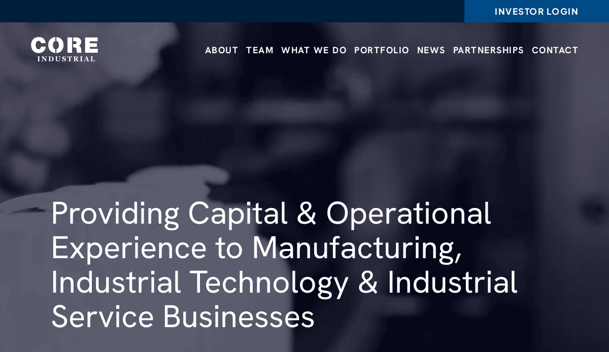
2. Core Industrial Partners
Location City In The US: Chicago, IL
3 Key Takeaways:
- Strong Industrial Aesthetic: The design effectively uses a modern, industrial-themed aesthetic with a clean color scheme that perfectly matches their investment focus.
- Impactful Statistics: Key metrics like “50+ companies acquired” are displayed prominently, immediately establishing credibility and a track record of success.
- Organized Team Section: The team page is well-organized, showcasing the breadth of their expertise and making it easy for visitors to connect faces with roles.
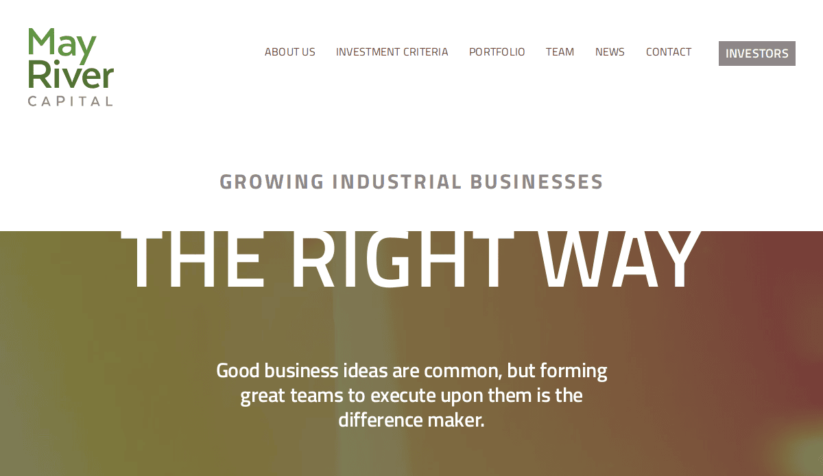
3. May River Capital
Location City In The US: Chicago, IL
3 Key Takeaways:
- Bold and Clear Messaging: The site uses large, bold typography to deliver its key messages, creating a confident and authoritative tone.
- Excellent Use of White Space: The clean layout and generous use of white space make the content highly readable and prevent the user from feeling overwhelmed.
- Streamlined Navigation: The main navigation is simple and logical, allowing visitors to find critical information about their strategy, portfolio, and team with ease.
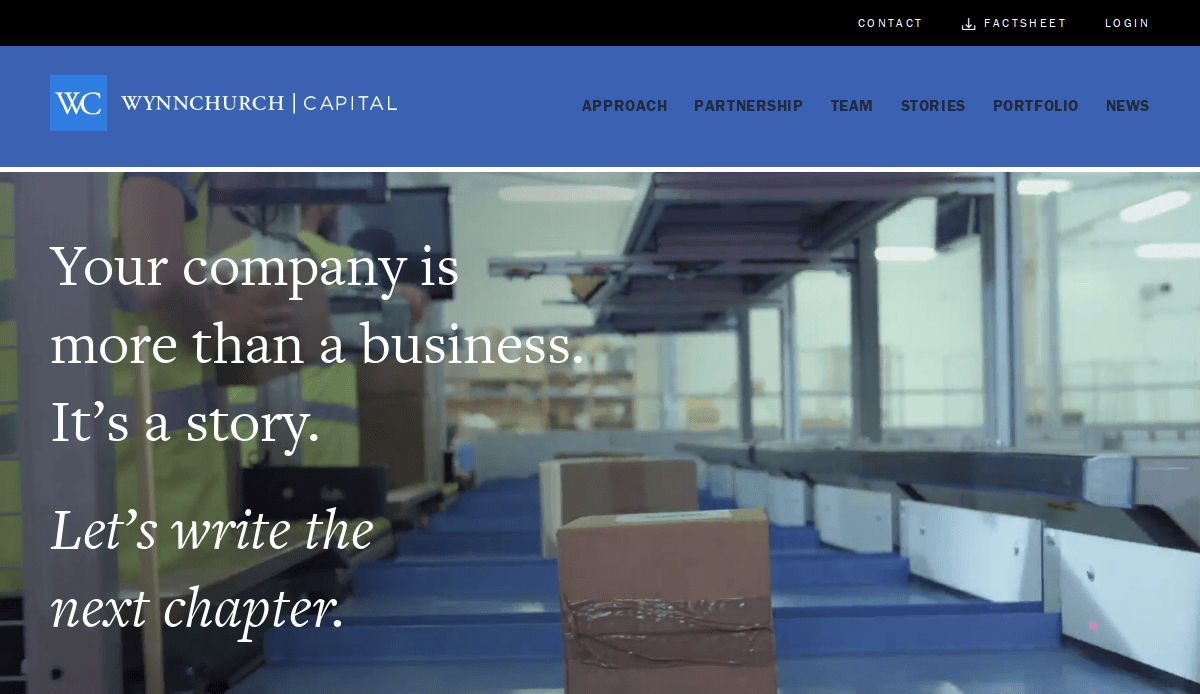
4. Wynnchurch Capital
Location City In The US: Rosemont, IL
3 Key Takeaways:
- Professional and Sophisticated Design: The website has a polished, corporate feel with a consistent and professional color scheme that builds immediate trust.
- Detailed Case Studies: The portfolio section goes beyond just logos, offering detailed insights into their partnerships and value creation stories.
- Clear Calls to Action: The site effectively guides different user types (business owners, intermediaries) to relevant sections with clear, accessible calls to action.
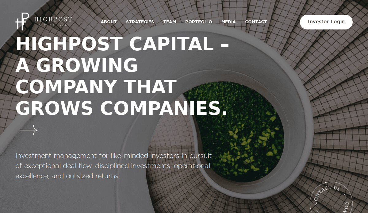
5. High Post
Location City In The US: Boston, MA
3 Key Takeaways:
- Engaging Brand Storytelling: The website effectively tells a story, connecting their investment strategy to their business identity with a cohesive narrative.
- Modern and Clean Layout: The design is modern and uncluttered, focusing the user’s attention on the content and key messages.
- Strong Visual Hierarchy: The use of size, color, and placement creates a clear visual hierarchy that guides the user’s eye through the page logically.
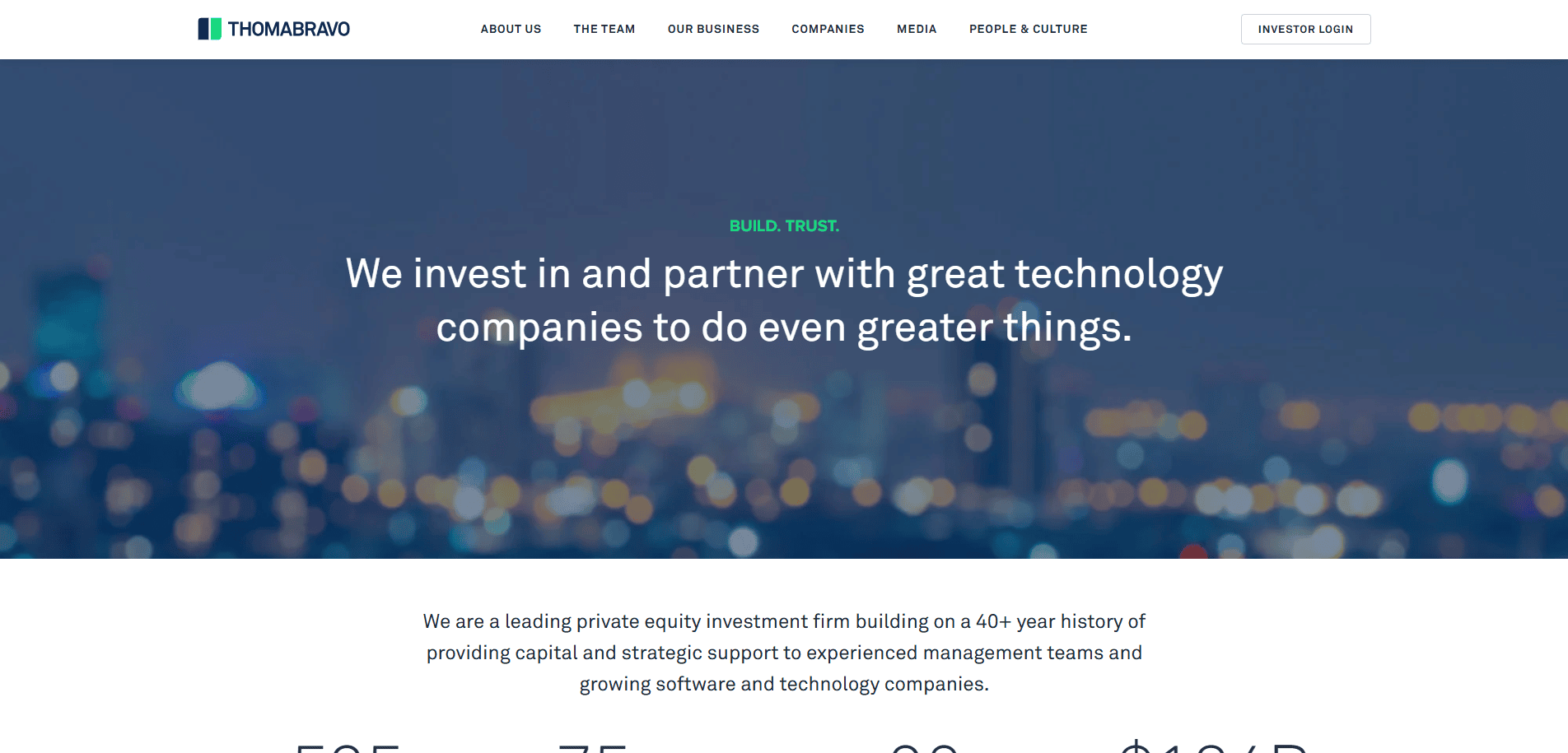
6. Thoma Bravo
Location City In The US: Chicago, IL
3 Key Takeaways:
- Striking Visual Identity: The use of bold, black-and-white colors with a single accent color creates a powerful and memorable experience.
- Focus on Expertise: The site immediately establishes its focus on software and technology, leaving no doubt about its specialization.
- Data-Driven Proof Points: Key statistics and metrics are integrated throughout the design, providing tangible evidence of their success and leadership.
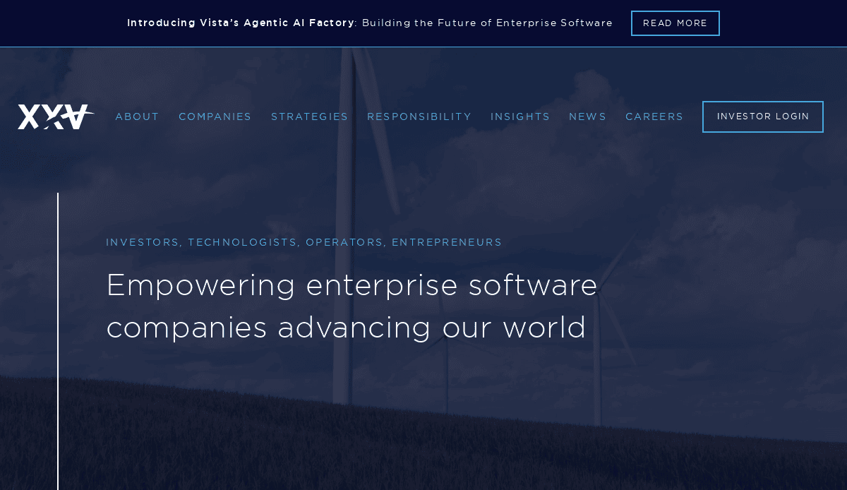
7. Vista Equity Partners
Location City In The US: Austin, TX
3 Key Takeaways:
- Effective Use of Video: The site incorporates professional video testimonials and content that add a personal touch and build credibility.
- Clean, Corporate Aesthetic: The crisp navy and light blue color scheme feels fresh, modern, and highly professional.
- Clear Sector Focus: The design and content are laser-focused on their expertise in enterprise software, reinforcing their market position.
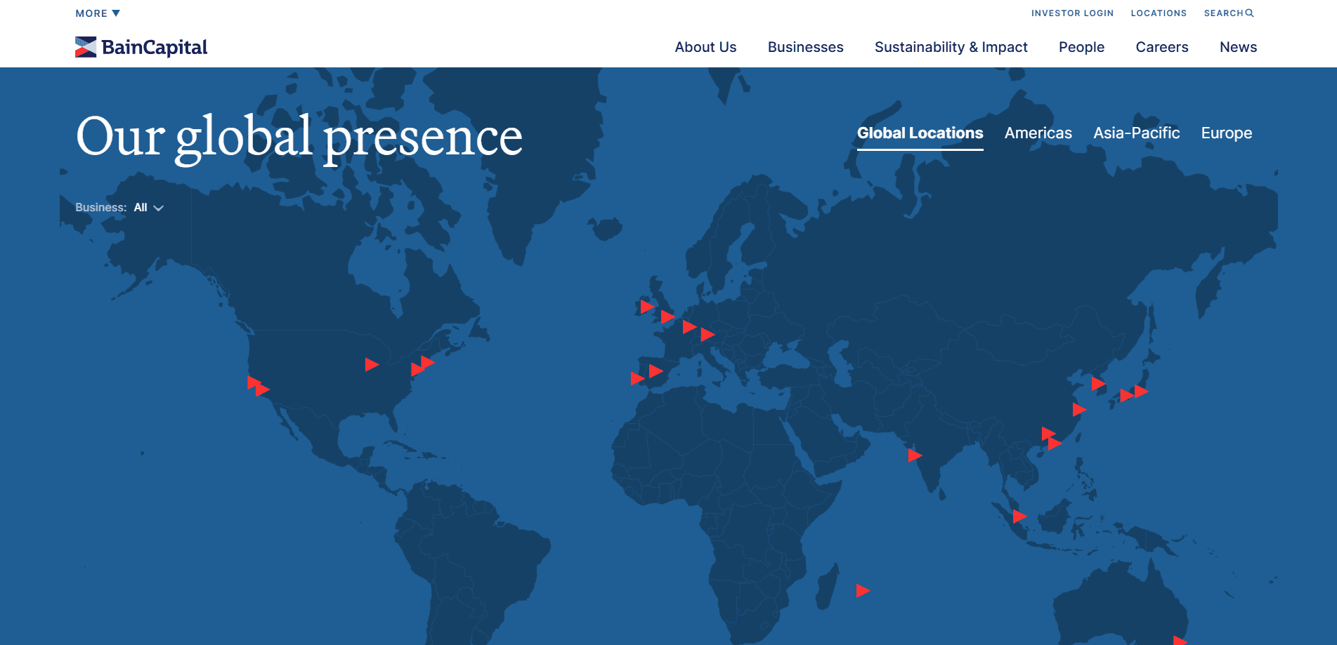
8. Bain Capital
Location City In The US: Boston, MA
3 Key Takeaways:
- Global and Authoritative Feel: The design successfully conveys the scale and global reach of the firm through its imagery and content structure.
- Comprehensive Insights Section: A robust “Insights” section establishes them as thought leaders in the industry.
- Logical Content Architecture: Despite the vast amount of information, the website is well-organized with clear navigation, making it easy to explore their various funds and strategies.
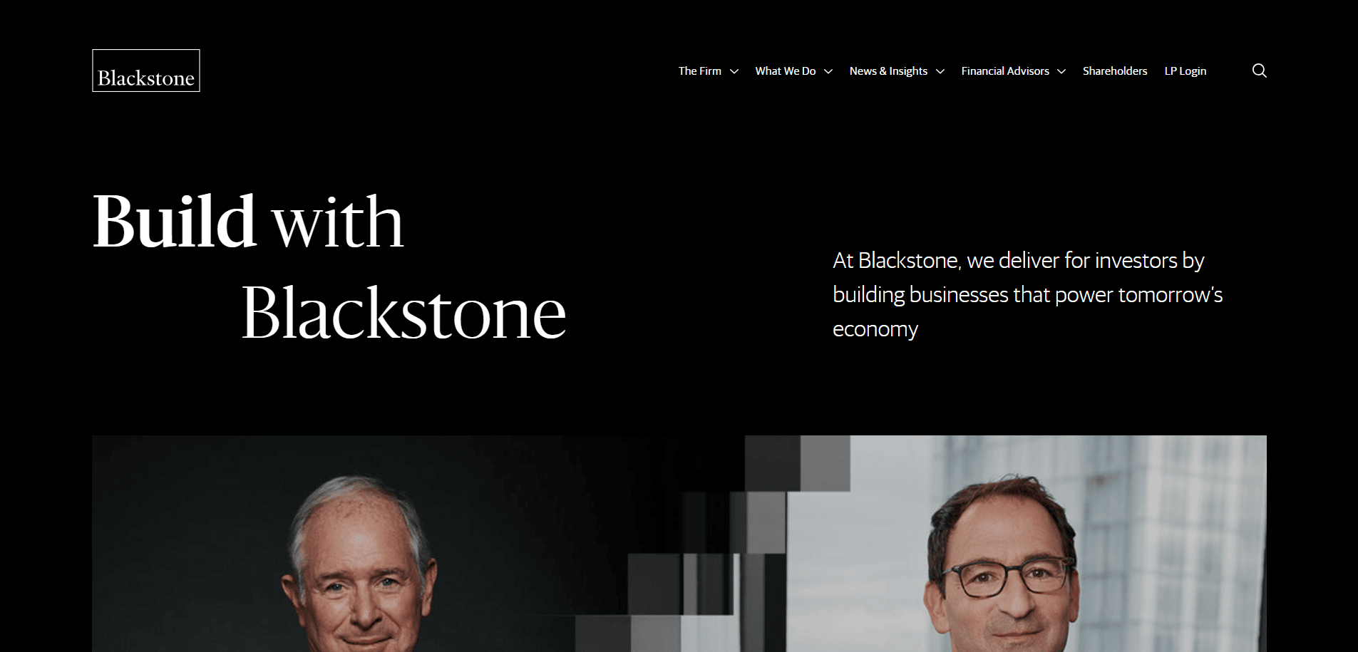
9. Blackstone
Location City In The US: New York, NY
3 Key Takeaways:
- Institutional Gravitas: The design is clean, stately, and professional, perfectly reflecting the image of one of the world’s largest investment firms.
- Impactful Numbers: The homepage immediately greets visitors with powerful, high-level statistics about their AUM and impact.
- Seamless User Experience: Navigation is intuitive, and the site performs flawlessly, providing a smooth experience for institutional and individual visitors alike.
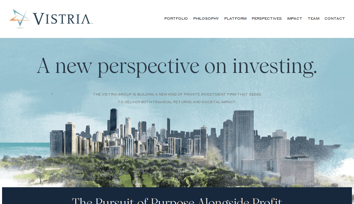
10. The Vistria Group
Location City In The US: Chicago, IL
3 Key Takeaways:
- Purpose-Driven Messaging: The site leads with its mission and purpose, creating an immediate connection beyond just financial returns.
- Stunning Visuals: Use of high-quality, authentic photography of people gives the firm a human and relatable feel.
- Simple and Elegant Layout: The minimalist design is elegant and allows the impactful stories and imagery to stand out.
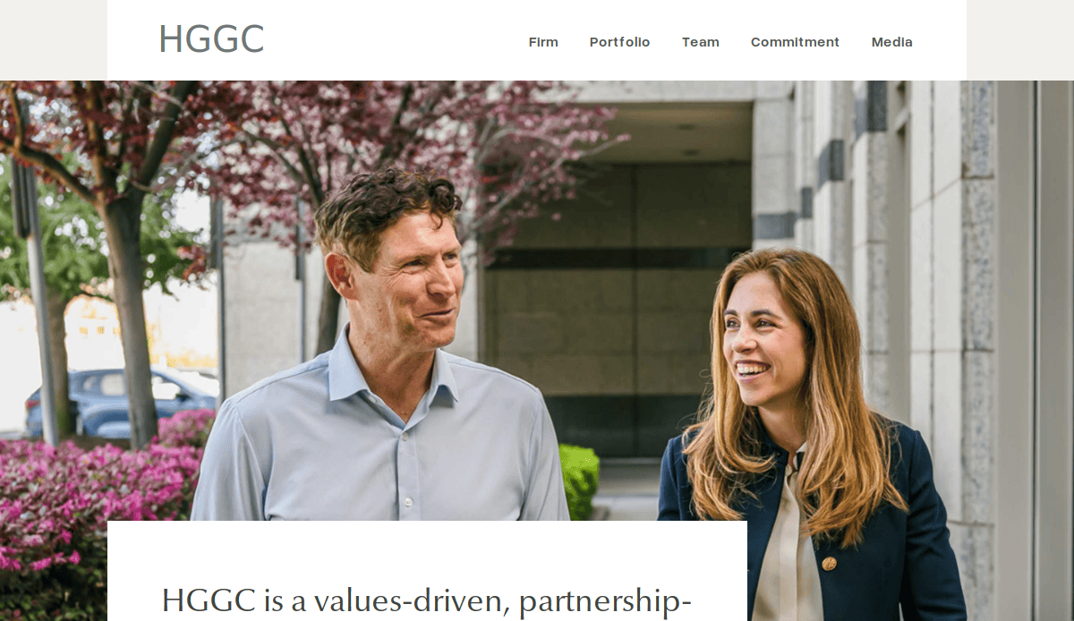
11. HGGC
Location City In The US: Palo Alto, CA
3 Key Takeaways:
- Bold Value Proposition: The headline “Advantage is Everything” is confident and memorable, setting a strong tone.
- Interactive Elements: Subtle animations and interactive elements on the portfolio and team sections make the site engaging to explore.
- Focus on Partnership: The language and imagery consistently emphasize their collaborative approach with management teams.
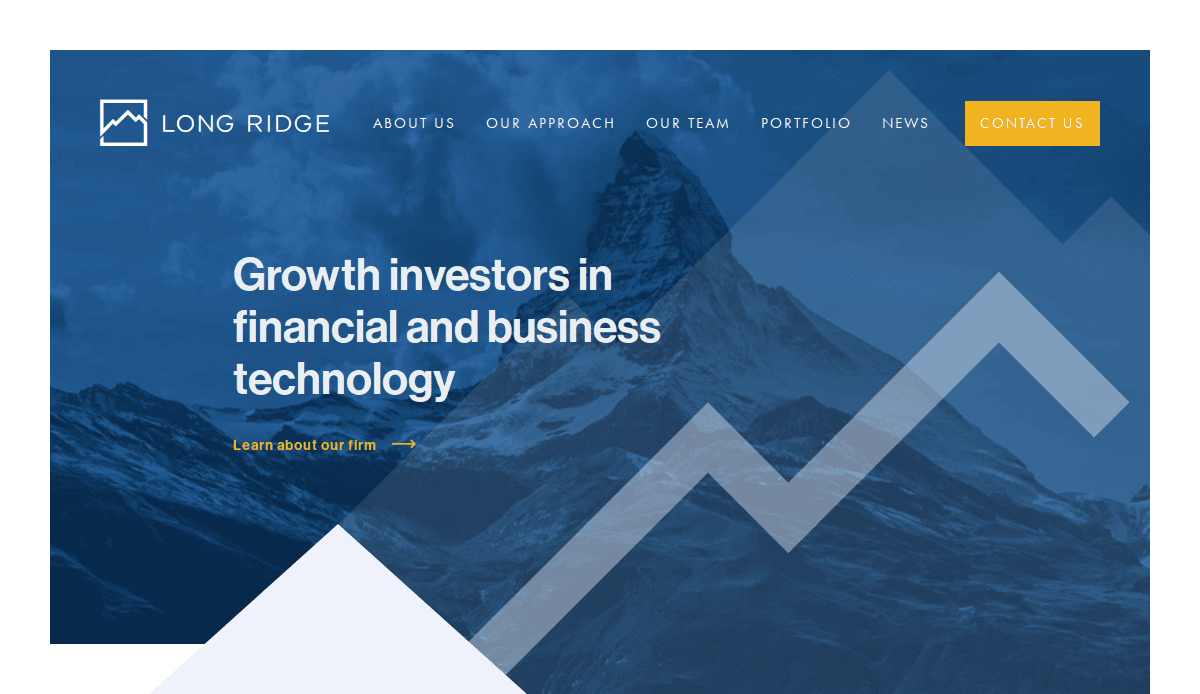
12. Long Ridge
Location City In The US: New York, NY
3 Key Takeaways:
- Clean and Modern Typography: The use of a modern sans-serif font throughout the site creates a crisp, clean, and highly readable experience.
- Grid-Based Layout: A well-executed grid system keeps the content organized and visually appealing across all pages.
- Direct and Uncluttered Navigation: The simple main menu allows users to find exactly what they need without confusion.
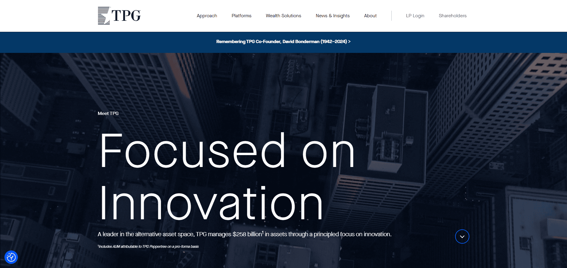
13. TPG
Location City In The US: Fort Worth, TX
3 Key Takeaways:
- Dynamic Hover Effects: Engaging hover animations on portfolio items and team photos add a layer of interactivity and polish.
- Strong Thematic Sections: The website is clearly divided into its core investment platforms, making it easy to understand their diverse strategies.
- Emphasis on ESG: Their commitment to ESG is featured prominently, showcasing a forward-thinking and responsible approach.
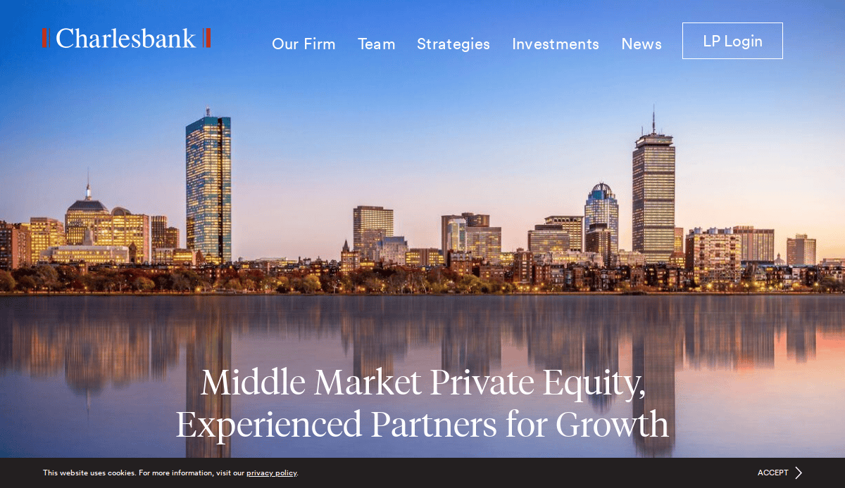
14. Charlesbank Capital Partners
Location City In The US: Boston, MA
3 Key Takeaways:
- Professional and Timeless Design: The site avoids fleeting trends in favor of a classic, professional design that inspires confidence.
- Filterable Portfolio: The portfolio is highly functional, allowing users to filter investments by industry and status, which enhances usability.
- Clear Headline Hierarchy: The content is structured with a strong visual hierarchy, making it easy to scan and absorb key information quickly.
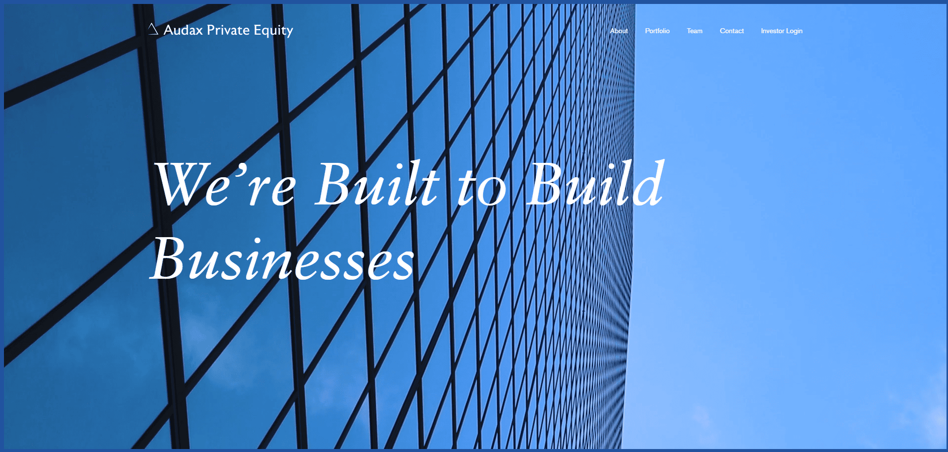
15. Audax Private Equity
Location City In The US: Boston, MA
3 Key Takeaways:
- Data Visualization: The site effectively uses charts and graphs to prove its legacy of achievement and “Buy & Build” strategy.
- Strong Branding: The red and charcoal color scheme is used consistently to create a strong and recognizable brand.
- Clear Path for Business Owners: The site does an excellent job of speaking directly to potential sellers with dedicated content and clear contact paths.
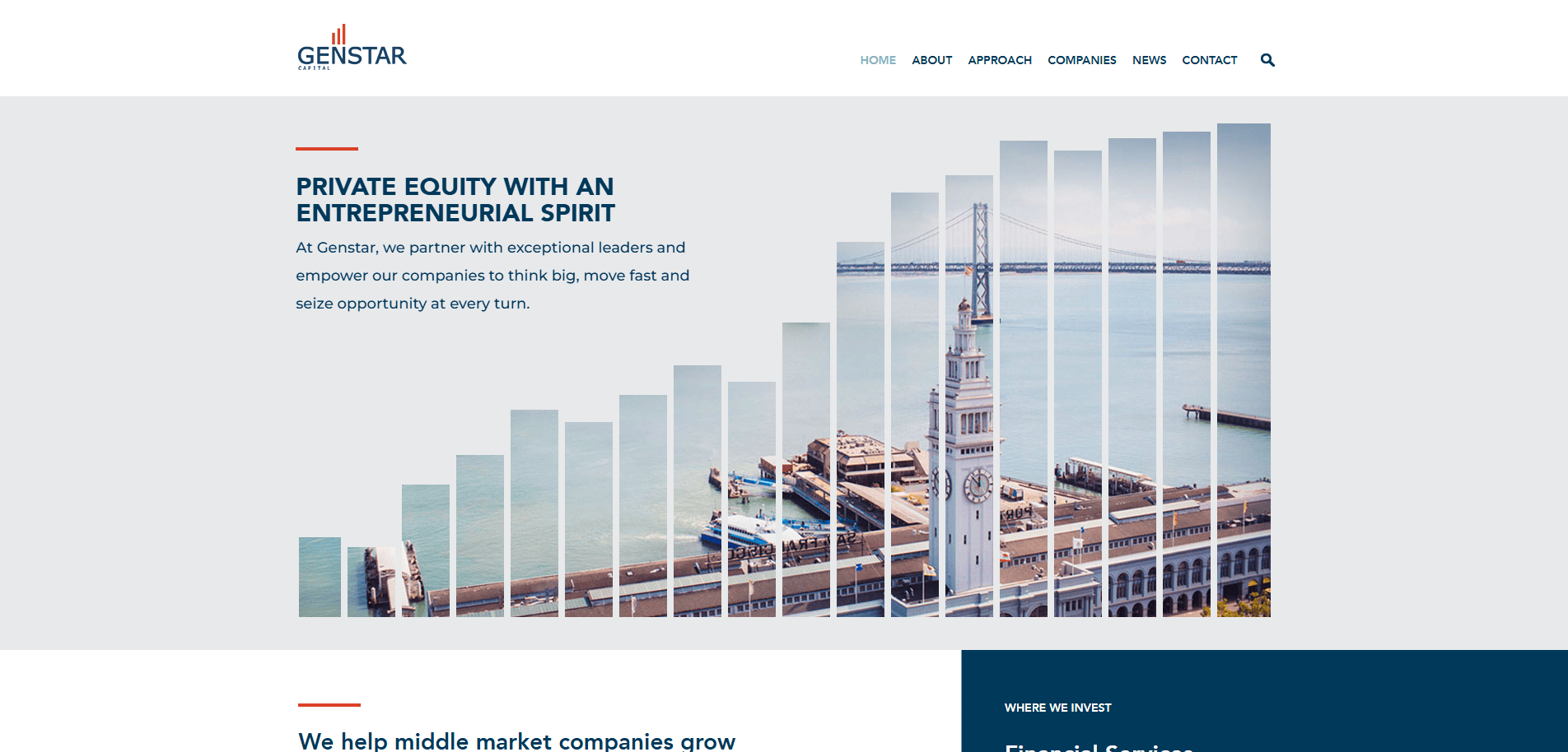
16. Genstar Capital
Location City In The US: San Francisco, CA
3 Key Takeaways:
- Sophisticated Color Palette: The use of gold, charcoal, and white creates a sense of prestige and sophistication.
- Focus on Team and Culture: The website places a strong emphasis on its people and collaborative culture as a key differentiator.
- Concise and Impactful Copy: The writing is sharp, direct, and free of jargon, making their investment thesis easy to understand.
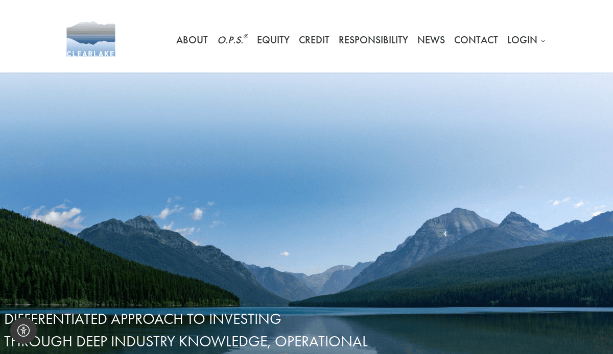
17. Clearlake Capital Group
Location City In The US: Santa Monica, CA
3 Key Takeaways:
- Dynamic Backgrounds: Subtle, moving abstract backgrounds add visual interest without being distracting.
- Structured Case Studies: The portfolio section features well-structured case studies that clearly outline their O.P.S.® value creation framework.
- Prominent News Section: An active and prominent news and press release section highlights the firm’s momentum and activity.
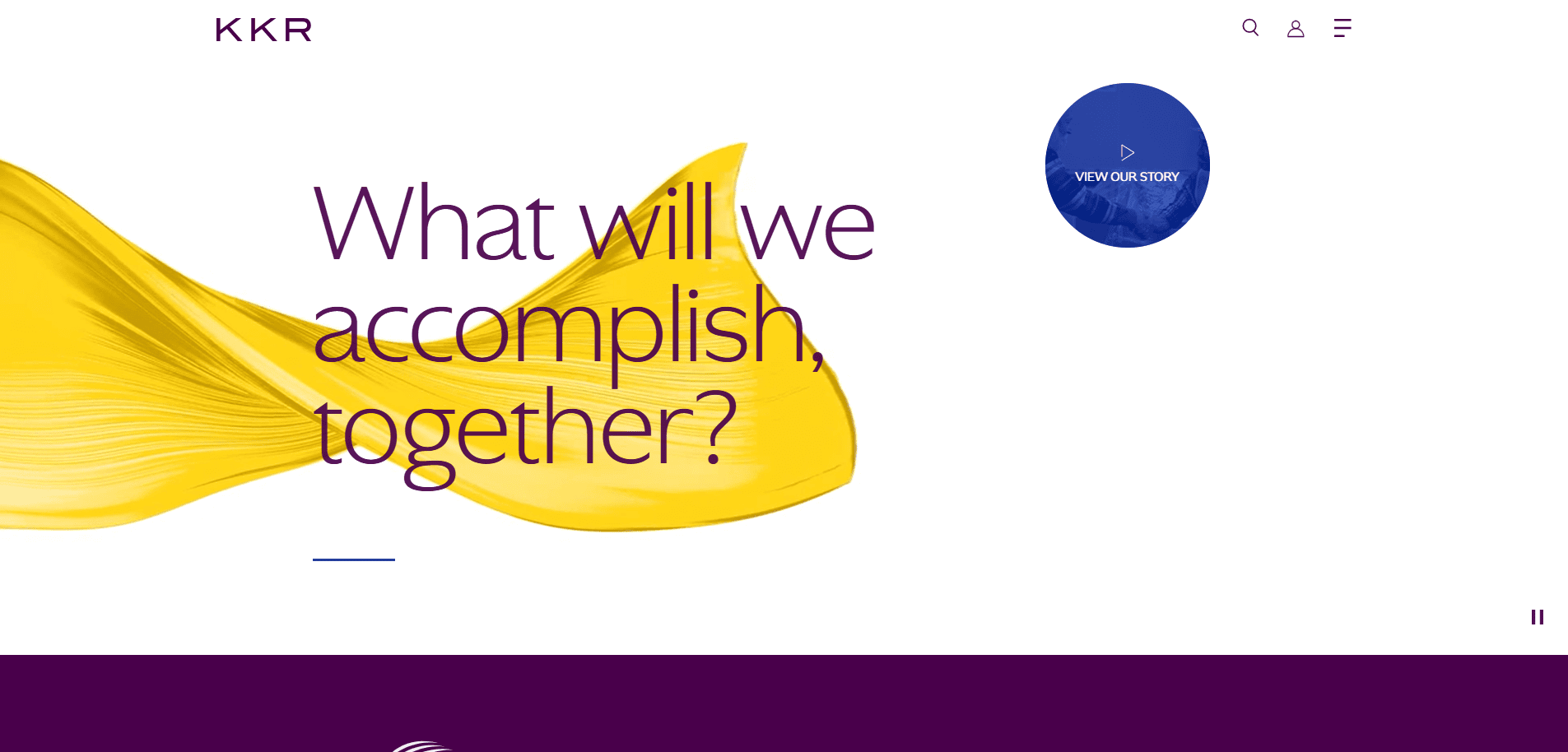
18. KKR
Location City In The US: New York, NY
3 Key Takeaways:
- Magazine-Style Layout: The site uses a sophisticated, almost editorial layout that is rich with content and insights.
- Global Perspective: The imagery and content successfully project a sense of global scale and deep market intelligence.
- Thought Leadership: The site is rich with thought leadership content, including market commentaries and research, positioning them as industry experts.

19. LLR Partners
Location City In The US: Philadelphia, PA
3 Key Takeaways:
- Vibrant and Approachable Design: The use of bright accent colors and photos of people creates a more approachable and energetic feel than many competitors.
- Value-Add Content: The “Growth Resources” and “Events” sections provide tangible value to entrepreneurs beyond just capital.
- Clear Industry Focus: The website immediately clarifies its focus on technology and healthcare, attracting relevant visitors.
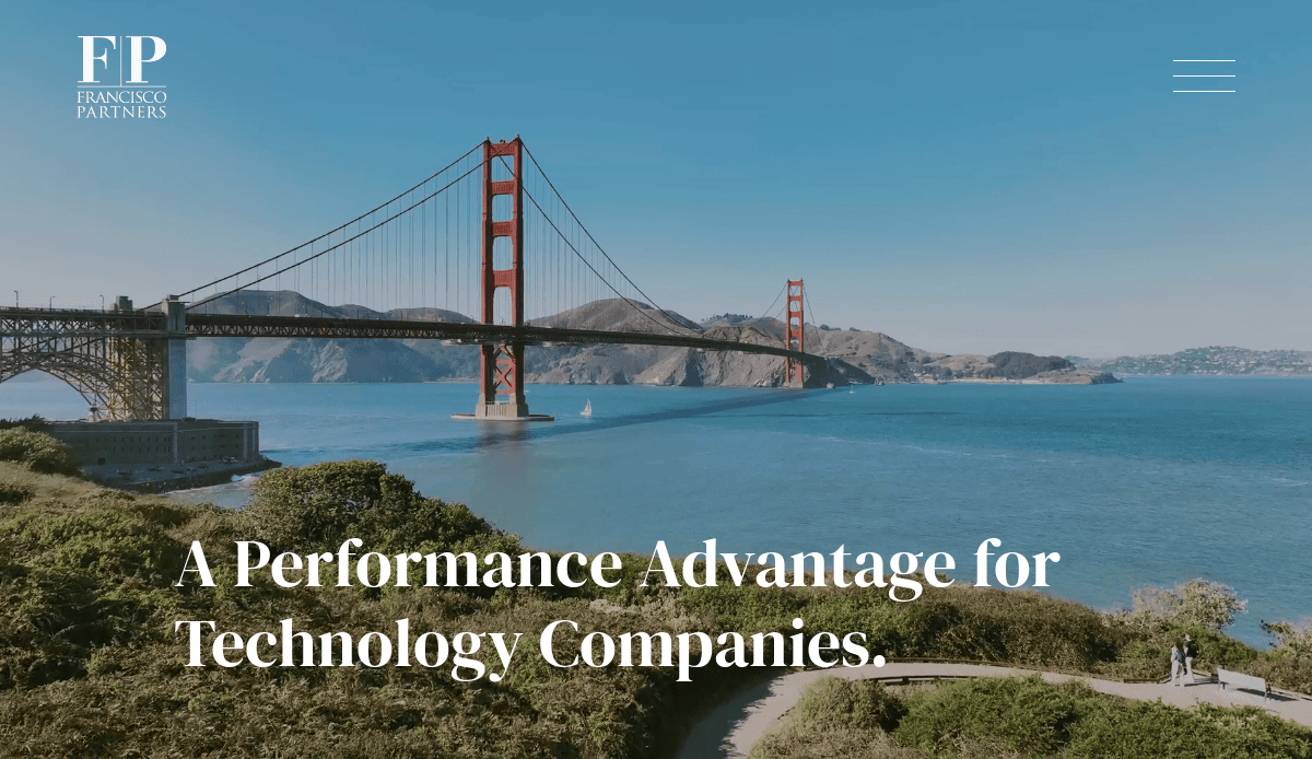
20. Francisco Partners
Location City In The US: San Francisco, CA
3 Key Takeaways:
- Tech-Forward Aesthetic: The design feels modern and tech-focused, perfectly aligning with their specialization in technology investments.
- Compelling Statistics: Key metrics are presented in a visually engaging way, highlighting their impressive track record.
- Simple, Bold Statements: The site uses short, powerful sentences and headlines to communicate its message with confidence and clarity.
From Blueprint to Benchmark: Elevate Your Digital Presence
A truly well-designed website is more than an online brochure; it is a strategic asset that powers growth and reinforces credibility in the competitive private equity space. Applying the best practices for private equity discussed in this guide is the key to ensuring your firm’s site is designed effectively to communicate its unique value. Whether you are launching a new site or planning a website redesign, aligning your branding and website strategy is critical for long-term website performance. Executing professional private equity site design requires a deep understanding of the industry and expert design and development capabilities.
If you are ready to implement these strategies and ensure your firm’s digital presence reflects its prestige, our team is ready to help. Contact us today for a consultation on your website project.
Commonly Asked Questions About Private Equity Web Design
What are the most important pages on a private equity firm’s website?
The best sites are built on a foundation of clarity and intuitive navigation. The most critical pages include: an “About Us” or “Our Firm” page to detail your history and ethos; an “Investment Strategy” or “Approach” section to define your criteria; a “Portfolio” to showcase current and past successes; a “Team” page with professional biographies; and a clear “Contact” page. How these sections are structured is vital for all website visitors. For a deeper dive into structuring your site’s architecture, our website organization guide offers detailed best practices.
Why is minimalist design so common in the private equity sector?
Minimalist design is prevalent because it aligns perfectly with the core values of the private equity sector: strength, clarity, and authority. This approach isn’t about following modern design trends; it is a form of thoughtful design that removes distractions, allowing the substance of your message and the quality of your investment management to take center stage. A design is clean not just for aesthetic reasons, but because it improves the user experience and design effectively communicates confidence. Many of these concepts are rooted in the core principles of web design that prioritize clear communication.
What key website features attract new investors?
Potential investors value efficiency and evidence. Key website design features that cater to them include a secure and easily accessible investor login portal, clear data visualizations of fund performance, in-depth portfolio case studies demonstrating value creation, and detailed team bios that highlight expertise in private capital. The top-performing sites in this industry ensure their website features are easy to use, reinforcing professionalism and transparency.
How long does a website redesign or development project take?
The timeline for a site development project for websites in this sector varies based on the complexity of the firm’s web needs. A standard timeline can range from 12 to 20 weeks, but can be longer depending on custom website features, the depth of content creation required, and integration with third-party systems. To understand each stage of a project, from discovery to launch, we recommend reviewing our step-by-step guide to the web design process.
How can a website’s design effectively communicate a complex investment strategy?
A well-designed website uses a combination of strategic elements to make complex information digestible. The overall design works to translate your strategy through concise and powerful copywriting that avoids jargon, an intuitive information architecture that guides users logically, and compelling data visualizations like charts and infographics that illustrate your approach to private credit or other specific investment theses. The goal is for the design to effectively highlight their focus, making the firm’s unique value proposition immediately apparent to all website visitors.