Just looking for our Best User Experience Website examples list?
Your key takeaways:
Strong Planning Sets the Stage: Aligning your website’s structure and goals from the start ensures every element supports the visitor journey and drives business results.
Design Principles Matter: Applying clarity, consistency, and accessibility in your web design leads to intuitive interfaces and better user engagement.
Navigation and Content Work Together: Clear menus and structured content hierarchy guide users efficiently, reducing friction and improving conversions.
Visuals Should Be Functional and On-Brand: Color schemes, typography, and imagery must reinforce brand identity while enhancing usability and interface clarity.
Maintenance is Non-Negotiable: Regular WordPress updates, security checks, and performance monitoring keep your site fast, secure, and optimized for a seamless user experience.
Why User Experience Website Design Is the Smartest Investment for Your Business
A website today is often the first interaction a potential customer has with your brand. If that experience isn’t seamless, intuitive, and strategically designed, you’re likely leaving money on the table. Great web design is not just about aesthetics—it’s about crafting an exceptional user experience (UX) that guides your visitors effortlessly through their journey and compels them to act.
When a site is designed with clear navigation, strategic interaction design, and thoughtful design principles, it doesn’t just look better—it performs better. High-performing websites reduce bounce rates, increase conversions, and create stronger customer relationships. Whether you’re working with a seasoned ux designer or building your own strategy, focusing on usability and aligning with modern ux best practices isn’t optional anymore—it’s essential.
This guide breaks down everything you need to know about creating a user-focused, conversion-driven website. From understanding the design process to optimizing every step of the user journey, we’ll walk you through what it takes to build a digital presence that works just as hard as you do.
Website Planning & Purpose: Setting the Foundation for Exceptional UX
Before you write a single line of code or select a color palette, every successful website begins with a solid planning phase. This critical step is where strategy aligns with user intent, and where the blueprint for both function and form is developed. For companies serious about their digital footprint, neglecting this phase means risking usability flaws, unclear messaging, and missed business goals.
The planning phase starts with defining your website’s core purpose—are you looking to generate leads, drive e-commerce sales, or establish thought leadership? Once that goal is clear, you can shape your user experience around it. This includes developing user personas, mapping the visitor journey, and identifying the key interactions that will drive conversions. A great ux design process always starts by understanding your audience and their pain points.
Content strategy, site architecture, and wireframes come next. These elements help clarify how information will be organized and accessed, ensuring smooth navigation and an intuitive flow. Collaborating with a skilled design team and leveraging insights from both a ui designer and a ux designer ensures your final product is visually compelling, functional, and user-centric.
A well-planned site will integrate user interface elements that make sense, reflect brand values, and guide visitors toward the intended actions. This is where usability, accessibility, and responsiveness are considered from day one, not added as afterthoughts. In essence, great web design doesn’t just happen. It’s built from the ground up with strategy, structure, and the user firmly in mind.
Design Principles That Drive Results in User Experience Website Design
When it comes to crafting a website that performs, strong principles of design are the foundation. These principles guide the layout, interaction, and overall usability of your site, ensuring that every visual and functional element supports your business objectives. For any organization focused on improving user experience, understanding and applying these principles is essential to creating a site that looks professional and delivers measurable outcomes.
One of the most fundamental principles is clarity. Every page, section, and call-to-action must communicate purpose without confusion. Whether it’s your homepage or a product detail page, clarity in both content and interface design helps reduce friction in the visitor’s journey. This ties directly into another core principle—consistency. Users should be able to predict how the interface behaves, with uniform buttons, navigation styles, and color schemes that establish trust and reduce cognitive load.
Hierarchy is equally important. Good web design uses visual hierarchy—through typography, spacing, and color—to guide the user’s eye and draw attention to key elements, such as lead forms, service details, or special offers. By structuring content around user priorities, you help ensure that visitors absorb the most critical information quickly and efficiently.
Accessibility and responsiveness also belong at the core of your design philosophy. Your website must function seamlessly across devices, be navigable with assistive technologies, and load efficiently under various network conditions. When these principles are baked into the design process, your site becomes more inclusive, reaching a wider audience and supporting better performance.
To understand how design and user experience intersect, it’s important to explore the difference between web design and UX design. Learn more in this detailed breakdown: Web Design vs UX Design: Understanding the Differences.
In short, principles for effective design are not subjective—they are strategic. When executed properly, they create a cohesive, intuitive, and user-focused website that delivers results.
Content & Navigation: Structuring for Seamless User Experience
In a high-performing website, content and navigation work together to create a seamless, intuitive experience for users. This isn’t just about where your menu is placed or how many pages your site has—it’s about building a structure that mirrors how your audience thinks, searches, and engages with information. For businesses looking to convert visitors into customers, a strategic approach to both content layout and navigation is non-negotiable.
Effective navigation starts with simplicity. A clean, top-level menu with well-labeled items helps users understand their options at a glance. Dropdowns, if used, should be limited and logically grouped to avoid overwhelming visitors. Including key pages such as Services, About, Contact, and Case Studies ensures users can access what they’re looking for quickly and without confusion.
Your content should follow a clear hierarchy and be broken into digestible sections using headers, bullet points, and visual cues. Each page should have one clear goal—whether it’s informing, persuading, or guiding to a call-to-action—and content should be structured to support that goal. Thoughtful content hierarchy improves readability and keeps users moving forward in their journey.
When content and navigation are planned together, it becomes easier to build a cohesive visitor journey. For example, a visitor landing on your homepage should be able to quickly understand your value, find supporting proof (like client success stories), and navigate to service-specific pages without friction. Every element of your site should point users toward engagement.
To enhance usability even further, integrate modern interaction patterns and maintain consistency across the site. This helps eliminate user guesswork and builds trust. For actionable strategies to elevate your site’s usability, check out 5 Fresh Tips to Improve Website User Experience.
Ultimately, intuitive navigation and well-structured content create confidence and clarity, helping visitors find what they need and take the next step—whether that’s making an inquiry, booking a service, or completing a purchase.
Visual Elements: Bringing Brand and User Experience Together
Visual elements are more than just aesthetics—they’re a critical part of how users interact with your website and perceive your brand. When executed with purpose, elements like imagery, icons, colors, and typography can significantly enhance usability, guide the user journey, and create an emotional connection with your audience. In user experience website design, visuals must support both form and function.
Every visual component should be aligned with your brand identity. Your color palette should evoke the right mood and provide enough contrast for readability. Fonts should be legible across devices and reflect your brand’s tone—professional, creative, approachable, or authoritative. Consistency in visuals reinforces trust and makes the site feel cohesive from page to page.
Beyond branding, visual design directly impacts usability. For example, call-to-action buttons must stand out without being disruptive. White space isn’t wasted space—it gives content room to breathe and improves readability. Icons can replace or support text, helping users scan and interpret information faster. High-quality images—whether product shots, team photos, or hero banners—should load quickly and be optimized for every screen size to support performance as well as design.
A well-crafted interface anticipates how users move through a site and uses visual hierarchy to lead them naturally from one step to the next. From bold headlines to subtle hover effects, these microinteractions shape the user experience. For practical guidance on integrating visual and interface components effectively, explore this helpful UI Design Guide.
Visual elements, when rooted in strategy, do more than decorate—they direct attention, clarify messages, and strengthen your brand’s presence online. In short, they transform your website into a powerful, user-focused marketing tool.
Ongoing WordPress Maintenance: Protecting Performance and User Experience
A high-performing WordPress website doesn’t stop evolving the day it launches. For any business that depends on digital visibility and lead generation, ongoing maintenance is not optional—it’s foundational. Without regular updates, performance declines, security vulnerabilities emerge, and the user experience suffers.
Maintenance starts with keeping the WordPress core, themes, and plugins up to date. These updates are not just about adding new features—they often include critical security patches and performance enhancements that keep your site running smoothly and securely. Ignoring them can lead to compatibility issues or even site outages.
Performance monitoring is equally important. Regular speed checks, database optimization, and uptime monitoring help ensure your site loads fast and stays accessible. Even a one-second delay in load time can negatively impact conversions and increase bounce rates. Ongoing performance audits help keep everything running at peak efficiency.
Security is another essential component. WordPress sites need real-time malware scanning, firewall protection, and routine backups. A reliable backup solution allows your site to be restored quickly if anything goes wrong, while active monitoring helps identify and block threats before they cause damage. For businesses handling sensitive customer data, this level of security is non-negotiable.
User experience should be revisited frequently. As your audience grows and your business changes, your website must evolve to meet new demands. Reviewing analytics, testing user flows, and refining calls-to-action should be part of a regular cycle of improvement. These updates ensure your site remains intuitive, relevant, and results-driven.
Ultimately, ongoing WordPress maintenance protects your investment and reinforces your brand’s credibility. It’s what keeps your site secure, fast, and aligned with business goals long after the initial design is complete.
Best User Experience Website Examples
Here are 20 exemplary UX-based websites, including five designed by our agency. Each site demonstrates outstanding user experience through intuitive layouts, responsive design, and user-centered content.
1. MURAL
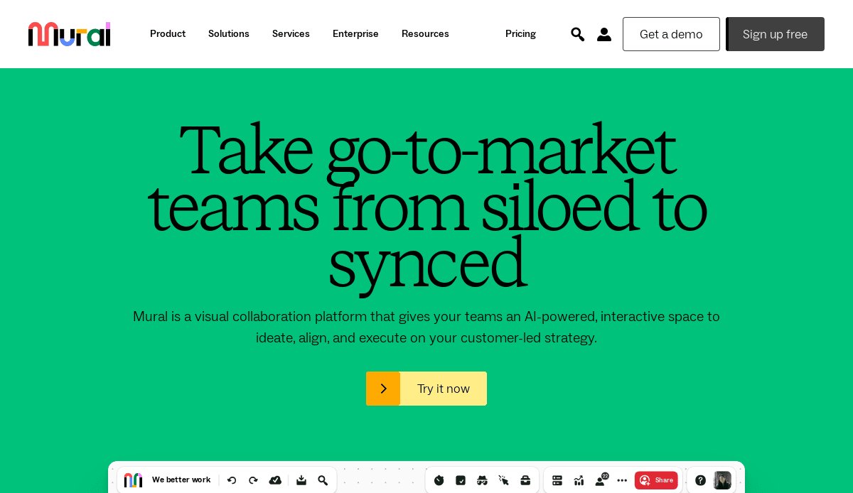
Location: San Francisco, CA
Key Takeaways:
- Intuitive visual collaboration tools enhance team productivity.
- A clean interface with guided user flows simplifies complex tasks.
- Responsive design ensures seamless experience across devices.
2. QuickBooks
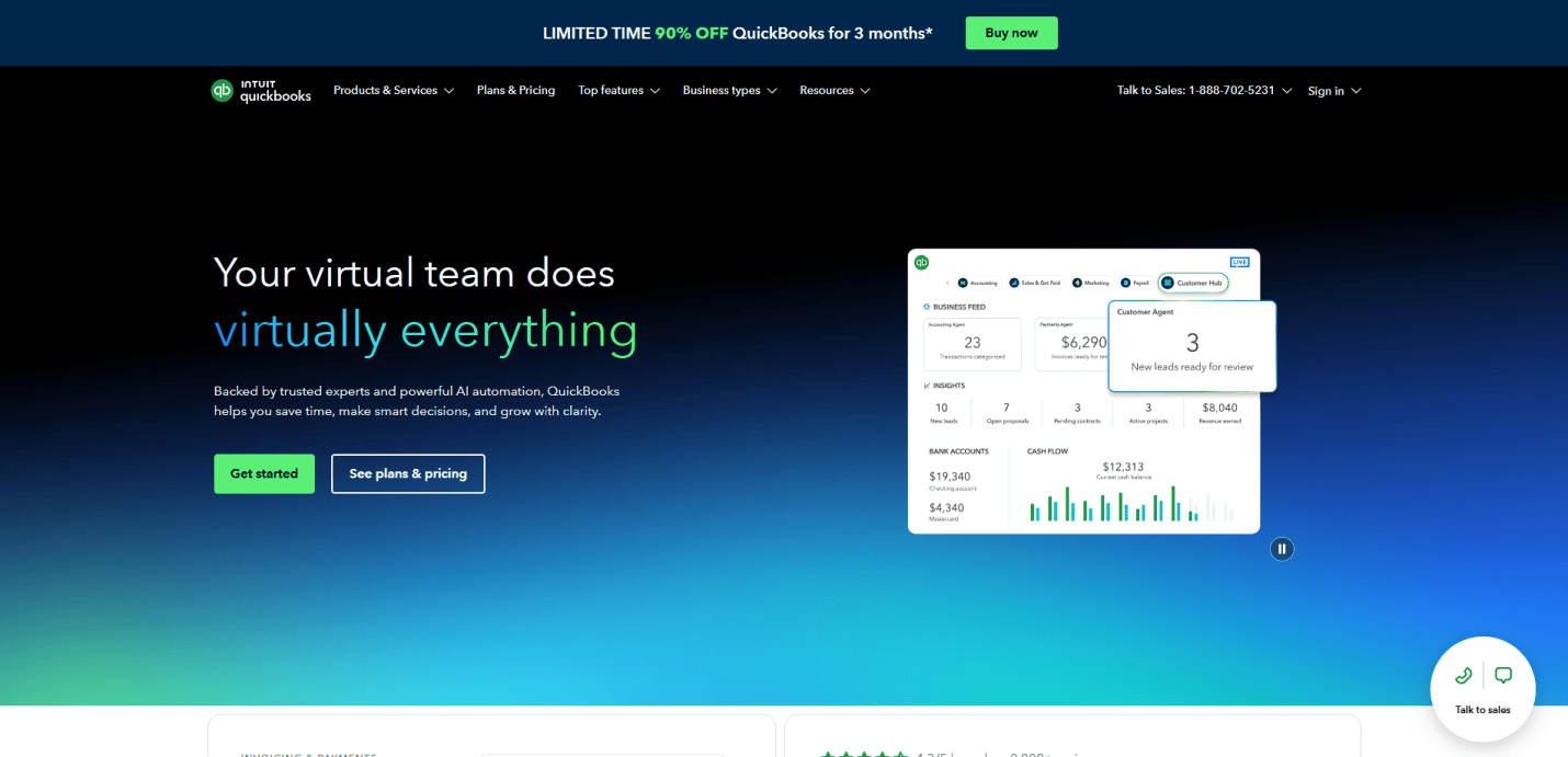
Location: Mountain View, CA
Key Takeaways:
- Streamlined onboarding process for new users.
- Dashboard provides clear financial overviews.
- Consistent design language across web and mobile platforms.
3. Asana
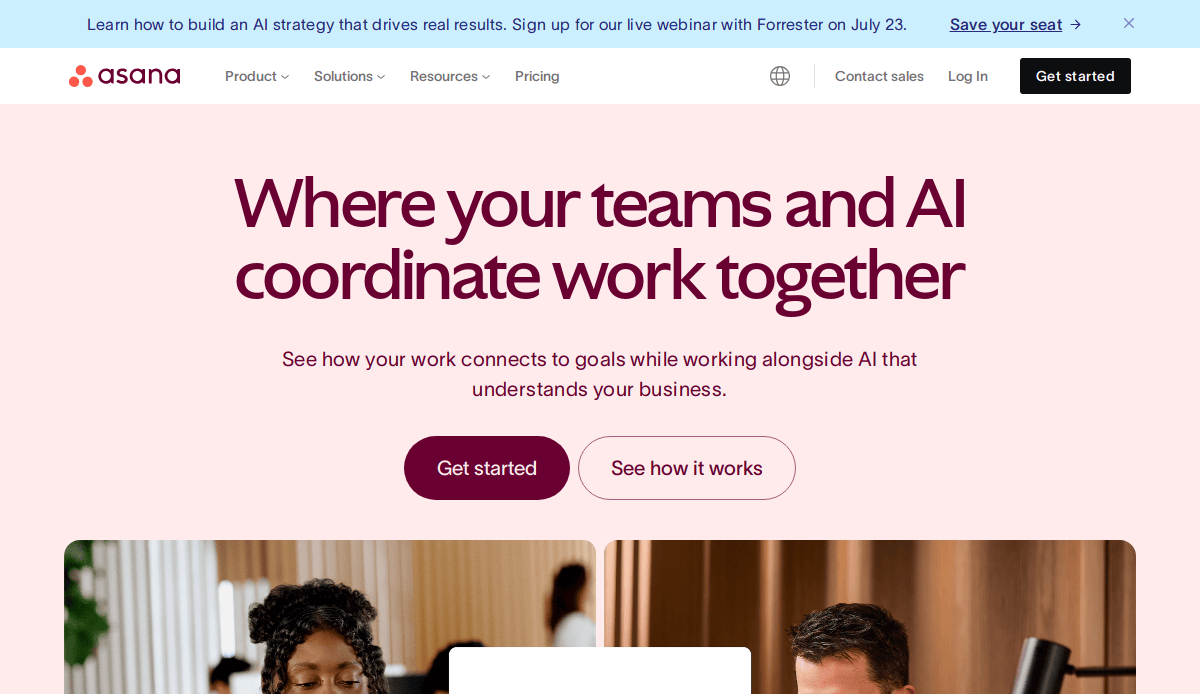
Location: San Francisco, CA
Key Takeaways:
- Task management features are easily accessible.
- Visual project timelines aid in planning.
- Minimalistic design reduces cognitive load.
4. Airbnb
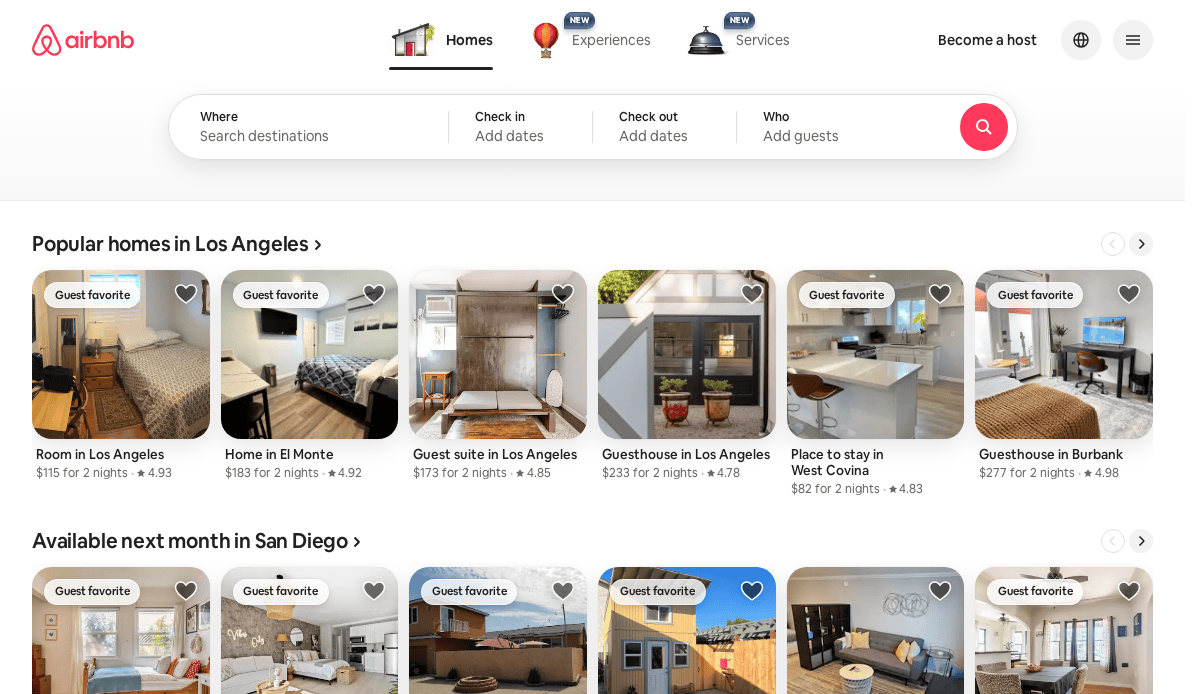
Location: San Francisco, CA
Key Takeaways:
- Personalized recommendations enhance user engagement.
- High-quality images improve trust and appeal.
- Simplified booking process increases conversions.
5. Dropbox
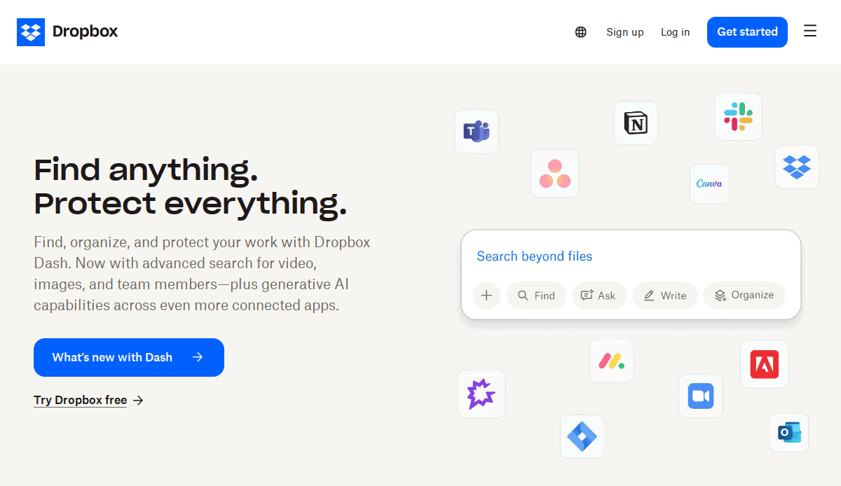 Location: San Francisco, CA
Key Takeaways:
- Drag-and-drop functionality simplifies file management.
- Clear call-to-action buttons guide user behavior.
- Consistent branding across all pages.
6. Slack
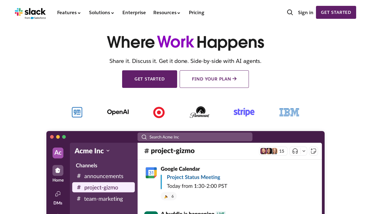 Location: San Francisco, CA
Key Takeaways:
- Real-time messaging interface is user-friendly.
- Customizable notifications improve user control.
- Integrations with other tools enhance functionality.
7. Trello
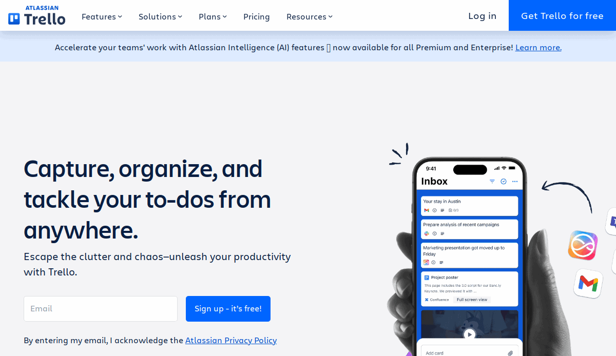
Location: New York, NY
Key Takeaways:
- Kanban-style boards provide visual task management.
- Drag-and-drop features enhance usability.
- Mobile responsiveness ensures accessibility on all devices.
8. Spotify
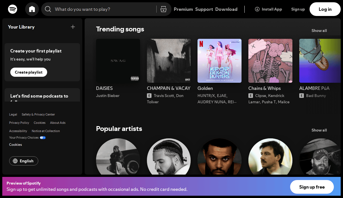
Location: New York, NY
Key Takeaways:
- Personalized playlists increase user engagement.
- Seamless pathways between music and podcasts.
- Consistent user interface across platforms.
9. Mailchimp
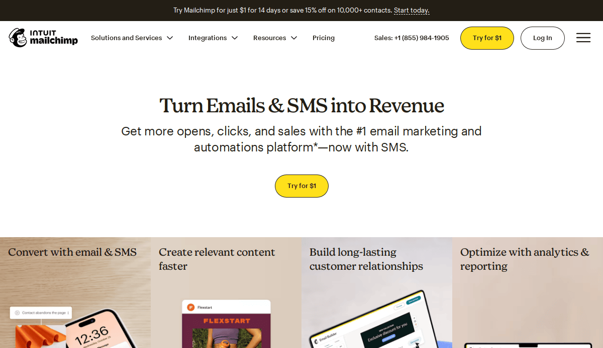
Location: Atlanta, GA
Key Takeaways:
- User-friendly email campaign builder.
- Analytics dashboard provides actionable insights.
- Clear direction aids in user task completion.
10. Zoom
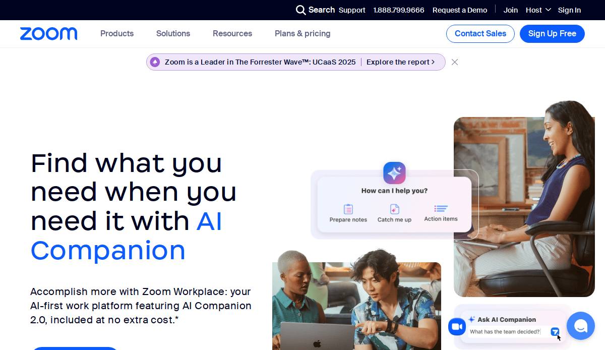
Location: San Jose, CA
Key Takeaways:
- One-click meeting setup simplifies user experience.
- High-quality video and audio enhance communication.
- Intuitive interface reduces learning curve.
11. Acorn Public Library
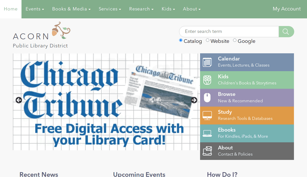
Location: Oak Forest, IL
Key Takeaways:
- Colorful and inviting homepage design.
- Simple navigation for accessing library services.
- Well-organized events section for community engagement.
12. Elmhurst Public Library
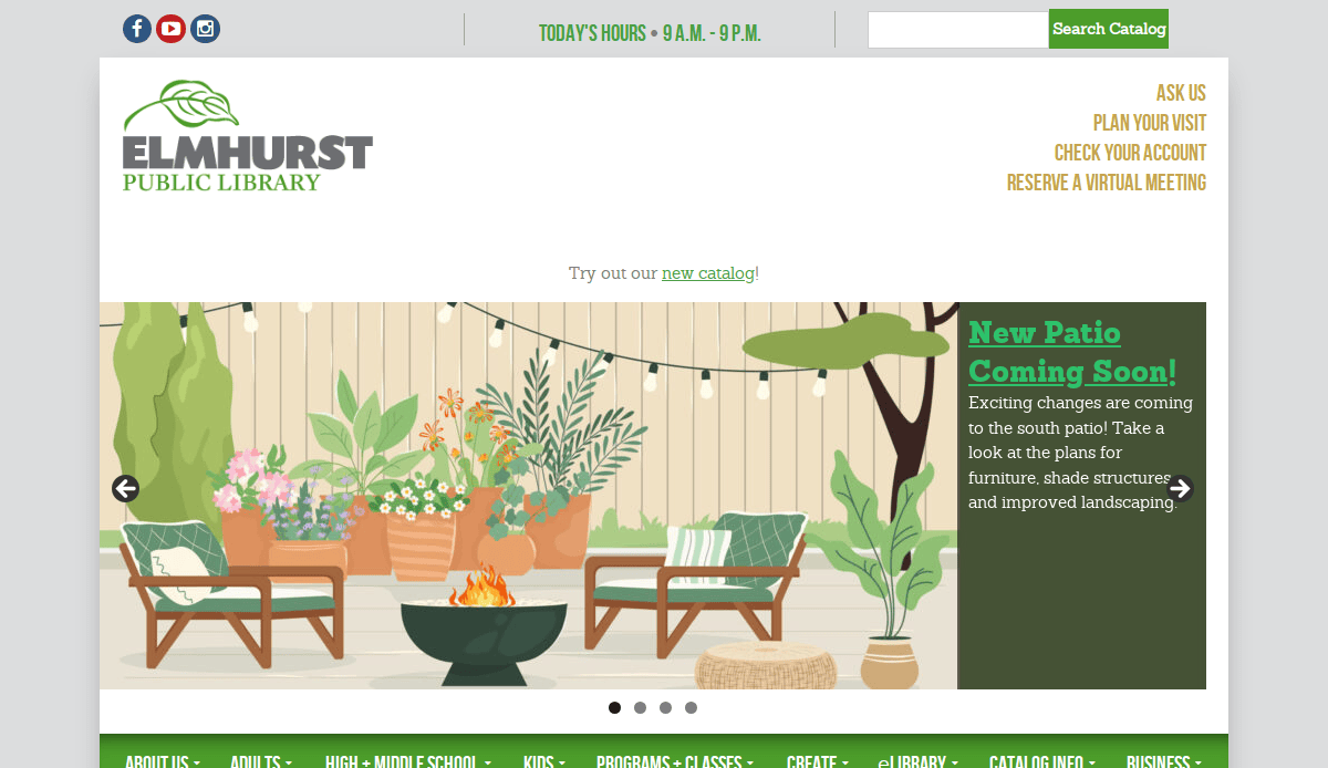
Location: Elmhurst, IL
Key Takeaways:
- Blend of traditional services with digital innovation.
- Inclusive online space for community interaction.
- Vibrant and accessible design elements.
13. City of San José
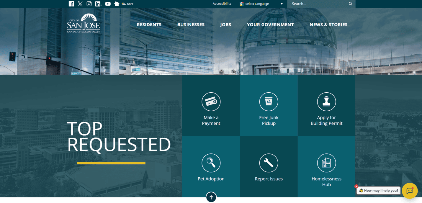
Location: San José, CA
Key Takeaways:
- User-friendly design with modern appearance.
- Clear categories for residents, businesses, and tourists.
- Multilingual chat support for diverse community needs.
14. City of Mesa 
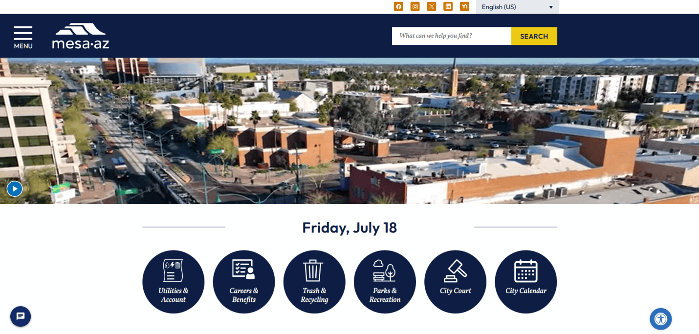
Location: Mesa, AZ
Key Takeaways:
- Slick, contemporary style with consistent color scheme.
- Accessible design for users with impairments.
- Prominent call-to-action buttons for user engagement.
15. City of Los Angeles
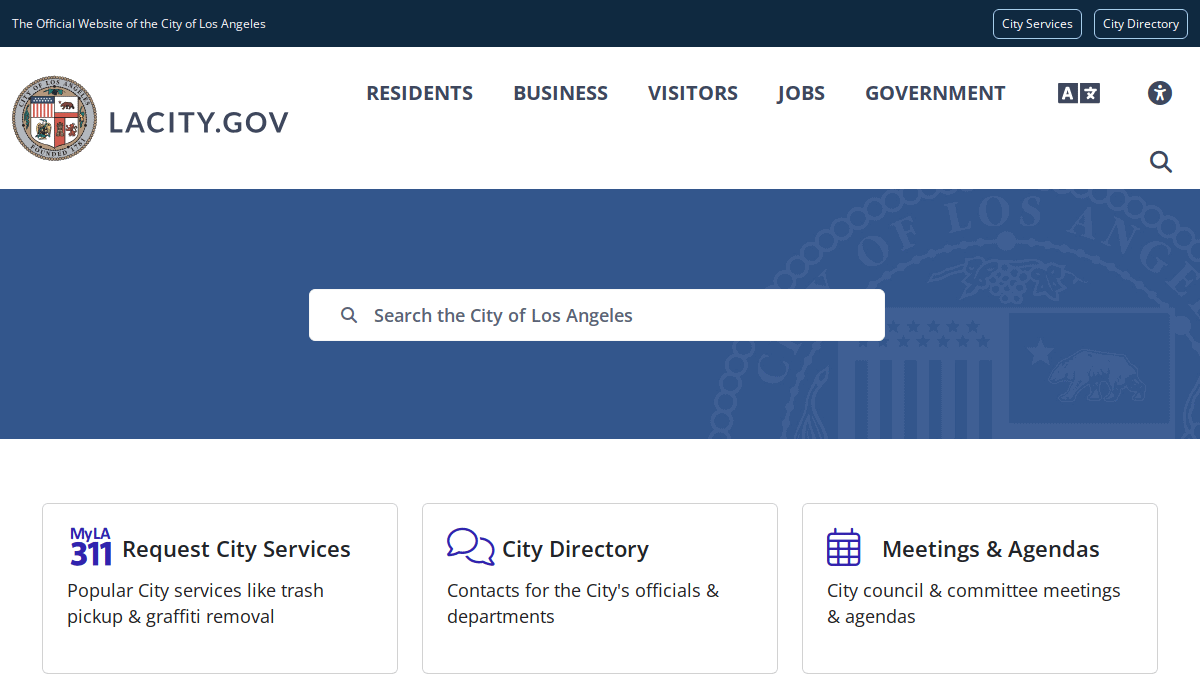
Location: Los Angeles, CA
Key Takeaways:
- Modern color palette reflecting the city’s dynamic essence.
- High-quality graphics and icons for improved aesthetics.
- Fully integrated accessibility features.
16. N26
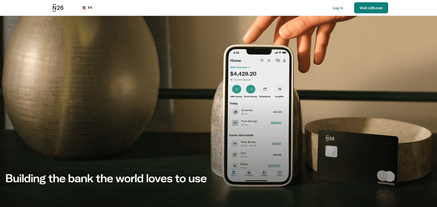
Location: New York, NY
Key Takeaways:
- Simple design with clear icons for easy navigation.
- Tailor-made features for personalized banking.
- Secure and user-friendly interface.
17. ASOS
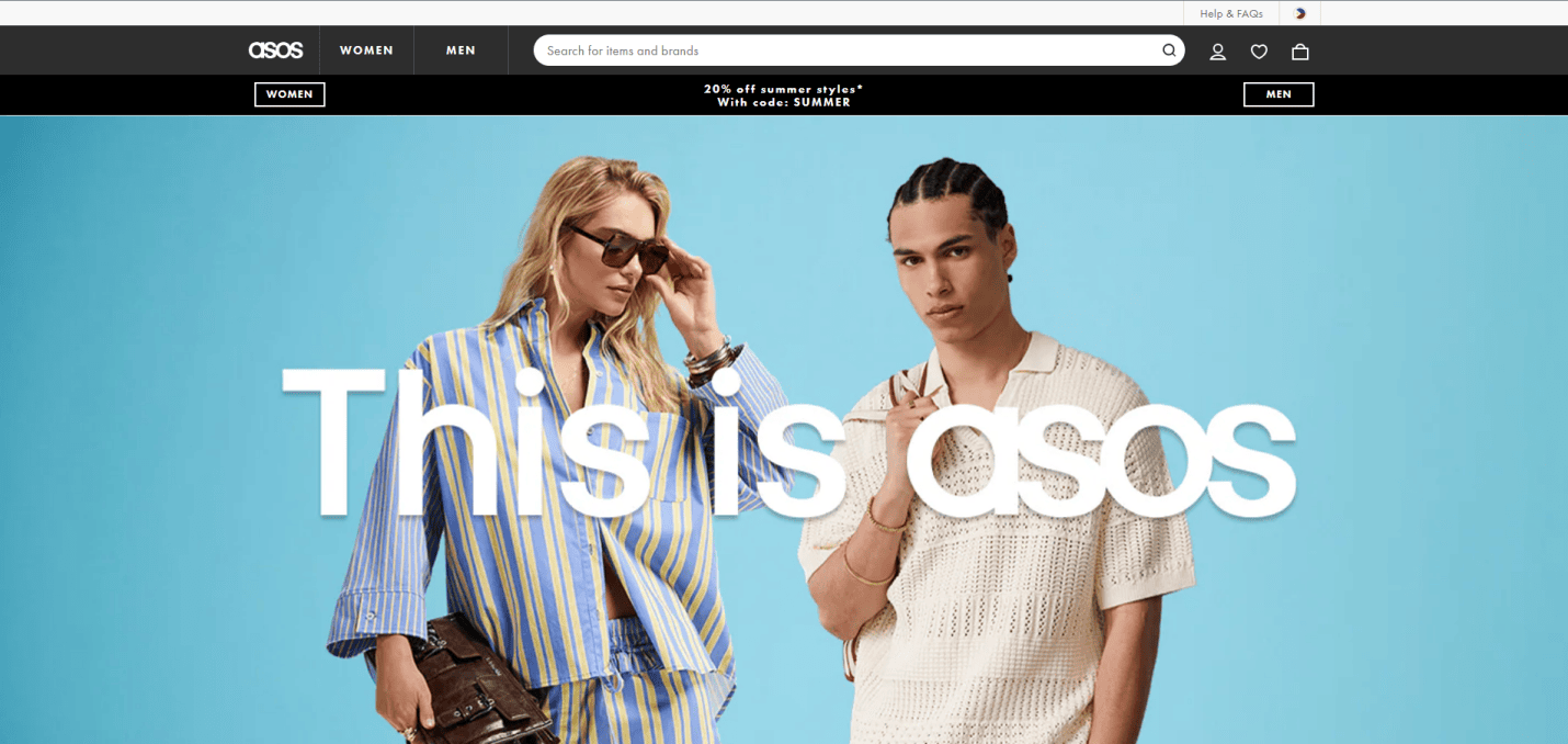
Location: New York, NY
Key Takeaways:
- Interactive elements enhance online shopping experience.
- Detailed product information aids in decision-making.
- Responsive design for various devices.
18. Calm
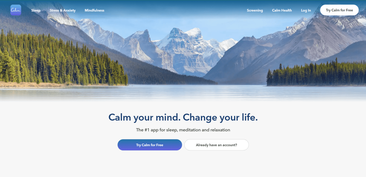
Location: San Francisco, CA
Key Takeaways:
- Soothing visuals and sounds create a relaxing environment.
- Simple design for accessing meditation and sleep stories.
- Emotional connection through empathetic design.
19. HAVEN
Location: New York, NY
Key Takeaways:
- User-friendly design focused on personal safety.
- Accessible features for all users.
- Intuitive interface for quick access to safety tools.
20. Goodreads

Location: San Francisco, CA
Key Takeaways:
- User-friendly design for enhanced reading experience.
- Interactive elements and customization options.
- Clear images and easy commands for user engagement.
These websites exemplify the best practices in UX design, offering valuable insights for anyone looking to enhance their online presence.
Ready to Enhance Your Website Experience?
Your website is more than a digital brochure—it’s the central platform where your brand meets your audience. When you align your web design process with solid ux design principles and a deep understanding of user needs, you create more than just a beautiful interface. You create a system that supports real business growth and user satisfaction. From the early design phase to long-term optimization, great design is about creating a consistent, seamless experience that drives engagement and trust.
Whether you’re looking to revamp your current site or launch a new digital product, investing in smart, strategic design is how you stand out. The best web designers know that each design project is shaped by user data, feedback, and a commitment to delivering a positive user experience across all web pages.
Let’s talk about how to elevate your next website or app. Request a proposal today and start building a site that works just as hard as you do.
Frequently Asked Questions About UX and Website Design
What is UX design, and why is it important for my website?
UX design focuses on how users interact with and experience your website or app. It goes beyond aesthetics, aiming to provide a pleasant user experience through intuitive design, fast-loading pages, and clear calls-to-action. A well-executed UX strategy can reduce user pain points and dramatically increase conversions by aligning your site with the expectations and behaviors of your end users.
How does UX differ from UI design?
While UX is about creating an overall positive experience on your site, UI (user interface design) deals with the layout, colors, typography, and interactive elements. Together, ux and ui design ensure your website looks great and is also easy to use. Both are part of the design process and must work in harmony to provide consistent design and user satisfaction.
What does the UX process involve?
The UX process begins with understanding user needs and conducting user research. This often includes user interviews, user testing, and analyzing user behavior. Designers then use this data to shape wireframes, build a design system, and test interactions. Iteration based on user feedback ensures a responsive web experience that meets real user expectations.
How does user research impact web design?
Conducting user research helps uncover user pain points, expectations, and behaviors. This allows web designers to empathize with the user and build solutions that enhance user experience. From feature prioritization to navigation structure, every design decision should be rooted in research and data collected directly from the end user.
What are the design best practices for creating a good user experience?
Design best practices include using a consistent design system, prioritizing accessibility, maintaining visual hierarchy, and minimizing cognitive load. Other key elements include clear user pathways, responsive layouts, and interaction patterns based on an understanding of user behavior.
How do I measure if my UX is successful?
You can evaluate UX success through metrics such as bounce rate, conversion rate, task completion rate, and user satisfaction surveys. Feedback collected through user testing or tools like heatmaps also offers insights into how users interact with your site and where improvements can be made.
What role does user feedback play in UX design?
User feedback is critical in validating design ideas and identifying usability issues. It allows you to refine your interface and eliminate friction points, ensuring your product design supports a good user experience. Iterative feedback loops are a core component of any user-centered design strategy.
Why is responsive design essential for UX?
A responsive web design ensures your site functions smoothly on all devices and screen sizes, from desktops to smartphones. Without it, users may experience layout issues or poor gateways, leading to a poor user experience. Responsive design is a standard part of the ux and ui process today.
Can UX design improve my search engine rankings?
Yes. Google increasingly rewards websites that provide a positive experience, which includes fast load times, mobile responsiveness, and easy to use. These factors are all part of the UX process and directly impact your search experience. Better UX also leads to lower bounce rates and longer visit durations, both positive signals to search engines.
How often should I update my UX design?
UX is an ever-changing field. As user expectations evolve and technology advances, it’s important to revisit your UX strategy regularly. Reassessing your site every 12 to 18 months—or sooner if user data shows declining engagement—is a smart part of the design thinking approach and ensures you continue driving user engagement and delivering a positive experience.