Just looking for our Best Kitchen Cabinets Website examples list?
You are a master of your craft. You know that the perfect kitchen design is a symphony of details—the precise alignment of custom cupboards, the seamless integration of a new refrigerator, the flawless flow of the look from prep space to cooking station. You spend your days transforming a client’s vision into their ideal kitchen, obsessing over every inch of the floor plan and the quality of casework, making your finished work a testament to quality, skill, and an unwavering commitment to excellence.
So why doesn’t your website reflect that same level of mastery?
For too many industry professionals, a website is just a static gallery of past projects—a digital brochure that looks nice but does little to bring in new business. It showcases the beautiful appliance selections and stunning finishes, but fails to do the most important job: convince a prospective client to pick up the phone. Your site might get compliments, but it doesn’t get you qualified leads.
This guide is here to change that. We’re going beyond aesthetics to provide a strategic blueprint for transforming your website into your most powerful sales and business management tool. We will show you how to design for client acquisition, not just admiration, creating a high-performing site that works as hard as you do to grow your business.
The Professional’s Guide to Kitchen Web Design: Key Takeaways
Here are the essential takeaways from our guide to designing a high-performing kitchen and bath website. This summary provides the core strategies you need to transform your site from a simple online brochure into a powerful engine for generating leads and sales.
- Treat Your Website as a 24/7 Sales Consultant, Not a Passive Brochure.The primary goal should be active client acquisition. Every element, from the homepage headline to the portfolio, must be strategically crafted to guide visitors toward a consultation. Its main job is to answer questions, build trust, and qualify potential customers before you ever speak with them.
- A High-Quality Portfolio is Your Most Powerful Selling Tool.Your website must showcase your work with high-resolution, professional “before and after” photos. Go beyond a simple gallery by structuring your portfolio as project case studies. For each project, include a brief story about the client’s goals, the solutions you provided, and a direct testimonial to build credibility and help potential clients envision their own success.
- Design for Your Ideal Client, Not a General Audience.Effective web design for industry pros begins with a deep understanding of your target market. Whether you serve high-end luxury clients or focus on mid-range family renovations, your site’s messaging, imagery, and features should speak directly to their specific needs, pain points, and aspirations.
- Integrate Lead Generation Features at Every Opportunity.Do not rely on a single “Contact Us” page. A successful website weaves lead generation opportunities throughout the user experience. This includes placing clear Calls-to-Action (CTAs) like “Schedule a Consultation,” offering valuable “lead magnets” such as budget planning checklists or design guides, and making your phone number and contact forms easily accessible on all pages.
- Build Trust with Prominent Social Proof and About Us Pages.Homeowners hire people they trust. Your website must build this trust instantly. Prominently display customer testimonials, embedded reviews from Google and Houzz, industry certifications (like NKBA), and any awards you have won. Furthermore, your “About Us” page should tell your company’s story and feature photos of your team to create a vital human connection.
- Transform Your Website into a Business Operations Tool.Gain a competitive edge by integrating tools that streamline your business and improve the client experience. Consider adding an interactive budget calculator to pre-qualify leads, a kitchen visualizer to increase engagement, or even a password-protected client portal for sharing project timelines and updates. This elevates your website from a marketing asset to a core part of your operational workflow.
Phase 1: The Blueprint – Planning Your Website’s Purpose
Before a single sledgehammer swings or a cabinet is ordered, every successful remodel begins with a meticulous plan. You create blueprints, map layouts, and define every detail to ensure the project meets the client’s vision and budget. Launching a website without this same level of strategic planning is like starting demolition without knowing where the load-bearing walls are—it’s costly, inefficient, and guarantees a disappointing result.
Your website serves a customer making a high-stakes, deeply personal investment. They aren’t just buying a product; they are shaping the heart of their home. Therefore, the planning phase of your website design is the most critical. It’s where you define your site’s purpose and create a blueprint that will guide a potential customer from casual interest to a signed contract. This phase is not about colors or fonts; it’s about establishing a foundation for trust and a clear path to conversion.
Defining Your Ideal Client: Who Are You Building For?
You don’t build the same design for every client, so why would you build a single website meant to attract everyone? The first step is to get laser-focused on your ideal client. This “client avatar” will dictate every subsequent design and content decision. Ask yourself and your team:
- Who is our “best-fit” customer?Are they a young family needing a durable, functional space, or an established couple investing in a high-end, luxury kitchen for entertaining?
- What are their biggest pain points?Are they worried about the disruption of a remodel, going over budget, or choosing the right materials?
- What does their dream space look like?What styles are they drawn to? What features are non-negotiable?
- What questions do they always ask during the first call?Your website should answer these proactively.
Knowing these details allows you to tailor your website’s messaging, imagery, and portfolio to resonate with the exact type of customer you want to attract, effectively pre-qualifying them before they even contact you.
Mapping the Customer Journey: From Inspiration to Consultation
Once you know who you’re talking to, you need to map out their journey to hiring you. A typical customer journey in the remodeling industry involves several stages, and your website must serve a different purpose at each one:
- Awareness & Inspiration: At this stage, the user has a problem (e.g., “outdated kitchen,” “need more space”) and is looking for ideas. Your website can capture their attention with blog posts about design trends, articles on planning a remodel, and inspirational portfolio images.
- Consideration & Vetting: Now, the user is actively researching solutions and potential companies. This is where your website must work hard to build trust. They will scrutinize your portfolio case studies, read your “About Us” page to learn your story, and look for testimonials and reviews that validate your expertise.
- Decision & Contact: The user is ready to take the next step. Your website’s job is to make this as easy and frictionless as possible with clear calls-to-action, simple contact forms, and readily available contact information.
Establishing Your Website’s Core Job Description
Finally, based on your client avatar and their journey, you must define your website’s core purpose. Move beyond thinking of it as a digital brochure and instead write its “job description.” For a successful business, that job description includes:
- Generate Qualified Leads: To attract ideal clients and provide them with clear, compelling pathways to request a consultation.
- Build Unshakeable Trust: To use project stories, testimonials, and team bios to make a potential client feel comfortable and confident in your ability to deliver.
- Showcase Unmatched Expertise: To serve as the ultimate gallery of your best work, demonstrating your quality, craftsmanship, and attention to detail.
- Answer Common Questions 24/7: To save you time by proactively addressing common client concerns about process, budget, and timelines.
With this strategic blueprint in hand, you are no longer just building a website. You are engineering a purpose-built machine designed to grow your business.
Phase 2: The Visual Blueprint – Core Design Principles for Websites
In web design, you instinctively follow core principles. You create balance with color and texture, establish flow so a family can move efficiently through the space, and use lighting to create a visual hierarchy that draws the eye to a stunning backsplash or a custom-built island. The very same principles apply to designing a website that effectively guides visitors and converts them into clients.
An effective website design is not about chasing fleeting trends; it’s about creating a clear, intuitive, and trustworthy experience for the user. For a homeowner considering a five or six-figure investment, the visual presentation of your website is a direct reflection of the quality and professionalism they can expect from your work. This is where you begin to translate your strategic blueprint into a tangible visual experience.
Visual Hierarchy and a Clean Layout
Visual hierarchy is about controlling where the user looks first. Just as you want a client to immediately notice the magnificent quartz countertop when they walk into a finished kitchen, you want a website visitor to immediately see the most important information, like your value proposition or a “View Our Work” button. You achieve this with:
- Strategic Use of Whitespace: Ample “empty” space around text and images prevents a cluttered feel, making your content more legible and professional. It allows your project photos to breathe and command attention.
- Bold, Clear Typography: Use different font sizes and weights to distinguish between headlines, subheadings, and body text. Your main headlines should be instantly scannable, conveying the key message of each page.
- Purposeful Color Palette: Use your brand colors consistently. A bright, contrasting color should be reserved for critical conversion elements, like “Schedule a Consultation” buttons, to make them stand out.
A clean, uncluttered layout feels organized and professional, subconsciously telling the visitor that you are a contractor who is organized and values quality.
High-Quality, Authentic Imagery is Non-Negotiable
This is the single most important design principle for your industry. Stock photos are the fastest way to destroy credibility. Your website visitors are there to see your work, not a generic kitchen from a photo database.
- Invest in Professional Photography: Consider professional photos of your completed projects as a core marketing investment, not an expense. A professional photographer knows how to capture lighting, angles, and details to make your work look as stunning online as it does in person.
- Showcase Variety: Include a mix of shots for each project : wide-angle photos to show the overall transformation, medium shots to highlight specific areas like the island or appliance suite, and detail shots to showcase your craftsmanship—the perfect cabinet joints, intricate tile work, or custom hardware.
- The Power of Before-and-After: This is one of the most compelling visual tools you have. It provides a dramatic and immediate demonstration of your value and skill, making the impact of your work undeniable.
Intuitive Navigation for a Seamless User Experience (UX)
In a well-designed kitchen, the “work triangle” ensures the sink, stove, and refrigerator are efficiently placed. Your website’s navigation should be just as logical and efficient. A visitor should never have to hunt for information.
- Keep Your Main Menu Simple: Stick to clear, universally understood labels. “Home,” “About Us,” “Services,” “Portfolio,” and “Contact” are all that a user needs. Avoid clever or confusing jargon like “Musings” for your blog or “Creations” for your portfolio.
- Ensure a Logical Flow: A user interested in your custom-fitted furniture services should be able to click from “Services” to the “Custom Cabinetry” page, see relevant portfolio examples on that page, and then easily find a CTA to contact you about that specific service.
- A Searchable Portfolio: If you have a large portfolio, include features to filter projects by style (e.g., “Modern,” “Traditional,” “Transitional”) or project type. This helps visitors find examples relevant to their own vision quickly.
Mobile-First, Responsive Design is Mandatory
Today, the majority of initial online research happens on a mobile device. A potential client might browse for inspiration on their phone while watching TV or on a tablet at their kitchen table. If your website is difficult to read, navigate, or view on their device, you have already lost them.
Responsive design means your website automatically adjusts its layout to fit any screen size, from a large desktop monitor to a smartphone. It ensures your photos look great, your text is readable without pinching and zooming, and your buttons are easy to tap. In today’s market, this is not an optional feature; it is a fundamental requirement for a professional website.
Phase 3: The Framework – Structuring Your Website’s Content and Navigation
Think of the most functional cooking area you have ever designed. Everything has its place. The silverware is in a drawer next to the dishwasher, the spices are near the stove, and the walk-in pantry is organized for at-a-glance access. This logical organization is what makes the space effortless to use. Your website requires the exact same thoughtful structure. Its content and navigation are the cabinets, drawers, and pantries of your digital showroom. A logical framework ensures visitors can easily find the information they need to build trust in your brand and make the decision to hire you.
This phase is about organizing your pages and creating a clear, intuitive path for users to follow. Here are the essential pages and navigation principles that form the framework of a high-performing kitchen and bath website.
The Homepage: Your Digital Showroom Entrance
Your homepage is your most valuable digital real estate. It must make a powerful first impression in seconds, communicating who you are, what you do, and why you are the best choice. It is not a catch-all for random information; it is a curated entrance that guides visitors to more detailed content.
Key Content Elements:
- A Compelling Headline: A clear value proposition that speaks directly to your ideal client’s needs (e.g., “Timeless Kitchen Designs, Expertly Crafted for Your Life”).
- Stunning Hero Imagery: A large, high-resolution photo or video of your absolute best work right at the top.
- Prominent Trust Signals: Immediately visible logos of awards, certifications (like NKBA), or publications you’ve been featured in.
- Introduction to Your Services: A brief, visually engaging summary of your core services with clear links to learn more.
- A Glimpse of Your Portfolio: Showcase 3-4 of your most impressive projects to entice visitors to view your full body of work.
- A Client Testimonial: A powerful quote from a happy client to immediately begin building social proof.
The Services Pages: Detailing Your Craftsmanship
A common mistake is to lump all services onto one generic page. To improve both user experience and search engine optimization (SEO), create dedicated pages for each distinct service you offer. This allows you to provide rich detail and capture visitors searching for specific solutions.
Essential Service Pages and Their Content:
- Full Kitchen Remodeling:Detail your end-to-end process, from initial design and demolition to installation and finishing touches. Address common client questions and concerns.
- Custom Cupboards:Showcase your craftsmanship. Discuss the types of wood, finishes, and hardware you offer. Explain your design and fabrication process.
- Countertop Installation:Detail the materials you work with (quartz, granite, marble, etc.) and the benefits of each.
Each service page should act as a mini-sales page, complete with relevant project photos, testimonials, and a clear call-to-action.
The Portfolio: Your Ultimate Sales Tool
Your portfolio is where you prove your promises. Do not treat it as a simple photo gallery. Instead, structure it as a collection of compelling case studies that tell a story of transformation. This approach allows potential clients to see themselves in your work.
Each Project Case Study Must Include:
- An SEO-Friendly Title: For example, “Modern Farmhouse Kitchen Remodel in Arlington, VA.”
- The Client’s Challenge: Briefly describe the problem the client was facing with their old space.
- Your Solution: Explain how your design and execution solved their problem and achieved their goals.
- A Visual Journey: A gallery of high-quality “before-and-after” photographs that showcase the dramatic results.
- A Project-Specific Testimonial: A quote from that client about their experience working with you on that specific project.
The Main Navigation: Creating an Effortless Path
Your main navigation menu is the primary roadmap for your website. It should be simple, predictable, and consistent across every page. The goal is effortless discovery.
- Header Navigation: Keep your top menu clean and focused on the essentials. A proven structure is:
- Home
- About Us
- Services (using a dropdown menu to list your dedicated service pages)
- Portfolio / Projects
- Blog (if you have one)
- Contact
- The Power of the Button: Include a visually distinct button in your header—separate from the main navigation links—for your primary call-to-action, such as “Schedule a Consultation.” This should be in a contrasting color to draw the eye.
- Footer Navigation: The website footer acts as a secondary, “catch-all” navigation menu. It should include links to all your key pages, your full contact information (Name, Address, Phone), social media links, and any necessary legal pages like your Privacy Policy.
Phase 4: The Finishing Touches – Using Visual Elements to Build Your Brand
The final phase of a remodel is where the project’s true character comes to life. It’s in the selection of the cabinet hardware, the style of the pendant lighting, and the texture of the backsplash tile. These finishing touches are not merely functional; they are carefully chosen visual elements that tie the entire design together, creating a cohesive and memorable space.
In the same way, your website’s visual elements—your photography, colors, typography, and logo—are the finishing touches that define your brand’s personality and professionalism. A disconnected and inconsistent visual presentation can make even the best company feel amateurish, eroding trust before a visitor even reads a single word. A strong, cohesive visual system, however, communicates quality, attention to detail, and a clear brand identity that attracts your ideal client.
Professional Photography and Videography: The Heart of Your Visual Brand
We have stressed the importance of imagery, but it is critical to understand its role as the centerpiece of your visual brand. For a kitchen and bath designer, your photos are your product online. They are the primary tool for creating an emotional connection and showcasing the tangible results of your expertise.
- Go Beyond “After” Shots: While before-and-after photos are essential, supplement them with “in-progress” shots that highlight your team’s craftsmanship and clean worksite. Detail shots of perfect joinery, flawless tile work, or custom storage solutions showcase your commitment to quality.
- Incorporate Video: Video is the most powerful medium for building trust and telling a story. Consider investing in a short (1-2 minute) brand story video that introduces your founder and your company’s philosophy. Project showcase videos, featuring a walkthrough of a finished space with a testimonial from the homeowner, are incredibly effective at helping potential clients envision the experience of working with you.
Typography that Communicates Professionalism
The fonts you choose for your website say more than you think. A font can feel modern and minimalist, classic and elegant, or sturdy and traditional. The key is to select a typography system that aligns with your brand’s personality and is, above all, easy to read.
- Readability First: For body text—your main paragraphs—always choose a clean, simple, and highly legible font. Sans-serif fonts like Open Sans, Lato, or Montserrat are popular web choices for their clarity on screens.
- Create Contrast with Headlines: Use a complementary, often bolder or more stylized font for your page titles and section headlines to create visual interest and a clear hierarchy.
- Limit Your Choices: A professional website rarely uses more than two or three fonts. Sticking to a consistent font family creates a sense of cohesion and polish. Anything more begins to look chaotic and unprofessional.
A Strategic and Cohesive Color Palette
Color is a powerful tool for evoking emotion and reinforcing your brand identity. Your color palette should be used consistently across your entire website, from your logo and navigation to your buttons and links.
- Establish Your Brand Colors: Choose a palette of 3-4 colors. This typically includes a dominant primary color, a secondary color for accents and backgrounds, and a neutral color (like a light gray or off-white) for text and clean space.
- Use an Accent Color for Action: Select one bright, high-contrast color from your palette to be used exclusively for your most important clickable elements, such as “Schedule a Consultation” buttons. This practice, known as using a “call-to-action color,” draws the user’s eye and tells them exactly where to click.
- Ensure Accessibility: It is critical that your text color has a high contrast ratio with its background color. Black text on a white background is the most readable combination. Avoid placing light-colored text on a light background, as it can be difficult to read for many users.
Your Logo: The Signature of Your Brand
Your logo is the most concise visual summary of your company. It should be professional, easily recognizable, and used consistently across your website.
- Placement is Key: The standard and most effective placement for your logo is in the top-left corner of your website’s header, where users instinctively expect to find it. Clicking your logo should always link back to your homepage.
- Use High-Quality Formats: Ensure your logo is uploaded in a high-resolution format (like SVG or PNG) with a transparent background. This allows it to look sharp on all devices and be placed over images or colored backgrounds without an unprofessional-looking white box around it. A blurry or pixelated logo instantly cheapens your brand.
Phase 5: Protecting Your Investment – Ongoing WordPress Maintenance
You would never install a state-of-the-art, professional-grade kitchen for a client and then walk away without explaining how to care for it. The marble countertops need sealing, the stainless steel appliances require specific cleaners, and the custom cabinetry needs periodic attention to remain pristine. Handing over the keys is just the beginning of that asset’s life. Your website, the digital engine of your business, demands the same level of professional care to protect its value and performance.
Launching your WordPress website is a significant investment in your business. Ongoing maintenance is the essential service that protects this investment. It is not an optional IT task, but a core business practice that ensures your site remains secure, fast, and functional, so it can continue to generate leads and represent your brand with the quality it deserves.
Consistent Core, Theme, and Plugin Updates
WordPress is a dynamic platform, with its core software, themes, and plugins receiving frequent updates from developers worldwide. These updates are not optional. They are released to patch security vulnerabilities, fix bugs, improve performance, and occasionally add new features. Operating a website with outdated software is equivalent to leaving a window open in your digital showroom—it creates an unnecessary risk and an easy entry point for security threats. Consistent, timely updates are the first line of defense in keeping your website healthy.
Regular, Automated Website Backups
A reliable backup is your website’s ultimate insurance policy. In a worst-case scenario—such as a server failure, a critical update error, or a security breach—a recent, complete backup is the only thing that stands between a quick recovery and a total loss of your digital asset. For a business that regularly updates its portfolio with new projects, daily automated backups are the professional standard. These backups should include all website files and the database, and they must be stored in a secure, off-site location, separate from your web hosting server.
Proactive Security Monitoring and Malware Scanning
Your brand’s reputation is built on trust. A compromised website can shatter that trust instantly. Proactive security is the 24/7 alarm system for your website. This involves implementing a web application firewall (WAF) to block malicious traffic before it reaches your site and running regular, automated scans of your website’s files to detect any malware or suspicious code. This constant vigilance ensures threats are identified and neutralized immediately, protecting your business, your brand, and your clients’ data.
Performance Optimization and Database Health
Over time, your WordPress website’s database can become cluttered with old post revisions, spam comments, and other unnecessary data, much like a workshop accumulates sawdust and scraps. This digital clutter can slow down your site, leading to a poor user experience and potentially lower search engine rankings. Performance optimization is the process of regularly cleaning and optimizing this database, ensuring your site’s engine is running efficiently. This keeps your website fast, responsive, and ready to impress potential clients.
Uptime Monitoring
You cannot afford for your digital showroom to be closed. Uptime monitoring is a simple but critical service that constantly checks to see if your website is online and accessible to visitors. If your site goes down for any reason, this service sends an immediate alert to your technical support team. This allows for a rapid response to resolve the issue, minimizing downtime and ensuring you lose as few potential lead opportunities as possible.
Best Kitchen Cabinet Website Examples
An effective site blends stunning visuals with clear navigation and compelling calls-to-action to turn visitors into qualified leads. Below are 19 of the best industry websites, chosen for their design, user experience, and ability to inspire trust.
1. Seigle’s Cabinet Center
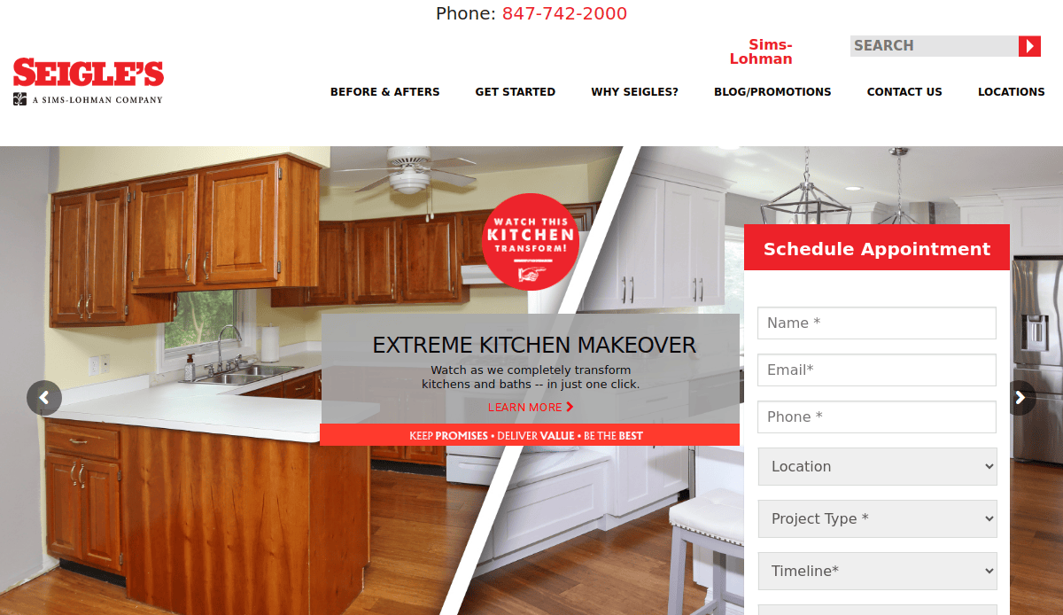
- Location City: Elgin, IL
- 3 Key Takeaways:
- Strong Trust Signals: The site prominently features “Since 1881,” which immediately establishes a long history of reliability and expertise.
- Action-Oriented Formatting: The homepage uses clear, block-style navigation with actionable titles like “Visit a Showroom” and “We Install,” guiding users directly to key conversion points.
- Interactive Inspiration: The “Before & After” gallery is a highly effective tool that visually proves the company’s transformative impact, a crucial element for remodeling businesses.
2. Direct Quality Cabinets
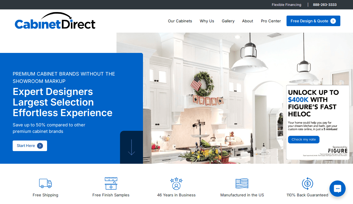
- Location City: New York, NY
- 3 Key Takeaways:
- Benefit-Driven Headlines: The main headline, “Premium cabinet brands without the showroom markup,” directly addresses customer value and cost-consciousness.
- Clear Process Explanation: The website effectively breaks down its customer journey into simple, numbered steps (“Start Here,” “Free 3D Design”), which demystifies the process and builds confidence.
- Prominent Guarantees:Featuring a “110% Back Guaranteed” promise and “Free Shipping” above the fold reduces purchase anxiety and builds immediate trust with visitors.
3. J&K Cabinetry
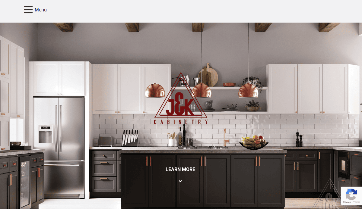
- Location City: Dallas, TX
- 3 Key Takeaways:
- Audience-Centric Navigation: The site quickly funnels users by design style (“Contemporary,” “Transitional,” “Traditional”), allowing them to self-select and view the most relevant products immediately.
- High-Impact Visualizer Tool: Placing a “Product Visualizer” link prominently under each category is a powerful interactive feature that increases engagement and helps users envision their project.
- Clean and Professional Aesthetic: The use of ample white space and a simple, elegant theme reflects the quality and style of the cabinetry, creating a high-end feel for the brand.
4. CliqStudios Cabinetry
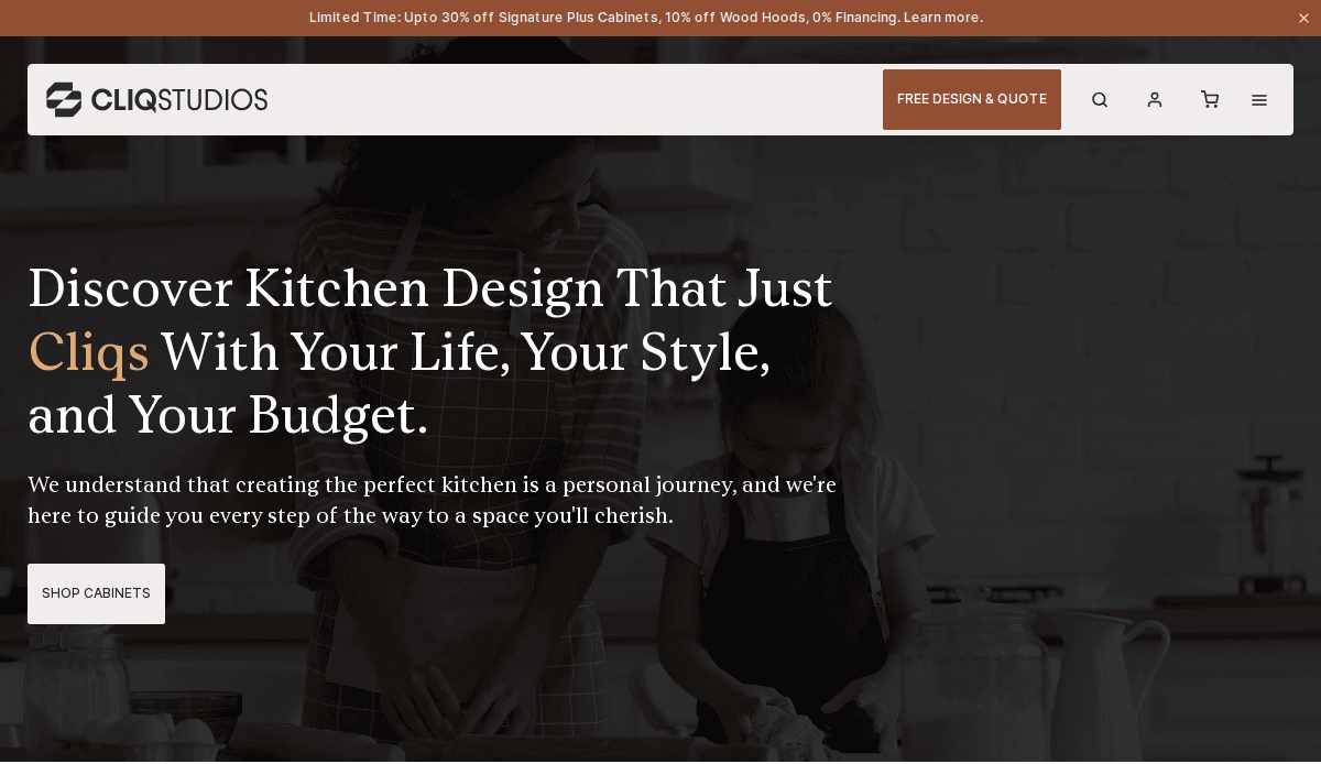
- Location City: Minneapolis, MN
- 3 Key Takeaways:
- Strong Call-to-Action (CTA): The entire site is geared towards a free design consultation, with a clear “Get Free Design” CTA that is consistently present and easy to find.
- Excellent Educational Content: The “How It Works” section is incredibly detailed, guiding users through every step from wishlists to delivery, which educates the consumer and builds trust in their process.
- Social Proof Through Media Mentions: Featuring logos from well-known media like HGTV and This Old House lends significant third-party credibility to their brand.
5. 27estore
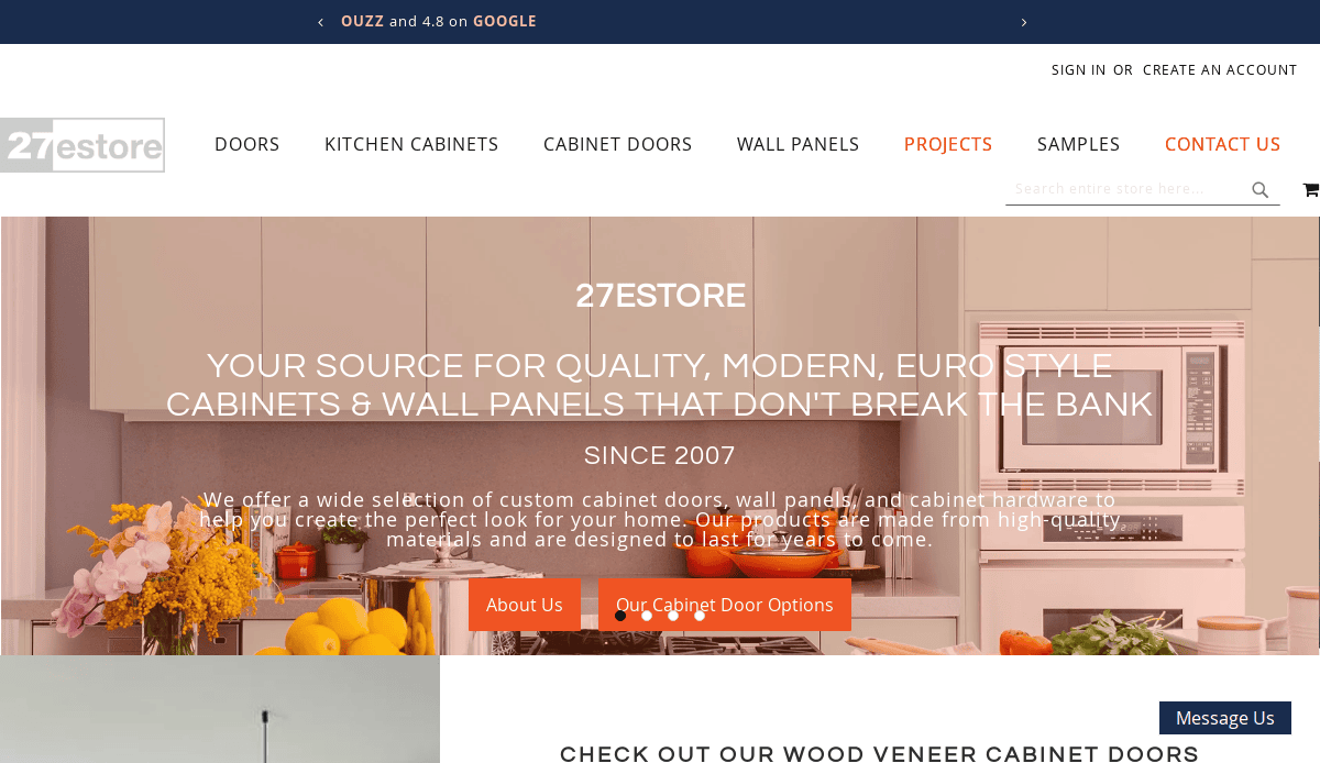
- Location City: Las Vegas, NV
- 3 Key Takeaways:
- Modern, E-commerce Feel: The website has a clean, grid-based design that feels very modern and is easy to browse, much like a high-end e-commerce store.
- Clear Value Propositions: The site effectively uses banners and icons to highlight key benefits like “Up to $1,000 off,” “FREE SHIPPING,” and “Since 2007,” which are powerful conversion drivers.
- Focus on Customization: The site excels at showcasing its wide range of custom options, particularly with a dedicated “Explore over 200 different lacquer colors” section, appealing directly to discerning customers.
6. Normandy Remodeling
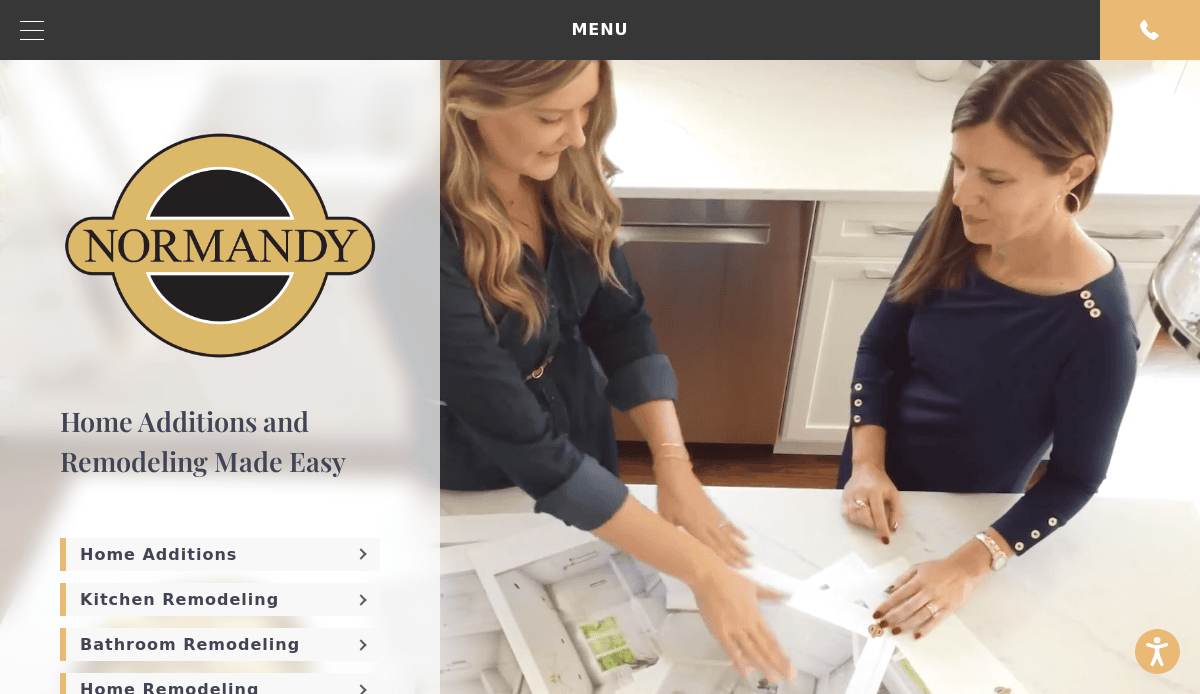
- Location City: Hinsdale, IL
- 3 Key Takeaways:
- Award-Winning Showcase: The site heavily features its award-winning designs, which act as powerful social proof and a mark of quality.
- High-Quality Video Content: Integration of professional videos provides a dynamic look into their projects and company culture.
- Trust-Building Team Section: The detailed “Our People” section with professional photos and bios helps humanize the brand.
7. Case Architects & Remodelers
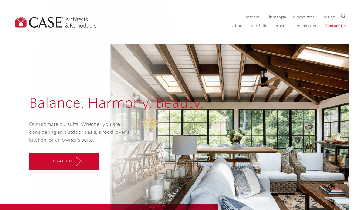
- Location City: Washington, D.C.
- 3 Key Takeaways:
- Proprietary Process Branding: They brand their method as the “CaseStudy®,” which gives their process a unique, professional, and trustworthy feel.
- Stunning Hero Imagery: The homepage immediately grabs attention with a full-screen, high-resolution image of a beautiful space, instantly showcasing the quality of their work.
- Clean and Elegant Navigation: The simple, clear top menu makes it easy for users to find exactly what they are looking for, from kitchens to baths to outdoor living.
8. Power Home Remodeling
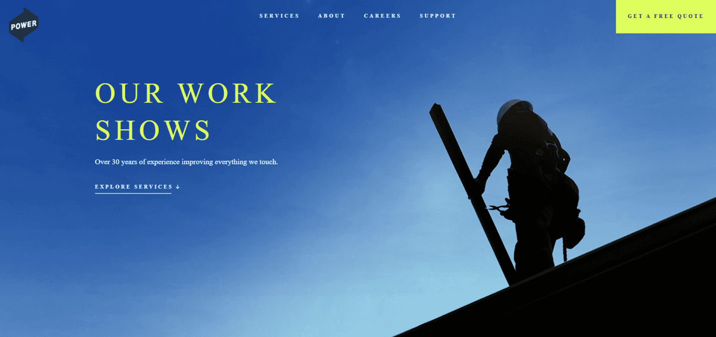
- Location City: Chester, PA
- 3 Key Takeaways:
- Strong Mission Focus: The website leads with its mission to improve communities and people, creating an emotional connection beyond just the remodeling service.
- Impactful Statistics: Using numbers like “1,000,000+ happy customers” provides powerful and quantifiable social proof.
- Focus on Employee Culture: Highlighting their company culture and employees helps build a brand that customers feel good about supporting.
9. Neil Kelly
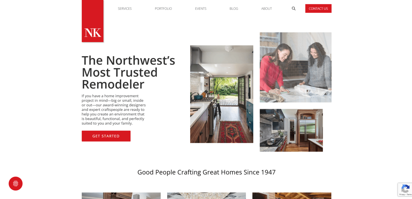
- Location City: Portland, OR
- 3 Key Takeaways:
- Heritage and Trust: Leading with “Since 1947,” the site establishes a long history of trust and experience in the Northwest.
- Comprehensive Service Offerings: The site clearly lays out a wide range of services beyond kitchens, including ADUs and handyman services, positioning them as a one-stop shop.
- Educational Workshops: Offering in-person and online remodeling workshops is an excellent lead-generation tool that also establishes their authority in the field.
10. Jackson Design and Remodeling
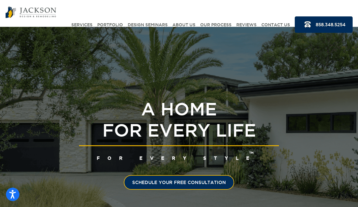
- Location City: San Diego, CA
- 3 Key Takeaways:
- Video Testimonials: Featuring professionally produced video testimonials adds a powerful layer of authentic social proof.
- Prominent Local Recognition: The site showcases numerous local awards (“Best of San Diego”), which builds strong regional trust and authority.
- Clear and Simple CTA: A persistent “Let’s Talk” button in the header makes it incredibly easy for potential clients to take the next step.
11. Houzz
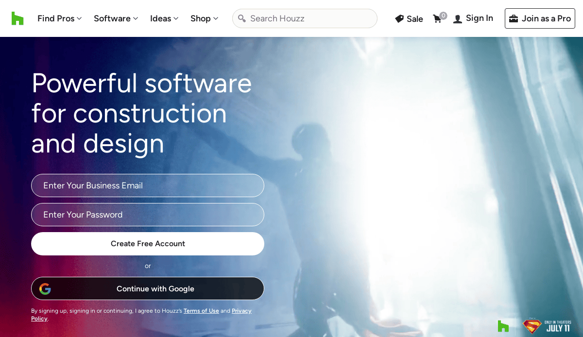
- Location City: Palo Alto, CA
- 3 Key Takeaways:
- Massive Visual Inspiration: Houzz functions as a vast, searchable library of high-quality images, making it the go-to place for homeowners in the inspiration phase.
- Integrated Platform: It successfully combines inspiration (photos), commerce (products), and services (finding professionals) into a single, seamless user experience.
- Community and Reviews: The robust system of professional reviews and community advice makes it a trusted resource for vetting remodelers.
12. Porch
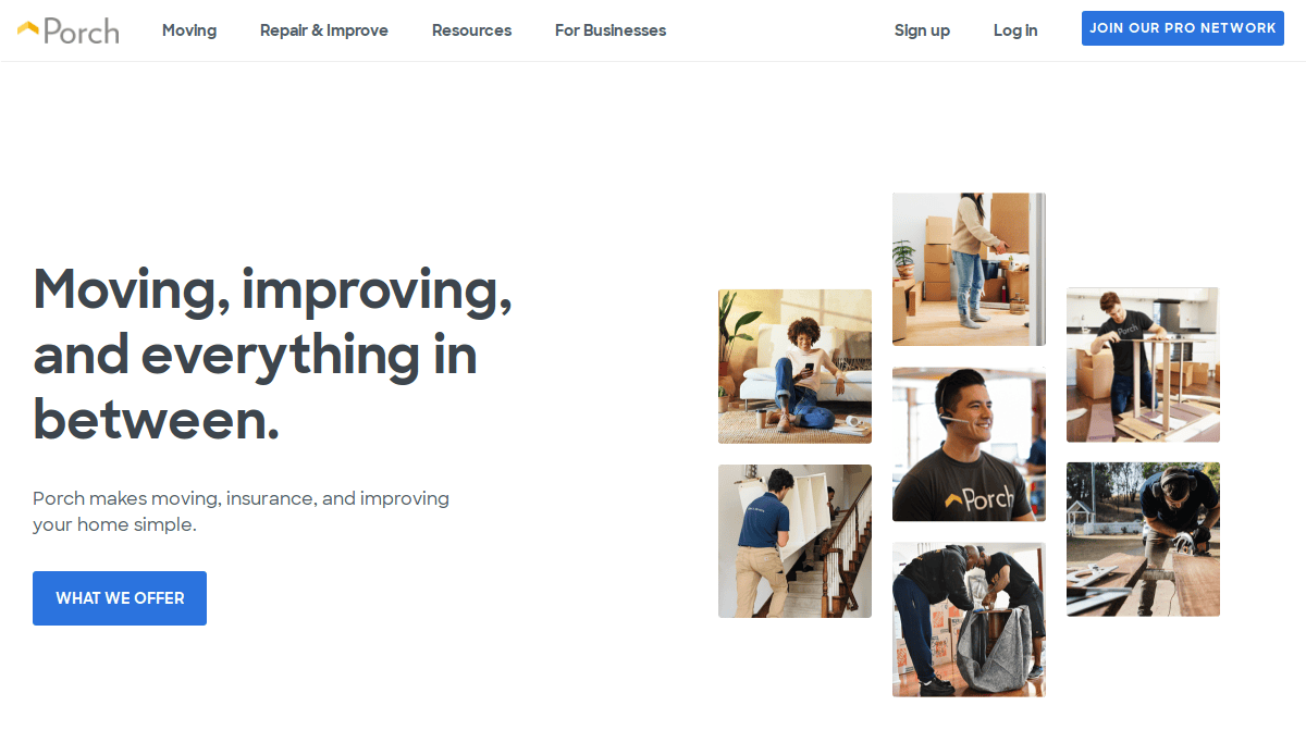
- Location City: Seattle, WA
- 3 Key Takeaways:
- Simple, Direct Service Connection: The site’s primary function is to quickly and easily connect homeowners with available professionals for specific jobs.
- Focus on “Done for You”: The messaging is geared towards homeowners who want a project handled with minimal fuss, offering a clear solution to a common pain point.
- Trust Through Vetting: The entire value proposition rests on the idea of providing pre-vetted, reliable pros, which addresses a major fear for homeowners.
13. Sweeten
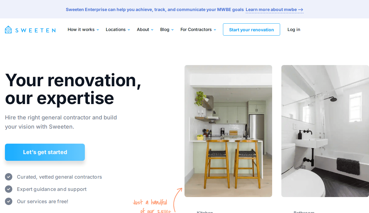
- Location City: New York, NY
- 3 Key Takeaways:
- Focus on Matchmaking: Sweeten’s core strength is its curated matchmaking service, connecting homeowners with a pre-vetted stable of general contractors.
- Clear Value Proposition (Free): The site repeatedly emphasizes that its service is free to homeowners, removing any barrier to entry.
- Robust Project Examples: The blog and project spotlights provide real, detailed stories of renovations, which are more compelling than a simple photo gallery.
14. System Pavers
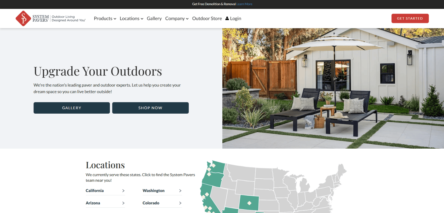
- Location City: Santa Ana, CA
- 3 Key Takeaways:
- Outdoor Living Specialization: While not exclusively for indoor cooking areas, their focus on outdoor kitchens is a key differentiator, and the site showcases this expertise brilliantly.
- Strong Offer-Driven Marketing: The site prominently features promotions like “Free Demolition & Removal” and “$3 Off every sq. ft.,” which creates urgency and encourages action.
- Visual Design Process: The site clearly explains its design process with visuals, helping customers understand the journey from consultation to installation.
15. Matrix Home Solutions
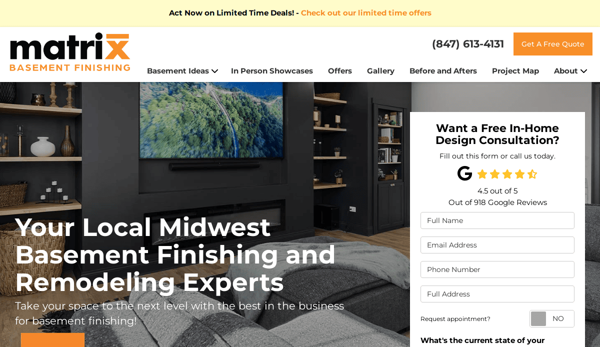
- Location City: Arlington Heights, IL
- 3 Key Takeaways:
- Direct and Bold CTAs: The “Get a FREE Quote” CTA is everywhere, making it impossible for a user to miss the primary conversion action.
- Financing as a Key Feature: The site heavily promotes its financing options (“$0 Down, 0% Interest”), addressing a major consideration for customers upfront.
- Strong Visual Proof: The prominent use of before-and-after sliders on the homepage provides instant, visual evidence of their work’s quality and impact.
16. Reborn Restorations
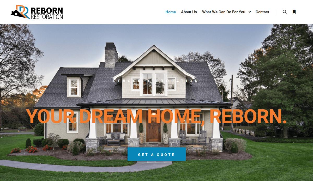
- Location City: Rockford, IL
- 3 Key Takeaways:
- Strong Family-Owned Messaging: Highlighting their “40 years” of family-owned history builds a narrative of trust and reliability.
- “Ultimate Remodeling Experience” Branding: They brand their service with a confident, benefit-driven tagline that sets high expectations.
- Clear Geographic Focus: The website makes it very clear which areas they service, which helps in pre-qualifying potential leads.
17. Kitchen Magic
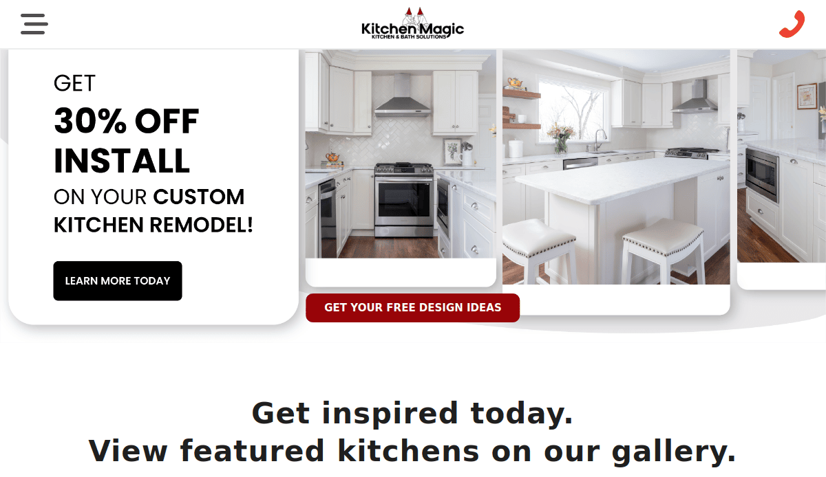
- Location City: Nazareth, PA
- 3 Key Takeaways:
- Specialization in Refacing: The site does an excellent job explaining the benefits of cupboard refacing, targeting a specific niche within the market.
- Interactive Visualizer Tool: The kitchen visualizer is a standout feature, allowing users to experiment with styles and engage deeply with the product offerings.
- Strong Warranty and Guarantee: Promoting their lifetime warranty is a powerful statement that conveys confidence in their product quality and durability.
18. White Wood Kitchens
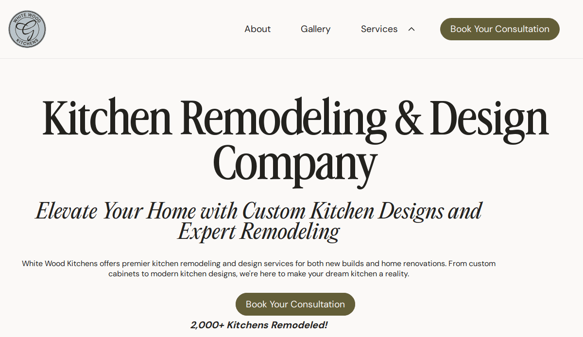
- Location City:Sandwich, MA
- 3 Key Takeaways:
- Boutique, High-End Feel: The clean design, elegant font choices, and stunning photography create a premium, bespoke feel for the brand.
- Story-Driven Testimonials: The testimonials are presented as “Customer Experiences” with names and locations, making them feel more authentic and personal.
- Simplified Process: Outlining their work in a “Simple 4-Step Remodeling Process” makes the potentially overwhelming prospect of a remodel feel manageable and clear.
19. The Kitchen Specialist
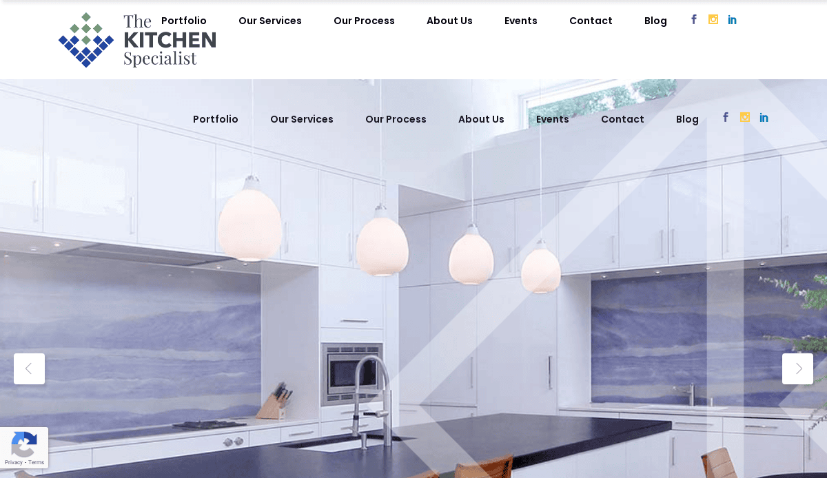
- Location City: Durham, NC
- 3 Key Takeaways:
- Art-Focused Branding: The tagline “Where kitchen design is fine art” immediately positions the company as high-end, creative, and detail-oriented.
- Focus on Partnership: The copy emphasizes collaboration with clients, making potential customers feel like they will be part of the creative process.
- Elegant and Clean Design: The website uses a minimalist design with beautiful typography and professional photos, reinforcing its brand as a premium service.
Ready to Build a Website as Stunning as Your Kitchens?
The goal is to build a digital showroom that results in a stunning kitchen for every lead it generates. This ultimate guide has shown that creating a high-performance online presence requires the same attention to detail as your physical projects. Just as you meticulously handle the planning for the heart of the home, your website must perfectly balance aesthetics and functionality. From the flow of the user experience to the showcase of your beautiful cabinetry and countertops, every element must work together to create a space that attracts and converts your ideal clients.
As design professionals who understand the design process from the ground up, we know what it takes to translate your craftsmanship into a powerful digital marketing tool. If you’re ready to stop worrying about your website and focus on designing your dream kitchen for your clients, let us help. Our team is ready to help you bring your vision to life online.
Schedule Your Free Consultation Today to discuss how we can build a website that truly grows your business.
Your Guide to Kitchen Design (FAQs)
How can my website best showcase the specific design details of my work?
Your website must function as a high-fidelity digital portfolio. Go beyond standard galleries by creating detailed case studies for each project. Use high-resolution photography to highlight the quality of your kitchen materials, the precision of your cabinetry and countertops, and the unique backsplashes you install. In your project descriptions, mention the specific cabinet styles and countertop materials (like Corian or quartz) used. This allows potential clients to see not just a beautiful new kitchen, but to understand the craftsmanship and quality that went into designing it with you.
What is more important for a kitchen designer website: aesthetics and functionality?
This is the central question in both web and interior design, and the answer is: they are equally vital and cannot be separated. A visually stunning website that is difficult to navigate is as frustrating as a beautiful kitchen with poor space planning. Your website’s design must create an inviting atmosphere while its functionality and style work in harmony to guide the user. The goal is to make your kitchen website an environment where common kitchen design questions are answered easily and a user’s journey to becoming a client is both beautiful and effortless.
How does my website help a client who is just starting their kitchen planning?
Your website is the perfect tool to guide a client through the initial, often overwhelming, stages of a renovation. You can publish blog posts that act as a guide, covering topics like choosing between layouts, selecting the right materials, or the benefits of adding an island. Offering downloadable checklists or guides in exchange for an email address is an excellent lead-generation strategy. By providing value during their research phase, you position yourself as a trusted expert. For a deeper look at structuring these features, our guide on remodelling company website design offers valuable insights.
How can my website show that I can work with both large open-concept spaces and smaller kitchens?
A diverse portfolio is key. Instead of showing dozens of similar projects, feature a curated variety of kitchen designs. Include a grand open-concept kitchen, a project in a compact urban space that uses tall cupboards and open shelving cleverly, and perhaps a specialized project like laundry rooms with custom cabinetry. By showcasing different layouts and solutions, you demonstrate your versatility as a designer and prove you can create a space that maximizes both beauty and function, regardless of the footprint.
My work is similar to general home builders. Are the principles for my website the same?
While there are many crucial overlaps, such as the need to build trust and showcase high-quality work, the focus is different. Your website must excel at visualizing a specific, high-touch kitchen environment. This means more detailed galleries focusing on materials, specific design ideas for cupboard doors or pull-out shelves to keep the space clutter-free and content that speaks directly to the kitchen plays in the heart of the home. However, understanding the broader principles is crucial. Many of the strategies discussed in our home builder website design guide apply here as well, especially regarding project timelines and building client trust.


