Just looking for our Best College & University Website examples list?
Designing an effective college website requires a blend of user-centric design, strategic SEO, and innovative features to meet the evolving expectations of prospective students and stakeholders. Here are the critical takeaways to guide your institution’s digital presence:
- Prioritize User Experience (UX) and Accessibility
Ensure intuitive navigation, mobile responsiveness, and compliance with accessibility standards (WCAG) to provide an inclusive experience for all users. - Implement AI-Driven Personalization
Utilize artificial intelligence to offer personalized content and recommendations, enhancing engagement and meeting individual user needs. - Optimize for Search Engines (SEO)
Employ strategic keyword integration, meta descriptions, and quality content to improve visibility in search engine results, attracting more prospective students. - Incorporate Interactive and Immersive Elements
Leverage interactive design features such as virtual tours, micro-interactions, and dynamic content to create engaging visitor experiences. - Highlight Diversity, Equity, and Inclusion (DEI) Initiatives
Clearly communicate your institution’s commitment to DEI through dedicated pages and resources, fostering a welcoming environment for all students. - Maintain Consistent Branding and Visual Identity
Use cohesive color schemes, typography, and imagery to reinforce brand identity and build trust with visitors. - Enhance Site Performance and Load Times
Optimize images, utilize efficient coding practices, and employ content delivery networks (CDNs) to ensure fast loading times and reduce bounce rates. - Provide Clear Calls-to-Action (CTAs)
Design prominent and persuasive CTAs to guide users toward desired actions, such as applying, scheduling a tour, or requesting information. - Regularly Update Content and Features
Keep website content current with regular updates, news, and events to demonstrate the institution’s vibrancy and responsiveness. - Leverage Analytics for Continuous Improvement
Use analytics tools to monitor user behavior, track engagement metrics, and inform ongoing website enhancements.
By focusing on these key areas, colleges can create compelling, accessible, and effective websites that resonate with today’s digital-savvy audiences.
Why Great College Website Design Is More Important Than Ever
In an era where first impressions are made online, a website is no longer just a digital brochure—it’s the front door to your institution. For prospective students, it’s often the first and most influential touchpoint in their decision-making journey. A well-designed site establishes trust, communicates value, and drives conversions—from campus tour signups to enrollment applications.
But great design goes far beyond aesthetics. A high-performing website seamlessly blends usability, accessibility, and performance. It ensures that a visitor finds exactly what they need—whether that’s exploring academic programs, understanding financial aid, or navigating the homepage with ease. Strong design improves the UX and directly impacts key metrics like engagement and inquiries. It also supports visibility in search engine results, helping your institution stand out in an increasingly competitive digital world.
If your current site is outdated, cluttered, or slow, a redesign isn’t just a nice-to-have—it’s a strategic imperative. In this guide, we’ll break down the elements that make a college website not just good, but exceptional. Whether you’re starting from scratch or planning a redesign, you’ll discover what it takes to build a site that works for both your audience and your bottom line.
Laying the Groundwork: Planning a Website with Purpose
Before a single line of code is written or a design mockup is created, the most effective websites begin with detailed planning. This foundational phase is where institutions define their goals, align stakeholder priorities, and build a strategic blueprint that guides every design decision. Without this groundwork, even the most visually appealing site can fail to serve its audience or meet institutional objectives.
The planning phase starts by identifying the core purpose of the site. For most colleges, this includes attracting prospective students, streamlining the admissions process, showcasing academic programs, and providing resources for current students, faculty, and alumni. It’s essential to establish which of these goals takes priority and how success will be measured—whether that’s more campus visit signups, increased application starts, or higher engagement on key pages.
Another crucial element is understanding your audience. Colleges often serve multiple user groups with very different needs. New students, for instance, are primarily looking for degree information, financial aid guidance, and a sense of campus life. Meanwhile, current students need access to portals, course schedules, and campus news. Mapping out these needs in the planning stage ensures your content architecture and navigation cater to all users without overwhelming them.
A successful website strategy also includes content audits and user journey mapping. Evaluating existing assets helps determine what to keep, update, or retire. Meanwhile, mapping user paths—such as how a potential student navigates from the homepage to an application—helps ensure that the most important actions are easily accessible and friction-free.
Colleges must also consider how internal departments will manage the site after launch. This includes choosing a content management system (CMS), defining governance policies, and training content contributors. A great website is never “done”—it requires ongoing maintenance, updates, and optimization.
If you’re ready to dig deeper into this critical stage of website development, explore our step-by-step guide to the web design process. A purposeful planning phase lays the foundation for a website that looks great and delivers real results.
Design Principles That Power Exceptional Websites
Effective site design goes beyond polished aesthetics. It’s rooted in core design principles that guide every visual and functional element. These principles ensure the website attracts attention, supports the decision-making journey of its users, especially potential students evaluating multiple institutions online.
Clarity is the cornerstone of strong design. From the homepage to internal program pages, users should never wonder where to click next. Clear calls-to-action, well-organized content, and intuitive navigation help visitors accomplish their goals efficiently. This is especially important for those who may be visiting the site for the first time and need quick access to admissions information, financial aid details, or academic offerings.
Consistency is equally vital. Repeating layout patterns, color palettes, and typographic styles reinforces brand identity and builds trust. A website should visually reflect the institution’s culture and values, providing a cohesive experience across all pages. This consistency isn’t just about aesthetics—it impacts usability and helps users orient themselves no matter where they land on the site.
Hierarchy and visual flow direct users’ attention to what matters most. Strategic use of headings, spacing, and imagery guides the eye naturally from top-priority messages to supporting content. A well-designed layout will highlight key actions—like “Apply Now” or “Schedule a Visit”—without overwhelming the viewer.
Accessibility must also be embedded in the design process from day one. Adhering to WCAG guidelines ensures that the site is usable for everyone, including individuals with visual, auditory, or mobility challenges. Design choices like contrast ratios, readable font sizes, and keyboard navigation aren’t optional—they’re essential.
Responsiveness rounds out the core design principles. Educational websites must perform seamlessly across all devices, especially as more users browse from mobile phones and tablets. Layouts should adapt gracefully, preserving functionality and clarity at every screen size.
For inspiration rooted in these best practices, explore our collection of the best higher education website designs. These examples showcase how strong design principles can transform a website from a basic information hub into a high-performing recruitment and engagement tool.
Structuring Content and Navigation for a Seamless Visitor Experience
A website must serve a diverse audience, and the way content and navigation are structured can make or break the visitor experience. From prospective students to faculty, each visitor arrives with specific goals. A clear, strategic content hierarchy and intuitive navigation ensure those needs are met quickly and efficiently.
Begin by organizing content based on user intent. New students typically want quick access to admissions, academic programs, tuition, financial aid, and campus life. These should be prominently featured in the primary navigation menu. Avoid burying critical pages under vague labels or drop-down menus.
For secondary audiences—such as current students, parents, alumni, and faculty—dedicated navigation pathways or portals can keep content relevant without cluttering the main site experience. A persistent utility menu at the top of the page can offer access to login areas, directories, and calendars without overwhelming new visitors.
Content should follow an inverted pyramid structure: lead with the most important information, followed by details, then supporting links. This respects users’ time and reduces bounce rates. Each page should have a clear purpose, a singular focus, and a strong call-to-action—whether that’s scheduling a campus visit, exploring a degree program, or contacting admissions.
Strong internal linking is also critical. Connect related content logically, such as linking academic program pages to faculty bios, department resources, or application deadlines. This keeps users engaged and encourages deeper exploration.
Visual content, like images and videos, should support—not distract from—the narrative. Use student testimonials, virtual tours, and infographics to break up text and offer richer context, especially on key pages like the main page or admissions.
Finally, keep navigation consistent across all devices. Responsive design ensures that menus, buttons, and CTAs remain accessible and functional on mobile, which is increasingly the primary way that students access websites.
A website should feel effortless to explore. When content is structured for clarity and navigation flows intuitively, the result is a digital experience that informs, persuades, and converts.
The Role of Visual Elements in Site Design
Visual elements play a central role in shaping how users encounter a website. Beyond aesthetics, they serve a strategic function—guiding users, reinforcing brand identity, and delivering key messages at a glance. For institutions competing for attention in a crowded digital landscape, high-impact visuals are not optional—they are essential.
Photography is often the first visual cue that sets the tone for a site. Authentic, high-quality images of campus life, classrooms, and student interactions build trust and create emotional resonance with students. Stock imagery feels generic and distant, while real visuals showcase what makes a college unique. Feature current students, recognizable campus landmarks, and diverse community moments to convey inclusion and personality.
Video is another powerful storytelling tool. From virtual campus tours to student testimonial reels, video content increases engagement and helps users visualize life at the institution. When embedded strategically on key pages—such as the main page, about page, or admissions section—videos can increase time on site and drive deeper interaction.
Graphic elements like icons, illustrations, and infographics also enhance user comprehension. These elements can simplify complex information, such as the admissions process or academic pathways, making it easier for users to navigate and take action. Visual hierarchy—achieved through color, contrast, and typography—helps guide the eye and emphasize priority content.
Consistency in visual branding is just as important as the assets themselves. A cohesive color palette, typographic system, and logo usage across every page reinforce credibility and professionalism. This visual consistency builds brand recognition and ensures the website feels unified, no matter how many departments contribute content.
Importantly, all visual elements should be optimized for performance and accessibility. Compress images to reduce load times without sacrificing quality. Include alt text on every image to support screen readers and meet accessibility standards.
For real-world inspiration, explore our curated list of the 20 best education websites. These examples demonstrate how thoughtful use of visuals can elevate a site from functional to exceptional, one that informs and truly inspires.
Why Ongoing WordPress Maintenance Is Critical for All Websites
Once a website launches, the work is far from over. Ongoing WordPress maintenance is essential to keep the site secure, functional, and aligned with user expectations. Without consistent upkeep, even the most thoughtfully designed site can quickly become outdated, vulnerable, and difficult to manage.
Colleges handle large volumes of content—from academic programs and event calendars to news updates and department changes. WordPress makes content management easy, but it also requires regular software updates to remain stable and secure. Core updates, theme adjustments, and plugin patches must be applied routinely to prevent compatibility issues and close security vulnerabilities.
Security is especially critical for educational websites, which often process sensitive data through forms, student portals, and application systems. Delayed updates can expose the site to malware, hacks, and downtime. Implementing real-time monitoring, firewall protection, and regular malware scans helps safeguard the site and maintain trust with users.
Backups are another cornerstone of WordPress maintenance. Scheduled, automated backups ensure that if anything goes wrong—whether it’s a plugin conflict or accidental deletion—the site can be quickly restored. This protects the institution’s investment in its digital infrastructure and prevents unnecessary disruption.
Performance optimization also plays a key role in maintenance. As new content is added, pages can become bloated and slow. Regular database cleanups, image optimization, and speed testing help keep the site running smoothly across all devices. Fast load times improve the UX and support better search engine rankings.
Accessibility audits and content reviews should be part of an ongoing process. As staff update pages or add new features, it’s easy for small accessibility issues to accumulate. Routine checks help ensure the website continues to meet WCAG compliance and remains inclusive for all users.
Maintenance should also include analytics monitoring. Reviewing user behavior, bounce rates, and conversion paths offers insight into what’s working and where adjustments are needed. This enables colleges to refine their digital strategy and continuously improve the experience for students, parents, and faculty alike.
Neglecting WordPress maintenance risks more than just broken pages—it can impact recruitment, reputation, and return on investment. Ongoing upkeep ensures that a website remains fast, secure, and ready to support institutional goals year-round.
Best Interior Painting Website Examples
Here are 20 exemplary university websites, including five designed by our agency professionals, each demonstrating outstanding design and functionality:
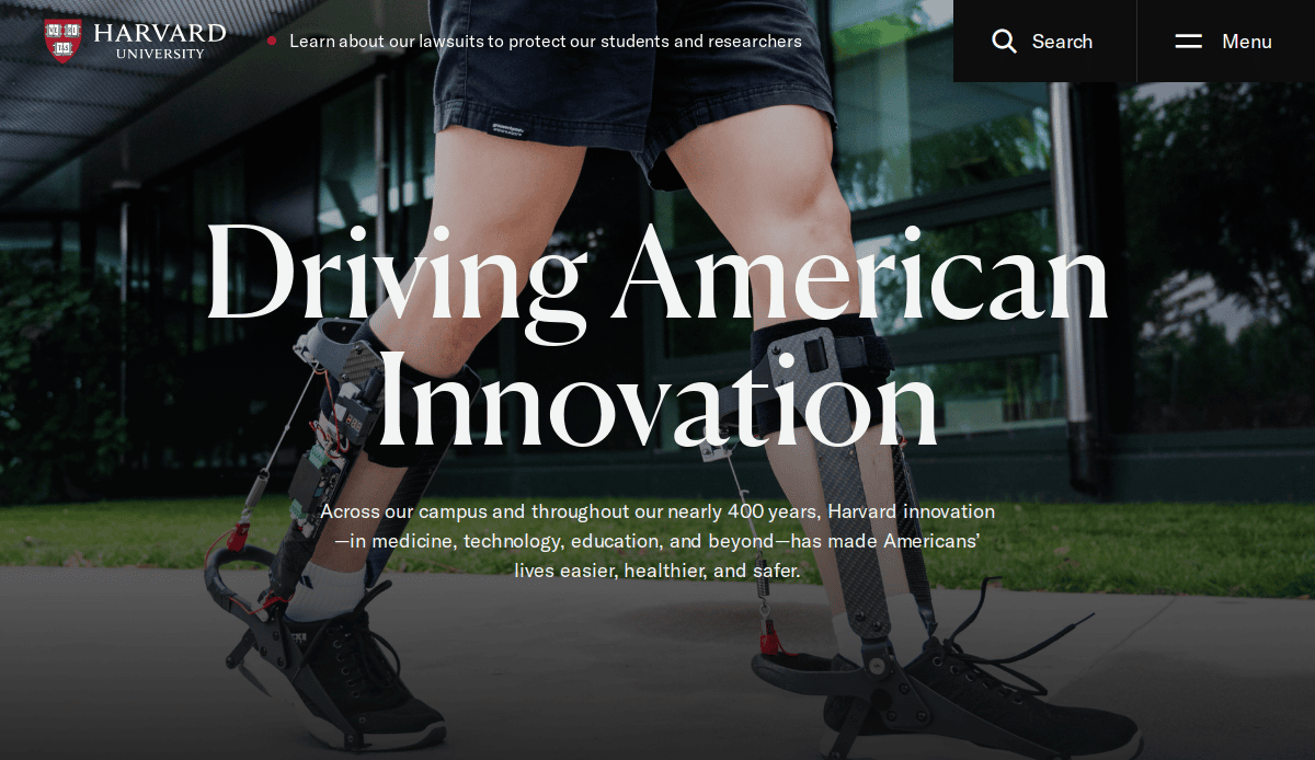
1. Harvard University
Location: Cambridge, MA
Key Takeaways:
- Timeless design reflecting academic prestige.
- Intuitive navigation enhances user experience.
- Responsive layout ensures accessibility across devices.
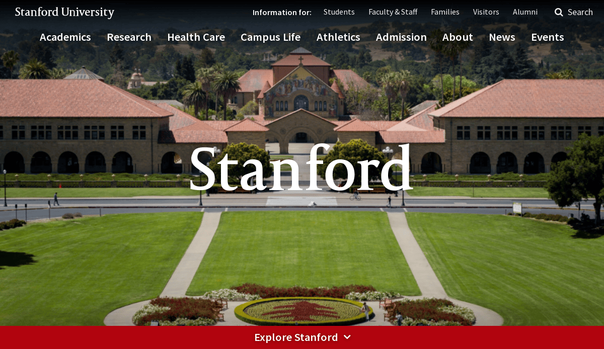
2. Stanford University
Location: Stanford, CA
Key Takeaways:
- Dynamic homepage showcasing research and student life.
- Consistent branding with strong visual elements.
- Interactive features like virtual tours engage visitors.
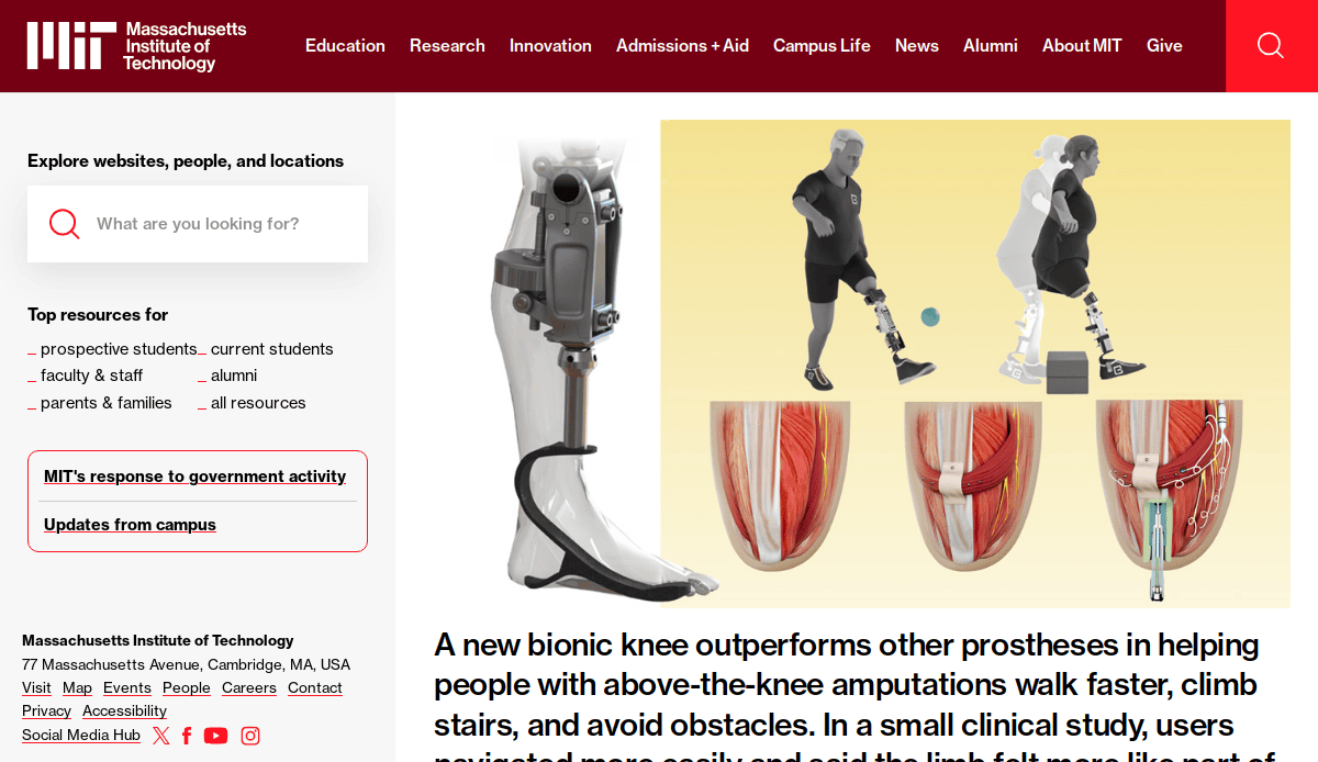
3. Massachusetts Institute of Technology (MIT)
Location: Cambridge, MA
Key Takeaways:
- Balanced use of imagery and content for clarity.
- Highlighting ongoing projects with interactive elements.
- Consistent color scheme reinforcing brand identity.
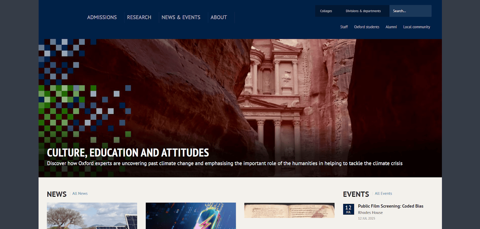
4. University of Oxford
Location: Oxford, UK
Key Takeaways:
- Blend of classic and modern design elements.
- High-quality photographs showcasing campus architecture.
- Intuitive navigation to admissions and departmental information.

5. University of Cambridge
Location: Cambridge, UK
Key Takeaways:
- Elegant, image-centric design highlighting heritage.
- Prominent news and research breakthroughs on homepage.
- Unified color palette and typography for cohesive branding.
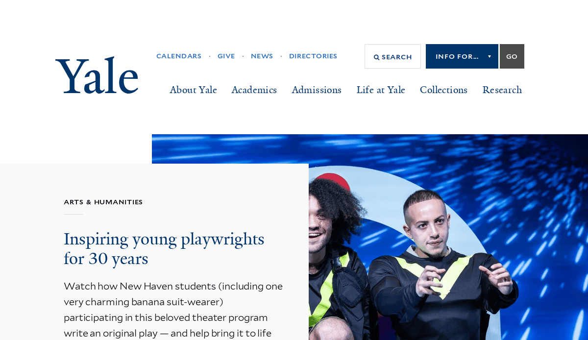
6. Yale University
Location: New Haven, CT
Key Takeaways:
- Warm color scheme with high-resolution imagery.
- Thoughtful navigation for exploring programs and research.
- Modern layout with clear headlines and calls to action.
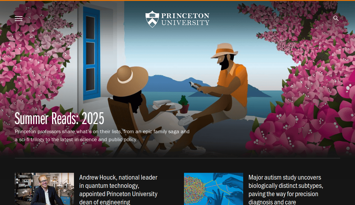
7. Princeton University
Location: Princeton, NJ
Key Takeaways:
- Dynamic carousel showcasing faculty and student achievements.
- Strategic use of white space and bold typography.
- Intuitive filters and search functions for program exploration.
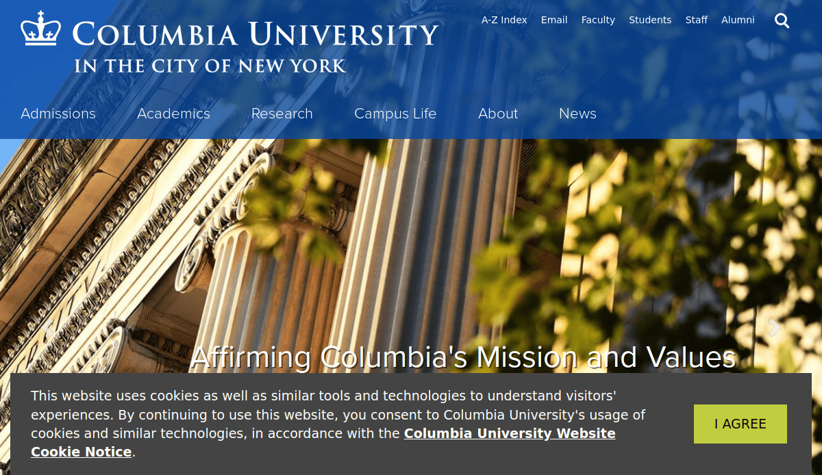
8. Columbia University
Location: New York, NY
Key Takeaways:
- Integration of tradition with contemporary design elements.
- Organized navigation directed to key university areas.
- Subtle animations enhancing user engagement.
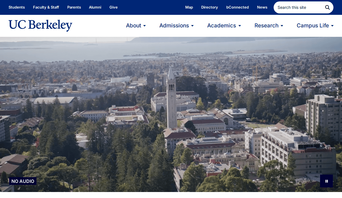
9. University of California, Berkeley
Location: Berkeley, CA
Key Takeaways:
- Visually appealing interface with bold imagery.
- Clear sections for admissions, academics, and research.
- Video highlights adding a personal touch.
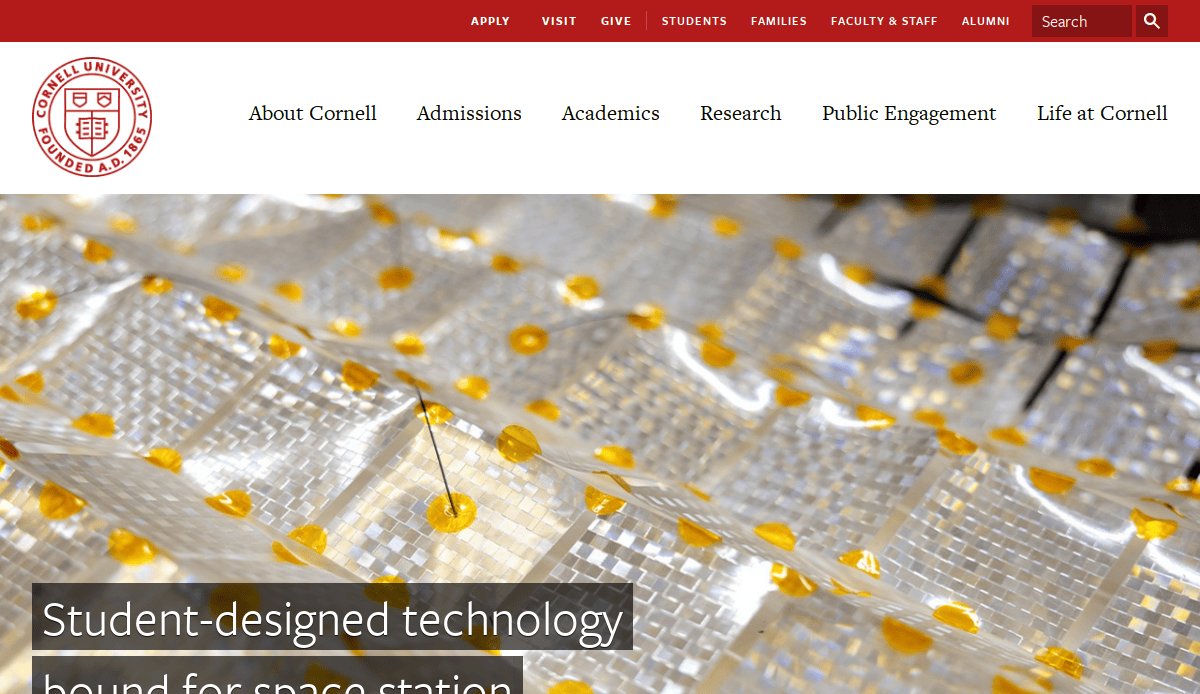
10. Cornell University
Location: Ithaca, NY
Key Takeaways:
- Refined yet approachable design.
- Intelligent organization of navigation categories.
- Prominent calls to action for various user groups.
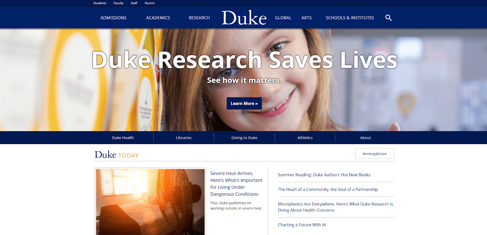
11. Duke University
Location: Durham, NC
Key Takeaways:
- Expertly curated web experience focusing on scholarly accomplishments.
- Dynamic homepage carousel featuring research and student stories.
- Strategic use of white space and bold typography.
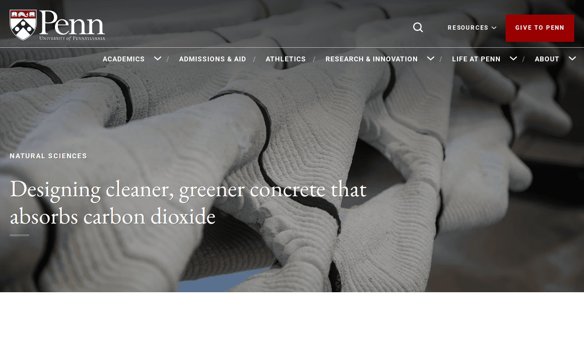
12. University of Pennsylvania
Location: Philadelphia, PA
Key Takeaways:
- Consistent branding and professional design.
- Homepage highlighting sustainability and inclusion priorities.
- Regular updates on student and campus news.
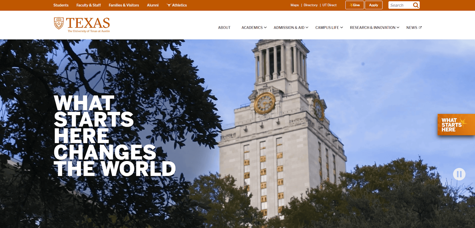
13. University of Texas at Austin
Location: Austin, TX
Key Takeaways:
- Bold typography creates a strong visual impact.
- High-resolution images enhancing site aesthetics.
- Comprehensive information catering to prospective students.
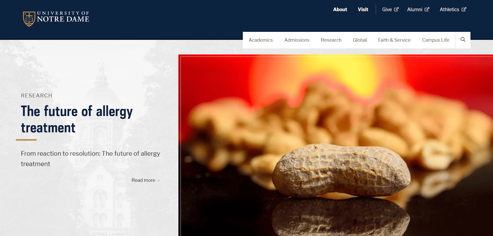
14. University of Notre Dame
Location: South Bend, IN
Key Takeaways:
- User-friendly navigation ensures smooth browsing.
- Mobile optimization for accessibility on various devices.
- Consistent color and design choices throughout the site.
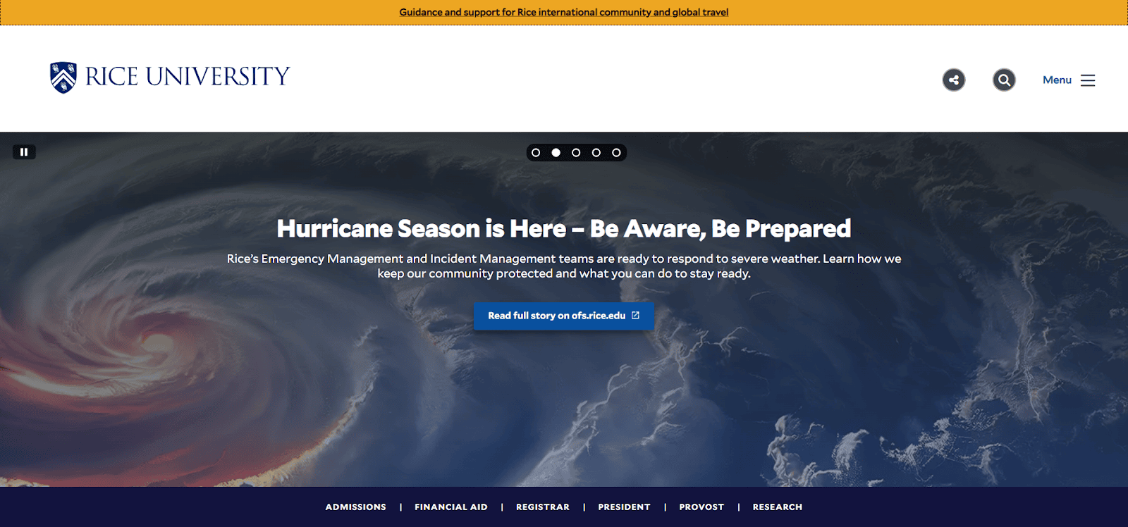
15. Rice University
Location: Houston, TX
Key Takeaways:
- Interactive illustrations of campus facilities.
- Engaging virtual tour experience.
- Unique approach to showcasing campus life.

16. University of San Francisco
Location: San Francisco, CA
Key Takeaways:
- High-quality hero image depicting student life.
- Simple yet effective menu for easy navigation.
- Quick access to essential information.
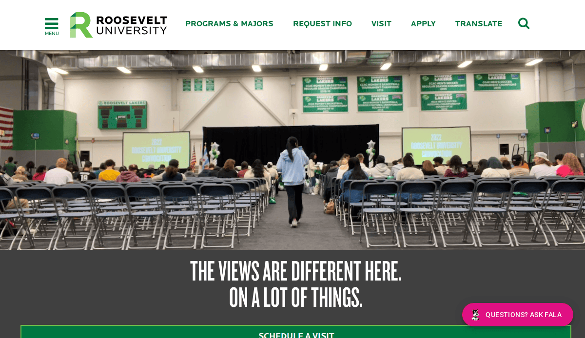
17. Roosevelt University
Location: Chicago, IL
Key Takeaways:
- Optimized experience across desktop and mobile platforms.
- Inviting calls to action guiding users to key information.
- Streamlined access to various university resources.
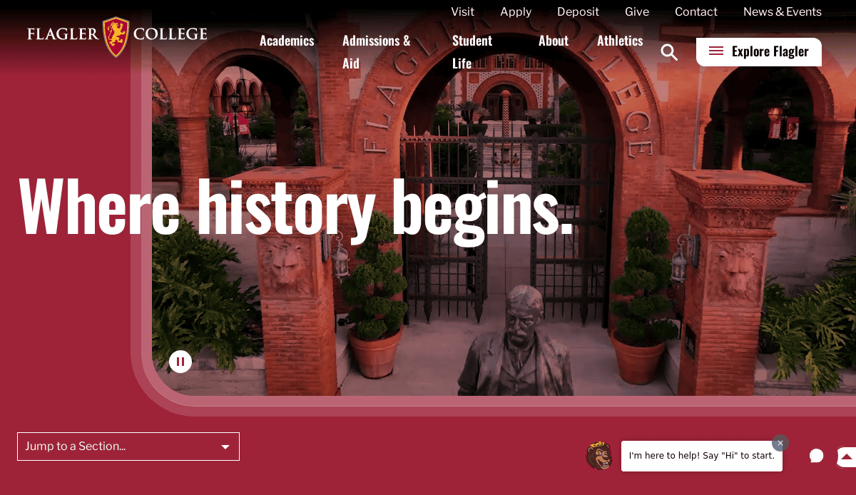
18. Flagler College
Location: St. Augustine, FL
Key Takeaways:
- Homepage featuring a campus tour video.
- Bold and vibrant color scheme.
- Emphasis on areas of interest for prospective students.

19. Adelphi University
Location: Garden City, NY
Key Takeaways:
- Exceptional accessibility features for all users.
- Descriptive alt text and captions for multimedia content.
- Inclusive design accommodating various impairments.

20. University of Pittsburgh at Bradford
Location: Bradford, PA
Key Takeaways:
- Innovative use of virtual reality for campus tours.
- Student testimonials providing authentic insights.
- Immersive experience for prospective students.
These universities exemplify excellence in web design, offering user-friendly interfaces, engaging content, and responsive layouts that cater to diverse audiences.
Take the Next Step Toward a High-Performing College Website
Whether you’re planning a redesign or building from the ground up, now is the time to align your digital presence with the needs of prospective and current students, faculty, and staff, and your broader target audience. A well-structured website is more than a collection of webpages—it’s a strategic asset that supports enrollment goals, promotes academic programs, and ensures your website reflects the values and strengths of your college or university.
Today’s website visitors want relevant information, an accessible design, and a seamless user experience across all devices. From web accessibility standards to search engine optimization, higher education institutions must design and structure their sites to meet modern expectations. The best sites succeed because they prioritize usability, organize web content strategically, and use analytics to track performance and continuously improve.
If your current site isn’t meeting those standards, we’re here to help. Our full-service digital marketing agency specializes in higher ed websites that are easy to use, fast to load, and designed for impact.
Explore our web design services for colleges and universities to take the first step toward building a site that works for your institution and the audiences it serves.
Frequently Asked Questions About College Website Design
What do students look for on a college website?
Students want clear, accessible information directly related to their academic and social interests. This includes details on admissions, related courses, campus life, and new student orientation. Prospective undergraduate students and graduate students also explore departments or offices for program-specific details and career support.
How can a website meet the needs of different audiences?
The most effective college and university websites are designed with multiple personas in mind—including prospective students, current students, faculty, staff, alumni, and counselors. Each audience needs tailored content and intuitive navigation to meet their needs without confusion or content overload. Creating a strategy around user research helps structure your webpages based on real behavior and intent.
Why is accessibility so important in site design?
Accessibility considerations ensure your website can be used by everyone, including individuals with a visual or cognitive impairment. This involves more than just readable fonts—it includes alt tags on images, proper use of alternative text, and keyboard-friendly design. Many university websites fail to comply with accessibility guidelines, which can exclude valuable users and risk non-compliance.
What design guidelines should colleges follow?
Higher education institutions should follow consistent design guidelines that align with their brand and user needs. This includes adhering to a centralized style guide, using responsive layouts for mobile devices, and maintaining a consistent URL structure. These practices make it easier for website users to navigate and find the information they need quickly.
How do top universities design their websites?
The best university websites—such as Stanford University—combine clean design, fast performance, and a strong focus on user experience. These sites prioritize strategic goals like enrollment, reputation, and research promotion while also ensuring usability across devices. Our best higher education website designs highlight what these top institutions do right.
Why should a college hire a design agency for its website?
Working with a professional design agency ensures your website doesn’t just look good—it functions well, meets accessibility and SEO standards, and reflects your college education brand. An agency brings experience with organizational needs, navigation design, and technical execution that many in-house teams struggle to manage alone.
What role do thumbnails and images play in a website?
Images—especially thumbnails on program pages, news stories, and faculty directories—help draw attention and convey information visually. They should always include alt tags and be optimized for fast loading on mobile devices to maintain accessibility and performance.
How can Google Analytics improve a website?
Google Analytics provides information that helps colleges understand how users interact with their site. It can reveal what content students look for, which webpages they visit most, and where they drop off. This data is essential for improving site navigation, refining messaging, and aligning with strategic goals.
Should each department or office have its own webpage?
Yes, but it must be well-integrated into the larger site structure. Each department or office should have a dedicated webpage that provides information relevant to its services, events, and contacts. However, content and design should still follow the institution’s style guide and design guidelines to maintain consistency.
What information should be highlighted for prospective students?
When using your website to reach prospective students, prioritize the information that they need: academic programs, admissions process, financial aid, and student life. Include content relevant to both undergraduate and graduate students, and organize it in a way that supports their research process—whether guided by a counselor or self-directed online.


