Just looking for our Best Church Website examples list?
Building a Church Website To Drive Real Results
A family moves into your town and begins looking for a new spiritual home. Their first move isn’t to check the local phone book or drive around looking for steeples. They pull out a mobile device, open a search engine, and type in “churches near me.” In that single moment, the digital first impression your church makes is everything. Will they find a welcoming, easy-to-navigate site that clearly communicates who you are, or will they find a confusing, outdated page that gets lost in the search results? The difference determines whether they ever discover your service times and walk through your doors.
For many church leaders, the task of managing a website feels like a technical chore—a box to be checked. But a powerful online presence is one of the most vital instruments of modern ministry. An effective website design does more than just look good; it is the engine for your digital outreach and the hub for your church community. It’s how you welcome newcomers, disciple your congregation, and facilitate crucial functions like online giving. A confusing site doesn’t just frustrate users; it hinders your mission.
This guide was created to change that. We will move beyond the basics of picking a template and show you how to build a great church website that works as hard as you do. We’ll provide a strategic framework that covers everything from creating a clear call to action to optimizing for search engines (a practice known as search engine optimization), ensuring your site doesn’t just exist, but thrives. It’s time to build a website that truly helps your church grow.
The Foundation: Planning a Website with Purpose
Before you look at a single template, choose a color, or write a line of text, the most critical phase of your website project begins: planning. In the corporate world, this phase is about market share and sales funnels. For a church, the stakes are different. The planning phase of your site design is about clarifying your ministry’s purpose in a digital space. It’s the process of building a blueprint that ensures your website is not just an online brochure, but a powerful tool to serve your churchgoers and reach your community. Skipping this step is the single biggest reason why websites fail to meet their potential.
Defining Your Digital Mission
Every successful ministry has a mission statement that guides its decisions. Your website needs one too. A Digital Mission Statement is a clear, concise declaration of your website’s primary purpose. It is the North Star that will guide every decision you make, from the layout of your main page to the features you choose to include. It prevents your project from becoming a collection of disconnected ideas and focuses your efforts on what truly matters.
To craft your statement, gather your church leaders and answer these three fundamental questions:
- Who is the primary audience we are trying to serve with this website?(e.g., first-time visitors in our local area, our active members)
- What is the primary action we want them to take after visiting our site?(e.g., plan a visit, join a small group, watch a lecture)
- How will we know if we are successful in six months?(e.g., we have more visitor sign-ups, online giving has increased, and more people are engaging with online resources)
Answering these questions will help your church create a focused statement like: “Our website exists to welcome and inform first-time visitors, making it easy for them to plan a visit, while also serving our congregation with accessible resources like sermons and online giving.”
Identifying Your Key Audiences
A website that tries to be everything to everyone will ultimately be effective for no one. A great website understands that it has at least two distinct, vital audiences, each with unique needs.
- The First-Time Visitor: This person is likely exploring faith or is new to your town. They are filled with questions and potential anxieties. Your website must feel like a welcoming digital handshake. They are looking for answers to questions like:
- What are the service times, and where are you located?
- What is the style of worship and preaching like?
- What should I wear?
- What programs do you have for my children?
- Will I feel out of place?
- The Active Member: This person is already part of your church community. They are not looking for your life story; they are looking for information and tools to stay connected. Their needs are practical and immediate. They want to know:
- How can I give online quickly and securely?
- Where can I find the latest address if I missed the service?
- What events are coming up on the church calendar?
- How can I sign up for that ministry event or small group?
By clearly defining the needs of these two groups, you can design a navigation and a main page structure that serves both effectively, ensuring your website helps your church both grow its flock and shepherd it well.
Design Principles for an Engaging Website
With a clear purpose and a deep understanding of your audience, you can now focus on the visual and functional aspects of your website. The design of your site is not merely decorative; it is the visual language that communicates your church’s personality and values. For a church, effective website design is about creating a feeling of welcome, trust, and clarity. Here are the core principles to guide your design process.
Clarity Over Clutter: A Simple Path for Every Visitor
A visitor’s attention is finite. When they arrive on your homepage, they should never feel overwhelmed or confused about where to go next. The most important information—service times, location, and a clear “I’m New” section—should be immediately visible without requiring the user to scroll or search.
- Why it Matters: A cluttered or confusing website creates friction and frustration. A potential first-time visitor who cannot find your location within seconds is likely to leave and look at the next church on their Google search list. An active member who has to hunt for the online giving link may abandon the process altogether.
- How to Implement It:
- Limit Your Main Navigation: Keep your main menu items to a maximum of 5-7 essential choices (e.g., About, Visit, Sermons, Events, Give). Use a dropdown menu for secondary pages.
- Embrace White Space: Do not feel the need to fill every pixel of the screen. White space (or negative space) is a powerful design tool that helps guide the eye, improve readability, and give your site a clean, professional feel.
- Use Obvious Labels: Avoid using clever or insider language in your navigation. Label pages clearly and intuitively. “Plan Your Visit” is much clearer than “Our Experience.”
Authenticity in Imagery: Reflecting Your Real Community
Stock photography has a place, but it should not be the primary visual language of your site. Your church is a living, breathing community of real people, and your website’s photography and videography should reflect that reality.
- Why it Matters: Authentic imagery builds instant trust and connection. When a potential visitor sees photos of diverse, smiling people who look like them, it subconsciously communicates that they, too, would be welcome. Generic stock photos create a sterile, impersonal feeling that can be a major turn-off.
- How to Implement It:
- Invest in Professional Photography: If budget allows, hiring a professional photographer for a Sunday service or special event is one of the best investments you can make for your website.
- Organize a Volunteer Photo Day: If a professional is not an option, find a skilled volunteer with a good-quality camera. Get permission from your churchgoers, and capture candid shots of worship, fellowship, children’s ministry, and community outreach events.
- Focus on Faces: Prioritize images that show the genuine emotion and connection within your church community. Photos of people engaged with one another are far more powerful than empty shots of your building.
Mobile-First Ministry: Designing for Your Congregation on the Go
Today, your website will be viewed more often on a mobile device than on a desktop computer. A mobile-first approach means that you design the mobile version of your website first, and then adapt that design for larger screens. This is a fundamental shift from the old method of “shrinking” a desktop site to fit a phone.
- Why it Matters: A poor mobile experience is no longer excusable. If a user has to pinch, zoom, and struggle to tap tiny buttons on their phone, they will simply give up. This is especially true for the new visitor looking up your service times on their phone on a Sunday morning. Furthermore, Google’s search engine prioritizes mobile-friendly websites in its rankings.
- How to Implement It:
- Test on Your Phone: Throughout the design process, constantly pull up the website on your own smartphone. Can you easily read the text? Are the buttons large enough to tap with your thumb? Does the navigation work intuitively?
- Simplify Forms: On mobile, filling out long, complex forms is difficult. Keep your contact and sign-up forms as short and simple as possible.
- Ensure Fast Load Times:Mobile users are often on slower cellular connections. Optimize your image sizes and streamline your design to ensure your site loads quickly.
Guiding the Next Step: The Art of the Gentle Call to Action
Every page on your website should have a purpose and guide the visitor toward the next step. A Call to Action (CTA) is a button or link that prompts the user to do something specific. These CTAs should be clear, gentle, and mission-focused.
- Why it Matters: Without clear CTAs, a visitor may read your content and then leave without ever taking a step to get more involved. CTAs build a bridge between information and participation.
- How to Implement It:
- Use Action-Oriented Language: CTAs should be compelling and use verbs. Instead of “Contact,” use “Get in Touch.” Instead of “Sermons,” use “Watch the Latest Sermon.”
- Design for Visibility: Make your CTA buttons visually distinct from the rest of your page content. Use a contrasting color that draws the eye but still fits within your overall brand palette.
- Place CTAs Strategically: Place your most important CTA (e.g., “Plan a Visit”) in a prominent location on your main page. End relevant pages with a logical next step. For example, a page describing your children’s ministry should end with a “Register Your Child” or “Meet Our Kids’ Team” button.
Content & Navigation: Building a Clear Path for Every Visitor
Once you have established your design principles, the next step is to structure your website’s content and navigation. This is the “information architecture” of your site—the blueprint that dictates how information is organized, labeled, and interconnected. The goal is to create an intuitive and welcoming journey for every user, whether they are a first-time visitor looking for service times or an active member trying to find a specific resource.
Crafting Your Core Pages: The Must-Haves for Every Website
While your church’s unique ministry will influence your specific pages, there is a set of core pages that every effective website must have. Think of these as the foundational pillars of your digital home.
- Homepage: This is your digital front door and your most valuable real estate. Its primary job is to welcome visitors, communicate your church’s identity at a glance, and direct different audiences to the information they need most.
- Essential Content: A welcoming headline, high-quality photos of your actual churchgoers, clear service times and location, a prominent “I’m New” or “Plan a Visit” button, and links to recent talks or upcoming events.
- About Us: This section tells your story and introduces your leadership. It helps visitors understand your church’s personality, beliefs, and what makes you unique.
- Essential Content: Your church’s mission and vision, a statement of faith or core beliefs, a brief history, and bios and photos of your key pastors and staff.
- I’m New / Plan a Visit: This is arguably the most important page for church growth. It should be designed specifically to answer the questions and ease the anxieties of a first-time visitor.
- Essential Content: A friendly welcome video, a detailed “What to Expect” section (covering worship style, dress code, service length), clear directions and a map, information about children’s and youth programs, and a simple contact form for them to ask questions or let you know they are coming.
- Sermons / Messages: This is a vital resource for both your current members and those exploring your church from afar. It should be easy to browse and use.
- Essential Content: A searchable and filterable archive of past addresses. Each sermon should include the video or audio, the date, the speaker, the series it belongs to, and ideally, a transcript or discussion notes.
- Events / Calendar: This page is the central hub for all church activities. It keeps your congregation informed and makes it easy for newcomers to see how they can get involved.
- Essential Content: A clean, easy-to-read calendar view of all upcoming events, services, and meetings. Each event should be clickable, leading to a page with more details, including time, location, cost (if any), and a contact person.
- Give: In the digital age, a simple and secure online giving page is non-negotiable. It should be trustworthy and completely frictionless.
- Essential Content: A prominent button or form to give, clear options for one-time or recurring donations, security reassurances (e.g., logos of security providers), and a brief statement about how their generosity fuels the ministry.
Designing Your Main Menu: Simple Paths, Clear Labels
Your main navigation menu is the primary tool visitors will use to find their way around your site. The goal is to make this process effortless.
- Keep it Simple: Limit the number of items in your main navigation bar to 5-7 top-level choices. Too many options lead to decision paralysis. Group related pages under a single, logical heading (e.g., “Ministries” could have a dropdown menu for “Kids,” “Youth,” and “Small Groups”).
- Use Clear Language: This is not the place for clever, insider jargon. Use straightforward terms that anyone can understand. “Give” is better than “Stewardship.” “About Us” is better than “Our Story.” “Plan a Visit” is better than “The Experience.”
- Organize by Priority: Arrange your navigation items logically, usually from left to right in order of importance. For most churches, “I’m New” or “Visit” should be one of the first items, and “Give” is often placed last, on the far right.
- Utilize the Footer: The footer at the bottom of your website is the perfect place for secondary links that don’t need to be in your main menu. This includes links to your privacy policy, staff email directory, member login portal, social media profiles, and detailed contact information. This keeps your main navigation clean while still providing access to important information.
Visual Elements: Communicating Your Church’s Unique Identity
Visual elements are the heart and soul of your website’s design. They are not just decoration; they are a powerful, non-verbal language that communicates your church’s personality, values, and vision. From your color scheme to your choice of photographs, these elements work together to create an immediate feeling and a lasting impression. A cohesive visual strategy builds trust, enhances user experience, and makes your brand memorable. It’s how you ensure your website feels like your church.
Color Palette: Setting the Mood of Your Ministry
The colors you choose for your website have a profound psychological impact on your visitors. They set the tone before a single word is read. A vibrant, energetic color palette might communicate a lively, modern church, while a more subdued, earthy palette might suggest tradition, peace, and contemplation.
- Why it Matters: Color choices influence emotion and perception. A well-planned palette makes your website look professional, trustworthy, and intentional. A chaotic or clashing color scheme can feel unprofessional and jarring, undermining the credibility of your message.
- How to Implement It:
- Start with 2-3 Core Colors: You don’t need a rainbow. A primary color, a secondary color, and an accent color are usually sufficient.
- Consider Color Psychology: Blues often convey trust, stability, and calm. Greens can represent growth, nature, and health. Yellows and oranges can evoke energy, joy, and warmth. Think about the feeling you want your church to embody.
- Ensure High Contrast for Readability: Your primary goal is to make your text easy to read. Always place dark text on a light background or light text on a dark background. Use a contrast checker tool online to ensure your choices are accessible to people with visual impairments.
Typography: The Voice of Your Written Word
If colors set the mood, typography is the voice your visitors hear when they read your content. The fonts you select say a great deal about your church. A traditional serif font (like Times New Roman) can feel classic and reverent, while a clean sans-serif font (like Helvetica or Lato) can feel modern, friendly, and approachable.
- Why it Matters: Typography directly impacts readability and sets the personality of your brand. A font that is difficult to read will frustrate users and cause them to abandon your content. The style of the font itself contributes to your overall brand identity.
- How to Implement It:
- Limit Font Choices: Use no more than two or three fonts throughout your entire website to maintain a clean and consistent look. A common and effective practice is to use one font for headlines and a different, highly readable font for the main body text.
- Prioritize Readability: For paragraphs and body text, choose a font that is simple and easy to read at various sizes. Test it on both desktop and mobile screens.
- Establish a Clear Hierarchy: Use different font sizes, weights (bold, regular), and styles (italics) to create a clear visual hierarchy for your content. This helps users scan the page and easily distinguish between headlines, subheadings, and body paragraphs.
Imagery and Videography: Showing, Not Just Telling
The most powerful way to communicate the life of your church is through authentic images and videos of your community. While your text tells visitors what you do, your visuals show them who you are.
- Why it Matters: Authentic imagery builds an immediate emotional connection and establishes trust in a way that words alone cannot. It allows potential visitors to see themselves as part of your community, breaking down barriers and reducing the anxiety of visiting a new place.
- How to Implement It:
- Eliminate Cheesy Stock Photos: Avoid generic, posed photos of smiling models. Visitors can spot them from a mile away, and they create a sense of corporate inauthenticity.
- Capture Candid Moments: Your best photos will come from real church life—people laughing in the lobby, hands raised in worship, volunteers serving the community, and kids engaged in their classroom. These candid moments tell a true and compelling story.
- Create a Welcome Video: A short, 1-2 minute video on your main page featuring your pastor and members of your church can be an incredibly effective tool. It makes your church feel personal and approachable from the moment a visitor arrives on your site.
Branding and Logo: A Consistent Visual Signature
Your church’s logo is the most concise representation of your visual identity. It should be used consistently across your website to create a professional and unified brand experience.
- Why it Matters: A clear, professional logo acts as a stamp of quality and recognition. When visitors see the same logo on your website, your social media profiles, and your physical building, it creates a sense of cohesion and reinforces your identity.
- How to Implement It:
- Use a High-Resolution Version: Ensure your logo is clear and sharp, not pixelated or blurry. Use a PNG file with a transparent background for maximum versatility.
- Place it Prominently: our logo should typically be placed in the top-left corner of your website’s header and should link back to the main page.
- Maintain Consistency: Use the same logo and brand colors across all digital and physical materials to build brand recognition and present a unified, professional front for your ministry.
A Living Platform: The Necessity of Ongoing WordPress Maintenance
Launching your website is a major accomplishment, but it is the beginning, not the end, of your digital ministry journey. A WordPress website is a dynamic platform, not a static brochure. Just like a physical church building requires regular upkeep to remain safe and welcoming, your website requires ongoing maintenance to function correctly, stay secure from threats, and provide a seamless experience for your visitors. Neglecting this crucial process can lead to slow performance, broken features, and serious security vulnerabilities.
Core Updates: Keeping Your Website Healthy and Secure
Your WordPress site is built from three main software components: the WordPress core, your theme, and your plugins. Developers of these components release regular updates that provide new features, fix bugs, and, most importantly, patch security holes.
- What It Is: This task involves regularly checking your WordPress dashboard for available updates to the WordPress software itself, the visual theme you have installed, and all the plugins that provide functionality like event calendars or online giving forms.
- Why It’s Critical: Outdated software is the number one entry point for hackers. A known vulnerability in a single, old plugin can compromise your entire website, potentially leading to data breaches, malicious content being shown to your visitors, or your site being taken offline completely. These updates are your first and best line of defense.
- How to Do It: WordPress makes updates relatively simple. When logged into your dashboard, you will see a notification number next to “Updates.” From there, you can select the components to update and run the process. It is best practice to back up your site before running any major updates.
Your Digital Safety Net: The Critical Role of Regular Backups
A complete backup of your website is your most important insurance policy. In the event of a catastrophic server failure, a hacking incident, or a human error that breaks the site, a recent backup allows you to restore your digital ministry with minimal downtime.
- What It Is: A backup is a complete copy of all your website’s files and its database, which stores all your pages, posts, and settings. These copies should be created on a regular schedule and, crucially, stored in a separate, off-site location like Google Drive, Dropbox, or a dedicated backup server.
- Why It’s Critical: Without a backup, a serious issue could mean losing all your content permanently—every church address, every blog post, and every page you have built. For a church, this loss of historical records and resources can be devastating.
- How to Do It: The most reliable method is to use a trusted WordPress backup plugin, such as UpdraftPlus or Solid Backups (formerly BackupBuddy). These can be configured to run automatic backups on a schedule (e.g., daily or weekly) and send the backup files directly to your preferred cloud storage location.
Guarding the Flock: Proactive Security and Monitoring
Beyond just performing updates, active security monitoring is essential for protecting your website and the data of your churchgoers. Hackers are constantly scanning websites for weaknesses, and you need a system in place to block their attempts and alert you to suspicious activity.
- What It Is: Proactive security involves using a dedicated security plugin to act as a firewall, scan for malware, and monitor login attempts. It also includes practicing good “password hygiene” for all users who can access the website’s backend.
- Why It’s Critical: A security breach can damage your church’s reputation and compromise sensitive information from your members. A proactive approach helps block attacks before they happen and provides the tools to clean up an infection if one occurs.
- How to Do It: Install a comprehensive security plugin like Wordfence or Sucuri Security. Configure its firewall and schedule regular malware scans. Enforce the use of strong, unique passwords for all administrator and editor accounts, and consider implementing two-factor authentication for an additional layer of protection.
For many busy church leaders and volunteers, managing these ongoing tasks can feel overwhelming. This is why many churches choose to partner with a provider who offers website maintenance and support plans. This ensures all critical updates, backups, and security monitoring are handled by experts, allowing you to focus on your ministry, not your technology.
Best Church Website Design Examples
Here are 20 of the best church websites that effectively serve their communities and reach newcomers. They showcase strong design principles, clear communication, and a heart for ministry.
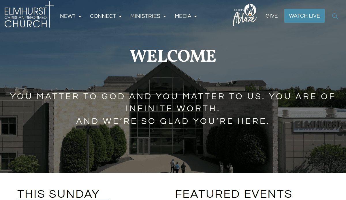
1. Elmhurst Christian Reformed Church
- Location: Elmhurst, IL
- 3 Key Takeaways:
- Warm & Inviting Photography: The site uses high-quality, authentic photos of its congregation, creating an immediate sense of a welcoming community.
- Clear Next Steps: Prominent “Plan a Visit” and “Watch Live” buttons on the main page make it easy for users to take their next step in engaging with the church.
- Well-Organized Navigation: The menu is simple and intuitive, allowing visitors to easily find information about ministries, events, and beliefs without feeling overwhelmed.
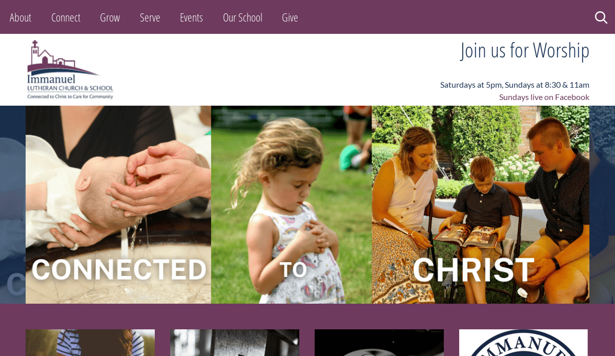
2. Immanuel Lutheran Church
- Location:Elmhurst, IL
- 3 Key Takeaways:
- Strong Brand Cohesion:The website uses a consistent color palette and typography that aligns perfectly with the church and school’s branding, creating a professional and unified look.
- Action-Oriented Homepage:This main page effectively uses clear sections and calls-to-action for its primary ministries, including the church, school, and childcare.
- Integrated Blog/News Section:The “From the Blog” section is prominently featured, keeping the content fresh and offering insights into the church’s life and teachings.
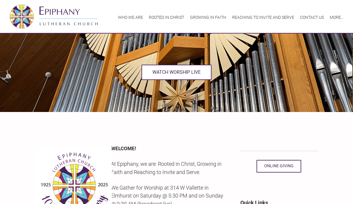
3. Epiphany Lutheran Church
- Location:Elmhurst, IL
- 3 Key Takeaways:
- Clear Statement of Welcome:The homepage immediately communicates a message of inclusion, stating “all are welcome” with specifics, which is powerful for new visitors.
- Simple & Clean Layout:The design avoids clutter, using ample white space that makes the content easy to read and digest.
- Effective Use of “Quick Links”:A dedicated quick links section helps regular members quickly access important information like the calendar and newsletter.
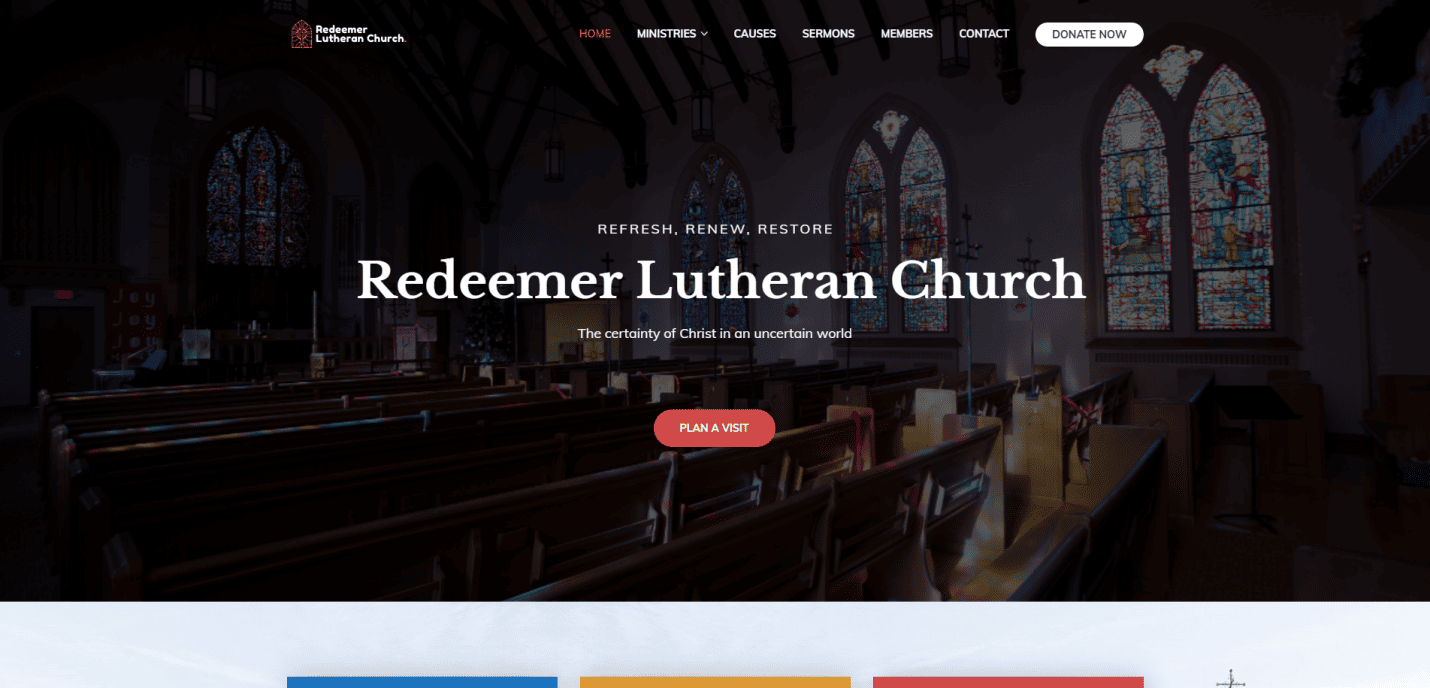
4. Redeemer Lutheran Church
- Location: Elmhurst, IL
- 3 Key Takeaways:
- Prominent Sermon Series:The current series of talks is featured with strong graphics on the homepage, immediately giving visitors a sense of the church’s teaching style.
- Countdown Timer for Services:A live countdown to the next service creates a sense of anticipation and urgency for online worship.
- Mission-Focused Tagline:The tagline “Receive… Renew… Rejoice” is simple, memorable, and effectively communicates the church’s core focus.
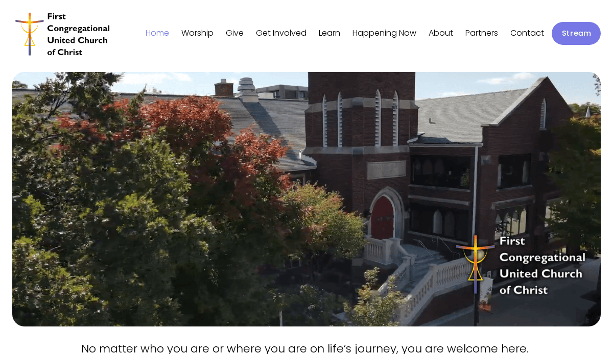
5. First Congregational United Church of Christ
- Location: Downers Grove, IL
- 3 Key Takeaways:
- Values-Driven Content: The website clearly articulates the church’s values on the homepage, giving visitors a deep understanding of what they stand for.
- Powerful Testimonials: Integrating quotes from members provides social proof and a personal touch that is very compelling for newcomers.
- Inclusive Language: The copy throughout the site is intentionally inclusive and welcoming, aligning with the church’s “Open and Affirming” stance.
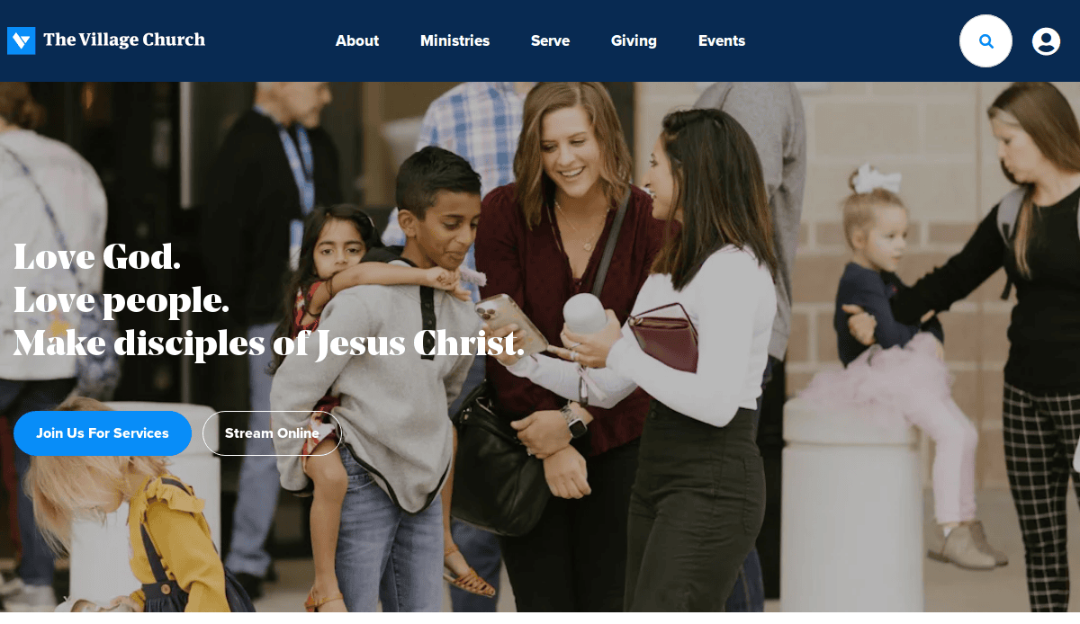
6. The Village Church
- Location: Flower Mound, TX
- 3 Key Takeaways:
- Bold, Simple Homepage: The homepage focuses on one primary message at a time, making it incredibly clear and impactful.
- Excellent Use of Typography: The font choices are modern yet readable, creating a strong brand identity that feels both authoritative and approachable.
- Resource-Rich: The site offers a deep well of resources, including articles, church addresses, and podcasts, establishing the church as a theological authority.
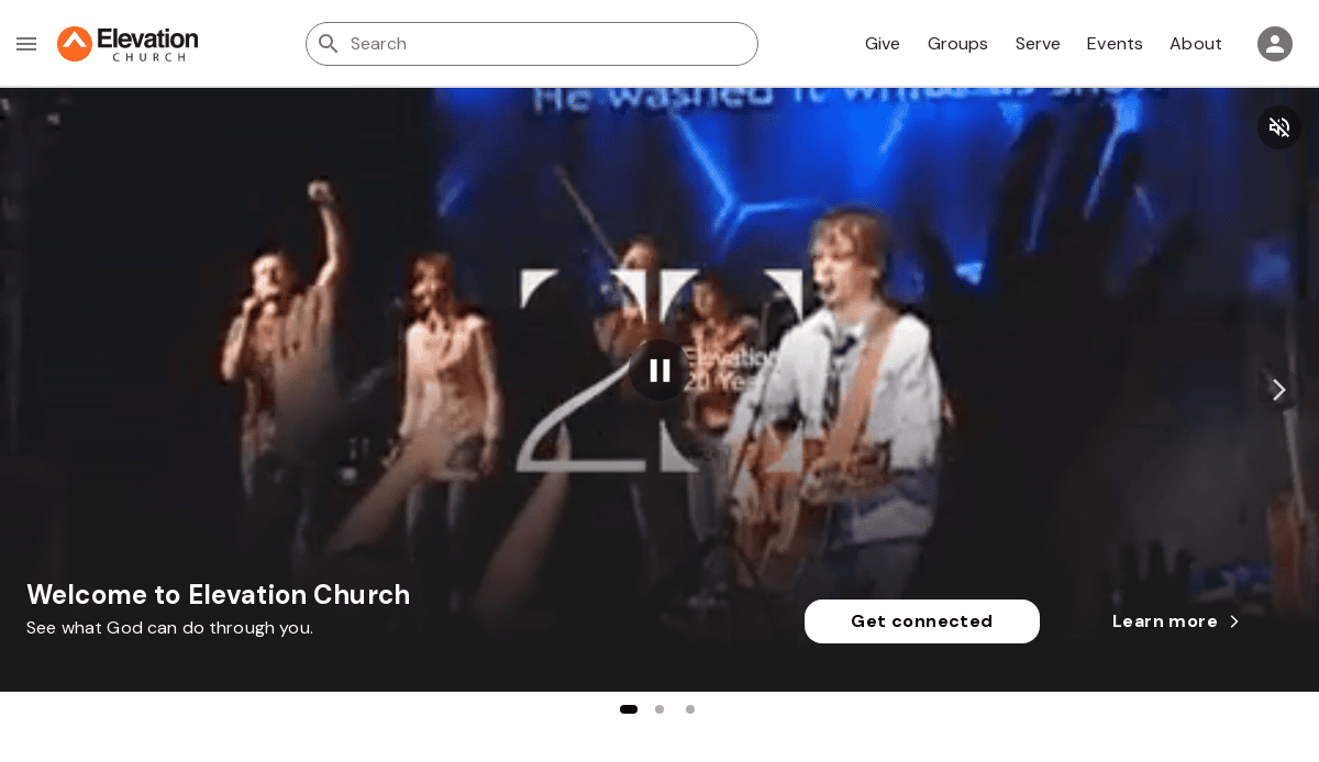
7. Elevation Church
- Location: Matthews, NC
- 3 Key Takeaways:
- High-Energy Video & Imagery: he website uses dynamic, high-production value video and photos that capture the energy and scale of their worship experiences.
- Seamless Online Giving: The “Give” call-to-action is always present, and the giving interface is one of the cleanest and simplest available.
- Global Focus: The site effectively highlights the church’s global reach and online ministry, making it feel accessible to anyone, anywhere.
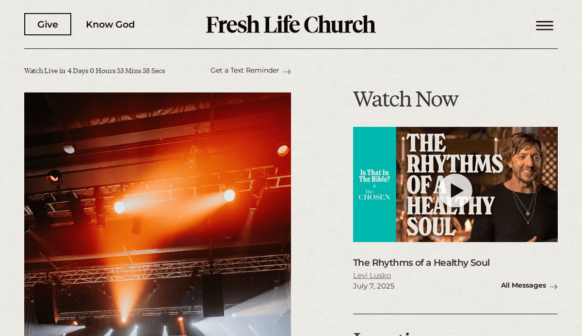
8. Fresh Life Church
- Location: Kalispell, MT
- 3 Key Takeaways:
- Unique and Consistent Branding: The rugged, outdoor-themed branding is unique in the church space and is applied consistently across the entire site.
- Story-Driven Approach: The site effectively tells the story of the church’s mission and impact through compelling visuals and narratives.
- Clear Path to Engagement: From the homepage, it’s immediately clear how to watch online, find a location, or join a group.
9. Churchome
- Location: Kirkland, WA
- 3 Key Takeaways:
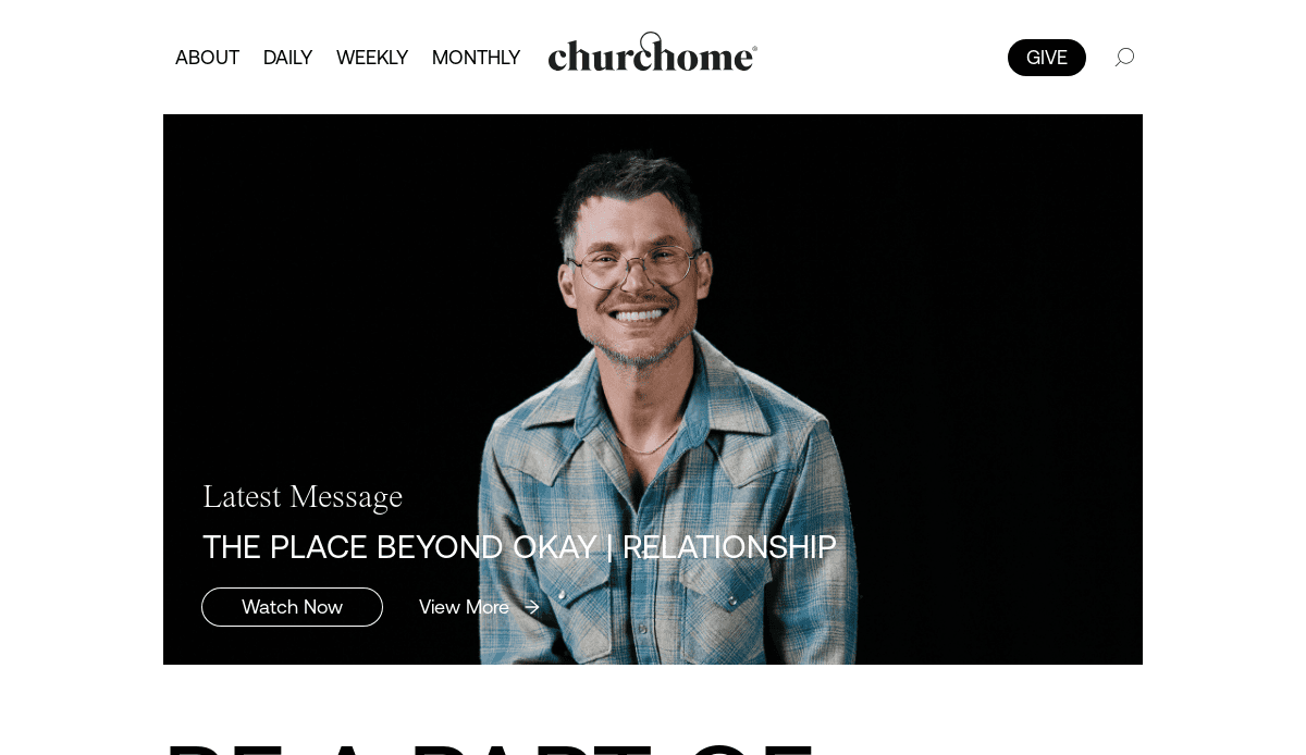
- Mobile-First Design: The website is clearly designed with mobile users in mind, functioning almost like an app with simple, tap-friendly navigation.
- Focus on “Community”: The language and imagery are heavily focused on small groups and personal connection, reinforcing their “church at home” model.
- Minimalist Aesthetic: The clean, minimalist design with lots of white space makes the site feel modern, calming, and easy to navigate.
10. Passion City Church
- Location: Atlanta, GA
- 3 Key Takeaways:
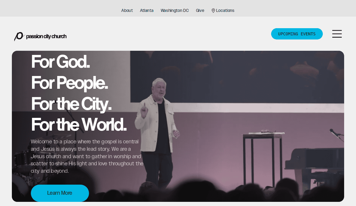
- Visually Stunning: The site uses artistic, high-contrast photography and a dark theme that is visually striking and memorable.
- Atmospheric Video Backgrounds: The subtle video backgrounds create a sense of atmosphere and draw the user into the worship experience.
- Strong Event Promotion: Major events and conferences are given prominent space and are integrated seamlessly into the site’s design.
11. The Potter’s House
- Location: Dallas, TX
- 3 Key Takeaways:
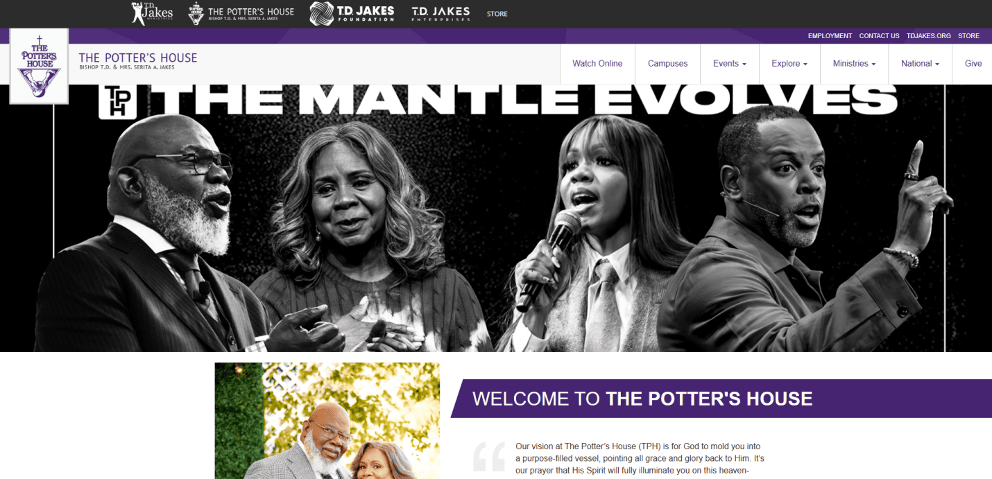
- Leader-Centric Branding: The website prominently features Bishop T.D. Jake’s, leveraging his personal brand to connect with a global audience.
- Comprehensive Media Library: The site offers an extensive and well-organized library of church addresses, books, and other media resources.
- Clear Ministry Pathways: The navigation clearly directs users to the church’s various ministries, from outreach to education.
12. Lakewood Church
- Location: Houston, TX
- 3 Key Takeaways:
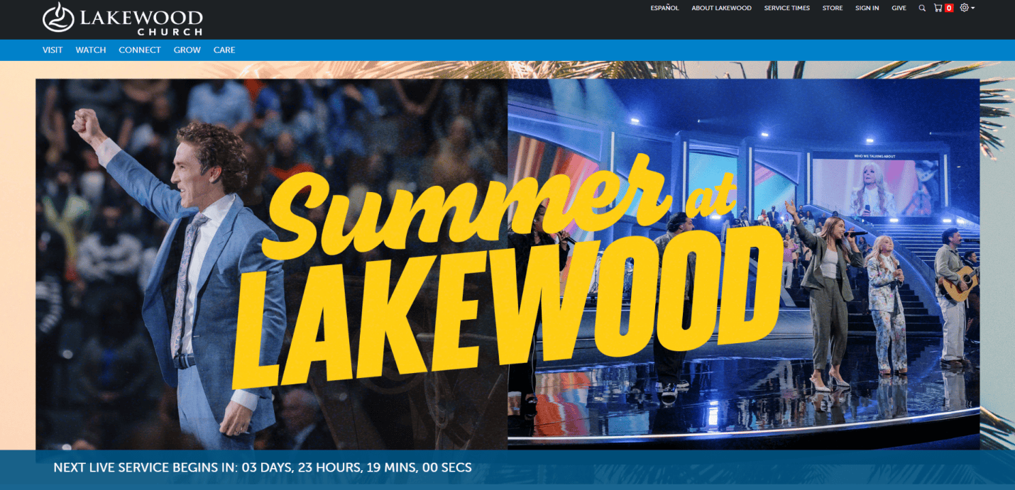
- Inspirational Tone: The entire site, from the copy to the imagery, is designed to be uplifting and hopeful, reflecting the church’s message.
- Prominent “Hope for Today” Section: A dedicated section for daily inspiration makes the site a resource that users can return to frequently.
- Bilingual Accessibility: The site offers an easy toggle for English and Spanish, making it accessible to a broader community.
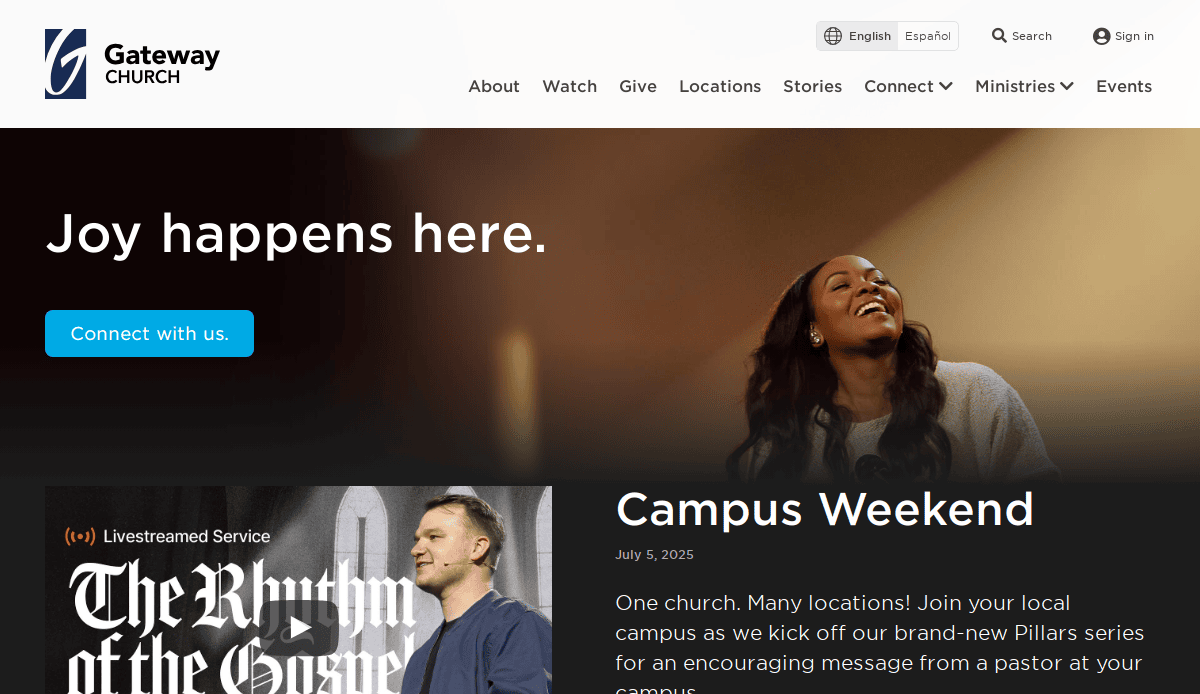
13. Gateway Church
- Location: Southlake, TX
- 3 Key Takeaways:
- Campus-Centric Navigation: The site makes it incredibly easy for users to find and select their specific campus, personalizing their experience.
- Warm and Welcoming “New Here?” Page: The page for new visitors is exceptionally well done, answering key questions and making people feel at ease.
- Strong Use of “Next Steps”: The site constantly provides clear and gentle prompts for users to take their next step, whether it’s joining a group, serving, or giving.
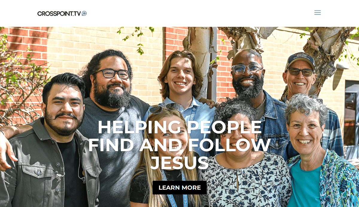
14. Cross Point Church
- Location: Nashville, TN
- 3 Key Takeaways:
- Relatable Tagline: “Everyone’s Welcome, Nobody’s Perfect, Anything’s Possible” is a powerful and memorable tagline that sets a welcoming tone.
- Question-Based Navigation: he “I’m looking for…” dropdown menu is a unique and user-friendly way to guide visitors to the right content.
- Authentic Storytelling: The “Stories” section provides powerful video testimonials that showcase life change in a compelling way.
15. Flatirons Community Church
- Location: Lafayette, CO
- 3 Key Takeaways:
- Unconventional and Bold Design: The design feels more like a modern tech company or outdoor brand than a traditional church, which appeals to their target audience.
- Direct and Authentic Copy: The language used is very down-to-earth and avoids “churchy” jargon, making it highly relatable.
- Clear Focus on a Single CTA: The homepage often directs users to a single, primary call-to-action, such as “Watch Now,” which simplifies the user journey.
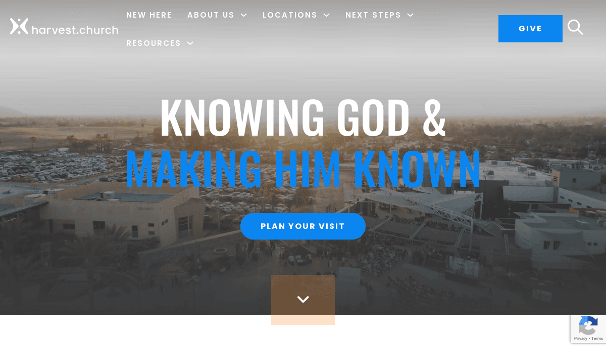
16. Harvest Christian Fellowship
- Location: Riverside, CA
- 3 Key Takeaways:
- Mission-Forward Homepage: The mission “Knowing God and Making Him Known” is front and center, providing immediate clarity of purpose.
- Robust “Get Involved” Section: The site does an excellent job of showcasing the wide variety of ministries and making it easy to sign up to serve.
- Strong Use of Event Calendars: he calendars are clean, easy to filter, and provide all the necessary information for upcoming events.
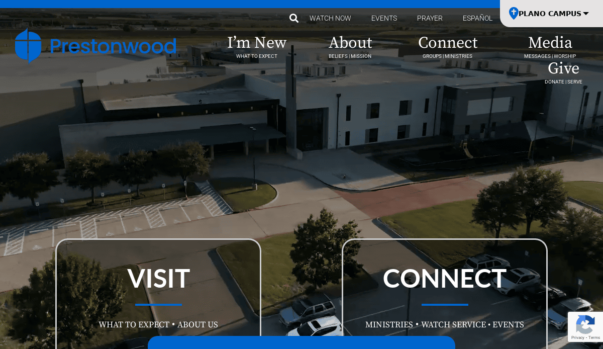
17. Prestonwood Baptist Church
- Location: Plano, TX
- 3 Key Takeaways:
- Ministry-Rich Navigation: The mega-menu effectively organizes a vast number of ministries and programs without being overwhelming.
- Campus-Specific Information: Users can easily toggle between campuses to see relevant service times, events, and staff information.
- Professional and Trustworthy Design: The clean, corporate-style design communicates a sense of stability, organization, and professionalism.
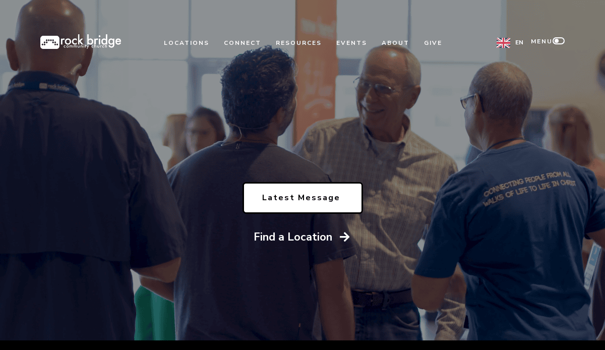
18. Rock Bridge Community Church
- Location: Dalton, GA
- 3 Key Takeaways:
- Community-Focused Imagery: The photography consistently emphasizes small groups and people in community, reinforcing the church’s name and mission.
- Simple, Clean Navigation Bar: The primary navigation is limited to a few key items, making it extremely easy for a new visitor to understand.
- Effective “What To Expect” Video: The video for new visitors is authentic and features real members, which helps reduce anxiety for newcomers.
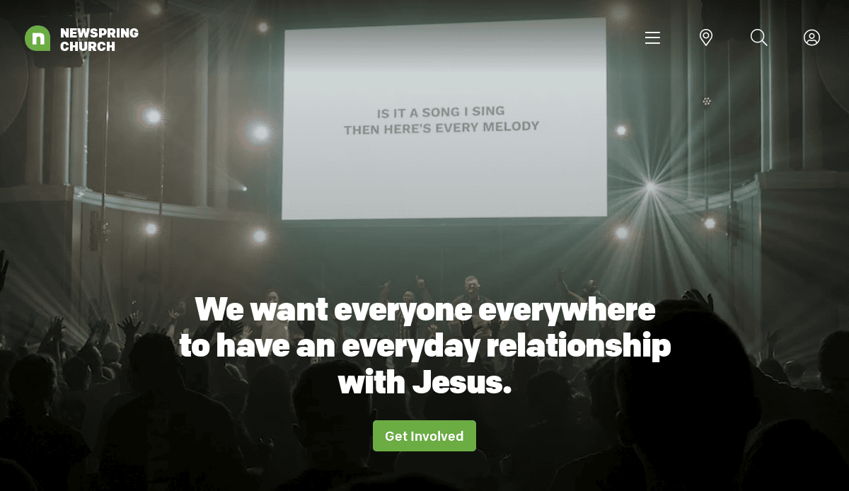
19. NewSpring Church
- Location: Anderson, SC
- 3 Key Takeaways:
- Exceptional Typography and Visuals: The site uses large, bold fonts and high-resolution images to create a powerful and modern visual impact.
- Clear Next Steps for New Visitors: A dedicated “New Here?” button is always visible, leading to a page that clearly outlines what to expect.
- Focus on Life Change: The website consistently highlights stories of baptism and life change, effectively communicating the church’s impact.
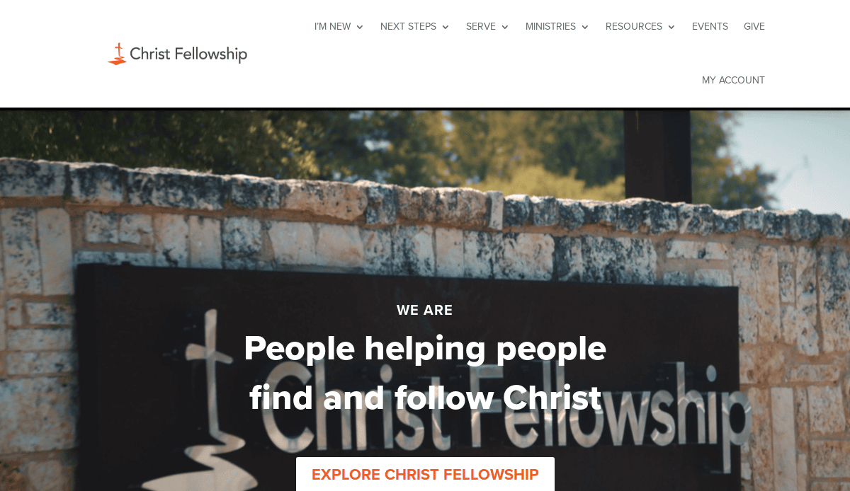
20. Christ Fellowship
- Location: McKinney, TX
- 3 Key Takeaways:
- Warm and Inviting Color Palette: The use of warm colors and soft textures in the design creates a comfortable and welcoming feel.
- Clear and Concise Copy: The website’s text is easy to read and gets straight to the point, respecting the user’s time.
- Family-Friendly Focus: The imagery and highlighted ministries clearly communicate a strong focus on families and children.
Ready to Build Your Church Website?
You now have a complete blueprint for how to create a website that serves as a powerful ministry tool. From initial planning and design to content strategy and technical SEO, it’s clear that the process to build a website involves more than just choosing a website builder. While a dedicated web builder can be a starting point, crafting a site that truly engages your community and reaches newcomers requires a thoughtful, strategic approach. The details matter, and you don’t have to navigate them alone.
If you’re ready to build your church website but want an expert partner to guide you through the process, our team is here to help.
Contact us today for a free consultation!
Frequently Asked Questions About Church Website Design
What is the most important thing to focus on when you build a website?
The single most important thing is clarity of purpose. Before you consider design options or a website builder, you must define who your website serves and what you want them to do. A successful website is built around the specific church needs of its two primary audiences: first-time church visitors searching for a church and your existing congregation. Focus on providing clear information about your church, making it easy for people to find your service times and location, and telling the story of your church community authentically. A great website is less about flashy features and more about how effectively it helps people connect with your church.
How much does it cost to build a professional website for your church?
The cost can vary widely based on your goals. Using a simple DIY website builder can be a low-cost entry point, but it often comes with limitations in design and functionality. To create a custom, professional website that is built to reach more people and support your church management needs, you are looking at a more significant investment. This investment covers strategic planning, custom modern design, development, and SEO. Think of it not as a cost, but as an investment in a critical piece of your ministry infrastructure that enhances your ability to engage with your church online and in person.
Should we use a DIY church website builder or hire a professional?
This depends on your church’s resources, technical comfort level, and long-term goals. A site builder can make the process of getting a basic site online seem faster and easier, but you may be limited by a template. Hiring a professional for designing your website offers significant advantages. An expert can create a custom website that reflects the unique story of your church, ensure an intuitive design for all website visitors, and build a scalable website platform that grows with your ministry. For churches and ministries serious about using their church web presence to reach more people, a professional partner is almost always the better choice.
What key features help a website reach more people?
To reach more people who are searching for a church, your website needs to be built with growth in mind. The most critical feature is a welcoming and informative page for new church visitors. Beyond that, strong Search Engine Optimization (SEO) is essential to help people find your church through search engines like Google. A regularly updated sermon archive and blog can also attract new website visits. Finally, a responsive design that works perfectly on any mobile device is non-negotiable, as most people will visit your website on their phone first. These features work together to help create a welcoming first impression that encourages someone to visit your church in person.
How can we make sure our existing website truly reflects our community church?
If your existing website doesn’t feel like it reflects your community, a redesign or refresh is a great idea. Start by gathering high-quality, authentic photos of your actual church members—this is the fastest way to make the site feel personal. Update your “About Us” section to tell the current story of your church. Ensure you have a professionally designed logo for your church and use it consistently. A key step is also to reorganize your content and navigation to better meet your church’s needs. A clear structure helps website visitors easily find information and is crucial for a great website. For a detailed walkthrough on this, see our Website Organization Guide.

