Just looking for our Best Candy Website examples list?
Why Great Candy Website Design Drives Business Growth
In the world of sweets, your website isn’t just a storefront—it’s your brand’s first impression, digital shelf, and most powerful sales tool. Whether you’re running a boutique chocolate brand or a bustling online candy store, a thoughtfully designed site can make all the difference in turning visitors into loyal customers.
Today’s shoppers are visually driven and quick to bounce from sites that confuse or overwhelm. A well-crafted candy shop website uses every pixel with purpose. From a strategic color palette that evokes emotion to intuitive design elements that streamline the user journey, design is the silent salesperson that works 24/7.
Even the tastiest treats need the right packaging—and online, that means building a site that looks irresistible and functions flawlessly. This guide will show you how to create a high-performing WordPress website that looks sweet and entices, converts, and scales with your business.
Website Planning & Purpose
Before designing a website, it’s essential to start with a clear strategy. Unlike other industries where form follows function, candy brands must balance fun and flair with performance and usability. Planning a candy store or chocolate brand site means thinking beyond the homepage—it’s about defining goals, understanding your target audience, and mapping their journey from first click to final checkout.
Start by outlining the business objectives: Are you focused on brand storytelling, product sales, or driving traffic to physical retail locations? Each of these goals impacts layout choices, content hierarchy, and what design elements are emphasized. For example, a candy shop emphasizing e-commerce will prioritize fast-loading product pages, clean navigation, and secure, frictionless checkout experiences.
Next, define your customer personas. Who are they—parents shopping for gifts, chocolate enthusiasts, or impulse buyers browsing mobile? Knowing their motivations and behaviors helps determine how to structure calls to action, what imagery to prioritize, and how to build trust with clear value propositions.
This phase also includes competitor analysis and inspiration-gathering to spot trends and set your site apart. Identify what your competitors do well and where their designs fall short. Then, outline your sitemap and wireframe key pages.
For more on this foundational step, explore our Core Principles of Web Design to learn how structure, flow, and clarity are essential in creating a successful online experience.
Website planning isn’t just a box to check—it’s the blueprint for the entire customer experience. Starting with clear goals and a solid strategy ensures your website looks stunning and supports meaningful growth.
Design Principles
Once the planning is in place, it’s time to bring the vision to life through design. For company websites, the design must walk a line between fun and function—delighting users while guiding them toward action. Core design principles help ensure that balance is met.
Visual hierarchy is critical. Use size, contrast, and spacing to draw the eye to key elements, such as product categories, featured items, and calls to action. Avoid clutter by limiting the number of competing elements in one visual space. This keeps the user focused and helps streamline decision-making.
Consistency builds trust. Choose a defined color palette that aligns with your brand’s identity—whether that’s bold and vibrant for a youthful candy store or soft and sophisticated for a boutique chocolate line. Stick to a consistent set of fonts, button styles, and iconography across the site to establish visual reliability.
Whitespace enhances clarity. Don’t fear empty space—it gives your design room to breathe and makes important content stand out. This is especially useful on mobile devices, where a cramped layout can quickly frustrate users.
Functionality must match flair. Incorporate modern design elements like parallax scrolling or hover animations only when they serve the user journey. Avoid gimmicks that distract from the main goal: converting visitors into customers.
Accessibility also plays a key role in good design. Make sure your site meets basic ADA guidelines—readable fonts, proper contrast ratios, and alt text for images—so it works for all visitors.
Finally, remember that every design decision should support your business objectives. For deeper insight on how strong design supports strategy, review our guide on Crafting Effective B2B Website Designs. These principles translate across industries and are especially vital for e-commerce-focused candy brands.
Effective site design is more than eye candy—it’s about aligning visual excitement with a seamless, profitable user experience.
Content & Navigation
A beautiful website is only as effective as its content and how easily visitors can navigate it. Content and navigation go hand in hand—they determine how users explore your offerings, understand your brand, and ultimately make a purchase.
Start by structuring your site around clear content buckets: homepage, product categories, individual product pages, about the brand, contact info, and support. Each page should have a single purpose and a logical flow. For instance, product pages should highlight flavor, ingredients, and pricing clearly, with an easy-to-spot “Add to Cart” button.
Navigation should be intuitive and uncluttered. Use a top-level menu that includes no more than 6–7 items. Group related pages under clear drop-downs like “Shop by Category” or “Explore Flavors.” Mobile-friendly menus, sticky headers, and breadcrumb trails can guide users while keeping the experience smooth on any device.
Use internal links to help both users and search engines find important content. A blog post about chocolate pairings should link to relevant product pages and seasonal promotions. Strategic linking enhances SEO and keeps visitors engaged longer.
Content must be scannable. Break text into short paragraphs, use bullet points for ingredients or benefits, and include headlines that guide the reader’s attention. Imagery is just as important—professional photos of your candy can often say more than words.
Each page should include a call to action. Whether it’s “Buy Now,” “Learn More,” or “Create Your Custom Mix,” clear next steps keep users moving toward conversion.
For a deeper dive into how to structure your website for usability and growth, read our Website Organization Guide. It outlines best practices that apply to candy websites and beyond.
Great content and intuitive navigation create an experience that is delightful and drives results. When users can find what they want effortlessly, they’re far more likely to become loyal customers.
Visual Elements
Visual elements are at the heart of what makes a website truly engaging. They don’t just catch the eye—they guide the user journey, build emotional connections, and reinforce brand identity.
High-quality imagery is non-negotiable. Close-up shots of glossy truffles, colorful candy assortments, and seasonal packaging help create an irresistible visual experience. Use consistent lighting, clear backgrounds, and well-composed product photography to show off your treats in their best light.
Color plays a powerful role in shaping perception. A playful color palette can instantly evoke joy and nostalgia, while elegant tones lend a premium feel to upscale chocolate brands. Choose colors that look appealing and align with your brand’s tone and target audience.
Typography should be both readable and on-brand. Use font styles that support your message—bold and rounded for fun-loving candy stores, or serif fonts for artisan chocolate makers. Ensure that headings, subheadings, and body text are clearly differentiated.
Icons and illustrations can add charm and clarity. Use them to represent product categories, guide users through steps, or add a whimsical touch to callouts and promotions.
Animations and microinteractions bring your website to life. Subtle effects like a button expanding on hover or a lollipop twirling as a product loads can delight users without being distracting. These details encourage users to explore and engage with your content.
Background visuals and textures can create depth and dimension when used thoughtfully. For example, a soft candy stripe in the background or a chocolate drizzle as a section divider adds personality without overwhelming the content.
Together, these visual elements do more than just decorate the page—they create a cohesive, memorable experience that encourages visitors to linger, click, and come back for more.
Ongoing WordPress Maintenance
Once your website is live, ongoing WordPress maintenance is essential to ensure it remains secure, up-to-date, and fully optimized. Regular updates are not optional—they’re the backbone of long-term website performance.
WordPress core updates, plugin patches, and theme revisions are released frequently. Failing to apply them can leave your site vulnerable to security threats or functionality breakdowns. A consistent maintenance schedule helps prevent bugs, downtime, and data breaches.
Backups are equally important. Set up automated daily or weekly backups depending on your website traffic and update frequency. This guarantees a restore point in case of errors, accidental deletions, or server failures.
Performance monitoring is another key task. Slow-loading pages can drive visitors away, especially on mobile devices. Use tools like caching plugins, image compression, and speed testing reports to maintain optimal site speed and user experience.
Database optimization is often overlooked but can significantly improve site responsiveness. Clear out post revisions, spam comments, and unused media files that accumulate over time and impact performance.
Security measures such as firewalls, malware scans, and two-factor authentication should be part of your routine. These proactive steps help block unauthorized access and flag suspicious activity early.
Maintenance isn’t only about what’s under the hood. It’s also an opportunity to refine and evolve your site as your candy business grows. Seasonal content updates, product launches, and design refreshes help keep your site feeling current and engaging.
A candy website built on WordPress requires consistent attention to keep delivering sweet results. Proactive maintenance helps protect your investment, safeguard your brand reputation, and ensure your site performs flawlessly year-round.
Best Candy Website Design Examples
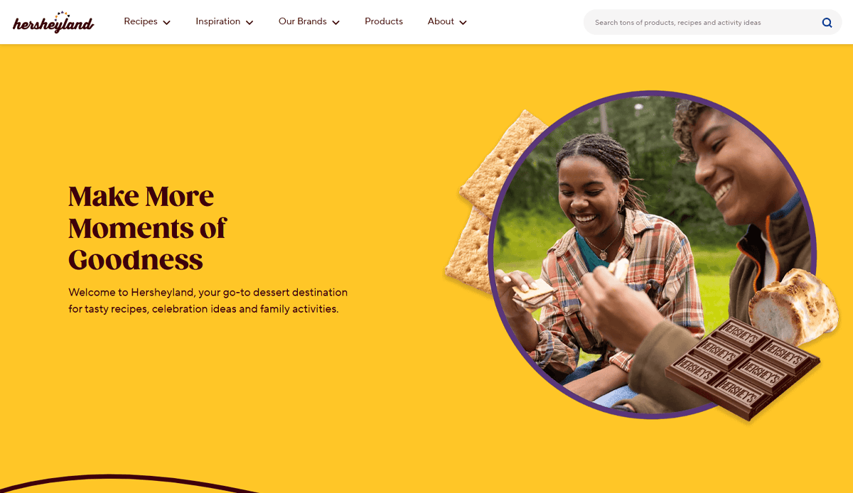
1. Hershey’s
Location: Hershey, Pennsylvania, USA
Key Takeaways:
• Rich brand history showcased with immersive storytelling and heritage visuals
• High‑quality imagery of candy bars and seasonal treats for strong visual appeal
• Clear calls to action for product purchase, events, and gift offers
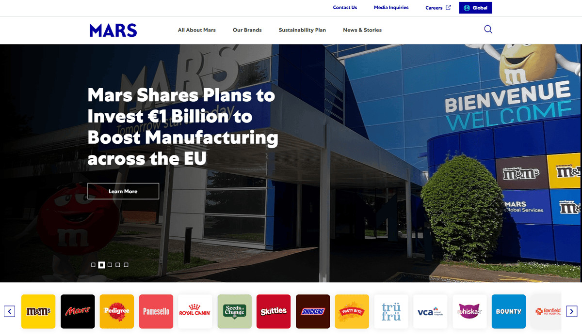
2. Mars
Location: McLean, Virginia, USA (global brand headquarters)
Key Takeaways:
• Bold navigation highlights multiple candy brands and product categories
• Integrated brand initiatives like sustainability elevate messaging
• Large product images and rich visuals across Mars ecosystem
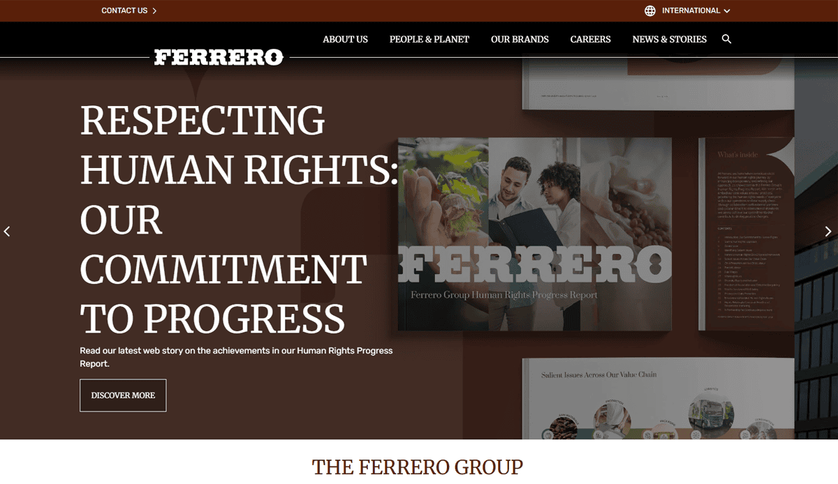
3. Ferrero
Location: New York, New York, USA (US presence)
Key Takeaways:
• Elegant typography and warm palette align with a gourmet chocolate feel
• Detailed product pages include sourcing, lineage, and brand story
• Clean layout supports seamless browsing and conversion
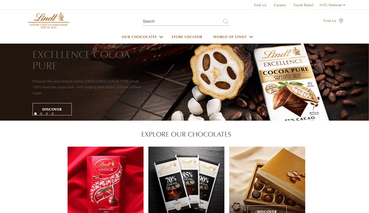
4. Lindt
Location: Stratham, New Hampshire, USA (Lindt & Sprüngli USA HQ)
Key Takeaways:
• Luxurious product imagery and gifting-focused sections
• Menu streamlined for seasonal specialties and collections
• Strong brand storytelling focused on craftsmanship
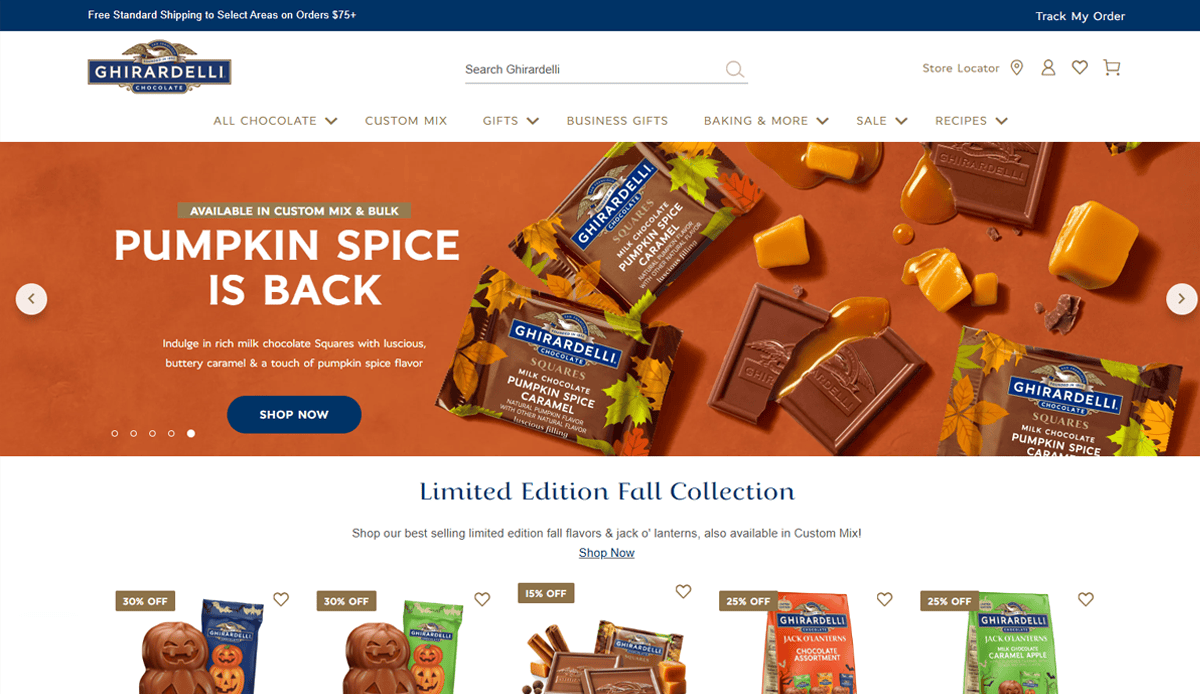
5. Ghirardelli
Location: San Francisco, California, USA
Key Takeaways:
• Rotating banners showcase seasonal offerings like candy bars and gift sets
• Recipes and pairing suggestions extend engagement beyond purchases
• Easy navigation between classic chocolate and newer products
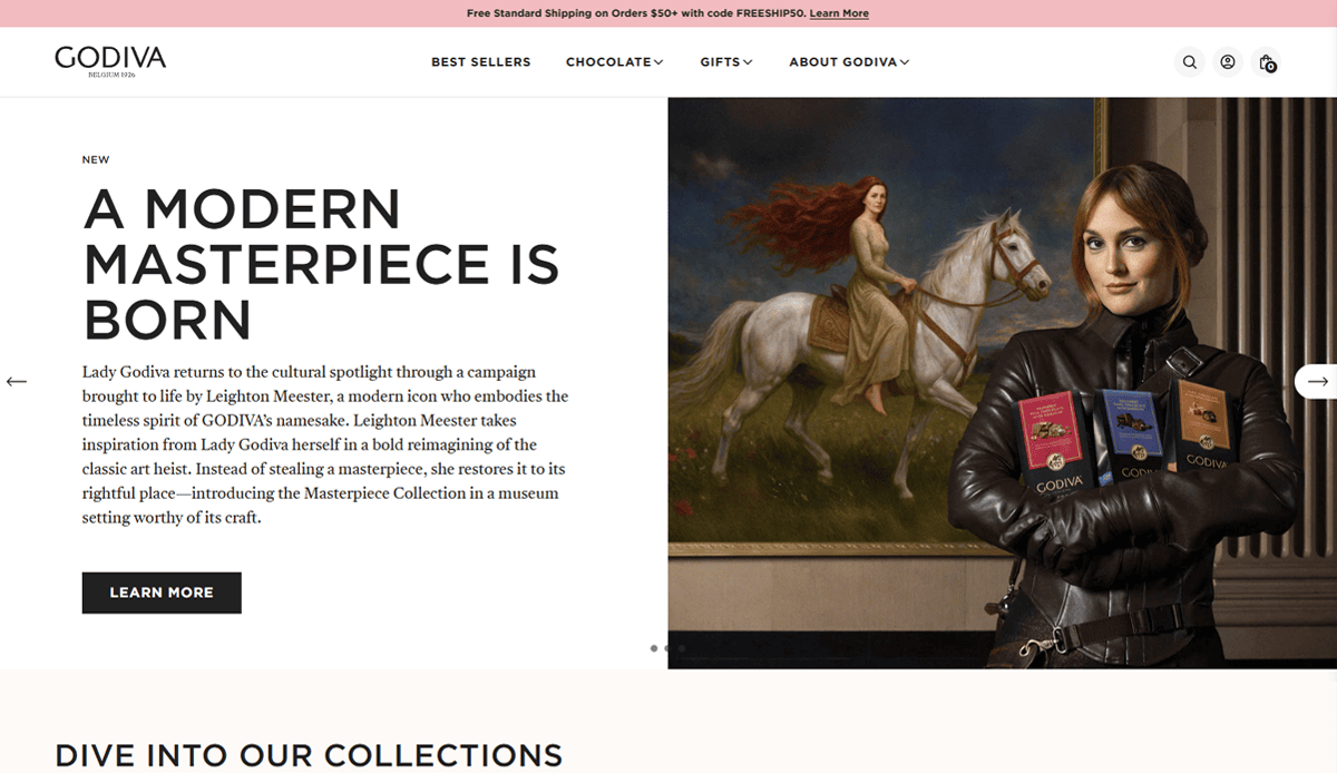
6. Godiva
Location: New York, New York, USA
Key Takeaways:
• Striking visuals and premium packaging design interface
• Gift set focus with curated collections for holidays and events
• Elegant color scheme reinforcing high-end positioning
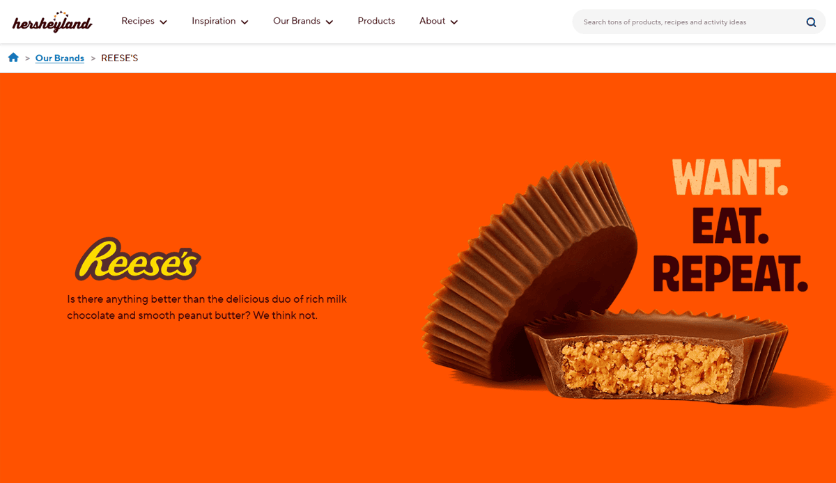
7. Reese’s
Location: Hershey, Pennsylvania, USA
Key Takeaways:
• Playful orange branding mirrors the product personality
• Interactive elements highlight new candy bars and limited editions
• Bold promotions encourage recipe ideas and user engagement
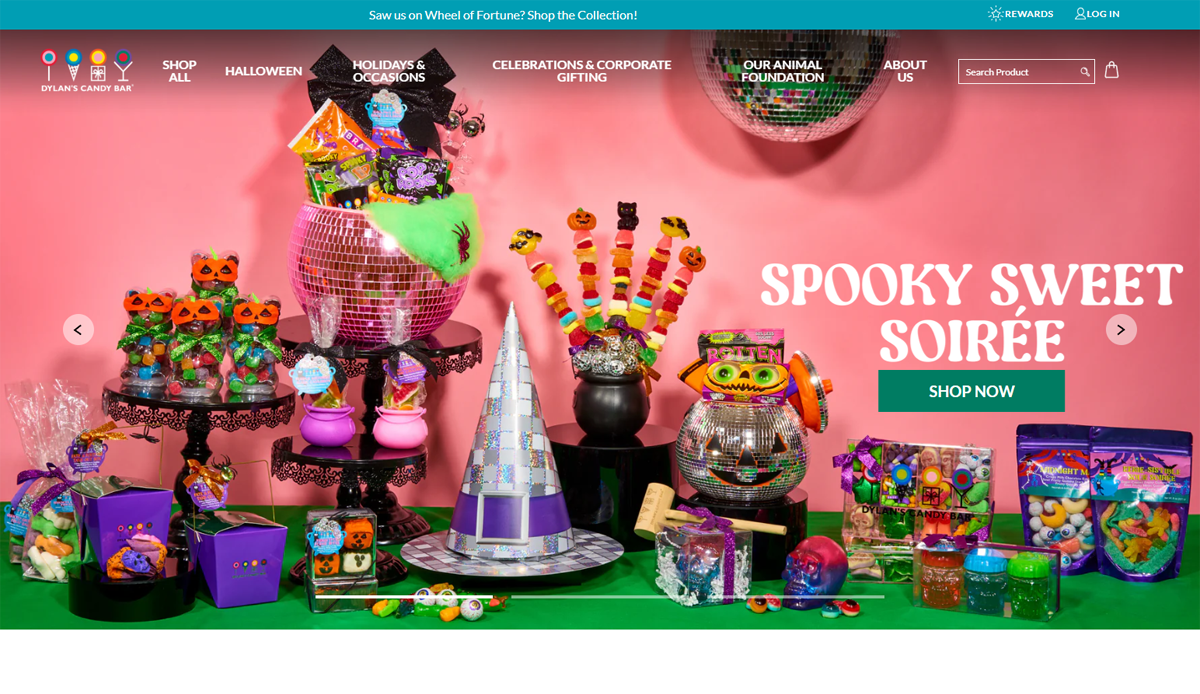
8. Dylan’s Candy Bar
Location: New York City, New York, USA
Key Takeaways:
• Magazine-style layout with vibrant visuals and curated candy selection
• Shop-by-category and world candy collection navigation
• Brand as experience—merging fashion, art, and sweetness
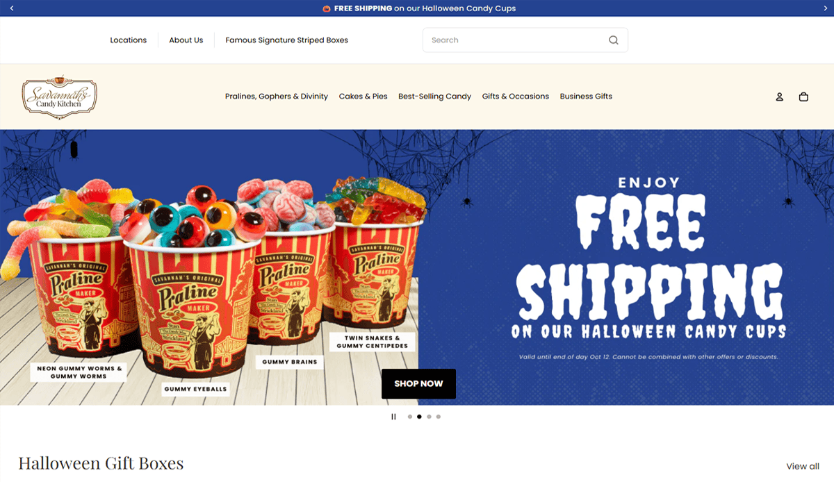
9. Savannah’s Candy Kitchen
Location: Savannah, Georgia, USA
Key Takeaways:
• Live candy-making visuals support artisanal authenticity
• Seasonal pralines and southern sweets emphasized
• Easy online ordering with store locator and mail-order options
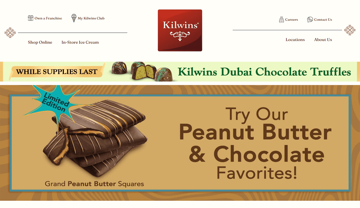
10. Kilwins
Location: Petoskey, Michigan, USA
Key Takeaways:
• In-store craftsmanship highlighted by photo and video content
• Multi-location structure with ice cream and chocolate offerings
• Nostalgic interface evokes a classic candy store atmosphere
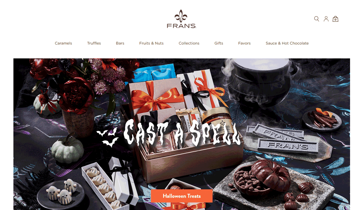
11. Fran’s Chocolates
Location: Seattle, Washington, USA
Key Takeaways:
• Specialty salted caramel products featured with premium visuals
• Brand legacy and quality reinforced in storytelling sections
• Clear navigation for gifting, flagship products, and retail locations
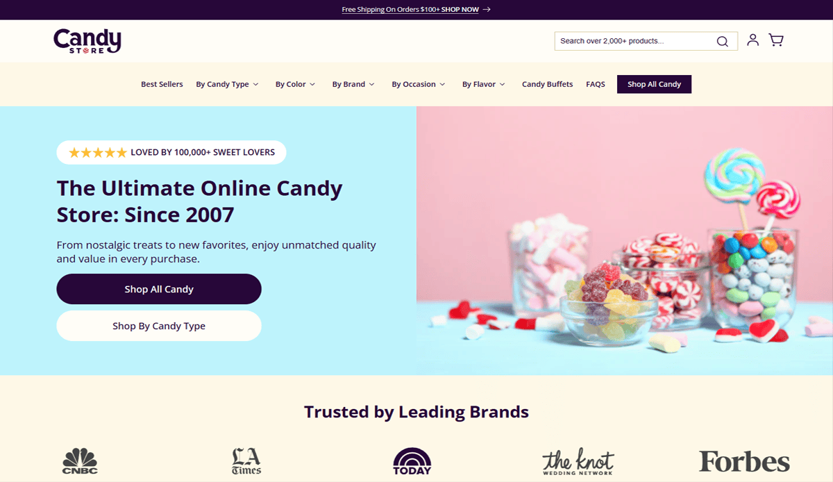
12. CandyStore.com
Location: Cincinnati, Ohio, USA
Key Takeaways:
• Huge catalog (over 6500 candies) with powerful search and filter tools
• Bulk candy options are prominently featured for parties and events
• Simple layout with fast-loading pages despite product volume
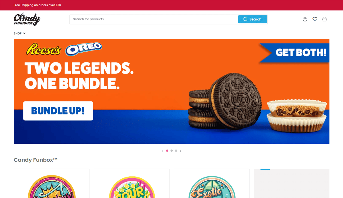
13. Candy Funhouse
Location: based in USA
Key Takeaways:
• Extensive variety with clear filter by brand and treatment type
• Large social following promotes community and engagement
• Free shipping banner and promotions are visible on every page
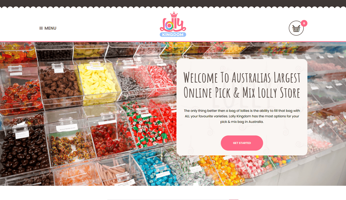
14. Lolly Kingdom
Location: Chicago, Illinois, USA
Key Takeaways:
• Mix‑and‑match candy options with vibrant visuals and easy selection
• Shop‑by‑color and flavor filters to guide candy enthusiasts
• Modern responsive design for desktop and mobile, seamless use
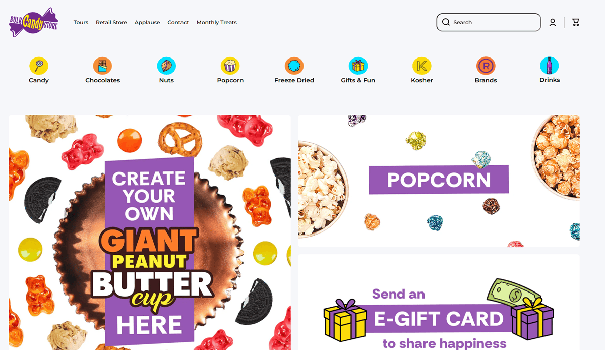
15. BulkCandyStore
Location: Elmhurst, Illinois, USA
Key Takeaways:
• Bulk candy categories clearly organized for event buyers
• Strong SEO-optimized product descriptions targeting candy buyers
• Clean layout supports fast navigation and conversions
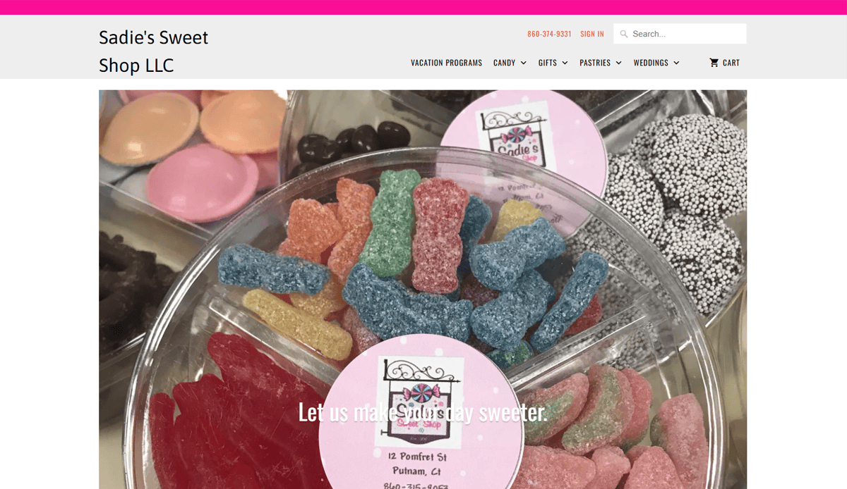
16. Sadie’s Sweet Shop
Location: Elmhurst, Illinois, USA
Key Takeaways:
• Nostalgic design featuring classic candy shop branding elements
• Event catering and classes promoted as core offerings
• Effective call‑to‑action for both online ordering and in-store visits
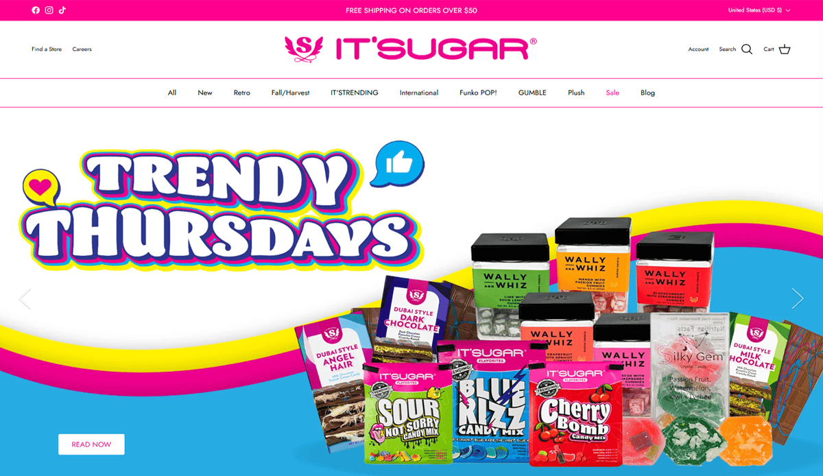
17. IT’SUGAR
Location: Fort Lauderdale, Florida, USA
Key Takeaways:
• Bold, oversized candy branding creates a playful, high-energy feel
• Store locator and online ordering streamline both digital and physical purchases
• Highlighting novelty and retro candy drives interest across multiple demographics
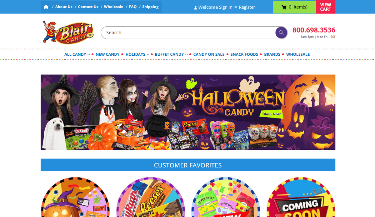
18. Blair Candy
Location: Elmhurst, Illinois, USA
Key Takeaways:
• Specialty packaging categories for weddings and graduations
• Clean UI that supports product variety without clutter
• Quick links for bulk ordering and customization
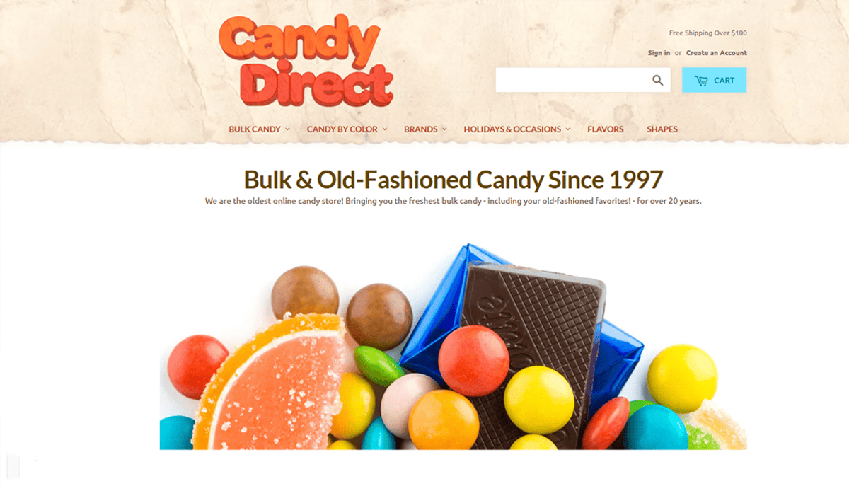
19. Candy Direct
Location: Elmhurst, Illinois, USA
Key Takeaways:
• All‑in‑one event candy store layout for large orders
• Clear calls to action for bulk candy buyers and event planners
• Organized by candy type and occasion for ease of discovery
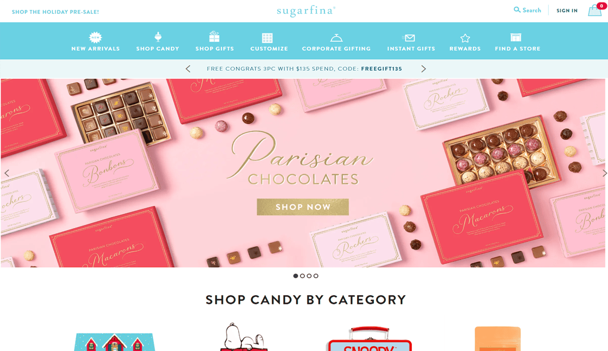
20. Sugarfina
Location: Beverly Hills, California, USA
Key Takeaways:
• Luxe boutique feel enhanced by elegant visuals and gift packaging
• Custom Bento Box options feature curated candy assortments
• Aspirational UX reflecting premium candy offerings
Take the Next Step Toward a Sweeter Online Presence
A beautifully designed website can transform how potential customers perceive your candy business online. Whether you’re showcasing candy with colorful candy displays, offering bulk candy for online shopping, or launching unique candy creations to entice candy lovers, a strategic digital experience will set you apart.
Let our experts help you create a visually appealing, performance-driven site that elevates your candy store design and enhances the shopping experience from the first click. Request your free consultation today and take your candy website to the next level.
Candy Shop Site Design: Commonly Asked Questions
What are the best design ideas for a candy website?
The best candy websites use colorful candy displays, oversized candy props, and clear product descriptions to create a cheerful, visually appealing layout. These elements attract customers and enhance the shopping experience for candy enthusiasts.
How can I organize different types of candy on my website?
Organize candy varieties by category, flavor, color, or seasonal offerings. Use filters and smart sorting to make it easy for customers to explore candy options, compare items, and find their favorite treats.
What should I include in candy product descriptions?
Include ingredients, candy colors, texture, packaging size, and whether it’s sugar-free or gluten-free. Adding engaging content like the story behind your classic candy or retro candy helps create a memorable brand experience.
How can I improve my candy store experience online?
Focus on intuitive navigation, a strong online presence, and vibrant design that showcases candy. Integrate tools that allow customers to interact with the site, such as “create custom mix” options or quizzes to find their perfect candy.
Should my website reflect the interior design of my retail store?
Yes, mirroring interior design themes—such as oversized candy displays or sections of the store—online strengthens brand consistency and creates a unified candy experience across all touchpoints.
Is there a template I can use for a professional candy shop?
You can use a WordPress template tailored for candy stores or a digital candy business. Look for features like responsive design, online ordering, and easy updates. If you prefer a hands-off setup, consider hiring a professional for website creation.
What role do product photos play in candy purchases?
Photos of different candy types at eye level and with consistent lighting make your website more visually appealing. Highlighting texture and packaging helps encourage customers to complete their candy purchases.
How often should I update content to keep the store fresh and exciting?
Refresh your site with new candy arrivals, seasonal themes, and featured candy bars every few weeks. This keeps the store fresh and encourages return visits.
Can an AI website builder create a candy store design that stands out?
An AI website builder can generate layouts quickly, but to create a memorable brand and engaging customer experience, a custom design approach often produces better long-term results. Learn more about core design principles to guide your decision.
How can I encourage customers to engage throughout the store?
Use strategic calls to action, vibrant design elements, and product sections like “Create Your Mix” or “Top 10 Candy Categories” to keep candy enthusiasts exploring and interacting across the entire candy selection.


