Just looking for our Best Cafe Website examples list?
A high-performing café website isn’t just attractive—it’s strategic. From structure to security, each element plays a role in creating a seamless digital experience that reflects your brand and moves visitors to action. Here are the most important takeaways from this guide:
- Strategic planning is the foundation of success.
Before designing, define your site’s purpose—whether that’s driving foot traffic, promoting online ordering, or showcasing your menu. Build the site structure and content strategy around those goals to meet your customers’ needs. - Great design balances brand and usability.
Effective café website design relies on clear gateways, consistent branding, accessible layouts, and intentional use of visual hierarchy. These principles help users find what they need while reinforcing your café’s identity. - Content and navigation must serve real customer behavior.
Highlight the most requested information—menu, hours, contact information, and location—within one click from the homepage. Use clear calls to action and mobile-first design to accommodate on-the-go visitors. - Visuals create an emotional connection and trust.
Professional photos of your space and menu aren’t just eye-catching—they drive engagement and convey quality. Match your color palette and typography to your in-person atmosphere to build consistency.
Each of these elements is what makes your website an asset, not just an online placeholder. When planned and maintained correctly, your website becomes a trusted extension of your brand and a dependable source of business growth.
Why Your Site Design Is a Make-or-Break Factor for Business Growth
When someone searches for a local café or restaurant, your website is often their first impression—and in a competitive industry, first impressions determine whether you’re gaining a loyal customer or losing them to a competitor. A poorly executed homepage or confusing pathways can instantly deter even the most motivated visitor. But a high-performing restaurant website does more than look good—it builds trust, improves your search engine visibility, and directly influences whether that visitor becomes a paying customer.
Great site design isn’t just about aesthetics—it’s about guiding every potential customer toward action, from viewing your menu to finding your location on Google Maps. It’s about ensuring your online presence reflects the quality and personality of your café. Done well, a custom restaurant website can amplify your brand, streamline online ordering, and even improve customer experience before they walk through your door.
This guide will break down what goes into effective café website design and why investing in a professional web design team like ours is a strategic move, not just a stylistic one. Whether you’re starting from scratch or refining a dated template, we’ll help you make your website work as hard as you do. Let’s get started.
Website Planning & Purpose: Building the Foundation for a Website
Before diving into fonts, photos, or even layout templates, the most critical phase of any successful website design is strategic planning. The planning stage lays the groundwork for everything that follows—from how your site looks to how it functions and converts. Without this step, you risk building a site that may look good but fails to support your business goals.
For cafés and restaurants, the website is more than a digital business card. It’s a 24/7 marketing tool, reservation desk, and first touchpoint with your potential customers. That’s why the purpose of the site must be defined before a single pixel is placed. Are you trying to drive more foot traffic? Promote online ordering or delivery? Make your menu easier to access? Attract tourists searching on mobile for a nearby brunch spot? Each of these goals requires different design and technical considerations.
The planning phase includes identifying your ideal customer, understanding how they’ll use your site, and mapping out a content structure that speaks to their needs. This includes thinking through your navigation, deciding what important information should appear above the fold, and ensuring your contact information, menu, and ordering online links are always easy to find.
It also means setting clear functional priorities—like whether to integrate a reservation system, highlight daily specials, or connect with your Google Maps listing. For example, if most of your business is grab-and-go, your homepage should guide users quickly to hours and directions. If you thrive on catering or group reservations, those services should be visible within the first scroll.
Finally, your website should reflect your brand personality. Whether your café is cozy and rustic or modern and minimalist, the site needs to translate that experience digitally. A well-planned website doesn’t just inform—it creates a feeling that aligns with the in-person experience, helping convert casual browsers into loyal customers.
Planning isn’t a creative afterthought—it’s the strategic starting point that determines how well your design will perform. Get this phase right, and you’ll build a site that does more than look great—it will work hard to grow your business.
Design Principles: What Makes a Site Visually Effective and User-Friendly
The most effective websites balance beauty with function. A great design reflects the ambiance of your space and drives action, from enticing visitors to check out your menu to nudging them toward making a reservation or placing an order online. That’s why understanding and applying a few key design principles can make or break your restaurant website design.
First, clarity is non-negotiable. Users should never have to guess where to click or how to find what they need. A clean layout with intuitive user pathways ensures visitors can access core information—menu, hours, location, and contact details—without friction. Your homepage should immediately communicate what type of café you are and what experience you offer.
Consistency establishes trust and reinforces your brand. Fonts, colors, imagery, and even the tone of your copy should match your café’s personality. A modern espresso bar might opt for bold typography and sharp contrast, while a cozy neighborhood café might lean into warm tones and inviting imagery. No matter your vibe, consistency across pages is key to creating a polished, high-quality impression.
Whitespace, or the intentional use of empty space, is often overlooked but essential. It helps guide the visitor’s eye, makes content more digestible, and keeps the design from feeling cluttered. A spacious layout allows key elements—like call-to-action buttons or featured menu items—to stand out.
Accessibility should also be built into the design from day one. That means using high-contrast colors for text, ensuring mobile responsiveness, and avoiding content that depends solely on images or animations. Your café’s website should be easy to use for everyone, whether they’re browsing on a phone in a rush or using a screen reader at home.
Visual hierarchy ensures the most important elements are noticed first. This could mean highlighting ordering online or featuring a rotating image of your most popular dishes near the top of the homepage. Use font sizes, colors, and positioning to guide users naturally through the page in a way that supports their intent and your goals.
Finally, remember that photos sell food. Invest in professional photography to showcase your space, dishes, and drinks. High-quality images play a central role in making your café stand out and creating an emotional connection with visitors. If they can almost taste the latte or imagine themselves seated by the window, you’ve already won half the battle.
When applied thoughtfully, these design principles help make your website not just attractive, but effective—a true extension of your brand that turns online visitors into in-person customers.
Content & Navigation: Structuring Your Website for Maximum Impact
Your website’s content and navigation aren’t just technical details—they’re essential to creating a user experience that keeps visitors engaged and drives conversions. Where customers often visit your site with a specific need in mind—like checking the menu, finding directions, or placing an order—clarity and simplicity in content structure are everything.
Start by defining your key pages. At a minimum, every restaurant website should include a homepage, menu page, about page, contact page, and a location or visit us page. If you offer online ordering, catering, or host events, those deserve their own pages too. Each page should have a clear purpose and speak directly to the needs of your audience.
The homepage acts as a high-level snapshot and should immediately communicate who you are, what you serve, and why someone should visit. Use bold, benefit-oriented messaging and striking imagery to make a strong first impression. From here, guide users with clear calls to action—like “View Menu,” “Order Online,” or “Get Directions.”
Menu pages are often the most visited section, so keep them easy to find and even easier to scan. Avoid forcing users to download PDFs or scroll through overly designed menus that aren’t mobile-friendly. Use well-organized sections, high-quality images, and descriptions that sell the experience, not just the ingredients.
The contact and location page should feature everything a potential customer needs to visit you without friction—your address, embedded Google Maps location, business hours, phone number, and a contact form. If your hours vary, keep them updated regularly.
Navigation should be visible at the top of every page and remain consistent throughout the site. Limit the number of top-level menu items to keep things focused, and use drop-downs to organize subpages logically. Label everything clearly—don’t get creative at the expense of clarity. “Menu” should say “Menu,” not “Our Creations.”
Calls to action should appear throughout the site, not just at the bottom of the page. Whether you’re inviting users to browse the menu, reserve a table, or sign up for updates, every page should have a next step.
Mobile usability is crucial. Most visitors will check your website from their phones, often while they’re out and about. That means buttons and content need to be just as intuitive and fast-loading on mobile as on desktop.
Effective content and navigation turn casual browsers into paying customers. By structuring your website around your visitors’ needs and habits, you create a digital experience that’s as inviting and seamless as your in-person one.
Visual Elements: Bringing Your Brand and Experience to Life Online
Visual elements are the first things users notice when they land on your website—and for cafés and restaurants, they play a pivotal role in shaping perception, guiding decisions, and cementing trust. In this industry, where ambiance, presentation, and sensory experiences matter deeply, your website must visually reflect the environment and experience you offer in person.
Photography is your most powerful tool. High-resolution, professionally shot images of your food, drinks, space, and even your team help visitors visualize themselves in your café. A shot of your latte art, the sunlight pouring into your seating area, or a close-up of your weekend brunch spread can do more to entice a visitor than any block of text. These images aren’t just decorative—they’re working assets that sell your experience and enhance user engagement.
Your color palette should align with your physical brand. If your café interior uses earthy tones and reclaimed wood, your website might use warm browns and soft neutrals. If you run a modern espresso bar, clean lines and monochrome or high-contrast color choices might better reflect your brand’s tone. Consistent visual branding between your online and physical space builds familiarity and strengthens your identity.
Typography also plays a critical role. Use fonts that are easy to read and match the personality of your café. A trendy coffeehouse might use bold, minimal sans-serif fonts, while a charming neighborhood café could lean into hand-written styles or serif fonts that convey warmth and approachability. Font pairings should maintain visual clarity across devices, especially for mobile users.
Icons and graphical elements should serve a function before flair. Use them to visually support user pathways—like markers for delivery, hours, Wi-Fi, or pet-friendliness. These subtle cues make the browsing experience smoother, especially for visitors scanning quickly for answers.
Videos, if used, should be short and impactful. A quick clip showing your barista preparing a drink or a customer enjoying the space adds dimension and authenticity. Just ensure videos load quickly and don’t autoplay with sound, which can disrupt the user experience.
Whitespace, or negative space, lets your visual elements breathe. A clutter-free layout ensures photos and headlines stand out, improves readability, and prevents visual fatigue. It also elevates your site’s aesthetic, helping it feel premium and thoughtfully designed.
Every visual decision should reinforce your café’s story and make your website more usable, enjoyable, and persuasive. From imagery to layout, visual elements connect visitors emotionally with your brand and guide them toward meaningful action, like stopping by for a visit or placing an order online. Done well, your site doesn’t just look good—it makes people feel good about doing business with you.
Best Cafe Website Examples
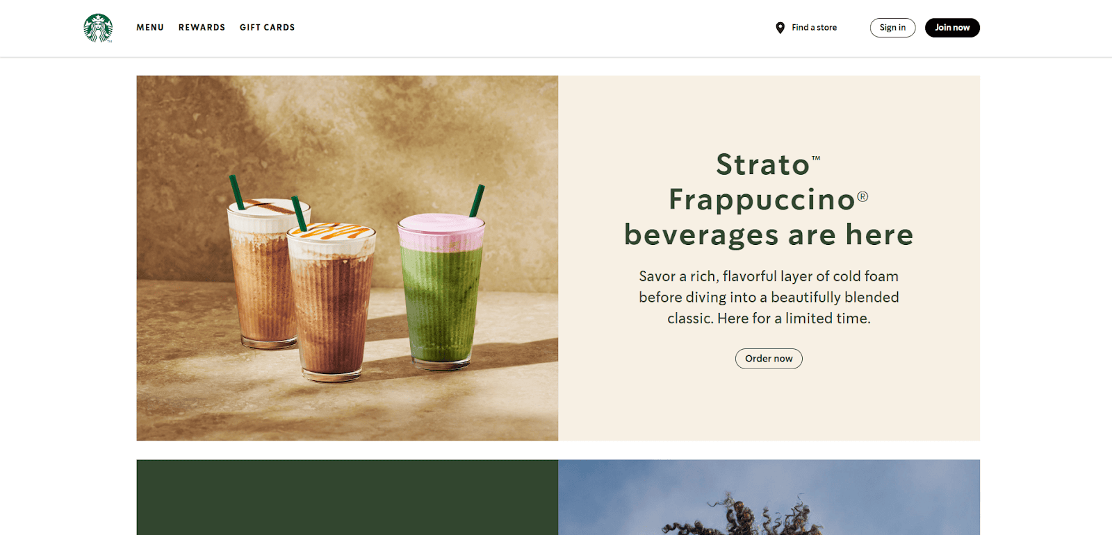
1. Starbucks
Location: Seattle, WA
Key Takeaways:
- Seamless integration of rewards programs and mobile ordering.
- Consistent branding across all digital touchpoints.
- User-friendly with clear calls to action.
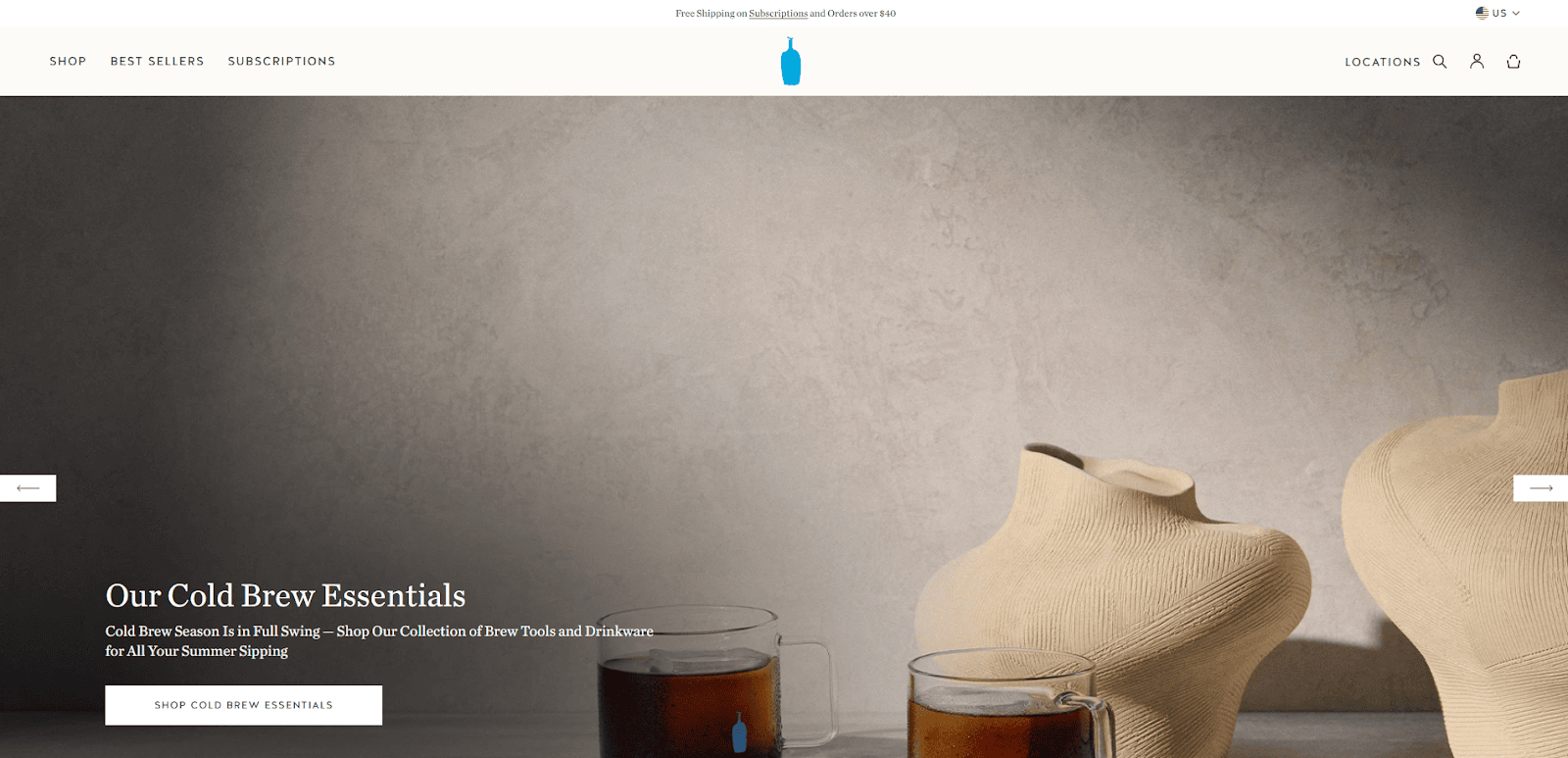
2. Blue Bottle Coffee
Location: Oakland, CA
Key Takeaways:
- Minimalist design reflecting the brand’s aesthetic.
- Top-quality imagery showcasing products and spaces.
- Easy access to subscription services and store locations.
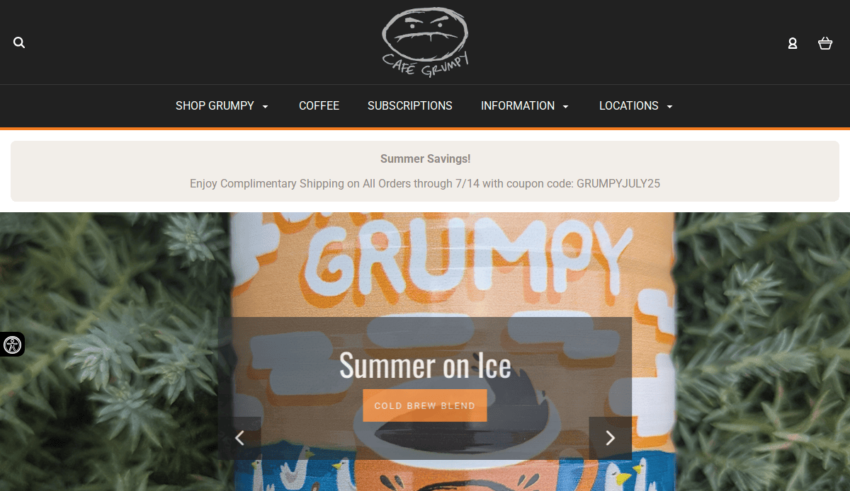
3. Café Grumpy
Location: New York, NY
Key Takeaways:
- Vibrant visuals capturing the café’s atmosphere.
- Detailed information on coffee sourcing and roasting.
- The online store integrated seamlessly with the site.
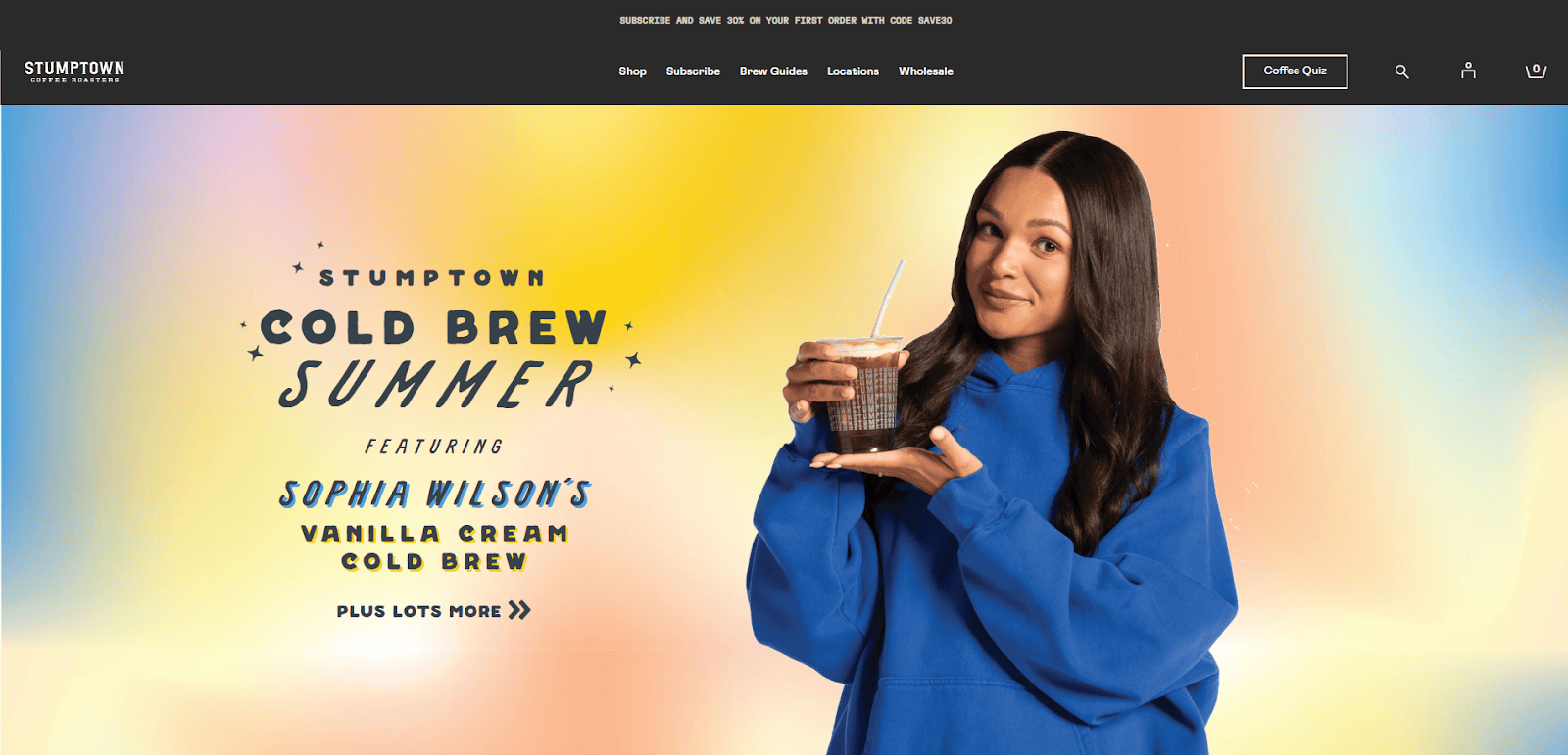
4. Stumptown Coffee Roasters
Location: Portland, OR
Key Takeaways:
- Storytelling approach to brand history and coffee origins.
- Interactive elements enhancing user engagement.
- Clear navigation with emphasis on product offerings.
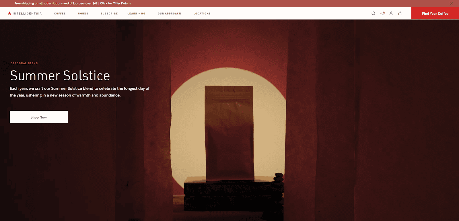
5. Intelligentsia Coffee
Location: Chicago, IL
Key Takeaways:
- Sleek design with a focus on education and transparency.
- Comprehensive guides on brewing methods.
- Robust e-commerce platform for coffee and equipment.
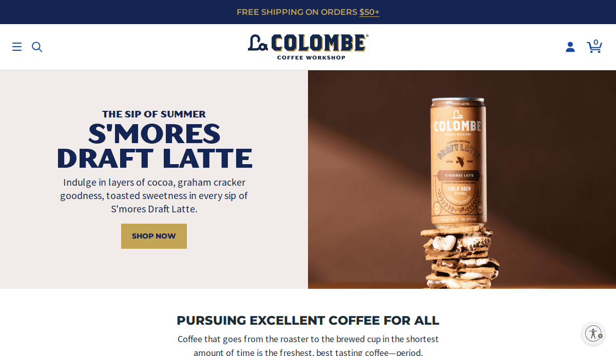
6. La Colombe Coffee Roasters
Location: Philadelphia, PA
Key Takeaways:
- Bold visuals highlighting product quality.
- Integration of storytelling in product descriptions.
- User-friendly online ordering system.
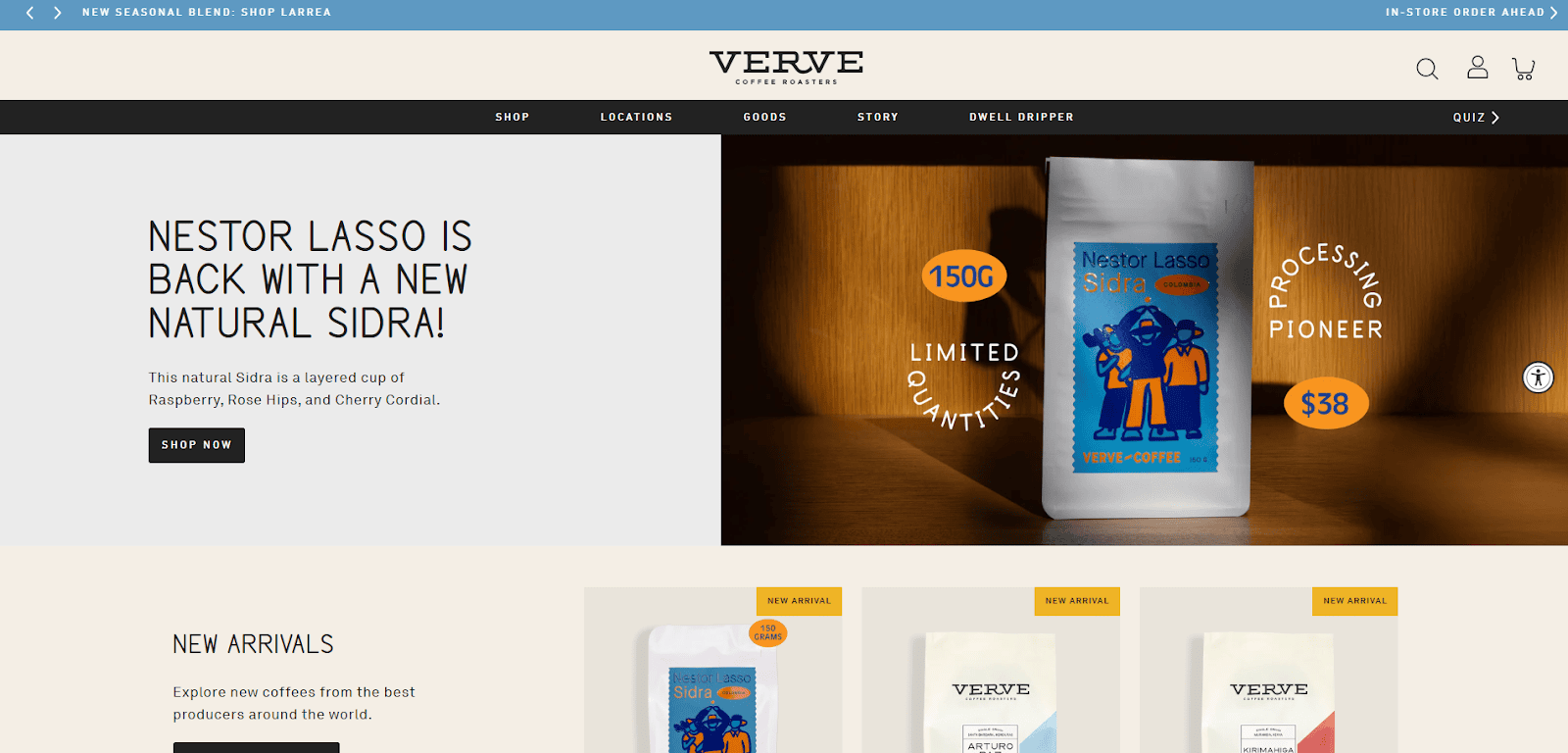
7. Verve Coffee Roasters
Location: Santa Cruz, CA
Key Takeaways:
- Clean, modern design with an intuitive layout.
- Emphasis on sustainability and direct trade practices.
- Engaging blog content related to coffee culture.
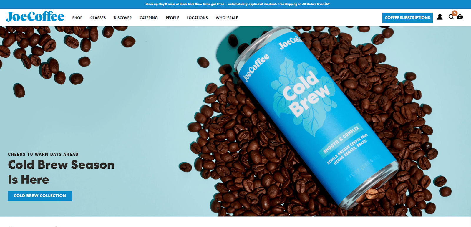
8. Joe Coffee Company
Location: New York, NY
Key Takeaways:
- Warm, inviting design reflecting café ambiance.
- Detailed information on classes and events.
- Streamlined online store for merchandise and coffee.
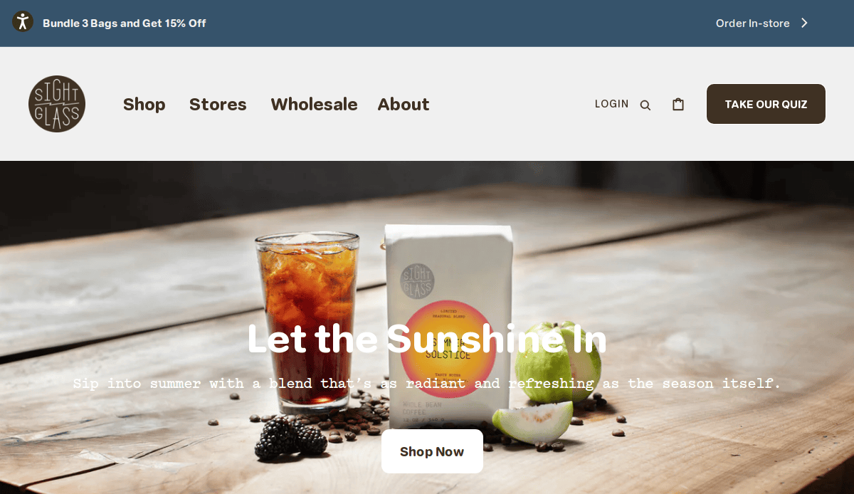
9. Sightglass Coffee
Location: San Francisco, CA
Key Takeaways:
- High-resolution imagery showcasing café interiors.
- Transparent information on sourcing and roasting.
- Easy-to-navigate layout with clear product categories.
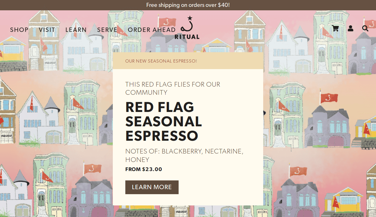
10. Ritual Coffee Roasters
Location: San Francisco, CA
Key Takeaways:
- Vibrant color scheme aligning with brand identity.
- Detailed coffee profiles and brewing guides.
- Integration of social media feeds for community engagement.
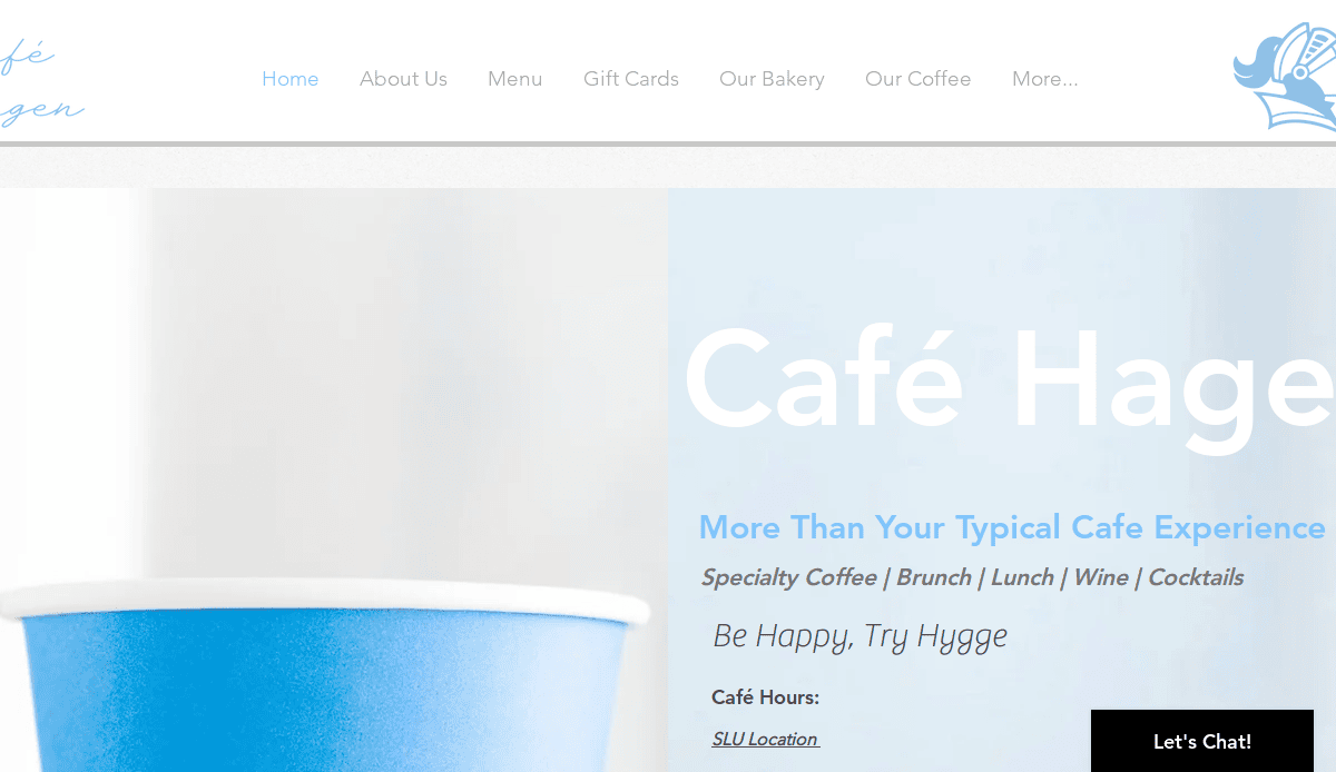
11. Café Hagen
Location: Seattle, WA
Key Takeaways:
- Scandinavian-inspired design with minimalist aesthetics and natural materials.
- Emphasis on hygge ambiance, offering a cozy and inviting atmosphere.
- Integration of in-house roasted coffee and artisanal menu items.
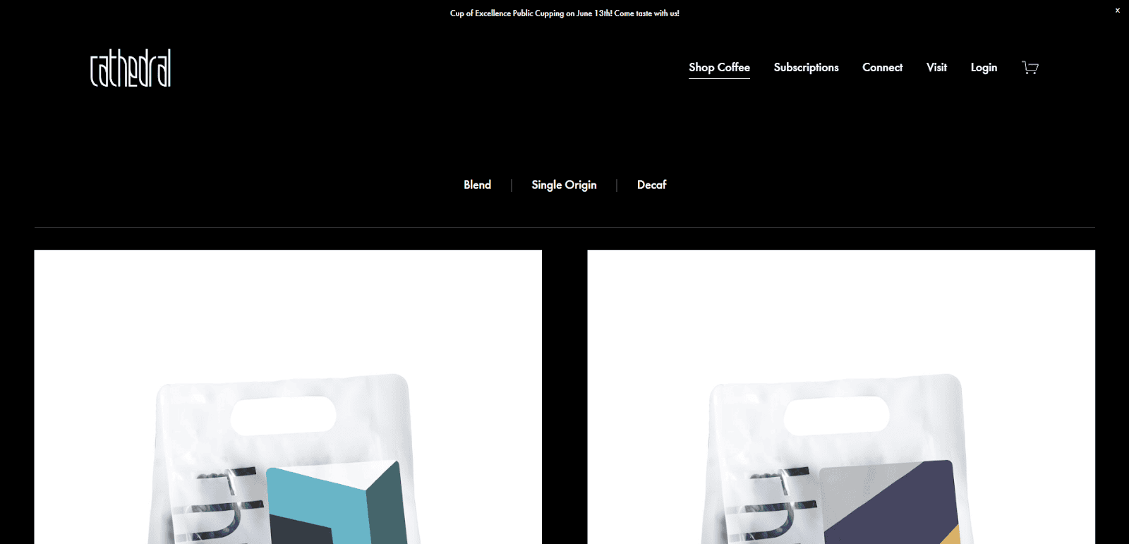
12. Cathedral Coffee
Location: Portland, OR
Key Takeaways:
- Artistic interior featuring graffiti art and a library nook, reflecting community engagement.
- Warm color palette and rustic design elements create a welcoming environment.
- Focus on local sourcing and sustainability in both design and offerings.
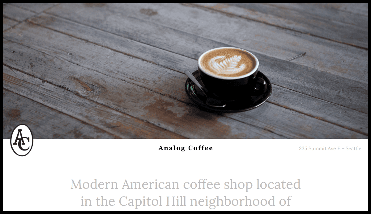
13. Analog Coffee
Location: Seattle, WA
Key Takeaways:
- Retro-inspired design with a focus on simplicity and functionality.
- Community-centric approach with local art displays and events.
- Streamlined website with essential information and easy to use.
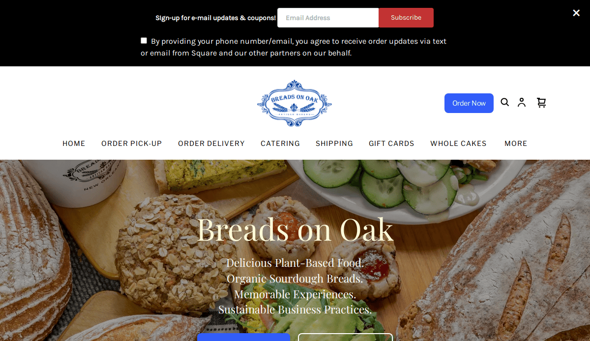
14. Breads on Oak
Location: New Orleans, LA
Key Takeaways:
- Emphasis on organic and vegan offerings, reflected in the clean and natural website design.
- Storytelling approach highlighting the café’s mission and values.
- User-friendly interface with clear calls to action and menu accessibility.
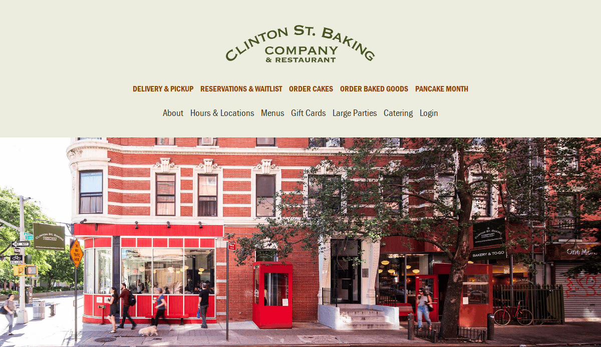
15. Clinton Street Baking Company
Location: New York, NY
Key Takeaways:
- Classic design that mirrors the café’s traditional and homely atmosphere.
- High-quality imagery showcasing signature dishes and interior ambiance.
- Easy-to-navigate layout with clear information on menus and reservations.

16. Think Coffee
Location: New York, NY
Key Takeaways:
- Socially conscious branding with emphasis on sustainability.
- Detailed information on community initiatives.
- Easy access to store locations and menus.
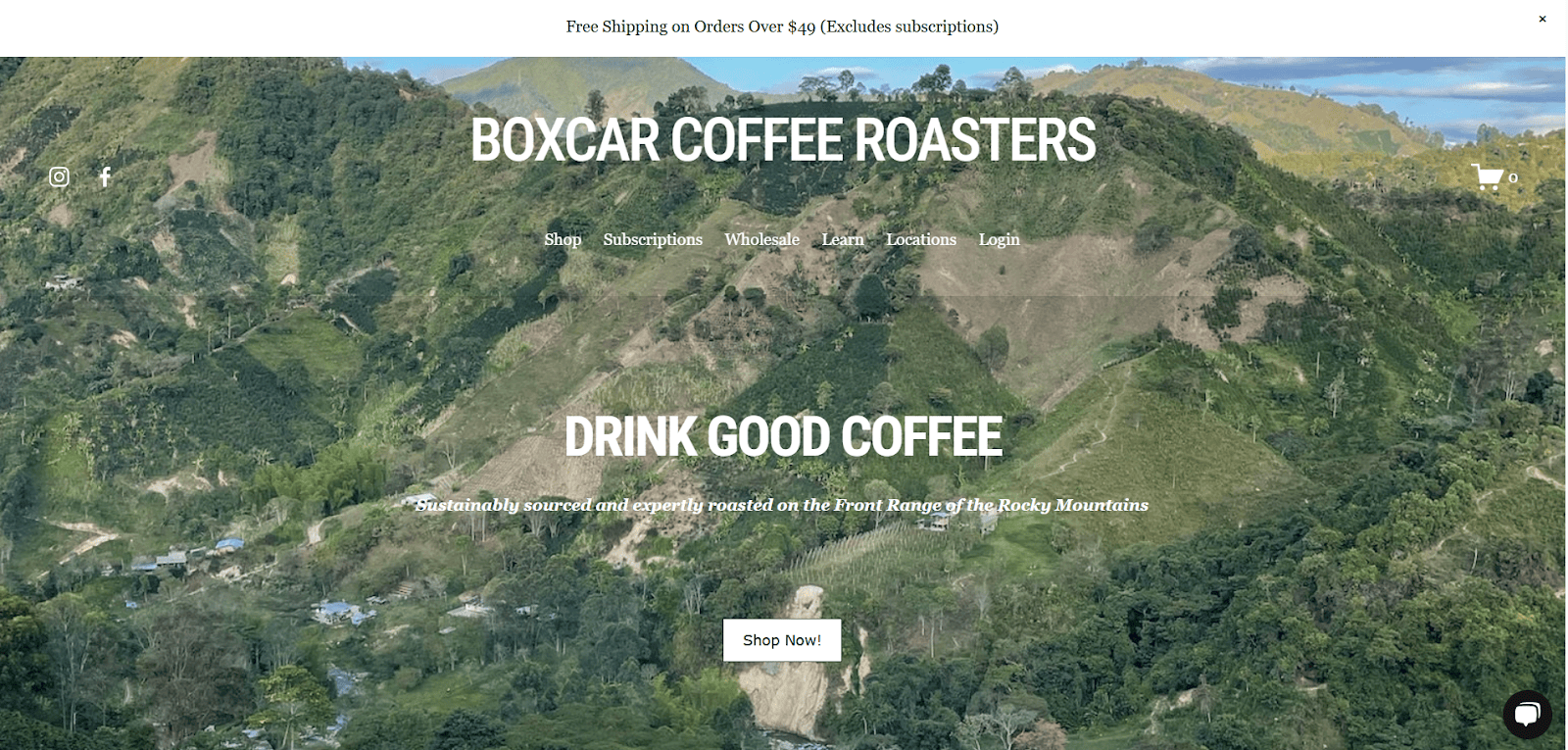
17. Boxcar Coffee Roasters
Location: Boulder, CO
Key Takeaways:
- Rustic design elements reflecting the brand’s roots.
- Comprehensive information on coffee sourcing and roasting.
- Engaging content on brewing techniques and equipment.
![Close-up of hands holding a cup of latte with foam art. Text on the image reads: Voted Best Coffeehouse in Portland, Oregonian’s Readers Choice Awards 202[cut off]. Spella Caffè logo is at the top.](https://www.cyberoptik.net/wp-content/uploads/2025/08/Spella-Caffe.png)
18. Spella Caffè
Location: Portland, OR
Key Takeaways:
- Vintage aesthetic with a focus on traditional Italian espresso culture.
- Compact and efficient website design reflecting the café’s intimate setting.
- Emphasis on handcrafted coffee and personalized customer experience.

19. Toby’s Estate Coffee
Location: Brooklyn, NY
Key Takeaways:
- Bright, inviting design with quality HD visuals.
- Detailed information on coffee offerings and origins.
- Easy-to-use online store for coffee and merchandise.
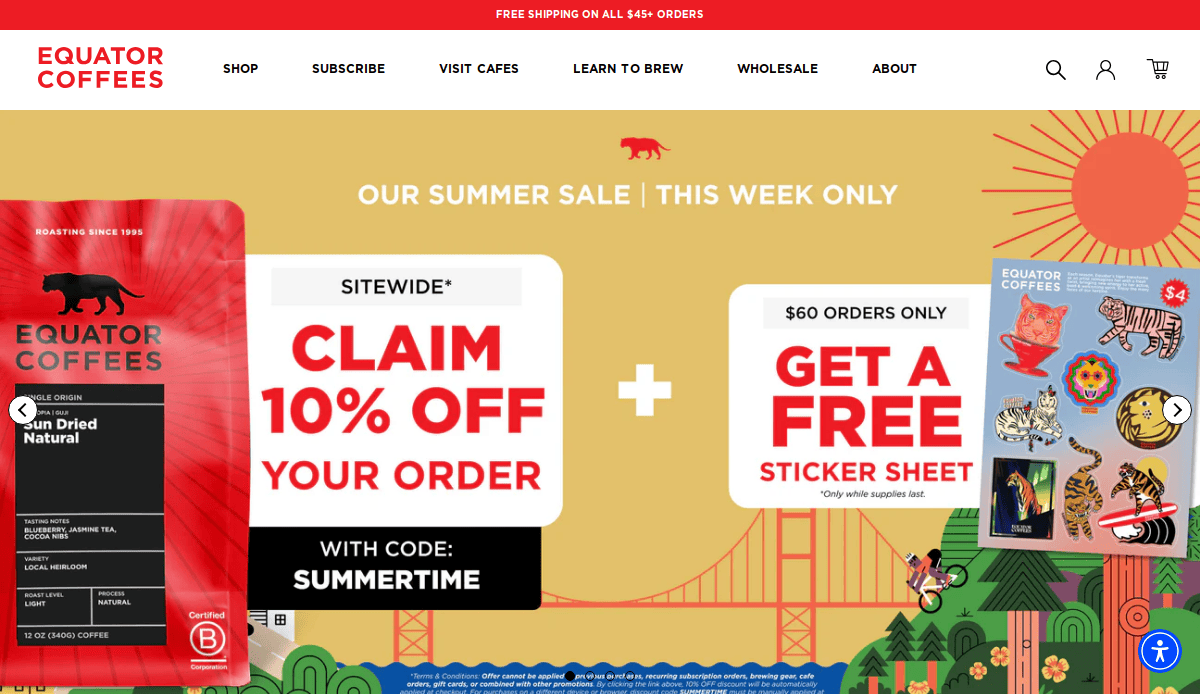
20. Equator Coffees
Location: San Rafael, CA
Key Takeaways:
- Strong emphasis on sustainability and social responsibility.
- Comprehensive information on coffee sourcing and partnerships.
- User-friendly design with clear pathways and calls to action.
These examples showcase a range of design inspirations and functionalities that can serve as a guide to restaurant website design. Whether you’re looking to create a cafe website or redesign an existing one, these sites offer valuable insights into effective restaurant website features and aesthetics.
Ready to Turn Visitors Into Customers? Let’s Build a Site That Works as Hard as You Do
A well-designed website is the heart of your brand’s online identity and one of the most important tools for growing your coffee shop or café. Whether you’re just starting out or looking to redesign a dated layout, investing in strategic, high-quality restaurant web design is one of the smartest moves you can make in the restaurant industry.
Your website should do more than look great—it should communicate your brand, streamline the main menu, showcase your food menu, and offer a seamless user experience that converts website visitors into real-world customers. From responsive design to conversion-focused UX design, the design process should reflect your café’s vibe while supporting your business goals. If you’re serious about building a website that drives results, it’s time to work with a design agency that understands your industry, audience, and the difference a well-designed website can make.
Make your restaurant stand out online—get a custom strategy from our agency today.
Frequently Asked Questions About Café and Restaurant Website Design
How do I create a café website that attracts more customers?
To create a cafe website that draws in more visitors and converts them into paying customers, focus on clear action steps, strong branding, and essential website features like online reservation tools, a visually appealing restaurant menu, and a mobile-friendly design. Use professional imagery, intuitive design elements, and easy access to important information. For full guidance, explore our web design services.
What should be included in a great restaurant website design?
A great restaurant website design should include a homepage with strong branding, clear calls to action, online reservation options, your food menu, contact info, and high-quality visuals. It should reflect your restaurant’s atmosphere and provide an intuitive experience across all devices. Pages should load quickly, and every design element should support the user’s goal. Visit our page on business website essentials for deeper insight.
Are website templates good for restaurant websites?
Website templates can work for smaller restaurants or tight budgets, but they often lack the customization needed to stand out among the best restaurant websites. Templates may not support advanced features like a custom landing page, tailored pathways, or third-party integrations for a coffee shop website. A custom solution built by a professional restaurant website designer offers flexibility, scalability, and an optimized user experience.
What are the best restaurant website design ideas?
Some of the best restaurant website design ideas include showcasing your signature dishes through full-screen photography, using engaging design elements like parallax scrolling, incorporating customer reviews, and integrating your social media feeds. Consider what makes your restaurant unique—whether you’re a great cafe, stunning cafe, or a Mexican restaurant—and build a site around that personality. For design inspiration, explore our portfolio of website examples.
Why is UX design so important for my restaurant’s website?
UX design ensures that your website is user-friendly, easy to navigate, and built to convert. Whether someone is looking to make an online reservation or browse your food menu, the site should guide them seamlessly to their goal. A well-executed UX strategy can differentiate a best cafe website from one that leaves visitors confused or frustrated.
How often should I update my restaurant’s website content?
You should update your website content regularly—at least once a quarter—to reflect seasonal menus, new promotions, updated business hours, or events. Frequent updates signal to search engines that your site is active, and it shows visitors that your restaurant is vibrant and up to date. This also applies when you’re planning a website design or redesign.
Can I use a website builder for my coffee shop website?
Yes, a website builder can be a cost-effective way to get started, especially for smaller restaurants or cafés. However, if you want to be among the best cafe or best restaurant website designs, a custom site offers more control, flexibility, and professionalism. It also better supports growth and performance in the long term.
What makes a landing page effective for a restaurant?
An effective landing page focuses on one specific action—such as making an online reservation, ordering takeout, or promoting an event. It should be visually aligned with your brand, include minimal distractions, and feature persuasive copy and relevant images. Strong calls to action, social proof, and optimized loading speed are essential.
How can I make sure my website stands out from competitors?
To make sure your website stands out, focus on a compelling visual identity, rich media, intuitive UX, and custom content. Invest in design inspiration and functionality that supports your brand’s unique story. Whether you’re running a local great restaurant or aiming for the best cafe website spot, a personalized experience always beats a generic one.
Do I need a restaurant website designer, or can I do it myself?
While some tools allow you to build web pages on your own, a professional restaurant website designer ensures your site performs at a higher level. They bring experience in designing a restaurant website that looks great and is also optimized for SEO, performance, and conversions. To see how we can help, visit our restaurant web design page.


