Just looking for our Best Manufacturing Website examples list?
Today, a well-designed SaaS website is crucial for attracting and retaining customers. Here are the essential strategies to ensure your website stands out and drives conversions:
- Prioritize User Experience (UX): A seamless and intuitive UX is paramount. Ensure your website is easy to navigate, with clear calls-to-action and a responsive design that performs well across all devices.
- Embrace Modern Design Trends: Incorporate contemporary design elements such as minimalist layouts, bold typography, and interactive features to engage users and convey professionalism.
- Optimize for Mobile Devices: With the increasing use of smartphones, your website must be mobile-friendly. Implement responsive design techniques to ensure content displays correctly on various screen sizes.
- Highlight Clear Value Propositions: Immediately communicate the unique benefits of your SaaS product. Use concise messaging and visuals to demonstrate how your solution addresses user needs.
- Implement Strong SEO Practices: Enhance your website’s visibility by optimizing for relevant keywords, creating high-quality content, and ensuring fast load times. This will improve search engine rankings and attract organic traffic.
- Utilize Social Proof: Incorporate testimonials, case studies, and client logos to build trust with potential customers and validate your product’s effectiveness.
- Offer Interactive Demos: Allow users to experience your product firsthand through interactive demos or trial versions, which can increase engagement and conversion rates.
- Maintain Consistent Branding: Ensure that your website’s design elements, such as color schemes, fonts, and imagery, align with your brand identity to create a cohesive and memorable user experience.
- Provide Transparent Pricing: Clearly display your pricing plans and what each includes. Transparency helps users make informed decisions and reduces friction in the conversion process.
- Continuously Test and Improve: Regularly perform A/B testing on various elements of your website, such as headlines, images, and CTAs, to identify what resonates best with your audience and optimize accordingly.
By implementing these strategies, your SaaS website will be well-equipped to attract, engage, and convert visitors effectively.
Why SaaS Website Design is Your Silent Sales Engine
When it comes to converting potential customers into loyal users, your website isn’t just a digital storefront—it’s your most powerful sales tool. In a market where user expectations are higher than ever, mediocre design can cost you far more than missed clicks—it can kill trust, stall engagement, and sink conversions.
The best websites aren’t just visually appealing—they’re carefully crafted experiences that navigate users through a clear value journey. From intuitive navigation to persuasive content placement, every element of your site should be optimized for performance. And yet, many SaaS companies still treat design as an afterthought.
This guide dives into SaaS website design best practices that go beyond trends. We’ll break down the design elements that influence user experience, explore what today’s highest-converting websites do differently, and show you how to position your SaaS product for long-term growth. Whether you’re working with a design agency or building in-house, you’ll walk away with the insights you need to build trust, increase your conversion rate, and create a site that drives results.
Website Planning & Purpose: Setting the Foundation for SaaS Success
Before a single pixel is designed or a line of code is written, a successful website begins with meticulous planning. This phase is about far more than choosing colors or drafting layouts—it’s about clarifying business goals, understanding your audience, and mapping a user journey that drives conversions.
SaaS companies often operate in a fast-paced, competitive environment where customer acquisition and retention hinge on clarity and functionality. The planning process should begin by identifying the primary purpose of the website. Is it to generate qualified leads? Reduce churn through better onboarding? Educate prospects with in-depth resources? Every design decision should tie directly to this purpose.
Next, defining your target personas is critical. Understanding who your users are—what they value, what problems they’re trying to solve, and how they interact with technology—helps tailor the site’s messaging, structure, and user experience. Whether you’re appealing to time-strapped startup founders or enterprise decision-makers, your website needs to speak directly to their pain points.
A well-planned sitemap ensures logical navigation, allowing users to find the information they need without friction. This includes structuring key pages such as the homepage, features, pricing, testimonials, and a clear call to action. Each page should serve a specific role in guiding visitors through your SaaS funnel.
Planning should also incorporate how your content strategy and technical requirements will support your site’s performance. Integrating SEO from the ground up, outlining conversion points, and establishing KPIs for success ensures the site will look good and deliver measurable results.
For a deeper look at the key pillars that support strategic web design, explore our guide to the core principles of web design. Starting with the right framework ensures your website becomes a business asset, not just a digital placeholder.
Design Principles That Drive High-Performing Websites
Designing a website is about applying time-tested design principles that align user needs with business goals. These principles ensure every element on the page works together to create a seamless, conversion-driven experience.
The first and most essential principle is clarity. Company websites must immediately communicate what the product does, who it’s for, and why it matters. This means clear value propositions, intuitive page layouts, and minimal distractions. Cluttered interfaces or vague headlines only add friction, making it harder for visitors to take the next step.
Consistency is another core principle. Visual consistency—from font styles and color schemes to iconography and button shapes—helps establish a professional, trustworthy appearance. For SaaS companies, this consistency also reinforces brand identity, which plays a key role in building recognition and trust with potential customers.
Visual hierarchy moves users through your content by assigning weight and importance to different elements. Strategic use of headings, subheadings, and white space helps visitors process information more easily. Calls to action should stand out clearly on the page, positioned to align with a user’s natural scanning patterns.
Responsiveness is no longer optional. Your SaaS website must deliver a flawless experience on desktop, tablet, and mobile. This includes ensuring that buttons are easily tappable, fonts are legible at all sizes, and layouts adjust dynamically without breaking.
Accessibility is another principle that modern SaaS websites must embrace. Ensuring that your site can be used by people with disabilities—through alt text, keyboard navigation, and screen reader compatibility—expands your audience and reflects a user-first philosophy.
Finally, usability testing and iterative improvement are baked into good design. The most effective SaaS websites are refined over time based on real user behavior and feedback. For a more tactical breakdown of how to apply these principles from planning through launch, our step-by-step guide to the web design process offers actionable insights that can sharpen your execution.
By grounding your website in these design fundamentals, you create an experience that looks polished and functions as a strategic growth engine.
Content & Navigation: Structuring for Clarity and Conversion
In website design, content and navigation are more than support elements—they are strategic assets that shape user flow, engagement, and ultimately, conversion. A well-structured content strategy paired with intuitive navigation ensures that visitors quickly understand your product and move smoothly through the buying journey.
The most effective websites start with a clear content hierarchy. Your homepage should immediately articulate your core value proposition and navigate users to deeper information. From there, use supporting pages—like features, pricing, use cases, and FAQs—to address specific questions, reinforce benefits, and reduce friction.
Each page should have one primary goal, supported by crisp headlines, digestible copy blocks, and relevant visuals. SaaS audiences are often decision-makers seeking fast, actionable insights. Avoid dense paragraphs or excessive jargon. Instead, emphasize benefits over features and highlight real-world outcomes your product delivers.
Navigation must be intuitive and frictionless. A clean top menu with 5–7 clearly labeled items is ideal for instructing users without overwhelming them. Use familiar terms like “Pricing,” “Features,” and “Resources” to reduce cognitive load. Sticky headers and breadcrumb trails also help users maintain orientation as they explore.
For SaaS products with multiple solutions or plans, consider segmented navigation that allows visitors to self-select based on their goals or company size. This leads to more personalized and relevant user journeys.
On mobile, simplify navigation into an accessible hamburger menu and prioritize tap-friendly buttons and links. Mobile users should be able to access any key page in two taps or fewer.
Don’t overlook the importance of footer navigation. This area is ideal for secondary links—like support, privacy policy, blog, and login portals—that don’t need prime placement but are still essential for usability.
Smart internal linking within content also enhances site flow and SEO performance. For example, linking a feature description to a related use case or case study keeps users engaged and increases the time spent on the site.
As user expectations evolve, so do design approaches. Stay ahead by exploring our professional insights on upcoming web design trends for 2025, which reveal how top websites in this industry are adapting their content and navigation to meet rising standards.
By aligning your content structure and navigation with user intent, your SaaS website becomes not just a resource but a conversion engine.
Visual Elements: Reinforcing Brand and Guiding the User Journey
In site design, visual elements do more than beautify a page—they shape perception, reinforce brand identity, and influence how users interact with content. When implemented with purpose, these elements create clarity, trust, and engagement.
First impressions matter. A website has mere seconds to communicate credibility, and design plays a leading role in this judgment. Clean layouts, consistent color palettes, and modern typography all contribute to a professional appearance. Together, these elements signal to visitors that your brand is established, trustworthy, and forward-thinking.
Visual consistency across pages helps reinforce brand recognition. From icons and illustrations to button styles and imagery, every element should reflect your brand’s personality. Whether you’re aiming for bold and innovative or calm and authoritative, the design language should support that message without distracting from content.
Whitespace, often overlooked, is one of the most powerful visual tools. It creates breathing room between elements, allowing users to focus on what matters—key messages, features, and calls to action. Crowded layouts confuse visitors and can dramatically increase bounce rates.
Imagery should serve a purpose. Rather than generic stock photos, use visuals that align with your product’s core value. Screenshots of your software, animated product tours, or custom illustrations help potential customers visualize how your solution fits into their workflow. These assets can also be used to highlight differentiators or complex functionality in a more digestible format.
Color plays a key role in guiding attention and establishing emotional tone. Strategic use of contrast helps emphasize buttons, highlight key content areas, and improve readability. Colors should also align with accessibility standards to ensure your site is inclusive for all users.
Typography isn’t just about font choice—it’s about readability and tone. Clear, legible fonts combined with consistent hierarchy in headings, subheads, and body text make your content easy to scan and understand.
Microinteractions—such as hover states, subtle animations, or loading indicators—enhance user feedback and reduce friction. These small touches guide users through your site and provide a sense of control and interactivity.
In the SaaS space, where competition is fierce and differentiation is subtle, strong visual elements can be the factor that keeps users engaged long enough to understand your product’s value. When done right, visuals
Ongoing WordPress Maintenance: Keeping Your SaaS Website Secure and Performing
Launching a website on WordPress is just the beginning. To ensure long-term performance, security, and reliability, ongoing maintenance is essential. Neglecting regular upkeep can lead to slow load times, outdated plugins, security vulnerabilities, and broken user experiences—all of which can cost you potential customers and revenue.
SaaS companies operate in fast-paced digital environments where downtime or compromised functionality can damage brand reputation and disrupt the customer journey. Regular WordPress maintenance ensures that your website continues to meet high expectations and supports business growth without interruption.
One critical aspect of maintenance is keeping core WordPress files, themes, and plugins up to date. Updates often include security patches and performance enhancements. Delaying these updates increases the risk of compatibility issues and exploitation by malicious bots or hackers.
Backups are another non-negotiable element of maintenance. Your site should be backed up daily, with both onsite and offsite copies stored securely. In the event of a crash, data loss, or cyberattack, reliable backups enable fast restoration with minimal disruption to users.
Performance monitoring is just as important. A slow website hurts conversions and user satisfaction. Ongoing optimization—including image compression, caching, and database cleanup—keeps your site loading quickly across all devices and networks.
Security monitoring tools help identify and block suspicious activity, while malware scans and firewalls provide additional layers of protection. For SaaS businesses handling user accounts or sensitive data, this level of security is a foundational part of trust and compliance.
Broken link detection, form testing, and regular UX audits should also be part of your maintenance checklist. These steps ensure that critical features like signup forms, product pages, and customer support tools are always functioning properly.
Staying current with WordPress best practices and evolving web standards can also improve SEO rankings and ADA compliance. A well-maintained site signals to search engines that your content is reliable, current, and worth ranking highly.
For SaaS companies that rely on their websites as lead generation machines and customer support hubs, ongoing WordPress maintenance isn’t optional—it’s a requirement for sustainable success. It’s the behind-the-scenes work that keeps your site fast, secure, and ready to convert at all times.
Best SaaS Website Design Examples
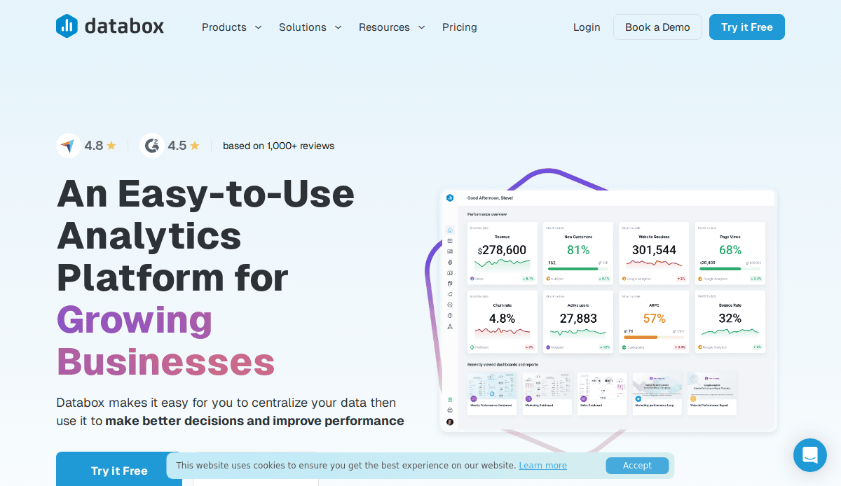
1. Databox
Location: Boston, MA
Key Takeaways:
- Clear messaging that immediately explains the platform’s value.
- Strategic use of social proof to build credibility.
- Clean design with intuitive navigation.
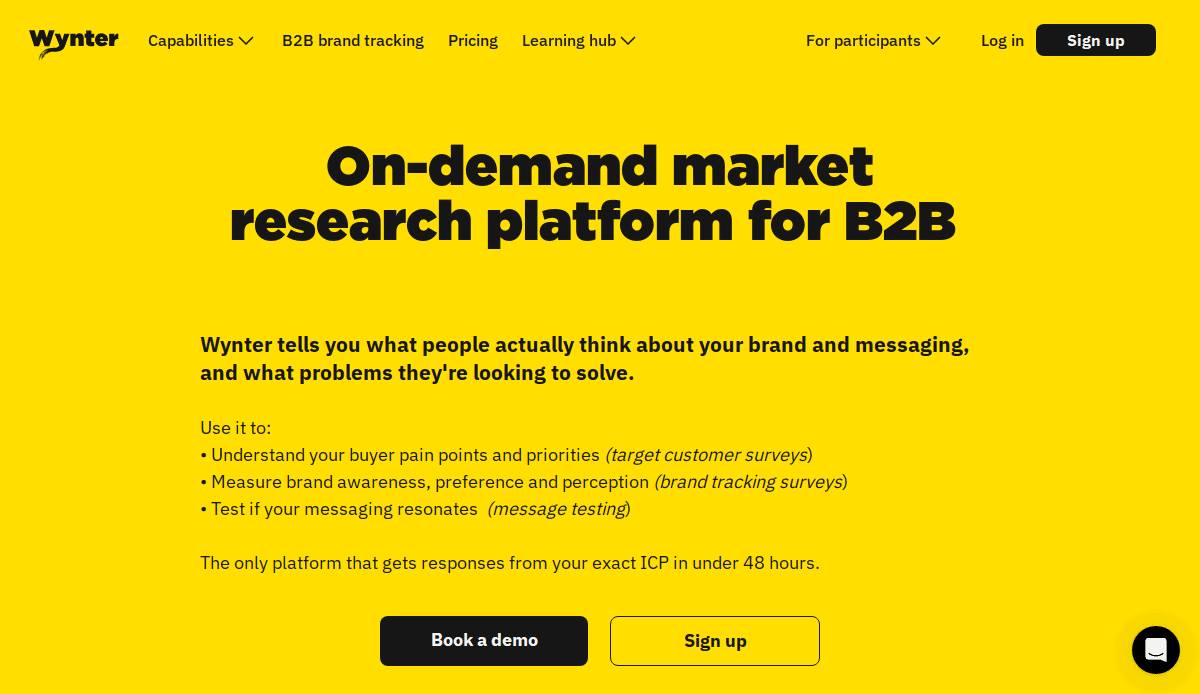
2. Wynter
Location: New York, NY
Key Takeaways:
- Concise messaging tailored to the target audience.
- Effective use of looping video to demonstrate platform functionality.
- Thoughtful color usage enhancing user experience.
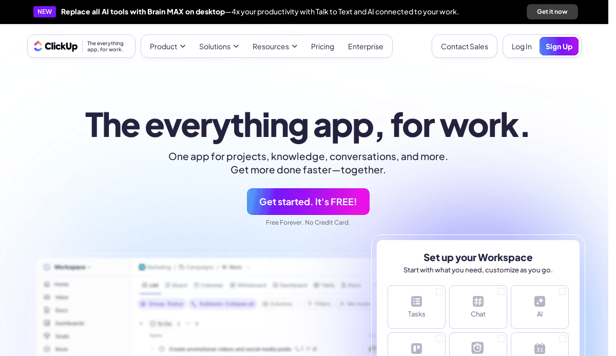
3. ClickUp
Location: San Diego, CA
Key Takeaways:
- Visually captivating design aligning with productivity enhancement.
- Clear navigation guiding users through various services.
- Prominent call-to-action encouraging user engagement.

4. Lattice
Location: San Francisco, CA
Key Takeaways:
- Immediate introduction to services and unique value propositions.
- Inclusion of use cases and a prominent demo CTA.
- Clean layout facilitating user exploration.
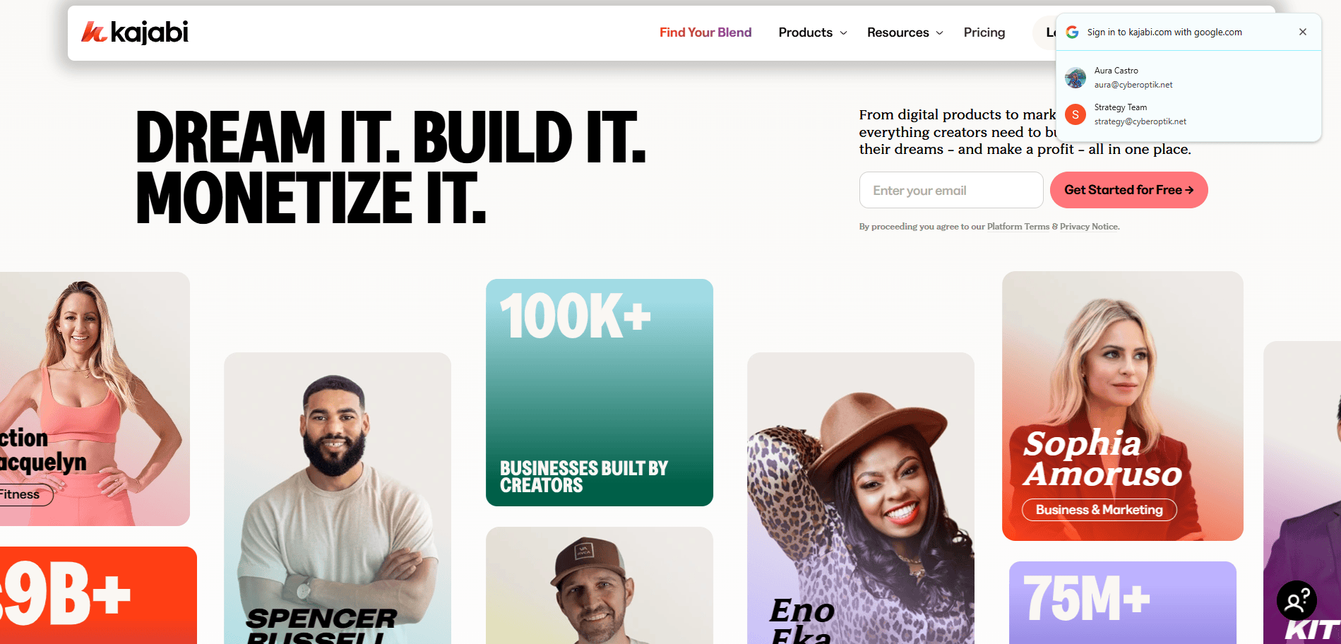
5. Kajabi
Location: Irvine, CA
Key Takeaways:
- Showcases user success stories prominently.
- The bold color scheme enhances visual appeal.
- Testimonials providing social proof to potential clients.
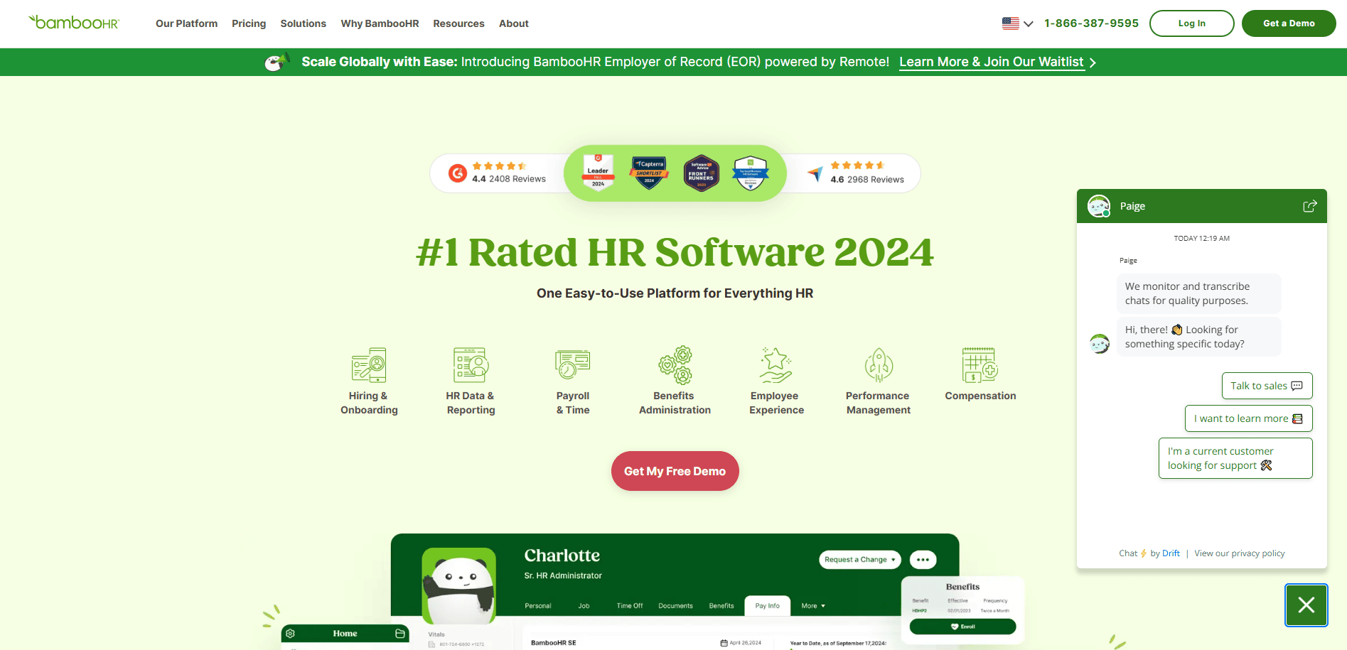
6. BambooHR
Location: Lindon, UT
Key Takeaways:
- Engaging headers capturing visitor attention.
- Dynamic navigation bar enhancing user experience.
- Clear presentation of services offered.

7. Mailchimp
Location: Atlanta, GA
Key Takeaways:
- Minimalist yet vibrant design.
- Clear messaging with consistent slogans.
- Dual conversion paths on the homepage.
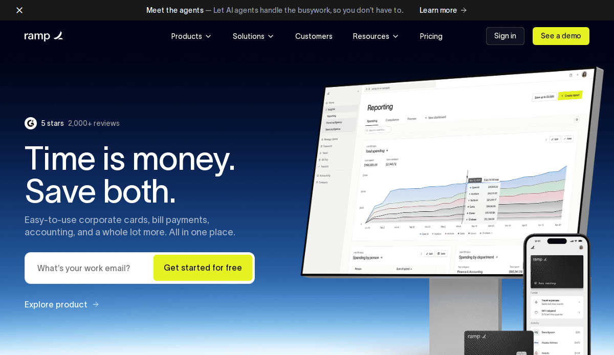
8. Ramp
Location: New York, NY
Key Takeaways:
- Clean and modern design instilling professionalism.
- Strategic use of white space focusing on key elements.
- User-friendly navigation system.
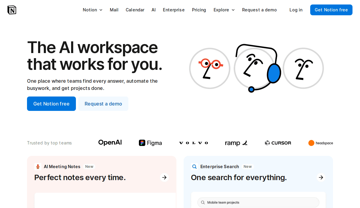
9. Notion
Location: San Francisco, CA
Key Takeaways:
- Simplistic design emphasizing content.
- Interactive elements enhancing user engagement.
- Clear value propositions communicated effectively.
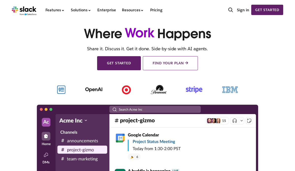
10. Slack
Location: San Francisco, CA
Key Takeaways:
- Straightforward design focusing on essential information.
- Consistent color scheme establishing brand identity.
- Prominent “Get Started” button facilitating user onboarding.

11. Ascendo
Location: Chicago, IL
Key Takeaways:
- Modern and minimalist appeal with a welcoming design.
- Intuitive navigation structure.
- Strategic integration of calls to action.

12. Insight Optix (Designed by CyberOptik)
Location: Chicago, IL
Key Takeaways:
- Clean, organized layout conveying professionalism.
- Well-thought-out color scheme enhances clarity.
- Integration of testimonials and awards building credibility.
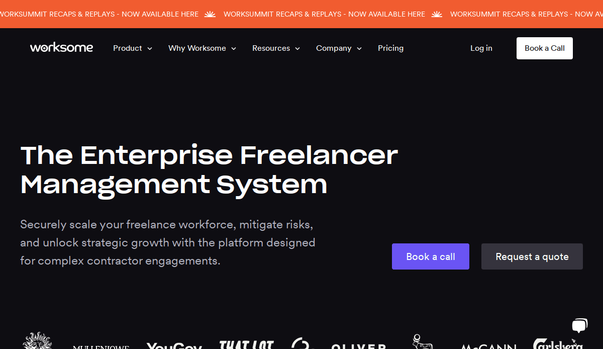
13. Worksome
Location: Chicago, IL
Key Takeaways:
- Minimalist design with a sophisticated black-and-white color scheme.
- Meticulous content organization.
- Strategic positioning of calls to action.
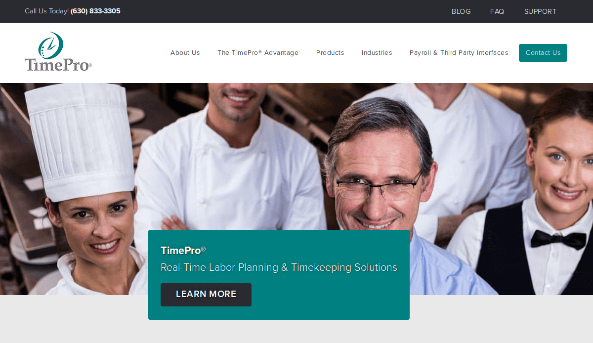
14. TimePro (Designed by CyberOptik)
Location: Chicago, IL
Key Takeaways:
- Well-organized layout with high-quality visuals.
- Clear and concise top menu guiding users seamlessly.
- Strategic placement of calls to action.
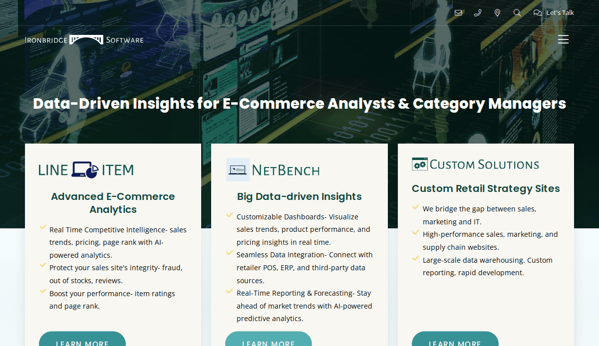
15. Ironbridge Software (Designed by CyberOptik)
Location: Chicago, IL
Key Takeaways:
- Uncluttered and straightforward design.
- Modern and easy-to-read font choices.
- Intuitive navigation with a well-organized top menu bar.
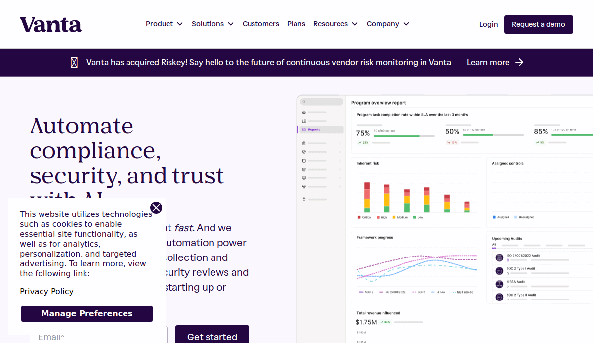
16. Vanta
Location: San Francisco, CA
Key Takeaways:
- Professional visuals and branding.
- Clear navigation aiding user flow.
- Strategic CTAs enhancing lead generation.
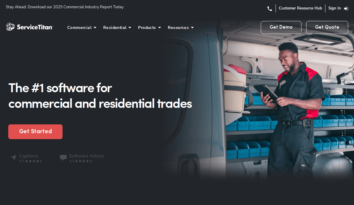
17. ServiceTitan
Location: Glendale, CA
Key Takeaways:
- Comprehensive resource center supporting user education.
- Mobile responsiveness ensures accessibility.
- Integration of marketing tools enhancing functionality.
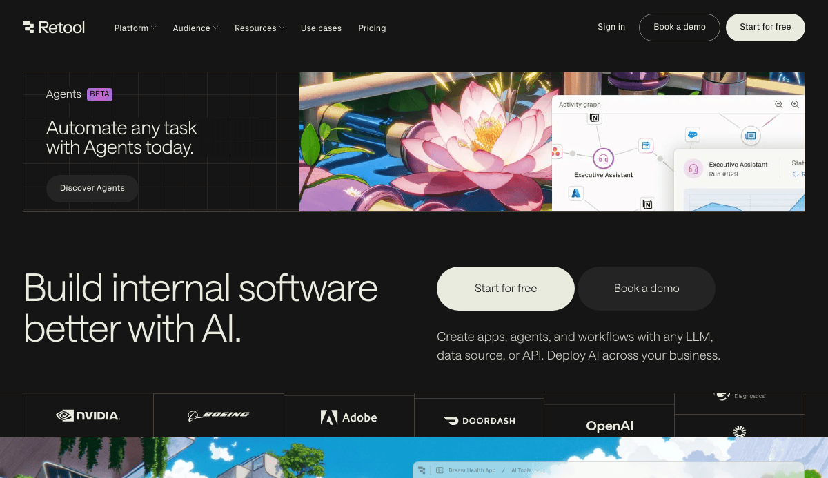
18. Retool
Location: San Francisco, CA
Key Takeaways:
- Intuitive navigation and user flows.
- Professional visuals establishing trust.
- Strategic CTAs driving conversions.

19. Cribl
Location: San Francisco, CA
Key Takeaways:
- Clear messaging aligning with user intent.
- Professional visuals and branding.
- Mobile responsiveness enhancing user experience.

20. UpKeep
Location: Los Angeles, CA
Key Takeaways:
- Intuitive navigation aiding user exploration.
- Strategic CTAs enhancing lead generation.
- Professional visuals building credibility.
These websites exemplify effective B2B SaaS design, combining clear messaging, intuitive navigation, and strategic calls to action to engage visitors and drive conversions.
Ready to Build a High-Converting SaaS Website?
A great SaaS website isn’t built by accident—it’s the result of thoughtful strategy, intentional UX design, and a clean, intuitive layout that reflects your brand’s value and communicates your SaaS product’s features with clarity. From your homepage to your pricing page, every element should be focused on improving the user experience on your website and helping visitors move confidently toward conversion.
Whether you’re creating a SaaS website from scratch or planning a strategic website redesign, applying these best practices will position you among the top-performing platforms in your niche. With the right structure, content, and visuals, your website becomes more than a digital presence—it becomes your most powerful growth engine.
If you’re ready to transform your site into one of the best SaaS website design examples in your industry, our professional designers are here to help. Let’s discuss your project and start building a user-friendly SaaS website design that converts.
Frequently Asked Questions About SaaS Website Design
What makes a SaaS website successful?
A successful SaaS website clearly communicates the product’s value, guides users through an intuitive journey, and converts visitors through strong calls to action. It balances performance and aesthetics with a clean design, simple navigation, and persuasive copy that reflects the brand’s design philosophy. Following SaaS website best practices—like prioritizing UX, showcasing real-world examples, and optimizing the saas homepage—is essential for sustained results.
What pages are essential for a high-converting SaaS website?
Key pages include a compelling homepage, a features or solutions overview, pricing, customer success stories, and a focused SaaS landing page. Each should use custom design and clear messaging to address user pain points. Your website architecture should be streamlined, helping visitors find what they need without confusion. For a deeper look at the fundamentals, review our core web design principles.
How should I approach the design and development process?
Start with a clear strategy aligned with business goals and audience needs. Your approach to design should prioritize intuitive design, performance, accessibility, and scalability. Every step—from wireframes to launch—should support a seamless user experience and reflect your SaaS platform’s core value. Our step-by-step web design process offers a full breakdown.
How does UX impact SaaS website performance?
User experience affects every aspect of a SaaS website—from how easily users can navigate to how quickly they convert. A user-friendly website built on solid UX principles keeps visitors engaged and reduces bounce rates. UX isn’t just about visuals; it includes loading speed, mobile responsiveness, layout clarity, and more. High-converting SaaS websites are usually those with optimized UX throughout.
What role do design elements play in driving conversions?
Design elements that resonate with users—such as visual hierarchy, strategic white space, and bold CTAs—help guide actions and reinforce trust. A modern SaaS app or platform benefits from clean layouts and branding consistency that make navigation and content consumption easy. Innovative design also signals product maturity and professionalism.
Why is the homepage so critical for SaaS platforms?
The homepage is often the first touchpoint for your audience and must quickly explain what the SaaS solution does, who it’s for, and what makes it better. It sets the tone for the entire site and plays a key role in conversion. A well-structured SaaS homepage with compelling messaging, social proof, and prominent CTAs is a hallmark of top-notch SaaS brands.
How often should I update my SaaS website?
Website updates should be ongoing. This includes content, performance improvements, UX refinements, and SEO. SaaS website development is not a one-time project but a continuous process, especially in a competitive and fast-evolving saas industry. Regularly reassess your site’s design details, tools, and customer feedback to maintain relevance and drive better outcomes.
What are some design tools recommended for SaaS websites?
Figma and Adobe XD are great for prototyping and collaborative UI/UX design. WordPress is a strong platform for scalable website development, especially when customized with performance-focused themes. For teams managing content, integrating CMS tools with your saas web framework ensures flexibility without sacrificing usability.
Can you share examples of the best SaaS website design?
Yes. The best website examples often feature custom design, storytelling, bold visuals, and smart use of whitespace. They focus on real-world examples and case studies to build trust. These sites typically belong to brands that invest in design and layout as a core growth strategy. We’ll be sharing a curated list of standout designs in the upcoming section on best examples.
How do I know if it’s time for a website redesign?
If your current site has slow load times, high bounce rates, outdated branding, or poor conversion metrics, it’s time to consider a website redesign. A refreshed site aligned with modern design and development practices can significantly improve your website experience, help highlight your SaaS product’s features, and better reflect your company’s market position. Visit our post on web design trends for 2026 to see what’s shaping the next generation of SaaS sites.


