Just looking for our Best Interior Painting Website examples list?
Why Every Painter Needs a High-Performance Website
A website is more than a digital business card—it’s your most valuable sales tool. Whether you’re a solo artist or a growing painting company, your online presence is the first impression for potential customers. A stunning, professional website design isn’t just about colors and layout—it’s about building trust, boosting search engine visibility, and converting visitors into paying clients.
Many budding professionals start with a website builder or free template, only to discover it limits customization, slows performance, and lacks SEO optimization. Others skip crucial steps like selecting the right domain name or integrating a gallery that reflects their craftsmanship. That’s where a WordPress-powered artist website becomes a game-changer. With flexible features, fast load times, and the ability to add plugins for testimonials, image optimization, and user experience enhancements, WordPress empowers pros to showcase their work and win new business.
This guide breaks down exactly how to build a website as a professional painter that works for you, 24/7. We’ll explore design best practices, SEO techniques tailored for painting professionals, and how to structure your contact information to make it easy for visitors to reach you. Whether you’re refining an existing site or starting from scratch, you’ll learn how to craft a high-converting, visually stunning online presence built to grow your business.
Website Planning & Purpose: Laying the Groundwork for Website Success
Before any site design begins, planning is essential. Too often, painting companies jump into design or choose a template without first defining what they want their website to accomplish. The result? A site that may look fine but does little to bring in leads or reflect the brand’s expertise.
Define Your Business Goals First
The first step in planning is clarifying your goals. Do you want to generate more local painting leads? Highlight specific services like interior, exterior, or commercial painting? Or perhaps your focus is building authority in a niche, like historic home restoration or high-end decorative finishes? Every choice in your site’s structure should support these objectives.
Know Your Audience
Understanding your audience is just as critical. Are you targeting residential homeowners, commercial property managers, or both? What services do they value most? What would make them trust you enough to reach out? Painters should tailor every part of the website—from homepage headlines to gallery examples—to speak directly to the needs and concerns of their ideal client.
Map Out Key Pages
Create a sitemap early. At a minimum, a site should include:
- A homepage that clearly communicates your value
- Service pages for each major offering (e.g., interior painting, cabinet refinishing)
- A gallery that visually demonstrates your craftsmanship
- A contact page with easy access to your contact information and inquiry form
- Testimonials and reviews to build trust
- An “About” page to humanize your business and showcase expertise
Just like with home builder websites, painting professionals benefit greatly from having a clear strategy upfront. For more inspiration, explore our in-depth Home Builder Website Design Guide that parallels many of the same planning needs for service-based businesses.
Create a Conversion Strategy
Planning isn’t complete without addressing how your site will convert visitors into leads. This includes thinking through the placement of calls to action, like “Get a Free Quote,” and ensuring your connect page is frictionless and mobile-friendly. These details can make or break your ability to turn website traffic into real opportunities.
When done right, the planning phase transforms your website from a passive online brochure into a high-converting tool that actively supports your business goals. It’s not just about having a website—it’s about having the right website, built with purpose.
Design Principles for High-Performing Websites
An effective website doesn’t just showcase your work—it builds credibility, guides visitors, and turns interest into action. The right design principles ensure your site looks great and performs as a powerful marketing tool.
1. Clarity Over Complexity
Clean, uncluttered layouts help visitors quickly understand who you are and what you offer. Avoid design distractions and focus on intuitive navigation. Use concise headlines, large service icons, and scannable sections that communicate your message at a glance.
2. Strong Visual Hierarchy
Painters are visual professionals, and your website should reflect that. Use contrast, size, and spacing to lead the visitor’s eye through the content, starting with a bold hero image or statement, followed by a brief overview, client reviews, and a compelling call to action. Hierarchy helps users consume your content in the right order and prevents them from bouncing.
3. Responsive and Mobile-First
Over 60% of web traffic now comes from mobile devices. Your site must be fully responsive, meaning it looks and works perfectly across smartphones, tablets, and desktops. Prioritize tap-friendly buttons, simplified mobile menus, and short forms for lead capture on smaller screens.
4. Consistent Branding
Your color palette, typography, and logo usage should stay consistent across every page. Whether you’re a residential painter using soft, calming colors or a commercial painter with bold branding, the look and feel must reflect your business identity. Consistency builds recognition and trust.
5. Performance-Optimized
Fast-loading websites aren’t optional—they’re expected. Compress images in your gallery, minimize scripts, and use caching tools to reduce page load time. A slow site frustrates users and hurts your search engine rankings.
6. Accessibility for All Visitors
Great design is inclusive. Use high-contrast text for readability, descriptive alt text for all gallery images, and make sure your site’s navigation is accessible to screen readers. Accessibility supports a wider audience and improves your site’s overall usability and SEO performance.
7. Purposeful Use of Testimonials and Trust Elements
Every design element should support your credibility. Place client reviews near service descriptions or in the gallery section to add social proof where it matters most. Include badges, affiliations, and before/after photos to reinforce your authority and help users feel confident in reaching out.
By following these key design principles, you can build websites that do more than just display past projects—they guide users, build trust, and convert leads into real clients. A well-designed site communicates your professionalism before a visitor ever picks up the phone.
Structuring Content & Navigation for Conversion Websites
Effective content and navigation are the backbone of any website that converts visitors into customers. For painting professionals, the structure of your site should guide users to the information they need quickly and clearly, while reinforcing your expertise at every click.
Clear, Purpose-Driven Navigation
Your navigation bar should include no more than 5 to 7 top-level items. The most important sections for a website typically include:
- Home
- Services
- Gallery
- Testimonials
- About Us
- Contact
Each item should be specific. Instead of a vague label like “What We Do,” use “Painting Services” or “Interior & Exterior.” If you offer multiple services—such as commercial, residential, or cabinet painting—create dropdown options under your Services tab. This allows potential customers to go straight to what they’re looking for, which improves UX and conversion rates.
Strategic Page Structure
Every page should follow a flow that balances education with persuasion. Use clear H2 subheadings, short paragraphs, bullet points, and bolded keywords to make scanning easy.
For example:
- Service Pages should include benefits, processes, location-specific keywords, and a CTA.
- The Gallery should be broken down into project types (interior, exterior, commercial) to help users find relevant examples quickly.
- A Testimonials page can be enriched with project photos and short quotes directly tied to results.
For inspiration on how some of the most effective sites handle layout and content, check out our roundup of the Best House Painting Website Designs. These examples showcase how streamlined navigation supports the customer journey from first click to inquiry.
On-Page Content Essentials
Here’s what every core page needs to perform well:
- Homepage: A clear headline, a few lines of benefit-driven content, service callouts, testimonials, a featured gallery item, and a visible CTA.
- About Page: Your background, mission, team, and values. Humanize your brand and build a connection.
- Contact Page: Include a short form, phone number, map, and business hours. This page should never feel like an afterthought.
Add Internal Linking to Guide Users
Use strategic internal links to guide users deeper into your site. For example, a call-to-action at the end of your Services page could link to your Gallery or Client Reviews. This creates a natural user path while signaling relevance to search engines.
A painter’s website with strong content and intuitive navigation does more than look good—it reduces friction, builds trust, and encourages action. Structure your site like a conversation, leading users from “Can they do what I need?” to “This is the company I want to hire.”
Visual Elements That Elevate Web Design
For professionals, your website’s visual elements aren’t just aesthetic enhancements—they’re proof of your craftsmanship and attention to detail. Every image, color choice, and layout decision contributes to how potential customers perceive your brand, evaluate your professionalism, and decide whether to trust you with their home or business.
High-Quality Imagery Is Non-Negotiable
Painting is a visual trade, and your work needs to speak for itself. Showcase it through a well-organized exhibit filled with professional photos of completed projects. Avoid grainy smartphone shots; instead, invest in high-resolution images with proper lighting and framing. Use close-ups of textures and wide shots of completed rooms or exteriors to give a full sense of your capabilities.
Before & After Comparisons
Before-and-after sliders are powerful tools to show transformation. They grab attention, and visitors visualize the value of your service. Place these strategically on both your homepage and gallery pages to give users quick proof of results.
Color Palette and Design Consistency
The colors you use on your website should reflect your brand and resonate with your audience. If you specialize in modern, minimalist interiors, stick to a neutral, sleek palette. If your niche is bold exterior repainting, incorporate strong, confident tones. Just as you guide clients through color decisions, your own palette should create an emotional response aligned with your brand identity.
Ensure visual consistency throughout—your logo, typography, icons, and image styles should all work together to reinforce brand trust and recognition.
Clean Layouts Enhance Usability
Whitespace isn’t empty—it’s essential. Clean, spacious layouts help your content breathe and make your website feel more polished and professional. Group related content using boxes, separators, or background color shifts to guide the user’s attention and reduce cognitive load.
Icons and Graphics Support Understanding
Well-designed icons can make scanning service pages easier. For example, use a brush icon for “Interior Painting,” a roller for “Exterior,” and a building for “Commercial Projects.” These visual cues help users quickly understand your offerings, especially when paired with concise copy.
Responsive Visual Design
Every visual element must look great on all devices. Mobile users expect to scroll through images with ease, tap images to expand them, and fill out contact forms without zooming. Ensure that all images, buttons, and design elements are responsive and touch-friendly.
Visual Trust Builders
Add visual elements that build credibility: logos of professional affiliations, local awards, insurance badges, and client feedback with photos (with permission). These visuals reinforce that you’re a trustworthy and reputable painting professional.
Done well, visual elements make your site memorable, engaging, and conversion-ready. They bridge the gap between what you say and what users believe, showing rather than just telling them why you’re the right choice.
Best Interior Painting Website Examples
Here are 20 outstanding painter websites, including a few designed by our professional web developers, showcasing top-tier design, functionality, and user engagement.
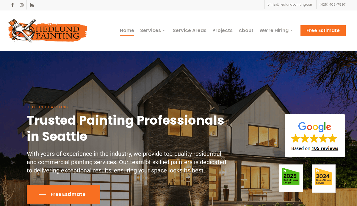
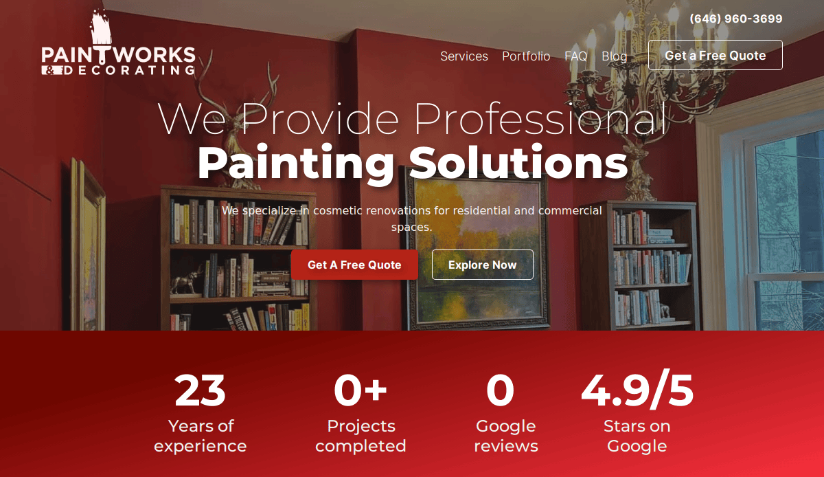
1. Hedlund Painting®
Location: Chicago, IL
Key Takeaways:
- Elegant, modern layout with clear navigation and prominent CTAs
- Visually striking portfolio showcasing craftsmanship
- Testimonial integration reinforces credibility
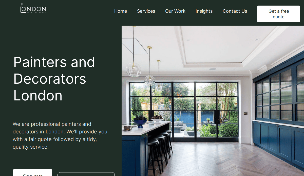
2. London Painting Group®
Location: London, UK (relevant US‑style layout showcase)
Key Takeaways:
- Sleek, elegant color scheme and UX
- Strong storytelling through services and history
- Responsive design with clear CTA
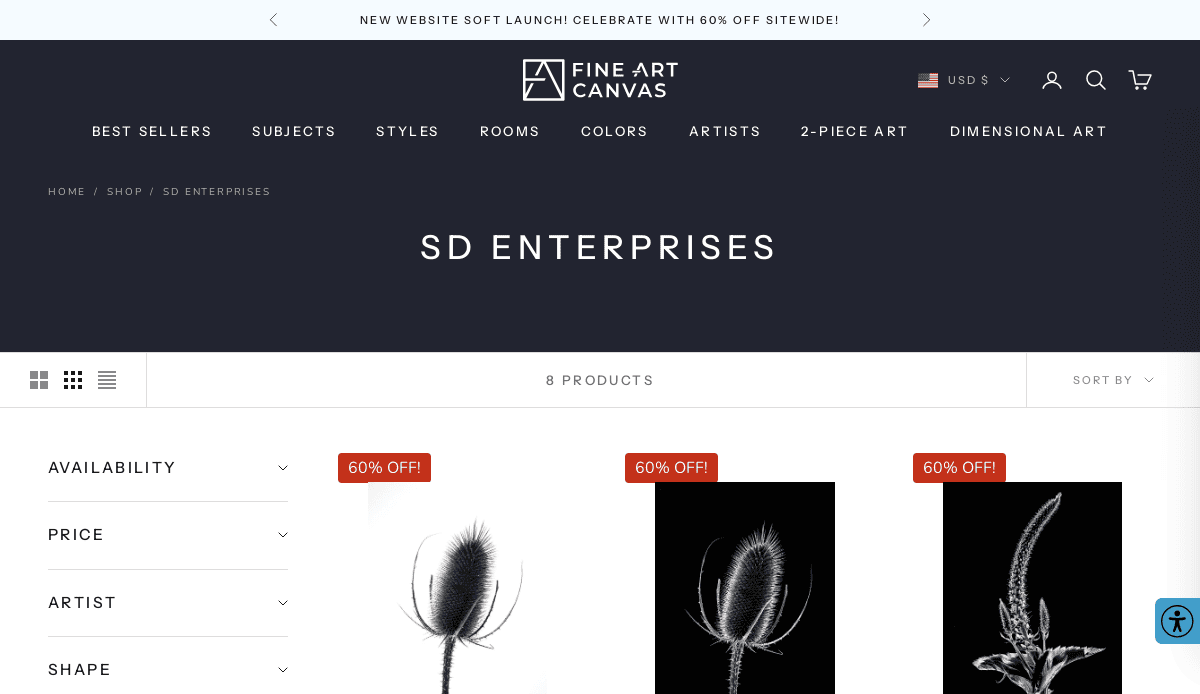
3. S&D Enterprises Painting®
Location: Elmhurst, IL
Key Takeaways:
- Bold hero visuals with seamless mobile responsiveness
- Project galleries with emphasis on testimonials
- Built-in SEO and trust elements
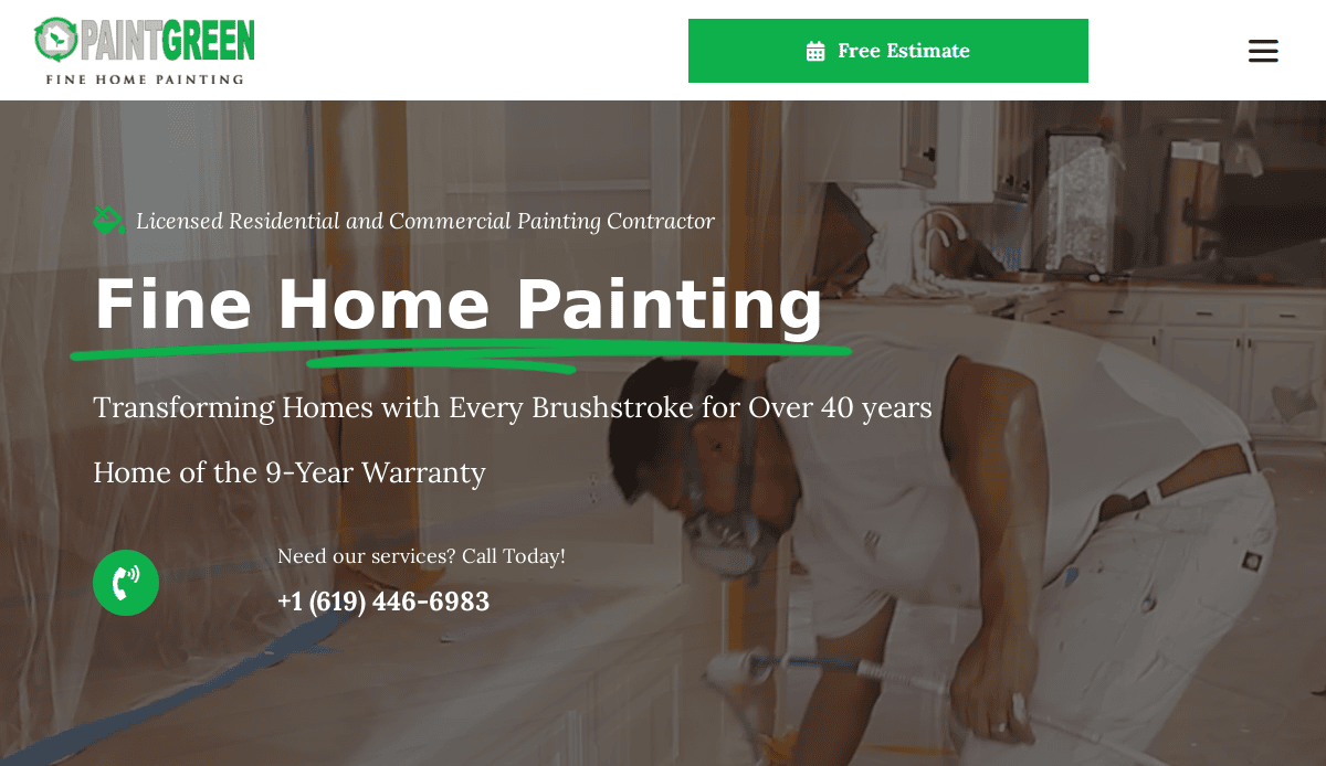
4. PaintGreen Professional Painters®
Location: Chicago, IL
Key Takeaways:
- Clean, eco-friendly color palette that reinforces brand values
- Interactive “Free Estimate” tool enhances user engagement
- Balanced layout combining professionalism with artistic flair
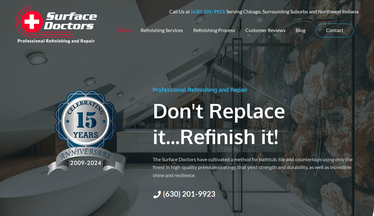
5. Surface Doctors Painting®
Location: Naperville, IL
Key Takeaways:
- Minimalist, refined design emphasizing craftsmanship
- Before-and-after imagery showcases impressive transformations
- Intuitive navigation and clear CTAs streamline the user journey
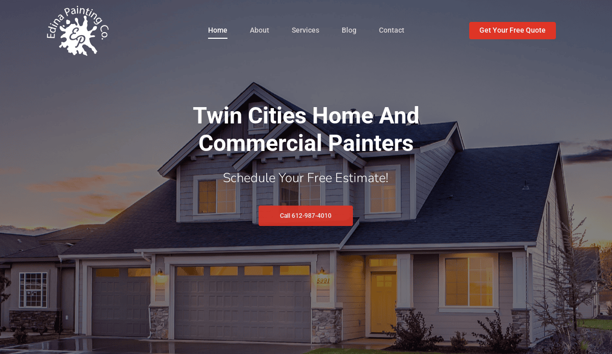
6. Edina Painting Co.
Location: Edina, MN
Key Takeaways:
- Striking hero imagery that builds immediate trust
- Minimal, split‑screen layout keeps focus on visuals
- Effortless user experience
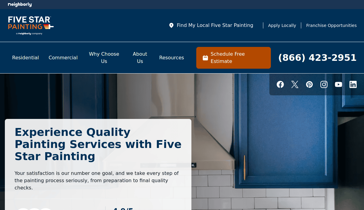
7. Five Star Painting
Location: Dallas, TX
Key Takeaways:
- Balanced color scheme and engaging icons
- Strong CTAs enhance usability
- Clean layout with SEO‑friendly template feel
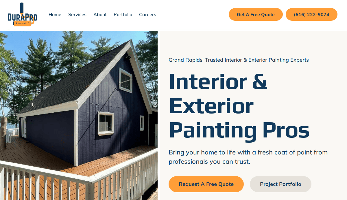
8. DuraPro Painting
Location: Minneapolis, MN
Key Takeaways:
- Bold brand palette reflecting durability
- Modern typography paired with strong visuals
- Clear service messaging
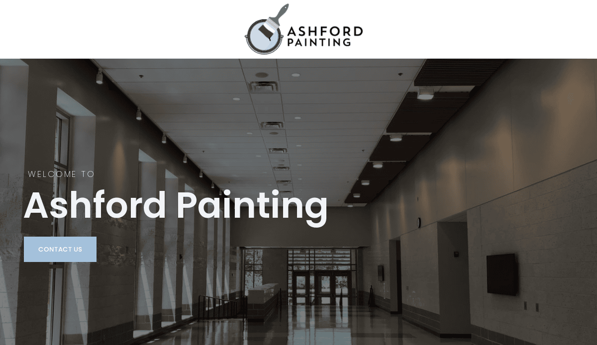
9. Ashford Painting
Location: Edina, MN
Key Takeaways:
- Calming color overlays with refined logo
- Modern, clean layout improves user flow
- Professional tone and visual consistency
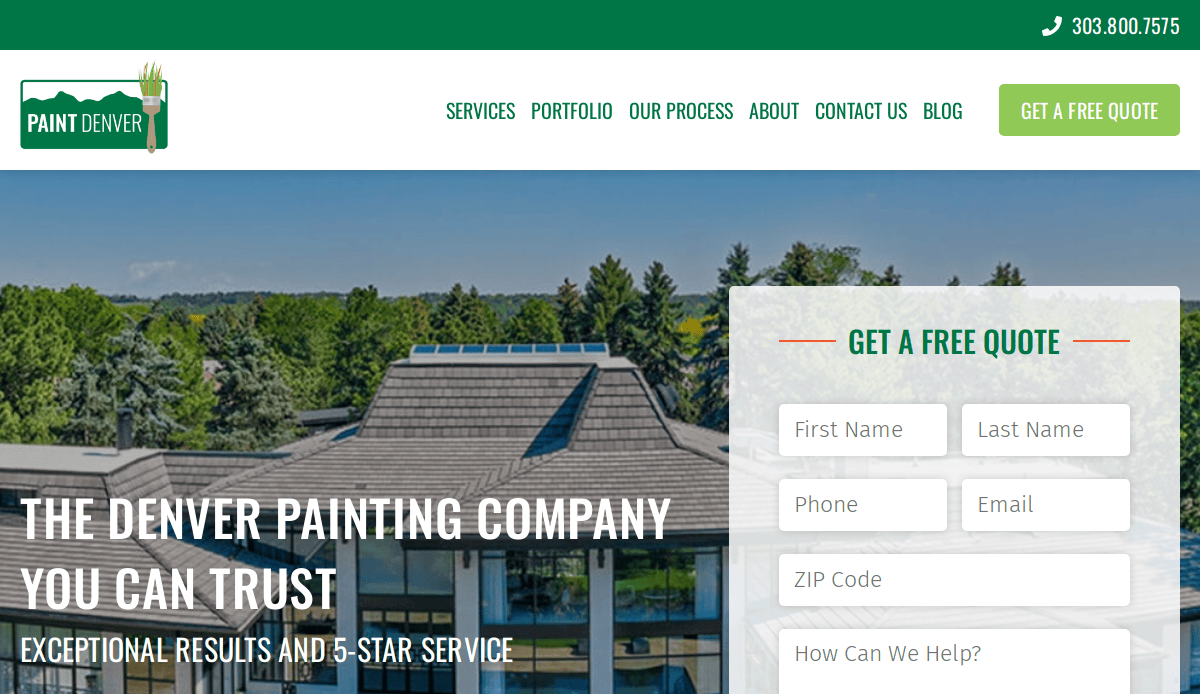
10. Paint Denver
Location: Denver, CO
Key Takeaways:
- Branded green theme with bold fonts
- Prominent review placements for social proof
- Logical navigation and CTA placement
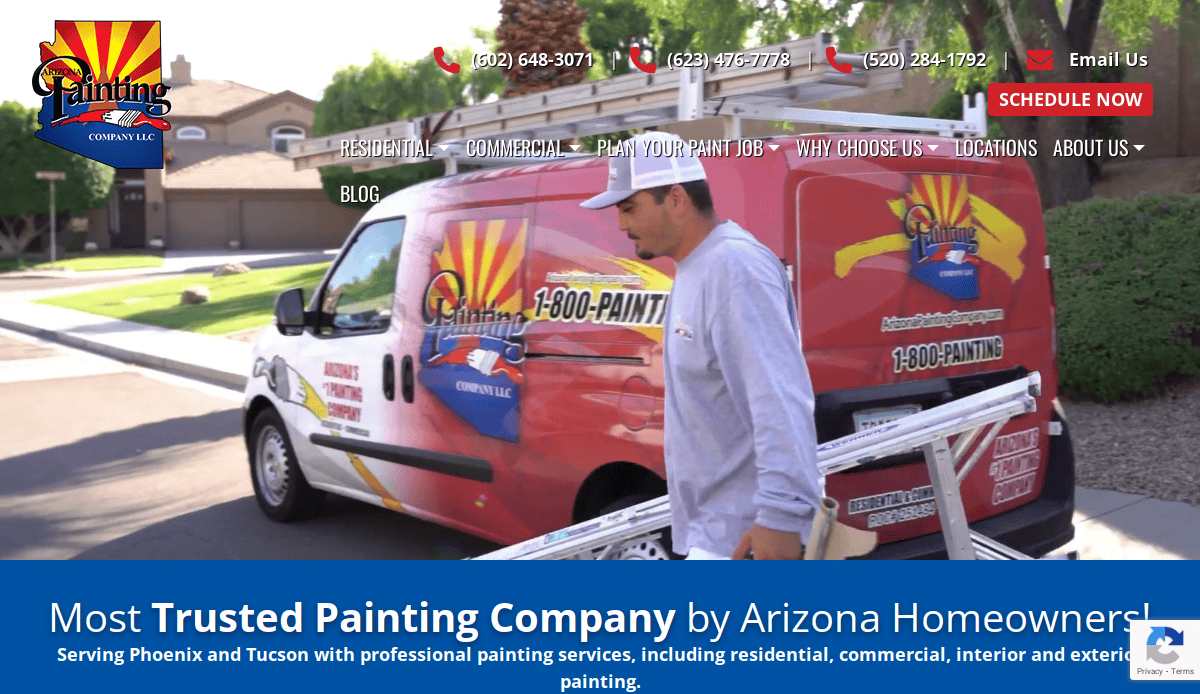
11. Arizona Painting Company
Location: Phoenix, AZ
Key Takeaways:
- Subtle home page animations add professional flair
- Unique textures and clean Contact info
- Strong focus on local SE
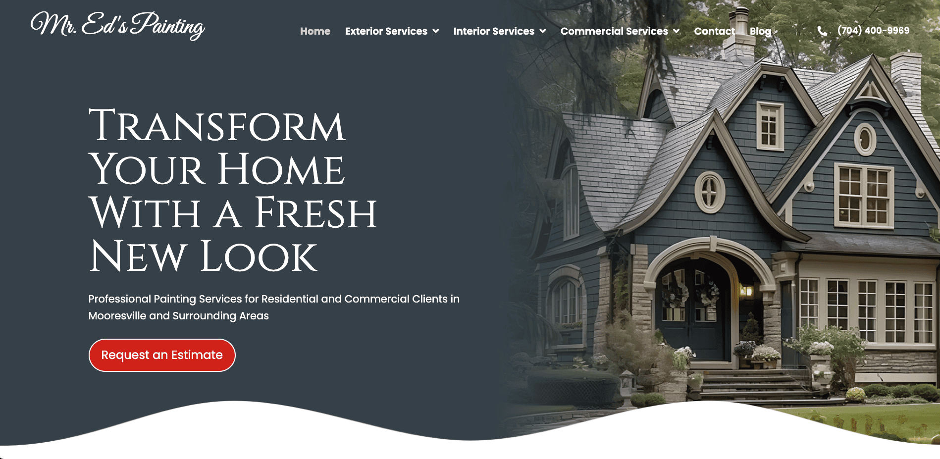
12. Mr. Ed’s Painting
Location: Mooreville, NC
Key Takeaways:
- Hero photography and bold headlines elevate the brand
- Streamlined contact and gallery sections
- High contrast to guide the eyes
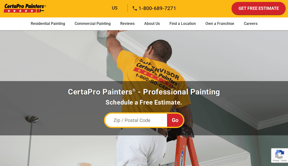
13. CertaPro Painters
Location: Multiple US Markets
Key Takeaways:
- ZIP‑based locator for local lead generation
- AI color visualizer to engage visitors
- Rich content and testimonial integration
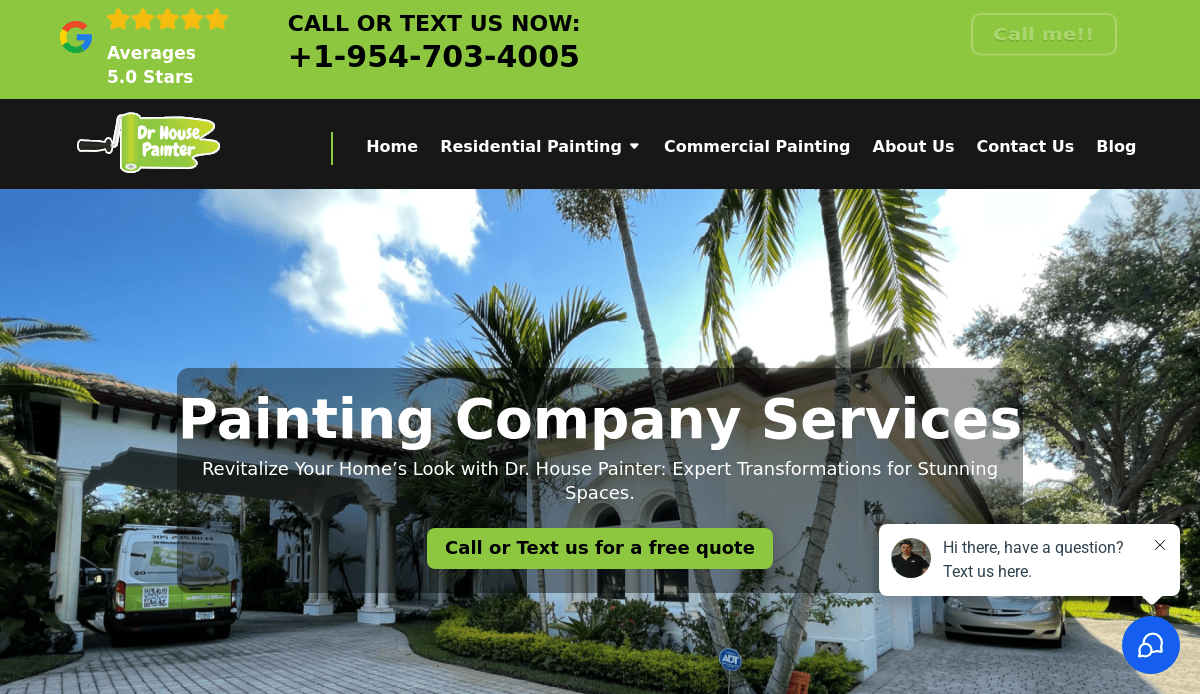
14. Dr. House Painter
Location: Miami, FL
Key Takeaways:
- Promotional banner and clear CTAs drive action
- Minimalistic and user‑friendly design
- Emphasis on reviews and professional partners
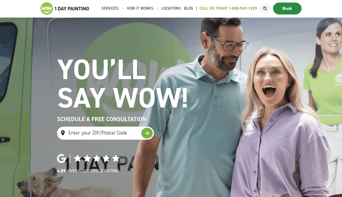
15. Wow 1 Day Painting
Location: Nationwide
Key Takeaways:
- Hero image conveys fast, quality service
- Search bar to find local branches
- Brand tone and UX reinforce the promise
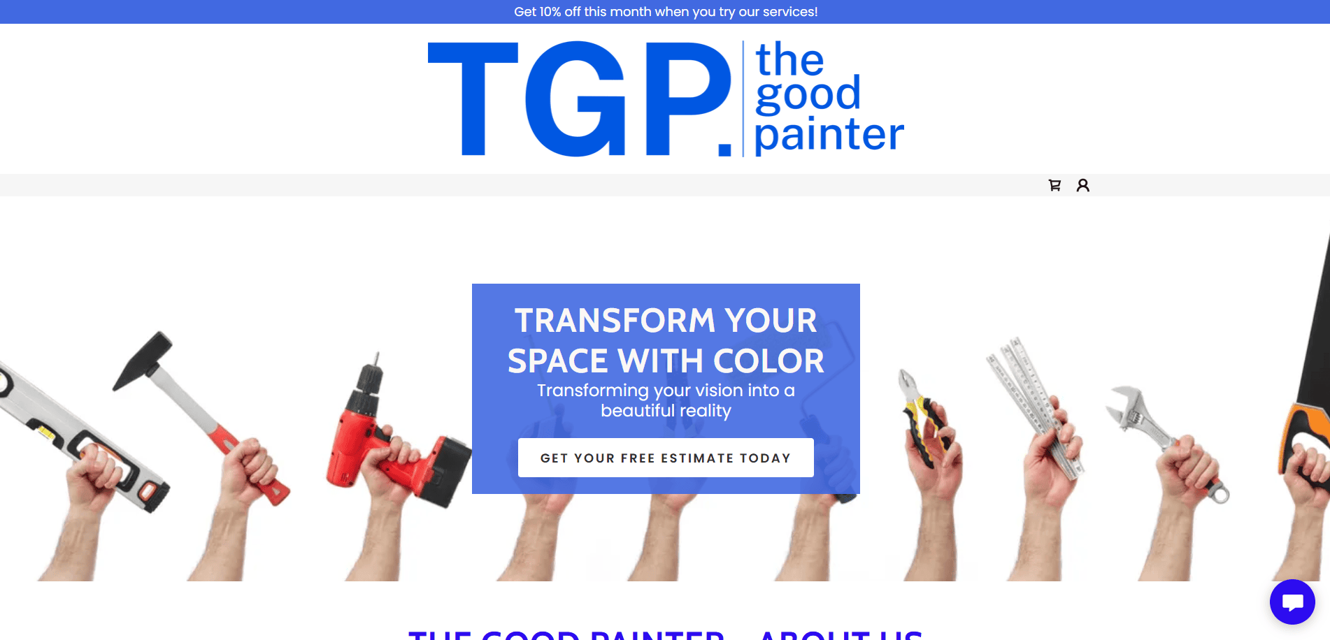
16. The Good Painter
Location: US‑style layout
Key Takeaways:
- Emergency contact CTA is visible at the top
- Balanced service visuals and trust elements
- Clean UX with clear contact links
17. Paint Works
Location: US‑based inspiration site
Key Takeaways:
- Bold color blocks and consistent branding
- List-style services with clear menu labels
- Clean, SEO-conscious design
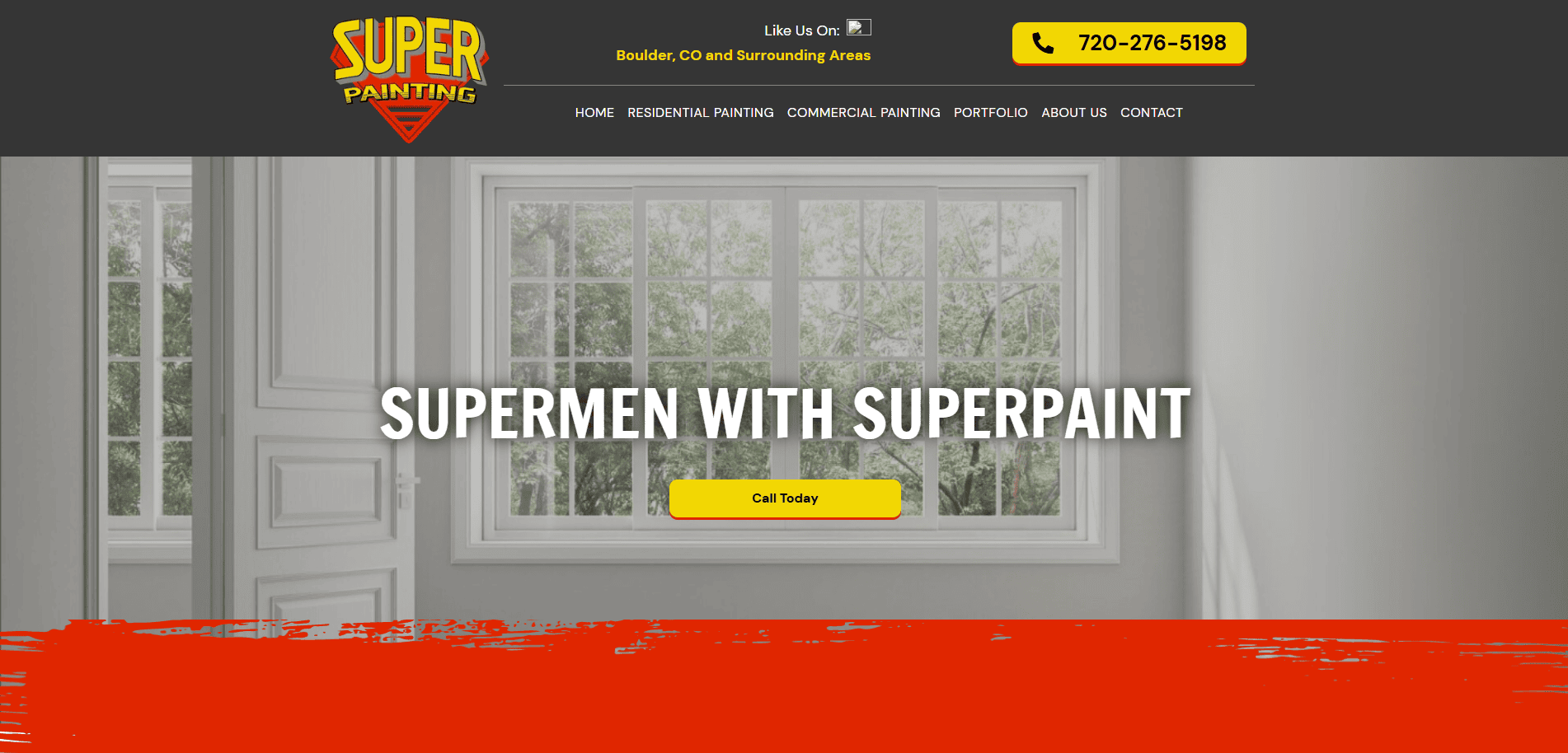
18. Super Painting
Location: US
Key Takeaways:
- Strong font choices for a professional tone
- Service CTAs are intuitive and visible
- Clean UI for better UX
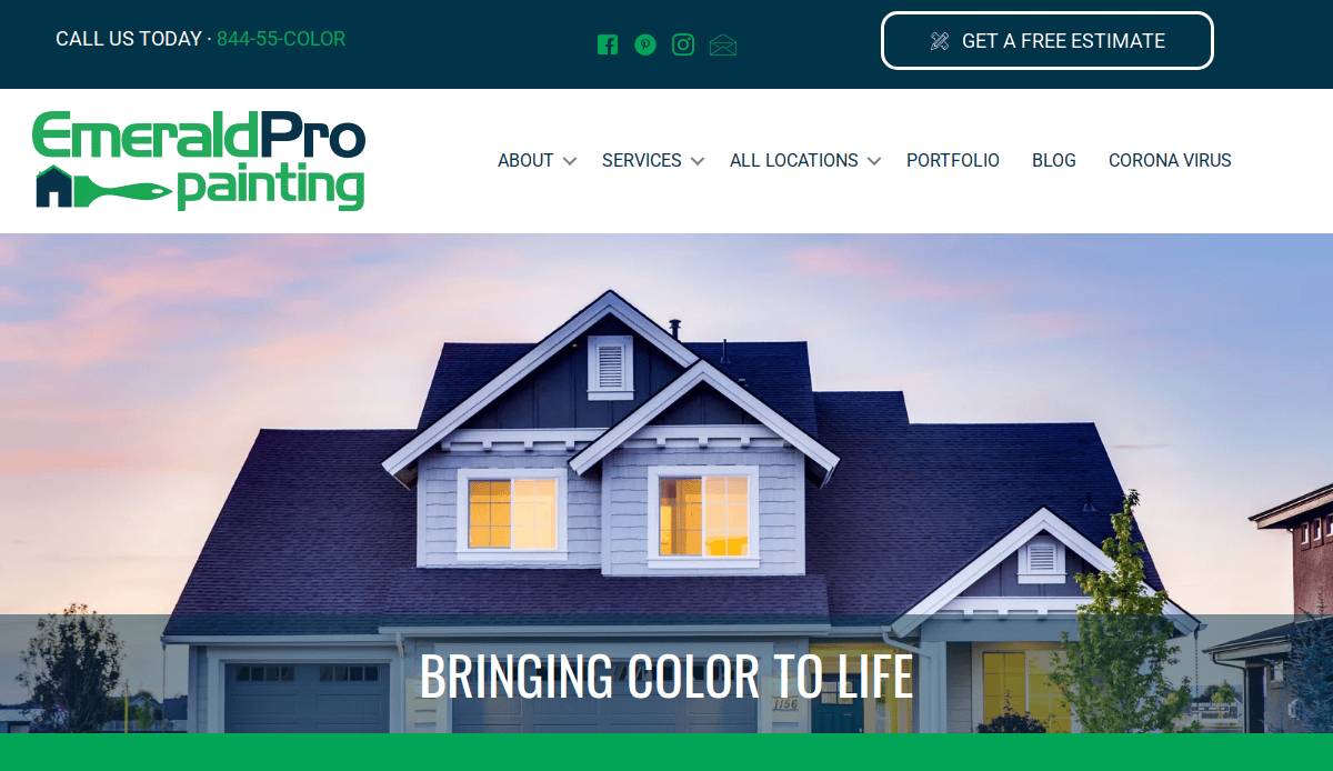
19. Emerald Pro Painting
Location: Seattle, WA
Key Takeaways:
- Memorable color scheme and bold logo placement
- Review section enhances reputation
- Professional typography
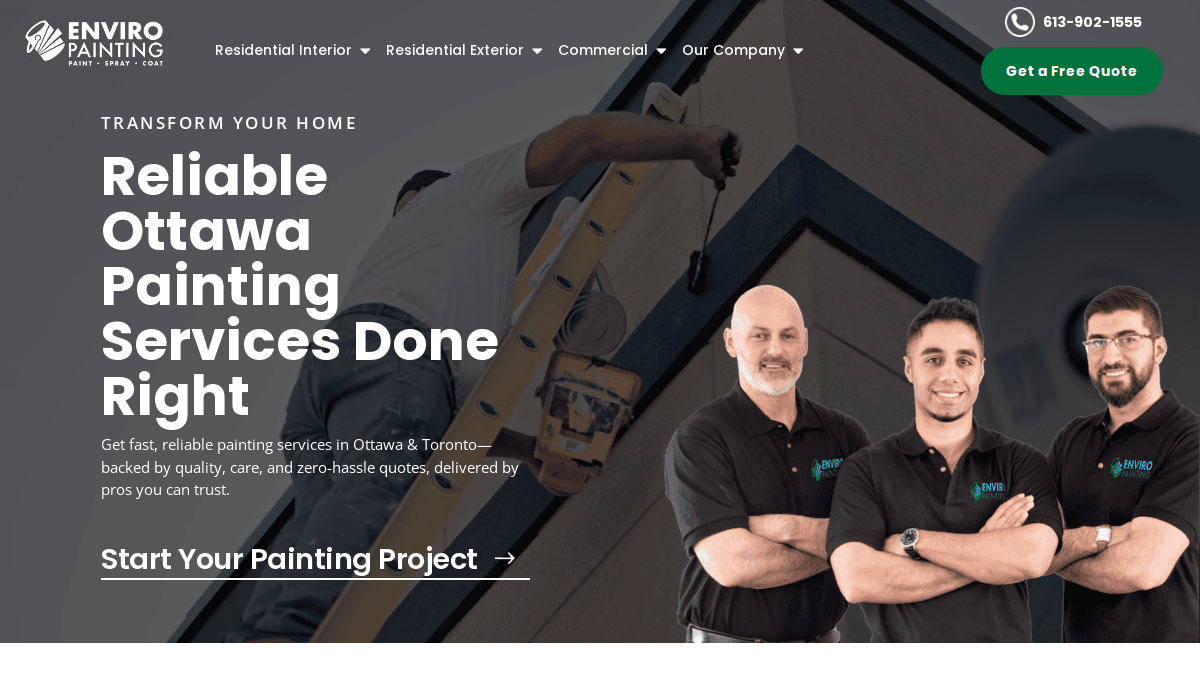
20. Enviro Painting
Location: Minneapolis, MN
Key Takeaways:
- Clean, modern palette with green accents
- Icons aid navigation and visual comprehension
- Before/after sliders for engagement
These websites exemplify strong visual design, clear calls to action, and functional navigation tailored to painting business needs, providing excellent inspiration for your own high-performing site.
Build a Website That Sells Your Painting Expertise
Your website is often the first—and sometimes only—opportunity to impress potential clients who are seeking painting services. Whether you’re a solo professional artist, run a residential painting company, or operate a growing team of painting contractors, an effective website is the foundation for long-term success in the painting industry. You need to create a professional artist website that reflects your craft, drives traffic to your website, and generates leads consistently.
From customizing your design to organizing your artist portfolio or highlighting your painting estimate process, this guide has walked you through a step-by-step strategy to create a website that performs. The right web design incorporates responsive design, clear messaging, and compelling visuals, making it easier for people visiting your website to explore your services, review past painting projects, and take action. Your entire website—from the homepage to your contact form—should be designed to create a beautiful experience that converts interest into results.
If you want to create or refresh your painting business online, don’t wait until the slow season. Launching your website as soon as possible will help you create a digital presence that outshines your competition. From art website design to showcasing the best art gallery website examples, we know what works and what doesn’t in this space.
Need a website to showcase your work and grow your painting business? Let our team help you create a professional painting website that gets results. Whether you’re showcasing a professional art exhibit, listing art galleries, or building a portfolio website to sell art, our team brings the design experience and industry expertise to make your company website a lead-generating machine.
FAQs: Painter’s Web Design Questions Answered
What is the best website builder for artists?
The best website builder for professionals is WordPress. It offers unmatched flexibility, customization, and scalability. Unlike drag-and-drop platforms, WordPress allows you to create a website with original design elements, advanced SEO capabilities, and integration with plugins for galleries, booking, and reviews. Our step-by-step guide for service businesses outlines the benefits of building your entire website on a solid, open-source foundation.
How can I make sure my website looks professional and builds trust?
To ensure your website looks professional and credible, start with a clean layout, use high-resolution photos of your best work, and include trust signals like client reviews and certifications. Incorporate your artist statement or business mission, and design each page with clear navigation, responsive formatting, and easy access to contact forms. A professional look communicates reliability and enhances your credibility, key to converting visitors into leads.
What pages are essential for an artist’s website?
Every artist’s website or painting business site should include:
- Homepage – concise overview of your services
- Services – broken down by interior, exterior, or specialty painting
- Gallery or Portfolio – showcases your great painting projects
- Testimonials – build trust and show proof of quality
- Contact Page – makes it easy for clients to reach out
These pages help you create a business website that captures leads and reflects your professionalism.
How do I write an artist profile or artist statement for my site?
Your artist profile or artist statement should focus on what drives your work, your background, and the values that set your business apart. This could include your experience with certain finishes, your approach to color consultation, or how you manage residential and commercial projects. Keep the tone authentic and aligned with your brand.
Can my website help me sell art online or book more painting jobs?
Yes, your website will help you sell art online or secure more painting contracts if it’s structured correctly. Include calls-to-action, clearly explain your services, use booking forms or quote request options, and provide examples of past work. Showcasing online art and integrating e-commerce or lead gen tools ensures your website is more than just a digital brochure—it becomes your top sales tool.
How often should I update my website?
To keep your website relevant and functional, aim to review it at least once per quarter. Update your portfolio with new projects, revise outdated content, test contact forms, and check that your site’s performance is strong on mobile and desktop. Staying current keeps you ahead of competitors and ensures your site continues to reflect your best work.
What makes a painting website “highly effective”?
Artist websites that are highly effective combine clarity, originality, and usability. They offer a seamless browsing experience, clearly present services, and use visual storytelling to demonstrate expertise. They also rank well in search engines thanks to optimized content, structured data, and internal linking strategies.
Should I include graphic design elements on my website?
Yes, incorporating tasteful graphic design can help elevate your brand and make your website more visually engaging. This could include icons that represent different services, branded color schemes, and layout enhancements that draw the user’s eye. But balance is key—use design to enhance UX, not distract from your message.
What are some helpful tips for creating an artist’s website?
Some helpful tips include:
- Keep your website simple and easy to navigate
- Include only your best work in your gallery
- Write for your audience, not just for search engines
- Ensure fast load times and mobile responsiveness
- Use internal links to guide visitors through the site
- Make your calls-to-action clear and visible
Can I create art and manage a website at the same time?
Many artists worry about juggling their craft with website maintenance. The key is to set up a strong foundation and then automate where possible—use scheduled blog posts, managed hosting, and backup plugins to keep your site running smoothly. If you’re short on time, partnering with a web design team like ours can help you focus on what you do best: create art, while your website continues working for you.


