Just looking for our Home Builders Company Website examples list?
Why Website Design Is the Blueprint of Home Builder Success
First impressions are everything. Before a potential client ever steps into a model home or picks up the phone, they’re visiting your website. It’s your digital front door—and if it looks outdated, loads slowly, or confuses visitors, you’ve likely lost the sale before it even starts.
A well-designed home builder website isn’t just about aesthetics—it’s a strategic business tool. The right design attracts qualified leads, showcases your craftsmanship, and positions your brand as the trustworthy expert in a crowded market. From mobile responsiveness and SEO to virtual tours and high-impact visuals, every design choice you make influences how potential homebuyers perceive your work and whether they choose you over the competition.
Whether you’re launching a new site or looking to refresh your current one, this guide breaks down exactly what goes into a top-performing website. You’ll discover the essential pages, the latest design trends, and actionable tips to elevate your online presence and convert more leads. Let’s build something great—starting with your digital foundation.
Website Foundation: Key Design Principles for Home Builder Websites
Just like a quality home begins with a solid foundation, a successful website starts with exceptional design principles. A poorly constructed website—much like a poorly built home—can crumble under pressure, leading to lost traffic, frustrated users, and missed opportunities. Here’s how to ensure your site stands strong from the ground up.
Visual Hierarchy that Guides the Eye
Use size, color, contrast, and spacing to emphasize what matters most, such as a featured project, a review, or a call-to-action. Clear, scannable layouts help users find what they’re looking for without friction.
Responsive and Mobile-First Design
With mobile traffic now surpassing desktop, your site must perform flawlessly across all devices. Responsive design ensures your content, images, and navigation adjust smoothly, providing a seamless experience from phones to tablets to desktops.
Consistent Branding Across Pages
From your logo and color palette to typography and messaging tone, consistency builds recognition and trust. Use your brand’s visual identity across every page to reinforce professionalism and help visitors instantly identify your business.
High-Impact Visuals and Media
Images sell homes. Invest in professional photography, 360° virtual tours, and drone footage to visually communicate your craftsmanship.
Clear Navigation and Site Architecture
A confusing site can lead to high bounce rates. Ensure your top navigation is clean and logical, highlighting essential pages like “About,” “Floor Plans,” “Gallery,” and “Contact.”
Conversion-Driven Layouts
Design with your goals in mind. Use strategically placed CTAs—such as “Schedule a Consultation” or “View Our Models”—to move visitors down the funnel.
Accessibility and Compliance
Use readable font sizes, alt text for images, and sufficient color contrast to make your site accessible and ADA-compliant.
Fast Load Times and Performance Optimization
Speed matters. Compress images and leverage caching tools to keep your site fast.
Content & Navigation: Structuring a Website That Guides and Converts
In website design, structure is everything. Just like a blueprint guides the construction of a home, a well-organized site guides users to the information they need—quickly, clearly, and convincingly.
Design Around Buyer Intent
Structure your content to answer key buyer questions early and clearly using language that speaks to their goals.
Simplify Navigation with Clear Labels
Keep your top navigation focused, including essential pages like:
- Home
- About Us
- Floor Plans / Communities
- Portfolio / Virtual Tours
- Testimonials
- Contact
Optimize for Scannability
Use H2s, H3s, bullet points, and short paragraphs to make content easily digestible.
Leverage Internal Linking
Guide users deeper into your site and improve SEO by linking relevant pages and content.
Highlight Key Calls-to-Action
Place CTAs like “Book a Free Consultation” or “Tour a Model Home” prominently across each page.
Use Location-Based Content for SEO
Create dedicated landing pages for each community or region you serve.
Provide Trust Signals
Add builder certifications, warranty info, and client reviews near conversion points.
Visual Elements: Showcasing Quality and Building Trust Through Design
For industry professionals in home building, what clients see is what they believe. Visual elements are more than decoration—they’re proof of craftsmanship, professionalism, and attention to detail.
Professional Photography That Captures Craftsmanship
Use high-resolution photos to exhibit interiors, exteriors, and community amenities.
Virtual Tours and Interactive Elements
360-degree tours and interactive floor plans help buyers visualize your homes remotely.
Consistent Use of Brand Colors and Typography
Maintain a unified brand presence with consistent design across all pages.
Iconography to Enhance Usability
Use intuitive icons to help users scan and interact with your content.
Before-and-After Stories
Tell compelling stories of transformation to highlight your expertise.
Cinemagraphs and Drone Footage
Add motion and aerial views to create emotional impact and visual distinction.
Whitespace to Create Focus
Use spacing to reduce visual clutter and emphasize key elements.
Ongoing WordPress Maintenance: Keeping Your Website Running Like a Well-Built Home
Just like a custom-built home requires regular upkeep, a WordPress website needs ongoing maintenance to stay secure, functional, and high-performing.
Security Updates and Patching
Keep core files, themes, and plugins up to date to protect against threats.
Plugin and Theme Compatibility
Ensure features like galleries and forms work smoothly across all platforms.
Performance Optimization
Clean up your database and compress images to keep load times fast.
Regular Backups and Recovery
Automate backups to safeguard your site against unexpected failures.
Monitoring and Analytics
Track performance metrics and user behavior to inform improvements.
Content Refresh and SEO Health Checks
Update content and fix broken links regularly to stay relevant in search.
ADA Compliance and Legal Updates
Ensure accessibility and keep legal documents like privacy policies up to date.
Now, here are some examples.
Best Home Builder Website Examples
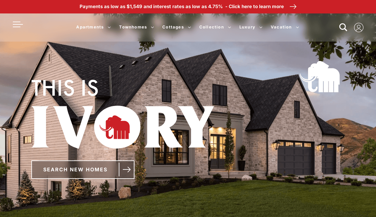
1. Ivory Homes
Location: Salt Lake City, UT
Key Takeaways:
- Engaging homepage banner with the tagline “Celebrate the Great Indoors”
- Emphasis on sustainability and community initiatives
- Clean layout with intuitive navigation
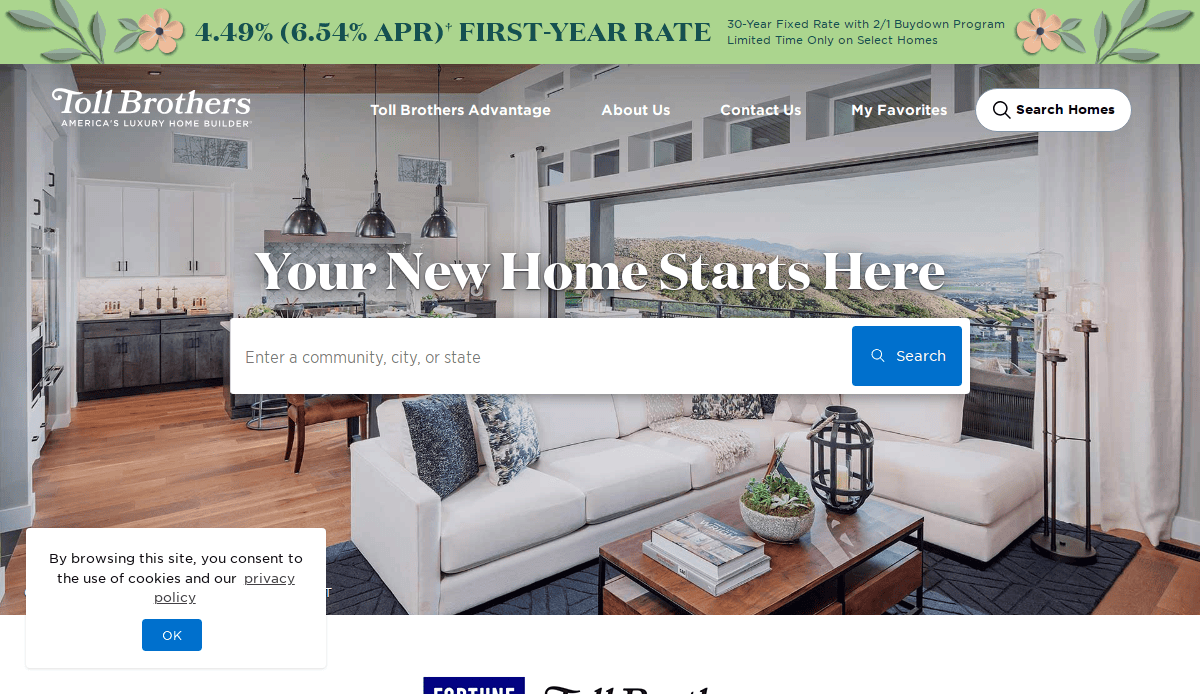
2. Toll Brothers
Location: Fort Washington, PA
Key Takeaways:
- High-quality imagery highlighting luxury homes
- User-friendly navigation with clear CTAs
- Comprehensive information on home designs and communities
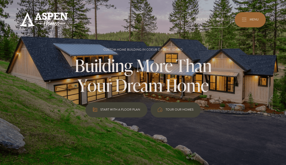
3. Aspen Homes
Location: Coeur d’Alene, ID
Key Takeaways:
- Majestic home images that captivate visitors
- Pleasing color scheme enhances visual appeal
- Strategically placed buttons for easy navigation
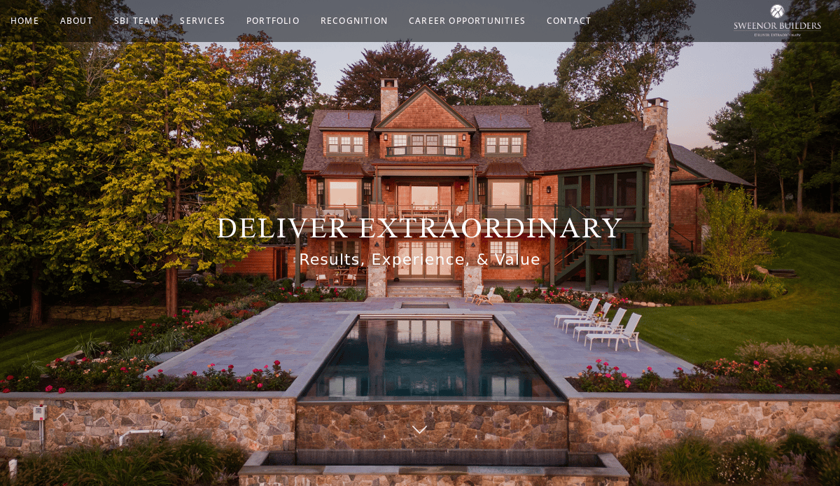
4. Sweenor Builders
Location: Wakefield, RI
Key Takeaways:
- Elegant black-and-white color scheme
- Focus on exhibiting designer work
- Smooth scrolling experience with high-quality visuals
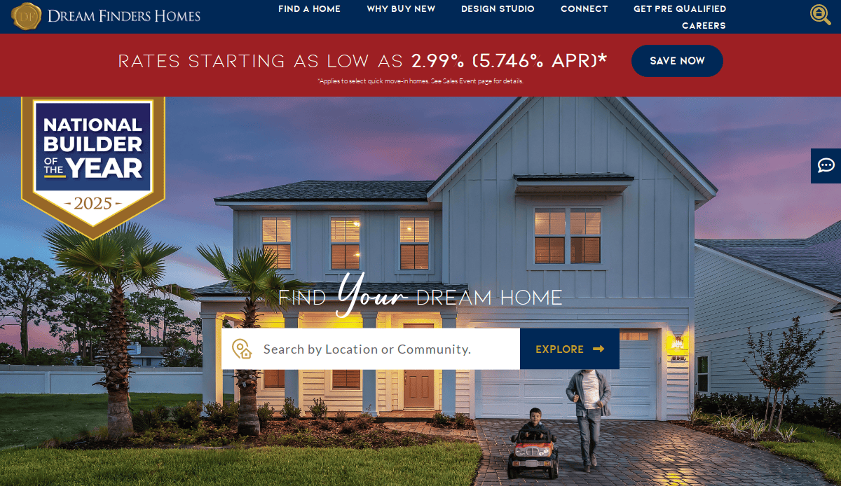
5. Dream Finders Homes
Location: Jacksonville, FL
Key Takeaways:
- Design studio highlighting available designs
- Interactive features allowing customers to visualize homes
- Emphasis on customer engagement
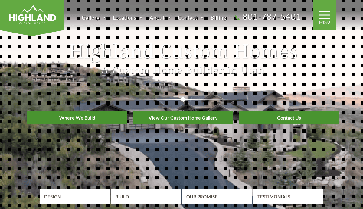
6. Highland Custom Homes
Location: Lehi, UT
Key Takeaways:
- Bright green accents highlight key information
- Creative background graphics enhance brand identity
- Simplistic yet effective logo design
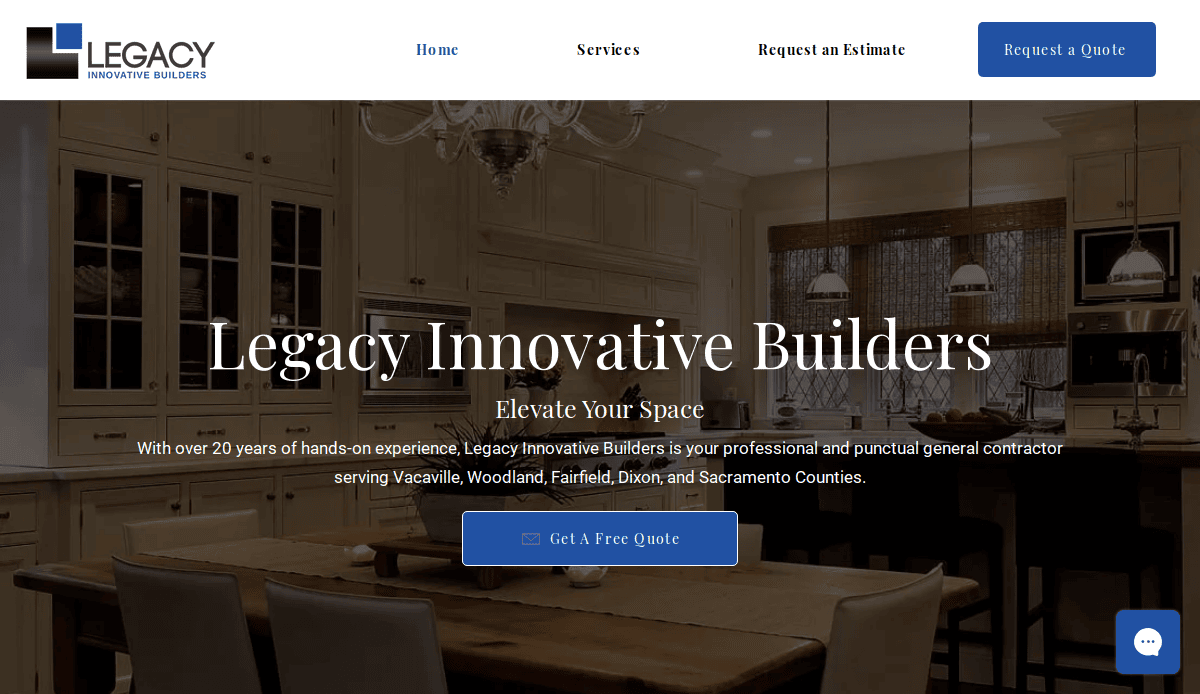
7. Legacy Innovative Builders
Location: Temecula, CA
Key Takeaways:
- Bold design elements capture attention
- Prominent chat feature for immediate customer engagement
- Clear presentation of services and experience
8. QualMax Construction
Location: San Diego, CA
Key Takeaways:
- Clean layout with aesthetic appeal
- Emphasis on timely and budget-conscious project delivery
- Easy navigation enhances user experience
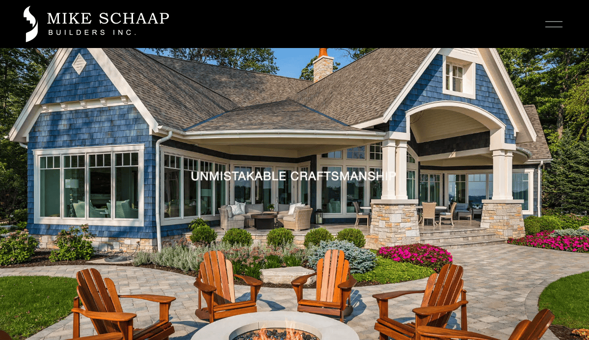
9. Mike Schaap Builders
Location: Holland, MI
Key Takeaways:
- Distinctive black-and-white color scheme
- Unique navigation with a hamburger menu
- Alternating background colors add visual interest
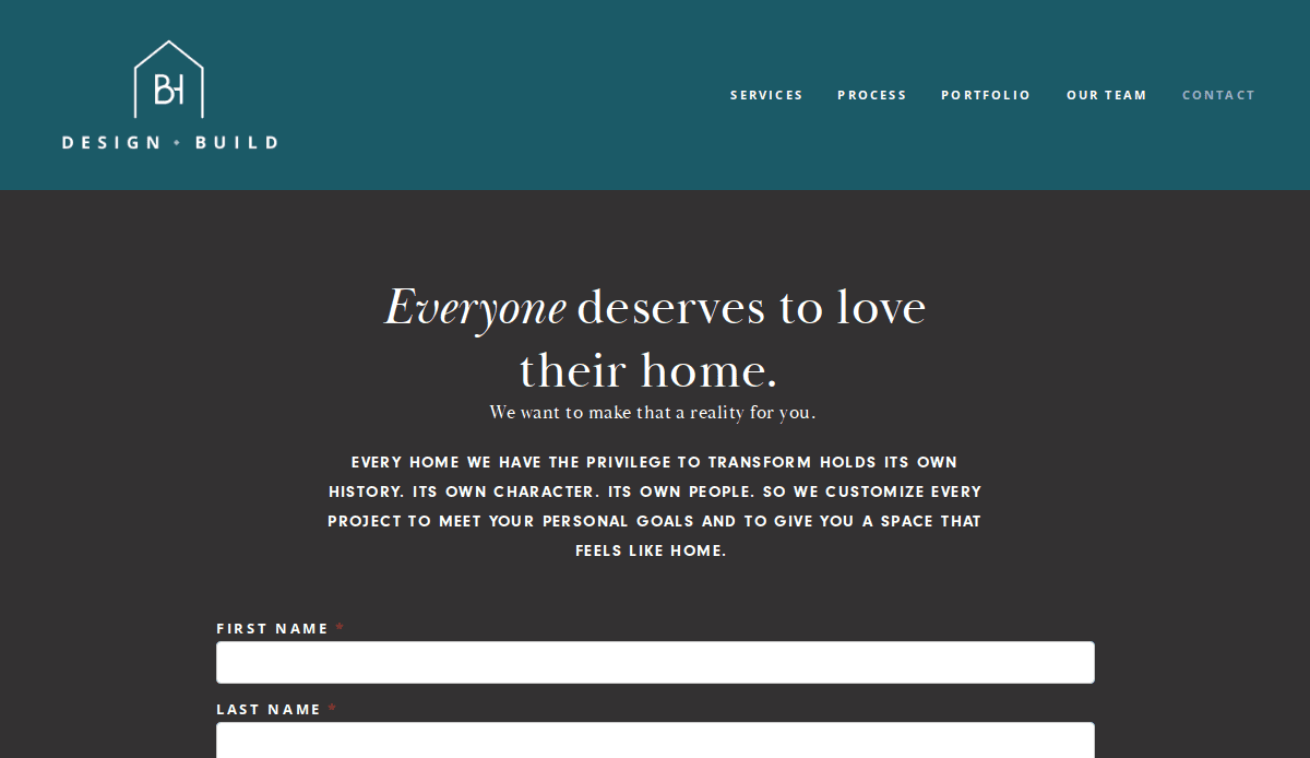
10. BH Design & Build
Location: Chicago, IL
Key Takeaways:
- Sleek, contemporary design enhances visual appeal
- High-quality photos highlighting the portfolio
- Well-organized menus for easy navigation
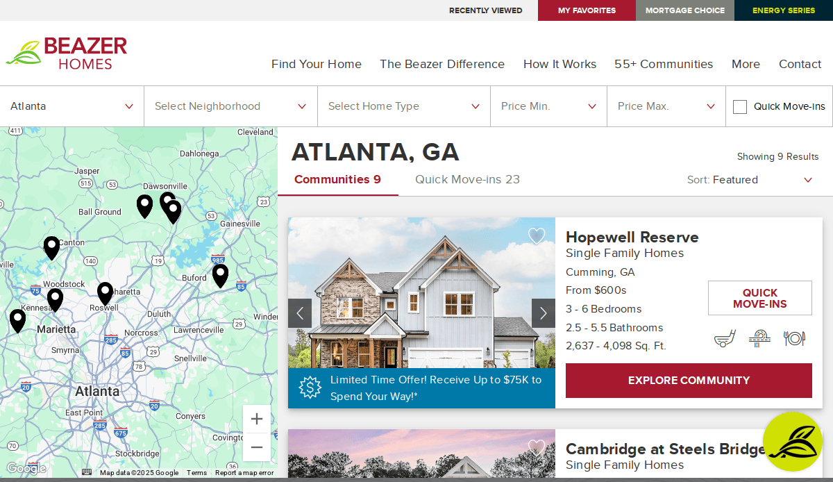
11. Beazer Homes
Location: Atlanta, GA
Key Takeaways:
- Balanced design with images and text
- Seamless browsing experience
- Comprehensive information on home options
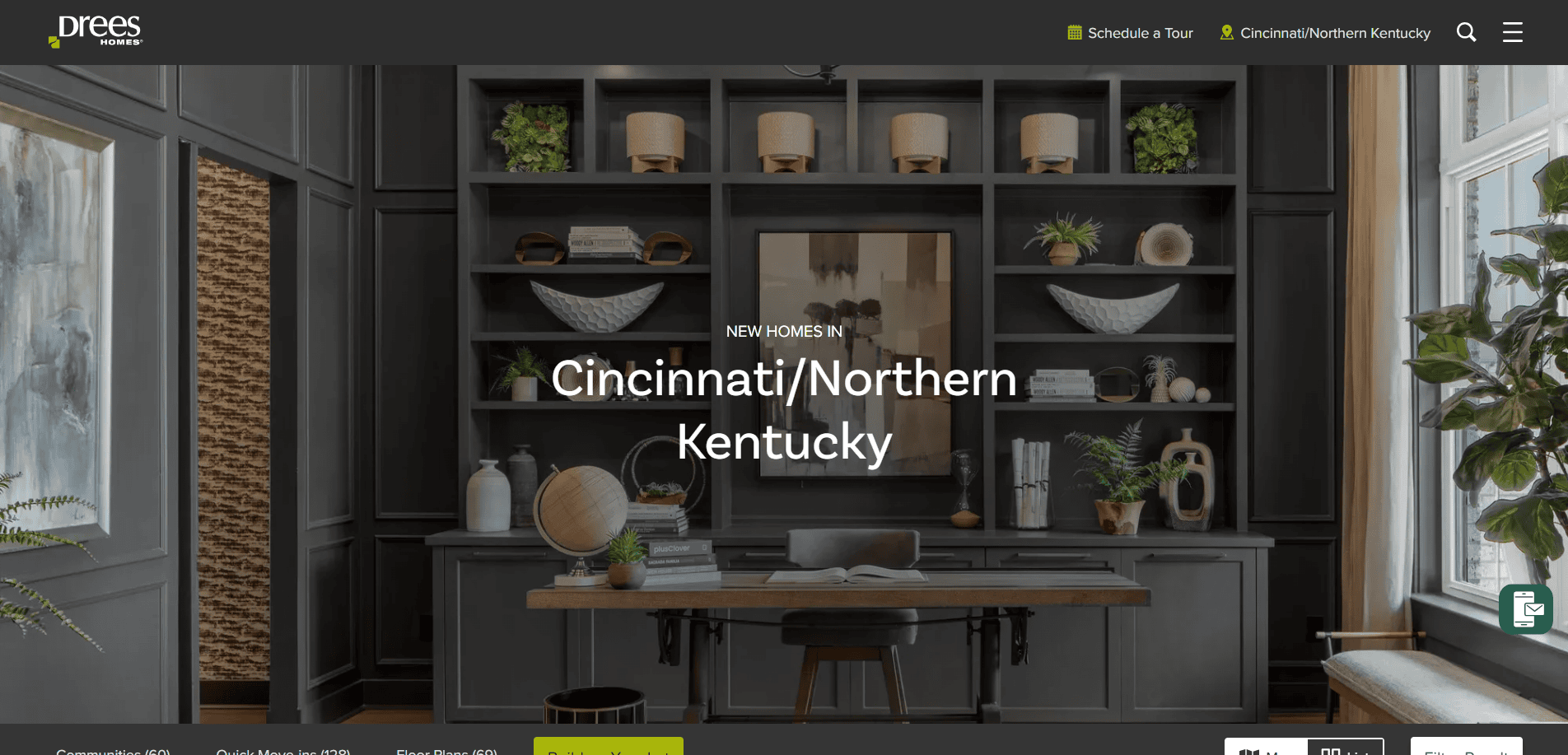
12. Drees Homes
Location: Fort Mitchell, KY
Key Takeaways:
- Smooth design flow with large images
- Thoughtfully placed minimal text
- Easy scheduling feature for home visits
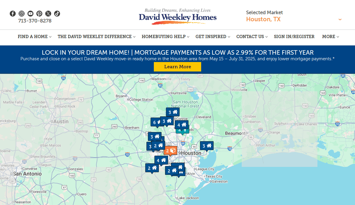
13. David Weekley Homes
Location: Houston, TX
Key Takeaways:
- Structured presentation with a clear purpose
- Engaging storytelling about the company
- User-friendly interface with detailed home information
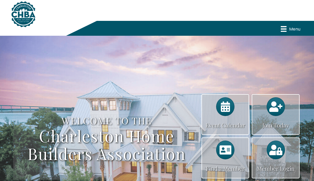
14. CHB Home Builders
Location: Charleston, SC
Key Takeaways:
- Clear project exhibit for easy exploration
- Emphasis on custom home construction
- Simple design highlighting quality craftsmanship
15. True Homes
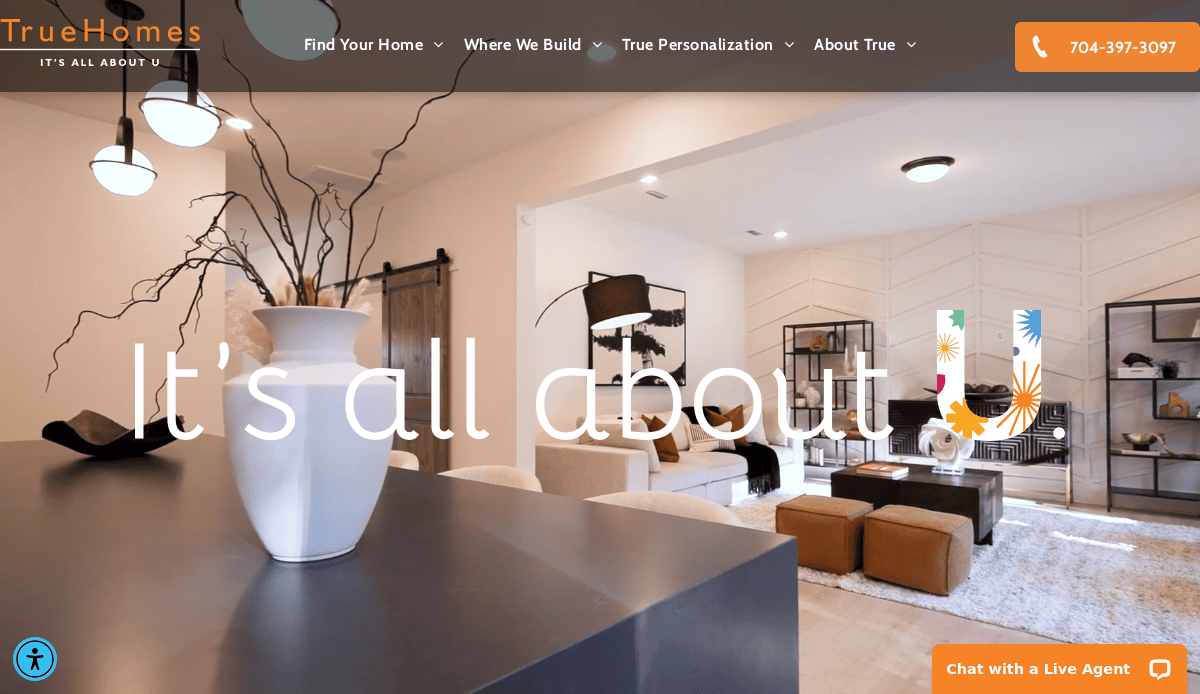
Location: Monroe, NC
Key Takeaways:
- Streamlined building process outlined clearly
- Accommodates various budgets with transparent pricing
- Dedicated team support throughout the project
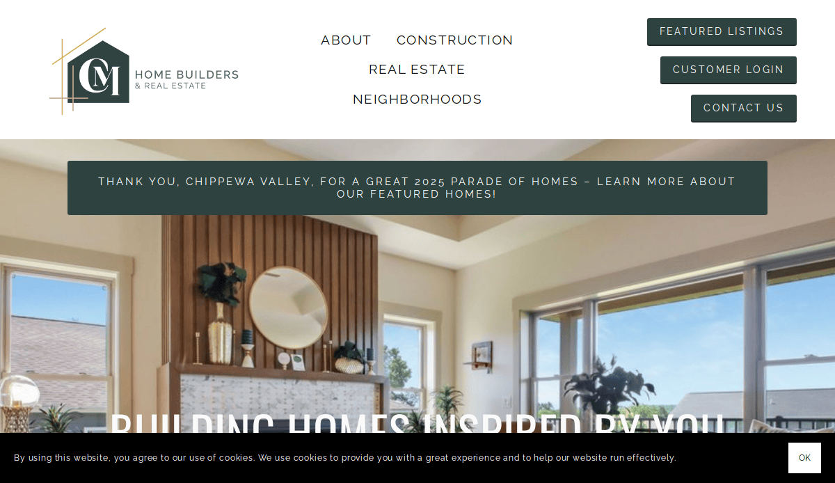
16. C&M Home Builders
Location: Eau Claire, WI
Key Takeaways:
- Bold and professional font usage
- Optimized content for better reader engagement
- Personalized search bar enhances user experience
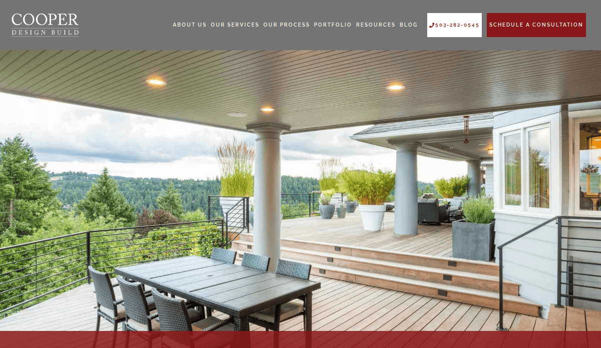
17. COOPER Design Build
Location: Portland, OR
Key Takeaways:
- Elegant and polished design
- Sophisticated color palette complementing images
- User-friendly navigation with well-organized menus
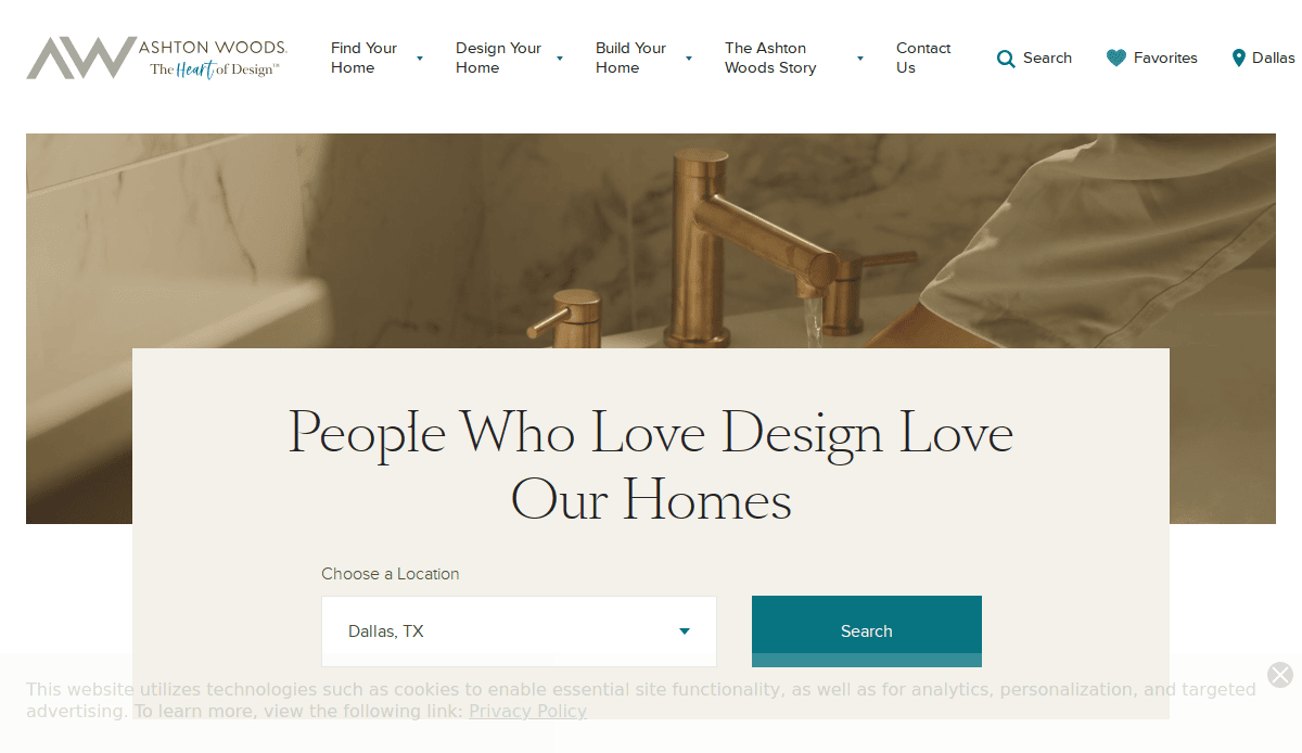
18. Ashton Woods
Location: Atlanta, GA
Key Takeaways:
- Interactive and customer-centric design
- Award recognition is prominently displayed
- Easy navigation with a location selection feature
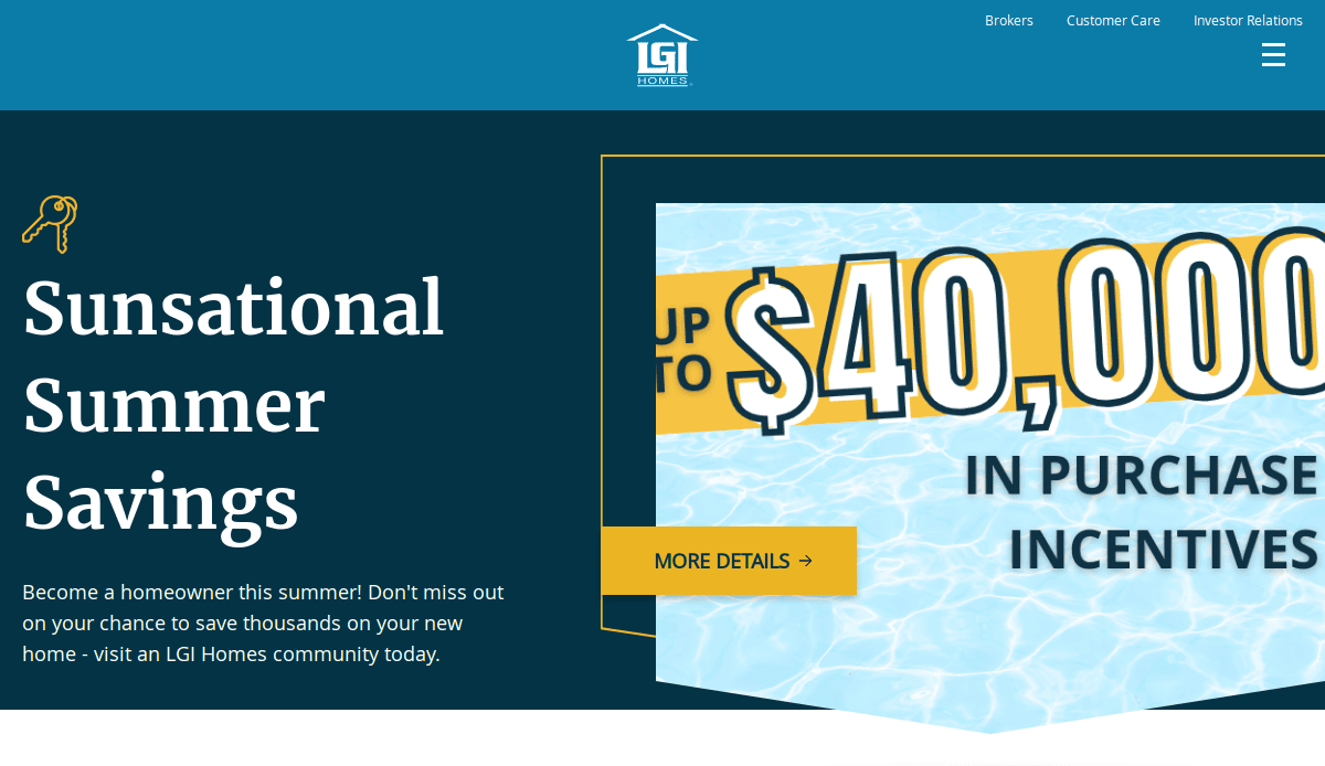
19. LGI Homes
Location: The Woodlands, TX
Key Takeaways:
- Well-customized contact form catering to various visitor needs
- Reviews and customer reviews enhance credibility
- Advanced property search options
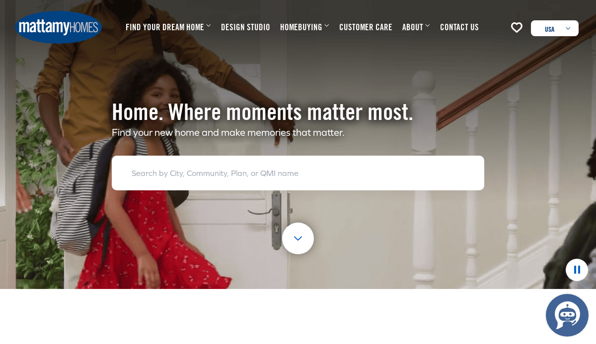
20. Mattamy Homes
Location: Orlando, FL
Key Takeaways:
- Serves multiple locations with a user-friendly interface
- Country selection feature for the USA and Canada
- Organized menus with city-specific information
Ready to Build a Better Website for Your Home Building Business?
In this industry, your digital front door is just as important as your model home. Whether you’re launching a new website or updating your current one, now is the time to stand out with a custom website that reflects your craftsmanship and meets the expectations of modern home buyers. From the homepage to your project portfolio, each element must be strategically designed to be easy to navigate, optimized for online sales, and aligned with your brand’s price point, types of homes you construct, and the building process you guide clients through.
Too many websites in the industry rely on outdated templates and ignore essential website features that drive engagement. To truly differentiate in a competitive market and attract new customers, your site must be more than a brochure—it must be a tool. Integrating drone videos, live chat, and downloadable brochures, along with clear calls to action and smart SEO, can boost visibility, build trust with prospective buyers, and convert more sales.
Our expert web designers specialize in professional web design and digital marketing for homebuilders. We’ll help you make your website a powerful asset, using proven best practices, advanced content management systems, and decades of experience to create a site that delivers. Whether you’re showcasing a newly launched community or your full range of building sites, we have the track record to guide you from initial consultation to final launch.
Let’s build a better website that drives results. Contact us today to schedule your consultation.
Frequently Asked Questions (FAQs)
What makes a great website for the home building industry?
A great website combines visual appeal with strategic functionality. It highlights the types of homes they construct, provides rich visual content like exhibits and virtual tours, and offers clear navigation to address customer needs. It should be mobile-friendly, SEO-optimized to drive more traffic, and include strong calls to action to convert visitors into leads.
How often should I update my builder’s website?
Regular updates are essential. You should update your website every quarter to reflect new projects, community launches, and changes in square footage offerings or amenities. Keeping your website fresh with blog posts, new imagery, and client feedback helps you rank better in search and builds trust with visitors.
Do I need a custom design, or can I use a template?
While some websites use templates, a custom website tailored to your brand, process, and market can help you stand out. Templates may save time, but they often lack the flexibility and uniqueness needed to reflect your brand’s quality and many bells and whistles. Learn more about our website design services built specifically for homebuilders.
What key features should I include on my website?
Your site should include high-quality imagery, interactive floor plans, service area details, client reviews, and an easy-to-use contact form. Additional website features like downloadable brochures, live chat, and integrated CRM tools can further help you build a website that captures and nurtures leads.
Can a better website help me attract more qualified leads?
Absolutely. A professionally designed website with clear messaging, SEO integration, and conversion-optimized design helps drive more traffic and improve lead quality. When your site is built with customer needs in mind, it encourages potential customers to reach out.
How do you tailor design services to different types of home builders?
Our design services for homebuilders are customized to each client’s unique offerings and types of homes they construct, whether you build custom estates, townhomes, or multifamily developments. We design with your audience and business goals in mind.
Are there any more examples of industry websites?
Yes, we’ve curated a list of the 10 best home builder websites that showcase top-tier designs, engaging user experiences, and industry-leading strategies. Use this guide for inspiration as you plan or redesign your own site.
What is the best way to plan the structure of my builder’s website?
Start by identifying your core offerings and customer questions. Your builder’s website should be organized by the types of homes they construct, the communities you serve, and your building process. Include a homepage, services, gallery, reviews, and contact page, then expand with blog content and resource pages.
Should I include square footage details on my home listings?
Yes, square footage is a critical decision factor. Including it in your floor plan pages and property listings helps users quickly evaluate whether a home fits their needs, enhancing their experience and building trust.
How long does it take to build a website?
Timelines vary, but typically it takes 6–10 weeks from planning to launch. This includes discovery, design, development, and testing. For a tailored timeline, start with an initial consultation to discuss your project and goals.

