Just looking for our Best B2B Website examples list?
Key Takeaways:
Here are the essential takeaways from our advanced guide to B2B website design. This is your blueprint for creating a digital experience that functions as a true growth engine for your business.
- Design for the Entire Buying Committee, Not a Single Persona. A modern B2B website must serve multiple stakeholders involved in a purchase decision. Structure your content and navigation to provide clear pathways for different roles, such as the end-user who needs technical specs, the manager who requires ROI calculators, and the executive who wants to see the top-level selling proposition and trust signals immediately.
- Your Website’s Primary Goal Is to Accelerate the Sales Cycle. Shift your perspective from viewing your website as a static digital brochure to seeing it as your most powerful sales tool. A successful B2B site actively educates buyers, answers their questions, and builds trust, allowing them to complete much of their journey independently and come to your sales team more informed and ready to engage.
- Measure True ROI, Not Just Surface-Level Metrics. To prove your website’s value, you must track metrics that connect directly to revenue. Go beyond simple traffic and lead counts to measure your cost per influenced lead, the impact on sales cycle velocity, and the lead quality score based on user behavior. Integrating your site with your CRM is critical for this level of analysis.
- Future-Proof Your Website with AI and Personalization. The next generation of high-performing B2B websites will leverage technology to create tailored user experiences. Plan for features like dynamic content that changes based on visitor data (industry, company size) and intelligent chatbots that can qualify leads in real time. This is how you will build and maintain a competitive edge.
- A B2B Website Is Not a Project; It’s an Evolving Product. The “set it and forget it” approach is obsolete. The most successful websites are subject to continuous improvement based on performance data and evolving customer needs. Treat your website as a core business product that requires ongoing investment, analysis, and optimization to deliver maximum returns.
Building a B2B Website That Drives Real Results
Let’s be honest: a significant number of B2B websites, even ones that cost a fortune, are failing. They may look clean and professional, but they function as little more than static digital brochures. They fail to engage the modern B2B buyer, they don’t build trust, and they do a poor job of converting visitors into qualified leads. The reason is simple: they are built on an outdated understanding of what an effective B2B website is meant to accomplish.
Today, a generic approach to web design is a recipe for stagnation. A poor user experience or a muddled value proposition doesn’t just create a neutral impression; it actively drives potential customers away and into the arms of your competitors. Your B2B site is often the first and most critical interaction a prospect has with your brand, and if it fails to deliver, the conversation is over before it even begins.
This guide throws out the generic playbook. We are moving beyond a simple checklist of common design best practices. Instead, we will provide you with a strategic blueprint for creating a website that functions as the core of your growth engine. We will explore the sophisticated strategies required to engage your entire target audience, demonstrate the value of your product or service, and build a site that consistently delivers measurable business results.
Website Planning & Purpose: The Foundation of a High-Return B2B Website
A successful website is never an accident. It is the direct result of a meticulous and strategic planning phase that occurs long before a single design element is created. This “Discovery and Strategy” phase is the most critical part of the entire project. Skipping or rushing it is like building a house without a foundation—the structure is guaranteed to fail. This stage is about defining the commercial purpose of the website and creating a detailed blueprint that aligns every subsequent design and development decision with specific business objectives.
The core goal of this phase is to move from assumptions to data-backed conclusions. It involves a deep dive into your business, your market, and your customers to answer foundational questions:
- Defining the Primary Job of the Website: What is the single most important action we want a visitor to take? Is it to “Request a Demo,” “Talk to Sales,” “Download a Whitepaper,” or something else? While a site will have multiple goals, identifying the primary directive brings clarity and focus to the entire project.
- Stakeholder Interviews and Alignment: The process begins internally. We must interview key stakeholders from sales, marketing, product development, and leadership. The sales team knows what questions prospects ask, the marketing team understands the brand voice, and leadership knows the core business goals. A successful website translates these varied internal insights into a single, cohesive digital strategy.
- Competitive and Market Analysis: A deep analysis of your competitors’ websites is crucial. We identify what they do well, where their user experience falters, and, most importantly, where there are strategic gaps in their content and selling proposition that we can exploit. We also analyze the broader market to understand the expectations of your target audience.
- Mapping the B2B Buyer Journey: We map out the specific stages your buyers go through, from initial awareness of a problem to evaluating solutions and making a purchase decision. For each stage, we determine what questions they have and what information the website must provide to move them confidently to the next step. This ensures the site architecture and content plan are built around user needs, not internal assumptions.
This rigorous planning ensures that the project’s goals are clearly defined and measurable. It establishes the key performance indicators (KPIs) we will use to gauge success post-launch, as discussed in our section on measuring ROI. By front-loading this strategic work, we ensure that the creative process of crafting effective B2B website designs is guided by a clear, data-driven purpose, transforming your website from a mere expense into a predictable and powerful revenue-generating asset.
Core Design Principles for the Modern Website
While the strategic foundation is paramount, the visual and interactive design principles are what bring that strategy to life. For B2B audiences, design is not about flashy trends or artistry for its own sake; it is about facilitating a journey, communicating complex value, and building unshakable trust. An effective website adheres to a set of core principles that prioritize the user’s goals and the business’s objectives above all else.
1. Clarity Over Cleverness
The single most important design principle in B2B is immediate clarity. A visitor, who is likely time-constrained and mission-oriented, must understand who you are, what you do, and for whom you do it within seconds of landing on your homepage.
- Instantly Recognizable Value Proposition: Your unique selling proposition should be the hero of your homepage, stated in clear, benefit-driven language above the fold. Avoid vague jargon or overly clever taglines that require interpretation.
- Visual Hierarchy that Guides Focus: Use size, color, and placement to create a clear visual path for the user’s eye. The most important elements—the headline, the call-to-action, the key benefit—should command the most attention.
- Legibility and Readability: The design must prioritize effortless reading. This means using clean, appropriately sized fonts, strong contrast between text and background, and ample white space to prevent cognitive overload.
2. Trust Through Transparency and Professionalism
In B2B, where sales cycles are long and investments are significant, trust is the currency of conversion. Every design choice should be made with the goal of reinforcing your company’s credibility and professionalism.
- High-Quality, Authentic Imagery: Avoid generic, cheesy stock photos. Invest in professional photography of your team, your products in action, and your facilities. Authentic visuals make your business feel tangible and real.
- Consistent Brand Application: Your brand’s colors, typography, and logo should be applied consistently across every page. This consistency builds brand recognition and signals a stable, well-managed organization.
- Prominent Display of Trust Signals: Don’t hide your proof. Client logos, customer testimonials, industry certifications, security badges, and links to detailed case studies should be seamlessly integrated into the design where they are most relevant, such as on service or product pages.
3. Guided Navigation as a Strategic Tool
Site navigation is not just a table of contents; it is a strategic tool for guiding different members of the buying committee to the information they need. The design must accommodate these varied user journeys.
- Audience-Centric Labeling: Use clear, unambiguous labels in your navigation menus. Instead of generic terms, consider labels that speak directly to your audience, such as “Solutions for Manufacturing” or “Platform for Developers.”
- Frictionless Pathways to Key Information: A visitor should never be more than two or three clicks away from critical information like pricing, case studies, or contact details. The design should anticipate user needs and make these pathways obvious.
- Conversion-Oriented Calls-to-Action (CTAs): Every page should have a clear primary or secondary CTA. The design of these buttons (color, size, placement) should make them stand out, and the copy should be action-oriented (e.g., “Get Your Custom Quote” instead of “Submit”).
4. Accessibility as a Business Imperative
Website accessibility is not an optional add-on; it is a fundamental aspect of professional web design. An accessible website (one that adheres to WCAG standards) is crucial for several reasons.
- Expanded Market Reach: It ensures that individuals with disabilities can access and use your site, expanding your potential customer base.
- Enhanced Brand Reputation: It signals that your company is modern, inclusive, and socially responsible—a powerful brand differentiator.
- Improved SEO and Usability: Many accessibility best practices, such as proper heading structures, alt text for images, and keyboard-navigable menus, also improve search engine optimization and overall usability for all visitors.
Content Architecture and Navigation: The Twin Pillars of the User Experience
If strategy is the foundation and design is the structure, then content and navigation are the essential utilities that make the entire building usable. Where buyers are conducting extensive research, the way you structure your information is just as important as the information itself. Excellent content becomes useless if it cannot be found, and intuitive navigation is pointless without valuable content to guide users to. These two elements must be developed in lockstep to create a seamless and productive user journey.
Architecting Content for the Buyer’s Journey
Your website’s content cannot be a random collection of pages. It must be a deliberately architected library designed to meet the specific needs of the B2B buyer at each stage of their decision-making process.
- Top-of-Funnel (Awareness Stage):At this stage, your prospects are identifying a problem or a need. They are looking for educational, expert content, not a hard sales pitch. Your website must provide resources like in-depth blog posts, downloadable guides, and articles that address their pain points. This content builds authority and makes your brand a trusted resource early in the process.
- Middle-of-Funnel (Consideration Stage):Once a buyer understands their problem, they begin evaluating potential solutions. Your content must now shift to demonstrate how you solve that problem better than anyone else. This is where detailed service and product pages, technical specification sheets, webinars, and compelling case studies are critical. This content validates your expertise and helps a prospect build a business case for choosing your company.
- Bottom-of-Funnel (Decision Stage):When a prospect is ready to make a choice, the content needs to remove any final friction and build ultimate trust. This includes a clear pricing page, details on the implementation process, a strong “Why Us” or “About Us” page that highlights your competitive advantages, and prominent testimonials. The content at this stage is a direct extension of your core business goals and should be tightly integrated with your best B2B marketing strategies to ensure a seamless transition from marketing interest to sales engagement.
Designing Intuitive Navigation Pathways
Your navigation is the map that allows users to access your carefully architected content. If the map is confusing, users will become frustrated and leave. The primary goal of B2B website navigation is predictability and clarity.
- Simplicity is Key: Stick to familiar, top-level navigation labels that users instinctively understand: “Services,” “Solutions,” “Resources,” “About Us,” “Pricing,” and “Contact.” Avoid using internal jargon or overly clever marketing terms that can cause confusion. The main menu should be concise and focused on the highest-priority information.
- Segment by Audience or Solution: For companies serving multiple industries or customer types, use dropdown menus under a “Solutions” or “Industries” tab to create clear pathways. A visitor from a healthcare company should be able to easily find content relevant to them, separate from content aimed at a financial services firm. This segmentation makes users feel understood and quickly delivers relevant information.
- Utilize a Comprehensive Footer: The website footer acts as a secondary, catch-all navigation menu. It is the perfect place for important but less-trafficked links such as “Careers,” “Media Kit,” “Privacy Policy,” “Terms of Service,” and support portals. It should also repeat the main navigation links for users who have scrolled to the bottom of a long page.
- Leverage Contextual On-Page Linking: Do not rely solely on your main menu. Weaving contextual internal links into your page copy (as we’ve done in this post) is a powerful way to guide users to related content, improve your SEO, and increase time on site by encouraging deeper exploration.
Strategic Visual Elements: Communicating Brand and Guiding the User
Visual elements are often underestimated. They are not mere decorations; they are a powerful communication tool that works in fractions of a second to establish trust, clarify complex information, and define your brand’s personality. Every visual choice—from a photograph to the space between paragraphs—must be intentional and serve a strategic purpose, supporting both the user’s journey and the company’s professional identity.
1. Photography and Imagery: The Face of Credibility
The imagery you use is often the first and most lasting impression a visitor has of your company’s scale and professionalism. Its primary role in B2B is to build a tangible sense of trust.
- Authenticity Over Stock: The modern buyer is adept at spotting generic, overused stock photography. Images of smiling, diverse teams in perfectly lit boardrooms can feel inauthentic and erode credibility. Instead, invest in professional photography of your actual team, your office environment, and your products in use. Showing real people and real places makes your company feel accessible, human, and trustworthy.
- Purposeful Product Visualization: If you sell a physical product, high-resolution, multi-angle photographs are non-negotiable. For software or intangible services, high-quality, annotated screenshots, clean UI mockups, and short video demonstrations are far more valuable than abstract concepts. The goal is to make the intangible tangible and show your product with clarity and confidence.
2. Color Palette and Typography: The Voice of Your Brand
Before a visitor reads a single word, your color scheme and fonts have already communicated a message about your brand.
- Strategic Color Application: B2B color palettes typically prioritize professionalism and trust. Blues, grays, and whites often form a stable, clean base, conveying reliability and competence. A single, vibrant accent color should then be used strategically to draw attention to the most important elements on the page, such as call-to-action buttons, key headlines, and clickable links. The goal is to guide the user’s eye, not overwhelm their senses.
- Typography that Signals Professionalism: Your choice of font (typography) is a key indicator of your attention to detail. A professional B2B website uses clean, highly legible fonts that are easy to read across all devices. More importantly, it uses typography consistently—defining specific sizes and weights for headings, subheadings, and body copy—to create a clear visual hierarchy that helps users scan content and understand its structure effortlessly.
3. Custom Graphics and Iconography: The Simplifiers of Complexity
B2B products and services are often complex. Custom graphics and icons are invaluable tools for breaking down complicated ideas into easily digestible visual information.
- Clarifying Features and Benefits: A well-designed set of custom icons can communicate a list of features or benefits far more quickly than a block of text. A small icon of a shield next to the word “Security” or a chart next to “Analytics” instantly reinforces the message.
- Visualizing Processes and Data: Instead of describing a complex workflow or presenting data in dense paragraphs, use custom infographics, charts, and diagrams. These visual aids make information more engaging, easier to comprehend, and significantly more memorable. They are also highly shareable, extending the reach of your content.
4. White Space: The Foundation of Focus
Often overlooked, white space (or negative space) is the blank area around other design elements. Its strategic use is a hallmark of a professional, high-end design because it is fundamental to creating a positive user experience.
- Reducing Cognitive Load: Cluttered pages are overwhelming and difficult to process. Ample white space around text and between sections gives content room to breathe, making it easier for users to read, absorb, and understand your message.
- Creating Emphasis and Focus: By surrounding a key element, like a “Request a Demo” button, with generous white space, you give it visual prominence and naturally direct the user’s attention to that desired action. It tells the user, “This is the most important thing on the page.”
Ongoing WordPress Maintenance: Protecting Your B2B Growth Engine
Launching a high-performing website is a significant milestone, but it is the start, not the finish line. A website is a dynamic, evolving business asset that requires continuous professional attention. Ongoing WordPress maintenance is the disciplined process of protecting your investment, ensuring peak performance, and safeguarding your digital presence against constant threats. Where brand reputation and lead generation are paramount, foregoing maintenance is a significant and unnecessary business risk.
A comprehensive B2B maintenance plan is built on four essential pillars designed to ensure your site remains secure, fast, and fully functional.
1. Proactive Security and Threat Prevention
B2B websites are valuable targets for malicious actors due to the sensitive customer and lead data they process. A single security breach can inflict devastating damage on your brand’s reputation and destroy the trust you have built with your clients. Proactive security maintenance is a critical defense. This includes regular malware scanning, management of your web application firewall (WAF), continuous monitoring for suspicious activity, and—most importantly—the timely application of security patches for the WordPress core, all plugins, and themes to close vulnerabilities as soon as they are identified.
2. Performance and Speed Optimization
The speed of your website directly impacts your bottom line. Modern customers are time-efficient and have a low tolerance for slow-loading pages. A sluggish user experience leads to higher bounce rates, lower search engine rankings, and lost lead generation opportunities. Regular performance maintenance ensures your site remains fast and responsive. Key activities include database optimization to clean out unnecessary data, image compression to reduce load times, and effective management of caching systems to serve pages to visitors as quickly as possible.
3. Software Updates and Compatibility Assurance
The WordPress ecosystem is constantly evolving. Core files, themes, and plugins receive frequent updates that introduce new features, improve performance, and patch security flaws. Applying these updates is essential, but it must be done correctly. A professional maintenance process involves testing all updates on a secure staging environment before deploying them to your live site. This crucial step prevents plugin conflicts or theme issues from breaking your website, ensuring seamless operation and avoiding costly downtime.
4. Comprehensive Backup and Recovery Strategy
Even with robust security measures, unforeseen issues can occur. A reliable and frequently tested backup strategy is your ultimate insurance policy. A professional maintenance plan includes automated, daily backups of all website files and the critical database. These backups are stored securely in an off-site location, insulated from any issues on the web server. This ensures that in the event of a critical error or security incident, your website can be rapidly restored to a clean, fully functional state, minimizing business disruption and protecting your valuable data.
Best B2B Website Examples
Here are 20 of the best B2B company websites, with detailed takeaways on their effectiveness.
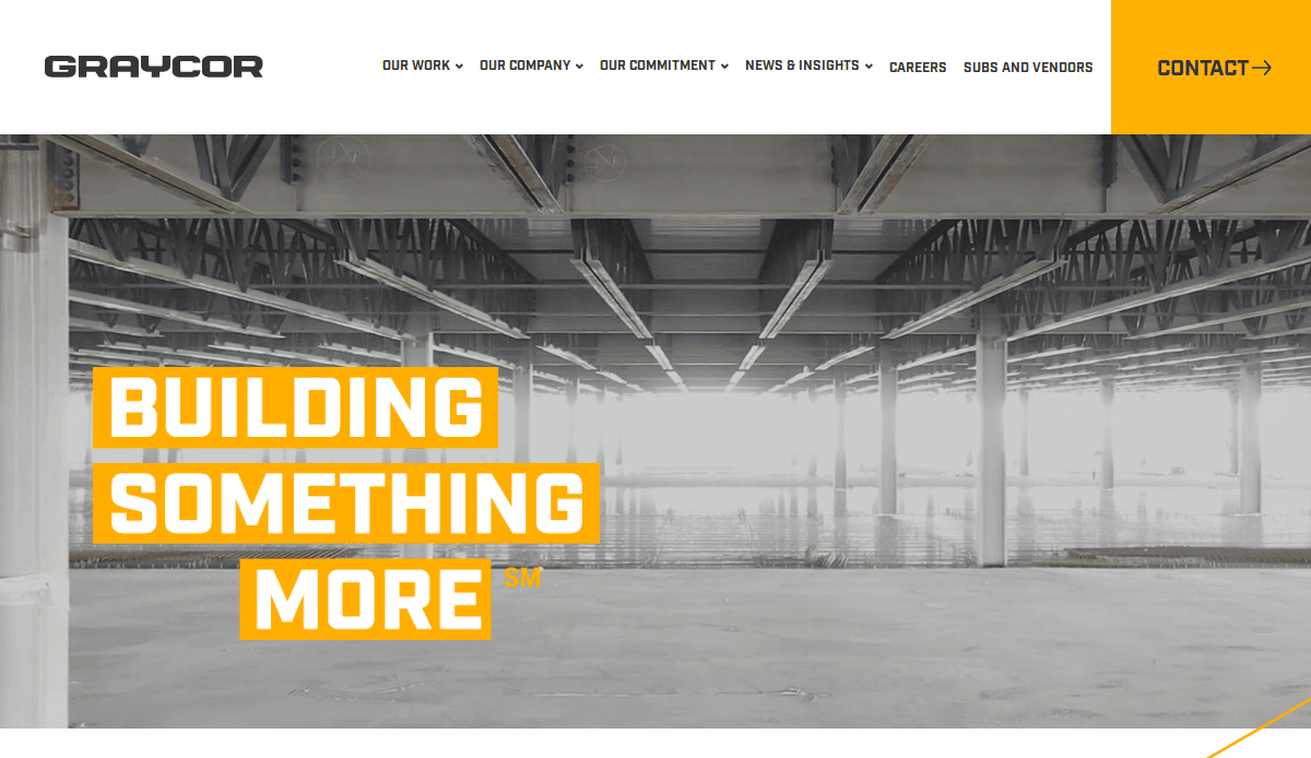
1. Graycor
- Location City In The US: Oakbrook Terrace, IL
- 3 Key Takeaways about what makes it effective:
- Impactful Hero Section: The website immediately grabs attention with high-quality, full-width video backgrounds of their large-scale construction projects, instantly communicating their expertise and the impressive scope of their work.
- Clear Market Segmentation: Graycor effectively segments its extensive services by industries (e.g., Industrial, Commercial) and markets, allowing potential clients to quickly navigate to the specific information that is most relevant to their needs.
- Emphasis on Safety and Culture: The site prominently features its commitment to safety and company culture. This human-centric approach helps build trust and differentiates them in a competitive, high-stakes industry.
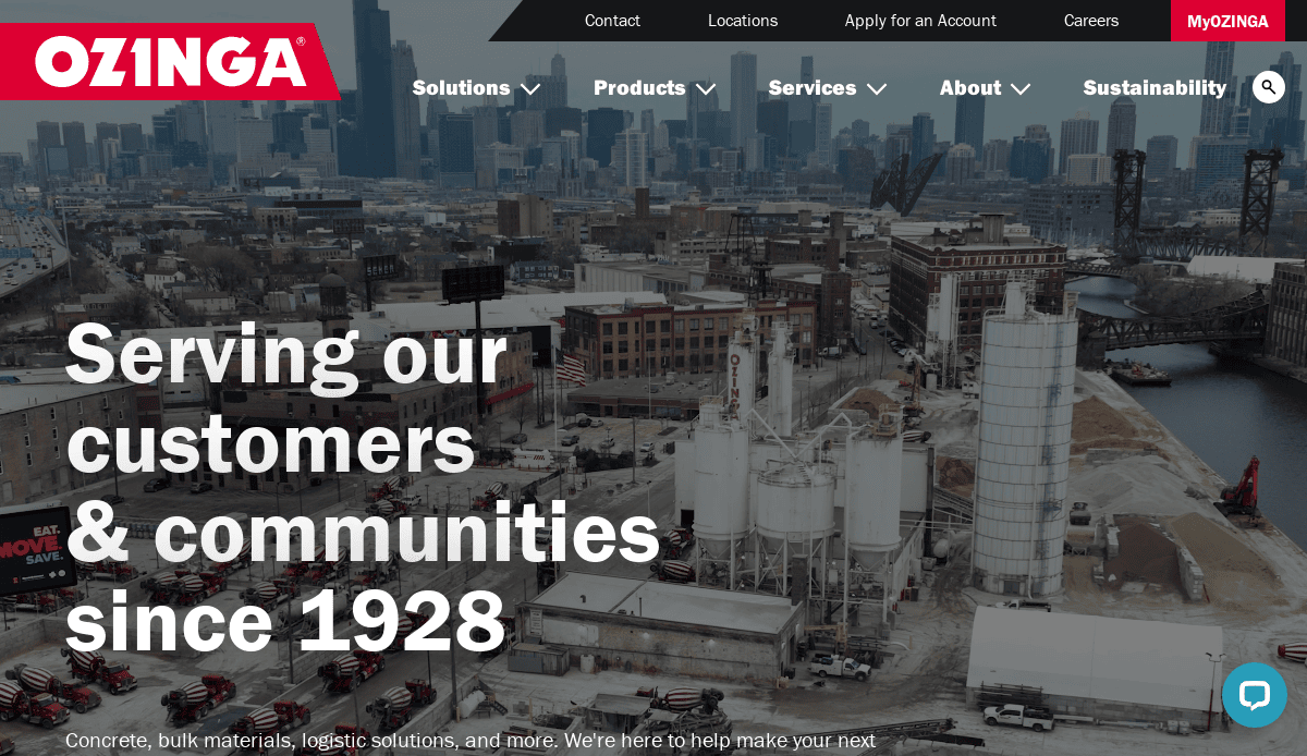
2. Ozinga
- Location City In The US: Mokena, IL
- 3 Key Takeaways about what makes it effective:
- Vibrant and Consistent Branding: Ozinga’s iconic red and white branding is used consistently and boldly throughout the site, creating a memorable and instantly recognizable identity that stands out in the construction materials industry.
- Product-as-Solution Showcase: The website does an excellent job of presenting its products (like concrete and building materials) not just as commodities, but as solutions to specific challenges, such as sustainability (“CarbonSense”) and large-scale projects (“Mission Critical”).
- User-Friendly Quote and Order Tools: The “Get a Quote” and “Order Online” CTAs are prominent and easy to access, streamlining the path to conversion for both new and returning customers and demonstrating a clear understanding of user intent.
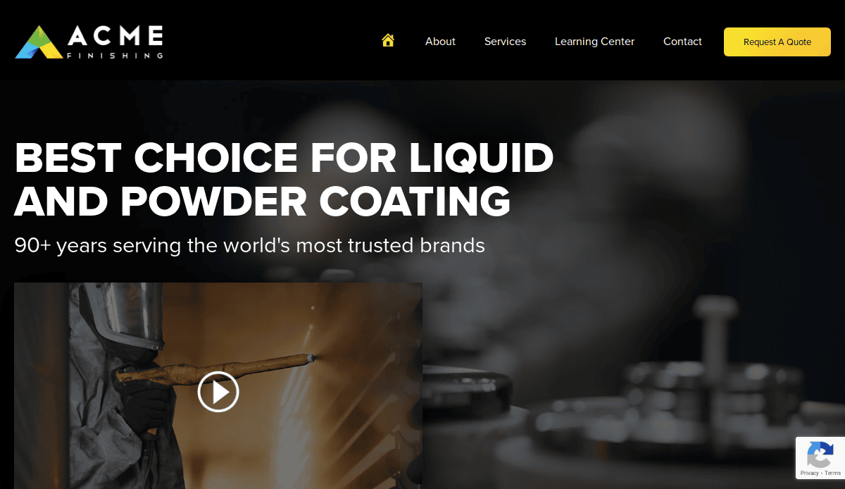
3. ACME Finishing
- Location City In The US: Elk Grove Village, IL
- 3 Key Takeaways about what makes it effective:
- Strong Positioning Statement: The hero section immediately clarifies their unique value proposition: “We’re not a job shop. We build custom programs…” This bold statement effectively pre-qualifies their ideal customer and sets a professional tone.
- Benefit-Driven Case Studies: The case studies are not just project descriptions; they are framed around specific problems and solutions (e.g., Volume, Masking, Plastics), making it easy for prospects to find examples that mirror their own challenges.
- Clean and Professional Aesthetic: The website uses a clean, organized layout with a professional color palette and high-quality imagery of their facilities and finished products, reinforcing their message of quality and precision.
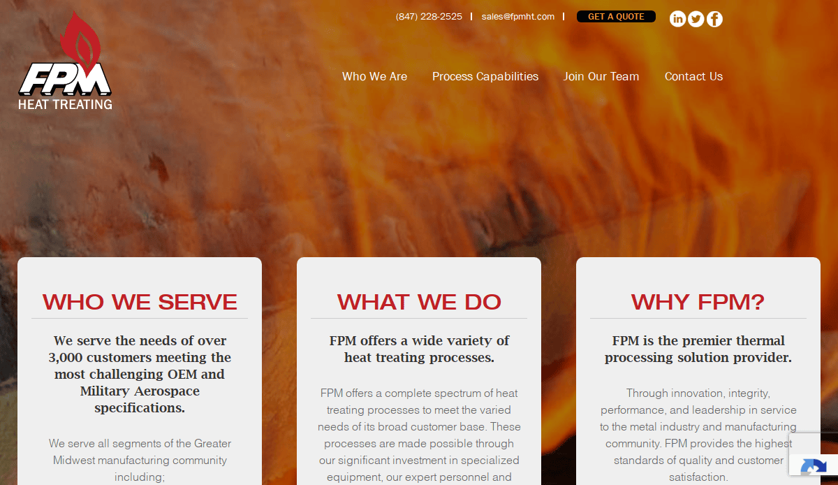
4. FPM Heat Treating
- Location City In The US: Elk Grove Village, IL
- 3 Key Takeaways about what makes it effective:
- Clear Service Specialization: The website immediately presents its core services (like Vacuum Heat Treating and Gas Nitriding) with clear visuals and concise descriptions, making it easy for users with specific technical needs to find relevant information.
- Prominent Quality Certifications: FPM prominently displays its key industry certifications (Nadcap, ISO 9001), which act as a powerful trust signal for B2B clients in high-stakes industries like aerospace and automotive.
- Direct and Accessible Contact Info: The phone number and a “Request a Quote” CTA are visible at the top of every page, providing a direct and frictionless path for potential customers to initiate contact and start the sales process.
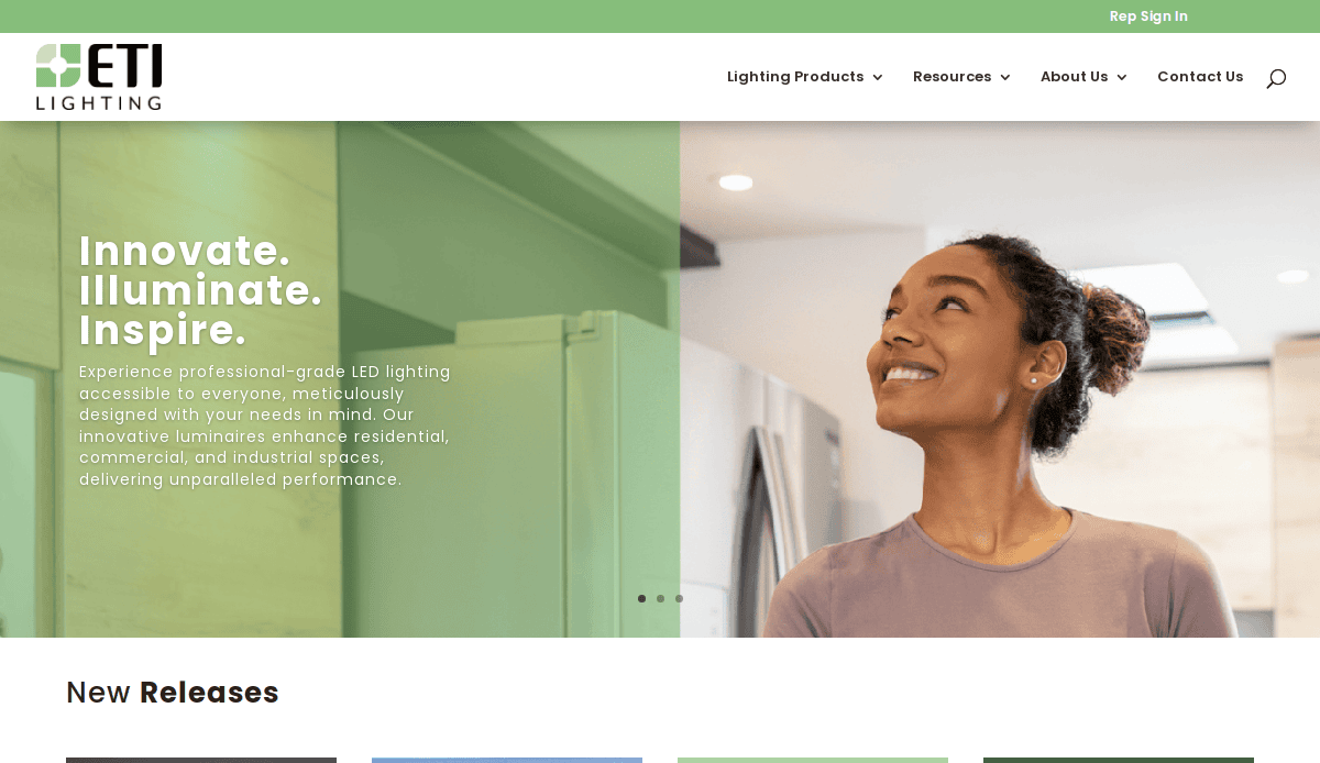
5. ETI Solid State Lighting (a B&K Brand)
- Location City In The US: Wheeling, IL
- 3 Key Takeaways about what makes it effective:
- Excellent Product Categorization: The site organizes its vast inventory of lighting products into logical, easy-to-navigate categories (e.g., Commercial, Industrial, Residential), preventing user overwhelm and streamlining the product discovery process.
- Resource-Rich Content: The inclusion of a comprehensive “Resources” section with catalogs, a learning center, and case studies positions ETI as an expert in the lighting industry and provides significant value to potential buyers doing research.
- Clean and Modern Visual Design: The website utilizes a bright, clean aesthetic with high-quality product imagery and ample white space, which appropriately reflects the modern, high-tech nature of solid-state lighting solutions.
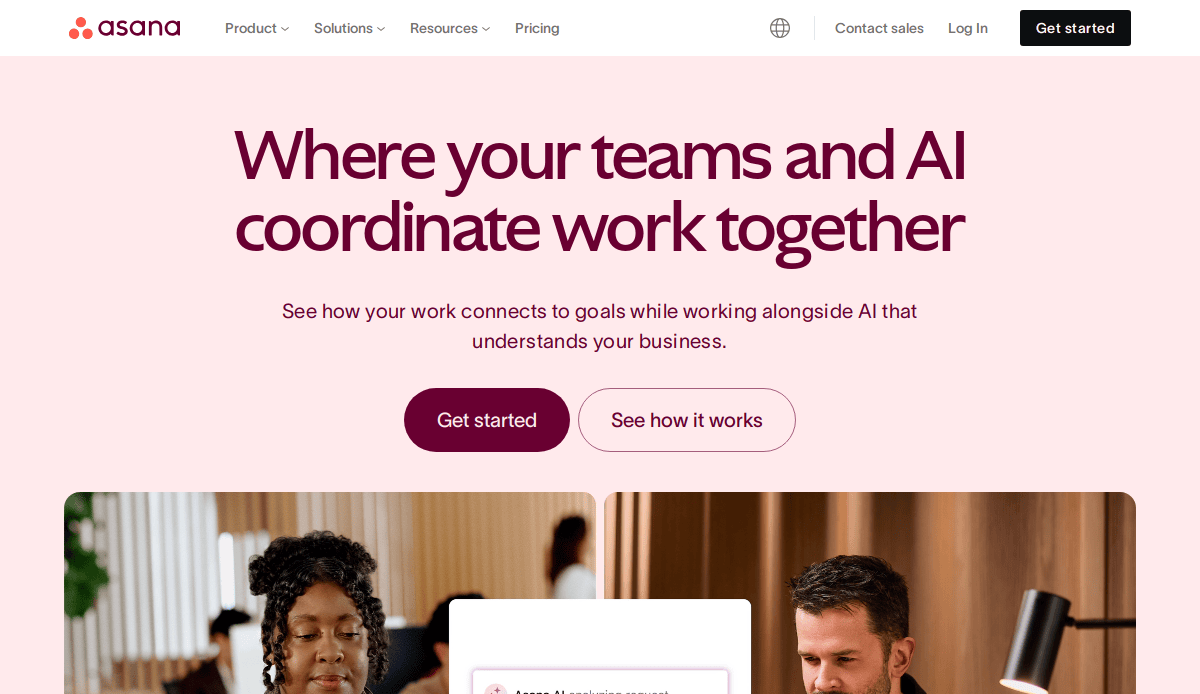
6. Asana
- Location City In The US: San Francisco, CA
- 3 Key Takeaways about what makes it effective:
- Benefit-Oriented Headlines: Asana uses clear, concise headlines that focus on the user’s desired outcome (e.g., “Meet goals, hit deadlines, and build forward”) rather than just listing product features.
- Interactive and Dynamic Visuals: The site is filled with smooth animations and interactive elements that demonstrate the software in action, making a complex product feel intuitive and easy to use.
- Social Proof and Use Cases: They masterfully integrate logos of well-known customers and showcase specific use cases by department (Marketing, Operations), allowing potential buyers to easily see how Asana fits their specific needs.
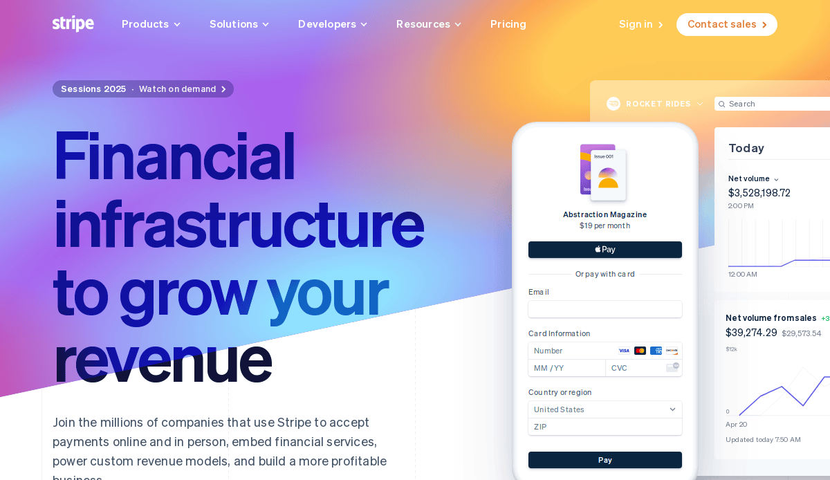
7. Stripe
- Location City In The US: San Francisco, CA
- 3 Key Takeaways about what makes it effective:
- Developer-First Approach: The design is clean, technical, and highly organized, immediately appealing to its core audience of developers and tech-savvy founders. The “Documentation” is a primary navigation item, not an afterthought.
- Exceptional Visual Hierarchy: Stripe uses a combination of gradients, subtle animations, and perfectly structured content blocks to guide the user’s eye exactly where they want it to go, making complex information feel digestible.
- Unified and Elegant Branding:The visual identity is incredibly consistent across the entire platform, from the marketing site to the developer documentation, creating a seamless and highly professional user experience.
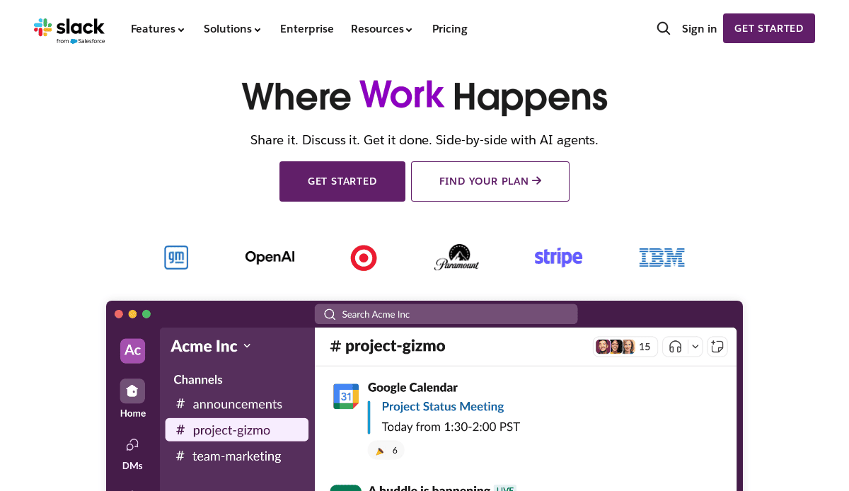
8. Slack
- Location City In The US: San Francisco, CA
- 3 Key Takeaways about what makes it effective:
- Clear Value Proposition: The headline “Made for people. Built for productivity.” is simple, memorable, and perfectly encapsulates the platform’s dual focus on user-friendliness and business results.
- Engaging and Human-Centric Imagery: Slack uses a mix of clean product UI and photos of diverse, collaborative teams, which makes the brand feel approachable, modern, and focused on people.
- Interactive Demo: Instead of just static screenshots, the website often features an interactive, “scrollytelling” demo on its homepage that walks the user through the platform’s key features in an engaging way.
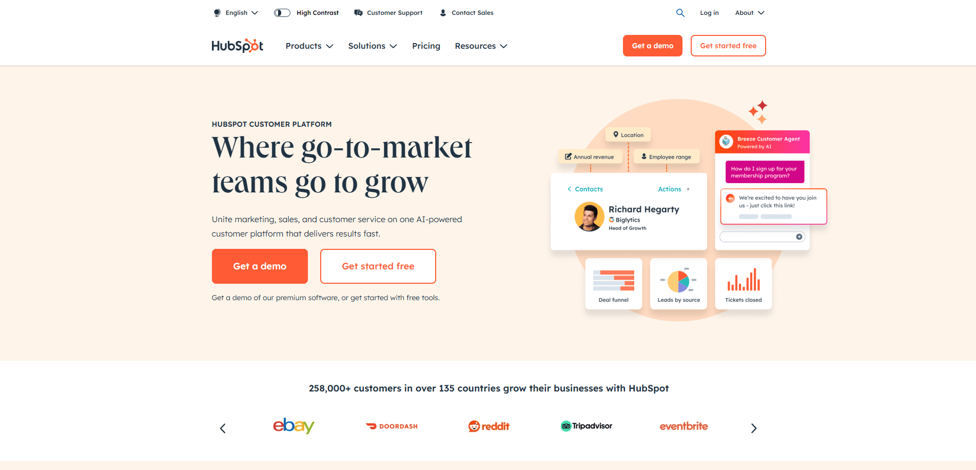
9. HubSpot
- Location City In The US: Cambridge, MA
- 3 Key Takeaways about what makes it effective:
- Masterful Content Hub: HubSpot is a prime example of inbound marketing. Their website is a massive resource of free blogs, guides, and tools that attract and educate their target audience, building immense trust and authority.
- Scalable Solution-Based Navigation: The site effectively organizes its vast suite of products under “Marketing,” “Sales,” “Service,” and “CMS Hubs,” allowing businesses of all sizes to find the specific solution they need.
- Clear Growth-Oriented CTAs: Calls-to-action like “Get a demo” and “Get started free” are everywhere, consistently prompting the user to take the next step in the buyer’s journey, no matter where they are on the site.
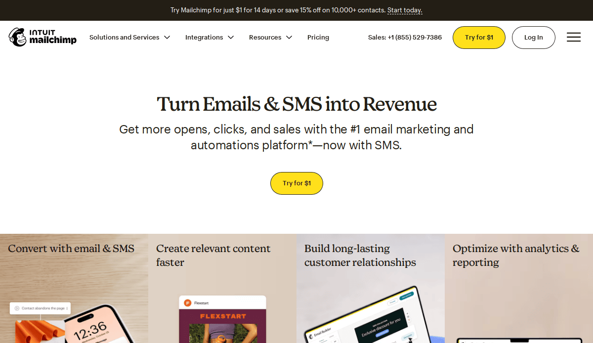
10. Mailchimp
- Location City In The US: Atlanta, GA
- 3 Key Takeaways about what makes it effective:
- Distinctive and Playful Branding: Mailchimp’s quirky illustrations and friendly brand voice create a unique and memorable personality that stands out in the often-sterile B2B software space.
- Simplified Pricing Tiers: The pricing page is exceptionally clear and well-designed, using feature comparisons to guide users to the right plan and effectively upselling them on the benefits of higher tiers.
- Focus on Customer Success: The site is filled with inspiring case studies, customer stories, and examples of what others have built using their platform, which helps potential users envision their own success.
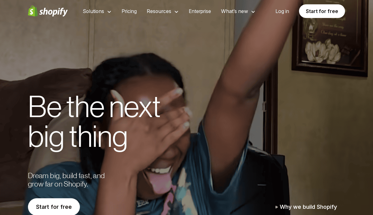
11. Shopify
- Location City In The US:(Primary US operations, though HQ is in Ottawa, ON)
- 3 Key Takeaways about what makes it effective:
- Entrepreneur-Focused Messaging: The language throughout the site is empowering and speaks directly to the aspirations of entrepreneurs and business owners, creating a strong emotional connection.
- Clean, Aspirational Visuals: The website showcases beautiful, professional examples of stores built on its platform, serving as direct inspiration and proof of the high-quality outcomes customers can achieve.
- Low-Friction Entry Point: The “Start free trial” call-to-action is the most prominent element on the page, removing barriers to entry and encouraging users to immediately start exploring the platform.
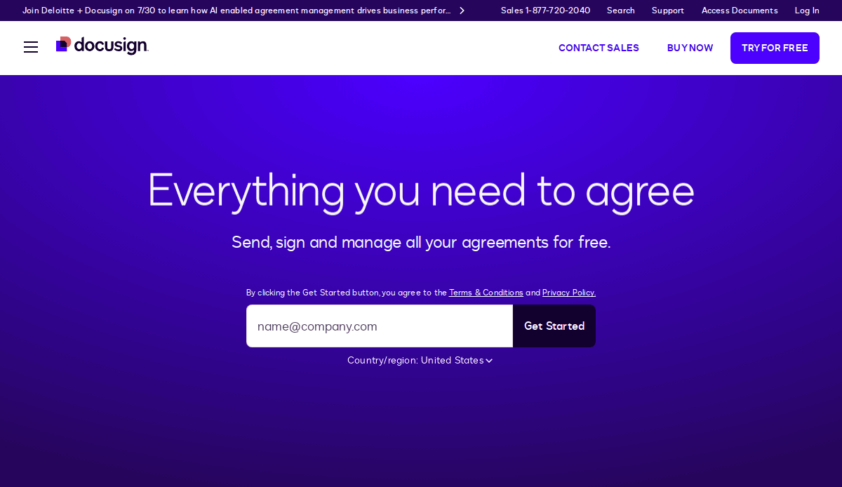
12. DocuSign
- Location City In The US: San Francisco, CA
- 3 Key Takeaways about what makes it effective:
- Clear and Ubiquitous Use Cases: DocuSign effectively showcases its applicability across numerous industries (Real Estate, Financial Services, etc.) and departments, making its value proposition instantly clear to a wide range of business professionals.
- Trust and Security as a Focal Point: The website prominently displays security credentials, compliance information, and trust seals, directly addressing potential customer concerns about the safety and legality of e-signatures.
- Simple, Action-Oriented Interface: The design is clean, uncluttered, and highly functional. The focus is always on the next logical action, whether that’s trying the product for free or contacting sales.
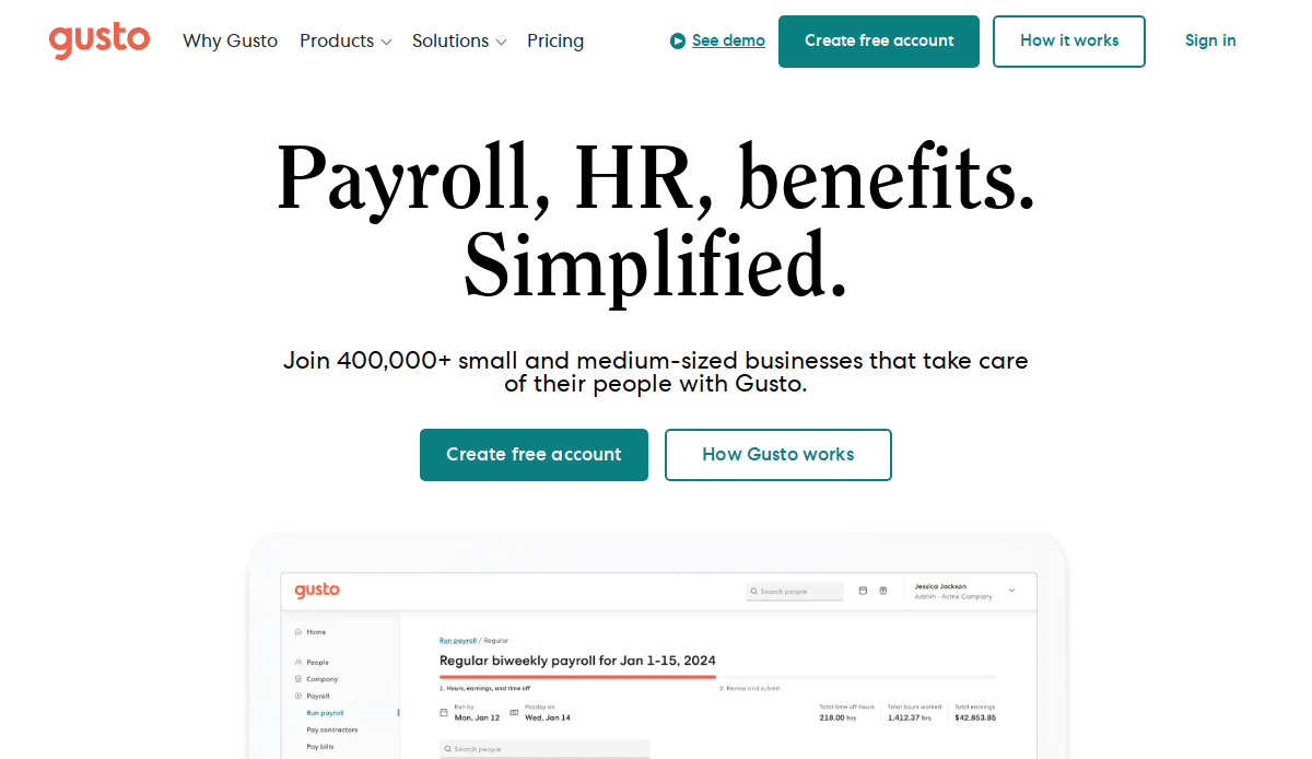
13. Gusto
- Location City In The US: San Francisco, CA
- 3 Key Takeaways about what makes it effective:
- Warm and Inviting Design: Gusto uses warm colors, friendly illustrations, and photos of real small business owners, creating a welcoming and reassuring feel for a topic (payroll, HR) that can be stressful.
- Transparent and Simple Pricing: The pricing page is a model of clarity. It clearly outlines the features included in each tier with no hidden fees, which builds significant trust with potential customers.
- All-in-One Solution Messaging: The website excels at communicating the value of having payroll, benefits, and HR all in one place, emphasizing ease of use and the time-saving benefits for busy founders.
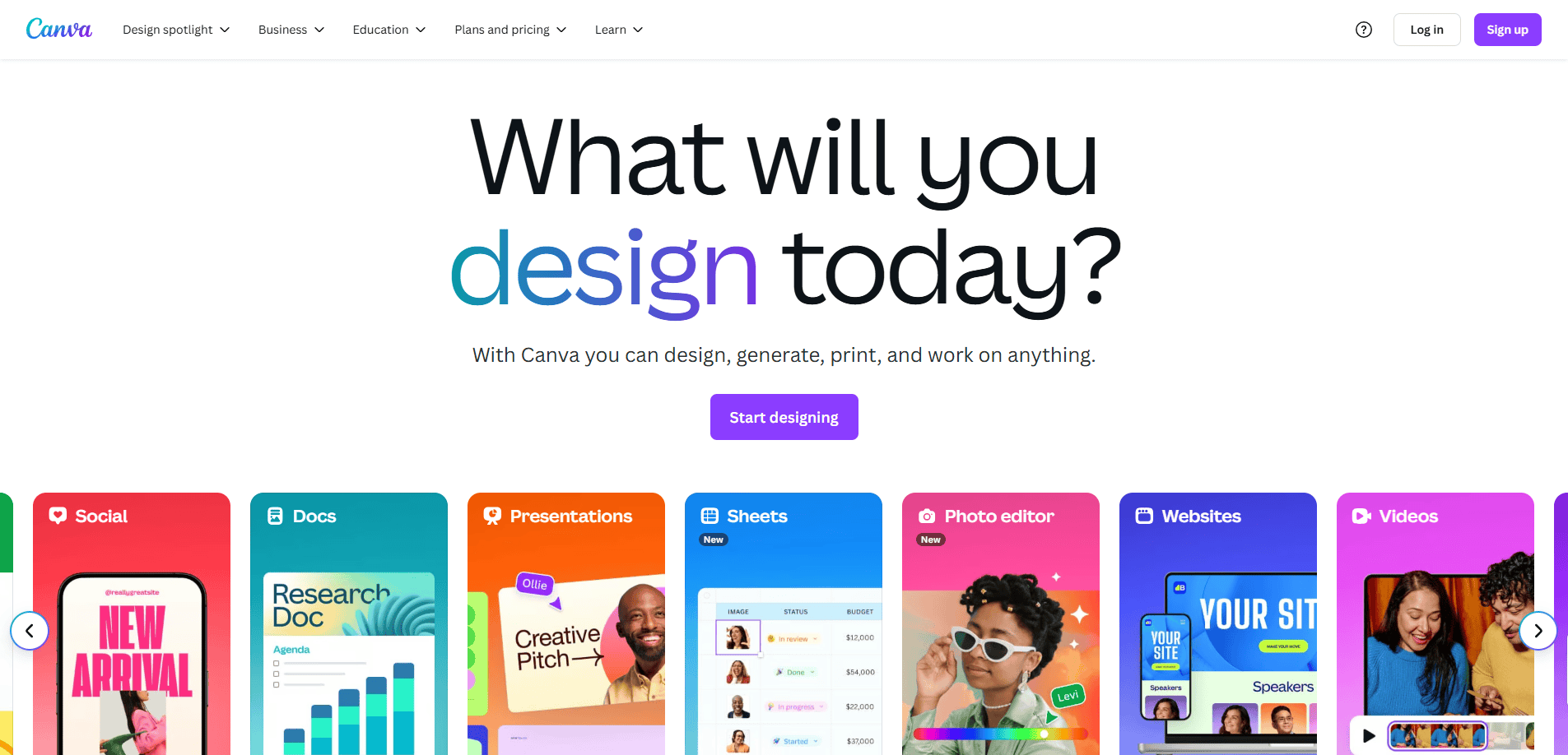
14. Canva
- Location City In The US:(Primary US operations, though HQ is in Sydney, AU)
- 3 Key Takeaways about what makes it effective:
- Visually-Driven Discovery: The homepage is a dynamic showcase of what can be created with the tool. It allows users to immediately start designing or explore templates, promoting learning by doing.
- Powerful Freemium Model: The distinction between the free and “Pro” versions is made clear, but the free version is so robust that it builds a massive user base and acts as the most effective marketing tool for upgrades.
- Template-Based Solution Selling: Canva organizes its offerings around user goals (e.g., “Docs,” “Presentations,” “Social Media”), presenting templates as quick solutions to common business and marketing needs.
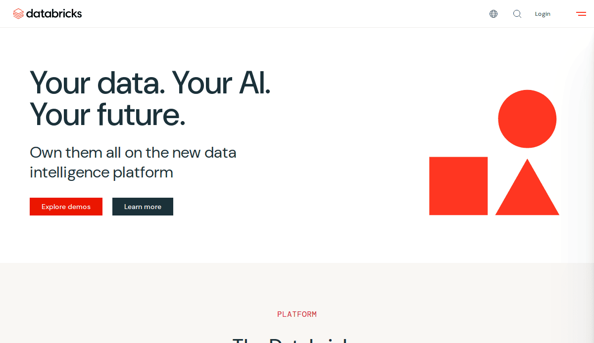
15. Databricks
- Location City In The US: San Francisco, CA
- 3 Key Takeaways about what makes it effective:
- Authoritative and Technical Tone: The website speaks the language of its highly technical audience (data scientists, engineers) with confidence, using precise terminology and focusing on platform architecture and capabilities.
- Robust Educational Resources: The site features extensive documentation, technical blogs, and guides that establish Databricks as a thought leader in the data and AI space, providing immense value to its users.
- Clear Platform Architecture Visualization: Through clean diagrams and a structured layout, the website successfully simplifies and explains its complex “Lakehouse Platform,” helping potential customers understand its core components and benefits.
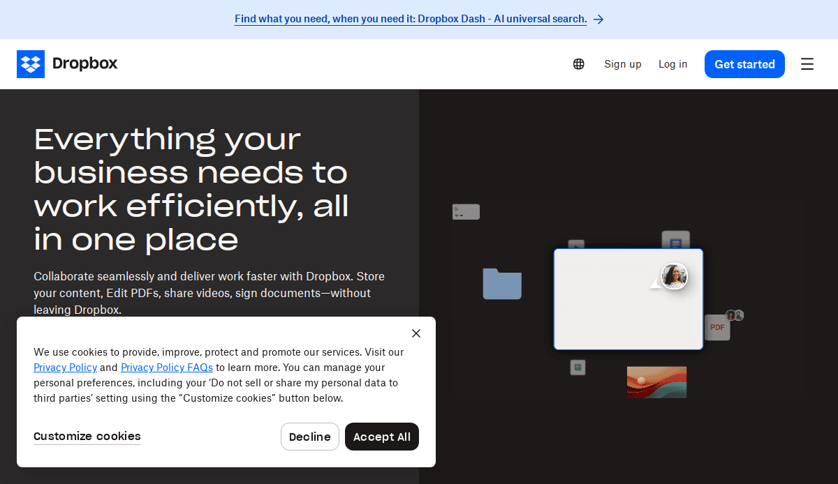
16. Dropbox Business
- Location City In The US: San Francisco, CA
- 3 Key Takeaways about what makes it effective:
- Clear Differentiation from Consumer Product: The B2B section of the site does an excellent job of highlighting features specifically for businesses, such as advanced security, admin controls, and team collaboration tools.
- Benefit-Focused and Relatable Copy: The copy focuses on solving common business pain points like disorganized files, inefficient workflows, and security concerns, making the solution feel immediately relevant.
- Clean, Uncluttered User Interface: The design mirrors the simplicity and ease of use of the Dropbox product itself. It’s minimalist, intuitive, and allows the user to find information without distraction.
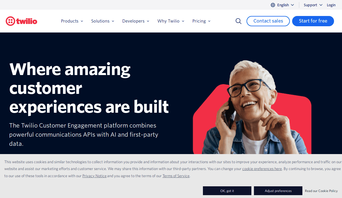
17. Twilio
- Location City In The US: San Francisco, CA
- 3 Key Takeaways about what makes it effective:
- API-First Presentation: The website is structured like a library of APIs, with clear documentation and code snippets readily available. This immediately resonates with its primary developer audience.
- Use-Case-Driven Solutions: Twilio organizes its products around what users want to achieve (e.g., “Customer Identity,” “Marketing Campaigns,” “Contact Center”), making its powerful but complex tools more accessible.
- Interactive and “Try it Now” Functionality:The site encourages hands-on exploration, with interactive demos and clear pathways to sign up for a free API key, letting the product’s power sell itself.
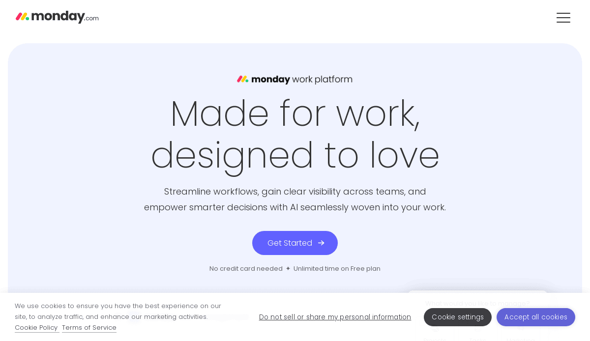
18. monday.com
- Location City In The US: New York, NY
- 3 Key Takeaways about what makes it effective:
- Vibrant and Colorful Design: The use of bright, bold colors and dynamic animations creates a feeling of energy, collaboration, and productivity, visually differentiating it from more staid project management tools.
- Extensive Template Library: The site prominently features a vast library of pre-built templates for different industries and use cases, which helps users immediately visualize how they can use the product for their specific needs.
- Clear “Work OS” Messaging: They effectively position themselves not just as a project management tool, but as a flexible “Work Operating System,” a bigger-picture concept that communicates scalability and customization.
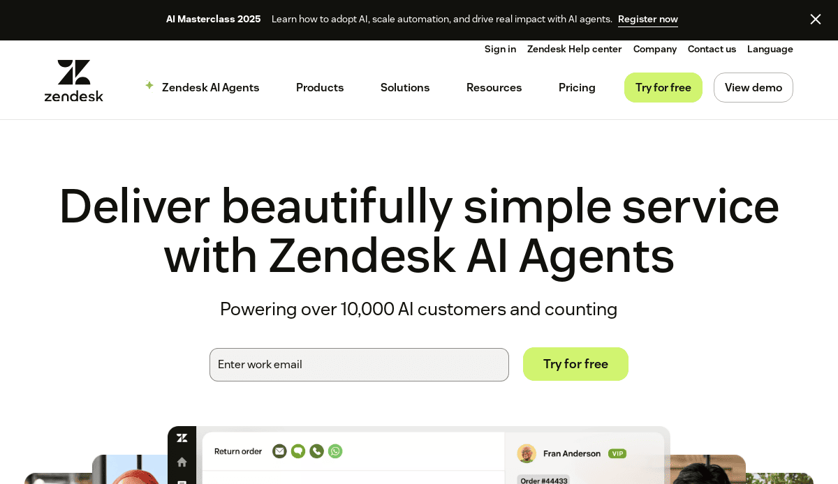
19. Zendesk
- Location City In The US: San Francisco, CA
- 3 Key Takeaways about what makes it effective:
- Empathetic and Customer-Centric Language: The copy consistently focuses on the importance of the customer relationship, using words like “champions” and “conversations” to create a warm, service-oriented brand identity.
- Solution-Oriented Navigation: The navigation is structured around business size (“For Enterprise,” “For Startups”) and needs, helping different types of customers quickly find the most relevant information and product suite.
- Strong Visual Storytelling: Zendesk uses a mix of friendly illustrations and customer success videos to tell a compelling story about improving customer service and building better relationships.
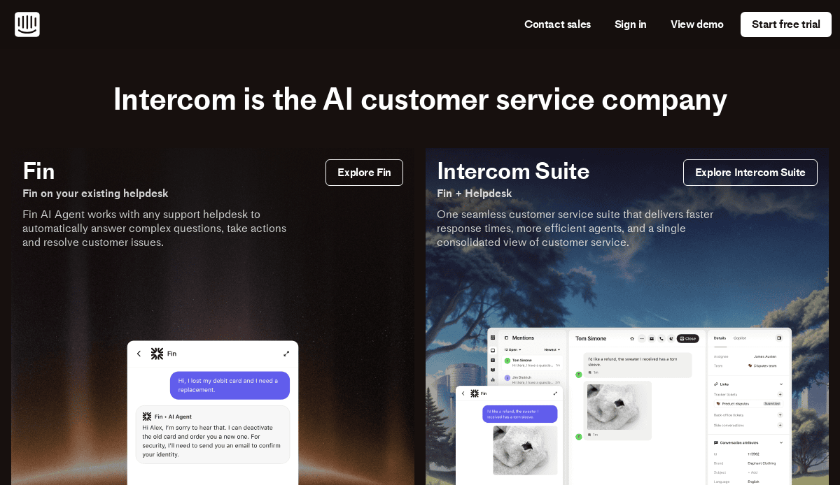
20. Intercom
- Location City In The US: San Francisco, CA
- 3 Key Takeaways about what makes it effective:
- Clear Focus on Conversational Engagement: The entire website is built around the theme of conversations, effectively communicating its core business of being a customer communications platform.
- Polished and Modern Aesthetics: Intercom uses a sophisticated color palette, beautiful typography, and clean layouts that create a premium, high-tech feel, appealing to modern SaaS and tech companies.
- Interactive Product Tours: The website features guided, interactive tours that allow users to click through the platform’s interface in a simulated environment, providing a much richer understanding than static screenshots ever could.
Your Blueprint is Ready: Let’s Build Your New Website
You now have the framework for a successful b2b website strategy, moving beyond the surface-level differences between b2b and b2c. Creating a great website that fuels b2b sales requires a disciplined design process that masterfully blends design and functionality. Whether you are planning a new website from the ground up or undertaking a complete website redesign, the goal is to optimize your website into a powerful tool for business growth. It’s time to put the principles from this complete guide into action and build a b2b platform that delivers results.
If you’re ready to partner with an agency that specializes in strategic b2b website design and development, our team is here to help. Contact us today to schedule a free consultation and start building your growth engine.
Frequently Asked Questions About B2B Website Design
What are the key differences between B2B and B2C website design?
The primary difference between b2b and b2c websites lies in the audience and the complexity of the purchase. B2C websites often cater to a single buyer making a relatively quick, emotional decision. In contrast, a B2B website should focus on a much longer sales cycle and the needs of a diverse buying committee. The b2b customer requires logic, detailed data, and a clear ROI. Therefore, an effective b2b web strategy prioritizes education, lead generation, and building long-term trust over the impulse buys common in b2c and b2b e-commerce. The entire design approach must be built to facilitate complex b2b transactions and nurture leads over time.
What are the most critical design factors for a strong B2B website?
To create a good b2b website, several design factors are critical. First, the website’s design must instantly communicate credibility and professionalism. This includes having a fully responsive design that works flawlessly on all devices. Second, the design and content must be perfectly aligned to guide website visitors through a logical journey. This means intuitive navigation, clear calls-to-action, and content that speaks to specific user pain points. Ultimately, the best practices for b2b website success emphasize clarity over confusing design trends. The entire design communicates the benefits, so every element must work together to establish trust and facilitate a business goal.
How can our B2B business improve our website’s effectiveness?
You can improve your b2b website’s effectiveness by adopting a strategic, data-driven design approach. Start by analyzing user behavior to understand how visitors interact with your site. Implementing seo best practices is fundamental to increasing qualified website traffic. Address technical issues immediately, as a slow website is a guaranteed conversion killer. The goal is to optimize your b2b website by continually refining the design and functionality to better meet user needs. For more specific actions, reviewing these tips for crafting effective B2B website designs is a great starting point.
Should a B2B website follow the latest design trends, like minimalist design?
While it’s important to appear modern, a strong b2b website should prioritize timeless principles over fleeting design trends. A trend like minimalist design can be effective if it serves the primary goal of clarity and helps users focus on your selling proposition. However, the core web design strategy should not be trend-chasing. The right b2b website is one that is built on a deep understanding of the b2b customer. The most important b2b website design best practices involve creating a clear, trustworthy, and efficient user experience, which will always be more effective than simply applying the latest visual style.


